
The opening Post to a soon to be great franchise, I hope.
Don't wanna be here? Send us removal request.
Statistics
We looked inside some of the posts by yourmajestysworld-blog and here's what we found interesting.
Average Info
Notes Per Post
2
Likes Per Post
2
Reblog Per Post
0
Reply Per Post
0
Time Between Posts
21 days
Number of Posts By Type
Text
10
Last Seen Tumblr Blogs


Fun Fact
25% of US internet users with an annual income of $80-100K use Tumblr.
Text
After 5 App Design
After Five Cleaning – Introduction
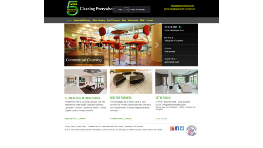
After Five cleaning is a cleaning company whom do cleaning services for inside houses. They offer various types of different services and are available via their website. They needed an app designed that would allow them to add and edit the questionnaire that they would send their users to fill out when they want to request their services. This project differed in a sense from the websites and game UI that I normally designed. This was something considerably smaller, but because of that this also mean there was far less room for error. Simply put, I needed to throw a jab, but only a jab. This mean I can practice this to the maximum
After Five Cleaning – Mobile first design (Identifying the needs)
The first thing that was to be noted, that it was a questionnaire. This sounds pretty simple, but because of the application (to book appointments), and the fact that the app was actually very in depth, this needed to be laid out visually, in a way that made booking as smooth as possible. The one problem that I can easily encounter, is that with all of the questions that are required, is that it can get overwhelming. Imagine sitting for an hour, just answering monotonous questions, it may be necessary, but it isn’t exactly a good experience. Normally in UX design, you would want to identify the common pain points that someone using an app or a site would experience, but this sadly couldn’t be the case here, as there wasn’t any real previous reference to go off of. This presented a unique challenge for me, and meant that instead of simply “improving” off of what had already been done, I needed to effectively “shoot in the dark” (as at this stage I am still quite inexperienced)
After Five Cleaning – Wireframe layout
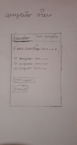

So, the first thing I did was pull out my pen and paper and got to drawing. I wanted to design something that can take advantage of the one key advantage mobiles have. Hand gestures, make things that would require scrolling on a computer or doing certain actions (such as closing or changing page) incredibly swift and easy. This is one of the main draws. My first worry, was making the app be a chore to scroll down, as you added more and more questions. The Sketch was just a good idea of what to do before the colour scheme was to be decided
After Five Cleaning – Colour Scheme
This was the likely the easiest part of the entire project. Because the company colours was green/white for their website, they wanted this to be used with the app to keep it consistent. This was perfectly fine by me, my work load was reduced. For me the only real choices that needed to be made was where the colour was to be placed. Green, especially dark racing green, can be a very overwhelming colour when used too often, whereas white, can be very “boring” when done
After Five Cleaning – Mobile Version V1
The sketch for the mobile version was quite a ways different from what the final product ended up becoming. If you’ve seen my portfolio at coroflot. You can immediately see that the sketch you’re looking at looks a lot more “phone” like, for lack of a better word. What I mean by this is that I have designed the interface to be able to take advantage phone specific features (in this case, swiping). This was where I learned about user testing. Once I designed the application (I could quickly mock it up with colours, as these had effectively been decided for me) I immediately received the following question;
“what would I do if I wanted to edit a question I already submitted”
And right there the design fell apart. Effectively, I had no real answer for this. So, immediately it was back to the drawing board.
After Five Cleaning – Mobile Version V2
So, it was effectively. Back to the drawing board. For the next one, I looked towards different inspirations for the layout of the mobile version of the app. This time instead of trying to design what I “think” would work, I instead wanted to go and see what similar apps there was on the market place that was currently being used.
Survey Monkey

The app layout of this was pretty solid, it was easy to use familiar, and it actually reminded me quite a bit of google forms. The only problem was. One of the key requirements was that each question was to have “sub questions”, as due to the layout of the question, there also needed to be sub questions related to it, to them determine what sort of equipment would be used (e.g. if you have a room with windows, how many windows?). So this presented a different problem. This effectively meant that I needed a way to “group” a question for ease of use for the employees. The reason for this was that the cost, hours and equipment they would visit the house with, was determined by what answers were given.
Google Forms
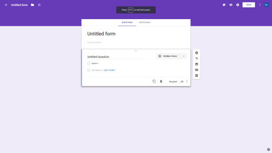
This is partly what the first version was based on, as this is software that I use often, So I decided to take another look at the layout and analyse it once again to see where I went wrong. As you can see, the similarities between that two, is that there is a “panel”. This is where the idea to have employee’s “swipe” left and right came from (this is a desktop screenshot). The problem that I encountered here (again) was simple How does one keep track of all of the questions they have added? And how do you make this straight forward to view and modify?
Tree List Layout
This was something I actually found upon by accident. The tree list layout is when you have a parent and child relationship layout. The parent is the main object on the screen, and the child are the things that are related to it. This sort of structure is used often in the programming space, as someone who has done computer science in the past, I am very used to using it conceptually whilst doing object oriented programming
As a result. I decided to try out this layout for an interface. Instead of making question a “question”, it becomes an “Object”, the sub questions merely become the “child” of the “parent”, this isn’t UX related per say, but this is programming related. This effectively describes how the programmer would need to implement this method, which is important because I was actually working side by side with a programmer as I was implementing the interface (he was the one that asked the question) This line of thinking, resulted in the following sketch
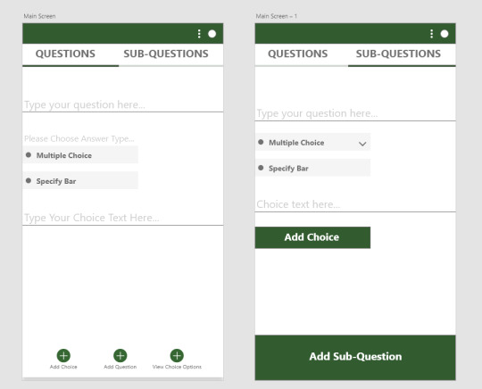
Low Fidelity Sketch

High Fidelity Sketch

This is the result of the sketch. The idea was to have one main menu which allowed you to add “parents” (questions) which automatically gave you answers (the child). This structure would then be delved upon via the sub-questions. Which lets you do the same thing (add a sub question). The one problem that could still be present with a view like this is overwhelming amounts of information, or having to constantly scroll through layers upon layers of information (especially when the questionnaire gets large) To somewhat resolve this, I put in a collapse all or expand all button, something which is fairly common when working with folders in applications.
Things to improve upon
One of the key things that I actually missed out, was a search button. As it stands, even with everything “collapsed” there would still be a fairly large amount of questions to look through. This can easily be cut through if the user can manually search the question itself that they are looking for. The thing to remember is that the main user base will have upward of thirty to forty questions at a time, each with their own sub questions. I also intend to make the each “object” numbered. Where you can see the “type your question here” section, should have a “1.” annotation, to let the user know. I consider this a mere quality of life change, but an important one nonetheless
But even with that particular problem, the UX of the app, is something that is
1 note
·
View note
Text
Component, High Fidelity Designs and where to go next
So, with that done. It was time to then design the components themselves. I already had the style in mind, and with the layout of it all. The shape was already set up for the menu components, however for the display of the vehicles and courses, for visual clarity, I had to change to more rounded rectangles. It also felt a bit too basic to use the same shape over and over (to the point of being lazy than anything).

General Rules and Menu Buttons
The initial designs of these was done with a few rules in mind. All were to start in black and white. This was to make sure that they were suitable for those who were colour blind. As a result, the main way these were to be “animated” was they were either to make a sound, or they would be modified visually on the screen, subtle changes such as say, a buttons border becoming wider.
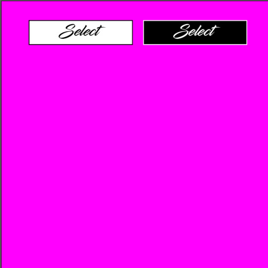


As these buttons all follow the same sort of convention, they’re effectively covered together (they’re the same functionality wise). If the only change visually, that the “colour” changes, this means that a sound will play when it is clicked. The reason for this choice was, at the time I had realized that the buttons were put somewhat close together, so having to add an animation, and then give screen space for it to play would result in me having to change the layout of the screens entirely. I considered this somewhat of a flaw at the time (this will be explained later on)
HandBrake
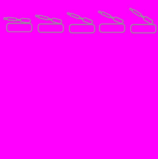
I started on the handbrake because the handbrake actually had two variations. The first one that you see here, is actually the lever of a handbrake. This is because in my mind, most people would recognize that it is a hand brake level, and push it to slide. The animation mirrors how a handbrake is pushed as well.
Hilariously enough, When I tested this with someone whom is an actual driver, they not only did not recognise the handbrake lever, they thought it was the track map. Said person then advised me to actually look at the UX for vehicles, and advised me to use the universal sign for handbrakes in the UI. This led me to heavily regret not doing something so obvious early on. Whilst I did take his advice and adopt this, I also feared that many would take this to mean its the brake sign (because not everyone drives), so I put handbrake to accentuate this. I also changed it so that instead of simply lighting up, it will now glow, like in a real car, but also shake slightly, because again, someone might be colour blind.

Nitrous

Nitrous is a fairly easy concept. The icon is a basic lightning symbol, which is a fairly common logo used for speed. Due to the instant drastic changes that occur when you hit the nitrous button, you do not necessarily need to “indicate” via the UI when the button is pressed. All that needs to be required of it, is that it is easy to get to and press. The reason for this is that it is not really the job of the UI to communicate when you have pressed it, that’s what the gameplay is for, as you’re speeding up drastically. This should be more evident in what’s happening on the screen than anything else. As a result, I put a very simple, understated animation of a ring appearing around it when pressed.
Speedometer
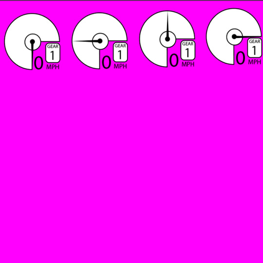
As mentioned before, the speedometer is placed at the top, with everything being labelled (again, not everyone will be able to tell what the gears are if they’re not labelled). Even though these were explained above, I still felt it important to actually talk about this a bit, as the speedometer to me is the most iconic part of a racing game UI, and the way its styled and executed, can be the difference between an average arcade racer and an iconic one.
Brake/Accelerate Pedals

These are fairly simple in my opinion. Once again, your interaction with these, affects what is going on in the world. As a result, I put the simple animation of the pedal going downwards when pressed, to indicate that the button itself is working, I have also put these as see through to make sure parts of the screen are not covered.
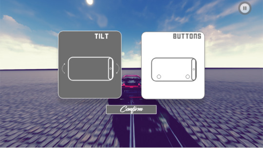
Tilt/Button Controls

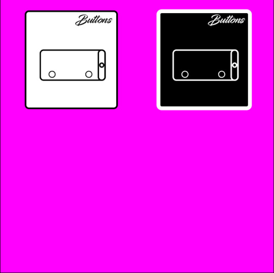
Every racing game offers these options. So it is imperative that I offer them as well. A simple vector drawing depicting the control scheme works here. What needs to be noted however, is that these aren’t actually animations. These are just what is to happen when selected. As a result, I have made the border visibly bigger when it is selected, in order to let the user know they have selected it successfully, and of course a sound will play.
High fidelity wire-frames – Menu

Pictured: Language Screen
Pictured: Main Menu Screen

Pictured: Track Screen

Pictured: Vehicle Screen
Pictured: Loading Screen

Pictured: Loading Screen

Pictured: Controls Screen
For me, this is where the magic can start. The function is already in place and the menu conceptually, looks very simple. So the main problem that many game interfaces stumble upon in their UX is already solved (form over function) This gives me free reign to effectively be a graphic designer without having to worry about hindering usability. The joys of proper planning!
I decided upon a colour scheme of four colours. Two colours for the main interface, and two for the buttons. In the end I decided upon the following colours as seen below:
The reason chose these were fairly simple. The orange, was originally yellow, due to games like ridge racer type 4, but I eventually decided to change this to orange to avoid feeling like I had copied their entire style. Another change that I actually added AFTER the wireframe planning, was that I decided to actually add a shadow underneath the UI elements to make them look “elevated” and make them stand out more. One flaw that didn’t crop up in the planning, was that everything looked a bit too...level. This led to the buttons looking like they were part of the screens, and not actually sticking out to the user. I chalk that one up
to inexperience personally. I put the shadows and called it a day.
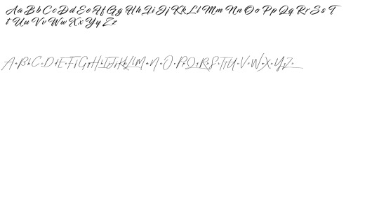
The two fonts that I used are fairly important, as of this time of writing, the project doesn’t have a full name a logo, so it uses a working title. Once again, the theme is fast and stylish. With the font choices I decided to go full on “stylish”, favouring calligraphy and brush styled fonts. For this I chose the following two fonts: “Infinite stroke” (the top one) and “Taken by vultures” (the bottom one)
Infinite stroke was brilliant, because it is stylish and bold. Taken by vultures is very thin in its styling, and this could easily lead to readability problems. Especially as mobile phone screens are very small in comparison to a pc screen. Infinite stroke is bold and large enough to not be too big for the UI components, but just small enough to not look unwieldy. As a result, Taken by vultures was relegated to use of the title screen, and screen labellings at the top right, where it’s not restricted in size by the component scale, meaning I can put it as big as I need to, without it looking blocky or poorly placed.

Pictured: In game GUI (Buttons)
Pictured: In game GUI (Tilt)
This is where my theory gets put to the test. As you can see, there is actually a lot of grey in the UI. The directional buttons and the accelerate/brake are the main parts i wanted in grey, as whilst they’re important buttons, they’re also the largest on the screen. Having them coloured with full opacity would easily obscure the screen too much. Another thing you will notice in the mockup, is the modified speedometer. In practice, when used with triple numbers, it was far too cluttered for triple digits. This was rectified during the high fidelity process. Thankfully it was rectified fairly easily with a few rearrangements.

Pictured: In game Options
Of course, every game needs a pause button. The first thing to take note of, is the pause button itself in the top right corner. The border is larger which indicates it has been selected, as well as the game stopping. This screen is fairly simple, you can either pause, change your control scheme or resume. I wanted to make sure the exit button was bright red (the only instance of bright red other than the handbrake) so that the user sees it immediately, and will not press it by accident.
Pictured: The control screen.
This is the control screen. What you are seeing here, is one of the control schemes being selected, which is why the buttons is the opposite colour.This is one of the few times where I almost always opt for a basic colour scheme or screen. Simply because the user doesn’t want to spend much time here. They want to select their option and then leave immediately and get back to playing the game.
Once looking at everything as a finished product, I noticed one major change I could have easily made. I could have easily chopped part of the rectangle off, and replaced with a small circular animation that plays when highlighted, and then the sound can play. This looks more asthmatically pleasing and it is still fits purpose. I also need to add a “are you sure you want to quit?” screen. It’s a small fix, but it’s one that shows polish and consideration for a potential mistake from the user regardless.
#ux#ui#game#component#gui#design#racing#games#graphic#adobe#illustrator#photoshop#screenshot#high#fidelity#drawing#portfolio#work#stuff#final#improvement#to#be#made
0 notes
Text
Screen Designs – Menus intro
So, now that the theory is out of the way, it’s time to obviously design the screens. The first thing I wanted to make sure I did, was sketch some wireframes for the screens. For these, I made sure to follow the same principle that I normally use with graphic design. Start simple, scale it all the way up. The UI’s described in the last post are the products of wireframes that have gone through re-designs upon re-designs, some even after going live (asphalt 8 being the eighth entry into the series). This isn’t the case for my product, so as a result I gave myself some leeway. As the Bruce lee saying goes “I fear not the man who has practised a thousand kicks once, but the man who has practised one kick a thousand times”.

This is the controls/Pause screen. It was later decided upon to actually add another screen to this. This was well past the sketch stage so I instead had it as a screen of two icons which would then lead to this screen.


For the record, the more is a mistake. This was supposed to be “tutorial”. By the time I had corrected this, I was well past the wireframing stage
Keep it simple, keep it stylish, send the user straight into the gameplay.
So, the first idea that I wanted for the sketches, was that for anything not related to going straight to the racing, I wanted them to be interlinked. This sounds complicated, but all it means is that you can go straight from one screen to the next with ease. How most screens go are the following
A > B > C
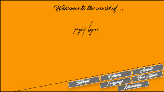
As of the time this is being written, the name of the product hasn’t been decided (working name is project lagoon). From screen A, you have three options, but once you select one of those options, you can only go back or forward, you can’t say, select the options menu, and then go straight into the time attack mode. You have to go backwards first to the main menu. This particular restriction is actually normally present on consoles, the older PC games do not have this problem, and I also feel like I get the chance to bring this advantage back slightly with the current layout. Having the menu fixed for the entire experience, while giving me a bit less space to work with, gives me a sort of consistency that avoids any sort of complication that can arise from having differently structured screens, perfect for what I am trying to achieve here.
As a side note, this also made me realize the other reason that I wanted the screens and process to be so direct; that is how I attempt to navigate through most interfaces, much preferring the hotkeys to navigating with the mouse if I can. Just an interesting thought that I realized whilst drawing this screen.
Another design choice I made with these screens, was to actually have it diagonal. Because the games designed to be played horizontally, I felt like having the user simply use their thumb to scroll would make scrolling back and forth a lot easier. I actually got this idea after using the xbox 360 controller. I feel like the natural placement of where someone’s thumbs where would be a good idea to replicate ergonomically, and also give the app a memorable look and feel.
Screen Designs – In game

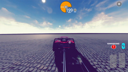
The first thing you will notice is the rectangular block in the middle of the page. This is where the users eyes are mostly going to be directed, as this is where the action is happening. The smaller the rectangle is, the more you are being affected by tunnel vision as the car is speeding up. Whilst the UI might seem slightly out of the way (particularly the hand brake and nitro button) there are reasons for this. Firstly, the users fingers are always going to be on the corner of the screen (this is why the directional buttons are there). This means that the user can easily access them via the thumb, similar to how someone uses a controller, secondly these buttons are not static interactions. Touching the button will cause interaction within the game world. It is the opposite of the situation of the warframe picture from the previous post. Your interaction with the world in warframe effects the UI. Here, your interaction with the UI will effect what happens in the world. In this case, you either drift, or you speed up considerably. Because of this, the user will ALWAYS know when they have pushed these buttons.
This screen is a slight bit more generic but there is one thing that I wanted to do a call back to. Placing the speedometer at the very top of the screen. This actually for two reasons. A. It is a call back to the older racing games that would do this (like scud race), the other reason, is because users are often holding the screen by their thumbs, which would obscure the speedometer, meaning they have to possibly hold it in an uncomfortable position. The directional buttons, I actually decided to use the same principle I did above. Instead of having the user slide his thumb left to right, they do it from top to bottom. This notion, as tested by various others, felt a lot more natural, as the left direction is designed to be sat right where your thumb rests.
#ux ui#ux#ui#game#desing#gaming#design#photoshop#wireframe#terrible#drawing#skills#stuff#i#work#on#portfolio
0 notes
Text
Wire Frames – Menu
Wire Frames – Menu
Before any work could happen onto the computer. The first thing that really needs to be done, is to take a thorough look into what is on the market currently. Whilst I mentioned that many games today have an overly complicated UI and an average at best UX, this is was more to do with my experience as a gamer myself, it wasn’t concentrated targeted user research. This was. So, as I was starting on mobile. The first thing to be done was, go and download some mobile games. I started with three main titles.

Asphalt 8
As a graphic designer, the first thing that struck out to me personally, was the high quality and polish of the components. I always appreciate buttons and transitions that are well made. One thing I do not ever appreciate however, was how scattered everything felt. I’m also not a fan of how I had to stare at a set of notifications that I had no idea of (first time playing the game) before I got to actually stare at anything. Thankfully, upon getting into the game, it allowed me to look at tutorials. I didn’t need to, as I’ve played racing games before. One of the more annoying things I had to deal with, was the sheer amount of information. I actually felt it quite overwhelming. The UI is clearly designed to push events to the forefront and get you playing (this I appreciate) though it all felt a bit...overwhelming. It didn’t help that the options at the top were incredibly small. But overall, the menus were very solid, as was the car selection screen.

what does spending coins have to do with racing exactly?

Lovely. The first time I play a game. It assumes I’ve never played a game before.
Real Racing 3
Whilst I like to have games that put you straight into the action, one thing I absolutely hate, is forced tutorials, or an interfaces that forces you into the racing immediately. This is, in my opinion absolutely sacrilege in regards to UX. The user is meant to be naturally “guided” towards it, not literally shoved into the gameplay. This particularly struck me as frustrating, as I wanted to look at all of the screens. This singular experience alone, has caused to decide design a tutorial button, solely to avoid having anyone deal with this when they first open up my game. The way I will remedy this is simple. Have the tutorial button animate in the opposite colours to the other buttons (so if the other buttons are black with a white border, the tutorial button is white with a black border). This is pretty much how Asphalt 8 handled it. If you want to do a tutorial, that is fine. Just tap yes, otherwise proceed to play the game. Animations in particular are a go to for me, as they draw attention, can be scaled to be either blatant or subtle, and you do
not have to worry about users who are colour blind or deaf, (just don’t design the animation with colour in mind)
That pain aside, the first thing I actually noticed about the game, was how it didn’t actually look “gamey” so to speak. In context, things that look gamey, are elements or aspect that remind you, you’re in a game. It’s hard to give an example of this in side of say UX and/or UI, the best example is most likely a realistic shooter or racer, that has a visible health bar on the screen. Simply put, it’s something that breaks immersion of the user and causes disconnect. The first thing I noticed, was just how clean everything looked. When you realise that is a sim racer, this minimalist look is important. The first thing I’m greeted with, is three large screens. A dashboard at the top telling me my stats and a row of buttons at the bottom. The layout is clearly well thought of, and I definitely intend to study it further. The one thing I like, that pertains to my main goal, is the large screens/images at the very front. They stick out to you immediately, and it works very quickly to “tell” the user where to go, without actually telling them.

Granted, when there is literally only one option that isn’t greyed out and has a huge lock symbol on them, there isn’t really much else that can be said.

Hovercraft Take down
Out of all of the interfaces I did, this was probably the most interesting. This game, honestly embodied what I meant when I spoke about my game funnelling the user straight into the gameplay, the UI is so non-existent, that I actually put my phone down and accidentally started the game. I had to restart it just so I can take the current screenshot you’re seeing below this paragraph. This game, to me, represents the core ideals I am trying to follow with my game to the absolute maximum. In a way, it’s actually very interesting. Upon opening the game, there isn’t really a “UI” to speak of. The game boots up, there’s a play button. You hit it, see a distinctive picture and a small piece of text explaining it and then you’re in the game. That is literally the UX of the game. In a way its quite testing to my initial theory, because this is the embodiment of my theory/beliefs on how to the execute the game.

This is probably the most important UX for me thus far. I got to see just how effective this was re-playability, and compared to the two previous experiences I just went through (especially with a forced tutorial and an added 30 minutes of time before I could just boot the game up and explore it) it definitely came with an “oh” factor to it, an element of surprise that a game simply lets me...play it.
This is a pretty huge revelation to me, as this isn’t standard in games any more. There’s tutorials, cutscenes, customisation screens, all sorts of filler, but the actual gameplay UX wise, often takes a back seat to this. Averting this (in my opinion) annoying trope was a great choice. Hovercraft Take down confirms this.
Stay tuned for more.
Kind Regards
0 notes
Text
The GUI for Project Lagoon
Project Introduction
After a lengthy break, I can finally post again. These next set of posts, are going to be about the UX and UI design of the product. To me, often times, game design is very closely entwined with user experience. My main reason for this type of thinking comes from a designer of team fortress 2. The man said in regards to balancing that whilst something may conceptually be fair, it might not feel fair. I apply the same sort of thinking to my game. This quote (which I sadly cannot find any more, feel free to correct or help me with this one) is a big part of the way I approach the screens and interface design of my game.
Instead of “feeling fair” it is “feeling simple” or “feeling straight forward”. Something can be as simple as two plus two, but if the user doesn’t feel that way almost always, is it really? As such most of the UX and UI, is very much function over form (which coincides with how I am in general, despite being a graphic designer).
This post is just a “hello” to all those reading, to let you know I still exist. But stay tuned, next week or so, I will have a heap load of content coming through.
0 notes
Text
Project UI introduction
So, the game, which is currently not named (working title is project lagoon) has one simple goal. Funnel the user directly into the gameplay. Everything inside the game, and alongside it, is designed to focus on what is the main selling point of the game, stylish, fast paced gameplay. This is important, I don’t have any previous pedigree or reputation that I can rely on in order to sell the game, so simply put, the game needs to sell itself, so to speak. This shines through in the UX. One thing in particular that I have found with modern day games and their UX design, is how grossly over-designed they tend to be. Focussing on form over function (the recently released dragon ball fighterz is a particularly bad example of this). Mobile games, due to their focus on advertisements, are an even bigger example of this. This was something that I desperately wanted to avoid.
Mobile first design introduction
This brings me to my current point. Mobile first design. This project was the first time that I attempted to implement this. Some would say that this is somewhat of an awkward design choice, as most games are made console first an then mobile first. But being that this was my project, this design choice actually made perfect sense for the way that the product was to be designed regardless.
Why mobile first?
The main aim of the mobile version, was to actually be a simplified version of the game, not just in terms of scope or graphics, but in its execution. Simply put, the game is a love letter to classic arcade games of past, the console/pc version is the full edition of the game, whereas the mobile version, was to be more of a pure, straight up “coin-op” experience. This means that the user would boot up their phone, boot the game up, and within a few seconds be ready to play. Just like in the arcade (the naming of the mobile version, “track day edition” was done to reflect this).
Because of this, to me, starting with the mobile version made absolute sense. The mobile version is effectively the arcade port, with everything else coming later on to the desktop version. Effectively, I can make the components first for my game, and then scale the components or modify them to fit the PC and Desktop size. Scaling up means to change, to scale down means to compromise. With this in mind, starting with mobile first is effectively a forgone conclusion.
#games#ux#ui#racing#graphic#design#stuff#case#study#mood#board#wire#frame#wireframe#mobile#first#gui
0 notes
Text
PHYSICS!
ttps://www.youtube.com/watch?v=qrlOwiXkMpo&t=3sPhysics!

We all love physics right? Well, most of us love them when we’re not studying them, or when they’re doing something cool (like I say, hovercrafts) but one thing everyone likes, regardless of trade or experience, is good video game physics. Now what would that be you say? Well for me, I personally, typically define them by these traits. Please bear in mind, this is solely my opinion, I’m not miyamato (for the uneducated, the man that made mario) or dan cormack (the guy that made doom), I’m just a breh trying his hardest to make a good, solid experience. So without further ado…
Fit for purpose
I mean, this sounds quite obvious, right? Well. Not always. You see with a game’s visual aesthetic, that in and out of itself also comes with an actual exception (this also ties into difficulty as well, there’s an entire trope dedicated to subverting the users expectations with visual style, see here – tv tropes/surprise difficulty) So, simply put, a game that looks a certain, should play a certain way. For example

and

But these are extremes, it doesn’t just come down to the graphics and how realistic they do or do not look (because as I posted earlier, a lot of games today go for the realistic look anyway). There’s also subtle differences that will influence your perception and expections of the game. Take a look at these two games.
Need for speed 2015

Forza Horizon 4

They’re very similar games. Both arcade, both free roam. Both amazing fun. The subtle differences in how they’re presented however, do show up not just in the game play but in how they look to. Need For Speed very much goes for a fast and furious (particularly tokyo drift) theme and feel, and its gameplay reflects that, drifting is the order of the day, blazing through traffic with modified cars , just general all out madness.
Horizon on the other hand, looks quite, well, clean. It shows up when you’re playing the game. The entire game is centred around a festival, all about racing (this is partially where the idea for my ethos for my game came from also), now if you watch the game play of it, you will notice that whilst you can drift, slide, fishtail all day long, the emphasis is a bit more on precision.
Expectations mean a lot. These are set by the visual style you choose for the game. Your physics and handling need to meet these or else there will be a strong disconnect.
Game Feel
You could type this into google right now, and I am pretty sure a huge chunk of articles ranting on and on about this would appear. It’s a pretty heavily discussed topic. Simply put, it’s how the game responds to play input, and truthfully, they’re so many different variables depending on genre, that I will honestly just keep to the racing genre so that this post doesn’t end up being the length of a dark tower novel. So, game feel. The most important part of game feel, is how the car feels, and responds to not just the steering and accelerate/decelerate, but also to do with how it handles the curbs, how the suspension reacts to bumps. This plays into game expectations also, because nobody will expect a sports car to react to a bump, the same way a SUV would and vice versa. This part of racing is probably the hardest to capture, regardless of racing style. When driving a car, you can often get a lot of feedback from inside the car, you can feel the down force (or lack thereof) on the car as it speeds up, you will also feel the bumps on the road if the suspension isn’t up to par, and you can feel the car shake once it starts to go into over-steer and spin out (or drift, if you have those skills).
All of this needs to be conveyed in the game feel, the physics of the game needs to be giving you constant feedback to the state of your car, and it needs to be telling a consistent story, you need to know how much power you’re putting into the throttle, how hard you’re steering, how close your car is to spinning out, or under-steering, and all of this, which is meant to be communicated inside of a car, has to be told to you outside, and in a clear succinct way, otherwise the unexpected happens, and that ties into my next point...
Fairness
Yes, fairness. Fairness is subjective, so therefore, in gaming, fairness is simply a feeling. A game, particularly its handling, needs to feel fair. If it doesn’t feel fair, it’s not fun. Nobody wants to drive a car that is bipolar and spins out at the slightest hint of a turn. At the same time, nobody wants to drive a car that will just stick to the road, that removes the challenge of driving in the first place. But there has to be a balance. There has to be a warning, the game needs to communicate to you in SOME form that what you’re doing can lead to a meeting with a steel wall. No warning, no fair.
Simple, right?
Well, no. They’re several games that do this beautifully. I’m going to go to the libery of actually listing them out from easiest to hardest, gameplay and physics wise. They’re other reasons for this, but this will be put in below. This isn’t to just cover their implementation of this idea, but to also give you an idea of the varying styles of gameplay in arcade racing, just because its not realistic, doesn’t mean it’s easy. Also, Simulation racers, for reasons that they’re an entirely different genre on their own, will NOT be covered here
EASY – OUTRUN

Out run, what is not to love? Its fast, its simple, and it’s beautiful. I Mean, that’s all there is to say. The car is grippy, it slides the minute you turn and brake, and the only way to cause a real collision is to drive head on into a wall. I imagine most people would know what happens if you drive head on into a wall
EASY – Need For Speed 2016

Need for speed in many ways, especially after burnout was released, gameplay wise, felt to me like a evolution of outrun. Despite all the bells an whistles, car customisation etc, the core gameplay was always pretty simple, and it was even more forgiving and only ever got so. The sliding was simple, the driving was fast paced and the physics were very lenient towards crashes, provided you didn’t do anything egrigous, the game wouldn’t slow down a bunch.
Medium – Project Gotham Racing

Project Gotham racing veers more towards grip racing in general, drifting takes a back seat but it is still possible to actually drift. Still, the game veers more towards grip racing, as a result the game is very “entry” orientated. Due to the handling model in all games being very...understeer heavy, that means the way you enter the corner means a lot more than it would in other arcade racers. In most other games, like outrun, you can quickly correct your line as the cars hug the road, and weave in and out. Not so in PGR, you take a corner wrong, you WILL hit the wall unless you slow down, quite a bit like like real life really
MEDIUM – Ridge Racer 7
Ridge racer...is probably one of the easiest games to get into and have fun with. But 7 is here because of its nitro system, simply put. When you drift, you build up nitro. You use nitro. When you’re done boosting, you’re in a “cooldown” state. When you drift in that cooldown state, your meter builds back twice as fast as it normally would from drifting.

This changes things entirely, because it means you can chain boosts together, which means you now have to pinpoint when and where you are going to drift on the track. This means the optimized racing line for a beginner and an advanced player are worlds apart.
See here - https://www.youtube.com/watch?v=IrjJE9QrEoM&t=278s
Hard – wipEout (PSX Generation)

Well, where do I begin with this franchise? First is the control scheme, the game handles a little differently to most racers, you don’t have a brake, you have steering, and a left air brake and a right air brake. Now instead of slowing you down, what this does is it instead pulls you towards either side. This nifty thing lets you actually take corners at insanely high speeds, the games tracks are actually designed with this in mind. Combine this just how fast this game is as a whole, (as well as the fact there is weapons) and the fact you can actually die as well as having checkpoints, and its not hard to see why someone would have problems playing a game like this.
Hard – wipEout (PSP – PS3 Generation)

WipEout, after the playstation era got a playstyle change in its physics, they became a little more forgiving, but with it, came a new feature, BARREL ROLLS. Done by tapping left,right, left, or vice versa, this costs 30 points of health, and gives you a quick speed boost when successful. This means you have to now consider the racing line and how far you are in the air, and how to tackle the course with the improved speed, as you will now have far less time to react.
What the fuck? - F-Zero GX

This is frankenstein of racing games. Right up there with games like gunZ. You will not see a game like this in my life or your life time, ever again. It has everything that a hard game would have in spades, let alone a racing game. Execution? Check, speed? Check, insanely hard courses? CHECK. Now you see, in order to explain why this game is so...ridiculous, I need to actually show you the techniques that are standard to do in this game.
Snaking - https://www.youtube.com/watch?v=fye3NLq2Rbw
Momentum Turbo Slide - https://www.youtube.com/watch?v=Z6_sWhr_z1I
So now, after watching all of that insanity, lets see it in motion...
https://www.youtube.com/watch?v=oi163iyPl1c
https://www.youtube.com/watch?v=8ybsZA2g6ys
Yeah, well and truly WTF material. Still one of the best racing games ever made though.
Now, also there are a few things also to commemorate…

The first is sickle kan, this is a company dedicated to fighting back and raising awareness for sickle cell, I wanted to give these guys a shout out because they do this off their own back, so on that note. So PLEASE give these guys a visit at their site https://sicklekan.com/. They’re reachable on instagram @sicklekan_
https://www.youtube.com/watch?v=qrlOwiXkMpo&t=3s
The Second is also a large project I am working on, Densetsu Zone. This is a project designed to help and ease players into the brutal mountain that is tekken. Both Me and The person making the project are easily available (@Kuzmatech) for any questions you may have, and lastly…

I’ll explain more next post ;), alongside an actual GAMEPLAY VIDEO!, yes, that’s right, a gameplay video, see you guys hopefully next week! :).
#racing game#sickle#cell#gaming#indie#old#school#racer#arcade#style#racinggame#xbox#playstation#nintendo#fzero#ridgeracer#project#gotham#racing#book#novel#scifiedit#stuff#blog
1 note
·
View note
Text
In game UX
In game UI and UX is a bit of a tricky one. There was two things that would define this game, speed and style. Speed for the gameplay, style for the graphics. The idea is pretty simple, its everything else around it, that needs to support this ideal. This coincides with the game design choices, and just like with the gameplay, handling, sound design, the UI and UX needs to do so as well. For me, already having done a website and an app, this where the bulk of the challenge comes from for me. Other screens and UI are static. In game is not. This creates an entirely new set of challenges and considerations to tackle head on when designing the UI.
This creates an even bigger set of challenges when designing the UX for the game. The big three for this particular game are the following. How do I make the UI function without doing the following
Being too obtrusive
Being too out of the way
Being visible at all times WITHOUT interrupting gameplay (e.g. having to look away from the action at a UI element)
Breaking immersion of the games world (the “gamey” point)
Presenting the information in a way that suits the gameplay’s themes AND the UI themes at the same time
Now, to me, much of this sounds like common sense. But not everyone is a gamer to the point where they notice subtle changes, or even subtle artistic decisions to support the design. To all five of these points will need to be explained for the more casual readers. The first is being too “obtrusive”.

Obtrusion
Obtrusive game elements are probably one of the more annoying things a gamer can experience. The thing is, there’s no imaginary slider that tells you too much is too much. You add one thing, and suddenly, the UI is clunky and cluttered. This is very prevalent in AAA games in my opinion (ironically though, MMO games have this in spades at times, as you can see from the above picture), there has to be an aiming reticle, a mini map, a health bar, and whichever additional mechanic is on the screen. The problem of all this is obvious. Information overload. The way, in my opinion to avoid this, is to only have something appear on screen if it needs to be there. Others think this way too, considering how often its been utilised.
Being too out of the way
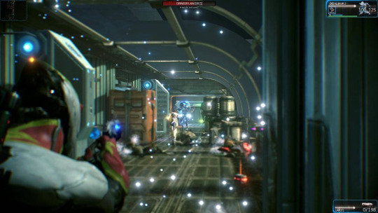
One of the key things to take note of in games, is where the users eyes are going to be centred. This is absolutely key for several reasons. Your eyes are effectively where the action happens. Things outside of this circle of attention, unless they identify themselves, do not exist. It is impossible to overstate how important this is. Not just for the game as a whole, but for UX. Have you ever played a game where something “suddenly” hit you without a chance to react? The disregard of this principle is precisely why. This rule alone, is why many games have a sound cue that plays when important events (such as your health bar being low), otherwise you would just die “suddenly”. If you didn’t have this, you realize that you would have to take your eyes off of the action, which could lead to you making a mistake you can’t realistically react to. Think about where you would focus your eyes in that picture, and then look at where the health bar and the ammo is.
For the record, war-frame is very much a one hit kill game at higher levels. I can personally attest to this. Digital extremes knew this UI didn’t cut it and redone it. Sadly, the same problem persists.
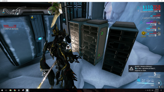
The map and health bar might as well be invisible. Don’t get me started on the ammo counter neither.
See how just one small removal of an element transforms a game from “challenging” to “false difficulty” This is what happens when a UI element, is shifted out of the way without its regard for importance to the scene at large.
There is an entire page worth of these sorts of bad experiences on TV Tropes. Under the page “fake difficulty”
See here - https://tvtropes.org/pmwiki/pmwiki.php/Main/FakeDifficulty
Ultimate I am saying that it is imperative that the UI is visible at all times WITHOUT interrupting gameplay (e.g. having to look away from the action at a UI element)
This is the true hard part. Because not only is it somewhat subjective, but its also important to the point where it can break the experience do to what I mentioned before. The game that I look to for reference on this, is actually the street fighter series. From Super street fighter 2 turbo (where the series added supers), this was handled expertly. They’re placed in a way that you can always keep an eye on them, but not so far off to the point where again, you have to actively search for them. The health bars are handled the same, keeping the user constantly informed of what is going on, without them having to force feed it into themselves. Fighting games have this the hardest, because they’re arguably the most intense genre of competition, as they’re solely player vs player, not team vs team, so all of the work has to be done yourself.

This manifests itself into my game, because whilst its not this intense mentally, there is a lot of action In the game and it is very very fast paced, being comparable to the wipEout games of old. A split second lapse results in a crash every time in this title, so the user cannot and shouldn’t have to ever take their eye off of where the camera directs them.
Breaking immersion of the games world (the “gamey” point)
This tends to apply to more realistic games, (you wouldn’t have a mini map on the corner in real life for example) but the root of it is, anything that breaks immersion and reminds you “you’re playing a video game”. It doesn’t really matter on the direction of the game, its just a far easier rule to break when your game is realistic, because your mind will be trying to differentiate what is going on, and then notice things that are awry.
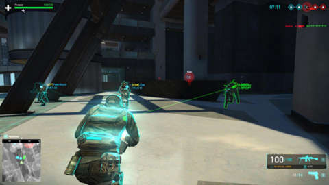
hyper realistic shooter...with a health bar. also, note where its placed.
This doesn’t “sound” like much in the way of UX, but immersion is a key factor to video game. The user wants to be led on, they want their suspension of disbelief to be satisfied, they want to feel like their a part of the world they are interacting in, and that in a way, that world could feasibly exist. When this is done right, this difference is immeasurable. This is, ultimately what sets trend setting video games, like metal gear solid, goldeneye 64 and doom apart from other competing titles.
Everything has to be considered here, the immersion isn’t part of the UX, it IS the UX. If this breaks at any moment, the design is a failure.
Presenting the information in a way that suits the gameplay’s themes AND the UI themes at the same time
This is another one of those “needs to be explained” sort of things. What it boils down to, effectively is this. Gaming is a medium, much like books, much like film. Gaming has a different set of tools that can be used to present its information, its story, and its theme. Once again, the main rule prevails and is always at work here.
Show, do not tell.
The problem is. Gaming is a different medium. Showing in a movie, is not the same as showing in a game. Showing in a book, is not the same as showing in a movie.
To tell in a movie, is to have pointless expedition (normally a conversation) that just reveals a plot point. An example is someone talking about someone's abilities, but this never being shown. This is known as an informed ability.
To show in a movie, is to have a plot point presented to you with action. Action speaks louder than words. It doesn’t have to be a big micheal bay explosion, it can be in body language. This is shown masterfully in the wire.
In games, you can not, I repeat, can NOT use this same principle. To tell the player something, often means to take control from the player, and play a cutscene.
Nine times out of ten, this cutscene can be playable.
To show a player, have them experience what you want them to experience. The designer is the master of the show, he can dictate what the user needs to feel and when.
Always show, never tell.
This distinction is absolutely important to make, because it a lost art in gaming. Many of the most iconic moments, are cinematic in ways only gaming can be. Let’s take a look at this iconic scene. The psycho mantis boss fight. Half way through the boss fight he scans your memory card and reads it. For reference. Psycho mantis is a psychic who reads and controls the minds of his foes. For any first time player, this throws you in a loop. The user isn't’ told he is psychic, they’re merely shown it when they have to fight their friend. But in this moment? The player is SHOWN that the man is a psychic.
https://www.youtube.com/watch?v=t0oHnGM_iQw
This, in any other medium is simply not possible. The character is reading game data, and using it to comment upon the player. This was ground breaking at the time, and in many ways it still is. It highlights how to “tell” in a game and how to “show” in a game (because the scene where he possesses the woman COULD be done with gameplay, simply have her attack you out of nowhere whilst on your side, but I digress. it’s a classic moment regardless)
So how does this apply to my game? Simple, the game is stylish and fast. The UI and UX needs to convey that in a way that only a game can. This means that with the design of the UI the user at all times must have control, even something small like manipulating the UI to coincide with the speed of the game, adds to the dramatic effect that I am trying to sell to the user.
Once again, immersion isn’t part of the UX. Immersion IS the UX.
0 notes
Text
From the real world to my own world
Hello There!
So, assuming you already read the first post, you will already know partially, what the blog is about. But one thing you might be wondering (or at least, I hope) is why it is in the art style it is in. For the uninitiated (read: those who aren’t that knowledgable on racing games, past or present). This is what most racing games tend to look like
Outrun 2006 Coast 2 Coast

Need For Speed 2016

Need For Speed payback

Forza Horizon 4

Ridge Racer 7

wipEout HD

Now, you can probably see the main concurrent theme between all of them visually. They all sport the same photorealistic look, regardless of their style of racing game. They all try to emulate real life. That’s all fine and dandy, but every racing game looking like that starts to look a little boring, do you not think? So, I started looking outside for some ideas. Here’s what I came across, and why I loved it so much
Overwatch

I’m not very much into shooters (unless it’s quake or UT) but what caught me off guard, was the style of the game. It sits in a strange place, it’s not quite realistic, well, its not realistic at all, but it’s not cartoon to the point where it looks like someone brought dragonball into the 3D realm, it just looks very stylized. From the time I saw this game all the way back in 2016, from the trailers, I knew straight away that I liked the look. This in many ways was probably the first piece of inspiration for the visual style that would become Project-R’s current aesthetic
Jet Set Radio

I mean, it’s one of my personal favourite games ever, it’s unbelievably stylish and it is just simply cool. What is there not to like about this game? The only real kicker, is that this look has gone out of style, not counting Hover revolt of gamers of course. But overall, from the minute I saw this, I KNEW that one day, if I ever made a game, of any sort, it would be something like this.
Auto Modellista

And now we are full circle, it’s a racing game, and it’s Cel-Shaded. What’s not to like? Well, I know what your first question will be. Why was this game not put up earlier? Firstly. It’s actually a sim style racing game, more in the vein of gran turismo, it’s also great fun, so do buy or emulate it if you get the chance!.
So, now that you see some of the inspiration for the graphical style. There is also another reason for it....It just looks damn COOL. One thing to bear in mind, I come from a graphic design background. So much of my thought process stems just as much from this, as it does gaming. If the game isn’t striking visually, it’s gameplay matters little, because people more often than not will just not play it.
"If a tree falls in a forest and no one is around to hear it, does it make a sound?"
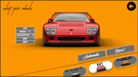
So, let me end this by showing yet another picture, this time of the beautiful NSX in game (which is a placeholder, the final game will use original cars, but be tributes of course).

The NSX looking a bit more realistic

Looks so much better, don’t ya think? (it’s okay to disagree by the way).
Have a happy weekend, I certainly did when I wrote this :). Hopefully, come the next week, I will have even more content to show you regarding the game.
Until next time folks!
#racing#game#gaming#graphicdesign#indie#video games#weekend#anime#cel shading#nsx#honda#unreal#unrealengine#ue4
0 notes
Text
A New Start to an old beginning
Welcome!
So, this is the first post for my blog, and you’re probably sitting here on your computer, wondering what this all is about.
Well, I’ll put it simple, this blog is here to put down my progress towards my game, my novel, and my graphic design work. All three will be spoken about on this blog, as well as my personal beliefs towards my work, and my general ethos towards how I want to approach things. So, for the first
My game -
My game, which I am calling Project-R is an arcade racing game. The game itself is designed to be a love letter of sorts to not only the arcade racing genre, but to motor-sport as a whole. Both genres have represented some of the finest memories in my life. From the drop dead gorgeous and styling of the Ridge Racer series (particularly Type-4) to the incredible sensation of speed in the outrun series, to the sleek presentation of the metropolis street racer series (later named to project gotham series). Whether it was in games or not (big shout out to gran turismo 2 being my true gateway to all of this)

There was something ever so satisfying about seeing the Calsonic Skyline BNR32 utterly trounce its competition, or hearing the stories of the legendary “Drift king” Keiichi Tsuchiya competing in the Super GT series, all the way down to watching footage of the late Aryton Senna, and even watching Colin Mcrae vs Tommi Makinen (one of my earliest memories of motorsport). That rivalry is what spawned my love of the Evo and the STI (I’m a Evo person for the record). Even to this day, when I heard of the tragic accident, I feel like to this day, a part of the Impreza brand passed with him. (For the uninitiated, I’m referring to the legendary Colin Mcrae’s helicopter accident)

Pictured: The ARTA NSX

Pictured: The Calsonic Skyline

Pictured: The iconic Imprezza that Mcrae drove

Pictured: The rival, Tommi makkinen, one of the legendary flying finns
By now, with the mention of being introduced to this world via gran turismo and motor-sport, why arcade? Well, that is pretty simple to be quite honest with you. Arcade racers, are a DEAD breed. Not dying, DEAD. They are non existent in the conscious of the gaming world. Need For Speed has an identity crisis, RR’s last entry was nearly ten years ago, Sega rally missing in action, wipEout officially dead due to the studio closing down, F-Zero on Hiatus indefinitely. That literally leaves Mario Kart….You can already see what I am getting at here. These type of games are not made anymore, I want to be the change that I want to see in the world.
But overall, I still want to pay homage to the amazing history of motor-sport and how much enjoyment it’s given me through the years. The sheer quantity of excellence on display, as well as how all of these cars took on their own “ethos” and personality themselves at times (The skyline’s unofficial name is literally “godzilla” because of its dominance), has repeatedly, to this day, kept me in awe. It is this greatness that I want the game to pay homage to. Not just to arcade racers, but to the racing, cars, and outright insanity that inspired so much of it. I don’t want Project-R to just be another racing game. Simply put, I want the game to showcase everything that I saw in motor-sport, and in arcade racing games as a whole.
To end this short post, I am going to post a few screenshots from my game currently, on how it looks. The next post, which will be sometime this week end, will go into how I am making this game, as well as the incredible artist that I am working with, hopefully I can even get some thoughts on his design process as well. Happy Friday everyone, I hope you’re all enjoying it as much as I enjoyed writing this blog post.


0 notes