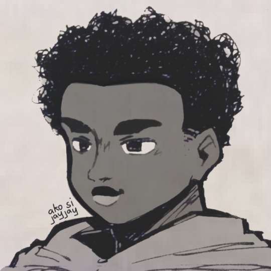
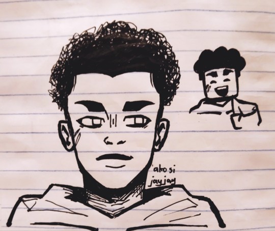
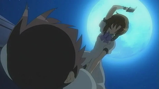
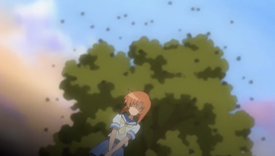
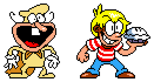
#it was a same base different artstyles thing
Text
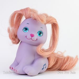
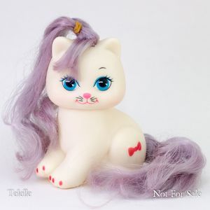
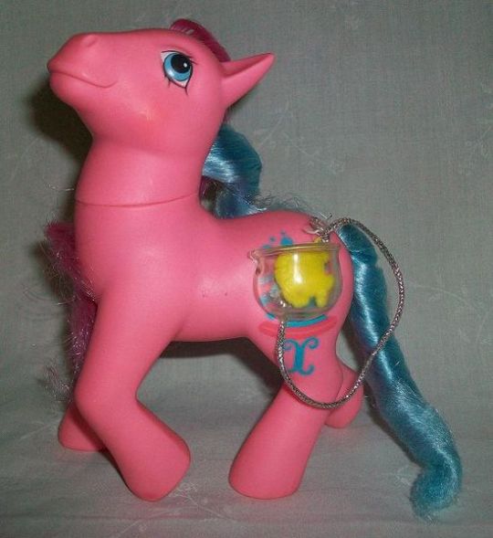
someone on MLPTP asked for Lil' Litters puppies/kittens so I've been attempting them in the background.
More information about these sculpts (aka down the rabbit hole) after cut
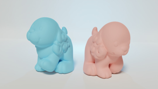
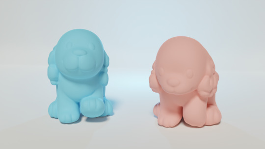
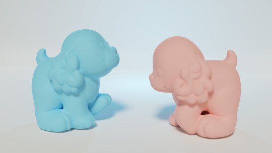
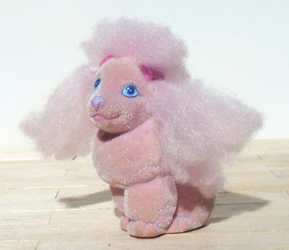
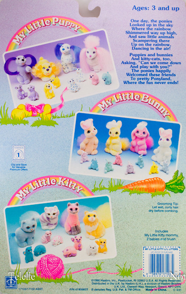
The coloration of the models in my shots were based off the My Little Puppy "Pretty Poodle" family, but models were reused for other sets
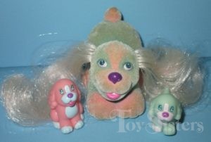
For example, Sweet Spaniel family had the "blue poodle" model but a unique sitting spaniel, although it looks like the proportions + ears are the same as the other two
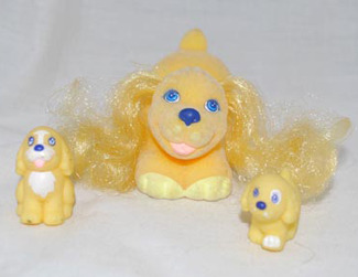
And then the next release had the "Funtime Spaniels" set which had the same poses but was more colorful, and also the puppies with the other "mom dog" sculpts:
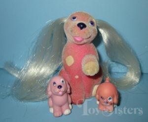
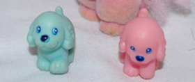
The website Toysisters, where I got the above photos, mentioned that the entire second line of My Little Puppies is hard to find so I looked them up and
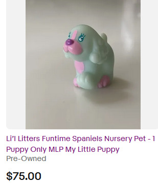
This was the only My Little Puppy 2nd year release I could find and its a single figure for $75.
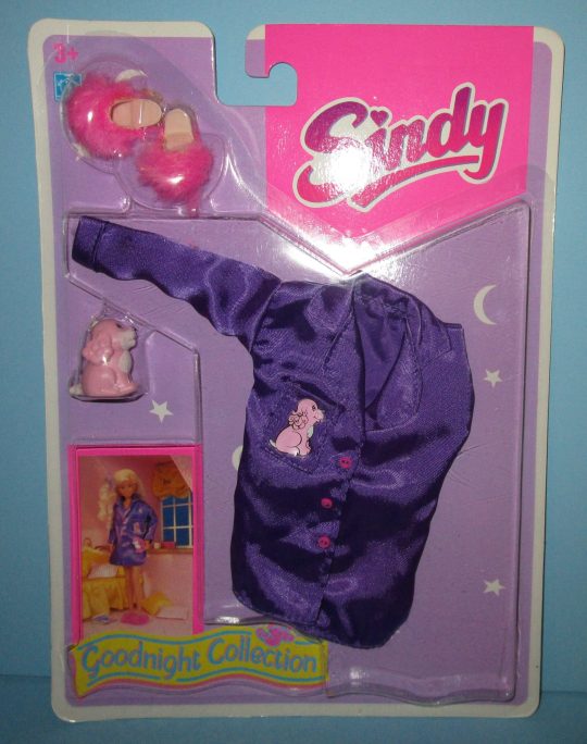
Also in the 1980s hasbro purchased the rights to a Barbie competitor (originally made in the UK) called Sindy and reused some of the pet molds in pajama party packs:
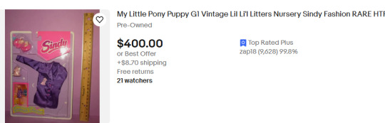
And this one also sells for a lot and isn't really available in many places
I don't bring up the prices, btw, as a critique of vintage toy collecting or anything. I don't make these models because I think people should just make new ones all the time. I /like/ that we're preserving old toys.
Rather, I hope my sculpts are used for collectors who have part of a collection and can't find a real vintage one, or people who think it is sweet and want to make a custom one (like they could do their dog or just a fun new thing). It's just for fun and not a replacement
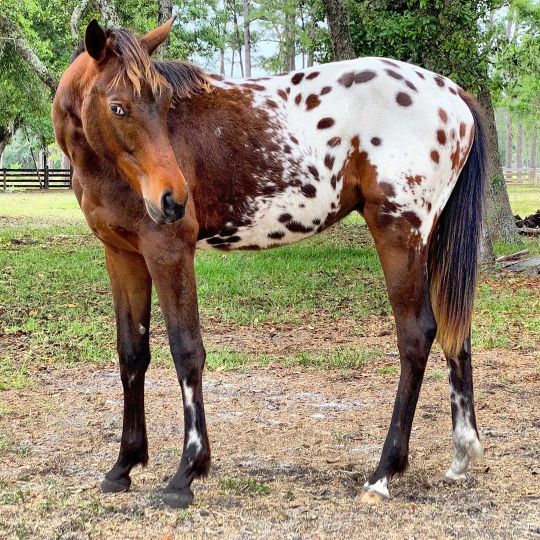
I think what really disappoints me about all the lil'litters characters is they don't have the colorful marks like the ponies. If you didn't know, the original pony marks were made to imitate the marks on an appaloosa horse
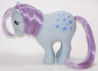
And to me, while they aren't the only reason the ponies did well, they're definitely one of the things that makes them unique, like the carebears stomachs or strawberry shortcakes' fruit hat
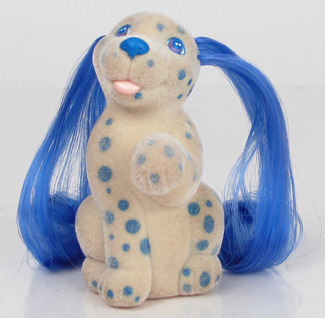
Like they made a dalmation dog and they didn't even give it like... heart shaped spots. Huge missed opportunity there imo.
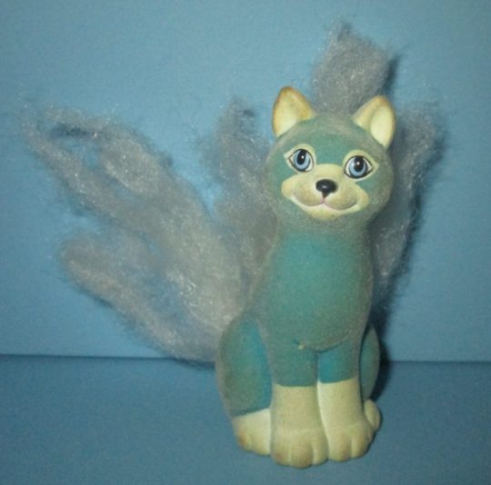
Also they did the siamese in reverse dark-light colors and iut looks like a fox. Siamese cats don't work this way, they gotta be darker around the tips for a reason.
Hasbro did release a line called Little Pretty that had a similar conceit, but I find the sculpt of the toys... underwhelming. They look more like Proto-Littlest Pet Shop to me than My Little Ponies:
The one on the left is supposed to be a dog and I only figured that out because she has no ears, just hair...
I much prefer the Lil Litters sculpts, they look more detailed and unique to me, and more similar to the OG MLPs

the My Little Kitty / Lil Litters were actually released concurrently with the Little Pretty line, both around 1990, so the discrepancy in artstyle feels really weird. but also it's just such a weird choice to create two similar looking brands to me? I don't... get it.
This was also year 9 of my little pony so the brand was going wild with the ponies and its interesting to me how plain and early-years the dogs+cats were in comparison
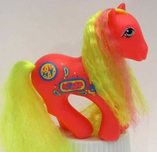
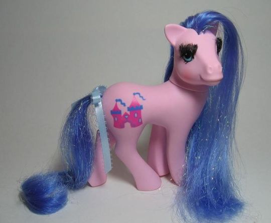
they were giving the ponies neon colors, false eyelashes and built in pockets and decided that their other animal lines would just be... different colors.
anyways my send-off is here are the first releases of lil litters:
#my art#blender#sculpt#is this even an art post it got so long that i put a readmore#vintage toys#vintage lil littlers#mlp lil litters
41 notes
·
View notes
Text
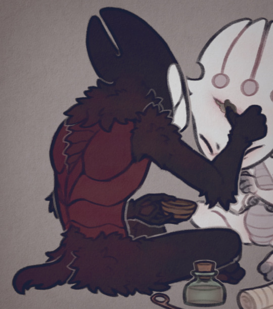
In Their Embrace
(Base used for this is from K_MB001 on twitter)
#this is for a collab me and my friend did#it was a same base different artstyles thing#my art#digital art#traffic smp#life series#mcyt#grian#watcher grian#3rd life#double life#last life#secret life
2K notes
·
View notes
Text
trying to use that one method of solving a problem by thinking of it as if you were explaining it to someone else to sorta force a new perspective on it and going crazier and madder each iteration until im so devoid of any mental capacity i just stare blankly into the dark of my drawing tablet and die of spontaneous combustion and rising from the ashes like an integer overflow time and time again for as long as theres a fuel to change the variables
#maybe i wouldnt be so nitpicky if i just made a single base for my fursona and made its constant design changes a part of him#maybe i would be able to be happy with a base if i wasnt constantly changing my artstyle and inspirations driving me to get better#its all of this for what. whaqt made me a perfectionist. who even.#im like hmmm but this specific shape isnt very realistic to how an animal looks in real life#..i say as i design a creature that barely follows any biological rules at all#this fucking looming unconscious desire to want everything to look like whatever other things youre already familiar with#a rooted and cemented fear of change that i only feel safe from detaching when making a character that doesnt represent me#what if i did the same to myself. what if i changed my persona for every pimple that surfaced and every stretch mark i gained#would i be as frustrated as i am now or would i finally realize and incorporate the futility of such an idiotic mindset?#anyways thanks for coming to my ted talk. next week ill talk about my fears of failing college and reiterate on whatever i said in this pos#t but with different wording. till next time#dextxt
3 notes
·
View notes
Note
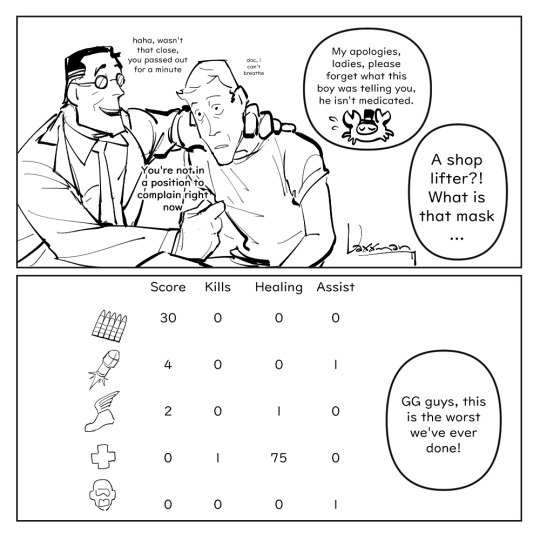
Could I request Medic having The Mom Grip on Scout’s shoulder after the speedy moron almost let a mercenary secret slip while they weee getting groceries?
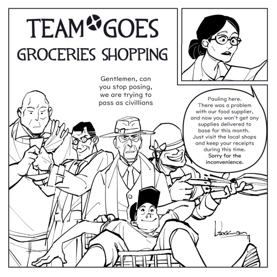

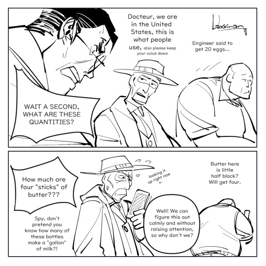


Three Europeans and two Americans walk into a grocery store in New Mexico.
I hope this is the right meme.
More silliness below.
This comic is the antithesis of the "wtf is a kilometre" joke.
The faces they make when they can't quite identify the type of brown bread in the bread aisle.
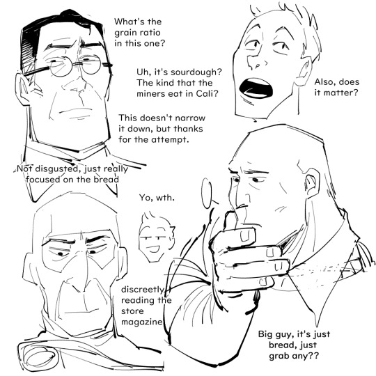
You don't know how [insert nationality here] you are until you go overseas and things are different.
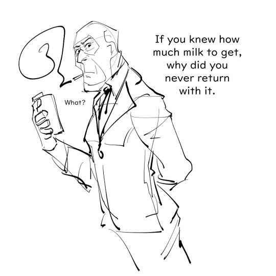
Spy obviously has no problems with pretending to know how much a gallon of milk is, he just peeks into his conversion chart notes, pretending it's his shopping list.
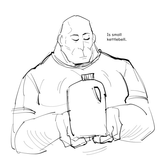
I want to think Heavy is completely fine with having to readjust to a new unit system, he just eyeballs most practical things anyways by holding them up and mumbling about how they approximately weigh like a chicken or his kettle bell etc. He's always been living in practical ignorant bliss.
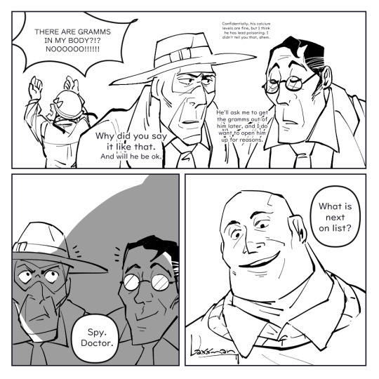
Medic has a peer reviewed meltdown the first time he realises there's no uniformity in "a cup of ____" because every object has different densities. He's diligent about memorising the conversion rates for ounces, pounds, the most common things etc., and recovers ok. He goes through the same stages of grief rage when he finds out about distances and lengths.
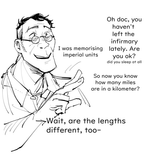
Just remember four inches are 10.16 cm and pray no one asks you to specify anything bigger than inches.
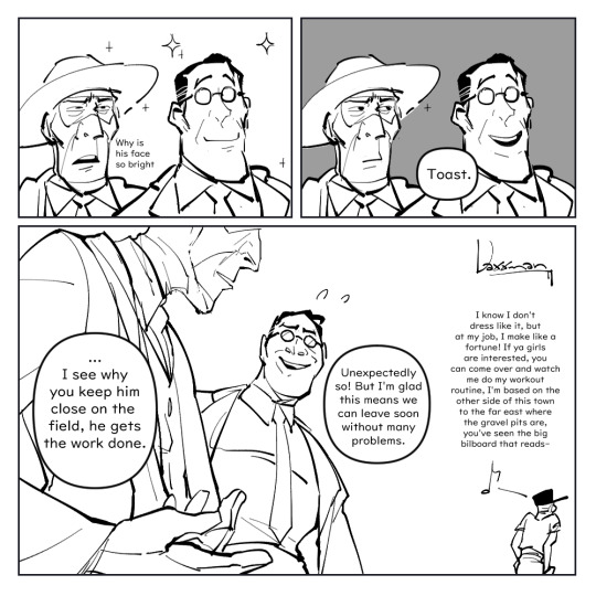
Everyone does a mental victory lap when they manage to guess how much Celsius the weather is because they keep forgetting it's Celsius*5/9+32=Fahrenheit, Engineer reminds them patiently.
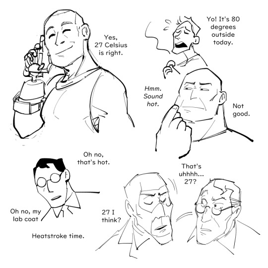
The true victories are the correct temperature guesses we've made along the way.
One time, a friend asked me if I actually knew how much a tablespoon of flour was in gramms to convince me that metric users also make use of volume based units without thinking about them. But little did she know a heaped spoonful of 405 flour is about 15g and a level tablespoon is 10g.
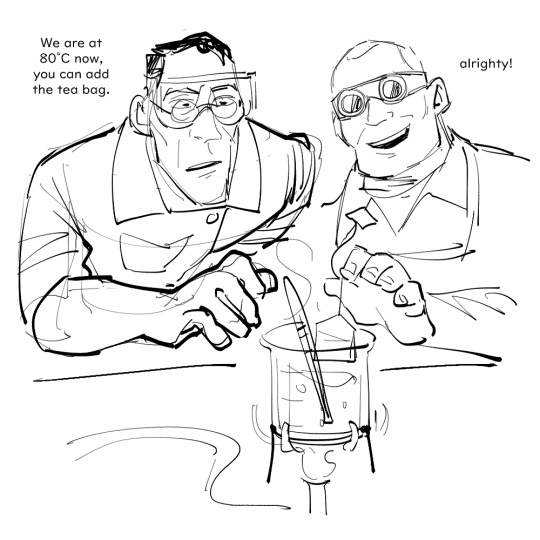
They claim Oolong just tastes better when it's boiled to 80°C exactly with a Bunsen burner.
You only asked for one scene but somehow I came up with a bunch of other things. This post was drawn across 2 months so the artstyle is all over the place. Thanks for your ask!
#team fortress 2#tf2#tf2 medic#tf2 scout#tf2 spy#tf2 heavy#tf2 soldier#Medic's reaction to a stick of butter is 100% based on my own reaction after reading an American recipe for the first time#Like I didn't know butter in America came in this normed stick-form I genuinely thought it was some arbitrary unit like ??? A Stick??#As in I didn't know if the recipe required the butter to be in this specific shape; like sometimes you have to add butter in shaves or molt#no biggie lemme whittle away at my butter block until it's shaped like a stick? And then I learnt it was the portions that butter comes in#Cut me some slack; I'm used to recipes using eggs as the scale-up ingredient; not butter#I also learnt that medical labels is where metric units are mostly encountered simply because medicine is international#But that is the main reason why I think Medic would not realise he'd have to deal with imperial units until he goes grocery shopping#The man's just been ignoring the “oz” information right below everything he's ever used; out of sight out of mind#I want to think Engi is the most normal person about the entire metric-imperial-units thing he just does some mental arithmetic and done#King just learned système international d'unités during one of his 11 phds; it's not unrealistic
1K notes
·
View notes
Note
Would you recommend the SSSS comic? I know little of it beside the very beautiful artstyle and premise
to answer the question of if i would recommend SSSS as a comic: yes, yes i would.
a description for those who don't know: Stand Still Stay Silent is a post-apocalyptic horror + adventure webcomic set in the nordics (norway, sweden, denmark, finland, iceland) that have been isolated from the rest of the world and gone back to their old gods. the the world outside of safe zones is full of trolls and beasts - humans and mammals that got infected by a horrible virus and turned into monsters. the story follows a ragtag crew that ventures into the old world (derelict denmark) on an expedition to collect books.
the comic updated every workday until it concluded in 2022, and consists of two Adventures. the creator had plans for many adventures with these characters in this world, but ended it after two when she wanted to take a new direction with her life.
what i love about it:
- the art is GORGEOUS. it's been a huge source of inspiration for me. open any page and it's a masterpiece, and you will ask yourself "how the FUCK did she update this FIVE DAYS A WEEK"
- the characters are wonderful and endearing. i just, i love them so much. i am so thankful lalli hotakainen exists he is one of my #1 blorbos forever
- the world is so cool. the blend of chunky sci-fi and norse mythology fantasy magic slaps. it goes so hard. i fell so hard for this comic when i got to the big ferry ship with a viking style dragon head prow added to it. it's everything
- it really really gets nordic cultures. it's difficult to explain all the dynamics and nuances but it just gets it. it brings me as a scandinavian a lot of joy to read a story that speaks to my heart this way. the attitudes, the language barriers, the cultural differences... it was so refreshing to me in a media landscape dominated by american stories. when the pandemic hit, i decided to reread the comic because i found such an odd comfort in seeing how it depicted the scandinavian countries reacting to, well, a pandemic.
- there's kittycats
what i don't like about it:
- the most glaring and obvious flaw is that everyone in the comic is white. there's not a single character of color anywhere, not even i background shots or the prologue. there's no mention of the saami people (the indigenous people of northern europe), either. i believe this was done in ignorance more than malicious intent, but the implications are Extremely Bad and it's been bothering me (AND MANY OTHERS) since day 1. that is the number one caveat i will give to anyone wanting to check this comic out. i've been in the discourse trenches and i am not going to excuse this. it's just bad!
- you can tell in the middle of adventure 2 that the creator has kind of lost interest in the work, around the time when she found jesus i guess. like, very few people can keep up work on the same creative project for years and years and years and i think it's fine that she wanted to drop it, but it's a bit sad to see the comic dragged to its end like a limp corpse, and feeling like the creator no longer really cares about the characters.
- minna sundberg has said and done some questionable things, presumably gotten somewhat radicalised over time, and has also converted to hardcore christianity which is what her new works are about. there's nothing about this in SSSS - there is a moment of christianity represented in the story in a sort of mythological sense, just like the other religions, but this was written before minna's conversion. her new works... are a Choice. i have much to say about them, and i have, and im not gonna rehash it now.
SO YEAH hopefully this will help you take an Informed Choice! i got into this comic in 2015 and was deep in the fandom and it's for better or for worse part of my soul foundation now.
i also recommend A Redtail's Dream, minna's "practice comic" before SSSS, based on finnish mythology and the kalevala.
137 notes
·
View notes
Text
January and February dump
This is my most recent work of Lloyd, and my most recent work in general. I made this in the computer room at school with a painful high-sensitive mouse. We have these special course thing in our junior high, so every tuesday after class, I get to be in the computer room. For six hours... (My course is Visual Graphics Design. I'm kinda regretting it now since I've been thinking of becoming an architect... I can't change my course now since it's too late. Which is stupid.)
I'll try to draw more there! I really like drawing with a mouse cause I like the challenge. And since I'm not accustomed to a high-sensitive mouse, it'll be a bigger challenge for me!

I made these two in traditional then polished them digitally since I straight up just used a pen. I rarely use a pencil nowadays so I can learn to fix mistakes without erasing it. Usually it ends up looking like chicken scratch but I'm getting better.
My Harumi one is so bad lol.. When I was making it, my classmates around me were messing around and moving the chairs in the process, making me have to draw strokes with shaky lines. It's not that noticeable though since I made the lines thicker.


I was planning to make something for Rebooted's anniversary but I got busy... (And lazy) The PIXAL one was inspired by an animatic I saw.
If you compare the previous Arin portrait, yes, they don't look the same. I'm trying to find a look for Arin, as I do with every character, that I'll be satisfied with.
By the way, I'm kind of basing Arin's hair with my classmate's hair. Which is funny because my other classmates compared this artwork to my classmate, who looked nothing like Arin but have similar hair, commenting they're the same. (I'm not mad because I actually find this a bit humorous)


I was trying to make an animatic and this was going to be the sketch. But then again, I got busy and lazy. (Mostly lazy)
I accidentally changed their facial features a bit by accident on the second page because I forgot to reference the first page. It was tiring flipping pages every 5 seconds, ok! Also, I drew it after 2 days when I drew the first page, and I didn't have a design I liked for them yet. (...I just noticed Jay has different eye colors in both pages...)
I think I'm sticking to these looks for Lloyd. I'll try to make it accurate to this. (I think I did great with the first image of this post. Though, I made him too round for my liking.)
Discard the growing beard post redesign Lloyd has. That beard thing was supposed to be where his chin was until I realized it was too small. And it's still too small.
Child Lloyd is so cute! The eyeshadow wasn't intentional at first, but then it got me thinking, what if Lloyd had an emo phase? And now emo child Lloyd is my headcanon.
Pre redesign Lloyd kind of reminds me of TommyInnit, and I find it quite funny. Maybe it's the facial gesture, I know a lot of TommyInnit fanarts with that silly face.
For Dragons Rising Lloyd however, I want him to have long hair with his post redesign face. I'll try to make full body designs of the 4 Lloyds.
You guys probably don't care, and this is the first time you've seen me because I don't have an exact artstyle and I dont post as much, but I'm going to put descriptions now since this blog is going to be a silly little art dump! And blog posts are supposed to be descriptive. Which I should've done in the beginning and explained my works..
Anyhow
If you liked my art, thank you!
If you saw me before and told me I did well, thank you and I'm sorry!! I know my previous posts have gotten comments and I'm sorry I didn't respond.. I'm not trying to be ungrateful, I just don't know how to express my appreciation for your positive feedback! Or just reply in general... I get nervous even when I'm wearing my mask..
Please don't hate me, I'm just really anxious to show my work to people I don't know to the point where I might think people disliked my artwork when it's the opposite..
(I'll probably copy paste this in future posts now lol. But I AM thankful that some of you guys think my works are great!)
#everytime i draw idk#traditional art#digital art#2024#2024 art#ninjago#ninjago dragons rising#ninjago lloyd#ninjago lloyd garmadon#lloyd garmadon#ninjago harumi#ninjago arin#ninjago pixal#pixal borg#ninjago zane#ninjago zane julien#zane julien#ninjago jay#ninjago jay walker#jay walker#ninjago cole#tag
56 notes
·
View notes
Text
Out of nowhere I bet but I wanna try listing off why AI Art isn't good-
The common argument against the accusation of AI Art is that human beings themselves take ideas from their surroundings and mix them together to make 'original' ideas (like a horse with a horn to make a unicorn). However, the difference between an AI and a human being comes not only from how the human brain is infinitely more powerful than any computer ever made by humanity (meaning it can consider ideas and alter them at a far greater rate than any algorithm) but also that the human brain is affected by things like 'preference' and 'bias' for certain ideas or expressions.
For example, a person who prefers anime style drawings will almost always interpret the idea of 'badass horse' will interpret that to mean 'badass horse in an anime style'. While this seems simplistic and easy to replicate with AI (keyword being replicate)- there are INNUMERABLE preferences and biases that come into play when making art. To the point that an ultra specific prompt could still result in innumerable different interpretations because of people's individual tastes. This can then satisfy numerous peoples' different desires or perhaps even create a new demand. AI can't really do this- It will give you exactly what you asked for. ... Exactly. No differing interpretations or unique ideas mixed in. You ask for 'horse with a water mane' and you get a horse with a water mane. That's it.
Another reason why AI Art isn't good is that AI art...is just a dead end. The way it works is that the algorithm is taught to look at certain images in association with certain keywords and then, based off the data given, it will spit out an image to match. ... Notice how, in this process- the AI is reliant on outside information to make the image. As in, the AI NEEDS to be able to look at certain artstyles in order to properly fulfill its request. Unlike a human artist, who can use the data gained from other experiences (like touch, taste and hearing) along with how those would be associated with certain imagery to create new styles or interpretations. Humans can independently create ideas, AI can only regurgitate.
There's also how the human brain has this...uncanny ability to detect when something looks wrong or doesn't look real. You see this most often in movies or shows with heavy use of CGI- the images might be more technically impressive but without the grounding in real life that practical effects have they can easily look off because computers...just can't generate anything on par with reality. Same with AI- it can generate images resembling real works of art. ... But there's always something in them, some variable the AI can never account for, that will tip off the human brain to the fact that a human didn't make this.
In short- AI cannot take creative liberties, is basically parasitic with human artists and is too simplistic to match a real artist.
That's why AI art is a bad idea from my point of view.
73 notes
·
View notes
Text
I am extremely confused as to how the 2006 Higurashi anime (a flawed adaptation of its VN but still a generally beloved horror anime) and the Umineko anime (an actual insult to its source material that both nonfans and fans of the VN its based on despise) are directed by the same person. What happened??
People often explain it as "oh Umineko is just inherently harder to adapt" which is true, but I think Chiaki Kon showed so much skill in the way she directed Higurashi.
The Studio Deen Higurashi anime (specifically the first season) is poorly animated due to its lack of a budget yes, but its still a competently made show. It not only has such a clear visual identity (from the iconic expressions, to the colors and how they sometimes drastically change hues depending on the setting/mood/time of day, to even things like shot composition and the angles utilized to create a sense of unease and dread) but also in general it's a fun, intense, creepy show to watch.
Even ignoring the iconic gore scenes that the anime is most famous for, there's so many shots that are permanently burned into my memory just because of the expressions or pose or colors or shot composition.


It's an interesting looking show! And it genuenly has a great atmosphere. If you're wondering what I mean, I think all you need to do is just watch the 2006 version of the "You're lying!" scene and compare it to the 2020 version from Higurashi Gou (sequal/remake series).
While yes, the 2020 version has cleaner smoother animation, the 2006 version in my opinion is more tense. The shot composition makes the scene feel urgent, and there's little extra touches the 2020 version doesn't have that makes it more impactful (Rena's scream of "You're lying!" making birds fly away from a tree behind her, not only creating an iconic shot visually, but incorporating further sound design to elevate the scene).
Circling back, but the Umineko anime is so unbelievably incompetant. It's not only a bad adaptation, but it's a bad show period. It's hard to follow and confusing unless you are familiar with the source material, and it's just such a surface level adaptation that's trying to recreate what Higurashi's anime adaptation did, but failing. It's extremely uninspired. Higurashi's anime adaptations often get criticized for their overuse of gore (to a point it mischaracterizes the series as just violence with no substance) and while that is a fair criticism, Higurashi still let us spend time with the characters a little before the murders start. The Umineko anime gives us half an anime episode of chill, before the drama begins, and only 2 anime episodes before the full on horror begins. We can't get emotionally attached to 18 characters in the span of two 20 minute episodes. Like that is impossible. Also the colors are flat and dull with nothing to offer, the animation isn't the best but that would be ok if it idk- gave us ANY iconic shots. The only good thing about the Umineko anime adaptation is just the opening and ending songs and mby the artstyle.
Also I don't want to hear any of you saying Umineko is impossible to adapt, when the Stageplay managed to do such a good job of adapting it into a shorter format and different medium.
Anyhow again, how are these two anime directed by the same person. I don't get it I rly don't!
85 notes
·
View notes
Text
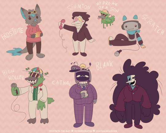
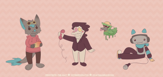
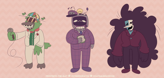
'evil'/anti artstyle meme! inspired by excessive-moisture's post doing this same thing!!! i showed it to my friends and asked them to give out my own art traits and basically a list of things i should not do.
the result is this art style! soft colors, less purples, very round and soft, thin lines + no line weight, no trademark things like how i draw fur and mouths PLUS slightly different desighs to fit the style more! (for example spamton being drawn more like his shop sprite)
i drew several characters i'm known to draw a lot / mean a lot to me just to see them how different they are from when i draw them normally! HURTS to not have an oversaturated drawing, uegugh.... but coloring was the most fun part! i love working with colors! the worst part was the lineart because i got SO BORED. fun challenge anyway!
little explanations on each character under the cut since this is a multifandom + ocs post and i wanna short talk about my silly guys ever (my, what the kids call these days, blorbos,)
since this has multiple characters not everyone may be familiar with, here's a tiny bit of info on everyone
frostbite = my fursona! they're a bat / dragon mix. they're holding a mango! nothing much to say since they're just my sona. me, y'know?
spamton = you know him! it's spamton from deltarune chapter 2 !! he's a shopkeeper and a secret boss in the game where he appears in his 'NEO' form. he's based on scam e-mails and ads!
my freak of a son = toontown corporate clash oc - he's a goopy low baller that i call my son. or rather, toontown version of frostbite and i call him their son. regular frostbite as shown in this image and frostbite are separate. he was made using one of high roller's attacks.
scratch = my deltarune sona and self insert! they're the fourth member of sweet cap'n cakes. they're a dj! they're inspired by cat headphones, soundboards and karaoke machines! they're who this blog is named after :P
high roller = from toontown corporate clash! he is a cog 'manager' who only appears during a yearly event 'april toons'. she is a show host and a fusion of two characters ('dave brubot' and 'buck ruffler'). it's show is also the boss fight you fight when they're around!
cathal = full name cathal ray toby bravecog aka the multislacker, also from toontown corporate clash. he is a manager you can fight in-game after completing a set of 'kudos' tasks. they are the VP's son and are based on crt tvs! they're known for being 'lazy'.
blank = (full name blank b. addison) a deltarune oc for my big deltarune au named datapack au. he is an addison who got corrupted by a swatchling mask - which is a new concept introduced in my au. he used to sell movie related trinkets and was a stand-up comedian.
#oc art#[frostbite]#[scratch]#[sscc]#my freak of a son#deltarune#toontown#toontown corporate clash#spamton#high roller#multislacker#blank#dpau#datapack au#guz art#[2024]#[January_2024]#<- new system specifying months... makes it a bit easier than the archive for me in the future!!!!#blank b addison#i forgot which tag for him i used... but oh well i want my tags Somewhat organized on my art blog.
62 notes
·
View notes
Text
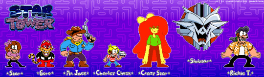
My first post of 2024 may have been cited to be the first look at Star Tower, my arcade-centric Pizza Tower AU, though consider this post to be your first real look at both the AU! This is a post I've been wanting to make for quite some time, and I am simply overjoyed to finally reveal the first set of characters for Star Tower!!! ⭐👾✨
This is a long post packed to the brim with art— some of which aren't featured in the above image— so if you're interested, I highly suggest you read on underneath the cut! 💙✨
As an AU, Star Tower dates back to March 3rd of 2023, which is when I first drew the logo for it. A sprite of myself drawn in the Pizza Tower artstyle predates Star Tower as an AU by about a month, so I think it goes without question that the stand-in for Peppino is Star Tower is a representation of myself!

It's just another day for Star Splitscreen at the local arcade, when all of a sudden, the multicade cabinet bugs out and sucks her inside! It's within the cabinet's confines where she meets the omnipotent Sinistar, who claims it'll set her free if she can best its '20-in-1 Supercade Challenge'.
What follows is an arduous adventure that sees Star venturing through arcade games familiar and obscure, and learning Sinistar's secret identity as well as escaping back into the real world all depends on her success... it's a good thing a seasoned arcade expert like her has what it takes!
I knew going into designing for Star Tower that I wanted each floor boss (I.E. Pepperman, The Noise, etc.) to be represented with an actual character from an established arcade game (With one exception...) and trust me when I say that I spent a fair amount of time carefully going through every arcade game I knew of and selecting a character appropriate for each boss's role.
Ultimately, I'm quite proud of the selection of characters I settled with, so let's jump right in and discuss Pepperman's stand-in...
Goro from 1983's Mappy! I find that, in terms of appearance, Goro was a perfect fit to replace Pepperman. Both are predominantly large red characters who are often depicted with wide, toothy grins— it was the perfect match!
Unlike both his canon personality and his personality in the animated ShiftyLook series, Goro in Star Tower is a lot more nefarious and self-centered, and sends out the Meowkies to do his dirty work when his own efforts don't cut it. I wanted to include sprites of the three Meowkies for this post originally, but I decided to save them for a future post (That's tech talk for 'I'm still trying to figure out how to stylize them').
I think of the four main bosses, Goro was the hardest to sprite in the Pizza Tower artstyle solely for the way his head is drawn. There's something about his face that was extremely difficult to draw at such a small scale, but after drawing pretty much every other sprite featured in this post, he was the final character in this lineup that I drew a sprite for, and I'm quite happy with it!
While Goro is certainly an iconic character, the same can't be said for The Vigilante's stand-in who, in spite of starring in one of the earliest known arcade games, is all the more obscure. Enter...
Mr. Jack from 1979's Sheriff! The Vigilante is the only boss of the main four who originally was going to be represented by an entirely different character, that being Kinzo from 1996's Pac-Man Arrangement.
It was when I remembered about Sheriff that I realized that Mr. Jack was the perfect candidate to replace The Vigilante. I mean, both are represented as mostly yellow cowboys armed with guns and a fashionable cowboy hat. How much closer could you get than that?
The real challenge was finding a good image of Mr. Jack to base his appearance in Star Tower off of. For those who don't know, Mr. Jack only has three known images of him that exist despite the fact that the game he hails from is over forty years old, so it wasn't exactly the easiest task.
I decided to base his appearance off of how he looks on Sheriff's bezel as that's the only full-body look we've ever gotten of him. The guy already looks like a Pizza Tower character as it is (A long lost cousin of Burton, perhaps?), and I find that his sprite looks the most like something you would actually see in Pizza Tower!
On the topic of arcade characters that are perfect fits for stand-ins of certain Pizza Tower characters...
Charley Chuck from 1983's Food Fight was, without question, the ideal choice to replace The Noise. One look at this flyer for Food Fight should perfectly encapsulate as to why. He's a little brat who's primary objective is to make the lives of the local chefs miserable. Sound familiar? It should!
Charley has had numerous different designs drawn for him around the time his game debuted, and it was pretty difficult settling on just the right one. I decided to give him a white and red striped shirt which he wears on the Food Fight arcade cabinet, and draw him as similar to the Noise as I could— I even sized him so that he stands smaller than Star, which took a lot more time than I'm willing to admit.
What's particularly interesting is that, fairly recently, Atari announced a Splatoon-like game for their VCS console, and you'll never believe who's the poster boy and what the game is a sequel to. I'm fairly certain that just before the announcement of Food Fight: Culinary Combat, I was the only person who was doing anything with Charley Chuck, and here he is starring in a brand new game some forty years after his initial debut. Not bad, kid!
One must wonder if I was the one who manifested Charley's return into existence...
With Charley Chuck properly introduced, I can move onto who may just be my favorite of this post's lineup...

Crazy Star.
With the success of 1981's Donkey Kong, an officially licensed clone was created for use in Japan only, though found its way outside of the country without the license to do so from Nintendo. This clone's name is Crazy Kong, and to say it's uncanny wouldn't be doing it justice.
Originally, I was a bit hesitant on just designing a 'fake Star' and calling it a day. I wanted there to be some arcade theming to it, and when the idea of a 'bootleg Star' came to mind, I quickly turned to Crazy Kong as a point of reference and Crazy Star is what came out of it (I should also mention that Crazy Kong released in 1981... now that's what I call meant to be)!
Out of everyone featured in this post, I've definitely drawn Crazy Star the absolute most because, as I mentioned before, it's just about my favorite of the Star Tower bunch! My favorite detail about it is that its color palette is made up of colors hand-picked from Crazy Kong itself!
Originally, I had screen-picked its colors from a YouTube video of the clone, resulting in a slightly different color scheme, but once I found a sprite sheet for Crazy Kong, it resulted in the Crazy Star you see in this post! Crazy Star may look unsettling, but in reality it's just as welcoming as Star, and all it wants is to be just like her.
Just like her... just like her... just like her...
Beware... Sinistar from the 1983 arcade game of the same name lives! Yet another instance of the perfect replacement, both Pizzaface and Sinistar are giant evil floating circles, and it was clear to me from the get-go that Sinistar would make a perfect stand-in for the former, especially since half of its name is 'Star'!
Drawing a sprite for Sinistar was both a cakewalk and a challenge. For one, seeing as its sprite is on the larger side, that meant I had a lot more detail to work with. On the other hand, however, I struggled for a while to get a good design drawn for Sinistar. Eventually, my good friend @panurei-derogatory suggested that it would be funny if Sinistar was hyper-realistically detailed compared to the other sprites, and that was something I had a lot of fun with when drawing its sprite!
Anyone who's played Pizza Tower knows that Pizzaface himself is merely a facade, as the true mastermind behind Peppino's misery has been hidden in plain sight since the very start— the comically villainous Pizzahead! I think out of every 'arcade stand-in' I chose for Star Tower, coming up with one for Pizzahead was the absolute hardest, because none of my ideas really seemed to stick the landing.
But then, I thought "What if it was a completely original character?"

And that's where Richard Benito Townsend (More commonly known by his alias 'Richie T.'), the self-proclaimed 'king of video games', enters the scene!
Richie T., who is absolutely not based off of any notorious cheaters in the arcade world record scene, is a washed-up video game master has-been, once highly regarded in his heyday for being an icon in the world of video games before his supposed 'unbeatable world records' were discovered to be fraudulent.
Shunned to a life of seclusion, the ever boisterous Richie T. now pilots Sinistar within a multicade cabinet where he's free to call the shots, daring to go toe-to-toe with Star once she proves herself worthy of being a Supercade Superstar. After all, she's just some girl— she can't possibly trounce the Richie T., can she?
Spoilers: He has no idea.
And with that out of the way, that's just about everything I wanted to touch base on in pertains to this first set of Star Tower characters! As I said before, this post has been a long time coming, and it's ever so wonderful to finally get this out onto tumblr!
You can expect a part two of sorts to this post sometime in the coming months, as there are still more stand-ins I've yet to post... this time, replacements of the supporting characters, such as Gustavo, Mr. Stick, and a couple of others! For now, I hope that you've enjoyed your first real look at the world of Star Tower! 💙✨
#⭐ Star's Art ⭐#Star Tower#Pizza Tower#Pizza Tower AU#Arcade Games#Star Splitscreen#Goro Mappy#Mr. Jack#Charley Chuck#Crazy Star#Sinistar#Richie T.#Aseprite#Sprite Art#Coolness#STAR TOWER WILL BE REAL IN ZERO SECONDS!!!#I spent a solid two or three hours writing everything for this post from the write-ups to the image IDs#I was simply THAT determined to get this post up as soon as I had finished every sprite featured in this post.#For those who have read the entire post I realize I keep repeating how nice it feels to have these sprites out there now...#And I truly mean it! Now I can post all the miscellaneous stuff I've made for Star Tower I wouldn't have been able to post before!#Such as the OODLES of Crazy Star content I've drawn XD#I'm considering on drawing a render for some of the other bosses like I did with Richie T. and Crazy Star#I think it would look particularly cool to have full-sized renders of Goro and Charley Chuck in particular!#Hopefully this post properly illustrates just how big of a love letter Star Tower is to arcade game fans the world over#My best friend Kintsu knows full well of just how many arcade references I've packed into ideas for Star Tower#I again want to give her a shout-out for encouraging me to go all in on this AU— it wouldn't be where it is now without her 💛
29 notes
·
View notes
Text
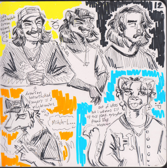

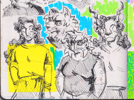

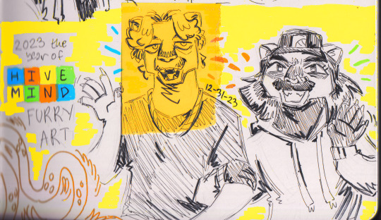
mid-october - end of 2023 sketchbook highlights
descriptions and such below
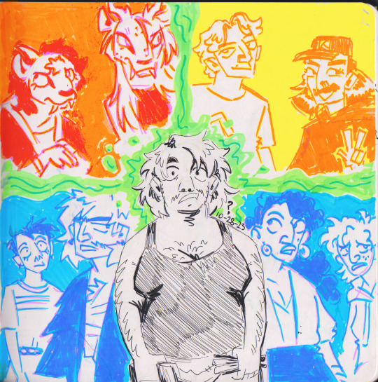
1: front page of the sketchbook cus i like to do something a little more elaborate for that. however i didnt have any ideas so i just drew me with the three groups of characters/people that i like to draw (my sumakha ocs, hivemind, and my comatelma ocs)
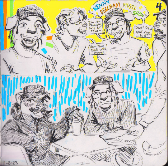
2: doodles from after kenny beecham's hivemind appearance adding him to the hmfcu (hivemind furry cinematic universe). usually i avoid giving people domestic cat/dog sonas but i associate dogs with sports so much and ALL i know about kenny is that he likes basketball. so hes a dog
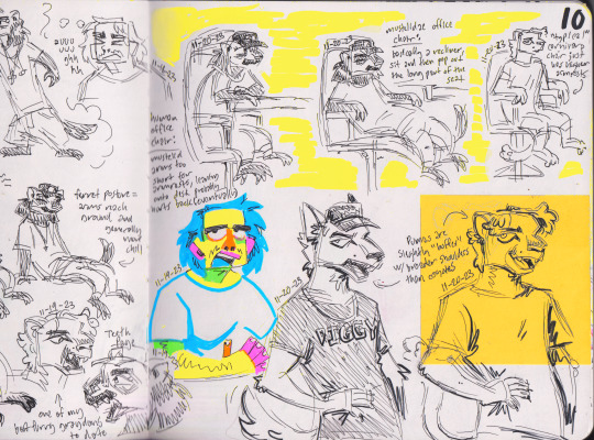
3: notes about furry shit. one thing about me is i love to draw comparative furry anatomy diagrams
4: bunch of quad doodles after the release of scrapyard III (mostly based on the easier mv but guess who quad is also there). i changed his fursona to a sheep literally RIGHT after my hiatus started LOL
5: random hivemind stuff from the same day as the scrapyard III doodles
6: i have catboy toxoplasmosis (also ft. my friends and i at the bottom)
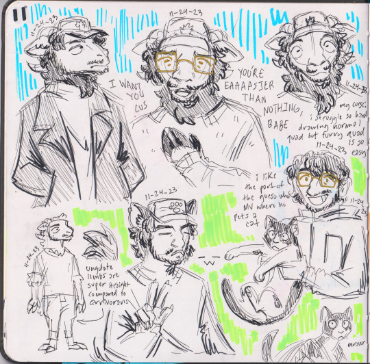
7: redraw of one of hiveminds instagram pics :-) so cute creachers
8-9: redraws of older art (first one is here and second is... something i never posted LOL) but in my Silly Mode artstyle that i developed so i can have a little fun whenever im feeling frustrated with my Normal Style. it's somewhat inspired by @crosssssky's hivemind art, please go follow them!
10-11: oc stuff (and graydon and dignan at the bottom of 11). love hivemind but im hoping my brain will cool down on them in 2024 cus im planning to actually Do Something with my ocs this year. idk when ill actually post about that tho
12: bidding farewell to 2023... im so good at drawing exactly four different furry species now
#hivemind tv#quadeca#my art#fanart#sketchbook#2023#my ocs#sumakha#hmfcu#eki#shikann#comatelma#daewon#julian#samjulang#ramiel#my friends#self portrait#furry#sorry if the yellow parts in this look weird btw. yellow highlighter does NOT scan well but i didnt want to keep it looking so dull#so i. did my best#future sketchbook dumps might look a little less crisp than this also. at my parents house with their nice scanner but the one at the#university library is kinda jank#so ill either ask my parents if i can take this scanner or just. cope LOL#also crosssssky i hope you do not mind the tag i just wanted it to be easier for people to find you LOL
45 notes
·
View notes
Text
one thing that kind of bugs me whenever ppl talk about hylics 2 “perfecting” jrpg combat and arguing that viewpoint from a purely mechanical perspective (hp, the meat system, the lack of weaknesses, etc) is that most ppl don’t give credit to the system for being as insanely streamlined as it is. simplicity in rpgs goes a long way to immersion when the rpg mechanics aren’t so removed from the characters and the overall pacing of the story. the biggest complaint many people have with old school jrpgs is not actually focusing on how “grindy” they are but rather how the bells and whistles of their core systems bog down down the actual experience and take away from the idea that your characters are growing in an organic and natural way. that is what breaks immersion and what pivots away from the core gameplay loop interacting with the game in a meaningful way.
Because, at the end of the day, people have always been roleplaying in games to some degree. DnD is perhaps the most famous example but LARPing and other forms of role-based play have been around for millennia with humanity in some shape and have always served as a method of telling a story and immersion in its most basal form. The many micro-managing elements of many jRPGSs have always served as a stop-gap between a rock and a hard place for more strategy based games and games that simply use units to tell some kind of cohesive narrative, and when said micro-managing elements become detrimental to the immersion of a player and the ease at which they can engage with the world, that’s when you start getting problems.
Simply put, hylics 2’s simple JRPG elements have never “redefined” combat. The game is simply not asking the player to engage with the combat as a means to its own end. In Hylics 2, every battle is a kind of spectacle, some kind of obstacle yes, but the limited enemy encounters streamline the pace of the game’s functions and how the player is interacting with the world around them. In its most basal form, Hylics 2 is using turn based combat to take players from setpiece to setpiece, contextualizing much of the game’s world within its mechanics as the terms “role” and “play” can be split apart and discussed in their most prescriptivist senses.
I think a good way to put this analysis into a bit more perspective is to compare Hylics 2 to Ultrakill, but placing them both on different ends of the same scale. While both are heavily stylized indie games with a unique artstyle and musical soundtracks, Ultrakill takes the maximalist approach with its gameplay loop and sense of immersive entanglement with its world, barraging the player with noisy and overwhelming stimulus to simulate the same kind of terror being experienced by the creatures within the game, while Hylics 2 does the opposite. It’s minimalist approach to sensory white noise comes from the abstraction of symbols, the lack of crystal clear visual cues and symbols often associated with games of its ilk, or even just the world in general. The game is meticulously designed such that (just like ultrakill is) it evokes the same kind of immersion in a slower, more deliberate way. Getting into the world of Hylics 2 is done via a drip feeding of barely legible (at first) information until the bigger picture finally arrives at the end and the lights, sounds, artwork and world finally come together in something that is halfway understood just as the characters in game experience it.
tldr I like the combat in hylics 2 it feels like real life. if I punch and kill a guy there is no respawning
#hylics#hylics 2#ultrakill#analysis post#hope this makes sense to at least one person KSBSKSBKSHSJSBSKSHSH#Personal post
32 notes
·
View notes
Note
the way you color stuff is AMAZING!!! I MEAN IT!
mind explaining how you make colors look so good?? its ok if you dont want to :)
Hi, thank you so much!!! <3
Generally, I try to go for softer, more pastel like palettes, and that helps make the drawings seem more "consistent" and pleasing to the eye.
First tip: if you use Clip Studio Paint, definitely get this tool. It saves so much time on filling out lineart, and it's crazy accurate. If you're having trouble figuring out how it works, here's how I do it: I put the lineart layer in a group, add another layer below it (still in that group), and then use the tool on that new layer. Make sure the tool is set to refer to layers in a group though. Then I erase some areas that were "enclosed" by the lineart.

As for the actual coloring process. First of all, I use the mechanical pencil brush from Clip Studio Paint, the same one I use for the lineart, except this one has random color jitter per stroke. It adds slight variety to the base colors, which helps making them look less flat.
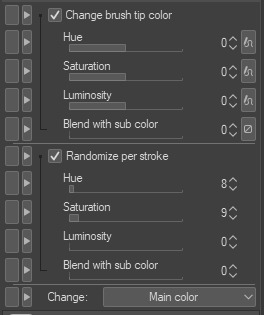
Here are the settings I use, but I recommend playing around with them if you want less subtle results.
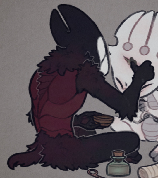
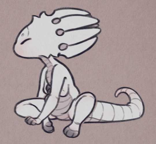
For a comparison, here is one of my drawings with regular flat colors vs one colored with the brush I mentioned:
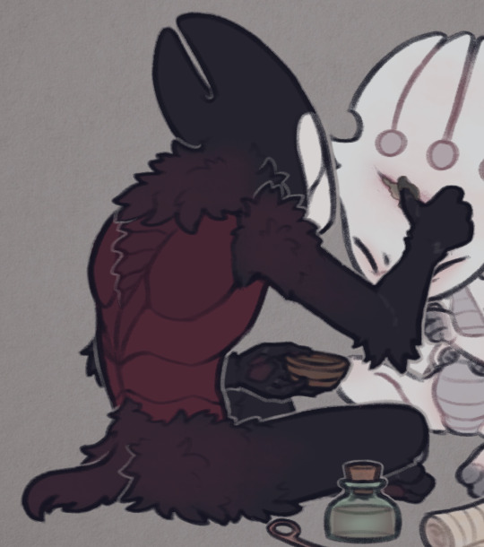

A pretty important part of the process isn't actually related to the coloring itself, but the layer effects I add to the finished drawing, as well as the paper texture (which you can see in the background; I add it twice, to the background and on top of all the layers).
Here are the layers I usually go with, I'll explain each of them below.
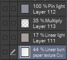
I'll start from the bottom. The paper texture is almost white with some very subtle warm tones, and it's set to linear burn, which works the best for this kind of texture. Like I mentioned, I use this overlay twice, but both use the same layer mode.
Next is the brown-ish linear light mode layer. This is to give the drawing more subtle contrast while also tinting it with a sepia-like tone. You can use any color for this, but I find this light brown color to work the best for my artstyle, since it makes the drawing look softer and gives it the old photograph kind of look which I tend to go for.
The multiply layer is mostly transparent aside from the edges. This is for the vignette effect, not much aside from that. It's definitely a personal preference thing.
Lastly, there is the pin light layer. This one is a bit weird, but I really like the effect. It's hard to explain it, but I use it to tint the dark tones of the drawing with a slight blue color. You'll see what I mean in the examples below. Occasionally, I'll add another layer with a darker base color, since pin light kind of works in reverse: if you use a light color, it will target the dark shades on your drawing, but if you use a dark color, it will instead only go for the light shades. Note that it's pretty strong in this drawing in particular, I usually make it a bit more subtle. If you look at my recent drawings you'll see it.
Here is the same drawing, with each of the layers applied in the order I listed (left to right order):


I'd also like to mention the lineart, which actually plays a big role in making my drawings look softer. I color the lines on the "inside" with a darker shade of the base color, though I often make it more saturated to really bring them out.
For example, here are the colors I use for FPK's lines. Not including his eye colors or the tips of his fingers/feet, since I don't color the lineart there. And a comparison of what he looks like with and without those lines colors, just to show how big of a difference it makes.

And to go back to the previous drawing, here is a similar comparison.
One thing to note is the additional white lines on the darker areas of Grimm's arms, the lines blend with the base color so I like to make them slightly lighter to help them pop out.
And lastly, I'll mention the light outlines you probably noticed by now. I add them as the final touch, they're the same color as the background though I sometimes lower the opacity if I feel like they're too much. They're meant to help with colors that blend together too much, and to highlight the silhouettes of the characters, as well as adding more dimension to the drawing. I think you'll see what I mean when I hide them in this final comparison:

Hope this is helpful! Sorry if you didn't expect that long of a post, I wanted to go through each step in my process so that I can explain it the best I can haha
40 notes
·
View notes
Note
Hi ! I was just wondering if you minded your work being used for references, not traced or for profit or anything. I really find your art style very inspiring.
Ofc you would be credited if I posted anything (if you don’t mind it being posted).
Either way thanks so much for the work you put in to all your work, I adore Stray Souls dm you don’t even know.
Sorry if this is awkward or worded weirdly I don’t really know how to do this 💀💀💀
You can read about it more in my previous q&a reply but in general I don't appreciate people using my work as a reference. Of course if I myself used a meme or a reference picture as a base you're welcome to use the same thing, but the vast majority of my compositions and posing comes directly from my brain and it feels very weird to me to see it "repurposed" with different characters.
You're welcome to take inspiration from my artstyle and study it, but referencing a specific drawing of mine is something I'm not 100% on board with. Thanks for asking though!
51 notes
·
View notes
Text
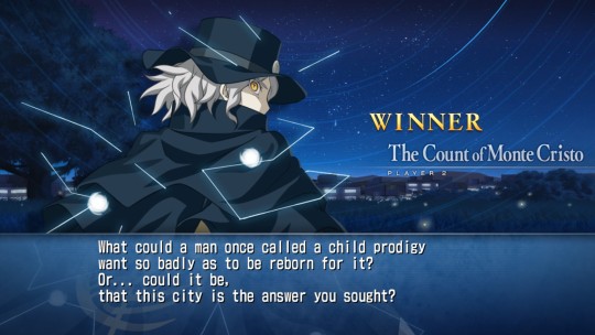
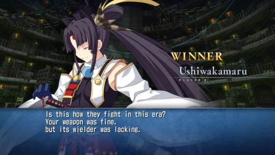
Don’t say i never gave these guys a chance
Also putting aside my feelings for them being in the game, French Bread did a phenomenal job. The animations (especially Ushi’s Last Arc and Dantes’ Arc Drive), and the sprite art are some immaculate stuff, and it’s nice that Dantes is extremely easy to pick up and play while Ushi was very clearly made to be labbed by pros. Pressing the same buttons seemed to lead to completely different moves while pressing 22L and 22M seemed to do exactly the same thing so who knows how to control this character lmao
Also Ushi strangely really fits Takeuchi’s artstyle while miraculously having a more distinct face than the other Takeuchi girls (probably due to her bushy eyebrows). It was interesting to note.
Also, if Ushi is basically C. Nanaya but with servant powers then I’m going to make a ridiculous lore assumption and say the original Nanaya assassination arts were based on her, and the reason they picked Ushiwakamaru for Melty Blood is because she’s the Nanaya ancestor you heard it here first
163 notes
·
View notes
Note
Was the weird, monstrous troll Mary and Lenore saw based off any specific troll design or did you just come up with it yourself?
well i should say first of all that the Mary/Lenore scene in B1 Verse 2 was written by Zoe (she just wrote up a thing about her work here) and touched up by me. so the big monstrous troll was her idea. i asked her for a response and this is what she gave me:
"I just sorta rolled with like, we already know that old highbloods can get pretty gnarly looking so it's gotta be a step beyond that, enough that it would stand out to Mary as remarkable, and I liked the idea of trolls that are more like fantasy trolls, just these hulking monsters that live underground.
the idea of the evil moon hurling rocks at the planet's surface was influenced by some other worldbuilding we've done, the solar Judgments of Fallen London, and maybe most prominently the insane sapient Psychedelic Sun from The Star Beast (Doctor Who). Actually in retrospect the idea of them living under the surface was probably partly ganked from Axile in Fallen London, which was scorched by the system's sun because it found the inhabitants repugnant. so it's sorta pulling from a bunch of sources in this sort of psychedelic science-fantasy mode."
my only addition would be that over the years there've been a lot of cool troll designs. insect versions, furry versions, softer versions, sharper versions, etc. i've always really liked the interpretive versatility given to audiences by Homestuck's abstracted and constantly changing artstyle. in a darker age there were many heated debates on the subject of troll biology, particularly among those desperate for a singularly Canon truth. no such truth can or should exist, but since when has that stopped fandom?
one of the big reasons i wanted Mary on the crew with Dare and Dave is to get an Alternian troll in the same room with a Repitonian troll and just, y'know, see what happens. there are a lot of canonical differences in their biology and cultures that i find fascinating, but in a larger sense i think they do a lot to build on some of the core ideas of Double Album. as often as possible, i want to avoid a reductionist reconciliation of differences in favor of an expansionist one. instead of having these two trolls come into conflict over, like, which troll species is "the real trolls" or whatever, i think it's much more interesting to instead say "actually there are infinity troll species and they're *all* real." and i think Zoe and i both wanted to fold fanon troll designs into that, to explicitly say that they're not all necessarily bipedal humanoids but that they can in fact be weird and monstrous. so of course, Zoe's fucked up subterranean hulk troll fit the bill perfectly.
12 notes
·
View notes
Last Seen Blogs

alec-lightwoodd
my specility is ice
sweetdayz
╱╲❀╱╲╱╲❀╱╲
limitedheat
Limited
realxxxgn-blog
☆ I'm EVIL to the core ☆

okaychoii
Untitled