#it's always fun to put a semi-realistic twist on anime-style characters
Text
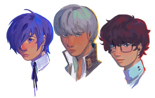
protag portraits
#my art#fanart#persona#persona 3#persona 4#persona 5#makoto yuki#yu narukami#ren amamiya#it's always fun to put a semi-realistic twist on anime-style characters
1K notes
·
View notes
Text
Once again, making a side blog, looking for people to roleplay with on discord.
First off, important shit. I am 23, won't roleplay with anyone not 18+ Mostly because that's uncomfortable for me and the themes I like/enjoy writing.
I like darker intense themes, romance that could very much be considered toxic, unhealthy etc. Obsessive? Possessive? That only makes it all more fun.
I want to have fun with chaotic, messy drama and potentially unhinged characters. I love fantasy, supernatural themes as well as criminal / crimes themes.
I love writing twisted, disturbed themes. In regards with nsfw/smut — I like writing it but I don't mind leaving it as Implied or fading to black if my partner prefers that.
I've been roleplaying off and on for years, ten plus years at least. I only write original characters. M x F / F x F / M x M / Nb characters are welcome as well.
Novella/semi-para — third person only is my writing style. (No need to worry about one liners from me, I always put effort into my replies, always wanna give my partner something to work with.)
FC wise— I will use realistic & anime/manga style for my own original characters/muses etc. I don't mind partners who don't use any at all. Relying only on written descriptions is no issue to me.
(My hard limits & big no-no's : scat / vore / watersports / incest / underage / beastiality)
Sidenote: I like to make collages & pinterest boards, sharing memes, aesthetic/characters inspo as well as stuff that makes me think of our ship. Chatting ooc is nice, just a little bit of friendliness. We don't have to be besties but talking a bit outside of our writing would be cool.
19 notes
·
View notes
Text
The Backlog, week 1
I am one of many steam users who have way to many games in their steam libraries. And I have also not been able to play many of them. This summer I wish to rectify that. Every week from here until the end of summer, I will play 5 or more games from my steam library and write a short review on them. This is the tumblr version of this project, but I will include links to the Steam review versions with every review. We are starting with the numbers and working our way down. Now enough rambling, let us begin.
100% Orange Juice. Time played: 1 ½ hours.
100% Orange Juice is a board game. That is about the most I can say definitively about this game. It is extremely luck based. So for the majority of the game you’re praying to RNGesus to give you rolls that put you on the spaces that get you stars, and to avoid spaces that make you lose stars. Stars are extremely important to the game, being the metric that determines who wins the game. There are also spaces dotted around the board that teleports you to another random teleport space, and on top of that, sometimes at the start of every chapter the game decides to teleport you to the other side of the board. There is some strategy to the game though. The game has several cards that can be played on your turn that have various effects, including increasing/ decreasing stats, healing, warping players around the board and more. From my short time with the game, I get the impression that there are not many cards in the game. However, I could be completely wrong about that. The game is a bit daunting at first, but once i got the hang of it, I found it pretty fun. The graphics are somewhere between cartoons and anime. The audio is a mix of decent music and annoying Japanese VO for the announcer. There is also a store where you can purchase characters for real money, and an online game mode that seems to be the real focus of the game. I have dabbled in neither system so take that as you will. If you are looking for a light, fluffy, totally random board game experience, I'd give this game a try.
1001 Spikes play time: ½ hour
This game is hard. I am tempted to leave this review there. The fear of writing this review made me halt the writing part of this summer project. But I must keep going, so here we are. 1001 Spikes is a retro style indie platformer, invoking the spirit of pulpy adventure movies ala Indiana Jones. The story, as it is, is that some deadbeat guy inherits a map from his jerk wad treasure hunter father, and decides to follow it to for one final “up yours” to his old man’s ghost. The game play your standard retro platformer affair. You run, jump, throw knives, the usual sort of fair for this type of game. The twist in all this is that it's painfully difficult. Now, i enjoy hard games. I am a proud member of the sun bros after all. However, I find that this game is way too hard. The best game I can compare it to is I Wanna Be The Guy, and other such obtusely difficult platformers. The nominal “gimmick” of this game is that you have 1001 lives at the start of the game, and the game will take those lives faster than you can blink. My big problem with this game is that it doesn't have a good difficulty curve. Once you get past the tutorial, the game take’s its gloves off and punches you straight in the jaw. If you are in the mood for a difficult platformer that is ever so slightly fairer than I wanna be the Guy, give 1001 Spikes a try
12 is Better Than 6 play time: 1 hour.
firstly, Yeehaw, second, this is a good game. Set in the old west, you play as “The Mexican” an amnesiac murderer who escaped slavery and is on the run through the old west. The Mexican is armed with only a knife, a sombrero, and whatever weapons you can pick up. The big draw of this game is that it has semi realistic gun controls, and by semi realistic, I mean it has clunky gun controls. In my time with the game I had access to three guns. The shotgun is the simplest to use. A point and shoot double barrel shotgun can get a lot done, the downside is that there are only two shots before you have to reload. The middle most complicated gun is the rifle. To fire this gun, you have to alternate left and right mouse buttons to cycle the chamber, but it does have excellent magazine size and good accuracy. The third weapon and the most complicated so far is the revolver. You have to hold down right mb and then click left to fire, then click again to cycle the chamber. I could not get a handle on the revolver controls, and avoided them like the plague. Since the gun control is clunky, and you die in one hit, its best to use stealth. The game is really a stealth game at heart. It has you sneak around and knife bounty hunters and other folks who want your mustache stuffed and mounted. If you're spotted, or fire a bullet accidentally, the entire map is alerted to your presence, and they all come rushing to kill you. You can still shoot your way out of the problem, but success is unlikely. The game is presented in a beautiful hand drawn ballpoint style. If you're looking for a difficult, hotline miami experience with more stealth and mild racism, 12 is better than 6 is for you. … did I mention that you can collect hats?
140 time played: 2 hours
140 is a minimalist, music based platformer. You play as a… shape… maneuvering through a technicolor level, collecting orbs and avoiding static. The art style is minimalist and so is the core game play. The platforming is solid and tight. The whole game revolves around the soundtrack, sort of. The first orb you get lays down the baseline, and the more orbs you get, the more sound elements get introduced to the song, alongside new game play elements for you to platform around. Each level is capped off with a boss fight against the static. In one, you have a triangle that fires lasers and you have to dodge projectiles while still hitting the boss. Another has you dodging static spikes in a vertically scrolling space. there isn't much more to say about 140 if you want a challenging platformer with good music, play 140.
2064: Read Only Memories play time: 1.75 hours.
Cyberpunk is an interesting genera. Many Books, fims, and games are set in a cyberpunk setting, but all of the worlds start to end up feeling the same after a while. There are always big corporations keeping the lower class down with drugs and robots. Cyberpunk is almost exclusively a dystopian setting. 2064 is different. It’s world is a modern cyberpunk, taking place in the not so far future where robotic advancements and genetic tampering have made the world a more technologically advanced place. Its setting is a lot like modern day, but with more robots and cat girls. The game itself is a point and click adventure game crossed with a visual novel. You’ll spend half of your time talking to colorful, fully voice acted, characters, and the other half doing simple rub one thing on another thing puzzles. You play as a snarky aspiring journalist, who’s home is broken into by a sapient robot who’s creator has gone missing. You and this robot, named Turing, must now embark on an adventure to find your missing friend and Turing's creator. The game is presented in beautiful, detailed and colorful pixel art. Each screen has a lot of things to look or touch at and the protagonist or Turing will have something to say about each of them. You can also carry spoiled milk. Yay? If you're looking for an interesting cyberpunk story, with beautiful graphics and a sorta unique setting, 2064 Read Only Memories is for you.
#steam#video games#gaming#review#summer#100% orange juice#1001 spikes#12 is better than 6#140#2064 read only memories
0 notes
Text
20 Best New Portfolios, May 2019
Hello all, as Justin Timberlake once predicted, it is now May. Now that I’ve subjected you to the latest and greatest in boy band jokes from the ‘90s, let’s check out this month’s portfolios.
It should be noted that as I write this, I am working with Internet that I borrowed from my new neighbor (yes, I did ask) and the speed is fairly slow. That’s not a complaint; it’s a warning. It means I’m going to be a lot happier with portfolios that load fast and don’t make me wait behind a preloader…Just sayin’.
Note: I’m judging these sites by how good they look to me. If they’re creative and original, or classic but really well-done, it’s all good to me. Sometimes, UX and accessibility suffer. For example, many of these sites depend on JavaScript to display their content at all; this is a Bad Idea, kids. If you find an idea you like and want to adapt to your own site, remember to implement it responsibly.
Up Late
Up Late is the one of the best neon-soaked portfolios I’ve come across, because it combines those bright and occasionally-flashing colors with considerable restraint in the rest of the design. The one-page portfolio is going to stick in your head for a while.
The only thing I might change would be to put a maximum width on the little bit of body text there is. At wider resolutions, it can get a bit harder to read.
Platform: WordPress
Raphael Aleixo
Raphael Aleixo’s one-pager is dark, clean, modern, and short, but still manages to make room for a full case study with each project. This is, in my personal opinion, one of the only acceptable ways to use modal screens.
The use of animation is sparing by today’s standards, but that just means the site loads and runs fast while still looking pretty. Extra bonus points all around!
Platform: Static Site
Artëm Tarasov
Artëm Tarasov’s portfolio is modernist and goes hard on the masonry layout. Beyond the home page, it’s all about those classic grid-style lines, and splashes of orange for emphasis. This sort of modernism may not be the most visually exciting of aesthetics, but it’s reliable.
Platform: Custom CMS (I think)
Rifat Najmi
Rifat Najmi has embraced a more classic form of minimalism, and plays into a sort of “design blog aesthetic” that’s all about the typography. Portfolio pieces are displayed like blog posts, which blends them in with the actual blog posts. That might sound a bit confusing, but it actually works rather well.
Just… what in the heck is a “certified design thinking practitioner”?
Platform: WordPress
Graphikconcept
Graphikconcept is a highly PowerPoint-style site, but it’s just that good-looking. The imagery, the geometric lines, the use of color to divide the website into visually distinct sections, I just like it. It’s the kind of graphic-design-heavy website that fourteen-year-old-me always wanted to make.
They made me wait behind a preloader, but it actually loaded pretty quickly. I’m going to give these guys a pass.
Platform: Static Site
Angle2
Angle2 is another presentation-style site, and it plays with angles a lot. You know, like in the name. It leans hard into the geometry, especially with the type, and it manages to look a little bit chaotic while remaining fairly usable.
It’s smooth, it’s pretty, and every page is different. No, let me rephrase that… I’m convinced that this is what happens when you give an art director coffee mixed with Red Bull to chase down their Adderall. They presumably designed this, then spent the rest of the week deep-cleaning their house. And I like it.
Platform: Static Site
Psychx86
Speaking of things fourteen-year-old-me would have loved, Psychx86 is totally what I would have named my studio, and possibly my character in any number of MMOs. In this case, it happens to be a snazzy portfolio that is clearly targeted at businesses who like a light touch of space imagery and lovely type.
Platform: Static Site
Contrast Visuals
Contrast Visuals is another portfolio site that leans hard into its name. It’s got black, white, and some video in an asymmetrical layout. It also has, in my opinion, the world’s best one-word navigation bar. It really is a case of less-is-more.
Is it weird that I actually kind of like the little clipart logo that you can chase around the page? I don’t think it’s weird.
Platform: WordPress
Branex
Branex stands out amongst other portfolio sites in its category by embracing color in a big way. And they’ve managed to use a bunch of gradients without overdoing it. And they do darn good-looking case studies.
Look, they’re doing a lot right. It’s like they hit that point in the design process where you think, “It’s good, but it just needs something more.”, and by God I think they found that something.
Platform: Static Site (I think)
Nicholas Jackson
Nicholas Jackson’s portfolio combines a sort of gritty artsy design with elegant minimalism, strong typography, and a great use of yellow. And we all know I’m a sucker for yellow in my web design.
The whole feel is almost like if National Geographic got a bit of a makeover. This especially holds true in the case studies. They’re laid out a bit like magazine articles.
Platform: Static Site
Alt Productions
Alt Productions’ site is interesting mostly for its navigation. Don’t get me wrong, I like the solid type and solid blues, but I really like the way what happens when you want to view a director’s work.
Well, you get to see their work, which is obvious, but when you’re done, you just scroll down and it takes you right back to the menu of directors. It’s simple, intuitive, and it saves clicks and mouse movement. The only potential downside is that users might get lost a couple of times before they get used to it.
Platform: Static Site
Aleksandr Yaremenko
Aleksandr Yaremenko’s portfolio brings us a touch of classic monochromatic elegance mixed with… emoji? I wouldn’t have thought of that, but the effect brings a touch of playfulness to an otherwise dead-simple experience.
Platform: Static Site
Kutia
Kutia is another one of those sites I wish I’d built when I was younger. Smooth gradients, super “techy” type, green Matrix filters on the imagery. Very junior designer me is in love!
Another thing I like is the call to action on the homer page. They encourage interaction by asking, “What can we help you with?”, and providing a number of potential responses. Sure, all roads lead to the contact page, but it helps customers get an idea of what this agency can do for them.
Platform: WordPress
Vincent Saïsset
Vincent Saïsset’s portfolio brings us some more lovely monochrome goodness, with thick type, and smooth animation that just feels right. It’s creative, it’s pretty, it’s good.
Platform: Custom CMS (Maybe)
Steven Hanley
Steven Hanley’s portfolio is made up of two things, pretty much: typography, and animation. Oh there’s imagery, but it takes a back seat to big words, and shifting color palettes until you actually click on a portfolio piece. All in all, it’s pleasant to look at and browse through. Can you ask for more?
Platform: Static Site
EVOXLAB
Now I know I talk about PowerPoint-style sites a bit, but EVOXLAB takes this concept to the next level. They went out of their way to make every section of their one-page portfolio look like an actual presentation slide. Thing is, for the way their content is set up… it really works.
Some of the text is a bit small in the “About Us” section, but otherwise, this design is kind of like a fun trip down memory lane, without all the Flashbacks. (Sorry.)
Platform: Static Site
Rumsey Taylor
Rumsey Taylor’s portfolio is interesting in that Rumsey’s featured work is linked to throughout paragraphs of regular copy text. It’s not the only portfolio to do this, but it does have its own twist on the formula. Go take a look.
Platform: Static Site
Grégoire Mielle
Grégoire Mielle’s portfolio is a semi-presentational site with some 3D graphics thrown into the mix. The fancy schmancy animation leads into a fairly standard but beautifully rendered minimalist layout.
The only thing I’d change would be to give the 3D graphics a little more contrast for those whose screens aren’t calibrated right.
Platform: Static Site
Chaptr
Chaptr is one of those portfolios that goes hard with the “default link blue”, or at least a very similar blue. While I’ve seen and featured a number of sites like that over the years, they still stand out because it seems like a lot of other designers are trying so hard to get away from that particular color.
In addition to loving the blue, I like how on various pages, scrolling will bring different elements into and out of focus, giving you one small chunk of content to digest at a time. It’s a simple effect, but it’s powerful.
Platform: WordPress
Iteo
Iteo presents us with a very business-friendly, yet still lovely aesthetic, with a focus on sans-serif type, and a lot of blue and orange thrown in to spice up the white backgrounds.
The whole thing just screams “modern”, but it’s still tasteful. In particular, I like the animated illustrations that are slightly reminiscent of blueprints. I also like that they add their own elements to the stock photos they use on their blog. It shows they put time and effort into everything they do.
Platform: Hugo
Add Realistic Chalk and Sketch Lettering Effects with Sketch’it – only $5!
Source
from Webdesigner Depot http://bit.ly/2VHfiPf
from Blogger http://bit.ly/2WtIs1o
0 notes
Last Seen Blogs

morgan-lee-business-talk
Morgan Lee's Business Talk

arcosanti-blog
Arconauts

shehkrwhany
الشيخ الروحاني

lebensmoode
하우

peppercosmos
PepperCosmos | Hiatus from art. working on coloring mostly.