#just because Pierre was aesthetically bigger
Text
Im begging people not to glorify the Pyry method….
#just because Pierre was aesthetically bigger#….#doesn’t mean all the questionable tactics Pyry used were good#Pyry let the AT garage play betting games with Pierre’s weight in public…#he played w pseudoscience experiments and gear on that poor man#sorry but Pierres reln w food and fitness under Pyry was SO… god#it makes me feel sick to think about especially w Daniel’s…. yeah#DONT PLEASE.#tw weight
28 notes
·
View notes
Text
22 f1 fic rec pt. III
Hey there!
It’s been a while since the last one but finally I’m here for the last fic rec of the year :)
I’m offering you ten of the best f1 fics I’ve read during the second half of the year (which I think you def cannot miss!!! )
so here we go...
- Sebastian and the Angel by Anonymous (Explicit)
This is a fic with an outstanding plot, an explicit and very detailed narrative that makes you feel like you’re whitnessing the story and all very ingenious characters. The emotional inteligence of the author is definitely something else.
- Every time I think the feelings fading I miss you (I miss you) by TheWiseOne12 (PG)
or a very sweet story about love, heartbreaking and refinding love even when everything is against you. It had me intrigued during all nineteen chapters and the strong point is definitely the hurt/comfort it offers, with a lot of angst but fluff on the same mesure.
- we can live in a world that we design by freed0m98 (T)
I have a soft spot on Carlos/Lando/Charles fic but this one is unexpectedly Carlos centered! I’ve never read one like this and the author definitely nailed it, the building is great (better than my own ficI’ll admit) and the ending is as sweet and you can expect it to be.
-Latibule by VettelMyPretzel (AndroidHeaven) (Explicit)
I’m obssessed with this fic!!! It’s basically Sebchal falling in love in the 20th century and again, the building and the sexual tension is otherworldly. One of my favorites of the 2022.
- I like you.. by formulacherry (T)
Or piarles confessing each other and it’s so godamn goals! they talk their past, their present and their future and the fic has an even bigger meaning if you read the fic before in the saga (a saga I highly recomend as well, but this work is my favorite of them) so go check it out.
- some of the best moments in life are the ones you can never talk about by Quagswagging (Explicit)
Or one of the hottest fics I got to read this year, and a very captivating sexting moment I have in my mind even after days of having read it. Definitely a sebchal ft Lewis jewel.
- e forse il mare è dentro di lui by DuquesaDeMiel (T)
One of the most well thought plots I got to read, where Pierre is a scientist and Charles is a lifeguard and the sea is.... well, the sea conects them and It’s all I can say without spoiling because I really want people to read this. It’s wonderful.
- First Love/Late Spring by blackest_eyes (Explicit)
Or my favorite Piarles fic of the 2022. It’s sweet, sexy, sad, and all the good S in there ;) (sorry for the bad pun). I love the nostalgia and how you can reflect on the characters’ feelings, fears and decisions. An emotional story with a hopeful ending that will leave you smiling for days.
- we do not perish. by Laeana (T)
Or the fic where Pierre and Charles live and die again and again untill they get their happy ending. There’s a lot to outstand in this fic; the originality of the idea, the narration, how it comes and goes in time, how sentimental it gets... It’s beautiful not just the plot but the whole aesthetic you get from it.
- it's better than regretting by FunkyinFishnet (M)
Or Lando and Charles get drunk and married in Vegas. Charles panics about it but everyone reassures him so he doesn’t fuck it up. Everyone in this fic has a role, and no detail is left hanging. I love that it shows the path of someone realizing that even when things look bad, there’s always something good in it and you have to make the most of it. My favorite Charlando fic so far.
This is it! Of course that if you’ve read these already and you’re looking for something new, you can go and check my stuff :)
Happy Holidays, Julie.
#RPF for ts#AO3 fic#f1#f1 fic recs#sewis#piarles#sebchal#charlando#lewis hamilton#Charles Leclerc#lando norris#sebastian vettel
69 notes
·
View notes
Text
Ok I've been tagged to a bit of tag games a while ago so I'm doing all of them in a single post. I feel like with some of them I was tagged by more than one person so sorry if I forgot to mention anyone,,
I was tagged by @shot-tothestars and @bluelric. Thank you for thinking about me <3
Rules: tag 10 follows you’d like to know better (Btw I don't get what does that mean? Do I have to tag people one follows, or people they're followed by?)
(Also I'm just skipping the questions I don't like, but here's all of them for reference in case someone else wants to do it!)
Cats or dogs: Definitely dogs!!
Current time: 12:14 pm when I started, then I stopped and now as the exact moment I'm posting this it's 01:20 am
Favorite animal: Uhm probably seaguls? But I really like birds in general, they look so free from everything. And cool marine creatures!!
When I made this blog: First post is from June the 13th!
Reason for url: Explained here :)
Tagging: Nobody here because I answered half of the questions so I don't find it fair to ask somebody to do it lol.
Tagged by @shot-tothestars; Again thank for tagging me; and feel free to hmu any time if you feel like it, I swear I don't bite XD
Rules: Tag 9 people you want to know better/catch up with
Three ships: Excluding tpn because that would be lame, the first that come to my mind are Bones x Kirk - Star Trek, (platonic) Elsa / Anna - Frozen, All Might x happiness - My Hero Academia. Now that I think about it, I've never been much of a shipping person? I personally find platonic relationships much more interesting.
Last song: The Opera - Natasha, Pierre & The Great Comet of 1812. Since it's quite a long song, I listen to it significantly less than the other songs from the recording- it's still a beautiful song tho.
Last movie: I may be wrong but I think it was J. J. Abrams' Super 8. I remember being very scared by it when I was younger, so I wanted to see if watching it again now it would have still scared me. It didn't, but it was a nice movie nonetheless!
Currently reading: Unfortunately I don't read much for myself during school, and even when it's finished I find it very hard to get back on track; but I really want to read War and Peace so that's probably the one I'm starting next- together with Dostoevsky's Notes from Underground because I can't possibly read just one book at once.
Currently watching: Some things. Avatar: The Last Airbender, Death Note, rewatching Kill la Kill with my cousin; also sporadically watching Steven Universe episodes and Law & Order (the original plus SVU) whenever it plays on TV. As bonus, I just finished watching Japan Sinks and Little Witch Academia. (I hadn't realized until now how many things I was watching and had watched, wow?? I'm glad I didn't waste time.)
Currently consuming: Nothing? Should I?
Food i’m craving: Uhm... The Wok to Walk I ate back in London last year... There's so many good places to eat in London and I live in a small small town with nothing to eat, it makes me want to cry ;;;;;;
Tagging: The last three people in my dms @fandoms-and-shitpost, @puff-poff, @acaderhmic; the last three people in my notes @illbecryinginthecorner, @cookiespace, @galezea; the last three people who followed me @yeoshin-est, @losertea, @soulessgingersthings.
Tagged by @bluelric and @stray-tori. Again thank you so much <3
Rules: Answer 17 questions and tag 17 people! (Please make sure to create a new post rather than reblogging!)
Nicknames: Tag? I love the nicknames you don't chose yourself, I think it's a cute thing
Age (the long lost question everyone was wondering about): Newly 19 bby 😎
Zodiac: Cancer according to astrology and Gemini according to astronomy (I don't really believe in astrology tho,,)
Height: I really have no idea. Average??
Last thing I googled: "little witch academia"
Song stuck in my head: Drift Away - Steven Universe: The Movie.
Number of followers: Really peoples one of the best things about Tumblr is not showing the followers number, thus making it easier for smaller and bigger blogs to interact, and not creating some sort of social classes based on ephemeral and currish arbitrary assigned popularity values. Why should I tell my followers number.
n followers I love very much <3
Amount of sleep: 6/7 hours (4/5 on school days)
Lucky number: ? Dunnot? I like even numbers
Dream job: Uhm something where I can give my best to significantly do something to change the world for the better - hopefully doing something I'm especially good at. Like, putting my abilities to the service of the community. I'll start studying political science at university! (I don't really aim to become a politician tho)
Wearing: I've spent more than one hour looking for an imagine of my shirt on the internet, but, as I should have expected, it seems like clothes companies delete the public data about older collections. Anyway, it's a cute, white, very light shirt with short sleeves. It's got thin vertical stripes of various pastel colors and it's made of a kinda rough material I can't seem to identify. Under that there's high-waisted, light blue jeans. I like this outfit, I find it pretty. I like wearing pretty things even when I'm staying home, it makes me feel good about myself.
Favorite song: With no hesitations, No One Else - Natasha, Pierre & The Great Comet of 1812. The only doubt I have is if I prefer Phillipa Soo's or Denée Benton's version.
Favorite instruments: Probably piano; second place is cello.
Favorite author: Of what? If this is about books, I don't feel like I read enough to give a fair answer, but so far Dostoevsky and Kafka really stuck with me.
Favorite animal sound: Seaguls' squeal!!!! But also lil birdies' chirping.
Aesthetic: Docks!! The seaguls screaming in the air. The sun shining in the blue sky, originating mesmerizing reflects on the sea, like millions of dimonds. All the smells in the world concentrated in just one place. The movement, the life!! So many sights, smells, flavors and feelings mixing together. The ephemeral beauty of catching, for a single moment, the sight of something marvelous and extraordinary, and never getting to see it again, but cherishing this exaggerated memory of that serendipity. The hectic atmosphere of people going to and fro. The concept of connecting different cultures, the concept of leaving for new adventures. Just one place filled with complete strangers all so different, all so unique, where you can disappear - but without losing yourself. I just find harbors neat!
Random: My posts follow a 4 fanart posts/ 4 text posts (or 2 fanart posts/ 2 text posts) pattern; it physically hurts to mess up, thus it can happen that some of the most recent reblogs may disappear for a while (but they always come back ;)
Tagging: @neverlandstrio, @idlyingabout , @holy-mantequilla, @vapidsoup, @dpgoinghost, @chidoroki, @lovesick-lovely, @ueno-ito-en, @x-supernova, @notelectrictiger12, @bubblesandpages, @joy-in-gold-shadows, @thathilomgirl, @yalikejazzmydude, @neo--queen--serenity, @wheatormeat, @icyhotsparkybroccoli but really feel free to ignore this if you don't like this stuff
And everyone else who wants to do this (or any of the others!!)
#The reason why I tag all these people is because#I'm that kind of person who enjoys doing this stuff#But won't untill I'm tagged#And that's because I'm d u m b#But ye
16 notes
·
View notes
Text
Photoshoot of the Week: July 1st-7th 2019 - Diana Boreyko & Ducati Multistrada

Amazing Russian pole dancer & model 💙 Diana Boreyko enjoying her journey to Italy in April and May 2019 experiencing one of the most beautiful sight: Venice?! No, Ducati Multistrada!!
Here there are all the pics of Diana's photoshoot in Parco San Giuliano in Mestre (not too much far from Venice anyway 😂)
https://www.youtube.com/watch?v=pqhwKlLIzTc
By the way, she also tried Ducati with a blue Sunday dress (?!) ... she's definetely a crazy girl
https://www.youtube.com/watch?v=zX6DzZV33bM
See Diana's complete Instagram story about her journey in Italy here
First introduced in 2003, the Ducati Multistrada (literally in Italian "many roads") is series of V-twin "street trailie" motorcycles. Essentially a hybrid of a supermoto and a sport-tourer, the Multistrada competes in the market with other dual-sport motorcycles such as the BMW GS; but, like the Yamaha TDM850, the Multistrada is neither intended nor suitable for off-road use. Designed by Pierre Terblanche as an evolution to his previous design, the Cagiva Gran Canyon, the Multistrada has drawn mixed reviews for its unconventional aesthetics.
A new addition to the popular Ducati Multistrada for 2019 is the tweaked Multistrada 950. And joining it comes a key addition in the form of the Multistrada 950 S, which also comes with wheel options.
‘S’ should be for ‘serious’ because the newbie is laden with top-spec kit, in fact there are more than 400 setting available via it’s sparkly new 5” TFT display – rider modes, traction control settings, damping, etc. At first glance you’d be correct in missing the upgrades. Aesthetically, not much has changed for 2019, other than some tweaks to the bodywork to bring it into line with the bigger Multistrada 1260 but there hasn’t been an ‘S’ model of the smaller Multistrada before, and the new machine adds much of the equipment from the slightly looney Multistrada 1260.
The deep, throbby burble of a Ducati twin is a joy to listen to especially when smashing through the revs and clipping up the gearbox, so much so that the tried and trusted 937cc Testastretta motor has only had some small refinements that make the world of difference. More of that later. Maximum power and torque figures remain the same as the 2017 model at 110bhp (83kW) @ 9000rpm and 71 lb-ft (96 Nm) @ 7750rpm, which makes it more powerful than rivals such as Triumph’s Tiger 800 and Suzuki’s Vstrom 1000, although less tourquey than the Japanese bike. It can’t match the new Kawasaki Versys 1000 for power and is only just shaded by Yamaha’s Tracer 900 GT. For those not opting for a heavier yet more powerful Multistrada 1260, this is the ideal sports-tourer that has some light off-roading capability. It outshines rivals in terms of build quality and finish plus the vast swathes of riding options but then again, you get what you pay for.
Visualizza questo post su Instagram @moto_smetanka ✨ #bikegirl ♀️ #motolady @moto_smetanka ' ➡️ @top_bikes_and_girls ➡️ @ducatimotor @moto_best_girls #topbikesandgirls #bikesandgirls #girlmotorider #bikerlady #bikeporn #motoporn #дукати #ducati #ducatirider #ducatibike #ducatimoto #ducatisti #ducatista #ducatilovers #ducatidiavel #ducatipanigale #ducatilife #ducatiracing #ducatigirl #ducatichick #ducatilady #ducatisexy #ducatihypermotard Un post condiviso da Best bikes & beautiful Girls (@top_bikes_and_girls) in data: 6 Mag 2019 alle ore 9:59 PDT
#bikergirl #motorcycle #ducatipanigale #bikeporn #RidinGirlsBlog #bikers #femaleriders #sexybiker #bikelife #streetbike #sexyriding #motorbike #bikerchick #ladyrider #panigale #sportclassic #speed #roadracing #ridingsexy #sportbike #motorgirl #sportbike #girlswhoride #ridersbook #motolife #motogp #motorsports #motocrossgirl #instamotor #ducati #girlboss #bikeride #miila #moto #motos #ducati #ducatista #ducatistagram #ducatigirl #motogirl #ducatisportclassic #ducatiworld #multistrada #motorbike #ducatilife #мотодевушка #мотоледи #мотоциклмосква #мотомосква #motogirls #мотороссия #motomoscow #мотоукраина #мотоциклист #motolife #motolove #байкерша #спортивнаяфигура #спортивноетело #спортивнаядевушка #motogirl #bikelife #instamoto #motorcycleofinstagram #instamotorcycle #fitgirl


Back in Mother Russia
Visualizza questo post su Instagram ❤️домашнее видео лимит скорости максимум 90! Дорога все время пр��мо. Не начинайте ...... . . . . . #мотодевушка #мотоледи #мотоциклмосква #мотомосква #motogirls #мотороссия #мотоукраина #мотоциклист #motolife #motolove #байкерша #смотра #воробьевыгоры #мото #мотоцикл #мотосезон2019 #мотожизнь #мотоциклистка #мотобайк #motocrossgirl #motorcyclesofinstagram #motogp #motogirl #bikelife #instamusic #andro #sportstersofinstagram #sportbike #девушкимосквы #r3 Un post condiviso da Diana Boreyko (@moto_smetanka) in data: 21 Mag 2019 alle ore 6:36 PDT
Read the full article
#bikelove#bikergirl#DianaBoreyko#Ducati#Ducatigirl#DucatiMultistrada#DucatiMultistrada1200#DucatiMultistrada950S#girlsonbikes#ladybiker#ladyrider#motorcyclewoman#Venezia
2 notes
·
View notes
Text
Year End 2018: Derek Taylor
Another year above ground. Another year salvaged in no small part through the solace of music. That may register as a Limbo-worthy low bar for measuring life satisfaction, not mention one hopelessly awash in hyperbole, but there’s a reason. The sobering sense of normalcy that’s come to characterize the daily insanity of the world writ large and small makes the railing and grousing about it through a laptop keyboard feel at once futile and arrogant. Many of us still have it pretty good, if not better. Able to move and think freely. Fortunate to readily find the time to spend sequestered with art, whatever the senses and thoughts it stimulates. Plenty of others can’t consistently say the same. That ever-widening disparity weighs on my mind with a regularity that makes the compiling and commentary of lists such as this seem both a luxury and a necessity. We’re all in it together and revitalizing music is as meaningful a reminder as any of that steadfast reality. If only the orange orangutan still soiling the Oval Office and the psyches of millions (if not billions) would swap the MAGA-emblazoned nonsense that’s his usual headgear for the Burnside brim pictured above and mean it!
No real ranking to the entries below other than the general order to which they visited me through contemplation and return engagement.
Eric Dolphy – Musical Prophet: The Expanded 1963 New York Sessions (Resonance)

Released in haphazard, infrequent and incomplete editions, Eric Dolphy’s interstitial work (landing between his formative tenure at Prestige and his solitary masterpiece for Blue Note, Out to Lunch) under the aegis of producer Alan Douglas has never really received a fair shake from curators and critics alike. That long-standing slight was rectified this year with the Record Store Day release of Musical Prophet: The Expanded 1963 New York Sessions on the Resonance label. Rescued, enhanced and appended with 85-minutes of previously unreleased music and a lavish 100-page book stocked with scholarly essays by the likes of flautists James Newton and Nicole Mitchell, Sonnys Rollins and Simmons, Han Bennink, Henry Threadgill, Oliver Lake and others it’s an unprecedented boon on all fronts. The CD version of the set is slated for a 1/25 street date.
Barre Phillips

Octogenarian expatriate bassist Barre Phillips has sustained a relatively steady output in the 21st century, but End To End, a solo set (his purported last) for ECM, and a Oh My, Those Boys!, a timely reissue of his extended duets with Japanese confrere Motoharu Yoshizawa on the Lithuanian No Business label are aural confirmation of his consistency across decades. Alone and self-limited to the length of a LP he sculpts a somber soliloquy of intimate communion with his instrument. In the fast company of Yoshizawa, who fields a custom-made electric upright, the mood is much more frenetic in playful. Both settings are aurally transfixing.
Mingus – Jazz in Detroit/Strata Concert Gallery/46 Selden

Weighing in at a mighty five-discs, Jazz in Detroit/Strata Concert Gallery46 Selden dispenses with Christian name specifics and allows surname to suffice in announcing its bigger-than-life subject. Mingus’ instrumental faculties weren’t quite as consistent as the virtuosic powers that propelled him in youth (he had just over six years to live in the winter of 1974 when this material was captured), but any effects of advancing age fall away when he calls a tune, soloing with strength and at length and according his auspicious sidemen including drummer Roy Brooks who is ostensibly responsible for the recording’s survival. Retooled staples like “Pithecanthropus Erectus” and “Peggy’s Blue Skylight” join newer improvisational springboards like “The Man Who Never Sleeps” and “Noddin’ Ya Head Blues” to form a veritable smorgasbord of vibrant small group, stage-born jazz.
Peter Brötzmann

The venerable German road dog always has a place on this list. Now somewhat miraculously pushing eighty he’s still at it, crisscrossing the globe and breaking hearty musical bread with friends old and new. Three releases stood out to these ears: two recent duos and a welcome reissue of Hot Lotta, one of his early free jazz missives recorded almost five decades earlier with faithful countryman Kowald and the Finnish duo of Juhani Aaltonen and Edward Vesala. In the must-hear duo column reside, Ouroboros, a 2011 German club date with Chicago cellist Fred Lonberg-Holm on Astral Spirits, and Sparrow Nights on Trost, a wrenchingly intimate studio encounter with pedal steel phantasmagorist Heather Leigh, who ranks easily among Brötzmann’s most intriguing recent coconspirators.
Corbett vs. Dempsey
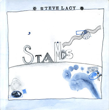
Keeping the Corbett vs. Dempsey count to just three for the year is a tough task as their usual prolificacy combined with a commensurate excellence. The reissue of Steve Lacy’s seminal Stamps, originally released in 1979 as his debut for the Swiss Hat Hut imprint narrowly edges out the equally edifying appearance of Milford Graves long-lost Bäbi if only because my spouse allows me to spin the cacophonously calorific latter platter only in her conspicuous absence. A decade was a long time to wait for Joe McPhee and Hamid Drake’s duo follow-up, Keep Going, this time trading stage for studio. But from the music to the mantra-ready title it’s a welcome inoculation against the forces of idiocy and ire globally arrayed against those with humanist allegiances.
Guy Lafitte

Last year it was Lucky Thompson. This year French tenorist Guy Lafitte got the Fresh Sound archival treatment with four full discs of material from his heyday as one of his country’s most popular indigenous purveyors of jazz. Each set delves into a different side of his folio from tight ensembles to modestly-sized orchestras, sometimes in the company of visiting guests, but more often plying his sound amongst a core crew of fellow believers. One of former, Michel de Villers, also earned a survey with The Complete Small Group Sessions 1949-1956 that shows him living up to the sobriquet of “Low Reed” at length on deftly deployed baritone saxophone.
Steeplechase

The Danish Steeplechase label always seems to slot in my yearly look back, mainly because of the consistency of both their roster and long-standing aesthetic. Sea changing surprises instigated by their records are exceedingly rare, but the odds of a stimulating listen are conversely high with virtually every release. Guitarist Pierre Dørge’s Soundscapes convenes a quintet with tenorist Stephen Riley and cornetist Kirk Knuffke in the service of the leader’s customarily open-ended compositions. Riley’s Hold ‘Em Joe is at once a canted tribute to Sonny Rollins and a welcome return to the piano-less trio format he first cut his teeth on for the label a decade ago. Baritonist Gary Smulyan’s Alternative Contrafacts yields winsome results with the instrumentation as well in a creative nod to the sort of extrapolations that were the fertile province of the Tristano School in the last century.
No Business/Chap Chap

A partnership between the No Business label and the Korean Chap Chap imprint continues to yield impressive reissues. All in circulation to date are worthy of consideration, but two bent my ears with pleasing consistency. Kang Tae Hwan’s Live at Café Amores offers an extended concert for solo saxophone that is equal measures Zen meditation and extended techniques master-class. Choi Sun Bae Quartet’s Arirang Fantasy teams a trio of Korean improvisers with visiting Japanese bassist Motoharu Yoshizawa for another café set that is ripe with cross-cultural creativity. Lastly, a reissue of sorely unsung vibraphonist Bobby Naughton’s 1976 masterstroke The Haunt with Leo Smith and the recently-deceased Perry Robinson (R.I.P.) in a setting of creative chamber jazz perfection.
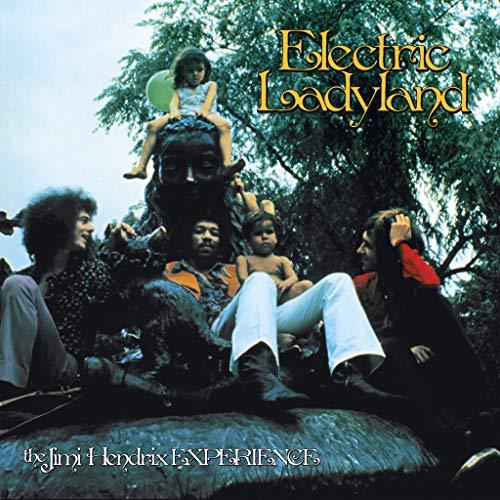
Jimi Hendrix – Electric Ladyland 50th Anniversary (Sony)
Repackaging of milestone rock albums is still the rage even as the compact disc as a physical musical format continues to wane with advance of other intangible digital formats. Hendrix has had his fair share of legacy parceled and promoted along these lines and it’s hard to fault the family for seeking to both cash-in and do right by his memory. Electric Ladyland 50th Anniversary does better than most past projects in this regard by hewing to a logical presentation and proffering some genuine value across three compact discs, a Blu-ray and a lavish LP-sized container replete hardcover tome covering all the minutiae of the original double-album phenomenon. And let’s face it, Hendrix fooling around with songs in their protean forms is more fun than sitting down with most rock musicians’ finished product.
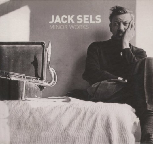
Jack Sels – Minor Works (SDBAN)
Parts of Belgian Jack Sels biography read like Hollywood-ready bohemian melodrama with riches, rags, tragedy and triumph all sewn into the story of a saxophonist who spent much of his life trying to capture the magic of his American idols while remaining fiercely true to his European roots. That latter decision explains his relative anonymity today, but the expertly-curated if humbly-titled Minor Works is practically bursting with recovered music and anecdotal context that frames a vivid portrait of a player well-deserving of posthumous consideration.
Jon Irabagon

Irabagon’s a dues-payer, tireless and admirably selfless in his dedication to a revolving door of projects and regular gigs. A recent interview with clarinetist & podcaster Jeremiah Cymerman reveals just how cool and unflappable a customer the Filipino-American saxophonist can be as he relates exercising the patience of Job in the face of dunderheaded racism by erstwhile peers. On the aural front two specific contexts stuck with me as evidence of his indefatigability. Dr. Quixotic’s Traveling Exotics on his own Irabbagast imprint teams his quartet with veteran trumpeter Tim Hagans in a program that feels like a natural and more focused extension of earlier work in Mostly Other People Do the Killing. Dave Douglas’ Brazen Heart: Live at the Jazz Standard released on the trumpeter’s Greenleaf label explores one of Irabagon’s recurring sideman posts and at length over eight discs covering a four-night stand at the titular NYC club in 2015.
Roscoe Mitchell
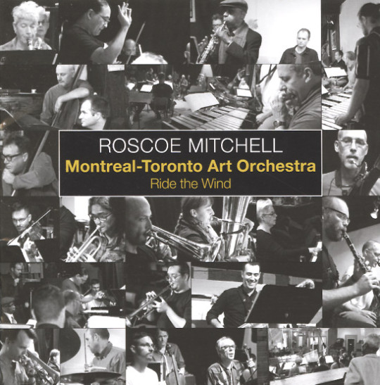
Recent and nascent masterworks with nearly a half-century of revelatory activity between them, Ride the Wind (Nessa) and Sound (Delmark) represent two essential signposts in Roscoe Michell’s reliably iconoclastic career. Both center on the blurring the subjective boundaries between improvisation and composition. Whether adapting improvised solos to orchestral charts or atomizing ensemble interplay into a freeing malleable framework that can take participating musicians in a multiplicity of expressive directions, Mitchell’s courageous adherence to personal designs and investigations has always been the bedrock of his work.
Intakt
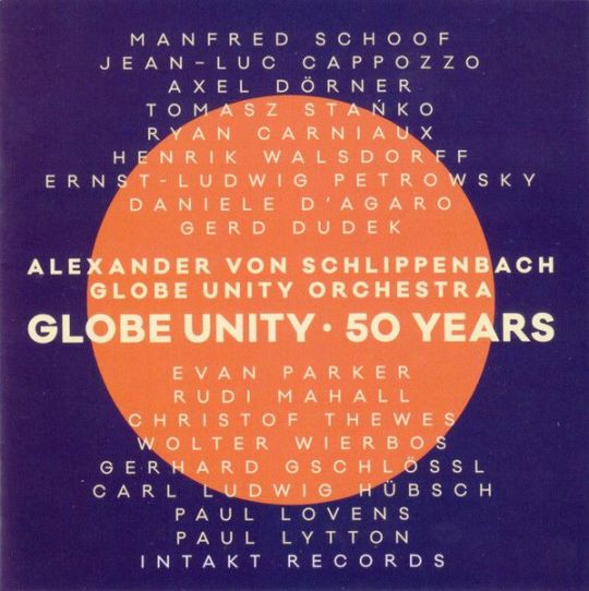
The Swiss Intakt imprint bridges the best aspects of a classic label construct (reliable stable, dependable production values, deep catalog, etc.) with a refreshing willingness to tweak the formula through a voracious ear for new talent. German altoist Angelica Niescer’s triumphant Berlin Concert and a pair of from Cuban pianist Auran Oritz, Live in Zurich with his working trio and Random Dances and (A)tonalities in the unexpected company of clarinetist Don Byron fit that latter bill. Globe Unity 50 Years celebrating the half-century longevity of Europe’s most influential improvising orchestra and Music for David Mossman by the equally indelible trio of Evan Parker, Barry Guy and Paul Lytton argue conclusively that the former end of Intakt’s endeavors is equally secure.
Clean Feed

Staunch loyalists to the tradition of improvisational album in physical form, Lisbon-based Clean Feed doesn’t just soldier on, it leads away with a release docket that reliably weds frequency with dependability. The sixteen discs that hit circulation in the span since January all have elements to recommend them, but two stuck to my ears and cranium more tenaciously than the others for both their audacity and intimacy. Vocalist Serpa’s Close Up is exactly that, a sans-net song forum with the stark support of Ingrid Laubrock’s saxophones and Erik Friedlander’s cello as the sum of sounding board. Similarly, trumpeter Susana Santos Silva’s All the Rivers situates her solitary horn in the unforgiving acoustics of the Panteão Nacional, a vast marble cathedral, for a recital rife with reverberating complexity.
Satoko Fuji – 12 for 60 Project

Year-long artist celebrations through output aren’t exactly common, but there’s certainly precedence (bassist Reuben Radding’s 12 in 2007 springs to mind). Already admirably prolific Japanese pianist Satoko Fuji decided to commemorate her 60th birthday on the planet by releasing a dozen albums on the Libra label over the course of the annum. As with her back catalog, many of them featured her kindred spirit Natsuki Tamura on trumpet as well as ensembles both familiar and freshly-minted. I’m still digesting the series in sum, but the standout so far is Aspiration, the core duo’s conclave with Wadada Leo Smith and electronicst Ikue Mori. Fuji has an admitted tendency to crowd the market and numb the senses with her productivity, but the focus and unity guiding these releases sets them apart.
Voices of Mississippi: Artists and Musicians Documented by William Ferris
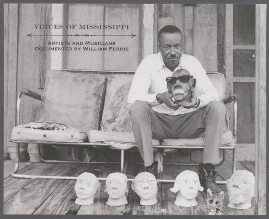
In common with the intimation of its name, Dust to Digital is a label that takes its time in the laudable work of producing archival music collections that stand instantly apart in terms of quality, scope and expertly-examined context. Voices of Mississippi: Artists and Musicians Documented by William Ferris is a work of art from the packaging to the sounds (and sights) contained within. Incisively indexed into three categories (Blues, Gospel & Folk), the field recordings are immersive and often carry the mesmerizing magic of incantations. A fourth disc containing a DVD collection of Ferris’ hand-shot films evokes time, place and person even more vividly. Temporary antidotes to slowly normalizing nightmare we find ourselves in as a world abound on this list, but this the one I have probably returned to most since my first encounter. It’s that transportive.
V/A – Technicolor Paradise: Rhum Rhapsodies & Other Delights

Exotica was originally indicative a certain slice of commercial music expression, one inextricably entangled in associative issues of appropriation, exploitation and in many cases mollification of indigenous cultural capital. Sometimes it was a complete recontextualization entirely as Numero Group’s Technicolor Paradise explores over three discs and an associative booklet brimming with commentary. This sort of deep crate project is nothing new for the label, but it is gratifying to see them go at it with such gusto after an earlier and unexpected embrace by the label honchos of streaming as a means of revenue. Some selections tip irrevocably into bromidic kitsch, but the first disc especially, which focuses on guitar bands keeps a more even keel of interest.
Charlie McCoy – Real McCoy/Charlie McCoy/Good Time Charlie/Fastest Harp in the South
Jerry Reed – Jerry Reed Explores Guitar Country/Cookin’/Georgia Sunshine/Me & Jerry (w/ Chet Atkins)
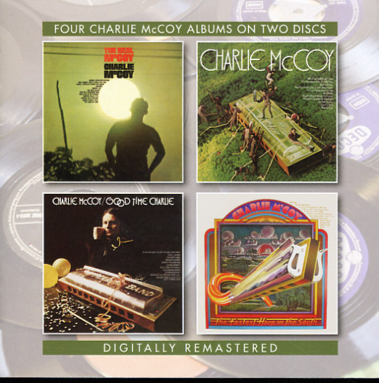
Time was when a two-fer reissue was a common currency in the compact disc market place. BGO’s done that erstwhile staple two better maintaining a fearsome foursome reissue program. Sets by country mouth harp maestro Charlie McCoy and good old boy-turned-ace guitar picker-turned-movie star Jerry Reed. Both are dipped liberally in countrypolitan production values that only occasionally slide over into schmaltz and McCoy wisely avoids vocals in favor of instrumentals that often sound like they could serve as soundtrack snippets to The Rockford Files (not a bad thing). Reed by contrast had a decent set up pipes to complement his strings-slinging skills and the chutzpah to try his hand at dry humor like the hilariously off-the-cuff ode to inconsolable nicotine addiction, “Another Puff.”
V/A – The Beginning of the End: The Existential Psychodrama in Country Music 1956 to 1972 (Omni)
V/A – Hillbillies in Hell: Country Music’s Tormented Testament (1952-1974) – The Resurrection (Omni)
V/A – Hillbillies in Hell: Country Music’s Tormented Testament (1952-1974) – The Rapture (Omni)

After an unexplained although far from unnoticed hiatus several years ago, the Omni Recording Corporation out of Australia roared back to life with renewed reissue campaign. The schedule of new projects eschewed full album(s) + plus bonus tracks for keenly curated collections focusing on the wilder and more tortured sides of the vintage country and country/pop spectrum. The Beginning of the End details descents into madness committed to song while two volumes more of the ongoing Hillbillies in Hell series doubled the entries to date describing that region of idiom(s) devoted to Beelzebub and his myriad earthly incarnations. All three are archly edifying as they are fun.
Sun Ra

Sun Ra reissues are once again a semi-regularity now thanks to reissue operators like Modern Harmonic and Cosmic Myth, both of which have conscripted longtime Ra repository Michael D. Anderson in their noble endeavors. Cymbals/Symbol Sessions: New York 1973 covers ground previously mapped by an earlier set on the Evidence label pairing worthy material including the (16:33) John Gilmore tenor <I<tour de force “Thoughts Under a Dark Blue Light.” God is More Than Love Can Ever Be has singular status as the solitary piano, bass and drums trio album in the entirely of Ra’s omniversal oeuvre and largely lives up to the stated promise of that proposition.
25 more in no fixed order...
Tyshawn Sorey – Pillars (Pi)
Henry Threadgill – Dirt… And More Dirt (Pi)
Peter Kuhn Trio – Intention (FMR)
Dave Holland – Uncharted Territories (Dare2)
Devin Gray – Dirigo Rataplan II (Rataplan)
John Coltrane - Both Directions at Once: The Lost Album (Impulse!)
JD Allen – Love Stone (Savant)
Fay Victor’s SoundNoiseFunk – Wet Robots (ESP-Disk)
A Pride of Lions – The Bridge Sessions 8
Michael Adkins – Flaneur (hatOLOGY)
Houston Person & Ron Carter – Remember Love (HighNote)
Spontaneous Music Ensemble – Karyobin (Emanem)
Cecil Taylor – Poschiavo (Black Sun)
Paul Rutherford – In Backwards Times (Emanem)
Mike Westbrook Concert Band – The Last Night at the Old Place (Cadillac)
Ustad Zia Mohiuddin Dagar – Raga Yaman & Ragas Abhogi & Vardhani (Ideologic Organ)
Kitsos Harisiadis – Lament in a Deep Style: 1929 to 1931 (Third Man)
Asnakech Worku – Asnakech (Awesome Tapes from Africa)
V/A – African Scream Contest 2 (Analog Africa)
Mulatu – Afro-Latin Soul (Worthy/Strut)
V/A – Listen All Around: The Golden Age of Central & East African Music (Dust to Digital)
V/A – Ocora – Le Monde Des Musiques Traditionelles (Ocora)
V/A – Music City Blues & Rhythm (Ace)
Professor Harold Boggs – Lord Give Me Strength: Early Recordings 1952-1964 (Nashboro/Gospel Friend)
Yuri Morozov – Strange Angels: Experimental & Electronic Music (Buried Treasure)
#dusted magazine#yearend 2018#derek taylor#eric dolphy#barre phillips#charles mingus#peter brotzmann#corbett vs. dempsey#guy lafitte#steeplechase#no business#chap chap#jimi hendrix#jack sels#jon irabagon#roscoe mitchell#intakt#clean feed#Satoko Fuji#voices of mississippi#technicolor paradise#charlie mccoy#jerry reed#the beginning of the end#hillbillies in hell#sun ra
5 notes
·
View notes
Text
At&t Zte Maven Review

At&t Zte Maven Reviews
At&t Login
So this is my ZTE Maven 3 a TNT full review.
At definition is - ��used as a function word to indicate presence or occurrence in, on, or near. How to use at in a sentence. Rt5161 driver. Try fast and safe sign-in with ZenKey. Sign in with ZenKey. Learn about ZenKey.
“Lorem ipsum” dummy text is used by many web-developers to test how their HTML templates will look with real data. Often, developers use third-party services to generate “Lorem ipsum” text, but now you can do that right in your editor. Just expand lorem or lipsum abbreviations to get the following snippet. Try 'Lorem' and F3. This gives you the Lorem Ipsum. Horst ( 2015-07-29 03:09:59 +0100) edit. @karolus - shortcuts depend on locale (DT in English, TEX in French ). LOREM (Latin) remains LOREM. To find them EditAutoText unfold the Category (e.g. Standard) pierre-yves samyn ( 2015-07-29 09:05:45 +0100) edit. =lorem If you want multiple paragraphs you can put a number in the ( ) There are also a lot of random Lorem ipsum text generators and here is a cool article by Tom with ideas. https://satloading933.tumblr.com/post/657375138155757568/lorem-ipsum-shortcut.
9pin USB Header Male 1 to 2 Female Extension Splitter Cable Connector Adapter (Male 1 to 2 Female) 4.4 out of 5 stars 625. E-SDS USB 3.0 2-Port 3.5 Inch Metal Front Panel USB Hub with 1 HD Audio Output Port/1 Microphone Input Port for Desktop 20 Pin Connector & 2ft Adapter Cable. Premium10-Pin USB/AC97/HD-Audio Internal Header Y. Ac97 cable. HD Audio to AC'97 Adapter Cable. Estimated Delivery. Order within. Be the first to review this product. 0 Questions, 0 Answers Ask Your Question. Product Details: Audio adapter cable, internal, AC97 to HD audio. Audio cable to adapt the AC97 frontpanel connector on a mainboard into a HD audio connector- AC97. Audio adapter cable, internal, AC97 to HD audio. Free Shipping Worldwide. Audio cable to adapt the AC97 frontpanel connector on a mainboard into a HD audio connector- AC97 male plug to HD audio female plug. Tags: AACP to AC97 cable HD Audio AC'97 Adapter 変換. The front panel audio header on an Intel® Desktop Board lets you connect to a front panel audio module built into a system chassis. See the header pinout configuration below for connecting a chassis with Intel® High Definition Audio (Intel® HD Audio) or AC'97 (Audio Codec '97) audio. Item 1 Internal Motherboard AC97 HD Audio 9pin Male To Female Extension Cable Cord 50cm 1 - Internal Motherboard AC97 HD Audio 9pin Male To Female. Save on Audio Cables & Adapters. VisionTek 900639 DisplayPort DVI-D Black cable interface/gender adapter - 900639. Trending at $34.19. 6 Inch 3.5mm 3-Ring Speaker/Microphone Headset.
So first I want to talk about aesthetics of unlock at&t zte Maven 3 so for a device that only cost you $30 on 18th I personally think this is a beautiful device. The back of the phone as you can see has a slate’ish feel to it you can see it has a slate feel to it I love the feel this back I wish they can incorporate it on a little more ZTE devices.
At&t Zte Maven Reviews

I love this feel it’s like a sandstone backing that can actually be removed so if we take a look I can remove this backing by a little knob tap to actually reveal our whole battery. Now that’s not something you see every day in a device as you can see it is flexible but it’s not something you see.
So ZTE Maven 3 has up to 32 gigs of SD card storage plus the built-in storage that came pre-installed already and then the sides of the device are technically plastic and as you can see it looks a little like a fake’ish metal but I know it feels plastic for sure.
The one thing I don’t like in unlock at&t ZTE Maven 3 is the power button isn’t texture it’s not like a cheap feeling texture which I love better than just smooth but you can differentiate it for sure and then the camera hump also isn’t that bad.
At&t Login
Then the front of the ZTE Maven 3 is another place that doesn’t look too bad for a 5-inch display you get your three capacitive buttons and then on top you get a ton of finger prints. Then you get also an LED light right up there and the other thing you get is your camera and your screen. The screen on zte Maven 3 literally isn’t that bad like if I go like this three dots am I going to go over to this screen right here and I will zoom into it as can see this isn’t that bad so let me turn off auto brightness here turn it down more it really isn’t bad I think it’s a beautiful screen like for what it is I think it looks beautiful I think it looks vibrant for being only 480 TFT panel I think it looks vibrant and it comes with a ton of different software built into it already 7.1.1 comes built in so as you can see I haven’t loaded up much on here at all or anything at all really I did I tried some stuffs nothing would actually load for me and from here I went through and I just tested it out calling and texting on it and taking pictures too so in my opinion I love the picture quality I did a video that I will link down below just for camera I think the video wasn’t the best but the picture quality for this device blew me away like I was surprised that how good the picture quality came out for a dis device 5 megapixel rear camera 720p video and fun and a 2 megapixel front camera 720p video and they’ve also Lumia way in terms of what they did and for the poor performance of the device I was able to text fast and call people well that worked out the battery lasted me all day of calling and texting people it has a headphone jack for you people that care and it has a micro USB charger and what came in the box I’ll list I’ll link the initial getting video down below the unboxing video where the don’t where what happened was it came with just the micro USB and the brick and for what it is is beautiful I think it’s nice it feels nice in the hand it’s not too big not too small that’s what she’s personally I’d like a bigger device but it doesn’t feels great I think the back if it were a little more sandstone II and not just a little bit cheaper feeling I think it would be a little better but for what I did feels excellent now everything on this device is great if you want spent 30 bucks one gig of ram a gigs of storage with like three four gigabytes usable now people say it’s bad some people say whatever I say if you’re looking for a cheap device maybe to get your kids for only 30 bucks you get them a device that can blast them for a little bit maybe you just want to teach them the values of owning the phone but you want to be smartphone so they can text their friends maybe even do snapchat if that’s what they do and you just want if it reloads on this phone but you just want to show them maybe you’re also scared that they’re gonna break the phone or at least my mom did this she did it where she did it where she bought me a cheaper smartphone at the time was expensive but I mean I’m calling it cheaper now because technically it was cheaper than the cheap smartphones the budget smartphones at that time and I now I buy my own phones for myself so maybe you want to teach them that maybe they’re earning up to her towards their first phone but you want to actually just give them their first phone maybe they’re and it’s something whatever it is I think this is a perfect phone for that I’d recommend this phone to anybody looking please don’t get mad one gig of ram 8 gigs of storage with 4 gigabytes approximately 4 gigabytes usable not bad at all I think it’s great for what it is and a great starter phone for any kid out there.
0 notes
Text
Architects
Considering I want to base my project around architecture, it is important that I look at famous architects throughout history so that I can get a perspective of their techniques, processes and outcomes; what makes them effective? How can I integrate this into my own work?
Kazimir Malevich
Malevich is someone I have looked at in previous projects. However his style and approach interest me a lot and I will continue to look at him in detail to breakdown his approach and thought in attempts to inspire myself.
Who was he?

Born February 23rd 1879 and died May 15th 1935, Malevich was a Russian avant-garde artist and art theorist who had a strong influence in development in abstract art in the 20th century. He worked in a variety of styles including; Impressionism, Symbolism, Fauvism and cubism.
Definitions:
Impressionism: A style of painting associated mainly with French artists of the late nineteenth century, such as Edgar Degas, Edouard Manet, Claude Monet, and Pierre-Auguste Renoir. Impressionist painting seeks to re-create the artist’s or viewer’s general impression of a scene.
Symbolism: The art or practice of using symbols especially by investing things with a symbolic meaning or by expressing the invisible or intangible by means of visible or sensuous representations.
Fauvism: The style of les Fauves, a group of early twentieth-century modern artists whose works emphasised painterly qualities and strong colour over the representational or realistic values retained by Impressionism.
Cubism: An early-20th-century art movement which brought European painting and sculpture historically forward toward 20th century Modern art. Cubism in its various forms inspired related movements in literature and architecture.
Suprematism: An art movement, focused on basic geometric forms, such as circles, squares, lines, and rectangles, painted in a limited range of colours.
Looking at all these genres within art and design, I must consider what area I would like to learn about and explore? What really catches my eye? Initially I am more swayed towards cubism, a more abstract interpretation of art that emphasises the importance of shapes within art. However this could be hard to look at when working with 3D medias.
Constructivism: An artistic and architectural philosophy that originated in Russia beginning in 1913 by Vladimir Tatlin. This was a rejection of the idea of autonomous art. He wanted ‘to construct’ art. The movement was in favour of art as a practice for social purposes.
Basically, constructivism was a art movement where artists believed their work should directly reflect the modern industrial world.
The reason I am looking at Malevich is because of his ‘Architektons’.
Architektons
From 1923 to the early 1930s, Malevich produced several 3D models which appear similar to models of skyscrapers, called “arkhitektons“. He would also compose sketched plans for these models called ‘Planits’.
Malevich created these architektons as he saw them as the ultimate form of suprematism; Architectural Suprematism.
Malevich worked with wood/paper/card to develop supreme and pure ideas of a utopian architecture suitable for the future of Russian society.
The arkhitektons are mostly white plaster models made up by several rectangular blocks added to one another. Usually a central bigger block is the main structure of the piece and then smaller geometric shapes would then be added to it.

Above is one of Malevich’s architektons. As you can see it is actually quite simple in its design as all you have to do is place geometric shapes next to each other in a vertical direction so that the peak is usually the central block. Malevich would paint the blocks white for neutrality and it would allow him to work with lighting for different photographic effects.
These contractions have no intention for function, and are just purely results of assembling abstract shapes. With their structural form, the arkhitektons embody Malevich effort to translate the suprematist principles of composition to three-dimensional forms and architecture.
When I am creating my outcome, will I focus on its purpose or its aesthetic?
I think it is important to consider both of these, however I shouldn't just create a bit of furniture or a building that I am used to seeing. I would lie to create something that visually intrigues me and draws the audience into it.
For one of our previous projects ‘Futures’, I created a series of these architektons...

I would say these are some of my most effective outcomes that I have made through this course as I think I was really able to capture the futuristic theme of the brief.
However, It is important that I don't just replicate this style and technique for my FMP, otherwise my portfolio will just consist of similar pieces of work and wouldn't show how I able to adapt my work to any theme or project.
So what do I get from Malevich?
When creating my outcome for my FMP, I must consider both the purpose and the appearance. What is more important? I will also look at how can I use simple shapes to create something more complex? Can I just throw a load of shapes together without planning to create something or do I have to carefully consider and plan every part of the creation of my piece?
Eliot Noyes

Who was he?
“One thing I am not going to become is a guy who is called in to change the expression on the corporate face by hanging abstract paintings on the office walls.”
What do I think this means? My interpretation of this is that Noyes doesn’t want his artwork to be just two dimensional paintings that act as decorations. Instead, he likes to inspire people by designing interesting and unique buildings that act as artwork
About Noyes:
Born August 12th 1910 in Boston, USA and passed away July 18th 1977. Noyes studied architecture at Harvard at once graduated, was employed by famous architects Walter Gropius and Marcel Breuer who won the AIA Gold Medal in 1968, an award presented to Le Corbusier in 1961 (who is have also studied). So instantly, Noyes was in with very experienced and skilled architects who could teach him the ways of the industry.
Eliot’s typical design usually included open interior spaces and clear geometry, often using a free-standing fireplace to divide the living and dining “rooms.” He also designed the IBM building in New York, where he also went on to design a Seletric Typewriter.

Why am I researching Noyes?
Noyes was renown for his modern style. His building often have a very crisp and clean finish even though they were constructed in the 50s/60s. This is an effect that I could try and attempt to capture when creating my outcome for this FMP. How can I make this piece timeless?
Timeless definition: not affected by the passage of time or changes in fashion.
In other words, it is something that looks stylish no matter what time period you are in or from. One artist who is great at creating this effect is Paul Rand, his logos that were created in the mid 20th century when technology was to a lower standard, his pieces still look very crisp and effective to this date.
What do I get from this?
When I create my final piece, whether it be a model of a building or a piece of furniture, how can I make my piece timeless? Do I want it to look timeless? Is there any way that I can make my piece attractive for everyones style? And is there a way I can make m piece desirable for business and home owners?
These are all questions that I will be asking myself throughout the development of my final piece.
Le Corbusier

Charles-Édouard Jeanneret (6 October 1887 – 27 August 1965), known as Le Corbusier, was a Swiss-French architect, designer, painter, urban planner, writer and one of the pioneers of what is now known as Modern Architecture.
He was Swiss born and became a French citizen in 1930. His career spanned five decades, and he designed buildings in Europe, Japan, India, and North and South America.
Dedicated to providing better living conditions for the residents of crowded cities, Le Corbusier was influential in urban planning. He prepared the master plan for the city of Chandigarh in India, and contributed specific designs for several buildings there.
Why have I looked at Le Corbusier?
One of his most famous designs is called: Notre Dame Du Haut.

This building was built in 1955, and is a Catholic chapel in France. It attracts around 80,000 visitors each year.
Looking at the building, it is extremely abstract, the windows are squares or rectangles cut into the wall, the roof is curved upwards with the corner of the exterior wall extending all the way up to the peak of the roof. I think this building is an anomaly of Le Corbusiers work, however at the time of it being built, Corbusier was not exactly interested in “Machine Age” architecture but he felt his style was more primitive and sculptural.
What interests me so much about this design is how Le Corbusier was so evidently able to combine both art and architecture together. This building is both a iconic piece of art, and also just a building. Le Corbusier was so successfully able to combine art and buildings together. When I am creating my final piece, I need to find ways to do this. I need to look at both aesthetic and practicality.
So what have I got from the research of these 3 architects?
First of all, here are the questions that I need to ask myself:
What Is more important; purpose or aesthetic?
How can I combine both visuals an practicality to create something interesting?
How can I use simple forms to create something visually complex?
What is more appealing; simplicity or complication?
I think it is clear that simplistic, modern styles attract me more than other styles. So I may attempt to create a model in a simplistic way. This could involve basic geometric shapes.
This ties along with the idea of ‘Timelessness’. In my opinion, one of the key factors to make something timeless is to incorporate simplicity with it. Simple things are more versatile to different environments than complex things. As we go into the future, we are seeing that more and more things are being stripped down to simple shapes with clean cut edges and neat colours.
All the timeless buildings above are generally quite simple. And when I think of other timeless artists such as Saul Bass’ logo designs, they are often consisting of basic shapes and colours.
Something else that makes pieces timeless is the adaptability to work in all sizes and colours.
0 notes
Link
via Today Bharat Nani is playing a serial killer in this film which will release directly on Amazon Prime Video on September 5. One of the biggest direct OTT (Over-theTop) releases in Telugu so far, V is all set to release this Saturday on Amazon Prime Video. Starring Nani, Sudheer Babu, Nivetha Thomas and Aditi Rao Hydari in the lead roles, the film is a neo-noir thriller with heavy emotions and drama, as director Mohana Krishna Indraganti describes it. The film has Nani playing a psychopathic serial killer, while Sudheer Babu plays a celebrated cop on a mission to chase him down. The pandemic disrupted the initial plans of an Ugadi release in March. After a long wait of five months, V is now releasing on Amazon Prime Video directly. TNM spoke to the filmmaker — whose works include the widely popular Ashta Chamma and the more recent film Sammohanam — about the challenges of making a violent thriller, writing intelligent women characters, the decision to have an OTT release and more. Could you tell us about the aesthetic influences and references for V? What kind of a vibe can we expect from the film? Two genres that have always fascinated me, the film noir of the American cinema of the ‘40s and ‘50s, and also the French noir that Jean-Pierre Melville and others have championed and mastered. I was also a big fan of ‘70s Hindi cinema which very interestingly captured the conflict between systems. If you look at films like Deewaar, Trishul and Don, they were always about police versus gangsters or criminals, law versus crime. Usually you have two protagonists, each representing one, like Amitabh Bacchan and Shashi Kapoor (in Deewaar). I always wondered how it would be to blend these two genres: the visual style in terms of the noir look, of dark edges and brooding style, coupled with these really powerful emotional exchanges; the dialogues, the dramatic scenes, and personal and family conflict. To Sudheer, I said, look at Brad Pitt (from Fight Club). I don’t want a muscular police officer, I want someone lean and athletic. Similarly, I told Nani to look at films like No Country for Old Men, where Javier Bardem did the role of a psychopath, or Keanu Reeves’s role in The Watcher or Kevin Spacey’s role in Se7en. I told them to watch all these guys not to imitate them, but to see how differently each actor was approaching the part. To the character of a killer, they’ve added their own texture with their performance. Beyond what I’ve written on paper, Nani has added his own interpretations and created a certain texture to the character. Much of Nani’s look in the film is the result of a lot of brainstorming. Sudheer Babu similarly did the same, he lost a lot of weight, he became leaner, he studied a lot of task force police officers. So we approached the film with a lot more seriousness than a regular mainstream film, where you would just go and create some mannerisms, and try to create some sensational image. We may be doing a nice popcorn film, but it's also a very meaningful popcorn film. I wanted it to be an emotional experience, not just people fighting and having sound effects and action. It’s very carefully designed. Even for cinematography, we had a lot of references. My cinematographer Vinda and I — we started our careers together — would watch a whole lot of films that we like, and we always wished we could do something like that. We’ve tried to pay tributes to all those films through V, through the lighting, design and costumes as well. There’s a lot of hype around the fact that V is Nani’s 25th film, and his third film in your direction (after his debut film Ashta Chamma and Gentleman). It’s also your 10th film. What has changed for you both since Ashta Chamma? I started off as a small filmmaker with very few means to make movies. I was trying to do low-budget and medium-budget movies, and to adjust my aesthetic and ambition to those limitations. Although I believed I could do all these things earlier, I could not do it because of lack of resources etc. Of course with these challenges and restrictions, you grow as a filmmaker. As I grew, more producers started approaching me for my kind of films. My budgets increased, my audience increased. I could bring in whatever I learned in my filmmaking training abroad, because now I have the money, the resources and the audience. Nani started off as a very shy but very ambitious and very creative kind of an actor, when he debuted with me in 2008. He made enormously risky choices, he challenged himself at regular intervals, he did all kinds of offbeat films in spite of commercial pressures. He has also grown and created an enormous fan base for himself, and people now look forward to Nani’s films In all my films, I tried to change the genre. But V is of a genre I always wanted to do, which is a giant leap for me from what I've been doing till now — because the scale is bigger, the risks are higher, the actors are bigger, the budget is big. What were some of the challenges in making V? The most important thing is the genre — it is dark and violent. I’ve never dealt with violence, it is not necessarily my favourite emotion. Unless I feel really compelled to incorporate it, I’ve never used it in my earlier films. But this film is violent by nature, it has to deal with violence So dealing with violence on a day to day basis is very challenging for me, as a director. And for the actors also, I am sure it’s not a very pleasant emotion to deal with it on a day to day basis. We have to deal with blood, murder and all kinds of psychotic elements, which kind of challenge you as a person emotionally. Shooting the film was also very difficult because we were shooting for a lot of nights, there were a lot of action and stunt sequences that the actors had to take risks for, which they went ahead and did. But they were all very tense affairs because we had to be very sure that nothing happened to them. Your films are known for having well-written female leads. Could you tell us about the women in V? I take great care in representing women because I am very fond of women-driven stories. V is probably a more male-driven film compared to my other works, but Nivetha (Thomas) and Aditi (Rao Hydari) are central to the plot. Their screen time may be less compared to both the male leads, because the film is about two men fighting each other. But it’s also about how these women bring meaning to their lives, and bring perspective to the conflict , instead of making it simply about two macho men brainlessly beating each other up. The presence of these women in their lives gives them a certain perspective, a certain purpose, a certain sense of meaning. How that happens is something you have to see in the film, but it’s very important that the women in my films play not just an eye candy part, they have to contribute to the narrative. How do you ensure that you write meaningful women leads? I try to do my homework. I am also surrounded by extremely brilliant women in my own household, my mom is a writer, my wife is a PhD. Most of the women I know, my friends and colleagues, are more educated and more well informed than I am, and I constantly learn from them. Subconsciously, all that admiration I have and my friendship with them, what I learn from them, seeps into the way I write women characters.Their mischief, their sense of humour, the way they make fun of some of the stereotypes that mainstream cinema perpetuates, all of that I try to write into the dialogues through these women. You'll see that in the opening scene of V, with Nivetha and Sudheer, where Nivetha says what kind of a woman she is. I obviously have to research and consult, but when I write, I don't think it’s a conscious effort. It seeps in naturally. I would be mortified if I ever wrote an unintelligent woman. Could you tell us about the decision to release V on OTT? What changes were made from the theatrical release version of the film? We dreamed about a theatrical release and so we did things a certain way, we lit it in a certain way … But these are extraordinary times and we have to make the best possible choices. We didn't want to kill the excitement around the film by waiting indefinitely. We also realised that a lot of people want good entertainment now. Besides, we had no clue as to how long we had to wait. There was no clarity, so we thought we’d go for it. To approximate and to bring this (OTT) experience closer to a theatrical experience, we tried to tweak the visual a little bit grading wise, we tweaked the sound, we tried to create a little more surround as much as we could, from 5.1 to stereo. We tried to give our best approximation, to bring the Atmos experience to OTT. And when we tested with different devices and different environments, we were very happy. We also looked at the least ideal to ideal environments to watch a movie: what if I am watching it on a phone in traffic, as opposed to a proper home theatre setup. We tried to find a middle ground to the entire spectrum, to give the best possible visual and aural experience to the audience. Could you talk about your literary influences? Are you considering any adaptations from Telugu literature for your future projects? I believe that it's essential for a filmmaker to be acquainted with other art forms, to be well read, to know about dance, theatre, music, painting, photography. Cinema is an amalgamation of all these art forms, and our exposure to these art forms will give us a sense of yardstick of excellence.To hone my skills as a director, writer, and a creative person, I feel all filmmakers must have a very close relationship with literature and other art forms, but especially literature because it is very close to cinema. I would like to adapt the popular novel Chivaraku Migiledi by Buchi Babu, and also Saptabhumi (by Bandi Narayanaswamy, which won the Sahitya Akademi Award in 2019). There are a few more, like one short story by Kodavatiganti Kutumbarao, for which I had written the script. All these are there in the pipeline. I have to find the right funding and the right atmosphere, the right cast and crew to do it, but I'll do it eventually.
0 notes
Text
Aeron Bergman, Alejandra Salinas: Telepathy 传心术 (2018) by INCA Press
❍❍❍

Telepathy 传心术 is an amazing book on the intersection of art and neoliberalism. The book is part of a series titled distinction, after Pierre Bourdieu's iconic book Distinction: A Social Critique of the Judgement of Taste. A must-read book [for all artists] about the connection of ‘Judgement of taste' and class.
Bergman and Salinas's objective is political and work-centered. They are interested to highlight the distinction between art and neoliberalism in a sociological way. What happens to the greater field of art (artworks, artists, institutions, etc.) under the contemporary dominance of neoliberal hegemony? A similar attempt was made from a cultural stand (rather than a socio-economical stand) in 2012 by Nikos Papastergiadis under the title, Cosmopolitanism and Culture by Polity Press.
Throughout the book, Bergman and Salinas are referring to neoliberalism as 'neoliberal capitalism’. In some parts, it seems like there are no differences between neoliberalism and capitalism. In other parts, it seems like 'neoliberal capitalism’ is a bigger hybrid monster that is made out of the two (occasionally replacing it with hyper-competition, Kleptomanism, Parasitoid démarche, etc.).
As artists and art writers, they stand next to their contemporaries such as Groys, Osborne and Bishop. In terms of political economy, history and philosophy, they are referring to Aihwa One, Philip Mirowski, Chin-Tao Wu, Reymond Williams, Theodor Adorno, Hanna Arendt and Georg Simmel. In their critical analysis, they are attacking F.A. Hayek -a right-wing European conservative asshole economist- who is brilliantly introduced in the book as ’neoliberalism’s founding thinker’. Hayek’s 1944 book, Road to Serfdom is mentioned as the main intellectual originator of today’s neoliberal ideology. Hayek’s political philosophy is extremely individualist and anti-socialist. Similar to other western colonial libertarians such as Robert Nozick and Garrett Hardin, Hayek is pro-competition, and in favor of private property, free market enterprise and minimal government. He also believes that individualism has created the Western civilization and therefore it has to be preserved and flourished (from the dangers of communism and socialism).
Hayek can be seen as the exact opposite of John Maynard Keynes. Although, as an essentialist, Hayek believed that Nazism was a ’necessary’ outcome of socialism -rather than a 'reaction' to socialism! Like many other European essentialists, he biasedly saw Naziism as a totalitarian socialist movement rather an ultra-nationalist racist movement made to establish the Aryan white race on top of the human pecking order through military force.
Bergman and Salinas cleverly connect the inception of neoliberal ideology to Hayek and the post-war Europe where individualism and market freedom was sold to people as an alternative to other modes of governmentality. The notion of 'being free', 'freedom of movement' and 'freedom of choice' is crucial for them. Out of David Harvey’s neoliberalism, they have discovered another monster that to me seems somehow bigger and mightier. Maybe, from the art and cultural perspective, the situation is more depressing than it seems (something that Chin-Tao Wu argued in Privatising Culture: Corporate Art Intervention Since the 1980’s). Neoliberalism is presented like a huge whirlpool that drags everything cultural inside of it, and along with it race and gender are also sucked in to disappear. Racism here is presented as an outcome of this neoliberal whirlpool, or a signifier of its existence. This class-conscious point of view is so strong that it might dismiss the other forms of social racism, just to blame everything on the neoliberal capitalism and the ruling class that is enforcing it. On the other hand, social racism is not the object of this book, unless it intersects with the neoliberal ideology.
The power of the book lies in the ability to introduce interesting terminology that connects the challenges of cultural production to market-driven business ideas. The writers introduce and dissect phenomena such as the genius artist (Genii), WEIRD art, Vile Maxim (Adam Smith), Skilled versus Deskilled artist, Aesthetics of psychopathy, Pseudo-collaborations and the Law of Janteloven in art. The section on The Law of Janteloven is my personal favorite, firstly because I didn’t know anything about it. And Secondly, due to my experiences in the art field, especially in the last 2 years. Instead of trying to describe it, I decided to quote the whole section of the book here:
P. 170 Norwegian Janteloven is a strange, related phenomena: it is hyggeling, (cozy), to be well-adjusted to majority opinion! Janteloven promotes nationalist group hegemony as a cover-up to buttress the usual hegemonic structures. Hostility towards difference is implemented across all social classes as a hands-off, efficient form for a self-policing population. The concept of Janteloven comes from the Danish Norwegian author Aksel Sandemose in his 1933 book, En flyktning krysser sitt spor. He captured the oppressive spirit of social adhesion so closely that Janteloven is now in the general vocabulary of Scandinavia. Here are a few key Laws of Jante, the unspoken moral operative:
"You’re not to think you are smarter than us. You’re not to convince yourself that you are better than us. You’re not to think you are good at anything. You’re not to laugh at us. You’re not to think anyone cares about you. You’re not to think you can teach us anything.”
Who is the us and who is the you in this law? In the case of a foreigner, person of color, and person of nonconforming gender in Norway, this you is easy to identify and developed with oppression in mind. However, in the case of white, heterosexual, male Norwegian, who is you and who is us? You is anyone who judges and acts as an individual using judgement without bannisters. You is anyone who decides that a particular majority taste is disgusting.
Janteloven is expressed in the art ecosystem too: Norway’s hippest, taste-making, popular art gallery is fittingly called Standard, and shows mostly mute, vacant work of self-censuring formalism, completely drained of any threatening content and difference…While it is sometimes argued internally that Janteloven is the reason that there are no 3 Michelin starred restaurants in Norway, in fact, Janteloven is used by Norway to promote itself as the most equal society on earth. It is dark comedy: “more-equal does not mean “equal”, and in fact, Norway is in the top 5 among industrial nations with the fastest increase of social inequality.
Bergman and Salinas are great in finding hidden problematics in the international art ecosystem and its institutions from Whitney biannual (and its racism and whiteness), Detroit and Seattle art scene (with its billionaire elite) to Norway (with its state-funded educational projects of homogenization that tries to be more equal than all, resulting in significant inequality).
P.110 "Art displaying ambiguous is not always produced, by the artist, primarily for this purpose. Furthermore, ambiguism is often agreeable, enjoyable and legitimately entertaining, rich, full, smart, and fun. This is the result of appealing to the widest base -- and it is therefore difficult to simply dismiss all together. Ambiguism is, after all, the contemporary art of our time.”
In terms of opposition to neoliberalism, they identify religion as a force –not the spiritual/meditative personal type of religion, rather the large religious organizations and governments. The ending chapter of the book presents a question; “if health in fact can be a possible strategy for protest?” Later they identify self-health and aesthetics of health (such as Hollywood yoga and Feng shui) as a sort of market-conformism or extreme nihilism.
p.23 In the 21st century there are very few fields that develop and utilize value systems parallel to the ruling theology of today: neoliberal capitalism. Two prominent fields that are sometimes capable of such opposition are religion (irony of ironies) and science (not the corporate version.)
Examples of religious opposition to neoliberal capitalism include Pope Francis' statement to the Wall Street Journal that "capitalism is terrorism against all humanity." Rabbi Jonathan Sacks also spoke out: "Humanity was not created to serve markets. Markets were created to serve humankind." Another powerful example of religious opposition is the Sharia compliant Islamic finance system practiced by Iran, Malaysia, and the countries of the Gulf Cooperation Council, a growing banking system outlawing rent-seeking via usury, or ‘riba’.
The book is very insightful and would perpetuate an economic understanding of the effects of neoliberalism on art. On the other hand, it is missing the current negative ‘reactions' that has risen (whether by states or by individual groups/communities) in response to neoliberalism. The example of Norway (Law of Janteloven) was the closest that the book came across these issues, yet not only this problem was presented as ‘cultural’ but the blame was laid solely on neoliberalism which is penetrating into different countries one after another.
Scandinavia is a great example in this case, where the rise of nationalism, racism and fascism seem to be connected to the fear of eroding national sovereignty or the gradual disappearance of the social welfare system. Denmark, for example, is implementing ‘forced assimilation’ to its Muslim migrant population along with fifty other cruel laws on immigration to preserve its Danishness. A mixture of right-wing racism and left-wing strive for a sovereign nation (against neoliberalism) that sometimes leads to nationalism and race-blindness. Wendy Brown presented this idea in her 2010 book Walled States, Waning Sovereignty. She mentioned these events as ‘reactionary’ to neoliberalism rather than caused directly by it. ‘Walls’ she said, "are often amount to little more than theatrical props, frequently breached, and blur the distinction between law and lawlessness that they are intended to represent. But if today's walls fail to resolve the conflicts between globalization and national identity, they nonetheless project a stark image of sovereign power.” Étienne Balibar talks about similar issues in regard to the history of left conservatism leading to nationalism: “...every 'social state' in the nineteenth and twentieth century, including the socialist state, has been not only a national state, but a nationalist state also.” (Race, nation, classe. Les Identités ambiguës)
Similar to this case, but reversely, in 1944 Hayek blamed socialism for the creation of the Nazi Party in Germany. Unlike his contemporaries he didn’t see Naziism as a ‘reaction’ to socialism, rather he saw it as a ‘necessary' outcome of socialism. Therefore, he laid the blame on the originator of a reactionary hate movement. He didn't see the hate movement itself as an underlying issue deep into the society. A sort of issue that only comes up in the times of crisis.
0 notes
Text
Is Men's Physique the New Bodybuilding?
Bill Comstock, Per Bernal
Did you hear that at last year’s Track & Field World Championships, just before the start of the 100-meter finals, Usain Bolt was told, “Your world record is 9.58 seconds—run any faster than that and you will be disqualified”?
Did you hear about the baseball authorities recently proclaiming that any pitch over 90 mph will be deemed void?
Did you hear about those two incidents? No, because neither happened. All sports follow the iconic “Faster, Higher, Stronger” dictum of Baron Pierre de Coubertin, creator of the modern Olympic Games, encouraging all athletes to constantly better previous performances. Only one sport seems to consistently grapple with putting limitations on human performance and is constantly immersed in discussing the issue of “How much is too much?” We’re talking about bodybuilding and fitness.
Left: Rachel McLish, the first-ever Ms. Olympia winner, looks significantly smaller than six-time Ms. Olympia Cory Everson (right).
THE HISTORY OF “TOO MUCH”
We old geezers nostalgically look back on what we call bodybuilding’s Golden Era of the ’70s, when the physiques of Arnold and the gang at Gold’s Gym in Venice, CA, seemed to represent an aesthetic, acceptable, and attainable look that didn’t scare the children. However, Arnold recalls that Marvin Eder, Mr. America competitor of the ’50s, once told him in the early ’70s, “You guys have taken it way too far. It’s grotesque.” Sound familiar?
Throughout bodybuilding’s history, the “How much is too much?” debate has raged. It manifested (or womanifested) most notably with the progression of women’s bodybuilding. While the ’80s physiques of Rachel McLish (the first-ever Ms. Olympia in 1980, who also won in 1982) and Cory Everson (six-time Ms. Olympia, 1984–89) kept within feminine dimensions, the ladies who came after them repped out with such drive and enthusiasm that they sculpted supermuscular physiques that caused their endeavors to dwindle in popularity to the point that there is no longer a Ms. Olympia bodybuilding contest.
The same up-the-ante evolution occurred with the women’s figure class, which was launched in 2001. As the years clicked by, the figure ladies became bigger, harder, and leaner. A similar scenario occurred with the bikini class, which debuted at the Olympia in 2010. It seemed that progressively they became so devoid of body fat (a body- building prerequisite), with ribs showing, that some didn’t look too well on contest day.
Mamdouh “Big Ramy” Elssbiay weighs 300-plus pounds onstage. Big indeed.
MEN’S PHYSIQUE: THE FUTURE?
And so, dear reader, we arrive at the present state of the IFBB Pro League men’s physique division.
That “How much is too much?” conundrum seems to be growing—like the physiques themselves—in this division. The guys who first competed in this class back in 2011 look a lot different—less developed—than their current peers. In the eyes of many, they are bordering on straying into bodybuilding territory, with many of the competitors now heavier than past Mr. Olympias Frank Zane and Samir Bannout. Whereas shape and leanness seemed to be the initial main criteria, we now have competitors being issued advice from judges like, “You need more upper-back thickness” and “Put some meat on those delts,” which are similar messages to what the bodybuilders are being urged to do.
How can these guys get even more muscular and bigger and still keep within the confines of how the men’s physique division was initially visualized? To be specific, the official IFBB/NPC rules state, “Judges will be looking for t contestants who display proper shape and symmetry combined with muscularity and overall condition. This is not a bodybuilding contest, so extreme muscularity should be marked down.” Well, increasingly, to these eyes at least, a lot of the MPD guys seem to be just a few reps and/or supps away from a bodybuilding physique. Which is not really a criticism. But again, the “How much is too much?” conundrum is raised as physiques in this division continue to get more muscular.
One can chart the progress of four-time Olympia Weekend physique champ Jeremy Buendia, who completed his quartet of Olympia wins with a frame that packs much more muscle than was evident during his initial 2014 triumph. Which is not in any way a criticism of Buendia’s progression. In fact it’s rather the opposite, as he follows the precepts of “Faster, Higher, Stronger” like all true sportsmen. A key element of the human spirit is to explore new limits to see how far you can go, and the physique guys are in pursuit of that goal.
The overall picture is maybe somewhat muddied by the 2016 introduction of the classic physique class, which offered an outlet for bodybuilders to compete within more “aesthetic” guidelines than is applied to their open bodybuilding brethren. However, the classic division introduced in 2016 does have limitations based on height and allowed body weight. Have we reached a point, a tipping point, where some level of constraint is on the horizon for men’s physique competitors?
Sticking one’s neck out may be a precarious venture (ask Louis XVI of France), but speculation is as much a part of bodybuilding as “I wuz robbed” proclamations. So here goes. Whereas 10 years ago we had no inkling of the impact of the men’s physique or classic physique divisions, what will the bodybuilding/fitness landscape look like in five or 10 years’ time? The blunt truth is that the men’s open bodybuilding division is losing traction in terms of spectator attendance at pro contests—and in the number and quality of those entering their ranks. Plus, there has been a drastic reduction in sponsorship opportunities being offered to them.
For the physique division, the opposite is true. That being said, there will always be an audience—albeit less than it was—for men’s pro bodybuilding. But is it possible that the classic and physique divisions will be fighting for preeminence in coming years? As a dyed-in-the-wool old fart and old-school zealot, I sincerely hope not. But then, I was one who said Velcro would never catch on.
JEREMY BUENDIA'S SHOULDER ROUTINE
Perform this routine once a week.
Seated Dumbbell Press | SETS: 2–3 & 4 | REPS: 10–15 (warmup) & 10, 8, 6, 10–20
Dumbbell Lateral Raise | SETS: 5–7 | REPS: 10–12
Alternating Dumbbell Front Raise | SETS: 4–5 | REPS: 10–15
Cable Behind-the-back Lateral Raise | SETS: 3–4 | REPS: 10–15
Cable Front Raise With Rope | SETS: 3–4 | REPS: 10–15
Face-pull | SETS: 4 | REPS: 10–15
Barbell One- arm Lateral Raise | SETS: 4 | REPS: 10–15
No
from Bodybuilding Feed https://www.muscleandfitness.com/flexonline/ifbb/mens-physique-new-bodybuilding
via http://www.rssmix.com/
0 notes
Text
Is Men's Physique the New Bodybuilding?
Bill Comstock, Per Bernal
Did you hear that at last year’s Track & Field World Championships, just before the start of the 100-meter finals, Usain Bolt was told, “Your world record is 9.58 seconds—run any faster than that and you will be disqualified”?
Did you hear about the baseball authorities recently proclaiming that any pitch over 90 mph will be deemed void?
Did you hear about those two incidents? No, because neither happened. All sports follow the iconic “Faster, Higher, Stronger” dictum of Baron Pierre de Coubertin, creator of the modern Olympic Games, encouraging all athletes to constantly better previous performances. Only one sport seems to consistently grapple with putting limitations on human performance and is constantly immersed in discussing the issue of “How much is too much?” We’re talking about bodybuilding and fitness.
Left: Rachel McLish, the first-ever Ms. Olympia winner, looks significantly smaller than six-time Ms. Olympia Cory Everson (right).
THE HISTORY OF “TOO MUCH”
We old geezers nostalgically look back on what we call bodybuilding’s Golden Era of the ’70s, when the physiques of Arnold and the gang at Gold’s Gym in Venice, CA, seemed to represent an aesthetic, acceptable, and attainable look that didn’t scare the children. However, Arnold recalls that Marvin Eder, Mr. America competitor of the ’50s, once told him in the early ’70s, “You guys have taken it way too far. It’s grotesque.” Sound familiar?
Throughout bodybuilding’s history, the “How much is too much?” debate has raged. It manifested (or womanifested) most notably with the progression of women’s bodybuilding. While the ’80s physiques of Rachel McLish (the first-ever Ms. Olympia in 1980, who also won in 1982) and Cory Everson (six-time Ms. Olympia, 1984–89) kept within feminine dimensions, the ladies who came after them repped out with such drive and enthusiasm that they sculpted supermuscular physiques that caused their endeavors to dwindle in popularity to the point that there is no longer a Ms. Olympia bodybuilding contest.
The same up-the-ante evolution occurred with the women’s figure class, which was launched in 2001. As the years clicked by, the figure ladies became bigger, harder, and leaner. A similar scenario occurred with the bikini class, which debuted at the Olympia in 2010. It seemed that progressively they became so devoid of body fat (a body- building prerequisite), with ribs showing, that some didn’t look too well on contest day.
Mamdouh “Big Ramy” Elssbiay weighs 300-plus pounds onstage. Big indeed.
MEN’S PHYSIQUE: THE FUTURE?
And so, dear reader, we arrive at the present state of the IFBB Pro League men’s physique division.
That “How much is too much?” conundrum seems to be growing—like the physiques themselves—in this division. The guys who first competed in this class back in 2011 look a lot different—less developed—than their current peers. In the eyes of many, they are bordering on straying into bodybuilding territory, with many of the competitors now heavier than past Mr. Olympias Frank Zane and Samir Bannout. Whereas shape and leanness seemed to be the initial main criteria, we now have competitors being issued advice from judges like, “You need more upper-back thickness” and “Put some meat on those delts,” which are similar messages to what the bodybuilders are being urged to do.
How can these guys get even more muscular and bigger and still keep within the confines of how the men’s physique division was initially visualized? To be specific, the official IFBB/NPC rules state, “Judges will be looking for t contestants who display proper shape and symmetry combined with muscularity and overall condition. This is not a bodybuilding contest, so extreme muscularity should be marked down.” Well, increasingly, to these eyes at least, a lot of the MPD guys seem to be just a few reps and/or supps away from a bodybuilding physique. Which is not really a criticism. But again, the “How much is too much?” conundrum is raised as physiques in this division continue to get more muscular.
One can chart the progress of four-time Olympia Weekend physique champ Jeremy Buendia, who completed his quartet of Olympia wins with a frame that packs much more muscle than was evident during his initial 2014 triumph. Which is not in any way a criticism of Buendia’s progression. In fact it’s rather the opposite, as he follows the precepts of “Faster, Higher, Stronger” like all true sportsmen. A key element of the human spirit is to explore new limits to see how far you can go, and the physique guys are in pursuit of that goal.
The overall picture is maybe somewhat muddied by the 2016 introduction of the classic physique class, which offered an outlet for bodybuilders to compete within more “aesthetic” guidelines than is applied to their open bodybuilding brethren. However, the classic division introduced in 2016 does have limitations based on height and allowed body weight. Have we reached a point, a tipping point, where some level of constraint is on the horizon for men’s physique competitors?
Sticking one’s neck out may be a precarious venture (ask Louis XVI of France), but speculation is as much a part of bodybuilding as “I wuz robbed” proclamations. So here goes. Whereas 10 years ago we had no inkling of the impact of the men’s physique or classic physique divisions, what will the bodybuilding/fitness landscape look like in five or 10 years’ time? The blunt truth is that the men’s open bodybuilding division is losing traction in terms of spectator attendance at pro contests—and in the number and quality of those entering their ranks. Plus, there has been a drastic reduction in sponsorship opportunities being offered to them.
For the physique division, the opposite is true. That being said, there will always be an audience—albeit less than it was—for men’s pro bodybuilding. But is it possible that the classic and physique divisions will be fighting for preeminence in coming years? As a dyed-in-the-wool old fart and old-school zealot, I sincerely hope not. But then, I was one who said Velcro would never catch on.
JEREMY BUENDIA'S SHOULDER ROUTINE
Perform this routine once a week.
Seated Dumbbell Press | SETS: 2–3 & 4 | REPS: 10–15 (warmup) & 10, 8, 6, 10–20
Dumbbell Lateral Raise | SETS: 5–7 | REPS: 10–12
Alternating Dumbbell Front Raise | SETS: 4–5 | REPS: 10–15
Cable Behind-the-back Lateral Raise | SETS: 3–4 | REPS: 10–15
Cable Front Raise With Rope | SETS: 3–4 | REPS: 10–15
Face-pull | SETS: 4 | REPS: 10–15
Barbell One- arm Lateral Raise | SETS: 4 | REPS: 10–15
No
from Muscle and Bodybuilding http://bit.ly/2v321Sw
via IFTTT
0 notes
Text
20 Best New Portfolio Sites, January 2018
And it’s here! January 2018 has arrived in all its cold, cold glory, and I just spent the first few days of it looking at portfolio sites. I do it all for you, dear Readers. I do it all for you.
This month doesn’t have a particularly specific theme, unless you count pretty much every variation of minimalism. There’s nothing completely new, and nothing completely old. I’m seeing more and more effort being made to strike a balance between extreme design philosophies, and I have to say that I’m quite liking some of the results.
Note: I’m judging these sites by how good they look to me. If they’re creative and original, or classic but really well-done, it’s all good to me. Sometimes, UX and accessibility suffer. For example, many of these sites depend on JavaScript to display their content at all; this is a Bad Idea (TM), kids. If you find an idea you like and want to adapt to your own site, remember to implement it responsibly.
CRUX
CRUX takes home the award for commitment to a concept. They work a lot with video, so they went and applied the timeline concept to the navigation on their one-pager. We’ve seen this once before in a previous portfolio article, but CRUX takes a less minimalist approach to the concept.
Fons Hickmann
Fons Hickmann’s portfolio is a shiny new example of what I’m calling the “Brutal Powerpoint” style of design. (W000! My first made-up trend name of 2018 has just happened, people! And no one has told me to stop yet.)
It’s all about mixing elements of minimalism, brutalism, and presentation-style sites to create something that feels like it was torn from two completely different design manuals.
Ben Mingo
Ben Mingo’s portfolio is classically minimalist, spiced up with animation. It’s on this list primarily because its layout and typographical elements are just that lovely.
My only peeve would be that I can’t use my scroll wheel on the home page. Drag-to-navigate is a normal interaction on mobile, but it seems clunky and inefficient on the desktop.
Zero
Zero uses a moderately stylized form of minimalism for its agency site. That balance between style and classic minimalism results in a site that is easy enough to navigate, but is still loaded with personality and potential.
Adoratorio
Adoratorio is a slick-yet-simple example of minimalism gone animated. It’s clean, it’s pretty. I’m actually kind of impressed by the way they implemented that slideshow on the home page. I’m still not sure slideshows are the best thing ever, but I like the way this one was done.
Root Studio
Root Studio is here because it uses yellow in a perfectly pleasant way. It’s here because the typography is lovely and very, very readable. And because I turned off the JavaScript and everything worked perfectly.
Ugh, I told myself I was gonna get off that particular high horse for a while, but I still love it when I find a site that degrades gracefully. Whatever. Root Studio = good. Go look at it.
The Glyph Studio
The Glyph Studio uses a highly presentational design. Considering one of their clients is Wix, I’m assuming that’s what they were going for. While highly animated, everything is tasteful and, dare I say, elegant. They obviously had an art director working on their case studies.
Gabe Abadilla
I’d just like to give credit to Gabe Abadilla for embracing the inevitable nickname/meme and buying “gabadilla.com”. He’s a good sport. He’s also got a lovely one-page portfolio.
It’s nothing too experimental, or out of the ordinary. It just looks good and works better. I would define the design aesthetic as aggressively pleasant, more than anything else.
Jake Stangel
Jake Stangel combines pastels, minimalism, and background video to create a simple experience that just gets the point across. I do feel some of the text could use a bit more contrast, but the presentation of the imagery stands out more than enough to make up for it.
Ben Wegscheider
This one is on the list just for the “odd” factor. From the get-go, this portfolio hits you with animated effects straight out of that old ’70s sci-fi movie you have on VHS. And it doesn’t really stop. To counter the somewhat distracting animation, the rest of the site is dead simple, with large typography that mostly stays readable, even over everything else that’s going on.
Wibicom
Wibicom’s presentation-style portfolio is pretty standard, as these things go. I do find it interested that scrolling down on the home page takes you straight to the navigation menu.
No intro content, no frills beyond a bit of background animation. They just throw you straight into the browsing. The trend continues throughout the site, as they seem to depend more on their imagery to do the talking.
Sympozium
Sympozium is a French design agency with a lovely site that looks classically professional while incorporating a couple more modern trends like asymmetry. It’s clear that every page has a bit of art direction to it, which is mostly evident in the layout.
Round
Round uses a style of minimalism that almost feels like the old days, now. It brings back the simple grid, the thick lines and almost thicker type.
It also splits the navigation in an interesting way. The actual portfolio part of the site is organized as an almost separate entity, and browsing that part of the site will display portfolio-specific navigation. Head to the part of the site that tells you all about the studio, and the main palette changes, along with the primary navigation.
The experiences are similar enough that the transition doesn’t feel too jarring; but they clearly design the portfolio experience to focus on browsing through their work, and the rest for the user who’s ready to get serious.
Tao Tajima
Tao Tajima is a filmmaker, and his website features his work by pretty much constantly being in motion. Animation and background video (as well as embedded video) are pretty heavily featured.
IPG Mediabrands
It’s been a while since I’ve reviewed a site that was as corporate-sounding as IPG Mediabrands. Their site is (who could have possibly guessed?) very visually corporate as well. It���s like the bank brochures I read as a child — while waiting for the adults to get done with the bank stuff already — grew up and turned into websites.
And none of that is criticism. Take one look at their list of clients, and you’ll get why they went with the corporate look. Plus, they use yellow really well.
Contemple
Contemple went as wild with their design and animation as they did with their URL. And hey, if you’re going to make your site look like an advanced PowerPoint, why not go all out? There’s a lot of animation, but it’s pretty good animation.
Pierre Georges
Pierre Georges’ portfolio won’t blow any minds with weirdness. It’s just a clean, pleasant portfolio with big text, and much bigger images. Enjoy.
Jessica Chabot
Jessica Chabot’s portfolio takes a dead-simple, and makes it stand out with a few simple flourishes. That white space at the right, the white space in general. The site feels “feature-complete”, even with a bare minimum of content.
I’m not sure about that disappearing logotype, but hey. Can’t win ’em all.
Brad Geiger
Brad Geiger’s portfolio is an example of how post-minimalism is starting to trend back toward classic minimalism. We’ve got the now-familiar asymmetrical and staggered layout combined with the thick sans type and monochromatic tendencies of yesteryear.
Well, they do say life is about achieving balance. I think this site pulls it off.
Bibliothèque
Bibliothèque brings us a pretty-if-simple portfolio built around masonry layouts. Given this central concept, it’s pretty much all images. Just one giant image gallery, and some contact info. And it works.
Fantastic Font Bundle of 30 Unique Typefaces – only $12!
Source p img {display:inline-block; margin-right:10px;} .alignleft {float:left;} p.showcase {clear:both;} body#browserfriendly p, body#podcast p, div#emailbody p{margin:0;}
http://ift.tt/2oZDI69
The post 20 Best New Portfolio Sites, January 2018 appeared first on Web Design, Hosting, Domains, and Marketing.
from WordPress http://ift.tt/2CWbShS
via IFTTT
0 notes
Last Seen Blogs

yourjoyfullynerdystudentfan
각종 민증 면허증 학생증 보건증 서류 내역서 계

blank-space-xo
33 / 🇬🇧

koivos
⠀

zelimpaweek
Zelimpa Week 2024

watchespremium3
Untitled