#just huge glossy pictures and then of course i collected all the records and then all the bootleg records that were recorded live
Text
Getting into skz was a bad idea because I've always had a penchant for collecting things, ESPECIALLY different variations of the same thing... and boy, does this album have different variations of the same thing.
#started with coins and beanie boos as a kid and then as a tween/teen i got super into riot grrrl groups#and the runaways was the proto all girl rock group from the 70s so i ended up collecting so much stuff#and tbh i still love all of it like the 70s japan had the best a3 size photobooks#just huge glossy pictures and then of course i collected all the records and then all the bootleg records that were recorded live#i was on some weird ass back alley websites to find those... hilarious tho it was before the kstew dakota fanning movie came out#and the runaways were popular in japan australia and a couple european countries but the US never fucked with them#lots of the old collectable shit was in the us the bc they were an american band so i got so much of it for so cheap#no way itd be that cheap now#stray kids albums just feel like smaller versions of the 70s runaways albums#love a good picture book with an album love a good poster i cant help it#i should take a pic of all my runaways merch for my main blog i always mean to do that
10 notes
·
View notes
Text

juke | fluff | drabble | title: voodoo doll // 5sos
🦋🦋🦋🦋🦋🦋🦋🦋
"I feel like Julie's ignoring me," Luke huffs, collapsing on the old couch. "Right?"
Alex is sitting at the edge of the loft, legs dangling, and sighs when Luke clearly interrupted his reading of the paperback. The boys stare at each other for a beat, the pouty boy not giving up his disgruntlement, so Alex puts his book down in surrender.
Poofing to sit beside him, he says, "What happened?"
"We talked at her school and then she didn't hug me!"
Alex blinks, confused. "So... she... didn't ignore you?"
His scowl deepens. "She did."
"Do you know the definition of ignoring someone?" he deadpans. "She talked to you at school, which, by the way, you should never be."
"I can go wherever I want."
"You go wherever Julie goes," Alex points out.
"I don't!"
"Then go do something right now — alone."
Luke gasps. "You kicking me out?"
Alex laughs, "I'm challenging you to get out of Julie-land, for once."
Ha, he's acting like Luke's attached to the hip with Julie. It's not like he's dependent on her, but it's just more fun to be around her. She makes the day better. Is that so wrong? So what if he tries to make her laugh during school hours? So what if he poofs into her bedroom while she's studying to tease her?
Sure, he's got a big fat crush on her, but they're first and foremost best friends. How can he not be over-fucking-zealous when it comes to his best friends?
Crossing his arms, he feigns indifference. "Sure, whatever. I'll, uh, go to the skate park. There are still record stores, right?"
Amused, the blonde nods and returns to his book, leaving Luke more annoyed and flustered than when he came in. With a snap of his fingers, he reappears in the heart of the bustling L.A. in search of excitement. He can do this! He doesn't need Julie, or anyone, to have fun!
And he does have fun. At first. Wandering around the few record stores that still thrive in the area, listening to new records and fawning over vintage ones — unbothered by customers phasing through him. He goes to Venice Beach and watches the skaters, talks to a couple of ghosts ("Gnarly waves, dude! Wish I could still surf!") and almost salivates at the smell of a delicious sandwich shop.
But that's the first few hours. Then it just goes downhill, like, really fast.
Sulking down the streets, annoyed people can't see him, wondering what his boys are up to, wondering what Julie is up to. If she's having fun, if she's bored, if Nick is trying to sweet talk her again. Luke frowns. He doesn't like that guy one bit. Too clean, too smooth, too... yeah, Nick ain't it. He hopes Julie sees that as well.
Oh, man. Is he jealous now? Should he go to her school and check? But then Alex wins! And how the hell would he even begin to explain it to Julie? "Hey, Jules! I got mad jealous of Nick possibly flirting with you. Has it happened yet?" That's crazy. He can't do that.
Finally, the sun dips into the afternoon and the miserable Luke poofs back to the studio. Alex is gone, Reggie's still out too, so all he can do is wait for Julie with eager anticipation.
When her footsteps near, he perks up.
"Hey, Luke," she smiles, dropping her backpack by the doors. "What's— oh!"
Before she can finish her sentence, he scoops her up in a warm embrace and lifts her off the ground.
Her sweet laugh chimes in his ear and he feels at ease again. Alex was right: he's fully immersed in Julie-land and, frankly, has no intention of flying back any time soon. The crush is mega fuckin' huge and he doesn't care at all.
"I'm still surprised you can hug me," she says. "It's like—" he puts her down and he catches her shy grin "—really... intense."
He grimaces. "Intense?"
"Good intense." She gently grabs his hand. "Promise."
Their hands swing between them and Luke feels himself melting. He knows he should crack a joke right now, or throw a song idea, but this is better. This is so much better.
She giggles, "What? Stop looking at me like that!"
Tugging on her hand, his head ducks to meet her eye and says, "I— what am I doing?"
Her gaze averts and she lets go of his hand, though her smile keeps growing as she goes to slide behind her piano. A breath leaves him, unsure how long he's been standing there, and collects himself.
She definitely isn't ignoring him now.
"You know what you're doing," Julie quips, directing his attention back to her. Challenge lights up her face as she leans forward. "I don't believe you don't know."
He puffs. "I swear to Eric Clapton I have no idea."
"That thing you do with your eyes? And smile?" When he doesn't react, clueless, she sits back with a shrug. "Whatever..."
"No!" He rushes forward, dialling up his smile to convince her. "No, continue, I wanna know." Propping his elbows on the glossy wood, he adds, "C'mon, boss, whatcha thinkin'?"
Julie chuckles, whipping up her phone and taking a picture of him. Confused, he cranes his neck to see if he shows up and then freezes. Whoa.
First of all, it's high definition. Not those grainy ass pictures Reggie used to take.
Secondly, his face. What the hell! Does he really make that face?
Sliding the phone towards him, she says with a smug hint, "Do you see it?"
When the screen fades to black, his heart spikes up. Reggie told him a couple of days ago how obvious he was, but he had dismissed it. But fuck, man, he really is. How is he supposed to stay suave and play along with the game of no ghost on human macking, when she's cornering him?
Shy, he says, "And... I have to stop doing that?"
She shrugs. "Maybe."
"Maybe?"
"Why do you look at me like that?"
His eyes narrow. Now she's just playing with him. Bouncing around the piano, he slides into the seat beside her and seizes her up. "You– you know why."
She doesn't stop, getting all in his face — something she probably learned from him — and uttering, "I do?"
"'Course," he retorts, casual, like he isn't freaking out inside, "I always say you're a star, so..."
Connection is all he ever craves, but he doesn't think it's ever felt so petrifying as now, when Julie's expression falls into one of complete awe. When she's so close he could kiss her. When they're both nearing the sun and uncovering all that's been simmering beneath each knowing smile and harmonised verse.
"I thought... you meant it in a, like, music way," she whispers.
He shrugs, dopey. "Both."
Never the first to move away, to back down, he waits for her to react. Luke's thrown it all on the table now (or piano, really) and there's no time to regret it.
Julie's gorgeous, something she deserves to be reminded of.
And then she kisses his cheek, chaste, and dazzles him with that smile that always makes his breath stutter.
Oh, man, oh, man, oh, man...
Turning to her songbook, she exhales loudly and says, "Anyway... music?"
"Yeah," he chuckles, giddy, "I'm thinking... Payphone?"
"Yeah, let's work on the bridge."
🦋🦋🦋🦋🦋🦋🦋🦋
@bluefirewrites @blush-and-books @willexx @ourstarscollided @unsaid-emily @pink-flame @constantly-singing @stydixa
72 notes
·
View notes
Note
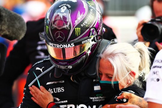
Hey, Caro, can you please introduce us to that sweet beau, Lewis Hamilton?? He's a speed driver, right??
lemme talk about this champ and beautiful man — he is a must-know.

lewis hamilton is a speed driver: in fact, the best racer in the world. with the fastest formula 1 lap in all history, and: if he wins this season (which has just started last week, your timing to get into this is perfect), lewis can boast a whopping 8 world championships. in short: you’re asking about the right guy. let’s go.

so i repeat, he won seven years (yeah, he’s a capricorn). which equals the current record holder, mister michael schumacher himself, i’m sure you heard of him. so, about time all the world knows more about this stunner as well, sir lewis carl davidson hamilton

lewis is so good and works his butt off so hard, he has more titles — he was knighted last year — and gigantic trophies than he can carry. since we’re talking f1 where drivers have to be light and agile inside the car, lewis is of course gloriously tiny, 5′7. so, the exhausted british short king on your news and twitter feed who walks around like this on a podium after doing 300 kilometers+ is dead sure to be him. can’t miss the guy.

wanna know more? lewis is an allrounder in every field and does everything what people say he can’t. unless he’s not somewhere modelling clothes being gorgeous (he collabs with tommy hilfiger for sustainable unisex collections)...

... taking care of his nieces or godson steve which regulary melts the f1 community...

... is using his favorite little scooter...

... showing up at the met gala as one of the few guys who really get the gist looking beautiful as always...

... playing with his cute crinkly bulldog roscoe who’s always by his side and F1′s most famously beloved driver pet...


...doing the absolute most with his activism and veganism — he even created his own plant-based restaurant chain — because as i said he’s a king, lewis never shies from taking a stand even if a lot of people hate him for it because it’s a white-dominated sport...


...or posts inspirational things that make you believe in yourself...

...lewis drives, can you guess:

for mercedes!
the #1 team which usually only red bull can currently challenge. which means he has a sexy, shiny, impossibly fantastic car — with his lucky number 44, that’s how you can spot it — that is almost always leading the field. if you see this on your sports tv channel on a saturday (qualifying) or sunday (race day), i assure you it’s lewis. 44, glossy black car, pole position, check. a great talent in a perfect car equals one hell of a winning streak.

— but if you ask me, the man is even sexier, cooler, and cuter and the real highlight. just so we’re clear on this. lewis is always a breath of fresh air. believe it or not: this guy is 35 (!!) years old. needless to say, prettiest fashion icon on the grid. and yes, he has amazing hair and tattoos.


killing it. 👍 lewis brings a presence to the grid.

who’s he making proud, then? now some notes on his circle, the people you spot him with.
family hamilton first, who do we have:

dad anthony, lewis’ former manager. at one point he worked 4 jobs so lewis could start his career in karting. carmen, his mom. linda, his stepmom, pictured below. his brother, nicolas, also a race driver. nicolas has a disability (cerebral palsy), he competes in the uk touring championship with a modified car since 2015. like nicolas, lewis is the only (!) black driver in his tournament and they are frequently sending out very important messages about it.

now for mercedes: accompanied he is by the calm and collected finnish valtteri bottas as his taciturn team colleague and runner-up champion. valtteri is the type to sit in a north pole sauna, lewis is ever-active, so they balance each other well. no trouble there, they’re a cool duo.

and i’m not kidding, valtteri is truly finnish. this is his twitter, summarized:

add the smart, austrian mercedes boss toto wolff who has the best height difference to him. these two get along very jokingly. where lewis goes, toto is not far. very dynamic duo, this is the success factory of formula 1.

while his most competitive love-hate relationship sparking the famous ‘silver war’ was retired german champion nico rosberg since day one. who came from priviledged backgrounds while lewis did not, they are the biggest team rivals of recent f1 times and people still talk about it. the ups and downs were huge but they sure had tremendous times as friends.

while the most smooth and consistent relationship — besides with roscoe — has got to be his bond with his whirlwind assistent/physio angela cullen!

lewis credits her for so much and treats her reveringly. you haven’t seen anything like this, they are glued to each other.
lewis’ off-grid relationships come and go because he’s so busy, colleagues come and go all the time, but angela stays a constant. so if you’re asking about who the most important woman on the circuit is to lewis, that is his personal angel(a) indeed. look how wholesome.


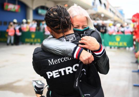


i mean, a picture says it all.

last but not least. lewis’ best ever friend is german driver sebastian vettel (formerly ferrari, now aston martin, struggling a lot currently :/), former 4-time world champion. these two are THE match made in heaven and support goals. seb has the humor, lewis has the cheekiness, seb is a father, lewis has his uncle duties, it just fits. everybody should have a seb to their lewis.

(^this is vet having hurried to be the first one to congratulate lewis on his latest championship win)

so now you know more about sir lewis carl davidson hamilton! you will hear a lot from him this season, he’ll continue to champion many a cause, and be in the fast lane as always.

90 notes
·
View notes
Text
A Life Through the Lens
The Telegraph- June 6, 2011
As a collection of Linda Eastman's best photographs - as chosen by her family - goes on display in a London gallery, her daughter Mary McCartney tells Roya Nikkhah that her mother's motto was always "Keep it simple"
In May 1968, Linda Eastman became the first female photographer to feature on the cover of Rolling Stone magazine with a portrait of Eric Clapton. Less than a year later, she married one of the most famous men in the world to become Linda McCartney, and was thereafter known primarily as a Beatle’s wife.
“No one knew I was a photographer,” Linda once said. “When I married Paul, to [the fans] I was an American divorcee.”
McCartney died of breast cancer in 1998 aged 56, but her family are determined to ensure that her accomplishments as a photographer live on. For the last year, McCartney and his daughters Mary, a photographer, and Stella, a fashion designer, have sifted through Linda’s archive of more than 200,000 images, to collate Linda McCartney: A Life In Photographs, a book of some of her best work, accompanied by limited-edition prints.
The retrospective encapsulates her work as a leading music photographer, with iconic images of Jimi Hendrix, Jim Morrison, the Rolling Stones and, of course, The Beatles. But while it covers studio sessions with the likes of Stevie Wonder and Michael Jackson, it is also an intimate family album, with touching and many previously unseen pictures of the McCartneys raising their young children – Heather, Mary, Stella and James – at their farm in Scotland, on holiday in the Caribbean and at home in London.
Mary, who talks openly of her mother’s huge influence on her own career, is wandering around the cavernous white space of the Phillips de Pury gallery in London, where a selection of the prints are being hung, among them Linda’s famous photograph of a baby Mary peeking out from inside her father’s sheepskin jacket, which later illustrated the cover of his first solo album, McCartney, in 1970. “It looks so cosy, doesn’t it?” says Mary. “That’s how they’d go riding together – zip me in there and go for a little horse ride.”
Mary speaks movingly of her regret that her mother’s work wasn’t more widely recognised, so often overshadowed by the McCartney name. “She didn’t self promote or do lots of interviews, she never blew her own trumpet, and so she was often pigeonholed as a celebrity who dabbled in photography, which isn’t how it was at all.
“People didn’t realise that it was through her photography career that Mum and Dad met and that she was a photographer way before she had a family with Dad. But she wasn’t that bothered about what other people thought about her, it’s more probably us, her kids, who got irritated.”
Linda’s break came in 1967, when she was the only photographer allowed on to a boat on the Hudson River in New York where the Rolling Stones were performing. The candid photographs of the band at work and at play paved the way for commissions from Rolling Stone and other leading glossy magazines.
“People know quite a lot about her Sixties work, but Stella, Dad and I were interested in showing a broader spectrum, as well as those iconic images,” says Mary. “When she got married, she stopped being a jobbing photographer doing all the bands in New York. When she moved to London, she carried on with a very similar style and eye, but her subject changed. She was still photographing the people around her, which were her family and friends.”
A previously unseen photograph of Twiggy shows the young model relaxing off duty during a visit to Linda in London shortly after Mary was born in 1969. Another shows her young brother, larking around with McCartney in a bubble bath in 1983. “This one really shows her style,” says Mary. “Mum’s motto was always 'keep it simple’ which I stick to. She would never pose us all.
“With Dad and James in the bubble bath, she would just walk by and have thought visually that was quite strong and have taken the picture. She’d always have the camera on her so these are all like pictures she’d take as she was wandering through life.”
Mary moves towards a black-and-white picture taken at their farm in Scotland in 1982, showing Paul standing on a fence in his dressing gown, while Stella crouches on the ground and a young James, in his pyjamas, leaps off the family Land Rover. “This one is a genius, but she won’t have set it up – it will have just been everybody there. That fence was really wobbly and we used to have a competition to see who could walk the longest along it before you fell off. It wasn’t very stable. I never, ever got all the way along.”
Mary remembers watching her mother at work; her subjects would barely register they were being captured on film. “She would have the camera with her but wouldn’t hold it up in your face for a long time, so she wouldn’t be clicking all around you – she’d chat with you, take a snap, put the camera down, so you didn’t have time to start posing and feeling self-conscious. She never intimidated people.”
Linda herself spoke of always trying to penetrate beneath the “veneer” of celebrity subjects like Jim Morrison, lead singer with The Doors, and her friend Jimi Hendrix. “People could confide in her, because she wasn’t a gossip,” says Mary. “Hendrix in particular became a bit disenchanted [with photographers] because they always wanted him to 'perform’ – be all rock and roll – but she was friends with him because she loved his playing, so he didn’t need to be like that with her.”
I wonder if Linda ever regretted relinquishing her successful career in New York after marrying Paul? “Talking to Mum, she had become a bit disenchanted with the music industry by that time,” says Mary. “She found that as the years went on, there were more lawyers and PRs around the record companies, who were more and obstructive.
“She was also being asked to get much more sensationalist pictures, which she wasn’t interested in doing. She told me people would try and get her to go to Andy Warhol’s Factory and take pictures of people shooting up, which wasn’t her style. It was enough to make her feel uncomfortable. She needed to be enjoying it to stay stimulated, so I think she’d got to a point where she’d done her bit.”
One of Mary’s favourite works in the gallery is Whisky and Milk, Scotland 1978, a black-and-white shot of an empty whisky bottle and a milk bottle side by side on the kitchen table. “I love that and it’s one of Stella’s favourites, too. It shows her quirky side and her sense of humour. She always thought that was quite entertaining, you know, the contrast of both bottles equally enjoyed by different age groups.
“This is one of my favourites too,” she says, moving over to Paul’s Feet, where McCartney grips a glass with his feet, toe-nails varnished in rainbow colours. “It kind of says a lot about Mum and Dad.”
Mary published From Where I Stand last year, a retrospective book accompanying an exhibition of her own work. While editing the book and show, she noted the similarity between some of her pictures and her mother’s. “I looked at some shots and thought, 'that was a picture Mum could have taken,’ but the difference between us is that she wouldn’t care about missing a shot, whereas if I see something and I haven’t got a camera, I can get quite stressed.
“She was very chilled, she’d say: 'It’s a soul camera moment’. Now, if I get annoyed that I’ve missed a shot, I try and think, 'Don’t worry, it’s on the soul camera’. I say it and don’t really mean it, whereas Mum could really let it go. She had everything captured in her soul camera.”
* Linda McCartney: Life in Photographs is at Phillips de Pury (Howick Place, London SW1, www.phillipsdepury.com) from June 7 to June 16. The book is published by TASCHEN and available for £44.99 at www.taschen.com
#linda mccartney#Mary McCartney#Photography#article#Paul McCartney#Stella McCartney#james McCartney#jimi Hendrix
4 notes
·
View notes
Text
Reviews 031: Uneven Paths
I’ve been sitting with this one for a few weeks, taking time to reflect on the scope and magic of the music, and on our collective luck in having Raphaël Top-Secret and Jamie Tiller dig up all these wonderful treasures. In releasing Uneven Paths: Deviant Pop from Europe 1980-1991, Music From Memory have done for avant-garde and weirdo European pop what they did for outsider Brazilian kosmische/ambient with Outro Tempo, unearthing hitherto unexplored scenes and giving some long deserved appreciation to artists and songs that were almost lost to the sands of time. The LP packaging is marvelous and includes interesting historical information in the liner notes, some of it nigh unbelievable, that helps establish context and even a narrative for these sonic gems and how they were (re)discovered. And it has been fascinating reading other reviews and seeing the huge variation in what people like and don’t like, which speaks to the incredible range and eclecticism of the music. I have my own preferences of course, and this is reflected in the fact that I chose only to review three or four of my favorite songs from each side. But the whole journey is worthwhile and each song is necessary to gain the full picture of this nearly lost era of popular music.
Uneven Paths: Deviant Pop from Europe 1980-1991 (Music from Memory, 2018)
Nightfall in Camp’s “Cada Día” is the perfect introduction, built from soft chords, a slow machine beat, and harmonically rich noise textures. The vocals are softly spoken, and meditative flute adds to the horizontal feel…everything floating in deep blue water. Tony Hymas’s “Pictures of Departure” starts with airport samples, hypnotic tropical mallet instruments, and deep soothing vocals speaking of mundane and melancholy travel experiences. Then almost out of nowhere, we drop into these neon lit downtempo bliss-outs with pounding drums, romantic and dreamy looped vocals, and climactic glossy synthesizers. It sounds remarkably like Chromatics, only decades earlier. Two of the compilation’s more anthemic cuts come at the end of the A-side, starting with “Listen Over the Ocean” by Violet Eves. Sitting somewhere between dark Portishead epicness in the low slung downbeat groove and that Siouxsie Sioux post-punk fire in the vocals, we have vibraphone dropping cool crystalline atmospherics aside melodramatic strings and glassy guitar. And Miko & Mubare’s “Komoma Ya-Ya-Ya” prowls on a mysterious groove, swaggering, dark, and hypnotic, as squelchy bass synth trades off martial riffs with bluesy psych guitar. It’s super rhythmic and vibin’, especially once the ritualistic chanting enters, celestial and atmospheric, before climaxing with a minimal downtempo nod-out and deep vocals imploring…demanding…”we all must speak in one tongue!”

Perhaps my favorite moment comes during the B-side, with John Makin & Friends’ “No Lie”. Starting on lilting psychfolk chords, an airy rhythm, and acid soaked fuzz soloing, this could easily be some lost Smith & Mudd track (think “Dogwood” from Gorthleck). Yet once the vocals enter, we shift back a few decades to the wide-eyed California infused folk-rock of Morrison Kincannon. Sparkling and kaleidoscopic guitar interplay, smooth electric piano, lyrics of lost love, and a totally freaked out echo guitar solo…brilliant. Elsewhere, the club vibrations are notched up. Nonobstant’s “Jessica” features smooth jammy electric piano over a stuttering and stoned funk swing, bass in stomping ascent, drums sizzling on hats and snare. The vocals are infectious, sometimes soaring over the mix, other times following the rhythm mesmerically. At times, the singing drops out, giving way to jammy sections of dueling guitar and electric piano soloing. Then there is the Kraftwerkian electro-boogie glory of “Depression” by Sound On Sound. Pocket calculator synthesizers blaze with sci-fi flare over a propulsive groove, accented by brass fanfares and catchy midnight diva chanting. The drums are cavernous and pounding, surrounded by bongos, sparkling chimes, and tropical mallets, everything working towards balearic dancefloor fire.

Side C starts off in a jazz leaning afro-groove with “What You Are” by Pete Brandt’s Method. Plucked contrabass ambulates over a hypnotic hand percussion shuffle, the mix embellished with moody organ chords, cinematic strings, sax solos, and fragile multi-tracked vocals. “Tambo Machay” by Lost Gringos seems like it could fit on any number of the amazing African/Middle Eastern psych records unearthed by Sublime Frequencies, yet it’s just a couple of German weirdos jamming away. The drum groove is primitive and esoteric, as playful stoned vocals and Floydian blues riffing alternate with furious and exotic Omar Khorshid surf guitar shredding. This side also has Brenda & The Beachballs’ “Dancing’ Thru the Night”. This is a highlight of the whole comp for me, featuring a body moving electro-boogie beat, fluttering melodica spaciness, and Brenda’s vibed out atmospheric vocals. There are spacefunk guitars with psychedelic echo trails firing through the mix as the hypnobass and cosmic fx swirl around the body-moving rhythms. And in a similar mode, though decidedly more sexual and sleazy, is Patrick Forgas’ “Sex Move”. Deep vocals, up front and too familiar, sit atop bright riffing guitars, a pounding bassline, and vibrant funk rhythmics. Late night string synths generate atmosphere as noir saxophone and epic brass themes ring out, joined by sci-fi pads and liquid spaceguitar.

Though it’s the penultimate track, Härte 10’s “Happy New Year” could easily work as an epic closer. After starting with playful tribal echo drums, weird vocoder effects, and airy distorted piano, we take a triumphant turn towards the ecstatic as sleigh bells and starlight chimes float with kaleidoscopic piano and majestic choral synthesizers. It’s like some optimistic march towards the heavens, totally earning its name. “The Whole City Between Us” by Bill Nelson’s Orchestra Arcana is similarly blissed out. Shimmering new age harp tones generate colorful fantasy atmospheres over a gated hard-hitting beat and sunshine electronics. There is something almost Broadcast-like in the childlike-yet-psychedelic nature of the melodies. One of the comp’s most balearic moments comes via Xavier Jouvelet’s “Oeuf en Clock”. This is a strange downtempo fusion odyssey, mixing organic and electronic textures in captivating ways. Tick-tock electronic rhythmics are accented by earthy shakers and jazz cymbals, vocal synthesizers solo alongside smokey and emotional soul singing, washes of mellow and oceanic pads underly bright splashes of aquatic electronics and shimmering chimes, and affecting Spanish guitar enters towards the second half, teasing out cinematic sunset warmth. And there is also the soulful buttery sax jam “Minéralité” by Lou Blic. The drums have a jaunty groove and occasionally we detour into weird sections of voice samples morphed into cerebral patterns alongside sparkly percussive effects, before returning to the head-nodding, blazing saxophone groove out.
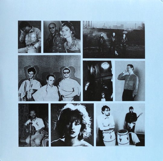
(all images taken from my personal copies)
#uneven paths#music from memory#deviant pop#europe#1980-1991#raphaël top-secret#jamie tiller#tako reyenga#brenda ray#brenda and the beachballs#outro tempo#nightfall in camp#sun lounge#music reviews#vinyl reviews#album reviews#vinyl#lou blic#xavier jouvelet#miko & mubare#bill nelson's orchestra arcana#avant garde#pop#balearic#pete brandt#lost gringos#violet eves#john makin#tony hymas
3 notes
·
View notes
Text
Choosing Your Wedding Photographer - Photography Styles Explained
Choosing The wedding Photographer - Wedding Photography Styles Explained
You've chosen your date, booked your venue and started searching for dresses. Now you are looking for a marriage photographer. There are plenty of types of photography available, even though people in the industry might know these styles inside out they be confusing for couples. Remember too that not only are you currently picking a type of photography, but various kinds of photography could make different demands in your time in your big day. wedding-venues-eastern-shore-Maryland
Picking design for photography you would like at the wedding boils down to three things. What style of images you want, just how long you need to spend with a photographer in your wedding day, and most importantly of all your personal personality and comfort in front of the camera.
There are many different photography buzzwords available. Vintage, editorial, artistic or contemporary are just a few. Perhaps more confusingly they are utilised by different photographers diversely. Ultimately it's up to couples to ask plenty of questions and do lots of research before selecting a photographer, and also to depend on seeing full set of photos from completed weddings Don't rely on the very best five or six shots from the 3 weddings to make a choice.
Photography styles are a compromise between producing fantastic work and keeping to a timetable. A photographer might produce brilliant photos, but if he adopts too much time to create them you probably won't enjoy the experience.
Traditional (or Posed) Wedding Photography
Many people consider traditional wedding photography as endless stuffy group photos where everyone looks stiff like a board. Worse still, the various collections of people seem to continue forever. I believe there's a fashion to be recorded on traditional photography, but the actual working framework is still the same for many professional wedding photographers. The photographs may be more stylish but the actual experience at the time for that bride and groom is very similar.
There is always a downside between your kind of work a photographer does and the time that it requires to shoot it. More formal posed photographs will take longer to set up and get. Any photographer who produces artistic posed work will need a certain amount of time to produce his best work. It is important that you find out how much time he will need, and work out how it will squeeze into your day. There are photographers who spend a couple of hours on formal shots. Make sure you are pleased with giving over that quantity of time in your big day. If you're not that comfortable in front of the camera you may find this kind of photography harder. A great photographer should be able to help you and set you at the ease however for many individuals it may still seem a bit daunting.
Reportage Wedding Photography (Wedding Photojournalism)
If traditional is all about posed photographs, then reportage photography may be the opposite. It depends on capturing moments as they happen, and it is a lot more like a fly on your wall documentary. This type of photography implies that the photographer spends the majority of his amount of time in the backdrop, and thus has become ever more popular with couples. Weddings are also increasingly less formal than they was once. Documentary wedding photography demands a different skill set from traditional photography so you have to make certain that your photographer has the correct photographic background can show you full weddings to back this up. Wedding photojournalism is much more about a complete group of pictures from the whole day than the usual set of twelve highlights. There are photographers available who'll jump on the latest bandwagon to gain business, but still use the very same style they always have. Wedding photojournalism is about anticipation and finding yourself in the right place in the right time. It's not about closely directing people, so it puts many traditional wedding photographers outside of their skill set. There are several less ethical photographers who'll use the latest buzzwords to improve their internet search engine presence, but still shoot the same tired old pictures.
If you are reticent about having your photo taken, wedding photojournalism is probably your very best choice. The photography happens without you actually realizing and you'll look your natural best.
Although both of these approaches may appear polar opposites, in reality most wedding photographers will offer a mix of both of these styles. There are hardly any wedding photojournalists who don't shoot a minimum of some formal photographs and traditional wedding photographers will shoot informal pictures as well. Find out what proportion of every a photographer likes to shoot, and still ask them the things they prefer to shoot probably the most - odds are this is what they are best at.
Vintage Wedding Photography
Vintage wedding photography is a style that has been coming into vogue recently, but in lots of ways its a tough one one to quantify. Vintage often means anything from using old film cameras during some of the wedding to just a different method of post production to create 'vintage' looking digital files. There are some great photographers available, but bear in mind that if you are receiving files which are heavily edited in a certain style, you take the chance of your photos looking rather dated a few years later. If I was getting a vintage style photographer, Personally, i want at least some of the wedding shot on film, I am not a huge fan of faking things. Of course inquire, see examples making an educated decision.
Editorial Photography
This wedding genre is inspired through the fashion editorials of glossy magazines, at it's best it may produce fantastic high-end images. For it successfully on a big day the photographer needs to be highly organised, and would probably require an assistant to assist setup some of the shots in advance, although that will rely on his or her style. Do your research to make sure that time requirements for this kind of shoot participate in your plans. If you really like this kind of photography but don't wish to devote a lot of time into it on your big day, consider booking another photo session following the wedding. Often describes like a trash or cherish the dress shoot, a separate photo session may be the best way to obtain the big day you want and also the photographs you'll love without losing an enormous slice of your wedding event. Additionally, it means that both you and your photographer can select the ideal time for the best light and you have scope for rescheduling if it's pouring with rain. In lots of countries, particularly the US, top end wedding photography is evolving towards three shoots: the engagement shoot, the wedding day, as well as an editorial session. Don't necessarily think that it all needs to be done in eventually.
Artistic or Fine Art Wedding Photography
Essentially an evolution of traditional wedding photography, this kind of photography offers a contemporary take on the traditional group of posed photographs, although these are both terms that have been somewhat over used by the photographic community, so again do your research. At its best this genre can establish moving romantic images, but some photographers can over use the same poses, so it can feel a little impersonal. Ask to see plenty of shoots and do not hesitate to input your own ideas at your pre-wedding meeting. wedding-venues-eastern-shore-Maryland
1 note
·
View note
Text
Just how to Create an Attractive Ecom Product Pages That Converts
Product web pages are the last point your consumers see prior to they make their acquisition.
Or, if points do not go as prepared, the last point they see prior to they struck the leave.
Let’s damage down 6 shops from 6 various specific niches, each with sensational item web pages. We’ll place their item web pages– every one of which were developed with Shopify– under a microscopic lense to see what they’re doing that you can duplicate at your shop.
The Standard Product Page
Chances are that whatever layout theme you utilize for your Shopify shop, the item web page backend will certainly look something such as this:
That’s basically just how item web pages appear of package: picture on the left; summary as well as Add To Cart switch on the right; optional things like social switches, amount selector, and more.
When web pages like that are pressed online, they will certainly basically resemble this:
Nothing incorrect with that said. Every one of the fundamentals are right there. Numerous photos, shade alternatives, as well as (certainly) the Add To Cart switch.
But allow’s take a look at just how a handful of innovative shops transform basic items web pages right into eye-popping Product Pages.
Allbirds
Allbirds, which offers footwear, developed the item web page we checked out above. You understand, the normal-looking one.
But Allbirds’ item web pages are just regular if you do not scroll down. As soon as you dive in, you locate several of the very best item web pages around.
There is great deals to fawn over below. Off, Allbirds sticks to the old saying that “type complies with feature.” Particularly, they have an item summary that fits nicely in the room given, alongside the included picture, without interfering with the proportion of the design.
But there is no lack of information! Since when you click Learn More, you are rerouted to a support lower on the item web page.
That’s where you’ll locate a substantial, vivid area committed to the information that do not fit easily ahead:
There is no guideline that states item summaries need to be restricted to that little space over the cart switch. Relocating those information down offers Allbirds the very best of both globes: Tons of highlighting the item, as well as a design that is instinctive. (This design additionally guarantee that the Add To Cart switch remains pinned over the layer. Which is where it belongs.)
Another incredible feature of Allbirds’ item web pages is the audacious video clips that they insinuate:
When you click that “picture,” you are dealt with to a video clip as opposed to an additional item image. The video clip is straightforward– it’s simply a couple of secs. No Emmy elections below. These kind of touches can transform your item web pages.
A pair extra points to mention with Allbirds’ item web pages.
Want to make your item web pages remarkable? Just how around a large hi-def picture of an unusual pet:
Then there’s a collection of advantages that vary from convenience to ease to ecological problems, each with its very own awesome symbol:
Social media connects on an item web page? Yeah, why not:
See extra: Allbirds item web page instances
Men’s Wool Runners
Men’s Tree Runners
Women’s Wool Loungers
Hem
Next up is Hem, a Scandinavian furnishings brand name. Hem uses some smart methods for transforming item web pages right into an experience all their very own.
Alright, below is the fundamental item web page– be the above-the-fold component. If somebody had actually currently determined to buy, they can proceed as well as put their order immediately.
Hem has their very own method of being cost-effective with added information. As opposed to connecting to various other components of the item web page, they make use of a collapse attribute. This …
… becomes this:
This design makes it so you do not need to scroll to obtain any type of crucial details. Naturally, if you do scroll down, points obtain quite intriguing.
These are the initial 2 photos you face: one is a video clip, the various other a cactus.
I can not remember ever before seeing a cactus remaining on a sofa. That stated, I have not ignored this sofa cactus because I saw it. It’s simply … amazing. A costly sofa on the one hand– a sofa that flaunts all the course you would certainly anticipate from premium Scandinavian layout– as well as a little cactus on the various other hand. The quirkiness is successful in developing a bizarrely remarkable scene.
And after that the video clip. Once more, this is not movie festival-level videography. It is relocating photos, as well as individuals enjoy relocating photos. The 26- 2nd video clip reveals the sofa from myriad angles as well as shows just how simple it is to build.
vimeo
After that, extra photos– huge, lovely photos– with a dashboard of composed word to provide consumers any type of information they could be missing out on.
See extra: Hem item web page instances
Palo 2-Seater Chaise Left
Udon Chair
All Wood Stool
Pure Cycles
Bike designer Pure Cycles includes greater than a couple of awesome components right into their item web pages.
Let’s absolutely no in on 4 refined however fantastic touches.
1. This little heart
This heart allows you include something to your wishlist. This is a wonderful touch for a couple of factors: First off, it makes future acquisitions easier, which is constantly an advantage. Second, it attracts individuals to dish out their get in touch with information, making it possible for Pure Cycles to increase a future acquisition with e-mails as well as price cut codes.
2. This Messenger choice
This can be extremely hassle-free for consumers. It additionally possibly does not harm Pure Cycles’ ove Facebook initiatives to have consumers involving with the social media sites system on item web pages.
3. Much more material!
Pure Cycles offers you a direct that there is added web content listed below the layer of this item web page. Simply in instance anybody erroneously assumed that this web page finished as well as began with a basic acquisition.
4. Wonderful video clip
Finally, the video clip ingrained amongst the item images.
Click that, as well as you obtain this. Absolutely nothing incorrect with 50 secs of 2 fine-looking individuals taking pleasure in life with their Pure Cycles bikes:
youtube
The remainder of the Pure Cycles item web page is naturally gorgeous. Pure Cycles lots it up with client evaluations, images, social media sites connects, as well as delivery information– things that absolutely would not have actually fit up there alongside the Add To Cart switch.
And for those food craving some concrete information, Pure Cycles has you covered:
See extra: Pure Cycles item web page instances
Road Bike
Pure City Bike
Urban Commuter
Original Plus
A Quick Word About Product Page Videos
Now, if you simply enjoyed that Pure Cycles video clip, you could be believing, “How the && %$ ^ am I mosting likely to produce something like that?”
No question, that video clip is quite glossy. Things like that does not show up out of slim air.
But video clips aren’t difficult!
Don’t think me? Allow’s intend that Oberlo began marketing sweatshirts. Sweatshirts are a product like that can absolutely utilize a video clip on the item web page– so we prepared one up! This was developed in around 45 mins, from recording to modifying to export to post.
youtube
Sure, that video clip will not obtain any type of applause. If you aren’t passing away to get one of those sweatshirts, as well as you’re forgiven. This isn’t simply something for huge brand names. The obstacle to access has actually been lowered to having some solid coffee as well as an apple iphone.
Okay, going on to our following shop.
Master & Dynamic
Master & & Dynamic offers premium sound devices. The top of the item web page is reasonably regular …
… however after that points obtain downright classy as you check out.
Here is that Master & & Dynamic item web page listed below the layer– a supposedly timeline of attributes:
This is quite fantastic: utilizing the layout of the real item to sustain the design. Certain, the earphone cable is specifically excellent.
Towards all-time low, after you’ve been dealt with to a collection of exciting images, you obtain the technological specifications.
See extra: Master & & Dynamic item web page instances
ME05 Earphones
MW60 Wireless Over-Ear Headphones
Wireless Speaker
Sunday Supply
Sunday Supply, an Australian shop that offers coastline umbrellas, goes huge with its item web pages. Like, essentially huge.
They overlook the basic “item left wing, information on the right” design as well as rather go for it with massive photos:
Even the present card item web page leads with a substantial picture:
You do not need to go much to locate the Add To Cart switch, which rests right listed below this image. (Sunday Supply’s switches claim “Add to bag” since, you understand, it’s beach-themed.)
You after that find some item information that are composed in an irresistibly lovely voice, offering the umbrella human top qualities like being “a fan of lengthy days in the sunlight as well as a terrific buddy.”
Other information like “Folds to 1.2 M X 0.2 M X 0.2 M” or “~ 7.0 KG in weight” can be located reduced on the web page, to ensure that’s all thereeng. Yet why not lead with the enjoyable things?
As any type of store marketing coastline equipment would certainly be important to do, Sunday Supply additionally reveals its items out in the wild. When you can utilize the sea as your background, why not?
See extra: Sunday Supply item web page instances
Natural Instinct Beach Umbrella
Gift Card
Animal Kingdom Beach Umbrella
Studio Neat
Studio Neat’s tool storage space as well as billing systems have item web pages that are equally as elegant as the trendy things they’re marketing.
The framework of the web page is basic however incredibly carried out. Both sentences of summary message allow you picture just how the product would certainly take a look at your area– “On your night table or at your workdesk …”– as well as touches like the round picture provide it some pop.
Just listed below that, we face a video clip that is refined as well as tidy, however absolutely nothing that would certainly call for Hollywood knowledge.
Then the item web page becomes an aesthetic scenic tour of the attributes that you can anticipate if you got this docking terminal. All the while, there are accents of laid-back message (” So regardless of just how you roll, you’ll have an area for your gadgets”).
Finally, the item web page consists of some shots of this phone dock around your house as well as workplace.
The styles of Studio Neat’s item web pages differ, as well as they’re all wonderful. Below, for instance, are a couple of shots from the item web page for a touchscreen pin. This composition lesson is both aesthetically engaging as well as interesting.
Meanwhile, this closeup of the pen at work actually makes you intend to experiment with one.
See extra: Studio Neat item web page instances
Material Dock
Cosmonaut
Apple TV Remote Stand
Conclusions on Product Pages
These item web pages all share a couple of points alike. Allow’s appealed them tl; dr design.
There’s great deals of room– utilize it
These item web pages do not allow pixels go to squander, neither do they avoid making the customer scroll a bit. Item web pages were birthed in papers as well as publications, where room was priceless. Online, you do not have to select in between that added photo versus that added little bit of thorough details. Utilize everything.
Videos as well as massive images
We’ve discussed video clips. You need to do video clips! And also certainly do not fail to remember the images. These web pages have beautiful photos. If you’re a dropshipper, that indicates you should not simply utilize your vendors’ images. Order your items, as well as take your very own. You do not require to be marketing bikes or state-of-the-art sound equipment for your item images ahead to life.
Conversion is still feasible on top of the web page
These jaw-dropping item web pages will certainly aid transform individuals that are on the fencing regarding getting. That’s why we see images as well as video clips as well as expensive designs. Do not fail to remember regarding the individuals that currently have their credit scores cards out! {If somebody prepares to get, do what these shops do as well as make it feasible to buy things without looking or scrolling.|Do what these shops do as well as make it feasible to buy things without looking or scrolling if somebody is all set to get.}
The post Just how to Create an Attractive Ecom Product Pages That Converts appeared first on Daily Job Killer.
source http://dailyjobkiller.com/ecom-product-pages/
0 notes
Text
Just how to Create an Attractive Ecom Product Pages That Converts
Product web pages are the last point your consumers see prior to they make their acquisition.
Or, if points do not go as prepared, the last point they see prior to they struck the leave.
Let’s damage down 6 shops from 6 various specific niches, each with sensational item web pages. We’ll place their item web pages– every one of which were developed with Shopify– under a microscopic lense to see what they’re doing that you can duplicate at your shop.
The Standard Product Page
Chances are that whatever layout theme you utilize for your Shopify shop, the item web page backend will certainly look something such as this:
That’s basically just how item web pages appear of package: picture on the left; summary as well as Add To Cart switch on the right; optional things like social switches, amount selector, and more.
When web pages like that are pressed online, they will certainly basically resemble this:
Nothing incorrect with that said. Every one of the fundamentals are right there. Numerous photos, shade alternatives, as well as (certainly) the Add To Cart switch.
But allow’s take a look at just how a handful of innovative shops transform basic items web pages right into eye-popping Product Pages.
Allbirds
Allbirds, which offers footwear, developed the item web page we checked out above. You understand, the normal-looking one.
But Allbirds’ item web pages are just regular if you do not scroll down. As soon as you dive in, you locate several of the very best item web pages around.
There is great deals to fawn over below. Off, Allbirds sticks to the old saying that “type complies with feature.” Particularly, they have an item summary that fits nicely in the room given, alongside the included picture, without interfering with the proportion of the design.
But there is no lack of information! Since when you click Learn More, you are rerouted to a support lower on the item web page.
That’s where you’ll locate a substantial, vivid area committed to the information that do not fit easily ahead:
There is no guideline that states item summaries need to be restricted to that little space over the cart switch. Relocating those information down offers Allbirds the very best of both globes: Tons of highlighting the item, as well as a design that is instinctive. (This design additionally guarantee that the Add To Cart switch remains pinned over the layer. Which is where it belongs.)
Another incredible feature of Allbirds’ item web pages is the audacious video clips that they insinuate:
When you click that “picture,” you are dealt with to a video clip as opposed to an additional item image. The video clip is straightforward– it’s simply a couple of secs. No Emmy elections below. These kind of touches can transform your item web pages.
A pair extra points to mention with Allbirds’ item web pages.
Want to make your item web pages remarkable? Just how around a large hi-def picture of an unusual pet:
Then there’s a collection of advantages that vary from convenience to ease to ecological problems, each with its very own awesome symbol:
Social media connects on an item web page? Yeah, why not:
See extra: Allbirds item web page instances
Men’s Wool Runners
Men’s Tree Runners
Women’s Wool Loungers
Hem
Next up is Hem, a Scandinavian furnishings brand name. Hem uses some smart methods for transforming item web pages right into an experience all their very own.
Alright, below is the fundamental item web page– be the above-the-fold component. If somebody had actually currently determined to buy, they can proceed as well as put their order immediately.
Hem has their very own method of being cost-effective with added information. As opposed to connecting to various other components of the item web page, they make use of a collapse attribute. This …
… becomes this:
This design makes it so you do not need to scroll to obtain any type of crucial details. Naturally, if you do scroll down, points obtain quite intriguing.
These are the initial 2 photos you face: one is a video clip, the various other a cactus.
I can not remember ever before seeing a cactus remaining on a sofa. That stated, I have not ignored this sofa cactus because I saw it. It’s simply … amazing. A costly sofa on the one hand– a sofa that flaunts all the course you would certainly anticipate from premium Scandinavian layout– as well as a little cactus on the various other hand. The quirkiness is successful in developing a bizarrely remarkable scene.
And after that the video clip. Once more, this is not movie festival-level videography. It is relocating photos, as well as individuals enjoy relocating photos. The 26- 2nd video clip reveals the sofa from myriad angles as well as shows just how simple it is to build.
vimeo
After that, extra photos– huge, lovely photos– with a dashboard of composed word to provide consumers any type of information they could be missing out on.
See extra: Hem item web page instances
Palo 2-Seater Chaise Left
Udon Chair
All Wood Stool
Pure Cycles
Bike designer Pure Cycles includes greater than a couple of awesome components right into their item web pages.
Let’s absolutely no in on 4 refined however fantastic touches.
1. This little heart
This heart allows you include something to your wishlist. This is a wonderful touch for a couple of factors: First off, it makes future acquisitions easier, which is constantly an advantage. Second, it attracts individuals to dish out their get in touch with information, making it possible for Pure Cycles to increase a future acquisition with e-mails as well as price cut codes.
2. This Messenger choice
This can be extremely hassle-free for consumers. It additionally possibly does not harm Pure Cycles’ ove Facebook initiatives to have consumers involving with the social media sites system on item web pages.
3. Much more material!
Pure Cycles offers you a direct that there is added web content listed below the layer of this item web page. Simply in instance anybody erroneously assumed that this web page finished as well as began with a basic acquisition.
4. Wonderful video clip
Finally, the video clip ingrained amongst the item images.
Click that, as well as you obtain this. Absolutely nothing incorrect with 50 secs of 2 fine-looking individuals taking pleasure in life with their Pure Cycles bikes:
youtube
The remainder of the Pure Cycles item web page is naturally gorgeous. Pure Cycles lots it up with client evaluations, images, social media sites connects, as well as delivery information– things that absolutely would not have actually fit up there alongside the Add To Cart switch.
And for those food craving some concrete information, Pure Cycles has you covered:
See extra: Pure Cycles item web page instances
Road Bike
Pure City Bike
Urban Commuter
Original Plus
A Quick Word About Product Page Videos
Now, if you simply enjoyed that Pure Cycles video clip, you could be believing, “How the && %$ ^ am I mosting likely to produce something like that?”
No question, that video clip is quite glossy. Things like that does not show up out of slim air.
But video clips aren’t difficult!
Don’t think me? Allow’s intend that Oberlo began marketing sweatshirts. Sweatshirts are a product like that can absolutely utilize a video clip on the item web page– so we prepared one up! This was developed in around 45 mins, from recording to modifying to export to post.
youtube
Sure, that video clip will not obtain any type of applause. If you aren’t passing away to get one of those sweatshirts, as well as you’re forgiven. This isn’t simply something for huge brand names. The obstacle to access has actually been lowered to having some solid coffee as well as an apple iphone.
Okay, going on to our following shop.
Master & Dynamic
Master & & Dynamic offers premium sound devices. The top of the item web page is reasonably regular …
… however after that points obtain downright classy as you check out.
Here is that Master & & Dynamic item web page listed below the layer– a supposedly timeline of attributes:
This is quite fantastic: utilizing the layout of the real item to sustain the design. Certain, the earphone cable is specifically excellent.
Towards all-time low, after you’ve been dealt with to a collection of exciting images, you obtain the technological specifications.
See extra: Master & & Dynamic item web page instances
ME05 Earphones
MW60 Wireless Over-Ear Headphones
Wireless Speaker
Sunday Supply
Sunday Supply, an Australian shop that offers coastline umbrellas, goes huge with its item web pages. Like, essentially huge.
They overlook the basic “item left wing, information on the right” design as well as rather go for it with massive photos:
Even the present card item web page leads with a substantial picture:
You do not need to go much to locate the Add To Cart switch, which rests right listed below this image. (Sunday Supply’s switches claim “Add to bag” since, you understand, it’s beach-themed.)
You after that find some item information that are composed in an irresistibly lovely voice, offering the umbrella human top qualities like being “a fan of lengthy days in the sunlight as well as a terrific buddy.”
Other information like “Folds to 1.2 M X 0.2 M X 0.2 M” or “~ 7.0 KG in weight” can be located reduced on the web page, to ensure that’s all thereeng. Yet why not lead with the enjoyable things?
As any type of store marketing coastline equipment would certainly be important to do, Sunday Supply additionally reveals its items out in the wild. When you can utilize the sea as your background, why not?
See extra: Sunday Supply item web page instances
Natural Instinct Beach Umbrella
Gift Card
Animal Kingdom Beach Umbrella
Studio Neat
Studio Neat’s tool storage space as well as billing systems have item web pages that are equally as elegant as the trendy things they’re marketing.
The framework of the web page is basic however incredibly carried out. Both sentences of summary message allow you picture just how the product would certainly take a look at your area– “On your night table or at your workdesk …”– as well as touches like the round picture provide it some pop.
Just listed below that, we face a video clip that is refined as well as tidy, however absolutely nothing that would certainly call for Hollywood knowledge.
Then the item web page becomes an aesthetic scenic tour of the attributes that you can anticipate if you got this docking terminal. All the while, there are accents of laid-back message (” So regardless of just how you roll, you’ll have an area for your gadgets”).
Finally, the item web page consists of some shots of this phone dock around your house as well as workplace.
The styles of Studio Neat’s item web pages differ, as well as they’re all wonderful. Below, for instance, are a couple of shots from the item web page for a touchscreen pin. This composition lesson is both aesthetically engaging as well as interesting.
Meanwhile, this closeup of the pen at work actually makes you intend to experiment with one.
See extra: Studio Neat item web page instances
Material Dock
Cosmonaut
Apple TV Remote Stand
Conclusions on Product Pages
These item web pages all share a couple of points alike. Allow’s appealed them tl; dr design.
There’s great deals of room– utilize it
These item web pages do not allow pixels go to squander, neither do they avoid making the customer scroll a bit. Item web pages were birthed in papers as well as publications, where room was priceless. Online, you do not have to select in between that added photo versus that added little bit of thorough details. Utilize everything.
Videos as well as massive images
We’ve discussed video clips. You need to do video clips! And also certainly do not fail to remember the images. These web pages have beautiful photos. If you’re a dropshipper, that indicates you should not simply utilize your vendors’ images. Order your items, as well as take your very own. You do not require to be marketing bikes or state-of-the-art sound equipment for your item images ahead to life.
Conversion is still feasible on top of the web page
These jaw-dropping item web pages will certainly aid transform individuals that are on the fencing regarding getting. That’s why we see images as well as video clips as well as expensive designs. Do not fail to remember regarding the individuals that currently have their credit scores cards out! {If somebody prepares to get, do what these shops do as well as make it feasible to buy things without looking or scrolling.|Do what these shops do as well as make it feasible to buy things without looking or scrolling if somebody is all set to get.}
The post Just how to Create an Attractive Ecom Product Pages That Converts appeared first on Daily Job Killer.
Just how to Create an Attractive Ecom Product Pages That Converts published first on your-t1-blog-url
0 notes
Text
Just how to Create an Attractive Ecom Product Pages That Converts
Product web pages are the last point your consumers see prior to they make their acquisition.
Or, if points do not go as prepared, the last point they see prior to they struck the leave.
Let’s damage down 6 shops from 6 various specific niches, each with sensational item web pages. We’ll place their item web pages– every one of which were developed with Shopify– under a microscopic lense to see what they’re doing that you can duplicate at your shop.
The Standard Product Page
Chances are that whatever layout theme you utilize for your Shopify shop, the item web page backend will certainly look something such as this:
That’s basically just how item web pages appear of package: picture on the left; summary as well as Add To Cart switch on the right; optional things like social switches, amount selector, and more.
When web pages like that are pressed online, they will certainly basically resemble this:
Nothing incorrect with that said. Every one of the fundamentals are right there. Numerous photos, shade alternatives, as well as (certainly) the Add To Cart switch.
But allow’s take a look at just how a handful of innovative shops transform basic items web pages right into eye-popping Product Pages.
Allbirds
Allbirds, which offers footwear, developed the item web page we checked out above. You understand, the normal-looking one.
But Allbirds’ item web pages are just regular if you do not scroll down. As soon as you dive in, you locate several of the very best item web pages around.
There is great deals to fawn over below. Off, Allbirds sticks to the old saying that “type complies with feature.” Particularly, they have an item summary that fits nicely in the room given, alongside the included picture, without interfering with the proportion of the design.
But there is no lack of information! Since when you click Learn More, you are rerouted to a support lower on the item web page.
That’s where you’ll locate a substantial, vivid area committed to the information that do not fit easily ahead:
There is no guideline that states item summaries need to be restricted to that little space over the cart switch. Relocating those information down offers Allbirds the very best of both globes: Tons of highlighting the item, as well as a design that is instinctive. (This design additionally guarantee that the Add To Cart switch remains pinned over the layer. Which is where it belongs.)
Another incredible feature of Allbirds’ item web pages is the audacious video clips that they insinuate:
When you click that “picture,” you are dealt with to a video clip as opposed to an additional item image. The video clip is straightforward– it’s simply a couple of secs. No Emmy elections below. These kind of touches can transform your item web pages.
A pair extra points to mention with Allbirds’ item web pages.
Want to make your item web pages remarkable? Just how around a large hi-def picture of an unusual pet:
Then there’s a collection of advantages that vary from convenience to ease to ecological problems, each with its very own awesome symbol:
Social media connects on an item web page? Yeah, why not:
See extra: Allbirds item web page instances
Men’s Wool Runners
Men’s Tree Runners
Women’s Wool Loungers
Hem
Next up is Hem, a Scandinavian furnishings brand name. Hem uses some smart methods for transforming item web pages right into an experience all their very own.
Alright, below is the fundamental item web page– be the above-the-fold component. If somebody had actually currently determined to buy, they can proceed as well as put their order immediately.
Hem has their very own method of being cost-effective with added information. As opposed to connecting to various other components of the item web page, they make use of a collapse attribute. This …
… becomes this:
This design makes it so you do not need to scroll to obtain any type of crucial details. Naturally, if you do scroll down, points obtain quite intriguing.
These are the initial 2 photos you face: one is a video clip, the various other a cactus.
I can not remember ever before seeing a cactus remaining on a sofa. That stated, I have not ignored this sofa cactus because I saw it. It’s simply … amazing. A costly sofa on the one hand– a sofa that flaunts all the course you would certainly anticipate from premium Scandinavian layout– as well as a little cactus on the various other hand. The quirkiness is successful in developing a bizarrely remarkable scene.
And after that the video clip. Once more, this is not movie festival-level videography. It is relocating photos, as well as individuals enjoy relocating photos. The 26- 2nd video clip reveals the sofa from myriad angles as well as shows just how simple it is to build.
vimeo
After that, extra photos– huge, lovely photos– with a dashboard of composed word to provide consumers any type of information they could be missing out on.
See extra: Hem item web page instances
Palo 2-Seater Chaise Left
Udon Chair
All Wood Stool
Pure Cycles
Bike designer Pure Cycles includes greater than a couple of awesome components right into their item web pages.
Let’s absolutely no in on 4 refined however fantastic touches.
1. This little heart
This heart allows you include something to your wishlist. This is a wonderful touch for a couple of factors: First off, it makes future acquisitions easier, which is constantly an advantage. Second, it attracts individuals to dish out their get in touch with information, making it possible for Pure Cycles to increase a future acquisition with e-mails as well as price cut codes.
2. This Messenger choice
This can be extremely hassle-free for consumers. It additionally possibly does not harm Pure Cycles’ ove Facebook initiatives to have consumers involving with the social media sites system on item web pages.
3. Much more material!
Pure Cycles offers you a direct that there is added web content listed below the layer of this item web page. Simply in instance anybody erroneously assumed that this web page finished as well as began with a basic acquisition.
4. Wonderful video clip
Finally, the video clip ingrained amongst the item images.
Click that, as well as you obtain this. Absolutely nothing incorrect with 50 secs of 2 fine-looking individuals taking pleasure in life with their Pure Cycles bikes:
youtube
The remainder of the Pure Cycles item web page is naturally gorgeous. Pure Cycles lots it up with client evaluations, images, social media sites connects, as well as delivery information– things that absolutely would not have actually fit up there alongside the Add To Cart switch.
And for those food craving some concrete information, Pure Cycles has you covered:
See extra: Pure Cycles item web page instances
Road Bike
Pure City Bike
Urban Commuter
Original Plus
A Quick Word About Product Page Videos
Now, if you simply enjoyed that Pure Cycles video clip, you could be believing, “How the && %$ ^ am I mosting likely to produce something like that?”
No question, that video clip is quite glossy. Things like that does not show up out of slim air.
But video clips aren’t difficult!
Don’t think me? Allow’s intend that Oberlo began marketing sweatshirts. Sweatshirts are a product like that can absolutely utilize a video clip on the item web page– so we prepared one up! This was developed in around 45 mins, from recording to modifying to export to post.
youtube
Sure, that video clip will not obtain any type of applause. If you aren’t passing away to get one of those sweatshirts, as well as you’re forgiven. This isn’t simply something for huge brand names. The obstacle to access has actually been lowered to having some solid coffee as well as an apple iphone.
Okay, going on to our following shop.
Master & Dynamic
Master & & Dynamic offers premium sound devices. The top of the item web page is reasonably regular …
… however after that points obtain downright classy as you check out.
Here is that Master & & Dynamic item web page listed below the layer– a supposedly timeline of attributes:
This is quite fantastic: utilizing the layout of the real item to sustain the design. Certain, the earphone cable is specifically excellent.
Towards all-time low, after you’ve been dealt with to a collection of exciting images, you obtain the technological specifications.
See extra: Master & & Dynamic item web page instances
ME05 Earphones
MW60 Wireless Over-Ear Headphones
Wireless Speaker
Sunday Supply
Sunday Supply, an Australian shop that offers coastline umbrellas, goes huge with its item web pages. Like, essentially huge.
They overlook the basic “item left wing, information on the right” design as well as rather go for it with massive photos:
Even the present card item web page leads with a substantial picture:
You do not need to go much to locate the Add To Cart switch, which rests right listed below this image. (Sunday Supply’s switches claim “Add to bag” since, you understand, it’s beach-themed.)
You after that find some item information that are composed in an irresistibly lovely voice, offering the umbrella human top qualities like being “a fan of lengthy days in the sunlight as well as a terrific buddy.”
Other information like “Folds to 1.2 M X 0.2 M X 0.2 M” or “~ 7.0 KG in weight” can be located reduced on the web page, to ensure that’s all thereeng. Yet why not lead with the enjoyable things?
As any type of store marketing coastline equipment would certainly be important to do, Sunday Supply additionally reveals its items out in the wild. When you can utilize the sea as your background, why not?
See extra: Sunday Supply item web page instances
Natural Instinct Beach Umbrella
Gift Card
Animal Kingdom Beach Umbrella
Studio Neat
Studio Neat’s tool storage space as well as billing systems have item web pages that are equally as elegant as the trendy things they’re marketing.
The framework of the web page is basic however incredibly carried out. Both sentences of summary message allow you picture just how the product would certainly take a look at your area– “On your night table or at your workdesk …”– as well as touches like the round picture provide it some pop.
Just listed below that, we face a video clip that is refined as well as tidy, however absolutely nothing that would certainly call for Hollywood knowledge.
Then the item web page becomes an aesthetic scenic tour of the attributes that you can anticipate if you got this docking terminal. All the while, there are accents of laid-back message (” So regardless of just how you roll, you’ll have an area for your gadgets”).
Finally, the item web page consists of some shots of this phone dock around your house as well as workplace.
The styles of Studio Neat’s item web pages differ, as well as they’re all wonderful. Below, for instance, are a couple of shots from the item web page for a touchscreen pin. This composition lesson is both aesthetically engaging as well as interesting.
Meanwhile, this closeup of the pen at work actually makes you intend to experiment with one.
See extra: Studio Neat item web page instances
Material Dock
Cosmonaut
Apple TV Remote Stand
Conclusions on Product Pages
These item web pages all share a couple of points alike. Allow’s appealed them tl; dr design.
There’s great deals of room– utilize it
These item web pages do not allow pixels go to squander, neither do they avoid making the customer scroll a bit. Item web pages were birthed in papers as well as publications, where room was priceless. Online, you do not have to select in between that added photo versus that added little bit of thorough details. Utilize everything.
Videos as well as massive images
We’ve discussed video clips. You need to do video clips! And also certainly do not fail to remember the images. These web pages have beautiful photos. If you’re a dropshipper, that indicates you should not simply utilize your vendors’ images. Order your items, as well as take your very own. You do not require to be marketing bikes or state-of-the-art sound equipment for your item images ahead to life.
Conversion is still feasible on top of the web page
These jaw-dropping item web pages will certainly aid transform individuals that are on the fencing regarding getting. That’s why we see images as well as video clips as well as expensive designs. Do not fail to remember regarding the individuals that currently have their credit scores cards out! {If somebody prepares to get, do what these shops do as well as make it feasible to buy things without looking or scrolling.|Do what these shops do as well as make it feasible to buy things without looking or scrolling if somebody is all set to get.}
The post Just how to Create an Attractive Ecom Product Pages That Converts appeared first on Daily Job Killer.
0 notes
Last Seen Blogs

shinobi-naruto-rp
NARUTO UZUMAKI🍥

ex1stenc3
•Dramaturgy•

amckmodels
Everything from health insurance to pensions

tranngocdiep30
Trần Ngọc Diệp