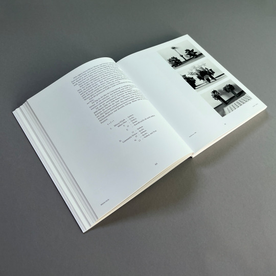
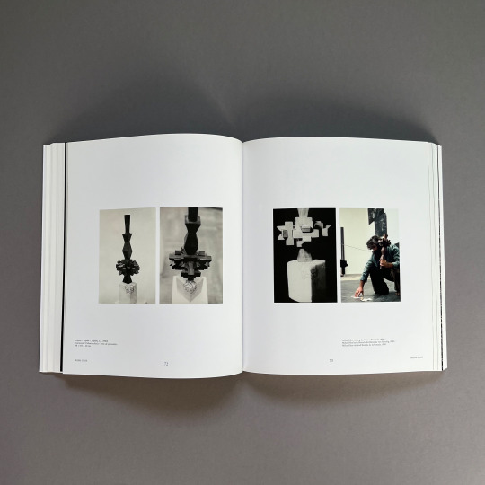
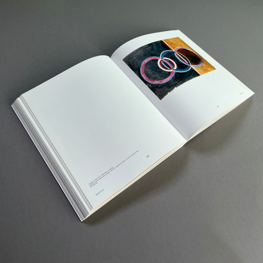
#kerber verlag
Text
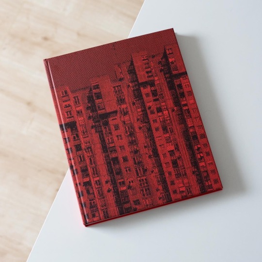
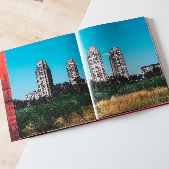
On the left bank of the Sava River and opposite the old town lies Novi Beograd, New Belgrade, the Serbian capital’s fastest growing municipality. It is a planned city and today’s inhabitants and businesses benefit from its rather modern infrastructure, a distinctive advantage over the old town. Novi Beograd’s construction began in 1948 but especially during 1960s and 1970s the municipality grew and numerous housing blocks and public buildings were erected. Because of these Novi Beograd in recent years has become something of a brutalist icon that is roaming social media platforms but is simultaneously subject to great change due to permanent new construction.
But while most photographers focus on the undeniable appeal of the architecture, Norwegian Marius Svaleng Andresen takes a closer look at the intersection of architecture and everyday life and the architecture in relation to the individual. In his book „Life in the New“, published last years by Kerber Verlag, Andresen explores the actual life going on inside, outside and in between the architecture: in view of the little stories of life the monumental architecture recedes into the background and becomes the stage of day-to-day life. People peeking out from behind the curtain, old men playing cards, a woman cleaning her windows and children running around, all of them populate Andresen’s photographs and bring up the question of what it is actually like to live in Novi Beograd. Apparently the photographer, who is also a journalist, asked himself this question too and met with 12 individuals who tell their own story of living in New Belgrade: there is Mirjana, the widow of a former military airport commander, who has been living in Novi Beograd for more than 50 years and at first didn’t really like it. And there is also Filip, the dog loving graphic designer and rapper, who philosophizes about the stepped volumes of the blocks and how they symbolize his daily struggle to reach the top.
In tandem with his sensible photographs Andersen provides an unusual, more humane portrait of Novi Beograd that is both visually stunning and emotionally touching. A warmly recommended read!
#marius svaleng andresen#architecture#serbia#novi beograd#belgrade#architectural photography#photo book#kerber verlag#book
41 notes
·
View notes
Text
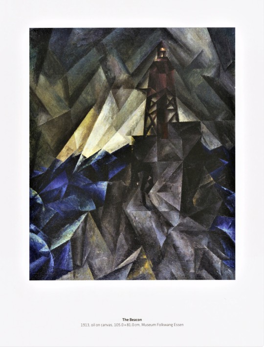


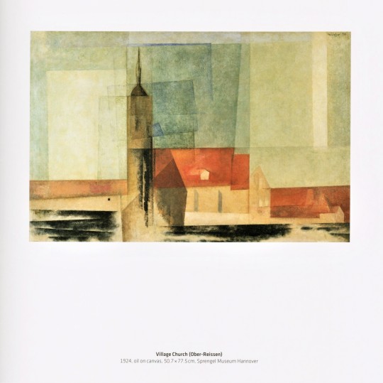

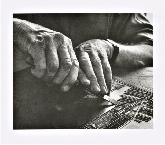
Milestone Monday
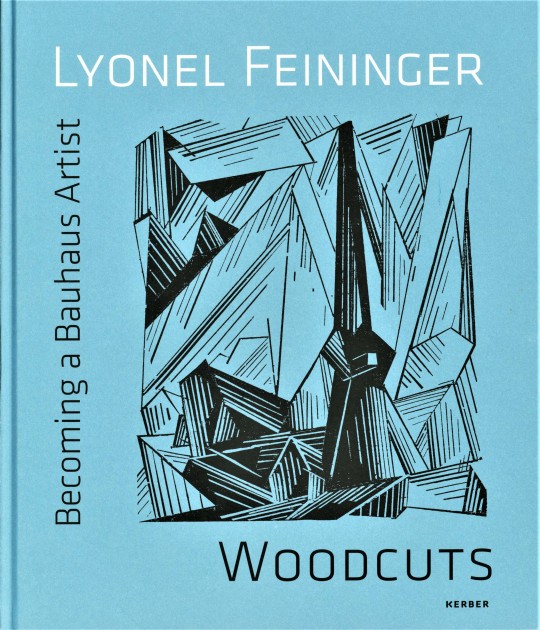
On this day, July 17th, in 1871 Expressionist and Bauhaus artist Lyonel Feininger was born into a German-American household in New York City. At the age of 16, Feininger moved to Germany to perfect his craft and later became part of the German Expressionist movement. He associated with artists from many different Expressionist groups including Die Brücke and the Blaue Reiter Circle during his time in Germany. Feininger also gained an interest in the Bauhaus school while in Germany and eventually designed the cover for the 1919 Bauhaus Manifesto and taught at the movement’s school for many years.
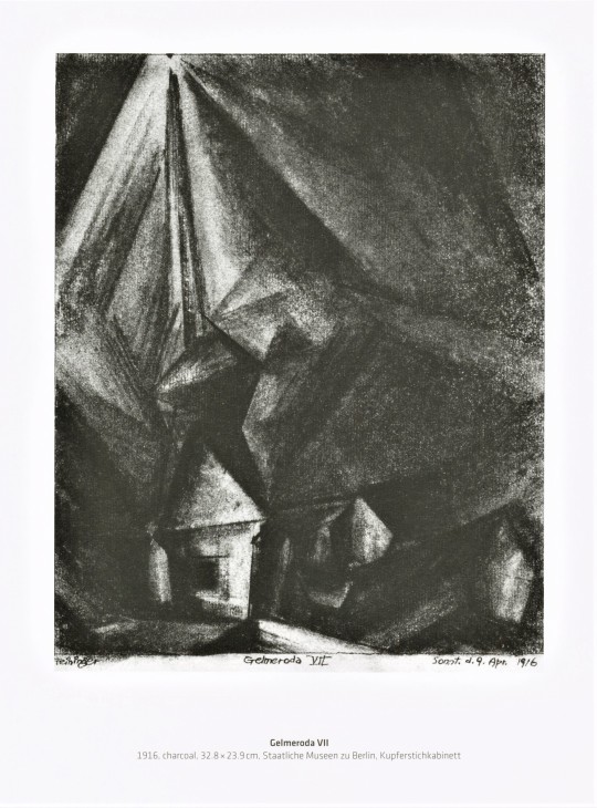
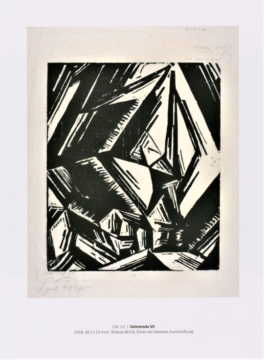
Much of Feininger’s Bauhaus work can be seen in the exhibition catalog Lyonel Feininger: Becoming a Bauhaus Artist, Woodcuts published in Bielefeld, Germany by Kerber Verlag in 2013. A large amount of the artist’s works focus on the representation of churches, both in his woodcuts and paintings. Viewers can see the clear Bauhaus influence in the artist’s work: minimalistic geometric shapes are used to depict the many buildings and scenes created by the artist, in both his prints and paintings. We also see Expressionist influence in these works as well, as they are also focused on similar geometric forms and creating art that represented what the artist felt about the subject, rather than a completely realistic depiction of it.
After his artwork was included in Hitler’s Degenerate Art exhibit, Feininger returned to America to teach, but he eventually moved back to Germany and focused on photography before his death in 1956.
View other Milestone Monday posts.
– Sarah S., Special Collections Graduate Intern.
#milestone monday#milestones#woodcuts#german expressionism#bauhaus#wood block prints#prints#lyonel feininger#Lyonel Feininger: Becoming a Bauhaus Artist#Woodcuts#Kerber Verlag#birthdays
40 notes
·
View notes
Photo


From: Romantischer Konzeptualismus / Romantic Conceptualism, Edited by Jörg Heiser, Collier Schorr, Jan Verwoert, Kunsthalle Nürnberg, Nürnberg / BAWAG Foundation, Wien / Kerber Verlag, Bielefeld, 2007 [Exhibitions: Kunsthalle Nürnberg, Nürnberg, May 10 – July 15, 2007; BAWAG Foundation, Wien, September 14 – December 1, 2007] [Saint-Martin Bookshop, Bruselles-Brussel]
Works: Bas Jan Ader, Robert Barry, Ross Birrell, Lygia Clark, Didier Courbot, Tacita Dean, Felix Gonzales-Torres, Tomislav Gotovac, Rodney Graham, Henrik Håkansson, Mathilde ter Heijne, Susan Hiller, Douglas Huebler, Kollektive Aktionen, Louise Lawler, Yoko Ono, Kirsten Pieroth, Allen Ruppersberg, Frances Stark, Jan Timme, Andy Warhol, Lawrence Weiner, Cerith Wyn Evans
#graphic design#typography#art#exhibition#catalogue#catalog#jörg heiser#collier schorr#jan verwoert#kunsthalle nürnberg#bawag foundation#kerber verlag#2000s
39 notes
·
View notes
Text
Muster und Moderne. Kunst der 20er Jahre aus der Sammlung Zuschlag-Wieneke: Berlin vom 12.01. bis 12.02.2023
Muster und Moderne. Kunst der 20er Jahre aus der Sammlung Zuschlag-Wieneke: Berlin vom 12.01. bis 12.02.2023
Konstruktivismus und geometrische Abstraktion prägten die bildende Kunst ebenso wie das Design der 1920er Jahre. 50 Jahre erforschten Fritz Zuschlag und Bodo Wieneke-Zuschlag das Thema Abstraktion in der bildenden Kunst wie auch im angewandten Bereich. Mit viel Leidenschaft und Sachverstand haben die beiden Kölner eine Kollektion zusammengetragen, die das Kunstschaffen der 1920er Jahre in seinen…

View On WordPress
#20er Jahre#Abstraktion#Berlin#Bilder#Bröhan Museum#Handwerkskunst#Keramiken#Kerber Verlag#Konstruktivismus#Manufaktur#Muster und Moderne#Sammlung#Skulpturen#Zuschlag-Wieneke
0 notes
Text

Jackie Nickerson (US, 1960)
Field Test photobook (published by Kerber Verlag) also highlights how indispensable the material has become to humanity. Brought into focus by Covid-19, subjects’ faces might be shrouded by industrial mesh, shielded by surgical masks beneath, some wear protective gloves and hospital scrubs. There are even Polaroids of healthcare workers in full PPE.
Field Test was conceived and shot long before the pandemic. In fact, she came up with the idea in 2014, when she travelled to Liberia to cover the Ebola outbreak for Time magazine.
https://www.1854.photography/2021/01/jackie-nickerson-field-test/
#Jackie Nickerson#photography#mix#plastic#covid 19#portraits#protection#defaced#isolation#photobook#colour
6 notes
·
View notes
Text
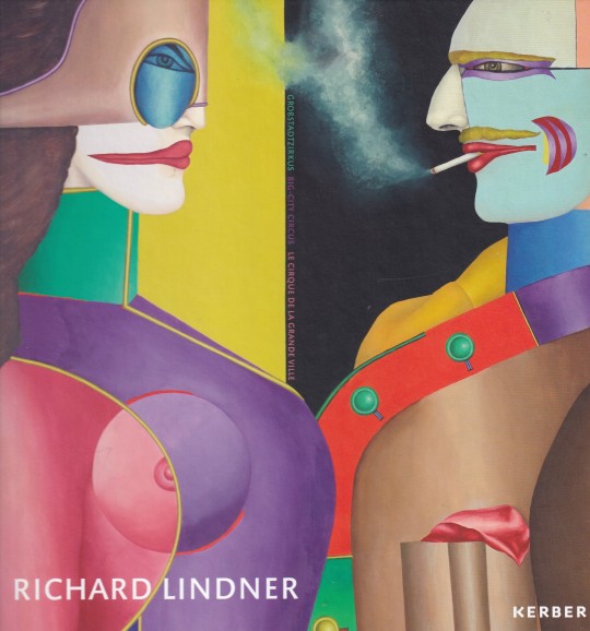
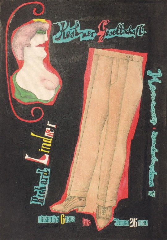
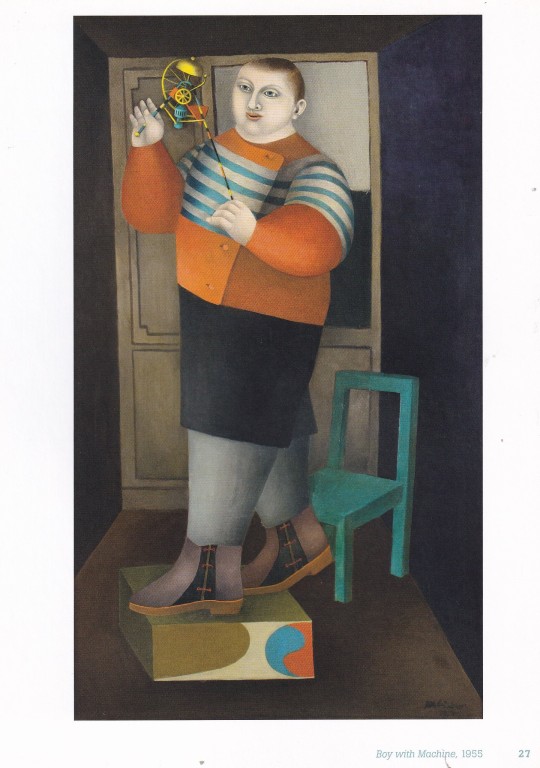
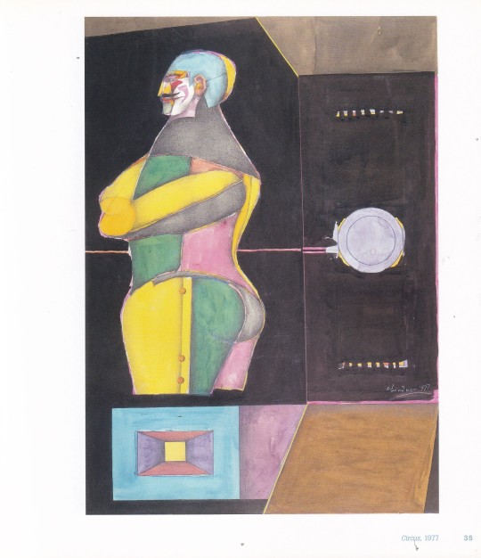


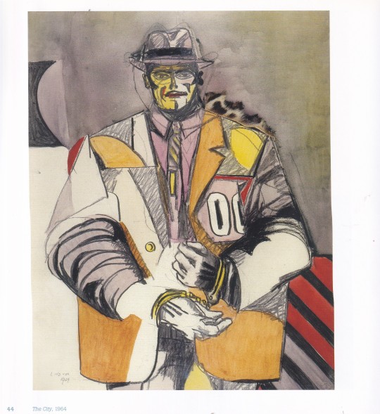
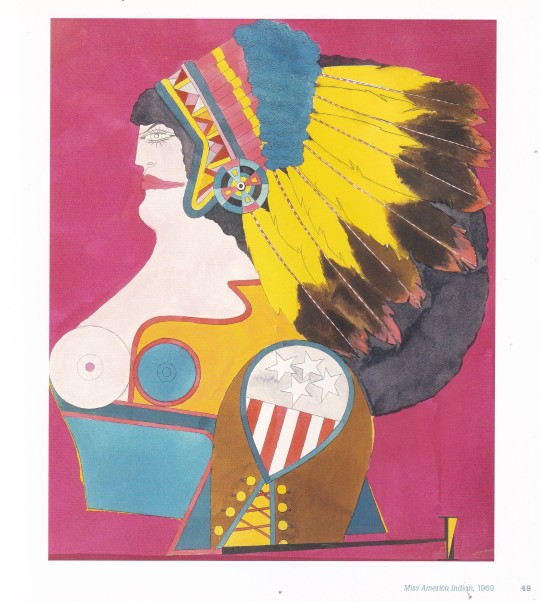
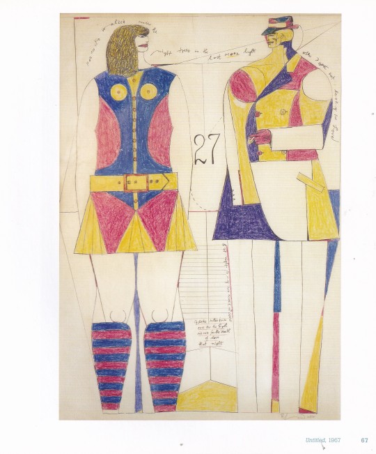

Richard Lindner
Großstadtzirkus | Big-City Circus | Le cirque de la grande ville
Editor Thomas Levy, Design by Claas Möller, claasbooks, Hamburg
Kerber Verlag, 120 pages, 22,5x22,5cm,68 colored and 14 b/w illustrations,Hardcover, German, English, French, ISBN 978-3-7356-0081-3
euro 30,00
email if you want to buy [email protected]
The painter Richard Lindner introduces his shadow figures of big-city life as if under a big top: thieves, prostitutes or gamblers as protagonists on the margins of society. With his unmistakeable imagery, Lindner has become one of the most important pioneers of Pop Art. The fifty or so oil paintings, watercolours and drawings in this catalogue provide an insight into his different creative phases from the 1950s to the 1970s. In cooperation with the estate of the artist, the catalogue gathers together numerous preliminary studies of Lindner’s paintings that have never before been shown in public and which demonstrate the erstwhile illustrator’s meticulous conquest of the image’s surface.
Exhibition: „Richard Lindner – Großstadtzirkus | Big-City Circus | Le cirque de la grande ville“, 06.02.2015 – 19.04.2015, Stiftung Ahlers Pro Arte / Kestner Pro Arte, Hannover
30/01/24
#Richard Lindner#Big-City Circus#cirque grande ville#art exhibition catalogue#Ahlers Pro Arte Hannover 2015#Pop Art#1950-1970#oil paintingssùwatercolours#drawings#art books#fashionbooksmilano
2 notes
·
View notes
Text
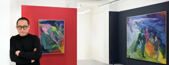
FOTO: ANJA SCHNEIDER
ラオ・フー (傅 饶/ Rao Fu) は1978年2月7日の北京生まれ。現在はドレスデン(ドイツ)を拠点に活動する国際的アーティスト。
ラオ・フーは2014年にドレスデン美術アカデミー(Hochschule für Bildende Künste Dresden)を卒業した直後、ハインリッヒ・ベール財団のアーティスト・フェローシップを授与された。同年、ヴォルフスブルクのフォルクスワーゲン主催のKunstverein Junge Kunstで個展が開催され、初の作品集「Rao Fu- Follow Wind」がドイツの出版社Kerber Verlagから出版される。
2016年、ラオ・フーはドレスデン市立美術館(Städtische Museen Dresden、SKD)で個展を開催し、その展示作品「Mirage」はドレスデン国立美術館(SKD)の常設展示の一部として収蔵されている。2018年にも、ラオ・フーはルクセンブルク現代美術館で個展を開催し、作品「Mermaid」は国立歴史美術博物館(MNHA)のコレクションに収蔵された。
2019年、ラオ・フーは台北のMind Set Art Centreと共同でKuandu Museum of Fine Artsで個展「Infinitrace」を開催し、その中で長さ4メートルを超える2つの大きなトリプティクを発表。
2020年、ラオ・フーはザクセン州文化省の創造性国家賞を受賞した。
2021年、ラオ・フーはパリのGalerie Vazieuxと上海の021の二都市で個展「Combustion」を開催。この展示作品はニースのアジア美術館でも展示され、そこでZao Wou-kiなどのアジアのアーティストと並んで展示された。
2022年の初め、ラオ・フーはマーク・ギスボーンとクリストフ・タナートによるthe German painting forum 「不協和音-プラットフォーム・ドイツ」 の最新版で紹介され、1970年以降のドイツの最も重要な画家を紹介する現代ドイツ絵画史の本に収録された。
ラオ・フーの作品は、東洋と西洋の異なる文化と哲学の融合を象徴している。彼は、中国の伝統的な山水画や書道、ヨーロッパの絵画、特にドレスデン派、エドヴァルド・ムンク、ペーター・ドイグ、ダニエル・リヒターなどの幅広い分野からインスピレーションを得て、独自の色彩と形態の言語を生み出している。このように、彼はアジアの要素を用いてサクソンの新表現主義を拡張している。彼の絵画には、伝統的なカリグラフィーや色彩エネルギー、具象絵画を組み合わせたものなど、さまざまな技法が見られる。夢と現実、混在する世界、ラオ・フーの個人的な生活など、さまざまなトピックが彼の作品に大きな役割を果たしている。半透明のオレンジやダークブルーがますます重要な役割を果たし、観察者に自由な空間を開く色彩の表現豊かな遊びによって、その雰囲気は強まっている。彼は、的を絞った演出と迂回によって視界を広げることを主要な要素としており、人物や色彩の陰影を前面に押し出した大判作品への取り組みも増えている。彼の芸術はヨーロッパと中国の文化を融合させながら、グローバルな言説に開かれたものであり、それによって文化的混合についての考察や議論も促している。
ホームページ:https://raofu.info
0 notes
Text

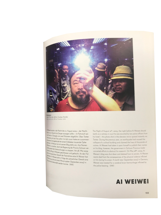


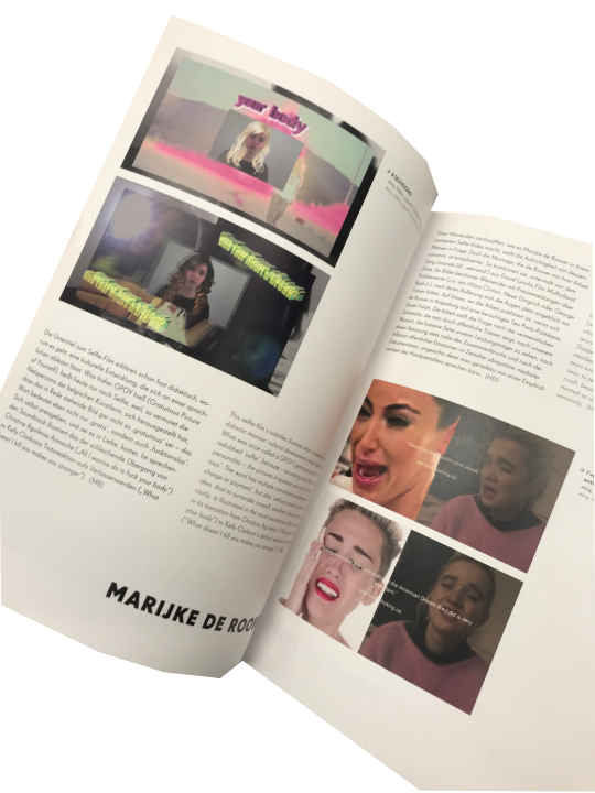


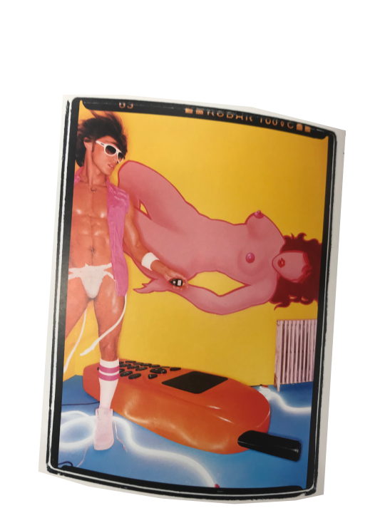
Library find #14
Hamster Hipster Handy - Bilder Geschichten zum Mobiltelefon
Hrsg.: Eleni Blechinger, Katja Gunkel, Jelena Jazo, Birgit Richard, Alexander Tilgner, Harry Wolff
Kerber Verlag
#erica scourti#Marijke de Roover#anne de vries#David la chapelle#still life#cell phone#wrecking ball#Kim crying meme#ai weiwei#tech nostalgia#tobias zielony#contemporary art#cell phone art#selfie
0 notes
Text
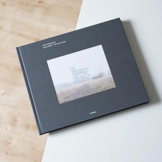
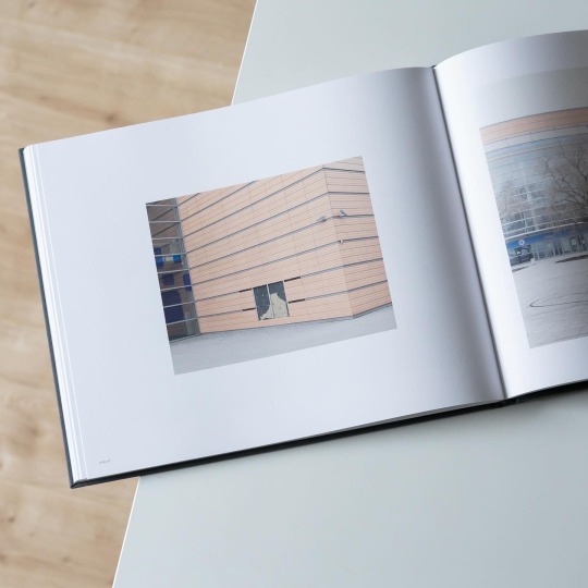
Under the motto „Man, nature, technology - A new world is emerging“ the Expo 2000 in Hannover, Germany, sought to kickstart the new millennium with a promising and sustainable outlook into the future: 155 countries exhibited on a total of 160 hectares, often in specifically designed pavilions. Between June 1 and October 31 some 18 million visitors came to see the Expo but once it was over the vast Expo area fell into a sleeping beauty slumber: although much of the infrastructure survived and many of the exhibition pavilions were demolished, demounted, re-used or translocated, landmark buildings like the Dutch pavilion by MVRDV rotted away as if to prove the Expo’s general secretary wrong: prior to the exhibition she stated that „There will be no ruins“, a noble yet unfulfilled wish.
This statement also concludes Piet Niemann’s book „Expo 2000 - 20 Years Later“, a photographic exploration of the former Expo area in Hannover published last year by Kerber Verlag. In 2020 Niemann, an architectural photographer who dedicates his free works to the long-term observation of places and the changes they undergo, set out to take stock of the current state of the area and its buildings: with great precision he documents how nature reclaimed certain areas, businesses repurposed the former exhibition architecture and also shows the previously mentioned Dutch pavilion as a derelict steel skeleton, swathed in fog and awaiting an uncertain future. But as architect Jacob van Rijs of MVRDV reveals in his essay the pavilion’s future isn’t uncertain anymore, instead it is slated for transformation into a permanent building, a circumstance that makes the photos all the more timely as they document the beauty of a ruin before its changed forever.
In general Niemann’s photos convey a sense of other-worldliness that leaves the readers wondering if the area has been frozen in time as a past idea of the future. A fantastic new look at an almost forgotten part of German history!
#piet niemann#kerber verlag#architectural photography#expo 2000#architecture#germany#architectural history#photo book#book
20 notes
·
View notes
Photo

SPEAKER RESEARCH - Verena Gerlach
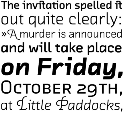
Verena Gerlach was an instructor of photography at the Hochschule der Küste in Berlin in 1991 and spent 1992 doing a first year course at Glasgow School of Art. In 1998, Verena Gerlach founded her studio for graphic design, type design and typography in Berlin. Since 2006, she has been working as a freelance book designer for art book publishers alike Hatje Cantz and Kerber Verlag. She started lecturing in type design, and typography in 2003, and she now gives lectures and workshops all over the globe.
Beside designing corporate fonts for global companies, she also is working on the typographic production for international, contemporary artists.
https://www.fraugerlach.de/
0 notes
Photo

TYPOGRAPHIKA SPEAKER RESEARCH - Verena Gerlach
Verena Gerlach was a photography instructor at the Hochschule der Künste in Berlin in 1991 and spent 1992 doing a first-year course at Glasgow School of Art. From 1993 to 1998 she studied communication design at Kunsthochschule Berlin Weißensee and spent one year as an exchange student at the London College of Printing. FF Karbid, FF Sizmo, and Chambers Sans are some of the few typefaces she created, Verena has her own studio for corporate design in Berlin. Since 2006, she has been consistently working as a freelance book designer for art book publishers like Hatje Cantz and Kerber Verlag. She began lecturing in type design, and typography in 2003,and currently gives lectures and workshops all over the world.
https://href.li/?https://www.fraugerlach.de/project/paradox_algiers
0 notes
Text
Finalising information
I then put all the text and images I wanted to use in one spot so that it was easy to find and I had all the designers info ready. This also means I have the best design content ready available, and if I want extra photos I can always have a look at the other ones I have.
Joseph Churchward
Joseph is a samoan born New Zealand graphic designer who mainly focuses on typographic work - Joseph is best known for having designed 690 original typefaces. He attended Wellington Technical college at age 13 where he perfected his craft and love for design.
After graduating, Joseph went on to work as a commercial designer, starting up his own company in 1969 - Churchward International Typefaces - which became one of New Zealand’s largest typesetting spaces. Not long after this was established, leading German type company Berthold Fototypes accepted some of his fonts for international distribution, and they were soon in use throughout the world.
“His accomplishments are not only significant on a national scale, but place him highly on the global stage. He is a pioneer and I admire his continued dedication to the craft of design. He is a true inspiration.” - John Britten, Black Pin Winner (2009)
Information compiled from AUT Materials and Media lecture slides - 2023 3/23
“Designers Institute” 2009 - John Britten

David Bennewith – 20.10.2005 “Joseph Churchward in his home studio.”
Tobias Frère Jones
For 25 years, Tobias Frere-Jones has created a major and significant name for himself as one of the world’s most successful typeface designers, creating some of the most widely used typefaces, including Interstate, Poynter Oldstyle, Whitney, Gotham, Surveyor, Tungsten and Retina.
He gained a BFA in Graphic Design from the Rhode Island School of Design in 1992. Then joining Yale University School of Art in 1996 and has lectured throughout the United States, Europe and Australia. His work is apart of collections in Victoria & Albert Museum in London and the Museum of Modern Art in New York. He has received the Gerrit Noordzij Prijs, the AIGA Medal, and most recently Cooper Hewitt’s 2019 National Design Award for Communication Design, recognizing his contributions to typographic design, writing and education.
Alot of Tobias retro and vintage based graphics come from his love of collecting various antiques when he was younger - we can see the inspiration for alot of his work today from this.
Information compiled from Tobias Frere Jones website.
AUT Materials and Media lecture slides 3/23

Photos by http://www.grahammacindoe.com/ Uploaded onto Tobias Frere Jones website.
Verena Gerlach
Verena Gerlach was a photography instructor at the Hochschule der Künste in Berlin in 1991 and spent 1992 doing a first-year course at Glasgow School of Art. From 1993 to 1998 she then went on to study communication design at Kunsthochschule Berlin Weißensee and spent one year (1996) as an exchange student at the London College of Printing. FF Karbid, FF Sizmo, and Chambers Sans are some of the few typefaces she created, Verena has her own studio for corporate design in Berlin.
In 1998, Verena Gerlach began her studio for graphic design, typedesign and typography in Berlin. Since 2006, she has been consistently working as a freelance book designer for art book publishers like Hatje Cantz and Kerber Verlag. She began lecturing in type design, and typography in 2003,and currently gives lectures and workshops all over the world.
as well as designing corporate fonts for global companies, she also is working on the typographic production for international contemporary artists.
Information provided and uploaded on Verena Gerlach's website and portfolio.”Silk Screen posters” 2010
AUT Materials and Media Lecture Slides 3/23.
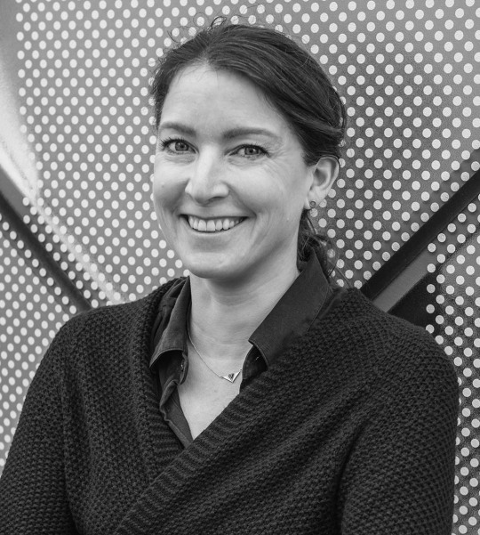
photograph by © Daniel Rodríguez - provided on her portfolio
Nadine Chahine
Dr. Nadine Chahine is an award-winning and very successful Lebanese type designer working as a UK Type Director and Legibility Expert at Monotype. She has an MA in Typeface Design from the University of Reading, UK, and a PhD from Leiden University, The Netherlands. Nadine’s research focus is on eye movement and legibility studies for the Arabic, Latin, and Chinese scripts. She has numerous awards including two Awards for Excellence in Type Design from the Type Directors Club in New York in 2008 and 2011. Her typefaces include the best-selling Frutiger Arabic, Neue.
Nadine’s work has been featured in the 5th edition of Megg’s History of Graphic Design and in 2012 she was selected by Fast Company as one of its 100 Most Creative People in Business. In 2016 her work was showcased in the 4th edition of First Choice which highlights the work of the 250 top global designers practising today. In 2017, Nadine was selected by Creative Review to their Creative Leaders 50 which aims to celebrate, educate and inspire those who are leading creative businesses, organisations and teams in the UK.
Nadine is a current CEO at I love typography.
Information compiled and found on
http://arabictype.com/about/ and Materials and Media AUT Lecture slides 3/23

Photo provided and uploaded onto Nadia Chahines portfolio website “http://arabictype.com/about/”
Carol Twombly
Carol Twombly is an incredible and unique creative force who is to thank for majority of the graceful characters found in several typefaces such as Trajan and Charlemagne. During Carols childhood in New England, she spent a lot of her time exploring several artistic techniques and composition. Having specific interest in sculpture, Carol followed her architect brother to Rhode Island School of Design (RISD). Once there, she changed her major to graphic design. Carol says, “I discovered that communicating through graphics - by placing black shapes on a white page - offered a welcome balance between freedom and structure.” Though graphic design became her career focus, Carol also specialises in basketweaving, drawing, painting, and jewellery making.
After graduating RISD and a year spent working in a small Boston graphic design studio, Carol accepted an invitation from Bigelow and joined a small group of students in a newly formed digital typography program at Stanford University. The program, which has been discontinued, awarded Carol and her colleagues Masters of Science degrees after two years of study in computer science and typographic design. Carol has designed a number of very popular and widely used text and display typefaces. Trajan, Charlemagne, Lithos, and Adobe Caslon are inspired by classic typefaces and characters from the past - from early Greek inscriptions, around 400 B.C., to William Caslon’s typefaces of the 1700s. Designs like Viva and Nueva explore new territory while maintaining traditional roots. In 1994, she received the Charles Peignot award from the Association Typographique Internationale for outstanding contributions to type design. She was the first woman and only the second American to receive this prestigious honor.
Information provided by Adobe Fonts.
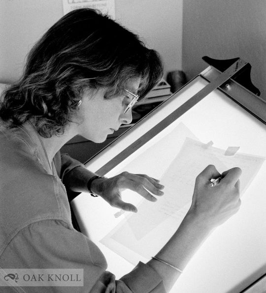
“Carol Twombly” Image sourced by Oak Knoll Books - Stock-Allen, Nancy
Veronika Burian
Veronika Burian studied Industrial Design in Munich and worked in that space in Vienna and Milan over a few years. Discovering a true passion for type, she graduated with distinction from the MA in Typeface Design in Reading, UK, in 2003 and worked as type designer at DaltonMaag in London for a few years. After staying for some time in Boulder, USA, and her hometown Prague she is now living in sunny Cataluña.
Veronika Burian is a type designer and co-founder of independent type foundry TypeTogether. She has created award-winning typefaces and collaborating on specific typefaces for a large number of clients. She is involved with Alphabettes.org, a showcase for work and research on lettering, typography and type design by women. She continues to give lectures and workshops at international conferences and universities. Her typeface Maiola received, amongst others, the TDC Certificate of Excellence in Type Design 2004. Several other typefaces by TypeTogether have also been recognised by international competitions, including ED-Awards and ISTD.
She is also a founding member of typography platform Alphabettes.org created by and for women, being solely involved in mentoring program the GRANSHAN project for non-Latin fonts and typography, which is unique in the world, she engages in communication and sponsorship.
“Her typeface Maiola received the TDC Certificate of Excellence in Type Design 2004. Several other typefaces by TypeTogether have also been recognised by international competitions, including ED-Awards and ISTD.” - Type Together

“Veronika Burian” Image by Type Together.
Information provided by:
http://bitscon.asia/speakers/2016/veronika-burian
https://fonts.adobe.com/designers/veronika-burian
Jessica Hische
Jessica Nicole Hische is an American letterer, illustrator, and type designer. Jessica has spoken at over 100 conferences, colleges, and other design events on nearly every continent. Winning awards such as New York Times Best-selling Author, Forbes under 30, New Visual Artist, ADC Young GunGDUSA, Person to Watch.
When Jessica is not drafting letterforms, manipulating beziers, writing kids books, or letterpressing on my Vandercook, she spends her time trying to help others find the same happiness and fulfillment that she finds in her work.
Information compiled and found on https://www.jessicahische.is/afanofoxfam

Image by Helena Price.
Johnson Witehira:
Johnson Witehiras work has the purpose of bringing all cultural aspects of Maori culture back into the lives of Maori and has alot of cultural responsive media and design.
Johnson lives in Wellington, where his work is prominent and successful there.
“My kaupapa (mission) as both an artist and designer is to bring Māori visual culture back into the lives of all Māori. This is done through careful consideration of how indigenous culture, design and technology intersect. We once created all the things in our world; the clothes, buildings, vehicles and tools. Nowadays everything is made for us. If we’re lucky we get to decorate. I want to put Māori back in the drivers seat, so we’re active participants in creating the tools and the world we want to live in.”
Overseas, works from Ko Aotearoa Tēnei (2012) series are on permanent display in a number of New Zealand Embassies and Consulates (Shanghai Consulate, NZ Embassy in Dublin, NZ High Commissionto Canberra and the NZ Consulate Hawaii). In 2015, the Land of Tara series was exhibited at the Talente Munich design Fair. He has also showcased in group exhibitions in Canada including; InDigiNous Aotearoa: Virtual Histories (Winnipeg, 2017), The Space Between Us (Banff, 2018) Gathering Across Moana (Tornoto, 2019) and REGENERATION: Breaking Time with Indigenous Video Games (2019, Vancouver).
Information complied via his website:
https://www.johnsonwitehira.studio
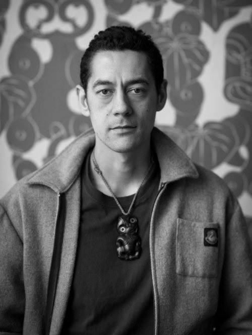
Johnson Whitera - Shown on his website and provided by https://semipermanent.com/profiles/johnson-witehira
0 notes
Text
Week 1 SDL - Research
Speakers
Verena Gerlach
1998, Verena Gerlach founded her studio for graphic design, type design and typography in Berlin. Since 2006, she has been working as a freelance book designer for art book publishers alike Hatje Cantz and Kerber Verlag. She started lecturing in type design, and typography in 2003, and she now gives lectures and workshops all over the globe.
Beside designing corporate fonts for global companies, she also is working on the typographic production for international, contemporary artists.
https://berlin-notebook.com/verena-gerlach/
https://www.fraugerlach.de/contact
Nadine Chahine
Dr. Nadine Chahine is an award winning Lebanese type designer. She has an MA in Typeface Design from the University of Reading, UK, and a PhD from Leiden University, The Netherlands. Nadine’s research focus is on eye movement and legibility studies for the Arabic, Latin, and Chinese scripts. She has numerous awards including two Awards for Excellence in Type Design from the Type Directors Club in New York in 2008 and 2011. Her typefaces include: the best-selling Frutiger Arabic, Neue Helvetica Arabic, Univers Next Arabic, Palatino and Palatino Sans Arabic, and Koufiya.
Nadine’s work has been featured in the 5th edition of Megg’s History of Graphic Design and in 2012 she was selected by Fast Company as one of its 100 Most Creative People in Business. In 2016 her work was showcased in the 4th edition of First Choice which highlights the work of the 250 top global designers practising today. In 2017, Nadine was selected by Creative Review to their Creative Leaders 50 which aims to celebrate, educate and inspire those who are leading creative businesses, organisations and teams in the UK.
https://arabictype.com/about/
Carol Twombly
During her childhood in New England, Carol spent much of her time exploring various artistic disciplines. Settling on sculpture, Carol followed her architect brother to Rhode Island School of Design (RISD). Once there, however, she decided that graphic design would be a more practical course of study. About this decision Carol says, “I discovered that communicating through graphics - by placing black shapes on a white page - offered a welcome balance between freedom and structure.” Though graphic design became her career focus, Carol hasn’t abandoned her other artistic pursuits, which include basketweaving, drawing, painting, and jewelry making.
During her eleven+ years with Adobe, Carol has designed a number of very popular text and display typefaces. Designs like Trajan, Charlemagne, Lithos, and Adobe Caslon are inspired by classic letterforms of the past - from early Greek inscriptions, circa 400 B.C., to William Caslon’s typefaces of the 1700s. Designs like Viva and Nueva explore new territory while maintaining traditional roots. In 1994, she received the Charles Peignot award from the Association Typographique Internationale for outstanding contributions to type design. She was the first woman and only the second American to receive this prestigious honor.
Since leaving Adobe, Carol has continued to explore other non-computer-based arts including weaving, natural-object sculpture, silk painting, and making gourd shekeres (hand-held African percussion instrument), with which to accompany her fellow conga players. She lives quietly in a small community in the Sierra foothills, practicing Qi Gong and Afrocuban drumming, hiking, volunteering locally.
https://fonts.adobe.com/designers/carol-twombly
http://luc.devroye.org/fonts-26216.html
https://www.oakknoll.com/pages/books/125344/nancy-stock-allen/carol-twombly-her-brief-but-brilliant-career-in-type-design
Joseph Churchward
Joseph is a master typeface designer, and through focused dedication to this art from a young age he’s created more than 690 hand-crafted fonts. Which include recognisable fonts in New Zealand such as the TV One logo, The Evening Post and The Dominion.
Born and raised in Samoa. He moved to New Zealand at age 13 and attended Wellington Technical College. There he concentrated on art and especially lettering. He then went on to work as a commercial artist at Charles Haines Advertising for 12 years before setting up Churchward International Typefaces in 1969. His first breakthrough was not long in coming. Berthold Fototype accepted several of his first typefaces for distribution and continued to add Churchward’s new designs to their catalogue for many years. He later went on to sign distribution agreements with D.Stempel AG, Dr Böger Photosatz GmbH/Linotype, Mecanorma-Polyvroom B.V and Zipatone. Churchward International Typefaces published a handful of original fonts in 1978 being the first and only company in New Zealand to publish original photo-lettering. Now officially retired, he continues to create unique alphabets and has over 300 original faces to his name.
https://www.the10sonsofmanu.com/tag/joseph-churchward/
https://www.myfonts.com/collections/joseph-churchward
Veronika Burian
Veronika Burian studied Industrial Design in Munich and worked in that capacity in Vienna and Milan over a few years. Discovering her true passion for type, she graduated in 2003 with distinction from the MA in Typeface Design course in Reading, UK. Veronika then worked as a type designer at Dalton Maag in London for a few years, spent some time in Boulder, USA, and then her hometown, Prague, and is now enjoying life in sunny Cataluña, Spain.
Veronika Burian is a type designer and the co-founder of the independent type foundry TypeTogether with José Scaglione, publishing award-winning typefaces and collaborating on tailored typefaces for a variety of clients. She is also involved with Alphabettes.org, a showcase for work and research on lettering, typography, and type design by women, and she continues to give lectures and workshops at international conferences and universities.
https://fonts.adobe.com/designers/veronika-burian
https://www.fontshop.com/content/women-in-design-veronika-burian
http://bitscon.asia/speakers/2016/veronika-burian
Tobias Frere-Jones
Over 25 years, Tobias Frere-Jones has established himself as one of the world’s leading typeface designers, creating some of the most widely used typefaces, including Poynter Oldstyle, Whitney, Gotham, Surveyor, Tungsten and Retina.
Tobias received a BFA in Graphic Design from the Rhode Island School of Design in 1992. He joined the faculty of the Yale University School of Art in 1996 and has lectured throughout the United States, Europe and Australia. His work is in the permanent collections of the Victoria & Albert Museum in London and the Museum of Modern Art in New York. In 2006, Royal Academy of Visual Arts The Hague (KABK) awarded him the Gerrit Noordzij Prijs for his contributions to typographic design, writing and education. In 2013 he received the AIGA Medal in recognition of exceptional achievements in the field of design.
He spent seven years at the Bureau and he learnt his craft under the experienced eye of David Berlow. During that time at Bureau he created a successful typeface based on US highway signs called Interstate family. That was a successful font of 1990s. Also he created most of typefaces that are best known from Bureau like including Interstate and Poynter Oldstyle & Gothic. As is stated by (Hoefler & Frere-Jones,2010) “He joined the faculty of the Yale School of Art in 1996, where he continues to teach typeface design on the graduate level.”
Tobias is the founder and lead designer at Frere-Jones Type, an independent type design practice in New York City.
https://fonts.adobe.com/designers/tobias-frere-jones
https://designhistoryresearch.wordpress.com/category/tobias-frere-jones/
https://www.tdc.org/profiles/tobias-frere-jones/
0 notes
