#lazerhorse
Text
i can’t get over how good the ep art is i love lazerhorse sm
47 notes
·
View notes
Text
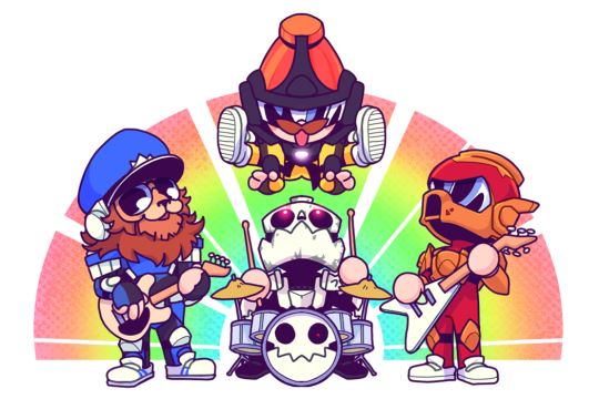
Mr. Horse

Nooo!! Mr. Horse!! Don't go there!!!


8 notes
·
View notes
Text


I was colour picking for future reference and found some good colours for a flag
117 notes
·
View notes
Text
you WILL listen to the new twrp ep NOW!!!!!
#dontlistento me#twrp#i dont use spotify but most people do so <//3#biting gnawing eating this ep. the art is so good i am waiting eagerly for lazerhorse to post it#not normal#tupperware remix party#Spotify
12 notes
·
View notes
Text
dbd is so good except i hate playing that kind of video game i just loved watching meech and doc play it
#esp if lazerhorse was there#miss that guy. so mad i never saw his art streams live and that the vods dont exist (afaik ?)
2 notes
·
View notes
Text
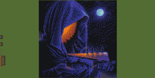
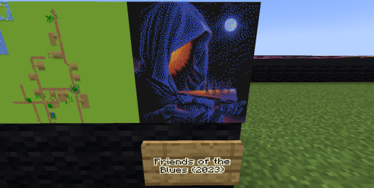
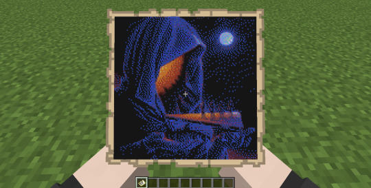
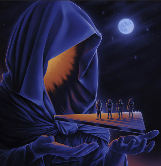
In honor of the release of the newest TWRP EP, Friends of the Blues, I recreated the album art in Minecraft. I love Lazerhorse's art and this new cover is so gorgeous.
#i have a small collection of twrp pixel art at this point#i might post more later#twrp#friends of the blues#minecraft#pixel art#map art
34 notes
·
View notes
Photo

Good afternoon! The pre-orders for some of the merch I got to design for my favorite band, TWRP, are live! There’s a lovely die-cut holographic sticker, and a cute limited-palette design available both on a poster and a tee!
You can see them in the shop and pre-order them here! They’re supposed to roll out later on in the winter.
I had a really wonderful time designing these and taking notes from Lazerhorse. I hope I can work with him and the band again sometime!
#TWRP#TWRPBand#escherbug art#you can buy this#still stunned that out of like eight palettes i gave them Mr Horse went yes give me the pan pride flag that i snuck in for fun
162 notes
·
View notes
Text
Seeing the new poster that lazerhorse put out
really makes my attempt at pixel art feel bad
That’s okay though. Lazerhorse is the entire reason I step out of my art-comfort-zone in the first place
I’m just going to have to give it another try
#i see his art and I’m like ‘I want to make art like that too!’#he’s definitely one of my top favourite artists over all and everytime more work of his get posted I’m just like#‘time for art’ whether or not I’m tired or in art block#idk I’m just motivated by his work to improve my skill too
0 notes
Audio
okay so i didn’t know arthur doyle (lazerhorse) was on leighton and brian’s podcast this past fall, but y’all after listening, i’m happy to announce he’s finally free from twrp’s evil basement!!! that makes me so fucking happy!!!!
he was trapped for 4 years, 8 months, 24 days.
damn twrp, you’re fucked up. 😂😂😂
i hope you got that sandwich you deserved too arthur!
#twrp#lazerhorse#arthur doyle#leighton gray#brian wecht#leighton night with brian wecht#i was literally laughing so hard i cried#especially when he said how did you know about that? looool
12 notes
·
View notes
Text

youtube
#leighton night#lazerhorse#leighton gray#brian wecht#game grumps#ninja sex party#leighton night twitter#leighton night youtube#podcast#Youtube
15 notes
·
View notes
Text
also ladybug?? we talking about how damn good it is?? and lazerhorse posted an animation wip of a ladybug crawling?? what r they releasing tomorrow??

4 notes
·
View notes
Video
undefined
tumblr
Make Me A Sandwich, Roy Blaze
Dead by Daylight / 8-9-19
20 notes
·
View notes
Note
What is your opinion on Return to Wherever
Opinion on Return to Wherever? I've got opinions for sure. I'll try to keep it short.
Solid album. I'd recommend it as a good first for new listeners. Definitely one of my top favourite albums of TWRP's
Here is a bit more ↓
I also feel like Return to Wherever was a turning point for TWRP's sound overall. It feels much brighter in comparison to earlier works. Of course they started the change back with Ladyworld and continued it in Together Through Time, but for me they really solidified that new feeling they were putting into their music. Note: I believe Doctor Sung mentioned on stream that RtW was written around the time they relocated to Los Angeles, and it had an effect on their music writing at the time. I'll try to check the vods to cite this, because I don't want to say that he said something without source (thats a lot of hour to go through, so it may be a while, but I did check the years they announced they were moving and it does match up)
I'd also like to talk about the cover art.
Lazerhorse definitely does a good job at emulating styles from the different artists he takes inspiration from, and Hiroshi Nagai is no exception. The beach is lovely, the clouds are fluffy, and the horizon calls back to Ladyworld with those otherworldly crystals. Then there is the rendering style of the boys themselves. It reminds me of that one retro airline poster that Daft Punk used.
Theres also the name stripe that holds the album name, band name, and track list. Its the perfect shade of pink and no one can tell me otherwise. It goes very well with the blue used for the sky and water, and was a good choice to make the text stand out from the artwork. Also, the vinyl release with the pink and blue colouration to match was a great choice as well.
tldr: good album.
#suave asks#suave answered#I talked about the art more than the actual music but for good reason#while i was writing i kept having thoughts like “oh! i should talking about the french horn!” or “oo! that one part in All Night Forever-”#there are nine tracks and i could talk about each one#i needed to stop myself berfore i wrote a whole essay or some sort of thesis statment#unless someone asks for that#ANYWAY i'm glad someone actually sent an ask. like. the ask box is always open#was very excited to get to talk about this album#or just enthuse about Twrp in general#also if anyone remembers the stream i'm thinking of where sung was asked about RtW please let me know.#i can't remember what game he was playing. its going to take forever to search for.
3 notes
·
View notes
Text

"Hey this is kinda neat. A little over a year ago, these were the initial brainstorm sketches that @lazerhorse did for Ladyworld's album art"
-via TWRP Instagram January 3rd, 2018
I forgot about these and figured it was worth sharing since I know a lot of people love the Ladyworld album design, as do I (glances at album art poster).
#twrp#tupperware remix party#lazerhorse#art#album design#albums#doctor sung#commander meouch#lord phobos#havve hogan#electro funk#electronic rock#funk#Ladyworld#2017
92 notes
·
View notes
Link
Items will be restocked in the near future!
Vertical Poster
David Liu (Illustration), Michael Doig (Colourist) & Lazerhorse (Graphic Design)
Character T-shirt
David Liu (Illustration) Michael Doig (Colourist) & Lazerhorse (Graphic Design)
Horizontal Poster
India Swift (Illustration), Michael Doig (Colourist) & Lazerhorse (Graphic Design)
Logo T-shirt
India Swift (Graphic Design), Noitibmar (Logo Design) & Elle Power (Logo Design)
Stickers
India Swift (Illustration)
Pins
India Swift (Illustration) & Elle Power (Illustration)
#starlight brigade#knights of the light table#tshirts#pins#stickers#twrpband#posters#merch#david liu#india swift#michaeldoig#lazerhorse
60 notes
·
View notes
Text

30+ hours later, I have a full cross stich pattern for the twrp logo in the Hit (curse you lazerhorse for your incredible art skills). Tomorrow I’ll go look at threads in person so I can fix the colors (the grays should be light blues but my computer monitor wasn’t cooperating). I might stick it up online if anyone else wants it? It’s 6 pages and 9000 stitches so this’ll take a hot minute to stitch lol
14 notes
·
View notes
Last Seen Blogs