#like tried to define and simplify the shadow shapes in this as much as i could
Text

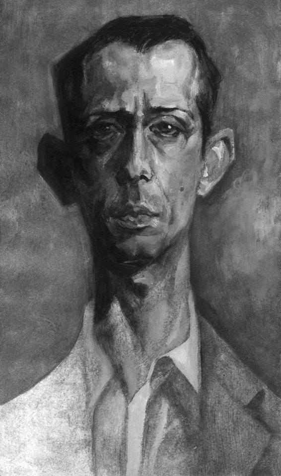

kendalling in oil
#KENDALL!!!!!!!!!!!!!!!!!!!!!!!#art#traditional art#painting#oil paint#portrait#succession#succession fanart#kendall roy#jeremy strong#eye contact#art school is crazy because youre learning super fundamental concepts that make ur work stronger#but its so hard to apply those concepts in action#like tried to define and simplify the shadow shapes in this as much as i could#and theyre STILL mushy. but so much better than previous paintings have been#art growth is so slow and non-linear and fiddly#but i love his face so so so so much#succ critters are my muses
1K notes
·
View notes
Text
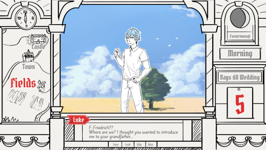
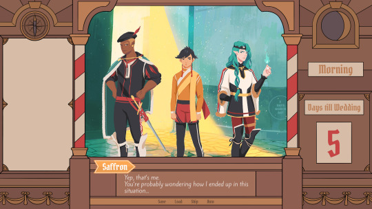
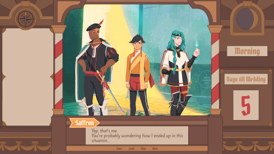
Devlog #34 - Status Update, Character Design, and UI
Hello! It's time for another update on the development status of Brassica. It’s also our first actual devlog purely about Brassica!
After working on separate projects for a while, we are now in the process of getting back on track working on the same game again.
Because of that we're happy to announce that the rest of Brassica's Act 2 will be released in March!
It grew a bit in size from what we originally planned but that just means more game for you~
The exact date will be announced when we can more clearly estimate how long the remaining tasks will take but we're in the process of finishing everything up so it shouldn't be too long.
As for Act 3, our current plan is to release it in April. From now on development should be a lot faster but because we mainly worked on it on the side until now, that is still only a rough estimate. We'll definitely keep you updated on any developments regarding the release dates though!
Well, and that's about it for the status update. Because it's been a while since our devlogs actually described much of our development process (and we haven't shared much about our thought processes behind Brassica), we decided to bring that back with today's devlog.
PECTIN will tell you a bit about Saffron and his design while eZombo describes the development of the UI.
So without further ado, here we go:
Art - PECTIN
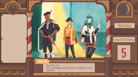
Saffron is the curious prince the player takes control of in Brassica. Before I began concepting him Felix and I defined his character. At this point we already knew he would be one of the princes Sappho tricks into going on the journey. (And would then fall in love with another prince because YaoiJam'18). We soon agreed on naming him Saffron. So I already associated the colours of the spice "saffron" with him here.
We also wanted to make him a protagonist with his own personality. Thinking of the player who role-plays him we thought it would be cool to have his character split into three separate personalities he could have:
- the cunning and a bit wild prince
- the typical goody two-shoes type of hero
- and the soft boi who's overwhelmed by the whole predicament and really needs a hug
Another external influence was, my intention to try and fuse traditional things with modern sportswear. Brassica is a fairytale but it's told in a contemporary voice. That's where the idea came from.
...Okay. So I had his name, colours I could associate with him, the three archetypes and my goal to fuse sportswear with traditional clothing. Having all of these "pointers" I began looking for reference pictures. I browsed through online stores of popular sports brands to find things that would fit the character. Due to Saffron's character ranging from cute to rather untamed (in the sense that he would climb a tree without hesitation) I thought that wearing shorts would be most suitable and comfy. But for the top and the overall outfit I wanted to let myself get inspired by traditional elements. The name "Saffron" reminded me of the spice and then its use in Indian culture. I never designed a character with Indian influences before and thought researching into that would be interesting. I found a lot of stuff I could translate into the design. Even the leggings Saffron wears were intially inspired by my findings about Indian culture.
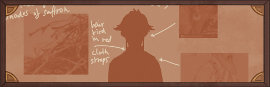
Here's a visual breakdown of what inspired what (excuse my srawly handwriting >-<):

During the process of drawing out his design, as I always do, I thought about how each component of the outfit would "flow". There're lot's of lines and intersections in his outfit that guide the eyes along the his body:

And here is our boy again as a sprite. Not much different right? Here I put one of his hands in his shorts' pocket, because I think it would suit someone who is either unsure and does that or feels liking hiding something.
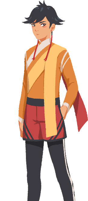
That's it about Saffron! I could go on about his colours but I'll save that for when I explain the general artstyle of Brassica! :3
UI - eZombo
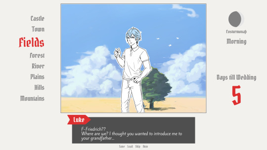
Because Brassica was planned as an entry for Yaoi Jam 2018, we thought about ways to keep the scope small. One idea we came up with was to reduce the size of the screen that shows backgrounds and characters so producing the art is a bit faster than filling a full HD 16:9 canvas. One inspiration for that was Sticky Zeitgeist by Porpentine & Rook but something like the Undertale console version where the graphics at the border of the screen change based on the in-game location was also something we considered.
When it came to actually planning the screen, Undertale's influence came through again, because the main area of the screen actually has an aspect ratio of 4:3. This obviously leaves a lot of unused screen space but one thing we knew we could definitely use to fill this was the text box. Having it separate from the main screen also made sure that it didn't overlap with the characters or backgrounds so the space that was reserved for that could be used to its full potential.
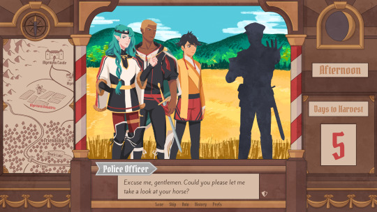
With two elements already on the screen, we still had the sides to fill with content. Just using graphics as borders definitely was an option but because Brassica's story plays out a bit like a road movie, we thought having a map of the game world would definitely add to the feeling of that. And to make the UI visually more balanced again, the last bit of free space was then filled with some information on the time of day and how many days were left for the quest of the princes which basically added all the important context for what is going on in the center of the screen.
A first mock-up of the UI featuring a familiar face and St. Bernard...
Around that time, we also developed the idea of presenting the whole game screen like a paper or puppet theater. This seemed like a good way to bring all these different elements together while still supporting the colorful fantasy-ish look of the game art.
I did a quick sketch of how this could look, which turned the mock-up into this:
Aside from adding some more purely graphical elements, I adjusted the text box and the flag that showed the name of the character that is currently speaking.
The map was graphical now instead of just a list (which would have given away future locations) and I was overall fairly happy with the direction the UI was going in.
A few of the border elements overlapped with the main screen now but I tried to make sure it only happens in areas where we wouldn't put any focus.
After getting some feedback from PECTIN I then went on to work on the final lineart while also trying to simplify all the shapes. By then, the characters were also being concepted so instead of Luke I could put Ode into the mock-up (along with a reference for a possible background style).

As you can see, some unnecessary lines, elements, and text were removed to simplify the look of the UI and make sure that the important elements aren't overshadowed by anything else. Overall I tried to keep the lines clean without making them look overly sterile, so any round shapes are generally drawn freehand instead of using any vector shapes. Except for the compass, moon, and their enclosing arcs. Those just looked sloppy when they weren't exact. Not using fixed line widths was another way to make the lines more organic even when they were perfectly straight.
The idea to use different colored flags for each character also came into play now, although Ode's color here is actually used by Hans now…
Colors were next on the agenda. First a basic pass, followed by some adjustments and line colors to make the lines fade more into the background. Having the concepts for the three princes was very helpful for this step because it was important that the UI colors fit into the overall color scheme while keeping the focus on the actual game art.
That's why red is only used close to the center and for important UI elements (the current location on the map is also marked in red). The rest of the colors are rather muted and monochrome on purpose with only a little bit of gold to break it up.
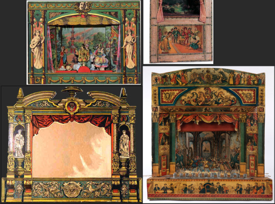
Throughout the whole process my main references were old paper theaters but especially during the coloring process I deviated from these references in favor of using colors that would match with most backgrounds.
Once we were happy with the colors, I did a relatively quick shading pass, just adding shadows with a fairly abstract light source to keep most shadows parallel to the lines. I also added some subtle noise to make everything look a bit more organic.
For the most part it still looked too clean though, so PECTIN suggested overlaying the UI with some watercolor textures.

Which lead to this final mock-up and not only solved the problem but also gave the UI a more painterly look that didn't interfere as much with the general artstyle.
Well, but as always, there are still a few things that changed on the way into the engine.
The map was obviously added (which could probably fill a devlog by itself), the text on the side was changed to better reflect the current quest of the princes (although the other sign may or may not return in future acts...), I added a CTC icon and updated the quick menu (although I can't remember why "Load" was removed so maybe that will return again), but most importantly:
The text box was reduced from three to two lines of text. This wasn't as much an active decision as it was caused by the fact that small line spacing in Ren'Py cuts of parts of some letters until all lines of text are displayed. There are some games that still do this but personally I don't really like how it looks while the text appears. Increasing the textbox would have caused a lot of work because I would have had to shift around more elements of the UI to keep a balanced layout so it was simply easier to remove a line of text and increase the line spacing.
This had a pretty strong effect on the writing because sentences have to be fairly short now or if that doesn't work, broken up into multiple lines.
Even if it wasn't exactly planned, it still influenced the writing style of Brassica and further distinguished it from our other games (although there's more to say on that one) and in hindsight, only two lines of text also look a lot cleaner in this layout.
I could go on about the actual implementation of the UI but this has already been a pretty lengthy post so maybe I'll save it for another devlog.
But that's it for now! We'll be back in two weeks with some more development insights and our current status. We also plan to start posting these devlogs regularly again, so stay tuned for that!
As always, thank you so much for reading and we hope you could find a few things of interest in this devlog.
#brassica#fairytale#devlog#gamedev#game#development#otome game#romance#tutorial#visual novel#indiedev#indie#okay
8 notes
·
View notes
Text
World Chocolate Day Infographic Process
25.10.18
This will probably be quite a long post, but I’ll do my best.
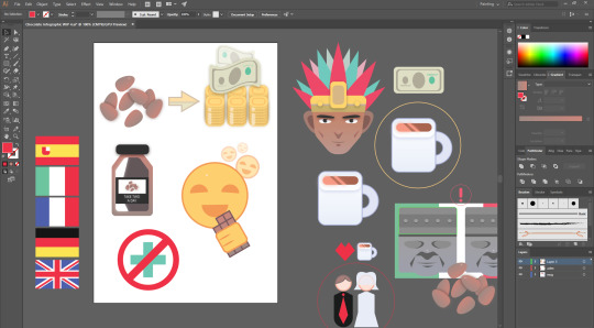
So, we had been given the mini-project of essentially creating an infographic on a particular area of chocolate in celebration of world chocolate day—the history of chocolate, for example. The post below this one contains my research on the history of chocolate in fact, though it has much more information, like the uses and effects of chocolate. Have a read through that if you want an insight into how chocolate came about. Anyway, long story short, I chose to do trivia for my infographic, since there was a lot of trivia I’d gathered, and I thought it would be fun to make certain graphics, like an Aztec or the money.
Sketchbook Work
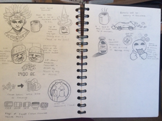
So below are two pages of my sketchbook which I designated to drawing out ideas which I thought would look good from the information which I collated. I’ll start with the Aztec in the top left—I thought it compulsory to make an Aztec warrior-looking guy, since chocolate was enjoyed by them back then. I looked at a couple different random references of Aztecs, and came up with the simple design that you see. I also drew a mug of hot chocolate next to him, since it was enjoyed as a “hot, frothy stimulative with restorative properties”. Next to that is another mug with a kind of spotlight shining on it—it’s supposed to look like some kind of heavenly ray, hence the clouds also. This was because it was the “food for the gods”.
Below the top row of drawings, are a couple of Olmecs, the earliest known major civilization in Mexico following a progressive development in Soconusco. They are said to have produced chocolate in present-day Mexico as early as 1900 B.C., so I thought it necessary to celebrate them and make graphics of them. They were fun to draw—they have very defined facial features. I put a simplified version of the Mexican flag behind them too, and some cocoa beans in front of them, to make it look like they just discovered them. Also 1900 B.C. for measure. Below them is one I thought would be fun to digitise in Illustrator—the cocoa beans to currency. Yeah, they were used as currency back then. It’s just two stacks of coins and some dollar bills flying around. Next I drew a simple couple getting married, since you would use hot chocolate in ceremonies and such. There’s a little heart and a mug of chocolate above them too. Then at the bottom of the first page lay five flags of Europe, which says when chocolate reached each country, until it reached Britain.
Onto the next page, I started by drawing a mug of chocolate (final mug of hot chocolate counter: 4) which looks pretty random since I forgot to annotate why it’s there, but it wasn’t really important anyway, since it was there to show how chocolate was used in Mexico, which was just as hot chocolate. Next to this is a Formula One car, which runs on chocolate, among other things, but I’m not very good at drawing cars, so it didn’t turn out very well. Then on the left again is one of my favorite drawings on these two pages—it’s a bottle of medicine with some cocoa beans and text that reads: TAKE TWO A DAY on the front. It was discovered that the Yucatan used medicine containing cocoa beans. Then finally on the right, there is a dismembered head—I mean happy face enjoying a bar of chocolate. Above are miniature dismembe—happy faces which are supposed to portray dopamine, which essentially makes you feel good. Oh, and to his left is a health cross underneath a no entry sign, which shows that chocolate isn’t good for your health. That’s everything for my sketchbook work, but I also wrote some notes on other aspects of my infographic, like what kind of palette I would use. I didn’t use one since I had way too many assets to stick to one palette of around 6 colours, so I thought I would just use colours corresponding to the respective asset. I will probably use my usual slightly desaturated colours overall. As for fonts and such, I will most likely use sans-serif fonts since it will fit better with a bouncy, colourful infographic.
Anyway, to start with the process, I created that mug of hot chocolate that I was oh so excited to make (actually not sarcasm). It was fun to make, as was mostly everything else on my final infographic. It’s comprised of a couple main shapes, like rounded rectangles and a circle that I cut into with a smaller circle for the handle. I added a shine across the visible hot chocolate at the top and gave it a nice glow. I gave the mug a slight white to blue gradient and a drop shadow underneath the rim of the mug at the top, to give some more depth. That was it for the mug. Next it was time to create what I thought would probably be the most fun to make—the Aztec dude. It was indeed fun to make, and basically, I started by making a shape using the line tool for the head. I made his head quite toned and refined, he’s an Aztec warrior dude after all, I think he’s worthy of one. I gave it a slight gradient (I really like using subtle gradients) from red-brown to a more slightly desaturated brown. The facial features were fun to make—I mainly used the pen tool as well as some basic shapes that I warped to my liking. The crown(?) turned out good too and was fun to make, it’s just some rounded rectangles and some circles that look like bolts or something. Next I made the feathers which stick out from the crown(?). I made them red and green to keep it simple.
I’m kind of proud of this particular asset, so here is a bigger image of it: https://imgur.com/a/l5XgL0v

Next up I thought I would make the stone Olmec statue, which again was fun to make. It’s comprised of a bunch of (warped) shapes like rounded rectangles, again, and then lots of pen tool-created things, like the mouth and the laugh lines around his mouth. The shadow under the nose I thought was a nice touch, and also the shade under the helmet thingy. Alongside this, I made a golden ring using the ellipse tool and placed it around the mug of hot chocolate. I did this because I’d tried doing that heavenly light thing that I mentioned in my sketchbook work, but I couldn’t really get it to look good, so I did this much more subtle nod to the fact that hot chocolate was the “food for the gods”.

This next screenshot is a big update—So after I’d made the Olmec dude, I duplicated it and placed it next to him, like with what I did in my sketchbook, except they were both different. Anyway, I stayed faithful with the Mexican flag behind them—albeit, a bit of a simplified version of it. Then I went on to make the cocoa beans that would be placed in front of them to make it look like they stumbled upon them—discovering them if you will. The beans were fairly simple to make, I just made some ellipses and warped them a bit, and gave them a brown gradient. Next, I wanted to make the money, which I thought would be pretty fun to make, and it was, and the result was very good in my opinion. I had initially planned on doing just two stacks of coins, but after I created one, which I did so by making some rounded rectangles and then adding some lines on the sides to look like ridges. Then I duplicated it and accidentally placed it over the top of the original, and so I thought that it might look good if I did multiple stacks which made them look 3D. For the notes, I just made a rectangle and put some ellipses in and some random letters and numbers. Then I went to envelop distort under object and then I clicked on wave to make it look like it was waving.

Next, I moved onto the flags of Europe, these flags were to show what year chocolate reached that particular country. 1528 for Spain, 1606 for France, 1615 for Italy, 1646 for Germany, and finally 1650 for Britain. I made the Spanish flag much more simplified than it actually is since it would take a long time to get it to match with the actual Spanish flag, so I decided to just make a kind of shield shape and put a white square in the top right of it since those were the main details. The rest of the flags were just comprised of rectangles, though the Union Jack was kind of tedious to make since I had to make different sizes of rectangles and put them in the correct places. Either way, this was probably the most tedious part about making the graphics, but at least I’m satisfied with how they turned out.

Now I had to make the two people getting married with the mug of chocolate and the heart above them, to show that it was used in ceremonies like weddings. The two people were fairly easy to make, using ellipses for heads and rounded rectangles for torsos. For the bride’s head, I put a put a transparent sheet over her head since that’s what they tend to wear. The man is in a simple suit and tie. I gave him some hair using the pen tool. After this, I decided to make the bottle of chocolate medicine, which I made using the rectangle tool for the bottle and then the pen tool for the top and the rounded rectangle tool once again for the cap. I duplicated the shape and put it inside the original and coloured it a dark brown and made a shine on the left side by cutting into the shape using the pen tool. I also added the label which I drew in my sketchbook that says “TAKE TWO A DAY” and some cocoa beans at the top.
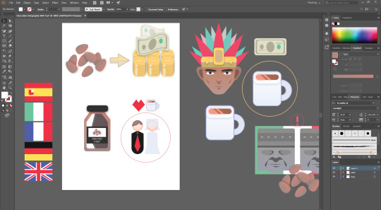
Lastly, for the assets, it was time to make the happy face who’s eating a bar of chocolate. It was fairly easy to create since I’ve made a similar thing in another class recently, that and it’s just a simple face. I chose a nice yellow with an orange stroke and used the ellipse tool for the head as well as another shape to cut into an ellipse to make it into a semicircle (for the mouth and eyes). The hand was also easy to make, it’s just a rounded rectangle with some pen strokes to look like fingers. Again, the chocolate bar was simple—it is just a rectangle with some squares inside using the pen tool and the same gradient that I used for the cocoa beans and the medicine bottle. Finally, (for now) I made the health cross and the no entry sign to show that it’s not good for health. Both easy to make—just using basic tools and methods.
So, after finishing the assets (for now) I moved onto the layout, which I had a couple of ideas of what I would do. So what I did was make some squares and gave them some depth by making them look like they were sticking out. The whole background would be a faded chocolate bar, faded so it wouldn’t take away from the assets that I’d made. I think I pulled it fairly well in my opinion. For the title, I thought I would keep it simple by just calling it “World Chocolate Day” in some very appealing browns might I add. I chose an easy-to-read font that is quite blocky. Moving on, I made these card things which would have my assets on along with some trivia relating to the image. I think they look quite appealing—the brown with spots and the cream-coloured border, they look like some kind of chocolate snack. I decided to put the Aztec underneath the border, so I cut into him. Then I put the hot chocolate mug with the golden ring under the text, and lowered the opacity. For the text, I made it white and in a font that is clearly legible. Underneath this is the one containing the flags, which I resized as I thought they were the most flexible assets on here, and it wouldn’t matter if I’d made them even smaller than they are now. I made the dates underneath also clear to read, going from white to yellow on the end where Britain is, to show that’s where it ends, though this might be a bit misleading.
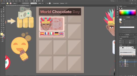
Next up I duplicated the border from the first card and put it beneath the Olmec and the Mexican flag and the cocoa beans. Instead of putting the box around all of the things (namely the cocoa beans) I only put it around the Olmec and the flag as there’d be too much empty space if I did put it around the beans. Next to this is the box containing the cocoa beans to currency, which I think looks quite good—I made the money and cocoa beans stick out of the box (which is the original box with inverted colours). II changed the arrow which I made earlier because it looked really obnoxious and ugly in contrast with the nice browns which I’d picked out. Also I made it go down and right, instead of it just going straight right. Finally for this update, I just moved some of the remaining assets around until I found a place which I thought they would fit.

So I did move the assets around some more, and added some boxes behind them when I was happy with their positions. The wedding ceremony asset I am particularly pleased with, since it looks really nice with the box that I chose to put around it, and I like how I separated the text from the top. I also did this with the box in the bottom right which I recently added. Anyways, that box contains the medicine aspect of the graphic—I thought it was too plain with just the medicine bottle on its own, which I realised when I had placed the text—so I thought I would make other things relating to medicine, and so I made a syringe, as well as some small pills. To the left of this box is the health and effects of chocolate trivia, with the happy face and dopamine emanating from it, as well as the health cross which I put across from the happy face. I thought the best thing to do here would be to put the text between the two assets. With that, my graphic was pretty much complete, with some minor tweaks.
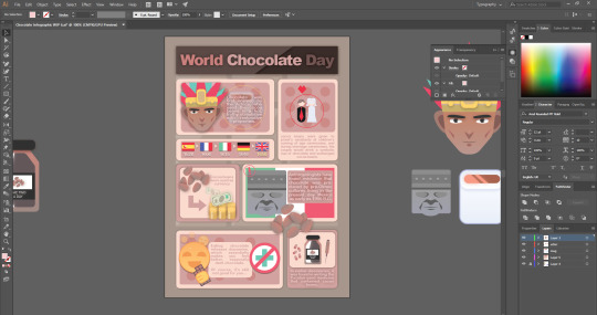
Final World Chocolate Day Infographic
Imgur link (clearer)

10 notes
·
View notes
Text
‘Hello Stranger’ Exercise
4/3/20
In this exercise, we studied observational drawing and the ways that we are able to identify different types of drawing. The types that we as a class identified was sketching, observation and doodling, we went in further in each category and outlined their differences and benefits for us as animators/illustrators i.e. doodling - is an ‘active process’ and is useful when trying too generate new ideas. Observation - useful for trying to keep our drawing realistic and resemble to our physical reference. Sketching - ‘technical’, useful for planning layouts and basic ides.
The aim for this exercise was to practice how to convey a sense of personality through illustration.
From this, we analysed the difference between drawing and illustration. Both drawing and illustration are used to convey a message. Drawings are visual expressions used to convey feelings and emotions evokes within the artist, it’s a quick and fairly immediate result. Whereas, illustrations are visual expressions that help the viewer to further understand and visualise the textual content accompanying it. They’re a more polished and professional finalised product.
I agree with this very much, as drawings seem to be a faster and have a more immediate result, where the messages which the artist try’s to convey could be slightly vague. Due to roughness and lack of precision possibly. I do believe that illustrations are clearer to understand as they capture the exact textual context and the visual expression from the artist. This due to a further developed and finalised creation, as the message being conveyed by the artist has added as much as they could to try and make their visual expressions clearer to the viewer.
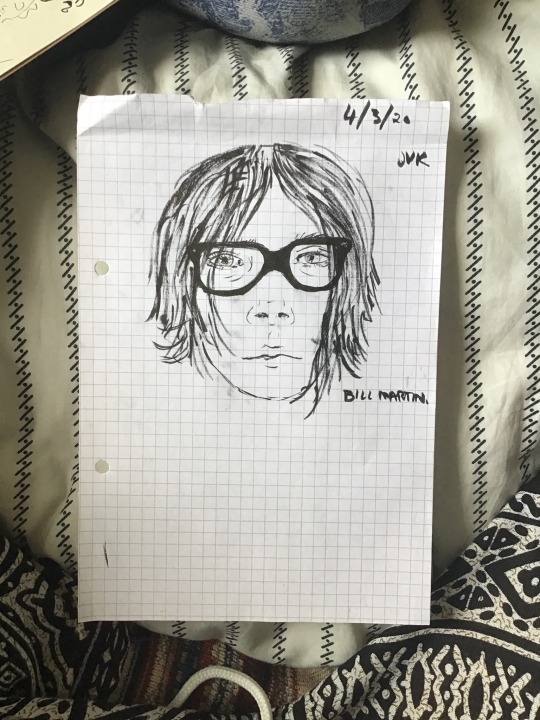
The task was to interview a person in our course, who we don’t usually socialise with, and encounter them. We both had the same questions and interviewed each other. The image below shows the questions and the answers I got from my partner.

Before beginning the task we were asked to draw our partner. This was my first drawing my partner, Bill.
From the information collected from asking my partner questions I created my own illustration to represent the image they portrayed to me. In the image below I used the colours pastel pink and yellow because these were his favourite colours, the pink was used to as more of a shadow and the yellow was used to highlight aiming to add depth and lighting to the piece to make it pop. I used acrylic paint for this since it was bright and show off these colours.
Bill explained that his favourite food was a hotdog and using my knowledge of bills preference of lil peep’s music I decided to include the hotdog as a facial tattoo. Lil peep had many facial tattoos and I thought this was a nice personal touch. In hindsight the hotdog would look better if it was more defined, the ink bled due to paper and ink used. Smaller pens may help if I were to redo the piece.
His most worn item of clothing were his checkered vans, given how iconic the design for these shoes I decided to add homage to the classic vans and add a simple checkered background with pink and yellow highlights to merge the favourite colours and favourite item.
Bill said that if someone would describe him the word, it would be psychopathic, in my mind this had connotations of murder mystery movies and sending notes using magazine letter cut outs, I tried to keep this in mind and mimic that style and randomness when adding his most used word “fuck”, again using his favourite colours. As a finishing touch I added a cactus which represents a pet hate of my partners, he had specifically mentioned desk cactuses however I felt that the western style of cactus was very fitting for the piece.

Review: bill does not have pastel pink hair with yellow highligts like in the illustration, in addition the illustration has a tattoo of a hotdog on his face however despite these differences I feel that the overall piece accurately represents proportion and shape of bill’s face. I have simplified the piece so shading is minimal and lines are simple but I feel that other than details mentioned above it is very close to being observational.
0 notes
Text
Exercise: Using black and white
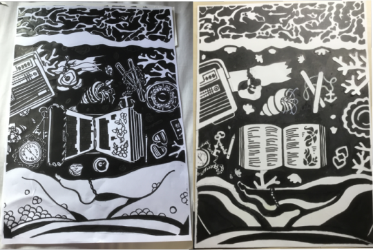
Left - first go, right - second go
Challenges when developing ideas for this exercise in sketchbook:
- how to interpret + apply advice of exploring ideas a bit more before settling on one
My brain realllly likes detail and collecting and categorising information. But if there’s too much information, then processing it into ideas and creating work hopefully intelligently informed by the information becomes really daunting and overwhelming. At first I misinterpreted the advice above and read it as “I need to collect even more visual information and come up with even more ideas at the mindmap stage” but I have no problem coming up with ideas, I find it more difficult to pick which to focus on or which will work best (especially when the brief is so wide). So I kind of overwhelmed myself at the start by collecting a ton of visual information. The good news is I now have so many ideas for sea-themed projects in the future..
(So for me I think this advice is placed further on visual development than the entire idea-generation process. I can explore ideas through words way faster than visually, so just mentally shift the focus along a bit so I’m not overwhelmed when it becomes time to turn words/visual information into my own pictures. Another element of this is probably developing more patience to explore multiple image ideas/comp. thumbnails and not be racing to the final piece...)
-how to produce a “line visual”; draw shapes/a scene/composition without values
It took a little while to figure out how to do this. I think I’m more of a shape person than a line person. When I draw objects or people from reference I have a lot more success with resemblance when I observe the main shapes of dark and light and their proportion to each other instead of producing a silhouette straight away. This is a method I’ve been using since sixth-form life drawing classes so it’s quite ingrained. In my sketchbook I tried drawing objects just as lines, seeing if adding values afterwards would work out ok and had very mixed results. Eventually I decided to forget about the values for now and focus on lines. Interestingly in order to define the shapes I was inclined to add a lot of detailed lines and patterning, which would complicate things a lot when it became time to turn the line visual into a graphic...
Producing graphic piece
- Take 1, A3, using negative to cut and stick onto positive:
I really went in with the line details and patterns in the line visual phase, so when I produced the negative I just had so much visual detail going on that the helpful effects of using the negative to fill in the positive were negated a bit? There were lines everywhere and no empty interior spaces.
- Take 2, had run out of photocopies so traced the original A4 to start over fresh:
I left out some of the odd bric-à-brac to just simplify and focus on the bits I liked, along with things that would have affected the lighting in the scene, like the candle. Where things looked messy I traced the vague shapes, painted out the object and stuck a simplified one on top. Originally I was trying to think about where the light source would be coming from, but I couldn’t figure out how to keep the objects legible at the same time, so focused on the latter. Favourite parts, where I think the black and white shapes minus lines work well: sea foam, tea cup (couldn’t figure this out at all until I added the handle!), seaweed, keys, pencil, shading on legs. I’m happy with the radio and the book, I don’t know the point where a thin shape just becomes a line though, so these might not fit the exercise. The hermit crab and shell is better than in the first attempt but maybe not as distinct as it could be. The plank of driftwood has a good shape but maybe would be better with some black inside the shape to define the wood grain. I also left the scales on the legs off in this version because I couldn’t get them to look defined with the leg shading, which is a shame because it added a hint of character and narrative to the illustration.
How do the graphic and the line visual compare? How has the use of black and white altered it? Where does the focus now lie?
I find my eye is drawn to each for different reasons. The graphic is definitely more catchy in a dynamic way and I can feel my eyes bouncing around from one lighter, larger shape to another. With the line visual, my eyes get pulled into the lower left corner with the fine detail on the pocket watch chain, keys and mussel shells. The chains are definitely better on th line visual, with the cut-outs on the graphic I wasn’t able to achieve the same intricacy (and didn’t attempt to to be honest).
Since I chose to make the sand and water dark in the graphic, with the objects white, it has a night-time mood with maybe the moonlight reflecting off the objects. To me it has a moodier, darker atmosphere compared to the clean, open-ness of the line visual. In the graphic I altered the composition so that less of the objects were overlapping. Although the objects are more thought-out compared to the line visual, where sometimes I added things just to fill space (seaweed behind the radio), maybe the graphic would have more of the detail-interest of the line visual if objects did overlap more. I do think when viewing the graphic you read the image more as a whole composition with balance between light and dark, clear and busy spaces. I like the detail, pattern and flowing lines of the line visual but my eyes get stuck looking in the busier places, maybe in a diagonal line from the lower right corner to the upper left, instead of circling around the whole image.
Things I’ve learnt/were reinforced by this exercise/things to apply to coursework moving forward:
- I find it very, very hard to draw without including value shapes (looking at block areas of shadow and their placement/proportion)
- Value is important in how you guide the eye around a composition.
- Value is important for creating a sense of atmosphere
- I find scaling images down more helpful than scaling up as a way to create critical distance from a composition - too much space a3, a4 feels like less space so I have to use it well.
- For the 50s interior exercise I made a line visual-type thing (inks) then made a digital value comp. but kept the lines more opaque over the top. The value comp. helped so much in creating the atmosphere I wanted when colouring that illustration. It’s be interesting to apply today’s exercise’s even simpler value comp. as part of working on a future “fully rendered”/coloured piece and see if it’s even more helpful, or whether creating multi-toned monochrome value comps works best for me.
- apply artist research earlier on when developing work instead of as an afterthought. It should be helpful!
- don’t over do it on the mind maps. Shift focus to exploring a few written concepts in many ways artistically/visually instead of many words/info, few pictures.
0 notes
Text
Don’t Miss the 10 Best Watercolor Paintings of 2017
This Year’s Best Watercolor Paintings
Every winter, we look forward to putting together this article of the best watercolor paintings of the year. Of course, “best” is subjective, but one way a painting earns that distinction is to stand out in competition.
So with that being said, we turn to art societies — from the West Coast to the East Coast, Florida to Canada — to bring our attention to some of North America’s best watercolor paintings of 2017. Enjoy!
Brightness Burning on the Heart Within
Brightness Burning on the Heart Within by Ali Cavanaugh, watercolor on Aquaboard
Artist Inspirations
My oldest daughter, Neve, was the inspiration for this piece. She’s been my graceful muse for many years. Neve is poised and reserved, and in this composition, I was able to catch her in direct profile. A striking diagonal was created with her downcast head and hand placement.
The two primary elements in my work are bold compositions paired with
a delicate application of paint.
I had hoped to achieve a sense of elegance, beauty, thoughtfulness and intimacy.
—Ali Cavanaugh, Ste. Genevieve, Missouri | Missouri Watercolor Society
Juror’s Response
I wanted to give an award to this particular piece because it exhibits a broad range of techniques, skillful handling and interesting subject matter: the gesture; the angle or position of the body; powerful, stunning color; and a large area of negative space. A painting like this is hard to forget.
–Dongfeng Li, Juror
Carrie Mae
Carrie Mae by Dean Mitchell, watercolor on paper
Artist Inspirations
Carrie Mae has been a friend of my family’s since before I was born. She’s a kind, brilliant human being. She’s 97 now, and was born in Boston. She graduated from A&M as valedictorian in 1941 and received her master’s from Columbia in 1945. She got her Ph.D. from Iowa State University in 1958.
Her mother owned a hotel in the Boston area for 35 years called “The Mother’s Lunch.” It was one of the few — if not the only hotel — where African-Americans could stay. The list of people who stayed there is a “Who’s Who” in American culture — Ella Fitzgerald, Etta James, Billie Holiday, Sam Davis, Mary McLeod Bethune and many others. She’s talked about her sister doing Ella Fitzgerald’s hair just before she went on stage to perform.
—Dean Mitchell, Tampa, Florida | Florida Watercolor Society
Juror’s Response
Carrie Mae is a masterful example of design, foresight and capability possessed by very few contemporary artists. The muted colors are utilized with a delicacy and deftness of brushstrokes that emphasize the sense of dignified tranquility that clearly indicates the subject is a character of strong positive influence in the artist’s life.
The subject’s pose at the edge of her chair and the slight lean of her head suggest a natural listener, reinforced by her face, with its somber expression, and her clasped hands. If the painting could speak to me, it would say “wisdom.”
One thing that caught my attention was the little bit of red nail polish. Once I saw that bit of red, the muted tones of the seat and wooden furniture began to reveal a repetition of the same color placed throughout the image.
–Iain Stewart, Juror
Glass on Glass on Fabric
Glass on Glass on Fabric, Laurie Goldstein-Warren, watercolor on paper
Artist Inspirations
Painting glass in watercolor makes for a unique set of challenges, beginning with the importance of seeing the various reflections and refraction in the glass and drawing them accurately.
When I composed this painting, I wanted to use the taller glass pieces. After setting up the still life, I realized it needed a horizontal element, so I introduced the fabric with its more organic design.
—Laurie Goldstein-Warren, Buckhannon, West Virginia | Califonia Watercolor Association
Juror’s Response
Glass on Glass on Fabric possesses a fanciful, magical quality. The effects of light on glass are mesmerizing. The sparkling highlights contrast with deep, rich darks. The luminous, complementary color scheme and skillful composition are beautifully orchestrated in this powerful watercolor.
–Donna Zagotta, Juror
Morning in Paris
Morning in Paris by June Webster, watercolor on paper
Artist Inspirations
The view from my hotel balcony in Paris near the Luxembourg Gardens inspired me to paint. The city was so quiet in the morning, and the painted lines on the street created beautifully defined shadows.
I wanted to capture that feeling of calm, as well as the color and value changes created by the shadows.
—June Webster, Cheshire, Connecticut | Transparent Watercolor Society of America
Juror’s Response
By simplifying the image and illuminating the subject, the basic design and divisions of space are balanced and keep the viewer’s eye moving. It’s a well-designed and evocative image that makes one feel a sense of being alone within a city full of people.
–Jean Pederson, Juror
Insomniacs Dreamboats
Insomniacs Dreamboats by Cathy Hegman, acrylic on paper
Artist Inspirations
My paintings are always about my life or some aspect of my life. I work from my imagination, not models or photos.
My inspiration was constant bouts of insomnia. I’ve done a long-running series of paintings called Insomniacs with which I try to convey the feeling of needing to do something but being unable to.
—Cathy Hegman | Holly Bluff, Mississippi | American Watercolor Society
Juror’s Response
Stars represent the night. There are sheep, ships passing and a fantastical hairpiece, which could represent a cloud or the dark night.
The painting possesses good graphic qualities, strong vertical and horizontal movement, contrasts light and dark values, and has good color and competent technique. Plus, it captures and conveys a message beyond surface appearance that we all can relate to.
–Antonio Masi, Juror
Summer’s Reflection
Summer’s Reflection by Sidra Kaluszka, watercolor on paper
Artist Inspirations
Summer’s Reflection depicts a couple of persimmons that I picked in a park while walking with my in-laws, and some purple basil from my mother’s garden. I constantly seek new challenges, like incorporating the mirror behind the fruit. I wanted to capture the interaction between the subjects, the mirror and light.
The viewer doesn’t have a straightforward view of the reflection. I painted the focal point off center, with lines weaving in and out, because it invites the eye to explore.
—Sidra Kaluszka, Radford, Virginia | West Virginia Watercolor Society
Juror’s Response
This painting is so dynamically strong. Design and composition are important to me as an artist, and this piece displays great composition. There’s a wonderful use of contrasts: value, temperature, shapes, and hard and soft edges. Although it’s a realistic painting, it has a nice abstract feel to it.
–Chris Krupinski, Juror
Backstage Adjustments
Backstage Adjustments by Bev Jozwiak, watercolor on paper
Artist Inspirations
My youngest daughter is a professional ballet dancer, and I grew to love the art form. I helped out a lot around her dance studio — everything from designing tutus to making tiaras — and painted four 20- by 40-foot backdrops.
My ballet paintings are always near and dear to my heart. Dancers are extremely close to one another because they spend so much time together, and dance is intimate. I wanted this piece to convey that closeness and willingness to help each other.
—Bev Jozwiak, Vancouver, Washington | Northwest Watercolor Society
Juror’s Response
This work caught my attention with its bold use of colors and brushwork that’s both unique and evocative. I gave the work a high point in design elements and composition.
While Jozwiak employs a variety of traditional techniques and knowledge of art, it’s also evident she’s not afraid to push the envelope of water media, which I admire immensely. As a result, her work looks pleasing from an academic point of view, but also has an edgy, modern appeal.
–Keiko Tanabe, Juror
Family Walk
Family Walk by Antonia Masi, watercolor on paper
Artist Inspirations
I have about 16 colors in my palette, but I tend to select two that will set the mood. I explore value combinations I can create with my two picks, and use the other colors to augment the purity, warmness and coolness of the original two I’ve chosen. This way, I can control the values in my painting.
Normally I find compositions in real life — texture, chain-link fences, graffiti and figures, like the tiny ones silhouetted under the arch in Family Walk, passing from darkness into light. At first, it appeared as a mass of confusion and excitement, so I exaggerated the smallness of the figures into this massive state of confusion and tried to bring order into it. I was thinking of a colorful quilted blanket; it has many patterns, but, at the same time, it’s still one unit.
—Antonio Masi, Garden City, New York | North East Watercolor Society
609 Main
609 Main by Ron Thurston, watercolor on paper
Artist Inspirations
The white staircase in 609 Main is one of my dog’s designated stops on our daily walks. The house nearby also made the cut. I couldn’t resist including it, but the real one is white and situated too far away.
Experimenting with value choices, I decided to make the house blue and black as a support to the black dog. Milton Avery was my color muse. It’s his unusual color combinations that inspire me.
—Ron Thurston, Coraopolis, Pennsylvania | Penn State Watercolor Society
Purely Spectral
Purely Spectral by Brenda Benson, watercolor on paper on matboard
Artist Inspirations
I was preparing paper for another piece using dour color and dark, depressing neutrals in shades of brown and gray. Suddenly I felt the need to cast off that burden and do something bright and joyful. I thumbed through my sketchbooks until I found something that would celebrate the joy that color can bring, and settled on a rough sketch of a quilt. A quilt and an open box of new crayons were my inspiration.
“I cut the paper into rectangles, then scored and folded them into squares. Meanwhile, I painted mat board with acrylics in the design I had worked out in my sketchbook. Taking a folded square of the painted paper, I used scissors or paper punches to cut a random design and then glued it down to its spot on the matboard grid. I chose bright primary and secondary colors for the joy of opening a new box of crayons. Colors transition gently from one to another with analogous hues.”
—Brenda Benson, Monroe City, Missouri | Springfield Art Museum
Juror’s Response
One of the central reasons that the Springfield Art Museum created Watercolor USA was to recognize innovation in the use of watercolor. I love that this painting uses multiple pieces of paper, instead of the standard two dimensions.
–Laurin McCracken, Juror
What do you think is the best watercolor painting on this list? Do you have any others to add to the lineup? Tell us in the comments!
Peruse through past issues of Watercolor Artist here. And, be sure to subscribe to Watercolor Artist for more examples of the best watercolor paintings, interviews with top artists, the latest trends, and watercolor tips and techniques.
The post Don’t Miss the 10 Best Watercolor Paintings of 2017 appeared first on Artist's Network.
from Artist's Network http://ift.tt/2mUiaIq
0 notes
Last Seen Blogs
nondeterminedconsort
Glitter Garbage

kistacoklattanpaoperasi-blog
Pengobatan Kista Coklat Tanpa Operasi Di Jakarta
wellnesscard
jfsjfskgsjfa

itsmanagedservicesbiz-blog
Managed Service Biz
prinsegod-blog
Untitled