#like when you swirl paint to create a kaleidoscopic pattern
Explore tagged Tumblr posts
Visit Tumblr Blog
Explore Tumblr blogs with no restrictions, modern design and the best experience.
Last Seen Tumblr Blogs


Fun Fact
Mobile US users spent an average of 115.8 minutes on Tumblr app monthly.
Text
Yes yes Skywarp is called Skywarp bc he teleports and we all agree Starscream has a screamy voice and should also have a canary cry attack [thank you Cyberverse] but Thundercracker needs to complete this by cracking the skies open with a thunderous noise when he puts the throttle down
#transformers#thundercracker#also skywarp's teleportation *should* make it look like the area he just left has warped#like when you swirl paint to create a kaleidoscopic pattern#elite trine
40 notes
·
View notes
Text
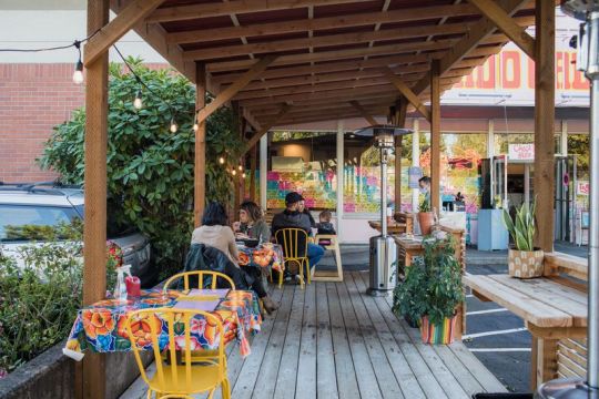
How to Bring This Portland Restaurant’s Colorful Outdoor Oasis to Your Home

The fun of dining at Gado Gado isn’t just in the menu. It’s also in its signature playful spirit.
While restaurants around the United States are figuring out how to shift their business to adapt to a new culinary landscape, some teams are having more success making it work. In Portland, Oregon, Thomas and Mariah Pisha-Duffly, the owners of the hit Indonesian restaurant, Gado Gado, have not only figured out how to operate in a socially distanced manner that continues to draw customers (even inspiring them to open a second spot called Oma’s Takeaway), but they’ve managed to maintain the restaurant’s signature playful spirit along the way.
The fun of dining at Gado Gado is apparent in the amped-up flavors of its menu, which draws on Thomas’s Indonesian-Chinese heritage for dishes like Sumatran-style spicy beef rendang (served with coconut rice and a green chile tomatillo sambal), ayam lawar (a shredded chicken and coconut salad with galangal dressing), or a pandan jelly dessert. But it’s the restaurant’s thoughtful Peranakan-inspired design accents mixed in with some psychedelic vintage finds that truly make it an experience. Even now with a closed dining room, the Pisha-Dufflys have brought some of the restaurant’s bold design scheme to its two outdoor patios.
“When we were designing the restaurant, it felt like a really great opportunity to communicate ourselves through design,” says Mariah Pisha-Duffly. “There were a lot of spaces opening up around us that were extremely beautiful but minimal, and we wanted to go the opposite way and do something maximal and full of pattern.” When reimagining the dining room for the outdoors, the duo continued the theme with mismatched rugs, oilcloth tablecloths, and other delightful personal touches, all while trying to keep costs low.
Below, Mariah Pisha-Duffly explains how they made Gado Gado into a colorful outdoor oasis, and how to bring the Gado Gado brand of power-clashing onto your patio or into your home.
Remix your old stuff with new purpose
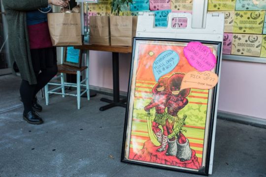
The black light poster works as decor and a way to communicate instructions for social distancing.
“When we started to rethink the patio for the year of COVID, it felt like working with what we had, and being really resourceful was necessary,” says Pisha-Duffly. “The bathrooms inside Gado Gado are filled with themed ’70s fantasy art. We brought this black light poster outside, and we made little word bubbles on it to let people know where to find their takeout. It didn’t used to be that you needed all these instructions for customers, but you do now, and we wanted to make it beautiful and fun.”
Shop it: Black light posters
Whether you place them in the bathroom or the bedroom, ’70s-style black light posters give the space a trippy element.
Add bold personal touches
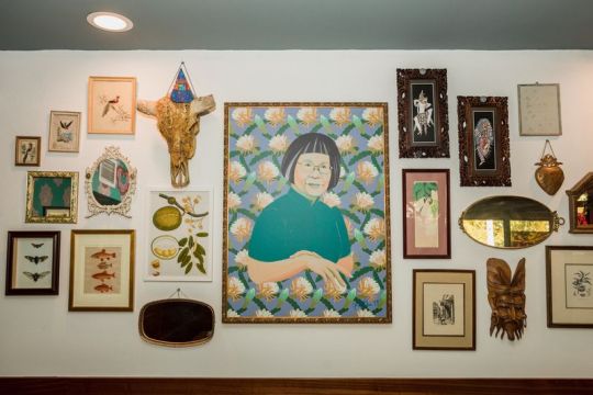
Design features like this gallery wall and custom-designed wallpaper had to remain inside.
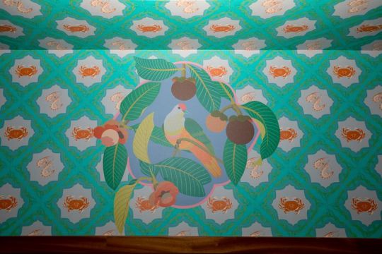
“Thomas’s family is Chinese, but his grandmother lived in Indonesia, Singapore, and Malaysia, before coming to the U.S. You see a lot of Peranakan design throughout Southeast Asia — full of patterns, tiles, and intricate carvings. Inside, we have a big portrait of his grandmother painted on the wall by artist Kate Blairstone (she also did our amazing wallpaper with shellfish and birds) and a mask that my grandparents got while living in Indonesia. Whenever you collect something it tells the stories of who you are and what you like, and getting the opportunity to put that in the restaurant was really special.”
Shop it: Patterned wallpaper and paintings
Blairstone has made dozens of custom wall accents that speak to each individual owner’s story. Whether you fancy a version with oysters, flowers, or carrots, she’s available to make works on request that speak to one’s story. You can also find wallpaper with similar motifs on Etsy.
Don’t be afraid to mix and match
Plates and bowls come in various vintage patterns.

“Once I knew we were going to open Gado Gado, I could finally get all this thrift store stuff that I’ve wanted to buy for forever. I would go to Goodwill three or four days a week, just collecting things.”
Shop it now: Power-clashing vintage plates
Part of what makes dining at Gado Gado special is that none of the plates and glassware match, which means each time you dine there it might be a little different. The cornucopia of palettes somehow never feels like too much, but rather, it functions almost like a sewn-together quilt that uses a kaleidoscope of fabrics that come together beautifully. Vintage, granny-esque floral plates are given an exhilarating new life here.
Serve your drinks in ice cream sundae cups

Now that it’s colder, slushie cocktails aren’t on offer. Instead, Gado Gado serves cocktails like this one, the Honey Honey, in sundae glasses.
“This summer we were doing a lot of slushy cocktails made with things like freshly juiced turmeric and ginger, tamarind, coconut, lime, and tequila. We like to add fun garnishes to them, too.”
Shop it now: Old-fashioned ice cream sundae cups
These clear glass tumblers are usually the vessels for heaping scoops of strawberry ice cream with a fudge swirl, whipped cream, and sprinkles, but they are equally useful for spicing up an after-work drink. Add a fun garnish to complete the effect.
Have fun with lights
Gado Gado’s disco takeout tent is no more, but string lights still provide some whimsy.
“Initially we were doing takeout and delivery that was extremely no contact and figuring ways to make the experience personal and hospitable within the framework. We had a takeout tent with disco balls, flashing lights, and fake mangosteens — things that still communicated fun and warmth without physical contact. Someone called it a “block party for one.” And it’s true, we love rainbow lights, to the point that we have a giant fruit bowl full of LED remotes because at this point we own so many rainbow light set-ups.”
Shop it: Party lights
Bring the party back home with these funky light options. “For lighting we like to go really cheesy,” Pisha-Duffly says.
Incorporate more pattern with plants
“We worked with this great company called Appetite that brought us plants such as palms, yucca trees, succulents, and ginseng plants. They have fabric buckets, and when they stopped by they were like, ‘What color palette [are you] thinking of for the bases?’ and we were laughing, like, ‘Nothing is off the table, our restaurant is a rainbow.’”
Shop it now: Fabric planters
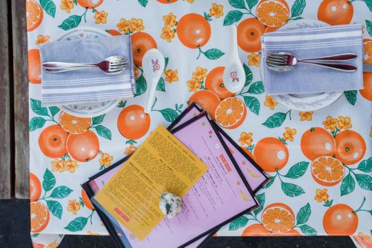
Make your table restaurant-worthy

Oilcloth is practical and has the added benefit of being in keeping with Gado Gado’s colorful style.
“Oilcloth is so cool. It’s durable and it’s fairly inexpensive — we have versions with golden floral prints, orange, and a sort of blue and red floral thing happening.”
Shop it now: Oil cloth prints
As Eater has documented in the past, oilcloth is a popular choice for many restaurants, and you can bring it into your own space. Even the messiest of eaters won’t have trouble cleaning them, and the more tablecloth options you have, the more backdrops for taking Instagram-worthy food photos.
Bring rugs outdoors

“Having all the rugs outside was a fun way to create a sense of comfort that’s super affordable.”
Shop it now: Outdoor rugs
Rugs don’t only have to stay inside. These versions can bear the brunt of rainy Portland weather, bringing a little bit of sunshine as they do.
Emma Orlow is a writer for Eater, Grub Street, T: The New York Times Style Magazine, and Bon Appétit (among others), where she covers the intersection of the food and design worlds. Celeste Noche is a Portland-based photographer.
from Eater - All https://ift.tt/2HOsFrz https://ift.tt/2HSfKF6
The fun of dining at Gado Gado isn’t just in the menu. It’s also in its signature playful spirit.
While restaurants around the United States are figuring out how to shift their business to adapt to a new culinary landscape, some teams are having more success making it work. In Portland, Oregon, Thomas and Mariah Pisha-Duffly, the owners of the hit Indonesian restaurant, Gado Gado, have not only figured out how to operate in a socially distanced manner that continues to draw customers (even inspiring them to open a second spot called Oma’s Takeaway), but they’ve managed to maintain the restaurant’s signature playful spirit along the way.
The fun of dining at Gado Gado is apparent in the amped-up flavors of its menu, which draws on Thomas’s Indonesian-Chinese heritage for dishes like Sumatran-style spicy beef rendang (served with coconut rice and a green chile tomatillo sambal), ayam lawar (a shredded chicken and coconut salad with galangal dressing), or a pandan jelly dessert. But it’s the restaurant’s thoughtful Peranakan-inspired design accents mixed in with some psychedelic vintage finds that truly make it an experience. Even now with a closed dining room, the Pisha-Dufflys have brought some of the restaurant’s bold design scheme to its two outdoor patios.
“When we were designing the restaurant, it felt like a really great opportunity to communicate ourselves through design,” says Mariah Pisha-Duffly. “There were a lot of spaces opening up around us that were extremely beautiful but minimal, and we wanted to go the opposite way and do something maximal and full of pattern.” When reimagining the dining room for the outdoors, the duo continued the theme with mismatched rugs, oilcloth tablecloths, and other delightful personal touches, all while trying to keep costs low.
Below, Mariah Pisha-Duffly explains how they made Gado Gado into a colorful outdoor oasis, and how to bring the Gado Gado brand of power-clashing onto your patio or into your home.
Remix your old stuff with new purpose
The black light poster works as decor and a way to communicate instructions for social distancing.
“When we started to rethink the patio for the year of COVID, it felt like working with what we had, and being really resourceful was necessary,” says Pisha-Duffly. “The bathrooms inside Gado Gado are filled with themed ’70s fantasy art. We brought this black light poster outside, and we made little word bubbles on it to let people know where to find their takeout. It didn’t used to be that you needed all these instructions for customers, but you do now, and we wanted to make it beautiful and fun.”
Shop it: Black light posters
Whether you place them in the bathroom or the bedroom, ’70s-style black light posters give the space a trippy element.
Add bold personal touches
Design features like this gallery wall and custom-designed wallpaper had to remain inside.
“Thomas’s family is Chinese, but his grandmother lived in Indonesia, Singapore, and Malaysia, before coming to the U.S. You see a lot of Peranakan design throughout Southeast Asia — full of patterns, tiles, and intricate carvings. Inside, we have a big portrait of his grandmother painted on the wall by artist Kate Blairstone (she also did our amazing wallpaper with shellfish and birds) and a mask that my grandparents got while living in Indonesia. Whenever you collect something it tells the stories of who you are and what you like, and getting the opportunity to put that in the restaurant was really special.”
Shop it: Patterned wallpaper and paintings
Blairstone has made dozens of custom wall accents that speak to each individual owner’s story. Whether you fancy a version with oysters, flowers, or carrots, she’s available to make works on request that speak to one’s story. You can also find wallpaper with similar motifs on Etsy.
Don’t be afraid to mix and match
Plates and bowls come in various vintage patterns.
“Once I knew we were going to open Gado Gado, I could finally get all this thrift store stuff that I’ve wanted to buy for forever. I would go to Goodwill three or four days a week, just collecting things.”
Shop it now: Power-clashing vintage plates
Part of what makes dining at Gado Gado special is that none of the plates and glassware match, which means each time you dine there it might be a little different. The cornucopia of palettes somehow never feels like too much, but rather, it functions almost like a sewn-together quilt that uses a kaleidoscope of fabrics that come together beautifully. Vintage, granny-esque floral plates are given an exhilarating new life here.
Serve your drinks in ice cream sundae cups
Now that it’s colder, slushie cocktails aren’t on offer. Instead, Gado Gado serves cocktails like this one, the Honey Honey, in sundae glasses.
“This summer we were doing a lot of slushy cocktails made with things like freshly juiced turmeric and ginger, tamarind, coconut, lime, and tequila. We like to add fun garnishes to them, too.”
Shop it now: Old-fashioned ice cream sundae cups
These clear glass tumblers are usually the vessels for heaping scoops of strawberry ice cream with a fudge swirl, whipped cream, and sprinkles, but they are equally useful for spicing up an after-work drink. Add a fun garnish to complete the effect.
Have fun with lights
Gado Gado’s disco takeout tent is no more, but string lights still provide some whimsy.
“Initially we were doing takeout and delivery that was extremely no contact and figuring ways to make the experience personal and hospitable within the framework. We had a takeout tent with disco balls, flashing lights, and fake mangosteens — things that still communicated fun and warmth without physical contact. Someone called it a “block party for one.” And it’s true, we love rainbow lights, to the point that we have a giant fruit bowl full of LED remotes because at this point we own so many rainbow light set-ups.”
Shop it: Party lights
Bring the party back home with these funky light options. “For lighting we like to go really cheesy,” Pisha-Duffly says.
Incorporate more pattern with plants
“We worked with this great company called Appetite that brought us plants such as palms, yucca trees, succulents, and ginseng plants. They have fabric buckets, and when they stopped by they were like, ‘What color palette [are you] thinking of for the bases?’ and we were laughing, like, ‘Nothing is off the table, our restaurant is a rainbow.’”
Shop it now: Fabric planters
Make your table restaurant-worthy
Oilcloth is practical and has the added benefit of being in keeping with Gado Gado’s colorful style.
“Oilcloth is so cool. It’s durable and it’s fairly inexpensive — we have versions with golden floral prints, orange, and a sort of blue and red floral thing happening.”
Shop it now: Oil cloth prints
As Eater has documented in the past, oilcloth is a popular choice for many restaurants, and you can bring it into your own space. Even the messiest of eaters won’t have trouble cleaning them, and the more tablecloth options you have, the more backdrops for taking Instagram-worthy food photos.
Bring rugs outdoors
“Having all the rugs outside was a fun way to create a sense of comfort that’s super affordable.”
Shop it now: Outdoor rugs
Rugs don’t only have to stay inside. These versions can bear the brunt of rainy Portland weather, bringing a little bit of sunshine as they do.
Emma Orlow is a writer for Eater, Grub Street, T: The New York Times Style Magazine, and Bon Appétit (among others), where she covers the intersection of the food and design worlds. Celeste Noche is a Portland-based photographer.
from Eater - All https://ift.tt/2HOsFrz via Blogger https://ift.tt/3jJ4lVl
0 notes
Text
Inspirit - The new iOS app by Escape Motions is coming this September
We’re happy to announce that we are about to release a new iOS application for all creative souls out there! Its name is Inspirit and it’s a beautiful little app that will sparkle your creativity.
Inspirit is created by Peter and a high school student Stefan who spent his whole summer break in our office on an internship (and we absolutely admire him for it!). Peter chose one of many experimental projects he had been having up in his sleeve and prepared the design for iOS devices while Stefan’s task was to rewrite and optimize the code. Together they created a neat user interface and after the beta test, the application was ready for release.
What is Inspirit?
Inspirit is a relaxing and easy to use painting application that lets you design mesmerizing mandala and kaleidoscope artworks and watch how they slowly evolve in time. The application beautifully combines art, spiritual and relaxing elements and allows everyone to unwind in the most artistic way. Watch the video below to witness the beauty of Inspirit with your own eyes:
youtube
Inspirit is a perfect calming app for everybody no matter the age.
Children will have fun drawing swirling patterns while adults will enjoy it as a perfect app for relaxation and stimulation of their creative minds. The possibilities are endless. Every picture you make with Inspirit is unparalleled and shows the real uniqueness of you as an artist. With Inspirit you will be able to draw beautiful artworks like the ones below:


When will Inspirit be released?
Inspirit will be released in early September worldwide through the App Store in the Entertainment category for an introductory price of $0.99 USD and will be compatible with iPad and iPhone devices.
We are so thrilled for this release! We believe you will love this little app as much as we do. Be sure to check your Inbox for an official release newsletter soon.
Stay creative!
More info: inspirit.escapemotions.com
0 notes
Text
Wall decorating ideas with modern wallpapers
Modern wallpaper may sound like an oxymoron if you associate wallcoverings with that outdated, stuffy, impossible-to-remove chintz from your great grandmother's house. But wallpaper, and perhaps the design industry in general, is simultaneously loosening up and embracing nostalgia. Translation: Modern wallpaper is trending (maybe it never even went away), and we're here for it. As Manhattan designer and wallpaper extraordinaire Danielle Colding tells House Beautiful, “everything that’s old is new again,” and “there are no rules anymore.” Learn how to freshen up any old wallpaper with some clever styling tips and get inspired by gorgeous rooms that revolve around modern wallpaper with the twenty examples below.
1 Pick a Repeating Motif
Paired with traditional cotton bedding and an ultra-modern silver mushroom lamp, this trippy, kaleidoscopic wallpaper in a Studio DB-designed bedroom is a stunning and innovative backdrop. The wallpaper, Nimbo in Noctilucent by Flat Vernacular, was inspired by something as eternal as clouds moving across the sky, yet it feels decidedly modern. breakfast bar ideas for small kitchens https://www.justdiydecor.com/kitchen-decor-ideas/4-easy-and-affordable-breakfast-bar-ideas-for-small-kitchens/
2 Get Bold and Graphic
When you want a wallpaper that's 100% modern, a graphic print is your best bet. The linear lines and perceived three dimensional effect make it look like its from the future (or at least inspired by some kind of digitized blue print). Case in point? This space designed by Studio Razavi Architecture, which features a mesmerizing wallpaper with a cubic print that draws upon the the shapes of the herringbone floors and painted wall in the dining room.
3 Capture a Mood With Ombré
Designed by Space Exploration Design, this bathroom is a serious mood. The ombré design of the wallpaper from Calico's Aurora collection is inspired by twilight skies. Paired with a moody marble vanity, rose cold fittings and modern light fixture, and a frameless mirror, it captures that beautiful, hard-to-pin-down, in-between moment of dusk when the light begins to fade.
upstairs loft ideas https://www.justdiydecor.com/interior-decoration/7-functional-upstairs-loft-decorating-ideas/
4 Spotlight a Cheeky Print
You can always count on Fornasetti for a fun, cheeky wallpaper print. This one (Tema e Variazioni ) is both a classic and a youthful statement, thanks to the bright minty green hue with that iconic portrait. It livens up the small dining space designed by Jeff Andrews, even though the Craftsmen-style architecture isn't particularly modern.
5 Try the Tonal Trend
Two words: Tonal perfection. How could you not want to crawl right into this fluffy pink cloud dream of a bed? The abstract rose quartz wallpaper by Flat Vernacular sets the scene for a heavenly atmosphere, dancing and interacting with the light. And while it isn't necessarily that rigid, austere beauty of modern interiors, the tonal approach is definitely on-trend. We also love the Art Deco-inspired bed frame for a retro accent.
twin girl bedroom ideas https://www.justdiydecor.com/bedroom-decor-ideas/7-timeless-twin-girl-bedroom-ideas/
6 Display It as Artwork
you don't need to cover the entire wall to make a statement. In fact, framing your favorite wallpaper print can be a more affordable and less labor-intensive optoin. In this living room, 2LG Studio framed a panel of Calico Wallpaper's Bone collection in Wabi, which "speaks to time immemorial" (and just adds a fun splash of gold). .
7 Focus On Modern Accents
While the wallpaper itself is pretty neutral in this bathroom designed by Studio DB, the modern mirror above the sink as well as the contemporary blush pink bulb make it feel like the perfect blend between elegant and on-trend. If you're drawn to this vignette, consider an understated yet slightly whimsical print with sophisticated materials like marble in more permanent features (like the counters) and then add modern accents.
kids bathroom decor https://www.justdiydecor.com/bathroom-decor-ideas/10-kids-bathroom-decor-ideas-every-mom-will-love/
8 Make a Statement With Large-Scale Prints
With a super large-scale print that looks more like a work of art than your everyday wallpaper, this dining room designed by Regan Baker Design is a force to be reckoned with. Because the olive and forest greens as well as the swirls of gold assert an intensity, Baker chose to more casual furniture to ground the space as family-friendly and approachable.
9 Be Matchy-Matchy
The graphic navy wallpaper and matching upholstered headboard along with the chrome table lamp assert a modern sensibility to the antique pieces throughout the dapper bedroom designed by Nick Olsen. If you're wondering how to mix in old family heirlooms or flea market finds, take note.
10 Freshen Up Original Features
Here's proof that original elements can age well given the right design treatment. As the designers from 2LG Studio describe, "this house already had charm and great bones, with period features including the stunning original tiles in the entrance hall." They achieved that super lived-in vibe by keeping the original colorful tiles but then added a cloud-print, pale mint-hued wallpaper that brings the whole space up to speed.
11 Pair Classic Prints With Modern Furniture
Hello, mural wallpaper of our dreams. It doesn't get more elegant than a de Gournay wallpaper. But there are also tons of ways to make it feel new again, as done fabulously in this dining room designed by Studio DB. The chairs from The Socialite Family are a modern interpretation of a retro design as is the light fixture from Ladies and Gentlemen Studio. The blooms also look like they're blossoming out of the paper itself.
12 Make What's Old New Again
This bedroom designed by Emily Henderson is a great example of how to make something as timeless as toile feel contemporary. Paired with midcentury-inspired accents, modern artwork, and simple blue bedding, it's a great mix of eras and trends to create something totally unique. A black and white toile like this one is a great way to incorporates florals without going overboard.
13 Make Traditional Art Feel Fresh
Interior designer Martyn Lawrence Bullard was tasked with giving the 1820s Victorian in Rhode Island a "mad old aunt" aesthetic with a modern twist. The hand-painted, agate-like -wallcovering by Robert Crowder & Co brings dimension and life to the hallway, and even makes the pair of 19th-century lithographs of etchings by Giovanni Battista Piranesi look cool and edgy.
14 Dress Up Your Corners
This Catherine Kwong-designed space proves that monochrome interiors have endless potential. With a painterly-inspired black and white wallpaper, this awkward corner is transformed into a comfortable and stylish reading nook.
apartment bathroom decor ideas https://www.justdiydecor.com/bathroom-decor-ideas/10-apartment-bathroom-decorating-ideas-for-less/
15 Cover Every Nook and Cranny
According to 2LG Studio, the former owners of this house had covered all the walls in pink. Using that as inspiration, they maintained the light pink theme throughout, covering the walls in a gorgeous geode-meets-brutalism wallpaper. The gorgeous blue carpet is a bold and modern play on classic design motifs. This, along with the baby pink walls, baby blue accent chair, and modern lighting are all it takes to set the tone of the home.
16 Make Unexpected Design Decisions
While the palm leaf print wallpaper isn't necessarily a new trend, there are countless ways to reimagine it. For example, in this bedroom at Hotel Henriette in Paris, the floors are painted black to give the room a more intimate, romantic, and grounded sensibility while the mint green linens introduce a laidback country chic vibe. It's the perfect blend of breezy island vibes and a moody urban oasis.
17 Work With Existing Pieces
The splatter paint-inspired wallpaper both complements and complicates the classic Mediterranean-style tiles. It, along with the mirror, give this tiny bathroom a 21st century spin. "We wanted to maintain the strong heritage of the architecture, whilst bringing it up to date with our new take," say the designers of 2LG Studio.
18 Play With Texture and Embrace Quirks
In this little dining nook designed by 2LG Studio, what could have been an awkward eyesore becomes the striking focal point. That's thanks to the texture-rich wallpaper, which looks like torn paper up close. Stretching from floor the ceiling, it doubles as artwork. 19 Rethink Traditional Patterns
Modern, photorealist interpretations of classic designs are popping up everywhere. In this dining room designed by Leanne Ford Interiors, the walls are covered in a contemporized botanical print that gives the romantic, old-school floral look a new spin. But the dining room still feels timeless, thanks to the linen slipcover chairs and reclaimed wood table.
20 Brin the Outdoors in (But Digitize Them)
Like the space above, a digitalized geometric or nature-inspired pattern can bring so much intrigue to a room that just can't be executed with paint or artwork. In this bedroom designed by 2LG studio, the wallpaper mimics wood grain swirls for a nature-inspired twist. Think of it as a new way to bring the outdoors in.
0 notes
Text
The world was underwater so I kicked my feet and swam.
*
White horse waves crashed against the caves of my skull and searing hot flames coursed through my veins. Bloated and bulging eyelids framed my hazy vision and filtered my view through layers of vibrantly coloured glass like a kaleidoscope or the stained windows of an old church. The immediate space around me was awash with pools of light; fazing through the spectrum, diluted in translucency. Ominous objects appeared to revolve in the places the light couldn't reach. I noticed then the fine silvery thread, rooted in my chest and reaching out into the darkness. It grew as I studied it; fresh shoots of the strange stuff snaked out from my heart into the night. How can something be so alien and so familiar at the same time? The shimmering fibres twisted and intertwined with each other in a delicate, precise ballet. Looping and tightening, pulling me on all the while.
Like a shark I needed to keep moving to survive. Heaving and hauling I struggle with the meaty encasement which is my body but the thread never stops tugging. A fleeting thought rings through ‘more trouble than it’s worth’. Using my last fumes of strength; the life inside me beat down upon the rotting flesh hard. Pressure building, cracks forming, I push so hard that finally I burst out. Right out of my own chest, leaving a shell like a bruised peach suspended there on the other side. A mobile of pulp turning in slow motion, swollen and spattered. Bubbles of glistening spit still gopping down a purple cheek. An unstuck mosaic of jagged porcelain and glass lists by, mementos of a past life which were no longer real. Flakes of faded lime wallpaper peel free under my fingers as I propelled myself along the corridor. Treading water all the way.
*
A sweltering heat hung in thick air that night. So hot the tarmac seemed to tack onto the tyres of the old bus as it ground toward us, it’s soon to be passengers, like a layer of sticky treacle covered the road and if the bus stayed stationary too long it’d melt right into the ground.
Shuffling with bags and fumbling in pockets we assemble a misshapen que in our unspoken respectful order; coffin dodgers at the front, suited and booted bringing up the rear. I hang back and savour the last few tokes. 5 strangers, all in a row. From here I could hear the soft hum of each little universe whirring inside their cranium encasing. Swelling with fleeting thoughts, distant memories, and familiar faces. Time lines stretching far ahead of them. On the same path momentarily, all headed to their own destination. I wondered, in two days time how many miles apart we would all be from each other? Maybe I’m attributing these people more exciting lives than realistic. They could all well be snug back at home in cosy ole M before lunch tomorrow. No thanks. The last person in the que, a wild haired man in an almost neon fuchsia and green flowered shirt, filed through the doors. Emblazoned onto the back of his shirt in what looked like painted black acrylic were the words: ‘9/11 WAS AN INSIDE JOKE’ A chuckle echoed from deep in my empty belly but it was tainted by the sharp twinge of guilt and hopelessness as I re-watched those little silhouettes drop from the top floors of my minds eye and hurtle toward the ground. My own line tugged and I too boarded. There was no air conditioning on the bus and the humidity pulsed. A stale, sweaty stench engulfs you as you walk up the steps, as if breaking the invisible film which was containing the odour. Something else hung in that thick air too, I could taste it like iron on my tongue. Wiry carpet with garish swirling patterns of burgundy mustard and navy crunched underfoot and crept up the walls to meet at the ceiling, creating a gaudy claustrophobia, this combined with the heat and the smell was nausea inducing.
I reached to push a window open but something was jamming it. A sloths voice spoke, low and slow ‘so… do any of these windows… ’ He paused for a breath, I was unsure if it was for effect or due to the sheer effort exerted in forming the sentence. ‘open…? ’ It was colourful shirt guy, rattling with the back two. He was one of those who could look either 13 or 35, depending on the light. I almost told him this ‘no, this front one wasn’t opening either’ but thought better of the idea. Colourful shirt’s question would instead be answered by the Driver; whom I hadn’t really noticed until now, having been distracted by the smell when dashing my coins into his little plastic tray.
The Driver was a gaunt looking man with an immediate uneasy presence. I saw him through a screen of cigarette smoke curling from the camel between his yellowed teeth, leaning from the cabin to peer at us. At first glance he looked menacing; tall and burly with broad, hunched shoulders curving like a cage around his back, forcing his arms to hang low like Frankenstein’s Igor. He wore no drivers uniform, only a washed out pair of jeans, grey t-shirt and a crooked badge with the name JERRY typed onto it. Funny, I thought. He didn’t look like a Jerry.
His face was weathered; wrinkled with deep lines branching from around his eyes and mouth. Rough stubble grew in patches on his chin but there was something still oddly youthful about him. He surveyed us all for a moment, seeming to make eye contact with each of us individually. Almost urgent from between sagging purple lids. But alas, as if snapping back to real time his head jolted straight, eyes faltered in blinking and when they opened his gaze was cold and passive. ‘Don’t open anymore. Broke. ‘ealth and Safety.’ He grumbled, this time not looking at anyone but out of the glass doors and onto the street.
The two old women exchanged disgruntled tuts and raised eyebrows as they took their seats in the sweltering tin can on wheels. I jotted a rough mental letter of complaint that I would never bother to write.
0 notes
Photo


WEEK 4/5: SET DESIGN
(please note, the colour has been severely augmented from my original digital paintings, so if they seem muddy and garish that only like 20% my fault)
This week was mostly about catch up for me, as it was consulting week for our assignments. For this part of the assignment we had to make +10 environmental thumbnails of a dark forest, then choose one to make into a full complete artwork. FUN FACT: Judy garland trained for 3 months for her role as Dorothy by living in the holly wood hills wilderness with the MGM lion. The two clashed over creative differences, but they eventually became good friends.
The guide lines were pretty lenient, we just had to create an image that had a forest of something (trees, limbs, houses, pipes, people, you name it). 1st Image: The first image was inspired by slavic folklore, I wanted to create an eerie and quiet atmosphere. 2nd Image: For this one I wanted to try out a forest of buildings as a concept, the result isn’t quite as interesting as the others but the atmosphere is pretty nice
3rd Image: For this one I wanted to create a non-euclidian forest, a vortex of red branches that evoked the image of veins or perhaps a shredded esophagus. 4th Image: For this one I wanted to create an oil slicked dystopian dark forest. It would later become the one I finished because I like the atmosphere, composition, and concept so much.
5th Image: For this image I wanted to create a jungle of rocks, however this didn’t quite work out as expected so I added in twisted trees which made it more forest like, the result is my second favorite image
6th Image: I wanted to play with the composition of the forest, so I came up with the idea of the forest being so thick they created canyons. The result became an underwater trench when I coloured which was an unintended but equally effective result.
7th Image: I then expanded on the ‘forest walls’ idea by making this tunnel of vines, which on its own it rather boring. The scarecrow/crucified torso figure is supposed to add more visual interest and act as a sign post.
8th Image: I decided to go minimalist and abstract for this thumbnail. The result is not necessary a forest but it is very visually pleasing. I think it has a lot of potential for another project. This thumbnail doesn’t really look dark nor foreboding.
9th Image: For this thumbnail I played with the idea of scale, the idea that the trees were so big their roots formed the forest. The result is a gloomy, cyclopedia waste (not necessarily a forest though) that I really liked but didn’t quite serve the brief.
10th Image: Next I wanted to play with setting, what if “The Wizard of Oz” was set in Australia? I was inspired by ghostly gums and early Australian artists. I really like this piece and I might go back and actually finish it if I change my mind about my setting. 11th Image: For this thumbnail I wanted to go as alien, non-euclidean, and abstract as possible. I started by creating a hole that got lighter the further down it went, then kaleidoscoped that into a repeating pattern. I then went over that creating swirling “branched’ alternating the brush tone to create the illusion of depth. This image is pretty, but it doesn’t have much going on conceptually, it just kind of looks like a vortex, and there no real ‘composition’.
12th Image: This one is continuation of the principal, this time I displaced gravity and tried to create the illusion of the forest floor being on multiple plains. It didn’t translate well.
0 notes