#low-fi wireframes
Text
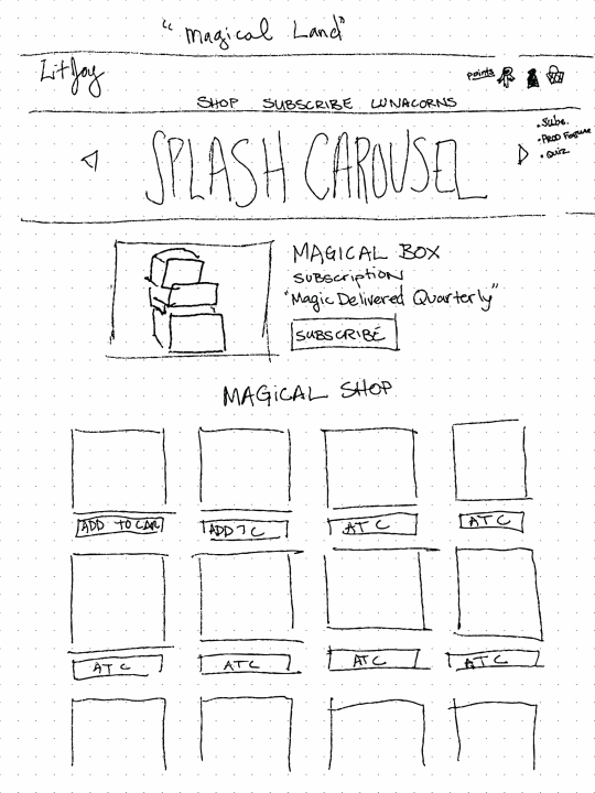
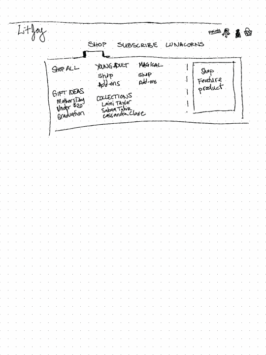
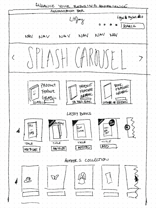
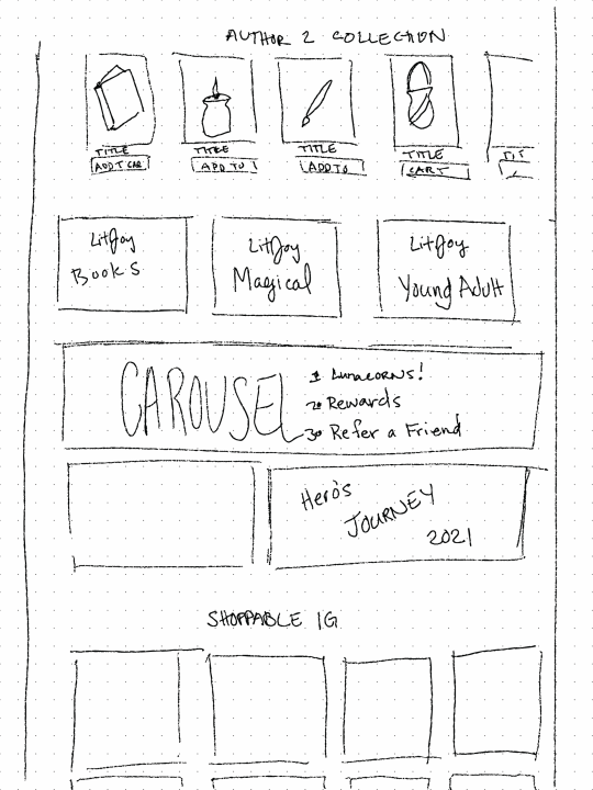
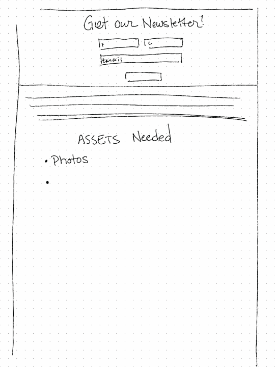
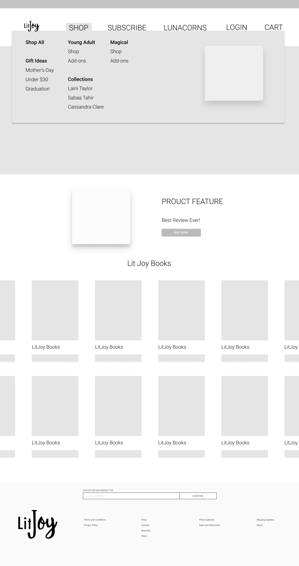
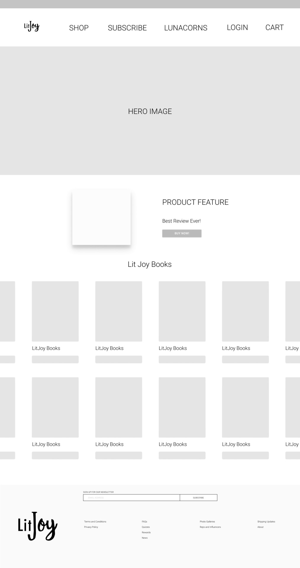
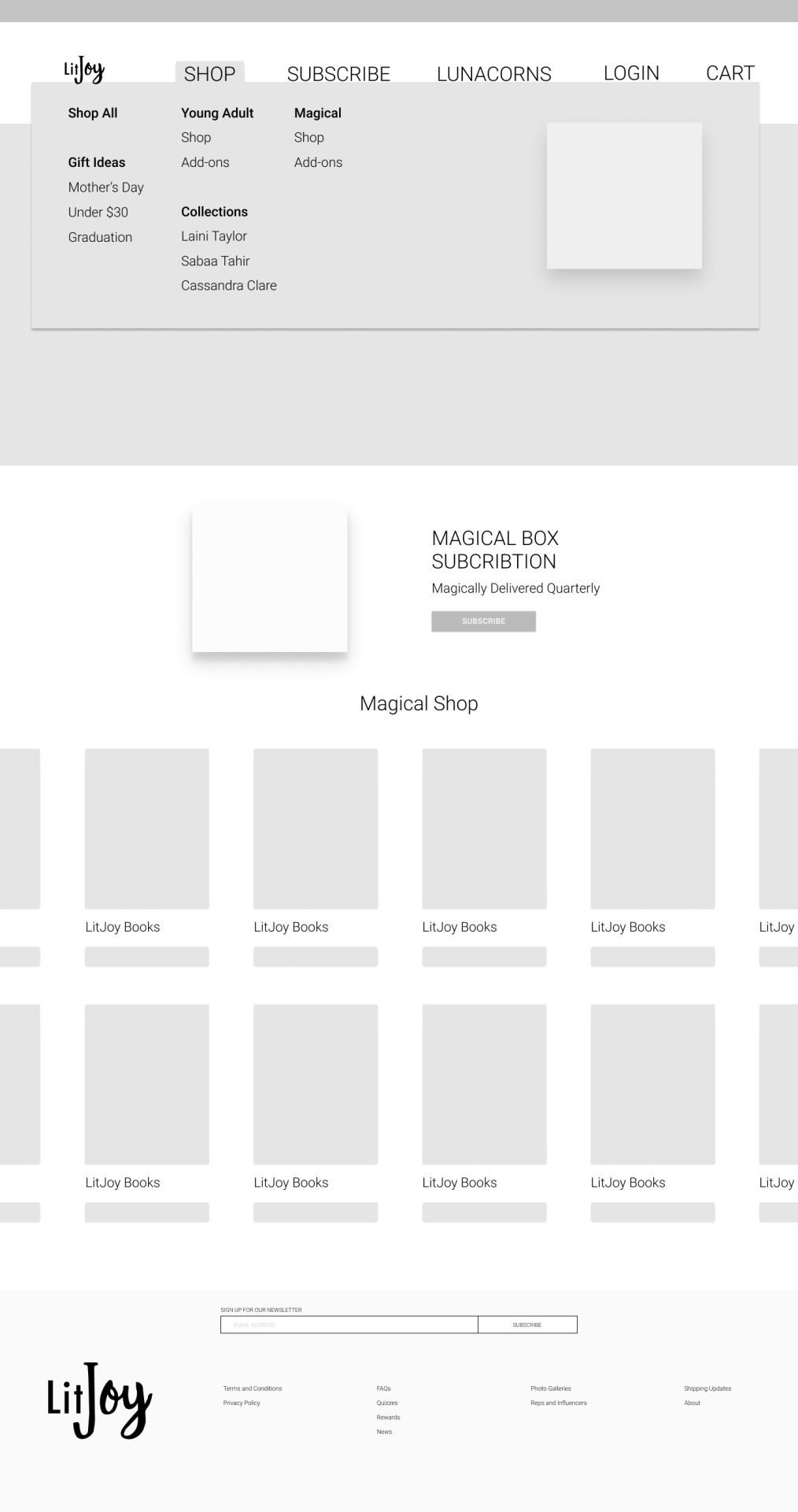
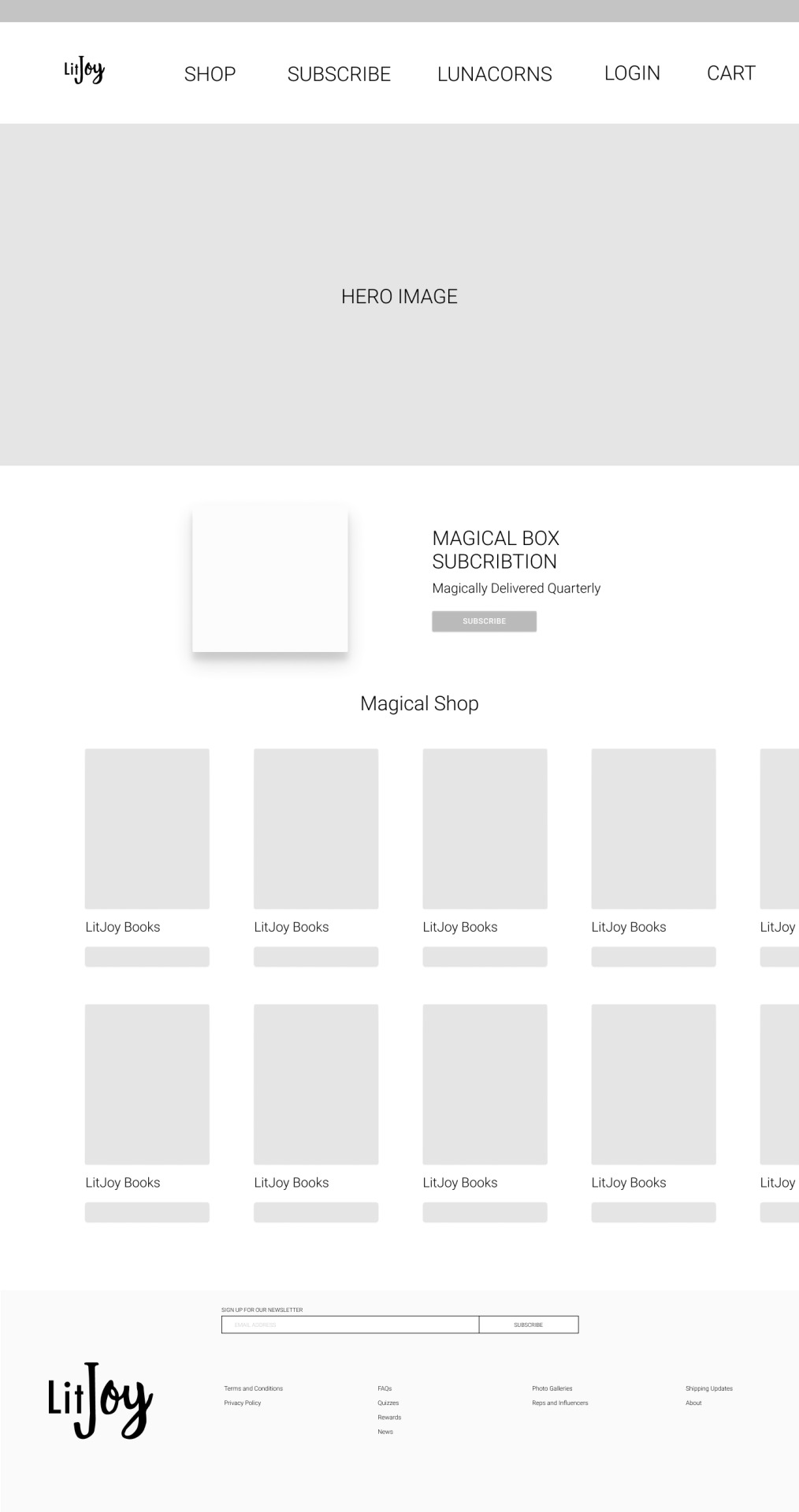

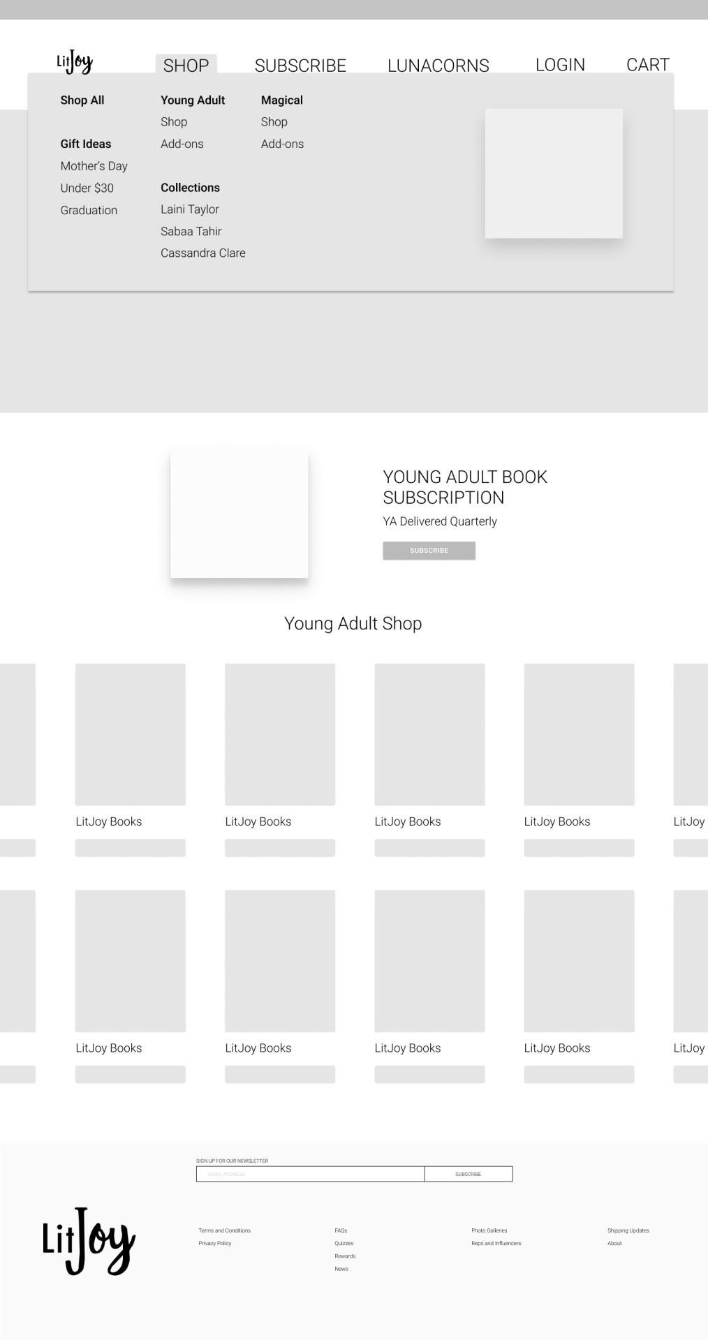
April-May user experience design from 2021 while working with the LitJoy Crate team. These low fidelity frames were created following receiving sketches from my teammate and LitJoy contact to assist the web developer in the website redesign.
0 notes
Text
night city time
#artists on tumblr#wip#game dev#indie games#indie dev#low poly#low poly art#sci fi art#scifi#retro#80s#90s#wireframe#3d gif#3d artwork#mine#level design#Ethan Redd
177 notes
·
View notes
Text
Process review 6
Week 8: Creating the Brutalist Building and Addressing Challenges in Houdini and Substance Painter


In this phase of my project, I focused on creating a Brutalist building based on my reference pictures. Following my planning folder, I began by modeling low-poly versions of the buildings in Maya, along with additional elements like pipes to add to the overall structure.
Modeling and Importing into Houdini:
Once the modeling was complete, I imported the buildings into Houdini. Here, I used the Oscar Greeble generator, a tool I downloaded from the Houdini community. This generator was particularly useful as it aligned perfectly with my concept of buildings covered in steel blocks to protect against radiation. After adjusting the settings—such as the number of iterations, seed, and extrude distance—I applied these settings consistently across all the buildings.
Encountering Issues:
The first significant issue I encountered was related to the building’s structure. The building had an outside shell and an inside wireframe that were not linked together. Initially, I attempted to merge them in ZBrush, but this approach didn’t work as expected. To resolve this, I decided to unwrap the UVs directly in Houdini, which allowed me to successfully import the model into Substance Painter without further issues.
Light Testing and Resolution Concerns:
After importing the buildings into Substance Painter, I conducted some light testing and was generally pleased with the results. However, I noticed that the resolution wasn’t as high as I had hoped. Since these buildings were intended to be in the background of the scene, I didn’t require close-up shots, but the lack of resolution still stood out to me. In the future, I may consider reducing the size of the buildings or dividing them into different parts to generate higher-resolution UV tiles, allowing for better detail and texture quality.
Objective Judgement:
The Brutalist buildings I created align well with the original design intent, combining simple Brutalist shapes with the concept of steel bunkers inspired by nuclear shelters. This combination fits seamlessly into the sci-fi environment, effectively conveying the idea of radiation protection. The use of the Oscar Greeble generator in Houdini was particularly effective in recreating this aesthetic, enhancing the fortified, industrial look of the scene.
Creative Decisions:
I chose the Oscar Greeble generator because it closely matched the steel architecture seen in my research on nuclear shelters. This tool allowed me to recreate the steel surfaces of the buildings, which were integral to achieving the desired protective and industrial appearance. The generator ensured that the final look of the buildings aligned perfectly with my creative vision.
Learning Curve:
This experience taught me the importance of dividing larger structures into smaller parts and using a procedural approach to achieve higher resolution and multiple UV tiles. Although I wasn’t able to fully implement this in Houdini due to the scale of the project and my current experience, this process has significantly contributed to my understanding of managing large assets in future projects.
Time Management:
I fell slightly behind schedule when merging the inner and outer shells in ZBrush didn’t work as planned. To save time, I used the generated UV tiles from Houdini and proceeded with texturing them in Substance Painter, which allowed me to catch up on my Gantt chart and continue making progress.
Resource Management:
Using the Oscar Greeble generator was crucial for achieving the detailed geometry I wanted, which interacted with lighting more effectively than normal maps. This decision helped me enhance the quality of the assets and achieve a more realistic visual outcome.
Application to Future Work:
The generator is a powerful tool for sci-fi environments, and I plan to use it in future projects. However, I’ve learned to apply it on a smaller scale to maintain higher pixel density for textures. This experience will influence my approach to environment design, helping me balance scale and detail more effectively.
Reflection:
This experience underscored the importance of adaptability and problem-solving when working with complex 3D models and new tools. Despite the challenges, I managed to find solutions that allowed me to move forward with the project. The Brutalist buildings aligned well with my concept, and the use of the Oscar Greeble generator added a layer of realism that enhanced the overall scene.
Learning Outcome:
This phase reinforced the importance of refining details, even for background elements, as they contribute to the overall coherence of the scene. It also highlighted the value of community tools, like the Oscar Greeble generator, in streamlining the workflow and achieving specific design goals. Moving forward, I’ll focus on optimizing the resolution and possibly exploring ways to break down larger structures into smaller, more manageable parts for better UV mapping and texturing.
0 notes
Text
Weekly Design Challenge
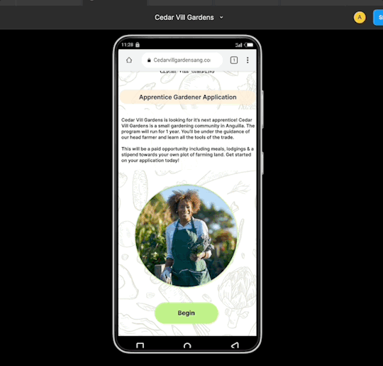
Here are the frames for my last design challenge for a sign up form for gardeners in anguilla. Here's my process. So knowing me, my biggest weakness is finding questions where there probably shouldn't be (especially for design challenge prompts from non human beings).
A sign up prompt for a gardener sounds pretty vague to me and left me with questions like..
Who's the gardner ?
What's their goal? What's their need?
Is this a person who's looking for a gardener for their business? or for personal work?
So many questions. Eventually I figured this scenario could go one of two ways.
A sign up form in search for new gardeners for a company/business
A sign up form for business to draw in new customers i.e) newsletter,tips, advertising.
I narrowed down on the first option and created a mobile sign up for a gardening company in search of a garden apprentice.
Now that I had a decision it was time to jump in
Research
I conducted a competitive analysis of 4 gardening companies/entities making note of the best features to worse features of each one and asking myself why ? What company had features in their sign ups that showed they thought about their user's experience and what areas needed work or were lacking
-Insert image here
Lingering Thoughts
After the competitive analysis I was left with a few final questions to answer for my researching.
-insert image before or after
"The main question was what device was the most user friendly to design for ?" Which then lead to several branches of supporting questions.
What's the most user friendly device to design for?
What will be easier for my target audience to use?
Do they have access to the most commonly used devices?
Who's using it and where ?
How long is the sign up form going to be ? What information will be needed to do so?
Being that this was supposed to be a timed design challenge I didn't scope as far I would have liked to. I did what I could with the research I found online. As a summary I found that based on my research the most user friendly device would be mobile. Mobile phones are accessible across multiple income backgrounds. I took consideration of pricing and currency for the cheapest smart phones to the most expensive. The biggest thing I lacked for research was checking how well and accessible the internet was for the locals outside of resorts.
Ideally it would be best to make sure the design was responsive to widened the range of users access.
For the information, I gauged through multiple important elements for sign up forms for gardening apprenticeships. I utilized chatgpt to assist me in searching for this.
Wireframes
For my wireframes due to time I stuck to creating a mobile version only.
Low-Fi Wireframes

Hi-Fi WireFrames
-insert wf-

Conclusion
Cedar Vill Gardens Gardener Apprenticeship mobile design
I set out to create an inviting sense of simplicity, all while keeping an eye on the finer details. My aim was to make the mobile experience a breeze for users, giving them a stress-free way to sign up and complete their necessary information. It's all about making things easy and enjoyable. Check out the prototype here! Feel free to drop some feedback in my inbox or below (its the only way to improve and do better)
Check out the figma file to get a closer look here!
1 note
·
View note
Text
Week 8
Improved UI, IA, etc.
There are several actions you could take at this time if this is the course you want to take.
Low-fidelity paper-and-cardboard prototypes with modifications and ideas
new information architecture card types
tests of novel navigation in trees
Based on desk research, how have other solutions handled this issue?
Survey on methods of operation: 12 replies so far
The biggest factors affecting attendance in classes are public transportation and commute time.
The type of work they are completing determines how most pupils prefer to work.
However, more pupils believe that they work more effectively at home than in a classroom.
a classroom
What's positive: constructive criticism, devoted work hours, group activities, and cooperative work
What's not so good: travelling, learning, and exhaustion
Home:
What's good: comfortable, relaxing, concentrated, private, and adaptable
Not so good: Lack of feedback, procrastination, and diversions.
Low to hi fidelity levels
You will go through numerous stages of increasing fidelity with your designs, starting with rudimentary sketches to explore concepts and possibilities.
At each stage, you'll discover something new.
If your early concepts received favourable feedback, you may begin creating wireframes and prototypes to evaluate the structure and flow. If you require feedback on your navigation at this time, card sorting and tree testing can be useful.
Get it right before you go hi-fi with the user flow
Definition: A user flow is a series of interactions that illustrates the normal or optimal sequence of activities required to complete a regular task wit a product.
with a thing.
Simple flow charts, task diagrams, or low-fidelity wireflows are a few examples of artefacts that can be used to describe user flows. These maps record important user actions and system reactions; unlike trip maps, they do not contextualise the process with feelings and thoughts.
User flow: where designers and developers get together
Creating flowcharts is a common requirement for developers when preparing their code. The decision points (diamonds) and links to databases (cylinders) in these flowcharts are both represented by common symbols. The designer's version of these are user flows.
The Happy method (the most typical predicted method to achieving a goal where everything goes right) as well as Exceptions must be mapped out by the designer. How does the application respond to typical situations like.
networks not working
Data is downloading.
No data, such as the initial state
User flow: Moving from Lo fi to hi fidelity
We can consider shifting from low to high fidelity in how we map our users' paths across our solution, just like with design and content fidelity.
1. Clearly defining the user's aim is the first stage. The tale in Agile is a common name for this.
What are the assignments? Try formatting this in the manner shown on the right.
Wireflow 3. What UI component links the user to the following screen.
4. Adding logic, exceptions, and interactions to the user flow.
flow of users: why do they
Developers frequently ask UX/UI designers to provide rather thorough responses to enquiries about how the app or product will behave. By considering this and developing user flows, you can foresee their enquiries. The best practise approach should be researched ahead of time rather than having to be thought up on the spot. Additionally, customers don't always choose the "Happy Path"; therefore, planning ahead will speed up production, prevent delays and rework, and improve user experience.
a user's flow
Participate in a design crit with other designers. To discuss your solution, present it to developers, business analysts, or product managers.
Investigate many options before prototyping
Round 2 prototypes
When choosing a prototyping tool, keep in mind the type of prototype you're creating as well as the tools you already have.
Do you design for mobile or responsive web?
Are smooth animations and interactions crucial to your experience?
Or do you require a clever technology that can produce realistic personalised material, such as the user's grandmother?
You'll probably need to become a little more advanced and produce a more lifelike experience for your high fidelity prototypes.
Techniques for reducing time
Now that you're getting into high quality, it's quite simple to lose track of time. A little preparation now can save a lot of time later.
tile patterns: You can use a single page as a "sampler" of Ul pieces to test out various themes before incorporating them into your layout.helpful for group design projects as well.
Symbols and templates are reusable components that speed up design and maintain consistency. They go by different names in different prototype tools. A button is an example of a symbol. Update the master to update all symbols at once.
Grids: Designing with a grid is a wise move.
This is especially crucial for creating responsive websites. Frequently, the code is supported by a framework like Bootstrap that adheres to a grid.
Styles: To expedite design and encourage consistency, employ text styles similar to those in InDesign.
Future steps: prototypes from round 1's user testing
Some pointers: Never describe your prototype to participants in a real user test (as opposed to testing it on peers). NEVER describe your prototype in detail. It should be simple for your representative users to fit into a scenario you've built for the test. This is different from telling everyone about your concept.
You only get one chance to receive objective, recent feedback. Don't ruin it with hints!
For next week:
Keep your prototyping fast and your designs sketchy at this stage
Tested your prototype with 3 users
Have synthesize your findings
-Are you heading in the right direction?
-Do you need to re-think your idea?
Keep referring back to your HMW. Have you addressed this challenge in your prototype?
0 notes
Text
Case study writings
Design process - Objectives
Wire framings and Design system
first step by step process of wireframes, inspirations and testing layouts for beginning process
Prototype progress
Low - fi prototype, further developing towards High - fi prototype, design process and changes made during development process.
Security, user safety
Information towards new added feature and also explanations towards how these feature benefits the website and how it links to the HMW question.
0 notes
Photo


LOW FI wireframes
I created two different versions. The top image contains low fi wireframes which are more of a brain dump of ideas for layouts.
The second group is the actual wireframes for the website and is split between the different pages.
0 notes


Text
Lo-fi homepage wire-frames and USP Exploration


I decided to create all the sketches into low fidelity wireframes. I did this get a better look at my experiment t and give all the sketches an even playing ground.
The two that stood out to me are #1 and #5. These are two very different takes on how a landing page could look and serve two different purposes. #1 is very functional and utilitarian , it shows you what you want to see as soon as the website opens, however it could be overwhelming and not aid someone in their work but stress them out of it. If I’m trying to avoid cognitive overload this is not the right way to go. The answer to that concern is #5, I waned to feel more like a desktop home screen where a user could have this page open all day. While displaying less information, it provides a calmer entrance into productive work, hopefully easing the anxiety of starting for someone. I wanted to play into more emotional design creating a space for a user rather than just a tool.
When looking to my user persona it becomes pretty clear which direction I should head, #5. One of my users pain points is becoming overwhelmed, and my tool should be designed to avoid creating an overwhelming space.
I think this is where I can start to push my USP, there are many other apps that are purely functional they show you everything at once without a consideration of information overload or even aesthetics.
0 notes
Text
Week 8
User flow. This week I am trying to figure out what each screen will consist of and the journey the user will take. I am aiming to have some low-fi wireframes for next class to show some kind of user flow in a visual way
These photos show the main user flow I will be focusing on. This is to show the process of swiping through restaurants to eventually match on one with the person/group who you have connected with.


0 notes


Text


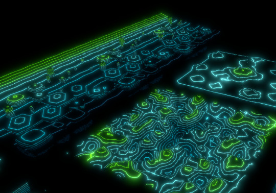
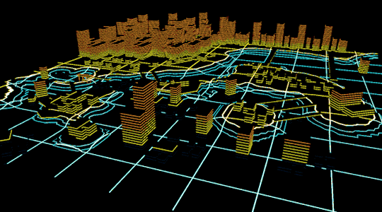
color-coded terrain elevation shader, for visualizing gameplay in my editor
#artists on tumblr#Ethan Redd#game dev#vfx#3D#3D art#wireframe#wip#low poly#gaming#sci-fi#sci fi art#black artist
157 notes
·
View notes
Text
BTP Assignment 2.1
Wireframing - For a travel planner for the Randstad Rail
Introduction
In this Assignment we were tasked to construct wireframes for a travel planner application for planning journeys with the Randstad Rail. A list of functional and non-functional requirements was also given to fulfill the interface needs

Testing Protocol
Introduction
Hello, and thank you for agreeing to participate in this user testing. You will user testing a low-fi prototype of a travel planner app. I will provide you with few tast that will help you navigate through the app. Please share your feedback at any time while user testing, as your feedback is valuable.
Task
Please plan your journey from The Hague Central to De Terp
Find out info of the transfer and the time the journey takes
How will you navigate through the app if you want to select your arrival time instead
Find our more about landmarks
Look into Line E specifically and see the transfer points at each station
Questions
How easy was it to navigate through the app? Good points and bad points
Do the flow of the app seem logical?
What could be improved on?
User Feedback & Insights
Add more back arrows and make use of arrows to aid navigation through the app (eg, to slide up or down)
Not obvious that you had to slide up to show the landmarks
Low-Fi colors not enough contrast, difficult to read
Make Buttons darker overall for CTA
Indicate the specific time the trains will stop at each stop (suggested route)
Improved Wireframes & what was changed

Changes Made
More contrast between the different elements and buttons too.
More arrows added for better navigation
Instructions to Slide up or down
Specific time at each stop shown in suggested route
0 notes
Text
Reflection
I would say that low-fi prototyping was the most valuable technique I learned in this course. When I work, especially digitally, I tended to get straight into the details. But while I was learning the low-fi prototyping and actually working on it, I realized that start designing from the wireframe can be a good way for a solid foundation for further stage of design.
As of the testing method, I found A/B testing very interesting and useful. I think it can give a very obvious outcome and insight into the prototype by making one opposite iteration. It also could be helpful in the ideation process, allowing me to understand my design in an objective view by comparing it with iterated version.
Overall, I did enjoy this course. It was a very practical and interesting course for me as a future UX designer. However, I felt a bit stressed about new assignments coming up every week and following them up, since there are assignments from other courses at the same time as well. Besides that, it gave me a lot of experience and insight about UX design. So I am glad that I am finishing this course with many lessons I learned.
0 notes
Text
Week 7
Ideation: Describe it and explain why we do it.
The diverging phase of the design thinking process is ideation. corresponding to the double diamond model's "going wide"
That means
Lots of ideas
Quantity over quality
No bad ideas
Embrace crazy, wild and even bad ideas.
Don't worry, there will be time to research later and determine viability, but if you wait to embrace the insane, you'll never discover anything novel or creative.
Utilise this strategy to consider numerous alternatives and go beyond the initial thought.Early, frequent, and iterative prototypes are best for learning.
From ideas to actions:
From thoughts to deeds:
The ability to engage with a prototype, as opposed to a sketch, is what distinguishes it from a design or sketch.
A prototype is a crucial component of the design thinking process since almost everything we create involves interaction of some kind. Having something we can present to a user and see how they respond, where they struggle, and what works well makes a prototype essential.
The value of users offering feedback on your design is far inferior to that of users actually using a prototype.
Lo-fi prototype: test to gain knowledge
You might not yet be able to predict how users would react to your proposal. It's still early.
A low risk approach is a low fidelity prototype.
A low risk method of receiving early feedback on a concept before investing a lot of time and energy is by creating a low-fidelity prototype.
At this point, try to embrace the mindset of prototyping and testing to learn rather than to validate.
Therefore, keep it brief and nebulous. As long as the tool you're using is quick, don't worry about it.
We may make mistakes with prototypes at a reasonable cost.
What may be learned from "just enough."
Concentrate on the things you're less certain about, anything fresh or unproven.
Concentrate on the essential elements of the encounter that you determined required better.
Avoid getting sucked into processes like logins unless they were deemed to be a serious issue during the initial experience.
Use the "button to nowhere" to learn with the least amount of effort; that is, your button doesn't even need to accomplish anything; simply knowing where a user would tap or click may inform you whether it is operating properly or not.
Putting your design in front of others for input is never too early.
Porotypes have three stages:
Early
Low fidelity, wireframes, and paper Fast
can test a variety of ideas
Feedback is more open when participants are aware that it's a prototype.
Due to the fact that you haven't given the notion enough thought yet, you are less attached.
Mid
digital, tools for prototyping, simple click through
Examine task flows
Check for content understanding
Obtain input regarding design preferences
High
Live sites, active applications, and demo sites
Micro- and test-level interactions
complicated realistic material
intricate flows with numerous variables
Transitions, animations, and wait times
Three levels of rapid prototyping: What approach is best for the stage you're in?
Paper prototyping is quick, inexpensive, and potentially very time-saving, but most designers don't use it enough.
Running a successful paper prototype testing session: Useful methods, advice, and strategies for doing an early-stage prototyping test.
The IDEO website contains a number of papers and case studies that offer suggestions for prototyping beyond the typical digital experience.
You will have to cope with the difficulty of testing your theories without being physically present with your participant if social distance continues to be a problem.This is not ideal and does restrict your ability to test goods, services, and tangible objects. Make every effort to apply the idea of paper prototyping to online experiences. Utilise prototyping software that rewards speed over perfection.
For Next time:
Test out your design
three persons
have some preliminary results
What direction are you going in?
Should you reevaluate your plan?
0 notes
Text
Show HN: TinyUX – Grid based low-fi wireframing on your mobile phone
https://www.tinyux.app/
Comments
0 notes
Last Seen Blogs

kakekou
Untitled

instantlystickytaco
Untitled

cat-stim
this blog is kinda new so pls be nice to me :)

musicdepott
Music Depot

solidairedemesconfreresdeba-blog
SOLIDAIRE DE MES CONFRERES DE BAGNE