#malphiguswrites
Text
ANALYSIS of Together
Denada Permatasari. 6 November 2017.
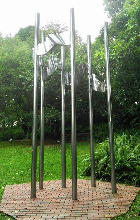
Fig 1.0 Photograph of Osman bin Mohammad’s Together, taken at Fort Canning Park, Singapore.
I have chosen this sculpture (Fig 1.0) titled Together by Osman bin Mohammad, a sculptor from Brunei Darussalam made in 1988. This sculpture is 3 meters tall and is made of stainless steel. Together is situated in Fort Canning Park’s sculpture trail, and is a part of the ASEAN Sculpture Garden, along with other five sculptures representing the original members of ASEAN.
I think that this sculpture is the most interesting sculpture in the whole trail because I understand its meaning just by looking at it. Other sculptures may have more interesting shapes and abstract, but because I do not understand what they mean, their significance is lost to me. I also find that Together is aesthetically more pleasing than rest of the sculptures in the trail.
The six flagpoles represent the six members of ASEAN at the time, which is Singapore, Indonesia, Malaysia, Thailand, Philippines, and Brunei Darussalam. What makes this sculpture stand out –especially in the context of the ASEAN Garden- is this one of two sculptures in the ASEAN collection representing six figures. The rest of the sculptures (Fig 1.1) have five figures as symbolism for the ASEAN members (Singapore’s Balance is a sculpture divided into five parts; Philippines’ Fredesvinda has five pairs of ribs; Indonesia’s Unity has five vertical sticks jutting out and five crisscrossing “pinheads” in its center; Thailand’s Concentration which is made up of five separate steel plates together; with the exception of Malaysia’s Augury which has six points going up). I found that this exception is due to Together being made last, as originally, Brunei Darussalam was not a member of ASEAN when the collection was made. The sculptures were made for the first ASEAN Sculptures Symposium held in May 1981. This symposium was hosted by Singapore.
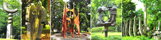
Fig 1.1 The rest of the sculptures in the ASEAN Sculpture Garden. From left to right: Singapore’s Balance, Thailand’s Concentration, Malaysia’s Augury, Indonesia’s Unity, and The Philippines’ Fredesvinda (courtesy of the National Parks Singapore).
It is known that Singapore was improving its infrastructure rapidly during the 60s and 70s, proven from “its massive planting of instant trees in places of high visibility” (Gwee 17). In fact, the genius lies in the background of the ASEAN symposium:
Sculptures were introduced to improve the quality of the landscape by creating interesting landmarks in parks. The ASEAN Sculpture Corner was created at Fort Canning Park, as part of the ASEAN Sculptures Symposium in 1981, to ASEAN unity and cooperation. Sculptures were donated by each member country and installed at the Park (Gwee 18).
From that excerpt, I can say that Together was not just a diplomatic, political show of cooperation from Brunei, but instead, it is that and a genuine attempt to beautify Singapore.
The meaning of this artwork is also apparent through its looks. From Together’s aspects of form, it is easily the most understandable sculpture in the entire bunch. The sculpture just shows six flagpoles with five flags connecting them. Together resonates closest to the theme of the camaraderie of ASEAN members. Flags are widely regarded as nationalistic symbols, high and prideful, broadcasting a country’s presence and identity (Artic).

Fig 1.2 Zoom in shot of Together, showing the connected flags clearer. Taken from a low angle.
The way the flags themselves are arranged also has meaning behind it, for the flags in Together are connected on one flagpole to another. The artist could have made conventional flag displays, each separate from the other, but this conscious design choice is actually the main reason why this sculpture is rightly titled Together. Through the connected flags, they make the relationships between the poles, or the countries, interconnected and interdependent on one another. The connecting design makes six separate pieces –countries– into one, stronger, wholesome unit.
Even the shape and the curvature of the “flags” carry meaning. The wavy, dynamic form of the flags (Fig 1.2), as if blown by strong wind yet still anchored firmly unto their poles, speaks of the artist’s vision for the ASEAN members. The wind here is a metaphor for difficulty and challenges that a country faces, as echoed by the concerns of Narciso Ramos, the Philippines Secretary of Foreign Affairs at the time, that:
“’The fragmented economies of Southeast Asia,’ [Ramos] said, ‘[with] each country pursuing its own limited objectives and dissipating its meager resources in the overlapping or even conflicting endeavors of sister states carry the seeds of weakness in their incapacity for growth and their self-perpetuating dependence on the advanced, industrial nations’” (ASEAN).
The fluid, almost water-like curves of the flags can also act as a metaphor for the ASEAN members’ flexibility and potential for the future.
The number of flags, five, in comparison with the number of flagpoles, six, is also another point of intrigue. Why did the artist deliberately left out one pole without a flag? At this point of the essay, I must admit to the very limited number of accessible analysis of this artwork, therefore I resort to making my own assertions. I would guess that it was to make the sculpture have an opening gap. If there were six connected flags, the sculpture would be a closed circle. In turn, this could mean that Osman wanted to convey the openness of the ASEAN countries, in particular, their openness to cooperation and change for the better.
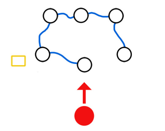
Figure 1.3 A simplified diagram of Together, from a bird's eye perspective. Note that this diagram is not up to scale.
Through my own observation, I have noted that the placement of the flagpoles is also curious, and worthy of further analysis. I have made a diagram (Fig 1.3) to illustrate more clearly how the artwork is arranged. The black-outlined circles are the flagpoles. The blue wavy lines are the connected flags. The yellow box on the side is the artwork’s information. The red circle is the viewer, along with the direction of sight that the viewer will naturally have if they should see the artwork. This is to affirm the orientation of the sculpture.
For one, the arrangement is not perfectly symmetrical. Though there is a recognizable formation, I think the imperfect placement is deliberate, though the meaning of this is not very obvious. I choose to interpret it as that Osman acknowledges the countries, and especially ASEAN itself since at the time, ASEAN was still in its infancy. The sculptor realizes that they are not perfect and that there is room for improvement. However, the main highlight of the arrangement is the middle pole in the outer three that juts out from the rest.
This flagpole stands nearest to the viewer, as if a leader or a commander of the group. This could be taken as placing one of the countries as the leader, or in this context, the host, which is Singapore. Or, it could also mean that the flagpole in question is a newcomer, not yet fully aligned with the others. If it is the latter case, then the metaphor shifts from Singapore to it being Brunei, as Brunei Darussalam was the newest addition back at the time. If this is so, then this speaks of the sculptor’s awareness of the status of his country and chose to acknowledge it.
Stainless steel as a material is also a point for discussion. Stainless steel are known for its long-lasting properties, resistance to rust, and durability (BS Stainless). I feel that this gives the meaning that through this sculpture, the six ASEAN members are portrayed as strong, enduring countries.
Last, but I think that this is critical to analyze, is the location of the sculpture itself, which is at Fort Canning Park. It occurred to me that out of all the public parks in Singapore, why Fort Canning? Why were the results of the ASEAN Sculptures Symposium placed in Fort Canning Park? Is there something particular about Fort Canning Park, or was it just one of the many parks in a checklist?
I found out that even the placement in Fort Canning Park was deliberate, as said by Mr. S. Dhanabalan, the Minister of Culture at the opening of the symposium:
I am happy to announce that the sculptures will be given pride of place in what will become one of Singapore’s most beautiful parks. A sculpture garden will be created to display the finished works on the site of the Central Park in the heart of historic Singapore. … We could not have asked for a more appropriate site, for it encompasses those institutions that have come to be associated with out artistic and intellectual life, namely, the National Museum, the National Library, [and] the National Theatre … (Natl. Archives).
The simple fact that Fort Canning Park used to be called Central Park during this time is already telling in of itself. Further research reveals that Fort Canning Park is one of the main historical sites in Singapore, from it being a center of power about 700 years ago, then as a military base in the mid of the 19th century, again in World War II, and finally a place of lush greenery for relaxation today (Walton). The gesture of placing the ASEAN Sculptures in the heart of the country is not lost on anyone; Singapore is proud to have international connections to other South East Asian countries through ASEAN. I believe that this is one of the rare moments where the meaning of an artwork is amplified by an external party, unbeknownst to the artist himself.
To conclude, I would like to posit my final thoughts regarding Together: I find it extremely curious that Brunei Darussalam still wanted to donate a sculpture even after seven years later the symposium was held. This persistence speaks of Brunei’s attitude with international relations and status; the country cared about contributing to a collective. The use of flags is also simple and effective, especially in consideration of the ASEAN theme.
I think that the straightforwardness of the subject matter is the sole reason why I think Together is the most interesting sculpture in the trail. Its simplicity, especially in comparison with the other ASEAN sculptures, makes it the most available and legible for viewers. Even more impressive is that Osman managed to imbue so many meaningful metaphors and symbolism to his seemingly straightforward sculpture without making it abstract like the others. Whether or not he intended to include the metaphors there through his aspects of form, as information regarding the artist is scarce, is ultimately irrelevant; I, as an outside viewer, managed to draw meaning just by looking at the sculpture, and therein lies the true genius of Together.
Works Cited
Gwee, June. Case Studies in Public Governance: Building Institutions in Singapore. Routledge. 2013. 17-18.
“What is the importance of a flag?” Artic. N.d. 5 Nov 2017 <http://www.artic.edu/~hkang2/importanceofflag.htm>.
ASEAN. “History: The Founding of ASEAN.” Association of Southeast Asian Nations. N.d. 5 Nov 2017 <http://asean.org/asean/about-asean/history/>.
BS Stainless Ltd. “Why Use Stainless Steel?” N.p. 6 Jan 2012. 5 Nov 2017 <https://www.bsstainless.com/news/2012/january/what-is-stainless-steel-and-why-use-it.html>.
Natl. Archives of Singapore. Archives and Oral History Department Singapore. Speech by Mr S Dhanabalan, Minister for Culture at opening of ASEAN Sculpture Symposium, at National Museum Art Gallery. Singapore, 5 Apr 1981 <http://www.nas.gov.sg/archivesonline/data/pdfdoc/SD19810401.pdf>.
Walton, Millie. “Singapore Stories.” LUX Magazine. 2 Aug 2014. 5 Nov 2017 <https://www.lux-mag.com/2014/08/02/singapore-stories-fort-canning-history/>.
#together#osman bin mohammad#brunei darussalam#asean#sculpture#flags#stainless steel#fort canning park#park#june gwee#millie walton#malphigus#malphiguswrites#art#analysis#essay#2017
4 notes
·
View notes
Text
ANALYSIS of Face Cages
Denada Permatasari. 1 September 2017.
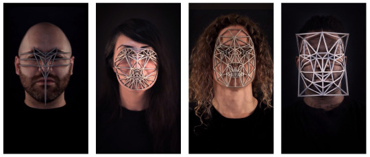
Fig 1. Zach Blas’ Face Cages, exhibited at the Institute of Contemporary Arts Singapore, Gallery 1. 29 July - 22 October 2017.
I visited Gallery 1 at B1 on LASALLE College of the Arts, Singapore and I was immediately drawn to Zach Blas’ Face Cages exhibition.
The exhibit contains four 113.7 x 64 cm screens displayed in portrait mode, with each screen presenting a twelve-minute video of people wearing different masks. The screens have the distance of 93 cm between them. At the front of the screens there are the original masks that were worn by the subjects, not remakes. The plain black background behind the screens and the contrasting white lights illuminating the masks gives off a very polished and technologically-savvy vibes of the exhibition, even when the placement of the exhibition is not at the front of center of the gallery.
The face masks are 3D-printed with stainless steel as their material, and the polygonal patterns are from the subjects' own biometric data from facial recognition scans. They are symmetrical and express a progression from barely a mask until a mask so wide it goes beyond the just the face. The material's strength and durability is a symbol of oppression that is everlasting, while the progression shows the growth of imprisonment that steadily gets worse overtime.
Face Cages is the title of the series and I think the title is self-explanatory. At first glance, I understood immediately what the series is about. It's about not being able to express our true selves, and that we are trapped within our own selves. But after further study I found out that the artwork carries a more nuanced meaning.
First, I learned that the artist who made them, Zach Blas, is a gay man. The rest of the subjects also belong to the LGBT community. Aside from Blas, they are also racial minorities (non-Caucasian). The fact that the subjects wearing the masks are minorities of minorities makes this series a bold political statement: "We, (referring to Blas et al. as representatives) the minority, suffer greatly."
To give this series even further context, "Zach Blas is an artist and writer whose practice confronts technologies of surveillance, security and control with minoritarian politics." (Blas) The masks do not fit the subject's faces and in doing so, it is an "endurance performance" as it is very painful to wear them. I can confidently say that this is an analogy of the minority struggle, in which they suffer until they can't anymore (implying rebellion and or suicide).
From the start of the 2010s, especially up until the mid-2010s, the LGBT discourse is reaching its all-time high, with notable moments such as the USA legalising same-sex marriage country-wide in June 2015 and the suicide of Leelah Alcorn, a transgender teen, in December 2014, just to name a few. This series rightly belongs to the Contemporary Art genre, which has all the hallmarks of the genre: identity politics and incorporated technology (Kleiner 942).
Taking into account of today's social and political context, this series is a plea for attention, a "dramatization of the abstract violence of the biometric diagram." (Blas) When I read that, I disagreed with the description as 'violence' is a strong and specific word, but upon more research I discovered that it is about literal violence; countries all over the world are implementing a nationwide biometric face scan for identification purposes, and people whose faces aren't recognised will receive penalty and years in prison. (Blas)
At this point I realised that Face Cages is a literal title, not a metaphorical one. The revelation drives home at the gravity of systemic discrimination and violence inherent in a so-called 'objective' algorithm that runs biometric scans, and that this invisible brutality is happening right under my nose. After viewing Face Cages and having knowledge of its context, I am grateful and impressed at Blas' courage for speaking up through his art, to give the oppressed minorities a voice that can, and should be heard.
References
Blas, Zach. “Biography”. <www.zachblas.info/biography/>
Kleiner, Fred S. Gardner’s Art through the Ages. 14th edition. Wadsworth Publishing, 2012. Print.
Blas, Zach. “Face Cages”. <http://www.zachblas.info/works/face-cages/>
Blas, Zach. “Escaping the Face: Biometric Facial Recognition and the Facial Weaponization Suite”. Journal of the New Media Caucus. CAA Conference 2013 (2003). <http://median.newmediacaucus.org/caa-conference-edition-2013/escaping-the-face-biometric-facial-recognition-and-the-facial-weaponization-suite/>
#zach blas#face cages#lgbt#oppression#minority#queer#biometric#identity#algorithm#essay#analysis#art#exhibition#lasalle#2017#malphigus#malphiguswrites
2 notes
·
View notes
Text
ANALYSIS of The Great Red Dragon and the Woman Clothed with the Sun
Denada Permatasari. 9 September 2017.
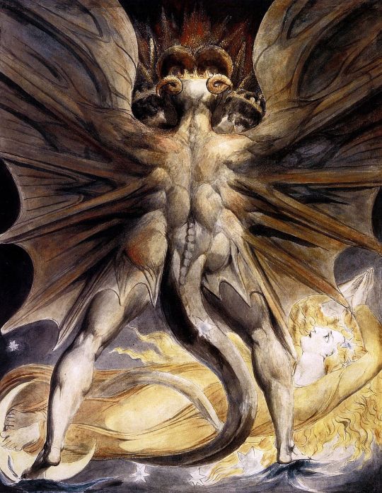
Fig 1. William Blake’s The Great Red Dragon and The Woman Clothed with the Sun, circa 1803-5.

Fig 2. Under the same title and artist, circa 1800.
In this essay I will talk about just two out of four of Blake’s The Red Dragon series. The first painting (Fig. 1) was done in watercolour, chalk, and pen. Its dimension is 43.5 x 34.5 cm and was made circa 1803-5. The second (Fig. 2) was done in watercolour and its size is 15.75 x 12.75” (40 x 32.4 cm), made circa 1800. Currently, they are exhibited at different museums.
Both paintings are a part of a larger series, namely Apocalypse, commissioned by Thomas Butts. He commissioned Blake to illustrate biblical passages (Rosenblum and Janson 60), and the first Great Red Dragon painting (Fig. 1) in this essay are a representation of Revelations 12 verse 1-4 (qtd. in Lister 89):
1And there appeared a great wonder in heaven; a woman clothed with the sun, and the moon under her feet, and upon her head a crown of twelve stars;
2And she being with child cried, travailing in birth, and pained to be delivered.
3And there appeared another wonder in heaven; and behold a great red dragon, having seven heads and ten horns, and seven crowns upon his heads.
4And his tail drew the third part of the stars of heaven, and did cast them to the earth; and the dragon stood before the woman which was ready to be delivered, for to devour her child as soon as it was born.
I immediately note that Blake painted the dragon not as a conventional, fully-reptilian dragon but instead as a half-human, half-something else. Further research tells me that the winged, impressive figure is the devil, Satan (Hoagwood 3). The woman was painted brightly, as she is clothed with the sun, but oddly, she is in an unusual, unnatural horizontal pose. She looks up at him, shocked, as if she is in the middle of praying (shown by her hands above head) and then got interrupted by Satan’s unexpected presence. The devil also dominates the artwork, taking up two-thirds of the space, his outstretched wings going beyond the canvas.
I interpret this as Blake wanting to exert the power, the utter dominance of Satan against the bright woman below him, a show of good versus evil, and evil is winning. But the story obviously doesn’t end there, as I will get into the second painting and then conclude the paintings as a whole after I analyse them separately beforehand.
The second painting (Fig. 2) shows the devil now hovering above her, as a continuation of Revelations 12, verse 13-16 (New International Version):
13When the dragon saw that he had been hurled to the earth, he pursued the woman who had given birth to the male child.
14The woman was given the two wings of a great eagle, so that she might fly to the place prepared for her in the wilderness, where she would be taken care of for a time, times and half a time, out of the serpent's reach.
15Then from his mouth the serpent spewed water like a river, to overtake the woman and sweep her away with the torrent.
16But the earth helped the woman by opening its mouth and swallowing the river that the dragon had spewed out of his mouth.
Now, the woman is in the possession of new eagle wings, and has her arms outstretched wide open, as if challenging the devil. The zig-zag lines around the woman are the river spewed from his mouth, but obviously it fails to drown to woman as he intended. The devil is still above the woman, but he no longer dominates the canvas, signifying the changed power dynamic between the two forces.
Knowing now that the paintings are chronological (even though Blake made the second painting earlier), I will say that Blake illustrates that at first glance, evil has the upper hand, but at the end, goodness triumphs. While this meaning is okay, I decided to further my research to include the artist and the time period, and my findings give me a deep insight that I didn’t expect.
First, I learned that Blake is “a private rebel who wished to refect virtually the entire system of art, society and religion … in favor of a grandiose private structure of new myths, new moral truths … of what he saw as the corrupt status quo.” (Rosenblum and Janson 59). His use of watercolour indicates that aspect rebellious aspect of Blake, as oil was the standard of creating art in his time era (mid-18th century Romanticism), as explained that Blake “rejected the formal and descriptive formulae of early nineteenth-century painting.” (Maheux 125) and he “vehemently opposed to oils—they did not please him or comport with his style” (Gilchrist 369).
Second, the social and political context during the time both paintings were produced. Blake witnessed and even taken part in the American and French revolutions that happened around 1800. Blake and most artists of his time considered those events as “a scriptural metaphor of what [was happening in that time] –a period of devastating and high-minded revolutions, of radical change …” (Rosenblum and Janson 60). He painted his version of Revelations as a representation of the fundamental shift in worldview that was happening, and this is further compounded by his religious upbringing.
Last but not least, in response of my initial understanding of placement and how it relates to power dynamics: The devil above, and woman below, is actually a recurring motif in Blake’s works, not necessarily a power show. The seer/visionary subject is placed below, with their visions above them (Hoagwood 1). This denounces my first understanding of the positioning choice of the subjects. Blake transformed a literal passage into a mythical one, “[his] vision destroys matter, leaving nothing but bolts of imaginative energy” (Rosenblum and Janson 60).
To finish, I conclude that The Great Red Dragon and the Woman Clothed in the Sun paintings reveals the historical attitude during the revolution era that was tightly interwoven with religious concerns, and also a novel way of depicting religious morality. The paintings make me realise that our perception of reality is deeply coloured by our upbringing and cultural values. Differences in interpretation will happen no matter what, hence this difference should be celebrated as it enriches my (and to an extension everyone’s) understanding of the world.
Bibliography
Rosenblum, Robert and H.W. Janson. 19th Century Art. Harry N. Abrams, Inc., New York, 1984. Print.
Lister, Raymond. The Paintings of William Blake. Cambridge University Press, 1986. Print.
The Bible. New International Version, 2011.
Hoagwood, Terence Allan. “Pictorial Apocalypse: Blake’s ‘Great Red Dragon and the Woman Clothed with the Sun’”. Colby Quarterly 21.1. March 1985. < http://digitalcommons.colby.edu/cgi/viewcontent.cgi?article=2577&context=cq>
Maheux, Anne. “An Analysis of the Watercolor Technique and Materials of William Blake”. Blake/An Illustrated Quarterly 17.4. Spring 1984. < http://bq.blakearchive.org/17.4.maheux>
Gilchrist, Alexander. The Life of William Blake. Volume 1. London: Mac-Millan and Co., 1863. Print.
#william blake#the great red dragon#The Great Red Dragon and the Woman Clothed with the Sun#essay#art analysis#analysis#devil#rosenblum#hoagwood#maheux#gilchrist#lister#bible#malphigus#malphiguswrites#2017
1 note
·
View note
Text
The Evolution of Art
Denada Permatasari, 23 March 2018. Edited 26 September 2020.
Through analysing some contemporary artworks in the duration of my arts diploma, I have discovered a trend with art periods, what each period emphasises on and why they change overtime. I shall provide a gross oversimplification of the progression of art throughout history as far as my own knowledge goes: At first, humans made art to communicate and to leave a mark, evidenced by cave paintings. This purpose is purely practical, before people discovered that they can communicate while at the same time making it look pretty. The moment people start decorating their clay vases and walls, using colourful feathers for their clothes, is when art starts to become a vehicle for aestheticism.
From there, the subsequent art periods focus on how to make the images better and more enjoyable to look at. They also focus on making art as a social and political tool. Enter the Medieval period and see all the artworks done to promote the church and the goodness of God. By the Renaissance, balance, composition, and perspective started to enter the picture, and ideas on objective beauty were bolstered by the Enlightenment. Next, the Baroque takes the meaning of objective beauty through the grand, the wealthy, and the opulent. Romanticism sprang as a counter to the vanity of Baroque, as the Romantic era embraces the natural, the emotional, and the imperfect self as beautiful. Romantic art also emphasises on self-expression, which was unprecedented at the time.
Before you know it we enter the Modern era, which is basically ‘out with the realistic drawings and paintings and in with art that is unreal’. This unreal-ness is the cause of experimentation that exploded in this era. Impressionism, Expressionism, Dadaism, Surrealism, and many other sub-movements are all just different ways of making art non-realistically. As a follow-up from Romanticism, the Modern era also further explored the personal aspect and incorporating the artist’s personal identity and flair to their artworks. The Modern period introduces the concept of relative aestheticism, which is a direct counter to the mindset that there is an objective beauty in art that has been prevalent for centuries.
Contemporary art has been, then, as the execution of this relative beauty. Artists seek to challenge what does beauty look like and what even counts as art. From Warhol, the commercial and the consumerist is now art. Vandalism and illegal markings are now considered its own art form, thanks to Graffiti. A whole new trend started when Marcel Duchamp first posited that a fountain can also be considered as art. Conceptual art is therefore where the idea behind the artwork is an artwork in of itself, and the actual artwork does not mean as much.
At the same time art is being constantly questioned and redefined, art has also become increasingly more personal, more accessible to the everyday people. Self-identity is also a major theme in Contemporary art, particularly when discussing identity politics. Names like Barbara Kruger, Frida Kahlo, Robert Mapplethorpe and others constantly pop up in the background of social and political reform.
Now, why is this important? Why I am even discussing art history and its progression? Well, I feel that it’s important to understand that with art periods and the attitudes in them explain the progression of human values and what society deems important. Nowadays, contemporary art has reached a point where it is so personal, it is impossible to understand the work without understanding the artist. The artist, their identities, life experiences, and personal values have become so deeply entrenched in the artworks, it is as if they become an artwork all on their own. In the past, especially pre-Modern Era, artworks were judged by their skill and objective beauty. One can appreciate an artwork and the artists behind them remained largely unknown and unpopular, the popular being the masterfully skilled at rendering realism.
Nowadays, and I realised this as I was analysing the likes of Jeff Koons and Martin Creed, the world has finally made room for personal and conceptual art to a whole new degree, to the point where I think the aesthetic aspect of art is ignored completely, in favour of the idea and meaning. When reviewing art, it is like I’m reviewing the artist more than the work itself. This is not always a bad thing, but the problem arises when the idea and meaning are even not there! Art has evolved from a purely practical tool to a purely objective thing, then to a purely meaningful thing, and now finally art is just a thing. In one case of David LaChapelle’sArchangel Michael: And No Message Could Have Been Any Clearer, he uses art for a socio-political critique. In the case of Jeff Koons’ Popeye sculpture, he uses art to express just how objectively amazing he is. In the case of Martin Creed’s Work No. 1092 (alt. title ‘MOTHERS’), he doesn’t even know why he creates art, and he doesn’t even think that what he makes is art! In three artists I have described the progression of art: from the practical and rational to the personal and finally to just is.
Public outrage when David LaChapelle as good as committed blasphemy is not wholly unfounded, and so on and so forth when Jeff Koons’ sculptures are sold for millions of dollars, and Martin Creed has a whole gallery space for him displaying canvases painted in one solid colour, chairs stacked high, cacti arranged from small to tall, and a 12 metre wide monstrosity that is a possible danger to heads. What does this tell us of the human condition at large?
I think it is important to remember why we make art in the first place. Why we want something that has not existed yet to exist. In every era of art, their emphasis comes from what was lacking at that time. The Renaissance focused on the elegant and beautiful, in a world full of injustice, death, and disease. The Romantics focused on the natural and the self, when the Industrial Revolution hit and now everyone was dull and the same factory workers. Modern art focuses on personal identity and social critique as Martin Luther King orated his I Have a Dream, as feminism started, as LGBT rights soared to new heights.
Now, in a day of individualistic self-importance, supported by platforms like Facebook and Instagram, in a day of every man for himself, in competition with other 7.5 billion people, in a day where suicide rates has reached never before terrifying, unprecedented levels, one must ask: how do we make our art in response to all that?
With rapid advancement of technology and rise of the middle-class, making art has never been so accessible as it is now. Art is no longer exclusive to the privileged few of the educated, upper class. Technology has advanced far enough that physical limitations such as colour-blindness or paralysis does not make it impossible to create art. Accessibility makes art come from anyone, anywhere. It is maybe a point to my own bias, but I am seeing more and more diverse artworks highlighted made by diverse artists. Diversity has always existed but it is only now that they’re starting to get properly celebrated and given the spotlight it deserves in mainstream media. Diverse storylines coming from minority experiences and voices. Unique narratives that are non-white, queer, and or neurodiverse.
It is an era of self-conscious art, where we are finally brave enough to confront the fact that facets of our identities influence our perceived worth and place in society. An era of celebrating the unwillingly-invisible. An era of clearing away the fog from the fringes.
The era of unsilenced truths.
#the evolution of art#art#essay#writing#art history#david lachapelle#jeff koons#martin creed#2018#2020#philosophy#malphigus#malphiguswrites#denada permatasari
0 notes
Last Seen Blogs

plurh
Plur

wormedw00d
BIBLICALLY ACCURATE ANGEL

cprscenelover
Untitled

virgil-the-bab-frog
Frog baby

parneon
Adventure - Observation - Fun