#margin vs padding
Explore tagged Tumblr posts
Visit Tumblr Blog
Explore Tumblr blogs with no restrictions, modern design and the best experience.
Last Seen Tumblr Blogs


Fun Fact
When “GIF” was named word of the year in 2012, Oxford Dictionaries U.S.A. credited Tumblr for pushing the word.
Text
تابع موقعنا من هنا ليصلك كل جديد 😍👈
https://bit.ly/3igFQB3
انضم لعائلتنا على قناة التليجرام
https://t.me/safaadesign
رابط قناتي على يوتيوب 😊👇 https://www.youtube.com/c/SafaaAbdElHameed
👇 شاهد الفيديو عملي يشرح الفرق بينهما من هنا
youtube
#safaaabdelhameed#safaa abd el hameed#safaa emam#margin#padding#margin vs padding#الفرق بين margin و padding#Youtube
1 note
·
View note
Text
there's something deeply interesting to me about the comparison between Banjo and Kazooie from Banjo-Kazooie/Banjo-Tooie vs Mario from Super Mario 64. Because, like, obviously the fundamental premise of the gameplay is extremely similar, the core concept of the game design is similar as well, and some moves and elements are nearly identical (grip grab and ledge grip are almost the same, backflip and flap flip are almost identical, etc), but on the other hand the differences are FASCINATING. like one could easily point to B-K and say that the duo's moveset is far more broadly varied than Mario's, which is, on paper, true -- there are far more moves across the two n64 Banjo games than there are in Mario 64, and the moves (and powerups) are also more clearly delineated (players may beat Bowser without ever knowing that the Side Somersault is even called that, for example, while you cannot escape the knowledge of the Grip Grab's name, since it's plastered in huge golden letters on the screen when you learn it), which in itself may lend to the feeling that Banjo and Kazooie have more "moves" than Mario does, even in just the first game. However, there's also something to be said for the fact that all of Mario's moves are available right from the get-go, and you only need eight of the game's 120 stars to unlock every powerup as well -- meaning that right out of the gate Mario has far more versatility and an experienced player can start doing cool shit right away with Mario on the castle grounds, whereas you just flat-out can't do, for instance, the Shack Pack until you reach World 7 of Tooie, and you require at least two previous moves (Grip Grab to get to the Plateau, and then Split Up Pads to both get to the Cliff Top and get the actual move) to unlock it. That means that by the time you're facing Bowser in the Sky you've probably got a near-encyclopedic understanding of how Mario works, and what he can do -- whereas I've seen full playthroughs of Banjo games where the player just straight-up forgot about how to do certain moves. And, like, the minor differences in moveset are really pivotal when you think about it -- there are lots of Power Stars that Mario can get easily while the bear and the bird just straight-up couldn't get to them; Mario's old nickname of Jumpman is well-earned, seeing as even the most basic of his jumps in Mario 64 dwarfs even the Flip Flap, and he can make jumps that match the Leg Spring with only marginal effort; whereas Banjo and even Kazooie would look at a complicated Wall Kick challenge and draw a complete blank. Meanwhile, the Banjo games are so purely attuned to the specific abilities Banjo and Kazooie have that Mario would find himself completely at a loss for many of even early-world jiggies -- how would he get past a basic puzzle that requires shooting eggs? These are but a few of the many thoughts that fuck their way through my broken demented brain every hour of every goddamn day.
7 notes
·
View notes
Text
Padding vs Margin in CSS:
Q01. What is the difference between Padding and Margin? Q02. What is the CSS Box Model? Q03. What is the Margin Collapse in CSS? Q04. Which one allows a negative value between margin and padding?
3 notes
·
View notes
Text
explaining why this is poor design: new on left (light mode) and old on right (dark mode)
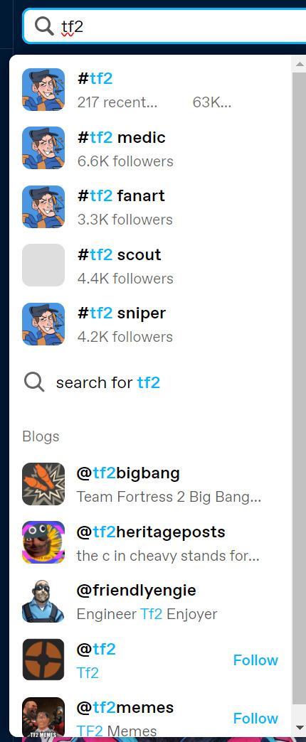
having tag thumbnails is quite ineffective when all tags have the same thumbnail
i don't know about other people but i personally prefer not to search by tag? i usually search by keyword because it gives me more varied content in my search. strange choice to prioritise tagging but lmk what other people think
"217 recent... 63K..." yeah this is sooo optimised for different browser sizes
when have follower counts for tags ever been important information that we need to know while navigating to a tag? on the website where "follower counts don't matter"??? this is useless information; i used to primarily use instagram, it was also useless there and mainly used to double check i didn't misspell anything.
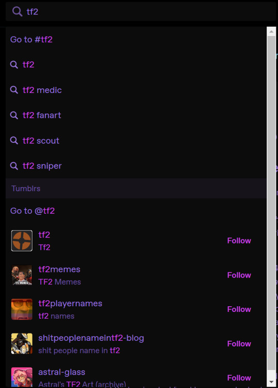
the leading and vertical margins/padding are bad; not only makes the title and subtitles feel disconnected, but also makes it harder for your brain to distinguish between sections.
making everything larger makes it more cramped, and again, removes the spatial distinction between where one entry ends and the next one begins
props for making stuff more distinguishable for colourblind users and also easier to read from further away though. although uh some other website has done it better and... well... we'll get to that later

before we do, i had a search of what other people thought and stole this screenshot from @helpimstuckinafandom (ryuji image to stop the screenie from taking up too much space)
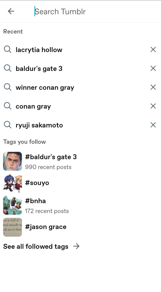
this is somehow WORSE - it's so cramped on the left side with so much empty space on the right, making it feel bloated and empty at the same time, the text in the different sections don't line up (they didn't used to either, i know), the enlarging of the icons reduces the negative space that was already lacking with my update, and somehow the bolded text of the search suggestions makes it feel even emptier compared to the cramped "tags" area. the good thing? less unnecessary information, like no tag follower counts, and no icons for recent searches.
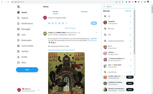
alright. moving on, i sure do wonder where they got this idea for larger and bolder font choices from OH WAIT (roland image to stop it from being so damn large)


oh wait this actually looks pretty good though. so why does twitter's layout work? same reason why tumblr's old one was, frankly, pretty ugly but worked:
SPACING VS CLUTTER
there's no images for the tags / searches because there doesn't need to be! there's no information about follower counts because again, it's not important! notice their width is almost the same as tumblr's, but it still feels better because the content is smaller and the spacing appropriately allows your brain to digest things into smaller chunks.
it's also completely legible and comfortable to read no matter your browser size!!!!!!!!!!!! which tumblr fails to do! even when display names reach their character limits (see: PearlescentMoon) it's still completely legible and not confusing.
ok so if twitter's so good why do i hate it looking more like twitter? simple: brand identity. tumblr removing the stuff that makes it look like tumblr, is in fact, bad. having thick weighted, rounded fonts is not inherently bad. it's what twitter looks like, it's what apple looks like - they have a certain brand identity of legibility, professionalism, and cleanliness that they need to uphold. which is great. microsoft is straight edges and geometric shapes - utilitarian, functional, professional.
what i'm trying to say is this: if you want to keep branding tumblr as the stupid clown funny gay people ancient hellsite, then revel in the aesthetic. in the blatant html-ness of it all, it's unique, you can't get it anywhere else (you can but not on a site as popular). YES make it more accessible, YES make it more welcoming and easy to pick up and use for new users. you don't have to strip it of it's individuality to do so.
i was going to end it here but right before i hit post, i realised tumblr has a tumblr-looking, well spaced, organised and aesthetically pleasing suggestion-based navigation system already - right under the search bar. anyways. that's all. goodbye

6 notes
·
View notes
Text
iOS vs Android – Fidelidade e Escolhas body { font-family: Arial, sans-serif; margin: 0; padding: 0; background-color: #f4f4f4; line-height: 1.6; color: #333; } header { background-color: #0077cc; color: #fff; padding: 20px 0; text-align: center; } section { padding: 20px; max-width: 1000px; margin: auto; background-color: #fff; margin-bottom: 20px; border-radius: 8px; box-shadow: 0 0 10px…
0 notes
Text
<DOCTYPE html>
<html lang="en">
<head>
<meta charset="UTF-8">
<title>Sunset on the Grid: The Strange Science, Culture, and Spectacle of Manhattanhenge</title>
</head>
<body style="font-family:Arial, sans-serif; line-height:1.6; color:#333; max-width:800px; margin:auto; padding:20px;">
<h1>Sunset on the Grid: The Strange Science, Culture, and Spectacle of Manhattanhenge</h1>
<p><strong>By [Author Name]</strong></p>
<p>Twice a year, New Yorkers pause in their daily sprint to witness something almost otherworldly—<strong>Manhattanhenge</strong>. In a city defined by vertical ambition, it's the horizontal that steals the show: the setting sun aligns perfectly with Manhattan’s grid, casting golden rays down the east-west corridors and lighting the city in surreal brilliance. It’s part natural phenomenon, part urban design marvel, and entirely New York.</p>
<h2>A Celestial Coincidence</h2>
<p>This semiannual event was first named and popularized in the early 2000s by astrophysicist Neil deGrasse Tyson. He saw a parallel between the stone solstice alignments of Stonehenge and the modern steel canyons of New York. But the alignment itself has existed since the <strong>Commissioners' Plan of 1811</strong> laid the street grid 29 degrees off true east-west. That slight tilt makes all the difference.</p>
<img src="https://upload.wikimedia.org/wikipedia/commons/e/e5/Manhattanhenge_sunset.jpg" alt="Manhattanhenge Sunset in Manhattan" style="width:100%; height:auto; margin:20px 0;">
<h2>Half Sun vs. Full Sun: What’s the Difference?</h2>
<p>Each Manhattanhenge cycle brings two types of sunsets:</p>
<ul>
<li><strong>Half Sun</strong>: The upper half of the sun is visible just above the horizon. A preview of the phenomenon. Subtle, poetic, and fleeting.</li>
<li><strong>Full Sun</strong>: The entire solar disk sits centered in the street canyon, creating a glowing orb effect. More vivid, dramatic, and powerful.</li>
</ul>
<p>Half sun always precedes full sun in each seasonal cycle. In 2025, the alignments occur on:</p>
<ul>
<li><strong>May 28</strong> (Half Sun) – 8:13 PM ET</li>
<li><strong>May 29</strong> (Full Sun) – 8:12 PM ET</li>
<li><strong>July 11</strong> (Full Sun) – 8:20 PM ET</li>
<li><strong>July 12</strong> (Half Sun) – 8:22 PM ET</li>
</ul>
<h2>Best Streets and Viewing Tips</h2>
<p>The most iconic locations for viewing Manhattanhenge include:</p>
<ul>
<li><strong>34th Street</strong> (Empire State Building)</li>
<li><strong>42nd Street</strong> (Chrysler Building)</li>
<li><strong>57th Street</strong> (Classic skyline views)</li>
<li><strong>Tudor City Overpass</strong> (Elevated and unobstructed)</li>
<li><strong>Hunter’s Point South Park (Queens)</strong> (Reverse perspective of Manhattan)</li>
</ul>
<img src="https://upload.wikimedia.org/wikipedia/commons/5/57/Manhattanhenge_2014.jpg" alt="Crowds watching Manhattanhenge in NYC" style="width:100%; height:auto; margin:20px 0;">
<h2>The Cultural Impact</h2>
<p>In New York, even the sunset gets an audience. Tourists, photographers, and locals flood the streets. Taxis honk. People cheer. Strangers clap together. Art is made. Photos go viral. Rooftop bars fill up with solar-chasers sipping cocktails named after celestial bodies. The city stops—just a little—to pay attention.</p>
<h2>What If It Rains?</h2>
<p>When clouds spoil the show, disappointment runs deep. But what if there were an alternative event? Enter the idea of <strong>“Shadowhenge”</strong>—a contingency celebration with LED light installations simulating the solar alignment, live music, projections, and archival footage. With enough imagination, the backup could be just as magnetic as the real thing.</p>
<h2>Could Boston Have a ‘Henje’ Moment?</h2>
<p>Probably not. Boston’s winding streets, many of them formed by cow paths, lack the geometric predictability of Manhattan’s grid. Other cities like Chicago or Toronto offer grid alignments, but Manhattanhenge remains uniquely New York—a synthesis of astronomy and architecture, nature and planning, sunlight and steel.</p>
<p><strong>For ten minutes twice a year, New York City synchronizes with the solar system. And that’s worth showing up for.</strong></p>
</body>
</html>
0 notes
Text
Hydration Matters: How to Use Moisturizers After a Derma-plane
Introduction
In the ever-evolving world of skincare, dermaplaning has emerged as a favorite among beauty enthusiasts and dermaplaning at home vs professional professionals alike. But what exactly is dermaplaning? This technique involves gently exfoliating the top layer of dead skin cells along with vellus hair (often referred to as "peach fuzz") using a specialized tool. The result? A smoother, more radiant complexion that serves as an excellent canvas for makeup and skincare products. However, one essential aspect often overlooked is post-dermaplaning care, particularly moisturization.
Hydration Matters: How to Use Moisturizers After a Derma-plane is not just about slapping on any moisturizer; it's about dermaplaning understanding your skin's needs and how to enhance the benefits of dermaplaning effectively.
What is Dermaplaning?
Dermaplaning is a cosmetic procedure that involves using a sterile surgical scalpel to gently remove the top layer of dead skin cells and fine vellus hair CosMedic LaserMD in Ann Arbor from the face. This non-invasive treatment offers several benefits:
Exfoliation: It promotes cell turnover, revealing fresher skin. Smooth Skin Texture: The removal of peach fuzz makes makeup application smoother. Improved Product Absorption: Post-treatment, skincare products penetrate deeper into the skin. How Does Dermaplaning Work?
During a professional dermaplaning session, trained estheticians use a specialized tool to perform the treatment in controlled strokes across the face. For those considering doing it at home, there are dermaplaning tools available that can be used safely if proper techniques are followed.
Dermaplaning Near Me
If you're considering this treatment but don't know where to start, searching for “dermaplaning https://www.google.com/maps/place/CosMedic+LaserMD/@42.2874029,-83.8258557,682m/data=!3m1!1e3!4m6!3m5!1s0x883cb16ab766d057:0x14d5a6c19b877b3b!8m2!3d42.287391!4d-83.8249116!16s%2Fg%2F11c7vtrftg?entry=ttu&g_ep=EgoyMDI1MDQyMS4wIKXMDSoASAFQAw%3D%3D near me” can yield numerous local options. Look for licensed dermatologists or certified estheticians who specialize in this procedure.
Professional Dermaplaning vs. At-Home Dermaplaning
When deciding between professional services how dermaplaning improves skin quality and at-home options, consider the pros and cons:
table border-collapse: collapse; width: 100%; margin: 1em 0; th, td border: 1px solid #ccc; padding: 8px; text-align: left; Aspect Professional Dermaplaning At-Home Dermaplaning Expertise Performed by trained professionals Self-administered Safety Higher safety standards Risk of cuts without proper technique Results Often more effective Variable based on skill Cost Higher initial cost More affordable Best Dermaplaning Treatment Options
The best dermaplaning treatment will depend on individual skin types and concerns. Those with sensitive skin may benefit from gentler methods or pre-treatments like cooling gels. Always consult with your dermatologist or esthetician for personalized recommendations.
youtube
youtube
Dermaplaning Benefits
The benefits of dermaplaning extend beyond immediate aesthetics:
Smoother Makeup Application: Foundation goes on flawlessly without clinging to dry patches.
1 note
·
View note
Video
youtube
Stop Wrecking Your Divi Layouts – Learn Margin vs Padding NOW!
Learn the difference between margin and padding in the Divi Theme and how to use each effectively when designing with the Divi Blurb Module. In this easy-to-follow tutorial, we’ll break down what margin and padding actually do, how they affect spacing inside and around your elements, and when to use one over the other. Using Divi’s built-in spacing options, you'll see how to create cleaner layouts, fix alignment issues, and get more precise control over your design.
0 notes
Text
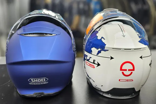
Schuberth C5 vs Shoei Neotec 3: The Ultimate Modular Helmet Comparison
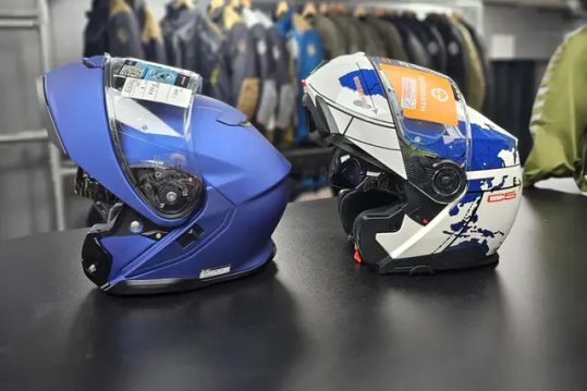
When it comes to high-end modular motorcycle helmets, the Schuberth C5 and Shoei Neotec 3 stand out as two of the most refined options available today. At Moto Central, where we proudly offer both models, we've put together this comprehensive overview to help you decide which helmet is best suited to your riding style and priorities.
Safety and Build Quality
Both helmets are certified to the latest ECE 22.06 standard, ensuring they meet the most rigorous safety requirements. However, their construction methods and safety test performances differ slightly.
Schuberth C5: The standard model is crafted from fibreglass strengthened with carbon fibre, while the C5 Carbon variant features a full carbon fibre shell—offering both durability and lighter weight. In SHARP safety testing, the C5 scored 4 stars and achieved a perfect 100% chin bar retention rate during impact testing.
Shoei Neotec 3: Utilising Shoei’s Advanced Integrated Matrix (AIM) shell, which combines fibreglass and organic fibres, the Neotec 3 earned a full 5-star SHARP rating, with the chin bar remaining closed in 97% of tests.
Conclusion: The Neotec 3 edges ahead in overall SHARP ratings, but the C5’s flawless chin bar performance and lightweight Carbon option give it a strong position for safety-conscious riders.

Comfort and Fit
Comfort is key on long journeys, and both helmets excel—albeit with slightly different design philosophies.
Schuberth C5: Offers a fully removable and washable interior with customisable padding. Its Anti-Roll-Off System improves both fit and safety, while the ratchet-style chin strap is easy to use. The C5 is particularly impressive when it comes to noise reduction, registering just 85dB at 62mph on a naked bike.
Shoei Neotec 3: Known for its plush interior, it also includes Noise Isolators within the cheek pads and a close-fitting neck roll to minimise wind intrusion. The micro-ratchet fastening is secure and user-friendly. Although marginally noisier than the C5, it still delivers a very quiet ride.
Conclusion: The C5 is the clear winner for noise-sensitive touring riders, while the Neotec 3 shines with its snug fit and well-integrated features for everyday comfort.
Ventilation
Effective airflow is essential for rider comfort, especially on warm days or during extended trips.
Schuberth C5: Equipped with dual chin vents and a top vent featuring a two-stage slider. While internal airflow is solid, the vent switches could be more user-friendly.
Shoei Neotec 3: Comes with a two-position chin vent and an improved top vent, both easily operated with gloves. It provides consistent airflow, especially noticeable at higher speeds.
Winner: The Neotec 3 takes the lead with intuitive, glove-friendly ventilation controls and excellent overall air circulation.
Integration of Communication Systems
Both helmets are designed with advanced communication systems in mind, offering seamless integration.
Schuberth C5: Includes built-in HD speakers, two antennas, and a microphone as standard. It’s fully compatible with the SC2 system, offering Mesh 2.0 connectivity for group rides. Setup is straightforward and hassle-free.
Shoei Neotec 3: Pairs with the SRL3 system, co-developed with Sena, offering both Mesh and Bluetooth options for up to 24 riders. The system fits neatly into the helmet’s design, preserving its aerodynamic profile.
Winner: Both systems offer excellent integration, but the C5’s pre-installed components add convenience and ease of setup.
Visor and Sun Visor Performance
A good visor setup can significantly improve your ride quality and safety.
Schuberth C5: Comes fitted with a Pinlock 120 insert, delivering top-notch anti-fog capabilities. Its sun visor is adjustable via a side slider, though some may find the operation a bit clunky.
Shoei Neotec 3: Equipped with a Pinlock Evo insert, also effective against fog. Its sun visor operates smoothly and offers generous coverage for various lighting conditions.
Winner: The C5 edges out in fog prevention, while the Neotec 3 scores higher on ease of use and sun visor quality.
Other Modular Helmets to Consider
If you're open to exploring further options, two premium alternatives worth considering are:
HJC RPHA 91 Carbon: Lightweight and streamlined, with plush interior padding and strong touring appeal.
Nolan X-1005 Ultra Carbon: Offers dual homologation, excellent airflow, and an elegant carbon fibre finish.
Both the Schuberth C5 and Shoei Neotec 3 represent the pinnacle of modular helmet design. Whether you're a long-distance tourer or a commuter prioritising versatility and comfort, either model will serve you exceptionally well. Visit Moto Central’s showroom in the Midlands or explore our full range online to try these helmets for yourself. Plus, don’t forget about our Shoei Personal Fitting Service to ensure your helmet fits like a glove.
0 notes
Text
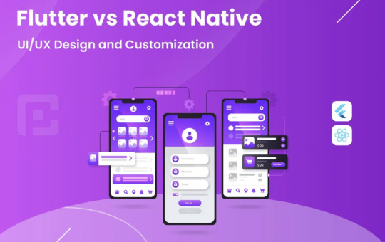
Flutter UI/UX Design Tips: Creating Beautiful and Responsive Apps
Introduction
Flutter has revolutionized cross-platform mobile development by offering a seamless way to create visually appealing and highly responsive apps. A well-designed UI/UX enhances user engagement, improves retention, and ensures a seamless experience across multiple devices. Whether you're a beginner or an experienced developer, mastering UI/UX principles in Flutter can significantly elevate your app's usability and aesthetics.
If you're looking to enhance your expertise in Flutter development, consider enrolling in Flutter Training in Chennai to gain hands-on experience with industry-standard design techniques.
1. Understanding UI vs. UX in Flutter
Before diving into design tips, it’s essential to distinguish between UI (User Interface) and UX (User Experience):
UI (User Interface): Focuses on the visual elements, including layout, colors, typography, and animations.
UX (User Experience): Encompasses the overall interaction users have with the app, including usability, responsiveness, and navigation.
A successful Flutter app balances both UI and UX to create an engaging and efficient user journey.
2. Designing a Clean and Intuitive UI
Choose a Simple and Consistent Layout
A clutter-free and intuitive design enhances user interaction. Follow these best practices:
Use a consistent grid structure to align elements properly.
Follow Google’s Material Design or Apple’s Human Interface Guidelines for a polished look.
Maintain visual hierarchy by using varying font sizes, colors, and spacing.
Use Engaging Color Schemes
Color selection plays a crucial role in user engagement. Here are some tips:
Choose a primary color that represents your brand.
Use complementary colors for contrast and visual appeal.
Maintain color accessibility by ensuring readability (e.g., high contrast between text and background).
Optimize Typography
Text should be readable and visually appealing. Consider:
Using Google Fonts or custom typography to enhance aesthetics.
Setting font sizes dynamically to maintain readability across devices.
Using line height and letter spacing to improve text clarity.
3. Enhancing User Experience (UX) in Flutter Apps
Ensure Smooth Navigation
Navigation plays a vital role in user retention. Follow these principles:
Use bottom navigation bars for primary sections.
Implement gesture-based navigation (swiping, tapping) for a seamless experience.
Avoid deep nesting of pages to simplify user flow.
Make Forms User-Friendly
Forms should be easy to fill out and not overwhelm the user. Ensure:
Input fields have clear labels and placeholders.
Enable auto-focus on the next field after a user enters data.
Provide error messages and real-time validation.
Optimize Performance for Better UX
App performance directly affects user satisfaction. Optimize:
Reduce widget rebuilds to improve speed.
Use lazy loading for lists and images.
Minimize excessive animations to prevent lag.
4. Implementing Responsive Design
Flutter apps need to adapt to different screen sizes and orientations. Consider these best practices:
Use Adaptive Layouts
Utilize MediaQuery to get device dimensions.
Implement Flexible and Expanded widgets for dynamic resizing.
Use FittedBox to adjust UI elements dynamically.
Ensure Touch-Friendly UI
Maintain button size of at least 48x48 pixels for easy tapping.
Provide adequate spacing between interactive elements.
Use gesture detection for intuitive interactions.
Test Across Multiple Devices
Use Flutter’s device preview tools to check responsiveness.
Test on real devices and emulators to identify UI inconsistencies.
Adjust padding, margins, and scaling factors accordingly.
5. Enhancing Engagement with Animations
Animations improve the overall user experience when used correctly. Follow these guidelines:
Use subtle animations for transitions and feedback (e.g., button clicks, page swipes).
Avoid excessive animations that slow down performance.
Implement Lottie animations for lightweight, high-quality animations.
6. Accessibility Considerations
Building an accessible app ensures inclusivity for all users, including those with disabilities:
Use semantic labels for screen readers.
Support dynamic text scaling for visually impaired users.
Maintain high contrast ratios for readability.
Conclusion
Creating beautiful and responsive Flutter apps requires a balance of aesthetics, functionality, and performance optimization. By following these UI/UX principles, developers can build engaging applications that enhance user satisfaction.
To gain hands-on experience and practical knowledge in Flutter app development, enroll in Flutter Training in Chennai and master UI/UX design techniques from industry experts.
0 notes
Text
DRS Full Form in Cricket – Decision Review System Explained
The DRS full form in cricket stands for Decision Review System. It is a technology-driven system used to assist umpires in making fair and accurate decisions. Introduced to reduce human errors in umpiring, DRS allows teams to challenge on-field decisions using ball tracking, UltraEdge, and Hot Spot.
In this article, we will cover DRS full form, history, rules, technology, benefits, and its impact on the game.
What is DRS in Cricket?
The Decision Review System (DRS) is a modern technology introduced in cricket to ensure fair play and reduce umpiring errors. It allows teams to challenge the on-field umpire’s decision, which is then reviewed by the third umpire using advanced technology.
DRS Full Form in Cricket
D – Decision R – Review S – System
Why Was DRS Introduced?
To eliminate umpiring mistakes.
To give teams a fair chance to challenge decisions.
To make cricket more transparent and error-free.
History of DRS in Cricket
2008 – First introduced in Test Cricket during the India vs Sri Lanka series.
2011 – Implemented in ODIs (One Day Internationals).
2017 – Officially used in T20 Internationals (T20Is).
2018 – Became a mandatory part of all ICC events.
Initially, BCCI (Board of Control for Cricket in India) opposed DRS, citing inaccuracies, but later adopted it in 2016.
How Does DRS Work in Cricket?
When a player is dissatisfied with an umpire’s decision, they can request a DRS review. The third umpire then examines the decision using advanced technology.
Steps in a DRS Review:
Review Request:
The fielding or batting team requests a review within 15 seconds of the umpire’s decision.
Technology Used:
UltraEdge/Snickometer (for caught-behind and edge detection).
Hawk-Eye Ball Tracking (for LBW decisions).
Hot Spot (to detect ball impact on the bat or pad).
Final Decision:
The third umpire upholds or overturns the decision based on the evidence.
DRS Rules in Cricket
Number of Reviews:
Test Matches – Each team gets two unsuccessful reviews per innings.
ODIs & T20Is – Each team gets one unsuccessful review per innings.
Umpire’s Call Rule:
If the ball marginally touches the stumps (less than 50%), the original umpire’s decision stands.
Teams do not lose the review if it is Umpire’s Call.
Time Limit for Review:
The player must request a review within 15 seconds of the umpire’s decision.
Technology Used in DRS
1. Hawk-Eye (Ball Tracking)
Tracks the ball’s path and predicts its trajectory after pitching.
Used to determine LBW (Leg Before Wicket) decisions.
2. UltraEdge (Snickometer)
Detects sound waves when the ball passes the bat or pad.
Helps in deciding caught-behind or LBW appeals.
3. Hot Spot
Uses infrared imaging to detect ball impact on the bat or pad.
Reduces confusion in bat-pad LBW decisions.
4. Slow-Motion Replays
Used for stumping, run-out, and catch decisions.
Benefits of DRS in Cricket
The Decision Review System has significantly improved the fairness and accuracy of umpiring decisions in cricket. Here are some key benefits:
1. Reduces Umpiring Errors
Ensures that wrong decisions can be corrected using technology.
Helps umpires make better and more informed decisions.
2. Improves Fair Play
Allows teams to challenge unfair calls and get justice.
Ensures that players are not given out unfairly.
3. Enhances Viewer Experience
Spectators enjoy the thrill of DRS reviews, adding excitement to the game.
TV broadcasts provide detailed analysis and insights into decisions.
4. Provides a Second Chance to Players
Batsmen wrongly given out can use DRS to continue their innings.
Bowlers get a chance to reverse a bad decision and take a wicket.
5. Reduces Controversies
Before DRS, umpiring errors led to huge controversies in cricket.
With DRS, teams accept decisions more peacefully.
6. Promotes Use of Technology in Cricket
Encourages the modernization of cricket with advanced tech.
Improves data collection and analysis for future matches.
Impact of DRS in Cricket
Advantages of DRS
Reduces umpiring mistakes, leading to fair play. Gives teams a second chance to correct wrong decisions. Increases audience engagement with high-tech analysis.
Disadvantages of DRS
❌ Umpire’s Call Rule sometimes leads to controversial decisions. ❌ Technology is not 100% accurate. ❌ Some cricket boards, like BCCI (initially), opposed DRS due to errors.
Famous DRS Moments in Cricket
1. Sachin Tendulkar’s DRS Escape in 2011 World Cup
During the India vs Pakistan semi-final, Tendulkar survived an LBW decision after a successful DRS review.
2. Ben Stokes’ Ashes 2019 Survival
In the 3rd Ashes Test (2019), Ben Stokes overturned an LBW decision, helping England win a historic match.
3. MS Dhoni’s DRS Expertise ("Dhoni Review System")
MS Dhoni was known for his accurate DRS calls, leading fans to call it the "Dhoni Review System".
Conclusion
The DRS full form in cricket stands for Decision Review System, a revolutionary technology that enhances fair play and reduces umpiring errors. With Hawk-Eye, UltraEdge, and Hot Spot, the system has made cricket more accurate and transparent.
The benefits of DRS include fair decision-making, improved player confidence, better viewer experience, and reduced controversies. Despite minor drawbacks, DRS has become an essential part of modern cricket and continues to evolve.
0 notes
Text
Canada Vs USA Game
<!DOCTYPE html> <html lang="en"> <head> <meta charset="UTF-8"> <meta name="viewport" content="width=device-width, initial-scale=1.0"> <title>USA vs Canada: 4 Nations Face-Off Championship Live Updates</title> <style> body { font-family: Arial, sans-serif; margin: 20px; } .scoreboard { background: #f4f4f4; padding: 10px; text-align: center; font-size: 24px; } .content { margin-top: 20px;…
0 notes
Photo
Liga 1 Te Apuesto inicia temporada 2025: Siete partidos marcan el retorno
El campeonato peruano de fútbol profesional iniciará su temporada 2025 con una programación de siete encuentros distribuidos entre el 7 y 10 de febrero, marcando el retorno oficial a las canchas.
Sport Huancayo y Alianza Atlético darán el pitazo inicial de la Liga 1 Te Apuesto este viernes 7 de febrero a las 3:00 pm en el estadio IPD de la ciudad incontrastable.
El plato fuerte de la jornada inaugural llegará el sábado 8 cuando Alianza Lima reciba en el estadio de Matute a Cusco FC para un duelo estelar a las 7:00 pm.
Los celestes de Sporting Cristal viajarán a Huánuco para enfrentar a los recién ascendidos de Alianza Universidad el domingo 9 a la 1:00 pm en su debut temporada.
El actual monarca del fútbol peruano, Universitario de Deportes, visitará a Comerciantes Unidos en el Germán Contreras, mientras Sport Boys recibirá al debutante Juan Pablo II en el Callao.
La primera fecha cerrará el lunes 10 con el encuentro entre Los Chankas y Deportivo Garcilaso en el estadio de Talavera, mientras Binacional aguardará su debut para la siguiente jornada.
.fixture-table width: 100%; border-collapse: collapse; margin: 20px 0; font-family: Arial, sans-serif; background: white;
.fixture-table th background: #003366; color: white; padding: 12px; text-align: left;
.fixture-table tr:nth-child(even) background-color: #f2f2f2;
.fixture-table tr:nth-child(odd) background-color: #ffffff;
.fixture-table td padding: 12px; border-bottom: 1px solid #ddd;
.fixture-table .date-header background: #004d99; color: white; font-weight: bold;
@media screen and (max-width: 600px) .fixture-table display: block; overflow-x: auto; white-space: nowrap;
.fixture-table td, .fixture-table th min-width: 120px;
PROGRAMACIÓN FECHA 1 – TORNEO APERTURA Fecha Partido Hora Estadio Viernes 7 de febrero Sport Huancayo vs. Alianza Atlético 3:00 pm IPD de Huancayo Sábado 8 de febrero Melgar vs. UTC 1:00 pm Monumental de la UNSA Sábado 8 de febrero Atlético Grau vs. Ayacucho FC 3:15 pm Campeones del 36 Sábado 8 de febrero Alianza Lima vs. Cusco FC 7:00 pm Matute Domingo 9 de febrero Alianza Universidad vs. Sporting Cristal 1:00 pm IPD de Huancayo Domingo 9 de febrero Sport Boys vs. Juan Pablo II 3:00 pm Miguel Grau del Callao Domingo 9 de febrero Comerciantes Unidos vs. Universitario 3:30 pm Germán Contreras Domingo 9 de febrero Cienciano vs. ADT 6:00 pm Garcilaso de la Vega Lunes 10 de febrero Los Chankas vs. Deportivo Garcilaso 3:00 pm Municipal de Talavera Descansa: Binacional
Panamá protesta por declaraciones de Trump sobre el Canal en la ONU
Deportes
via https://pachamamaradio.org/liga-1-te-apuesto-inicia-temporada-2025-siete-partidos-marcan-el-retorno/
0 notes
Text
Best Free Graphic Design Templates & Upcoming Trends for 2025
Welcome to GraphyPix LLC’s free graphic design templates for your unique creativity. You will get free and premium templates for presentations, print templates and mockups. Nowadays graphic design is getting more and more popular. As digital trends continue to take shape and size, graphic design online becomes an imperative.
It becomes an accessible service for business owners and creators from all parts of the world. With many online graphic design services at one’s fingertips, every person has the ability to work with talented online graphic designers irrespective of where they live. It is this flexibility in terms of work scope that has opened many graphic design websites that have portfolios, templates, as well as inspiration among both designers and clients.
Specifications of Graphic Design Templates
When designing the templates for graphic design, it is essential to set key elements that might be changed for different uses but still keep the brand consistent and aesthetically appealing. The core components you would want to have in multi-use graphic design templates are explained below.
1. The grid and structure of the layout
Grid System: This will help in aligning the content consistently and in a reliable way for free graphic design templates. Some options may be a 2×2 or 3×3 grid system or even custom, depending on how complex and what type of content it is.
Margins and Padding: Make it look polished by using uniform spacing. Set transparent inner and outer padding to allow your design to breathe.
Column Layouts: For text-heavy templates, columns enable readability and visual flow.
Asymmetrical vs. Symmetrical Layout: The designer has the choice to make it asymmetrical or symmetrical. This will visually create either a dynamic or formal look for free graphic design templates.
2. Typography
Font Styles and Pairing: Choose a primary font for headers and a secondary font for body text. Font pairing should match the brand personality, whether modern, elegant, or playful for your free graphic design templates.
Hierarchy and Sizing: Use different font sizes and weights to show hierarchy. This will make the most important elements stand out for your free graphic design templates.
Line Spacing and Alignment: Maintain consistent line heights and alignment to ensure readability and uniformity across free graphic design templates.
3. Color Scheme
Primary Colors: These should be the most used and should reflect the brand’s core colors.
Secondary Colors: Include accent colors for variety and contrast. Secondary colors are excellent for calls to action or highlighting. Neutral backgrounds are often essential. They create contrast with text and visuals and keep balance.
Color Gradients: If relevant, subtle gradients can add depth without overwhelming the design. You can check our website for more color scheme, palettes and design ideas.
4. Imagery and graphics
Placeholder Image Frames: Use placeholder frames to define image areas. They can be easily swapped out.
Use custom icons or illustrations: They should match your brand and convey messages quickly.
Image Filters or Overlays: Set filters or overlays to keep a consistent look in images, even with new ones.
5. Shapes and patterns
Use shapes such as circles, rectangles, or unique brand-specific shapes to highlight specific text or images. You can use circled shapes with interactive patterns for graphic presentation.
Background patterns or textures: Subtle textures or patterns can add depth. But they must not interfere with the text.
Dividers and Borders: These are elements that draw lines to separate and structure content. They should be manageable for the design for your free graphic design templates.
6. Icons and buttons
Call-to-Action Buttons: Use standard shapes and colors for buttons. They should stand out and be recognizable for your free graphic design templates.
Iconography Style: Icons should match the overall aesthetic. They can be minimalist, detailed, or illustrative. They must also align with the template’s purpose.
Social Media Icons: They should be the same size and style. Please place them in designated areas for simple access for your free graphic design templates.
7. Branding Elements
Place for Logo: A designated place for the logo so that one never misses branding.
Taglines or Slogans: Insert taglines here to enforce brand messaging.
Watermark or Subtle Brand Marks: Include transparent brand marks, especially for visually heavy designs like images and presentations.
8. Text and Content Blocks
Preformatted text boxes: headers, subheaders, body text, quotes-all are kept consistent. Apply obvious styles to lists, especially in informative templates like infographics.
Highlight Boxes: Text boxes with contrasting backgrounds for key notes or highlights.
9. Interactive Elements (for Digital Templates)
Hover Effects: For web templates, incorporate effects that make buttons or links stand out when hovered over.
Clickable Links or CTA Areas: Set placeholders for CTA links or social media buttons. Ensure they’re simple to locate.
10. Consistent file structure and layer naming
Organized Layers: Each element should have a clear label for easy editing for your free graphic design templates.
Editable Sections: Mark areas as editable to ensure ease of customization, especially if handing off the template to a team.
By setting these elements, you’ll create robust, flexible templates that adapt well to different needs without sacrificing design quality.
Find your desired free graphic design templates in Best Price. Subscribe to GraphyPix LLC today!
Graphic Design Websites: Inspiration for graphic design templates and resources
For those seeking inspiration for top graphic design websites, they offer valuable resources. Top-notch portfolios from around the world are showcased. The best graphic design websites showcase work by top designers and agencies. They are a creative hub for the industry.
GraphyPix LLC: Visit our website for more updates on free and premium graphic design templates.
Behance: It is one of the best sites for free graphic design templates. It lets designers share projects with a global audience. It is one of the best graphic design portfolio sites. It includes work in various design fields, such as illustration, motion graphics, and UI/UX.
Dribble: It’s a popular graphic design site. Designers post snapshots of ongoing projects there. Known as one of the best websites for graphic design, it’s popular among UI/UX designers and illustrators. Check out Dribble. It’s a go-to for creatives. It has many free graphic design templates. From eye-catching social media graphics to sleek presentation templates, Dribble offers high-quality resources to elevate your design projects.
Adobe Portfolio: It’s one of the best graphic design sites. It integrates with Adobe Creative Cloud. It’s ideal for designers who want a customizable, user-friendly portfolio. Unlock creativity with free graphic design templates in Adobe Portfolio. Perfect for professionals and beginners.
Squarespace and Wix: For designers who want full control over their portfolio’s layout, Squarespace and Wix are excellent choices. These website and graphic design platforms provide visually appealing templates tailored to graphic design websites for a professional look.
Canva: This is a designing tool and also one of the trending sources for free graphic design templates. Canva pre-built layouts in respect to social media, presentations, and many more. Thus, it is ideal for those amateurs and professionals who are after fast solutions. From Canva, you will obtain the finest visuals. No design experience is required. You can also check our website for more ideas on infographics for Canva.
Envato Elements: Offers ready-made graphic design templates. This includes business cards, social media assets, and presentation slides.
Freepik: It offers free graphic design templates for any use. It’s popular with both beginners and professionals.
Adobe Stock: Adobe Stock provides free and premium graphic design templates. Adobe Stock offers professional templates for InDesign, Illustrator, and Photoshop.
Adobe Spark: It has templates for web and social media. Contains free graphic design templates. They are customizable. It is a simple way to create engaging content.
Pro tips: To access our pre-designed free graphic design templates, click the provided button. Then, provide your credentials, and voila, your template will be right at your desk! Contact GraphyPix LLC for more details.
Tools and software for graphic design
Effective graphic design programs are essential for high-quality work. These programs for graphic design offer tools for creating everything from logos to complex digital illustrations. Here’s an overview of the best graphic design software. It covers both paid and free programs.
Adobe Creative Cloud is the top graphic design software. Adobe offers some of the best graphic design tools. They include Photoshop, Illustrator, and InDesign. These tools cover everything from photo editing to vector creation.
Photoshop is the best graphic design program for beginners and pros. It’s ideal for photo editing, digital painting, and web design. Free Photoshop templates can save you time. They provide a professional foundation to start with. Customize the design colors, fonts, and images to match your brand identity. These templates cater to your needs for social media graphics, marketing materials, and website banners.
Illustrator is the best app for vector graphics and logo design. It’s a top graphic design tool. Explore a vast array of templates where you can find designs for everything. They include business cards, social media graphics, brochures, and posters. These templates are often customizable. You can add your unique touch and brand identity.
InDesign is vital for layout and print design. It helps create magazines, books, and brochures. Free InDesign templates are a goldmine for designers. They want to streamline their workflow and elevate their projects. These pre-designed layouts are a solid base for many projects. You can use them for brochures, magazines, posters, and presentations.
CorelDRAW is versatile. It is often among the best graphic design programs, especially for print design. Looking for professional-quality designs without breaking the bank? Free CorelDRAW templates are a treasure trove of pre-designed layouts. They are perfect for various projects. These templates can enhance your efficiency.
The software Affinity Designer is a powerful alternative to Adobe. It is popular among freelancers and one of the best graphic design apps for vector and raster designs. Unlock creativity with Affinity Designer templates, which are available for free. These templates range from logos and business cards to infographics and presentations.
Inkscape is an open-source graphic design program for vector graphics. It is ideal for logos and illustrations. Gimp, Inkscape, and Krita are available for Mac users.
Free Graphic Design Templates: Features to Look For
Any graphic design software should have certain features that you will need at some point in your design journey. If the ones we’re investigating don’t have them, we’ll feel like they are behind the times, and we can find something better.
You may have to pay for some of these features, but we’re hoping to find at least one suite of tools that can do them all for free.
Feature 1: Flexibility of File Type and Size
If you import a vector image for free graphic design templates, it should be able to exit as any file type. If you import a PNG file, it should automatically convert to a JPEG file type.
If you bring in a large image, you should be able to shrink it without losing quality. If you upload a small image, you may receive a warning that enlarging it could lead to a loss of image quality.
Feature 2: Background Eraser
Having a reliable background eraser where you don’t have to outline things awkwardly with your finger on a mouse pad is a must.
People who do graphic design for a living typically have a screen/pad and stylus solution for this. However, if you’re looking to complete a task for your business on a budget, we need to ensure that it remains simple.
Feature 3: Templates
The more templates, the better. Saving time by finding something close to what you want and making changes to it can be a huge time saver.
They should, of course, also have a way to start from scratch if you’re just not seeing anything like what you’re trying to accomplish.
Feature 4: Social Post Creation… Maybe scheduling?
We would love to see interactivity between the design software and social platforms, even if it’s through an app you add to the design software.
We don’t want to create and save the image in one program and then upload it to a social platform. After that, we would need to handle the optimization tasks and schedule the post.
Make Your Ideas Look Amazing in Designs-Click the button below!
Here are free graphic design templates to get you started:
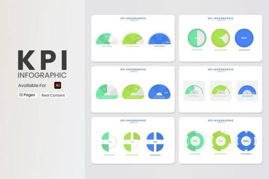
1. KPI Infographic Template|12 Unique Premium Slides
Free — Purchase
Want a KPI infographic to evaluate your main matrices? Our template solves your problem. Key performance metrics can be controlled by our compact design. Present data analysis results with it. Much more, as needed.
What’s included:
12 stylish slides.
Resize and alter all graphics.
Free web fonts.
Use it as a reference with actual details.
Display resolution is 1920 x 1080.
Drag and drop photos and text.
Everything is customizable and easy to change.
A Documentation file is added.
2. Roadmap Infographic Template|12 Unique Creative Slides
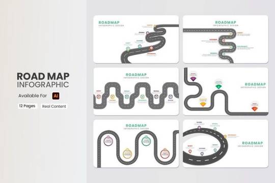
Free — Purchase
Your roadmap infographic template for many business infographics. Our template lets you build your identity gradually. Our beautiful template displays reports and diagrams. It can point targets and create brand marketing maps.
What’s included:
12 stylish slides.
Ideal for non-designers.
Choose from hand-picked typefaces that suit you.
Customize each slide with your own material.
Display is 16×9 FULL HD.
It supports Apple and Windows.
An XML theme color option.
Dag and drop photos and text.
Everything is customizable and easy to change.
There are also instructions for common editing applications.
3. 16+ Free Company Profile PowerPoint Presentation Templates
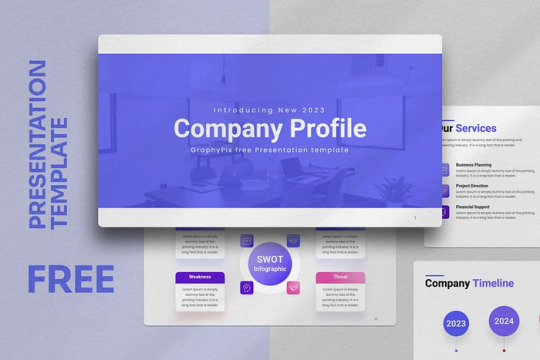
Free — Purchase
Find corporate profile PowerPoint templates from GraphyPix LLC. This handy tool visually displays a business’s essentials. It usually comprises slides with the company’s purpose, vision, values, and USPs. Company history, team bios, major achievements, and products or services are generally included in the template. Stakeholders can quickly identify the brand and its market position.
What’s included:
16 compact, sleek-looking slides.
All graphics are resizable and editable.
Free web fonts are used.
The display provides a 16×9 FULL HD ratio.
It is suitable for both Apple and Windows OS.
It’s easy to modify, and everything is editable.
A documentation file is provided.
4. Exhibition Booth Mockup
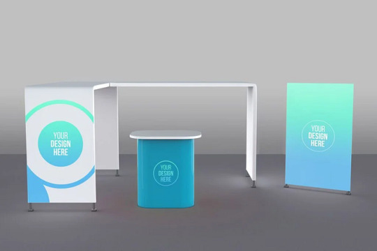
Free — Purchase
Photoshop expertise is not required to utilize this template. Simply replace the artwork to edit this template. Smart object layers simplify customisation.
What’s included:
High resolution 4000×3000 px, 300 Dpi
4000×3000 PX
300 dpi
Editable via smart object
Organized Layers and folders
Help file included
5. Editable Productivity Planner Template | 30+ Canva Modern Unique Design
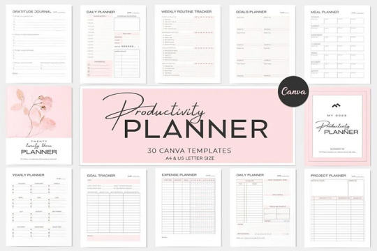
Free — Purchase
Organize and reach your goals with this unique Canva Productivity Planner Template kit. This planner has everything you need to keep on track throughout the year. Canva lets you edit, customize, save as a PDF, and reuse. Useful for coaching, lead magnets, challenges, and more!
What’s included:
Planner pages (daily, weekly, monthly, yearly, goals)
Tracker pages (habits & routines)
Blank pages (notes, journaling, doodles, mindmaps)
Finance pages (budget, expenses, debt, bills)
100% customizable in Canva with your brand colors, fonts, contents, etc
Download as a pdf
Use the free or pro version of Canva
6. YouTube Branding Kit Canva + PSD
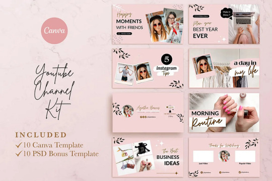
Free — Purchase
Get these Youtube Templates to make your social media content look professional and stylish! These templates are INSTANT DOWNLOADABLE and FULLY EDITABLE.
What’s included:
7 Youtube Thumbnail Canva Template (You’ll get a PDF file with the link to Canva templates)
7 PSD Youtube Thumbnail Template (In PSD folder)
2 Youtube Channel cover art Canva template
2 PSD Youtube Channel cover art
1 End Screen Canva template
1 PSD End Screen
7. Food Packaging Mockup

Free — Purchase
PSD food container mockups make showcasing designs easy and professional. Smart object layers simplify customisation. Changes to showcase your design are easy and quick. Food packaging mockups are ideal for projects that require realistic food container designs. With its adjustable features, you may quickly present your work professionally.
What’s included:
5 PSD files with 5 different variations
High resolution 4500×3000 px, 300 Dpi
Editable via smart object
On/off shadows
Shadow intensity control
Background color variation
Organized Layers and folders
Help file
8. Snack Bar Packaging Mockup
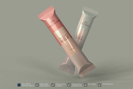
Free — Purchase
For creatives to showcase their work, snack bar packaging mockups are invaluable. These mockups make it easy to make your goods and designs look professional. PSD mockups may be customized rapidly using smart object layers. It’s easier than ever to promote your products and designs. A snack or chocolate bar mockup is perfect for creatives who want to leave a lasting impression. Easy customisation lets you make your design stand out and look excellent.
What’s included:
7 PSD files with 7 different variations
High resolution 4500×3000 px, 300 Dpi
Editable via smart object
On/off shadows
Shadow intensity control
Background color variation
Organized Layers and folders
Help file
Elevate Your Graphic Templates — Explore Our Free Templates Today!
Best Practices for Social Media Graphic Design
Consistency: A consistent color palette, font, and style for free graphic design templates to help build a cohesive brand image.
Templates: We have free graphic design templates designed for Instagram, Facebook, and Twitter. These save time and maintain a consistent aesthetic appearance.
Visual Hierarchy: Organize elements in such a way to make vital information instantly catch the eye. This enhances readability.
Creating a Graphic Design Portfolio
A strong portfolio is vital. A graphic design website shows skills and attracts clients. The best sites for graphic design portfolios are Behance, Dribble, and Adobe Portfolio. Here are some tips for Building an Effective Portfolio,
Curate Your Best Work: Showcase high-quality examples that demonstrate a range of skills.
Clean Layout: A well-organized design allows work to shine.
Client Testimonials: Adding client feedback adds credibility.
Conclusion: Mastering Graphic Design Online
This concludes our overview of the free graphic design templates offered by GraphyPix LLC. Explore thousands of presentations, print templates, mockups, and custom templates that suit your taste. The right tools, templates, and platforms are essential. They help with graphic design services and building a portfolio. From industry-standard software for graphic design to free graphic design templates, resources today empower designers of all levels.
This guide is a roadmap for beginners, freelancers, and business owners. It shows them the options in graphic design. With creativity and the right tools, you’ll be ready to build a unique, professional presence online. Visit our website for more updates on presentation, print templates, mockups and custom templates. To learn more about free graphic design tutorials, visit our website.
#graphic design#free template#design template#brochure template#template design#print template#brochure design#template#graphypix#psd template#ppt#design#layout#presentation
1 note
·
View note
Text
ONNX vs. Core ML: Choosing the Best Approach for Model Conversion in 2024
/* General title box styling */ h1, h2, h3, h4, h5, h6 { display: inline-block; padding: 10px; margin: 10px 0; border-radius: 5px; color: white; /* Text color for readability */ } /* Specific colors for titles */ h1 { background-color: #000000; /* Black */ } h2 { background-color: #d2a679; /* Light brown */ } h3, h4, h5, h6 { background-color: #b8860b; /* Goldenrod */ } ONNX vs. Core ML:…
0 notes
Text
The rewrite RPG that I found and lost (and really wish I knew how to find again) had a great way to deal with that. The way the tech worked actually made it logically MUCH easier to beam down than it was to beam up. It also got rid of the pesky suicide machine problem.
The transporter was a direct offshoot of warp tech. What it did was wrap you up in a warp bubble and shoot you at the target.
Part of the precision work of beaming people was putting in the right amount warpage so you would phase through exactly the right amount of matter (moving through/over it in higher dimensions) but not too little or too much. Too little and the warp bubble would pop too soon and suddenly you’re skydiving. Too much and you materialize inside the planet buried alive.
But it’s relatively easy to beam down because the surface has so much more mass compared to everything else the bubble is going to hit. There’s a large safety margin. So you just shoot the warp bubble like a bullet made out of a soap bubble and it pops when it hits the ground. Tada, transported down.
This also explains why there are so many bits of them beaming down near the target instead of at the target. To beam inside a building requires more precision than to just beam onto the ground. To beam onto solid ground requires less precision than to beam down onto the surface right above a cave or sewer network. What you really want is some nice open parkland.
The next problem is that any warp bubble you make requires the warp engine and the transport requires the transporter. So you can only shoot the bubble from a transporter pad. That’s what the transporter is doing. You can’t initiate a warp bubble at an arbitrary point in space.
So when it’s time to beam, it’s a precision hand off between the transporter engineer and the warp engineer. The ship has to be using the impulse engines during beaming because the warp engines are needed to make the transporter bubble.
Not a big problem if you’re safely in orbit and don’t have to get anywhere super fast. So, again, beaming down is relatively easy. You get in orbit, make the switch, shoot the bubble. Circle around until it’s time to beam up.
But all that comes back into play when it’s time to beam up. You can’t be at warp when you beam. The beam has to originate at the transporter. You have to make a bubble go through exactly the right amount of matter. You have to shoot the warp bubble at where the landing party is to pick them up. You have to switch back to warp drive to zoom around to the opposite side, faster than the beam (so, faster than light speed) and catch the soap bubble bullet on the far side of its trajectory. It’s playing catch with yourself at superluminal speed.
During which, you don’t want to pick up the wrong amount of matter and gouge out a piece of the planet or a whole tunnel through.
So, while beaming down you can just shoot straight at the planet, no worries. But beaming up, the safest way to do it is to be orbiting in a way as if you’re skimming a rock, exactly once, off the surface, at the precision point where a straight line will pass only through air until it hits the landing party at the point of the skip and then continues on through only air on the far side. At which point you switch back to warp drive and intercept the warp bubble on the far side of that line, at the point it will be at in space given the timing and speed differential so the bubble finally pops inside the ship. But also like beaming to a building, it’s harder that you HAVE to now precision it so they’re inside the building, underground (because the ship has virtual mass from the warp bubble unless you turn off the warp drive again), on exactly the floor you intend instead of on the outside of the hull or the exterior of the warp bubble.
So beaming down vs beaming up is the difference between shooting a gun at a target, even the Captain can probably figure it out ;) vs a hyper complex orbital-mechanical train problem through more than three dimensions (so in higher dimensions you pass through the party to catch them inside the bubble but not at the place where the ground they’re standing on is in that same multidimensional space point). Even with the ship’s extremely advanced computers, you can’t do it safely on a whim at an instant. What takes seconds to calculate for a beam down takes minutes to calculate for a beam up. And, for the technicians, they just have to input a much harder targeting solution.
So, if you’re running around or falling or under fire or protected from the sky or hidden from sensors, the calculation is too difficult to run in the time span where the calculation will still be valid because everything is moving and it’s automatically a multi body problem and the landing party isn’t in a predictable orbit, making it essentially incalculable unless they’re standing still or the technician is willing to guesstimate.
Again, this is all doable if the landing party just goes outside and stands stock still. That takes out their random motion. They have a minute to give a farewell speech and then they vanish at the catch.
In a fire fight - good luck.
But if the crew knows they’re going into something moderately dangerous, they can have emergency transport protocols. Essentially, the technicians can continuously monitor the landing party, redoing only parts of the calculations over and over again as quickly as possible, in order to be ready to be beamed up as quickly as possible. But this means the ship can’t do anything else meaningful. The computers are needed for that calculation. The ship cannot adjust its orbit without a full recalculation. The good sensors have to remain locked on the landing party (making it hard to spot another ship) and technicians have to be constantly at the post.
Even then, if the landing party starts moving fast, the technician is going to have to guesstimate if the party needs beaming up super fast. So it’s still a “dramatic” amount of time to beam up, several seconds after the command to energize at best.
If something weird happens and they need to figure out what happened, what it was, oops, we need the computer.
If another ship comes at them, they need the warp core for the ship (shields and phasers also use the same tech).
If they need the sensors. If they lose lock. If the technician just zones out for a bit out of boredom. Pretty much if anything goes wrong. That beam up is going to take a minute - far longer than it takes to be shot.
But… if the landing party is just locked in a cell, still the same problems as the series. It actually gets worse than the series. Give the ship twenty minutes or so and there’s no way to keep the beam out from working, even putting the cell in the center of the planet. As long as the ship knows where the landing party is and has time, nothing but another warp bubble can block the transport.
And if the landing party has any of their tech on them, the time was reduced significantly because the ship could use the signal in the communicator to lock on and the tricorder could even help do some of the calculations on the other end. Even just a phaser is a teeny tiny little bare bones warp core to pick up on the sensors as an obvious disturbance.
So, it didn’t solve everything but I feel like it got the important bit to be solved regularly.
another inherently funny part of star trek is the very first show establishes a magic machine that sparklezaps them out of uncomfortable situations so for the next 56 years writers have to keep coming up with reasons why it won't work this time
33K notes
·
View notes