#mark gouache sketch
Text

#mark gouache sketch#nct#nct mark#nct fanart#mark lee#그림#팬아트#kpop fanart#일러스트#kpop artwork#illustration#gouache sketchbook#gouache art#gouache#gouache painting#mark lee fanart#nct mark lee#nct mark fanart#sketchbook art#kpop sketchbook#sketchbook ideas#kpop journal#mark lee aesthetic#nct 127#nct dream#nct 127 fanart#nct dream fanart#sketchbook#scrapbook#watercolor painting
26 notes
·
View notes
Text

19-9-23
#moleskine#sketchbook#sketch#daily#dailyart#dailydrawing#dailypainting#dailysketch#sketchaday#artoftheday#art#artbook#artists on tumblr#gouache#painting#blackandwhite#monochrome#mark of the vampire#vampire#dracula#bela lugosi#spiderweb#cobweb#spooky
181 notes
·
View notes
Text
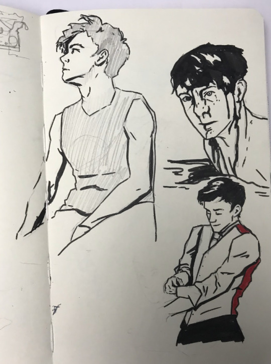
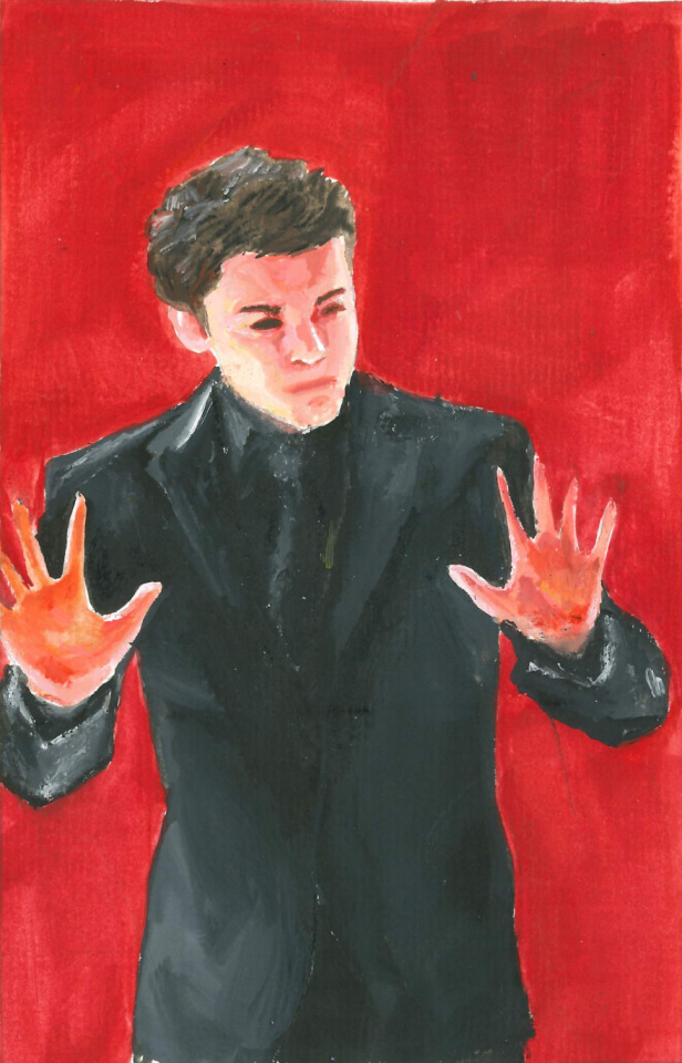
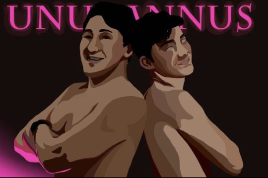
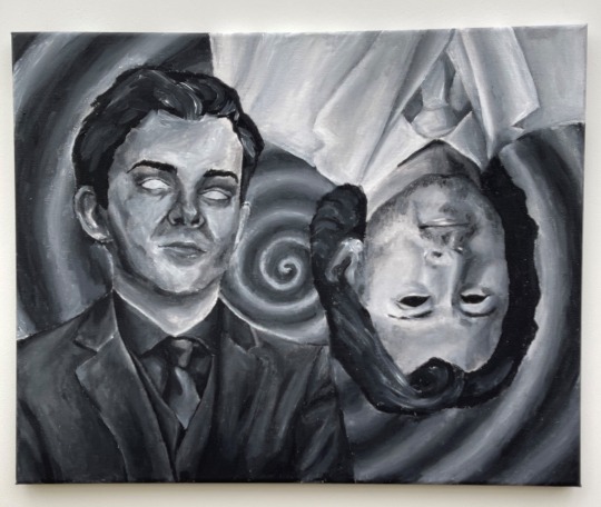

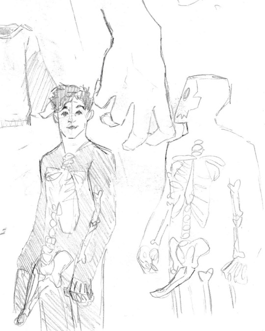

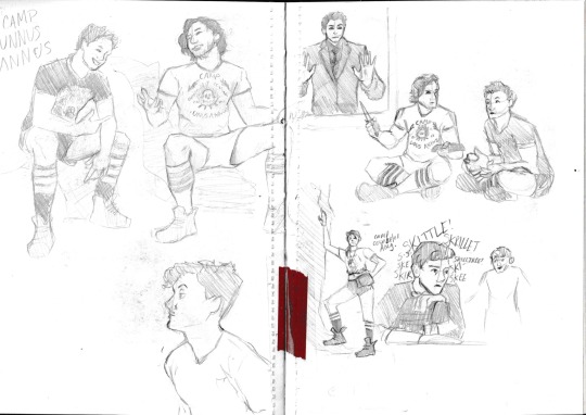

momento mori friends ! in honour of the 2 year anniversary of the deaths of our friends unus and annus, here’s a little art dump (including some badly scanned sketchbook pages i luckily still had on my computer)
i don’t wanna get mushy but this project meant the world to me at a super rough time in my life and i’m glad we get to celebrate it
#unus annus#unus annus fanart#unus annus is over party#momento mori#crankgameplays#crankgameplays fanart#ethan nestor#markiplier#markiplier fanart#mark fischbach#art#fanart#artwork#sketchbook#sketch#illustration#gouache painting#watercolour#watercolor#gouache#digital art#traditional art#jam draws stuff
26 notes
·
View notes
Text
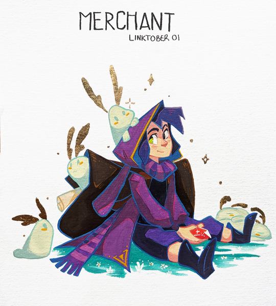


It's #linktober again! And gouache it is this year. Heheheh. Some text below!
This is my 4th year and as usual, I like to add an extra challenge. I want to learn gouache! This one here marks my second attempt at it. It is a lot of fun! I've added the initial sketch I did on the last slide.
- I highly doubt I will do all challenges in a timely manner since I am quite overbooked this year, but so far I have about 17 sketched (not painted lol). Yay!
- These unique pieces (A5 format) will be for sale after the challenge. I will not make prints out of them, but might select a few to make stickers! ;)
--------------------
This is Ravio, or how I see him in the world of Strings of Fate (From my previous Linktober story). I added 24K gold accents on the bunnies and omg I now want to add gold accent everywhere. It's stunning in the light.
If you haven't read Strings of Fate, my last Linktober story, I suggest you go have a look, since a lot of these prompt will have characters from it! :)
Happy Linktober y'all!!
878 notes
·
View notes
Text
WIP
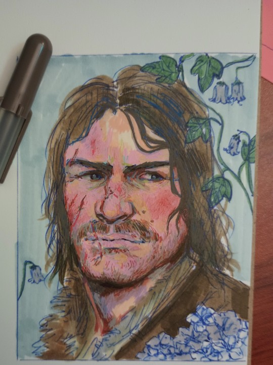
Johnny boy with Victorian flower language? Yes please.
These drawings take me about 4-5 hours on a good day. Lots of scribbling and smearing gel pen with my poor fingers. I do a sketch in shitty ballpoint pen, and then mark out my base colors with Copic markers or my Ohuhu markers which are a much cheaper alternative. Then I go ham with the Gellyroll pens until he looks like a human person and not a blue tinted monstrosity
I love Gellyroll pens because they layer like good gouache paint! If you mess up, they're opaque enough to cover over it, and they have a good line quality that's easy for my shaky ass hands to be precise with. Make sure to use a mixed media paper though, because you can and will put holes in anything thinner. Blend when wet, and use a Moonlight pen to do so. I hoard the pastel pink ones because that's my go-to blender. The standard pens are not as opaque as Moonlight ones, but they make a great base layer.
My drawings are SMALL! They're only about 3 1/2 by 4 1/2 or 4x6 if I feel adventurous. Easier to work with, less surface area to cover.
35 notes
·
View notes
Text

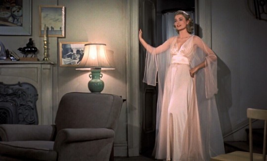

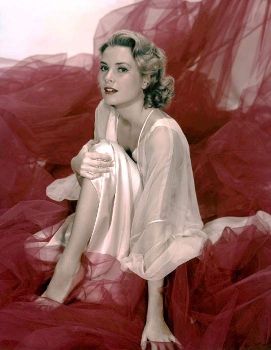
An original gouache and ink on paper costume sketch by Edith Head from the production of Alfred Hitchcock's classic film Rear Window (Alfred J. Hitchcock Productions, 1964), depicting Grace Kelly as Lisa Fremont wearing an ivory peignoir. In the film Lisa removes the peignoir from a Mark Cross traveling case and wears it to seduce L.B. Jefferies (James Stewart). Head has signed the piece to the bottom right in her hand. The paper has two rips to the top edge, left and right.
#grace kelly#rear window#edith head#nightgown#nightwear#lisa carol freamont#lisa fremont#peignoir#trosseau#1954
20 notes
·
View notes
Text
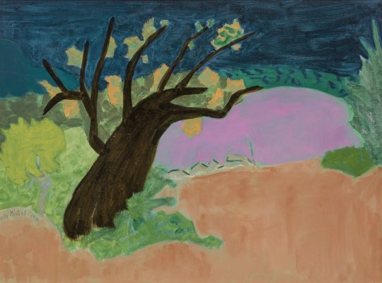
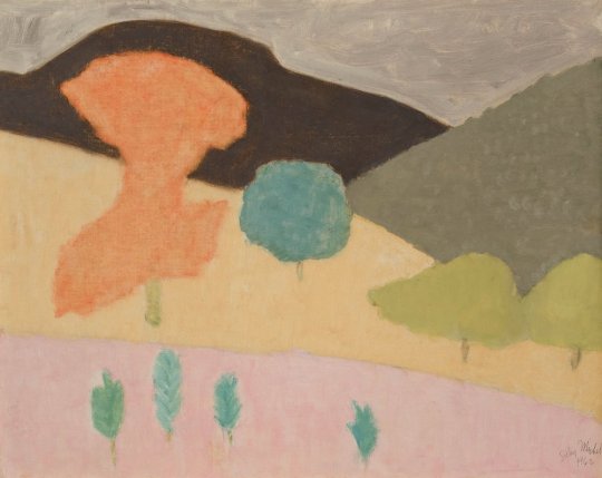
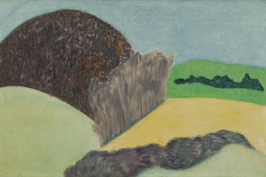
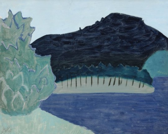

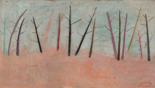

Sally Michel’s story cannot be told without bringing in her life partner, Milton Avery.
Milton Avery (1885-1965) and Sally Michel (1902-2003) met painting in Gloucester, Massachusetts in 1924. They admired each other’s dedication to sketching all day. Married in 1926, Sally and Milton worked in New York as a unit until Milton’s death in 1965. To provide support, Sally worked as a freelance illustrator, an occupation she could pursue at home. This allowed her to remain by the side of Milton and their young daughter, while continuing to develop her own painting. The couple would rise at six in the morning and draw or paint straight through to dinner. Sally was gregarious and Milton was taciturn, so she became his spokesman. Every Saturday they went to New York’s galleries and museums. They continued to sketch from a model at the Art Students League and later with a group of their artist-friends, at each other’s studios. Through the 1930s, fellow artists of Sally’s generation, including Mark Rothko, Adolph Gottlieb, and Barnett Newman frequently came to the Avery home to discuss art. By the mid-1940s Milton and Sally had each developed their own parallel but unique approaches to painting.
The refinement of their artistic visions evolved over many years of sketching, painting, looking, and sharing ideas on art. The Averys structured their year so that summers could be shared creating together and later with their artist-daughter March (b. 1932). Because rental apartments in New York were plentiful, Milton and Sally were able to leave the City each summer and return in the fall. They sketched non-stop on their trips, gathering source material for future paintings to be executed in the studio. A list of the summer trips gives some indication of which location inspired a painting’s subject. With limited funds in the 1930s, the Averys drove to summer locations in Connecticut (1930), Gloucester, Massachusetts (1926-1933), Vermont (1937, 1939, 1940), and the Gaspé Peninsula, Québec (1938).
Sally Michel did paint directly from nature throughout her career, but developed most of her artwork from sketches. She often created an intermediary watercolor or gouache that then informed the finished oil, transmitting a mood, time of day, weather, or season. The fluidity and luminosity of gouache and watercolor provided freedom to experiment with color and tone, which could be duplicated on canvas by painting with thinned pigments. To create an overall textural softness, Sally used a stiff brush to apply matte pigments in thin layers. If a pigment became too thick it could be scraped from the canvas to reveal lower coats of pigment and achieve the desired tone. In looking over a group of sketches to select one to paint, Sally considered contrasts between straight and curving lines, discrepancies in scale, and different views of a single scene. Sally’s portraits of individuals were often close-ups isolated against flat backgrounds. Scale distortion, exaggerated color, or caricature could provide social commentary when she desired it. This sketch-to-painting approach allowed Sally to achieve simplified and abstracted shapes locked together into finely balanced compositions.
Milton and Sally Michel Avery were artists dedicated to painting what they saw at a time of uncertainty for realism in American art. From 1946 to 1958 Abstract Expressionism, a gestural or action painting style with roots in European Surrealism, was at its height of popularity. Abstract Expressionists considered any reference to recognizable imagery to be parochial, out of date, and taboo. The Averys saw that bridges between realism and abstraction can go both ways and color, structure, and light are the common denominators. This realization led to recognizing that shapes, spaces, and color form a set of unique relationships independent of any subject matter. The Averys modernized realism by using the shapes of things, the spaces around them, and color in new ways. They treated color less naturalistically to reflect mood and transcend the factual aspects of realistic subjects.
Realism traditionally relies on light and dark contrasts to create depth. They found the use of non-naturalistic color suppressed that contrast and led to a new challenge of how else to produce depth. The solution they found was that a highly structured composition would still be read as a landscape, still life, or figure. To capture further universality and interconnections in their paintings, the Averys worked with shapes and their edges. They used thinly applied paint so the canvas ground was revealed around the edges of shapes, making the bare canvas function as color. The boundaries of soft shapes could be achieved through intricate color transitions, creating contiguous forms that blend into one another. This approach led to a new and important discovery that the distinctions between objects in a painting are fundamentally illusions and that the borders between shapes are what create representational art.
The Averys also found that reducing the number of shapes and colors in a painting and eliminating illusionistic rounded volumes and modeled forms added modernity to a scene. Shape and color could become equal when shapes were used as containers of color and that areas of color could be stacked as abstract signs of foreground, middle ground, distance, and sky. The Averys used patterns, organic or geometric, to express the forces as well as the forms of nature. Liquid or transparent areas of paint could embody the forces of wind and water. This demonstrated that painterly surfaces associated with the Abstract Expressionists could be used in realism to express more than angst.
In March of 1964 Milton’s health put him in a New York hospital where he died in January of 1965. Sally worked tirelessly to ensure Milton’s legacy while also continuing to paint and evolve the way she used materials for another twenty-five years. To achieve a dry paint surface with a soft matte feel, she mixed large amounts of turpentine with her paint rather than linseed oil. Always frugal with pigment, Sally used rags to moderate layers of color in a shape, and added luminosity by tinting colors with white pigment. Her experimentation with color harmonies was often daring. When she wanted textural interest or to bring attention to the two-dimensional surface of a canvas, she scratched into the paint. In the figures, animals, still lifes, and landscapes she painted, Sally worked to achieve mood and movement rather than detailed representation. She continued to find her imagery in the visible world, often inspired by her own travels abroad. To present it in a modern way took careful consideration and skill in her non-associative color choices for mood, selection and placement of realistic shapes, and attention to the edges of her reductive forms to achieve flattened compositions. In her art, Sally Michel understood and adapted elements from the two streams of representation and abstraction to refresh realism, keeping it relevant after Abstract Expressionism.
Essay by Deedee Wigmore
9 notes
·
View notes
Text
HEYYO
I'm Tora, I am a 23 yr old Indian artist. I make digital art and sometimes traditional art (with gouache paints or watercolours)
I have mainly been making Charlie Slimecicle, Just Roll With It, QSMP, and The Magnus Archives fanart at the moment. if you like any of them, you can follow me!
You can find my art by searching the tag "handbarfs art" or "tora's art"
I do not make NSFW art, but some of my personal pieces have nudity in them, so please take care!
here's a list of my art as well (latest to old)
Dungeon Meshi chimera Falin
Slimariana Howl's moving castle au
Generation Loss the social experiments fanart
Slimecicle fanart
Rapunzel fanart
QSMP Misclick duo and Juanaflippa
Dungeon Meshi Farcille
JRWI The Suckening Emizel and Shilo
The Magnus Archives The archivist
rize kamishiro Tokyo Ghoul
elmariana portrait study
QSMP character design Quackity
undertale frisk
QSMP slimecicle praying
Slimecicle portrait study
QSMP Slimariana
The Magnus Archives Jane Prentiss
QSMP Chunsik
QSMP Elmariana fairy
QSMP misclickduo
QSMP slimecicle- nine of swords
QSMP slimariana
JRWI Riptide Star and Zamia
QSMP Slimecicle and elmariana
The Magnus Archive JMart doodle
Personal art photostudy
Personal Art Maa Kali
The Magnus Archive JMart doodle
The Magnus Archives The Lonely
QSMP Juanaflippa and Tilin
QSMP pepito and bobby
The Magnus Archives Jon Sims doodle
JRWI The Suckening Emizel
QSMP philza and fitmc
QSMP Team BOLAS ROJAS
JRWI Riptide Jay's hunter's mark
JRWI Prime Defenders discord calls
JRWI Riptide the prophetic hero
q!baghera and q!slime
code flippa and code slimecicle
Aimsey portrait study
QSMP five nights at gegg's
mi familia miope - slimecicle and elmariana
QSMP slimecicle- "try and be me" animatic
Mariana and juanaflippa
QSMP art trade- barbieboyhalo
Slimariana as ponyo and sosuke
JRWI Riptide 109- Gillion's Evil Sense
Wolflippa
QSMP Slimariana and Juanaflippa
juanaflippa in a mexican traditional dress
charlie slimecicle mall goth look
portrait study selena quintanilla
QSMP humanoid Gegg <;33
QSMP charlie's birthday stream gift
Charlie slimecicle bday slime story art
Just Roll With It Riptide Gillion in the mirror
Good Omens Muriel
QSMP six fanart
Just Roll With It Apotheosis Angelstone doodle (another one lmao)
Just Roll With It Apotheosis Angelstone doodle
Just Roll With It Apotheosis Angelstone
QSMP The Shining QSMP movie starring Cellbit and Cucurucho
Spittake bugs
QSMP charlie's eggxile
QSMP art geggsona
there is a demon in charlie slimecicle's room
QSMP gegg YIPPEE
QSMP gegg poster GEGG CHAMG E WORLD
Just Roll With It Riptide Gillion Tidestrider the chosen one
QSMP Charlie slimecicle at a wedding
Just Roll with JORT STORM riptide
QSMP gegg poster join the geggnation
QSMP gegg poster gegg for president
Generation Loss demon!charlie slimecicle in a box
Generation Loss demon!charlie slimecicle
Generation Loss demon!charlie slimecicle I MEAN SLIME
QSMP gegg on a lilypad
QSMP juanaflippa and tillin
Personal Art traditional sketches
Personal Art digital art (gore)
Personal Art gouache painting
Personal Art digital art
Personal Art gouache painting mushroom girl
Personal Art digital art self portrait
Personal Art oil painting
Thank you for reading this!! I really appreciate likes and reblogs!
#art#illustration#illustrators on tumblr#sketch#artists on tumblr#drawing#digital art#qsmp#slimecicle#charlie slimecicle#slimecicle fanart#generation loss#just roll with it#qsmp fanart#jrwi#good omens 2
21 notes
·
View notes
Text
2023 Art Plans & Patreon
Patreon link
2022, despite all its raw trashfire energy, has been one of great learning for me. In the course of those 12 months, I: 1) finally purchased a cheap light board, allowing me to sketch on a separate piece of paper to trace the lineart, instead of drawing straight on the watercolor paper (I know, I can't believe I stuck with stupid for so long); 2) introduced fountain pen inks into my repertoire, which has now expanded to include 3 main painting inks; 3) added gold foil and metallic paints into my watercolor pieces; and 4) gotten more familiar with gouache, and finally being able to paint pieces I like with it.
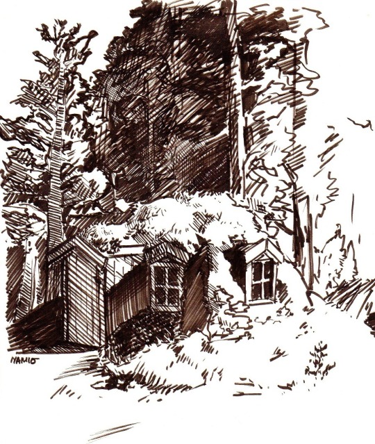
With those in mind, I've been wondering where to focus my attention to next year. I've been wanting to introduce better backgrounds to my illustrations for a while now, but it frankly has been harder than anticipated. So to make it easier on myself, I figured that I would ease myself back in by doing more sketches like below. In addition, I will do digital studies, which would both cut down on wasted material and be far more forgiving. Monthly, and probably pretty casual; I don't want to stress it so much that I end up becoming more intimidated by it.

Another thing that I'd like to work on is my digital style, but on that front, I'm still unsure which direction to take. I'll update you on that. But adjacent to that is that I realized recently that Impressionistic pieces often have color palettes I really would like to imitate, and perhaps that might be where I'll take my digital style? I want texture and I want marks. For the time being, though, I'll play around with the digital style some more before settling on something concrete. Meanwhile, I'll probably use my modified, muted pastel gouache set to study and explore colors, since I struggle with using digital for that-- something about too much option and being unable to feel anchored.

In light of this, I've decided that the list might go like this:
- Sketch more backgrounds, maybe do a 2-3 tone monochrome shading to get back into thinking of pieces with backgrounds
- Do a small digital background study once a month
- Introduce the use of masking fluid into my watercolor toolkit
- Use my custom, pale pastel gouache set to play with colors more until I find a comfortable niche
It will be a journey, but it's one I plan to share with everyone. At the same time, though, I think I will be sharing the ugly, along with the good, over on my newly made Patreon. I have plans for 2023 that includes physical goods, but I can’t take the financial risk and don’t have the energy nor consistent enough inspiration for a shop. A tier I added to that is intended to allow me to play around with the physical goods idea without the pressure of needing to come up with a big array of “new things” to sell monthly.
That being said, a follow, both here on Tumblr and over on Patreon are support enough for me. I do just enjoy drawing and painting, and while I do it for myself, it does make me happy to know that there are people interested in the results.
Thank you for being here!
- namio
15 notes
·
View notes
Text

LOT #230 ELIZABETH TAYLOR: MARK ZUNINO SIGNED :THESE OLD BROADS" "BERYL MASON" COSTUME SKETCH
A gouache on paper costume sketch for the character "Beryl Mason," portrayed by Elizabeth Taylor in These Old Broads (ABC, 2001). The sketch features glitter detailing and has been penciled "Elizabeth" on the right side next to a gold seal stamped in part "NM."
Created by Mark Zunino for Nolan Miller, both of whom worked as costume designers on These Old Broads, and signed by both (in black marker and in black ink, respectively).
17 x 14 inches
PROVENANCE Lot 337, "Property From The Lifestyle Of Elizabeth Taylor," Julien's Auctions, Beverly Hills, CA, 12/6/2019.
https://rb.gy/g49kn
1 note
·
View note
Text

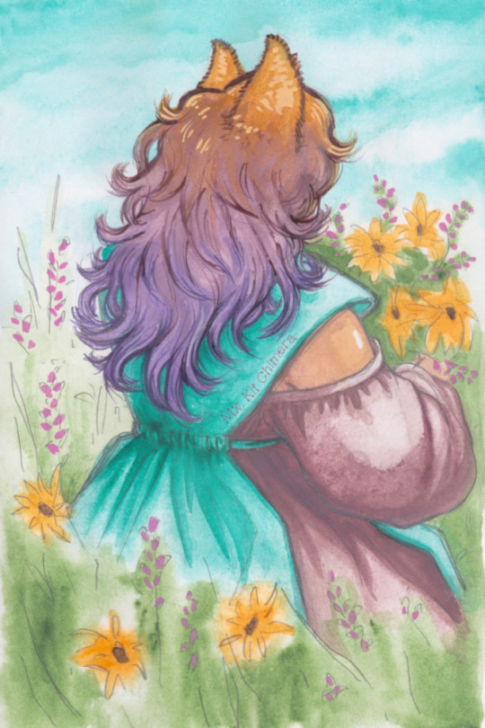
watercolor [gouache] sketches on very not-watercolor paper.
one. TANGENTS.
more experiments with 2022's OTP (one true palette) : PR122, PG7, PY110, PW6, and PBk31 just because I think it's neat (but the same hue could be mixed from the first three pigments). the brown shade used in the pants was a previous convenience mixture I'd made, so I made a lil' half pan of the ash rose/dusty mauve? color used in the hair and tail. Both have a convenience pastel (some of the base mix + PW6 in its own half pan).
I also was itching to change hair color (again) and for some reason wanted to go a lil' more subtle and warmer. Earlier this year I had teal hair, a couple months ago I went purple, so I was hoping I'd "walked around the color wheel" enough to go ash rose.
two. HAIR GRADIENT.
PR122, PG7, PY110, PW6 -- and my personal convenience mixtures of them-- taken for a jog in the sketchbook with paper that's not even marked acid-free.
a watercolor sketch to capture some of the essence of what my hair did when I dyed it. the reality is more subtle, but I love when old hair decisions (teal, purple dyes) mix with new ones for happy accidents. Some of my hair did actually become rose gold, but it's a fascinating gradient.
5 notes
·
View notes
Text

1-1-23
#moleskine#sketchbook#sketch#daily#dailyart#dailydrawing#dailypainting#dailysketch#sketchaday#artoftheday#art#artbook#artists on tumblr#watercolor#gouache#painting#sun#runner#running#on your mark#get ready set go
234 notes
·
View notes
Photo
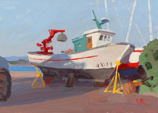
The local shipyard in the evening sun (O Grove, Spain), casein tempera on clayboard, 5x7 in. My experiments with the casein paints continue. Yesterday, I finally received my Ampersand clay boards and did this painting on the smallest one of them to see how the clay surface took the casein paint. It turns out that these boards are absolutely perfect for casein tempera and I am sure they will work beautifully for goache as well (especially for when you are going to varnish your gouache painting to frame it without glass). The clay surface is as smooth as hot pressed watercolor paper but it is less absorbent which is good (that's why you can see some marks in this study that are similar to the marks oil paint leaves on a gesso panel). I absolutely loved using these boards with the casein paint. Softening edges is harder on this surface because if the paint layer is thin it is easy to lift the color, but if the paint layer is normal (not too thick, but also not watercolor-like thin) then softening edges is not a problem with these boards. In any case, for my painting technique, this smooth surface works much better than the rougher surface of canvas (that I tried a few days ago). • If you have questions about my painting approach, I have written a few painting guides that are available for free download at www.lenarivo.com • My original paintings can be purchased at www.lenarivo.com/shop • Giclee prints of different sizes are available at www.lenarivo.com/prints • • • #tempera #caseintempera #casein #caseinpaint #painting #pleinairpainting #fineart #impressionism #gouache #gouachepainting #art #sketch #allaprima #traditionalart #impressionism #gouachepainting https://www.instagram.com/p/Ch90GGWsK8J/?igshid=NGJjMDIxMWI=
#tempera#caseintempera#casein#caseinpaint#painting#pleinairpainting#fineart#impressionism#gouache#gouachepainting#art#sketch#allaprima#traditionalart
2 notes
·
View notes
Text
These are **some** of the bookmarks I'll have listed when my Etsy shop opens!!
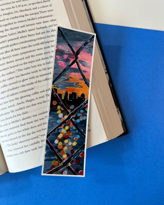


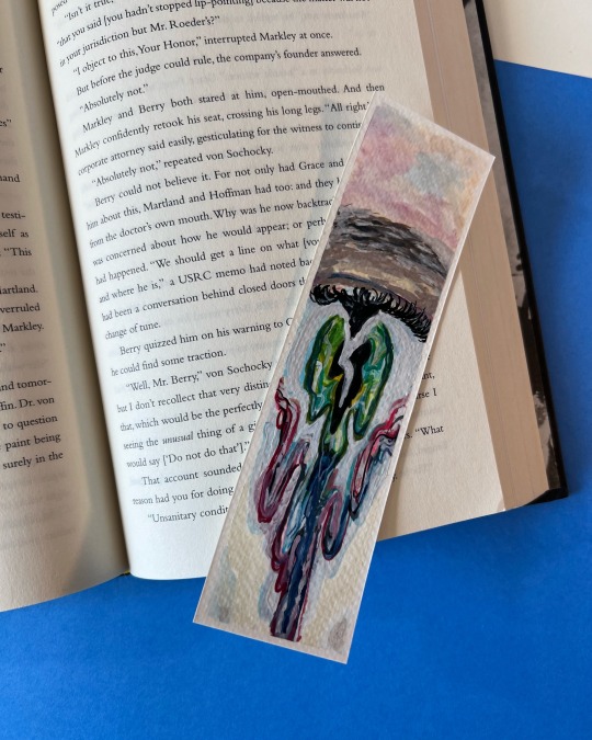
When my new debit card arrives (Sunday-ish) I can finish setting things up and BetweenTheBooks will be open!!
Everything is hand painted with watercolor and gouache (some have metallic gel pen accents) on 140lb cold press paper. And sealed with two layers of Kamar Varnish to protect it from spills and general wear and tear.
Bookmarks are currently between 3-8 USD depending on the quality and time it took to make.
I have a disclaimer in all the descriptions that since every bookmark is hand cut, designed and painted, there are bound to be imperfections. All sizes are also approximate.
They're roughly 7in by 2in (17.5cm by 5cm), but can be larger or smaller, typically by less than a centimeter.
I also list all noticeable imperfections (such as crooked lines, uneven cuts, paint smearing, small marks, etc) in the description for each bookmark, so even if it's not noticeable in the pictures, you'll know what to expect when you get it in person.
I also put in the description that the paper is thick enough to withstand everyday use, but has a tendency to warp when not in use. However closing it in a book or sitting it underneath something heavy will flatten it back out.
I have a tier system that I'll go into more detail about when I'm open! But essentially there's A-grade B-grade and Paint Scraps.
For example the top left one took a decent amount of time and I really love it, however I classified it as B-grade because there's smearing on the top of the boarder and faint sketch lines still visible in the sky. Because of that I knocked the price down to $5 (if it had come out without smearing on the top it would be $8)
I'll update more when I'm officially open!! I can't wait!! And I'm always open to suggestions!
#yayyayyay!!!#I can't wait#abshags#I hope it does well#!!!#book marks#Etsy#BetweenTheBooks#thatkidnic
4 notes
·
View notes
Text
Background Paintings
Gouache
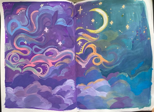
I started making Gouache paintings from the small thumbnail story board sketches to figure out composition/ colours in more detail and depth.
To gather inspiration for this I watched The Last Unicorn, which is a 1982 animated film by Arthur Rankin Jr. and Jules Bass based on the 1968 novel by Peter S. Beagle, and which is also very dear to my heart. My mum was the first one to show me this movie as she watched it when she was a kid also.
This movie means a lot to me because of its allegoric themes of humanity, death and also maturity.
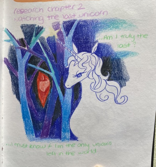
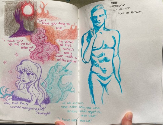
I did some drawings with coloured pencil while I watched the movie and wrote down some quotes that I really liked.
Writing and listening to the dialogue, made the think about the symbolism of unicorns in media and mythology. Amalthea’s transformation into a human in the movie was very symbolic to me of growing into a woman or loss of innocence. In medieval Folklore only a virgin can tame a unicorn and the unicorn is a symbol for innocence, which is an important theme in this project specifically so I decided to make a unicorn shadowed in clouds/ magic, blending into the start sky as the background.

Some more direct scenes from the movie which inspired the drawing (time mark 4:26)

youtube
0 notes
Text
having now decided on my three main subjects for this project I wanted to develop my 2D skills further and work on my collection of "studies" I was creating of fruit. obviously the next victim would be an orange.
I was sat on the bus travelling home from class when I felt a little hungry and decided to pull an easy peel orange from my bag to snack on. as I was digging my thumbs into the skin and releasing the strong smell into the air I realised that oranges truly were the perfect subject. they're violent in a sense, they leave their mark on their "attacker" (smell, orange fingers/nails), and they leave behind some kind of evidence that they were there and more importantly that they were eaten there.
so I naturally decided to snap a photo of my half peeled orange to paint once I got home.
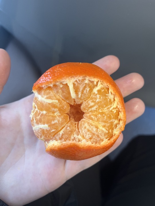
I used water colour and touches of gouache for this piece, two paints that I have experience with but not a lot, a great opportunity to expand my skills more.
I began with a pencil sketch and then just started experimenting with paints. I also started a small page to keep tabs of my paint swatches which I intended to keep for the whole project.



I also made sure to film a lot of my painting process to help myself remember the kind of techniques I was using.
I'm actually really happy with how the piece turned out!

0 notes