#menu css3
Explore tagged Tumblr posts
Visit Tumblr Blog
Explore Tumblr blogs with no restrictions, modern design and the best experience.
Last Seen Tumblr Blogs


Fun Fact
The most popular pages on Tumblr are about Minecraft, GIFs, and David J. Peterson.
Text

Drop Down Menu On Hover
#dropdown menu on hover#html css dropdown menu#html css#divinectorweb#css#html#frontenddevelopment#css3#html5#css dropdown menu#drop down menu css#dropdown list#pure css dropdown menu#webdesign#learn to code#css snippets
5 notes
·
View notes
Text

Sticky Navigation Menu
#sticky navigation menu#sticky navbar#codenewbies#html css#html5 css3#css animation examples#webdesign#css#code#html css menu#css menu
5 notes
·
View notes
Text

Navbar Animation with Moving Hover Effect
#codingflicks#html css#frontend#css#html#frontenddevelopment#webdesign#css menu hover#css menu hover effects#html css menu#navbar animation#css3#moving hover animation#navigation menu#navigation bar
15 notes
·
View notes
Text
Como fazer um menu para o tumblr ou blog é simples
1- coloque no seu style, esse aqui
Depois coloque esse aqui na sidebar
2- aqui
Aprestem bem atenção nas cores, por favor nao façam carnaval nos temas
0 notes
Text
Custom Shopify Theme Development: Building E-Commerce That Matches Your Brand
In today's fast-paced online world, getting out isn't an option; it's essential. It's important to consider that your Shopify store's design isn't only about aesthetics, but also about attracting the attention of customers, building trust, and generating conversions. This is where custom Shopify theme development can be a significant game changer.

Instead of using generic templates that are pre-made, custom theme development provides your store a design that is a reflection of your brand. Pixel by pixel after click.
What is Custom Shopify Theme Development?
The customization process for Shopify theme development is the process of creating and programming a custom-made design for the Shopify store. Instead of using pre-designed themes that are available from Shopify's Theme Store Shopify Theme Store, a custom theme is created from scratch or extensively customized to meet your company's particular needs. Control as well as creativity and conversion.
Control creative thinking, control, and conversion.
Why Go Custom? (Top Benefits)
1. Total Branding Control
With a custom theme, every part of your store—colors, layout, buttons, typography—is designed to reflect your brand identity, not someone else’s.
2. Optimized for Conversions
Standard themes are built for everyone. Custom themes are built for your customers, optimized to guide them smoothly from product discovery to checkout.
3. Blazing Fast Performance
A custom-built theme contains only the code you need, which speeds up loading times, enhances user experience, and boosts SEO rankings.
4. Mobile-First and UX-Centered
Modern custom themes are crafted with a mobile-first approach, ensuring seamless navigation, fast interaction, and high conversions on smartphones and tablets.
5. Flexibility for Scaling
Need to integrate advanced features, unique product pages, or third-party APIs? A custom theme makes that possible without performance bottlenecks.
Key Components of a Custom Shopify Theme
1. Homepage Layout
A fully customized homepage designed to hook visitors, introduce your brand, highlight bestsellers, and drive them deeper into the store.
2. Custom Product Pages
Built with tailored layouts to emphasize features, benefits, social proof (like reviews), and dynamic upselling sections.
3. Collection Filters & Sorting
Smart, user-friendly filtering systems that help customers find what they need in seconds.
4. Optimized Cart & Checkout Flow
A streamlined path from browsing to purchase, minimizing abandoned carts.
5. Advanced Navigation Menus
Mega menus, sticky headers, or mobile accordion menus—built your way to ensure ease of use.
The Custom Theme Development Process (Step-by-Step)
Step 1: Discovery & Strategy
Understand your brand, target audience, and store goals. This phase includes competitor analysis and planning site architecture.
Step 2: Wireframes & Design Mockups
UX/UI designers create mockups of key pages using tools like Figma or Adobe XD.
Step 3: Theme Coding & Development
Developers write clean, responsive Liquid code (Shopify’s templating language), combined with HTML, CSS, JavaScript, and JSON.
Step 4: App & Feature Integration
Add custom functionalities such as wishlists, subscription options, multilingual support, or personalized recommendations.
Step 5: Testing & QA
Extensive testing across devices and browsers for bugs, loading speed, and user experience.
Step 6: Launch & Optimization
Once approved, the theme is published. Post-launch optimization includes SEO tuning, analytics setup, and A/B testing.
Tools & Technologies Used
Shopify Liquid—Shopify’s templating language
HTML5/CSS3—for structure and styling
JavaScript/jQuery—for dynamic elements
JSON—for theme settings
Git—for version control
Figma/Sketch/Adobe—For UI/UX design
Shopify CLI—For local theme development and deployment
Custom vs. Pre-Built Theme: What's Better?
Feature Pre-Built Theme Custom Theme: Low upfront cost Higher, one-time investment Branding Limited customization 100% brand-aligned Performance May include excess code Clean, lightweight code Scalability Less flexible Easily scalable and extendable Support & Maintenance Generic support Tailored to your setup
If your business is growing and you want to leave a lasting impression, custom is the way to go.
Who Should Invest in Custom Shopify Theme Development?
Established brands needing a strong digital presence.
Niche businesses with complex product requirements.
Startups aiming to disrupt with a bold brand identity.
Agencies and designers building Shopify solutions for clients.
SEO & Performance Optimization in Custom Themes
A professionally developed custom theme isn’t just beautiful—it’s also built to rank high and convert visitors.
Fast load speeds
Structured schema markup
Custom meta tags & SEO-friendly URLs
Optimized image formats
Mobile-first responsive layouts
Lightweight code for better Core Web Vitals
Final Thoughts: Is Custom Shopify Theme Development Worth It?
If you're committed to your e-commerce, buying the custom Shopify theme is among the best decisions you could make. It provides you with a distinct advantage in a competitive marketplace, builds brand equity over time, and gives users an experience that converts.
Rather than trying to fit into a cookie-cutter template, custom theme development lets your brand shine in its own unique light exactly the way it should.
0 notes
Text
The Future of Responsive Web Design with AI
Running a successful business in this competitive digital market is no less than a battle. For this, businesses take the help of web design service providers, such as Aripro Designs, who create responsive web designs that can make your website adaptable on all devices. Lately, building and designing a website has been transformed due to the advances in Artificial Intelligence (AI). The blog tries to shed light on the impact of AI on responsive design and how web design companies are integrating this jaw-dropping technology to create websites that are responsive.

Understanding Responsive Web Design and the Way a Web Design Company and AI Enhance it
There has been a steep increase in worldwide web traffic from mobile phones, hence the demand for a web design that can readily accommodate a user’s device. This calls for responsive web design (RWD), which lets websites function across different devices and platforms.
How a Web Design Agency Creates a Responsive Web Design
A responsive web design agency designs websites that can automatically function on any screen. In simpler terms, it allows users to access the website from their computer and phone. Agencies have skilled and creative designers who complete the process in a systematic format.
They listen patiently to the clients to understand their specific needs. Based on this, they devise a plan to meet the client’s targets.
Each responsive web design agency has a dedicated design and development team that prepares layouts and uses responsive frameworks.
After final testing and optimization, the website is all set to work and looks good on various browsers and devices like phones, tablets, and computers.
How Artificial Intelligence Helps to Create a Responsive Web Design
Artificial Intelligence (AI) has altered the process of creating a responsive web design. The AI-based tools allow websites to respond to aspects (such as user behaviors, preferences, and devices) in real-time, providing distinctive personalization and functionality. It can increase the different elements of the web design process.
Using automated layout adjustment, the AI can change how the website looks and also ensure that it fits on different screens. It speeds up design adjustments and also improves precision.
In order to enhance and give a personalized user experience, the user’s behavior is analyzed by AI, and based on this, content and design elements and enhancing engagement are adjusted.
It also tests the website to ensure it works everywhere and fixes issues faster.
AI uses voice search optimization that lets people find websites by talking instead of typing.
It also helps the websites open faster by making images smaller and content smarter. Thus, AI helps them achieve a better ranking on Google ratings.
The Future: Integration of AI and Human Collaboration
Though AI can offer a lot, one must realize that it can hardly offer the human touch and empathy provided by web design companies. The highly advanced AI tools help the creative designer in many ways, especially:
fetching crucial data
analyzing the user’s behavior
making design enhancements based on the findings
converting drawings and sketches related to website ideas into digital layouts showing website elements (buttons, menus, images, and text).
Aripro Designs: Embracing AI to Deliver Responsive Web Design
Being a trusted web design service provider, Aripro Designs uses AI to create future-proof responsive website solutions. It boasts a highly trained and forward-looking web design department that appreciates the importance graphic design brings when it comes to customer retention. The business incorporates some of the most current technology, like Figma, HubSpot, Squarespace, BigCommerce, and Wix, in an effort to make a responsive web design with excellent user experience as well as the functionality of a site.
They, for instance, incorporate animated elements built using SVG, CSS3 transitions, and Canvas, as well as load-balancing techniques that are useful. The skilled team works on server-side frameworks (such as React, Angular, PHP, Laravel, and Node.js). They operate on different CMS platforms, including Drupal, WordPress, OpenCart, and Magento, to facilitate user engagement. With Aripro Designs by your side, you get access to some of the best minds who can craft result-driven websites that resonate, engage, and convert.
Conclusion
Absolutely, AI-based design software can create responsive web designs successfully; however, there should be a balanced mix. One must realize that the best web experiences come from blending the efficiency and power of AI with human insight and creativity. Combining them both gives the key to optimizing the designs, which keeps you relevant and thriving in this fast-paced tech arena.
Let Aripro Designs be your tech partner, harnessing AI to enhance human experiences and interactions and driving your digital success.
0 notes
Text
Top 10 Free Coding Tutorials on Coding Brushup You Shouldn’t Miss
If you're passionate about learning to code or just starting your programming journey, Coding Brushup is your go-to platform. With a wide range of beginner-friendly and intermediate tutorials, it’s built to help you brush up your skills in languages like Java, Python, and web development technologies. Best of all? Many of the tutorials are absolutely free.

In this blog, we’ll highlight the top 10 free coding tutorials on Coding BrushUp that you simply shouldn’t miss. Whether you're aiming to master the basics or explore real-world projects, these tutorials will give you the knowledge boost you need.
1. Introduction to Python Programming – Coding BrushUp Python Tutorial
Python is one of the most beginner-friendly languages, and the Coding BrushUp Python Tutorial series starts you off with the fundamentals. This course covers:
● Setting up Python on your machine
● Variables, data types, and basic syntax
● Loops, functions, and conditionals
● A mini project to apply your skills
Whether you're a student or an aspiring data analyst, this free tutorial is perfect for building a strong foundation.
📌 Try it here: Coding BrushUp Python Tutorial
2. Java for Absolute Beginners – Coding BrushUp Java Tutorial
Java is widely used in Android development and enterprise software. The Coding BrushUp Java Tutorial is designed for complete beginners, offering a step-by-step guide that includes:
● Setting up Java and IntelliJ IDEA or Eclipse
● Understanding object-oriented programming (OOP)
● Working with classes, objects, and inheritance
● Creating a simple console-based application
This tutorial is one of the highest-rated courses on the site and is a great entry point into serious backend development.
📌 Explore it here: Coding BrushUp Java Tutorial
3. Build a Personal Portfolio Website with HTML & CSS
Learning to create your own website is an essential skill. This hands-on tutorial walks you through building a personal portfolio using just HTML and CSS. You'll learn:
● Basic structure of HTML5
● Styling with modern CSS3
● Responsive layout techniques
● Hosting your portfolio online
Perfect for freelancers and job seekers looking to showcase their skills.
4. JavaScript Basics: From Zero to DOM Manipulation
JavaScript powers the interactivity on the web, and this tutorial gives you a solid introduction. Key topics include:
● JavaScript syntax and variables
● Functions and events
● DOM selection and manipulation
● Simple dynamic web page project
By the end, you'll know how to create interactive web elements without relying on frameworks.
5. Version Control with Git and GitHub – Beginner’s Guide
Knowing how to use Git is essential for collaboration and managing code changes. This free tutorial covers:
● Installing Git
● Basic Git commands: clone, commit, push, pull
● Branching and merging
● Using GitHub to host and share your code
Even if you're a solo developer, mastering Git early will save you time and headaches later.
6. Simple CRUD App with Java (Console-Based)
In this tutorial, Coding BrushUp teaches you how to create a simple CRUD (Create, Read, Update, Delete) application in Java. It's a great continuation after the Coding Brushup Java Course Tutorial. You'll learn:
● Working with Java arrays or Array List
● Creating menu-driven applications
● Handling user input with Scanner
● Structuring reusable methods
This project-based learning reinforces core programming concepts and logic building.
7. Python for Data Analysis: A Crash Course
If you're interested in data science or analytics, this Coding Brushup Python Tutorial focuses on:
● Using libraries like Pandas and NumPy
● Reading and analyzing CSV files
● Data visualization with Matplotlib
● Performing basic statistical operations
It’s a fast-track intro to one of the hottest career paths in tech.
8. Responsive Web Design with Flexbox and Grid
This tutorial dives into two powerful layout modules in CSS:
● Flexbox: for one-dimensional layouts
● Grid: for two-dimensional layouts
You’ll build multiple responsive sections and gain experience with media queries, making your websites look great on all screen sizes.
9. Java Object-Oriented Concepts – Intermediate Java Tutorial
For those who’ve already completed the Coding Brushup Java Tutorial, this intermediate course is the next logical step. It explores:
● Inheritance and polymorphism
● Interfaces and abstract classes
● Encapsulation and access modifiers
● Real-world Java class design examples
You’ll write cleaner, modular code and get comfortable with real-world Java applications.
10. Build a Mini Calculator with Python (GUI Version)
This hands-on Coding BrushUp Python Tutorial teaches you how to build a desktop calculator using Tkinter, a built-in Python GUI library. You’ll learn:
● GUI design principles
● Button, entry, and event handling
● Function mapping and error checking
● Packaging a desktop application
A fun and visual way to practice Python programming!
Why Choose Coding BrushUp?
Coding BrushUp is more than just a collection of tutorials. Here’s what sets it apart:
✅ Clear Explanations – All lessons are written in plain English, ideal for beginners. ✅ Hands-On Projects – Practical coding exercises to reinforce learning. ✅ Progressive Learning Paths – Start from basics and grow into advanced topics. ✅ 100% Free Content – Many tutorials require no signup or payment. ✅ Community Support – Comment sections and occasional Q&A features allow learner interaction.
Final Thoughts
Whether you’re learning to code for career advancement, school, or personal development, the free tutorials at Coding Brushup offer valuable, structured, and practical knowledge. From mastering the basics of Python and Java to building your first website or desktop app, these resources will help you move from beginner to confident coder.
👉 Start learning today at Codingbrushup.com and check out the full Coding BrushUp Java Tutorial and Python series to supercharge your programming journey.
0 notes
Text
Marvel Vertical Menu WordPress Theme - Premium site builder tool with stacks of layout designs, user-friendly Theme options and rich drag & drop content builder to help create your perfect vertical menu site in minutes https://visualmodo.com/theme/marvel-vertical-menu-wordpress-theme/ Take your website to the next level! 💻🚀📱
webdesign #HTML5 #CSS3 #template #plugins #themes #wordpress #ecommerce #responsive #bootstrap #sitebuilder #creative #vertical #navigation #menu
0 notes
Text
How ArtAttack Transforms Noida Businesses with Stunning Web Designs?
In today's digital-first world, having a visually appealing and functional website is not just an option—it’s a necessity. ArtAttack, a leading web design company in Noida, has been at the forefront of this transformation, helping businesses establish a powerful online presence through cutting-edge web designs.
Why Web Design Matters for Noida Businesses?
Noida, being a hub of startups and established enterprises, is witnessing a digital revolution. A website is no longer just an online brochure but a business powerhouse that influences customer perception, trust, and conversion rates. ArtAttack understands the competitive landscape of Noida and tailors designs that not only captivate but also convert visitors into loyal customers.
ArtAttack's Approach to Stunning Web Designs
1. User-Centric Web Designs
At ArtAttack, the focus is always on the user experience (UX). A well-structured website that is easy to navigate enhances engagement and ensures that potential customers find what they are looking for without frustration. Some key elements include:
Intuitive Navigation – Simplified menu structures for easy browsing.
Fast Load Times – Optimized pages to reduce bounce rates.
Mobile Responsiveness – Designs that adapt seamlessly to all devices.
2. SEO-Optimized Websites for Maximum Visibility
A beautiful website without traffic is like a billboard in the desert. ArtAttack integrates SEO best practices into every design, ensuring websites rank well on search engines. Their approach includes:
Keyword-Optimized Content – Ensuring that all web pages contain industry-relevant keywords.
Technical SEO Implementation – Clean coding, fast loading speeds, and proper indexing.
Internal Linking Strategy – Connecting relevant pages to enhance search rankings.
3. Custom Website Development for Unique Business Needs
Every business is different, and a one-size-fits-all approach doesn’t work. ArtAttack specializes in custom web design solutions that cater to specific industry needs. From e-commerce platforms to corporate websites, they craft digital experiences that align with business goals.
4. High-Quality Graphics and Visual Appeal
A visually stunning website enhances credibility. ArtAttack’s design team leverages high-quality graphics, typography, and branding elements to create aesthetically pleasing websites that leave a lasting impression.
5. Conversion-Driven Design Strategies
A well-designed website should do more than look good—it should drive conversions. ArtAttack incorporates:
Compelling Call-to-Action (CTA) Buttons – Strategically placed to encourage engagement.
Landing Page Optimization – Maximizing lead generation.
Trust Signals – Customer testimonials, certifications, and case studies to build credibility.
Industries Benefiting from ArtAttack’s Web Design Expertise
1. E-Commerce Businesses
With the rise of online shopping, having a user-friendly and secure e-commerce website is crucial. ArtAttack provides robust e-commerce web solutions that ensure seamless shopping experiences, fast checkout processes, and secure payment gateways.
2. Corporate Websites
A professional website strengthens a company's brand image. ArtAttack designs corporate websites that effectively communicate company values, services, and success stories.
3. Startups & SMEs
Small businesses need cost-effective yet powerful digital solutions. ArtAttack helps startups establish a strong digital foundation with scalable websites that grow with their businesses.
4. Educational Institutions
Educational portals need to be interactive, engaging, and informative. ArtAttack crafts intuitive designs that enhance student and faculty engagement.
Technologies Used by ArtAttack for Web Development
To stay ahead in the competitive web design space, ArtAttack leverages the latest technologies and frameworks:
HTML5 & CSS3 – For clean and responsive designs.
JavaScript & jQuery – Enhancing interactivity.
WordPress & CMS Solutions – Enabling easy content management.
E-Commerce Platforms (Shopify, Magento, WooCommerce) – For seamless online shopping experiences.
UI/UX Design Tools (Adobe XD, Figma, Sketch) – Creating visually stunning prototypes.
Why Choose ArtAttack Over Competitors?
1. Proven Track Record
With years of experience, ArtAttack has successfully delivered hundreds of high-performing websites across multiple industries.
2. Dedicated Team of Experts
Their team comprises skilled UI/UX designers, web developers, SEO specialists, and content strategists working together to create impactful websites.
3. Client-Centric Approach
ArtAttack believes in collaboration. They take the time to understand the client’s vision and business goals before crafting a tailored digital solution.
4. Affordable Pricing & Transparent Process
Unlike many agencies that charge exorbitant fees, ArtAttack offers competitive pricing with no hidden costs. Their process is transparent, ensuring clients are involved in every step.
5. Post-Launch Support & Maintenance
A website is a dynamic entity that needs regular updates. ArtAttack provides post-launch support, including bug fixes, security updates, and performance optimization.
Final Thoughts
If you are looking to elevate your online presence and give your business a competitive edge, ArtAttack is the partner you need. Their expertise in web design and development, combined with a focus on SEO and user experience, makes them the go-to web design agency in Noida.
0 notes
Video
youtube
Smart Bites, Pack 4: Creativity on a New Level
🚀 The fourth clip completes the series with projects that take creativity and interactivity to a new level.
1️⃣ Sidebar Menu A side menu with dynamic switching between text and icons. GitHub: https://github.com/Zorger27/Sidebar-Menu
2️⃣ My Favorite Buttons Stylish buttons with unique CSS3 animations. GitHub: https://github.com/Zorger27/Fav-buttons
3️⃣ Vue.js & Three.js Template Template for developing SPA with interactive 3D graphics integration. GitHub: https://github.com/Zorger27/Vue-Threejs-Template Website: https://vue-threejs-template.vercel.app
4️⃣ Rotating 3D Cube Interactive 3D cube with full control: scale, rotation, changing viewing angles. GitHub: https://github.com/Zorger27/Vue-Threejs-1 Website: https://vue-threejs-1.vercel.app
Dive into the world of creative solutions and fresh ideas! Each video in this series is a small masterpiece of web development. Stay tuned for new episodes! 🌟
1 note
·
View note
Text

Dropdown Menu on Hover
#dropdown menu on hover#css menu#hover dropdown menu#html css#divinector#css#html#frontenddevelopment#css3#pure css dropdown menu#css dropdown menu#css tricks
3 notes
·
View notes
Text
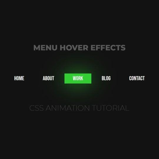
Animated menu hover
#animated menu hover#css menu hover#html css#html5 css3#codenewbies#frontenddevelopment#webdesign#css animation examples#css animation tutorial#pure css animation#css#html css animation#css menu#html css menu
7 notes
·
View notes
Text

Responsive Navigation Menu
#codingflicks#html css#responsive navigation menu#css menu#css#html#css3#frontend#frontenddevelopment#webdesign#navbar#learn to code#responsive web design#menu html css
5 notes
·
View notes
Text
Menu Sleep
Oooooooi :3
Hooje to com pressa porque vou cortar meu cabelo enfim, vou ensinar a voces um menu super fofo que achei!
VEJA O MENU AQUI
Vamos aos códigos? Vamos!
Como sempre vamos começar pelos scripts cole esse código abaixo logo depois de <head>:
<script type="text/javascript" src="http://ajax.googleapis.com/ajax/libs/jquery/1.4.0/jquery.min.js"></script>
Depois de colar o script acima vamos para o css do theme, cole esse código abaixo agora entre as tags <style> e </style>:
@font-face {font-family: "Pf Arma Five";src: url('http://static.tumblr.com/bigjj8s/1Tmm7vjp6/pf_arma_five.ttf');}#content {margin: 5px auto;background:;padding:10px 0;}#content .menu {text-align:center;padding-top:30px;}#content .menu .primary-menu {list-style-type:none;position:relative;}#content .menu .primary-menu li {display:inline;text-align:center;margin:0 10px;position:relative;}#content .menu .primary-menu li a {position:relative;text-decoration:none;background:#d9d9d9;display:inline-block;width:50px;height:35px;padding-top:15px;color:#fff;border:3px solid #eee;-webkit-border-radius:100px;-moz-border-radius:100px;-o-border-radius:100px;-ms-border-radius:100px;-khtml-border-radius:100px;border-radius:100px;-webkit-box-shadow:0 0 1px 1px #afafaf;-moz-box-shadow:0 0 1px 1px #afafaf;-o-box-shadow: 0 0 1px 1px #afafaf;-ms-box-shadow: 0 0 1px 1px #afafaf;-khtml-box-shadow:0 0 1px 1px #afafaf;box-shadow:0 0 1px 1px #afafaf;-webkit-transition:all 1s;-moz-transition:all 1s;-o-transition:all 1s;-ms-transition:all 1s;-khtml-transition:all 1s;transition:all 1s;behavior: url(http://static.tumblr.com/de00tfu/eyOmby4jh/pie.htc); /* CSS3 Fix for Internet Explorer */}#content .menu .primary-menu li.m1 a{ background-color:#00438f; background: url('http://static.tumblr.com/de00tfu/b8vmby5n9/m.png');}#content .menu .primary-menu li.m2 a{ background-color:#00b8df; background: url('http://static.tumblr.com/de00tfu/tMmmby5w9/e.png');}#content .menu .primary-menu li.m3 a{ background-color:#df00bd; background: url('http://static.tumblr.com/de00tfu/ukhmby61o/n.png');}#content .menu .primary-menu li.m4 a{ background-color:#ff7800; background: url('http://static.tumblr.com/de00tfu/x5Jmby62q/u.png');}#content .menu .primary-menu li a:hover {-webkit-transform: rotate(360deg);-moz-transform: rotate(360deg);-o-transform: rotate(360deg);-ms-transform: rotate(360deg);-khtml-transform: rotate(360deg);transform: rotate(360deg);behavior: url(http://static.tumblr.com/de00tfu/eyOmby4jh/pie.htc);}#content .menu .primary-menu li span.social-span {font-family: Pf Arma Five;font-size:8px;color: #fff;position:absolute;width:100px;top:45px;left:-45%;background:#eb925d;padding:5px;opacity:0;-webkit-border-radius:10px;-moz-border-radius:10px;-o-border-radius:10px;-ms-border-radius:10px;-khtml-border-radius:10px;border-radius:10px;-webkit-transition:opacity 1s ease-in-out;-moz-transition:opacity 1s ease-in-out;-o-transition:opacity 1s ease-in-out;-ms-transition:opacity 1s ease-in-out;-khtml-transition:opacity: 1s ease-in-out;transition:opacity 1s ease-in-out;behavior: url(http://static.tumblr.com/de00tfu/eyOmby4jh/pie.htc);}#content .menu .primary-menu li a:hover ~ span.social-span {opacity:1;}#content .menu .primary-menu li span.social-span:after {content:"";position:absolute;border-color:#eb925d transparent;display:block;top:-7px;left:40%;width:0;border-width:0 7px 7px;border-style:solid;}
Vamos entender os principais códigos acima:
width:50px;height:35px; - É o tamanho do circulo.
color:#fff; e border:3px solid #eee;- Cor da fonte e cor da borda do ciirculo.
-webkit-border-radius:100px;-moz-border-radius:100px;-o-border-radius:100px;-ms-border-radius:100px;-khtml-border-radius:100px;border-radius:100px;- Então gente esse código é o que define o circulo portanto se voce quiser um quadrado retire esse código.
width:100px;left:-45%;background:#eb925d; - Define o tamanho e a posição do tooltip do menu e a cor do fundo.
border-color:#eb925d- Coloque a mesma cor que voce colocou o fundo acima porque é a setinha :)
Apoos entender esse código e fazer as modificações necessarias voce vai mudar as imagens e adicionar mais se quiser, lembrando que se for adicionar mais tem que mudar o nome da class “.m1” para a class a mais, feito isso vamos para o html ou seja o que vai fazer o efeito funcionar, então cole esse código aonde quiser que o efeito apareça:
<div id="content"> <div class="menu"> <ul class="primary-menu"> <li class="m1"><a class="social-item" href="url"></a><span class="social-span">Menu Leep</span></li> <li class="m2"><a class="social-item" href="url"></a><span class="social-span">Por: João Netto</span></li> <li class="m3"><a class="social-item" href="url"></a><span class="social-span">Se usar</span></li> <li class="m4"><a class="social-item" href="url"></a><span class="social-span">dê like e credite ♥</span></li> </ul> </div> </div>
Pronto!
0 notes
Text
Key Tips for Better Mobile Design in Victoria
Mobile websites have become the need of the hour for businesses. Many people make accessing and purchasing decisions through their smartphones. An effective mobile design is no longer a choice but a necessity. The business community needs strategic Victoria mobile website design to capture local audiences and ensure seamless user experiences.
Responsive Design
This approach will automatically change the layout and content of the website. A good design makes sure that your website looks great on all devices. Victoria mobile website design should prioritize flexibility. Your website must look perfect whether viewed on a smartphone or desktop computer.
Speed Optimization Strategies
Mobile users are more impatient, and Websites that load slowly lose potential customers. Businesses must focus on speed optimization. Compress images and use efficient hosting solutions. Aim for load times under three seconds and Faster websites improve user experience and search engine rankings.
Navigation Simplification
Mobile screens are smaller, so navigation must be simple and intuitive. Make sure you are using clear and large buttons. Implement dropdown menus and ensure important information is easily accessible within two taps. Victoria mobile website design should prioritize user-friendly navigation that reduces user frustration.
Performance Tracking and Improvement
Regularly monitor your mobile website's performance. Use tools like Google Analytics to understand user behaviour. Track metrics such as bounce rates and conversion rates. Continuously refine your design based on real user data.
Technical Considerations
Implement modern web technologies. Use HTML5 and CSS3 for better performance and ensure cross-browser compatibility. Consider accelerated mobile pages (AMP) for faster loading. Victoria mobile website design should leverage the latest technological standards.
In Conclusion
Making a mobile website is not a one-time process. Always keep up with the trends and advancements in technology. A mobile website, well designed, can make all the difference for your business in Victoria.
0 notes
Text
eCommerce Website Design Services by Tecroost
eCommerce Website Design Services by Tecroost
In today’s digital era, having a robust eCommerce website is not just a luxury but a necessity for businesses looking to expand their reach and grow their revenue. At Tecroost, we specialize in providing eCommerce website design services that cater to diverse business needs, ensuring our clients achieve a seamless online presence. Below, we explore the key components and benefits of our services.
What Makes a Great eCommerce Website?
An exceptional eCommerce website goes beyond aesthetics. It requires strategic design elements that ensure a user-friendly experience, fast performance, and high conversion rates. Here’s what Tecroost focuses on:
Responsive Design: Ensures the website adapts seamlessly to all devices, including desktops, tablets, and smartphones.
Fast Loading Times: Optimized performance to reduce bounce rates and enhance user satisfaction.
User-Centric Navigation: Simplified menus and intuitive navigation to guide users effortlessly.
High-Quality Visuals: Stunning product images and videos to captivate potential customers.
Secure Payment Systems: Integration of encrypted payment gateways to protect user data.
Our End-to-End eCommerce Website Design Process
At Tecroost, our design process is tailored to deliver the best results. Here’s a step-by-step breakdown of how we work:
1. Discovery and Planning
Understanding your business goals and target audience is the foundation of our design process. We conduct:
Market research to identify your competitors.
Audience analysis to understand user preferences.
Goal setting to align website objectives with your business needs.
2. Custom Design and Development
Our team creates unique designs that reflect your brand identity. Key highlights include:
Custom Templates: Avoiding cookie-cutter designs to ensure your site stands out.
Advanced Coding Standards: Utilizing HTML5, CSS3, and JavaScript for enhanced functionality.
3. eCommerce Platform Expertise
We work with leading eCommerce platforms such as:
Shopify
WooCommerce
Magento
BigCommerce
Each platform is chosen based on your specific requirements, scalability needs, and budget.
4. Mobile Optimization
Given that a significant portion of online shoppers browse through mobile devices, we emphasize mobile-first designs that offer:
Touch-friendly navigation.
Fast mobile loading times.
Easy checkout processes.
Essential Features of Tecroost eCommerce Websites
Our designs come packed with features to enhance user engagement and streamline management:
1. Advanced Search Functionality
We implement robust search tools with filters and suggestions, enabling users to find products quickly.
2. SEO-Friendly Architecture
A well-optimized site structure ensures better rankings on search engines. We prioritize:
Proper URL structuring.
Optimized meta tags and descriptions.
High-speed performance.
3. Secure Shopping Cart Integration
Our secure shopping carts reduce cart abandonment rates by providing:
Simple checkout processes.
Multiple payment options, including PayPal, credit cards, and cryptocurrency.
4. Analytics and Reporting Tools
Gain insights into customer behavior and website performance through:
Real-time analytics.
Heatmaps for user activity.
Customizable reports.
Why Choose Tecroost for Your eCommerce Website?
When it comes to eCommerce website design, Tecroost stands out for the following reasons:
1. Industry Expertise
With years of experience, we understand the nuances of eCommerce and how to align our designs with current trends.
2. Customization at its Best
Every business is unique, and so is our approach. We tailor each website to match your branding and objectives.
3. Support and Maintenance
We offer continuous post-launch support, ensuring your website remains up-to-date and functional.
4. Cost-Effective Solutions
Our pricing models are transparent and competitive, delivering maximum value for your investment.
Benefits of a Tecroost eCommerce Website
Choosing Tecroost ensures a host of benefits, including:
Improved User Engagement: A captivating design keeps visitors on your site longer.
Higher Conversion Rates: Optimized layouts and secure payment systems lead to more completed purchases.
Scalability: Our websites grow with your business, accommodating more products and traffic over time.
Brand Credibility: A professional online store builds trust with your customers.
0 notes