#css menu hover effects
Explore tagged Tumblr posts
Visit Tumblr Blog
Explore Tumblr blogs with no restrictions, modern design and the best experience.
Last Seen Tumblr Blogs


Fun Fact
US Tumblr user growth rate is estimated to slow down to 4.1%.
Text

Navbar Animation with Moving Hover Effect
#codingflicks#html css#frontend#css#html#frontenddevelopment#webdesign#css menu hover#css menu hover effects#html css menu#navbar animation#css3#moving hover animation#navigation menu#navigation bar
15 notes
·
View notes
Text
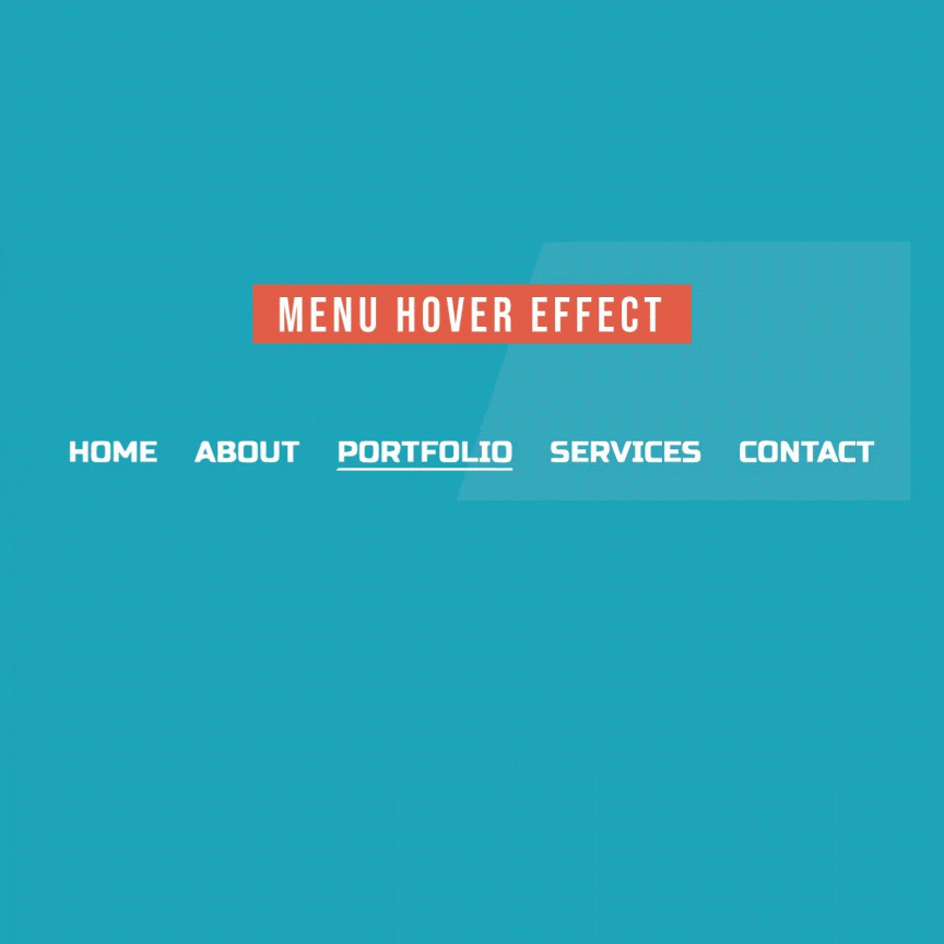
Menu Hover with Underline Animation
#css menu hover effects#html css#menu hover animation#css underline animation#css animation#pure css animation#webdesign#css#html#divinectorweb#learn to code#css3
4 notes
·
View notes
Text

Pure CSS Menu Hover Animation
#css menu hover effect#css menu#css menu hover#html css menu#css gradient hover#css gradient animation#html css#css tricks#css animation examples#pure css animation#code#css#html5 css3#codenewbies#css animation tutorial#frontenddevelopment#css3#learn to code
0 notes
Text
How to Create Mobile-Friendly Websites with Responsive Design
In today’s digital era, where mobile devices dominate web traffic, creating mobile-friendly websites has become more important than ever. As users increasingly access the internet through smartphones and tablets, businesses must ensure their websites are optimized for a seamless mobile experience. This is where responsive design comes into play. At Nividaweb, a leading responsive web design agency in Vadodara, we specialize in crafting websites that look and perform flawlessly on any device.

Here is a comprehensive guide on how to create mobile-friendly websites with responsive design:
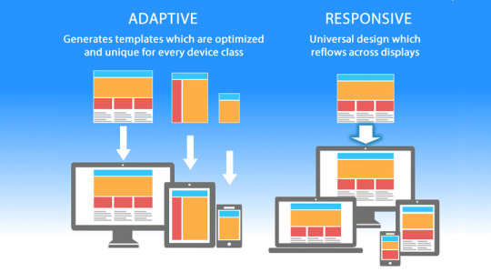
What is Responsive Design?
Responsive web design is a design approach that ensures a website's layout and content adapt dynamically to different screen sizes and resolutions. Whether your users are browsing on a desktop, tablet, or smartphone, a responsive website delivers a consistent and user-friendly experience. This adaptability is essential for improving user engagement, reducing bounce rates, and enhancing overall website performance.
Why Responsive Design Matters?
Before diving into the how-to, let us understand why responsive design is crucial:
Improved User Experience: A responsive website ensures that users can navigate and interact with your site effortlessly, regardless of their device.
Higher Search Engine Rankings: Search engines like Google prioritize mobile-friendly websites in their rankings, making responsive design a key factor in SEO.
Increased Conversion Rates: With a user-friendly interface, responsive websites encourage visitors to stay longer and take action, boosting conversions.
Cost-Effective Maintenance: Instead of maintaining separate websites for desktop and mobile users, a responsive design simplifies updates and reduces costs.
Steps to Create a Mobile-Friendly Website with Responsive Design
1. Start with a Mobile-First Approach
The mobile-first approach involves designing the website for smaller screens first and then scaling up for larger devices. This method ensures that the core elements are optimized for mobile users. A responsive web design company in Vadodara like Nividaweb emphasizes this approach to ensure a seamless user experience on all devices.
2. Use a Flexible Grid Layout
A flexible grid layout is the foundation of responsive design. It allows website elements to adjust proportionally based on the screen size. Instead of fixed-width layouts, use percentages and relative units like ems or rems to define dimensions. This ensures that your website adapts smoothly to different screen resolutions.
3. Optimize Images and Media
Large images and media files can slow down your website, especially on mobile devices. To enhance performance:
Use responsive images that scale according to screen size.
Implement modern image formats like WebP for better compression.
Use CSS media queries to serve appropriate image sizes based on the user’s device.
At Nividaweb, a trusted responsive website design company in Gujarat, we leverage advanced tools to optimize images and improve loading times.
4. Implement CSS Media Queries
CSS media queries are essential for responsive design. They enable you to apply specific styles based on the device’s characteristics, such as screen width, height, or resolution.
5. Prioritize Touch-Friendly Navigation
Mobile users interact with websites using touch gestures, so it is essential to design navigation that is easy to use. Key considerations include:
Larger buttons and clickable areas.
Simplified menus with collapsible options for smaller screens.
Avoiding hover-dependent features, as they do not work well on touch devices.
6. Test on Multiple Devices and Browsers
Testing is a critical step in creating a mobile-friendly website. Use tools like Google’s Mobile-Friendly Test and browser developer tools to simulate various devices and screen sizes. Additionally, test your website on physical devices to identify and resolve any usability issues.
7. Ensure Fast Loading Times
Mobile users expect websites to load quickly. A slow-loading site can lead to higher bounce rates and lost opportunities. To optimize loading times:
Minimize HTTP requests by combining CSS and JavaScript files.
Enable browser caching and compression.
Use a Content Delivery Network (CDN) to deliver content faster.
As a responsive web design company in Vadodara, Nividaweb employs performance optimization techniques to ensure your website loads swiftly across all devices.
8. Leverage Responsive Typography
Typography plays a crucial role in readability and user experience. Use scalable fonts that adapt to screen sizes and maintain legibility on smaller devices. Tools like CSS’s viewport units (e.g., vw, vh) can help create fluid typography that adjusts dynamically.
9. Incorporate Mobile-Friendly Features
Enhance your website's usability by integrating features tailored for mobile users:
Click-to-call buttons for quick communication.
Location-based services like maps.
Fast and secure payment options for e-commerce websites.
10. Work with Experts in Responsive Design
Creating a truly responsive and mobile-friendly website requires expertise and experience. Partnering with a reputable responsive web design agency in Vadodara, like Nividaweb, ensures that your website meets the highest standards of design and functionality.
Why Choose Nividaweb for Responsive Website Design
Nividaweb is a leading responsive website design company in Gujarat, dedicated to transforming your online presence. Here is why businesses trust us:
Tailored Solutions: We understand that every business is unique. Our team works closely with clients to deliver customized designs that align with their brand identity and goals.
Cutting-Edge Technologies: We stay ahead of industry trends and utilize the latest tools and techniques to create responsive websites.
Experienced Team: Our skilled designers and developers have extensive experience in crafting mobile-friendly websites across diverse industries.
End-to-End Services: From design and development to testing and optimization, we provide comprehensive solutions for all your web design needs.
The Future of Mobile-Friendly Websites
As technology evolves, so do user expectations. Emerging trends like voice search, augmented reality, and progressive web apps are reshaping the way users interact with websites. At Nividaweb, we are committed to staying at the forefront of these developments, ensuring our clients remain ahead of the curve.
Conclusion
Creating a mobile-friendly website with responsive design is no longer optional; it is a necessity. By following the steps outlined in this guide and partnering with a reliable responsive web design agency in Vadodara, you can create a website that delivers exceptional user experiences, drives engagement, and boosts conversions.
Ready to take your website to the next level? Contact Nividaweb, the trusted responsive website design company in Gujarat, and let us help you create a website that stands out in today’s competitive digital landscape.
#Responsive web design agency in Vadodara#Responsive web design company in Vadodara#Gujarat#Responsive website design company in Gujarat#Vadodara#Website design and development company in Gujarat#India#Web design and development agency in Gujarat#Website design and development company in Vadodara#eCommerce web design in Vadodara#eCommerce website developer in Gujarat#eCommerce website developer in Vadodara#Best web design agencies in Vadodara#Web design company in Vadodara#Best website design company in Vadodara
5 notes
·
View notes
Text
The Role of a Frontend Developer: Crafting Engaging User Experiences
In the digital age, the frontend developer plays a pivotal role in creating the online experiences we interact with every day. From websites to mobile apps, these professionals are responsible for shaping how users interact with digital products, ensuring that every click, scroll, and swipe is smooth and intuitive. But what exactly does a frontend developer do, and why is their role so critical in today's tech-driven world?
What Is a Frontend Developer?
A frontend developer is responsible for the visual and interactive elements of a website or application that users interact with directly. They bridge the gap between design and technology, translating a designer’s vision into functional, responsive, and user-friendly interfaces. Unlike backend developers, who focus on the server-side aspects, frontend developers specialize in client-side development, working with tools and technologies that directly impact the user experience.
Key Responsibilities of a Frontend Developer
The main job of a frontend developer is to ensure that users can easily navigate, interact with, and enjoy the digital product. Here’s a breakdown of their core responsibilities:
Turning Design into Code: Frontend developers take the visual designs created by UI/UX designers and bring them to life using code. They ensure that what users see on their screen aligns with the intended look and feel, while also making sure it’s functional across different devices and screen sizes.
Responsive Design: With users accessing websites from various devices, such as smartphones, tablets, and desktops, frontend developers focus on responsive design. This means building websites that automatically adjust to fit different screen sizes and orientations, offering an optimal experience regardless of the device.
Optimizing Performance: A key part of a frontend developer’s job is making sure that websites load quickly and perform smoothly. They optimize images, manage scripts, and streamline code to ensure fast loading times, as slow websites can lead to user frustration and high bounce rates.
Implementing Interactivity: Frontend developers add interactive elements like animations, hover effects, and dropdown menus that enhance the user experience. By using JavaScript and frameworks like React or Vue.js, they make websites dynamic and engaging, going beyond static designs.
Cross-Browser Compatibility: Websites need to work consistently across different browsers (Chrome, Firefox, Safari, etc.), and frontend developers are responsible for ensuring this compatibility. They test websites in multiple environments to fix any bugs or inconsistencies in the design or functionality.
Core Skills of a Frontend Developer
To excel as a frontend developer, there are several technical skills and tools that are essential:
HTML/CSS: These are the building blocks of web development. HTML structures the content, while CSS styles it, ensuring that it looks polished and visually appealing.
JavaScript: This programming language allows developers to add interactive elements, like form validation, dynamic content updates, and animations, making websites more engaging.
Frameworks and Libraries: Frameworks like React, Angular, or Vue.js help developers build complex web applications efficiently by providing pre-built structures and components.
Version Control (Git): Collaboration is key in web development, and version control tools like Git allow frontend developers to track changes, collaborate with other developers, and manage different versions of the project code.
Responsive Design & CSS Frameworks: Developers often use frameworks like Bootstrap or Tailwind CSS to ensure that their websites are responsive and adaptable to all devices.
The Evolving Role of Frontend Developers
As technology continues to evolve, the role of a frontend developer is expanding. Today, the line between frontend and backend development is becoming increasingly blurred, with many frontend developers expected to have some knowledge of backend technologies (a role often referred to as "full-stack development").
Additionally, the rise of progressive web apps (PWAs) and headless CMS architectures has introduced new ways of thinking about frontend development. Frontend developers are now focusing on creating experiences that go beyond the browser, delivering high-performance, native-like experiences on the web.
Another area of growing importance for frontend developers is accessibility. Ensuring that websites are usable by people with disabilities is not just a legal requirement but a responsibility for developers who want to create inclusive digital experiences. This involves using semantic HTML, providing keyboard navigability, and designing with screen readers in mind.
Why Frontend Developers Are Crucial for Business Success
Frontend developers play a critical role in shaping the user experience, which directly impacts the success of a digital product. A well-designed, fast, and user-friendly website or application can increase engagement, boost conversion rates, and enhance brand perception.
For businesses, the user interface is often the first point of contact with potential customers. If a website is slow, difficult to navigate, or visually unappealing, users are likely to leave, costing the business potential sales or leads. Frontend developers ensure that the website or app not only looks great but also performs optimally, keeping users engaged and satisfied.
Conclusion
In the modern digital landscape, frontend developers are essential to creating seamless, engaging, and high-performance online experiences. Their unique combination of technical skills and creative problem-solving allows them to transform designs into functional, responsive, and dynamic websites. As the demand for intuitive digital products continues to grow, the role of the frontend developer will only become more integral to business success and the evolution of web technologies.
4o
You said:
is ko english ma kr do "A o A Sir aj 3 outreach sy bat hoi or YTC k Backlinks Create KIa "
ChatGPT said:
ChatGPT
"Hello Sir, today I had discussions with 3 outreach contacts and created backlinks for YTC."
4o
You said:
ma gmail pr richout kr raha ho mujy ya masg aya ha is ka mujy koi replly kro "Thanks for reaching out. We charge $59 for submission. Let me know what you think."
ChatGPT said:
ChatGPT
You can reply with a polite and professional message like this:
Subject: Re: Submission Inquiry
Hi [Recipient's Name],
Thank you for your response and for providing the pricing details. I appreciate the information. I'll take this into consideration and get back to you shortly with my decision.
Best regards, [Your Name] [Your Position] [Your Company]
This keeps the conversation open while allowing you time to decide.
4o
You said:
Write A Article on "Front End Developer"
ChatGPT said:
ChatGPT
Title: The Role of a Front-End Developer: Crafting the Digital Experience
In today’s fast-paced digital world, websites and applications are the primary touchpoints for businesses and users. The seamless experiences we enjoy on websites—from smooth navigation to responsive design—are largely due to the efforts of front-end developers. But what exactly does a front-end developer do, and why is their role crucial in building user-friendly, efficient digital products?
What is a Front-End Developer?
A front-end developer is a professional who focuses on the client-side development of a website or application. This means they work on the part of the website that users directly interact with. While the back-end (server-side) handles the logic and data storage, the front-end is responsible for what users see and how they interact with a site.
In essence, front-end developers translate design mockups into functional websites or applications using code. They combine the worlds of design, user experience (UX), and coding to ensure a smooth, responsive, and visually appealing user interface (UI).
Key Responsibilities of a Front-End Developer
The role of a front-end developer goes beyond just coding a website. It involves understanding user needs, optimizing for performance, and ensuring the digital product works flawlessly across various devices and browsers. Here are the key responsibilities of a front-end developer:
Translating Designs into Code: Front-end developers take designs created by web designers and bring them to life using programming languages like HTML, CSS, and JavaScript. They ensure the design translates accurately into a functioning webpage or application, maintaining the visual fidelity of the design while ensuring usability.
Ensuring Responsiveness: In today’s multi-device world, websites need to work across desktops, tablets, and smartphones. Front-end developers make sure websites are responsive, meaning they adapt seamlessly to various screen sizes and orientations.
Implementing Interactivity: Interactivity is key to user engagement. Front-end developers use JavaScript and related frameworks to add interactive elements like animations, sliders, form validations, and dynamic content updates, making the user experience more engaging.
Optimizing Performance: Fast loading times are critical for user satisfaction and SEO. Front-end developers optimize images, minimize code, and ensure efficient loading of assets to create websites that load quickly and perform smoothly.
Cross-Browser Compatibility: Websites need to work consistently across different browsers such as Chrome, Firefox, Safari, and Edge. Front-end developers ensure that websites function correctly and look the same on all browsers, addressing any quirks or inconsistencies.
Maintaining Website Accessibility: Front-end developers also focus on making websites accessible to all users, including those with disabilities. They implement practices like semantic HTML, ARIA (Accessible Rich Internet Applications) attributes, and keyboard navigation to create an inclusive user experience.
Essential Skills for a Front-End Developer
To excel as a front-end developer, professionals need a combination of technical skills, creativity, and attention to detail. Below are some of the key skills required:
HTML/CSS: These are the foundational languages of front-end development. HTML (Hypertext Markup Language) structures content on the web, while CSS (Cascading Style Sheets) defines how that content looks in terms of layout, color, fonts, and design.
JavaScript: JavaScript is a powerful scripting language used to add interactivity to a website. With JavaScript, developers can create dynamic content, handle user events, and interact with back-end data in real-time.
Responsive Design: Knowledge of responsive design is crucial to ensure that websites and apps work seamlessly across all devices. Tools like Bootstrap or media queries in CSS help developers create adaptive layouts that fit all screen sizes.
Frameworks and Libraries: Modern front-end developers often use libraries and frameworks like React, Angular, or Vue.js to build more complex web applications efficiently. These tools provide pre-built components and structures to speed up development.
Version Control (Git): Front-end developers often work in teams, and version control tools like Git allow them to track changes in code, collaborate with others, and ensure the codebase remains organized.
Cross-Browser Development: Each browser interprets code slightly differently, so front-end developers must test their websites across various browsers and devices to ensure compatibility.
The Importance of Front-End Developers in Business
In today’s digital economy, a company’s website or mobile app is often the first point of contact with customers. Whether it’s an e-commerce platform, a SaaS application, or a simple company webpage, the user experience can significantly impact brand perception and business outcomes.
Front-end developers ensure that these digital touchpoints are engaging, easy to navigate, and visually appealing, which can directly influence user engagement and conversion rates. A well-designed website that loads quickly, functions smoothly, and offers a seamless user experience can set a business apart from its competitors.
Moreover, front-end developers are key players in building websites optimized for SEO (Search Engine Optimization). Fast-loading, mobile-friendly, and well-structured websites tend to rank higher on search engines, driving more organic traffic to the site.
Front-End Development and Emerging Technologies
As technology evolves, so does the role of the front-end developer. The rise of progressive web apps (PWAs), single-page applications (SPAs), and headless CMS (Content Management Systems) has created new challenges and opportunities for front-end developers.
PWAs allow websites to function like native apps, offering offline capabilities and faster load times. Front-end developers need to integrate these features while maintaining the flexibility of a website.
SPAs load a single HTML page and dynamically update content as the user interacts with the app, creating a more fluid experience. This requires front-end developers to have expertise in frameworks like React and Angular.
Headless CMS decouples the front-end from the back-end, giving front-end developers more control over how content is presented. This allows for greater flexibility in design and user interaction.
Conclusion
The role of a front-end developer is crucial in shaping the digital experience. By combining technical expertise with creativity, front-end developers bring designs to life, ensuring that websites are not only visually appealing but also functional, responsive, and user-friendly. In a world where the digital experience can make or break a business, front-end developers are key players in driving online success.
2 notes
·
View notes
Text
Mastering the Art of CSS Translate Property
Do you want to elevate your CSS skills? 🌟 💡 Ever wondered how to create stunning web animations and smooth transitions? Check out our latest blog post: Mastering the Art of CSS Translate Property: A Comprehensive Guide with 7 Examples In this guide, you will learn all about the CSS Translate property and how it works, along with key insights on the Transform property. Discover 7 hands-on examples, including how to create sliding menus, animated flip cards, stylish draggable elements, centered image galleries with hover effects, smooth and responsive modals, expanding search bars, and dynamic search bars. Don't miss out on these powerful techniques to enhance your web projects! 🚀 Read the full guide now and start creating amazing CSS animations today! 👇
#WebDesign#CSS#FrontendDevelopment#WebDevelopment#CSS3#Programming#WebDev#Animation#UXDesign#JavaScript#skillivo#skillivoBlogs $hashtag#slidingMenus#animatedFlipCards#CSSmodals
3 notes
·
View notes
Text
Mastering Z-Index in Elementor: Everything You Need to Know
When designing websites with Elementor, managing layers and ensuring proper content visibility can be a challenge—especially when multiple elements overlap. This is where understanding Z-Index in Elementor becomes essential.
What is Z-Index in Elementor?
Z-Index is a CSS property that controls the stacking order of elements on a web page. In simpler terms, it decides which element appears on top when two or more elements overlap. The higher the Z-Index value, the closer the element appears to the front.
In Elementor, every widget or section can be assigned a custom Z-Index value. This is especially helpful when creating advanced layouts such as overlapping text, layered images, sticky headers, or pop-ups.
How to Use Z-Index in Elementor
Select the Element: Click on the widget, column, or section you want to modify.
Go to the Advanced Tab: Under the 'Advanced' settings, scroll down to the 'Z-Index' field.
Set the Value: Input a positive or negative number. Higher values will place the element in front.
Example: If your text is hidden behind an image, increasing the text’s Z-Index will bring it forward.
Common Uses of Z-Index in Elementor
Making sticky headers stay on top while scrolling.
Creating interactive hover effects.
Layering background shapes or graphics.
Fixing overlapping issues between sections and widgets.
Tips for Using Z-Index in Elementor
Avoid unnecessary high values: A Z-Index of 9999 might work, but keep your values logical to avoid conflicts.
Use relative positioning: For Z-Index to take effect, elements often need a relative, absolute, or fixed position.
Check responsive views: Overlapping might differ between desktop, tablet, and mobile views.
Special Features of Z-Index in Elementor
The Z-Index in Elementor isn’t just a basic layering tool—it's a powerful feature that gives you full control over how elements appear in relation to each other on your webpage. Below are some standout features and benefits of using Z-Index effectively in Elementor:
1. Precise Layer Control
Z-Index allows you to manually control which elements appear on top or behind others. This gives you the freedom to design complex, multi-layer layouts without coding.
2. Works Across Widgets, Columns, and Sections
Elementor makes Z-Index available for:
Widgets (like buttons, images, headings)
Columns
Entire Sections
This means you can adjust layering at any level of your layout.
3. Dynamic with Position Settings
Z-Index works best when combined with Elementor’s position controls:
Relative
Absolute
Fixed
You can create advanced designs like sticky headers or floating call-to-action buttons that stay on top of all other content using Z-Index.
4. Responsive Control
With Elementor’s responsive settings, you can tweak Z-Index for mobile, tablet, and desktop individually. This ensures your designs remain visually consistent across all devices.
5. Conflict Resolution
Z-Index is your best friend when solving layering conflicts—like when a menu hides behind a section or a popup doesn’t appear as expected.
6. Supports Negative and High Values
You can assign negative values to push elements further back, or high values (e.g., 999) to bring elements to the front. This flexibility is crucial in layered design scenarios.
7. Improves User Experience
Using Z-Index properly ensures that clickable elements like buttons and menus stay accessible and visible, leading to a smoother UX.
Unlock the Full Power of Elementor Pro at an Unbeatable Price
Want to take your web design to the next level with advanced features, templates, and custom controls?
Get Elementor Pro @ Just ₹499 through CVWorld’s Elementor Group Buy and access premium tools affordably!
0 notes
Text
The Role of Motion UI in Web Development: Adding Delight to UX
In the age of digital-first interactions, user expectations are higher than ever. They don’t just want fast-loading websites—they want smooth, intuitive, and engaging experiences. One of the most powerful tools to achieve this is Motion UI—the strategic use of animations and transitions to guide, inform, and delight users.
Modern Web Development Company teams are increasingly integrating Motion UI into their workflow not just to make interfaces look good, but to enhance usability, improve storytelling, and make digital experiences feel more human. When used well, Motion UI turns static screens into dynamic journeys that users enjoy navigating.
What Is Motion UI?
Motion UI refers to the use of animated elements within a digital interface to convey meaning, improve interaction, and enhance aesthetic appeal. It includes elements like:
Smooth page transitions
Micro-interactions (e.g., button hover effects, toggles, loading spinners)
Scroll-triggered animations
Modal or menu reveals
Feedback animations (e.g., shake effect on invalid form input)
Unlike flashy or distracting animations, Motion UI is subtle, purposeful, and user-centric.
Why Motion UI Matters in Modern Web Development
1. Guiding User Attention
In a visually noisy digital space, animations can help direct the user’s eye to what matters most. Whether it’s drawing attention to a CTA, highlighting a newly loaded section, or showing the progress of a task, motion cues subtly guide behavior without overwhelming the user.
Why it matters: Strategic motion reduces cognitive load and enhances information hierarchy.
2. Providing Feedback and Affordance
Users feel more confident when the interface responds to their actions. Hover effects, loading animations, and success indicators provide instant feedback that confirms, “Yes, your action was registered.”
For example:
A button that slightly enlarges on hover indicates it’s clickable.
A form field that glows red upon error highlights correction needs.
A spinner after form submission reassures the user the process is underway.
Why it matters: Feedback builds trust and smooths interaction flows.
3. Creating Seamless Transitions
Instant changes on screen can feel jarring or disorienting. Motion UI introduces transitions between pages, states, or elements to soften the shift and help users understand how they arrived at the new state.
This could include:
Page fade-ins
Slide transitions in mobile navigation
Expanding cards or modals
Why it matters: Transitions help maintain context, making interactions feel more natural and logical.
4. Enhancing Brand Personality
Motion is also a storytelling tool. The style and speed of animations can reflect your brand’s personality—playful, elegant, modern, bold, etc. For instance, a creative agency’s website might use lively, bouncy transitions, while a law firm’s site may favor slow, smooth fades for a calm, professional tone.
Why it matters: Motion supports emotional connection and brand differentiation.
5. Improving Mobile and Touch UX
Motion UI isn’t just for desktops—it plays a vital role in mobile web design. Mobile users rely on gestures and need visual feedback more than ever. Swipe animations, touch transitions, and collapsible sections improve usability and reduce interface friction.
Why it matters: Fluid mobile motion contributes to better retention and conversion on handheld devices.
How Web Development Companies Use Motion UI Effectively
Strategic Planning, Not Overuse
Experienced developers use motion sparingly and intentionally. They prioritize usability over decoration and ensure motion supports functionality rather than distracting from it.
Performance Optimization
Heavy animations can affect performance, especially on low-powered devices. Agencies implement motion using:
CSS animations for lightweight transitions
JavaScript libraries like GSAP or Framer Motion for advanced effects
Lazy loading and hardware acceleration for smooth playback
Accessibility Considerations
Motion isn’t for everyone. Users with motion sensitivity may find transitions disorienting. Web development companies honor user preferences by respecting browser settings like “Reduce Motion” and offering toggle options where necessary.
Testing Across Devices
Motion must be consistent across browsers, screen sizes, and performance conditions. Agencies rigorously test animations to ensure they work well on all devices—without causing lag, layout shifts, or usability issues.
Final Thoughts
Motion UI isn’t about adding glitter—it’s about adding clarity, emotion, and flow to your user experience. When implemented strategically, it enhances usability, builds trust, and transforms your website from functional to unforgettable.
A professional Web Development Company understands how to balance motion with performance, accessibility, and brand storytelling. They don’t just build static websites—they craft immersive digital experiences where every interaction feels intuitive, responsive, and delightful.
0 notes
Text
8 CSS & JavaScript Snippets for Creating Sticky Elements — Speckyboy
New Post has been published on https://thedigitalinsider.com/8-css-javascript-snippets-for-creating-sticky-elements-speckyboy/
8 CSS & JavaScript Snippets for Creating Sticky Elements — Speckyboy
Modern websites often feature extensive scrolling. Long pages are common on desktop devices, but are even more frequent on mobile screens. The practice creates usability challenges for tasks like navigation and referencing important information.
That’s where “sticky” design elements come in handy. They allow users to scroll without losing access to your site’s menu. You can also use them to keep ads in view, attach social media sharing buttons to the viewport, or create fun special effects.
Implementing a sticky element can be simple, as CSS has a dedicated position property for this function. JavaScript can be used for building more robust features. As usual, there are several methods to achieve your goals.
We searched the CodePen archives to find interesting examples of sticky elements in use. Below, you’ll find various options that enhance the user experience. So, get stuck in your easy chair and be inspired by these code snippets!
Pure CSS Header Animation to Sticky Navigation
Created by Amit
Sticky headers are among the most popular use cases. On Chromium browsers, this snippet uses CSS to transform a tall and narrow header into a full-screen bar upon scrolling. Unsupported browsers receive a narrower, taller, sticky header. Keyframe animation is used to create smooth transitions. The feature is useful, lightweight, and attractive.
See the Pen Pure CSS header animation to sticky nav by Amit
Sticky Responsive Sidebar Navigation
Created by Areal Alien
Sidebar navigation can also take advantage of staying put during scrolling. Hovering over the sidebar expands the navigation to include text labels – it works on mobile too. However, you might also reserve this concept for large screens and use the traditional “hamburger” menu for mobile.
See the Pen Sticky responsive sidenav by Areal Alien
CSS Sticky Table Header & Column
Created by Mike Golus
Long HTML tables can be a pain to read. You have to memorize the column headers to understand the context. Sticky headers make even the busiest tables easier to read. Using position:sticky (and a few other tricks) on the first row and column enables scrolling without losing sight of key information. The examples in this Pen demonstrate how it’s done.
See the Pen CSS Sticky Table Header and Column by Mike Golus
Long Scroll Sticky Sections
Created by Burmese Potato
Here’s a unique way to denote the various sections of a long page. Scroll down the page, and the episode number (displayed in the left column) sticks until you reach the end of the section. The snippet combines sticky positioning with the calc() property on the container’s height to keep the number in view. This little bit of CSS adds a nice touch to the user experience.
See the Pen Pretty Sticky by Burmese Potato
Just Another Sticky Section Layout
Created by Misala
Sticky design elements can also be used to show off product features. Scroll down this page and watch as featured text and videos change. The layout occupies the entire screen viewport and is responsive for mobile devices. It’s a high-end feature sure to capture a user’s attention.
See the Pen just another sticky section layout by misala
Multi-Navigation Sticky Bars & Layout
Created by Den
This snippet asks the question: What if you have more than one navigation bar? The first bar is sticky by default. Scroll past a few sections, and a second sub-navigation bar lines up underneath. That second bar also features a neat frosted glass look as content scrolls underneath.
See the Pen Sticky layout + filters #2024 by Den
Sticky Video with CSS @container scroll-state()
Created by Jhey
We’re seeing more websites implement sticky videos, where the presentation sticks to the bottom corner upon scrolling. It allows users to view the rest of your content without losing sight of the video. Here, CSS container queries are used to reposition the video player. Use the included config panel to see how different settings impact the animation effects.
See the Pen CSS @container scroll-state() faux PiP video by Jhey
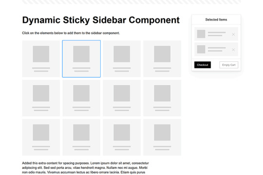
Dynamic Sticky Sidebar Component
Created by Ryan Mulligan
Features like shopping carts are a perfect fit for sticky sidebars. The UI makes it easier for shoppers to keep track of their cart and, most importantly, finish their purchase. This sidebar widget keeps track of cart contents and sticks to the screen while you scroll in the page content area.
See the Pen Dynamic Sticky Sidebar Component by Ryan Mulligan
Stick With What Works in Your Designs
We may think of sticky elements as being used for site headers and navigation. However, the examples above show that they can do much more. There are so many creative possibilities for informing and entertaining users.
What’s more, CSS can do a lot of the heavy lifting for you. Several snippets in this collection don’t require a single line of JavaScript. Still, it’s nice to know you can add some DOM manipulation when needed.
We hope this collection sparked your imagination! Check out our CodePen collection for even more sticky snippets.
Related Topics
Written by Eric Karkovack
Eric Karkovack is a web designer and WordPress expert with over two decades of experience. You can visit his business site here. He recently started a writing service for WordPress products: WP Product Writeup. He also has an opinion on just about every subject. You can follow his rants on Bluesky @karks.com.
Read more articles by Eric Karkovack
#2024#ADD#alien#amp#animation#Articles#attention#Building#Business#buttons#Capture#change#chromium#code#container#content#CSS#CSS Layout Snippets#CSS Snippets#Design#desktop#devices#easy#effects#Featured#Features#Filters#Full#glass#hamburger
0 notes
Video
youtube
Add Eye-Catching Hover Effects to Divi Menus in Minutes!
In this video, you’ll learn how to create an interactive eye-catching menu decoration hover effect in the Divi Theme using just a bit of simple CSS. By using the Divi Custom CSS panel along with Chrome’s built-in Inspector tools, we’ll walk you through every step to add dynamic hover styling that will instantly make your menu stand out and grab attention. No plugins or advanced coding needed—just pure Divi power combined with a creative CSS touch!
0 notes
Text
youtube
How to cutomize social media section in wordpress astra theme ?
Customizing the social media section in the Astra theme for WordPress can be done in multiple ways depending on your requirements. Here’s how you can do it:
1. Using Astra Customizer (For Built-in Header/Footer Social Icons)
Astra provides built-in options to add social media icons in the header or footer.
Steps to Add or Customize Social Icons in Header/Footer:
Go to WordPress Dashboard → Appearance → Customize.
Navigate to Header/Footer Settings:
For Header: Header Builder → Primary Header
For Footer: Footer Builder
Add a Social Icons Widget:
Click + to add a new element.
Select Social Icons.
Customize Icons:
Click on the added Social Icons element.
Add your preferred social media platforms (Facebook, Twitter, LinkedIn, etc.).
Enter the links to your social profiles.
Customize styles (icon size, spacing, and colors).
Click Publish to save changes.
2. Using Astra Widgets (For Sidebar or Footer)
Go to Appearance → Widgets.
Select the widget area where you want social media icons (Sidebar, Footer, etc.).
Add a Navigation Menu widget or Custom HTML widget.
If using Navigation Menu:
Create a social menu under Appearance → Menus.
Add Custom Links with your social media URLs.
Assign this menu to the widget.
If using Custom HTML:
Insert social media icons manually using HTML.
htmlCopyEdit<a href="https://facebook.com/yourpage" target="_blank"> <img src="facebook-icon.png" width="30" alt="Facebook"> </a>
3. Using Astra Pro Add-ons (For More Design Options)
If you have Astra Pro, you get more customization options:
Appearance → Customize → Header Builder or Footer Builder.
Select Social Icons and choose advanced styling options like:
Custom colors, hover effects, shape (circle/square).
More placement options.
4. Using a Plugin (For Advanced Customization)
If Astra’s built-in options are limited, use a plugin like:
Social Icons Widget by WPZOOM
Simple Social Icons
Ultimate Social Media Icons
Install & activate the plugin from Plugins → Add New.
Configure the social icons inside the plugin settings.
Place the icons via widgets, shortcodes, or block editor.
5. Customizing with CSS (For Advanced Users)
If you want a unique look, you can add custom CSS:
Appearance → Customize → Additional CSS.
Use CSS like: cssCopyEdit.ast-social-color-custom a { background-color: #ff5733; /* Change background */ color: white; /* Change icon color */ border-radius: 50%; /* Make icons round */ padding: 10px; }
0 notes
Text
CSS Menu Hover Animation
#css menu hover effects#css menu hover animation#css menu hover#html css#frontend#css#html#frontenddevelopment#webdesign#css3#html css menu#css menu#css animation tutorial#css animation examples
9 notes
·
View notes
Text

Navigation Menu Hover Effect
#css menu#css menu hover effects#html css navbar#css navbar#menu html css#html css#divinector#frontenddevelopment#css#html#css3#css animation examples#html css animation#css animation tutorial
0 notes
Link
[ad_1] You have for sure heard about the new CSS Anchor Positioning, right? It’s a feature that allows you to link any element from the page to another one, i.e., the anchor. It’s useful for all the tooltip stuff, but it can also create a lot of other nice effects. In this article, we will study menu navigation where I rely on anchor positioning to create a nice hover effect on links. CodePen Embed Fallback Cool, right? We have a sliding effect where the blue rectangle adjusts to fit perfectly with the text content over a nice transition. If you are new to anchor positioning, this example is perfect for you because it’s simple and allows you to discover the basics of this new feature. We will also study another example so stay until the end! Note that only Chromium-based browsers fully support anchor positioning at the time I’m writing this. You’ll want to view the demos in a browser like Chrome or Edge until the feature is more widely supported in other browsers. The initial configuration Let’s start with the HTML structure which is nothing but a nav element containing an unordered list of links: We will not spend too much time explaining this structure because it can be different if your use case is different. Simply ensure the semantic is relevant to what you are trying to do. As for the CSS part, we will start with some basic styling to create a horizontal menu navigation. ul padding: 0; margin: 0; list-style: none; display: flex; gap: .5rem; font-size: 2.2rem; ul li a color: #000; text-decoration: none; font-weight: 900; line-height: 1.5; padding-inline: .2em; display: block; Nothing fancy so far. We remove some default styling and use Flexbox to align the elements horizontally. CodePen Embed Fallback Sliding effect First off, let’s understand how the effect works. At first glance, it looks like we have one rectangle that shrinks to a small height, moves to the hovered element, and then grows to full height. That’s the visual effect, but in reality, more than one element is involved! Here is the first demo where I am using different colors to better see what is happening. CodePen Embed Fallback Each menu item has its own “element” that shrinks or grows. Then we have a common “element” (the one in red) that slides between the different menu items. The first effect is done using a background animation and the second one is where anchor positioning comes into play! The background animation We will animate the height of a CSS gradient for this first part: /* 1 */ ul li background: conic-gradient(lightblue 0 0) bottom/100% 0% no-repeat; transition: .2s; /* 2 */ ul li:is(:hover,.active) background-size: 100% 100%; transition: .2s .2s; /* 3 */ ul:has(li:hover) li.active:not(:hover) background-size: 100% 0%; transition: .2s; We’ve defined a gradient with a 100% width and 0% height, placed at the bottom. The gradient syntax may look strange, but it’s the shortest one that allows me to have a single-color gradient. Related: “How to correctly define a one-color gradient” Then, if the menu item is hovered or has the .active class, we make the height equal to 100%. Note the use of the delay here to make sure the growing happens after the shrinking. Finally, we need to handle a special case with the .active item. If we hover any item (that is not the active one), then the .active item gets the shirking effect (the gradient height is equal to 0%). That’s the purpose of the third selector in the code. CodePen Embed Fallback Our first animation is done! Notice how the growing begins after the shrinking completes because of the delay we defined in the second selector. The anchor positioning animation The first animation was quite easy because each item had its own background animation, meaning we didn’t have to care about the text content since the background automatically fills the whole space. We will use one element for the second animation that slides between all the menu items while adapting its width to fit the text of each item. This is where anchor positioning can help us. Let’s start with the following code: ul:before content:""; position: absolute; position-anchor: --li; background: red; transition: .2s; ul li:is(:hover, .active) anchor-name: --li; ul:has(li:hover) li.active:not(:hover) anchor-name: none; To avoid adding an extra element, I will prefer using a pseudo-element on the ul. It should be absolutely-positioned and we will rely on two properties to activate the anchor positioning. We define the anchor with the anchor-name property. When a menu item is hovered or has the .active class, it becomes the anchor element. We also have to remove the anchor from the .active item if another item is in a hovered state (hence, the last selector in the code). In other words, only one anchor is defined at a time. Then we use the position-anchor property to link the pseudo-element to the anchor. Notice how both use the same notation --li. It’s similar to how, for example, we define @keyframes with a specific name and later use it inside an animation property. Keep in mind that you have to use the syntax, meaning the name must always start with two dashes (--). CodePen Embed Fallback The pseudo-element is correctly placed but nothing is visible because we didn’t define any dimension! Let’s add the following code: ul:before bottom: anchor(bottom); left: anchor(left); right: anchor(right); height: .2em; The height property is trivial but the anchor() is a newcomer. Here’s how Juan Diego describes it in the Almanac: The CSS anchor() function takes an anchor element’s side and resolves to the where it is positioned. It can only be used in inset properties (e.g. top, bottom, bottom, left, right, etc.), normally to place an absolute-positioned element relative to an anchor. Let’s check the MDN page as well: The anchor() CSS function can be used within an anchor-positioned element’s inset property values, returning a length value relative to the position of the edges of its associated anchor element. Usually, we use left: 0 to place an absolute element at the left edge of its containing block (i.e., the nearest ancestor having position: relative). The left: anchor(left) will do the same but instead of the containing block, it will consider the associated anchor element. That’s all — we are done! Hover the menu items in the below demo and see how the pseudo-element slides between them. CodePen Embed Fallback Each time you hover over a menu item it becomes the new anchor for the pseudo-element (the ul:before). This also means that the anchor(...) values will change creating the sliding effect! Let’s not forget the use of the transition which is important otherwise, we will have an abrupt change. We can also write the code differently like this: ul:before content:""; position: absolute; inset: auto anchor(right, --li) anchor(bottom, --li) anchor(left, --li); height: .2em; background: red; transition: .2s; In other words, we can rely on the inset shorthand instead of using physical properties like left, right, and bottom, and instead of defining position-anchor, we can include the anchor’s name inside the anchor() function. We are repeating the same name three times which is probably not optimal here but in some situations, you may want your element to consider multiple anchors, and in such cases, this syntax will make sense. Combining both effects Now, we combine both effects and, tada, the illusion is perfect! CodePen Embed Fallback Pay attention to the transition values where the delay is important: ul:before transition: .2s .2s; ul li transition: .2s; ul li:is(:hover,.active) transition: .2s .4s; ul:has(li:hover) li.active:not(:hover) transition: .2s; We have a sequence of three animations — shrink the height of the gradient, slide the pseudo-element, and grow the height of the gradient — so we need to have delays between them to pull everything together. That’s why for the sliding of the pseudo-element we have a delay equal to the duration of one animation (transition: .2 .2s) and for the growing part the delay is equal to twice the duration (transition: .2s .4s). Bouncy effect? Why not?! Let’s try another fancy animation in which the highlight rectangle morphs into a small circle, jumps to the next item, and transforms back into a rectangle again! CodePen Embed Fallback I won’t explain too much for this example as it’s your homework to dissect the code! I’ll offer a few hints so you can unpack what’s happening. Like the previous effect, we have a combination of two animations. For the first one, I will use the pseudo-element of each menu item where I will adjust the dimension and the border-radius to simulate the morphing. For the second animation, I will use the ul pseudo-element to create a small circle that I move between the menu items. Here is another version of the demo with different coloration and a slower transition to better visualize each animation: CodePen Embed Fallback The tricky part is the jumping effect where I am using a strange cubic-bezier() but I have a detailed article where I explain the technique in my CSS-Tricks article “Advanced CSS Animation Using cubic-bezier()”. Conclusion I hope you enjoyed this little experimentation using the anchor positioning feature. We only looked at three properties/values but it’s enough to prepare you for this new feature. The anchor-name and position-anchor properties are the mandatory pieces for linking one element (often called a “target” element in this context) to another element (what we call an “anchor” element in this context). From there, you have the anchor() function to control the position. Related: CSS Anchor Positioning Guide [ad_2] Source link
0 notes
Text
8 Key Principles for Designing Interactive User Interfaces
In modern digital environment users expect easy and exciting experiences, that is why Development of interactive User Interface has become vitally important for successful product outcome. User interaction design is critical when or if concerning the general interaction of users to a concrete mobile application or website or even a certain software.
Contrary to common thinking, interactions UI design is all about creating a guise for more interaction with an interface; it encompasses concepts like how an interface appears, its entity, and the way it feels to use. For students and professionals of the institution such as the Unitedworld Institute of Design (UID), the only way to design new experiences, is by effectively understanding the concept of interaction design.
So here are eight principles that any interaction designer needs to learn to tackle IU designing with relative ease so check the detailed description here:
1. Understand Your Users
The substrate for any successful interactive UI is a profound understanding of the customer. Who are they? What is their pain? What is on their wish lists? These are questions whose answers should guide you in the case of any design decision that you are going to make.
Survey, interview, and usability test your users.
User personas are imaginary characters that represent the target consumers in their organization.
Particularly dissect out the user journey to make sure that one is aware of the points that are more sensitive in terms of user interplay.
Why It Matters: Creating your interface in a way that reflects how a user will interact with it makes it more meaningful.
2. Prioritise Usability
An interactive design must be functional above all else. Users should be able to achieve their goals with ease, whether they’re navigating a website, completing a form, or shopping online.
Simplify navigation with clear menus and intuitive pathways.
Ensure buttons, links, and icons are easily identifiable and actionable.
Avoid overcomplicating tasks; aim for simplicity.
Pro Tip: Follow established design patterns that users are already familiar with to minimize confusion.
3. Design for Responsiveness
Users interact with digital interfaces across multiple devices, from smartphones to desktops. Your interface should adapt seamlessly to different screen sizes and resolutions.
Use responsive design frameworks like Bootstrap or CSS Grid.
Ensure touch targets (buttons, links) are large enough for mobile devices.
Test the interface on various devices to ensure consistency.
Why It Matters: A responsive design improves accessibility and user satisfaction.
4. Ensure Consistency
Consistency in design elements, interactions, and functionality builds trust and familiarity with users. They should feel like they’re navigating a cohesive system rather than a disjointed experience.
Use a uniform color scheme, typography, and iconography.
Maintain consistent interaction patterns across all screens and devices.
Create a design system or style guide to enforce consistency.
Fun Fact: Apps like Instagram and Spotify are loved for their consistent design language.
5. Emphasise Visual Hierarchy
An effective UI guides users’ attention to the most important elements first. This is achieved through visual hierarchy, where size, color, and placement of elements direct the flow of user interaction.
Highlight primary actions (e.g., “Sign Up,” “Add to Cart”) with prominent buttons.
Use contrasting colors to draw attention to key areas.
Group related elements together to improve readability.
Key Insight: A well-structured visual hierarchy simplifies decision-making for users.

6. Focus on Feedback and Interaction
Interactive interfaces should feel alive, providing users with instant feedback for their actions. Feedback reassures users that their inputs have been registered and understood.
Use hover effects, animations, or color changes to indicate clickable elements.
Show loading indicators for actions that take time, like submitting a form.
Provide confirmation messages for completed tasks or warnings for errors.
Example: When you “Like” a post on Instagram, the animation of the heart provides satisfying feedback.
7. Incorporate Accessibility
Designing for all users, including those with disabilities, is essential. Accessibility in interaction design ensures that your interface is usable by the widest possible audience.
Include alt text for images to support screen readers.
Ensure color contrast ratios are sufficient for users with visual impairments.
Support keyboard navigation and voice commands.
Tools to Use: Leverage tools like WAVE or Lighthouse to test accessibility in your designs.
8. Test, Iterate, Repeat
No design is perfect in very the first time. Therefore, continuous testing and iteration are crucial to refine your interface and enhance user interaction.
Conduct usability testing with real users to identify pain points.
Collect feedback through surveys or in-app prompts.
Use analytics tools to track user behavior and optimize based on data insights.
Pro Tip: Adopt an agile design approach to make iterative improvements throughout the project lifecycle.
The Role of Interaction Design in the Future
As the digital landscape evolves, interaction design continues to shape how users experience technology. The rise of AI, voice interfaces, and augmented reality demands a deeper understanding of how users engage with emerging technologies.
At Unitedworld Institute of Design (UID), students are equipped with the skills to navigate these shifts, learning not just the principles of user interaction design but also how to innovate in a competitive industry.
Designing interactive user interfaces is both an art and a science. By adhering to these 8 key principles, designers can create interfaces that are intuitive, engaging, and effective. Whether you’re a seasoned professional or an aspiring student at UID, understanding the fundamentals of user interaction design is essential for crafting exceptional user experiences.
Read More:- 8 Key Principles for Designing Interactive User Interfaces.
0 notes
Text
How to Optimize Your Website for Mobile: Key Steps for Better User Experience

Why Mobile Optimization Matters
Mobile optimization refers to the process of ensuring your website is fully functional and aesthetically appealing on smartphones and tablets. When visitors land on your site from their mobile devices, they expect it to load quickly, be easy to navigate, and deliver a seamless user experience. Poor mobile optimization leads to frustrated users, higher bounce rates, and ultimately, lower conversions.

1. Implement a Responsive Design
Responsive design ensures that your website adapts to different screen sizes, whether it’s a smartphone, tablet, or desktop. Instead of creating separate mobile and desktop versions of your site, a responsive design automatically adjusts the layout based on the device being used.
This approach provides several benefits:
Consistent user experience: Users enjoy a seamless browsing experience regardless of the device they’re on.
Improved SEO: Google values responsive design, and it can boost your search engine rankings.
Faster updates: Since there’s only one version of the website to maintain, updates are simpler and faster to implement.
2. Optimize Your Page Load Speed
Mobile users are often on the go, so if your website takes too long to load, they won’t hesitate to leave. Research shows that even a one-second delay in page load time can result in a significant drop in conversions. To improve your mobile site’s load speed, consider the following steps:
Compress images: Large images can slow down your website. Use tools to compress images without sacrificing quality.
Minimize JavaScript and CSS: Streamlining code helps reduce loading times.
Use browser caching: This allows your site’s elements to be saved in the user’s browser, speeding up load times on subsequent visits.

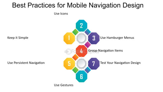
3. Simplify Navigation for Mobile
Mobile screens are smaller, so it’s crucial to simplify your website’s navigation. A complex or crowded menu can frustrate users. Focus on providing easy access to your most important pages and ensure that your menu is intuitive and easy to use. Consider the following best practices:
Use a hamburger menu: A hamburger menu (three horizontal lines) is a mobile-friendly option for hiding your navigation menu, saving valuable screen space.
Prioritize key pages: Limit the number of menu options and prioritize your most important pages, such as your contact page, products, or services.
Clickable buttons: Make sure buttons are large enough to be easily tapped on a mobile screen.
4. Make Text Easy to Read
When users visit your site on their mobile devices, it’s important that they don’t have to zoom in to read text. Ensure that the font size is large enough to be readable on small screens. Additionally:
Use high contrast colors: Ensure the text contrasts well with the background for readability, especially on mobile devices where lighting conditions can vary.
Avoid long paragraphs: Mobile users prefer scannable content. Break up your content into shorter paragraphs and use bullet points when appropriate.
5. Optimize for Touchscreen Interaction
Mobile devices rely on touchscreen navigation, which is different from the mouse or keyboard navigation used on desktops. To improve usability:
Ensure buttons are large enough: Make sure buttons are big enough for easy tapping, without accidental clicks.
Avoid hover effects: Since hover effects don’t work on touchscreens, ensure all important interactions are clickable and not reliant on hovering.
Test user interactions: Ensure that forms, buttons, and interactive elements work seamlessly on mobile devices.
6. Mobile-Friendly Forms
Forms are essential on many websites, but filling them out on a mobile device can be challenging if not optimized. To improve mobile user experience:
Use smaller forms: Only ask for the most essential information, such as name, email, and phone number.
Enable auto-fill: This helps speed up the process and reduces errors.
Use large, clickable input fields: Ensure users can easily tap and fill in information without zooming.
7. Implement Mobile SEO Best Practices
Mobile SEO is critical for ensuring that your site performs well in search engine rankings on mobile devices. Some key tactics include:
Optimize for local searches: Many mobile users search for local businesses. Make sure your website is optimized for local SEO by including location-specific keywords and registering on Google My Business.
Use structured data: This helps search engines understand the content of your pages and can improve your visibility in search results.
8. Test Your Website Across Different Devices
Before launching your mobile-optimized site, it’s important to test it across multiple devices and browsers to ensure everything functions properly. There are several tools available to test your site’s mobile responsiveness and user experience.
Conclusion
Mobile optimization is no longer optional—it’s essential for providing a top-notch user experience and improving your SEO rankings. By implementing a responsive design, improving page load speed, simplifying navigation, and making your site touchscreen-friendly, you can enhance both user experience and mobile traffic.
At Nexgen Minds, we specialize in web design and SEO strategies that help businesses optimize their websites for mobile devices. Whether you need to redesign your website or improve your mobile traffic, our team can assist you in achieving the best results.
Stay connected with us on social media for more tips and updates! Follow us on @NexgenMinds and join our agency to take your business to the next level.
Let’s get your business optimized for mobile and grow your digital presence today!
Stay updated on the latest email marketing strategies and best practices by following Nexgen Minds on social media! Facebook: @NexGenMinds Linkedin: @NexGenMinds
Instagram: @NexGenMinds
Take the first step towards optimizing your digital marketing strategy with Nexgen Minds—where innovation meets results!
0 notes