#nd also he can create illusions for each of the senses at a time
Text
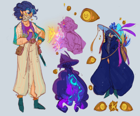
everyone say hello to arion, chromia’s color witch and my new empiressona! she/he pronouns :^D
#luna’s constellations#empires#empires sona#empires smp#arion has a fur coat that is a pocket dimension and can eat people sometimes#nd also he can create illusions for each of the senses at a time#and change the color of objects!#so like he can make someone see a butterfly but not touch it#or he can make someone feel a tap on their shoulder but not see or smell it#etc#i love her already this design brings me much joy
92 notes
·
View notes
Text
Social dictators Cristiano Ronaldo- El Rey

It’s very important to comprehend the magnitude of social influence and how SOME people take charge whilst others remain in a herd. This is not to say that the herd do not have the power to wake up, they certainly do. It is not a person’s fault to idolize another person, it is the extent to which that person will go to make this idolized person different from him/her. That is important.
Social dictators, especially in the 21st century, dictate and work in cohesion with brands to sell their products. They are the medium- social media is an instrument to relay the message. We have multiple biases and one goes by the name of, association, which is within our psyche. Stereotypes are one of these associations, and with the work of social dictators, the public makes a connection/association with their products and thus consume more of their goods. For example, Cristiano Ronaldo’s partnership with Nike. Cristiano is widely popular and his success in the football world has given him access to lucrative deals with other brands. Ronaldo according to Business Insider generated 500 million dollars in value for Nike from his social media properties in 2016. He also received a billion-life pact contract in 2016. We will also be evaluating his present-day scores; previous statistics were recorded in 2017. . His accumulation of prosperity and attention, success in having his own shoe line and sales that come from it, this is a stem that is the root of this contract.
Ronaldo reached 262 million followers on all his socials: 120 million followers on Facebook-fact; 122 million as of 2019, falling below Facebook at number 1 with 214 million likes, and 2nd Samsung at 160 million likes. Checked it myself as of 9/28/19 at 10:30 A.M. This is amusing. There is no other human with such followers or likes until 7th place. And of course, Shakira with 100 million likes. Big entities such as Real-Madrid at 4th, not surprised there.
Real Madrid is a historical city and team; however, they had not won the prize that every team in every European league is eyeing. The Champions League, since the 2001-2002 final. Ronaldo has 4 UEFA (Union of European Football Associations)Champions League titles under his belt. 3 won in a row. He also won 15 trophies in his time in Real Madrid from 2009-2018. In the football realm, its either Ronaldo or Lionel Messi, who is also considered one of the best in the world. I would say many people know Ronaldo because of his large following and possibly because he knows English, he is able to connect to more people. But that is just a bias I could be showcasing.
Transitioning back to his socials: Twitter followers equal to 80.1 million followers and Instagram 185 million followers. Now, the projections of 2017 statistics said 262 million followers in the social sphere. 2019 accumulative as of today, 387.1 million followers. Mind-boggling, Nike understands the height of Ronaldo’s success, furthermore. According to Forbes, Niall McCarthy reiterates on the fact that Juventus benefitted before Ronaldo had arrived to the club. The bare news that circulated after the transfer was accomplished, saw Juventus share increase by 40 percent. Consequently, Juventus socials were flooded by 1.5 new million followers in one day. Business Insider, reported 520,000 Ronaldo Jerseys sold in 24 hours. That is worth 62.4 million in revenue and the football clubs receive 10-15 percent of the revenue, so Juventus got about 6-9 million dollars.
Ronaldo has an influence wherever he goes. You can say that money does fall from his tree. 2 years ago, Ronaldo posted 347 pictures that included the Nike logo or mention, and this generated 477 million interactions.
This is a transaction of social influence into monetary power.
Ronaldo has amassed quite a following, let us try to understand why that is from a psychological perspective/philosophical perspective.
Medium is the Message
Marshall McLuhan in his interview, recorded in 1977. “…When you trigger these vast media that we use, you are manipulating an entire population…” We have different avenues to lose ourselves into provided by the big corporations. In George Orwell’s famous book 1984. His belief was that the practice of hedonism was on the rise through a consumable western society. We have different brands and they each have customers. This in turn would decrease the freedom of western societies. The impediment of freedom to venture towards self-reflection, our leisure time spent in finding ways to better society, Theodor Adorno from the Frankfurt School explains this well. The School of Life on YouTube goes in-depth with this notion. Becoming the herd, rendering individuality by a consumable collective. This is what I call the matrix. Orwell believes this nature in society(hedonism) makes people less resistant to change, Aldous Huxley-in his book Brave New World had his own interpretation: this could be used as a tool to oppress, Academy of Ideas on Youtube explains, “… because people will willingly forgo freedom for sensory pleasure and endless consumption, ‘ (side note- one quotation mark is input from the understanding put forth, carry on) bringing us back to Ronaldo’s influence by the number of followers he has’… if a society can be structured so that people can devout much of their time to pursuing pleasures, gratifying materials wants and even drugging themselves to escape reality...” There was a lot of worry about how the future of technological/ media improvements would have on the masses, used as a tool to spread ideological thoughts whilst unknowingly becoming part of a system. If you’re to respond to this paragraph sir, what would you say, ‘Well, this is true. I believe we should understand the pessimistic side of situations and find a solution to these circumstances. Although association and grouping of people are in our DNA as we are social beings, we cannot escape if one is not willing to. Furthermore, one needs to be strict with oneself, abide by some rules, discipline. A few philosophies I like to follow are stoicism and epicureanism. These thoughts on the way of life have stopped me from getting lost in the sauce/illusion. In addition, it’s also important to understand, these media have created different approaches in making money, and some capitalize on it, and it’s a bonus when one is being successful.’
Group Psychology
Edward Bernays developed a theory called group psychology. In his book, Propaganda, released in 1928 *clears throat* ‘the minute people who have a deep sense of knowing how to control the masses through symbols and manipulation of habits... a constitution of people who control a country’. Bernays developed complex manipulation techniques used by companies to sell products. Sigmund Freud thoughts on group psychology, “concerned with the individual man as a member of a race, of a nation, of a caste, of a profession, of an institution, or as a component part of a crowd of people who have been organized into a group of at some particular time for some definite purpose.” Group Psychology tries to understand the psychology of people once they are branded as a group, the habits, thoughts, behaviors, how do they alter once involved in a crowd.
There was a survey done reported by Business Wire, it was working around the understanding of group psychology. Customers are influenced more by influencers than the brand itself. I remember watching a video of an influencer, and he was saying that. His followers do not purchase products in the ads that he puts on his videos, but rather products that he uses genuinely in his life. In the United States and United Kingdom, influencers have had an impact on how consumers’ purchase: “44 percent of all respondents said they have considered purchasing a product or service based on a social influencer post; 31 percent said they have already purchased a product or service based on an influencer post, and 24 percent said they have recommended a product or service based on an influencer post.”
I’m ready to gobble all your feedback, toodles
1 note
·
View note
Text
The Final Problem Giga Meta 4/4: from Musgrave to the end
Part 3


From Sherlock falling into black goo, we now have a Sherlock lying as if he’s just fallen and crashed.
There’s something quite strange in the pictures on the wall too: we see little Sherlock and little Mycroft, but we never see pictures of Eurus.
But now that Sherlock has won Eurus’ tests, he can now freely talk to Little Eurus. His puzzles made the plane advance, each time closer to the ground and the fall or landing of the plane.
Now, Eurus reaches the front of the plane and she can see where exactly she is going and can give us actual relevant informations.
Finally, we know and Sherlock says as much: this city is definitively her home.
YOUNG EURUS: I can see a river. And there’s a big wheel.
(…)
SHERLOCK: Does the river look like it’s getting closer? (…) That means you’re nearly home.
A city with lot of lights, it is night which means that while she stays in the dark during the whole episode, she is now roughly in the same timezone than where Sherlock is. A big city near the sea but with a river leading to it. And a big wheel, don’t forget the big wheel she can see.
That was totally London.
This is the capital of England, it is a monument in itself. But to Eurus who spent her whole life in Sherrinford? That means absolutely nothing and was never home.
And when Sherlock finally faces Musgrave, right after Sherlock told Little Eurus she was nearly home, we get the beginning of an answer.
SHERLOCK: I’m home. Musgrave Hall.
EURUS : Me and Jim Moriarty, we got on like a house on fire, which reminded me of home.
SHERLOCK: Yeah, it’s just an old building. I don’t care.
Musgrave was home for Eurus, not London. If we think Eurus actually is real, that doesn’t make any sense. It was also home for Sherlock, but not anymore, it’s just stones, an old building and he doesn’t care anymore.
SHERLOCK: Just put me back in London. I need to get to know the place again. Breathe it in, feel every quiver of its beating heart.
SHERLOCK: I will keep you safe. But it has to be in London. It’s my city; I know the turf.
But London? London is his turf. This is the city that Mycroft has sworn to protect even if there is bound to be collateral damage. This is where Baker Street is, where he does The Work and more importantly where all the people he loves are.
To Sherlock, London is everything because that’s where his heart and everyone he loves are.
It’s only normal that Eurus, his emotions, was going to land there. That’s home, where his heart is.
And finally the metaphor is complete. Sherlock is dying, everything seems hopeless, he is lost and can’t see where he is supposed to go to survive. Eurus is torturing him to let him actually use his sentiments, his heart, and integrate them in his deductions. Add emotional context, it’s all about emotions.
But no matter how painful that was for him to do so, there is now light at the end of the road, and that light leads him to the one place where his heart, where the people he loves are.
SHERLOCK We just need to get in touch with some people on the ground. Now, um, can you see anything that looks like a radio?
And what is a radio except one big complicated phone? What is a phone in Sherlock if not a heart? Sherlock doesn’t know how to land the plane, but someone on the ground does. All they have to do is use the radio and phone London to get contact with the people in it. All he has to do is to open his heart and to ask for their help. Even, if right now, she can’t find the radio.
SHERLOCK: Are you there yet?
JOHN: Yeah I’m here!
Now John is chained at the bottom of a well and we’ve got a three-way conversation. John is answering questions aimed to Little Eurus. It’s not that John is Eurus, it’s that Little Eurus and John are connected. Emotions and the Heart.
LITTLE EURUS: The whole plane’s shaking.
SHERLOCK: It’s just turbulence. It’s nothing to worry about.
LITTLE EURUS: My ears hurt.
SHERLOCK: Does the river look like it’s getting closer?
LITTLE EURUS: A-a little bit.
SHERLOCK: All right, then. That means you’re nearly home.
JOHN: Sherlock? I’m in a well. That’s where I am; I’m in the bottom of a well.
John survival depends on Eurus and Sherlock managing to land the plane and Sherlock solving the puzzle, and vice versa. Because water represents dying in EMP and John is chained and about to drown, while Little Eurus' ears start hurting, meaning that the plane is starting to go down and crash.
Anyway, back with Big Eurus.
EURUS: Sweet Jim. He was never very interested in being alive, especially if he could make more trouble being dead.
SHERLOCK: Yeah, still not interested. The plane!
EURUS: You knew he’d take his revenge. His revenge apparently is me.
SHERLOCK: Eurus, let me speak to the little girl on the plane and I’ll play any game you like.
EURUS: First find Redbeard. (...) At long last, Sherlock Holmes, it’s time to solve the Musgrave ritual. Your very first case!
Now, he must solve the Musgrave ritual, because that’s what is ultimately going to save Sherlock, Litlle Eurus and John. Finding out the answer to this puzzle.
JOHN: Yeah, it’s flooding. The well is flooding.
SHERLOCK: Try as long as possible not to drown.
JOHN: What?
SHERLOCK: I’m going to find you. I am finding you!
JOHN: Well, hurry up, please, because I don’t have long!
LITTLE EURUS: It’s leaning over, the whole plane!
Because it’s now urgent for Sherlock to solve the Musgrave ritual.
The correct answer to the Musgrave ritual isn’t the song is a cipher, it is ‘Eurus created that song in a way to explain the wrong dates’. The song isn’t a puzzle, it’s the solution needed because the graves are the puzzle that fascinated Sherlock as a child.
A fake gravestone where Nemo Holmes was ‘buried’. But really, Nemo was no one. Or nobody. There was no body.
You can’t really face your own grave, can you? Unless you have a TARDIS, all you can do is have a gravestone with your name on it and no date of death. You’re still not dead so the dates will be necessarily wrong.
Basically, if you want to survive, you need to figure out the contradiction your gravestone is telling you. Show the inconsistencies and reveal it as a fake.
Here starts the puzzle. Now that the inconsistencies are laid bare, you need to find how that can tell you how to survive.
SHERLOCK: The wrong dates, she used the wrong dates on the gravestones as the key to the cipher and the cipher was the song.
Here, Stupid Sherlock strikes again.
The reverse is what happened.
Do you know what an Ottendorf code is? Better, do you remember The Blind Banker? You have a set of numbers and they refers to a word of a page of a very specific book. This is what we’re facing.
The cipher is the graveyard, the key is the song.
The graves represent the number of the stanza and the numbers the words used in said stanza in ascending order. If you start with a number like 28 and then use 1, that just means you need to use the last stanza above (word 28).
Grave 1 (Stanza 1): 134-1719 -> 1 3 4 17 19 I AM LOST HELP ME
Here we can’t do 13 because we have 4 after, nor 34, so 1 3 4, now we are in the two digits 17 and 19
Grave 2 (Stanza 2): 28.9.1520 -> 28 9 15 20 BROTHER SAVE MY LIFE
We could have 2, 8, 9, 15 and 20 but then you get NOT SHADE SAVE MY LIFE, so 28 it is.
Grave 3 (Stanza 3): 1818 24 26 -> 1 8 18 24 26 BEFORE MY DOOM I AM
No choice is there? You can use the last like of the last stanza but that’s is so no 18. 1 8 and 18
Grave 4 (Stanza 4): Nemo Holmes: 1617-1822 32 -> 16 17 18 22 32 MY SOUL SEEK MY ROOM
If it’s 1, 6 and 17, It’s WITHOUT BEFORE SOUL, so 16 and the rest follows
You’ll notice that there is a part of the final message missing, so there is a grave missing.
GRAVE 4.0.0: LOST WITHOUT YOUR LOVE SAVE
So grave 4.0.0 should be : 28 1 2 3 8 in any combination.
What can we have then?
2/8/1238? 28/12/38? 2812 age 38? Age 28 1238? 2812-38? 28.1.238?
The grave stones aren’t real, the numbers are wrong, but at minimum they give for a second an illusion of reality. Yes, there are two centuries of difference, but you won’t have many graves stones starting in the 29th century. Also we can’t start with the age of the dead Holmes, this comes only at the end.
You can have 2/8/1238, or even something like 28/12/38 or 28/1/238 but there is another option I want to point out.
2/8/12, Age 38.

Here lies Mr. Sherlock Holmes, born on the 6th of January 1974 who died the 2nd of August 2012 at 38.
I admit, I’m not using John’s blog to estimate Sherlock’s “deathday” because, mainly, Watson was always shit at keeping track of dates.
But we need another Holmes grave, one that is the fakest fake to have ever faked the word. Also, it’s the only things that makes sense. Why wouldn’t they show the final grave needed if the numbers used were so pointless?
They gave us a solution that is missing a fifth of the answer, and not the least important because this is where we get the answer ‘LOST WITHOUT YOUR LOVE SAVE’.
So, the secret behind Sherlock’s grave, the one thing that turned his own grave into a pure architectural joke and not a genuine thing, the one thing that made sure that Sherlock is still alive is Love.
By solving these fake deaths, Sherlock found the answer to save the plane before it crashes and creates a far more genuine grave.
SHERLOCK: Help me, brother, save my life, before my doom. I am lost without your love, save my soul, seek my room.
Without Sherlock’s love, Eurus won’t be able to find her way home, back to London and the ground.
Twice already Sherlock tricked death in two finale, twice love is what gave Sherlok the means to survive. He just needs to do it again.
Now he knows what he needs to do. He needs to find Eurus and accept her. Go to the top of the tower where she’s been locked up in her room, like some faitytale priness.
SHERLOCK: Look how brilliant you are. Your mind has created the perfect metaphor. You’re high above us, all alone in the sky, and you understand everything except how to land. Now, I’m just an idiot, but I’m on the ground. I can bring you home.
EURUS: No. No, no. It’s too late now.
SHERLOCK : No it’s not. It’s not too late.
EURUS: Every time I close my eyes, I’m on the plane. I’m lost, lost in the sky and... no one can hear me.
SHERLOCK: Open your eyes. I’m here. You’re not lost any more.
SHERLOCK: Now, you-you just went the wrong way last time, that’s all. This time, get it right. Tell me how to save my friend. Eurus, help me save John Watson.
Sherlock has created the perfect metaphor of the situation by using Little Eurus and the plane about to crash. Unconsciously, he understand everything except how to land. And he doesn’t know what to do, but he knows that there are people on the ground. And these people on the ground are probably idiots, not as clever as he is, but among them one knows what to do when someone is dying. Caring is Sherlock’s greatest advantage because he has them. Even though it seems like it’s too late, they are on the ground and they will definitely bring him home.
And if there is a reason for him to survive, it’s this: John Watson needs to be saved.
LESTRADE: I just spoke to your brother.
SHERLOCK: How is he?
LESTRADE: He’s a bit shaken up, that’s all. She didn’t hurt him; she just locked him in her old cell.
JOHN: What goes around comes around.
LESTRADE: Yeah. Give me a moment, boys.
SHERLOCK: Oh, um. Mycroft. Make sure he’s looked after. He’s not as strong as he thinks he is.
LESTRADE: Yeah, I’ll take care of it.
Now that everything is more or less over, it’s time to figure out what to do with Mycroft. He did go to the doghouse, but finally after years thinking he was perfect, Sherlock finally understands that he’s not as strong as he looks. He’s human too.
POLICE OFFICER: Is that him, sir? Sherlock Holmes?
LESTRADE: Fan, are you?
POLICE OFFICER: Well, he’s a great man, sir.
LESTRADE: No, he’s better than that. He’s a good one.
At the end of the road, Sherlock has integrated sentiments and got huge character development. He’s a good man now.
SHERLOCK: I said I’d bring her home. I can’t, can I?
JOHN: Well, you gave her what she was looking for: context.
SHERLOCK: Is that good?
JOHN: It’s not good, it’s not bad. It’s... It is what it is.
But Eurus isn’t quite ready to leave, not yet. But she gained context. It’s not good it’s not bad, it just is.
MRS. HOLMES: Alive?! For all these years? How is that even possible?!
MYCROFT: What Uncle Rudy began.. I thought it best to continue.
MRS HOLMES: I’m not asking how you did it, idiot boy, I’m asking how could you?
MYCROFT: I was trying to be kind.
MRS. HOLMES: Kind?! Kind? You told us that our daughter was dead.
Remember how the Holmes were in the known when Sherlock faked his death? It’s them who are betrayed this time, because, while they could be worried Sherlock wouldn’t survive his two years mission, Eurus was never supposed to ever come back. Mycroft, we are told, didn’t lie because he didn’t want their influence, he wanted to spare them pain. He was trying in his own way to be kind.
MYCROFT: Better that than tell you what she had become. I’m sorry.
MR. HOLMES: Whatever she became, whatever she is now, Mycroft, she remains our daughter.
MYCROFT: And my sister.
MRS HOLMES: Then you should have done better.
SHERLOCK: He did his best.
It’s not that Mycroft wanted to be cruel, he wanted to shoulder the burden on his own, protect his family by lying about the horrible truth. He’s got a big heart, our Mycroft. He just doesn’t know how to use it correctly.
And Sherlock gets that now. He’s grown up now even if Mummy believes he always was this way.
MR. HOLMES: When can we see her?
MYCROFT: There’s no point. (...) She won’t talk. She won’t communicate with anyone in any way. She has passed beyond our view. There are no words that can reach her now.
MRS HOLMES: Sherlock. Well? You were always the grown-up. What do we do now?
Now, Eurus has decided to remove herself from the text. She has passed beying everyone’s view. She won’t talk, but that doesn’t mean she refuses to communicate. Sherlock and Eurus don’t need to use words after all. And the subtext is always more honest than the text.
Now, Sherlock and Eurus are working together again.
‘Play you’, Eurus has asked him, and he hadn’t managed before to do it, even though Eurus was already playing ‘Who You Really Are’ before his coming. But now he can.
Because, ‘Who You Really Are’ was always a duet. Sherlock Holmes is the detective and Eurus, two sides of the same coin needed to have a whole.
And even if the text via Mary is telling us that who you are doesn’t matter, their music is screaming the exact opposite.
MARY: Would you listen to me, who you are, it doesn’t matter.
DUMBLEDORE: It is our choices, that show what we truly are, far more than our abilities.
It’s not who you are inside that truly matters, it’s what you’ve decided to do with what you’ve been given.
A junkie who solves crime to get high, and the doctor who never came home from the war.
That’s where you get divided because Mary is implying that they’re fucked up (which, okay, is true) but that this is a state they can’t escape, something inheritantly bad.
Fortunately, being a good man isn’t only something you are, it is an action, a constant choice.
In other words, it could have been an incredibly positive message, hadn’t Mary slightly shifted it.
MARY: There is a last refuge for the desperate, the unloved, the persecuted. There is a final court of appeal for everyone. When life gets too strange, too impossible, too frightening, there is always one last hope.
Because, apparently, Sherlock and John have decided to be the last refuge for unfortunate people, to help others. It doesn’t matter if they’re a bit broken, they’ll keep fighting the good fight. That’s why they’re good people.
Problem is, the line below destroys the positive message and shows us this isn’t what she’s selling:
MARY: It’s all about the legend, the stories, the adventures.
So, no. It’s not what’s they’re doing that matters. It is what they’re pretending to be. This line turns everything on its head. This is just the front they show to the public. And suddenly, what comes after seems to be just that.
A nice story. But it’s not something real.
And also, the reason we didn’t see this message is because Mary presents herself as the cause for this, as the alpha and omega.
MOFFAT: [Mary] changed and illuminated the path of the show.
But we know that this isn’t true. They were doing this before Mary and keep doing it after her. They’re not doing this because of her, they’re not even solving cases in her memory, it never was a question of stopping.
They’re doing it because this is 'Who they really are.’
And the music is honest.
#sherlock#meta#sherlock meta#sherlock season 4#the final problem#the final problem giga meta#tfhc#emp
44 notes
·
View notes
Text
VICTORIAN ARTS CENTRE
The Arts Centre is widely known around Melbourne for its entertainment and is positioned along St Kilda Road, Melbourne, close by the Yarra River. Guests often go to enjoy live music, theatrical and comedic performances held in their grand theatre halls. Approximately 4,000 performances and public events are held at the centre every year!
Construction of the Arts centre began in 1973 and was completed and opened in October 1984. Roy Grounds (architect) was originally appointed the position of designing the building but by 1979 John Truscott was to redesign and plan new interiors for the Melbourne Concert hall and Theatres building. The Arts Centre comprises of: “The Hamer Hall”, “State Theatre”, “Fairfax Studio” and “ Playhouse”. What makes this building so remarkable and recognisable is the tall spire attached to the main building. It was completed in 1996, reaches 162 metres and the steel in which it is built from weighs an amazing 97.7 tonnes.
The Arts Centre has quite a long and complicated history. Here is a brief timeline of events to give you an insight into its interesting background.
1887: “Cooper & Bailey's Great American International Circus” establishes its tent on the site
1907: “Wirth Brother's Circus” takes over site for 50 years to follow until their building was destroyed by a fire, 1953
1959 : Roy Grounds ( architect) is designated to the project of the Arts Centre
1973 : Construction began!
1982 : Hamer Hall ( was called “Melbourne Concert Hall)
1984 : Arts Centre Completed
1996 : Spire officially completed
From this timeline of events, you are able to see that this site has been used to entertain the people of Melbourne from the late 1800's up until till now. This is something I find quite significant and unique.
Roy Grounds (1905-1981), the original Victorian designer/architect for the Arts Centre is known for his modern take on design. He focused particularly on geometric based design elements. He was more well known for his modern home designs, which he helped introduce to Australia. I believe his design concepts contrasted against others as he was ahead of his time. Grounds modernism and primarily geometric focus were sometimes criticised by other designers and architects, as he had a unique interpretation of the modern style. Modernism emerged in the late 19th century-early 20th century. Features of this design era included: clean lines, basic shapes and forms, linear elements, reinforced concrete, glass, steel. Function and practicality helped dictate design in this era. Most of these elements can be seen in the Arts Centre Melbourne, ie the spire.
Whilst saying this, The Arts centre also combines and uses Post-modern features with modernism, creating a visually unique building. This is particularly seen inside of the building. For example, the soft textures, bold colour choice and large mirrors indicate the shift in design style. These particular elements emulate features of 1920's Art Deco style. Post-modernism (mid-late 20th century) liked to recycle past historical trends and events which can be seen in the Arts Centre. Post-modernism was a reaction to modernism and in this case, both styles seem to compliment each other.
In terms of the exterior, the Spire is the most intriguing feature and the triangular steel design reflects Grounds love for geometry and modern design. The spire has a sharp and long white spire reaching up to the sky almost resembling the Eiffel Tower. The spire also lights up at night and looks quite whimsical, similar to the Eiffel tower. It dominates the surrounding landscape due to its scale and appearance. Its delicate yellow steel framework leads your vision up to the very top and its gravitational pull is what makes it a strong focal point amongst the other buildings. Whilst its dominance evokes this sense of grandness it also creates a magical atmosphere ( particularly at night). Looking towards the bottom of the spire, you can see the beautiful curvature of the framework. It appears as if the spire has attached itself to the main concrete foundation of the building resembling an underwater creature such as a starfish or octopus. This way, the building allows the viewer's imagination to wander, which brings a fun playful element to its design. The simple rounded concrete design of the main building reinforces the contemporary style of the centre.
The Arts Centre is probably my favourite interiors of the three buildings. Guests are welcomed by a rich colour palette of reds and gold. Deep red carpet can be seen throughout the whole building, including the stairs. The balustrades are gold, including some of the pillars. The interior walls are either of creamy colour or are made up of a light brown timber. Some of the walls are lined with large mirrors creating an illusion of a more spacious area, emphasising its grandness. Lighting is kept simple and classy. Furniture is kept quite simple and minimalistic in the waiting rooms and foyer, emphasising the modernistic design. The choice of plain brown chairs and bench seating means the furniture doesn't distract from the beautiful interior. The combination of a tasteful colour pallet, warm lighting and beautiful large mirrors leaves an impression of high class and elegance. This may encourage guests to have a more enjoyable evening as they may feel a sense of royalty. Such glamorous design elements indicate the post-modern aspect of the interior and references back to Art Deco style.
Hamer Hall is one of the most well known performing spaces. Hamer Hall is a multi-level concert venue for orchestral performances. It originally opened as the “Melbourne Concert Hall” but was renamed in 2004, paying homage to former Victorian Premier Sir Rupert Hamer. By 2012 the Hall had undergone major redevelopment. This includes new modern foyer spaces, river entrances, stairs, improved acoustics and seating, disabled access, and more. Hamer Hall is more modern and minimalistic compared to the rest of the buildings more post-modern interior.
The Halls' walls are painted in patterns and colours which are said to reflect Australia's gemstone deposits. This gives the impression that the building was carved out of a hillside. This natural textural appearance reminds guests that the hall is underground and makes their experience even more memorable. The hall seats 2462 which are now better than before and are of a Spanish design. With all the refurbishments the hall has undergone, it aims to create the most comfortable experience for guests. The earthy, natural design and minimal colour pallet ( mainly shades of light brown) and wide open space creates a tranquil atmosphere allowing guests to escape from the world above. The design also allows for guests to focus solely on the performers and to enjoy the music travelling throughout the room. The contemporary refurbishments stay true to Roy Grounds original project vision.
The State Theatre is probably the grandest in terms of design and reflects the same elegant features that can be seen in the foyer. The theatre is underground and the stage is one of the largest in the world, apparently equivalent to the floor space of eight suburban homes! The theatre is typically used for ballet and musical productions such as the opera. As guests enter they are faced with the same deep red colour scheme that can be seen outside the theatre. Almost everything is of red colour with exception of the stage and the seating barriers on the 2nd and 3rd floors. The red scheme accompanied with the ceiling lights creates a very warm and pleasant environment making guests feel welcomed straight away. Seating is tiered ( 3 floors) and space is large enough to hold 2,000 people. As the lights dim, 75,000 small brass cups decorate the ceiling above can be seen, which helps create an enchanting atmosphere. The heavy red-draped stage curtain is decorated with hand-painted windflowers, the state's Coat of Arms and the outspread of a lyrebirds tale. The gold paint shines brightly in the night and mesmerises its audience. The State Theatre falls nothing short of being majestic and timeless. The bold expansive space encourages the audience to comfortably appreciate performances in all their glory. Guests may be overcome with feelings of excitement, curiosity and joy even before the show has started. There is a stark contrast between the design of this theatre compared to Hamer Hall. The theatre space represents a 1920′s design whilst Hamer Hall remains simple and modern.
Having been to the Arts Centre myself, I can express the significant way in which the design and environment captivate guests as they walk through the door. There are no other words than timeless, elegant, royal and majestic that can describe the design and emotions that guests are able to feel.
REFERENCE:
References
"Our History | Arts Centre Melbourne", Arts Centre Melbourne, date accessed :14/04/2018, https://www.artscentremelbourne.com.au/en/about-us/our-history.
Conrad Hamann, "Biography - Sir Roy Burman Grounds”, Australian Dictionary Of Biography, date accessed : 14/04/2018, http://adb.anu.edu.au/biography/grounds-sir-roy-burman-12571.
"Roy Grounds", Wikipedia, date last edited : 22nd October 2016, date accessed :14/04/2018, https://en.wikipedia.org/wiki/Roy_Grounds.
"Modern Architecture", Wikipedia, date last edited: 8th April 2018, date accessed: 14/04/2018 https://en.wikipedia.org/wiki/Modern_architecture.
Openlearn from the open university, “Modernism: design in a nutshell”, Youtube, date uploaded :May 8th 2013, https://www.youtube.com/watch?v=vDCEtnXlA4Y
"Hamer Hall | Arts Centre Melbourne", Arts Centre Melbourne, date accessed : 14/04/2018, https://www.artscentremelbourne.com.au/Visit/Theatres-and-Spaces/Hamer-Hall.
"Melbourne’S Hamer Hall Reopens: Is $136 Million Money Well Spent? , Stage Whispers, published in the September / October 2012 edition of Stage Whispers, date accessed: 15/04/2018, http://www.stagewhispers.com.au/articles/197/melbourne%E2%80%99s-hamer-hall-reopens-136-million-money-well-spent.
"State Theatre”, Arts Centre Melbourne" , date accessed : 15/04/2018, https://www.artscentremelbourne.com.au/en/visit/theatres-and-spaces/state-theatre.
*I ADDED MY IMAGES FOR THE ARTS CENTRE HOWEVER IT WILL NOT ALLOW ME TO POST WITH PHOTOS* (no idea why)
0 notes
Text
The Double Take: The Multifaceted Designs of Olly Moss
Editor’s Note: This article originally appeared in HOW Magazine’s Summer Creativity issue. Get a copy to discover amazing optical illusions, exciting design exercises and more.
The work of Olly Moss sweeps across many disciplines, but whether it’s a poster design, a logo design or video game art, he always makes you look twice.
The portfolio of Winchester, UK–based Olly Moss is barely a decade old and already spans multiple creative disciplines: T-shirt design, limited-edition posters, comic books, video games, websites, branding and more. Between the larger, more prominent entities you’ll fi nd a sprinkling of odd commercial jobs. For every Batman or Star Wars project in his portfolio, design work for a small indie film or a logo peeks in.
When discussing his body of work, Moss is quick to brush off its depth. “I think you can look at any piece of work that I’ve done and reverse engineer it, in terms of its intent. There’s no real deeper meaning, it’s just a thing that I thought was good so I did it. There’s not really much more to say than that with most of it.”
Moss is in a unique position for a freelance designer. The work finds him—and with good reason. As illustrator and Mondo Gallery art director Rob Jones puts it, “Solutions flit around like butterflies in his head at all times, and he just effortlessly nets one when needed.”
[Related: The True Grit of Illustrator Eric Nyffeler | Designer Aaron Draplin Talks His Book, His Posters, His Way]
His relationship with clients begins with his sketches. In an interview with film and game concept designer Ash Thorp on Thorp’s “The Collective Podcast,” Moss said, “I love pitching [concept art] for free. It frees you from any assumed expectations that you have. You have the brief, but when you really want the job, you’re so focused on giving [the client] what you think they want rather than what they actually want from you, which is you. So I think, what do I want from this job? What do I want to give them? They’ve come to me because they’ve seen my portfolio and all the things I put there because I thought they were good; all the client work that I hate is not there. They’ve come to me for those reasons, and I want to give them more of that. I want to pitch you the weird thing. I will send you a sketch that will take me eight hours to think of and five minutes to do.”
For his work with publisher Pottermore Limited on the cover illustrations for the 2015 worldwide digital release of J.K. Rowling’s Harry Potter book series, Moss was asked for a single sketch, yet turned in five separate approaches with sketches for each of the seven books. “I pitched harder for that than anything I’ve ever pitched in my life. I wanted it so badly. They were my books growing up. I loved Harry Potter and I still love Harry Potter so much. I wanted that job.”
The approach that was chosen was Moss’ second favorite, leaving his preferred illustrations to disappear on a hard drive of unused work. “They felt the closest to what I wanted to do with Harry Potter as a fan,” Moss explains. But because the illustrations were intended for a digital release that would most likely be seen on black-and-white e-reader screens, Pottermore decided that his choice of seven illustrations with only minor element changes to a landscape of Hogwarts wouldn’t be as useful as designs that remained impactful at any size and in both grayscale and full-color. “They were like, ‘What can we do with these [other cover concepts]?’ And I was like, ‘Well, I have a little side line in posters.’”
“I WANT TO PITCH YOU THE WEIRD THING. I WILL SEND YOU A SKETCH THAT WILL TAKE ME EIGHT HOURS TO THINK OF AND FIVE MINUTES TO DO.”
FIRST STEPS
That “side line” in poster design has been a mainstay in Moss’ career. In 2007, while he was still a student at the University of Hertfordshire, Moss began submitting designs to the site Threadless.com, an internet-based T-shirt company that allows the audience to rate submitted designs, and those with the highest ratings are turned into a tee and sold on the site, with a portion of profit going to the creator of the winning design.
For Moss, the immediate feedback and critique on his work, or lack thereof, would determine the next design. “If the vast majority of people are saying it’s good, you can figure out why this particular piece is working or why another doesn’t get an immediate response. You know it’s bad when you put something up and nobody comments or cares about it. That’s the real alarm bell.”
These early designs were bright, with Moss’ ever-present intelligent absurdity. “Spoilt,” one of his more popular Threadless shirts, is a text-based design spoiling Hollywood’s most regarded film twists: “Darth Vader is Luke’s father,” “Bruce Willis is a ghost in The Sixth Sense,” etc.
“Spoilt” for Threadless.com
Moss readily admits these illustrations for Threadless were not well-executed, but as he explained in his talk at the 2012 Offset conference: “It just sort of hit me really quickly that a weak execution can be overcome by a strong concept. Any concept at all can elevate a terrible execution.”
Through his self-assigned series of red and black film posters, Moss put his concepts to the test. The series found Moss removing elements, simplifying. As he defined each concept, the audience for his work grew. Early coverage of the posters online recognized the simplicity of his execution and the brawn of his concepts, filled increasingly with sharp illusions that require a double take to fully comprehend.
At Offset, Moss explained the impetus for the self-assigned series: “I was always using movie references in my work, but I never thought of doing something actually based on a movie. I thought about my desire to keep simplifying my work, and putting the meaning and the concept as the focus, and just really wanting to have a go at something like this. These film posters are the first things I remember people blogging about or me getting inquiries about. They wanted to see work like this.”
BRANCHING OUT
Those early internet rumblings were followed by a call from Los Angeles—an offer for a position at visual effects house Prologue, creators of title sequences and graphics for films including Iron Man, Superman Returns and Star Trek Beyond. Moss, then an expat in Los Angeles, lasted a short time at Prologue, but that time was impactful.
It was there that he worked on concept design for the titles of the 2010 film The Losers, which introduced him to the work of New York Times bestselling comic book artist Jock, as well as other creatives, like Thorp, with whom he would work later. It was also there that he realized the pace of Hollywood was not for him. “It’s like boot camp,” Moss says. “You go and you learn so much so quickly because there are so many talented people around you doing great stuff. It was a really valuable experience, as much in terms of teaching me that’s not what I want to do.”
So Moss returned to his home in Winchester and focused on work he wanted to pursue. In 2009, Moss was invited to participate in Los Angeles–based Gallery 1988’s event inspired by the hit ABC television show Lost. This would be his first licensed poster. For his part, Moss created an illustration around the character Locke, pulling inspiration from the aesthetic of the great Saul Bass. “I didn’t want to ape any one of his posters in particular. I came at it from the point of view of: What would he have done? How would he have solved this problem?”
Mitch Putnam, co-founder and creative director for the Austin, TX–based gallery and poster company Mondo, was responsible for bringing Moss deeper into the poster fold. “I had seen Olly’s work around the internet for a year or two before contacting him,” Putnam says. “He had made a couple of viral design projects that showed up seemingly everywhere. He was basically the godfather of modern minimal movie poster design. I didn’t really think about Mondo posters until after his entry in the Lost poster series. His piece was definitely the shining success of the series, so the desire to work with him was pretty natural.”
The first job Moss did with Mondo was a poster for the Sam Raimi horror classic The Evil Dead. The film’s original 1981 poster is striking—a hand reaches from the earth, gripping the throat of a young woman. Moss kept a similar composition, explaining, “It’s almost disrespectful when you’re working on a project to just wipe clean the slate if what’s already been done is so good.”
With only two licensed posters under his belt, Moss was again approached by Putnam with another film poster gig—Star Wars. Mondo had recently acquired the license from LucasFilm and wanted to create a series of posters for the original trilogy. Moss looked to his previously successful The Evil Dead design and followed suit. The hand in silhouette, its interior filled with elements of the film, begat C-3PO, Boba Fett and Darth Vader in the role of the silhouetted framework.
Working directly with Mondo, Moss’ initial sketches were approved immediately. The design process on the series was smooth and unremarkable, with Putnam noting that, “Nobody could’ve predicted the unbelievable response that those Star Wars posters were met with. They remain some of [Mondo’s] most popular products of all time.”
When Gallery 1988 later offered him a chance at his first solo exhibition, Moss shunned the expected showing of film-inspired screenprints full of visual stunts and instead filled the gallery with 300 silhouettes of modern faces from popular culture cut from black construction paper.
Still, Moss remained cognizant of his audience’s expectations that each of his works would contain a higher concept or double entendre. “Sometimes I want to do something that doesn’t have a stupid visual trick, but then I’ll get messages going, ‘Hey, I’m just not seeing it. Where is the thing?’ … You have to always be aware of the context in which people view your work. That’s a blessing and a curse. It allows you to subvert expectations in really interesting ways, but also those expectations can be a little bit of a ball and chain sometimes.”
With the solo exhibition, Moss moved further away from the expected, but with the same end goal in mind. “Olly and I admire the same qualities in good design,” says designer Jay Shaw, a frequent collaborator with Moss. “It’s all about the message. The imagery is important, but it’s always at the service of the concept. It’s interesting collaborating with another artist rather than an art director or a filmmaker. Artists will take what you’ve done and start drawing right on top of it. You then get to take the new image and add your own bits and pieces until you’ve got something you’re both happy with.”
Moss’ collaborative efforts led to his first writing credit with illustrator Becky Cloonan handling the art for “Bruce,” a story featured in Batman Black and White #6. Cloonan explains, “We were at San Diego Comic-Con having a few drinks when he first told me about the idea. I loved it, and immediately thought out loud, ‘I have to draw this.’ It was such a simple story, but had so much depth and weight and humanity.”
Cloonan introduced Moss to DC Comics editor Mark Chiarello and mentioned Moss had a story to pitch for Batman. Months later, Chiarello asked to hear it. It was an immediate yes. Moss shared the script with friend and Batman artist Jock, who notes, “It just read great. It was an interesting, unique point of view on a character we all know. But that’s Olly. He seems able to just turn his hand to things and get an interesting take on them.”
EXPLORING NEW MEDIUMS
Despite being an avid gamer, Moss hadn’t worked on the design side of that industry until Sean Vanaman and Jake Rodkin approached him about art directing the first game to be released by their development company Campo Santo, launched in 2013.
The game, “Firewatch,” initially released in early 2016, follows Henry, a fire lookout in the Shoshone National Forest in 1989, and his only companion, Delilah, available through a walkie-talkie. The plot unfolds as a mystery, with Henry sent to investigate small fires and various strange occurrences.
Moss was hired as a concept artist, but his role blossomed over the two-and-a-half years to include art direction, logo design, posters, in-game textures, lighting and story. “I came to it with no video game experience. It was very frustrating to our lead 3D artist, Jane [Ng], who very much came from a place where you’d have a bunch of concept artists and there’d be a drawing of a rock from four different angles and it’s like, ‘OK, I’ll just make this then.’ And everything had an insane level of guidance behind it when you were sending it out to the world. I didn’t really do that on the game. The way it would usually work out is at the start of the project, I would draw a detailed and nice painting and by the end of the project where everything was spiraling out of control and there was so much to do, a very rough sketch of what an environment should look like, and then Jane would go and do a rough 3D blocking of that, and we’d consider the ways that a player might approach that environment.
His poster for the 85th Academy Awards might sum up his approach to visual problem solving as best as any piece of design can. “If I had to point at a piece of work in my portfolio and say, ‘What’s the most Olly thing you’ve done?’ I’d be like, ‘Oh, it’s probably this.’ I set up the rules very early in that piece … it’s every Oscar. And there are some that are harder than others. You have to figure out some that are obvious, and some that are deeper cuts, and it’s fun and hard and weird to do.”
There is distance between Moss’ current work and the work that brought him to the attention of collectors, art directors, film companies and game developers. Those poster days are in the past, for now. “It doesn’t feel like fertile ground for interesting new stuff right now. People can make a pretty good living and make really good work, but it’s just not super exciting to me.”
Once “Firewatch” was released, Moss moved on to a new project that won’t be seen for another few years—a personal project he won’t discuss for the moment. It will be released with no fanfare. Boom. Then it will exist. This is how Moss works.
As he puts it, “I think every interest I have has a shelf life of about three or four years and then I just want to move immediately on to the next thing.”
In the interim, he’s been teaching himself coding and 3D tools like ZBrush. “It feels like being back to the start, the struggle days—being really bad at them and not having the pressure to be good at anything. Just to toil away on something you don’t really know how to do on your own time without the pressure is really great.”
Following the back-to-back jobs on Harry Potter and “Firewatch,” Moss now finds some relief and stability. “I could quite happily not work for like two years, which is great. That’s the position I want to be in because it allows me to be a little pickier about the jobs that I take on and work on stuff there’s no financial reward for, but I’m keen to do.” To keep his audience alert, Moss is always looking for new ways to achieve that desired effect: the double take.
The post The Double Take: The Multifaceted Designs of Olly Moss appeared first on HOW Design.
The Double Take: The Multifaceted Designs of Olly Moss syndicated post
0 notes
Last Seen Blogs

nuzxx
Hermit

rainy-leaks-omo
gotta go!!


zpchips-blog
ZP chips

sweet-yet-strong-blog1
Clear And Unbiased Facts About STAMPED CONCRETE PATIOS