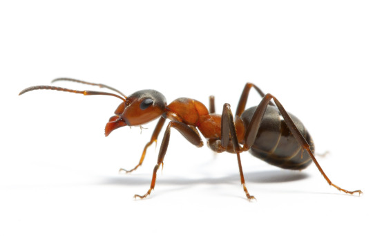
#need someone to teach me how to do good final lineart
Explore tagged Tumblr posts
Visit Tumblr Blog
Explore Tumblr blogs with no restrictions, modern design and the best experience.
Last Seen Tumblr Blogs


Fun Fact
Tumblr is used by 21% of adults online aged 18-29 years.
Text


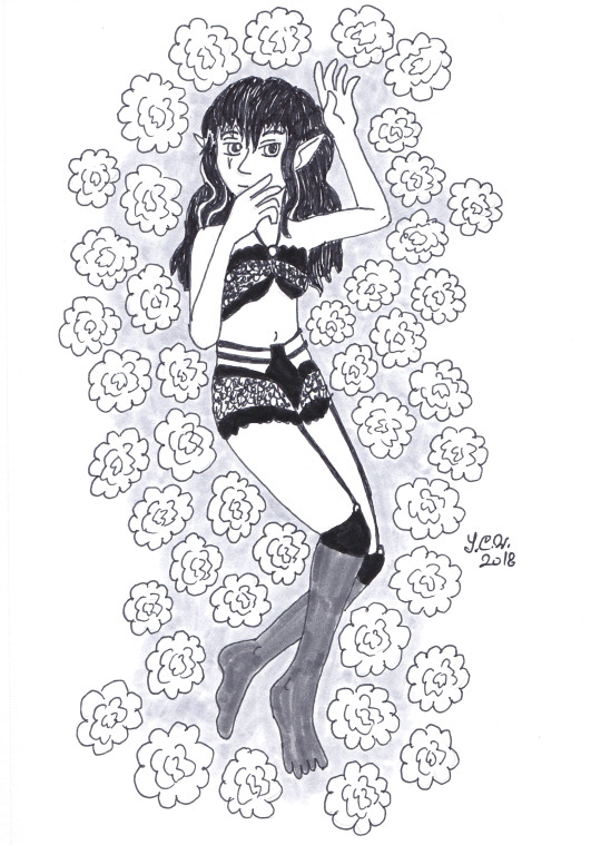
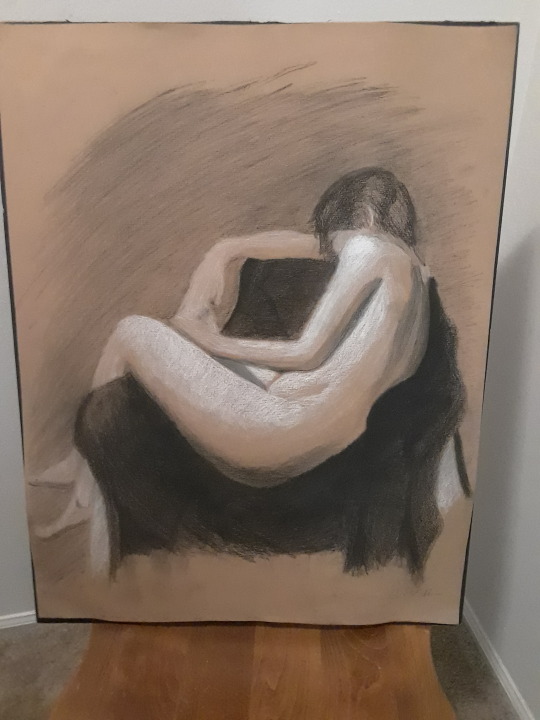
Aika Turnaround
#i don't want to be a magical girl#original character#need someone to teach me how to do good final lineart#mine always feels rushed (it is)#aika
6K notes
·
View notes
Note
What's your top 10 drawing tips?
Ohhh!!! Yes okay!!! This is gonna be long. Be prepared lol also keep in mind I'm a traditional artist so these may not work for digital artists!
1. Draw as often as you can. Don't over do it though because you'll burn yourself out and then it'll have the opposite effect and you'll not want to draw anymore. But the only way to get better is to put the time in which is hard because most of us want to be good immediately but it doesn't work that way! And trust me if you put the time in you'll one day look at your work and just go WHOA I IMPROVED HOLY SHIT like it'll slap you in the face and it will make you feel so good about the hard work you put in. Basically my first tip is is keep trying, take breaks, be persistent but don't over do it. never quit art though please! always make art. The world needs it!
2. Use reference pictures!!! Don't be afraid of reference pictures! All artists need reference pictures!! Even the most talented artists need reference and its actually pretty fundamental to learning how to draw. That's why art classes make you draw bowls of fruit! To teach you to draw from life! So find stock photos, take pics of friends and yourself and of objects, google image search and USE DAT REFERENCE!!
3. Try limiting your color pallet. Use a color pallet generator and make an artwork only using like 3, 4, or 5 colors. Limiting your color pallet helps you learn to think about the placement of colors and how to choose the right colors for an artwork. It helps you avoid the mistake that lots of people make where you use too many colors and your art looks like a tacky rainbow mismatchy mess!
4. Try doing ballpoint pen art!! Drawing without an eraser forces you to slow down. It forces you to think about the placement of each line so when you go back to pencil you feel much much much more confident and honestly it helps me sketch in pencil much faster and just makes me a more confident drawer overall. Like if I can make something look decent in ballpoint I'm like damn imagine what I can do with an eraser!!
5. It's okay to take tidbits of other people's style and work it into your art style. Don't outright copy someone but if a particular way they draw like say... eyes or something just really vibes with you then try drawing eyes like that! Everyone's art style is inspired by other art styles like my art style is partially inspired by ben 10 and I ain't about to deny it 😂
6. Try shading skin with lavender/purple. it looks fucking rad as hell try it do it like put the skin color down, shade with purple, then go over the purple again with the skin color. Try it and tell me how it goes
7. When doing lineart, if it fits your style, try outlining the silhouette of the character in a thicker line than the rest of the lineart.. it gives the lineart some cool line weight variation and makes the art look polished and more finished
8. Tracing art is okay and really helpful in learning how to draw! Just make sure that you either don't post it to social media or make sure you have explicit permission from the original artist to trace it and that you credit them
9. Try different mediums! Sometimes you think a medium is the one for you but sometimes you're wrong. Lol I thought I was going to be a digital artist for a long time but dude. Digital and I do not mix. I remember when I one day was like shit let's try these prisma colored pencils fuck it! This was after trying digital for like a year and when I worked with those pencils it was like the sun finally shown down on me and Angel's were singing and damn I haven't touched my tablet in like a year 😂 and that doesn't mean I couldn't get good at digital it just means you should work with the medium that makes you happy! I honestly hate digital now lmaooooo so ya! Try painting try pencils try markers hell try digital! Try it all!! Art is so fun omg I'm getting wild Haha
10. Don't let other people's art make you feel bad about yours. Like this one is hard because its difficult to not compare your art to other people's but I just know from experience that it's better to think "wow they're art is great I need to practice drawing like that style more" rather than like "wow their art is great I'll never be that good I should quit" because that artist was where you are once and the only reason they're at the level they are now is because they didn't quit!!! This is like my first tip lol I just get so heartbroken when people stop drawing. Art is so beautiful and everyone should make art always 💖💖
#art#art tips#artists on tumblr#ask#mars art#THANK YOU FOR TALKING TO ME ABOUT ART IT BRINGS ME SO MUCH JOY
150 notes
·
View notes
Text
Young Artists! It’s OKAY to use reference!
It’s okay to use reference! It’s okay to use reference! It’s okay to use reference!
Reference is NOT tracing! Reference is NOT cheating! Reference is NOT bad!
No seriously. Professional artists use reference all of the time.
So today, in one of the art groups I follow on FB, a young artist went about asking for critique on some anatomy with is normally nothing super special. However, this person stressed that they did not want to use reference and that they “relied on reference too much”. (Which isn’t actually a thing. I’ll explain why in a second.) Since I went to college for art, it was drilled into my head by my professors to always use reference when drawing. And these guys were the working in the field and teaching on the side type of guys.
When I was a much younger Starteller, I do remember having this notion myself. That “good” artists didn’t need reference and could just draw whatever. This SIGNIFICANTLY hurt my growth as an artist and was just a wrong opinion on the subject, period. But living in a small town with little access (and little want to) to proper art classes, and growing up during the era of dial-up and low-speed internet, I didn’t really seek things out. I dare say I was too proud too. And my artwork, especially when it comes to human anatomy, suffered. I think a lot of this mentality comes from pride or the pressures of peers and expectations to be “the artist” in your class.
Toss that aside. Professional artists use reference.
While I am no longer working as an artist professionally, I am going to share a few examples of my own, demonstrating what it means to use reference, both from life and from other sources. I’ll start with what I’m most known for: My Wings of Fire Chibi dragons.
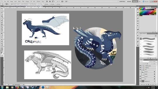
Above is my usual workspace that I set up, every time I make a new dragon.
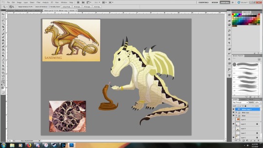
I ALWAYS have the Joy Ang general body plans for each dragon tribe in my file to look at for scale reference and some body reference since both I, and much of the WOF community care about some accuracy to these designs. I also will have color references if I have access to them, be they my own color choices, or someone else’s. As in the case with Blister, I pulled a diamondback image from online to pull colors and her pattern from. I think of this use of reference as transferring one style, to another.
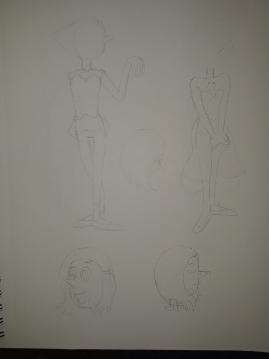
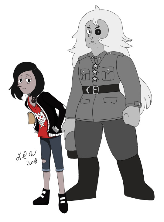
Sometimes, I’m trying to imitate a style exactly. An example like that is my Steven Universe OC. To be very close to the style of the show, I drew almost three pages worth of Pearl, to get her body shape right, as well as head shape. When working on my Black Pearl, I always have at least one of the Pearls (Yellow or Blue too) up in my file to make sure I’m recreating the style as accurately as possible. The same happened for Black Quartz.


References are not always styles or poses; they can be techniques, color palettes, or generalized lighting reference. And its not limited to just those!
I’ve recently found this wonderful little image that I have up a lot now when painting a bit more realistically, to help remind myself what colors to use to help make my shading have a bit more pop.

And I finally found this one too that will help me with painting the lighting on a human face.

Outside of my chibi dragons, (And yes, I do other stuff than dragons) I will use reference from life to help create.
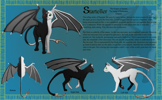
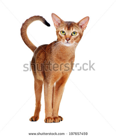
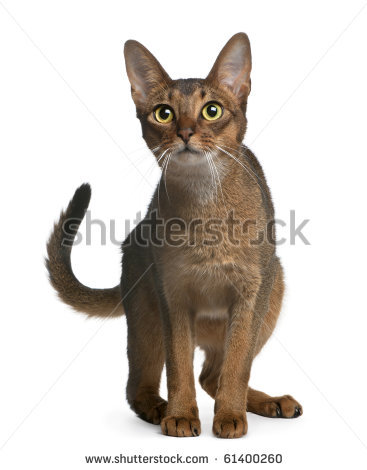
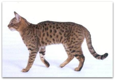
When doing my usual style, I use a photo reference I find online or capture myself to help me transfer the simpler shapes into the lineart. An example of this would be Starteller below (who I use reference to capture a cat’s body shape), and the SkyWing wing shape, which I lifted from a Peregrine Falcon.

However, I use reference much more closely when working on my “uncanny valley” style that I like to use for my monster designs.
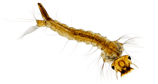
This here is a character of mine, the Entity of Fear. We’ll call him Fear for short. His references are: a caterpillar (Face and over-all body shape), an ant (legs) and a mosquito larvae (for the tail-end). I wanted him to look creepy, alien and parasitic so referencing creepy-crawlies to capture this effect.


When it comes to scenery you need both lighting and life reference. Below is the concept art I did for a college project called The Library. Using the chosen reference of our Director, I produced this library (which was used). I lifted some of the perspective from photos that I can’t locate at this time. (I did this project around 6-7 years ago)

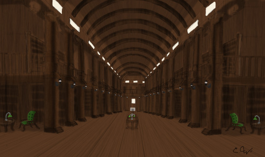

This is the one that sold the director! ^
The Trinity Library in Dublin was what I looked at and you can see the inspiration in the concepts.


But wait, you may be saying. “This isn’t the type of referencing I’M talking about! I’m talking about leaning on pose references!”
Yea, pro-artists do this too!
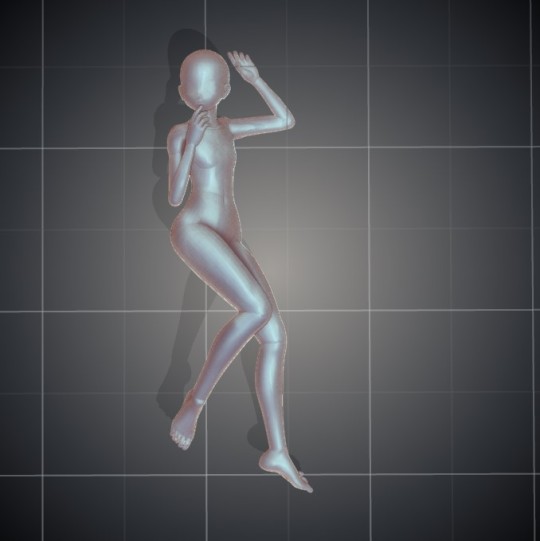
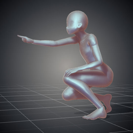
I, for example, use a couple of ways. One is that I use (when doing cartoon humans) DesignDoll to create custom poses that might be hard to find online. I leaned heavily on this method for last year’s Inktober.

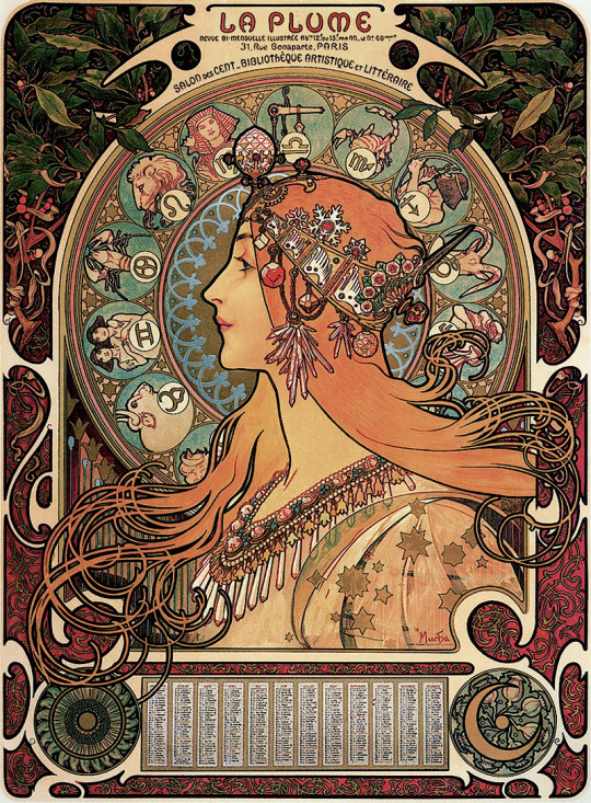
The other is looking at real-life reference, be that from photos or a live model. Below is an image of a painting I’ve put aside for a bit while developing my painting skills. The lineart however was referenced from a photo I found online, as well as a reference to Alphonse Mucha’s Art Deco Style. The other three are from a live model.
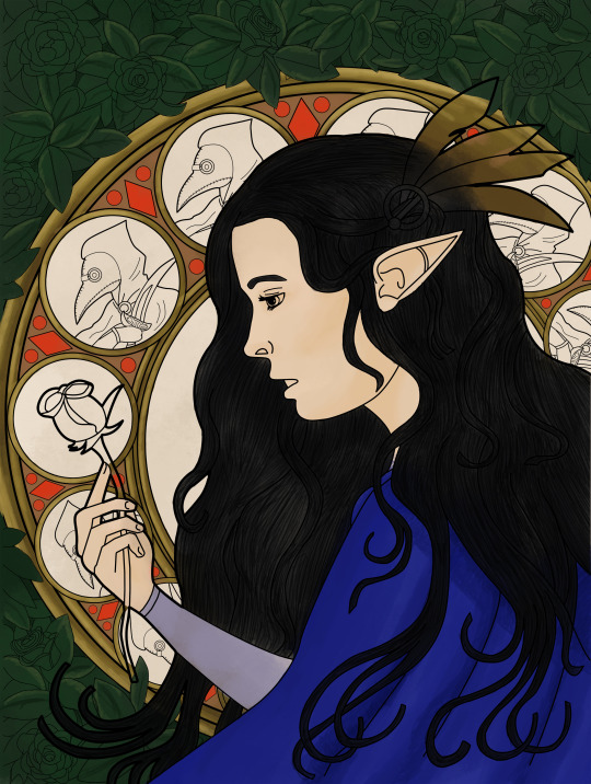


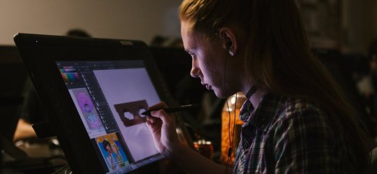
My workspace while producing the lineart ^


These three were done with a live model during college ^
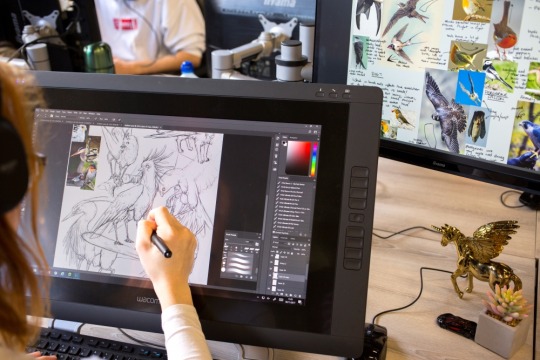
And if all my examples aren’t convincing enough, below are some images of student and pro work-spaces. Seriously. EVERY PRO ARTIST USES REFERENCE.
The idea that you can lean too heavily on reference is a myth. Using reference actually makes your art better in the long run as well as giving you a stable idea of what you want when creating. How closely you replicate that reference is up to the needs of the project. Obviously, if you were doing a portrait of someone from a photo or life, you would want it to be exactly the way it appears there. If you are creating something that isn’t real, your references will be used more loosely.
References are not restricted to poses, photos or life. They include color schemes, styles and techniques too!
When something isn’t being used as a reference:
-Copying another person’s artwork to a T, or so closely that it is obviously plagiarism. POSES FROM LIFE OR STOCK IMAGES DO NOT COUNT!
#reference#art reference#we all use it#and its a good thing#stream of distracted thought#starteller794
141 notes
·
View notes
Note
Oml please teach me your ways, how are you so good at linework?? I can never get my hand to get linework to look nice no matter what settings I use. How are you so good??
OMG
First ofall – thank you! I’m so flattered (and a little surprised because I alwayshave a feeling that I struggle with lineart way too much XD). I’ll try to answerthe best I can.
DISCLAIMER:Everything written below is based only on my personal, amateur experience +various tips and tutorial I’ve seen over the years. I don’t claim this is the“right” way to do lineart, it’s just how I do it and what I find helpful.
Please prepare for a long “Rainhowls tries to explain things” post under the cut.
Ok, let’sbegin.
Tools
I use Wacom Bamboo Pen CTL-470 and Krita software (which is GREAT and FREEand I recommend this program with all my heart).
Here is a legit graphical representation of what makes my lineart.
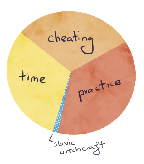
Nice and clear. And now let’s get into details.
1. Cheating
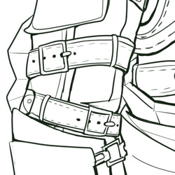
No, I don’tmean paying someone else to do your lineart and claiming it as your own. I meanusing the powers of digital painting for your advantage. So, let’s begin. As amodel, we’ll use Templar kun from the recent lineart I was making.
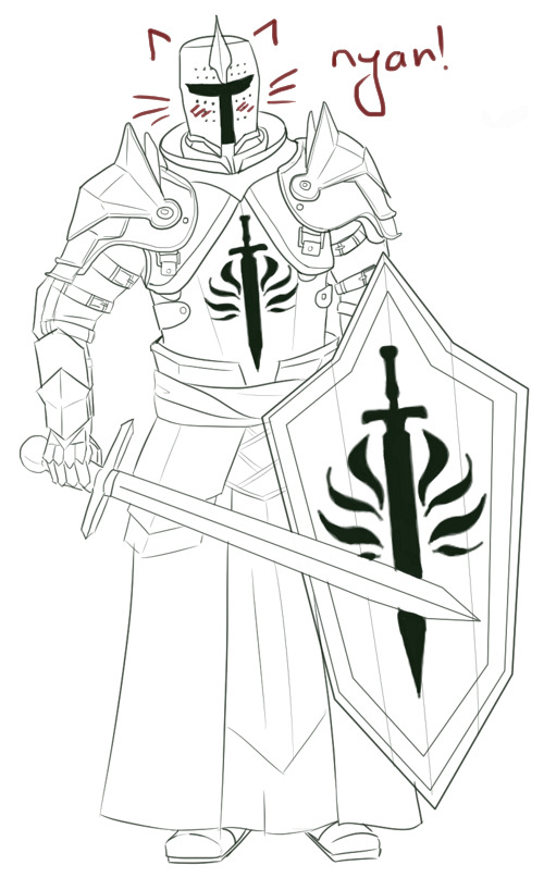
Use the simpleround brush with enabled pressure size but withoutpressure opacity. My two fav brushes for lineart are Ink brush 25 andInk-3G pen. The first one is better to imitate traditional brush and ink butthe second one is slightly easier to control.

Now, lookat the bottom left corner of the screen, where the tools options are – you’llsee the brush smoothing is set to Basic.
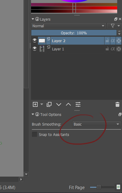
It is a default setting and it works alrightwith most of the short lines and small details (like Templar kun’s beltbuckles). Also good for eyes and other face features – IMO these little messylines make a face more interesting.
Let’schange the settings into Stabilizer.

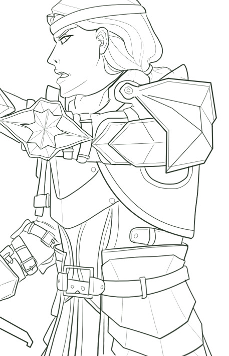
Stabilizeris great for lineart because it „forgives” the small, unwanted hand movements thatoften make lines messy. You have a lot more control over the line and thissetting is great to draw things like hair and fabric. Templar kun’s helmet androbes were made with Stabilizer.
Butsometimes even the Stabilizer isn’t enough – we want a geometrical shape. Forthat we want to choose Bezier Curve Tool.

Simply byclicking, you show where the edges are and voila! You can also make large, softcurves with that tool (although it’s tricky – I personally prefer Stabilizer).I used Bezier Curve to draw most lines in the pauldrons and the shield.
Important – don’t overuse this tool! If too many of yourlines look perfectly straight it can make your drawing look stiff andunnatural.
- Beforedrawing lineart make your sketch twice as big as you’ve planned in on the finalpicture. It will make small mistakes almost invisible. Templar kun is already abackground character, so let’s use Aveline here.
She looksquite ok.
But let’ssee her on 100% size and try not to cringe.
BUT! All thesesmall mistakes are here and I don’t have to care because human eye won’t catchit in a final drawing anyway! :D
- Play withline weight. Objects that are smooth, thin or far away will look good with thinlines, objects on the foreground can have bolder lines.
Templar kunis a background character so I didn’t bother with line weight. But KnightCaptain Cullen is much closer to the viewer and deserves a better treatment.That’s why I’ve tried to make his lines more interesting.

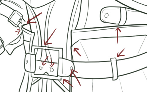
- Don’t work only onone layer when drawing more complicated elements of your lineart. I usuallydraw hair on a different layer than face and small details on different layerthan bigger shapes. It helps when you need to erase something – like parts ofthe face covered by hair – and don’t want to worry about your beautiful, smoothlines. When you are completely satisfied you can merge all the layers into one.
2. Practice
I know,everyone is sick of this advice but, well, it’s kinda true? Draw some lines,circles, get used to the pen pressure, experiment with different settings ofStabilizer to find the one that suits you best.
3. Time
Now, nomatter how good you are, clean lineart requires time and patience. You probablywant to make yourself a coffee and choose a 2 hour long song playlist inadvance.
- Don’tstart your lineart over a messy sketch. Sketching is fun because you usually usemany lines instead of one to convey a certain shape. In lineart, you have toconvey the same effect but with only one line. It’s often hard to find outwhich one would be the best and that’s why we often like our messy sketches alot more that inked final product.
So, let’slook at my first sketch of Templar kun.
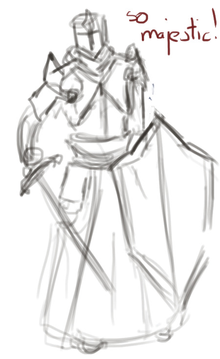
I have apose, I know where the arms are, I know he has a sword and a shield but when itcame to details I was like „meh, it’s just a sketch”.
If I wastrying to put a lineart on this, even with a ton of references under my nose, Iwould be confused as hell. So – I need to draw another sketch. This timewithout a „meh”
Here it is.
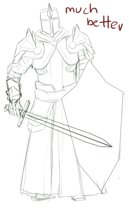
The majorshapes of the armour are here, the lines are quite clear. We still don’t havethings like fabric prints or belt buckles but these minor details can be easilyadded.
Sometimesyou need only two sketches. Sometimes three or more. It will take time to drawthem but in the end it makes your lineart look more deliberate.
- Ctrl+Z isyour friend. Really. You’re going to treat almost all your lines with thosekeys. Several times. At best.
Remember,lines should be drawn in single, quick movements. The tricks I’ve mentionedearlier are useful, especially in simple, large shapes, but they won’t domiracles. You have to keep drawing this one damn perfect line until you’resatisfied.
I’vesketched this little heart and tried to make a lineart in 2 smooth movements.
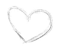
First try.

Ugh.
Second try.

Fuck.
Third try.

Ok I guess.
Basically,smashing Ctrl+Z like a madman also takes time.
4. Slavicwitchcraft
Put warmslippers on your feet, get a bowl of pierogi and play the Witcher 3 OST – themagic will fall on you.
And…that’s all, really. I hope it helps :)
37 notes
·
View notes