#not being able to move the brush size and opacity bars to the top of the screen is also so fucking annoying
Text

first ever procreate painting!!!
#my art#monstera#i hated procreate up until i finished this... it's not AS bad as i thought but i wish it were more intuitive#so many menus... and scrolling through 1 million brushes to find one is like hell on earth#the color picker and undo is wayyyy too slow too#i need that shit to pop up immediately in the middle of screen#the amount of times i color pick in 10 seconds is really high so the slow color picker just made me annoyed more than anything#also why would they not have a triangle color picker option...#what's wrong with you...#half the brushes feel like syrupy???? like they're slower than my pen and i can't use them to make scribbles it annoys the hell out of me#not being able to move the brush size and opacity bars to the top of the screen is also so fucking annoying#the amount of times my arm would mess with the size of the brush.......#ugh#what IS nice about the menus tho is because idk where everything is i just get to random choose a ton of brushes to use to get many effects#i liked that but i also like having 1 brush i use for sketching and not being able to find it in the sea of brushes#was NOT fun at all#and that was my review of procreate
4 notes
·
View notes
Text
Lost and Found: Making a Composite
23/03/21
Now that I have shot my two images, one location shot and one object shot in a DIY home studio, I can create a composite image in photoshop making sure to include a pen path. These are the steps I took after opening the files into photoshop and using the move tool to bring the object image on a new layer on top of the background location image and renamed these layers accordingly.
Pen Paths and Masks
With the Object layer selected, I selected the pen tool on the tool bar at the left side of the screen and made a pen path around the subject. As I made the pen path I placed anchor points slightly inside the edge of the subject to make the edges cleaner. I then saved the path after adding extra anchor points on areas that needed adjusting and then went to the ‘layer’ tab at the top of the screen applied a vector mask to the object layer with the pen path. By double clicking the thumbnail for the vector mask I could use the sliders to adjust the feathering on the edges and the density of the vector image.
I went to the ‘edit’ tab at the top of the screen and selected the ‘transofrm’ tool and then ‘scale’ so I could resize the object to the desired size for this composite. Then I duplicated the object layer and applied a normal layer mask and with the mask thumbnail selected, I used the brush tool set to the colour black to hide unwanted areas and switched the colour to white to reveal areas. I zoomed in using the magnifying glass tool located in the tool bar and resized the brush and the hardness using the sliders to make the mask more precise and cleaner.
I then added a new group in the layers tab at the right side of the screen and renamed this ‘castle’ and dragged the two object layers into this group.


Clone Stamps and Clouds
With the Castle layer still selected, I selected the clone stamp tool from the tool bar on the left-hand side of the screen and used this tool to remove any distracting features on the castle such as marks, dust or dents. I also used the dodge and burn tool to darken specular highlights that are distracting within the image.
I decided to add clouds into the composite to add depth, detail and emphasize the size of the Castle to create a more surreal image to fit the brief. Originally, I had added an image of clouds to used as a background that I had shot myself but this image didn’t fit with the composition of the other subject and I felt as though the subjects were not framed in the way I wanted them to be. So, I sourced two PNG cloud files on google and imported these into photoshop, I used the ‘transform’ and ‘scale’ tool to resize the clouds and duplicated the layer 4 times to place them in different areas within the image. I flipped some of the clouds so they didn’t appear repetitive and explored different blending modes and opacity percentages to see how these worked with the image. I initially applied a ‘lighten’ blending mode which made the clouds lighter but I then changed the blend mode back to normal and lowered the opacity slider to around 70% as this worked with the image. I also created a ‘clouds’ group in the layers tab and dragged the cloud layers into this group.

Adjustment Layers, Filters and Colour Matching
Some other additional adjustments that were made to this image were applying a curves adjustment layer by select the adjustment layer icon in the layers panel and selecting ‘curves’. I then moved points of the curve to change the intensity of the shadows and highlights. I also applied a colour look up adjustment layer and selected ‘3striplook’ as this warmed up the image and enhanced the saturation of the blue and yellow tones, then reduced the opacity of this level to 61% using the sliders. A filter that was applied to the image was a field blur. By selecting the ‘filter’ tab, then ‘blur gallery’ and ‘field blur’, I placed two circular points at the bottom of the image and another at the top of the tallest chimney. Then I changed the radius on these circles by clicking on them and dragging the slider which reduced the blurriness, or depth of field, between the two points. I applied this adjustment to bring more attention to the castle object in the background and add depth to the image. I also applied a Match Colour Adjustment layer, using the eyedropper tool to select a source image ang then used the drop down menu to change the image that would be colour matched. used the sliders for luminance and colour intensity to adjust these until I was happy with the result.


Feedback from Lecturers on areas to work on that were fixed
After I had made the majority of the adjustments to my composite image, I sent an email to my post-production lecturer and asked for some feedback on areas to work on, this is the feedback he provided.
Fix the verticals within the image so they line up, use the transform>distort tool. I spent some time trying to fix these but none of the adjustments worked as the edges of the castles are at a slant and I was unable to correct the perspective of the image without one area being the correct vertical which made another vertical look skewed. Eventually I was able to slightly improve these.
Fix the purple colour cast on the clouds. This colour cast turned out to be caused by the blending mode that I set on this layer, however I decided to remove this cloud layer and replace it with smaller groups of clouds.
Clone out the alarm at the from of the house in the foreground and make sure the layer masks are clean and there are no areas that have been missed. I used the clone stamp and the patch tool to remove the alarm on the front house and then used the brush tool set to black to remove any missed areas on the mask.

1 note
·
View note
Text
Behind the Wallpaper: san jose sharks + stealth jerseys
Requested by @philippsgrubauer
I’ve already done a post about how I do my wallpapers in general. Since the request was specific, I decided to do the tutorial on the Kevin Labanc wallpaper in my san jose sharks + stealth jerseys wallpapers collection.
1. Put Kevin (the object of the wallpaper) on the editing platform. Also, change the dimension of the editing platform. As you can see, I select it as an “Instagram Story,” since that holds the same dimension as a phone screen. Also “Snapchat Story,” the ratio 9:16, and 1080 (width) x1920 (height) pixels works for wallpapers.

2. Render Kevin! This can also be called “cut out,” “turn it into a transparent picture/PNG/vector.” The app I use, Bazaart, allows me to cut out anything with my finger. I like this because I find it to be more precise than using a mouse (like in Photoshop).
With my finger, I’m able to literally cut him out with the “scissors” feature, which is practically the same thing as using scissors. That is why Kevin here has a really bad jagged outline of the background around him. So that’s what I do first to cut down on the unnecessary background.
Then I go to the “eraser” tool to do precise “erasing.” Below Kevin being cut out using the eraser tool. For the settings, I use “hard” for the type of brush and “small” for the size of the brush.

3. Position Kevin! Of course, in this early step, this most likely will not be the object’s final position--things can change. But since I’m recreating the making of this wallpaper, this is Kevin’s final position.
I just simply moved him downward and shrunk his size.
During this stage, the rule of thirds is extremely important. Since Kevin is looking to the left, he is placed on the right so that there’s a lot of space to his left. If he is placed to the left, he would look extremely cramped and awkward.

4. Background! Bazaart offers an extensive variety of backgrounds! You can now even select your own color and adjust backgrounds!

5. Filter! It really depends on which tone I’m going for here. I want this to be aesthetic and serious and a subtle epic.
The filter “Fade” will give me just that.

6. Designs! Bazaart also has a new sticker pack of paint strokes! This helps because before, I had to go to Google Images to fetch some myself. So I just select a teal-colored one.

7. I then position and adjust the paint stroke behind Kevin. I made sure it doesn’t look out of place by filling in the blank space Kevin is facing toward.
Rule of thirds, folks.

8. Okay, things are gonna get tricky here, so stay with me.
I noticed in a bunch of hockey graphics--including professional ones--the visor is neglected. So it shows the background the player was originally from, making it stick out like a sore thumb.
I have found a solution for that so that it looks like the player is 100% in the background you place them in.
So first, you want to duplicate Kevin and align the duplicate (top layer) over the original (bottom layer). I lowered the opacity to help align the two layers.
To make sure the layers are perfectly aligned, move the opacity bar. If Kevin is shifting, that means he is not aligned. You want Kevin to stay still like a picture, even when you crazily move the bar.

9. I then take the top Kevin and erase the part of the visor that is NOT on his face. So practically, the part of the visor that is showing the background.

10. Then I select the bottom Kevin and go to “Blending.” This is where the magic happens: blends like “Screen” and “Overlay” blend the visor to the background, so it’s like the visor is actually a part of the “world” the wallpaper is displaying.
It depends on the background for which blending option is the best. The best thing to do here is to just play around with the blends and see which one is the best.
Also, I lower the saturation of the visor to 0% to make sure it’s super clear with no trace of the background.
This tactic also works for throat guards (glass “gobblers” some goalies wear), water, and any other glass or transparent objects).

11. I smack my watermark on the wallpaper (discreetly), then let it sit in my projects for a couple hours or even days. I do go back to it and make some corrections to better it. An artist is never finished with their work.

I hope that helps as to how I create my Sharks wallpapers. If you have any other questions, comments, concerns, or encouragement, do PM, comment, or ask me. If you even want a video, I can do that. Whatever is best for you guys to excel in graphic designing!
If you like this tutorial, check out my Carter Hart wallpaper tutorial!
Thank you for reading and have a wonderful day! :)
#bazaart#wallpaper#wallpapers#tutorial#edit#editing#san jose sharks#nhl#kevin labanc#behind the wallpaper#how to#how to do
6 notes
·
View notes
Text
Intensify For Mac

Intensify For Mac
Intensify Pro For Mac
Intensify Pro For Mac
Intensify For Apple Mac
Reveal the hidden beauty of your photos. Get instant results with dozens of pro presets. Or use powerful Structure, Sharpness, Detail and Pro contrast enhancements for.
Intensify Pro is for Mac photo enthusiasts who want their photos to stand out. Intensify Pro gives you powerful new ways to create dramatic results. Professionally created presets make it 'one.
Same functionality as on a mac? Canon 5D Mark II Canon 70-200mm f/2.8L IS USM Canon 35L Sigma 85 1.4 Helios 44M-6 58mm(M42) Zeiss 50mm 1.4 (C/Y) Canon 135L (2) 430EX II Photo Comments.
Intensify is the first product in a new line-up of softwares by McPhun targeted at professional photographers, and is available in two versions: Intensify sells for $19.99 and is only available on the Mac App Store; Intensify Pro, which adds the ability to run as a plug-in to popular host applications as well as several other features, has a.
Support OS: Mac OS X 10.8 or later The Verdict: 10/10 Do you want your images to look amazingly impressive? Intensify is here to help you. With thousands of professional photographers, Intensify makes your images vivid and eye-catching.
Updated on 5/20/2014 – Version 1.0.2
I had the opportunity to test a new software released today by MacPhun Software named Intensify Pro. According to MacPhun Software:
Intensify enables photographers of all skill levels to create powerful images using precision tools for enhancing detail. By offering superb control of contrast, structure, detail and sharpening across tonal ranges, Intensify is able to reveal otherwise hidden details and deliver the highest quality results no matter the style of image.
Intensify is the first product in a new line-up of softwares by McPhun targeted at professional photographers, and is available in two versions: Intensify sells for $19.99 and is only available on the Mac App Store; Intensify Pro, which adds the ability to run as a plug-in to popular host applications as well as several other features, has a suggested retail price of $59.99.
Intensify was named to Apple’s Mac App Store “Best of 2013” list and has ranked among the top 10 paid photography apps in the Mac App Store since its initial release in November 2013.
Even though MacPhun Software sells Intensify Pro as a detail enhancement software, what I find it is a complete package of image enhancement. In fact, Intensify Pro supports layers, smart brushes, RAW file format, and has tools that range from basic image tuning to various levels of contrast, detail and sharpness enhancements.
The Pro version of Intensify adds support to run as a plug-in to popular image editing software like Adobe Photoshop, Adobe Lightroom and Apple Aperture.
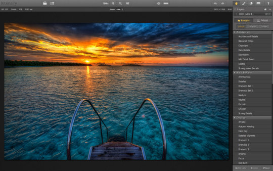
Intensify Pro in Action
When you open Intensify Pro, you are presented with a clean and well laid out interface. On the top there is a navigation bar with common zooming tools, a pup-up navigation window and before/after buttons. On the top right there are undo/redo buttons, and a set of four tools: the Hand Tool for moving your entire image within a window, the Draw Mode, the Erase Mask and the Gradient Tool.
Using the Draw Mode and the Erase Mask, you can craft masks using brushes. You can set brush size, opacity and softness, and you can clear and invert the mask. You can also toggle a show mask button that shows a red overlay of your mask over the image. The Gradient Tool allows you to create, well, gradients in your masks. This set of tools is very similar to Lightroom masking capabilities.
The masking capabilities are quite good, fast and reliable. This, paired with the layering capabilities of Intensify Pro, allows quite complex adjustments to images. What I miss here is a sort of feature like Lightroom’s auto mask or Perfect Photo Suite’s smart brush, and this could be a nice addition to a future release. Also, unlike Lightroom’s gradient tool, once you’ve positioned your gradient and applied it, you can’t move it anymore, but you can always reshape it using brushes.
On the right column of the interface there is the “core” of the software. On the top there is a layers panel where you can add and remove layers, set their opacity and toggle their visibility. Under the layers panel there are two buttons to switch from a presets view or an adjust view.
There is a good number of presets organised in folders. However there isn’t a preview of presets, but they’re applied instantly when you click on them. Also, under each preset there’s an opacity slider to tune their intensity. The default presets are quite over the top for my tastes, and they’re unusable at their default opacity, but they may be a good starting point. Obviously you can create your own presets and folders.
The Adjust view is where the “beast” is hidden. The depth of control over your image is amazing!
The first two panels are basic and common to a lot of softwares. You can fine tune colour temperature, exposure, overall contrast, highlights and shadows, vibrance and saturation. Quite identical to Lightroom’s Basic panel in the Develop module. There isn’t a colour picker to set the white balance though.
After this Basic Tune panel, there are the three core panels of Intensity Pro: Pro Contrast, Structure and Details.
Pro Contrast
In Pro Contrast you can adjust the contrast separately according to tonal ranges. You can set the contrast for highlights, midtones and shadows. Also, under each slider there’s an offset slider to adjust the median value for the contrast tonal range.
Intensify For Mac
It is intimidating at first and it takes a while to understand that offset slider, but after a little trial and error, the power of this contrast controls allows you to set the contrast precisely in a way no other tool allows you to do. Even the Pro Contrast filter in Google’s Nik Color Efex Pro isn’t as deep as Intensify Pro!
Structure and Details
Structure allows you to enhance low contrast areas of the image, helping reveal texture and details. You can control two levels of it: global and micro to target small or really small elements of the image.
You can control it separately for highlights, midtones and shadows (if you’ve used Google Silfer Efex Pro you know what that means). A softness slider allows you to set how soft or crisp this details should be, deciding how artistic or realistic the image is.
Details allows you to make the image crispier. You can act globally, on highlights or shadows on small, medium and large details. I find the effect of Details is quite strong, and it’s easy to overdo it. To obtain a natural effect I use it sparingly. However, the amount of control you have here is intimidating (in a good way!).
The Adjust view also contains a Micro Sharpness panel that allows to sharpen the image, and a Vignette panel to fine tune a vignette effect on the image. I don’t think I will ever use them in my own workflow, but they can be useful in some cases.
What’s new in the 1.0.2 release
The new Intensify release adds additional RAW file support for more cameras, more fully integrates features from Apple’s latest Macintosh OS (Mavericks), introduces the MacPhun Print Lab (powered by MILK Books) and adds the ability to export images to SmugMug, increasing the software’s sharing capabilities.
This is a small update. The big improvements are in the sharing capabilities with SmugMug and the MacPhun Print Lab, which I don’t think are really useful to the professional photographer. Being Intensify Pro an addition in the workflow (not a substitute for Lightroom or Aperture), I think they should focus in improving the editing capabilities rather than integrate it with SmugMug and such. This is a free update, so it’s ok. We’ll wait for the version 2.0 for something exciting.
Beware of colour spaces
MacPhun has solved the color spaces issue I pointed out on the initial release, and now it works correctly with ProPhotoRGB!
Before concluding, I want to write about a strange behaviour in handling colour spaces that looks like a bug.If you work in ProPhotoRGB in Photoshop, you can open correctly the image in Intensify Pro, but when you send it back to Photoshop, it somehow fails to save it with the correct profile, and you have to convert it manually.
This tells me Intensify Pro doesn’t work in the original colour space of the image, and I don’t like it!This happens only with ProPhotoRGB. I tested it with AdobeRGB images and it worked well.I hope MacPhun will fix this soon, because if they want to target professional photographers, they should know they much prefer to work in ProPhotoRGB for masters (a bigger colour space), and convert in sRGB only when exporting image copies for the web.
Conclusion
Intensify Pro is a great piece of software. Even though it doesn’t have groundbreaking technologies built in, in fact all the functions are already seen here and there in other plug-ins, Intensity Pro allows an unprecedented depth of control over contrast and detail in a single package.
It’s incredible, and quite intimidating, how deep the controls in Pro Contrast, Structure and Details go. Add to this the snappy performances and stability of the software, and you know that MacPhun has done a great job for its first professional package.
Here is a sample before/after of a recent image of mine, on which I tested
You can buy Intensify Pro here with a 10% discount using the coupon “DAVIDE2014”.
About MacPhun Software
MacPhun Software is a California based Mac app developer focusing on consumer photography and professional digital imaging markets, serving over 22 million customers worldwide.
Intensify Pro For Mac
First established in 2008 with a mission to create innovative photography software, Macphun’s products such as ColorStrokes, Snapheal, Focus 2, Intensify and Fx Photo Studio are consistently ranked among the top 15 in the paid photography category on the Mac App Stores around the world. The company has recently launched another new app–Lost Photos–a unique free app that enables anyone to re-discover forgotten photos in their email, save them to a folder on Mac or share via social networks.
Intensify Pro For Mac
If you enjoyed this article, consider to share it with your community. Also, consider to subscribe to this blog!
Intensify For Apple Mac
Disclaimer: if you purchase the software using one of the links in this article, I might earn a commission. Rest assured that my review is honest, and that it express my real opinion of the product.
0 notes
Text
As. 3: Infographic

Date: 17 March 2021, Week 8
Brief: Identify some dataset(s) to work with. Apply necessary techniques to communicate complex information quickly and clearly through visual representation.
Introduction:
I've always been fascinated by charts, figures and data visualisation. Bar graphs, pie charts, donut charts... And eureka! I had a sudden stroke of inspiration - why not create an infographic with a donut chart on donuts?
(Initially, I also considered bar graphs about chocolate bars or pie charts about pies, but decided to go with donuts as I thought it would have the most variation in flavours, colours and toppings for visual variation and interest.)
Data set:
I researched various statistics about donut flavours and used Ranker's list of donuts, which contained a list of the number of upvotes/downvotes for each donut flavour.

I then compiled the data onto a spreadsheet, and calculated the overall score (by deducting downvotes from upvotes) for each flavour. Subsequently, I calculated the percentage to find out the proportion of votes each donut flavour garnered, and sorted them from highest to lowest.
Developmental process:
I explored various compositions and styles for the infographic poster, first with each donut's size being in proportion to its percentage of votes. In my sketch, I had originally laid the donuts out in two structured rows, but I played around with different arrangements, such as by placing them in different positions or placing them in a box to resemble a box of donuts.


Finally, I decided that it would be the best if I represented it with just one large donut in the centre of the poster. Although it may seem a little simple, but I think by having just one donut, viewers would be able to focus on it without having their eyes moving all over the place. After all, simplicity beats complexity, especially when distilling a complex set of data in an infographic. Furthermore, it would also be a clever concept to represent the donut data using a donut chart.

I first created a base of the donut chart, then split it into different segments for each flavour.

I used a variety of tools and techniques to illustrate each donut flavour. For example, for the powdered donut, I used splatter brushes to create the powdered sugar effect. For the double chocolate donut, I used the Curvature Pen Tool to draw the frosting. and for the Chocolate Sprinkles donut, I used the Rounded Rectangle tool to draw little rainbow sprinkles all over the donut. For the base of the donut, I added texture and depth by using multiple layers on Soft Light and different opacity, such as to create shadows or glossy highlights.

Using layer masks, I masked out the rest of the donut, leaving only the specific segment visible.

I added the title, text and a border in a frosted, pastel pink shade, as it reminded me of candy and fit the theme of donuts.

Comments raised during the critique:
During the critique, Aaron said that it was an "interesting idea about donut flavours because the thing is presented as a donut...I think it's quite clever." However, he also pointed out that "the shape looks a bit like a lifebuoy, rather than a donut" and a classmate, Jing Quan said, "Maybe the hole in the middle could be smaller to look more like a donut."
Aaron also said, “After looking at the pink colour for a while, it's a bit straining on the eye. Same for the border as well.”
How the work has improved post-critique:
Based on the feedback from Aaron and my classmates, I decided to tweak the shape of the donut by making the hole smaller, so it would look more like a donut. I also removed the border, and changed the font and line colours to a dark chocolate brown similar to the chocolate donut so that it would be dark enough to be legible, less bright and straining on the eyes, and also cohesive with the overall colour scheme and theme.
Reflection & Learning Points:
Even though the idea of infographics and data analysis may seem complex or intimidating at first, I found that I had a lot of fun creating this infographic.
This assignment taught me that being a good designer isn't just merely about visuals and graphics, but also being able to research, analyse and synthesise data.
In the 21st century, it is critical that we are able to comprehend big data, and carry out data analytics and data visualisation. Even though the data set I used for this assignment wasn't huge or complex, the skills I learned (such as compiling data into a spreadsheet, doing statistical analysis and designing a chart to present data in a simple yet compelling way) are lessons that will inspire me to learn and explore more about data visualisation even after completing this assignment and class.
0 notes
Text
Creating Neon Sign Typography
Now that I have researched into the artist, Kate Bush, I will be moving onto creating my own piece. For this work, I’m hoping to create some artwork using typography where I will try to make it look as realistic as possible. To do this, I will be using Photoshop.
To start, I went to the ‘horizontal type mask’ which you can find under the type section of the left side of the page. The next step is to click anywhere on the page, to which this will change the colour of the background to pink as this means it has actually worked. After this, I went to Dafont to find a suitable font. I wanted a font that reflected my theme so this type would connect even more. I feel that the overall look I will create from task wont properly match with my ideas. However, I tried to get around this problem as much as possible by using this rough sort of type. To me this reminds me of scars that are from the bark of the wood or on the ornangutans effected. This is because it looks like slashes from a weapon. Carrying on the process, the next thing I did was to type out a word, to which I chose ‘SAVE US’. My thinking behind this is that it relates to the orangutans. I also feel that this phrase feels quite personal. Once I have wrote this out, I increased the size of the text so that it was larger when presented on the page. Now to get my text as an outline like below, I simply just went to the ‘move tool’ which is the on the left panel.
Here, I have then added a new layer and gone to ‘edit’ and ‘stroke’. Doing this brings up a new tab where you can now change the ‘width’. I chose to put it at 40px but this depends on the type of font and size you chose for your type to be. As you can see, I have also changed the colour to this green. I chose for it to be this colour as it reminds me of the concept of nature. Additionally, you need to make sure the ‘location’ is set to ‘inside’. Once you have done this, you can click ‘ok’. Doing this will show some outlines of the of this type now.

After this, I then went onto google chrome to find a suitable backdrop to add to this type. Before, I had even started this task, I knew I wanted to have some sort of old wooden background. There are two reasons for this, one being that wood relates to the idea that this material is getting cut down for palm oil plantations. The other is that Kate Hush used this kind of thing in one of the pieces I analysed. So overall, I thought this was the best option. As well as this, I did think of having an old barn where I could show it at night with the sign lighting certain areas up, revealing this. Although, when I tried searching up for this, all the walls of the barns were flat enough to look realistic.
When I was searching for an image on google, I had to change a certain setting so that it was a high quality image. To do this, I went to ‘settings’, ‘advanced settings’ and on ‘image size; I changed it to ‘larger than 1024x768′. This way all the images I won’t be looking pixilated once placed onto Photoshop where I will resize it.
Next, I would copy and paste this image into Photoshop where I will resize it enough to that the two sides are covering that certain part of the page. I then moved this to the top of the page where I would duplicate the layer by doing ‘CMD J’. After this, I did ‘CMD T’ to transform it so I could drag it down. By doing this, it will hopefully line up better so there is no obvious line. Although, I found mine still didn’t properly line up so I had to slightly move the position so that it wasn’t so noticeable able.

I have now double-clicked on the layer to which the type is on. This brings up the layer style tab, where I first went to ‘colour overlay’. I started by changing the colour to this slightly lighter green. Once I had done this, I went through all the ‘blend modes’. I think I ended up choosing ‘multiply’. Then I went to ‘outer glow’ where I have chose this dark green colour. Although this sign needs to be bright, I felt that have another shade of green would help to make the overall piece to seem more interesting. After this, I then just experimented with all the options to see what each one does. I ended up increasing the ‘spread’, ‘size’ and ‘range’.
After this, I went to the ‘drop shadow’ setting, where I could another shade of green along with lots of other options. This includes, the ‘blend mode’, ‘opacity’, ‘distance’, ‘spread’ and ‘size’. This setting being called ‘outer glow’ means that it will slightly add another colour to the outside of the letters.

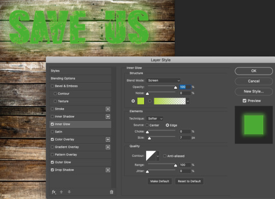
Once I have done that, I will then went to ‘inner glow, to which I think this was the most effective setting. The reason for this is because it really finished the piece off. I also think the shade I chose was very effective too. As you can see below, I decided on this very light green/yellow. In this screenshot, it is showing this very clearly. Again, I have thought about the settings and what effect it has on the overall design. This time, I chose to not add too much and just change the ‘blend mode’.
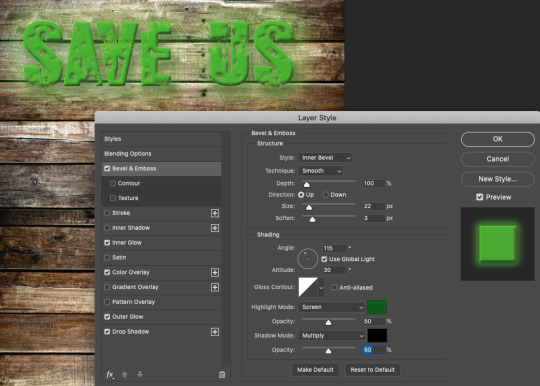
This screenshot beneath is presenting where the last step I have done is to use the ‘bevel and emboss’ setting. Using this option also had a massive effect on my end result as this gave a 3 dimensional look as this created the shadow. I also got to change the direction which the lighting was coming from too. As my type has some detail already from the font I thought this looked really appealing as it has enhanced this a lot more. As a result from doing this, it has added in some highlights but also shadow too.
Here, I have then changed the lighting of the background, but to do this I had to merge two layers together. These two layers are the type and background which I did by holding down ‘shift’ and clicking these two layers. Doing this means you can select more than one layer at a time. After this, I did ‘CMD E’ as this actually merges them. The next step would then to be click your background layers and go to the circular icon that is located at the bottom right hand side. It should be half filled white white and other as white. Click on this and then select ‘levels’. Below is showing the tab that will come up. I then just played around with the bar, to which it will change the lighting of the background.

Next, to get this glowing effect where the backdrop has been lit up around the sign. I used the ‘brush tool’ to which I chose a brush with the ‘hardness’ setting set to low as possible. this mean that I wont be adding a hard line. When picking the colours, I would either choose black or white. The black erases and the white reveals. So the black creates this lit up effect.
Another this, I have then added this metal texture to the type. The way is which I have done this is I have found a high quality image of a metal surface on google chrome. You will then need to copy and paste this image, to which you can add a ‘layer mask’ to the ‘type layer’. I feel this creates a massive effect on the overall text as it now has some more interesting element in each letter. As well as this, the green this is highlighted around the edges too, achieves this really striking effect on the viewers.

As a result, I think that this type loos really striking. Although, one mistake I made was the composition of where I have placed this type on the page. At the start of this task, I wasn't properly thinking about as I was more worried about what I was actually doing. However, I have just had an idea to add another element into the design which I thought could be a an orangutan. This way the type will be relating to the image below.
0 notes
Text
Photoshop Tools And What They Do
Photoshop is a very in-depth application. Photoshop was designed for the use of photo editing, image creation, and graphic design. The software provides many image editing features for pixel-based images as well as vector graphics. It appeals to photographers, graphic designers, video game artists, advertising, and meme designers.

Photoshop has many useful keyboard shortcuts, but if you’re anything like me, you tend to forget those shortcuts! There are so many shortcuts to remember that I find myself keeping a cheat sheet to remind myself of what does what!
For example, instead of right-clicking on the tool, you can press “W” and then “Shift-W” to toggle between the two tools.
If you’re completely new to Photoshop, whether it be your first time or simply new computer, opening up the application and selecting a tool brings up a video of how that tool works. It’s a rather nice way to show you how to use the tool instead of wondering what it does and getting yourself worked up.
Customisation
When in Photoshop, while in the Edit menu, you can select the “tools” option. Once clicked, the Customize Toolbar window displays and it allows you to customize the toolbar to however you like it. You can:
Group tools together
Hide little-used tools
Display a tool on the Photoshop Toolbar instead of it being nested
Change the keyboard shortcut for a tool
Save the customized Photoshop Toolbar to an option to use at another time
The Photoshop Toolbar is able to be moved around and displayed as a single row or a double row by selecting the two arrows at the top of it, it all comes down to how you want your workspace to look. You can also click and drag the top bar and drag the Photoshop Toolbar wherever you wish on the canvas.

Neural Filters
A Neural Filter is a smart and manipulative tool that is able to make changes to a person’s facial expression, age, hair thickness, head direction, or any other chosen area. To access it, simply click “Filter” from the menu bar, then click “Neural Filters”.

Neural Filters are put into 3 different categories:
Category 1: This category features Neural Filters, these filters are highly functional and can surprise the users with the outcome with standards.
Category 2: Beta Neural Filters. The Beta Filters option includes dramatic and impressive features. It combines features of popular apps and changes facial expressions, editing emotions, and more. It gives the user the ability to alter background, looking direction, hair thickness, smile, age, and more.
Category 3: This category provides the user with options to add little changes into a person’s skin, hair, details and more. The options involve:
Skin Smoothing
Style Transfer
Smart Portrait
Makeup Transfer
Depth-Aware Haze
Colorize
Super Zoom
JPEG Artefacts
Photo Restoration
Noise Reduction
Dust and Scratches
Face Clean up
Photo to Sketch
Sketch to Portrait
Pencil Artwork
Face to Caricature
Select & Mask enhancements
The Select and Mask tool in Photoshop helps to make the selection and masking process a lot easier and quicker than before. To use it, click the Lasso Tool, Magic Wand, or Quick Selection Tool from the options bar. Once you have that selected, look to the top bar and the Select and Mask button will show up.

Most useful tools in Photoshop
Move Tool – To move a part of any image.
Marquee Tools – To give any particular shape of an image.
Lasso Tools – To make any selection on an image.
Quick Selection Tool/Magic Wand Tool – To make a quick selection.
Crop Tool – To crop any part of an image.
Eyedropper Tool – To sample a colour from any image.
Spot Healing Brush/Healing Brush/Patch Tool/Content-Aware Move Tool/Red Eye Tool – To fill or remove in any area in an image.
Brush Tool – To retouch the image.
Clone Stamp Tool/Pattern Stamp Tool – To clone of copy image information.
History Brush Tool – To undo any tool used earlier.
Eraser Tool/Background Eraser Tool/Magic Eraser Tool – To remove any section of an image.
Blur Tool/Smudge Tool/Sharpen Tool – To blend color in various ranges.
Dodge Tool – To highlight in different tone on any image.
Text Tool – To write text anyway.
Pen Tool – To draw paths around objects.
Shape Tools – To give various shapes.
Hand Tool – To move any area of an image.
Zoom Tool – To zoom in and zoom out.
Move Tool
The Move Tool simply gives you the ability to move part of a layered image to a new location. The very first thing that you need to know about the Move Tool that it will only work if there is something that can be moved in your image. If the image has more than one layer and is locked, the tool can’t do anything to move the image as you need two layers to use the Move Tool. If a layer is unlocked, then you can use the move tool.
Marquee Tools
There are several marquee tools that allow you to select areas in an image. With the any of the selection tools selected, holding shift will add to your selection, and holding option/alt will subtract from the selection. One such selection tool includes:
I. The Rectangular Marquee Tool: it makes a rectangular selection on your Photoshop image.
The Elliptical Marquee Tool: it allows for you to make a round selection.
The Single Row Marquee Tool: this tool makes a 1px horizontal selection that spans the total width of your image.
The Single Column Marquee Tool: It makes a 1px vertical selection that spans the total height of your image.
Lasso Tools
In photoshop, there are several lasso tools that also allow you to make selections, including:
Lasso Tool: this tool makes loose selections around anything on a layer, just like a lasso. It operates the same way as the marquee tools.
Polygonal Lasso Tool: the Polygonal Lasso Tool let you make selections, but only in a particular way, meaning you can only draw straight lines for your selections.
Magnetic Lasso Tool: the Magnetic Lasso Tool lets you drag your mouse over the edges of an image, while doing that, the tool determines where the edges are, and anchor points are placed often to show where these edges are located. The tool offers a rather close and controlled selection.
Quick Selection Tool/Magic Wand Tool
These two tools are very popular in being used, mostly because they are the simplest to use and help to make quick selections in slightly different ways.
Quick Selection Tool: the Quick Selection Tool will makes a selection based on the edges of an object. Like the title says, it selects quickly and you can drag over the areas that you want to select.
Magic Wand Tool: the Magic Wand Tool allows for a selection based on where you click your mouse. As with other selection tools, you can hold Shift to add to the selection and hold Option/Alt to take away from your selection.
Crop Tool
Crop Tool: this tool lets you crop an image to the size that you want.
Eyedropper Tool: the Eyedropper Tool lets you sample a colour from any image so that you can use it in your work. You are in control the entire time and can select the colour area that it samples.
Spot Healing Brush Tool
This tool is a great way to remove blemishes from images. It works with a simple click of the mouse by sampling the surrounding areas and blending the blemish away.
Healing Brush Tool
This tool lets you brush out blemishes and areas that aren’t desired in your images. Unlike the Spot Healing Brush, the Healing brush requires you to select a reference point before it can begin working.
Patch Tool
The Patch Tool is a tool that allows the user to make a selection that is similar to the Lasso Tool. Once selected, you can click and drag it to the area to fill it with and when you release it, it patches that area with the selected content.
Content-Aware Move Tool
The Content-Aware Move Tool is a tool that intelligently tries to fill in any moved content with what it perceives to be there. Example: a rowboat on a beach can be moved, and Photoshop will try to fill in the sand that would be left behind the boat, the aim is to try and replace what has been removed.
Red Eye Tool
The Red Eye Tool is a quick way to click on portions of an image that have red-eye and remove them instantly.
Brush Tool
The Brush Tool is one of the most used and important tools within Photoshop. You will use this tool more than any other tool in Photoshop, especially if retouching is required. You can change the size of the brush, how hard it is, its shape, texture, opacity, flow, and more.
Clone Stamp Tool
The Clone Stamp Tool is used in order to clone or copy parts of an image from one area to another. You can hold the Option/Alt key and click an area of an image. Then, click the image to brush with the colour and image information that you sampled.
Pattern Stamp Tool
The Pattern Stamp Tool works similarly to the clone stamp tool, it allows you to use use a brush-type tool to paint a pattern or texture on your image.
History Brush Tool
This tool allows you to paint with an image snapshot in a different layer. This lets you bring in details from a previous point in your work, it is an undo feature.
Eraser Tool
This tool will remove pixel information from your image just like a real eraser. It is best to duplicate an image before using an eraser as it will remove pixels from the image itself and damage it.
Background Eraser Tool
The Background Eraser Tool is a tool used for removing the background from an image.
Blur Tool
This tool allows you to blur parts of an image, which can help with harsh contrasts between images. Like the Sharpen Tool, it behaves just like a brush and gives you accurate results.
Sharpen Tool
The Sharpen Tool gives the ability to sharpen areas of an image by painting on them., it gives to you a lot of control and accuracy when sharpening images.
Dodge Tool
The Dodge Tool paints in highlights in the different tone ranges of your images.
Burn Tool
This tool is used in pairing to the Dodge Tool, while the Dodge tool allows for you to paint in highlights, this tool lets you paint de-highlights in the different tone ranges of your images.
0 notes
Last Seen Blogs

elev7n
good girls go bad
sorella-di-icaro
SOLA NEL CAOS

remodelproj
Re:model

jmon2edd
Untitled

toadhacker
conflictedfox