#or even a 'this would realistically be more practical' redesign
Text
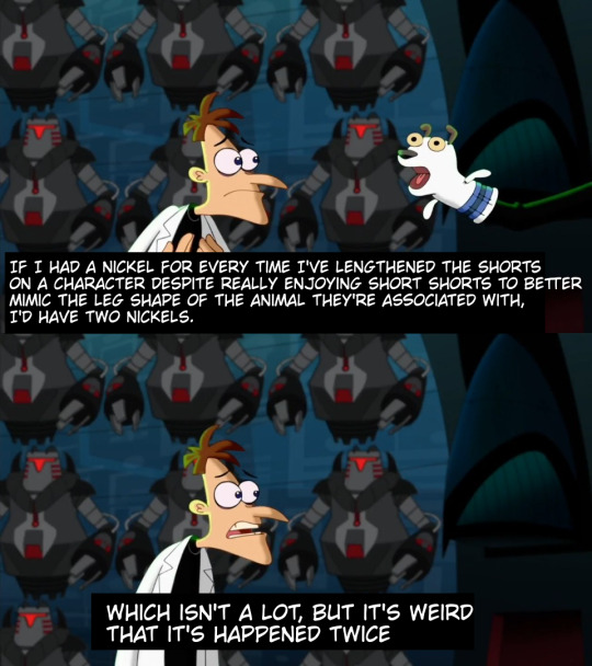
one piece strawhats post-ts redesigns part?? idk technically like 1.5? we’re going backwards hell yeah!!
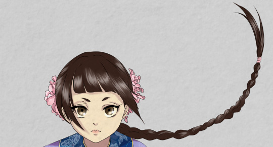
part 1.5: roronoa zoro (finally!)


i was originally really inspired by @deadbutnostink ‘s zoro fanarts! i love their style and trans goth zoro is the best thing ever!
this was the first planning sheet i ever made so it’s really plain without much elaboration sorry, so i’ll do that here:
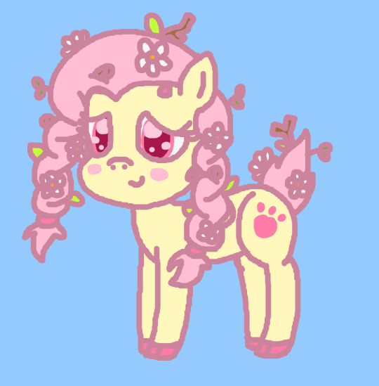
gothic, traditional japanese clothes, samurai armor, and pirate attire is kinda all built with lots of layers, but zoro will literally throw off his coat all the time just to fight shirtless, so i think he’s the kind of person that prefers light clothing. so i tried to use as little layers of clothes as possible. but now that i’m looking at the finished drawing, i think oda also intended that to show off his chest scar as much as possible, which is much more difficult to see in my design.
i feel like i’m getting off topic lol. so the mihawk influences and darker moody color palette is supposed to evoke the gothic gloominess of kuraigana and its inhabitants! zoro’s waistcoat has a brocade and standing collar like mihawk’s coat does, but with a thistle and wisteria pattern. In an sbs interview with robin’s japanese va, she was asked her what flowers she associates with each strawhat, and she assigned thistles for zoro. in a later sbs, oda was asked the same question for the supernovas, and assigned wisteria for him. i thought it was a cute detail lol. there’s also swirls in the brocade like on perona’s pre-ts shirt and an arrow-ish design on the sash like her post-ts dress


i wanted to add more overt perona references, but she’s very hyperfeminine in contrast to zoro, so i’d just imagine she painted his nails (but only on the condition that he at least learn how to do so himself)! his waistcoat is supposed to basically hit 3 birds with one stone (hehe threes): gothic, piratey, and traditional japanese style. cause gothic clothes in many subcultures are based off the more lavish clothes worn by nobility in time periods like the victorian era and other european eras before/around that, but stereotypical pirates tend to wear many of the same pieces, like frilly shirts, waistcoats, and coats with pauldrons, but of varying quality due to lower class and criminal status. the general silhouette of the sleeveless waistcoat, much like how the original green coat is like a kimono, is supposed to be reminiscent of a full length sleeveless haori.
zoro was originally supposed to wear haidate, japanese armor pieces worn over the thighs, so that with his haori and hakama pants his look would be reminiscent of samurai, but i ended not liking the extra bulk it added to his look. i considered giving him tabi boots instead of combat boots, but i think the combat boots add to the alternative vibe i’m going for. the gray garment worn under the waistcoat isn’t really a kimono, cause it’s cropped at the hips and with rectangularly constructed sleeves so that they can be rolled up, so i think it’s closer to a jinbei/samue. samue are also commonly worn by zen buddhist monks, like the mala beads that zoro also wears (inspired by @/jojodreamie on twt’s future strawhats au zoro design). apparently the people in shimotsuki village, his hometown, are shown to be buddhists. so even tho zoro is pretty much atheist, or at least agnostic, i think he just keeps beads and stuff as more of a cultural practice than a spiritual one.
i tried really hard to give him a more different realistic body type that suits his training/fighting styles, instead of just that really dehydrated jacked look. idk anything abt anatomy or muscle building or sword fighting, so this is all speculative (and i’ll still say stuff with complete confidence :D). zoro’s strength as a swordsman mainly seems to be focused in his upper body: shoulders/upper back and arms (maybe chest idk???). but with the way he fights with big sweeping swings he needs good strength in his thighs and core for stability. this reminds me more of discus athletes. the way he trains though, is weightlifting, which focuses much on those same muscle groups, but in a different manner focusing more on the back, core, and thighs to build bulk and endurance. so i kinda combined the two?? idk if i did it too well even with my references (i’m afraid of looking at pictures of shirtless dudes lol /hj)

i also gave him an unnecessary amount of scars, but knowing how reckless he is in battle i’d imagine he has a lot of scars around his hands and arms. and it looks cool. his skin tone is closer to his pre-sabaody color palette in the anime, but with the bright green hair of the post-sabaody anime, and the darker olive green roots like opla mackenyu zoro. idk why i gave him those arrow shaped eyebrows, ik i saw some fanart on twitter that inspired it, but i don’t remember it. his nose is also wider and supposed to be a kind of round bulbous shape that’s flat at the front, so a bigger nose shape like koushirou’s “roman” shaped nose.


and now some closeups!! i really like how he looks without the haori too!! but without the big green coat it’s not really reminiscent of the original look so i can’t keep it that way :/
i hope y’all like it! as the poll results show, i’ll be doing usopp next! or maybe i wont and go entirely based on my whims lol
#one piece#one piece redesign#op fanart#one piece fanart#roronoa zoro#zoro roronoa#zoro op#op zoro#character design#character redesign#one piece strawhats#straw hat pirates#straw hat zoro#straw hat crew#artist on tumblr#artists on tumblr#fanart#digital art#sproouts.jpeg
53 notes
·
View notes
Text
Mane 6 redesigns - mlpfim fanart
I made these a good while ago and thought hard about them but no-one cared at the time coz it wasn't a trend but now it is for some reason so I guess I'm gonna try reposting lol -v-'
get ready coz there is a long description of my inspirations and more details about these redesigns coming below. get ready for crazy amount of text
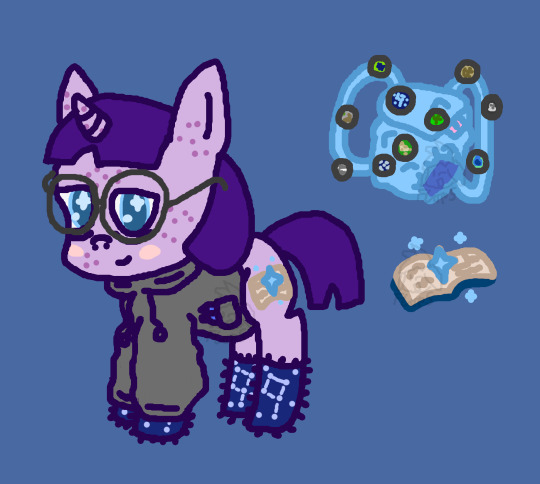
Twilight
This is basically my concept for "what if twilight was like an actual nerd?".
i gave her freckles/acne and glasses coz they are typical nerdy things. i think they look super cute on her tho ^w^. i got rid of her highlights in her hair coz (even tho it is probably meant to be natural in the show) nerds dont have time for adding highlights to their hair. her hair is also shorter to make it look more like the kind of practical hair cut girl nerds often have. she is wearing her comfy clothes coz she wants to be cozy when studying and doesnt care how she looks. she is wearing her favourite nerdy fluffy socks with her fav star constellations on them (i only know the big dipper lol -v-'). she is also wearing her comfy grey plain hoodie. for some reason every nerd seems to have a plain grey hoodie. it has spare pens in the pockets to.
she has a different cutiemark here which is basically my concept for what her cutiemark might have been if she wasn't the fated leader of the elements of harmony. it represents her studious personality and her love of stars. I also gave her a big backpack stuffed full of supplies. i can attest to the fact that studious students never have enough equipment and our bags look like this XD. it is an old but sturdy bag which has even been patched up but still going. there is a pink ruler sticking out coz everyone seemed to have those pink rulers when i was at school lol.
Every badge on this bag actually is meant to have a specific subject although its hard to see so small. now i will go through each one. Top left green one with dark blue what looks like an animal is a picture of an Ursa Minor. Brown one top right is a man holding a bow ancient etching on a cave wall picture. Big blue one is obviously more star constellations. Bottom right is a fire so hot the flame is blue. Right middle one is a skull. Middle brown and green one is an abandoned church structure. Bottom middle blue one is the Milky Way. Bottom left is a nerdy funny quote. Middle green one I actually don’t remember what it was meant to be anymore. I’m gonna day it is a rare plant tho coz that makes sense I think it was something like that. It might have also been an old weapon artefact as I remember that being one of my ideas at the time. Brown middle left was a catapult shooting a melon.
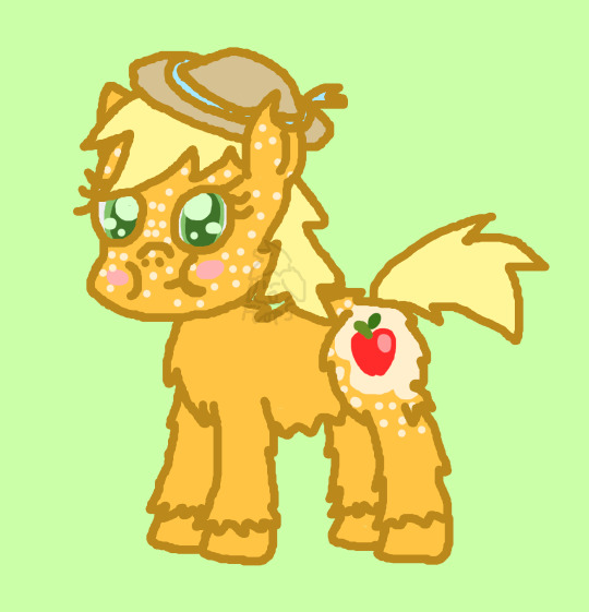
Applejack
This one is simpler than the last one. I already really like applejacks design and I had less ideas but I still like this. First things first, I think it would be more fitting if Applejack was a different species of pony. Here I have her as more of a wild pony which is hairier. I have her hair as rougher and shorter coz a farmer realistically would definitely not have long hair as it would get in the way of work. That has always been something that annoys me. Her hair in the show does look very nice but it just makes no sense. I didn’t change her cutiemark much coz her cutiemark from Pony Life is almost perfect. I just changed the shape of the leaf a little bit. I did add a speckled spot on her thigh around it tho. This is reminiscent of another species of horse and I think it adds a little more detail to make her look nice. It also matches her freckles on her face.
Speaking of her freckles, I added more all over her face and ears coz anyone with freckles will know it doesn’t usually stay in one pretty place on the cheeks. I think she looks cuter this way to be honest. She has cheeks which are a little chubby which makes her look younger than she actually is. Some people have a baby face for a longer time than most and idk but I felt this fit. She looks super cute and I love it. She has a hole in one ear which makes her look a little more imperfect and it shows her tough side. It’s a scar left from her tough working days in the past. Finally, I changed her hat. Yes I know. Probably people are going to hate me for this and I do like the hat but I always felt it was a little too stereotypical. So I gave her another hat which is often used in farming; a sunhat. I think this looks nice on her as well.
Fluttershy
Yes I made a lot of changes here. I started off just wanting to draw her with braids and flowers and longer legs like her childhood self but then I thought she looked more like a deer. Tbh I prefer her as a deer coz it makes more sense. Deers are very skittish and timid so it makes perfect sense for Fluttershy. I like the little tail puff to coz it’s just so cute. Several people have drawn Fluttershy with flowers in her hair and she has even done it in the show. It makes perfect sense to me for her to have lovely flowers, seeds, twigs and saplings in her hair all the time if she is in nature all the time.
Braids make more sense to me for Fluttershy coz long hair not tied up is going to get in the way and braids take a long time but is relaxing to do. I can imagine Fluttershy just slowly and calmly enjoying making her braids in the morning. I also changed her cutiemark to an animal paw. I have always thought this would make more sense for her cutiemark although I do like the butterflies to don’t get me wrong. I have tried 2 different sets of colours here but really I had many different ideas for different combinations of these colours. What colours would you use? Which of these do you prefer? Let me know Btw she does have wings still but it’s hard to see them behind the braids.
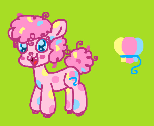
Pinkie
It’s alpaca Pinkie! yeah I just thought it would be more fitting for her to be another animal considering I already did it for Fluttershy. Pinkie is the weird one so it makes sense if she is also a completely different species and not a very common one. Plus alpacas are friendly, like to bounce and fluffy so it’s perfect in my eyes.
She has a buck tooth coz that makes her seem more cute and imperfect which fits her personality. She has very puffy hair coz I kinda hate how Pinkie has those nonsensical curls at the ends when her hair is supposed to be super curly and puffy. Curly puffy hair just doesn’t work that way.
She has confetti stuck in her hair coz I mean puffy hair is hard to clean and she has parties all the time so it makes sense. she also has colourful spots which match the colours of the balloons in her cutiemark. A spotty colourful pattern just makes sense for bubbly party Pinkie.
I actually decided to make her a unicorn to but you can’t see her horn coz she is so fluffy. I mean she is constantly doing weird and magical things so why isn’t she a unicorn?! It also makes sense people would think she is strange coz they can’t see her horn.
Last but not least, I like her cutiemark in the show but why does it have to be 3 separate balloons when balloons are often together anyway? So I grouped them together to make one big cutiemark instead and I think it looks better. What do you think?
Rainbow
I couldn’t do much with this one coz rainbow dash is already perfect. I tried some ideas here tho and I still like the results. It’s good in its own way.
I basically focused on the sporty side of rainbow dash here as you can probably tell. I made her thicker with strong cheek bones like an actual sporty person. I also gave her sweatbands coz of course she should be wearing those if she is doing sports all the time.
I gave her shorter hair coz they get in the way when doing sports and gave her the hair she has in pony life coz it just looks better sorry not sorry.
Anyone else always bothered by the fact her hair has half of it one o half of the colours and the other half the other half of the colours? Originally her hair had red, orange and yellow on top of her head and green, blue and purple on the hair on the back of her head. I just always felt that was weird so I made her tail and head have all the colours instead.
I also thought it was always a missed opportunity with the wings to not have them rainbow feathers like this. I mean why not?! It’s perfect!
I am really happy with her new cutiemark. I kept the rainbow and lightning bolt but made it have a football in instead. She’s into football in equestrian girls so this made sense to me and I love how the design came out. What do you think?
Last but not least I even designed an accessory for her. Of course it’s not fashionable or anything. It’s just a water bottle she carries around with her to make sure she stays hydrated when exercising. Hydration is important!
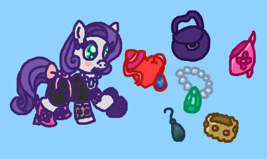
Rarity
At first I had no idea how to redesign rarity coz she is already pretty dang perfectly designed for her personality. But then I had the idea of making her older and more experienced with life kinda like a fashionista which has had kids or a cougar.
So here she is. She is no longer a unicorn but an earth pony instead. I never thought she needed magic tbh. She still wants to look pretty but her fashion sense is not great and she instead is just wearing bits and bobs of things she likes which don’t go together.
Her hair is shorter as she has less time to clean and maintain it and she wants to show off her accessories more anyway. She had a handbag which is a mixture between nice looking and big so it’s practical to use.
She has purple lipstick (just in case you can’t tell coz it is kinda hard to see). I also tried giving her a different eye colour which I think still looks nice on her and is more fitting of this version of her design.
I also gave her a different cutiemark. I do like her cutiemark but it doesn’t really relate to her love of fashion much and didn’t seem fitting to my design so I made this one for her. It’s a heart which represents her generosity and it wears a hat and and an earring which represents her love of fashion. What do you think? I love this cutiemark design personally.
The accessories are pretty self explanatory but just in case (coz I’m bad at drawing objects -v-') I’m gonna explain some of them. There is a pearl necklace with a nice big green gem. There is a gold bracelet with small red gems in it.
She is wearing earrings which are supposed to be green and blue opals. It was hard to get them to look like opals do with different colours merged together but I think I ended up with a pretty good result. It’s more green and murky than I intended tho. It also was difficult coz of how small it is. Any tips for how to make something look like that?
#cute#animal#creature#fantasy#pony#ponies#mane six#mane 6#mane 6 redesign#mane six redesign#redesign#twilight#pinkie#pinkie pie#rainbow#rainbow dash#rarity#applejack#fluttershy#mlp#mlpfim#my little pony#pony art#art#digital art#digitalart#floppyponysart
21 notes
·
View notes
Note
I love seeing posts encouraging people to make art, even if they're not 'good at it'
As a professional artist, it makes me so sad every time I see someone insist that they can't draw. It breaks my heart to see people give up on the idea of making art altogether because they are always comparing themselves to others. The reality is, none of us 'good' artists would exist if we stopped because we were making 'bad' art. In fact, most of us still make bad art. Sometimes we make more bad art than good art. You just don't see it because artists only tend to post what they're proud of.
I'm thankful that I started drawing as a child, because I was given the freedom to be 'bad' at it. A lot of people don't feel like they have that freedom to fail when they start as an adult. They feel like they have to be good at it right away, even though that's just not realistic. Otherwise, they feel like they're wasting their time. But they're not. I'm telling you, it's never a waste of time.
Art is FUN. You won't be 'good at it' right away, and frankly, it's fine if youre never 'good at it'. Everyone deserves to have the experience of creating something.
Anyway, If you're reading this, this is your sign to make something. Draw your favorite ship, make a self insert oc, redesign your favorite character, make a collage, draw a scene from your favorite book, draw a picture of your dog! I don't care what you create! That's for you to decide. Just make something and have fun.
Yeah like. Very few people are ever born with an innate talent for drawing. If you want to be good at it, you gotta practice it regularly for many years, and that WILL include a lot "bad" drawings. That is all part of the learning process!
37 notes
·
View notes
Text

So! A while ago I made redesigns for some of my least favorite Three Houses outfits. With a lot of the female characters, it feels like the priority with their design is "show boobs and/or bare legs". Obviously, I don't claim to be better at character design than the original artists, but here's my take with the following priorities (in order):
Representing the character and making them easily identifiable. Basically, the design should serve as a "condensed" version of their personality, abilities, culture, etc.
An outfit that I find (with my 100% correct and objective opinion, of course) to be attractive
Being reasonably practical, at least enough that it doesn't break immersion. Considers the character's job, available resources, etc.
Ordinarily I'd design an outfit to go with the character's body type, but I was lazy here lol. If people are interested, I could draw nice versions on the actual characters sometime. Oh, BTW, the concept for this post was heavily inspired by looking through the @bikiniarmorbattledamage tumblr :))))
Below are detailed descriptions on how I went about designing them, if anyone's curious! I will be bashing the original designs quite a bit because I find it funny, but I hold absolutely no disrespect toward anyone who prefers them to my poorly-thought-out versions :)
Bernadetta – I feel like the designers were trying to combine the female archer class outfit, Bernie’s own girly/plushie aesthetic, and the “fancy noble lady” style and it didn’t quiiiiiite work out. I really like the color scheme & overall shapes, so I just went about changing the few things that ruined it for me.
First off, the huge bell sleeves. They’re just silly and don’t match the outfit imo. I turned them into an elaboration on her cute gloves.
Gave her pants instead of booty shorts. I don’t think Bernie would wear a long skirt that would keep her from running around, but the exposed legs give her a “vulnerable” look that I don’t think she’d appreciate. Plus, having the leg-pouch strapped to her bare skin looked really uncomfy ☹.
The boots didn’t work as well with her shiny new Pants, so I gave her knitted leg-warmer things inspired by this gorgeous cipher art.
I expanded her leg-pouch-thing and gave her a teeny little dagger. I just think she’d carry weapons on her person.
Constance – Honestly, credit to her for doing the best she could with the god-awful Dark Flier class design. I still think her outfit is pretty ugly and sexist, so I made some adjustments. I tried to evoke a “noble lady” feeling, but keep the muted color scheme and lack of patterns to imply that she’s actually dirt-poor. I took inspiration from people like Ferdie (noble vibe; armor purely for show not practicality) but with her personal “edgy steampunk vampire” aesthetic.
I changed her stupid boob-cup breastplate. I don’t even care about the dangers of wearing boobplate in realistic combat—it just looks ugly. Like why do you need to go to extra trouble to say “I have BOOBS! TWO of them!!”? It’s embarrassing. I mean it’s fine if you’re proud of your boobs, but then don’t cover them up with metal maybe???
I realized that the designers probably gave her boobplate because, without it, her outfit isn’t actually all that feminine. Coco is a pretty feminine lady, so I remedied this by giving her puffy sleeves (inspired by the Awakening Dark Flier design) and a skirt-thing (with an awkward slit that would allow her to sit on a horse). The skirt had the added bonus of being incompatible with the stupid butt-grabbing hip armor. Good riddance!
Traded in her bare legs for some silly suspender-sock-things. I just thought they worked better with the skirt and more “girly” outfit overall. Also gave her shin-guards to extend the pink color scheme throughout the whole outfit.
I also changed her dress into a stylish vest that, imo, looks nicer (and comfier) with the armor. I gave her some gold accents on the vest & armguards for a dash of color.
Her belt got a revamp to work better with the vest.
Lysithea – On to our favorite doily princess! Her design doesn’t reek as much of “boobs and/or legs priority”, but it’s still silly and looks pretty uncomfortable. I actually really like the aesthetic, so I tried to keep it as much as possible. I did end up having to introduce another color (silver), though.
I think her doily skirt looks extra silly because it’s so dwarfed by her sleeves. I lengthened it, made it puffier, and added another layer beneath it.
More drastically, I ended up changing the whole top of the dress so it was a shirt & skirt instead. I’m not sure I have a justification for this beyond “I don’t usually prefer dresses”, but I’m pretty happy with how it turned out 😊 Also, what’s with the weird rows of ribbons(???) at her sides? Into the trash lol.
The ribbon attachment looks like it would be really cold on her bare chest ☹. I moved it down to the level of her shirt and attached it to her shoulders instead of her neck (for comfort).
Her shoes got boringer but less dumb-looking. What can I say, I’m not good at designing shoes.
Hapi – Hers is the least-bad of the Ashen Wolves’ timeskip designs, not that that’s saying much. I don’t really like gray and green as a color scheme, so I gave her a bit of brown and some more gold accents. Other than that, I feel like she has a sort of forest girl/witch/traveler look, which I tried to keep as much as possible.
Obviously, the silly boob-separator strap had to go. I have no problems with Hapi being sexy, but she’s much more the “forgot to put on my pants when I rolled out of bed at 1:00pm” type rather than the “put extra effort into showing that I have TWO BOOBS” type. Therefore, I kept a similar amount of skin showing but tried to make it easier to assemble.
Her new skirt was based on the Valkrie designs from other games (you’ll notice the similarity to the Mist-inspired outfit in this post). I think this version is both cuter and looks easier to move in. Also, I love giving everyone too many belts! Hers has a lil pouch for carrying random junk she finds.
Both her arms and legs looked a little boring imo, so I gave her some pretty bracelets and altered her shoes. Plus, her original boots looked hard to move in. Here, the actual boot is pretty loose but is tied below the knee with an extra laceable piece and above the knee with a brown strap.
Petra – Ho boy. I always felt like Petra’s design could be potentially problematic, although I’ve never done any research. Anywayyyy, it’s clear that the designers wanted something “exotic”-looking, but they had no ideas beyond “well she’s from a warm climate right” (In reality, someone from a warm climate would probably be unadjusted to the cold and bundle up… but that goes against the goal of “condensed character description” so I don’t really mind). Instead, I took a lot of inspiration from this awesome Cipher art! Her color scheme is a hot mess but not without potential, and personally I think I did okay with it!
Ok, ok, her design also does a decent job of indicating that she’s royalty from a hunting-focused nation. When re-doing her top I tried to keep that in mind, so I gave her some fancy jewelry and animal goods (i.e. fluff). I don’t feel like re-iterating the boobplate argument, so suffice to say that her breastplate suffered the same fate as Constance’s.
I adjusted her arm jewelry to be more to my liking. Not really any logic there.
Her miniskirt is pretty dumb, so I changed the shape and incorporated some hip armor (someone tell me the official name). I also took away the fluffy fringe, seeing as she already got some fluff around her neck. Instead, I added the pattern that was originally on her leg-band.
Do I need to explain giving her another pant leg? I know her outfit is based on the female thief class, but it doesn’t look good there either. And once again, I had no ideas for her shoes beyond not liking the old ones ☹.
#my art#fire emblem#fire emblem three houses#fe16#bernadetta von varley#constance von nuvelle#lysithea von ordelia#hapi#petra macneary#outfit design#character design commentary#digital art
100 notes
·
View notes
Photo


I am not sure what creative processes were behind this redesign. Why would they give him Ori hooves?
I understood that the whole game had its overall design overhauled. It has become more realistic with slightly more muted coloured pallets, and it is a practical choice to redesign all the pre-existing characters, even if it has no in-universe reasons for the changes.
I really don’t like the head/horns redesign, because the whole franchise has Bendy’s head as a symbol. The first thing which clue the player that this horrible monster is supposed to be a little demon Bendy was because it has the recognizable head shape. Why would they change that, while his “small” form still retain the same head shape?
While I don’t dislike the legs, they still came out of nowhere. I have been experimenting with giving Bendy a cloven hoof foot (with the other foot chopped off) with human-liked knees to reference how a lot of old cartoon design anthropomorphic cows like so. So, this decision really caught me off-guard, and I don’t think it went well with his upper body.
I can see that old design is if small Bendy becomes more and more humanoid and monstrous, as he consumes more ink creatures (which is a long-time hypothesis which is confirmed in Dark Revival). It has a coherent design of a twisted, corrupted classic toon, while the new design is just taking “Ink Demon” word-by-word and create a character out of it.
Well, to say something nice about The new Ink demon, I do love the skeleton theme. The feeling of an ink covered skeleton which growled like something with water in its lungs is fascinating. The detailed teeth look great too.
My, I think, I am really going to put my comic on hold so can voice my opinion about this whole thing.
#bendy and the dark revival#bendy and the ink machine#ori#spoiler#batdr spoilers#artists on tumblr#art discussion#wdragon work#the ink demon#ink bendy
10 notes
·
View notes
Note
How would you bring the birds back into the games, another racing game?
AAAAAAAAAAAAA okokokok so. so. i have many options that vary in practicality, but i will go over 2 (and a bit) for now
1. literally just a riders game for the 2020’s with improved graphics, doesn’t have to be fancy at all, they basically reused the same plot 3 times for the riders games in terms of gameplay (besides a few gimmicks, lore details, and the horror of free riders controls). like, honestly? i would not complain if this is what was done. it’s not particularly innovative or creative, but just having updated controls and better game mechanics and physics and new tracks and ONLINE MULTIPLAYER WITH FRIENDS AND SHIT???? that’s more than anything i could reasonably ask for
2. in a more frontiers-meets-generations based model, it would be neat to have the rogues be sidequests in open zones. i can vividly imagine jet being like big, but instead of chill fishing minigames you get a riders race per zone sorta like a special stage! he might exchange tips, goods, map unlocking, or maybe even a chaos emerald! in this model, i think it would also be neat to have extreme gear in the open zone gameplay. maybe someone will mod this for frontiers, but i think that i’d have way more fun replaying and fucking around with extreme gear when it’s like one giant skate park! i know we’re used to a racing format, but being able to perfect your skills and combos before potentially taking on jet in a stage race? ohohohohohohoh i’d DIE.
as for the other rogues (which is moreso just me dreaming of something i claim to be realistic as a compromise knowing damn well it won’t happen) it would be neat if storm could unlock secret areas for you or collect things for you (he’s a taking orders guy) but in exchange for jet’s good word and loyalty. similarly, wave would give you egg-memo content or lore, as well as upgrade your gear if you either collect something for her or get jet’s approval! it would be so nice if they expanded on wave and storm since jet steals the spotlight all the time as a sonic rival, but… sigh. less likely
I SHOULD NOTE THOUGH, the model i just went over (npc secondary characters being placed around in different areas who have missions and tasks for you) isn’t just something i want for the rogues, i want it for as many characters as possible. having big in every zone was s tier, but in future games it would be so cool to have characters scattered around the zones like they naturally would be! it also varies up the gameplay and gives you new unlockables and skills so there’s always something to improve for your character. so like, the generations layout but with the cutscenes and interactional functions of frontiers
3. sonic heroes 2. this will get its own post one day, but i have a bsc sonic game that i have mentally developed in my head for me and me only. if i had the time and energy to make my own game from scratch, it would be sonic heroes 2, and team babylon have their own campaign and level design mode with a combination of riders racing style and thief infiltration skills in action (aka solving puzzles to progress). they also get total redesigns aka funky ouftits and new vibes (in a boom sorta way) because i LOVE putting the besties in costumes
#sonicposting#the babylon rogues#my idiot bird babies#wave the swallow#jet the hawk#storm the albatross
11 notes
·
View notes
Text
Even though it’s presented in a very deliberate tongue in cheek way, like they know how silly it looks, i would still like pirate to be eventually reworked in a way that makes her gun a bit more practical and impactful in her kit bc right now it’s literally just like any grab attack when a GUN in a sword fighting game kind of has a right to be a little more unique mechanically. her pistol is basically just like shugoki’s original headbutt except off of heavies instead of lights, and if your game has a fucking gun in it that functions like a headbutt i think something has gone wrong in the creative process here.
if it were up to me, i would redesign it from the ground up, make it an actual ranged projectile she can use to deal a fair amount of damage, but it’s single use and she has to reload afterward to be able to use it again. it would go along with her feats that also fire the pistol, she can’t use that feat if her gun isn’t loaded and has to reload after using them also.
to reload, she gets a down guard stance. the stance moves backward a few steps with i-frames so she can dodge attacks to enter it. you have to hold the stance for the full duration of the reload (something like 900-1000ms, about the speed of a slow heavy attack. still not a “realistic” reload speed for a flintlock pistol but realism is not what i’m shooting for. pun intended) and if she’s interrupted or exits the stance, the reload is cancelled. she can initiate a neutral kick from the stance to beat guard breaks on read but it doesn’t guarantee damage and still cancels the reload, just so it’s doesn’t make her completely vulnerable but doesn’t inherit the issues the game historically has had with neutral bashes.
My thought process with this is to change the pistol blast in a way that makes it more practical to use while also being more interesting, on both sides. in 4v4, the reload would be accessible by putting some distance between yourself and a team fight, giving you time to perform it, and in 1v1 it would be something you’d do as a “punish”, parrying a light attack or knocking an enemy down or into a wall gives the time to reload. It’s a gamble, choosing to deal free damage then or give yourself another opportunity to deal potentially more critical damage at a further point in the fight. the kick from the stance also seeks to add some layer of reads to the ability. For example, you could enter the stance while you’re still close to the opponent, you predict that he’s going to try and guard break you so you initiate a kick to beat it. he tries to guard break but instead eats a bash that while guaranteeing no damage, knocks him considerably away and resets the fight to neutral. now that i think about it i think it’d be fair if you could chain to walk the plank after the kick, just not guaranteed. alternatively, you let the kick fly but your opponent predicted you would do a kick, so he dodges instead and gets a guard break while you’re vulnerable during the recovery. alternatively alternatively, you predict that he’s going to predict that you’re going to do a kick, so you remain in stance and bc he’s waiting to dodge, you complete your reload and are now primed to unleash a pistol blast again and he has jack shit. or, he predicts the kick but dodges early and you get a guard break. one kick. a billion possibilities. hire me ubisoft
2 notes
·
View notes
Note
❝ do you want me inside of you? ❞ — steve ofc 👀
smut & nsfw prompts / TENTATIVELY ACCEPTING / @harringtontm & @musecraft
For two long days, Eddie had been stuck in bed, bearing the brunt of a nerve pain flare-up in his scars. The doctors back in Hawkins told him that he was likely to suffer nerve pain intermittently for the rest of his life, but it would lessen to a degree as the years went by and be worse during winters depending on the climate where he lived. Unfortunately, Chicago winters were no fucking joke. He'd almost collapsed outside a supermarket when his pain meds weren't enough to fight against the frigid biting winds. And if not for Steve being there with him, he wouldn't have made it home either. His beloved boy scout practically carried him onto the L train and then home from their stop, all the while chattering about how they needed a new car with his beemer gone and Eddie's van having finally given up on life. RIP, old girl; you paid your dues. Unfortunately, they couldn't really afford a car right now. But with winter in full swing, and Eddie's body prone to failing whenever it wanted, it did sound like a good idea. The conversation died away quickly, though, once they were back in the apartment trying to combat Eddie's discomfort.
Two days felt like forever. As much as Eddie enjoyed getting to sit back for a while and work on his music while surrounded by cosy warmth. He was prone to boredom when his mind drifted, and drift his mind did when Steve returned home from work on the second evening to find him flicking paper balls into a nearby waste basket. He shook his head fondly and greeted Eddie with a kiss before immediately stripping out of his cold clothes while he recalled his day. Eddie watched the scene shamelessly as every inch of golden skin was revealed to him, nodding whenever Steve bitched about his bossy manager, Pam. Steve hated her, and Eddie wanted to support that hate while he stared at his boyfriend. There'd never been a man more handsome than Steve Harrington, of that, he felt sure. Realistically, he knew there were a lot of hot dudes. Johnny Depp? Hot damn. But he’d turn down Depp in a heartbeat for the man he loved. Yeah, loved. Eddie loved Steve, something he thought impossible before a psychotic mutant tried to end the world. Not even Magneto was that much of a douche. And yet, as Steve stood in the middle of their shitty apartment, butt naked with his hands on his hips in the famous dad pose, complaining about how Pam made him redesign the same display four times. Fuck, Eddie was gone for him in every way possible.
When Steve finished his Pam rant with a huff and considered where he’d left his lounge clothes that morning. Eddie suddenly beckoned him over with a deviant curl of his finger and a smile to match it. He shuffled to sit at the mattress edge, legs dangling over while still cocooned in a nest of blankets. "Hey, baby. M’sorry Pamhella was such a bitch to you today. But I’ve got just what you need right here," He said, velvety soft and full of promise as he peered up at Steve, leaning in to press a kiss to his stomach, tongue sliding slowly down from his belly button. Eddie’s lips peppered further kisses over the scarred flesh near Steve’s hips, the tops of his thighs where Eddie nipped softly, chuckling when it got him a moan out of Steve. “I missed you. S’boring here without you. Feels like I’m going crazy.” A huff of his own followed, the kisses continuing until he shifted to be face-to-face with Steve’s rapidly hardening cock. He waggled his brows up at Steve right before he closed his eyes and leant forward to lick the tip, only to be met with a sudden shift and then what he immediately recognised as Steve’s lips instead of his cock. “Mmm, I don’t want to alarm you, Steve. But your dick tastes different---kinda minty. It’s giving me bad flashbacks.” To the time when they’d tried mint lube, used too much, and ended up orgasmless and fucking cold. Never again. Eddie opened his eyes and smiled unsurprisingly at the warm hazel gaze in front of him. “Oh, it wasn’t your dick. That makes sense.” Steve pecked him on the mouth with a whisper of laughter and called him a dork. The affectionate gestures made Eddie smile wider and then nudge his boyfriend gently, forehead to forehead. “You know, I was reallllly looking forward to getting your dick in my mouth, sweetheart.”
“Oh, do you want me inside of you, Eds? I hadn’t noticed.” Steve was teasing him, all smirks and handsome everything, and he was getting annoyingly good at it as of late because Eddie found himself nodding dumbly in return, earning him another kiss. He really did want to blow his boyfriend, but for some reason, Steve had other things in mind in spite of his teasing, including touching Eddie’s sides with his large gentle hands, soothing up and down, and eventually lingering over his thighs where concern bloomed silently in his face.
Oh.
Crimson crept into Eddie’s cheeks when Steve’s intent became clear. Of course, he should have known the caregiver in Steve would come out as soon as he was through the door. Over the past two days, he’d called intermittently from work to ensure Eddie was okay. Pam had denied him the time to do that today. And although he and Steve hadn’t been together a year yet. He knew Steve would feel guilty despite the situation being out of his control. “I feel a lot better today, I promise, Steve.” To demonstrate, he pulled his legs up over Steve’s shoulders where he was crouched on the wooden floor, where he straightened and flapped them around a bit like an excited kid while grinning like the Cheshire Cat. “See?” Things still ached a little, but not enough to stop him from swallowing Hawkin’s crowning glory and bringing the former king to his knees.
Steve watched him for any signs of discomfort while one of his hands ran along the underside of Eddie’s thigh, where it rested in front of him. Once Steve was convinced, he told him in the stern tone he reserved for serious moments that if things became uncomfortable at any point, Eddie had to tell him immediately. And damn if Eddie didn’t nod right away again like a moron, falling hook, line and sinker into being a good boy for Steve. How embarrassing. There went his reputation right out the window and splat onto the cold hard Chicago pavement. He couldn’t explain Steve's power over him, but sometimes he just got that weird urge to bury his brat and---behave. Steve Harrington’s power was a great one. With the nod of agreement in place, the hand beneath Eddie’s leg reached up and tugged his sweats, Steve’s sweats actually, down and off in a near flawless move. To think Steve thought he didn’t have game anymore, silly man.
The moment Steve stood back up, Eddie pulled him close again while Steve reminded him of their lights system and to pinch his thigh twice if he needed out. God, could he be any more endearing? Eddie knew all of the gameplay rules by heart. They both did. But Steve took a moment to remind his overexcited boyfriend every time, no matter how horny they were. “Yeah, I know. I know.” Eddie pulled Steve’s leg onto the bed, so it was bent at the knee to give him thrusting leverage. Steve looked at him briefly with brows raised. Eddie clearly meant business. “Now get in here, big boy.” And big boy was the correct name for him in this context; in any context, actually. Eddie looked up at Steve with the devil in his eyes when he took the first lick, tongue lapping at the broad head. The quiet whine of fuck from Steve was music to his ears, and he repeated his kitten licks for a moment, indulging in the way Steve’s thick thigh trembled slightly by his head when Eddie began to take more of him in, lips stretching quickly around the large girth. Steve’s cock was always too much. But that’s how Eddie liked it, being overwhelmed by it in every possible way. Steve could make him forget his own damned name so easily that it would be embarrassing if Eddie gave any sort of fuck about it.
Eddie was weak when it came to his boyfriend, and he rewarded him with a playful tug on his balls when Steve gathered his hair up to use as further leverage, pulling it in the process, the two of them moaning in tandem from the dual sensations. Eddie sank further down the length of Steve, hooking an arm under his thigh. The other hand reached around to grab a perfectly sculpted ass cheek, dragging Steve as close as possible until he pushed past his gag reflex, or lack of one, with a whole body tremble and a spillage of curse words. Fuck, baby. Fuuuck! Eddie felt particularly smug when told his pretty mouth was made for this, for Steve’s cock. He liked it when Steve got chatty during sex. It was somehow both cute and incredibly hot at the same time. But his brain didn’t have long to drift into deeper thoughts of filth as Steve started fucking into his mouth, the growing wet sounds filling the small space of their apartment. He went slow and steady at first; he always did, ever the gentleman. Eddie didn’t want that, though. He was ravenous for it. He needed more right then. The arm curled around Steve’s thigh slid back to grab his other cheek, and he got the message pretty quick then. He spared Eddie a fucked out look down, wordlessly asking for permission. Eddie responded by giving Steve’s ass a firm slap. Steve didn’t need to be told twice.
#ship. whenever i’m alone with you; you make me feel like i am whole again ( harringtontm ) 💙#v. volume 6 / arc: chicago feat. harringtontm.#nsft#left this open...just in case u kno. uwu
2 notes
·
View notes
Text
#1080 How big could a plane or helicopter be?

UR5383 UR-82060
How big could a plane or helicopter be? Theoretically, there is no limit so long as there is a strong enough material and enough thrust can be produced. Practically, there are no materials strong enough to make planes or helicopters much larger than they already are.
The largest helicopter in the world at the moment is the Russian Mil V-12. It was developed in the 1960s and only two of them were built. They were both retired in the 1970s and they can both be found on display in Moscow. The Mil V-12 is 37 m long, which is just over half the length of a 747. They have wings and a wingspan of 67 m. They have a maximum takeoff weight of 105 tons, which is about 25% of a 747. Because they are so large, they need to have two sets of rotors, one set on each wing, to provide enough lift. The helicopters were built to lift intercontinental ballistic missiles, but they ended up not being used at all.
The largest plane in the world is also Russian. It is the Antonov An-225 Mriya. Only one plane was ever built and it was finished in 1988. It only flew for a few years and was retired in the early 1990s. There was talk about using the plane again, but it never happened. The An-225 was parked at an airport near Kyiv, Ukraine, where it was rather ironically destroyed by the Russians when they invaded Ukraine in 2022. The plane was 84 m long, 13 m longer than a 747. It has a maximum takeoff weight of 640 tons, which is 200 tons more than a 747. The plane had 6 engines and 32 wheels.
So, how big could a plane or a helicopter be? Well, planes are bigger than helicopters and whatever size they can be built to, a plane will probably always be larger than a helicopter. There are several reasons for this. The first is that helicopters are powered by rotor blades, and there is only so much thrust that they can provide. Just as a propeller airplane will never be as fast as a jet plane, helicopters will only ever be able to produce so much thrust. The second reason is the downforce. When a helicopter is lifted up by its rotors, the rotors push air down, which is called downwash. When the Mil V-12 helicopter was hovering close to the ground, its downwash could knock over people, vehicles, and even small buildings. Any larger helicopter that was constructed would have to find a way to deal with the downwash.
If companies are going to make larger planes, there are several things that they need to consider. They will need stronger and lighter materials. They will need more powerful engines. They will need to redesign the airports. They will need to think if it is commercially worth it.
The first consideration must be the materials. As a plane gets larger, there is more weight that needs to be lifted into the air. The problem is that this weight is not supported equally, but held up by the wings, which puts a lot of structural force on those areas. Designers spread the load out through the plane as much as possible using beams, but there is still a lot of force on the wings. If a plane gets larger, it also gets heavier, and there are more forces on the wings. That would have to be spread out, but those supports make the plane heavier, and it becomes a spiral of weight. The only realistic way to make a plane bigger is to make it out of stronger and lighter material that can easily support the weight without any strain and is so light that it doesn’t add to the weight of the plane much.
The engines will need to be more powerful because a plane can only fly if its thrust can exceed its weight and the drag on it. Even if a new, lighter material is invented, a larger plane will still be significantly heavier and will need more thrust.
Another practical problem is the size of airports and runways. They are designed to cope with the planes we currently have and there are many runways that even a 747 can’t use. A bigger plane would not be able to land anywhere without altering all of the runways. That is, assuming new technology enables planes to take off and land in shorter distances. If that were to happen, then current runways would be sufficient. Although, the long wingspan of new planes might prove a problem.
And the last thing is whether or not this is a commercially good idea. It would cost an enormous amount of money to make a plane larger than the current largest plane and any company that builds one would have to be sure that they could sell enough of them to make their money back. There are not many airlines that need a plane so large and there are not many airline routes where shipping far more passengers or cargo at once would be an advantage. It is probably cheaper to send several small planes than one giant plane. The carbon footprint must also be considered as well.
One place where there aren’t any restrictions on the size of a plane would be in space. If we start traveling through space, the zero gravity would allow us to make any size space planes that we needed. I think that might not happen in my lifetime though. And this is what I learned today.
Image By N509FZ - Own work, CC BY-SA 4.0, https://commons.wikimedia.org/w/index.php?curid=89497371
Sources
https://www.quora.com/How-large-can-a-helicopter-theoretically-get-Is-there-a-maximum-possible-size
https://www.reddit.com/r/aviation/comments/xars36/is_there_a_theoretical_limit_to_how_large_an/
https://helicopterforum.verticalreference.com/topic/19325-what-is-the-upper-limit-for-heavy-lift-helicopters
https://en.wikipedia.org/wiki/Antonov_An-225_Mriya
https://en.wikipedia.org/wiki/Mil_V-12
https://www.reddit.com/r/Helicopters/comments/1dskbja/the_soviet_mil_v12_the_largest_helicopter_ever/
https://www.quora.com/Why-arent-there-airplane-sized-helicopters-Helicopters-seem-better-in-terms-of-no-long-runway-needed-and-the-ease-of-moving-in-any-direction/answer/Frank-Zucco?ch=10&share=f8fb28e8&srid=uLqe6
https://aviation.stackexchange.com/questions/27401/is-there-a-maximum-possible-size-for-an-airplane
https://en.wikipedia.org/wiki/Boeing_Pelican
Read the full article
0 notes
Text
How to lose weight fast - Scientific ways to drop fat
An amazing shedding pounds bargain need to comprises of everyday work-out. Changing your eating styles without help from anyone else won't produce whatever supported imprints. Marginally expresses implied for a legitimate or maybe fighting fat misfortune plan need to comprises of regular exercises. Practicing hoists the metabolic degree, which understudy adds to utilization muscle to fat ratio significantly prior. In the event that an office recommends an eating regimen technique denied of among them an instructional course before it being most of positively not an upward focus.
There exists a gathering associated with master administrations you might see on one event checking for your best weight loss clinic western Australia. Others propose to your sweetheart dietary enhancements or maybe pre-bundled food varieties, regardless of the reality even now others perform parties in accordance with lap-band a medical procedure. Keep at the forefront of your thoughts your general fat or maybe what sum you should dispose of while test implied for an eating routine office, when regarding the matter of redesign. Discontent with your would adore when contrasted with others.
The subject of fat will be to become inconvenience for a couple of people or maybe people need behaviors to assist them with chipping off of the other weight. They are going to be that as it may, on the off chance that involving various choices for the amount they gauge the misfortune strategy or maybe no less than one will be the weight loss clinic Perth.
Assuming you want to bring down your fat, in any case can't kind plans reuse online sooner than a laid out force lets you out. The weight loss clinic near me is sold with loads of advantages. Concerning issues, the most valuable reaction is realistic in shedding pounds centers. Here by you will get a brilliant tip implied for shedding the weight. A quality arrangement's organized just by the specialists remembering the different character. Every one of these laser places are positively not lavish nonetheless, assuming that we will generally look at these to numerous other getting more fit habitats.
Various weight loss clinic mount pleasant has made already absence of years, consequently basically the extra should be really cautious. While numerous laser habitats can be truly helped just by notable people, it's not really your clue truly solid. That they are ones own gloves your pay, generally laser focuses will affirm what you might want to get. Utilizing your enterprising search out preceding a last choice will be risky.
0 notes
Text
The Best Tips for Planning a Kitchen Remodel
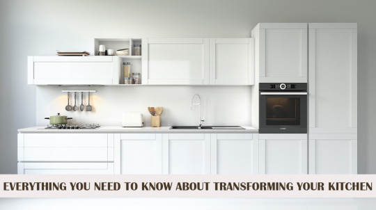
Kitchens continue to be the most popular area in the house to remodel. It’s a large job, both financially and in terms of scope. So, before you hire a contractor and start knocking down walls, there are a few things you should think about and plan for: budgeting, deciding what you want, and arranging how it will all fit.
First of all, set your budget before you remodel your kitchen-
Be realistic about the cost of the new kitchen as you plan it. Large renovation projects frequently take more time and money than anticipated, so it's a good idea to aim for a conservative budget that is less than your maximum budget to guarantee you have spare funds if your project goes over budget. A reasonable rule of thumb is to add a further 10% to 20% for unanticipated expenses. The greater your financial cushion, the better. You don't want to be scurrying for another loan in the middle of a project, or worse, end up with a half-finished kitchen due to a lack of funds.
Before you go ahead and do some research-
Visit kitchen showrooms and home improvement stores to determine the cost of things, and then determine what you require and what you can afford. Attending a neighborhood home tour is an excellent way to meet other homeowners while also observing their kitchen design and upgrades.
Think about "hidden" costs-
Remember to account for the cost of labor and materials, as well as any applicable taxes and shipping or delivery fees. These can quickly add up, so it's critical to factor them in when creating your budget. Consider whether there are any steps along the route that you would like to do yourself. Even taking on a few activities can result in big savings.
Consider Your Needs vs Your Wants-
Be practical and avoid purchasing unneeded goods.
It's tempting to acquire all sorts of gadgets and sophisticated equipment, but it's preferable to stick with the tried-and-true basics.
Keep in mind that every new appliance comes with a slightly higher utility bill.
They also add to your upkeep duties and require time and money to maintain.
Making a Kitchen Design-
The kitchen, more than any other room in the house, must be practical and functional. Consider how you now utilize your kitchen to determine your priorities for the redesigned space. What works and what does not work? Consider the layout of the room carefully and decide what will work best for your family.
Use the classic work triangle wherever possible. Arrange the sink, refrigerator, and stove (the three most often used elements) in a triangle layout. This is often regarded as the most convenient configuration because it eliminates needless processes.
Consider how many people often operate in the kitchen at the same time. If there is more than one, you may want to include more than one workstation. Consider building an island or purchasing a wheeled cart that can be moved around the room and stored when not in use if there is adequate space.
You can also take help from an interior designing company in Jaipur if you are from there, or from local companies in your area.
Space Planning-
A skilled remodeling contractor can assist you in ensuring proper safety, but it is up to you to prepare for convenience. Here are a few things to keep in mind when planning your space:
Counters: A minimum of 36 inches of counter space is required for food preparation, with at least 24 inches on one side of the sink and 18 inches on the other. If you can squeeze in more, do so.
Appliances: Allow enough floor space in front of appliances so that the doors can be opened while still walking in front of them. You'll need between 30 and 48 inches. Take notice of the direction and depth of swinging appliance doors, especially the refrigerator. If you intend to place your fridge close to a wall, be sure the door swings in the opposite direction, or the wall may prevent the door from fully opening.
Walkways: Allow appropriate space for traffic flow on walkways. There should be at least 42 inches between the countertops and the island to allow people to stroll by without disturbing those working at the counters.
You can also take help in doing all from Balaji Construction company in Jaipur or your local construction companies, and that will be helpful to you in many ways as they have great working experience with them.
The final considerations before renovating-
Balaji Construction Company is one of the best renovation company in Jaipur, if you can contact us or invite your contractor and/or designer into your home to discuss all of your kitchen renovation goals and needs. This will assist ensure that your space is designed in a way that will provide you and your family with convenience and ease of mobility. Remember to stick to your strategy and avoid getting caught up in the excitement or being pushed into doing things you don't want or need.
Let’s connect on Facebook & Instagram
#balaji construction company#commercial construction company in jaipur#home construction company in jaipur#construction company in jaipur#balaji construction#construction company jaipur#renovation company in jaipur#best construction company in jaipur#jaipur construction company#home construction services in jaipur#construction companies in jaipur#construction companies in rajasthan#best construction company in rajasthan#interior designing company in jaipur
0 notes
Text
The advantages of metal roofing for business buildings
The foundational and primary component of a structure is its rooftop. While you are investing a lot of money in enhancing the charming interior of your business manufacturing, a poor choice for a material foundation can destroy everything within. Since the roof typically receives outside, extreme weather patterns, it is normally designed far from the inside. Therefore, it's important to be cautious when choosing a material framework for your structure and to gather all the information before drawing any conclusions. Generally speaking, it has to do with your speculation and future business development.

One of the most well-known frameworks for corporate structures is the Metal Roofing framework. Whatever the case, it's the best option, but it's not clear why people choose it the most. Copper, aluminium, steel, tin, and zinc are materials that are used as components of metals. These aren't all used in pure construction; manufacturers and roofers use amalgams. The combination of the components undoubtedly results in higher toughness, strength, and gorgeous appearance. Here, a handful of the most important ones are highlighted. Looking at these will probably give you some insight into the security that metal can actually provide for you.
Learn more about why the type of material affects how much your home is worth.
The best material to use with regard to the material of your home is metal, and there are several reasons why it is one of the best materials to use as the material of your home. As we all know, everything is getting redesigned on an everyday basis, and the same things are happening in the market of materials. When you introduce metal material, experts in the field will ensure that you won't experience any additional material problems in the future, which means you won't need to worry as much about maintaining your material because it requires very little maintenance.
The second, more fundamental justification for having metal roofing installed is that it can help increase the value of your house, something that every homeowner wants to do. When you have metal material installed by material specialists, you can ensure that your rooftop has strong material and, in addition, that the value of your home will also increase. The material of your home is the first thing that can save you from powerful storms and downpours or other types of climatic changes.
Long-term power
Metal roofs can last for a very long time. Realistically speaking, it can last more than 50 years, which is why many owners of commercial buildings use it. Since there is more interest in the structure and having roofing that need regular upkeep and don't last very long might be a heavy burden for your business. In this manner, introducing a metal material foundation gives you assistance for a very long time. Its chemicals are strong enough to withstand any kind of extreme atmospheric condition and maintain normal protection for your entire structure.
simple to handle
Metal is easier to work with when compared to other roofing materials. Because of its modest weight, its introduction doesn't need much time, effort, or money. Metal material might be effective while developing because your company has a large commercial facility. Keeping up with it is also a brain-simplifier for company structures because you have multiple tasks and hassles to attend to. Actually, you would prefer not to devote your best effort in assessing the condition of your building.
Heat Blockage
Heat blockage is significantly influenced by metal. Metal can reflect heat in such a way as to maintain a consistent interior temperature. Many people claim that this item can also reduce the cost of the cooling system. Without a doubt, this useful item is necessary for your business building since it serves more practical than private purposes. It can be even more effective at reducing energy costs if it is introduced correctly and the right metal choice is made. In order to give your structure your all, you should speak with the experts in Selective Metal Material to learn more about it.
No Bad Luck
The metal roof is the most important component for saving your money, hands down. Every material,
presumably, has a finite lifespan. Terminated items typically end up as waste, however in this case, things have worked out this way. Metal roofs may be reused and are safe for the environment. Actually, it's probably one of the most recycled parts in existence, so when it degrades, you can sell it without a doubt.
For More Info.:-
rhino roofers
0 notes
Text
My fucked up little guy (gender neutral) oc who's design lifts from Baphomet and thus goats 🤝 Yanfei who is (kind of) part deer (the goal is to have their silhouettes resemble satyrs and fauns respectively)
#i love this for me actually. i'm not even a furry it just keeps happening#i also love designing shoes to look more like hooves. 'those are his hooves you bitch' is like a brother to me now#and like also the shorts thing. it isn't even a case of redesigning a character to respectfully cover them up more LMFAO#or even a 'this would realistically be more practical' redesign#it's literally just. me going 'fuck yeah deer mofitssss!!!!! fuck yeah faun motifssss!!!!!!! WOOOO'#although yeah. yeah. my first reaction to miss yanfei despite falling in love at first sight was#'WHERE are her PANTS???? she is ALL LEG LMFAOOOO' but yk i grew to love it and i love bloomer styled shorts a lot!#but at it's core this redesign is very much just me going 'let's make that beast a faun' and cheering LMFAOOO
4 notes
·
View notes
Text
no one asked for this and I’m sure none of my followers care but here’s my opinions on the AWL remake character designs that that been revealed so far
First of all. I’m so fucking pumped for it.
I’ve never played AWL but I played the shit out of HMDS and HMDS cute so I love the Forget-Me-Not Valley folks. HMDS was actually my first harvest moon game so I have a lot of nostalgia for the setting and characters. It’s been too long since we’ve seen them and I’m so happy they’re back.
Okay. Here we go.
Nina
She looks the same! She’s so cute as always. I love Nina, her design is literally perfect I would not change a thing, peak character design right here. 10/10
Vesta
Her apron is gone! And she’s wearing a vest! Maybe I’m biased because I LOVE vesta, but I think she looks great. I do think it’s interesting they yass-ified cody, but Vesta didn’t get the same treatment. Not that it’s a bad thing, in fact I’d prefer it if Cody kept his old design. But it goes to show that strong, masculine characters do fit with the new Story of Seasons art style, so I’m not sure why Cody’s a twink now. More on him later though. 10/10
Chris
PANTS! While I do miss her pencil skirt, the pantsuit is cute. I love her tie. Chris reminds me a lot of my mom (they even have the same name) and she dresses just like her. Which is weird because they have totally different jobs. iirc, chris is a sports reporter/commentator which I think she conveys a lot more in the new design than the old one. She looks more athletic while still looking very professional. Her old design was more like a secretary or office worker or teacher. 10/10
Wally
HE’S WEARING SOME TIGHT ASS PANTS. And for what? I mean, they’re probably more practical to run in, but geez it’s funny to me. He’s rocking them though, can’t complain. 9/10
Hugh
Okay, this is the first design choice so far I take issue with. He’s wearing the same clothes as his old design, but something is off. Hugh was a lot chubbier in his older design. I miss his baby fat :( it was cute! And it also gave him a little bit more character, almost like he’s working out all the time to get slim like his dad. I miss his clumsy, dopey look. 6/10
Galen
This is another one I have a problem with. He looks exactly the same, which is fine. But they toned down cartoonish aspects of all the other characters (Marlin’s hunch, Gustafa’a nose) and didn’t do this with Galen. He looks extremely out of place. I think the best choice with him would be to give him a more realistic head shape and nose, just so he could fit in standing next to everyone else. He seriously looks like he walked out of a completely different video game. This wasn’t a problem in the original since everyone else looked super stylized then, too, but now he sticks out like a sore thumb. 4/10
Mukumuku

They gave him a bow :) I love it, literally perfect. He is an angel, I’m obsessed. I love his cute little bow. 11/10
Marlin
I like Marlin’s redesign! I always thought the Elvis look was charming, and Marlin was my bachelor of choice in HMDS cute because I thought he was so handsome. I like that they kept his grumpy resting face and his weirdly shaped eyebrows. I also like that he’s still got a hunch, but it’s less stylized and more realistic now. He looks more put together now, which I like, while still looking like he could be a farmer. My only complaint (and it’s a pretty big one) is… WHAT HAPPENED TO HIS CURLY HAIR. Why did they do him like that? I loved his curls!!! And now it’s brown instead of black?? That’s so weird to me. Mainly though it’s the curls. I miss his curls. Give him his curls back. Please, god. 7/10
Muffy
Muffy looks the same, except for some minor detailing on her dress. I always thought her original design kinda looked like she was wearing lingerie, LMFAO. I mean look at it, that’s a slip from Victoria’s Secret.
The new dress is a welcome change, and the cardigan she’s wearing looks more comfortable. I really REALLY like her new design. Muffy was my bachelorette of choice in HMDS, so again, maybe I’m biased. 10/10
Lumina
Well, she definitely looks older and more age appropriate. I do think it’s interesting they went with her child design as her initial look rather than her dress. If it was my choice, I would have started her in her dress and completely gotten rid of the school-uniform-looking outfit she starts the game in. It’s just a weird decision to me, but like I said, she still looks older now. 9/10
Nami
I’m gay. I love women. That’s all.
Okay but for real I’m so glad they got rid of her vest. It was SO UGLY, I hated it so much. She is so cute in the redesign. I think she looks so much better now. 11/10
Rock
I really like Rock’s redesign! The new art style really suits him. He didn’t change much clothing-wise (though I do like that his pants come in at the legs now) but I think he looks so much better with more realistic body proportions. I love it! Wouldn’t change a thing. 10/10
Gustafa
I… REALLY LIKE IT. I know I’m in the minority here but I LOVE his redesign. He is so cute. I think a lot of people dislike it because he looks so different in this art style, but really, his key features are the same. He’s wearing the same clothes, has the same hair, same face, etc. The only thing that’s really MISSING is his beard, witch hat, and his giant nose. He still has a pretty big nose, but now it’s, like, actually human sized. I can understand getting upset that he’s missing his beard, but I think he looks charming with stubble. Also, I like his bucket hat a lot. Honestly I love this redesign so much, I think it’s my favorite. If you ask me, this is how you redesign a character. 14/10
Cody
CODY NO, WHAT DID THEY DO TO YOU? CODY PLEASE.
-148839294858929284/10
Then there’s the name changes. To put it bluntly, I don’t give a fuck. Molly or Muffy, Matthew or Marlin, they’re still the same characters. Like who cares, man? I only mention this because I’ve been seeing so many people complaining about it.
I wanna write more about my thoughts on the game but I gotta go to bed LMFAO ok goodnight
#text#story of seasons#a wonderful life#awl#sosawl#harvest moon#harvest moon a wonderful life#story of seasons a wonderful life#HMDS#HMDS cute
38 notes
·
View notes
Note
What would you change about Believix design wise?I think I remember someone said to make it superhero themed
Jdjejd
Hey, hi, hello
That was me 💗
Which was base on this part of s4


I wrote some realistic ideas of a redesign in this post
But the general idea would just be to mix the normal street wear Believix designs with something like this!
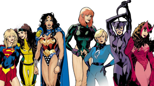
Tecna would properly do the full bodysuit and face mask bc duh, while Stella would be more wonder woman
I feel like Believix is bad in concept? Like the whole thing is just having people believe in magic, which makes them stronger against the people who can absorb Enchantix level spells because reasons
Hmmm Believix being a transformation that increases physical strength so they can just fucking punch the Wizards would be a fun away to get around the absorption problem, fit the super hero theme, and not condesne Enchantix
Obviously the Believix wings would stay and they'd still be fairy like, just with some comics book inspired changes to their outfit...
Musa but her outfit is slightly inspired by Harleen because I'm very normal about both of these fictional characters and do not have a Harley Quinn Funko pop. THE PIGTAILS—
I don't think that would look too odd on the girls? And it would match the earth thing? It would take some of the tropes of super hero costume and make them 🧚♀️✨ fairy ✨🧚♀️, and super hero costume already kinda look like a less sparkly magic Winx so I don't think it would be a huge stretch
I just???
Tecna brings up becoming superheros to the earth people to increase their Believix powers, and starts talking all about comic books and I thought it would be fun to incorporate that! Especially because once you notice that Aisha/Musa and Stella/Bloom's outfits share most of the same elements it slowly will drive you crazy... Or is that just me?
Musa is already rocking the superman pants!!! Fnnsndnsdn, it's perfect/j
The only ones this design wouldn't vibe with as well is Flora and Bloom
Bloom I can't see liking comic books all that much (she's a die hard classic fantasy nerd) so her outfit would be very similar to the one she has now, and Flora's general vibes don't match up with super heros all that well so she probably wouldn't bother leaning into the idea all that much
Plus it's an excuse to give Stella something like her shorts back bc I miss them
Here's some doodles I made while waiting on food

I drew these before having to run out the house, and ran out of space on the page. That's why they look shitty
Aisha's Believix top is literally already perfect. Just like pull it down to be a jump suit, maybe with a skirt like her Lovix


Just imagine it's a full shirt like in this doodle I made before I remembered her Lovix, and cursed myself as I realized in the middle of outlining
God I have no clue for Flora....
Ummm maybe Posion Ivy meets supergirl?????
Don't even ask about Roxy I do not know, not even a little bit
All I have is boy wonder robin bc I think it would be funny
Musa, Tecna, and Aisha are gonna have more masc transformers with outfits that are more practical; while Stella, Bloom, and Flora are going to have more femme transformations that say practicality whomst
These are all ideas off the top of my head
If you cannot tell I'm not super into comic books, so gjsjdje trying my best
The important part is that Tecna should be visiblely having fun with the outfits—
27 notes
·
View notes
Photo

Redesign Prompt RESULTS!
Alright, thank you everyone who has voted, the results are now in! Overwhelmingly our winner is Ranmao 🐈!


First of all, I need to insert a few caveats here. Unlike with Victorian fashion, I do not have years and years of studying of Qing dynasty-fashion behind me. So whatever results I show here are the product of a fortnight of reading up and meticulous studying of contemporary photographs. a.k.a. I am merely scraping the surface here. But! I do promise that everything shown here is done to the best of my ability to be responsible as a content provider.
Now without further ado, let us dive into Ranmao’s current design, the blatantly obvious inaccuracies, and how I propose to redes...ign... her outfit while keeping the original intact as much.... as possible????
Heck, this is not even worthy of being called a ‘redesign’, this is straight up designing from scratch!

Hair
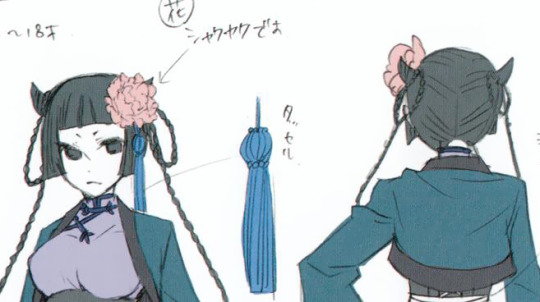
Let us start with her bangs. Her bangs are in fact surprisingly accurate, as late Qing dynasty women would wear their bangs in a variety of Bettie bangs trimmed well above the eyebrows. Having sides of the bangs growing longer framing the face was usual too, though they would be cut slightly thicker than Ranmao’s. Though, we don’t know how much hair Ranmao has, so I see no reason to alter it.
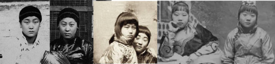
Twin braids are very much associated with the “China doll look”, but they seem to have been branded into our image of the “Chinese Girl” because it was the go-to look for unmarried women in Republic China (which is many years later than Ranmao’s time, and also has more surviving images.)

In Ranmao’s time, unmarried girls would either wear the bottom part of their hair down, or have everything tied into a single braid behind them. Girls who preferred a more feminine look would often decorate the sides or the top with flowers or other ornaments depending on their wealth.
Yana’s notes say that the flower in Ranmao’s hair is a Chinese peony, which is also called the Empress of Flowers in Chinese as well as Japanese culture. I could find sources on how the peony was the symbol of the Empress of China, and how one better avoid wearing any type of peonies around the Empress herself for fear of being suspected of disrespect. But I could not find any evidence of such flowers being banned for other people, so presumably it was more an ‘unwritten code of politeness’ rather than fashion law.
Hence, I kept the pink peony design for Ranmao, and decorated them in the way Qing women would have.

Neckline
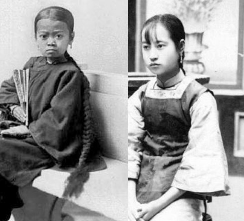
By far the most interesting thing I learned from this redesign attempt was that the “mandarin collar” - the thing that pops up first in most people’s minds when thinking about Chinese fashion - was in fact not at all common.

In this academic work on Chinese fashion history, Finnane writes that the ‘high collar’ was “not a common feature of costume before the twentieth century.” Instead, most costumes would have had a round neckline.

Finnane, Antonia. Changing Clothes in China : Fashion, History, Nation. New York: Columbia University Press, 2008. p. 93
The ‘high collar’ gained popularity in early 1900s in China after the Europeans brought with them the beauty standard for high collars, as well as slim-fitted silhouettes. The Chinese increasingly adopted this type of collar and the slim silhouette (the well known ‘china dress/qipao/cheongsam’), and the relatively many early photos that survived helped engrave this stereotype into our minds.

Sleeves
I do not think it requires any mention, but 19th century Chinese fashion did not include boleros... For many of the original designs of Ranmao I can sort of see where Yana got that image from, but this bolero-look truly beats me.

The sleeves worn in the late Qing period were relatively wide, though they were starting to slim down over time. Late Qing women enjoyed much more flexible clothing rules than earlier Qing women, and the width of the sleeves was in great part determined by personal preference, season, but mostly one’s wealth.
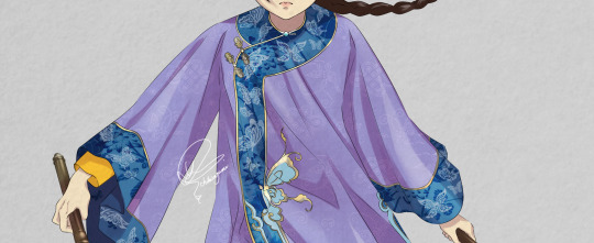
Needless to say, the larger the sleeves the more fabric and embroidery it would require, and thus more expensive. Also, the wider the more it would get into the wearer’s way.
I don’t know how much thought Yana put into Ranmao’s original design in relation to her function as elite bodyguard, but considering how the original has zero practicality and only serves to maximise Ranmao’s attractiveness, I have no qualms about giving Ranmao fairly large sleeves too. Besides, let us assume that Lau is responsible for providing Ranmao with clothes. Illegal money tends to fill the pockets quite deeply, I don’t think he can’t spare a few pounds for big sleeves.

Wider sleeves would expose much of ‘a lady’s precious skin’, as such a more fitted layer would have been worn underneath. (The sleeves under the wider sleeves obviously did not have to be orange-ish. This was merely coincidence that both my redesign and the visual source have this colour.)
Silhouette
The figure hugging silhouette x Chinese clothes was - as mentioned above - not at all a thing in Ranmao’s time. In fact, the accentuation of the “female curves” was considered very inappropriate if not downright ugly in the Qing dynasty.
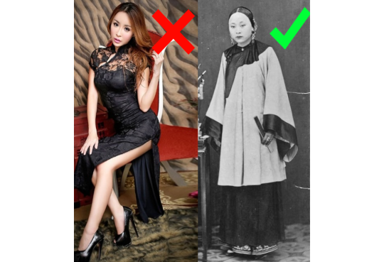

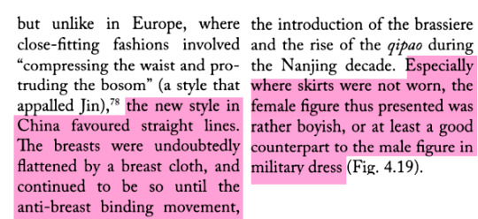
Finnane, Antonia. Changing Clothes in China : Fashion, History, Nation. New York: Columbia University Press, 2008. p. 94
Yana’s notes mention that the thing Ranmao wears is just an European corset and that that is the only thing ‘English’ about her attire.
Well... I don’t know where the idea that Victorians wore corsets on the outside comes from, but I myself admittedly was fooled by this a few years ago too... I promise you all now however, Victorians decidedly did not wear their ‘bras’ on the outside. I think even now this look is considered rather ‘questionable’ by most people.

Instead, Qing dynasty clothes were mostly cut wide and straight, loosely dangling around their bodies offering maximum comfort and space. You feared Ranmao killing you in her corset? Now tremble before her now blessed with maximised agility.

Trousers
Well... I considered ‘translating’ Ranmao’s attire to 2020 standard like I did for O!Ciel, but that would not be Tumblr-filter approved. Skirts so short they could be mistaken for a belt are nothing too surprising today, but wearing one with a split that deep is probably a bit too revealing even by today’s standards.

By the late Qing dynasty, men and women, rich and poor alike predominantly wore trousers. Long robes (skirts) were definitely in fashion too, but they were reserved for those who could afford to not have much agility. If you were a farmer, robes would not have been your first option. Perhaps the way long skirts were viewed by the Qing Chinese was not unlike the way we see them now; ‘more classy’ ‘more feminine’ and ‘less convenient’, but not the only way to express femininity.
In these pictures below we can see relatively rich women, married and unmarried alike, all wearing trousers.

Ranmao is predominantly a fighter, and as trousers are plenty feminine in Chinese fashion culture, I don’t see why she would not choose to wear trousers instead of a restricting long skirt. Hence I gave her a pair of trousers.
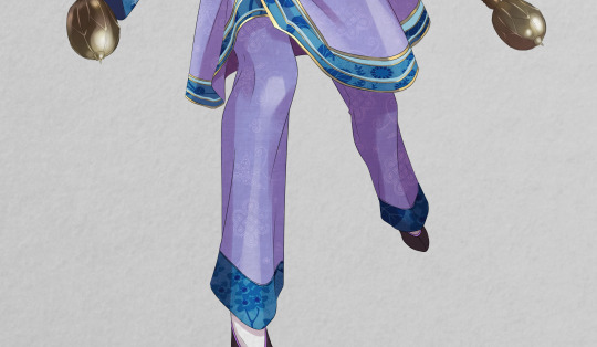
Shoes
Like I said before, “the shoes are correct...” But the anklets definitely are not!
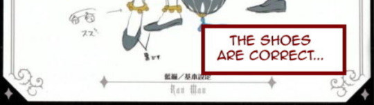
Golden or silver anklets are something that are worn by very, VERY young children in China. Even to this day it is customary among many Chinese people to gift newborn children at least one piece of pendant, bracelet or anklet, for it is believed to bring the child luck. More practically, this piece of jewellery will become the child’s first piece of property then, which can be sold later SHOULD they ever run into a financially difficult situation.

These anklets or bracelets would not be removed from the child unless they have outgrown them, which happens fairly quick. Ranmao who is probably full grown should have outgrown them at least ten years ago. Hence, seeing these things on Ranmao would probably make it look like she is still wearing diapers or bibs.
Chinese people would likewise not have worn shoes barefoot. Instead, they would have worn cotton socks which were mostly white.
DOUBLE HAMMERS
HERE COME THE WEAPONS! Luckily Yana wrote the following note or I would never have guessed what they are for my knowledge about Chinese weapons is next to nothing.
“These are【SUPER】heavy. They are weapons called 双錘 (double hammers) and they in fact exist. I heard these were used by power-type warriors.”
So, I googled 双錘 and it turns out that the type Ranmao is holding do indeed exist! But... only in fiction and theatre.
The hammers that were used in actual combat were either very thin and long, or short and plump. Such hammers were one of the most primitive metal weapons in China, and quickly fell out of favour among Chinese warriors when more practical weapons such as the metal spear, sword and bows were invented. The hammers mostly retained their value because of their weight in heroic tales and myths about legendary warriors and deities.
I don’t have the full details, but apparently according to some legends or myths, one of such big-ass hammers could deal a force of 200kg, and thus 400kg combined. Regardless of this being realistic or not, it sure does sound very cool! It is therefore no wonder this primitive weapon retains its popularity even today.

Nowadays when these hammers are used, they are either the blown up theatrical versions, or the smaller versions for the sake of preserving martial arts.
I had a bit of a dilemma as to which version to give Ranmao, but in the end I settled with the short and heavy ones because I wanted to keep the idea of this small and innocent looking girl wielding solid metal balls. Two cheer-leading sticks would simply not have the same weight, figuratively and literally.


Alright everyone! Did you enjoy my response to your votes? I hope you did ^^ Non-European fashion history really is not my strong suit, so my deepest apologies if I messed anything up.
Pray tell if I did, I am always happy to learn ^^
#Ran mao#ranmao#ran-mao#redesign#redesign prompt#art#my art#fan art#fanart#fan-art#Chinese clothes#UGGHGHHGHG non-European fashion REALLY is not my strong suit#BUT I learned a lot and I had fun!
1K notes
·
View notes
Last Seen Blogs

reikimontreal
Reiki Montreal

tank19900410-blog
Untitled

lekhaleki
writeblr

larajeahsong
love
estella-the-star
💫Estella the Star💫