#overlapping areas that are the same color blend together visually
Text
The Pokemon HOME app limiting random features and information to either the mobile or console versions is SO clunky and annoying.
My goal: to check which of my favorite Pokemon and shinies stored in HOME don't have the Paldea Champion Ribbon yet, so I can bring those into Scarlet and get it for them. But! You can only view what ribbons a Pokemon has on the mobile version of the software! And you can't move Pokemon to your switch games from mobile!!! So you have to:
quit out of the console app, if you opened it already because you thought this would be a relatively simple task
open the app on mobile
manually document which Pokemon don't have the ribbon- like, on a piece of paper or something
close the mobile app (you can't have both versions of the app open simultaneously)
open the app on console
move them from HOME into Scarlet, referring to aforementioned list
Now you might say "There is a custom tag feature in Pokemon HOME! You could apply a tag to the Pokemon you plan to move instead of making a physical note on a piece of paper!" But unfortunately, the only aspect of the tag you can see on the console version is the color- the name of the tag isn't visible. and I'm already using every color of tag available
(also: you can only make and apply tags on mobile. other mobile exclusive things: wonder trade and gts, viewing 90% of achievements, viewing models, switching between a pokemon's stats for different games it can go in without switching what game you're planning on moving things between)
#pokemon home#pokemon#i need a text post tag#i have more complaints too. i should make a comprehensive list. just for me#like: shinies don't have any symbol marking them as such on the GTS. so for the really subtle shinies? you just have to look REAL careful#whenever you import pokemon from Bank they automatically get tagged with a new tag with the name of the Box that they were imported from#which is maybe useful to somebody but its just super annoying for me to have to keep deleting the 'Kanto 1' tag from all of my Bank imports#the lighting in the model viewer is really fucking bad and makes the pokemon look flat and undefined#overlapping areas that are the same color blend together visually#for that matter; the HOME renders are really fucking ugly. compare them to the sugi art they're posed after sometime. terrakion. its WILD#the lag when moving between pages of boxes on the console version when you have a lot of pokemon stored in HOME is MISERABLE#the mobile app and console app have different sets of achievements that are only viewable on their respective apps???? its weird#can't reorder pokemon's box positions on mobile; you just get a big list that you can sort different ways#this doesn't affect their box placement at all#the tags seem really useful at first but if you're moving pokemon between HOME and games a lot?#you have to reapply the tags to those pokemon every time you put them back in HOME because that data is lost once they leave the app#they never fixed the Spinda problem with BDSP; they just made it so that you can't bring Spinda in or out of those games
24 notes
·
View notes
Text
1. Journaling Part 2
Asymmetrical balance- Is a work that looks balanced despite a lack of symmetry for example a garden, plants grow in all shapes and sizes and yet in a garden they seem unified and balanced.

Emphasis- Is when you want to draw attention to something. For example, if you want to emphasize your car you might get a bright color to draw attention.
Focal point- This is the place that the eyes go first, the place where the most emphasis is placed. For example, in this painting the water droplet is the place where the eyes travel first so it is the focal point.

Contrasts- The dramatic effect that happens when dark is against light. For example, people put a contrast wall in bedrooms to have this effect.
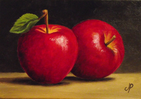
Subordination- The areas of the artwork that are rated as less important. For example, in this photo the artist has chosen to make the body of the colored pencils the same muted grate tones making them almost blended into the background.

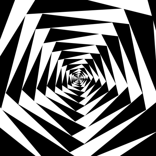
Directional forces- Are pathways designed by the artist for the audience's eyes to follow. For example, this artwork was designed to make the eyes move into the spiral.

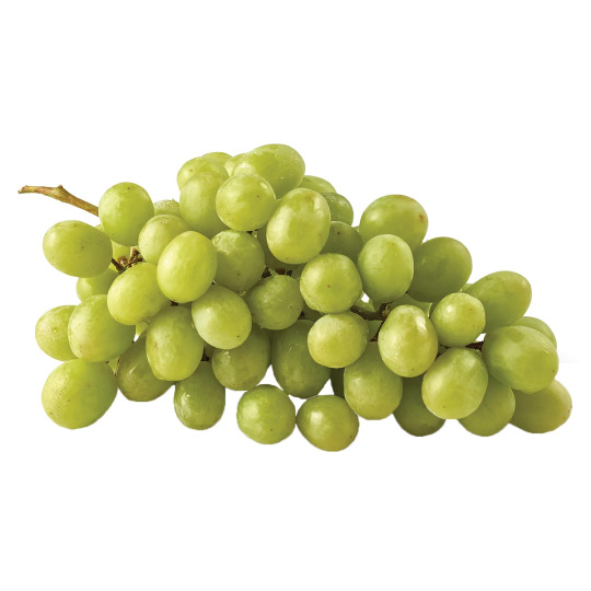
Repetition- The recurrence of an image. For example, in a bunch of grapes you will see the recurrence of green oval shapes that overlap in various ways.
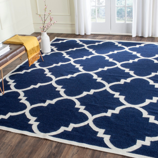
Pattern- Is the repetitive order of designs. For example, this rug is decorated with a pattern.
Rhythm- Is the complicated repeating of dominant and subordinate elements to make a sort of visual flow. For example, in this painting there is a repeating shape in both black (dominant) and white (subordinate) coming together to form an inward flow.
Scale- The size relation from one thing to another. For example, in this piece the artist has made the man sitting look very small because there is a large hand holding him.

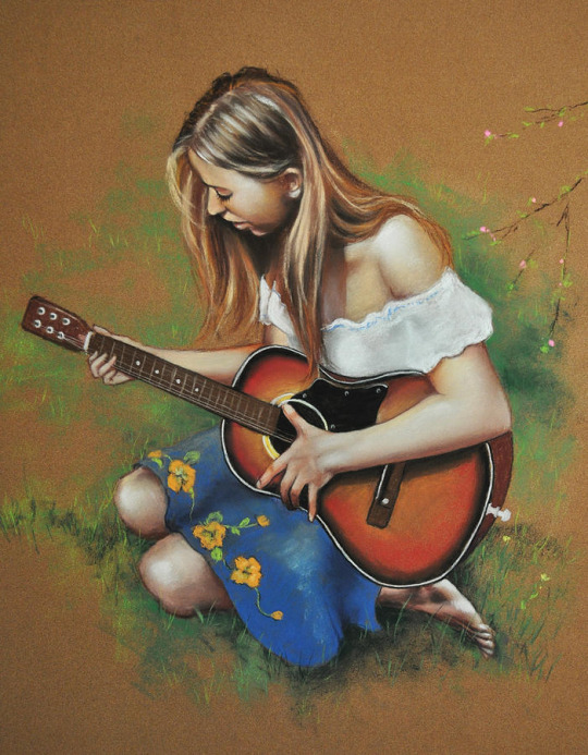
Proportion- The size relationship to parts and the whole picture. For example, in this piece the woman and the guitar are proportional to one another.
Format- Relates to the size and shape of the painting. For example, this rectangular shaped painting could be oriented on the longer side to be horizontal this makes the painting look longer but more squished.

Composition- Is how the artist chooses to organize the elements in the artwork. For example, the artist first chooses what item they were going to recreate then starts with a basic shapes as well as pick which direction there light source will be then they go in with color.
Design- The process the artist takes to organize their visual elements and the end product of that process. For example, Jason pollock painting he uses first starts by picking a color scheme and then he starts spluttering these colors until the canvas is covered.

0 notes
Text
gonna post progress pics from my volo painting and write a bit about my process since some1 asked for them!
excluding adjustment layers this has 20 layers in all. i wont show all of them bc some of them just have minor differences but ill show my general progress
sketch. just super loose but has enough visual clarity to be able to work off of and not have to fix issues caused by poor anatomy etc later
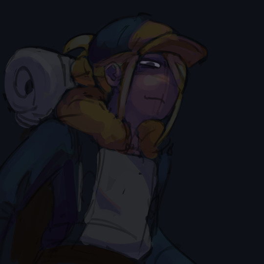
background color + painting under sketch. to choose colors, i go on the color wheel and just kinda choose colors freely and almost randomly & paint w them by very lightly pressing with a hard round elliptical opacity brush set to a large size, blending other colors on top of them this way. i dont use this brush the whole way through but honestly i couldve and it still wouldve turned out good
a lot of trial and error but because were doing it so loosely its pretty easy to find something that works quickly (also sorry the painting is so dark at this point oops)
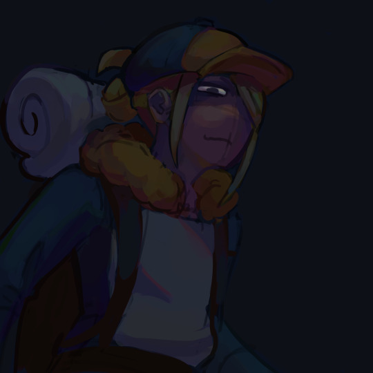
developed painting a bit more and upped saturation in some places using an adjustment layer.
to get a lot of the color variations im getting here, i colorpick from other areas of the piece, ie colorpicking from the face and using it as subtle lighting for the hair, seeing i like how those colors look, and using that as a jumping off point and using a more intense pink for the hair shading. you can also see i got some of the yellowish on the sleeping bag or whatever tf he has on his back from the hair/hat/etc, just brushed it on there really lightly and it looks cool. another place i like to colorpick from is where the sketch overlaps with the colors underneath, it creates some interesting desaturated colors.
you can also see im developing linework a tiny bit here, its pretty early on and a lot of it will be painted over later anyways but i start being like, okay the 3d forms i've been making are working, let's draw on top of the sketch a bit to encapsulate those areas
but yeah uhh definitely a lot of this is just testing stuff out when i'm this early in the painting, i am aaaalways in motion, never stopping and just working off of instinct and what looks cool. and if i mess something up, i can just erase it and i'll have the layer underneath to fall back on.
also im just straight up not thinking about anything at this point unless im trying to closely replicate a reference image, which i didnt do very much. i use reference for eeeeeeverything i make. i took a pic of myself at a similar angle to this and then loosely based the sketch off of it, looked at pics of volo, later on looked at some reference of how ppl paint fabric, grabbed some pics of how i drew one of my ocs who makes a similar expression w his eyes, grabbed images of other digital paintings i'd made! because i wanted to work in a certain style i'd done maybe only twice before. for reference images, i use pureref, which i would highly recommend to any artist, especially ones without dual monitors (like me). basically just allows you to make a reference board and pin it on the very top of your screen
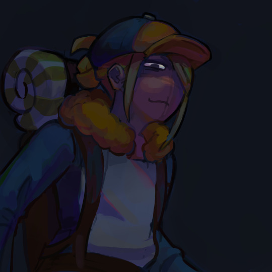
just developed more in the same fashion, then threw a couple adjustment layers over it. i toned back some of these adjustments later but yeah. you can see the lineart really starting to come together, a lot of the color variation on it colorpicked from accidental overlapping colors that ended up looking cool. btw i need to make it clear i do lineart and rendering on the same layers. also i did the stripes on the pack just by using a multiply layer, then giving it more love on the layer immediately above it so it doesnt look cheap
more rendering, got a vignette going w a multiply layer. actually started using reference for fabric folds. theyre really simply done honestly and dont look like. amazing. but they work
painted over the vignette in the background to make it a bit more interesting & not just a gradient, more rendering as usual, threw in some subtle highlights to make it a little more interesting! i probably couldve gone further with them honestly. also decided to do a really subtle outline around him cuz it looks cool. lineart is basically done at this point and this is where i started to think i was just about done

desaturated it a little bit, re-added some details i forgot about, generally fiddled with stuff and corrected some mistakes, added signature. and its DONE. i think this took me about four-four and a half hours? yeah something like that
other general notes:
-probably favorite part of this is the sleeping bag or whatever the hell that thing is on his backpack
-not entirely happy with how i did the fluffy part, it has some really cool color shifts but it doesnt feel like a proper 3d form all the way through to me. definitely pretty 2 dimensional in spots, but i was like eh i dont care enough to fix it
-although i think the pose works well enough, its definitely another example of me using pretty static poses and basic composition in my art. which isnt too terrible but i really need to start getting outside of my comfort zone on that stuff. this definitely couldve looked cooler if i developed the pose more and did better foreshortening but i didnt cuz that shiht is hard to me. im really awful at foreshortening
-on that same note, i worked off of the first sketch i made and didnt warm up beforehand which you do NOT want to do. thumbnail stuff out and make multiple sketches. 80% of the time the sketches following the first one will be better
-IM NOT AN EXPERT lots of stuff i still need to learn dont follow this 1:1
OVERALL im really satisfied with this though especially for how quickly it took me to make it. & i hope this was interesting, lmk if you have any more questions on my process !
12 notes
·
View notes
Text
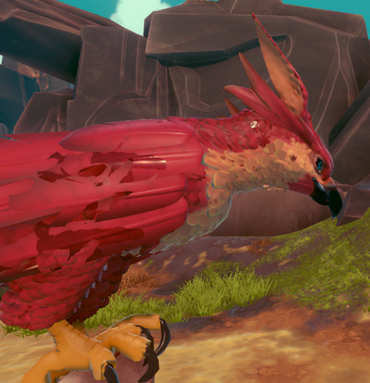
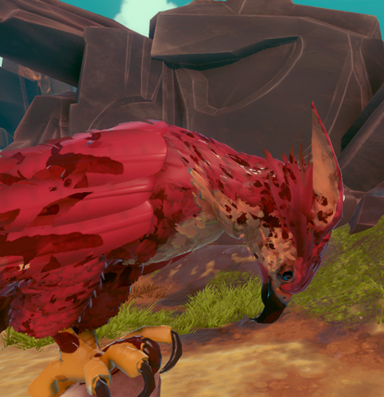
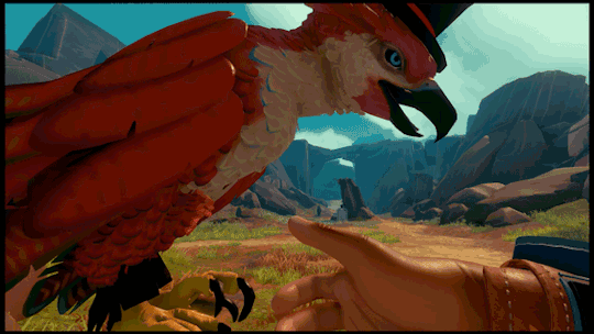
Anatomy of a Falcon
youtube
We recently announced Falcon Age, a game about nurturing a falcon from a baby, bonding with them, and together resisting the forces that colonise your planet. Falcon Age will be out in 2019 for PS4 and PS VR.
We showed off the game at PAX last week, got a great response, especially on the falcon. Let’s do a deep dive of the design of the falcon, animation and rig setup, AI and navigation, feather tech, and raptor sounds.
Falcon Design
Chandana Ekanayake and Darran Hurlbut

Our falcon design combines multiple raptor types. She is big as a golden eagle, fights like a hawk, has some eagle-hawk resemblance, some owl-like tufts, and falcon tendancies. She’s one of the last of her kind left in our world and we wanted to make her unique visually for the story and also visually stand out during gameplay against the sky and desert like environments.

One of the early inspirations for Falcon Age came from videos of golden eagles hunting large mountain goats. That led to some research on falconry and the idea of having a falcon as a pet and designing mechanics and gameplay around that core idea. We made a rough prototype early on to test out the ideas. The first time we successfully whistled for the bird in VR and saw the scale change from it approaching from a distance to landing on our hand, we knew we were on to something that could serve as the core of a unique game.
Animation and Rig
Aung Zaw Oo
FALCON FEET TRACKING
There are lots of animation options out there, but none of them would easily solve our specific falcon feet tracking needs. Inverse kinematic setups, root motion and other complex plugins could do the job if we had a bigger team and more time to dedicate to it. We wanted a more predictable outcome so we went with a multiple pose based solution made in 3dsmax.
However, the biggest reason for not using IK, is that this is the best way I could come up within a couple of days. We were building the prototype so fast back at the beginning of the project that we didn’t have time to look at what other solutions are available. This is the most reliable and least ugly way I found and we’ve stuck with it since. If it's not broken, don’t fix it.
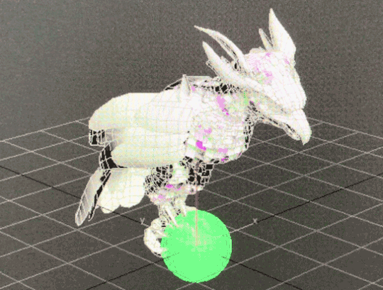
Here is how I imagined the bird claws blending IRL. The ball is the fist that is attached to the VR motion controls.There are limits to this method. The claws needs to be able to wrap around a fair chunk of the fist and the fist pose needs to be as spherical as possible.
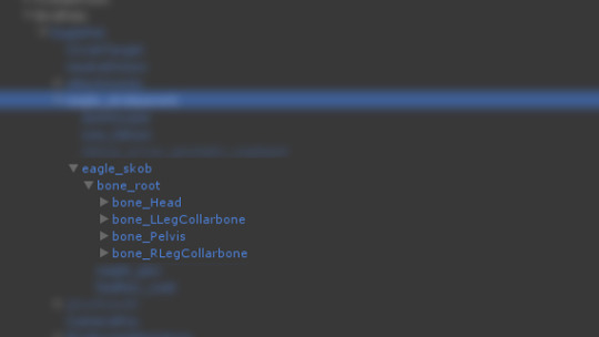
Note that head and legs are siblings of the pelvis. This makes the bone masking and making separate blend trees easier. Ignore the word ‘eagle’ in the naming. That was just a temp asset name before we figured out the bird design.

Short version of how its done; the fist is a ball and the bird’s feet rotate around the ball using 30 blend poses and shuffle animation to get the feet back to center when the ball(motion hand) has rotated too far.
30 Blend Poses on a ball
A shuffle animation let feet recenter
And the the blends start again after that quick shuffle animation from the new rotation of the hand. According to our programmer Justin, he is doing some regular old quaternion and linear algebra math. And I’m using 3 float values that he’s giving me and feeding them into those anim blend states.
For baby bird, the 2nd knuckle on the index finger is treated like a ball.

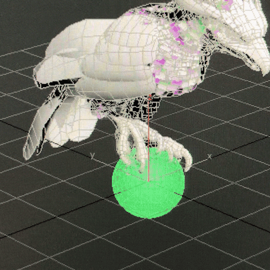
The one edge case where the ball concept doesn’t work is when the glove is pointed directly down. Pictured below.

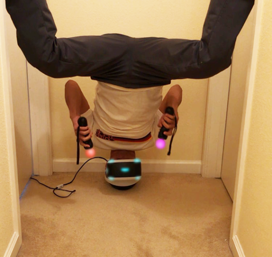
We had several ways we could’ve dealt with that case. One solution was to have a collider on the forearm part of the glove and have the bird fly away if bird’s collision intersects with it. Ultimately we decided to let it be as is. It’s more player friendly that way since it lets you scratch your left hip while in VR without having the bird leave you. Also most people would never have their hands positioned that way in normal play.
Unless they’re playing in a headstand for some reason. All kinds of animation features would look wrong or broken in a headstand.
FALCON HEAD TRACKING
Short version of how its done; the head (bone_Head) is a direct child of the highest object in the bird skeletal hierarchy ( bone_Root ).
Bone_Root’s position(not rotation) follows the position of the motion controller and bone_Head counters that motion. Basically a 2-object hierarchy where a positional blend is used to counter motion of the parent object to keep the child object in same global position. The rest of the bird body uses a blend of 27 poses to try its best to keep the bird looking natural.

With the size of the adult bird we have, a 12 cm translation in all axis(24x24x24 cube) seemed ideal for getting the stabilizer effect without stretching the neck too much. The head will also move at the edge of that range and when the motion hand stops moving, that new position is now the new center and another 24cm cube is formed there. Math wise, headlock is mostly just a vector transform with a lot of extra 'fluff' for limiting speed, transitioning in and out, and moving the lock point when it gets too far from the body but the bird is still in the area.

Bird Navigation and AI
Justin LaLone
BIRD BOREDOM
For the most part, the falcon obeys Ara’s commands and follows her around. If you stand around long enough in one area while the bird is just circling or if you launch her with no orders, she will start looking for something else in the area to do - usually hunting or landing on a point of interest. She will also take some initiative when perched on Ara if anything else tries to grab her (she’s possessive like that), and likes to help lead Ara to the next hole in lightning golf.
SUN BLINDING PREY
Some of the prey, such as the rabbits, are very skittish and as soon as they notice a falcon diving towards them they will take off for the nearest bolthole. They have a more difficult time seeing Ara’s bird if she approaches with the sun behind her, so paying attention to where the light is coming from and sending the bird from that direction can make catching prey easier and more reliable. On the other hand, simply diving from higher up can be good too, as the bird can pick up more speed before being noticed, giving her prey less time to dodge out of the way.
Coming in fast and and from the sun, for a guaranteed hit.
FALCON 3D NAVIGATION
Getting a flying animal to reliably traverse a 3D space in a somewhat natural looking way isn’t something you typically find out of the box in a game engine. We have roughly three levels of bird-navigation logic going on to get the bird from point A to point B without running into too many things or getting stuck in a corner.

For high-level navigation to find its way through the world, we build a 3D navigation graph and use A* to find a path. What’s probably somewhat unique in our implementation is that we are using the fairly new Unity job system to do all our A* pathfinding, giving us fast searches that stay off the main thread, allowing more time for other AI, physics, and more stuff in general. Most of the graph is generated automatically, with manually placed connections for flying through narrow gaps like windows that are small or require an approach from a good angle.
The purple line is a rough path for it to follow to get around the big rocks in between where the falcon started and where Ara is standing. The bird doesn’t try to follow this line very closely; it would be trying to make some pretty strange and sharp turns if it tried, so as soon as it has a clear shot to the next part of the path it heads there instead.

Sometimes smaller objects or moving objects can get in the way. The falcon looks ahead and goes over or around these objects. This rock is actually just big enough that it would normally navigate around it with A*, but I forced it to “forget” about that for now. Here, it’s turning left to go around the rock - the red lines show where it has been looking for the past few frames. It usually won’t try to go under things in this way, but the A* navigation can direct it to go under arches or walkways.
The last level of bird flight logic is the actual maneuvering logic, or how the bird decides how fast it wants to go, how much to ascend or descend, how quickly to turn, and how it applies physics accelerations, limited by what it is allowed to do, to get there. This feeds into the animation system telling it how hard the bird is working, what sort of pose it should be in, if it should be banking, etc. The object avoidance is tied in somewhat strongly with this, but all the A* navigation is completely separate. It is also a big pile of math and logic.
Feathers and Rendering
Ben Golus
The small body feathers, or contour feathers, on our birds flutter in the wind, and react to the player’s hands brushing against them to give a greater sense of tactile interactivity. The way this was done for the PAX demo is a bit of a hack which I hope to replace before we ship. (This of course means it’s the solution that will ship with the game.) The short description is each small feather on the bird is a treated like many grass or vegetation shaders. Several overlapping sine waves are used to calculate some simple noise used to flutter the feathers and give them some life. Their timing is offset by a random value per feather stored in the vertex color, and the flutter movement is scaled also using the vertex color. This means the base of the feathers don’t move, but the tips do. It also means longer feathers move more than shorter ones.
Unlike most grass shaders, we need the feathers to not move in random directions, so we can’t use world or local space directions. Plus this is on a skinned mesh which makes the direction even more dynamic. Instead I use a combination of the feather’s vertex normal and tangent so the feathers flutter in and out and side to side relative to their orientation. This isn’t strictly accurate, but for small movements like this it won’t be obviously wrong.
To handle hand interactions, the player’s hand has a script which tracks the bones and creates a list of capsules that follow the shape of each finger, and a sphere for the palm. If the hand is in range, the vertex shader iterates over the list of capsules to find closest distance to one and softly scales down the flutter if a capsule one is overlapping it. The feathers are also squished down towards the body. The capsules are oversized as the overlapping tests are soft, so this isn’t an instant on-off, but a gradual change. It’s roughly tuned so that once the visible finger is touching the feather it has stopped moving entirely and will push down.

Here’s an early test of this system in action. You can see how the feathers react to the sphere before it actually touches it, but the interaction is still convincing.


For the final release of the game I’d like to move to a geometry shader or compute shader approach which would solve some of the issues the effect currently has when only one vertex of a feather is being overlapped, and the fact the feathers light normals don’t change when being touched.
FALCON DAMAGE FEEDBACK
We needed some way to show when the bird is hurt, and we wanted to avoid using a health bar or similar mechanic as much as possible. Animation is used to make the bird look tired, and in pain, but we still didn’t find that it was clear enough to users that she had taken damage. We decided we wanted her to look physically damaged with blood and frayed feathers to really strongly communicate her state. The obvious answer was to do a material swap. However we also wanted to show a gradual increase in damage rather than a hard on / off, and did not want to have to have a lot of different maps. There was also the issue that most feathers shared the same UVs, which meant blood spots would be repeated all over the bird.
The solution we ended up with was done in two parts. First was feather damage and fraying. The alpha channel of each feather is setup in a special way so that both an undamaged and damaged version exist in the alpha at different opacities. The feathers are using alpha test cutout (actually alpha to coverage) at 50% opacity when at normal health, and 25% opacity when damaged to switch between the two states.
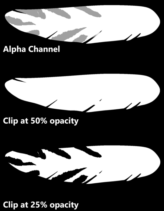
For blood splatter the bird has a second UV for the blood texture so we don’t have to reuse the original feather texture UVs, and then we blend in the blood on top of the base texture. The result is we only need one base texture set, and one blood splatter texture set for the bird and we can get variable damage effects on the bird.

Raptor Sounds
Rob Pearsall

The bird wasn’t designed to be different - futuristic or magical - from any bird in our world, just an amalgam of several flying raptors (except for wearing hats); so, it didn’t make any sense to create a voice for it that might sound ‘cinematically awesome’ - it just had to work and be believable.
That said, I did have the choice of “borrowing” the calls of any raptor I thought would communicate to the player the various moods, feelings, and responses of the bird. So, I listened to the sounds that raptors make; and to my surprise, the biggest, most impressive bird - the eagle - was absolutely the worst sounding predator of them all. First place for “don’t use this”.
The hawk is always a great choice. Everybody loves the screech of a hawk. I used to think that there was only one good recording of a hawk screech and every sound designer owned it and that’s why all hawks in all shows and movies sound the same. Not true. It turns out, all hawks sound the same. Not much variation at all. Now, don’t get me wrong, it sounds awesome, so yea… we’ve got that sound on our bird too. But that’s not all.
The best thing I had going for me was that I didn’t have to limit our falcon voice to one specific kind of falcon; and there are many kinds. Because of this, I could liberally choose any sound any falcon produces that makes sense as a kind of emotional statement from the bird.
Conveniently, the emotions were limited; I name them as statements from the bird:
All is calm, all is well
I hear you call me
I’m attacking
I’m hurt, but I’m still flying
That hurts
Getting a recording of a raptor that’s annoyed is really easy; show up with a bunch of recording gear, get into it’s space, and it’s already annoyed. So, there’s a lot of material of raptors sounding negative and mad. This works for ‘pain’. The hawk’s sounds work for flying responses and attack calls. The “all is calm” sounds were the difficult ones. There were several chirps that worked, but then I had to edit a lot of different kind of calls to get partial, short squawks that fit with the chirps, and it worked.
Keeping track of the bird sonically while in game… well, that’s another story for later.
Thank you!
Thanks for reading. For more info and latest updates follow @outerloopgames
15K notes
·
View notes
Text
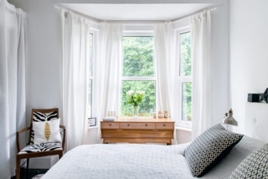
Bedroom Windows Buying Guide
Bedroom Windows Buying Guide
Bedroom window treatments aren’t given much thought by many homeowners or renters. You might throw something over the window to block out light if you sleep late or skip it altogether if you’re an early riser. But bedroom window valances, curtains or other window treatments can help turn your house into a home, adding a uniquely personal touch. Here is what you should know.

Image: Ant Clausen/Shutterstock
What are bedroom window treatments?
Although curtains are certainly included, window treatments provide a variety of options to dress-up your bedroom window. Ideas run the gamut in styling, from vintage to ultra-modern. Bedroom window treatments include everything from shades to formal drapes, as well as decorative valances, window scarves and cornices that sit above the window.
Master bedroom window treatments are often used to add luxury and serenity to the room, while window curtains for a bedroom in another part of the house might impart a different feel or function. For example, blackout curtains can make it easier for a toddler to nap.
How to buy the best bedroom window treatments
The best bedroom window treatments are the ones that work for you. You might want simple curtains for a bedroom window in a minimalist room or heavy formal drapes topped by valances in a vintage-inspired room.
It’s also important to consider the actual window. Bedroom windows come in many shapes and sizes, and some lend themselves more easily to small window treatments like mini-blinds. If your window glass is thin, thermal insulated curtains can help improve room comfort.
Choose colors that blend with the existing colors in the room, including paint and trim, for a peaceful and harmonious look. Or add drama to the room with contrasting colors and bold patterns. A color wheel can help you select colors that work well together.
Types of bedroom window treatments
Although there are seemingly innumerable styles, window treatments fall into a few simple categories:
Curtains and Drapes
The two terms are often used interchangeably, but curtains and drapes are not exactly the same thing. Both consist of two panels that come together in the center of a window (though single panel curtains also exist), but drapes are thicker, longer and more formal than curtains.
Curtains and drapes come in a range of light filtering options, from sheer to max blackout:
Sheer: Sheer curtains allow nearly all light to filter through. They can help reduce glare without blocking your ability to see out the window.
Semi-sheer: Semi-sheer curtains provide some privacy, while still allowing a great deal of light into the room.
Room darkening: As the name implies, these curtains greatly reduce the amount of light that comes into the room, creating a soft twilight effect.
Blackout: Blackout curtains offer privacy, noise reduction and some insulation while creating a dark sleeping environment even during the day.
Max blackout: For a truly dark sleeping experience, consider max blackout curtains, which filter 99% to 100% of light. They also provide maximum privacy and insulation, as well as protection against noise pollution.
Thermal insulating: Some curtains or drapes, especially blackout and max blackout styles, have an extra back panel of acrylic foam for further insulation. It’s also possible to buy a separate insulating liner for existing curtains or drapes.
Shutters
Shutters are generally the most expensive window treatment for a master bedroom or other room. However, they add the timeless elegance of wood to your bedroom design. Off the shelf shutters are available, but it’s typically better to have them custom made. This ensures that they properly fit your window for maximum protection, privacy and room-darkening effects, as well as aesthetics.
Blinds
Generally the least expensive option, blinds are also the simplest of the master bedroom window treatment ideas. Slatted and operated with a cord or small handle, blinds can sit inside or just outside the window. They can be a great choice for modern, minimalist bedrooms.
Shades
Shades are a fabric option similar to blinds. They come in several styles, from simple roller shades to elaborately folded roller shades, and in different levels of light filtration. Depending on the style, shades can go with nearly any bedroom.
Valances, Window Scarves and Cornices
Bedroom window valance ideas also include decorative window scarves and cornices, but the three are not exactly the same thing. A valance is a piece of fabric that hangs at the top of a window. Simple valances are casual, while box valances hang straighter and are considered more formal. A window scarf is a long piece of fabric that is draped loosely around a curtain rod. A cornice is a wooden frame that may be painted or covered in fabric and hung at the top of the window.
Valances, window scarves and cornices may be used alone, but they are often paired with curtains or drapes. They can add visual interest, contrast or even drama to a master bedroom window. They are sometimes used in other bedrooms as well, especially rooms with a vintage or shabby chic decorating aesthetic.
Choose the right size
Choosing the right size window treatment is extremely important. But how to measure depends on which type of window treatment you select.
For blinds or shades that will be mounted inside the window frame, measure both the length and width of the window in three different spots. Use the narrowest width and the longest length. If they will be mounted outside the frame, measure the outside of the frame and add 1.5 inches to each measurement to account for overlap.
For curtains or drapes, measure the width of the window and then add 3 to 8 inches, depending on how full you want the curtains to appear. To choose a length, decide where you want the top and bottom of the curtain to be and measure the distance between those points. Formal drapes tend to be floor length, or even puddle on the floor, while more casual curtains may hang just below the windowsill.
Interior shutters are measured similarly to blinds or shades, but exterior shutters are significantly more complicated. Consider having your window professionally measured or follow the manufacturer’s measuring instructions for the specific shutters you choose.
As long as the width is at least as wide as the window frame, you have a great deal of latitude with valances and cornices. Window scarves are the most flexible, as they are draped rather than precisely hung, but for best results choose a scarf that is significantly longer than the width of the frame.
Compare bedroom window treatment costs
Master bedroom window treatment ideas often involve multiple pieces, such as two curtain panels and a valance, so when looking at costs be sure to include everything you will need. You can find window treatments for less than $15 at big box stores, or pay hundreds of dollars per panel at specialty shops. Curtain rods are sold separately and can drive up the price. In general, the bigger the window, the more you will pay to cover it. Floor-length drapes are also typically more expensive than windowsill length curtains, and the material that you select matters a lot in the final price.
Read bedroom window treatment reviews
Bedroom window treatments come in all types, sizes, styles, and price points. Yet none of these factors is necessarily an indicator of quality. The best way to know if you are choosing window treatments that will last is to read customer reviews of them. Look for comments on durability, ease of installation and even whether the indicated sizing is accurate.
Installation
Installing most bedroom window treatments is relatively simple. You will need some basic tools such as a drill, a tape measure, a level and some screws, along with a ladder. You may also need anchors to secure the mounting brackets or hardware to the wall, depending on the type of walls you have and whether you are drilling into a stud. Outdoor shutters can be a bit tougher to install, as can window treatments for windows that are very high or large or are located in an awkward area such as above a stairwell. Always seek professional assistance if you have any doubts about your ability to safely perform the job.
Bedroom window treatment brands
There are innumerable brands for each style of bedroom window treatments, and which is objectively better depends on your individual needs. In many cases, store brands (Amazon, Home Depot, The Shade Store, Bed, Bath & Beyond) are every bit as durable and long-lasting as more expensive specialty brands. Custom window treatments are also available from both national brands and local shops. Focus on features and reviews rather than brand names, and you will find the window treatments that are right for you.
The post Bedroom Windows Buying Guide appeared first on Freshome.com.
0 notes
Text
Bedroom Windows Buying Guide
Bedroom Windows Buying Guide
Bedroom window treatments aren’t given much thought by many homeowners or renters. You might throw something over the window to block out light if you sleep late or skip it altogether if you’re an early riser. But bedroom window valances, curtains or other window treatments can help turn your house into a home, adding a uniquely personal touch. Here is what you should know.

Image: Ant Clausen/Shutterstock
What are bedroom window treatments?
Although curtains are certainly included, window treatments provide a variety of options to dress-up your bedroom window. Ideas run the gamut in styling, from vintage to ultra-modern. Bedroom window treatments include everything from shades to formal drapes, as well as decorative valances, window scarves and cornices that sit above the window.
Master bedroom window treatments are often used to add luxury and serenity to the room, while window curtains for a bedroom in another part of the house might impart a different feel or function. For example, blackout curtains can make it easier for a toddler to nap.
How to buy the best bedroom window treatments
The best bedroom window treatments are the ones that work for you. You might want simple curtains for a bedroom window in a minimalist room or heavy formal drapes topped by valances in a vintage-inspired room.
It’s also important to consider the actual window. Bedroom windows come in many shapes and sizes, and some lend themselves more easily to small window treatments like mini-blinds. If your window glass is thin, thermal insulated curtains can help improve room comfort.
Choose colors that blend with the existing colors in the room, including paint and trim, for a peaceful and harmonious look. Or add drama to the room with contrasting colors and bold patterns. A color wheel can help you select colors that work well together.
Types of bedroom window treatments
Although there are seemingly innumerable styles, window treatments fall into a few simple categories:
Curtains and Drapes
The two terms are often used interchangeably, but curtains and drapes are not exactly the same thing. Both consist of two panels that come together in the center of a window (though single panel curtains also exist), but drapes are thicker, longer and more formal than curtains.
Curtains and drapes come in a range of light filtering options, from sheer to max blackout:
Sheer: Sheer curtains allow nearly all light to filter through. They can help reduce glare without blocking your ability to see out the window.
Semi-sheer: Semi-sheer curtains provide some privacy, while still allowing a great deal of light into the room.
Room darkening: As the name implies, these curtains greatly reduce the amount of light that comes into the room, creating a soft twilight effect.
Blackout: Blackout curtains offer privacy, noise reduction and some insulation while creating a dark sleeping environment even during the day.
Max blackout: For a truly dark sleeping experience, consider max blackout curtains, which filter 99% to 100% of light. They also provide maximum privacy and insulation, as well as protection against noise pollution.
Thermal insulating: Some curtains or drapes, especially blackout and max blackout styles, have an extra back panel of acrylic foam for further insulation. It’s also possible to buy a separate insulating liner for existing curtains or drapes.
Shutters
Shutters are generally the most expensive window treatment for a master bedroom or other room. However, they add the timeless elegance of wood to your bedroom design. Off the shelf shutters are available, but it’s typically better to have them custom made. This ensures that they properly fit your window for maximum protection, privacy and room-darkening effects, as well as aesthetics.
Blinds
Generally the least expensive option, blinds are also the simplest of the master bedroom window treatment ideas. Slatted and operated with a cord or small handle, blinds can sit inside or just outside the window. They can be a great choice for modern, minimalist bedrooms.
Shades
Shades are a fabric option similar to blinds. They come in several styles, from simple roller shades to elaborately folded roller shades, and in different levels of light filtration. Depending on the style, shades can go with nearly any bedroom.
Valances, Window Scarves and Cornices
Bedroom window valance ideas also include decorative window scarves and cornices, but the three are not exactly the same thing. A valance is a piece of fabric that hangs at the top of a window. Simple valances are casual, while box valances hang straighter and are considered more formal. A window scarf is a long piece of fabric that is draped loosely around a curtain rod. A cornice is a wooden frame that may be painted or covered in fabric and hung at the top of the window.
Valances, window scarves and cornices may be used alone, but they are often paired with curtains or drapes. They can add visual interest, contrast or even drama to a master bedroom window. They are sometimes used in other bedrooms as well, especially rooms with a vintage or shabby chic decorating aesthetic.
Choose the right size
Choosing the right size window treatment is extremely important. But how to measure depends on which type of window treatment you select.
For blinds or shades that will be mounted inside the window frame, measure both the length and width of the window in three different spots. Use the narrowest width and the longest length. If they will be mounted outside the frame, measure the outside of the frame and add 1.5 inches to each measurement to account for overlap.
For curtains or drapes, measure the width of the window and then add 3 to 8 inches, depending on how full you want the curtains to appear. To choose a length, decide where you want the top and bottom of the curtain to be and measure the distance between those points. Formal drapes tend to be floor length, or even puddle on the floor, while more casual curtains may hang just below the windowsill.
Interior shutters are measured similarly to blinds or shades, but exterior shutters are significantly more complicated. Consider having your window professionally measured or follow the manufacturer’s measuring instructions for the specific shutters you choose.
As long as the width is at least as wide as the window frame, you have a great deal of latitude with valances and cornices. Window scarves are the most flexible, as they are draped rather than precisely hung, but for best results choose a scarf that is significantly longer than the width of the frame.
Compare bedroom window treatment costs
Master bedroom window treatment ideas often involve multiple pieces, such as two curtain panels and a valance, so when looking at costs be sure to include everything you will need. You can find window treatments for less than $15 at big box stores, or pay hundreds of dollars per panel at specialty shops. Curtain rods are sold separately and can drive up the price. In general, the bigger the window, the more you will pay to cover it. Floor-length drapes are also typically more expensive than windowsill length curtains, and the material that you select matters a lot in the final price.
Read bedroom window treatment reviews
Bedroom window treatments come in all types, sizes, styles, and price points. Yet none of these factors is necessarily an indicator of quality. The best way to know if you are choosing window treatments that will last is to read customer reviews of them. Look for comments on durability, ease of installation and even whether the indicated sizing is accurate.
Installation
Installing most bedroom window treatments is relatively simple. You will need some basic tools such as a drill, a tape measure, a level and some screws, along with a ladder. You may also need anchors to secure the mounting brackets or hardware to the wall, depending on the type of walls you have and whether you are drilling into a stud. Outdoor shutters can be a bit tougher to install, as can window treatments for windows that are very high or large or are located in an awkward area such as above a stairwell. Always seek professional assistance if you have any doubts about your ability to safely perform the job.
Bedroom window treatment brands
There are innumerable brands for each style of bedroom window treatments, and which is objectively better depends on your individual needs. In many cases, store brands (Amazon, Home Depot, The Shade Store, Bed, Bath & Beyond) are every bit as durable and long-lasting as more expensive specialty brands. Custom window treatments are also available from both national brands and local shops. Focus on features and reviews rather than brand names, and you will find the window treatments that are right for you.
The post Bedroom Windows Buying Guide appeared first on Freshome.com.
0 notes
Photo
Bedroom Windows Buying Guide https://ift.tt/39DcGVC
Bedroom Windows Buying Guide
Bedroom window treatments aren’t given much thought by many homeowners or renters. You might throw something over the window to block out light if you sleep late or skip it altogether if you’re an early riser. But bedroom window valances, curtains or other window treatments can help turn your house into a home, adding a uniquely personal touch. Here is what you should know.
Image: Ant Clausen/Shutterstock
What are bedroom window treatments?
Although curtains are certainly included, window treatments provide a variety of options to dress-up your bedroom window. Ideas run the gamut in styling, from vintage to ultra-modern. Bedroom window treatments include everything from shades to formal drapes, as well as decorative valances, window scarves and cornices that sit above the window.
Master bedroom window treatments are often used to add luxury and serenity to the room, while window curtains for a bedroom in another part of the house might impart a different feel or function. For example, blackout curtains can make it easier for a toddler to nap.
How to buy the best bedroom window treatments
The best bedroom window treatments are the ones that work for you. You might want simple curtains for a bedroom window in a minimalist room or heavy formal drapes topped by valances in a vintage-inspired room.
It’s also important to consider the actual window. Bedroom windows come in many shapes and sizes, and some lend themselves more easily to small window treatments like mini-blinds. If your window glass is thin, thermal insulated curtains can help improve room comfort.
Choose colors that blend with the existing colors in the room, including paint and trim, for a peaceful and harmonious look. Or add drama to the room with contrasting colors and bold patterns. A color wheel can help you select colors that work well together.
Types of bedroom window treatments
Although there are seemingly innumerable styles, window treatments fall into a few simple categories:
Curtains and Drapes
The two terms are often used interchangeably, but curtains and drapes are not exactly the same thing. Both consist of two panels that come together in the center of a window (though single panel curtains also exist), but drapes are thicker, longer and more formal than curtains.
Curtains and drapes come in a range of light filtering options, from sheer to max blackout:
Sheer: Sheer curtains allow nearly all light to filter through. They can help reduce glare without blocking your ability to see out the window.
Semi-sheer: Semi-sheer curtains provide some privacy, while still allowing a great deal of light into the room.
Room darkening: As the name implies, these curtains greatly reduce the amount of light that comes into the room, creating a soft twilight effect.
Blackout: Blackout curtains offer privacy, noise reduction and some insulation while creating a dark sleeping environment even during the day.
Max blackout: For a truly dark sleeping experience, consider max blackout curtains, which filter 99% to 100% of light. They also provide maximum privacy and insulation, as well as protection against noise pollution.
Thermal insulating: Some curtains or drapes, especially blackout and max blackout styles, have an extra back panel of acrylic foam for further insulation. It’s also possible to buy a separate insulating liner for existing curtains or drapes.
Shutters
Shutters are generally the most expensive window treatment for a master bedroom or other room. However, they add the timeless elegance of wood to your bedroom design. Off the shelf shutters are available, but it’s typically better to have them custom made. This ensures that they properly fit your window for maximum protection, privacy and room-darkening effects, as well as aesthetics.
Blinds
Generally the least expensive option, blinds are also the simplest of the master bedroom window treatment ideas. Slatted and operated with a cord or small handle, blinds can sit inside or just outside the window. They can be a great choice for modern, minimalist bedrooms.
Shades
Shades are a fabric option similar to blinds. They come in several styles, from simple roller shades to elaborately folded roller shades, and in different levels of light filtration. Depending on the style, shades can go with nearly any bedroom.
Valances, Window Scarves and Cornices
Bedroom window valance ideas also include decorative window scarves and cornices, but the three are not exactly the same thing. A valance is a piece of fabric that hangs at the top of a window. Simple valances are casual, while box valances hang straighter and are considered more formal. A window scarf is a long piece of fabric that is draped loosely around a curtain rod. A cornice is a wooden frame that may be painted or covered in fabric and hung at the top of the window.
Valances, window scarves and cornices may be used alone, but they are often paired with curtains or drapes. They can add visual interest, contrast or even drama to a master bedroom window. They are sometimes used in other bedrooms as well, especially rooms with a vintage or shabby chic decorating aesthetic.
Choose the right size
Choosing the right size window treatment is extremely important. But how to measure depends on which type of window treatment you select.
For blinds or shades that will be mounted inside the window frame, measure both the length and width of the window in three different spots. Use the narrowest width and the longest length. If they will be mounted outside the frame, measure the outside of the frame and add 1.5 inches to each measurement to account for overlap.
For curtains or drapes, measure the width of the window and then add 3 to 8 inches, depending on how full you want the curtains to appear. To choose a length, decide where you want the top and bottom of the curtain to be and measure the distance between those points. Formal drapes tend to be floor length, or even puddle on the floor, while more casual curtains may hang just below the windowsill.
Interior shutters are measured similarly to blinds or shades, but exterior shutters are significantly more complicated. Consider having your window professionally measured or follow the manufacturer’s measuring instructions for the specific shutters you choose.
As long as the width is at least as wide as the window frame, you have a great deal of latitude with valances and cornices. Window scarves are the most flexible, as they are draped rather than precisely hung, but for best results choose a scarf that is significantly longer than the width of the frame.
Compare bedroom window treatment costs
Master bedroom window treatment ideas often involve multiple pieces, such as two curtain panels and a valance, so when looking at costs be sure to include everything you will need. You can find window treatments for less than $15 at big box stores, or pay hundreds of dollars per panel at specialty shops. Curtain rods are sold separately and can drive up the price. In general, the bigger the window, the more you will pay to cover it. Floor-length drapes are also typically more expensive than windowsill length curtains, and the material that you select matters a lot in the final price.
Read bedroom window treatment reviews
Bedroom window treatments come in all types, sizes, styles, and price points. Yet none of these factors is necessarily an indicator of quality. The best way to know if you are choosing window treatments that will last is to read customer reviews of them. Look for comments on durability, ease of installation and even whether the indicated sizing is accurate.
Installation
Installing most bedroom window treatments is relatively simple. You will need some basic tools such as a drill, a tape measure, a level and some screws, along with a ladder. You may also need anchors to secure the mounting brackets or hardware to the wall, depending on the type of walls you have and whether you are drilling into a stud. Outdoor shutters can be a bit tougher to install, as can window treatments for windows that are very high or large or are located in an awkward area such as above a stairwell. Always seek professional assistance if you have any doubts about your ability to safely perform the job.
Bedroom window treatment brands
There are innumerable brands for each style of bedroom window treatments, and which is objectively better depends on your individual needs. In many cases, store brands (Amazon, Home Depot, The Shade Store, Bed, Bath & Beyond) are every bit as durable and long-lasting as more expensive specialty brands. Custom window treatments are also available from both national brands and local shops. Focus on features and reviews rather than brand names, and you will find the window treatments that are right for you.
The post Bedroom Windows Buying Guide appeared first on Freshome.com.
Freshome Team
0 notes
Text
Bedroom Windows Buying Guide
Bedroom Windows Buying Guide
Bedroom window treatments aren’t given much thought by many homeowners or renters. You might throw something over the window to block out light if you sleep late or skip it altogether if you’re an early riser. But bedroom window valances, curtains or other window treatments can help turn your house into a home, adding a uniquely personal touch. Here is what you should know.

Image: Ant Clausen/Shutterstock
What are bedroom window treatments?
Although curtains are certainly included, window treatments provide a variety of options to dress-up your bedroom window. Ideas run the gamut in styling, from vintage to ultra-modern. Bedroom window treatments include everything from shades to formal drapes, as well as decorative valances, window scarves and cornices that sit above the window.
Master bedroom window treatments are often used to add luxury and serenity to the room, while window curtains for a bedroom in another part of the house might impart a different feel or function. For example, blackout curtains can make it easier for a toddler to nap.
How to buy the best bedroom window treatments
The best bedroom window treatments are the ones that work for you. You might want simple curtains for a bedroom window in a minimalist room or heavy formal drapes topped by valances in a vintage-inspired room.
It’s also important to consider the actual window. Bedroom windows come in many shapes and sizes, and some lend themselves more easily to small window treatments like mini-blinds. If your window glass is thin, thermal insulated curtains can help improve room comfort.
Choose colors that blend with the existing colors in the room, including paint and trim, for a peaceful and harmonious look. Or add drama to the room with contrasting colors and bold patterns. A color wheel can help you select colors that work well together.
Types of bedroom window treatments
Although there are seemingly innumerable styles, window treatments fall into a few simple categories:
Curtains and Drapes
The two terms are often used interchangeably, but curtains and drapes are not exactly the same thing. Both consist of two panels that come together in the center of a window (though single panel curtains also exist), but drapes are thicker, longer and more formal than curtains.
Curtains and drapes come in a range of light filtering options, from sheer to max blackout:
Sheer: Sheer curtains allow nearly all light to filter through. They can help reduce glare without blocking your ability to see out the window.
Semi-sheer: Semi-sheer curtains provide some privacy, while still allowing a great deal of light into the room.
Room darkening: As the name implies, these curtains greatly reduce the amount of light that comes into the room, creating a soft twilight effect.
Blackout: Blackout curtains offer privacy, noise reduction and some insulation while creating a dark sleeping environment even during the day.
Max blackout: For a truly dark sleeping experience, consider max blackout curtains, which filter 99% to 100% of light. They also provide maximum privacy and insulation, as well as protection against noise pollution.
Thermal insulating: Some curtains or drapes, especially blackout and max blackout styles, have an extra back panel of acrylic foam for further insulation. It’s also possible to buy a separate insulating liner for existing curtains or drapes.
Shutters
Shutters are generally the most expensive window treatment for a master bedroom or other room. However, they add the timeless elegance of wood to your bedroom design. Off the shelf shutters are available, but it’s typically better to have them custom made. This ensures that they properly fit your window for maximum protection, privacy and room-darkening effects, as well as aesthetics.
Blinds
Generally the least expensive option, blinds are also the simplest of the master bedroom window treatment ideas. Slatted and operated with a cord or small handle, blinds can sit inside or just outside the window. They can be a great choice for modern, minimalist bedrooms.
Shades
Shades are a fabric option similar to blinds. They come in several styles, from simple roller shades to elaborately folded roller shades, and in different levels of light filtration. Depending on the style, shades can go with nearly any bedroom.
Valances, Window Scarves and Cornices
Bedroom window valance ideas also include decorative window scarves and cornices, but the three are not exactly the same thing. A valance is a piece of fabric that hangs at the top of a window. Simple valances are casual, while box valances hang straighter and are considered more formal. A window scarf is a long piece of fabric that is draped loosely around a curtain rod. A cornice is a wooden frame that may be painted or covered in fabric and hung at the top of the window.
Valances, window scarves and cornices may be used alone, but they are often paired with curtains or drapes. They can add visual interest, contrast or even drama to a master bedroom window. They are sometimes used in other bedrooms as well, especially rooms with a vintage or shabby chic decorating aesthetic.
Choose the right size
Choosing the right size window treatment is extremely important. But how to measure depends on which type of window treatment you select.
For blinds or shades that will be mounted inside the window frame, measure both the length and width of the window in three different spots. Use the narrowest width and the longest length. If they will be mounted outside the frame, measure the outside of the frame and add 1.5 inches to each measurement to account for overlap.
For curtains or drapes, measure the width of the window and then add 3 to 8 inches, depending on how full you want the curtains to appear. To choose a length, decide where you want the top and bottom of the curtain to be and measure the distance between those points. Formal drapes tend to be floor length, or even puddle on the floor, while more casual curtains may hang just below the windowsill.
Interior shutters are measured similarly to blinds or shades, but exterior shutters are significantly more complicated. Consider having your window professionally measured or follow the manufacturer’s measuring instructions for the specific shutters you choose.
As long as the width is at least as wide as the window frame, you have a great deal of latitude with valances and cornices. Window scarves are the most flexible, as they are draped rather than precisely hung, but for best results choose a scarf that is significantly longer than the width of the frame.
Compare bedroom window treatment costs
Master bedroom window treatment ideas often involve multiple pieces, such as two curtain panels and a valance, so when looking at costs be sure to include everything you will need. You can find window treatments for less than $15 at big box stores, or pay hundreds of dollars per panel at specialty shops. Curtain rods are sold separately and can drive up the price. In general, the bigger the window, the more you will pay to cover it. Floor-length drapes are also typically more expensive than windowsill length curtains, and the material that you select matters a lot in the final price.
Read bedroom window treatment reviews
Bedroom window treatments come in all types, sizes, styles, and price points. Yet none of these factors is necessarily an indicator of quality. The best way to know if you are choosing window treatments that will last is to read customer reviews of them. Look for comments on durability, ease of installation and even whether the indicated sizing is accurate.
Installation
Installing most bedroom window treatments is relatively simple. You will need some basic tools such as a drill, a tape measure, a level and some screws, along with a ladder. You may also need anchors to secure the mounting brackets or hardware to the wall, depending on the type of walls you have and whether you are drilling into a stud. Outdoor shutters can be a bit tougher to install, as can window treatments for windows that are very high or large or are located in an awkward area such as above a stairwell. Always seek professional assistance if you have any doubts about your ability to safely perform the job.
Bedroom window treatment brands
There are innumerable brands for each style of bedroom window treatments, and which is objectively better depends on your individual needs. In many cases, store brands (Amazon, Home Depot, The Shade Store, Bed, Bath & Beyond) are every bit as durable and long-lasting as more expensive specialty brands. Custom window treatments are also available from both national brands and local shops. Focus on features and reviews rather than brand names, and you will find the window treatments that are right for you.
The post Bedroom Windows Buying Guide appeared first on Freshome.com.
from https://freshome.com/windows/bedroom-windows-buying-guide/
via Bedroom Windows Buying Guide
0 notes
Text
Weaving One Element Over and Under Another Element
In this post, we’re going to use CSS superpowers to create a visual effect where two elements overlap and weave together. The epiphany for this design came during a short burst of spiritual inquisitiveness where I ended up at The Bible Project’s website. They make really cool animations, and I mean, really cool animations.
My attention, however, deviated from spiritualism to web design as I kept spotting these in-and-out border illustrations.

Screenshot form The Bible Project website.
I wondered if a similar could be made from pure CSS… and hallelujah, it’s possible!
See the Pen
Over and under border design using CSS by Preethi Sam (@rpsthecoder)
on CodePen.
The principal CSS standards we use in this technique are CSS Blend Modes and CSS Grid.
First, we start with an image and a rotated frame in front of that image.
<div class="design"> <img src="bird-photo.jpg"> <div class="rotated-border"></div> </div>
.design { position: relative; height: 300px; width: 300px; } .design > * { position: absolute; height: 100%; width: 100%; } .rotated-border { box-sizing: border-box; border: 15px #eb311f solid; transform: rotate(45deg); box-shadow: 0 0 10px #eb311f, inset 0 0 20px #eb311f; }
The red frame is created using border. Its box-sizing is set to include the border size in the dimensions of the box so that the frame is centered around the picture after being rotated. Otherwise, the frame will be bigger than the image and get pulled towards the bottom-right corner.

Then we pick a pair of opposite corners of the image and overlay their quadrants with their corresponding portion in a copy of the same image as before. This hides the red frame in those corners.
We basically need to make a cut portion of the image that looks like below to go on top of the red frame.

The visible two quadrants will lay on top of the .rotated-border element.
So, how do we alter the image so that only two quadrants of the image are visible? CSS Blend Modes! The multiply value is what we’re going to reach for in this instance. This adds transparency to an element by stripping white from the image to reveal what’s behind the element.
Chris has a nice demo showing how a red background shows through an image with the multiply blend mode.
See the Pen
Background Blending by Chris Coyier (@chriscoyier)
on CodePen.
OK, nice, but what about those quadrants? We cover the quadrants we want to hide with white grid cells that will cause the image to bleed all the way through in those specific areas with a copy of the bird image right on top of it in the sourcecode.
<div id="design"> <img src="bird-photo.jpg"> <div class="rotated-border"></div> <div class="blend"> <!-- Copy of the same image --> <img src="bird-photo.jpg"> <div class="grid"> <!-- Quadrant 1: Top Left --> <div></div> <!-- Quadrant 2: Top Right --> <div data-white></div> <!-- Quadrant 3: Bottom Left --> <div data-white></div> <!-- Quadrant 4: Bottom Right --> <div></div> </div> </div> </div>
.blend > * { position: absolute; height: 100%; width: 100%; } /* Establishes our grid */ .grid { display: grid; grid: repeat(2, 1fr) / repeat(2, 1fr); } /* Adds white to quadrants with this attribute */ [data-white]{ background-color: white; }
The result is a two-by-two grid with its top-right and bottom-left quadrants that are filled with white, while being grouped together with the image inside .blend.
To those of you new to CSS Grid, what we’re doing is adding a new .grid element that becomes a "grid" element when we declare display: grid;. Then we use the grid property (which is a shorthand that combines grid-template-columns and grid-template-rows) to create two equally spaced rows and columns. We’re basically saying, "Hey, grid, repeat two equal columns and repeat two equal rows inside of yourself to form four boxes."
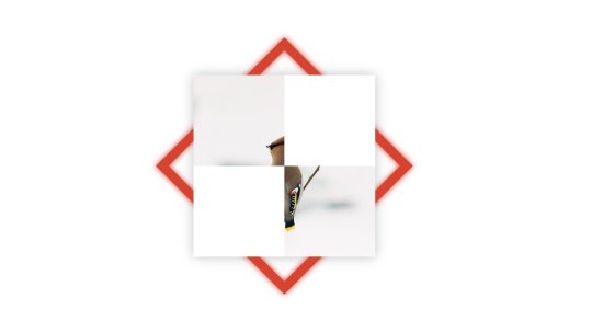
A copy of the image and a grid with white cells on top of the red border.
Now we apply the multiply blend mode to .blend using the mix-blend-mode property.
.blend { mix-blend-mode: multiply; }
The result:

As you can see, the blend mode affects all four quadrants rather than just the two we want to see through. That means we can see through all four quadrants, which reveals all of the red rotated box.
We want to bring back the white we lost in top-left and bottom-right quadrants so that they hide the red rotated box behind them. Let’s add a second grid, this time on top of .blend in the sourcecode.
<div id="design"> <img src="bird-photo.jpg"> <div class="rotated-border"></div> <!-- A second grid --> <!-- This time, we're adding white to the image quandrants where we want to hide the red frame --> <div class="grid"> <!-- Quadrant 1: Top Left --> <div data-white></div> <!-- Quadrant 2: Top Right --> <div></div> <!-- Quadrant 3: Bottom Left --> <div></div> <!-- Quadrant 4: Bottom Right --> <div data-white></div> </div> <div class="blend"> <img src="bird-photo.jpg"> <div class="grid"> <!-- Quadrant 1: Top Left --> <div></div> <!-- Quadrant 2: Top Right --> <div data-white></div> <!-- Quadrant 3: Bottom Left --> <div data-white></div> <!-- Quadrant 4: Bottom Right --> <div></div> </div> </div> </div>
The result!

Summing up, the browser renders the elements in our demo like this:
At bottommost is the bird image (represented by the leftmost grey shape in the diagram below)
Then a rotated red frame
On top of them is a grid with top-left and bottom-right white cells (corners where we don’t want to see the red frame in the final result)
Followed by a copy of the bird image from before and a grid with top-right and bottom-left white cells (corners where we do want to see the red frame) – both grouped together and given the blending mode, multiply.

You may have some questions about the approach I used in this post. Let me try to tackle those.
What about using CSS Masking instead of CSS Blend Modes?
For those of you familiar with CSS Masking – using either mask-image or clip-path – it can be an alternative to using blend mode.
I prefer blending because it has better browser support than masks and clipping. For instance, WebKit browsers don't support SVG <mask> reference in the CSS mask-image property and they also provide partial support for clip-path values, especially Safari.
Another reason for choosing blend mode is the convenience of being able to use grid to create a simple white structure instead of needing to create images (whether they are SVG or otherwise).
Then again, I’m fully on board the CSS blend mode train, having used it for knockout text, text fragmentation effect... and now this. I’m pretty much all in on it.
Why did you use grid for the quadrants?
The white boxes needed in the demo can be created by other means, of course, but grid makes things easier for me. For example, we could've leaned on flexbox instead. Use what works for you.
Why use a data-attribute on the grid quadrant elements to make them white?
I used it while coding the demo without thinking much about it – I guess it was quicker to type. I later thought of changing it to a class, but left it as it is because the HTML looked neater that way… at least to me. :)
Is multiply the only blend mode that works for this example?
Nope. If you already know about blend modes then you probably also know you can use either screen, darken, or lighten to get a similar effect. (Both screen and lighten will need black grid cells instead of white.)
The post Weaving One Element Over and Under Another Element appeared first on CSS-Tricks.
Weaving One Element Over and Under Another Element published first on https://deskbysnafu.tumblr.com/
0 notes
Photo


Album Assignment - UNIV101
1. Queen - Innuendo
I chose this album cover primarily because of the art style and the way the illustration plays with scale. Abstracted, surrealistic, and Tim Burton-esque styles have always been both an influence of mine and one that I regularly enjoy browsing. The sketchy, dark outlines form figures and shapes in a way that is reminiscent of medieval art and the likes of which is on tarot cards and older playing cards. The detail in color varies from very detailed, such as on the cloth of the Jester’s pants, to very simple, such as the grey strokes that make up the background, and the yellow of the banana the Jester seems to be juggling.
The cover also makes interesting use of scale in both its extremities- the towering Jester being almost colossal in comparison to all other details- the globes he stands amidst reaching only to his upper thighs, the planets, which he juggles with ease, and lastly, the man standing on a globe to the right corner of the piece. The positioning of the man’s body suggests he is recoiling- likely in fear of either the Jester, who, to him, likely stands as a giant, or the banana, which has flown out of the juggling path and is implied to be moving towards him.
2. King Crimson - In the Court of the Crimson King
I chose this album due to how dynamic the album’s illustration is. In terms of coloring, the images manages to pull in the eye with visually gripping reds, blues, and purples. I believe this was intentional use of colors that contrast, overlaying one warm and one cool color- the shades of red being used to color the face, and the shades of blue being used for shading of larger areas such as the wrinkles around the mouth, cheeks, and corners of the eyes. Furthermore, the sparing colors used help make the whites of the eyes, teeth, and upper cheeks stand out more. I believe that if more standard colors were used to color and shade the face that it would not pop out as much as it does.
In a similar vein, the dynamic, almost cartoonishly expressive look on the person’s face also serves to capture the audience’s eye. If the expression had not been as exaggerated- for example, had been held in a placid smile, or more averagely surprised look, the album cover would not have as much of a visual impact.
3. Day6 - Daydream
I chose this album cover because I think that the juxtaposition of a close-up shot atop a long shot is an interesting combination, as well as that the light color scheme- comprised of all cool colors rather than warm- lends itself to a very airy, light composition. The choir in making the overlaying hand transparent as opposed to solidly colored, coupled with the fact that the five figures seem to be walking offscreen, gives the illustration a very open-ended feeling reflective of the album’s title- Daydream. While the sky is not pictured in the inner photo, the white-blue gradient allows for the viewer to imagine it regardless- I believe that the cover would not be as complete if it were set against a solidly colored background- especially white- or if the hand had been more opaque.
4. Fitz and the Tantrums - Pickin’ Up the Pieces
I chose this album cover primarily because of the interesting technique used. The layered figures, coupled with their slight blur, allow for a style reminiscent of screen printing. The sparing choice of color- the male figure’s cool blue color overlaid atop the female figure’s warm red, set against pitch black- allow for a very dynamic image. The contrasting colors can also be inferred as reflective of each figure’s pose. The female figure holds herself in a more intimate, sensual, forward-leaning position, while the male figure is in a more pulled-back, reserved, and aloof sort of way.
5. DEAN - 130 Mood: TRBL
I chose this album because of the highly graphic, almost cut and paste style it has. It mixes realism with illustration in a way that infers an almost dreamlike state, furthered both by the curvature of the window lights on the ceiling that resemble a reflection in rippling water, and several other elements; several upside down doors leading into the walls, a lamp that sits upside-down in the right corner of the ceiling, and an upside-down figure, presumably a reflection, dressed in yellow that is reflected in the mirror. This then leads the viewer to recognize that the “correct” positioning of the illustration is actually what appears to be upside-down initially- that there was a photo taken of the ceiling, with the various other details, such as the figure lying on the couch, the lamp in the corner, and so on, pasted on atop it.
6. J-Hope - Hope World
I chose this album cover primarily because of how much it stands out against the others I selected. The colorful, cartoonish, and highly graphic elements of the illustration create a lighthearted, playful atmosphere- the artist having also added small touches reflective of one of the title tracks of the album, Airplane. I believe the colors were deliberately chosen to be high-contrast in a way that makes each and every object within the illustration pop out, along with to attract the eye. This striking choice of color works very well with the simplistic, unshaded style- if this same color scheme had been used with a more realistic, highly detailed art style it would not have been as effective and felt cluttered, the styles perhaps even clashing.
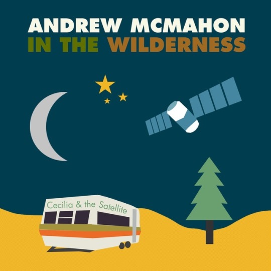
7. Andrew McMahon - Cecilia & the Satellite
I chose this album cover because it paints very clear imagery despite being very simple. The lack of shading helps lead the eye around the illustration as a whole, and the artist made effective use of selective detail to make the trailer and the satellite the standout details in the image. They achieved this by adding the moon, placed off to the left side and colored a dull grey, and only three stars- in some other cases the lack of detail might have worked against it and/or made it appear unfinished, but because the satellite is meant to be the focal part of the cover- tying in with the name Cecilia and the Satellite- the less shading and detail the better the picture works as a cohesive image.
If there had been shading, more stars in the sky, and even details such as small planes and ships, it would detract from the figure of the satellite by making it too cluttered and crowded. The fact that none of the objects are perfectly centered on the page helps to move the viewer’s eye around the piece, and the positioning of the trailer is at an inward slant which furthers this- leading the eye down and then up the point of the tree, towards the satellite.
8. Totally Enormous Extinct Dinosaurs - Household Goods
I chose this album because of the interesting changes made to the original photo. Presumably through the use of tracing paper, the artist was able to transfer the intricate shading and likeness of the original image onto the cover in complete greyscale. This color choice, or lack thereof, allows for the brightly colored beams extending from the figure’s eyes and spilling off the page, to stand out more strongly rather than if it had also been greyscale- likely blending into the pre-established figure. The small, plain type, kept at the top of the page helps the illustration stand on its own rather than overshadowed by large, colorful type- or, alternatively, the type being too difficult to read and making the album hard to identify.
9. Vixx - Eau de Vixx
I chose this album because of how well the colors work together to convey an overall theme. The figure, with a flower crown around his neck, is kept slightly off center, the slope of his neck and shoulder, leading the eye down around the flower crown and to the bold white box of type in the center. The album- its title track, Scentist, in particular- has a very ethereal, otherworldly concept and theme which is effectively shown by the delicate, floaty color scheme. The transparency and blur of the light magentas and blues, which overlap to form a very light purple in places, help to communicate that dreamlike state, particularly because the blur is reminiscent of slight static, along with the fact that dreams are often hazy and far from concrete. This color scheme also helps the bold white type to stand out vividly against its background, clearly identifying the album and its artists.
10. Metronomy - Forever
I chose this album cover primarily because of the interesting use of typography. The style itself is comprised of relatively simple elements, but they allow for the words spelled in lava to be easily deciphered. If set against a more detailed, shaded background with more elements to it, the use of typography would not be as effective, as the viewer would not be able to identify the band and title as easily. The flowing lines made in lava also serve to guide the viewer’s eye around the illustration- leading it in a sloping eye from the top of the starlit sky to the river at the bottom, where several creatures drink from it.
0 notes
Text
A Beginners Guide To Aria Markup

Accessibility is a major issue in today’s online world. These days, having a website that many people struggle to navigate is considered unacceptable.
ARIA markup is a step in the right direction. It’s an answer to the question how you can make your website more usable for those with disabilities.
What is ARIA? A set of code attributes that expand HTML’s capabilities and make it easy to optimize your site for screen readers. It does this by making parts of your website visible to assistive technology, that otherwise, these devices wouldn’t be able to interact with at all.
Ready to include ARIA in your website? Or just curious to learn more about it? In this article, we’ll explain what ARIA is, how to make your site accessible, and give you the resources to learn more about this invaluable technology.
Why Make Your Site Accessible?
Some people might wonder: why care about web accessibility? Is it really worth putting in the resources to learn specifications like ARIA? Is creating an accessible website really making much of an impact?
Disability Isn’t Uncommon
In actuality, yes. Disability isn’t so rare. 18.7% of Americans have a disability of some form. While not all of these will impair their ability to interact with the web, that’s still a staggering number, and it only includes people from the US.
3.3% of Americans also have a vision impairment. This means they could have trouble seeing websites and may rely on tools like screen readers. That’s also a significant percentage of your potential user base and includes the elderly and those with temporary disabilities.
People with impairments need the Internet just as much as everyone else. Many use it to shop, socialize, and find information. Sometimes it’s their primary, or even their sole way, of doing so.
54% of disabled people are online, and while this number is smaller than compared to the general population, it’s still a significant portion.
Plus, it’s 2019. In this day and age, we should strive to include every user group as well as we can. Giving people with disabilities unrestricted access to browse the web should be a major goal for any web developer.
Plus, it even comes with personal benefits.
Accessibility Overlaps With Good Web Design and SEO
A site that follows accessibility standards is often one that’s using good web design principles, works better on mobile devices, and ranks high in SEO.
For instance, one of the WCAG standards includes not auto-playing long clips of audio without a way to stop the sound. This is already a big no-no for web designers. Another standard is providing enough color contrast between elements. Colors that blend together on a website are often an indication of a bad palette.
As a consequence, following accessibility guidelines leads to a site that looks better and is more user-friendly. Can anybody say win-win?

Accessibility is also an important part of SEO. Shirking it can lead to ranking penalties from Google and other search engines. But adding alt text to your images, including keyboard controls in interactive elements, and using headings both help disabled visitors and give you an SEO boost.

As you can see, making your site accessible is a good idea as it has an impact on all user groups. If designing a website that offers everyone a good experience is your aim, then you should do everything you can to avoid excluding people with impairments.
One thing you can do is implement ARIA into your design, so people with screen readers can better find their way through your site.
What are Screen Readers?
A screen reader is a program that reads the content of a page or document out loud while allowing you to navigate it using the keyboard. Anyone can download one onto their computer, and there are a variety of programs available free or paid.
Some of them also help navigate the desktop and other programs as well as websites. They may enlarge text and images for the visually impaired, and some can output to a refreshable braille display. This guide explains how screen readers work.
Without screen readers, visually impaired people would struggle to use a computer and the Internet, or be unable to use them at all.
ARIA markup plays a big part in how these tools function. It provides extra information, giving them more options and the ability to interact with parts of the UI that would otherwise be invisible to them.
But what exactly is ARIA, and how can you improve your website by including it? Let’s give a quick breakdown on this specification and how it works.
What is ARIA?
ARIA stands for Accessible Rich Internet Applications. It is a set of attributes that provide extra context for how a web page is laid out and what’s inside it. In other words, they give more information about parts of the UI, such as popup alerts, menus, or even whole sections of the page.
If you have ever looked at a website with the browser developer tools, you might have seen it before.
To quote the Mozilla documentation: “The complementary landmark role is used to designate a supporting section that relates to the main content, yet can stand alone when separated.” So, basically, this part of the markup lets screen readers know about what part of the layout they are dealing with.
Consequently, ARIA allows you to create accessible interfaces and widgets without even changing how they look or act on the front end. Most people won’t be able to even tell the markup is present. But add a little code, and screen readers will be able to seamlessly interact with your interface.
When is ARIA Really Necessary?
By default, screen readers can understand most HTML and HTML5 elements. If you have a very simple, static site, you may not need to implement ARIA at all. But some Javascript, dynamic, and interactive elements can’t be seen by screen readers, and this is where the markup comes in.
On the other hand, you shouldn’t use ARIA when what you’re defining is already accessible. For instance, the HTML element is recognized by screen readers. It doesn’t need to have a button ARIA role. You should only include roles when you’re not using HTML elements that are supported by assistive devices.
In the same vein, technically I don’t need to add the complementary role to an aside element above as they both describe the same thing. However, you find this markup quite often as it is above.
Still confused? Let’s talk a little more about how ARIA works.
Understanding ARIA
Things can get very complex with ARIA, and it’s easy to get overwhelmed. But the basics of it are fairly easy to break down. Once you understand those, learning more advanced concepts will be a snap.
ARIA markup is made up of three attributes: roles, states, and properties.
ARIA Roles
Roles define elements on a page, such as buttons and checkboxes. They help screen readers tell what parts of a page do, and they have four different sub-categories: landmark, document, widget, and abstract roles.
Landmark roles — Separate a site into different sections, like main content, navigation, and complementary areas. This can help visitors get their bearings and more easily find what they’re looking for on a page.Document roles — Describe specific sections within a page, such as articles, documents, lists, and rows.Widget roles — Define elements and interfaces. Tabs, textboxes, alerts, and buttons are some of the elements ARIA can describe. When HTML doesn’t define these elements, or you’re using a widget made of many different parts, widget roles can help.Abstract roles — These are utilized by the browser. You don’t need to worry about them.States and Properties
States and properties work similarly to each other. Properties once set rarely change, as they only describe relationships with other elements. States are dynamic and can change on their own or with user interaction.
An example of a state is aria-busy, which tells the screen reader that the element is updating. Another is aria-pressed, which indicates that a button has been pushed. These are elements which can actively change.
On the other hand, properties include attributes like aria-valuemax which sets the maximum number in a range selector, or aria-haspopup which indicates that an element will trigger a popup. These are not likely to update.
And that’s the basics of ARIA. Much simpler once it’s broken down, right? But you’d be surprised how much you can do with it.
To learn more, try the official WAI-ARIA documentation, or Google’s beginner introduction for developers.
Testing for ARIA Accessibility
Once you’ve implemented ARIA, you might want to make sure that everything is running smoothly. How does your site really look on assistive devices?
The most obvious way is to download a free screen reader like NVDA, blindfold yourself, and go to town. This will give you the full experience.

You can also skip the blindfold and just hover the elements you want to check ARIA attributes on, but you’ll miss out on key info like how difficult it is to find those elements.
Even this isn’t a perfect representation of what it’s like to use a screen reader as it takes a lot of practice to learn, so it’s best to ask actual users to test drive your website.
There are also many inspector tools like Firefox’s Accessibility Inspector that let you see information about selected elements. WAVE points out various errors, including those with ARIA.
Finally, this ARIA widget checklist makes a great audit for while you’re designing.
Other Ways to Make Your Site Accessible
ARIA markup is just the beginning when it comes to web accessibility. There are many other standards you should follow to make your site usable by people with vision, hearing, mobility, and other impairments.
Here are a few examples of just a handful of guidelines you should follow.
Website content is responsive and works while zoomed in.The site and its elements can be used with only a keyboard.Text is properly contrasted against the background.All non-text content has text alternatives, including audio and video captions/transcripts.Ensure that most images have descriptive alt text, and decorative images have empty alt text.No information is conveyed solely through sight, sound, or color.Avoid auto-playing audio without providing a mute button.Automatically moving elements can be paused or stopped.That’s only a handful of what you can do to make your site truly accessible. If this feels like too much, try the simple accessibility checklist. Use it as a basis for your design before moving onto the more detailed WCAG guidelines.
Making Your Site Usable for Everyone
Avoiding accessibility can have a negative impact on your user base and even your reputation. People with disabilities make up a large percentage of web users, and it’s important to ensure that the majority of the Internet isn’t closed off to them.
By implementing accessibility standards including ARIA markup, you’re both giving screen reader users the ability to see more of the web, and allowing your website to grow as large as possible.
Once you know how to include specifications like ARIA, accessibility will seem a lot less confusing. Making your site easier to use for everyone means more people willing to stick around, so there’s no reason not to use ARIA if your site needs it. Many themes also offer it out of the box by now.
These standards don’t just help people with disabilities; they help everyone. Accessibility guidelines often overlap with good web design practices and are quick to implement once you know them.
So remember to include ARIA when you’re developing a website. It’s better for you and for all your users.
Do you ever have trouble navigating websites? What could web designers and developers do to improve the situation? Let us know your experiences with online accessibility (or lack thereof) in the comments!
Read the full article
0 notes
Text

!!!HEY!!! Someone asked for a hair tutorial, so I took some screencaps of the process while I worked on one of my commissions and wrote up my thoughts to go with it! If that’s something that interests you, click through the readmore!
Step 1: Lose the screencaps you took of your actual sketch, starting the tutorial off on a great note!
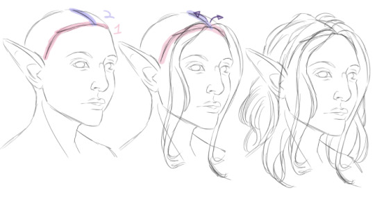
Whoops. I ended up drawing over my partially-rendered piece to reproduce it. (My actual sketch was much messier. You’ll be able to see a little bit of it later!) The actual Step 1 is: Draw head. Sketch hair. I rough in the shape of the skull, the facial features, and whatever part of the body is in-frame first. Then, I sketch in the hairline, highlighted in red. Hairlines come in all shapes, from rounded to square to widow’s peaks! Next, I draw in a part coming back from the hairline, following the curvature of the skull. From there I start drawing in “chunks” of hair, working front to back and from the part, out, in sweeping curves. All hair has at least little bit of lift- It grows up and out from the skull, then “droops” downwards. Depending on the texture, it may have more or less lift. This hair is fairly fine, so it falls down not far from the root, but even that little bit of volume makes it look more three dimensional. :v Pay attention to anywhere it parts around 3d objects and be mindful of which pieces go in front of your character’s shoulders (if any) and which pieces go behind (if any). Hair overlaps itself, too- Consider having pieces cross in front of and behind each other, or spiral together. This step can be messy and fairly imprecise, you just want a general shape to guide you later.
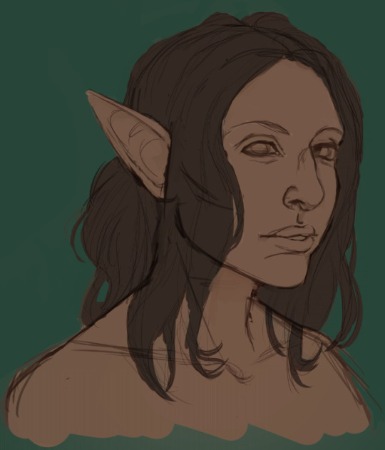
Next come the flat base colors. I choose and fill in my background color in a new layer beneath my sketch. On a layer above that (but still beneath the sketch!), I fill in behind my sketch with flat colors and a hard brush. I like to work from dark to light, so I pick a dark midtone or shadow color for this step- Since the character is going to be blonde, I went with a milk chocolate sort of color for the hair. You can see pieces of my original sketch here (everywhere but the face)- There are some bits showing through where they shouldn’t, like the jaw through the hair, but that’s fine. I lock my sketch opacity and change the color, usually to a brown, and set it to multiply, so I can blend it into the figure later. Then I merge it down onto my flat colors.
Like magic, the face appears!!! I neglect the hair for a while and do a rough render of the face. This isn’t quite what the final product will look like, but it’s a start. I’ve also pushed the hair around a little to reshape the face and removed the jaw lines in the hair. Around her shoulders I painted over some hair bits, but that’s going to be all covered later anyway. You can see how my rendering gets lighter than my base colors here, too.

For my darkest darks, mostly around the face, I colorpicked the bits of the sketch that were in the hair and filled in a little bit, mostly on the far side of the face where i felt like the edge was getting lost.
Keeping in mind what color the hair is going to be in the end, I pick a lighter midtone and start layering it over top of the base color. I’m using Clip Studio’s default oil brush here, since it picks up underlying colors and blends but preserves a fairly hard edge. You could get a similar effect with other low-opacity brushes. Keeping my hand light and my wrist loose, I start making quick strokes out from the roots, following the direction of the hair every time! My brush is just a little bit smaller than whatever “chunk” I’‘m working on to start..

...but as I start to build up more color, I progress to smaller and smaller brushes. Keeping your strokes really quick and messy creates a natural, organic streakiness that forms the beginning of your hair texture, and since the oil brush picks up a little bit of the underlying color on each stroke, the area you’re coloring gets closer and closer to your selected color every time you go over it. In this case, it’s getting brighter. So, keeping my brights concentrated towards my light source, I build up layers, and where I see those streaks starting to form I emphasize them and start dividing the chunks in my sketch into smaller segments. Since the sketch is on the same layer and a darker shade of brown, it almost immediately starts to blend away.
More texture! Also, roots. With a small brush I sharpened her hairline, and you can see the texture I’m emphasizing as I go, using a small brush to pick out pieces of hair. I’ve also swapped back to a darker brown for a few seconds to add furrows between pieces of hair that were solid beige from the last step.
This is what the whole head looks like at this point. That streaky swatch in the upper right corner is what I’m using next- it’s the “Painterly Sparse Bristle” brush from Frenden. It comes in a third party brush pack you can find with a quick Google, and I do love it- But you could get the same effect with a small brush and a few more strokes.I picked a lighter color for the next layer- I tried the color of the x on the left at first, and it was a little too grey, so I went with the one on the right.
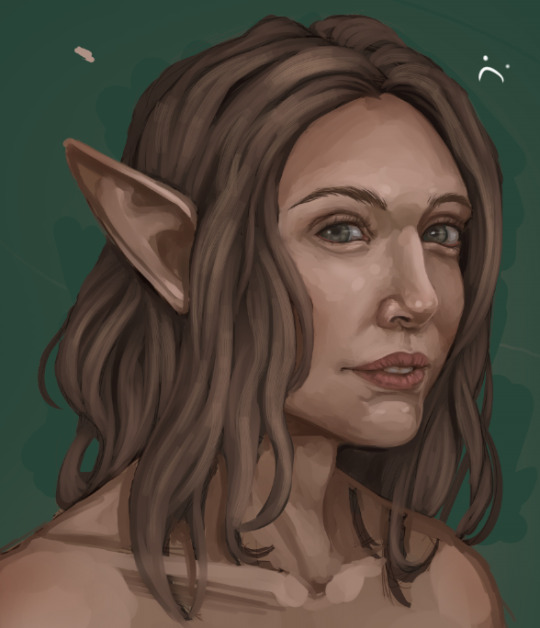
Light hand, loose wrist, following the direction of the hair and avoiding the shadows with the sparse bristle brush to lighten the hair overall and add texture. The shape of the brush gives me more strands per stroke and cuts down on time. It’s a little patchy where my strokes begin and end, which is fine- It’s also still too grey, as it turns out.
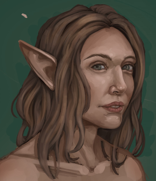
I picked a soft yellow, a soft brush, and set a new layer to “soft light”, then shaded over the hair to brighten it up. Not a super standard step but it does explain the shift in hue. Then I merged it down. It’s a little bit blotchy, but that will blend away as I work.
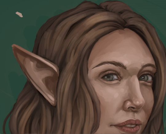
Up close, the edges of that sparse bristle brush look kind of square and chunky. Yuck.
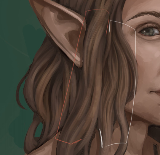
It’s fixable, though! I’m done adding new colors for a while. Instead, I zoom in closer and move around the piece, colorpicking off different parts of the hair and going in with the default oil brush at a tiny tiny size. I’m doing two things: Blending out the less appealing parts of those “sparse bristle” brush strokes, and emphasizing shadows and highlights to suit my taste. The orange section is untouched- The white section has been worked on a bit. Loose wrist, fast strokes, always in the direction of the hair! This is where I start making a lot of conscious decisions about my shading, refining a lot of the haphazard streaks into coherent shadows and highlights. Remember that the chunks of hair are objects in a three dimensional space that cast shadows on each other.
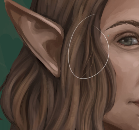
While I’m zoomed in close, smoothing things out, I tend to start picking out areas where loose or flyaway strands would work well. The idea here is to break outside of the boundaries of your sections with finer pieces and individual hairs. Disrupting the edges of the smooth shapes in a few places makes the hair look less like a sculpted helmet and more like..hair. You don’t have to do this everywhere- Just a few flyaway pieces can be enough to establish the illusion of a head of individual strands. I tend to go a little bit overboard for stylistic reasons, adding a few more than I strictly need to, and separating them a little bit further from the body of the hair than they might realistically be, almost like the flyaway pieces are being buoyed upwards by water or a breeze. This is just a matter of taste, though. :v
Something to remember: Whenever you’re working on details / zoomed in to a piece, you should zoom out and look at the piece as a whole, often. Otherwise you might find that something that looked good while you were really close to it looks out of place in the context of your painting as a whole!
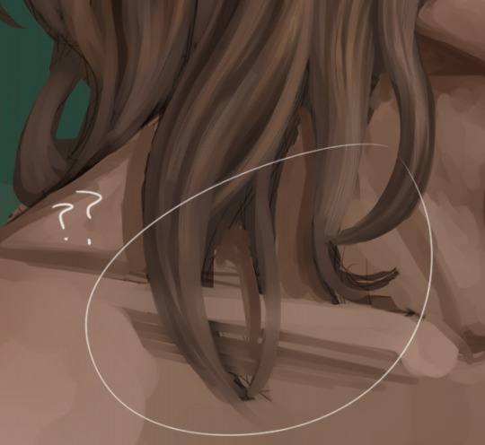
Moving around the hair at a high zoom means you’re going to run into the ends of the hair, and if you’ve been working with blendy brushes they probably look like this.
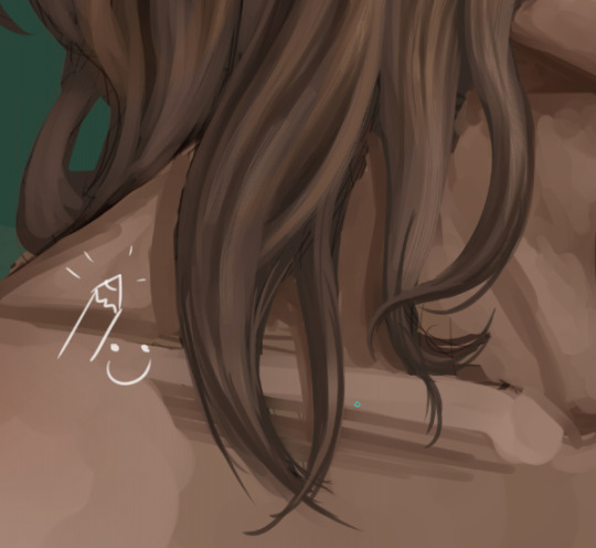
This is another great place to put some loose strands. I use the default “darker pencil” tool at a small size and sharpen the edges up, then blend a little bit on top with the oil brush if I need to. A little bit of a sharper curve at the ends of the hair, where there’s less weight pulling it down, can add some life- I tend to go exaggerate here, too, making the ends a little bit floaty, or a lot floaty, or swirling the ends of straight hair into spirals. It adds a little bit of magic to an otherwise static portrait.

Do the whole head! This is the most time-consuming part, but it can be really soothing, too. Take your time and work steadily, section by section. :> Speaking of exaggerated swirls, that piece starting to twist up on the (viewer’s) far right is a good example- That hair probably wouldn’t twirl up that way, but it DOES add a little bit of visual interest! I don’t have any loose hairs on the outside of the outermost edges of the hair here, though.
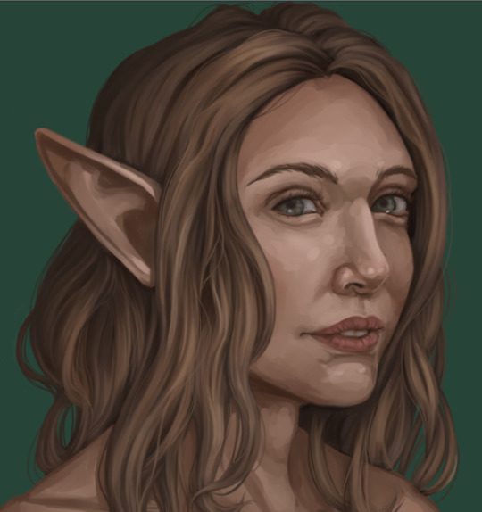
And now I do. I like to add the loose hair on the outside edges on a layer beneath the figure- That way, I don’t have to worry about blending the ends into the rest of the hair. When I’m done, I merge the two layers together.
Anddd highlights! I picked the lighest coor I’d put down, made a new layer above the figure, set it to “Add-Glow”, and used light, short strokes with the sparse bristle brush. Avoiding the shadows, I arranged the highlights in horizontal bands, keeping them dense towards the light source and fading them out as they moved back.
At this point, I still have some work to do, especially on the face, and I’m guaranteed to do more with the hair along the way. But anything I do from here on out is going to be a repeat of one of the above steps- More blending, more flyaway hair, etc. :> I change things around a LOT as I work, so no part of a piece, hair included, is for sure done until the whole piece is polished up and saved! If you want to see how the finalized painting came out, hair and all, you can click here!
I hope this is helpful to someone! If there’s anything else you’d like me to break down, let me know, and I’ll see about documenting my process the next time it comes up.
77 notes
·
View notes
Text
Create Impossible Photos with a Lighting Composite
youtube
“Do you have 9 lights?” The account manager at Oakland University asked me. Somewhat inspired by a Queen album cover, he was looking to create an image where 9 award-winning students stood out in a dramatized version of a newly renovated space on campus. While I understood the goal of the session, I immediately knew rigging 9 lights up would be nearly impossible while showing such a vast space. I told him that it may take some time, but I could get it done with just 2 lights.
My mind immediately went to a lighting composite. That is, individually lighting subjects to bring together in post-production. I’ve done this technique for years in wedding photography. It’s a favorite of MagMod users, as a way to achieve large light source results out of very compact modifiers.
I’ve always been fascinated with creating this type of image, because it creates light patterns and a visual style that is otherwise unobtainable in a single image. There’s no way to have a massive light source illuminate multiple people, without also illuminating the entire space they are in.
This wedding composite from 2016 took me hours to finish as my lighting influenced the background as well as created reflections on the ground.
I’m no Photoshop master, the vast majority of my work is volume editing done in Lightroom. So I took every precaution possible to ensure that this would be a seamless edit. Here are all the things you need to consider if you are interested in tackling your own lighting composite.
Keep It Steady
If you don’t want to hate yourself when you get to photoshop, make sure you keep your camera as steady as possible. If you don’t, you’ll find yourself having to adjust perspective and transform images just to get them to line up cleanly in post, which can be downright miserable.
A tripod is almost a necessity. I got away with keeping a Manfrotto tripod head on the ground for this low angle image, but I’d advise others not to take that risk as it’s easy for the head to slide on the ground.
Turn off any lens or in-body image stabilization. Those systems are great at compensating for movement, but when your camera body is securely locked down they can only harm your image by compensating for movement that isn’t happening.
If you can, avoid the camera’s shutter release button. Just that tiny amount of pressure could potentially alter your position and framing. This isn’t mission critical as your perspective is unlikely to change, but if you have the option definitely use an app or remote to trigger your camera.
Use Manual Focus. By switching to manual focus you ensure that your images will all have the identical depth of field.
Identify Your Settings
I highly suggest manual exposure for this, because you don’t want your settings changing shot to shot. It’s worth noting here that you want to do this in an environment where the lighting/background is not changing. If it does it may complicate your masking process later.
Don’t take my settings as a suggestion for your image, every location would require a different thought process. I started by choosing my f/stop of f/8. I knew I wanted total sharpness throughout the image. I set f/8 and checked to ensure that the subject closest and furthest from my camera were both acceptably sharp.
I then chose a shutter speed of 1/250s, which is the maximum flash sync speed my Sony a7R III does without entering high-speed sync. Then, I brought my ISO down to 400 which gave me the visual result I was looking for in the room. I chose to go so dark not only to make the subjects pop out in dramatic fashion, but I also wanted to hide the distractions that filled the room.
Note: In hindsight, I wish I would have brought my ISO down to 100 and shutter speed to 1/60s. That would have been equivalent visually, but given me more flexibility to manipulate images without introducing noise. The closer you are to your camera’s base ISO, the more dynamic range you will have in the raw file, allowing you to push the image without it crumbling. The 1/60s shutter speed would not have affected the image either, as the subjects are being illuminated by flash only, and the background and camera are static.
Managing the Group
Before ever starting the photography process, I made sure the entire group understood where their position was in the image and had them stay there until they were photographed. If they had to move we would mark their positions so they could come back to the same spot. This ensured that the students did not block one another, to make it really easy to isolate them in photoshop. As I worked through the group I would let those photographed slide down and out of the way.
Lighting it Up
I used 2 Flashpoint eVolv 200s (Godox AD200s) with the round head. My key light was in a 28” Deep Parabolic softbox with a grid. My rear light had a grid and snoot (from the proprietary AK-R1 modifier kit). The choice of the deep parabolic softbox and grid was to create a soft light that had a narrow cast. This narrow coverage means that the light will primarily hit the subject, and not spill onto the environment, creating inconsistencies between the photos.
I also chose a 28” because I wanted to keep the light very close to the subject. This means that the light will fall off very rapidly (see Inverse Square Law) and not influence the environment much. The rear light was modified with a grid and snoot for the same narrow light cast, however, the rear light didn’t need to be soft since its objective was to separate the students from the background.
I made sure to keep the lights in relatively the same position and direction for each student, that way the light patterns are similar. This creates cohesiveness across the image. This isn’t a requirement, I simply prefer when lighting appears natural, even if it is stylized and dramatic. I also had the lights pointing downward onto each subject, that way any cast shadows were going onto the ground, rather than the background.
Checking the Room
After all the students were photographed I sat for a moment to consider anything else I wanted to include. I decided to highlight two graphics in the room using the softbox, that way anyone seeing the image could more easily identify the space.
I also used the second level to fire the rim light at the camera. I figured since each student had light on their back, I had to create a believable light source in the background. I also made sure to capture the room completely empty, in case I needed to blend anything in the composite that was otherwise covered.
Post-Production
By taking all these steps, the post-production was quite simple. I brought in each student, made a soft selection around them, and masked out the entire background to show the empty room. I ended up using the graphics on the wall and the lights on the second level as well. The only complex masking I had to do was where one student overlapped the upper graphic, and removing a yellow color cast from the hint of ambient lighting on the base layer.
Once all the masking was done I removed a few more distractions through clone stamping (a breeze when 80% of your image is black), and finalized with contrast and sharpening adjustments. My video doesn’t dive too deep into the post-production, but if you want a follow-along approach to these composites, check out this video by Justin Haugen:
youtube
Keep in mind: this worked so well because I made the environment very dark. If you want to try in a brighter area, I highly recommend keeping your subjects far from the background so as to avoid illuminating your background with any flash. The inverse square law is your greatest ally here. I hope my break down helps you feel confident in tackling this type of image.
The finished composite lighting group portrait.
About the author: Robert Hall is a wedding and commercial photographer in Southeast Michigan. The opinions expressed in this article are solely those of the author. You can find more of his work on his website, Instagram, and YouTube.
source https://petapixel.com/2019/01/15/create-impossible-photos-with-a-lighting-composite/
0 notes
Text
Create Impossible Photos with a Lighting Composite
youtube
“Do you have 9 lights?” The account manager at Oakland University asked me. Somewhat inspired by a Queen album cover, he was looking to create an image where 9 award-winning students stood out in a dramatized version of a newly renovated space on campus. While I understood the goal of the session, I immediately knew rigging 9 lights up would be nearly impossible while showing such a vast space. I told him that it may take some time, but I could get it done with just 2 lights.
My mind immediately went to a lighting composite. That is, individually lighting subjects to bring together in post-production. I’ve done this technique for years in wedding photography. It’s a favorite of MagMod users, as a way to achieve large light source results out of very compact modifiers.
I’ve always been fascinated with creating this type of image, because it creates light patterns and a visual style that is otherwise unobtainable in a single image. There’s no way to have a massive light source illuminate multiple people, without also illuminating the entire space they are in.
This wedding composite from 2016 took me hours to finish as my lighting influenced the background as well as created reflections on the ground.
I’m no Photoshop master, the vast majority of my work is volume editing done in Lightroom. So I took every precaution possible to ensure that this would be a seamless edit. Here are all the things you need to consider if you are interested in tackling your own lighting composite.
Keep It Steady
If you don’t want to hate yourself when you get to photoshop, make sure you keep your camera as steady as possible. If you don’t, you’ll find yourself having to adjust perspective and transform images just to get them to line up cleanly in post, which can be downright miserable.
A tripod is almost a necessity. I got away with keeping a Manfrotto tripod head on the ground for this low angle image, but I’d advise others not to take that risk as it’s easy for the head to slide on the ground.
Turn off any lens or in-body image stabilization. Those systems are great at compensating for movement, but when your camera body is securely locked down they can only harm your image by compensating for movement that isn’t happening.
If you can, avoid the camera’s shutter release button. Just that tiny amount of pressure could potentially alter your position and framing. This isn’t mission critical as your perspective is unlikely to change, but if you have the option definitely use an app or remote to trigger your camera.
Use Manual Focus. By switching to manual focus you ensure that your images will all have the identical depth of field.
Identify Your Settings
I highly suggest manual exposure for this, because you don’t want your settings changing shot to shot. It’s worth noting here that you want to do this in an environment where the lighting/background is not changing. If it does it may complicate your masking process later.
Don’t take my settings as a suggestion for your image, every location would require a different thought process. I started by choosing my f/stop of f/8. I knew I wanted total sharpness throughout the image. I set f/8 and checked to ensure that the subject closest and furthest from my camera were both acceptably sharp.
I then chose a shutter speed of 1/250s, which is the maximum flash sync speed my Sony a7R III does without entering high-speed sync. Then, I brought my ISO down to 400 which gave me the visual result I was looking for in the room. I chose to go so dark not only to make the subjects pop out in dramatic fashion, but I also wanted to hide the distractions that filled the room.
Note: In hindsight, I wish I would have brought my ISO down to 100 and shutter speed to 1/60s. That would have been equivalent visually, but given me more flexibility to manipulate images without introducing noise. The closer you are to your camera’s base ISO, the more dynamic range you will have in the raw file, allowing you to push the image without it crumbling. The 1/60s shutter speed would not have affected the image either, as the subjects are being illuminated by flash only, and the background and camera are static.
Managing the Group
Before ever starting the photography process, I made sure the entire group understood where their position was in the image and had them stay there until they were photographed. If they had to move we would mark their positions so they could come back to the same spot. This ensured that the students did not block one another, to make it really easy to isolate them in photoshop. As I worked through the group I would let those photographed slide down and out of the way.
Lighting it Up
I used 2 Flashpoint eVolv 200s (Godox AD200s) with the round head. My key light was in a 28” Deep Parabolic softbox with a grid. My rear light had a grid and snoot (from the proprietary AK-R1 modifier kit). The choice of the deep parabolic softbox and grid was to create a soft light that had a narrow cast. This narrow coverage means that the light will primarily hit the subject, and not spill onto the environment, creating inconsistencies between the photos.
I also chose a 28” because I wanted to keep the light very close to the subject. This means that the light will fall off very rapidly (see Inverse Square Law) and not influence the environment much. The rear light was modified with a grid and snoot for the same narrow light cast, however, the rear light didn’t need to be soft since its objective was to separate the students from the background.
I made sure to keep the lights in relatively the same position and direction for each student, that way the light patterns are similar. This creates cohesiveness across the image. This isn’t a requirement, I simply prefer when lighting appears natural, even if it is stylized and dramatic. I also had the lights pointing downward onto each subject, that way any cast shadows were going onto the ground, rather than the background.
Checking the Room
After all the students were photographed I sat for a moment to consider anything else I wanted to include. I decided to highlight two graphics in the room using the softbox, that way anyone seeing the image could more easily identify the space.
I also used the second level to fire the rim light at the camera. I figured since each student had light on their back, I had to create a believable light source in the background. I also made sure to capture the room completely empty, in case I needed to blend anything in the composite that was otherwise covered.
Post-Production
By taking all these steps, the post-production was quite simple. I brought in each student, made a soft selection around them, and masked out the entire background to show the empty room. I ended up using the graphics on the wall and the lights on the second level as well. The only complex masking I had to do was where one student overlapped the upper graphic, and removing a yellow color cast from the hint of ambient lighting on the base layer.
Once all the masking was done I removed a few more distractions through clone stamping (a breeze when 80% of your image is black), and finalized with contrast and sharpening adjustments. My video doesn’t dive too deep into the post-production, but if you want a follow-along approach to these composites, check out this video by Justin Haugen:
youtube
Keep in mind: this worked so well because I made the environment very dark. If you want to try in a brighter area, I highly recommend keeping your subjects far from the background so as to avoid illuminating your background with any flash. The inverse square law is your greatest ally here. I hope my break down helps you feel confident in tackling this type of image.
The finished composite lighting group portrait.
About the author: Robert Hall is a wedding and commercial photographer in Southeast Michigan. The opinions expressed in this article are solely those of the author. You can find more of his work on his website, Instagram, and YouTube.
from Photography News https://petapixel.com/2019/01/15/create-impossible-photos-with-a-lighting-composite/
0 notes
Text
An Apartment With A Complex Geometry
A home interior or an optical illusion? The complex geometry of this apartment’s inner walls makes it both. Partitions refracted at different angles and curvilinear volumes form a labyrinth of rooms within just 73 square metres of space. Located in Moscow, the unique interior was designed by Shkaf Architects in this way to visually expand the space whilst accommodating all of the required areas including two bathrooms, an office, plus a dedicated dressing room. The place has a minimalist decor scheme that is painted in only white and deep blue but the many sloping angles evoke a strong emotional response. The furniture and home accessories are positioned to bring harmonious balance to the asymmetrical composition.
Photographer: Yuri Grishko
The kitchen diner and lounge are grouped as one whole open plan space. Inky blue paintwork brings attention to another, very separate room behind a multifaceted partition wall. The use of geometric shape gives the home its own energy, and the cuts enable the formation of a larger number of dedicated functional zones. A light fabric sofa in the lounge is set at an unusual angle, on the diagonal to a kitchen installation – though this helps give the unconventional room a strange sort of flow.
The white and blue themed living room faces a partially dividing wall that conceals more secrets. The wall is sloped across the top to create extra interest and intrigue.
A speaker is set into a bespoke waning console unit, which is wedge shaped to disappear toward the lower edge of the facing wall. Round end tables hold reading material in the living room.
3D geometric shapes are grouped on the media console as decor.
An ink blue area rug holds the elements of the lounge together; the hue complements a number of blue walls and the scatter cushions on the sofa.
The leaves of a tall indoor plant behind the sofa introduce a flash of fresh green into the pared back scheme.
A glimpse of the next area peeps around the side of the partition wall, drawing us in.
The cooking space is a white minimalist one wall kitchen with island.
The minimalist kitchen is crowned with not-so-minimalist kitchen pendant lights that are entangled in electrical wires. These are the AIM pendant light.
One arm of the central kitchen island is used as a breakfast bar, accessorised with monochrome kitchen bar stools. The other arm of the L-shaped island is home to the stove, which is shielded from plain view behind a low partition.
The half-height partition conceals kitchen mess from the rest of the open plan living room, and keeps the breakfast bar a more clean and relaxing area.
The white breakfast bar overlaps the dark countertop used around the induction hob and over on the prep bench opposite.
The kitchen sink and tap in the black and white kitchen are dark to blend with the work surface and backsplash.
A white bedroom receives a couple of blue accents to continue the same colour story right through the interior. Blue scatter cushions decorate the white bedclothes and a blue media unit is wall mounted below the tv.
A small plant dots a little greenery into the scheme from the bedside.
The white bedroom pendant light suspended over the bedside cabinet is another AIM pendant light.
The bedside unit is fashioned into the side of the floating effect platform bed, and is shaped to fit flush with the obscure angle of the headboard wall.
The headboard wall is tailored to create multiple angles.
In one of the bathrooms, the units and shower enclosure are all finished in blue.
The second bathroom has a floating blue vanity unit against a repeat of the white a grey marble wall tiles. Two modern wall sconces shed light over the setup. An electric towel heater by the basin keeps hand towels dry.
The open doorway by the sofa in the lounge reveals a raised area, a deep window seat into the double aspect.
Around the corner we also find a set of padded seat cushions and a double swing arm wall lamp, which transforms the window seat into a cosy a reading nook.
Directly behind the reading nook seat, you can find a home office with a bespoke blue desk.
The hallway has a selection of white and blue walls and doors.
Wood laminate floors visually warm the scheme. The planks are set on the diagonal to complement the complex geometry of the rest of the interior.
Sections of the wood laminate floor are cut away to make way for a blue finish – cut on the diagonal of course.
Optical illusion artwork decorates the home entryway. A wall mounted console unit provides a vanity area and drop off point by the door. A vertical strip light illuminates the corner and mirror edge.
The dedicated home office is like a hall of mirrors.
A single triangular seat is reflected in two facing mirrors to appear as an entire square set.
This may appear as a double workspace but it is in fact a single desk that has been angled into a mirror. This mirror forms the opposite side of the living room speaker wall.
A white desk chair looks over the reading nook and to the window. The wall lamp over the reading nook doubles as extra desk light.
Recommended Reading: A Stunning Apartment With Colorful Geometric Design
Related Posts:
Scandinavian Style Interior With Pink And Blue Accents
30 White Living Rooms That Exude Purity And Peace
A Luxury Apartment with Comfortable Furniture and a Double Height Ceiling
6 Perfectly Minimalistic Black And White Interiors
Modern Semi-Minimilist Design
4 Interiors Where Wood And Concrete Meet
0 notes
Last Seen Blogs

spurno
SPurno

ramimalleks
hello friend

ouatfashion
Once Upon a Fashion
ouatfashion
Once Upon a Fashion

mysticallygaming
Mystique