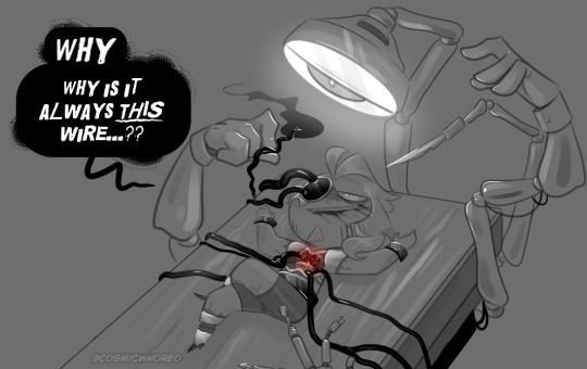
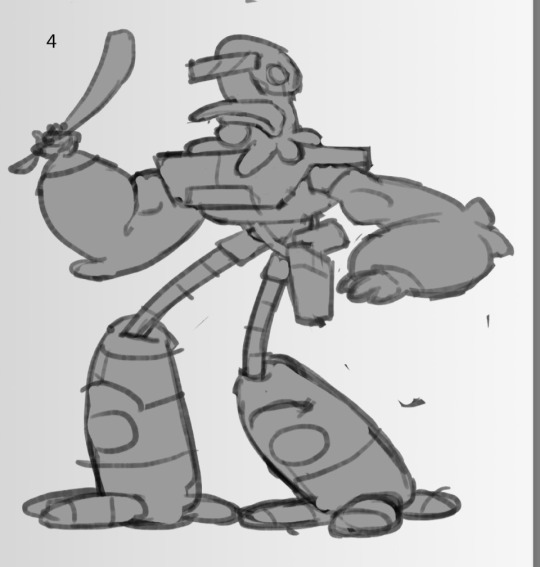
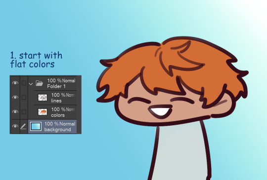
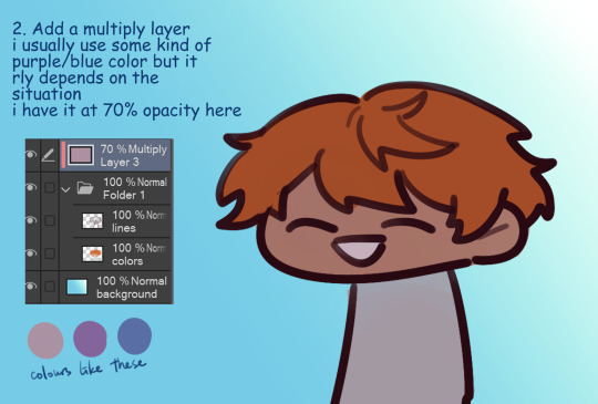
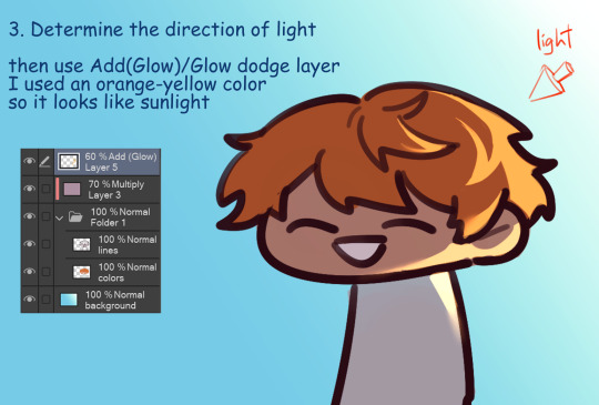
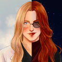
#playing with greyscale is FUN and good for lighting practice
Text
tw: blood
If you're not drawing your oc in pain for the fun of it, can you really call yourself an artist?

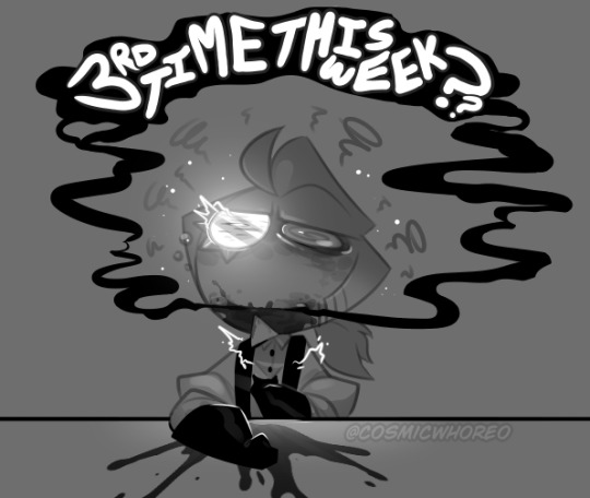
The cost of sophistication is being a little more "delicate" than one would care to acknowledge.
Gold has all sorts of malfunctions and hiccups every now and then. at least one every 3 or 4 months. Usually minor tics that, at worst, he would need to hit his chest like a staticky box tv to get it up and working again.
But there are other more... Violent outbursts that require a more involved hand... Either way, they can all be summed up as; unfun.
#playing with greyscale is FUN and good for lighting practice#cookie run kingdom#cookie run#crk#cw: blood#Tell the old man to take his pills (oil)#Gold Choco Cookie#cookie run oc#cookie oc#he'll be fine! and i'm sorry for that-
465 notes
·
View notes
Text
Digital Character Illustration - Class One
For the first part of this class, we pretty much just went over the basics of drawing on Photoshop with a drawing tablet. We learnt/relearnt many commands and learnt new techniques to better our drawing and colouring.
Commands include:
B = Brush
E = Eraser
CMD + Z = Undo
Shift + CMD + Z = Redo
OPT + Delete = Fill selection with foreground colour
Number Keys (1 - 0) = Opacity
CMD + A = Select All
There are even more helpful commands, but these are the ones we used the most.


First we did some page setup, distinguishing between layers and background. The layers are created by clicking the plus icon in the lower right of the layers menu. The background is the only layer present when a new file is made, and has a solid white background, unlike layers created afterward which are transparent.

We then tested lots of brush and eraser types. For example, there are hard and soft brushes, which refer to the rigidness of the lines edge when drawn. There are many other types of brushes, but we just used these for the example. We also played with the sizes of the brushes and erasers, as shown.


Next we tried changing the opacity of the brushes and eraser. I found this very interesting, especially the eraser, as it led to some cool gradients by just making very simple strokes. I think I'll keep this technique in mind when designing my characters.

After that, we messed with the colour wheel, and did some more of everything else over again, just to see how everything meshed together.
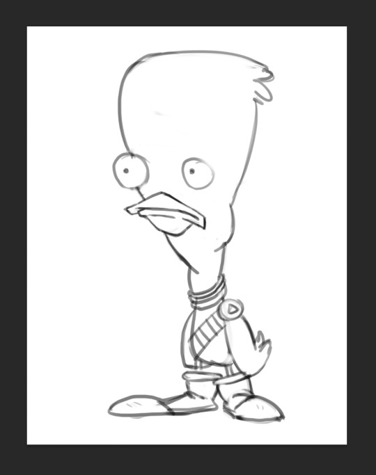
After we had finished getting used to Photoshop, we got our first character template to practice drawing over.

We then setup our layers, so we could draw overtop on a white layer whilst still being able to see our template. We did this by creating a second layer that was filled in with white, and dropping its opacity a little bit, so we could see the template. I drew my first outline, was happy with it. I think I'll be able to get used to the drawing tablet pretty soon.

Next, we started using the pressure brushes, which change thickness depending on how much pressure you put on the drawing tablet with your pen when drawing. I like this brush type a lot, it looks more like a manual drawing, which I think is really cool.
I also coloured it in for fun.
We then learnt a process for designing characters and colouring them, the process was made by Tom Garden, or at least that's what the slideshow said.
It pretty much consisted of choosing a design, drawing line art over your sketch, filling that line art with a base colour in grayscale, then making a new layer for each section of the design that needs a different colour, and adding a different grey to it depending how light/dark you want it, then adding colour to each section, and then adding shadows and highlights on individual layers as well.
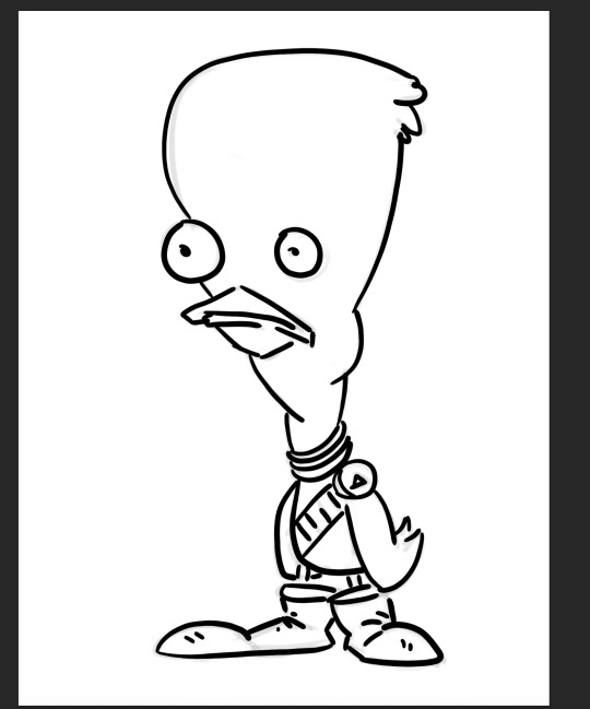
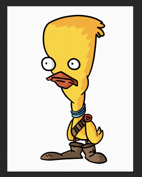
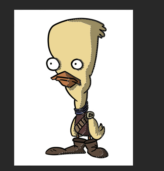
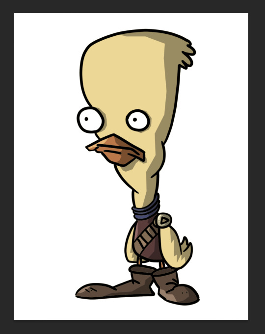
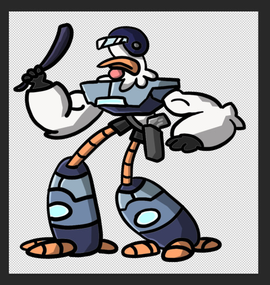
Here's my attempt below

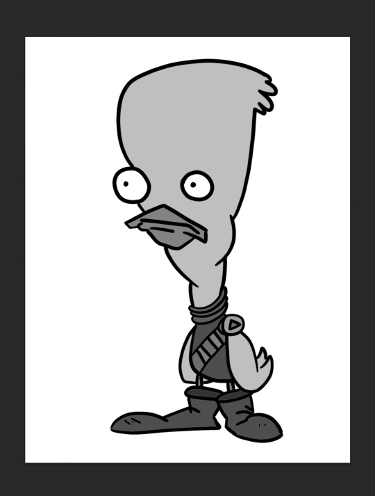
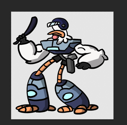
Here is my greyscale of the duck character. Each different type of grey was on it's own individual layer, so I could colour each section individually.
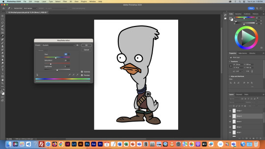
I then used the hue menu (CMD + U) to colorise each section of the design.
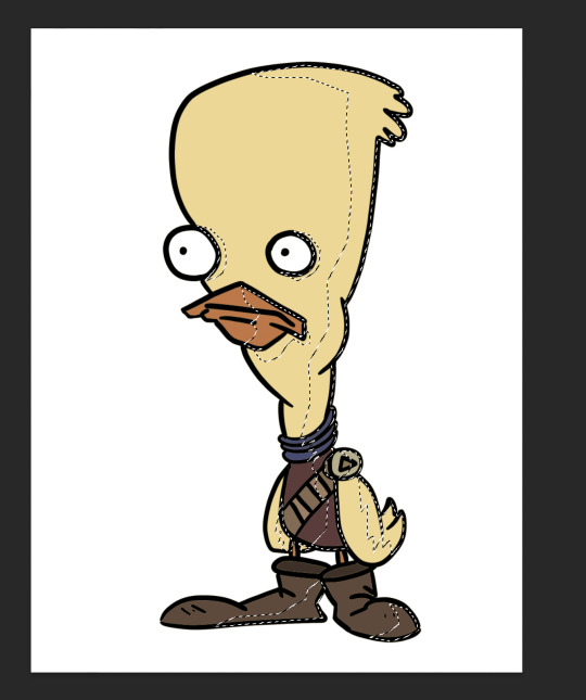
Next I used the polygonal lasso tool to select areas I wanted to add shadow to, on an individual layer, I filled the final selection with black, and made the opacity of the layer 35%, as it said in the instructions.
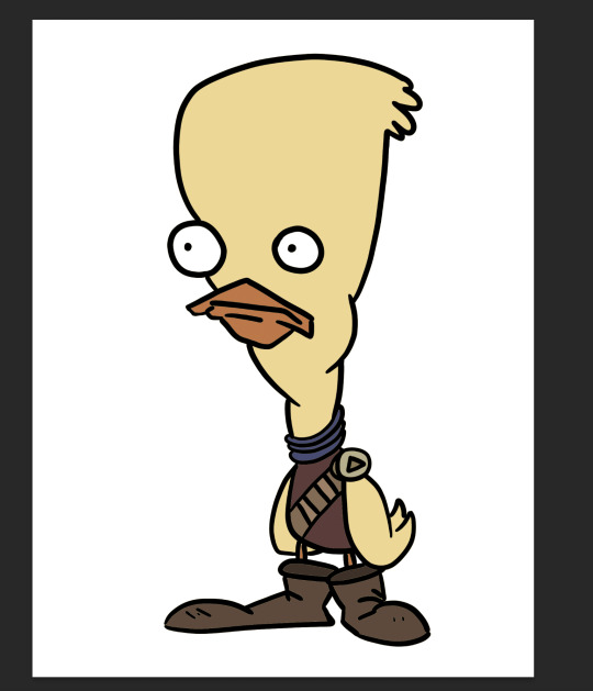
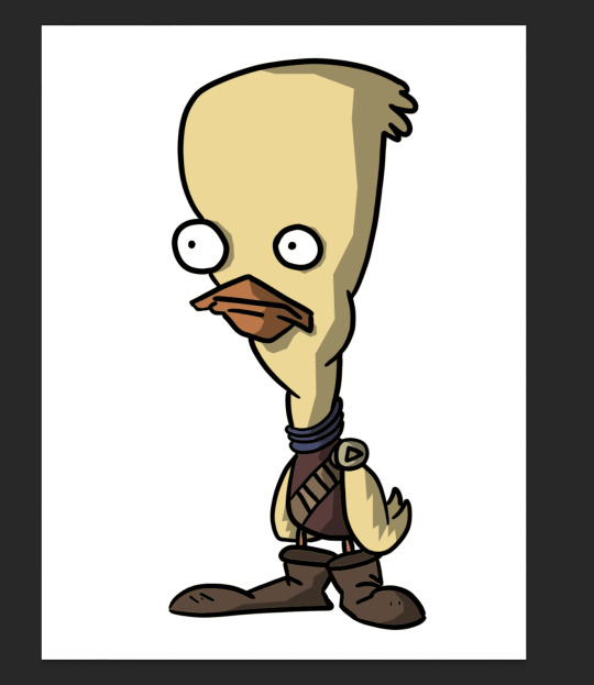
Finally, I added a couple highlights to the design, such as on the badge, shirt, shoes and beak. This added a little extra tone which I thought was nice. Overall I'm way happier with this one than the original one I coloured, so I'll definitely be using this process in the future.
I did this process again for another template we got:
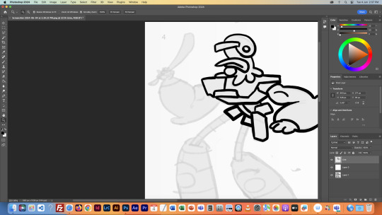
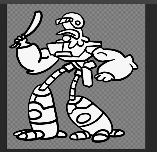
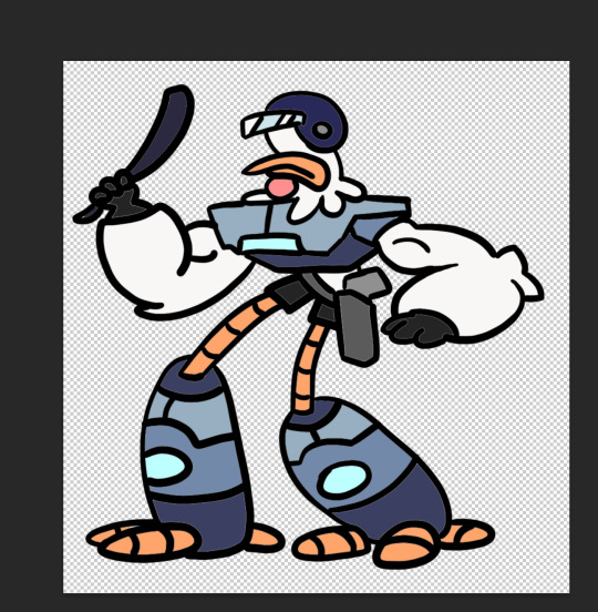
This was a little more intricate of a design than the duck was, so it was a nice step up to see how I would do. I think it turned out pretty good, since I''m doing pretty much all of this for the first time.
Overall this first class was very helpful, I learnt a whole bunch of new things and I can already see the improvement in my digital art compared to my previous stuff.
1 note
·
View note
Note
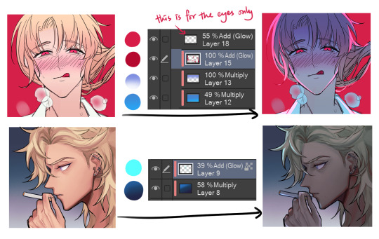
First off!! Completely adore your DoL art, the quality reminds me of CG art in dating sims because it’s rendered so beautifully!!
I’ve actually been trying to figure out your art and from what I can tell is that you use the blend tool and maybe gradient maps for the fabric?? But if you don’t mind, could you explain how you did the highlights on the first kylar and robin art you posted? the nose highlight on robin is very refreshing like he’s actually in the sunlight!! and kylar in a bathroom with dingy lighting (lmao)
Please don’t feel pressured to answer this ask if it’s too much!! either way I just wanted to let you know that your art is very inspiring and it would be really fun to see other art of yours non DoL related like ocs and whatnot, (again no pressure!!) hope you have a good day 💖💖💖
Thank you for all the kind words, anon! They mean a lot to me ahhhhh;;; I'm so happy you said my dol art reminded you of dating sims art because that was the totally vibe I was going for!!!!1! 😭😭💖💖💖
You are absolutely right in that I severely abuse use both gradient maps and the blend tool yes! I basically use the blend tool on everything (including fabric) and by that i mean e v e r y t h i n g. lol
I'm not very good at explaining stuff nor am I the best person to learn from LOL but I'll try to explain how I did the lighting!
These are just general guidelines! you can achieve all sorts of effects by playing around with colours and stuff;
see how much i abuse this LOL
basically i try to pay attention to values + colours to create a certain atmosphere, and to use lighting to guide the viewer's eye when i can
I used my robin art to explain it because its a lot closer to how I usually colour stuff; when i drew the kylar one I think I actually rendered it in greyscale and layered a gradient map over it. this is why his skin is practically grey lol. (but the thought process is essentially the same)
FUN FACT I actually colored his tongue red as a last-minute decision and i almost posted this lowkey-very-cursed green tongue kylar.
#ask#anon#tutorial#my art#honestly i think i blacked out when i drew that kylar i have zero memory of it#long post
256 notes
·
View notes
Text
Lava’s Art Masterpost
Hey, all! Welcome to my art masterpost! I have no idea if this is a thing that is done typically for art, but oh well, I like organizing things, so here we are! What you’ll find here is mostly Dragon Age, with a few non-DA pieces in there, and there’s a range of styles I like to use, depending on my mood. But a lot of what you’ll see will most likely combine lineart with some other form of coloring/shading.
Feel free to browse at your leisure, and I hope anyone who stumbles upon this enjoys what they find! :D And thank you to anyone who sees this and likes, or reblogs, or even just stops by to peruse a bit!
All that said, away we go!
Digital Portraits:
1. Portrait of Nameless Woman, 2020 - This one is just an experiment with a watercolor brush that I did. It’s not anatomically perfect, but I enjoyed playing around with shading.
2. Sketch of Aja Amell, 2020 - This one is basically sketch practice with my Amell~ Not really the most expressive pictures, but it’s a start toward drawing her more expressively. Full disclosure: Aja is one of those OCs of mine that I have had trouble with deciding on a definitive appearance for several pictures, and I really want to work on upping my level of consistency when drawing her.
3. Long-Haired Fenris, 2020 - Exactly what it sounds like; this was for practice drawing Fenris’s features (I love how distinct they are), but with long hair because I am weak for it. This one was a fun piece to shade, and mixing the stylized lineart that I normally use with a greyscale shading spectrum was really enjoyable.
4. Portrait of Ilorin Lavellan, 2016 - This is an oldie. Basically practicing expressions, and it is technically a WIP, but I’m still very happy with how the shading turned out, especially because this is actually (aside from the unfinished hair) one of the more minimal pieces I’ve done in terms of lineart It’s still there, and it still shapes the flow of the picture in some ways, but it also ends up flowing with the shading instead of standing out next to it, which I like. (Both styles are good, though, and I love seeing other artists try both too.)
5. Old Portrait of Aja Amell, 2016 - Much older picture I did of Aja; she... honestly looks very little like the newer one, I think, and that consistency is something I’m still working on, but this one was the first picture of Aja with that particular hairstyle I drew. What I like about this picture is how young she looks; it fits with her image as a fresh and sheltered Circle mage who’s only about 20 years old at the time of DAO.
6. Old Portrait of Trilyn, 2016 - They very first piece of art I posted to tumblr~ It’s not exactly how I envision Trilyn anymore, but it was still very fun to draw, and helped me get a feel for drawing him in the future.
Dynamic Movement Pictures/”Moment’s in Time”:
1. Tabris in Arl’s Estate, 2020 - TW: blood. I am super proud of this one. My ultimate goal is to draw all of my Warden DAO OCs, and I could not believe I’ve never drawn my Tabris, and so here she is. This was, in large part, practicing expressions because I absolutely love art that depicts characters in motion, or capturing some kind of expression.
2. Velyn in the Rain, 2017 - This one was actually based on some art that I saw in a Teen Wolf fic! It was an experiment with a more expressive style (and one of the first pieces I did without lineart left in the finished version) and it was a huge step out of my comfort zone. But overall, I am extremely happy with how it turned out.
3. Jem Nocking an Arrow, 2016 - And here is the lineart version. This was entirely an excuse to draw my DAI baby, Jem, and to do a cool archer pose because archers are my fav, and I love characters in motion.
4. Solas Teaching Trilyn Fade Magic, 2016 - This one was a painterly picture that was also (like the Velyn picture) something which I tried to keep lineart out of. Overall, I am proud of a lot of parts of the pic, but I think I would definitely go back over it and change a few things now if I had the patience.
5. Trilyn Closeup WIP, 2016 - TW: injury, blood, mention of abuse in the author’s note. A lot of early pictures I have are of my OC, Trilyn, and this is one of my absolute favorites. His entire upper body is technically in the picture, but I hadn’t finished rendering it yet, so this was what I posted. And it was an experiment with a cross-hatching style with the pencil tool for some texture, with air brush shading and a blurring tool. It’s a style I had fun playing around with!
6. Trilyn Blood Ritual, 2016 - TW: blood, injury (the slight cut used to supply the ritual with blood). This one was definitely a sort of “captured moment” from a backstory I gave Trilyn, and I think what I was really going for was an atmospheric piece that could fit with any potential fic I wanted to write for Trilyn. And then it ended up being practice for extreme lighting/shading techniques, and drawing the blood and the gross mass of demon ichor (or whatever the heck that is) turned out to be highlights of making the piece for me.
Art + Text:
1. Freedom and Control, 2020 - TW: scars, but very difficult to see. This one was ambitious for me! It started originally just as Solas and my Tal-Vashoth OC, Saara, facing each other, because I love the dynamic I’ve built for them in my head, but then it turned into an attempt at a tarot-esque background, and just sorta grew from there... Overall, I’m happy with how it turned out, especially with how Solas and Saara themselves turned out. The version you can actually see a larger view is here.
2. Marianna and Delia Codex and Art, Pt. 1, 2020 - I love writing my own codex entries, first off, and I love combining art with text to create a (hopefully) seamless work. This work was an attempt to flesh out these OCs of mine with both art (because unique facial structures are hard for me to get down, but so important regardless) and text (because writing~). I think it turned out well overall, but there are elements of the portraits that I might at some point touch up a bit.
3. Marianna and Delia Codex and Art, Pt. 2, 2020 - Part 2, with what I refer to as a “DAI Outfit Change” because I have always loved seeing fans show their own OCs as they look in DAO, DA2, and then finally DAI. So I absolutely wanted to jump on that bandwagon myself. The skin tones are a little off (and I’m sorry about that!) because I was playing with the watercolor brush at that point, and it dilutes the colors I use. Still working to figure that out, but I was very happy with the overall lineart and structures of the faces.
4. Alistair/Aja Amell Picture with a Blurb, 2017 - Ooooold, old, old, old, OLD! I still love the art, and I’m soooo happy with how the interaction between Alistair and Aja turned out (drawing kisses is extremely difficult for me; I always end up creating a distorted weird lip-creature, instead of realistically puckered lips...). I’m not as happy with the blurb that went with it? At that point, I was still very much figuring out my own DAO worldstate, and the characterization for everyone, so, eh. Take it with a grain of salt!
Unfinished Costume Designs:
1. Ancient Elvhen Armor with Dwarven Influence, 2018 - People who do costume design work are amazing and mystical beings, and I wish I could do what they do. This was an attempt at merging the Keeper robes from DAI with a more dwarven armor aesthetic, solely because I created an ancient elvhen character, Ceda, who was taken in by the Cad’halash dwarves mentioned in the Witch Hunt dlc, and I wanted this character to have a mix of the elven style of armor and the dwarven style. I’m overall decently happy with it, but there’s still that persistent level of self-criticism present.
2. Herald of Andraste Outfit WIP, 2016 - This was a very old picture, not one I showed around a lot, but the idea for this was entirely born of my intense interest in how fashion and outfit designs could be used to create a symbolic image for the Herald of Andraste. In general, I love the combination of ceremonial armor with long and flowing cloth, so that was what I went for here. I’m still actually very proud of how this came out, and headcanon something similar for my Herald in my canon DAI worldstate.
Pencil Sketches:
1. Quick Saara Sketch, 2019 - TW: saarebas mouth scars. Exactly what it says; very quick sketch of Saara I did in a small notebook I carry around with me. This was basically a test for myself to see if I could manage to draw Saara with the features and facial structure I envisioned for her without needing to use a lot of references.
2. Mass Effect Character Sketch; Jesse, 2018 - Similar reason for drawing this one as the above Saara sketch! With these characters, I love sometimes the way they can turn out with the specific character creator used for them, and when I draw them, I enjoy trying to create a definitive look for them using what I get from the CC, and my own knowledge of Hooman Faces.
3. Saara Sketch, 2017 - TW: saarebas mouth scars. A more detailed sketch of Saara than the one above, and one I definitely put more time into overall. It’s currently the profile picture I’m using for ao3, and is the definitive go-to reference picture I use whenever imagining Saara in a fic, or for other Saara pics I make. I am extremely proud of this picture, and feel like I should work in graphite more often. It’s such fun, and the texture is so nice to look at.
4. Sketch of Nameless Alamarri Woman, 2017 - This was a sketch I did of what I envisioned some Alamarri tribes to look like; I used artistic depictions of Gaul tribes and hairstyles for inspiration, and have used this as a go-to reference for my version of Alamarri tribes. Nothing super notable about this one, but I really liked the way the shape of her face turned out.
Events and Gifts:
1. Another Scar, 2020 - TW: blood, injuries, gore. The most recent piece of art on the list, and a gift for @cartadwarfwithaheartofgold; featuring sisterly love between Rica and fem!Brosca, which was her requested prompt. This was a tough piece for me because of the difficulty with the lighting I dealt with. For some reason, that one particular element of it gave me so much trouble. Overall, I’m very happy with how it turned out, though, especially the skin tones of the sisters; Brosca I always sort of like as having this greyish, more gaunt look to her, while Rica I like seeing with a darker, richer, and warmer tone to her.
2. A Very Cousland Christmas!, 2019 - This was for a holiday exchange for a server, and I drew a friend’s Cousland (Elissa, the girl on the left) with my Cousland (Gazza, the girl on the right). I love kid-fic, and I love kid-art, and so I decided... baby Cousland art! Drawing kid proportions was the toughest part, I recall, and I thiiiink it turned out well, and I’m still quite proud of it overall. Elissa’s design came entirely from my friend, but I added the holly~
3. Exchange Gift with Dis Brosca and Mabari, 2018 - This was an exchange gift for @fanfoolishness, using her lovely Dis Brosca, and was my first real attempt at backgrounds... I struggled with the coherence of the foreground and background a bit, but I’m still very proud of how it turned out, especially with the colors I had to work with. What I also really enjoyed working with was the lighting and the expression on Dis’s face. Backlit subjects are always fun to play around with!
4. Inktober Picture, “Deep”, 2017 - TW: scars, injury, mentions of abuse in the author’s note/attached dialogue snippets. This was for an Inktober prompt (the only one I’ve ever done, sadly... because I am bad with deadlines...), and again features Trilyn. Trilyn’s backstory has him a former slave in Tevinter, and a lot of the early works I do for him are sort of deep-dives into his life there. It’s all meant to be an exploration of the things he endures, and then those moments when he overcomes it all and takes back his own autonomy and self. This art is definitely provocative, and I can understand if not everyone likes it, but to me, I just wanted to show just what he faces (without glorifying it) before showing the moment of his own triumph.
5. Christmas Holiday Picture with my Brosca and a Friend’s Amell, 2017 - This was a piece of art drawn first by a friend of mine, @nanahuatli~ She drew the Amell, the background, the mistletoe, etc. All I did was add my Brosca to the mix to finish the image. It was a lot of fun to do, 1) because it was fun trying to match her style so that the picture looked cohesive, 2) because I love doing collabs with friends, and 3) because it was just such a fun thing to imagine my surly short Brosca, looking at this weird plant/fungus/thing dangling over some puckering human! It was an absolute joy to do this collab with her!
6. OC Kiss Week Pic of Jem and Saara, 2017 - TW: saarebas mouth scars. A spur-of-the-moment thing meant to demonstrate just what kind of dynamic my OC, Jem, has with my other OC, Saara (both of whom are members of Leliana’s network in DAI). This was a very quick picture (deadlines...) and was mostly just to have fun drawing these two characters interacting, and to see if I could make them look like themselves. I think I did a decent job with it overall, especially with Jem’s kissy-face! (Again... drawing kisses are the bane of my existence, although hands and feet take a close second.)
11 notes
·
View notes
Text
Blind Date Gaming: Mortal Kombat
Ever wonder what it was like to date a famous person? It's definitely a fantasy some share, I'm sure. There's intrigue in the idea -- Would they be as amazing as you thought they were? Would they floor you as much as indicated from the legacy they had created? Well, PRANG set me up to find out in my own brand of blind dates.
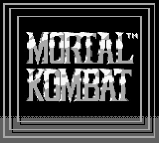
MORTAL KOMBAAAAAT! Now, I ought to start out and say that I'm not much of a fighting game player. Most fighting games out there rely on players to memorize long combinations of button presses to perform different moves (different for each character, making it even worse...), requiring research, rote memorization (at least until you get the muscle memory), and a ton of spacing and tactical wisdom that only comes from dedicating a significant chunk of time to the game. I suppose that's due to the genre's typical lack of a long campaign. Regardless, I have a night for this game, so obviously I'm not going to be a master here. Additionally, how good can a Game Boy port of this game be? Well, let's find out!

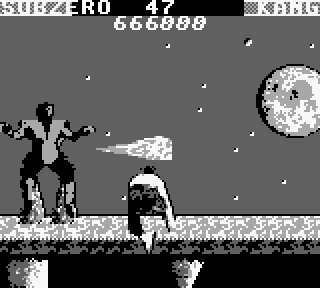
You get to choose between six fighters. You don’t get to see their names, either, so good luck telling greyscale Sub Zero apart from photocopied Scorpion. Now, I played this game a bit as a kid since a friend of mine had it, but I never got really far. I was always a big fan of Raiden since he looks so stupid when he does his open-palm punch things, though, so let's go with him! He's a god or something, right? Plus, his eyes are glowing with that terrifying light grey color! He's sure to strike fear into any who dare stand against him!

yeah no, I suck at fighting games
Okay, so I decided to drop Farmerhat McZipZap and pick one of the iconic masked vestsmiths. Plus, with this whole COVID thing, they're the best-equipped to fight without catching horrible diseases -- possibly the most lame Fatality that you can suffer from in a fighting tourney. So I picked Sub-Zero to make dumb ice one-liners and started messing around with controls until I found the basics. I kept getting owned at first because I had no idea how to do anything but punch, kick, and jumping versions of both of those. Luckily, I figured out a few moves myself, including the best move in the game -- the sweep attack.

This is what 95% of my fights looked like and they each ended in victory
Sweeping proved to be so deadly that it carried me through most of the game. I don't know if the CPU is just dumb or if the priority on sweeping is just that broken, but the only time I tended to get hit was when the CPU used a sweep attack slightly faster or when the really horrible controls screwed up and walked backwards slowly. Oh, and did I mention there’s considerable input lag and the framerate is abysmal? Yeah, all great features for a fighting game.

The living statues are incredibly confused at these dorks crouch-fighting
I eventually looked up a guide because it's impossible to stumble upon character-specific moves without a guide or instruction manual, as there’s no practice area or in-game tips. Some of the specials on Sub-Zero were cool (heh), but they really didn't hold a candle to sweeping. Scorpion seems overpowered since his hook pulls you close and sets up an uppercut, which does 25% of your HP in a single hit. The other special attacks are all mostly avoided by ducking, though Raiden can apparently fly like a banshee? I dunno, all I could get him to do was back massages.
Stance is everything when you shoot energy attacks. If you don't look like a crowing rooster, you're not doin' it right.
So sweeping rocks. Great. I sweep and sweep, even past the completely unfair two-on-one fights (you have to take down two CPUs in a single life bar). Everything's goin' my way, and then they throw me Goro. This guy can give 4 high fives, barf campfires, and is apparently immune to sweeps and like half of the other possible attacks you can do. So, obviously, I lose like an idiot.
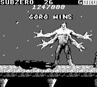
Is...is he asking for a hug or something?
That's when I learn the flying fist technique, which not only retains its effectiveness against lame CPUs but also actually looks cooler than the pseudo-breakdancing that is the sweep attack. It crushes Goro like Gallagher with a watermelon. Victory!

CROTCH PUNCH
So only one foe lies between me and total victory: Shang Tsung. Fortunately, he lacks Goro's immunities and I beat him to death in a corner after relapsing to sweep central. I kicked it up a notch! Trouble was a foot! Miscellaneous other stupid applicable puns!
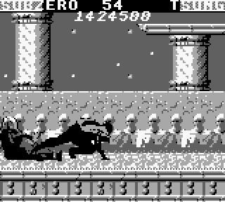
Your shins are weak!
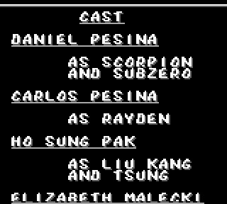
And so I won! What an unbelievably lame game! I assume the other versions were much more exciting and playable, but this was a sad one. It was clunky, sluggish, and felt like a chore at times. It also had some weird character attribution at the end, as if people starred in the game. This may have been for modeling the '3-D' characters, but I'd rather conclude that Rayden was actually some guy named Carlos in a goofy outfit.
Oh yeah, and if you're wondering, I did try some fatalities. Half of them are lame and just like flying punches. Sub Zero's was that way, unfortunately, but some of the others were fun. Scorpion breathes fire, Raiden electrocutes, and Sonya...uhh...kisses fire? Not sure about that one, but it might make Valentine's Day a little troublesome for her partner. Maybe she can only kiss underwater. What a dumb superpower!

So overall, this date was a hot mess. I definitely wouldn't recommend going on a second date. It lacks everything a good fighting game needs, proving that a name isn't everything. Definitely don't use this as a gauge for the rest of the series, though, as the other ports/games are fantastic. There are more sequels on the Game Boy, too, so here's hopin' those are better. Until PRANG serves me those, take this Sprite of Passage and show it off as the token representative of Mortal Kombat if it was run on a TI-83 calculator.

I don't know what this is, but it's apparently a world-class fighter in an extreme yoga pose
3 notes
·
View notes
Text
gif + colouring tutorial! ✨
i’ve been asked about my gif-making process a couple of times, so as promised, i put a little tutorial together! i’ve never done a tutorial before, so this was an adventure! 😅
when it comes to colouring, i find that a lot of it is personal preference. i prefer vibrant and saturated (perhaps sometimes oversaturated) colours and smokey greyscales, hence why i chose our illustrious cardinal in chapter six for this. i love the story videos, but i hate how desaturated they are. so let’s fix that!
this is for PHOTOSHOP CC 2017, but i think other photoshop versions are fairly similar. we’ll start with the video already imported into layers on our canvas and appropriately cropped and trimmed, so i’m not going to take this right from the top.
okie dokie, here’s our before/after!

so all colouring is, essentially, is messing around with a whole bunch of adjustment layers. it’s honestly just.... trial and error and fiddling around with settings and opacities and different combinations of things until you find what you like. there’s no right or wrong way to colour something; there’s only experimenting and finding what works best for you. it takes practice.
when i’m colouring something, i usually like to start with a curves layer first to brighten things up. we do that by going layer ➜ new adjustment layer ➜ curves. all of the other adjustments we’ll be using are found in the exact same menu! adjustment layers are friends! these are my settings for the curves:

and you can see it’s already made a big difference:

after that i’ll typically put on a vibrance layer. i love the vibrance adjustment ‘cause it just makes things pop. it’s a really quick and easy way to adjust the saturation and the brightness of your gif.

i’ll also do a brightness/contrast layer, which is another big favourite, and does exactly what it sounds like. i’ll normally up both of these until i achieve my desired effect. lowering the contrast can be very helpful too! i particularly like lowering it if i’m editing for a b/w gif, as it can help create more of a gentle greyscale.

here we are after our curves, vibrance, and brightness/contrast adjustments:

getting there!!! but i’m still not satisfied, so i’m going to go for the levels. this layer can be very useful for enriching shadows. on it you’ll see three toggles (black, grey, white) which translate to shadows, midtones, and highlights. i rarely touch the highlights. shadows and midtones only, babey. but again, play around and see what works for you and for that particular gif. i’ll start by adjusting the shadows, then move to midtones, which i generally don’t take too far away from its 1.00 starting point. a little can go a long way.

after that i’ll typically pop on a selective colour layer to tweak the colours a little bit. there’s several adjustable colour menus, but i mostly use the blacks, reds, yellows, and neutrals. this layer can be particularly good for darkening your blacks. this is one where you really gotta dig in and play around. i’m not going to screenshot my settings for every adjustment, but this is what my reds looks like:

finally, if i’m still not satisfied with the colours, i’ll usually add on a hue/saturation layer. there is an additional “lightness” setting on it, but i generally don’t touch it. actually, i don’t tend to fuck around too much with the hue settings either. i use this layer to give a final boost to the colours.

annnnnnd that’s it for colouring! once i’m happy with where i’m at, i normally group all of my adjustment layers into a folder, just to keep things nice and clean. now we’ve just got to sharpen and then save our gif! sharpening is one of the most important steps -- i find the difference in quality between an unsharpened and sharpened gif to be immediately noticeable.
to do this, i’m going to start by ensuring that i have both the first frame and the first layer selected in their respective panes. this is important! then from the animation pane i’m going to go to select all frames. once all animation frames are selected, i’m going to select convert to timeline, again from the animation pane. right off the bat you’ll notice that every layer has been made “visible” and your timeline should now look something like:

from here, we’re going to select all layers, which i do quickly by just using the shift key. once all our layers are selected, we’re going to right click and select convert to smart object. this will condense everything into a single layer.

now it’s sharpenin’ time! i use the smart sharpen function for all my gifs, so filter ➜ sharpen ➜ smart sharpen. these are my settings:

that’s it! we’re ready to export. so file ➜ export ➜ save for web. what settings you have here can also affect the output of your gif. be patient here! since my laptop is a piece of shit, photoshop can take a good few moments to load the preview, just leave it alone to do its thing. hopefully you have a better computer and don’t have to wait! here are my current gif settings:

almost theeere... don’t forget to change the looping options to forever, of course! then smash that mf save button!!!!!
annnnnnnd tada! we’re done! (ノ´ヮ´)ノ*:・゚✧


you can do lots of cool things with layer adjustments, so branch out and experiment with them all, including the ones i didn’t use here. feel free to use as many or as few adjustment layers as you want, and don’t hesitate to use the same type of adjustment more than once if you need to re-correct anything. practice, experiment, and have fun!! alrighto....
thank you very much for sticking with me!! i hope everything was clear, but please ask if you’d like me to clarify anything. 💖
#*mine#tutorials#resources#yeah idk what to tag this as#but i hope someone finds it helpful!!!#it was interesting for me to like... dissect what i'm doing#bc don't let this fool you 99.8% of the time i have no idea what the hell i'm doing#all photoshop is is clicking things and hoping for the best#it is CHAOS#💜💜💜
52 notes
·
View notes
Text
Digital Walkthrough – Dragon Thrall
From April 2007. Nowadays I tend to completely work in Photoshop CS, but many of the techniques are the same no matter the software. This is a fairly rambly post as it's taken from notes I made while painting. This is NOT the way I work for client work!!!!! This was a personal face study that I built a painting around. I now plan things!
This painting was completely unplanned. It started out as a gothic vampire piece… ended up something completely different! These are some of the notes I posted to LiveJournal while painting, and subsequently featured in February 2008’s EMG-Zine.
Normally it’s a good idea to plan a painting. You should work out your composition details, color schemes, lighting sources and other technical details, but sometimes it’s more fun just to get in there and paint! Some of my best paintings have been the result spontaneity, experimentation and sheer desperation to fix a mistake! It started out as an exercise in skin tones, turned into a modern vampire piece and ended up having dragons! Hopefully you’ll learn a few things about why planning can be useful, as well as why it can also be fun to follow the rambling path your muse sets you on!
A few thoughts on digital art and painting software:
There is a plethora of information on digital art available online. This article isn’t a basic A+B=C tutorial. It’s more a discussion on the creative process I employ while painting digitally. For this article you will need a basic understanding of Adobe Photoshop or similar software and have access to a digital graphics tablet (or be really good with a mouse!). Access to Corel Painter would be handy too, however you can get similar effects in Photoshop with a bit of experimentation and practice.
I use Photoshop and Painter together. I’m not going to argue about which one’s better – because frankly it’s like comparing a banana with a pineapple! They’re both graphic software programs, however they’re designed for completely different purposes. Photoshop is an editing tool which you can paint with. Painter is purely designed for painting, with a few editing tools thrown in. With each new incarnation the blurring of these definitions decreases. I’m sure that if you experimented enough, you could probably get the result you want in either software.
Setting up the canvas
I started the painting as an exercise in skin tones. I hadn’t worked in Painter for a while and thought it was time to flex those painting muscles again. Unfortunately some versions of Painter can cause files to corrupt in native Painter file format (pre-version 5), so I recommend that you either create your file in Photoshop first, or save the files in Photoshop format (*.PSD extension)
Just like painting on paper or canvas, a blank canvas can be very intimidating. I always lay down a color of some type on the background layer just because it’s something to start with. When you plan a painting it’s a good idea to think about the lighting in regards to the background. If you are painting a scene which is sunny, then a warm yellow or warm blue might be a good choice. If you’re thinking about a night scene then start with a dark indigo or a cool blue. If it’s in a forest you may want to think about a green, while a snow-filled landscape may require a pale lavender-blue color.
As I said, this was a practice for skin tones so I decided on a dark maroon to pick up the dark tones in the hair (I’d planned on painting a redhead). Most of the time I apply a lighting filter, or a gradient to make it more interesting – kind of give it a focal point.
The first character I sketch on a separate layer to the background/ canvas. When painting directly onto the computer with a graphics tablet I generally start with a few lines to work out the placement of the head, eyes, mouth, nose and ears. I then work out a few ‘base’ colors that I will use for the skin. I place ‘dabs’ of the color I use regularly somewhere on the canvas:
A mid pinky-brown color – the base color
A pale yellow/ pink color for highlights
A redder tone of the base color used for cheeks and nose area
A purple version of the base color for shadowing
A darker brown-pink for the deep shadows
A light pink-purple (not shown) for blending in areas where the skin is fine and the veins show through.
In later versions of Painter you get a tool called a ‘mixer’ where you can place dabs of colour and create variants using the mixing tools. If you are having difficulties with colours try using the colour picker on real photographs and see what ‘real’ skin colours look like. You’ll probably be quite surprised!
Once I have the colours and some lines down I begin to paint. For this face I used Painter’s digital Airbrush set at about set at about 10% opacity, 100% Resat, 0% bleed and 0% jitter. I vary the brush size from about 150, right down to 2 or 3.
I spent about 2 hours to get to this stage.
A few notes on skin tones:
Every person has a different skin tone and texture – we’re not all a standard ‘flesh tone’, straight from the tube
Men and women also have slight variations in colouring
Different nationalities have different skin tones. Some have ruddy complexions, others a yellow undertone, while some have dark skin. Study photographs, place them next to each other and note the differences
Skin tones reflect the colours around them. If you are wearing a purple shirt, you will get some reflection under your chin depending on the lighting. If you are standing next to a yellow wall, the side facing the wall will reflect the yellow.
The colour of the lighting impacts on skin highlights and shadows. If you use a yellow light, the shadows of the skin are generally the complementary colour (in this case purple).
One thing I remember reading (Don Seegmiller in his book Digital Character Design and Painting) was the fact that the strip across the nose section of the face is pinker than the rest, while under the eyes should be purplish-blue as the skin is so delicate here. I recommend his book for color theory, regardless of the painting medium! In fantasy art, the ability to create convincing skin tones in important, particularly if painting something like a Drow, or even an alien with blue skin
Adding the hair
Hair is basically made from 4 colours which I vary the opacity and size of the bush. The illustration below shows the four colours and the way I build up the hair.
A mid tone
A light tone
A dark tone
A very light tone for the highlights
Why having no ‘theme’ for a painting can be a problem!
Like most sketches where I don’t think about anything much except picking up the ‘paintbrush’, I get to a point where I start wondering about things like ‘does she want straight or wavy hair’, ‘does she wear modern or old fashioned clothes?’, ‘what the heck do I do with the background?’.
At this point I was listening to rock music and it was about midnight so I decided it should be a vampire/ gothic piece. Originally it was just going to be a strapless dress but it ‘felt’ wrong. I added a leather jacket and a cameo choker. I planned on having a night sky, maybe the silhouette of a building. This means that dark blue is going to have to replace the maroon canvas colour. A guy is going to be behind her, all ‘vampy’ and hopefully pretty good looking! I took a break and came back to the painting after some food. I’d been working for about two or three hours and realised that I’d changed the angle of her torso mid painting which is why it is looking odd. This is why it’s a good idea to plan your painting before you begin! You can waste a lot of time working on something, only to realise there is an inherent flaw in the drawing. So I really had a think about where the painting was going… which was feeling like the great digital dustbin in the sky!
Unfortunately I only had a clear picture of the character’s faces so I was basically very aimless when painting. I get bored with details so I moved onto the male character. I knew I’d have to revisit the female character but something was really bothering me about her and I didn’t want to think about it too deeply. I spent about 2 hours working on the guy. Notice that his skin base is slightly more yellow. Guys’ faces are also more angular than females (generally) so I painted in a more aggressive manner, not blending as smoothly as for the female. I also added in some texturing with a ‘captured bristle’ brush.
A note on photo-references:
When I work from photo references I try to avoid working directly from one reference for copyright reasons. Each painting I’ll often work from at least half a dozen images (which I normally collect AFTER I’ve made the initial sketch). I also have a huge collection of images that I’ve harvested from the net, reference books/ CDs, personal photo references.
I also like working with greyscale images and using small images so I can’t rely upon them too heavily. This way I can make the colour up on the fly. I also find that it helps to practice sketching in greyscale. You focus on rendering the form rather than colours, which teaches you a lot about volume, lighting and texture.
Back to the painting
I spent another 2 hours on this (up to about 10-12 hours now). I kind of became obsessed with finishing his face. I put him in a leather jacket and white shirt and played around with where his arm should go, ultimately deleting it. I changed the background colour to a near black colour while I was playing with things. I’m still not convinced about what’s going on in the painting. But I’m happy to let my mood decide what’s going to happen. I enjoy these kinds of paintings because I just let the paintbrush take me where it wills. However it’s getting to the stage where I will need to decide if I’m going to do something with this painting, or just file it as an experiment.
I’ve got more details to do… tidying up his eyebrows, giving his skin some texture around the jaw line, finalising his nose and lips, and one of his eyes is slightly off (shadowing and shape’s wrong… but I’ll fix that up later.)
Vampire goes Renaissance?
I’m heavily influenced by music. When I paint I listen to a variety of music, and often it can influence what I paint. I stopped listening to my Dishwalla album and put on Medieaval Baebes… at which time I thought to myself ‘this is just two people standing together, there’s no fantasy here’. So the painting went Venetian 16th century!
I’ve obsessed over historical costume for as long as I can remember and one of my favourite paintings is Rafael’s La Donna Velata. I deleted the leather jacket and replaced it with a front-laced bodice over a creamy chemise. This costume was popular with working classes as it was comfortable and didn’t get caught up while working. I think it is important to think about the clothes you put your characters in… it is part of their story. It can suggest what they do and their status in society, it can also indicate if they’re light and fluffy, or rigidly straight-laced.
A few hours work went into the dress. It’s not finished yet. This is only the basic form. I’m debating about patterns and colours. The more elaborate fabrics tended to be used a few decades after this dress style was popular, and only by the wealthy, but it’s fantasy so I guess I can do what I like!
Working out the background:
I have decided a night sky doesn’t suit the lighting of the characters, so I’ll do a dawn/ dusk sky. I flicked through some reference shots of skies and started laying down some colours in Photoshop with a large airbrush tool. Not much I can say about skies except for the light will reflect on the characters, which is why it’s not a strong sunlit scene. In this low light there won’t be much reflection or shadow.
I’m still playing around with the idea of having a column behind the male character. The sky’s getting close to being completed. I’ll start looking at the lighting in the painting later on… normally that’s something I do in the planning stages for a *proper* painting. It’s up to about 200MB… time to save a new copy and collapse a few layers I think.
On a side note, I’m not happy with the poses or placement of the characters. They’re too rigid. There’s no connection between them, I need to bring them together somehow. I’ve started to realise the girl’s body looks too small and much too straight on for her head. I’m going to have to repaint whole chunks which will be a lot of extra work. You can do this with digital, however if I’d planned the painting I wouldn’t have to be ‘fixing mistakes’ at this late stage!
I added some columns and moved the characters closer together. Each character is on a separate layer and I often take a copy of a layer to do the modifications (in case I muck it up!) I also do iterative saves… I have 7 versions of this file from various ‘major’ points from within the painting.
I like the placement better than the previous version, but I know that I’m going to have difficulties with his arm placement. I also don’t like her headpiece. I haven’t spent much time on it, but it just looks wrong – far too elaborate. I’ve got a feeling that she’s not the kind of girl to wear masses of jewellery! The pose is still disjointed. Why is she moving away from him? It doesn’t exactly look like a comfortable pose. Is he trying to put on her cloak, take it off, or strangle her? When you paint, you have to think about how the painting could be interpreted.
The home stretch
Unfortunately I sat down and painted in one marathon session (without taking saves part ways through). Inspiration struck and all at once I knew exactly how the painting had to look. All the missing elements fell into place. I had the narrative that went with the painting, I knew why they were standing together. The pose was vital to the scene. I think it is important to know ‘why’ things are the way they are. Sometimes it can be as simple as ‘because it looked right’ or ‘because I want the viewer to feel scared’, but with more narrative pieces, the ones that work best tend to make every piece of the painting into something vital to understanding the whole piece… like clues in a mystery novel.
I ended up moving her directly under his chin and slightly curved into his body and moved his arm so he’s supporting her, rather than embracing her. The sky remained unchanged however the bottom needed a focal point – it was too empty. The forest and cliffs are a scene I’ve used in numerous paintings… they are like an old friend – something quick and easy.The lake came next, and the glow lights (which have no real meaning, but they ‘fit’ with the mood of ‘magic in the air’). It still was looking empty. In the story in my head the character’s connection is through dragons. I’d already planned on giving the female character a dragon necklace and the male character golden eyes, however I think a more ‘literal’ representation of the dragon was needed. The placement was deliberate in that I wanted the viewer to follow the motion from the dragon to the characters and back around.
Often when I’m working without reference (like I did for their poses, I try to work out their bodies in their entirety. Even though it still looks a little ‘wrong’, because of the angle of his body, his shoulder is right behind her hair. I tried extending his shoulder but it didn’t look right either.
I added an Overlay layer to do some lighting along the side of the girl’s head and the columns. There are 13 layers in the final version (after I collapsed the multiple character layers from the previous version).
I thought I was finished. I posted it online, added it to a few galleries, but something was still a little unrefined. So I stepped away from it for a week or two (see further down for the revised version).
Some notes on Composition
I like working with the Golden Mean (also called the Golden Section/ ratio/ proportion/ The Divine Proportion). It’s a way of dividing up a painting so that the image is artistically and geometrically pleasing. It’s based on mathematical principles and can be seen in nature in such shapes as nautilus shells. Below I’ve added guidelines in pale blue that divides the painting into thirds. Notice how the parts of the painting that your eyes are drawn to tend to fall along the lines, with the light in the forest being at a ‘focal point’, where the lines intersect.
The painting’s composition loosely fits into what is called the ‘L’ Composition
It could also fit in with ‘V’ or ‘triangular composition.
The trick is to try and get the viewer’s eye to follow the movement from one point of the painting to the next
Final Piece:
I went back and refined it a little… just added a few more details to the hair, fixed the column and tidied up the tree-line. There are still aspects I’m not entirely happy with, but I’ve spent enough time on this painting… I don’t want to overwork it.
So 20 or so hours later, here’s the final piece and the story that goes along with it:
Text I wrote to go with the painting
The dragon-thrall caught her, its silken threads binding her mind to the golden dragon completely. Kara and the great beast launched upwards as one, pushed from powerful back legs. Muscles flexed as the wings extended fully, capturing the wind and propelling them higher still. Freedom! She threw back her head and laughed, the rumble echoing from the surrounding cliffs. The sun and sky called to her, daring her to fly higher and faster than she could ever dream.
She wheeled to the right as she caught movement in the valley below. Ruby eyes fixed on the deer. Tucking her wings to her side, she dove towards the earth, pulling up just above the forest, the trees bending then snapping back in her wake. Kara could taste the hot, sweetness of the blood. She wanted it, lusted for it, she had to have it. It was a burning pain that drove her.
Something yanked at her. Whipping her head around in annoyance she couldn’t see a rider. Focusing on the deer again she snarled as the strong will commanded her to stop. The hunger tore at her, but still he cajoled her, coaxed her, and compelled her. Snarling and baring her teeth she snapped at the unseen force. Finally he dominated, wrestling control from her. Emotions flitted across her mind – fury, hatred, pain, desire. And then she was in her own body again.
Rhys caught Kara as the dragon-thrall released her. He’d been with her throughout the flight, his golden eyes seeing just as the dragon had.
“Now do you understand?” he murmured, his breathing still ragged from the clash of wills. She shuddered, glad to still be in his steadying embrace.
“It helped, but I don’t think I’ll ever understand them, not the way you do.”
Prints and products are available here from RedBubble , painting can be found in the Dragon Fae Oracle as the Lovers card.
1 note
·
View note
Text
Universe Falls Preview 3
So ya’ll gettin lucky with this one I’m giving you an entire damn scene here just so I won’t have to give you a fourth preview (which I may still end up doing anyway idk it depends cause this chapter is going to be very long) but for reals I fucking love all of this and I’m so excited that I figured I”d share it so here you go!
Almost as soon as he had voiced this question, Dipper instantly noticed an abrupt breeze start to pick up, one that quickly turned into a full on, admittedly ominous gale as it whipped through the trees. Somewhat unsettled by this, he pulled his jacket tighter around his shoulders as he securely grabbed the laptop and braced himself against the sudden chill, only to realize that the light of the full moon in the skies ahead of him was starting to change as well. Slowly, a long, slitted line began to draw itself over the moon, splitting it cleanly in half as a series of initially transparent, glowing blocks began to gravitate towards it out of seemingly nowhere. Dipper gasped, alarmed by this bewildering phenomenon as he leapt to his feet, taking a nervous step back as he stared towards the moon with wide eyes, only for it to stare right back at him. The bright blocks continued stacking against the moon, forming a distinct triangular shape as the winds picked up to near hurricane levels. And then, as they finally all joined together in a bright, practically blinding flash of light, the world bled of color instantly, turning into a full, frozen greyscale scape as cause of all this strangeness finally made his appearance:
Bill Cipher.
“I THINK I KNOW A GUY!” he proclaimed boldly, his distinctively pitchy voice echoing harshly throughout the colorless woods. In light of this completely unexpected, unprecedented encounter, Dipper was effectively stunned into frozen silence as he stood in the dream demon’s massive triangular shadow. Still, Bill hardly seemed to notice or care as he drew in closer, his manner just as casual as ever as he circled the dumbfounded human before him. “Well, well, well. I gotta admit, you’re awfully persistent, Pine Tree. Hats off to you!” At this, Bill took his top hat off and tipped it, the entire world seeming to abruptly tilt along with it.
Dipper let out a startled gasp as he struggled to maintain his footing on the roof as it slipped sideways, though fortunately it leveled itself once more moments later. As it did, he was quick to regain his composure for the sake of putting on an air of brazen defiance to the crafty dream demon, remembering well how much trouble he had caused during his last appearance. “You again!” he exclaimed crossly, holding the laptop a bit tighter as Bill calmly glided past him. “What do you think you’re doing here?!”
“Oh, just checking in,” Bill shrugged coyly. “Did ya miss me? Admit it, you missed me.”
“Hardly,” Dipper scoffed, rolling his eyes. “You worked with Gideon! You tried to destroy my uncle’s mind! Oh, and not to mention that you constantly terrorized all of us while we were trying to save him, what with you stealing Steven’s gem and shooting a whole straight through my chest. Need I go on?”
“Geez, it was just a job, kid!” the dream demon countered defensively. “No hard feelings! Besides, since then, I’ve been keeping an EYE on you!” At this, Bill instantly shot up to a massive size, his voice ominously deepening and his eye turning pitch black as he peered at Dipper piercingly. “And even if you are a bit rough around the edges, I must say I’m impressed!”
“Y-you are?” Dipper asked, unsure of what to make of that. After all, he really didn’t see anything particularly good about garnishing the interest of a being like Bill Cipher, especially given the countless warnings the journal gave against him.
“Sure am!” Bill agreed brightly. “In fact, you deserve a prize! Here, have a head that’s always screaming!” With a mere snap of the dream demon’s fingers, a disembodied head appeared, one that, sure enough, was crying out in shrill, endless agony as it fell onto the roof. Dipper gasped in fearful disgust as he flinched away from it, only for the head to begin to peel itself away layer by layer, from skin, to muscle, to bone, before it disappeared entirely as Bill simply laughed in sadistic amusement all the while.
“Augh! What’s wrong with you?!” Dipper exclaimed at this, appalled by such a twisted, demented display.
“Ain’t that the question of the millennia!” Bill chuckled carelessly as he floated down to take a seat on the edge of the roof. “But the point is, I like you, kid! And I couldn’t help but notice that you’ve been having a hard time with that crusty old laptop there, so how’s about you let me give you a hint, huh? I only ask for a small FAVOR in return.” As the dream demon said this, both his hand and his eye lit up with an unnatural strain of blue fire, his manner still incredibly casual, even despite the immediately harsh rejection his offer received.
“Are you kidding me? I’d never do a favor for you!” Dipper exclaimed adamantly, unable to believe that the dream demon would even have the gall to propose something so outlandish. “Don’t forget who defeated you last time!”
“Right, you ‘defeated’ me,” Bill rolled his eye as he disappeared into the roof, only to come rising up out of it behind Dipper just a second later. “Still, seems to me like you’re passing up a great deal like this pretty quickly, Pine Tree. Kinda ironic when you think about how Water Wings didn’t hesitate to take up Stripes’ deal to save you…”
Dipper was completely caught off guard by this, especially as his picture of him and Lapis came flying out of his pocket to hover over the dream demon’s hand. “Hey! Give that back!” he protested, reaching for the photo only for Bill to teasingly pull it out of his reach.
“Whoa, hold your awkward, pre-pubescent horses for a sec, kid, and think about this,” the demon contested coolly. “Do you really think you’re getting anywhere by making all those shots in the dark about that password? You think you’re not just wasting your time out here while Water Wings has a non-stop, all-out brawl with Stripes at the bottom of that lake just so she can keep you ‘safe’?”
“S-stop,” Dipper muttered, his hands clenched tightly at his sides as he tried to block out what Bill was saying, even if he knew it was all true. But of course, the dream demon simply ignored him and kept going with his sly, almost cruel form of manipulation.
“Wouldn’t it just be so much easier to get just a little help, to get just a tiny bit closer?” Bill kept the photo positioned right above Dipper as he talked, deceptively close but still so far out of his reach, much like the blue Gem herself was at the moment. “Wouldn’t that make whatever small thing I want from you worth it just to bail her out?”
“Stop,” Dipper said a bit firmer this time, sending the dream demon a fierce warning glare as he tried to remind himself that he wasn’t going to take this deal, he wasn’t going to give Bill what he wanted, whatever that was. Still, that didn’t mean his appeal wasn’t starting to become the least bit tantalizing.
“After all,” Bill continued callously, clearly taking pleasure in how uncomfortable his truthful words were making Dipper. “Water Wings sure thought it was worth it to bail you out, didn’t she?”
“Stop!” Dipper finally shouted, unable to take any more of this, lest he actually give in under the pressure. A beat of heavy silence passed as he stared the dream demon down, his heated anger cooling just a bit, even if it was still very much on the surface as he offered a firm, but surprisingly tranquil response. “I don’t need your help.”
“Oh, suuuuure you don’t!” Bill deadpanned, rolling his eye once more. “After all, you already have Shooting Star and Rosebud to help you out with this, so why would you need me? Oh, but wait! They’re busy with that little puppet show, aren’t they? Oh, well, you can always ask those Crystal Chumps for help, right? I’m sure Fuse Box, Half-Baked, and Bird Brain know all there is to know about that laptop, almost is if they didn’t mysteriously lose all their memories on that journal of yours!”
Dipper stilled at this, hating the fact that, once again, the dream demon was right on the mark with such claims. With Steven, Mabel, and even Connie still distracted by the play and the Gems as clueless about who the author could be as they were, he was really the only one who could put the time and effort into this mystery that it truly deserved. And, so far, trying to tackle it completely on his own had gotten him absolutely nowhere at all. Still, to accept help from Bill, of all sources, would definitely be asking for trouble, trouble that, after all of the disasters of the recent invasion and its brutal aftermath, Dipper certainly didn’t need right now. “I said,” he began again, squaring his shoulders as he glared at the demon unrelentingly. “I don’t need your help!”
“Eh, well, then have it your way,” Bill shrugged, seemingly unconcerned by this refusal. “But if you ever change your mind, I’ll be here for you, ready to make a deal!” To punctuate his point, a slot machine appeared on his flat surface, all three wheels stopping right on the pine tree symbol. “You know, now that I’ve brought it up, maybe I’ll go pay your pal Water Wings a visit down at the bottom of the lake and let her know all about how her precious little Pine Tree doesn’t care enough about her to lend her a hand! I bet that would a lot of fun!”
“W-wha—no!” Dipper exclaimed, his calm manner all but gone at the idea of the dream demon tormenting the blue Gem. As if she wasn’t being tormented enough by being fused with Jasper alone. “You leave Lapis alone!”
“Boy, you sure are easy to rile up, Pine Tree.” Bill laughed twistedly, finally letting the picture fall back into Dipper’s hands. “It’s hilarious, almost as funny as you thinking you can guess that password all on your own! Oh, speaking of which, wanna hear my impression of you in about three seconds?” At this, the demon let out a loud, fearful scream, one that Dipper ended up inadvertently echoing only seconds later as he found himself abruptly pulled back into reality. Bill was fortunately finally gone and color had returned to the world as the skies filled in with the breaking of dawn, a calming sight after the still, lifeless void he had just been in.
#YEEEEEEEEEE#IM HYPE#WOO#Let me know what you think of this PLEASE!#i want some feedback!#cause im excited!!!#jen writes#universe falls#sock opera#uf preview
11 notes
·
View notes
Text
20+ Portfolio Websites 5+ Inspirational Blogs 09/07/17
Websites

https://www.femmefatale.paris/en
The title page for this website was extremely invigorating and unique compared to any I had ever seen before. Not only did it use 3d perspective with respect to mouse movement, but the fade in text animation gave it an interesting level of depth. Once you enter the site it is a single page scroll down website with various changing animations for separate sections and projects. I do however find the actual content of the index page less engaging and esthetically pleasing than that of the enter page. It is only when you click on a project that you are again rewarded with unique visuals.

http://www.alexandrerochet.com/
This website creeped me the fuck out at first. The static visuals mixed with elements of sound bordering on ASMR created quite the experience, and that was only for the enter page. It gives us an interesting look into the personality of the artist, and yet he is not limited to this esthetic. There is a sharp contrast between light and dark in the visual elements of this website. I think that is a unique idea because it’s as if he is completely changing the look and mood of the website for every single project that you click on. I a lot of work for desired effect.

http://y78.fr/
This website is an immediate assault on the senses, and I’m into it. You are treated instantly to an curious barrage of 80’s techno music, imagery, and typography that seems to shout “HEY LOOK AT THIS ASSHOLE” as soon as the website loads. This video combination scroll based portfolio takes an old idea and makes it its own with the incorporation of unexpected visual and audio media. I must say however, it is a little startling…but I can appreciate this.

http://www.adandypunk.com/
This was sort of an unexpected image map based website. I find that an image map can make creativity difficult to navigate if it is too contrived, however this website has a good balance. I like the idea of creating a gallery that overlays the index page with an animation that slides in from the right containing thumbnails. I haven’t seen too much of that done and it allows the user to have an instant look of the artists work rather than clicking on a link and loading a separate page.

http://www.rleonardi.com/
This guy knows how to animate and everything else in-between. I chose to write briefly about this website as well because I had the most fun playing around on it. The interactive resume is the most creative thing I have ever seen anyone do in the history of resumes. It was as immersive as playing a platformer game, in fact, that’s practically what it is but in resume form. I was simply blown away by the animation mixed with type and functionality. http://www.rleonardi.com/interactive-resume/

http://smartgc.com.ar/english.php
The most interesting thing about this website is its blatant lack of any color. The entire website is presented in greyscale until you mouse over a selected work or project. This is an interesting tactic to stand out because most of the websites I have visited are so vibrant and use interesting color schemes. That being said, I remember them far less than this website due to the sheer fact that it uses its grey scale theme as a creative advantage. I think this is a unique approach and an unexpected correct choice.

http://www.ollygibbs.com/
To contrast the previous site, Olly Gibbs has created a site filled with explosions of color, whimsy, and rampant imagination. There is a lot going on here that one can easily become overwhelmed by. I find it an interesting way to present your work however because it effectively gives the user a lot to look at in such a small amount of space. One could argue however that doing such can distract the user from the direction you would like them to take in seeking out information on the site. Organized chaos, that’s the word.

http://strangelove.me/
This is a simple portfolio site layout that is clean and to the point. Of all the ones I chose to write about, I truly feel that this design is the most practical and achievable on the list. A simple and clean interface with clear links and pathways that give you what you are expecting from a portfolio website. Now that may be somewhat boring, however the art makes up for a less than enthusiastic layout.

http://www.trademark-trademark.com/

This website was an absolute joy to look at because I felt like it never once took itself seriously. Even the website tab has a middle finger on it. It may be simple, but an artist like this needs to let their work stand alone. It seems like incorporating a lot of graphic elements would get in the way of the already blatant “fuck you society” vibe of this site. If I could change one minor detail, it would be to get rid of the harsh underline of the type in the navigation bar.

http://justinmaller.com/
This is a simple scroll down portfolio website with an interesting twist. You are offered a series of thumbnails that when clicked open up into a mini portfolio outlaying the process of that individual piece, or multiple projects that reflect the design of the thumbnail. This is a curious way to present work because it gives you a small sample, and when you click the payoff is a tremendous amount of insight and work that is quite unexpected. (I thought it would just enlarge the thumbnail…I was pretty fabulously wrong).

http://stereocreative.com/work
This is obviously a design portfolio site for a huge media company, and it flaunts that spectacularly. Each image is a still, and when you mouse over that section it springs to live as a video with typographic overlay. The amount of impressive work listed on this website is to be expected, so I can’t really give them that much credit. There is also a heavy influx in imagery featuring the Kardashians so they lose points there as well… Still, very impressive stuff.

http://www.ralphsteadman.com/
I wanted to throw this one into the mix, as ralph Steadman is one of my favorite illustrators and I think he has quite a unique portfolio website. I’m not sure if it counts as a “portfolio only” website because it also serves as a promotional website for his brand, services, shop, and etc. I do however enjoy the animated features that give you a sense of organized chaos that embodies his style and spirit. The website itself directs you to a tab where all of his past works can be viewed. For this portion of the website, he splits each collection up into its own separate page, with the information presented embedded into a container. I don’t find this as visually appealing as the index page, however it is functional and organized if you are trying to access a specific work from a specific collection.

http://www.blublu.org/
This is a unique portfolio website that I have visited in the past. I like the idea of using image maps for design purposes, however I think that could be somewhat of an organizational nightmare unless it is done properly. The feel of this website is indeed organized, however it can at times be difficult to find exactly what you are looking for due to the limitations of the interface. I do however think it is one of the most unique portfolio approaches I have seen yet, it’s also so street art so that’s a big plus for me.

http://www.vitosalvatore.com/
This is one of the more basic professional portfolio websites I’ve found, however I do think it is executable at my level of understanding. The animations and slide shows that showcase Vito’s work are a nice touch to an already organized and well thought out wesite. The use of whitespace and design icons work very well together with the larger full screen graphics. The works or index page is a scroll down that features the artist’s projects with a subtle image enlargement effect. This is a site I will be inspecting heavily for code information as it features a lot of effects that I am curious about.

https://www.studioanja.com/
This was a very different website apart from the rest I have included on this list. It is so basic and simple. It really leaves a lot to be desired, however it allows the work to really speak for itself. There is much graphically to be improved upon, but the content is there.

https://www.ferrisnorman.com/
I like the clean look of this contained website. It’s very organized and clean. This centered look can be favorable sometimes if you want absolute focus to right in front of the user. I appreciate this method, but at the same time, I can see how this could contribute to experiences of boredom.

http://www.christiansiriano.com/
This is a bit different from your typical design website, this is a fashion design website. This website has stunning visuals that make it seem larger than itself. One of the main problems of this site is the loading of the images, it could be improved by the slideshow.

http://www.joshharker.com/

http://stevenharrington.com/ =>

http://www.erikmarinovich.com/

https://www.mikeyburton.com/

http://mikemcquade.com/
Blogs:
Design---------------------------------------------------------
http://www.designclever.co.uk/
What I appreciate most about this blog is that it is 95% image. This is a great blog to gain inspirational images from as it incorporates so many different approaches to design. Often times if it appears on this blog its because it has recently been nominated for an award or considered by the design community as outstanding. I do enjoy the amount of posts on this site as well, I haven’t finished getting to the end of it yet.
https://eyeondesign.aiga.org/
This is a fascinating design blog that is more article than image. This blog is interesting visually and has the ability to capture your attention when it comes to recent creative politics and news.
https://illustrationage.com/
Since illustration is one of my stronger qualities as a designer, I do occasionally peruse articles and information on illustration age. This website is interesting because they often times do an illustrator of the week and showcase recent projects from that individual. It is a good way to learn about new creative individuals and their application of illustration and creativity that may defy conventional understanding of what it means to be an illustrator.
Web----------------------------------------------------------
https://www.webpagefx.com/blog/web-design/
In terms of usefulness centered around web themed blogs, I chose to speak about six revisions. While perusing the internet for interesting blogs steeped heavily in web design, I noticed that some where certainly form over function. I chose this blog because I find it extremely useful in solving web woes and answering questions that I didn’t even know I had. It is not particularly flashy or appealing in any regard, it is however extremely helpful.
http://materialdesignblog.com/
This is a unique hybrid site that focuses mainly on “how to” webdesign, however it contains information, works, and tutorials for regular design projects as well. This blog is more involved in showing off the creative aspects of web design rather than tackling problems with easy to understand articles such and “six revisions”. This is a much more engaging blog at it contains rich color and imagery within the posts. It flows well and is pretty organised so tutorials and information is easy to locate. 10/10
0 notes
Last Seen Blogs

aldbooks
ALDBooks
(Tiggertink08)

septemberbra1-blog
Untitled
septemberbra1-blog
Untitled

breakingbigmoney
Untitled