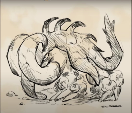
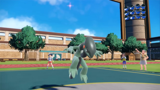
#pokemon trailer
Text
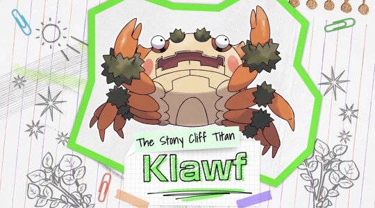
I’m love him
#pokemon#Pokemon scarlet#pokemon violet#Pokemon spoilers#pokemon scarlet and violet#klawf#pokemon trailer
3K notes
·
View notes
Text
I fucking love the idea of a sandwich mechanic. No condiments have been revealed yet but I'm already anticipating the amount of pokemon posts that will look like this

259 notes
·
View notes
Photo

Had the desire to draw Paul in Volkner's 2022 New Years outfit from PokeMas ever since I saw it
#pokemon#pokemon fanart#pkmnart#pokeani#anipoke#pokemon art#pokemon trailer#rival paul#trainer paul#pokemon paul#paul pokemon#pokemon trainer oc#pokemon oc#pokeani oc#anipoke oc#pokemon masters#pokemon masters ex#oc x canon#ocxcanon#sygna suits#saccha art#the dragon princess#invertshipping#paul
46 notes
·
View notes
Text
We're gonna be able to transfer hisuian pokemon to scarlet/violet!

#yknow...in 2023#pokemon#pokemon sv#pokemon scarvi#pokemon scarlet#pokemon violet#pokemon gen 9#gen 9#pokemon spoilers#pokemon home#pokemon trailer
77 notes
·
View notes
Text
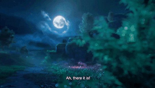


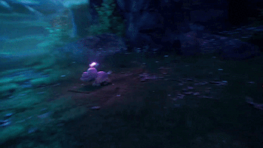

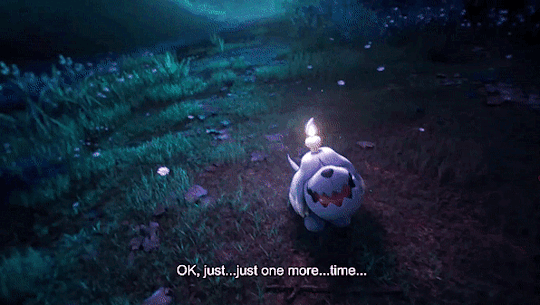

???? || Pokemon Scarlet & Violet Trailer || 10/25/22
#thought id try something different today#am a pokemon fan too#so why not gif this doggo from the scarlet and violet trailer#the doggo was intriguing so it seemed right to do#and its my blog so im allowed to do what i want lol#anyways#enjoy this everyone!!#pokemon#pokemon scarlet#pokemon violet#pokemon scarlet and violet#pokemon trailer#pokemon gifs#gifs#not sports#r.t. talks#r.t. makes gifs#r.t. posts gifs#pokemon scarlet & violet#video games#nintendo
124 notes
·
View notes
Text
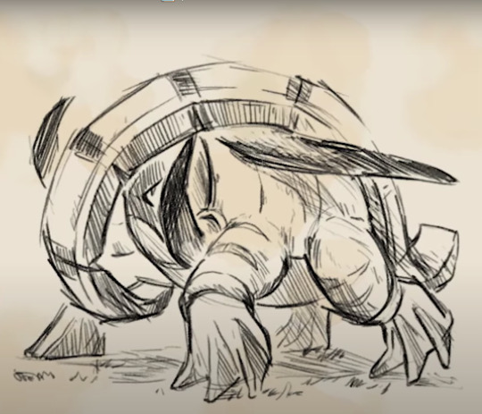
Sneaky bastards tried to gloss over these
#SPOILERS AND LEAKS IN THE TAGS#pokemon#pkmn#pokemon scarlet#pokemon violet#pkmn sv#pokemon sv#pokemon trailer#pokemon news#nintendo#donphan#WE GOT PARADOX FORMS#god the ancient one looks so much cooler#im sorry im probably getting violet#but holy hell i gotta trade for that ancient donphan#wonder what they other paradox forms will look like
122 notes
·
View notes
Text
[adds to my collection of very tired men]


#im interested but ill need more details#also return of the rose thorn hair i guess#sprout rant#first time ive seen a gym leader with a whip since Sabrina#pokemon trailer#im hesitantly intrigued#brassius feelings
29 notes
·
View notes
Text

Happy 5th anniversary to @hiimtryingtounderfell and I <33333333
It's her Chara and my gal Deal<3
#deal#chara#gengar#charizar#cradily#zoroark#shiny zoroark#shiny gengar#shiny pokemon#dragonite#mimikyu#pokemon fanart#pokemon trailer#pokemon champion#elite four#alternative universe
18 notes
·
View notes
Text


See no difference
27 notes
·
View notes
Text
Some of the names in this generation are great! First we had Lechonk and Smoliv and now Fidough!

26 notes
·
View notes
Text

Ceruledge (top) and Amarouge (bottom)
19 notes
·
View notes
Text
OMNI TYPE!?
So the new pokemon trailer for the Scarelt and Violet DLC was posted recently and there is a lot to talk about but I freaked out when I saw this.

OMNI TYPE!?
Is that Terapagos special ability!? To be every type at once?
I feel like It would either make every Omni type attack super effective, or make Terapagos resist every type. Both sound really powerful!
#pkmn scvi#pokemon#pokemon scarlet#pokemon violet#paldea#pokemon spoilers#pokemon dlc#tera type#pokemon trailer#pokemon theory#OMNI TYPE#The icon is so pretty!#I'm really curious how It will look on the pokemon
3 notes
·
View notes
Text
So anyone have thoughts on the 5 new hidden pokemon in the trailer?


14 notes
·
View notes
Text
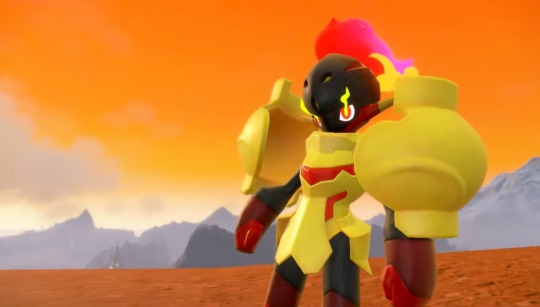
TPC really said we're gonna give you a 3 minute trailer just to show off our new e-girl
#pokemon#pokemon sv#pokemon scarvi#pokemon spoilers#pokemon scarlet#pokemon violet#pokemon trailer#iono#pokemon iono#gym leader
97 notes
·
View notes
Video
youtube
When there’s a trailer released in Japanese and you can only use your imagination -- that’s what this parody dub is but hey! New gym leader, Iono!
#pokemon scarlet and violet#pokemon scarlet violet#iono#iono pokemon#gym leader#gym leader iono#new gym leader#pokemon scarlet and violet trailer#pokemon scarlet and violet new trailer#new pokemon trailer#pokemon new#pokemon memes#iono english dub#pokemon trailer#iono scarlet and violet
9 notes
·
View notes
Text
A short (not short, I lied) story of why Pokemon Violet and Scarlet looks so bad to me. Especially this building, which looks like one of the main building of the game.
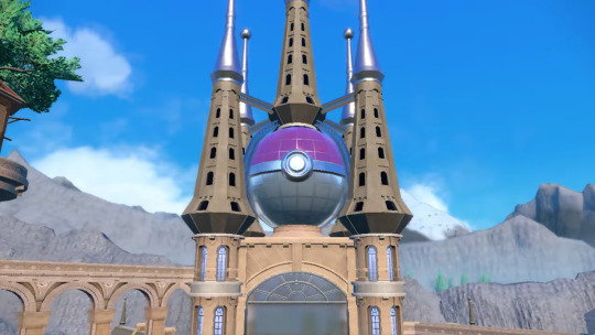
First of all, the different approach on both parts of this building. One is smooth, no harsh lines or shadows, and the other is the opposite. Windows are simply black precise shapes. Looks not put together, where is the lead artist, why is it not coherent? The obviously copy and pasted five columns look so out of place it makes me want to cry. If you want to make it work, everything should follow the same rule, but just under, the windows are blue, detailed, the building have tiny shapes to add to bigger shapes, it's good.
The color of these five stupid collums. Why do they not match the beautiful architecture just under it? This brown is bland, dirty and poor. The color right under is lively, pastel almost, maybe with some orange or pink mixed into it. Not a stupid brown. The lightning effect don't even match. What happened? Why? Did one guy do one part and one guy the other without ever talking to each other? On one of what seems like one of the most important building???
The effects aren't coherent. I've watched the new trailer a couple times over to understand. The lightning of the characters and the world are vastly different. They don't fit in. Character is smooth, no harsh shadows, his own shadow is blue and not black. The tree however, it has barely no transition from light to shadow and the shadow is way too black so it stands out. What you learn when you make an image is that contrast attracts the eye. So you see the tree first. Not the character. Which is dumb.
What do you see? The big thing on the right that towers over the image. The trees. Then the pokemon, that many missed the first time even if it was its very reveal because you don't see it, you see something else.

Now that I look at these two images, I think the lightning problem comes from the fact that the shadows are too dark and inconsistent. The substitute has a blue tinted lighter shadow and the other a harsh black shadow. I've seen it mentionned before, the world mostly need reflective light. It's the light that bounces off evertything and makes it that when you're behind an object and the light doesn't directly lit you, you still see the back of the object: it's not pure black. It's not suddenly night just because you're behind an object. That's reflective light.
If it costs too much to have the calculations run for this kind of light in Pokemon (which really, I am not qualified to tell), they should at least make it less dark and maybe have a colored tint. Shadows often aren't black, and light often isn't white. It's not what you learn when you have education about how to make an image in colors. This looks like screenshots from Pokepark 2.
Which, NEVERMIND, it's not even that dark because they couldn't afford to make reflective light so they made the shadows LESS DARK. THIS GAME IS FROM 2011. I'm sorry, but Pokepark 2 looks better. TEN YEARS APART.
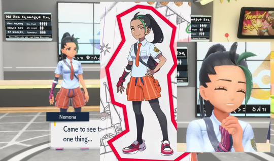
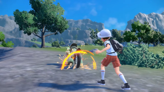
And then I'm just going to say a word on the 3D models. Which are, in my opinion, with the 3D models of the Pokemon themselves, the least terrible looking things of the game.
One. Colors don't match. Maybe it's delibarate, but because I find the 2D artwork much better looking, I think that's a shame. The orange is much brighter, the green accent too, her skin is a little darker, less orange and more cold. It's also a tendancy, they darken the eyes, which makes them pop less.
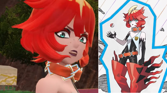
Especially on this character. The 3D model has very dark makup that the 2D artwork does not have. The eyes do not pop.
I'm quickly going to talk about the hair and the 3D choices they made to adapt the 2D design (which are fire, they are so good omg!!!) They try to make realistic a cartonish style. I'm sure in some ways it could work, but it doesn't, it could be much better. The strength of Pokemon designs are their use of lines and shapes, which are well-defined. Big shapes, beautiful lines that tend to be altered in the 3D models. The hair and its texture is very distracting from the lines. All the tiny hair that you see, how the end of the shape is split like real hair would do, it hurts the deisgn. It's noise that wasn't supposed to be there. The parting of the hair is even lost, because there isn't enough contrast, which completely changes the perseption of the character. It reads like one big messy shape, but is at least 3 in the 2D design.
I personnaly think Pokemon should stick to very Cartoon deisgns and embrace it. It is their strength. However, if they do wish to make it more realistic, it has to be good. I personnaly even think they should stick to 2D, because they are really good at 2D. Pokemon Legends of Arceus had its flaws, but I thought it was alright. Scarlet and Violet are starting to really cross the line for me. They're losing what makes their 2D designs and artwork absolutely stunning and unique. They made 3D games that worked well. Pokemon Let's go Eevee and Pikachu are what I consider is the best 3D they have ever made, in terms of colors, 3D models and lightning. I wish it back.
I'm still wishing for a Pokemon Hollow Knight. Because I think Pokemon could fit very well with the formula.
End of rant.
#pokemon scarlet and violet#pokemon#pokemon trailer#gen 9 pokemon#pokemon sv#pokemon scarlet#pokemon violet
17 notes
·
View notes
Last Seen Blogs

fusionboltzgx
A Nonbinary Warbot

justin-kaiko-blog
everything will be okay

app-teatrodipisa
ARCHIVIO POETICO della PANDEMIA
rifleman787742
bowie

tookyostar
olhem o post fixado!