#question mark italicised underlines
Text
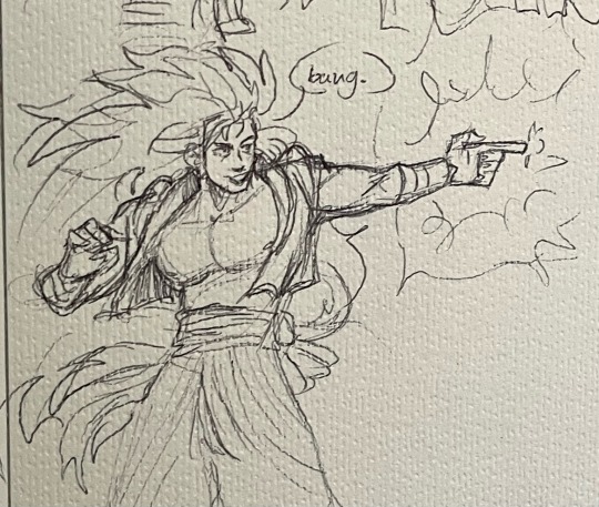
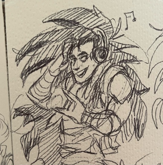
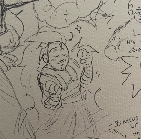
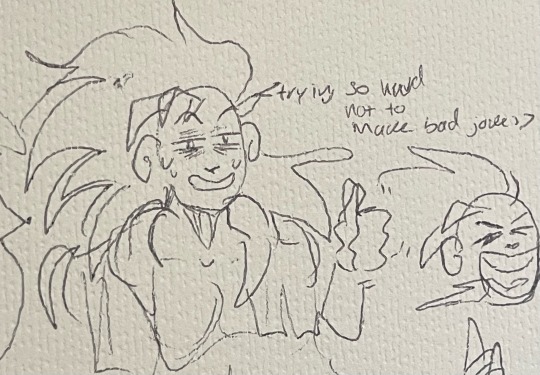
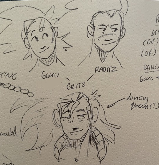
im so atrocious at making fusions but have some ideas on (best fusion name ever) the GRITZMEISTER…..
#brotherly bond incarnate more like uhhhhhh nerd + loser = cool#idk he dances#has bad hair#ingenuity + craftiness#we operate on VIBES ALONE okay leave me be#art#dbz#raditz#goku#fusion#question mark italicised underlines#HELP#he’s very smash mouth I think. To Me at least#gritz
40 notes
·
View notes
Text
Final feedback
Dont have quotes over page they get lost
For the card illustration maybe add a question mark
make the illustrations a bit more consistent: stars colour bleed
contents page don't do numbers its not needed
underlines extend to end of text
"what to do" add question mark
the stars at para too close just get rid of
change body to lighter weight of quotes inside text its too heavy
line weight is significantly different on some illustrations due to changing of sizes. Not much I can do this project but a learning curve for next time
Give more gutter space: change to 5mm or change to 4 collum
Remove subtitles
Put the subtitles to the top of the page: your skin goes at top and bottom on every page to do with skin
make titles cover columns of text currently sits really awkwardly
Change cover to blue woman thinking poster dark blue is too dark
Italicise the front cover or get rid of title completely
Add more pull out text and quotes throughout the zine
Info on back instead, small blurb?
I will be spending the day before hand in making the last of these corrections to my zine and then printing out the final outcome.
0 notes
Video
undefined
tumblr
For you, @adams-left-hand, and anyone else who have difficulty italicising works on AO3. There’s also a guide-thingy if you click the question mark
You can also paste your work (italicised, bolded, underlined and all) directly into the rich text and you won’t need to manually italicise every single word like you have to on the HTML format
11 notes
·
View notes
Last Seen Blogs
littlemisssquiggles
LITTLEMISSSQUIGGLES
ylly22
stuff for me

oops-all-lawyers
unnecessary feelings

sperma589
BARK BARK BARK

h-theartist
Meet the off-screen workers who keep the adult webcam