#skin design
Text
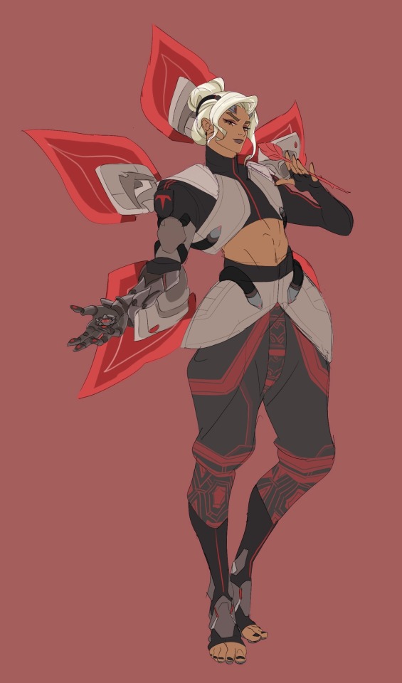
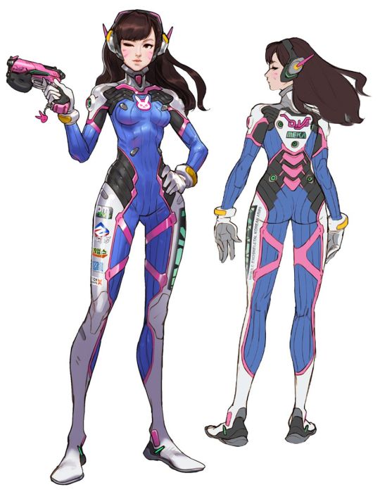
He’s evil and serving cunt🫶
i saw smb draw talon Niran on Twitter and thought that I could do it better/j
anyways my version of talon LW
#overwatch#overwatch 2#overwatch lifeweaver#niran pruksamanee#talon overwatch#lifeweaver#character design#skin design
127 notes
·
View notes
Photo

the whole gang is here
#mc#minecraft#skin design#my art#sketch#drawing#design#cahracter design#kai was the hardest#their face was so hard to draw damn
415 notes
·
View notes
Text
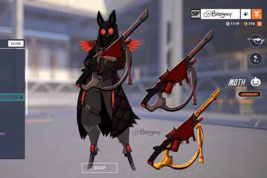
Hey blizzard, when we getting a mothman skin? Here's my contribution
87 notes
·
View notes
Text

Sighhhh
Shes lowkey giving evil stepmother 😻😻😻
#moira#moira overwatch#moira fanart#fan art#drawing#artist#art#digital art#digital artist#sketch#digital sketch#ow#overwatch fanart#skin design
42 notes
·
View notes
Text

drew this a while back but just remembered to post it here
#art#league of legends#league of legends art#start guardian lillia#star guardian#star guardian skin#skin design#LoL#leagueoflegends#lillia#deer girl#cervitaur
26 notes
·
View notes
Text
Got bored so I combined some interests
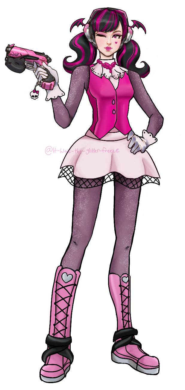
10/10 would cop
dva as draculaura (the shoes are god awful but u get the idea)
#overwatch skins#overwatch#overwatch 2#skin design#monster high#monster high draculaura#draculaura#my art#Ace.art
67 notes
·
View notes
Text
Baby Roadhog skin concept design

Initial idea from @actuallyroadhog-irl hehe
Just a sketch but such a funny concept, I'm gonna infiltrate blizz and make it real I swear guys🙏💪
#my art#digital art#overwatch#ow2#overwatch fanart#roadhog#mako rutledge#concept art#overwatch skins#skin design#sketch#silly#no but this idea is so cool actually imagine lol💀
42 notes
·
View notes
Text
Pomni and Ragatha?
Me and my friend we were playing LittleBigPlanet, then he saw my Jax skin, he was like: "Im going to Pomni and Raghata, to see how it goes" Later when he maked the skins i was like:💀


30 notes
·
View notes
Text
ArtTime Lapse- Pumpkin Cursed Cortex
youtube
#dr neo cortex#crash bandicoot#neo cortex#dr cortex#my art#neocortex#crash bandicoot 4#crashbandicoot#halloween#skin design#Youtube
9 notes
·
View notes
Text
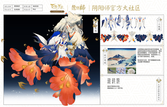
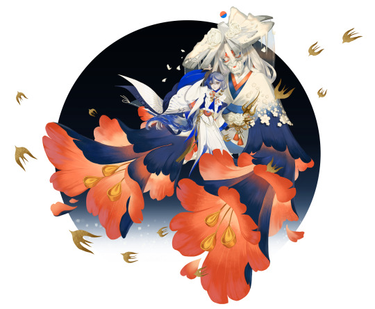

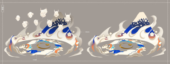


Onmyoji skin design 2022, didn't make it to the finals, but at least I know there's still a lot I need to learn and improve on
One of this year's themes is the hundred sceneries of the world
69 notes
·
View notes
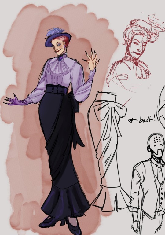
Text

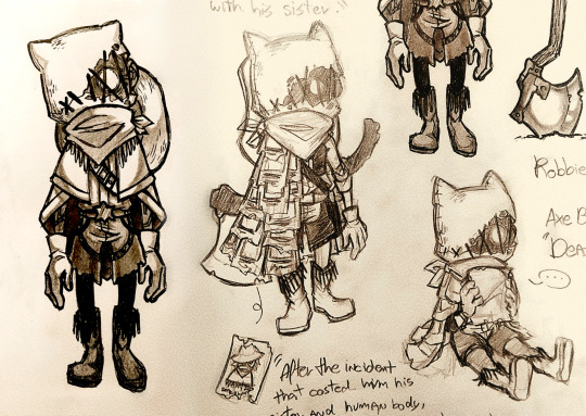
As artes que fiz para a "Old West Zine" de IDV, no Twitter.
Infelizmente, eu fui removida da zine após um anti bem popular do fandom se juntar a ela.
Olhar pra esses designs me deixa um gosto amargo na boca devido a injustiça de ser expulsa sem ter feito nada de errado, após meses de trabalho duro.
Eu ainda tenho muito orgulho desses desenhos, entretanto, e sei dar o devido valor ao meu trabalho. Quem age dessa forma em fandom não vai longe na vida real.
Em vez de focar no negativo, eu vou continuar fazendo o que sempre fiz: espalhar meu amor por esses personagens e histórias no que eu faço.
#IDV#Identity V#Robbie White#Axe Boy#idv axeboy#Arte#Art#Digital Art#Traditional art#Sketches#Zines#Zine Work#Skin Design#fanart
94 notes
·
View notes
Text
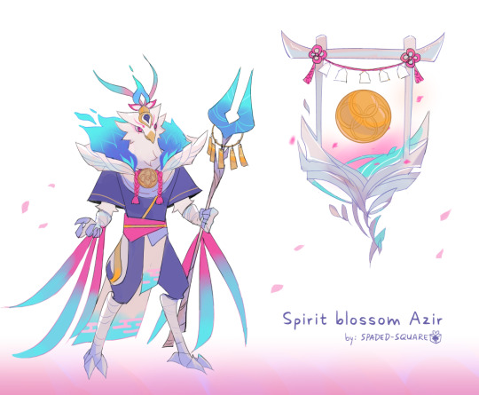
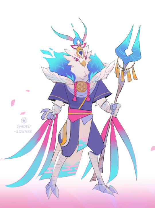
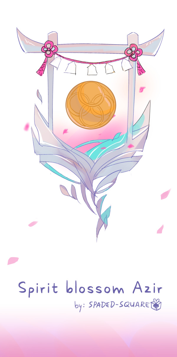
I present: Spirit Blossom Azir : D
#azir#league of legends#league of legends fanart#lol skin concepts#league skin#skin design#skin concept#fanart#my art
48 notes
·
View notes
Text
Yet another skin release, yet another disappointing prestige skin, this time for Katarina.
My main gripe with prestige skins when it comes to design is that they're just... boring? And I don't mean that they lack detail or skill, absolutely not, the in-game effects are stunning. But the design details are just stripped away
Let's look at the latest prestige skin, Faerie Court Katarina. First, the base one
I won't get into splashart structure too much, since that is a different topic entirely, but I will mention the colour palette is vastly different from other skins in this line, already distinguishing Katarina as someone in a different position, an outsider even.
Now, for design details. I'll list the ones that stick out to me the most
The blades are very thin, resembling insect wings or some type of mandibles. Insect
In the wing patterns there are eyes, reminiscent of some species of moths, and the wing shape is sharper, again leaning more towards moths instead of the butterflies of other skins
While it is a very fantasy design, the outfit clearly has armored pieces in it, immediately establishing her as a warrior of some sort, albeit distinct from Kalista. Her outfit is light, but protective, maybe less a brawler but more a, you know. Assassin (this is all ignoring the boob window. We all know the deal with boob windows, in a design analysis it may as well not be here)
The shoulder pads have scales and fur. The scales fit in with the general bug theme, while the fur further alludes to moths
A splashart specific design detail - in the art Katarina looks like she's emerging from a cocoon. The butterfly and moth theming is very strong
Now, let's compare that to the prestige version of the skin

Here the colour palette is, of course, changed to fit the prestige style, which is completely fine. The composition is more reminiscent of other prestige skins aswell, which means that Katarina's pose and surroundings don't reflect the theme as well as the base splashart.
And for the details I mentioned above
The blades are now shaped exactly like Katarina's base swords, with the added wing shapes at the handles
The wings are more rounded, and in the spots that had the eyes, there are now holes (which. Why. Cmon)
The armor pieces are all gone, including the shoulder pads with the fur and scales
The outfit has more fragments reminiscent of butterfly wings and flower petals
These changes are not inherently bad. They make for an attractive design. My issue is that the design is boring. Clearly a lot of thought went into the base design, adding many subtle but recognizable visual allusions to moths and insects in general. The prestige skin has nothing of the sort, only having some flaps of fabric that look vaguely wing-like
I think the design philosophy of prestige skins is immensely disappointing. I noticed that trend first with Star Guardian Syndra and Space Groove Nami, who both had those same issues, taking away the pieces of original design that made those designs unique and representative of their skin line
When Riot announced they would be changing the way they treat prestige skins, I was excited to see what they come up with, but honestly? All these prestige skins do is make me appreciate the base ones more
#league of legends#league of legends skins#faerie court katarina#visual design#long post#pork talks#prestige nami was a disgrace and i will die on that hill#katarina#skin design
10 notes
·
View notes
Text
Thoughts on: Faerie Court Skin Line
Alright, no one asked, but I love character/skin design and I want to write my piece on these because they have me excited.
The first thing I noticed about the Faerie Court Skins, which I will be calling "FC" for short, was the colors. Each splash art and in game model has lots of colors. I am going to be mainly talking about the splash arts here, not the in game models. I've got a couple things I wanna say about each skin, as well as the skin line as a whole, and some complaints that I am gonna tack on here and there.
Starting with Ezreal,

I really like this! I think it embodies Ezreal's silly, charismatic personality quite well. It has charm, especially with that big grin on his face and the littler faeries all around him. Seeing him playing or exploring with the smaller faeries gives this sense of playfulness, like he's leading them on an adventure. Having him lean on the tree like that gives the feeling that he just landed, mid flight. It reminds me a lot of that feeling you get from Treasure Planet, or Tinkerbell, that childhood exploration of "going on an adventure!" with all the charm and silliness that is Ezreal.
The face markings/pieces are a really nice touch. I think Ezreal's standard blue marks are all too easily forgotten, especially because I don't think we actually *know* what they are? But with FC we have these elegant, larger pieces that take up more space on his cheekbones and forehead, really adding this magical charm that he *isn't* just a human in a faerie costume. Not that they wouldn't be hard to replicate, any good cosplayer could make them, but I do think they are a nice touch that helps solidify the gem on his chest as it's own, connected piece and something separate from the gauntlet. Having the,, jewelry (?) match with the center gem, where the gauntlet takes on the color of his wings comes across quite well to me. I think those choices do a good job at showcasing which parts of him are the most magical; those of course being the faerie wings and the mystical gauntlet.
Overall, I'm a big fan of FC Ezreal, I'd honestly give this skin a 9/10.
Moving onto Kallista!
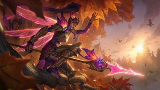
I am ESTATIC that Kallista finally got a skin, it's been too long. And I REALLY like this as well! First of all, the color scheme. The warm colors of orange and red and pink with this fall forest really make her keep purples and elegant golds stand out without alienating them. I think the splash art itself is just beautiful to look at.
I do think it was a little unnecessary to give her shorts here, I think pants and no feathers would've sufficed, but it's not a huge complaint. Having her with pink on one side and purple on the other is a little bit messy, especially since it seems to swap sides only on her hip piece (sorry don't know the armor term here) and then go back to normal on the arms and legs, but that's again, not a huge complaint. My only real complains with this skin is small things, like "quality of life" kind of stuff.
However, my absolute FAVORITE thing about this skin, is the wings. Using the sharpness of these dragonfly-esque wings to replace the shape language that her spears construct is a GREAT choice. I think it's clean, it's well done, and with the glowing details on her shoulder, headpiece and spear, I think this is a really cool skin. I will touch more on the crystal weapons once I talk about more of them, that is coming up.
Once again, high rating here, she's getting an 8/10
Next we have: Seraphine!
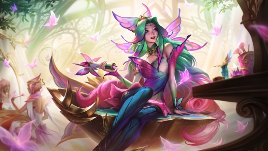
Now I'll be honest, I always tend to have mixed feelings when Seraphine skins come out, because many of them simply go "she's a singer!" and don't tend to change her story very much. However, without knowing the lore, I'm going to give FC Seraphine the benefit of the doubt, because this splash art does not convey "musician" to me. She is sitting on her stage, surrounded by makeup. There is a vanity in front of her, as well as someone doing their own makeup in the back. This reads much more like a makeup artist, like a faerie I would see doing court makeup than a music artist. And honestly, I like that! If that's true, if they are actually going with that concept instead of "the court musician" then I'm ecstatic! This will be really the only skin of Seraphine's to make her anything other than a singer, and she was in desperate need of that.
I love the colors here, making her hair fade from that green to pink with her bangs just slightly turning into wings is a really pretty and clever trick, as well as turning her normal hair floof at the top of her head into a cute little butterfly hairpiece is a nice touch.
My only *real* complaint with this skin is one that has a catch. If this is skin *is* Seraphine; the faerie who loves makeup, rides around on her vanity seat using pixie dust and making people feel good about themselves through the power of art and song: I think they toned her own makeup down WAY too much. I'll talk about it when I address the induvial characters more, for Fiora and Katarina have such bold makeup, Fiora in particular, that if the royal makeup artist/the one who's supposed to be good at makeup and making herself look friendly, presentable, and a little over the top because after all she is a performer, only has a bit of pink and a butterfly painted on? Seems a little bit boring. But, that's really my only complaint here, other than maybe smoothing out the shape language of the stage a bit. I do say, this is a tentative complaint, because I doubt we're getting anything other than "Seraphine, the faerie who loves to sing and brings people together by her vocal fae magic!" which is cute but, unoriginal for Seraphine.
For my rating, I'd say she gets two. If it's "just another singer skin" Seraphine, I'm giving it 4/10. If it's something more creative, maybe using the makeup or pixie dust I mentioned, 7/10. I think this skin is going to rely HEAVILY on it's lore.
Next: Milio!

I'll be honest, I don't have a whole lot to say about this splash art. This is of course, Milio's debut skin, but I was struggling to find a good image of his original to compare it to.
Overall, I will note the things I like about this one. I think making his little companions have a little more form to them other than just blobs was a cute choice. I also like the new outfit, it's a little more form fitting and I think expresses the "court" part in faerie court. He looks like a little kid who got dressed up for a special occasion, his outfit is a little over the top because he didn't pick it, he's trying to look formal. The haircut I have mixed feelings on, I think it's cute and makes him look a little chubbier with how it frames his face (which by all means is a good thing, we have a lot of dainty itty bitty thin shapes in this line, having a character with a rounder face is a nice change of pace from your typical skinny white elves.) I think they tried to keep a bit of the boxy shape his other haircut gave him by using the headpiece, but it didn't quite work. My only real complaints is the strange shoulder light bulbs and the little crown that's somehow magically floating on his bangs.
I'll give Milio here a 6/10. I like the vibes, the playfulness, but it's got a few things it could tweak.
Next up, Fiora

This is where I slow down on singing the praises of the FC skins. Not that I don't like it, I very much like it, but I've noticed a reoccurring pattern with these skins and their splash poses looking very,,,, bland. I like some of them, but there is a lack of life to others, like Fiora's here.
Having her guard some sort of special butterfly/faerie area I like, I think this pose and the composition here is well done. But,,, it's just another Fiora splash art where she is showing off her sword. I think her design in this skin line is pretty, it's interesting! And this just covers up most of it with her sword. I want to see the details of her outfit, I want to see how it looks without her sword pointed at me. I think that this is a pretty skin, but leaning into the faerie armor that Kallista's skin brings to the table, this feels honorary, this feels like she was given permission to "bring her sword to the dinner table" because she still has her crown on. Hopefully the lore will make it a bit more interesting, but it's not doing a whole lot for me.
Note: Did realize while looking at this that there is people in the back like an audience, and that lead to the implication of like, a royal fighter in an arena, which could be cool but I do think that everything I said before still holds.
Sorry Fiora, but unless that lore drop really helps build this splash art, I can only give you a 3/10. Lovely splash, but it doesn't feel like it's bringing anything *new* to Fiora.
Up next, Karma!

I,,, still haven't made up my mind about this one yet. There's things I like and things I don't, so let's get into it.
For a few good things to start, I love the shape language here. I love the flow. Her shield feels natural here, it feels like she is truly a Faerie Queen, radiating her power, reaching out to the magic around her. I think the gold on the wings is a strong move, though could have been a bit stronger. Having inorganic pieces on one of the most organic parts of her, the wings, feels powerful, it feels like some kind of upgrade or augmentation.
However, I do have some issues with this skin. I think it's colors are a little all over the place, with her hair feeling incredibly light compared to the deep purples of her outfit and wings. The pink on her wings is very subtle, and I don't think it connects it enough. I also think they leaned REALLY hard into the butterfly theme with this entire skin line (cough elderwood rakan and xayah cough) but then kept the lotus COMPELTELY the same as usual. Her makeup seems a bit boring, and with how they gave Ezreal these fancy upgrades for his face markings, it feels unbalanced that the faerie QUEEN still just has her simple ones.
I like this skin, I think it's very pretty, but it really doesn't radiate "all powerful and elegant faerie queen" to me. 6/10
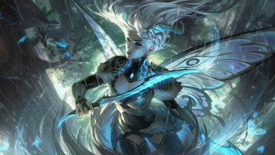
Last but not least, we have Katarina.

Since she has two, I'll sort of talk about them in tandem. My single biggest issue with these two skins is an issue Riot has a LOT: Same Face Syndrome. In this case, it applies less to the actual face, but more to the detailing in the splash art.
I'll give, normal FC Katarina doesn't do this has much as the prestige, but these two skins?

Are a bit,,, too similar for my liking. They are different, I'm not saying Diana and Kat are completely the same here, but you can't deny the similarities. White hair being held up in the air mysterious, blue color schemes with hints of lighter blue, grey, white, and maybe a little green, as well as a subtle metallic.
I like FC Katarina, but it does feel a little,,, bland, with winter blessed being so recent. However, putting that aside, there are some things I like about this skin.
For one, her expression. Kat is kind of a mischievous character, and many of her skins portray that with her expression, like Battle Queen or Battle Academia. Both of those skins give off a "ready to stab you when you aren't looking!" vibe that fits Kat, but with this? She looks somber, thinking, like she's done this fight a million times before and knows how it will play out reliably. And I like that, I like that sort of otherworldly reliance on her own magic and skills, it makes her feel confident but not arrogant. The eyes on the wings are gorgeous, and the wind moving as she spins and slices through it adds as a gracefulness that suits it very well.
Putting aside it's similarities to Winterblessed Diana, I'll give this skin an 8/10. I truly think it's beautiful, and I love the sort of "new" vibe it gives Kat.
Prestige... on the other hand...
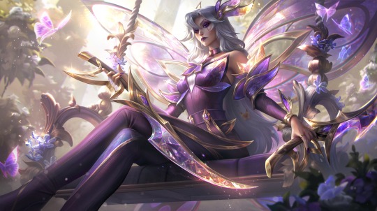
*sigh*
Honestly, if you told me these were the same character, I would probably believe you.
Now, I will be honest and admit, I hadn't seen Prestige Star Guardian Syndra in a while and I did think it was more purple, however these two,,, they feel the exact same. They even have almost the same expression, Kat's mouth is just closed.
I've always thought that the artistic goal of prestige skins was to add to a character cosmetically in ways the original skin did not. To add details and an alternative outfit/aesthetic to their new form provided by the lore of the skin line... and this... isn't that.
I really don't know what Prestige FC Kat is supposed to convey other than the fact that Riot seems to think powerful women with cool color schemes sitting is sexy or something because I'm not getting a lot here. She's a pretty woman,, sitting,,, with her weapons. I would even give this a little more of a break if there was anything Unique here, but there isn't: The only character with an different title is Faerie Queen Karma. This skin feels much more like royalty with the big wings and the seat and everything, and I think that Karma deserved the prestige much more here. Making a "Lunar Moth Queen" Karma would've been a MILLION times better than,,, this. Sorry Kat mains, but I'm giving it a 2/10.
For my final sort of overview of all the skins, there's a couple things I need to mention. First off, the weapons. I think the "crystal weapons that match your wings" is really cool looking. I don't know how well it'll hold up lore wise when that time comes, but I like how they look at I'm curious at how that universe will talk about them. Secondly, the butterfly in the room: butterflies. I think this skin line can technically be boiled down to "upgraded elderwood rakan and xayah" but that's okay. I would've loved to see Rakan and Xayah get skins for this in sort of a "from the elderwood they have grown, and in the court of faeries they blossom" where it connects their elderwood stories with the fearie court and we get new skins for them, but that's a lot to ask right after they got new skins with Broken Covenant, like, today? I think the skinline would've been served better by having more variation than just "butterfly." My favorite skin in this would have to be Kallista, and a good part of that goes to her being unique, she's the only one who isn't completely butterfly. Overall, I think the skinline is pretty, I think it could tell a really fun fantasy story if done right, and I have my gripes with certain parts of it, but I do like it quite a bit. For the whole skin like: 7/10.
If you read this far, thank you, it really means a lot to me that you read through all this. I'm really passionate about character design/skin design and my views on it have absolutely been inspired and shaped by TBSkyen, so credit to him for inspiring me enough as a creator to feel confident enough to share these thoughts. If ya'll like this sort of thing, I would absolutely be willing to make more posts addressing skin lines and character design. Let me know in the notes! ^^
#league of legends#league skin review#character design#skin design#ezreal#kallista#seraphine#milio#fiora#karma#katarina#ezreal lol#kallista lol#seraphine lol#milio lol#fiora lol#karma lol#katarina lol#ezreal league of legends#league of legends skin#league of legends skin review#zdux#zdux speaks#character design review#league of legends faerie court#faerie court#faerie court skins#faerie court ezreal#faerie court kallista#faerie court seraphine
13 notes
·
View notes
Photo

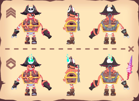

My entry for Brawl Stars’ skin design contest for the character “Surge”
Theme: Pirate
#brawl stars#brawl stars fanart#digital art#Character Design#character#pirate#skin design#supercell make#Illustration#digital artist#fan skin#design contest
8 notes
·
View notes
Text
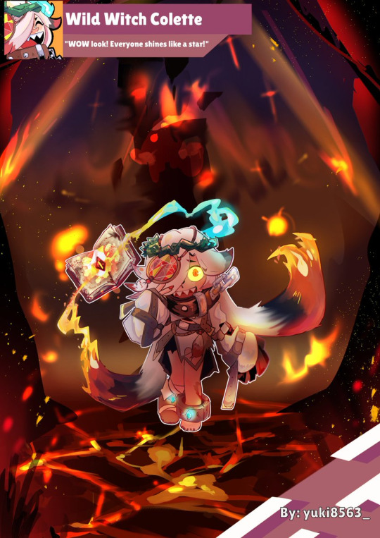
2023-02-15
🔥✨Wild Witch Colette ✨
FantasyBrawl2023
She can hear the voice of the devil, so she was imprisoned in the tower by the magician.
The outside world is sooooo interesting and dazzling to her.
I noticed that the devs of this game likes to use this 🔥 (?) MEME so I drew one too.☕️
Thank @/mapsandcollabs & @/starrparkedgar for the invitation and the patience of the members. 🥰

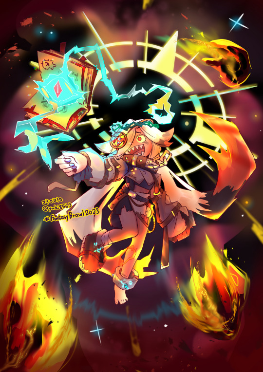
Read more (Another version and idea sketch)
This is my first time participating in a collaboration, I haven't drawn pictures in this style for a long time. I'm not used to it but I'm very happy.✊
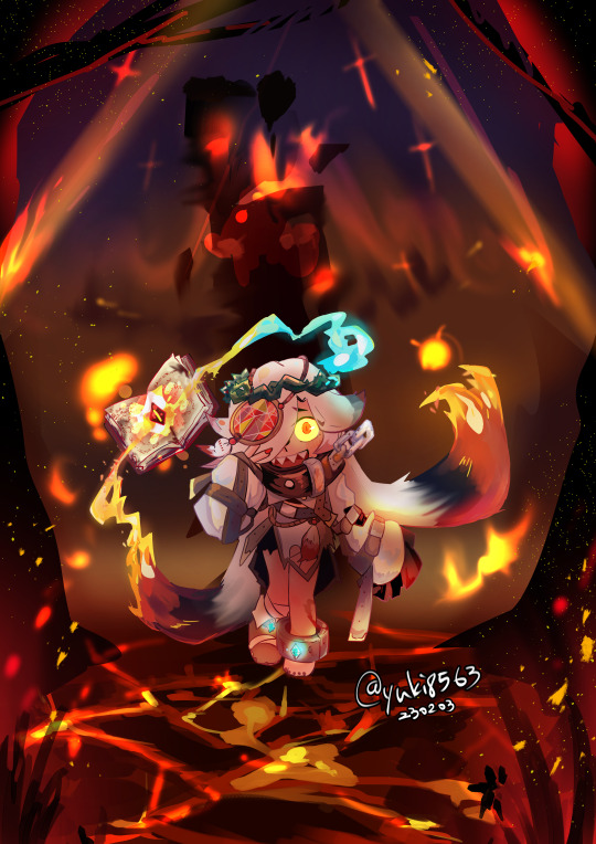
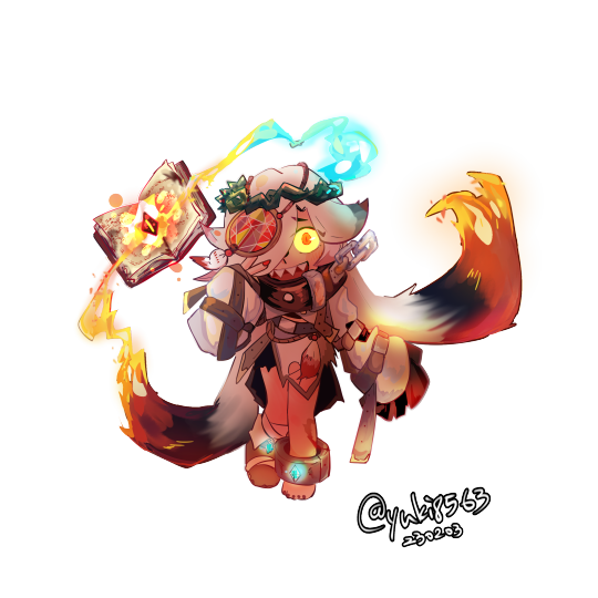


#brawlstars#Brawlstarscollab#FantasyBrawl2023#BrawlStarsArt#BrawlstarsColette#yuki8563art#skin design
5 notes
·
View notes
Last Seen Blogs

pkjobs
PK JOBS
lithiumloser
Brain Mush
hazy-egg
Rowan
edith-cushions
• 1823 •

the-shellum-guild
The Shellum Guild