#so I gotta resize the image slightly so it’s not too small
Text
Life’s sure got its Ups and Downs, eh, pal?
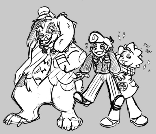
#the audios are so silly#also sorry if the images seem fuzzy#I got back into the habit of drawing small again#so I gotta resize the image slightly so it’s not too small#I know there’s a way to fix it#but I’m just too lazy lol#welcome home#wally darling#barnaby b beagle#sally starlight#toma art
93 notes
·
View notes
Text
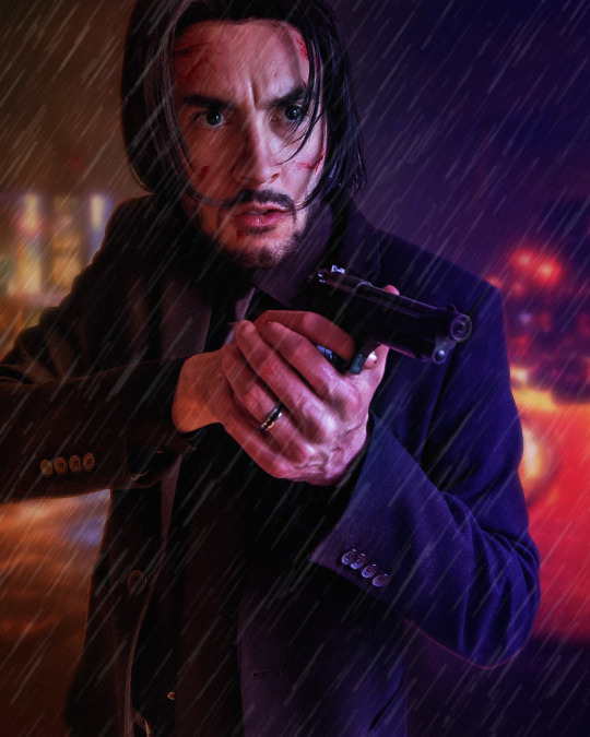
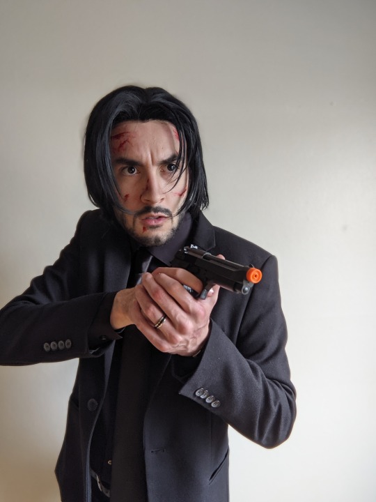
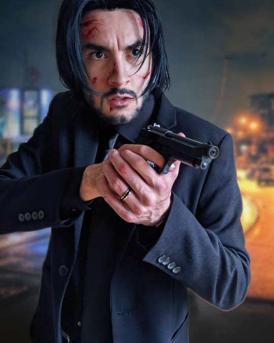
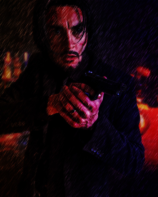
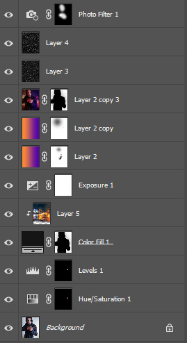
Photo editing step-by-step semi-tutorial
Trying something new here on the blog... I don't do much tutorial writing but wanted to share a little behind-the-scenes on how I typically edit my cosplay photos. A lot of this is cobbled together from various tutorials or trial-and-error over time but I think the results are pretty nice. I use Photoshop but a lot of these tips are generalized enough you might could use them in your editor of choice.
Let me know if this is helpful or cool, if you'd like to see more of this sort of thing!
First off I just use the default photo editing tools to clean things up a bit. Tighten the crop and adjust the levels and white balance... mostly just "eyeballing" it. Notably I already like the pose, lighting, and composition - anything you can take care of in-camera rather than post is preferable!
Then I gotta black out the gun tip - select the tip, tint orange toward blue, lower the saturation way down, then tweak the levels. Of course it still looks like a cap is on the tip, but the focus of the photo is kind of off the gun barrel anyway so who cares.
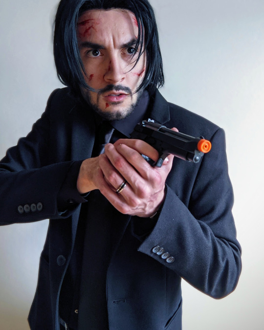

Next up we're going to swap out the background. In this case I want it to feel kind of indistinct - not a "scene" Wick is actively interacting with but more just scenery he's in front of. Wet nighttime streets are pretty prominent in the opening of Chapter 2 so I selected this photo.
I try to use sites like Pixabay that offer free-use photos rather than just pulling whatever from Google Images.
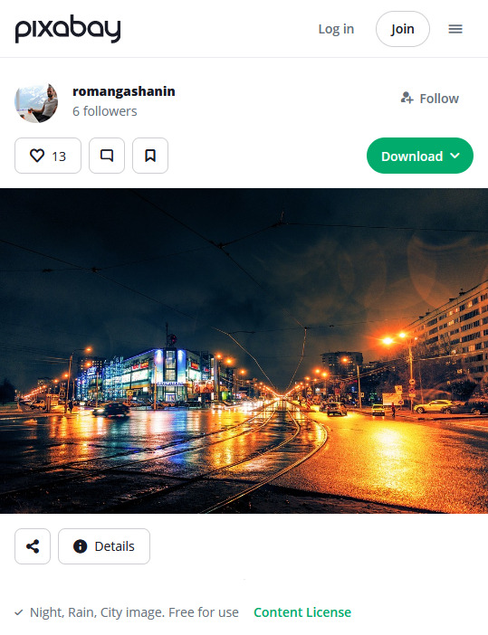

Once I have the photo, I crop it to where the horizon line looks good, add a Gaussian blur to imply depth, and mask it in the background. Photoshop's auto-select has gotten pretty robust, I tweak the cutout just a bit for clarity and to add some light leaks around the outline
In this case I set the transparency to 92% to get it a little lighter. In any case, I then add an Exposure layer to darken it for mood lighting.

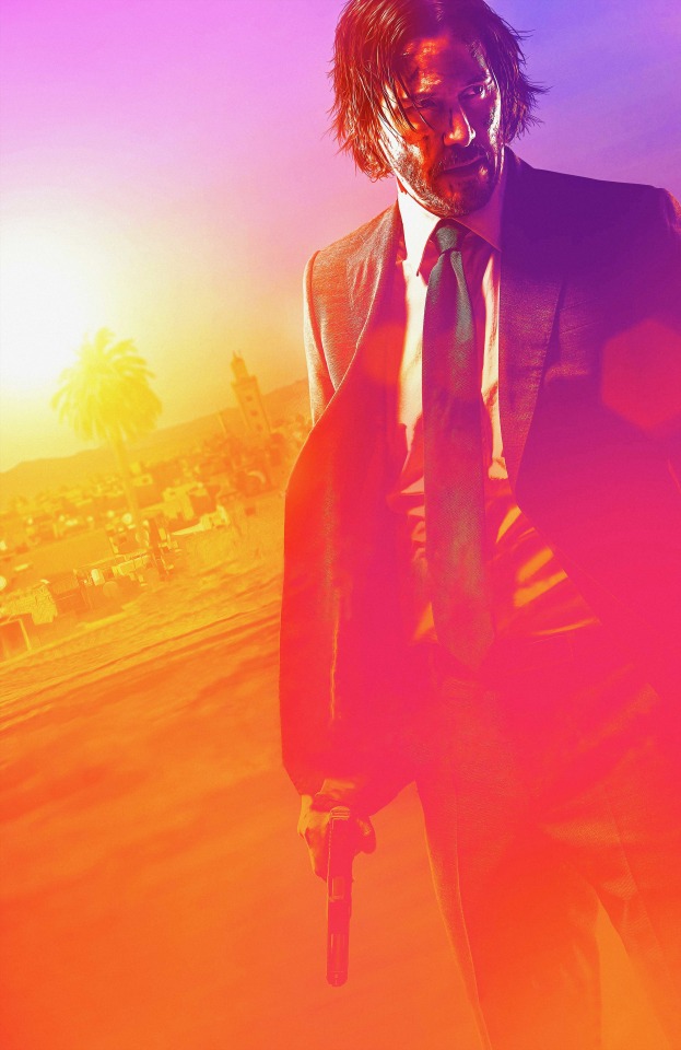
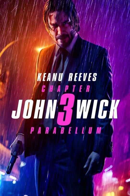
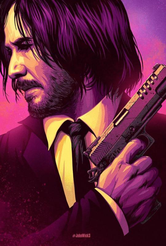
Next bit is color correction. In this case I wanted to evoke the look of Chapter 3 promo art... pulled a few reference images and took note of the orange/purple contrast and gradient they use:
I don't recall if I used the eyedropper tool but I created a similar gradient, set to split on my face so the two halves of the background ended up as different colors. Set the layer to "Soft Light" (in this case I actually duplicated it and set that duplicate to 25%), and I masked out some parts where the light is hitting particularly hard (left of face, hands, edge of gun) to keep a more natural look.
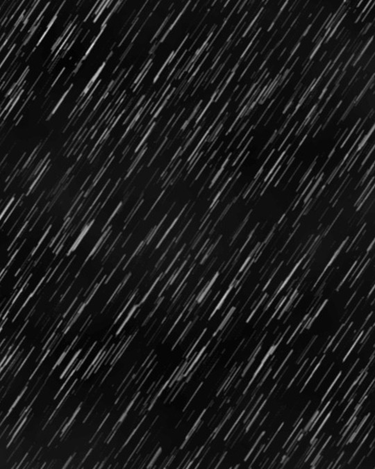
Since it's raining, I added a subtle "fog" look to the background. Created a single-layer duplicate of everything so far, masked the background, Gaussian blur - then set that layer to "Lighter Color". You can see it in the building lights, mostly - brings back some brightness after the multiple darkening we've done.

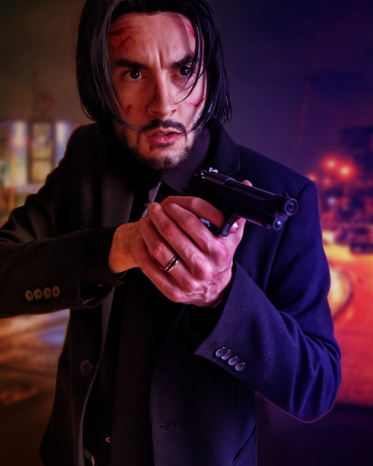
Finally bringing in some rain, again referencing the poster above.
To make the rain layers, I first make a solid black layer then "Add Noise" (monochromatic). Tweak the "Levels" so you get pockets of pure white against black (with a couple mid-grays layered in), then resize the layer so the dots are bigger than single pixels (it's fine if they get blurry). Finally, apply a motion blur to get the "falling" motion.
I do this twice to get a sense of depth. First layer is set to "Overlay" at low opacity (~25%), which also slightly darkens the image.
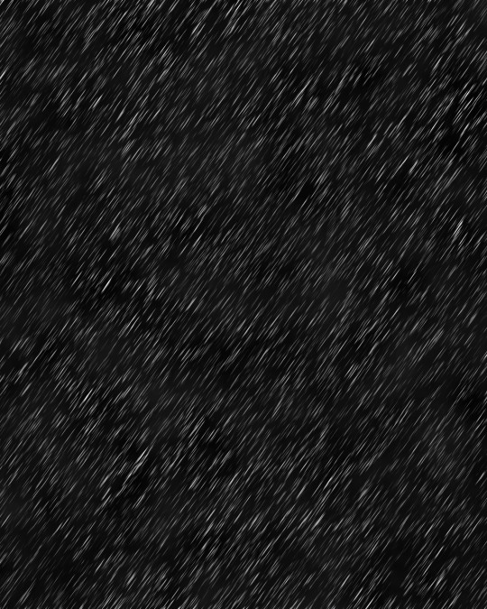

The second layer is set to "Screen", again at low opacity (~20%). Combined, it gives the effect of rain in front and behind throughout the scene.
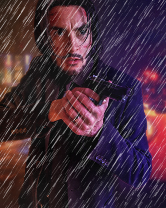

Finally I add a cooling "Photo Filter" layer, masked out to points like my face and hands, to add a little contrast. Sometimes I'll do a final pass with "Levels" or "Exposure", "Add Noise", or use some subtle Instagram filters to make sure it looks good on the small screen, but not really in this case.
All said and done, I usually spend less than an hour per image. Despite ending up with 10+ layers it's not too complex and I find the results quite satisfying!
17 notes
·
View notes
Photo
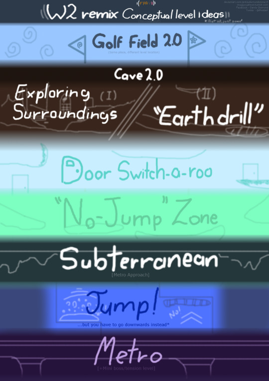
FPAVB updates #1 - World 2 remix levels fanconcepts
(Uploading it here too bc why not? Had to resize it because apparently my internet’s on shark week and Tumblr won’t let me upload it on its normal size grrr-)
So yeah
Just finished remasterization of Chapter XIII in VB's spanish version yesterday (and I tell you, it's literally crappypasta material since it's W1 remix but slightly fucked up), and went straight into thinking for W2 hyphotetical remix levels
Of course they're simple concepts made for VB itself and not meant to be a 'substitute' of the W2 remix Brad might be working on or something like that (just saying this bc I feel kinda awkward about doing something the developer himself hasn't released yet and well, you know-), but whatsoever I'll explain how these would work in an 'in-game' scenario
Lets-a-go
World 2 'main plot'
Since VB Chapter XIV is mostly focused on CPG's play instead of FPM himself, things of course won't work the same for each, but we'll get to it in a moment, keep reading
This 'remix' version of mine basically goes with the same logic of the original W2 (A.R. strikes and steals your stuff for asshole points, so you gotta go find where he's at to get your things back), but in Cutie's case, it's Kabootle the one who gets it from the Rabbit (ohotheykidnappedthecatto) and she needs to get to his hideout (yesiheadcanonhimhavingahideoutsomewherefarawaythegolffieldandstuffwhatugonnadoaboutit) to rescue her cat back.
However, if this actually was an in-game thing with FPM being playable, A.R. would surely steal the Pen from him instead or any other item that's important for the game to progress and stuff.
Anyway, that's how the plot would work in a short (andcarefullyspoilerfree) explanation
Now, let's get in the next part:
Main Levels
Okay, I'll clarify one thing in case you guys didn't notice the little sidenote at the upperside of the image shown here
The levels I show here are just the 'starter' levels, meaning there are a few more I got below my sleeve, but I just showed them here for the sake of exposure and also because those other levels are more extense and 'variable-context' -ish, kinda influenced by the W3 original levels and what not. Anyway, I'll try not to extend myself too much on each one's explanation, alongside their entrances and which level's place they're taking (as you may have noticed some even are derivatives of their original counterparts but with different mechanics, anyhow they're propense to suffer changes as they're still on beta states, but that's besides the point)
Quick sidenote, I don't really know the original W2 levels' names, so those you see there are just made-up
Golf Field 2.0
(Same place, different level location)
This is basically as an 'another-extend' version of the original Golf Field itself (for a lack of a better definition) and all that. Honestly I don't really like the idea of using the same mechanic of the 'hole-in-one' minigame that's on FPA2 at its own first level since it might clash a little with Cutie's mindset at CXIV (she's on her way to find FPM and therefore isn't really 'in the mood' for that) and is basically 'filler' stuff, but I'll try to 'soften the atmosphere' a little and implement it in a way that can be appealing to the story's plot (like it isn't that hard)...not to mention I need a hole so Rb gets to do his dicky move towards CPG's kitto (sorry Kaboo bb but y'know this guy won't lose any chances at doing the rob robbery rob rob)
Taking the place of: Golf Field in original W2
Entrance: Door
Cave 2.0
This is actually a two-in-one, which are:
I.- Exploring the surroundings
Works with the same format as Golf Field 2.0 (sameplacedifferentspot); no need to explain myself too much here
Taking the place of: Cave level in original W2
Entrance: Hole (duh)
II.-'Earthdrill'
The name is a word play due to the fact it's a big amount of earth-rock structure that got the shape of an 'iron drill' and stuff. Also, this level's kinda got a 3D-like design, I'll say why, just keep reading
The mechanic here is simple, you'll be sliding around this whole 'mountain' thing all the way to it's feet while the stage keeps spinning round and round the lower you go (this is why I said it has a 3D feeling since the camera remains on our spot while the scenario keeps moving along with us)
But here's the fun part: P A P E R P O R TA L S , S O N !
They're scattered on different places in our way (sometimes on the land, sometimes in the walls, right above us), and we must avoid them -either jumping or flinching- or else they'll teleport us all the way back to the start
Pretty simple...Right?
Yeah, but actually no
There are also some enemies surrounding the places -flying spiders- that'll be aiming ‘web bombs’ towards Cutie in order to stop us, and the way wecan take care of them is hitting the bombs to redirect them towards the fliers so they get covered in webs instead. But don't drop the guard down, they’ll attack with no warning and we'll better watch out when they do
Taking the place of: Short Blue loops level in original W2
Entrance: Portal
Door Switch-a-roo
SO this one is designed differently, althought it keeps the mechanics that one first level where you go riding over ink (don't mistake my words with SFPA there) and all that, but here's the fun part (or torture one, you define it as you like): Find the right door
yes, this a tricky one
And worst part is, each time you mess it up, some doors (not all, just some) will slightly 'switch' places
Anyhow, just to not make it too hard, I'd put a small amount of doors around the place so I don't make Cutie herself lose her mind trying to spot the correct door (and avoid unnecessary time loss)
Taking the place of: First inked platforms level (Light Blue) in original W2
Entrance: Door
"No-Jump" Zone
Remember the 'Earthdrill' level from before? Well, this goes with the same structure (has portals and stuff), but guess what
You can't jump
Yeah, no Mario boings for you this time, child
Okay serious talk now, in this level you have to get all the way downwards to the other side of the stage. You can fall, roll or slide through the inked platforms, but you can't jump or else,once you step on their surface, a secret paper portal will break open and will take you back to the start (YEAH I KNOW THAT'S A DICKY MOVE BUT THIS IS HOW IT WORKS-)
Taking the place of: Second inked platforms level (Green) in original W2
Entrance: Door
Subterranean [Metro approach]
Basic platform level, design idea is yet to be worked on (but it's not a hard idea on it's own, and doesn't need too much of a explanation)
It takes place, as you may guess, in an underground enviroment next to a metro stop (idkhowtoreallycallitlmao)
Taking the place of: Purple rocks, green hills and trees level in original W2
Entrance: Door
Jump! ...but you have to go downwards instead*
The Wall-jumping level from before, but you go the opposite direction, and if you don't jump in time you'll be thrown upwards by a 'sped-up' spring to a portal that (AgAInNNN)will bring you back to where you were at first
Yeah I kinda flip-flopped on this one, but it's still a BETA so pffft-
Taking the place of: Jump! level in original W2
Entrance: Door
Metro
Basic context level, although this one includes a little 'mini boss/tension' part for interesting points haha-
but -This one shares its place-take with another level that's basically W3 Squiggleville level..but it ain't Squiggleville ahahh-
Partially* taking the place of: Cactus West/Sky Kingdom/Super Secret Evil Lair of Spiders level in original W2
Entrance: Door
As said before there are a few more, but I'll keep them secret for now
Extra levels
Yep, there are also secret levels in this place
And do they bring something to the VB plot? Yes my dude
There's a task you must complete, and it is finding all pieces of an important item you must repair (it's a spare key to A.R.'s hideout); the doors are also labelled with a symbol on their upperside to make them easier to find
And well...that's mostly it for now
Jesus christ my head hurts, that was a lot of writing
However, I'll put this to bed for now so I can get to ACTUALLY start digitalizing JSABBR's 2 new pages because HECK I HAVEN'T UPDATED IT SINCE LIKE- JULY?? AUGUST?? I DON'T REMEMBER ANYMORE LOL BUT I MUST GET BACK ON TRACK ASAP I HATE LEAVING SHIT ON HIATUS FOR TOO LONG-
Anyway, see you guys in future updates on...whatever I upload next
k bye-
The Fancy Pants Adventures franchise (C) belongs to Brad Borne
TH!FPA:VB|W2 Remix fanconcepts (mostly)|Artwork (C) belongs to me
2020 (C) all rights reserved
#fancy pants adventures#fpa#fancy pants#the fancy pants adventure#fpavb#fancypantsadventuresau#venomous bittersweet#alternate universe#fanfic#fpaworld2remixconcept#aight imma head out now
3 notes
·
View notes
Text
2018 Megaman Summer Fanart Contest Part 1.0 Results!!
Again, thank you everyone for your patience. Too many random things popping up over the last 2 weeks. ^^; Whew, just got this posted before midnight. Sorry for the late night post for those of us in the US, but it’s kinda my thing, isn’t it?
14 total entries between the two categories, but as always, a nice mix of new participants and veterans to this contest. Are the usual players coming away with the goodies, or have the newbies snuck in to wow us with their creative styles? While tumblr will shrink down all the images, I will include the full size uploads (well, almost for all - 2 were way too big) on my imgbox account. Just click on the “(FULL VIEW)” link for each one. Hopefully this way, there won’t be people who have trouble viewing them this time around.
My thanks to @digitallyfanged and @jaybird-c for helping me judge the entries this time around!! We were all sorta on the same page it seems for our individual results, but it’s always harder when there is a smaller total of participants, because everyone is deserving in their own way.
Thanks once again also to all who participated! For all winners [and there are 10 of you, out of 14], I will be contacting you as soon as I can about your prizes. If you didn’t win, there’s always next time...which starts as soon as tomorrow, when I announce Contest Part 1.1 (as in Mega Man 11)!!
Without further ado, after the break, here are your top 3 winners for each category, the raffle winners, and all of the fantabulous artwork!
CATEGORY 1: Ride Armor Road Trip
[FULL GALLERY HERE]
1.) @follyknight: (FULL VIEW MAIN IMAGE LINK) (PHOTOS 1) (PHOTOS 2)

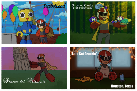
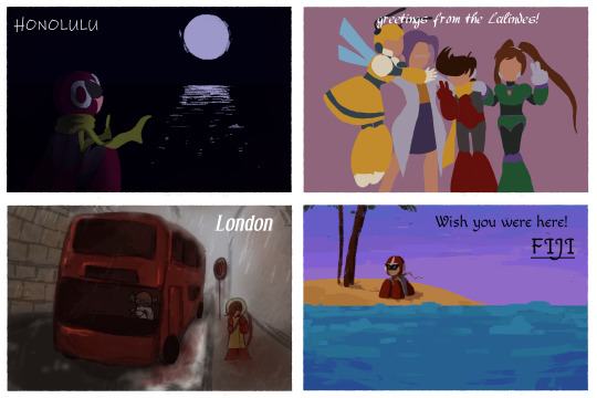
*Tabby’s #1 - I felt like out of all of the pieces, this hit the theme the hardest. Definitely showing the back of one of the cards was a really unique touch to the piece as well. And that LaLinde postcard. The CHEEK. “Hey dad, I visited your girlfriend while on vacation.”
*Jay’s #1 - I have got to hand it to Folly Knight, above and beyond doesn't begin to cover this. Eight postcards, each with a unique theme, composition, and aesthetic, and then all presented together? That's fantastic.
Miyabi’s #1 - Even as simple, everyday objects, that book and cup of coffee are painted so well! I appreciate all the various scenes you presented in your postcards, with emotions ranging in each one of them. From the hilarious “Shrimpin’ Ain’t Easy” bib to Blues’ loneliness in Fiji, your entry was varied and unique. I also felt your entry really represented the theme very, very well.
2.) @multiple-sages: (FULL VIEW LINK PIC 1) (FULL VIEW PIC 2)


*Tabby’s #2 - This is very cute. I like that it showed summer activities from sort of a different perspective/culture. Not everything is action and traveling. Sometimes it’s small festivals and quiet cafes with friends. Zero definitely seems like the type to sit around in a cat cafe for hours.
*Jay’s #2 - Man, it was hard to pick -- a lot of these have great composition, but I think the #2 Spot should go to [multiple-sages for] Cinnamon and Zero. It does a great job at setting the scene for the moment and raises a lot of interesting questions as to how exactly we got here. Obon postcard is also very good, but of the two, this is a slightly less evocative piece (that is, there's less story apparent here)
*Miyabi’s #2 - Both cards look super cute, and show different ways the hunters spend their time not battling Mavericks, while experiencing tradition in Japan. The Maverick Hunter logo stamp on Axl’s was a nice touch. The little kitties are all adorable, either sleeping or pawing around with Zero’s luxurious golden teaser toy hair. Like Cinny is trying, it’s hard to hide your smile while looking at that scene!
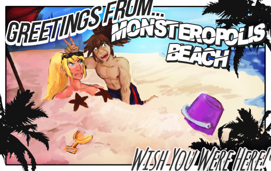
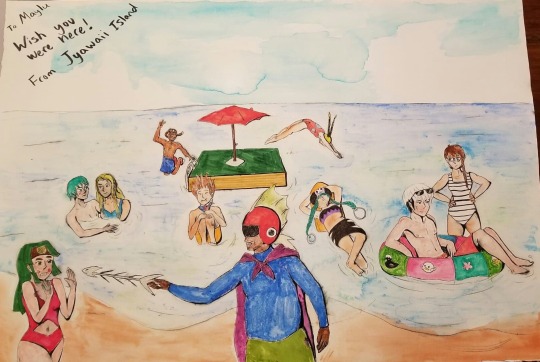
3.) Steph O’Dell: (FULL VIEW PIC)

*Tabby’s #3 - A very cute image of the ladies at the beach. Everyone needs some sun! I do dig how you made it sort of look like a selfie.
*Miyabi’s #3 - While the hubby is away, the girls will play. Haruka finally gets out of the house and to the beach with some friends. The selfie style was a different take compared to the other entries, while still feeling like a postcard. While the palm trees look like they’re just ‘shopped in, the rest of the background ocean and sand is deceptive enough where I couldn’t tell you had worked on that until I zoomed in closer. So kudos for making that part of your background look photorealisitic!
.
Runners up (in alphabetical order):
@bracedshark *RAFFLE WINNER ~ X7 4KOMA*: (FULL VIEW PIC)
*Jay’s #3 (tie) - Very appealing and exceedingly well-composed, but kind of suffers a little from how they handle the text. There's a sizing issue the cuts some of the text short.
*Miyabi says - I didn’t know I needed to see starfish booblight Zero, but I am amused! XD I totally liked where you were going with the curved arc format for the text to match that familiar typefont on so many postcards, but I agree that the ‘from’ getting partially chopped feels like it just needed to be resized down a little more. Otherwise, a fun pic that fit the theme well!
@chaudandfrends *RAFFLE WINNER ~ ZERO ACCESSORY SET*: (FULL VIEW PIC)
*Jay wrote - This drawing is ambitious, but I'm afraid it's more pictures with text over postcards.
*Miyabi says - I don’t care if I need to eat my calcium, I am not touching those fishbones, Captain Beefhead. Good mix of action with Yai, Dingo and Netto jumping into the water, to the rest of the crew reclining and enjoying their refreshing dip. The watercolor look to your sky and sand give a little contrast to the rest of your coloring technique for all the characters. LOL at Enzan ducky on his inner tube.
@forceway: (FULL VIEW PIC)

*Miyabi says - Much like myself, a Shadow vacation involves not really going anywhere, not really doing anything, and just enjoying the simple things outdoors near home, while sipping an ice cold beverage. XD While you won’t see many Polaroids around these days, it feels fitting for these two bots. I felt it was a wonderful composition, and very enjoyable piece.
@seabyrocks: (FULL VIEW PIC)

*Jay wrote - I gotta say, I love Seabyrocks' sunset lighting, but I'm afraid the pose is a little simple and, I hate to break it to you, Rock, but you put your hands on backwards.
*Miyabi says - Nobody should visit Mega City without a commemorative autographed heroic Rock Light postcard! I do think you did wonderful blending those sunset colors in, on the right side of the pic. The purples and oranges are so pretty in the sky. Very cute!
@tealsalmon: (FULL VIEW PIC)

*Jay’s #3 (tie) - Very appealing and exceedingly well-composed, but kind of suffers a little from how they handle the text, as it blends in with the darker parts of the background.
*Miyabi says - This turned out very pretty, and also gave me a laugh with Zero’s pointy helmet tips poking through his straw hat. Having a butterfly land on X’s finger feels so fitting for his peace-loving ways, and I loved the E-Tank being used as a container to hold all those fresh strawberries. Even the little details like the dirt and grass on Zero’s shovel are well done.
CATEGORY 2: Ruby-Spears Mega Man: Plasma Powered Up!!
[FULL GALLERY HERE]
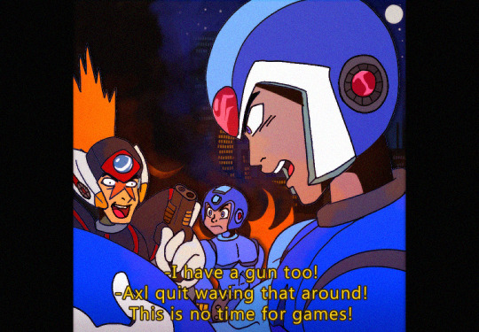
1.) @irissempi: (FULL VIEW ZERO SHEET RETRO)
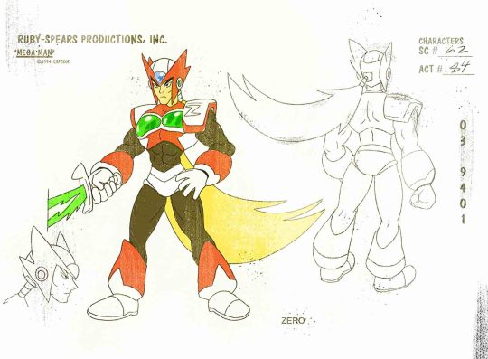
(FULL VIEW ZERO SHEET CLEAN)
(FULL VIEW ZERO CAP RETRO)

(FULL VIEW ZERO CAP CLEAN)
(FULL VIEW ZERO CAP 2 RETRO)

(FULL VIEW ZERO CAP 2 CLEAN)

(FULL VIEW AXL SHEET RETRO)
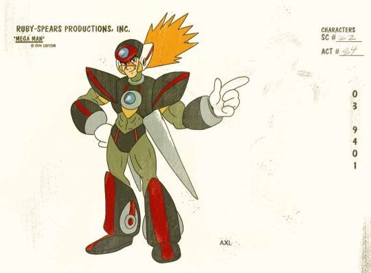
(FULL VIEW AXL SHEET CLEAN)

(FULL VIEW X SCREENCAP)
(FULL VIEW LUMINE CAP RETRO)

(FULL VIEW LUMINE CAP CLEAN)

*Jay’s #1 - This. This is the picture that caught my eye immediately. The composition, the lighting -- this is one of those iconic series' images that gives you everything a character stands for. Lumine is going to end the world, and every second of it's gonna rock. Goofball Axl and hardcore samurai Zero are also winners.
*Tabby’s #1 - I love this. I love everything about this. I love the extra mile on making the design sheets, and making it look like a horribly ripped off tv shot. The corny dialogue. Clearly Ruby Spears needed to continue and make us an X series.
*Miyabi’s #1 - You get major kudos for using an actual Ruby Spears production sheet as your format, and adding those effects to make it look just like it was a photocopy I scanned. The grainy filter to make the ‘screencaps’ feel like they came from a VHS tape, and punny one-liners are wonderful! Thanks for putting in all the work to make your entry feel like it would fit in perfectly with the original series! (P.S. - those aren’t booblights for Zero anymore. Those are mammoth pec sunglasses, that would blind anyone who dares to stare at his super cool, manly chest!!! LOL)
2.) @kaitlinexe: (FULL VIEW PIC)
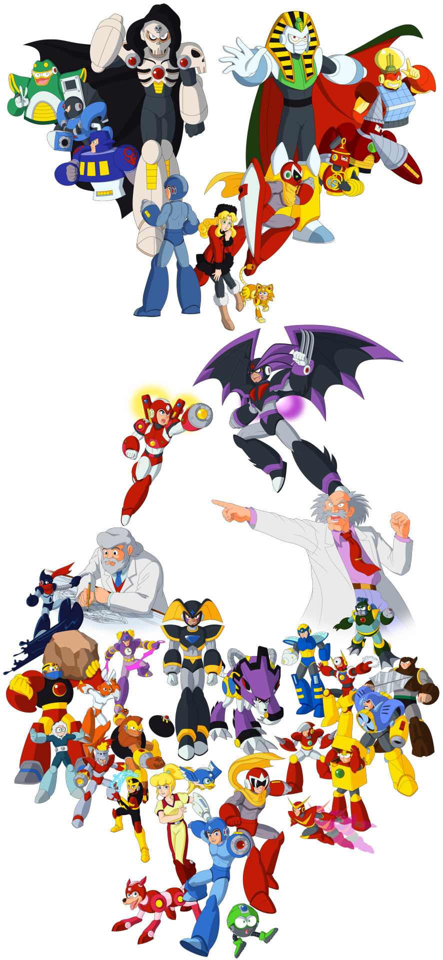
*Miyabi’s #2 - Of course this theme was right up your alley, and you certainly didn’t disappoint! I can’t believe how many characters you tried to fit into this collage. While at first glance it might feel like you focused on mostly existing RS-characters, you really did add quite a few updated designs. I just have this feeling that you planned to be even more ambitious than this, but weren’t able to finish it as you hoped. But regardless of the lack of background, the work you put in drawing all of these characters is amazing! Kalinka, Treble Boost Bass, and Time Man are probably my favorites of your redesigns.The more pronounced spikes for Bass’ helmet and claws look so, so good!!
*Jay’s #3 - I gotta love all your new designs, and is your Skull Man taking notes from Hitoshi Ariga or am I just getting my hopes up? Bonus points for all the attention to detail and going out of your way to replicate the original style.
*Tabby’s #3 - You definitely have the style down pat here. It’s super clean. This would make a great poster, with a little bit of background work.
3.) @pstart: (FULL VIEW PIC)
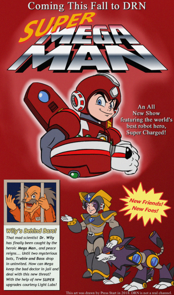
*Tabby’s #2 - Dat Forte. You really changed up his and Gospel’s design quite a bit, and it definitely works within the Ruby Spears theme. Super kudos on the retro graphic design going on here. It almost looks like the back of the old DVD covers too.
*Miyabi’s #3 - Just from the look on his face, I feel like Bass would have the same wisecracks and would sound almost just like Proto Man...only with a deeper voice. And now I’m imagining Proto and Bass both harassing Mega in stereo. XD I like the "super” title twist to your ad, which would have played off the actual game well, if Ruby Spears got another season to coincide with Megaman 7′s release. It does feel like an ad I’d see in old gaming mags.
*Jay wrote - I like your poster design. Good job cleaving to the show's style, good job with the little details like the marketing schlock and copyright, great job with the classy reference to the old school instruction manuals.
Runners up (in alphabetical order):
@forceduser *RAFFLE WINNER ~ RUBY SPEARS WILY CEL*: (FULL VIEW PIC)
*Jay wrote - Block Man is a neat design; the plunging neckline is certainly evocative. This one, too, could've stood to have more personality exhibited.
*Miyabi says - From what little we’ve heard, Block Man’s dialogue in Megaman 11 is like by far the most fitting to be used in Ruby Spears. So he was a good, and relevant choice to try to tackle. Definitely can see his chiseled pecs hiding under his main shell, and feels like he’s at least been working out on leg day, doing squats while lifting his heavy body around everywhere.
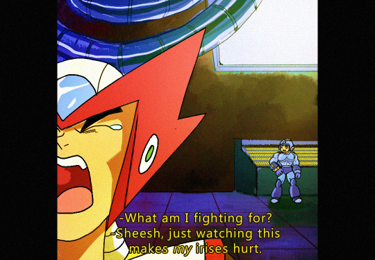
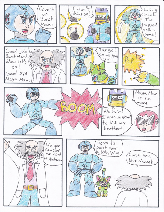
@hyperbole1729: (FULL VIEW COMIC) (FULL VIEW BURST)
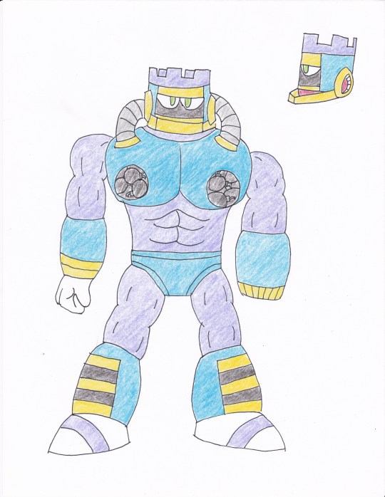
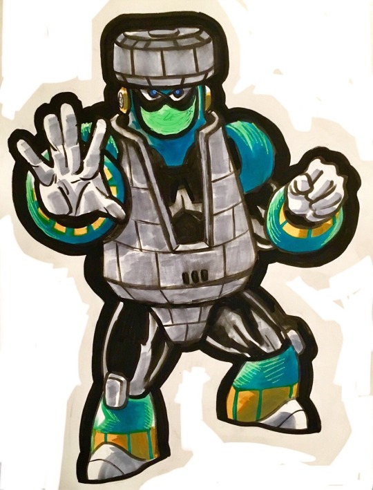
*Jay wrote - Your Burst Man is something. The explosive nipples are going to haunt me. But as stand-out as your design is, I wish you would've shown off more of Burst Man's personality.
*Miyabi says - Your comic totally has the right tone with the dialogue, from Proto’s complaint not being able to deal the final blow, Wily being Wily, and the obligatory ‘sizzling circuits.’ It flows well, has some drama, and I totally read it all in their Ruby-Spears voices. Burst does seem like he’s bulked up just right, with some minor changes to his classic design.
@3-oclock-blues *RAFFLE WINNER ~ ARCHIE COMIC INKED PAGE*: (FULL VIEW PIC) (FULL VIEW SPLASH)


*Jay’s #2 - Now THIS is promotional material. I love how well Bass is introduced by simply having him rage off into the distance. Everybody else, they're mad because they hate this moment. Bass? Bass just hates everything. Splash Woman is also a neat design, but also shows off more design than personality.
*Miyabi says - BUT I WON’T MISS THIS TIME...With all the rage and fear from everyone around them, it’s quite amusing to see the two brothers smiling as they hold their glowing busters to each other. It’s chaotic, but also nicely almost ties in with the photo theme of the first category, too. Splashy’s side fins and more flowing waves protruding from her helmet are nice touches to her design. Would have been interested to see how she and other Light/Wily bots would have fit into that family photo.
33 notes
·
View notes
Last Seen Blogs

tsuki-omaro
"What is Reality ?"

yournextgirlfriendsstuff
Untitled
yournextgirlfriendsstuff
Untitled


btsillegal
˗ˏˋ Lovelyˎˊ˗