#subviews in swift
Explore tagged Tumblr posts
Visit Tumblr Blog
Explore Tumblr blogs with no restrictions, modern design and the best experience.
Last Seen Tumblr Blogs


Fun Fact
25% of US internet users with an annual income of $80-100K use Tumblr.
Link
original source : https://stackoverflow.com/questions/35452908/swift-add-constraint-programmatically
뷰obj.addSubview(섭뷰obj) 를 통해 먼저 subview를 상부 view에 덧붙인다음 contraints를 적용해야 한다.
I ran into the same problem that you described earlier. In order to make the programmatic subview, (in your case the paymentTextField) you have to add this to the subview first and then apply your constraints.
By adding the subview to view first, this ensure both views have the same parent.
Very late, but hope this helps anybody else.
https://stackoverflow.com/a/41852169/3151712
0 notes
Video
youtube
iOS Swift 5 Tutorial: Superview and Subviews in iOS Hindi 2020.
#superview#subviews#swift#swift5#hindi#superview in swift#subviews in swift#ios#xcode#xcode11#swift 5 tutorial#2020#yogeshpatel#yogeshpatelios
0 notes
Text
Major Difference between iOS and Android App
Major Difference between iOS and Android App
For the inexperienced eye, creating mobile apps for Android or iOS can be very similar, but the truth is that each operating system has its peculiarities. In addition to the technical bases for the development of apps, in the process of creating an application there are many differences if it is Android or iOS. Not only on a technical level, but also on a design and mobile strategy level.
That is, the complete conception of the app will depend on the operating system. For this reason, it will be above all the Android or iOS programmer who goes from one operating system to another, who will notice it the most.
Then, what are the major differences between iOS and Android Apps?
Development differences
Let’s first see the differences that we can find at the mobile app development level when we have to create apps for Android or iOS mobile devices.
Read More Blogs:
cost to develop an on-demand delivery app like Doordash
Programming language
As they are different operating systems, apps are programmed with different programming languages. It is precisely its most distinctive feature: iOS uses Objective-C / Swift, while Android uses Java to create mobile apps.
Test the app
The testing phase of an app is essential in the process of creating mobile applications, just like for games and any other type of software. We must check that our development works perfectly. For this, we usually use the iOS simulator and the Android emulator for the two respectively.
The differences that we can see are that the iOS simulator is much faster than its equivalent for Android. But the advantage of the Android emulator is that it is an effective virtual machine with a virtualized CPU, so it is more realistic than that of iOS. In fact, the iOS simulator often fails to give realistic and accurate representations of Apple devices.
However, we will always recommend testing and testing on real mobile devices in order to see the interaction flow of the app and the failures in real hardware.
Graphic interface
Here we run into the visual differences when creating an app for Android or developing it for iOS. It will also be the end user who perceives the differences in the design.
At a technical level, the developer will mount XML files in the interfaces on Android. They are very similar to iOS XIB files , but the latter are not readable.
As for the animations, iOS is much better prepared than Android. Although Google has tried to solve it in the preview of Android L and with the trend of Material Design in terms of app design.
While Apple has always focused on smooth, complex and powerful animations, taking great care of aesthetics and user experience; Google, for its part, has taken care of them taking into account the hardware as the main objective.
‘Go back’
Another major difference between Android and iOS is the functionality of the ‘Back’ button, which does exist in Android but does not exist in iOS. So, throughout the development, this subsection must be taken into account.
In the case of Android, that button will be used for navigation, while in iOS it must be approached in another way. Either indicating on the screen how to go back, or with another type of interaction flow when it is not necessary.
Other differences in development
Delegate vs Adapter: iOS uses the delegate pattern when using delegate patterns. In Android, that pattern is represented by an adapter. Although they are different platforms and words, they are very similar concepts.
UIViewController vs Activity: in Android we use the Activity class to render a screen on an Android mobile device. On iOS, it’s the UIViewController that does that job. With it, we can also manage the life cycles of events, subviews, etc. Although it is not exactly the same, they have the same role.
Unlock: Android devices are unlocked by dragging up and on iOS to the right.
Preferences and permissions: better grouped in iOS devices, we find them all together in the general preferences of the device. In Android, they are more dispersed and it is necessary to navigate through the device to reach them.
Maps: in iOS development we can use Apple maps or Google Maps, but in Android we will generally use Google Maps .
Other differences when creating apps
Not only the technical part presents differences in operating systems when creating an app. Since the design and marketing part are clearly affected at a very basic level. Let’s see how these differences come to play:
Cost of creating apps
We have already talked to you on occasion about the cost differences when creating apps for Android or iOS . In fact, although the difference is not very big, the development for iOS is slightly more expensive. Due to a smaller offer than in Android since the initial material to develop iOS is more expensive as it requires original Apple materials.
App design
As we have already said before, the design of an app is closely related to development . Therefore, visually the iOS design is also different from the Android design.
Each of them has their respective logic of interaction and style strongly influenced by the creator brands of the operating systems. Therefore, it is advisable to have app designers who are experts in one or both operating systems. Thus, they will advise you according to your project. Only in this way can we create really good and interesting apps.
Read More Blogs:
cost to develop food delivery app like UberEATS
App Store Optimization
As might have been known already, app store optimization is not the same for both Android and iOS Apps. We will have to take it into account when optimizing the app so that it is properly positioned in the stores. You will have to pay special attention to the differences in title and description, since the rest of the variables are more or less the same for both cases.
Monetization and return on investment
As a general rule, the return on investment is not the same for both iOS and Android apps. If we talk about the income route, that is, the way to monetize the app itself, we see that on iOS, it is more common to charge for downloads and purchases within the app.
In contrast, on Android, applications are usually free to download and are monetized through embedded ads within the mobile application.
After analyzing the differences between iOS and Android, which operating system do you prefer? And if you want an app for your company, don’t hesitate to contact us at Brillmindz Technologies, The best mobile app development company in Bangalore India!
0 notes
Text
SwiftUI ScrollViewReader tutorial
In SwiftUI a ScrollViewReader is a view that provides programmatic scrolling inside sub views. With the scrollTo method the scrolling is executed. In his tutorial an item number can be chosen using a stepper. When the number is selected the ScrollViewReader will scroll to the chosen item. This tutorial is built for iOS 14 and Xcode 12, which can be download at the Apple developer portal.
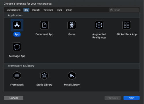
Open Xcode and either click Create a new Xcode project in Xcode’s startup window, or choose File > New > Project. In the template selector, select iOS as the platform, select App template in the Application section and then click Next.
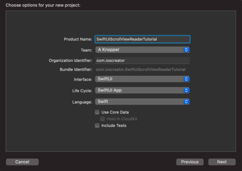
Enter SwiftUIScrollViewReaderTutorial as the Product Name, select SwiftUI as Interface, SwiftUI App as Life Cycle and Swift as Language. Deselect the Include Tests checkbos and click Next. Choose a location to save the project on your Mac.
In the canvas, click Resume to display the preview. If the canvas isn’t visible, select Editor > Editor and Canvas to show it.

In the Project navigator, click to select ContentView.swift. Change the code inside the ContentView struct to
struct ContentView: View { // 1. let colors: [Color] = [.yellow, .red, .blue] @State private var itemNumber = 1 var body: some View { ScrollView { // 2. ScrollViewReader { value in HStack { // 3. Stepper(value: $itemNumber, label: { Text("Jump to Item: ") }) Button { withAnimation { // 4. value.scrollTo(itemNumber) } } label: { Text("\(itemNumber)") } }.padding() // 5. ForEach(1..<10) { i in Text("Item \(i)") .frame(width: 300, height: 200) .background(colors[i % colors.count]) .id(i) } } } } }
The property constant colors is use as background of the displayed items. The state variable will hold the current item number where will be scrolled to
The ScrollviewReader is used to provide access to the scrollTo method and the subview where will be scrolled to.
A stepper is displayed with the current value of the itemNumber which can be in- and decremented
The scrollTo(_:) method scrolls to the current view which matches the id of the view in the ForEach loop
The ForEach loop generates ten items with colored boxes, each item is assigned an id.
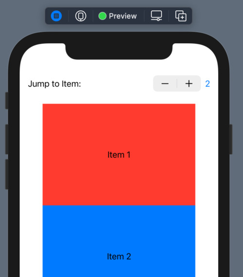
Go to the Preview and choose live preview. Change the number inside the stepper and click the number to scoll the selected colored item.
The source code of the SwiftUIScrollViewReaderTutorial can be downloaded at the ioscreator repository on Github.
0 notes
Text
How to Use Protocols to Fix a Cluttered UICollectionView in Swift
A UICollectionView is a way of arranging a content grid or a list of subviews (UICollectionViewCells) in a scrollable view. Collection views are ubiquitous: Instagram’s Search page, Chrome’s tabs overview, or your Favourites lists on media streaming services like Netflix and Crave. All of...
The post How to Use Protocols to Fix a Cluttered UICollectionView in Swift appeared first on Clearbridge Mobile.
How to Use Protocols to Fix a Cluttered UICollectionView in Swift published first on https://gpshandyorten.tumblr.com/
0 notes
Text
UIVisualEffectView Tutorial: Getting Started
Update note: This tutorial has been updated to iOS 11 and Swift 4 by Evan Dekhayser. The original tutorial was written by Ryan Nystrom.
Ever since the design of iOS dramatically changed in iOS 7, blurs have played an important part in app design. When used appropriately, blurs can significantly improve the usability and appearance of your apps.
Let’s take a look at how Apple uses blurs at a system level. One of the most notable examples is in Control Center. The blurred background preserves the context of the action –��Control Center is not its own app, but a panel shown above the active app.
Notification Center uses this effect as well, but rather than blurring the entire background, each Notification Center extension or notification has its own blurred background. Besides simply looking beautiful, this blur helps each element stand out just the right amount.
So how do you recreate these types of blurs in your own apps? Use the built-in UIVisualEffectView! In this UIVisualEffectView tutorial, you are going to learn everything you need to know to make your apps stand out using blurs.
Clear Facts on Blurs
Executing blurs in a tasteful – and efficient – manner takes a bit of finesse. In this section, you’ll learn about a common algorithm used to create a blurring effect.
How Blurs Work
All blurs start with an image. To achieve a blur, you apply a blurring algorithm to each pixel in the image; the resulting image then contains an evenly blurred version of the original image. Blurring algorithms vary in style and complexity, but in this section we’ll examine a common algorithm known as Gaussian blur.
Blurring algorithms generally examine each pixel of an image and use the surrounding pixels to calculate new color values for that pixel. For example, consider the following theoretical image grid:
Each cell in the above grid represents an individual pixel, and each pixel has a value between 1 and 10. Consider the case where the algorithm is evaluating the center pixel. The algorithm averages the values of the surrounding pixels and inserts this averaged value into the center pixel, resulting in the following new pixel grid:
You then repeat this process for every pixel in the original image. The sample algorithm above only examined one pixel in each direction to create the new averaged value. You can expand this blur radius even further to increase the amount of blurring in your image, as demonstrated in the image below:
3px and 16px Gaussian Blur applied to an image
Note: Generally, the greater the blur radius, the greater the processing power required to process the image. iOS offloads most image processing activities to the GPU to keep the main thread free.
Blur Design Strategies
Humans have a tendency to pay attention to elements that are in-focus and ignore those that aren’t. Believe it or not, this is a natural consequence of how our eyes work. Focusing on an object as it moves closer or further away from the eye is known as accommodation; it’s what helps you perceive the depth and distance of objects around you.
App designers exploit this fact and blur unimportant items on the screen to direct the user’s attention to the remaining non-blurred elements, as demonstrated in this screenshot of the popular Twitter client Tweetbot:
The user interface in the background is barely recognizable in the image above. This provides contextual awareness to the user about where they are in the navigational hierarchy. For instance, you’d expect to return to the blurred-out view in the background once you select one of the accounts displayed.
Note: Be careful about the overuse of blurs in your mobile apps. Although blurs can provide great-looking effects, they can be distracting and annoying if used inappropriately or too often.
Follow the standard design approach to use blurs to direct a user’s attention to things that matter and you’ll seldom go wrong. See the Designing for iOS section of the iOS Human Interface Guidelines document found on Apple’s iOS developer center for more on this subject.
Getting Started
To learn how to implement blurring, you’ll add some blur effects to a brand new Brothers Grimm fairytale app – aptly named Grimm.
The app displays a library of fairytales to the user. When the user taps on a fairytale, the app presents the full story on screen. The user can customize the display font, text alignment, or even the color theme for daytime or nighttime reading.
Start by downloading the starter project, then open Grimm.xcodeproj in Xcode. Open Main.storyboard and take a look at the view controllers contained in the app as illustrated below:
You can ignore the very first view controller in the image above as it’s simply the root navigation controller of the app. Taking each numbered view controller in turn, you’ll see the following:
The first view controller is StoryListController, which displays a list of all of the fairy tales in the database.
Tapping a story in the list segues the user to StoryViewController, which displays the title and text of the selected fairy tale.
OptionsController is contained within StoryViewController and displays the available font, text alignment, and color options. To display it, simply tap the top-right ellipses icon in the detail controller.
Build and run. You’ll see the initial screen as shown below:
Have some fun exploring the app; select different stories, tap the ellipsis icon and swipe to different fonts and reading modes to understand how the user interface functions.
Once you have a handle on how the app behaves, head straight to the next section to learn how to apply blur effects to the app.
Blur Effects using UIVisualEffectView
UIKit provides an entire suite of visual effects goodies. UIBlurEffect, a subclass of UIVisualEffect, is particularly relevant to your interests. UIBlurEffect provides the nice blurs you see in navigation bars, Notification Center, and Control Center – and you can use it in your apps as well.
Adding a UIBlurEffect
In this project, you will use blur to make the OptionsController stand out on top of the story. Let’s jump right in!
Open OptionsController.swift and add the following code to the end of viewDidLoad:
// 1 view.backgroundColor = .clear // 2 let blurEffect = UIBlurEffect(style: .light) // 3 let blurView = UIVisualEffectView(effect: blurEffect) // 4 blurView.translatesAutoresizingMaskIntoConstraints = false view.insertSubview(blurView, at: 0)
Taking each numbered comment in turn:
In order for the UIVisualEffectView to actually blur the content, its superview must be transparent. To do this, you change the background color to be clear.
Create a UIBlurEffect with a UIBlurEffectStyle.light style. This defines what style of blur is used. The other available styles are .extraLight and .dark, .extraDark, regular, and prominent.
Create a UIVisualEffectView with the blur you just created. This class is a subclass of UIView; its sole purpose is to define and display complex visual effects.
Disable translating the auto-resizing masks into constraints on the blurView — you’ll manually add constraints in just a moment — and add it at the bottom of the view stack. If you just added blurView on top of the view, it would end up blurring all of the controls underneath it instead!
Now you need to ensure your blurView is laid out properly with the rest of the view.
Add the following code to the end of viewDidLoad:
NSLayoutConstraint.activate([ blurView.heightAnchor.constraint(equalTo: view.heightAnchor), blurView.widthAnchor.constraint(equalTo: view.widthAnchor), ])
These constraints keep the frame of the blurView consistent with that of the OptionsController view.
Build and run. Select a fairy tale, tap the ellipsis button, and then scroll the text. Behold as the blur updates in real-time.
You now have a dynamic blur effect in your app that was not only easy to implement but looks great too.
Adding Vibrancy to your Blur
Blur effects are great – but as usual, Apple has taken it to the next level with UIVibrancyEffect, which when used in combination with UIVisualEffectView adjusts the colors of the content to make it feel more vivid.
The following image demonstrates how vibrancy makes your labels and icons pop off the screen, while at the same time blending with the background itself:
The left side of the image shows a normal label and button, while the right side shows a label and button with vibrancy applied.
Note: UIVibrancyEffect must be added to the contentView of a UIVisualEffectView that has been set up and configured with a UIBlurEffect object; otherwise, there won’t be any blurs to apply a vibrancy effect to!
Open OptionsController.swift and add the following code to the end of viewDidLoad:
// 1 let vibrancyEffect = UIVibrancyEffect(blurEffect: blurEffect) // 2 let vibrancyView = UIVisualEffectView(effect: vibrancyEffect) vibrancyView.translatesAutoresizingMaskIntoConstraints = false // 3 vibrancyView.contentView.addSubview(optionsView) // 4 blurView.contentView.addSubview(vibrancyView)
Taking each numbered comment in turn:
Create a UIVibrancyEffect that uses the blurEffect you set up earlier. UIVibrancyEffect is another subclass of UIVisualEffect.
Create a UIVisualEffectView to contain the vibrancy effect. This process is exactly the same as creating a blur. Since you’re using Auto Layout, you make sure to disable auto-resizing translations here.
Add optionsView as a subview of your vibrancy view’s contentView; this ensures the vibrancy effect will be applied to the view that contains all of the controls.
Finally you add the vibrancy view to the blur view’s contentView to complete the effect.
Next, you need to set up the Auto Layout constraints for the vibrancy view so that it has the same dimensions as the blur view, and for the options view to be centered in the vibrancy view.
Add the following constraints at the end of viewDidLoad:
NSLayoutConstraint.activate([ vibrancyView.heightAnchor.constraint(equalTo: blurView.contentView.heightAnchor), vibrancyView.widthAnchor.constraint(equalTo: blurView.contentView.widthAnchor), vibrancyView.centerXAnchor.constraint(equalTo: blurView.contentView.centerXAnchor), vibrancyView.centerYAnchor.constraint(equalTo: blurView.contentView.centerYAnchor) ]) NSLayoutConstraint.activate([ optionsView.centerXAnchor.constraint(equalTo: vibrancyView.contentView.centerXAnchor), optionsView.centerYAnchor.constraint(equalTo: vibrancyView.contentView.centerYAnchor), ])
There’s one thing you have left to do before this will work. If you look at the beginning of viewDidLoad, you already added optionsView as a subview – and views can only have a single superview.
At the beginning of viewDidLoad, comment out the following code:
view.addSubview(optionsView) NSLayoutConstraint.activate([ view.centerXAnchor.constraint(equalTo: optionsView.centerXAnchor), view.centerYAnchor.constraint(equalTo: optionsView.centerYAnchor) ])
Build and run. Bring up the options view to see your new vibrancy effect in action:
Unless you have high-contrast vision, the vibrancy effect makes it really difficult to read the labels and controls. What’s going on?
Ah – the content behind the blur view is light and you’re applying a UIBlurEffectStyle.light effect. That’s counterproductive, to be sure.
Modify the line near the top of viewDidLoad that initializes the blurEffect:
let blurEffect = UIBlurEffect(style: .dark)
This changes the blur effect to add more contrast between the background and text.
Build and run. You’re now experiencing some true vibrancy:
Accessibility
When it comes to blurs, there is one last thing you need to consider: what if the user has blurs disabled?
In the simulator or on your device, open the Settings app and go to General\Accessibility\Increase Contrast, and enable Reduce Transparency. Go back to the app, and open the options view once again.
Well, that isn’t going to work at all! In this situation, going back to what you started out with is a better alternative.
Luckily, you can check if this accessibility setting is enabled using UIAccessibilityIsReduceTransparencyEnabled(). If you know that this setting is enabled, you can change the way your app looks and behaves.
Using the code you commented out before, add the following right before you set the view’s background color in viewDidLoad:
guard UIAccessibilityIsReduceTransparencyEnabled() == false else { view.addSubview(optionsView) NSLayoutConstraint.activate([ view.centerXAnchor.constraint(equalTo: optionsView.centerXAnchor), view.centerYAnchor.constraint(equalTo: optionsView.centerYAnchor) ]) return }
This code checks to see if Reduce Transparency is enabled. If it is, you ignore all the code you just wrote and go back to the original layout without any blurring.
Build and run the app, and you’ll see that the options menu looks normal once again.
Where to Go From Here?
You can download the finished project here.
You’ve seen how images can be blurred, as well as how to create real-time blur effects using UIVisualEffectView. You can just as easily add advanced blur effects to your own app! There’s many more effects and options you could dive in to, and the best place to continue your exploration would be in Apple’s official UIVisualEffectView documentation.
UIVisualEffectViews update in real-time, so you can achieve all sorts of weird and wonderful things with these effects. While you might be tempted to go ahead and blur all the things, keep in mind what was discussed earlier in the tutorial regarding using these effects sparingly and only where appropriate. As is often the case, with blur and vibrancy, less is definitely more.
If you have any questions or comments about this UIVisualEffectView tutorial or visual effects in general, please join the forum discussion below!
The post UIVisualEffectView Tutorial: Getting Started appeared first on Ray Wenderlich.
UIVisualEffectView Tutorial: Getting Started published first on https://medium.com/@koresol
0 notes
Text
Storyboards Tutorial for iOS: Part 2
Storyboards, Segues and Static Cells
Update note: This tutorial has been updated for Xcode 9, iOS 11, and Swift 4 by Nicholas Sakaimbo. The original tutorial was written by Matthijs Hollemans.
If you want to learn about storyboards, you’ve come to the right place!
In the first part of this series, you covered the basics of using Interface Builder to create and connect various view controllers, along with how to make custom table view cells directly from the storyboard editor.
In this second and final part of this storyboards tutorial series, we’ll cover segues, static table view cells, the Add Player scene, and game picker scene!
We’ll start where we left off last tutorial, so open your project from last time, or download the example code from the previous tutorial here.
OK, now you’ll dive into some of the other cool features in storyboards!
Introducing Segues
It’s time to add more view controllers to the storyboard. You’re going to create a scene to add new players to the app.
Open Main.storyboard and drag a Bar Button Item into the right slot of the navigation bar on the Players scene. In the Attributes inspector change System Item to Add, and set its Style to Bordered.
When the user taps this button, you want the app to pop up a new modal scene for entering details of a new player.
Drag a new Table View Controller into the canvas to the right of the Players scene. Remember you can double-click the canvas to zoom out so you have more room to work. With the new Table View Controller selected, choose Editor\Embed in\Navigation Controller.
Here’s the trick: Select the + button you just added on the Players scene and ctrl-drag to the new Navigation Controller. Release the mouse button and select Present Modally from the popup menu:
This places a new arrow between the Players scene and the Navigation Controller:
This type of connection is known as a segue (pronounce: seg-way) and represents a transition from one scene to another. The storyboard connections you’ve seen so far were relationships and they described one view controller containing another. A segue, on the other hand, changes what’s on the scene. Segues are triggered by taps on buttons, table view cells, gestures, and so on.
The cool thing about using segues is you don’t have to write any code to present the new scene, or hook up your buttons to IBAction methods. What you just did, dragging from the Bar Button Item to the next scene, is enough to create the transition. (Note: If your control already has an IBAction connection, the segue overrides it.)
Build and run the app and tap the + button. A new table view will slide up from the bottom.
This is called a modal segue. The new scene completely obscures the previous one. The user cannot interact with the underlying scene until they close the modal scene first. Later you’ll see “show” segues that push a new scene onto a Navigation Controller’s navigation stack.
The new scene isn’t very useful yet – you can’t even close it to go back to the main scene. That’s because segues only go one way – so while it can go from the Players scene to this new one, it can’t go back.
Storyboards provide the ability to ‘go back’ with something called an unwind segue, which you’ll implement next. There’s three main steps:
Create an object for the user to select, usually a button.
Create an unwind method in the controller you want to return to.
Hook up the method and the object in the storyboard.
First, open Main.storyboard and select the new Table View Controller scene. Change the title of the scene to Add Player (by double-clicking in the navigation bar). Next, add two Bar Button Items, one to each side of the navigation bar. In the Attributes inspector, set the System Item property of the left button to Cancel, and the right button to Done.
Next, add a new file to the project using the Cocoa Touch Class template – name it PlayerDetailsViewController and make it a subclass of UITableViewController. Next, open Main.storyboard and select the Add Player scene. In the Identity inspector set its Class to PlayerDetailsViewController. I always forget this very important step, so to make sure you don’t; I’ll keep pointing it out.
Now you can finally create the unwind segue. Open PlayersViewController.swift, add the following extension above your UITableViewDataSource extension:
// MARK: - IBActions extension PlayersViewController { @IBAction func cancelToPlayersViewController(_ segue: UIStoryboardSegue) { } @IBAction func savePlayerDetail(_ segue: UIStoryboardSegue) { } }
cancelToPlayersViewController(_:) is simply a marker for the unwind segue. Later you’ll add code to savePlayerDetail(_:) to allow it to live up to it’s name!
Finally, open Main.storyboard and hook up the Cancel and Done buttons to their respective action methods. Ctrl-drag from the bar button to the exit object above the view controller then pick the correct action name from the popup menu:
Note the name you gave the cancel method. When you create an unwind segue, the list will show all unwind methods (i.e. ones with the signature @IBAction func methodname(_ segue:)) in the entire app, so create a name you can recognize.
Build and run the app, tap the + button, and test the Cancel and Done buttons. A lot of functionality for very little code!
Storyboards Static Cells
When you’re finished with this section, the Add Player scene will look like this:
That’s a grouped table view, but you don’t have to create a data source for this table. You can design it directly in the storyboard — no need to write tableView(_:cellForRowAt:) for this one! Static cells is the feature that makes this possible.
Open Main.storyboard and select the table view in the Add Player scene. In the Attributes inspector change Content to Static Cells. Change Style from Plain to Grouped and give the table view 2 sections.
Note: When you change the value of the Sections attribute, the editor will clone the existing section. (You can also select a specific section in the Document Outline on the left and duplicate it.)
The finished scene will have only one row in each section, so select two cells in each of the sections and delete them using the Document Outline.
Next, select the top table view section (from the Document Outline) and set the header value to Player Name.
Drag a new Text Field into the cell for this section. Stretch out its width and remove its border so you can’t see where the text field begins or ends. Set the Font to System 17.0 and uncheck Adjust to Fit.
You’re going to make an outlet for this text field on the PlayerDetailsViewController using the Assistant Editor feature of Xcode. While still in the storyboard, open the Assistant Editor with the button from the toolbar (the one at the top right with two intertwining rings). It should automatically open on PlayerDetailsViewController.swift (if it doesn’t, use the jumpbar in the right hand split window to select PlayerDetailsViewController.swift).
Select the new text field and ctrl-drag to the top of PlayersDetailViewController, just below the class definition. When the popup appears, name the new outlet nameTextField, and click Connect. Xcode will add the property to the PlayersDetailViewController class and connect it in the storyboard:
Creating outlets for views on your table cells is exactly the kind of thing I said you shouldn’t try with prototype cells, but for static cells it’s OK. There will be only one instance of each static cell so it’s perfectly acceptable to connect their subviews to outlets on the view controller.
Select the second section of the table view in the Document Outline and delete the placeholder “Section-2” text in the Header field in the Attributes Inspector. Set the Style of the static cell in the second section to Right Detail. This gives you a standard cell style to work with. Change the label on the left to read Game by double clicking it and give the cell a Disclosure Indicator accessory.
Just as you did for nameTextField, make an outlet for the label that says Detail and name it detailLabel. The labels on this cell are just regular UILabel objects. You might need to click a few times on the text “Detail” to select the label (and not the whole cell) before ctrl-clicking and dragging to PlayerDetailsViewController.swift. Once done, it will look similar to the following:
The final design of the Add Player scene looks like this:
Note: The scenes you’ve designed so far in this storyboard all have the width and height of the 4.7-inch screen of the iPhone 7, which is 667 points tall. Obviously, your app should work properly with different screen sizes, and you can preview these sizes within your Storyboard.
Open the Assistant Editor from the toolbar, and use the jump bar to select Preview. At the bottom left of the assistant editor, click the + symbol to add new screen sizes to preview. To remove a screen size, select it and hit the Delete key.
For the Ratings app, you don’t have to do anything fancy. It only uses table view controllers and they automatically resize to fit the screen space. When you do need to support different layouts for different sized devices, you’ll use Auto Layout and Size Classes.
Build and run the app. You’ll notice the Add Player scene is still blank!
When you use static cells, your table view controller doesn’t need a data source. Since you used an Xcode template to create the PlayerDetailsViewController class, it still has some placeholder code for the data source and this prevents the static cells from working properly. Time to fix it!
Open PlayerDetailsViewController.swift and delete everything from the following line down (except for the class closing bracket):
override func viewDidLoad() { super.viewDidLoad() }
Build and run the app. Now the new scene displays the static cells, and all without writing a line of code.
One more thing about static cells: they only work in UITableViewController. Even though Interface Builder will let you add them to a table view inside a regular UIViewController, this won’t work during runtime. The reason is UITableViewController provides some extra magic to take care of the data source for the static cells. Xcode prevents you from compiling such a project with the error message: “Illegal Configuration: Static table views are only valid when embedded in UITableViewController instances”. Prototype cells, on the other hand, work just fine in table view’s placed inside regular view controllers.
Note: If you’re building a scene with a lot of static cells — more than can fit in the visible frame — you can scroll through them in Interface Builder with the scroll gesture on the mouse or trackpad (2 finger swipe).
You can’t always avoid writing code altogether though, even for a table view of static cells. When you dragged the text field into the first cell, you probably noticed it didn’t fit completely. There’s a small margin of space around the text field. The user can’t see where the text field begins or ends, so if they tap in the margin and the keyboard doesn’t appear, they’ll be confused.
To avoid this, let a tap anywhere inside the row bring up the keyboard. Open PlayerDetailsViewController.swift and add the following extension to the end of the file:
// MARK: - UITableViewDelegate extension PlayerDetailsViewController { override func tableView(_ tableView: UITableView, didSelectRowAt indexPath: IndexPath) { if indexPath.section == 0 { nameTextField.becomeFirstResponder() } } }
If the user taps the first cell, the app should activate the text field. There’s only one cell in the section so you only need to test for the section index. Making the text field the first responder will automatically bring up the keyboard.
Note: when adding a delegate method, or overriding a view controller method, just start typing the method name (without preceding it with “func”), and you’ll be able to select the correct method from the available list.
You should also set the Selection for the cell to None in the storyboard Attributes Inspector, otherwise the row appears highlighted when the user taps in the margin around the text field.
All right, that’s the design of the Add Player scene. Now to actually make it work!
The Add Player Scene at Work
For now you’ll ignore the Game row and just let users enter the name of the player.
When the user taps the Cancel button the scene should close and the data entered should be lost. This already works with the unwind segue.
When the user taps Done, you should create a new Player object, fill its properties and update the list of players.
prepare(for:sender:) is invoked whenever a segue is about to take place. You’ll override this method to store the data entered into a new Player object before dismissing the view.
Note: Never call prepare(for:sender:) yourself. It’s a message from UIKit to let you know a segue has just been triggered.
Open PlayerDetailsViewController.swift, and add the following property at the top of the class:
// MARK: - Properties var player: Player?
Next, add the following method below your IBOutlets definitions:
// MARK: - Navigation override func prepare(for segue: UIStoryboardSegue, sender: Any?) { if segue.identifier == "SavePlayerDetail", let playerName = nameTextField.text { player = Player(name: playerName, game: "Chess", rating: 1) } }
prepare(for:sender:) creates a new Player instance with default values for game and rating. It does this only for a segue with the identifier SavePlayerDetail.
Open Main.storyboard, find the Add Player scene in the Document Outline and select the unwind segue tied to savePlayerDetail:. Change Identifier to SavePlayerDetail:
Next, open PlayersViewController and replace the unwind segue method savePlayerDetail(_:) with the following:
@IBAction func savePlayerDetail(_ segue: UIStoryboardSegue) { guard let playerDetailsViewController = segue.source as? PlayerDetailsViewController, let player = playerDetailsViewController.player else { return } // add the new player to the players array players.append(player) // update the tableView let indexPath = IndexPath(row: players.count - 1, section: 0) tableView.insertRows(at: [indexPath], with: .automatic) }
This obtains a reference to the PlayerDetailsViewController via the segue reference and resolves the Player object. Next, append the new Player object to the players array. Finally, inform the table view a new row was inserted at the bottom, since the table view and its data source must always be in sync.
You could have invoked tableView.reloadData() but it looks nicer to insert the new row with an animation. UITableViewRowAnimation.automatic automatically picks the correct animation, depending on where you insert the new row.
Build and run the app, you should now be able to add new players to the list!
Performance
Since you have several view controllers in the storyboard, you might be wondering about performance. Loading a whole storyboard at once isn’t a big deal. The storyboard doesn’t instantiate all the view controllers right away – only the initial view controller is immediately loaded. Since your initial view controller is a Tab Bar Controller, the two view controllers it contains are also loaded (the Players scene from the first tab and the scene from the second tab).
The other view controllers are not instantiated until you segue to them. When you close these view controllers they’re immediately deallocated, so only the actively used view controllers are in memory.
To see this in practice, open PlayerDetailsViewController.swift and add the following below your IBOutlet definitions:
// MARK: - Initializers required init?(coder aDecoder: NSCoder) { print("init PlayerDetailsViewController") super.init(coder: aDecoder) } deinit { print("deinit PlayerDetailsViewController") }
You’re overriding init?(coder:) and deinit, and making them log a message to the Xcode Debug pane.
Build and run the app. Open the Add Player scene. You should see the print() log statement from init?(coder:).
When you close the Add Player scene, either by tapping Cancel or Done, you should see the print() log statement from deinit. If you open the scene again, you should also see the message from init?(coder:) again. This should reassure you that view controllers are loaded on-demand only.
The Game Picker Scene
Tapping the Game row in the Add Player scene should open a new scene to let the user pick a game from a list. This means you’ll add another table view controller, although this time you’re going to push it on the navigation stack rather than show it modally.
Open Main.storyboard and drag a new Table View Controller into the canvas. Next, select the Game table view cell in the Add Player scene (be sure to select the entire cell, not one of the labels) and ctrl-drag to the new table view controller to create a segue between them. Select Show under Selection Segue in the popup, not Accessory Action.
Select this new segue and give it the identifier PickGame in the Attributes Inspector.
Select the new table view controller in the Document Outline and in the Attributes Inspector, name this scene Choose Game.
Next, select the prototype table view cell and set the Style of the prototype cell to Basic, and give it the reuse identifier GameCell. That’s all you need to do for the design of this scene:
Add a new Swift file to the project, using the Cocoa Touch Class template and name it GamePickerViewController, subclass of UITableViewController.
Next, open Main.storyboard and select the Choose Game Scene. In the Identity Inspector, set its Custom Class to GamePickerViewController.
Now you’ll give this new scene some data to display. Open GamePickerViewController.swift, and add replace everything in the class definition with the following:
// MARK: - Properties var games = [ "Angry Birds", "Chess", "Russian Roulette", "Spin the Bottle", "Texas Hold'em Poker", "Tic-Tac-Toe" ]
Next, add the following extension to the end of the file:
// MARK: - UITableViewDataSource extension GamePickerViewController { override func tableView(_ tableView: UITableView, numberOfRowsInSection section: Int) -> Int { return games.count } override func tableView(_ tableView: UITableView, cellForRowAt indexPath: IndexPath) -> UITableViewCell { let cell = tableView.dequeueReusableCell(withIdentifier: "GameCell", for: indexPath) cell.textLabel?.text = games[indexPath.row] return cell } }
Here you’re setting up the data source to use the games array and placing the string values in the cell’s textLabel.
Build and run the app and tap the Game row. The new Choose Game scene will slide into view. Tapping the rows won’t do anything yet, but because this scene is presented on the navigation stack, you can always tap the back button to return to the Add Player scene.
This is pretty cool, huh? You didn’t have to write any code to invoke this new scene. You just ctrl-dragged from the static table view cell to the new scene and that’s it. The only code you wrote was to populate the contents of the table view, which is typically something more dynamic rather than a hardcoded list.
Currently, this new scene isn’t very useful since it doesn’t send any data back. You’ll have to add a new unwind segue.
In GamePickerViewController add the following properties below the games property:
var selectedGame: String? { didSet { if let selectedGame = selectedGame, let index = games.index(of: selectedGame) { selectedGameIndex = index } } } var selectedGameIndex: Int?
Whenever selectedGame is updated, didSet will locate the game string in games array and automatically update selectedGameIndex with the correct index from the table.
Next, replace tableView(_:cellForRowAt:) with the following:
override func tableView(_ tableView: UITableView, cellForRowAt indexPath: IndexPath) -> UITableViewCell { let cell = tableView.dequeueReusableCell(withIdentifier: "GameCell", for: indexPath) cell.textLabel?.text = games[indexPath.row] if indexPath.row == selectedGameIndex { cell.accessoryType = .checkmark } else { cell.accessoryType = .none } return cell }
This sets a checkmark on the cell containing the name of the currently selected game. Small gestures such as these will be appreciated by users of the app.
Next, add the following extension below the UITableViewDataSource extension:
// MARK: - UITableViewDelegate extension GamePickerViewController { override func tableView(_ tableView: UITableView, didSelectRowAt indexPath: IndexPath) { tableView.deselectRow(at: indexPath, animated: true) // Other row is selected - need to deselect it if let index = selectedGameIndex { let cell = tableView.cellForRow(at: IndexPath(row: index, section: 0)) cell?.accessoryType = .none } selectedGame = games[indexPath.row] // update the checkmark for the current row let cell = tableView.cellForRow(at: indexPath) cell?.accessoryType = .checkmark } }
This method is called whenever the user taps a row. First deselect the row after it was tapped (makes it fade from the gray highlight color back to white). Finally, remove the checkmark from the previously selected cell, and puts it on the just tapped cell.
Build and run the app. Tap the name of a game and its row will get a checkmark. Tap the name of another game and the checkmark moves to that row.
The scene should close when the user taps a row but that doesn’t happen yet because you haven’t hooked up an unwind segue. Sounds like a great next step!
Open PlayerDetailsViewController.swift, and add the following below the player property:
var game: String = "Chess" { didSet { detailLabel.text = game } }
This property will hold the selected game so it can be stored in the Player object later. didSet will display the name of the game in the static table cell whenever the name changes.
Still in PlayerDetailsViewController.swift, add the following extension above your UITableViewDelegate extension:
// MARK: - IBActions extension PlayerDetailsViewController { @IBAction func unwindWithSelectedGame(segue: UIStoryboardSegue) { if let gamePickerViewController = segue.source as? GamePickerViewController, let selectedGame = gamePickerViewController.selectedGame { game = selectedGame } } }
This method is executed once the user selects a game from the Choose Game Scene and updates both the label on screen and the game property based on the game selected. The unwind segue also pops GamePickerViewController off the navigation controller’s stack.
Open Main.storyboard, ctrl-drag from the tableview cell to the Exit as you did before, and choose unwindWithSelectedGame: from the popup list:
In the Attributes Inspector give the new unwind segue the Identifier SaveSelectedGame.
Build and run the app. Create a new player, select the player’s game row and choose a game.
The game is not updated on the Add Player scene!
Unfortunately, the unwind segue method is performed before tableView(_:didSelectRowAt:), so the selectedGameIndex is not updated in time. Fortunately, you can override prepare(for:sender:) and complete the operation before the unwind happens.
Open GamePickerViewController, and add the following method below your property definitions:
override func prepare(for segue: UIStoryboardSegue, sender: Any?) { guard segue.identifier == "SaveSelectedGame", let cell = sender as? UITableViewCell, let indexPath = tableView.indexPath(for: cell) else { return } let index = indexPath.row selectedGame = games[index] }
The sender parameter of prepare(for:sender:) is the object that initiated the segue, which in this case was the selected game cell. You can use the indexPath to locate the selected game in games array then set selectedGame so it’s available in the unwind segue.
Build and run the app and select the game, it’ll update the player’s game details!
Next, you need to change PlayerDetailsViewController‘s prepare(for:sender:) to return the selected game, rather than the hardcoded “Chess”. This way, when you complete adding a new player, their actual game will be displayed on the Players scene.
Open PlayerDetailsViewController.swift, replace prepareForSegue(_:sender:) with the following:
override func prepare(for segue: UIStoryboardSegue, sender: Any?) { if segue.identifier == "SavePlayerDetail", let playerName = nameTextField.text { player = Player(name: playerName, game: game, rating: 1) } }
When you complete the Add Player scene and tap done, the list of players will now update with the correct game.
One more thing – when you choose a game, return to the Add Player scene, then try to choose a game again, the game you chose before should have a checkmark by it. The solution is to pass the selected game stored in PlayerDetailsViewController over to the GamePickerViewController when you segue.
Still in PlayerDetailsViewController.swift, add the following to the end of prepare(for:sender:):
if segue.identifier == "PickGame", let gamePickerViewController = segue.destination as? GamePickerViewController { gamePickerViewController.selectedGame = game }
Note you now have two if statements checking segue.identifier. SavePlayerDetail is the unwind segue going back to the Players list, and PickGame is the show segue going forwards to the Game Picker scene. The code you added will set the selectedGame on the GamePickerViewController just before the view is loaded. Setting selectedGame will automatically update selectedGameIndex which is the index the table view cell uses to set a checkmark.
Awesome. You now have a functioning Choose Game scene!
One More Thing: Storyboard References
Open Main.storyboard and zoom out. You’ll see the complete project has several scenes.
This bird’s-eye-view of your project is nice, but you can imagine a large number of scenes could become unwieldy to navigate. In addition, multiple people working in the same storyboard file can lead to nasty merge conflicts in version control.
To mitigate these issues, you can use Storyboard References to split up an existing storyboard into one or more smaller storyboard files, separated by logical areas of functionality. Let’s see how this works by refactoring all view controllers from the Players tab into their own storyboard.
To do this, click + drag to select all view controllers starting from PlayerViewController‘s containing navigation controller to the Choose Game scene (you may need to zoom out sufficiently to do this). Alternatively, you could also use Command + click to select view controllers in the Document Outline.
Next, select Editor\Refactor to Storyboard to consolidate the selected scenes into their own storyboard.
When prompted for a filename, type “Players” and hit “Save”. You’ll see a new Players.storyboard file in your project containing all the scenes you just built. In addition, back in Main.storyboard, you’ll see the tab bar controller now points to the Players Storyboard Reference and not directly to the Players scene.
Build and run the project to confirm everything works as before. Voila! Refactoring storyboards is easy and could save you down the road – it’s a great tool to have in your toolbelt.
Where To Go From Here?
Here is the final Ratings example project with all of the code from the above tutorial.
Congratulations, you now know the basics of using the Storyboard Editor, and can create apps with multiple view controllers transitioning between each other with segues! Editing multiple view controllers and their connections to each other in one place makes it easy to visualize your app as a whole.
One item you didn’t add as part of this tutorial is the ability to change the player rating, but you now know enough about storyboards to implement this yourself for practice. :]
You’ve also seen how easy it is to customize table views and table view cells. Static cells make it easy to set up an interface without implementing all the data source methods.
If you want to learn more about storyboards, check out our book the iOS Apprentice.
If you have any questions or comments on this tutorial or on storyboards in general, please join the forum discussion below!
The post Storyboards Tutorial for iOS: Part 2 appeared first on Ray Wenderlich.
Storyboards Tutorial for iOS: Part 2 syndicated from http://ift.tt/2uHrXAJ
0 notes
Link
original source : https://stackoverflow.com/questions/2156015/remove-all-subviews
In Swift you can use a functional approach like this:
view.subviews.forEach { $0.removeFromSuperview() }
As a comparison, the imperative approach would look like this:
for subview in view.subviews { subview.removeFromSuperview() }
These code snippets only work in iOS / tvOS though, things are a little different on macOS.
0 notes
Text
Volume View iOS Tutorial
When using audio in your app sometimes you want the user to change the volume. With the help of the MPVolumeView object you create a builtin Volume control which also has the abilty to redirect the output to an airplay device. In this tutorial we will play a sound and display the volume controls. This tutorial is made with Xcode 10 and built for iOS 12.
Open Xcode and create a new Single View App.
For product name, use IOSVolumeViewTutorial and then fill out the Organization Name and Organization Identifier with your customary values. Enter Swift as Language and choose Next.
Some audio is needed to play, so download the music file and add it to the Assets library.
Go to the Storyboard and drag two Buttons next to each other to the main view. Set the title of the left button to Play and the right button to Stop. Select the Resolve Auto Layout Issues button and select Reset to Suggested Constraints.
The Storyboard should look like this.
Select the Assistant Editor and make sure the ViewController.swift is visible. Ctrl and drag from the Play Button to the ViewController class and create the following Action
Ctrl and drag from the Stop Button to the ViewController class and create the following Action
The AVFoundation framework is needed for playing the music file and the MediaPlayer framework to use the MPVolumeView. Go to the ViewController.swift file and import the frameworks
import AVFoundation import MediaPlayer
Inside the ViewController class add the following properties
var audioPlayer = AVAudioPlayer() let wrapperView = UIView(frame: CGRect(x: 30, y: 200, width: 300, height: 20))
Implement the viewDidLoad method
override func viewDidLoad() { super.viewDidLoad() // 1 if let asset = NSDataAsset(name: "amorphis-my-enemy") { // 2 do { try AVAudioSession.sharedInstance().setCategory(.playback) try AVAudioSession.sharedInstance().setActive(true) try audioPlayer = AVAudioPlayer(data:asset.data, fileTypeHint:"mp3") audioPlayer.prepareToPlay() } catch { print("error") } } }
The audio file is loaded from the Assets library.
The audio session category is set to playback and set to active.
Implement the playSound method
@IBAction func playSound(_ sender: Any) { // 1 audioPlayer.play() // 2 view.backgroundColor = UIColor.clear view.addSubview(wrapperView) // 3 let volumeView = MPVolumeView(frame: wrapperView.bounds) wrapperView.addSubview(volumeView) }
The audio file starts to play
The wrapper view is added as a subview to the main view
The MPVolumeView is added as a subview of the wrapper view.
Implement the stopSound method.
@IBAction func stopSound(_ sender: Any) { audioPlayer.stop() wrapperView.removeFromSuperview() }
The audio is stopped and the wrapperView including the volume view is removed from the superview.
Build and Run the project, select the play button and change the volume and Output source. Note this can only be run on an actual device, since in the iOS Simulator you will only see a black view.
You can download the source code of the IOSVolumeViewTutorialat the ioscreator repository on Github.
0 notes
Text
Blur Effect iOS Tutorial
The UIVisualEffectView class can be used to apply visual effects to a view. In this tutorial a darkened blur effect will be applied to an image. This tutorial is made with Xcode 10 and built for iOS 12.
Project Setup
Open Xcode and create a new Single View App.
For product name, use iOSBlurEffectTutorial and then fill out the Organization Name and Organization Identifier with your customary values. Enter Swift as Language and choose Next.
For this tutorial we need a image to apply the blur effect to. Download the zip file containing the image. Open the Assets Library and drag the image into it.
Go to the Storyboard. Drag an Image View to the Storyboard. Go to the Size Inspector and make the Height and Width 256 points.
Go to the Attributes Inspector and in the ImageView section choose the image file at the Image field.
Drag a Button to the Storyboard and place it below the Image View. Give the button a title of "Blur". Select the Resolve Auto Layout Issues button and select Reset to Suggested Constraints.
The Storyboard should look like this.
Open the Assistant Editor and make sure the ViewController.swift file is visible. Ctrl + drag from the Image View to the ViewController class and create the following Outlet.
Ctrl + drag from the Button to the ViewController class and create the following Action.
Go to the ViewController.swift file. Change the blurImage Action method to
@IBAction func blurImage(_ sender: Any) { // 1 let darkBlur = UIBlurEffect(style: .dark) // 2 let blurView = UIVisualEffectView(effect: darkBlur) blurView.frame = imageView.bounds // 3 imageView.addSubview(blurView) }
the dark blur effect is assigned to the darkBlur variable.
The VisualEffectView is created containing the darkened blur effect.
the blurView is added as a subview of the Image View.
Build and Run the project, click the Blur button and the darkened blur affect will be applied to the image.
You can download the source code of the iOSBlurEffectTutorial at the ioscreator repository on Github.
0 notes
Text
Multiple Outlets iOS Tutorial
Creating Outlets for multiple Objects can be time-consuming and tedious. It is also possible for objects to share the same Outlets. In this tutorial multiple outlets will be created using the tag value of the buttons. This tutorial is made with Xcode 10 and built for iOS 12.
Open Xcode and create a new Single View App.
For product name, use IOSMultipleOutletsTutorial and then fill out the Organization Name and Organization Identifier with your customary values. Enter Swift as Language and choose Next.
Go to the StoryBoard and drag a button from the Object Library to the top-left of the main view. Go to the Attribute Inspector and in the View section change the Tag value to 10.
Copy this button and place it next to the first button in the top-right corner, this button will have the same tag value. Next, drag another button from the Object Library to the main view, place the button below the top-left button. Select the button and go to the Attribute Inspector. In the View section change the Tag value to 20. Again, copy the button and place it on the right side next to this button. The Storyboard should look like this.
Select the main view and select the "Resolve Auto Layout Issues" button on the bottom-right corner of the Interface Builder. Select the "Reset to Suggested Constraint option in the All Views section.
Go to the ViewController.swift file and change the viewDidLoad mehod to
override func viewDidLoad() { super.viewDidLoad() for subview in view.subviews where subview.tag == 10 { let button = subview as! UIButton button.addTarget(self, action: #selector(changeColorRed), for: .touchUpInside) } for subview in view.subviews where subview.tag == 20 { let button = subview as! UIButton button.addTarget(self, action: #selector(changeColorGreen), for: .touchUpInside) } }
The subview property can be used to traverse to the subviews of the main view. A target is added to each button. which was set with the tag value.Next, Implement the target methods.
@objc func changeColorRed(sender: Any) { let button = sender as! UIButton button.tintColor = UIColor.red } @objc func changeColorGreen(sender: Any) { let button = sender as! UIButton button.tintColor = UIColor.green }
The color of the button will change when the button is selected. Build and Run the project and click on the buttons to change the colors.
You can download the source code of the IOSMultipleOutletsTutorial at the ioscreator repository on Github.
0 notes
Text
Scroll View with Paging iOS Tutorial
Scroll Views in combination with paging enabled allows the user to scroll page by page. In this tutorial we will create some views, which can be scrolled using paging.This tutorial is made with Xcode 10 and built for iOS 12.
Open Xcode and create a new Single View App.
For product name, use IOSScrollViewPagingTutorial and then fill out the Organization Name and Organization Identifier with your customary values. Enter Swift as Language and choose Next.
Go to the Storyboard, drag a Scroll View from the Object Library to the View Controller inside the Storyboard.
Open the Assistant Editor and make sure the ViewController.swift file is visible. Ctrl + drag from the Scroll View to the ViewController class and create the following Outlet
In The ViewController class add the following properties
let colors = [UIColor.red, UIColor.blue, UIColor.green, UIColor.yellow] var frame = CGRect(x: 0, y: 0, width: 0, height: 0)
An Array containing colors and an empty CGrect are created. Next, change the viewDidLoad method to.
override func viewDidLoad() { super.viewDidLoad() for index in 0..<colors.count { frame.origin.x = scrollView.frame.size.width * CGFloat(index) frame.size = scrollView.frame.size let subView = UIView(frame: frame) subView.backgroundColor = colors[index] scrollView.addSubview(subView) } scrollView.contentSize = CGSize(width: scrollView.frame.size.width * CGFloat(colors.count), height: scrollView.frame.size.height) }
The for loops iterates through the color array, where each color is used as the background of an UIView. These views are then added as a subview of the Scroll View. The paging is enabled with the pagingEnabled property. Build and Run the project. Swipe right to scroll through the colored views, page by page.
You can download the source code of the IOSScrollViewPagingTutorial at the ioscreator repository on github.
0 notes
Text
Volume View iOS Tutorial
When using audio in your app sometimes you want the user to change the volume. With the help of the MPVolumeView object you create a builtin Volume control which also has the abilty to redirect the output to an airplay device. In this tutorial we will play a sound and display the volume controls.This tutorial is made with Xcode 9 and built for iOS 11.
Open Xcode and create a new Single View App.
For product name, use IOS11VolumeViewTutorial and then fill out the Organization Name and Organization Identifier with your customary values. Enter Swift as Language and choose Next.
Some audio is needed to play, so download the music file and add it to the project, make sure "Copy items if needed" is selected
Go to the Storyboard and drag two Buttons to the main view. Set the title of the left button to Play. Select the Button and select the Auto Layout pin button. Pin the Button to the top and left and click "Add 2 Constraints".
Set the title of the right button to Stop. Select the Button and select the Auto Layout pin button. Pin the Button to the top and right and click "Add 2 Constraints".
The Storyboard should look like this.
Select the Assistant Editor and make sure the ViewController.swift is visible. Ctrl and drag from the Play Button to the ViewController class and create the following Action
Ctrl and drag from the Stop Button to the ViewController class and create the following Action
The AVFoundation framework is needed for playing the music file and the MediaPlayer framework to use the MPVolumeView. Go to the ViewController.swift file and import the frameworks
import AVFoundation import MediaPlayer
Inside the ViewController class add the following properties
var audioPlayer = AVAudioPlayer() let wrapperView = UIView(frame: CGRect(x: 30, y: 200, width: 300, height: 20))
Implement the viewDidLoad method
override func viewDidLoad() { super.viewDidLoad() // 1 let path = Bundle.main.path(forResource: "Amorphis - My Enemy", ofType: "mp3") let music = NSURL(fileURLWithPath: path!) as URL // 2 do { try AVAudioSession.sharedInstance().setCategory(AVAudioSessionCategoryPlayback) try AVAudioSession.sharedInstance().setActive(true) try audioPlayer = AVAudioPlayer(contentsOf: music) audioPlayer.prepareToPlay() } catch { print("error") } }
The audio file is extracted from the Application's bundle
The audio session category is set to playback and set to active.
Implement the playSound method
@IBAction func playSound(_ sender: Any) { // 1 audioPlayer.play() // 2 view.backgroundColor = UIColor.clear view.addSubview(wrapperView) // 3 let volumeView = MPVolumeView(frame: wrapperView.bounds) wrapperView.addSubview(volumeView) }
The audio file starts to play
The wrapper view is added as a subview to the main view
The MPVolumeView is added as a subview of the wrapper view.
Implement the stopSound method.
@IBAction func stopSound(_ sender: Any) { audioPlayer.stop() wrapperView.removeFromSuperview() }
The audio is stopped and the wrapperView including the volume view is removed from the superview.
Build and Run the project, select the play button and change the volume and Output source. Note this can only be run on an actual device, since in the iOS Simulator you will only see a black view.
You can download the source code of the IOS11VolumeViewTutorialat the ioscreator repository on Github.
0 notes
Text
Custom UIViewController Transitions: Getting Started
Update note: This tutorial has been updated to iOS 11 and Swift 4 by Richard Critz. The original tutorial was written by József Vesza.
iOS delivers some nice view controller transitions — push, pop, cover vertically — for free but it’s great fun to make your own. Custom UIViewController transitions can significantly enhance your users’ experiences and set your app apart from the rest of the pack. If you’ve avoided making your own custom transitions because the process seems too daunting, you’ll find that it’s not nearly as difficult as you might expect.
In this tutorial, you’ll add some custom UIViewController transitions to a small guessing game app. By the time you’ve finished, you’ll have learned:
How the transitioning API is structured.
How to present and dismiss view controllers using custom transitions.
How to build interactive transitions.
Note: The transitions shown in this tutorial make use of UIView animations, so you’ll need a basic working knowledge of them. If you need help, check out our tutorial on iOS Animation for a quick introduction to the topic.
Getting Started
Download the starter project. Build and run the project; you’ll see the following guessing game:
The app presents several cards in a page view controller. Each card shows a description of a pet and tapping a card reveals which pet it describes.
Your job is to guess the pet! Is it a cat, dog or fish? Play with the app and see how well you do.
The navigation logic is already in place but the app currently feels quite bland. You’re going to spice it up with custom transitions.
Exploring the Transitioning API
The transitioning API is a collection of protocols. This allows you to make the best implementation choice for your app: use existing objects or create purpose-built objects to manage your transitions. By the end of this section, you’ll understand the responsibilities of each protocol and the connections between them. The diagram below shows you the main components of the API:
The Pieces of the Puzzle
Although the diagram looks complex, it will feel quite straightforward once you understand how the various parts work together.
Transitioning Delegate
Every view controller can have a transitioningDelegate, an object that conforms to UIViewControllerTransitioningDelegate.
Whenever you present or dismiss a view controller, UIKit asks its transitioning delegate for an animation controller to use. To replace a default animation with your own custom animation, you must implement a transitioning delegate and have it return the appropriate animation controller.
Animation Controller
The animation controller returned by the transitioning delegate is an object that implements UIViewControllerAnimatedTransitioning. It does the “heavy lifting” of implementing the animated transition.
Transitioning Context
The transitioning context object implements UIViewControllerContextTransitioning and plays a vital role in the transitioning process: it encapsulates information about the views and view controllers involved in the transition.
As you can see in the diagram, you don’t implement this protocol yourself. UIKit creates and configures the transitioning context for you and passes it to your animation controller each time a transition occurs.
The Transitioning Process
Here are the steps involved in a presentation transition:
You trigger the transition, either programmatically or via a segue.
UIKit asks the “to” view controller (the view controller to be shown) for its transitioning delegate. If it doesn’t have one, UIKIt uses the standard, built-in transition.
UIKit then asks the transitioning delegate for an animation controller via animationController(forPresented:presenting:source:). If this returns nil, the transition will use the default animation.
UIKit constructs the transitioning context.
UIKit asks the animation controller for the duration of its animation by calling transitionDuration(using:).
UIKit invokes animateTransition(using:) on the the animation controller to perform the animation for the transition.
Finally, the animation controller calls completeTransition(_:) on the transitioning context to indicate that the animation is complete.
The steps for a dismissing transition are nearly identical. In this case, UIKit asks the “from” view controller (the one being dismissed) for its transitioning delegate. The transitioning delegate vends the appropriate animation controller via animationController(forDismissed:).
Creating a Custom Presentation Transition
Time to put your new-found knowledge into practice! Your goal is to implement the following animation:
When the user taps a card, it flips to reveal the second view scaled down to the size of the card.
Following the flip, the view scales to fill the whole screen.
Creating the Animator
You’ll start by creating the animation controller.
From the menu, select File\New\File…, choose iOS\Source\Cocoa Touch Class, and click Next. Name the file FlipPresentAnimationController, make it a subclass of NSObject and set the language to Swift. Click Next and set the Group to Animation Controllers. Click Create.
Animation controllers must conform to UIViewControllerAnimatedTransitioning. Open FlipPresentAnimationController.swift and update the class declaration accordingly.
class FlipPresentAnimationController: NSObject, UIViewControllerAnimatedTransitioning { }
Xcode will raise an error complaining that FlipPresentAnimationController does not conform to UIViewControllerAnimatedTransitioning. Click the Fix to add the necessary stub routines.
You’re going to use the frame of the tapped card as a starting point for the animation. Inside the body of the class, add the following code to store this information.
private let originFrame: CGRect init(originFrame: CGRect) { self.originFrame = originFrame }
Next, you must fill in the code for the two stubs you added. Update transitionDuration(using:) as follows:
func transitionDuration(using transitionContext: UIViewControllerContextTransitioning?) -> TimeInterval { return 2.0 }
As the name suggests, this method specifies the duration of your transition. Setting it to two seconds will prove useful during development as it leaves enough time to observe the animation.
Add the following to animateTransition(using:):
// 1 guard let fromVC = transitionContext.viewController(forKey: .from), let toVC = transitionContext.viewController(forKey: .to), let snapshot = toVC.view.snapshotView(afterScreenUpdates: true) else { return } // 2 let containerView = transitionContext.containerView let finalFrame = transitionContext.finalFrame(for: toVC) // 3 snapshot.frame = originFrame snapshot.layer.cornerRadius = CardViewController.cardCornerRadius snapshot.layer.masksToBounds = true
Here’s what this does:
Extract a reference to both the view controller being replaced and the one being presented. Make a snapshot of what the screen will look like after the transition.
UIKit encapsulates the entire transition inside a container view to simplify managing both the view hierarchy and the animations. Get a reference to the container view and determine what the final frame of the new view will be.
Configure the snapshot’s frame and drawing so that it exactly matches and covers the card in the “from” view.
Continue adding to the body of animateTransition(using:).
// 1 containerView.addSubview(toVC.view) containerView.addSubview(snapshot) toVC.view.isHidden = true // 2 AnimationHelper.perspectiveTransform(for: containerView) snapshot.layer.transform = AnimationHelper.yRotation(.pi / 2) // 3 let duration = transitionDuration(using: transitionContext)
The container view, as created by UIKit, contains only the “from” view. You must add any other views that will participate in the transition. It’s important to remember that addSubview(_:) puts the new view in front of all others in the view hierarchy so the order in which you add subviews matters.
Add the new “to” view to the view hierarchy and hide it. Place the snapshot in front of it.
Set up the beginning state of the animation by rotating the snapshot 90˚ around its y-axis. This causes it to be edge-on to the viewer and, therefore, not visible when the animation begins.
Get the duration of the animation.
Note: AnimationHelper is a small utility class responsible for adding perspective and rotation transforms to your views. Feel free to have a look at the implementation. If you’re curious about the magic of perspectiveTransform(for:), try commenting out the call after you finish the tutorial.
You now have everything set up; time to animate! Complete the method by adding the following.
// 1 UIView.animateKeyframes( withDuration: duration, delay: 0, options: .calculationModeCubic, animations: { // 2 UIView.addKeyframe(withRelativeStartTime: 0.0, relativeDuration: 1/3) { fromVC.view.layer.transform = AnimationHelper.yRotation(-.pi / 2) } // 3 UIView.addKeyframe(withRelativeStartTime: 1/3, relativeDuration: 1/3) { snapshot.layer.transform = AnimationHelper.yRotation(0.0) } // 4 UIView.addKeyframe(withRelativeStartTime: 2/3, relativeDuration: 1/3) { snapshot.frame = finalFrame snapshot.layer.cornerRadius = 0 } }, // 5 completion: { _ in toVC.view.isHidden = false snapshot.removeFromSuperview() fromVC.view.layer.transform = CATransform3DIdentity transitionContext.completeTransition(!transitionContext.transitionWasCancelled) })
Here’s the play-by-play of your animation:
You use a standard UIView keyframe animation. The duration of the animation must exactly match the length of the transition.
Start by rotating the “from” view 90˚ around its y-axis to hide it from view.
Next, reveal the snapshot by rotating it back from its edge-on state that you set up above.
Set the frame of the snapshot to fill the screen.
The snapshot now exactly matches the “to” view so it’s finally safe to reveal the real “to” view. Remove the snapshot from the view hierarchy since it’s no longer needed. Next, restore the “from” view to its original state; otherwise, it would be hidden when transitioning back. Calling completeTransition(_:) informs UIKit that the animation is complete. It will ensure the final state is consistent and remove the “from” view from the container.
Your animation controller is now ready to use!
Wiring Up the Animator
UIKit expects a transitioning delegate to vend the animation controller for a transition. To do this, you must first provide an object which conforms to UIViewControllerTransitioningDelegate. In this example, CardViewController will act as the transitioning delegate.
Open CardViewController.swift and add the following extension at the bottom of the file.
extension CardViewController: UIViewControllerTransitioningDelegate { func animationController(forPresented presented: UIViewController, presenting: UIViewController, source: UIViewController) -> UIViewControllerAnimatedTransitioning? { return FlipPresentAnimationController(originFrame: cardView.frame) } }
Here you return an instance of your custom animation controller, initialized with the frame of the current card.
The final step is to mark CardViewController as the transitioning delegate. View controllers have a transitioningDelegate property, which UIKit will query to see if it should use a custom transition.
Add the following to the end of prepare(for:sender:) just below the card assignment:
destinationViewController.transitioningDelegate = self
It’s important to note that it is the view controller being presented that is asked for a transitioning delegate, not the view controller doing the presenting!
Build and run your project. Tap on a card and you should see the following:
And there you have it — your first custom transition!
Dismissing the View Controller
You have a great presentation transition but that’s only half the job. You’re still using the default dismissal transition. Time to fix that!
From the menu, select File\New\File…, choose iOS\Source\Cocoa Touch Class, and click Next. Name the file FlipDismissAnimationController, make it a subclass of NSObject and set the language to Swift. Click Next and set the Group to Animation Controllers. Click Create.
Replace the class definition with the following.
class FlipDismissAnimationController: NSObject, UIViewControllerAnimatedTransitioning { private let destinationFrame: CGRect init(destinationFrame: CGRect) { self.destinationFrame = destinationFrame } func transitionDuration(using transitionContext: UIViewControllerContextTransitioning?) -> TimeInterval { return 0.6 } func animateTransition(using transitionContext: UIViewControllerContextTransitioning) { } }
This animation controller’s job is to reverse the presenting animation so that the UI feels symmetric. To do this it must:
Shrink the displayed view to the size of the card; destinationFrame holds this value.
Flip the view around to reveal the original card.
Add the following lines to animateTransition(using:).
// 1 guard let fromVC = transitionContext.viewController(forKey: .from), let toVC = transitionContext.viewController(forKey: .to), let snapshot = fromVC.view.snapshotView(afterScreenUpdates: false) else { return } snapshot.layer.cornerRadius = CardViewController.cardCornerRadius snapshot.layer.masksToBounds = true // 2 let containerView = transitionContext.containerView containerView.insertSubview(toVC.view, at: 0) containerView.addSubview(snapshot) fromVC.view.isHidden = true // 3 AnimationHelper.perspectiveTransform(for: containerView) toVC.view.layer.transform = AnimationHelper.yRotation(-.pi / 2) let duration = transitionDuration(using: transitionContext)
This should all look familiar. Here are the important differences:
This time it’s the “from” view you must manipulate so you take a snapshot of that.
Again, the ordering of layers is important. From back to front, they must be in the order: “to” view, “from” view, snapshot view. While it may not seem important in this particular transition, it is vital in others, particularly if the transition can be cancelled.
Rotate the “to” view to be edge-on so that it isn’t immediately revealed when you rotate the snapshot.
All that’s needed now is the actual animation itself. Add the following code to the end of animateTransition(using:).
UIView.animateKeyframes( withDuration: duration, delay: 0, options: .calculationModeCubic, animations: { // 1 UIView.addKeyframe(withRelativeStartTime: 0.0, relativeDuration: 1/3) { snapshot.frame = self.destinationFrame } UIView.addKeyframe(withRelativeStartTime: 1/3, relativeDuration: 1/3) { snapshot.layer.transform = AnimationHelper.yRotation(.pi / 2) } UIView.addKeyframe(withRelativeStartTime: 2/3, relativeDuration: 1/3) { toVC.view.layer.transform = AnimationHelper.yRotation(0.0) } }, // 2 completion: { _ in fromVC.view.isHidden = false snapshot.removeFromSuperview() if transitionContext.transitionWasCancelled { toVC.view.removeFromSuperview() } transitionContext.completeTransition(!transitionContext.transitionWasCancelled) })
This is exactly the inverse of the presenting animation.
First, scale the snapshot view down, then hide it by rotating it 90˚. Next, reveal the “to” view by rotating it back from its edge-on position.
Clean up your changes to the view hierarchy by removing the snapshot and restoring the state of the “from” view. If the transition was cancelled — it isn’t yet possible for this transition, but you will make it possible shortly — it’s important to remove everything you added to the view hierarchy before declaring the transition complete.
Remember that it’s up to the transitioning delegate to vend this animation controller when the pet picture is dismissed. Open CardViewController.swift and add the following method to the UIViewControllerTransitioningDelegate extension.
func animationController(forDismissed dismissed: UIViewController) -> UIViewControllerAnimatedTransitioning? { guard let _ = dismissed as? RevealViewController else { return nil } return FlipDismissAnimationController(destinationFrame: cardView.frame) }
This ensures that the view controller being dismissed is of the expected type and then creates the animation controller giving it the correct frame for the card it will reveal.
It’s no longer necessary to have the presentation animation run slowly. Open FlipPresentAnimationController.swift and change the duration from 2.0 to 0.6 so that it matches your new dismissal animation.
func transitionDuration(using transitionContext: UIViewControllerContextTransitioning?) -> TimeInterval { return 0.6 }
Build and run. Play with the app to see your fancy new animated transitions.
Making It Interactive
Your custom animations look really sharp. But, you can improve your app even further by adding user interaction to the dismissal transition. The Settings app in iOS has a great example of an interactive transition animation:
Your task in this section is to navigate back to the card’s face-down state with a swipe from the left edge of the screen. The progress of the transition will follow the user’s finger.
How Interactive Transitions Work
An interaction controller responds either to touch events or programmatic input by speeding up, slowing down, or even reversing the progress of a transition. In order to enable interactive transitions, the transitioning delegate must provide an interaction controller. This can be any object that implements UIViewControllerInteractiveTransitioning.
You’ve already made the transition animation. The interaction controller will manage this animation in response to gestures rather than letting it play like a video. Apple provides the ready-made UIPercentDrivenInteractiveTransition class, which is a concrete interaction controller implementation. You’ll use this class to make your transition interactive.
From the menu, select File\New\File…, choose iOS\Source\Cocoa Touch Class, and click Next. Name the file SwipeInteractionController, make it a subclass of UIPercentDrivenInteractiveTransition and set the language to Swift. Click Next and set the Group to Interaction Controllers. Click Create.
Add the following to the class.
var interactionInProgress = false private var shouldCompleteTransition = false private weak var viewController: UIViewController! init(viewController: UIViewController) { super.init() self.viewController = viewController prepareGestureRecognizer(in: viewController.view) }
These declarations are fairly straightforward.
interactionInProgress, as the name suggests, indicates whether an interaction is already happening.
shouldCompleteTransition will be used internally to control the transition. You’ll see how shortly.
viewController is a reference to the view controller to which this interaction controller is attached.
Next, set up the gesture recognizer by adding the following method to the class.
private func prepareGestureRecognizer(in view: UIView) { let gesture = UIScreenEdgePanGestureRecognizer(target: self, action: #selector(handleGesture(_:))) gesture.edges = .left view.addGestureRecognizer(gesture) }
The gesture recognizer is configured to trigger when the user swipes from the left edge of the screen and is added to the view.
The final piece of the interaction controller is handleGesture(_:). Add that to the class now.
@objc func handleGesture(_ gestureRecognizer: UIScreenEdgePanGestureRecognizer) { // 1 let translation = gestureRecognizer.translation(in: gestureRecognizer.view!.superview!) var progress = (translation.x / 200) progress = CGFloat(fminf(fmaxf(Float(progress), 0.0), 1.0)) switch gestureRecognizer.state { // 2 case .began: interactionInProgress = true viewController.dismiss(animated: true, completion: nil) // 3 case .changed: shouldCompleteTransition = progress > 0.5 update(progress) // 4 case .cancelled: interactionInProgress = false cancel() // 5 case .ended: interactionInProgress = false if shouldCompleteTransition { finish() } else { cancel() } default: break } }
Here’s the play-by-play:
You start by declaring local variables to track the progress of the swipe. You fetch the translation in the view and calculate the progress. A swipe of 200 or more points will be considered enough to complete the transition.
When the gesture starts, you set interactionInProgress to true and trigger the dismissal of the view controller.
While the gesture is moving, you continuously call update(_:). This is a method on UIPercentDrivenInteractiveTransition which moves the transition along by the percentage amount you pass in.
If the gesture is cancelled, you update interactionInProgress and roll back the transition.
Once the gesture has ended, you use the current progress of the transition to decide whether to cancel() it or finish() it for the user.
Now, you must add the plumbing to actually create your SwipeInteractionController. Open RevealViewController.swift and add the following property.
var swipeInteractionController: SwipeInteractionController?
Next, add the following to the end of viewDidLoad().
swipeInteractionController = SwipeInteractionController(viewController: self)
When the picture view of the pet card is displayed, an interaction controller is created and connected to it.
Open FlipDismissAnimationController.swift and add the following property after the declaration for destinationFrame.
let interactionController: SwipeInteractionController?
Replace init(destinationFrame:) with:
init(destinationFrame: CGRect, interactionController: SwipeInteractionController?) { self.destinationFrame = destinationFrame self.interactionController = interactionController }
The animation controller needs a reference to the interaction controller so it can partner with it.
Open CardViewController.swift and replace animationController(forDismissed:) with:
func animationController(forDismissed dismissed: UIViewController) -> UIViewControllerAnimatedTransitioning? { guard let revealVC = dismissed as? RevealViewController else { return nil } return FlipDismissAnimationController(destinationFrame: cardView.frame, interactionController: revealVC.swipeInteractionController) }
This simply updates the creation of FlipDismissAnimationController to match the new initializer.
Finally, UIKit queries the transitioning delegate for an interaction controller by calling interactionControllerForDismissal(using:). Add the following method at the end of the UIViewControllerTransitioningDelegate extension.
func interactionControllerForDismissal(using animator: UIViewControllerAnimatedTransitioning) -> UIViewControllerInteractiveTransitioning? { guard let animator = animator as? FlipDismissAnimationController, let interactionController = animator.interactionController, interactionController.interactionInProgress else { return nil } return interactionController }
This checks first that the animation controller involved is a FlipDismissAnimationController. If so, it gets a reference to the associated interaction controller and verifies that a user interaction is in progress. If any of these conditions are not met, it returns nil so that the transition will proceed without interactivity. Otherwise, it hands the interaction controller back to UIKit so that it can manage the transition.
Build and run. Tap a card, then swipe from the left edge of the screen to see the final result.
Congratulations! You’ve created a interesting and engaging interactive transition!
Where to Go From Here?
You can download the completed project for this tutorial here.
To learn more about the kinds of animations you can do, check out Chapter 17, “Presentation Controller & Orientation Animations” in iOS Animations by Tutorials.
This tutorial focuses on modal presentation and dismissal transitions. It’s important to point out that custom UIViewController transitions can also be used when using container view controllers:
When using a navigation controller, vending the animation controllers is the responsibility of its delegate, which is an object conforming to UINavigationControllerDelegate. The delegate can provide an animation controller in navigationController(_:animationControllerFor:from:to:).
A tab bar controller relies on an object implementing UITabBarControllerDelegate to return the animation controller in tabBarController(_:animationControllerForTransitionFrom:to:).
I hope you enjoyed this tutorial. If you have any questions or comments, please join the forum discussion below!
The post Custom UIViewController Transitions: Getting Started appeared first on Ray Wenderlich.
Custom UIViewController Transitions: Getting Started published first on http://ift.tt/2fA8nUr
0 notes
Text
CALayer Tutorial for iOS: Getting Started
Update note: This tutorial has been updated to iOS 11, Swift 4, and Xcode 9 by Michael Ciurus. The original tutorial was written by Scott Gardner.
As you probably know, everything you see in an iOS app is a view. There’s button views, table views, slider views, and even parent views that contain other views.
But what you might not know is that each view in iOS is backed by another class called a layer – a CALayer to be specific.
In this article, you’ll learn what a CALayer is and how it works. You’ll also see 10 examples of using CALayers for cool effects, like shapes, gradients, and even particle systems.
This article assumes you’re familiar with the basics of iOS app development and Swift, including constructing your UI with storyboards.
Note: If you’re not quite there, no worries. You’ll be happy to know we have quite a few tutorials and books on the subject, such as Learn to Code iOS Apps with Swift and The iOS Apprentice.
How does CALayer relate to UIView?
UIView takes care of many things including layout or handling touch events. It’s interesting to notice that it doesn’t directly take care of the drawing or animations, UIKit delegates that task to its brother: CoreAnimation. UIView is in fact just a wrapper over CALayer. When you set bounds on a UIView, the view simply sets bounds on its backing CALayer. If you call layoutIfNeeded on a UIView, the call gets forwarded to the root CALayer. Each UIView has one root CALayer, which can contain sublayers.
Getting Started
The easiest way to understand what layers are is to see them in action. You’ll start with a simple starter project to play around with layers. Download this simple project which is just a single view app with a view inserted in the center.
Replace the contents of ViewController.swift with the following:
import UIKit class ViewController: UIViewController { @IBOutlet weak var viewForLayer: UIView! var layer: CALayer { return viewForLayer.layer } override func viewDidLoad() { super.viewDidLoad() setUpLayer() } func setUpLayer() { layer.backgroundColor = UIColor.blue.cgColor layer.borderWidth = 100.0 layer.borderColor = UIColor.red.cgColor layer.shadowOpacity = 0.7 layer.shadowRadius = 10.0 } @IBAction func tapGestureRecognized(_ sender: Any) { } @IBAction func pinchGestureRecognized(_ sender: Any) { } }
As mentioned earlier, every view in iOS has a layer associated with it, and you can retrieve that layer with .layer. The first thing this code does is create a computed property called layer to access the viewForLayer‘s layer.
The code also calls setUpLayer() to set a few properties on the layer: a shadow, a blue background color, and a huge red border. You’ll learn more about setUpLayer() in a moment, but first, build and run to the iOS Simulator and check out your customized layer:
Pretty cool effect with just a few lines of code, eh? And again – since every view is backed by a layer, you can do this kind of thing for any view in your app.
Basic CALayer Properties
CALayer has several properties that let you customize its appearance. Think back to what you’ve already done:
Changed the layer’s background color from its default of no background color to blue.
Given it a border by changing its border width from the default 0 to 100.
Changed its color from the default black to red.
And, lastly, given it a shadow by changing its shadow opacity from default zero (transparent) to 0.7. This alone would cause a shadow to display, and you took it a step further by increasing its shadow radius from its default value of 3 to 10.
These are just a few of the properties you can set on CALayer. You’ll try two more. Add these lines to the bottom of setUpLayer():
layer.contents = UIImage(named: "star")?.cgImage layer.contentsGravity = kCAGravityCenter
The contents property on a CALayer allows you to set the layer’s content to an image, so you set it to an image named “star” here. The image has been shipped with the starter project.
Build and run and take a moment to appreciate your stunning piece of art:
Notice how the star is centered – this is because you set the contentsGravity property to kCAGravityCenter. As you might expect, you can also change the gravity to top, top-right, right, bottom-right, bottom, bottom-left, left and top-left.
Changing the Layer’s Appearance
The starter project contains connected tap and pinch gesture recognizers.
Change tapGestureRecognized(_:) to look like this:
@IBAction func tapGestureRecognized(_ sender: UITapGestureRecognizer) { layer.shadowOpacity = layer.shadowOpacity == 0.7 ? 0.0 : 0.7 }
This tells the viewForLayer layer to toggle its layer’s shadow opacity between 0.7 and 0 when the view recognizes a tap.
The view, you say? Well, yes. You could override CALayer‘s hitTest(_:) to do the same thing, and actually you’ll see that approach later in this article. But hit testing is all a layer can do because it cannot react to recognized gestures. That’s why you set up the tap gesture recognizer on the view.
Now change pinchGestureRecognized(_:) to look like this:
@IBAction func pinchGestureRecognized(_ sender: UIPinchGestureRecognizer) { let offset: CGFloat = sender.scale < 1 ? 5.0 : -5.0 let oldFrame = layer.frame let oldOrigin = oldFrame.origin let newOrigin = CGPoint(x: oldOrigin.x + offset, y: oldOrigin.y + offset) let newSize = CGSize(width: oldFrame.width + (offset * -2.0), height: oldFrame.height + (offset * -2.0)) let newFrame = CGRect(origin: newOrigin, size: newSize) if newFrame.width >= 100.0 && newFrame.width <= 300.0 { layer.borderWidth -= offset layer.cornerRadius += (offset / 2.0) layer.frame = newFrame } }
Here you're creating a positive or negative offset based on the user's pinch, and then adjusting the size of the layer's frame, width of its border and the border's corner radius.
A layer's corner radius is 0 by default, meaning it's a standard rectangle with 90-degree corners. Increasing the radius creates rounded corners. Want to turn a square layer into a circle? Set its corner radius to half of its width.
Note that adjusting the corner radius doesn't clip the layer's contents (the star image) unless the layer's masksToBounds property is set to true.
Build and run, and try tapping on and pinching your view in and out:
Hey, with a little more polish you could have yourself a pretty nifty avatar maker! :]
The Great CALayer Tour
CALayer has more than just a few properties and methods to tinker with, as well as several subclasses that have unique properties and methods.
What better way to get an overview of all this great API than by taking a guided tour, raywenderlich.com-style?
For the rest of this article, you will need the following:
The Layer Player Source Code
The Layer Player App (optional)
This is a handy app that includes examples of 10 different types of CALayers, which you'll learn about in this article. Here's a sneak peak of some juicy examples:
As you go through each example below, I recommend you play around with it in the CALayer app, and look at the source code provided. You don't need to actually code anything for the rest of this article, so just sit back, read, and relax :]
Example #1: CALayer
You've already seen an example of using CALayer, and setting a few of the properties.
There are a few things that weren't mentioned about CALayers yet:
Layers can have sublayers. Just like views can have subviews, layers can have sublayers. You can use this for some cool effects!
Layer properties are animated. When you change the property of a layer, it is animated over time by default. You can also customize this animation behavior to your own timing.
Layers are lightweight. Layers are lighter-weight than views, and therefore they help you achieve better performance.
Layers have tons of useful properties. You've seen a few already, but let's take a look at a few more!
You'll take a tour of the full list of CALayer properties - some you haven't seen yet, and are quite handy!
let layer = CALayer() layer.frame = someView.bounds layer.contents = UIImage(named: "star")?.cgImage layer.contentsGravity = kCAGravityCenter
As previously seen, this creates a CALayer instance and sets it to the bounds of someView. Then sets an image as the layer's contents and centers it within the layer. Notice that the underlying Quartz image data (CGImage) is assigned.
layer.magnificationFilter = kCAFilterLinear layer.isGeometryFlipped = false
You use this filter when enlarging the image via contentsGravity, which can be used to change both size (resize, resize aspect, and resize aspect fill) and position (center, top, top-right, right, etc.).
The previous changes are not animated, and if isGeometryFlipped is not set to true, the positional geometry and shadow will be upside-down. Continuing on:
layer.backgroundColor = UIColor(red: 11/255.0, green: 86/255.0, blue: 14/255.0, alpha: 1.0).cgColor layer.opacity = 1.0 layer.isHidden = false layer.masksToBounds = false
You set the background color to Ray's favorite shade of green :] That makes the layer opaque and visible. At the same time, you tell the layer to not mask its contents, which means that if its size is smaller than its contents (the star image), the image will not be clipped.
layer.cornerRadius = 100.0 layer.borderWidth = 12.0 layer.borderColor = UIColor.white.cgColor
The layer's corner radius is set to half the width of the layer to create visuals of a circle with a border; notice that layer colors are assigned as the Quartz color references (CGColor).
layer.shadowOpacity = 0.75 layer.shadowOffset = CGSize(width: 0, height: 3) layer.shadowRadius = 3.0 someView.layer.addSublayer(layer)
You create a shadow and set shouldRasterize to true (discussed below), and then add the layer to the view hierarchy.
Here's the result:
CALayer has two additional properties that can improve performance: shouldRasterize and drawsAsynchronously.
shouldRasterize is false by default, and when set to true it can improve performance because a layer's contents only need to be rendered once. It's perfect for objects that are animated around the screen but don't change in appearance.
drawsAsynchronously is sort of the opposite of shouldRasterize. It's also false by default. Set it to true to improve performance when a layer's contents must be repeatedly redrawn, such as when you work with an emitter layer that continuously renders animated particles. (See the CAEmitterLayer example later.)
A Word of Caution: Consider the implications before setting either shouldRasterize or drawsAsynchronously. Compare the performance between true and false so you know if activating these features actually improves performance. When misused, performance is likely to take a nosedive.
Now shift your attention briefly to Layer Player. It includes controls to manipulate many of CALayer's properties:
Play around with the various controls - it's a great way to get a feel of what you can do with CALayer!
Note: Layers are not part of the responder chain so they won't directly react to touches or gestures like views can, as you saw in the CALayerPlayground example.
However, you can hit test them, as you'll see in the example code for CATransformLayer. You can also add custom animations to layers, which you'll see when you get to CAReplicatorLayer.
Example #2: CAScrollLayer
CAScrollLayer displays a portion of a scrollable layer. It's fairly basic and cannot directly respond to user touches or even check the bounds of the scrollable layer, but it does cool things like preventing scrolling beyond the bounds ad infinitum! :]
UIScrollView doesn't use a CAScrollLayer to do its work, instead it directly changes its layer's bounds.
What you can do with a CAScrollLayer is to set its scrolling mode to horizontal and/or vertical, and programmatically tell it to scroll to a specific point or area:
// 1 var scrollingViewLayer: CAScrollLayer { return scrollingView.layer as! CAScrollLayer } override func viewDidLoad() { super.viewDidLoad() // 2 scrollingViewLayer.scrollMode = kCAScrollBoth } @IBAction func panRecognized(_ sender: UIPanGestureRecognizer) { var newPoint = scrollingView.bounds.origin newPoint.x -= sender.translation(in: scrollingView).x newPoint.y -= sender.translation(in: scrollingView).y sender.setTranslation(CGPoint.zero, in: scrollingView) // 3 scrollingViewLayer.scroll(to: newPoint) if sender.state == .ended { UIView.animate(withDuration: 0.3, delay: 0, options: [], animations: { self.scrollingViewLayer.scroll(to: CGPoint.zero) }) } }
In the above code:
A computed property is used to return the underlying CAScrollLayer layer of the scrollingView.
Scrolling is initially set to both horizontal and vertical.
When a pan is recognized, a new point is created and the scrolling layer scrolls to that point inside a UIView animation. Note that scroll(to:) doesn't animate automatically.
Layer Player demonstrates a CAScrollLayer that houses an image view with an image that's larger than the scrolling view's bounds. When you run the above code and pan the view, this would be the result:
Layer Player includes two controls to lock scrolling horizontally and vertically.
Here are some rules of thumb for when to use (or not to use) CAScrollLayer:
If you want something lightweight and only need to programmatically scroll, consider using CAScrollLayer.
If you want the user to be able to scroll, you're probably better off with UIScrollView. To learn more, check out our 18-part video tutorial series on this.
If you are scrolling a very large image, consider using CATiledLayer (more below).
Example #3: CATextLayer
CATextLayer provides simple but fast rendering of plain text or attributed strings. Unlike UILabel, a CATextLayer cannot have an assigned UIFont, only a CTFontRef or CGFontRef.
With a block of code like this, it's possible to manipulate the font, font size, color, alignment, wrapping and truncation, as well as animate the changes:
// 1 let textLayer = CATextLayer() textLayer.frame = someView.bounds // 2 let string = String( repeating: "Lorem ipsum dolor sit amet, consectetur adipiscing elit. Fusce auctor arcu quis velit congue dictum. ", count: 20 ) textLayer.string = string // 3 textLayer.font = CTFontCreateWithName(fontName, fontSize, nil) // 4 textLayer.foregroundColor = UIColor.darkGray.cgColor textLayer.isWrapped = true textLayer.alignmentMode = kCAAlignmentLeft textLayer.contentsScale = UIScreen.main.scale someView.layer.addSublayer(textLayer)
Explanation of the above code:
Creates a CATextLayer instance and sets its to someView's bounds.
Creates a string of repeated text and assigns it to the text layer.
Creates a font and assigns it to the text layer.
Sets the text layer to wrap and left-align, (you have the option of setting it to natural, right, center and justified) and matches its contentsScale to the screen, and then adds the layer to the view hierarchy.
All layer classes, not just CATextLayer, render at a scale factor of 1 by default. When attached to views, layers automatically have their contentsScale set to the appropriate scale factor for the current screen. You need to set the contentsScale explicitly for layers you create manually, or else their scale factor will be 1 and you'll have pixelation on retina displays.
If added to a square-shaped UIView, the created text layer would look like this:
Truncation is a setting you can play with, and it's nice when you'd like to represent clipped text with an ellipsis. Truncation defaults to none and can be set to start, end and middle:
Layer Player has controls to change many of CATextLayer's properties:
Example #4: AVPlayerLayer
AVPlayerLayer adds a sweet layer of goodness to AVFoundation. It holds an AVPlayer to play AV media files (AVPlayerItems). Here's an example of creating an AVPlayerLayer:
var player: AVPlayer! override func viewDidLoad() { super.viewDidLoad() // 1 let playerLayer = AVPlayerLayer() playerLayer.frame = someView.bounds // 2 let url = Bundle.main.url(forResource: "someVideo", withExtension: "m4v") player = AVPlayer(url: url!) // 3 player.actionAtItemEnd = .none playerLayer.player = player someView.layer.addSublayer(playerLayer) // 4 NotificationCenter.default.addObserver(self, selector: #selector(playerDidReachEnd), name: .AVPlayerItemDidPlayToEndTime, object: player.currentItem) } deinit { NotificationCenter.default.removeObserver(self) }
A breakdown of the above code:
Creates a new player layer and sets its frame.
Creates a player with an AV asset.
Tells the player to do nothing when it finishes playing; additional options include pausing or advancing to the next asset, if applicable.
Registers for AVPlayer's notification when it finishes playing an asset (and remove the controller as an observer in deinit).
Next, when the play button is tapped, it toggles controls to play the AV asset and set the button's title.
@IBAction func playButtonTapped(sender: UIButton) { if playButton.titleLabel?.text == "Play" { player.play() playButton.setTitle("Pause", for: .normal) } else { player.pause() playButton.setTitle("Play", for: .normal) } }
Then move the playback cursor to the beginning when the player has reached the end.
@objc func playerDidReachEnd(notification: NSNotification) { let playerItem = notification.object as! AVPlayerItem playerItem.seek(to: kCMTimeZero, completionHandler: nil) }
Note this is just a simple example to get you started. In a real project, it would generally not be advisable to pivot on a button's title text.
The AVPlayerLayer and its AVPlayer created above would be visually represented by the first frame of the AVPlayerItem instance, like this:
AVPlayerLayer has a couple additional properties:
videoGravity sets the resizing behavior of the video display.
isReadyForDisplay checks if the video is ready for display.
AVPlayer, on the other hand, has quite a few additional properties and methods. One to note is rate, which is the playback rate from 0 to 1. Zero means to pause, and 1 means the video plays at regular speed (1x).
However, setting rate also instructs playback to commence at that rate. In other words, calling pause() and setting rate to 0 does the same thing, as calling play() and setting rate to 1.
So what about fast forward, slow motion or playing in reverse? AVPlayer has you covered. Setting rate to anything higher than 1 is equivalent to asking the player to commence playback at that number times regular speed, for instance, setting rate to 2 means double-speed.
As you might assume, setting rate to a negative number instructs playback to commence at that number times regular speed in reverse.
Before playback occurs at any rate other than regular speed (forward), however, the appropriate variable is checked on the AVPlayerItem to verify that it can be played back at that rate:
canPlayFastForward for any number higher than 1
canPlaySlowForward for any number between 0 and up to, but not including, 1
canPlayReverse for -1
canPlaySlowReverse for any number between -1 and up to, but not including, 0
canPlayFastReverse for any number lower than -1
Most videos can typically play at various forward speeds, but it's less typical that they can play in reverse. Layer Player also includes playback controls:
Example #5: CAGradientLayer
CAGradientLayer makes it easy to blend two or more colors together, making it especially well suited to backgrounds. To configure it, you assign an array of CGColors, as well as a startPoint and an endPoint to specify where the gradient layer should begin and end.
Bear in mind, startPoint and endPoint are not explicit points. Rather, they are defined in the unit coordinate space and then mapped to the layer's bounds when drawn. In other words, an x value of 1 means the point is at the right edge of the layer, and a y value of 1 means the point is at the bottom edge of the layer.
CAGradientLayer has a type property, although kCAGradientLayerAxial is the only option, and it transitions through each color in the array linearly.
This means that if you draw a line (A) between startPoint and endPoint, the gradations would occur along an imaginary line (B) that is perpendicular to A, and all points along B would be the same color:
Alternatively, you can control the locations property with an array of values between 0 and 1 that specify relative stops where the gradient layer should use the next color in the colors array.
If left unspecified the stop locations default to evenly spaced. If locations is set, though, its count must match colors count, or else undesirable things will happen :[
Here's an example of how to create a gradient layer:
func cgColor(red: CGFloat, green: CGFloat, blue: CGFloat) -> CGColor { return UIColor(red: red/255.0, green: green/255.0, blue: blue/255.0, alpha: 1.0).cgColor } let gradientLayer = CAGradientLayer() gradientLayer.frame = someView.bounds gradientLayer.colors = [cgColor(red: 209.0, green: 0.0, blue: 0.0), cgColor(red: 255.0, green: 102.0, blue: 34.0), cgColor(red: 255.0, green: 218.0, blue: 33.0), cgColor(red: 51.0, green: 221.0, blue: 0.0), cgColor(red: 17.0, green: 51.0, blue: 204.0), cgColor(red: 34.0, green: 0.0, blue: 102.0), cgColor(red: 51.0, green: 0.0, blue: 68.0)] gradientLayer.startPoint = CGPoint(x: 0, y: 0) gradientLayer.endPoint = CGPoint(x: 0, y: 1) someView.layer.addSublayer(gradientLayer)
In the above code, you create a gradient layer, match its frame to the bounds of someView, assign an array of colors, set start and end points, and add the gradient layer to the view hierarchy. Here's what it would look like:
So colorful! Next, you'll program a butterfly that comes fluttering out of the app to tickle your nose. :]
Layer Player provides you controls to change start and end points, colors and locations:
Example #6: CAReplicatorLayer
CAReplicatorLayer duplicates a layer a specified number of times, which allows you to create some cool effects.
Each layer copy can have its own color and positioning changes, and its drawing can be delayed to give an animation effect to the overall replicator layer. Depth can also be preserved to give the replicator layer a 3D effect. Here's an example:
First, create an instance of CAReplicatorLayer and set its frame to someView's bounds.
let replicatorLayer = CAReplicatorLayer() replicatorLayer.frame = someView.bounds
Next, set the replicator layer's number of copies (instanceCount) and drawing delay. Also set the replicator layer to be 2D (preservesDepth = false) and its instance color to white.
replicatorLayer.instanceCount = 30 replicatorLayer.instanceDelay = CFTimeInterval(1 / 30.0) replicatorLayer.preservesDepth = false replicatorLayer.instanceColor = UIColor.white.cgColor
Then, add red/green/blue offsets to the color values of each successive replicated instance.
replicatorLayer.instanceRedOffset = 0.0 replicatorLayer.instanceGreenOffset = -0.5 replicatorLayer.instanceBlueOffset = -0.5 replicatorLayer.instanceAlphaOffset = 0.0
Each defaults to 0, and that effectively preserves color value across all instances. However, in this case, the instance color was originally set to white, meaning red, green and blue are 1.0 already. Hence, setting red to 0 and the green and blue offset values to a negative number allows red to be the prominent color. Similarly, add the alpha offset to the alpha of each successive replicated instance.
After that, create a transform to rotate each successive instance around a circle.
let angle = Float(Double.pi * 2.0) / 30 replicatorLayer.instanceTransform = CATransform3DMakeRotation(CGFloat(angle), 0.0, 0.0, 1.0) someView.layer.addSublayer(replicatorLayer)
Then create an instance layer for the replicator layer to use and set its frame so the first instance will be drawn at center x and at the top of someView's bounds. Also, set the instance's color and add the instance layer to the replicator layer.
let instanceLayer = CALayer() let layerWidth: CGFloat = 10.0 let midX = someView.bounds.midX - layerWidth / 2.0 instanceLayer.frame = CGRect(x: midX, y: 0.0, width: layerWidth, height: layerWidth * 3.0) instanceLayer.backgroundColor = UIColor.white.cgColor replicatorLayer.addSublayer(instanceLayer)
Now, make a fade animation to animate opacity from 1 (opaque) to 0 (transparent).
let fadeAnimation = CABasicAnimation(keyPath: "opacity") fadeAnimation.fromValue = 1.0 fadeAnimation.toValue = 0.0 fadeAnimation.duration = 1 fadeAnimation.repeatCount = Float.greatestFiniteMagnitude
And, finally, set the instance layer's opacity to 0 so that it's transparent until each instance is drawn and its color and alpha values are set.
instanceLayer.opacity = 0.0 instanceLayer.add(fadeAnimation, forKey: "FadeAnimation")
And here's what that code would get you:
Layer Player includes controls to manipulate most of these properties:
Example #7: CATiledLayer
CATiledLayer asynchronously draws layer content in tiles. This is great for very large images or other sets of content where you are only looking at small bits at a time, because you can start seeing your content without having to load it all into memory.
There are a couple of ways to handle the drawing. One is to override UIView and use a CATiledLayer to repeatedly draw tiles to fill up view's background, like this:
The view controller shows a TiledBackgroundView:
import UIKit class ViewController: UIViewController { @IBOutlet weak var tiledBackgroundView: TiledBackgroundView! }
The overriden TiledBackgroundView view is defined like so:
import UIKit class TiledBackgroundView: UIView { let sideLength: CGFloat = 50.0 // 1 override class var layerClass: AnyClass { return CATiledLayer.self } // 2 required init?(coder aDecoder: NSCoder) { super.init(coder: aDecoder) srand48(Int(Date().timeIntervalSince1970)) let layer = self.layer as! CATiledLayer let scale = UIScreen.main.scale layer.contentsScale = scale layer.tileSize = CGSize(width: sideLength * scale, height: sideLength * scale) } // 3 override func draw(_ rect: CGRect) { let context = UIGraphicsGetCurrentContext() let red = CGFloat(drand48()) let green = CGFloat(drand48()) let blue = CGFloat(drand48()) context?.setFillColor(red: red, green: green, blue: blue, alpha: 1.0) context?.fill(rect) } }
Here's what's happening in the above code:
layerClass is overridden so the layer for this view is created as an instance of CATiledLayer.
Seeds the rand48() function that will be used to generate random colors in draw(_:). Then scales the contents of the layer (cast as a CATiledLayer) to match the screen's scale and its tile size set.
Overrides draw(_:) to fill the view with tiled layers with random colors.
Ultimately, the above code draws a 6x6 grid of randomly colored square tiles, like this:
Layer Player expands upon this usage by also drawing a path on top of the tiled layer background:
CATiledLayer – Levels of detail
The star in the above screenshot becomes blurry as you zoom in on the view:
This blurriness is the result of levels of detail maintained by the layer. CATiledLayer has two properties, levelsOfDetail and levelsOfDetailBias.
levelsOfDetail, as its name aptly applies, is the number of levels of detail maintained by the layer. It defaults to 1, and each incremental level caches at half the resolution of the previous level. The maximum levelsOfDetail value for a layer is that on which its bottom-most level of detail has at least one pixel.
levelsOfDetailBias, on the other hand, is the number of magnified levels of detail cached by this layer. It defaults to 0, meaning no additional magnified levels will be cached, and each incremental level will be cached at double the preceding level's resolution.
For example, increasing the levelsOfDetailBias to 5 for the blurry tiled layer above would result in caching levels magnified at 2x, 4x, 8x, 16x and 32x, and the zoomed in layer would look like this:
Pretty cool, eh? But wait, there's more!
CATiledLayer – Asynchronous drawing
CATiledLayer has another useful purpose: asynchronously drawing tiles of a very large image, for example, within a scroll view.
You have to provide the tiles and logic to tell the tiled layer which tiles to grab as the user scrolls around, but the performance gain here is remarkable.
Layer Player includes a UIImage extension in a file named UIImage+TileCutter.swift. Fellow iOS colleague Nick Lockwood adapted this code for his Terminal app, which he provided in his excellent book, iOS Core Animation: Advanced Techniques.
Its job is to slice and dice the source image into square tiles of the specified size, named according to the column and row location of each tile; for example, windingRoad_6_2.png for the tile at column 7, row 3 (zero-indexed):
With those tiles in place, a custom UIView subclass can be created to draw those tile layers:
import UIKit // 1 let sideLength: CGFloat = 640.0 let fileName = "windingRoad" class TilingViewForImage: UIView { let cachesPath = NSSearchPathForDirectoriesInDomains(.cachesDirectory, .userDomainMask, true)[0] as String // 2 override class var layerClass : AnyClass { return CATiledLayer.self } // 3 required init?(coder aDecoder: NSCoder) { super.init(coder: aDecoder) guard let layer = self.layer as? CATiledLayer else { return nil } layer.tileSize = CGSize(width: sideLength, height: sideLength) }
The above code:
Creates properties for the length of the tile side, base image filename, and the path to the caches directory where the TileCutter extension saves tiles.
Overrides layerClass to return CATiledLayer.
Implements init(coder:), in the view's layer, casts it as a tiled layer and sets its tile size. Note that it is not necessary to match contentsScale to the screen scale, because you're working with the backing layer of the view directly.
Next, override draw(_:) to draw each tile according to its column and row position.
override func draw(_ rect: CGRect) { let firstColumn = Int(rect.minX / sideLength) let lastColumn = Int(rect.maxX / sideLength) let firstRow = Int(rect.minY / sideLength) let lastRow = Int(rect.maxY / sideLength) for row in firstRow...lastRow { for column in firstColumn...lastColumn { guard let tile = imageForTile(atColumn: column, row: row) else { continue } let x = sideLength * CGFloat(column) let y = sideLength * CGFloat(row) let point = CGPoint(x: x, y: y) let size = CGSize(width: sideLength, height: sideLength) var tileRect = CGRect(origin: point, size: size) tileRect = bounds.intersection(tileRect) tile.draw(in: tileRect) } } } func imageForTile(atColumn column: Int, row: Int) -> UIImage? { let filePath = "\(cachesPath)/\(fileName)_\(column)_\(row)" return UIImage(contentsOfFile: filePath) } }
Then a TilingViewForImage, sized to the original image's dimensions can be added to a scroll view.
And voilà, you have buttery smooth scrolling of a large image (5120 x 3200 in the case of Layer Player), thanks to CATiledLayer:
As you can see in the above animation, though, there is noticeable blockiness when fast-scrolling as individual tiles are drawn. Minimize this behavior by using smaller tiles (the tiles used in the above example were cut to 640 x 640) and by creating a custom CATiledLayer subclass and overriding fadeDuration() to return 0:
class TiledLayer: CATiledLayer { override class func fadeDuration() -> CFTimeInterval { return 0.0 } }
Example #8: CAShapeLayer
CAShapeLayer makes use of scalable vector paths to draw, and it's much faster than using images. Another part of the win here is that you'll no longer need to provide images at regular, @2x and @3x sizes. w00t!
Additionally, you have a variety of properties at your disposal to customize line thickness, color, dashing, how lines join other lines, and if that area should be filled and with what color, and more. Here's an example:
First, create the color, path, and shape layer.
import UIKit class ViewController: UIViewController { @IBOutlet weak var someView: UIView! let rwColor = UIColor(red: 11/255.0, green: 86/255.0, blue: 14/255.0, alpha: 1.0) let rwPath = UIBezierPath() let rwLayer = CAShapeLayer()
Next, draw the shape layer's path. You do this by drawing from point to point using methods like move(to:) or addLine(to:).
func setUpRWPath() { rwPath.move(to: CGPoint(x: 0.22, y: 124.79)) rwPath.addLine(to: CGPoint(x: 0.22, y: 249.57)) rwPath.addLine(to:CGPoint(x: 124.89, y: 249.57)) rwPath.addLine(to:CGPoint(x: 249.57, y: 249.57)) rwPath.addLine(to:CGPoint(x: 249.57, y: 143.79)) rwPath.addCurve(to:CGPoint(x: 249.37, y: 38.25), controlPoint1: CGPoint(x: 249.57, y: 85.64), controlPoint2: CGPoint(x: 249.47, y: 38.15)) rwPath.addCurve(to:CGPoint(x: 206.47, y: 112.47), controlPoint1: CGPoint(x: 249.27, y: 38.35), controlPoint2: CGPoint(x: 229.94, y: 71.76)) rwPath.addCurve(to:CGPoint(x: 163.46, y: 186.84), controlPoint1: CGPoint(x: 182.99, y: 153.19), controlPoint2: CGPoint(x: 163.61, y: 186.65)) rwPath.addCurve(to:CGPoint(x: 146.17, y: 156.99), controlPoint1: CGPoint(x: 163.27, y: 187.03), controlPoint2: CGPoint(x: 155.48, y: 173.59)) rwPath.addCurve(to:CGPoint(x: 128.79, y: 127.08), controlPoint1: CGPoint(x: 136.82, y: 140.43), controlPoint2: CGPoint(x: 129.03, y: 126.94)) rwPath.addCurve(to:CGPoint(x: 109.31, y: 157.77), controlPoint1: CGPoint(x: 128.59, y: 127.18), controlPoint2: CGPoint(x: 119.83, y: 141.01)) rwPath.addCurve(to:CGPoint(x: 89.83, y: 187.86), controlPoint1: CGPoint(x: 98.79, y: 174.52), controlPoint2: CGPoint(x: 90.02, y: 188.06)) rwPath.addCurve(to:CGPoint(x: 56.52, y: 108.28), controlPoint1: CGPoint(x: 89.24, y: 187.23), controlPoint2: CGPoint(x: 56.56, y: 109.11)) rwPath.addCurve(to:CGPoint(x: 64.02, y: 102.25), controlPoint1: CGPoint(x: 56.47, y: 107.75), controlPoint2: CGPoint(x: 59.24, y: 105.56)) rwPath.addCurve(to:CGPoint(x: 101.42, y: 67.57), controlPoint1: CGPoint(x: 81.99, y: 89.78), controlPoint2: CGPoint(x: 93.92, y: 78.72)) rwPath.addCurve(to:CGPoint(x: 108.38, y: 30.65), controlPoint1: CGPoint(x: 110.28, y: 54.47), controlPoint2: CGPoint(x: 113.01, y: 39.96)) rwPath.addCurve(to:CGPoint(x: 10.35, y: 0.41), controlPoint1: CGPoint(x: 99.66, y: 13.17), controlPoint2: CGPoint(x: 64.11, y: 2.16)) rwPath.addLine(to:CGPoint(x: 0.22, y: 0.07)) rwPath.addLine(to:CGPoint(x: 0.22, y: 124.79)) rwPath.close() }
If writing this sort of boilerplate drawing code is not your cup of tea, check out PaintCode; it generates the code for you by letting you draw using intuitive visual controls or import existing vector (SVG) or Photoshop (PSD) files.
Then, set up the shape layer:
func setUpRWLayer() { rwLayer.path = rwPath.cgPath rwLayer.fillColor = rwColor.cgColor rwLayer.fillRule = kCAFillRuleNonZero rwLayer.lineCap = kCALineCapButt rwLayer.lineDashPattern = nil rwLayer.lineDashPhase = 0.0 rwLayer.lineJoin = kCALineJoinMiter rwLayer.lineWidth = 1.0 rwLayer.miterLimit = 10.0 rwLayer.strokeColor = rwColor.cgColor }
Set its path to the path drawn above, its fill color to the color created in step 1, and set the fill rule explicitly to the default value of non-zero.
The only other option is even-odd, and for this shape that has no intersecting paths the fill rule makes little difference.
The non-zero rule counts left-to-right paths as +1 and right-to-left paths as -1; it adds up all values for paths and if the total is greater than 0, it fills the shape(s) formed by the paths.
Essentially, non-zero fills all points inside the shape.
The even-odd rule counts the total number of path crossings that form a shape and if the count is odd, that shape is filled. This is definitely a case when a picture is worth a thousand words.
The number of path crossings in the even-odd diagram that form the pentagon shape is even, so the pentagon is not filled, whereas the number path crossings that form each triangle is odd, so the triangles are filled.
Finally, call the path drawing and layer set up code, and then it add the layer to the view hierarchy.
override func viewDidLoad() { super.viewDidLoad() setUpRWPath() setUpRWLayer() someView.layer.addSublayer(rwLayer) } }
This code draws the raywenderlich.com logo:
And in case you're curious to know what this drawing looks like in PaintCode:
Layer Player includes controls to manipulate many of CAShapeLayer's properties:
Note: You may notice that we're skipping over the next demo in the Layer Player app. This is because CAEAGLLayer is effectively obsoleted by CAMetalLayer, which debuted with iOS 8 alongside the Metal framework. You can find a great tutorial covering CAMetalLayer here.
Example #9: CATransformLayer
CATransformLayer does not flatten its sublayer hierarchy like other layer classes, so it's handy for drawing 3D structures. It's actually a container for its sublayers, and each sublayer can have its own transforms and opacity changes, however, it ignores changes to other rendered layer properties such as border width and color.
You cannot directly hit test a transform layer because it doesn't have a 2D coordinate space to map a touch point to, however, it's possible to hit test individual sublayers. Here's an example:
First create properties for the side length, colors for each side of the cube, and a transform layer.
import UIKit class ViewController: UIViewController { @IBOutlet weak var someView: UIView! let sideLength = CGFloat(160.0) let redColor = UIColor.red let orangeColor = UIColor.orange let yellowColor = UIColor.yellow let greenColor = UIColor.green let blueColor = UIColor.blue let purpleColor = UIColor.purple let transformLayer = CATransformLayer()
Create some helper code to create each side layer of a cube with the specified color, and to convert degrees to radians. Why radians? Simply because I find it more intuitive to work with degrees than radians. :]
func sideLayer(color: UIColor) -> CALayer { let layer = CALayer() layer.frame = CGRect(origin: CGPoint.zero, size: CGSize(width: sideLength, height: sideLength)) layer.position = CGPoint(x: someView.bounds.midX, y: someView.bounds.midY) layer.backgroundColor = color.cgColor return layer } func degreesToRadians(_ degrees: Double) -> CGFloat { return CGFloat(degrees * .pi / 180.0) }
Then build a cube by creating, rotating and then adding each side to the transform layer. Then set the transform layer's z axis anchor point, rotate the cube and add the cube to the view hierarchy.
func setUpTransformLayer() { var layer = sideLayer(color: redColor) transformLayer.addSublayer(layer) layer = sideLayer(color: orangeColor) var transform = CATransform3DMakeTranslation(sideLength / 2.0, 0.0, sideLength / -2.0) transform = CATransform3DRotate(transform, degreesToRadians(90.0), 0.0, 1.0, 0.0) layer.transform = transform transformLayer.addSublayer(layer) layer = sideLayer(color: yellowColor) layer.transform = CATransform3DMakeTranslation(0.0, 0.0, -sideLength) transformLayer.addSublayer(layer) layer = sideLayer(color: greenColor) transform = CATransform3DMakeTranslation(sideLength / -2.0, 0.0, sideLength / -2.0) transform = CATransform3DRotate(transform, degreesToRadians(90.0), 0.0, 1.0, 0.0) layer.transform = transform transformLayer.addSublayer(layer) layer = sideLayer(color: blueColor) transform = CATransform3DMakeTranslation(0.0, sideLength / -2.0, sideLength / -2.0) transform = CATransform3DRotate(transform, degreesToRadians(90.0), 1.0, 0.0, 0.0) layer.transform = transform transformLayer.addSublayer(layer) layer = sideLayer(color: purpleColor) transform = CATransform3DMakeTranslation(0.0, sideLength / 2.0, sideLength / -2.0) transform = CATransform3DRotate(transform, degreesToRadians(90.0), 1.0, 0.0, 0.0) layer.transform = transform transformLayer.addSublayer(layer) transformLayer.anchorPointZ = sideLength / -2.0 rotate(xOffset: 16.0, yOffset: 16.0) }
Next write a function that applies a rotation based on specified x and y offsets. Notice that the code sets the transform to sublayerTransform, and that applies to the sublayers of the transform layer.
func rotate(xOffset: Double, yOffset: Double) { let totalOffset = sqrt(xOffset * xOffset + yOffset * yOffset) let totalRotation = CGFloat(totalOffset * .pi / 180.0) let xRotationalFactor = CGFloat(totalOffset) / totalRotation let yRotationalFactor = CGFloat(totalOffset) / totalRotation let currentTransform = CATransform3DTranslate(transformLayer.sublayerTransform, 0.0, 0.0, 0.0) let x = xRotationalFactor * currentTransform.m12 - yRotationalFactor * currentTransform.m11 let y = xRotationalFactor * currentTransform.m22 - yRotationalFactor * currentTransform.m21 let z = xRotationalFactor * currentTransform.m32 - yRotationalFactor * currentTransform.m31 let rotation = CATransform3DRotate(transformLayer.sublayerTransform, totalRotation, x, y, z) transformLayer.sublayerTransform = rotation }
Then observe touches and cycle through the sublayers of the transform layer. Hit test each one and break out as soon as a hit is detected, since there are no benefits to hit testing remaining layers.
override func touchesBegan(_ touches: Set<UITouch>, with event: UIEvent?) { guard let location = touches.first?.location(in: someView) else { return } for layer in transformLayer.sublayers! where layer.hitTest(location) != nil { print("Transform layer tapped!") break } }
Finally, set up the transform layer and add it to the view hierarchy.
override func viewDidLoad() { super.viewDidLoad() setUpTransformLayer() someView.layer.addSublayer(transformLayer) } }
Note: So what's with all those currentTransform.m##s? I'm glad you asked, sort of :]. These are CATransform3D properties that represent elements of a matrix that comprises a rectangular array of rows and columns.
To learn more about matrix transformations like those used in this example, check out 3DTransformFun project by fellow tutorial team member Rich Turton and Enter The Matrix project by Mark Pospesel.
Running the above code with someView being a 250 x 250 view results in this:
Now, try something: tap anywhere on the cube and "Transform layer tapped!" will print to the console.
Layer Player includes switches to toggle the opacity of each sublayer, and the TrackBall utility from Bill Dudney, ported to Swift, which makes it easy to apply 3D transforms based on user gestures:
Example #10: CAEmitterLayer
CAEmitterLayer renders animated particles that are instances of CAEmitterCell. Both CAEmitterLayer and CAEmitterCell have properties to change rendering rate, size, shape, color, velocity, lifetime and more. Here's an example:
import UIKit class ViewController: UIViewController { // 1 let emitterLayer = CAEmitterLayer() let emitterCell = CAEmitterCell() // 2 func setUpEmitterLayer() { emitterLayer.frame = view.bounds emitterLayer.seed = UInt32(Date().timeIntervalSince1970) emitterLayer.renderMode = kCAEmitterLayerAdditive emitterLayer.drawsAsynchronously = true setEmitterPosition() } }
The above code prepares emitterLayer:
Creates an emitter layer and cell.
Sets up the emitter layer by doing the following:
Provides a seed for the layer's random number generator that in turn randomizes certain properties of the layer's emitter cells, such as velocity. This is further explained in the next comment.
Renders emitter cells above the layer's background color and border in an order specified by renderMode.
Sets drawsAsynchronously to true, which may improve performance because the emitter layer must continuously redraw its emitter cells.
Next, the emitter position is set via a helper method. This is a good case study for how setting drawsAsynchronously to true has a positive effect on performance and smoothness of animation.
Finally, explaining the missing methods that setup CAEmitterCell in ViewController:
Next, set up the emitter cell:.
func setUpEmitterCell() { emitterCell.contents = UIImage(named: "smallStar")?.cgImage emitterCell.velocity = 50.0 emitterCell.velocityRange = 500.0 emitterCell.color = UIColor.black.cgColor emitterCell.redRange = 1.0 emitterCell.greenRange = 1.0 emitterCell.blueRange = 1.0 emitterCell.alphaRange = 0.0 emitterCell.redSpeed = 0.0 emitterCell.greenSpeed = 0.0 emitterCell.blueSpeed = 0.0 emitterCell.alphaSpeed = -0.5 let zeroDegreesInRadians = degreesToRadians(0.0) emitterCell.spin = degreesToRadians(130.0) emitterCell.spinRange = zeroDegreesInRadians emitterCell.emissionRange = degreesToRadians(360.0) emitterCell.lifetime = 1.0 emitterCell.birthRate = 250.0 emitterCell.xAcceleration = -800.0 emitterCell.yAcceleration = 1000.0 }
There's a lot of preparation in this method:
It sets up the emitter cell by setting its contents to an image (this image is available in the Layer Player project).
Then it specifies an initial velocity and max variance (velocityRange); the emitter layer uses the aforementioned seed to create a random number generator that randomizes values within the range (initial value +/- the range value). This randomization happens for any properties ending in Range.
The color is set to black to allow the variance (discussed below) to vary from the default of white, because white results in overly bright particles.
A series of color ranges are set next, using the same randomization as for velocityRange, this time to specify the range of variance to each color. Speed values dictate how quickly each color can change over the lifetime of the cell.
Next, block three specifies how to distribute the cells around a full circular cone. More detail: It sets the emitter cell's spinning velocity and emission range. Furthermore, emission range determines how emitter cells are distributed around a cone that is defined by the emissionRange specified in radians.
Sets the cell's lifetime to 1 second. This property's default value is 0, so if you don't explicitly set this, your cells never appear! Same goes for birthRate (per second); the default is 0, so this must be set to some positive number in order for cells to appear.
Lastly, cell x and y acceleration are set; these values affect the visual angle to which the particles emit.
Next, there are helper methods to convert degrees to radians and to set the emitter cell position to the midpoint of the view.
func setEmitterPosition() { emitterLayer.emitterPosition = CGPoint(x: view.bounds.midX, y: view.bounds.midY) } func degreesToRadians(_ degrees: Double) -> CGFloat { return CGFloat(degrees * Double.pi / 180.0) }
Then set up the emitter layer and cell, and add that cell to the layer, and the layer to the view hierarchy.
override func viewDidLoad() { super.viewDidLoad() setUpEmitterLayer() setUpEmitterCell() emitterLayer.emitterCells = [emitterCell] view.layer.addSublayer(emitterLayer) }
Finally, override traitCollectionDidChange(_:):
override func traitCollectionDidChange(_ previousTraitCollection: UITraitCollection?) { setEmitterPosition() }
This method provides a way to handle changes to the current trait collection, such as when the device is rotated. Not familiar with trait collections? Check out Section 1 of iOS 8 by Tutorials and you'll become a master of them :]
Here's the outcome of running the above code:
Layer Player includes controls to adjust all of the above-mentioned properties, and several more:
Where To Go From Here?
Congratulations! You have completed the great CALayer Tour, and have seen 10 examples of how to use CALayer and its many subclasses. You can download the LayerPlayer project here, and you can download the completed first project here.
But don't stop here! Open up a new project or work with one of your existing ones, and see how you can utilize layers to achieve better performance or do new things to wow your users, and yourself! :]
As always, if you have any questions or comments about this article or working with layers, join in on the discussion below!
The post CALayer Tutorial for iOS: Getting Started appeared first on Ray Wenderlich.
CALayer Tutorial for iOS: Getting Started published first on http://ift.tt/2fA8nUr
0 notes
Text
How To Implement A Circular Image Loader Animation with CAShapeLayer
Update note:: This tutorial has been updated for Xcode 9, iOS 11 and Swift 4 by Michael Katz. The original tutorial was written by Rounak Jain.
A long while ago, Michael Villar created a really interesting loading animation for his post on Motion Experiments.
The GIF to the right shows the loading animation, which marries a circular progress indicator with a circular reveal animation. The combined effect is fascinating, unique, and more than a little mesmerizing! :]
This CAShapeLayer tutorial will show you how to recreate this exact effect in Swift and Core Animation. Let’s get animating!
Getting Started
First download the starter project for this CAShapeLayer tutorial.
Take a minute and browse through the project once you’ve extracted it. There’s a ViewController that has a UIImageView subclass named CustomImageView, along with a SDWebImage method call to load the image. The starter project already has the views and image loading logic in place.
Build and run. After a moment, you should see a simple image displayed as follows:
You might notice when you first run the app, the app seems to pause for a few seconds while the image downloads, then the image appears on the screen without fanfare. Of course, there’s no circular progress indicator at the moment – that’s what you’ll create in this CAShapeLayer tutorial!
You’ll create this animation in two distinct phases:
Circular progress. First, you’ll draw a circular progress indicator and update it based on the progress of the download.
Expanding circular image. Second, you’ll reveal the downloaded image through an expanding circular window.
Follow along closely to prevent yourself from going “round in circles”! :]
Creating the Circular Indicator
Think for a moment about the basic design of the progress indicator. The indicator is initially empty to show a progress of 0%, then gradually fills in as the image is downloaded. This is fairly simple to achieve with a CAShapeLayer whose path is a circle.
Note: If you’re new to the concept of CAShapeLayer (or CALayers in general, check out Scott Gardner’s CALayer in iOS with Swift article.
You can control the start and end position of the outline, or stroke, of your shape with the CAShapeLayer properties strokeStart and strokeEnd. By varying strokeEnd between 0 and 1, you can fill in the stroke appropriately to show the progress of the download.
Let’s try this out. Create a new file with the iOS\Source\Cocoa Touch Class template. Name it CircularLoaderView and set subclass of to UIView as shown below:
Click Next, and then Create. This new subclass of UIView will house all of your new animation code.
Open CircularLoaderView.swift and add the following properties to the top of the class:
let circlePathLayer = CAShapeLayer() let circleRadius: CGFloat = 20.0
circlePathLayer represents the circular path, while circleRadius will be the radius of the circular path. Rocket science! I know.
Next, add the following initialization code right below circleRadius to configure the shape layer:
override init(frame: CGRect) { super.init(frame: frame) configure() } required init?(coder aDecoder: NSCoder) { super.init(coder: aDecoder) configure() } func configure() { circlePathLayer.frame = bounds circlePathLayer.lineWidth = 2 circlePathLayer.fillColor = UIColor.clear.cgColor circlePathLayer.strokeColor = UIColor.red.cgColor layer.addSublayer(circlePathLayer) backgroundColor = .white }
Both of the initializers call configure(). configure() sets up circlePathLayer to have a frame that matches the view’s bounds, a line width of 2 points, a clear fill color and a red stroke color. Next, it adds the shape layer as a sublayer of the view’s own layer and sets the view’s backgroundColor to white so the rest of the screen is blanked out while the image loads.
Adding the Path
Now you’ve configured the layer, it’s time to set its path. Start by adding the following helper method right below configure():
func circleFrame() -> CGRect { var circleFrame = CGRect(x: 0, y: 0, width: 2 * circleRadius, height: 2 * circleRadius) let circlePathBounds = circlePathLayer.bounds circleFrame.origin.x = circlePathBounds.midX - circleFrame.midX circleFrame.origin.y = circlePathBounds.midY - circleFrame.midY return circleFrame }
In this simple method you calculate the CGRect to contain the indicator’s path. You set the bounding rectangle to have a width and a height equals to 2 * circleRadius and position it at the center of the view. The reason why you wrote a separate method to handle this simple operation is you’ll need to recalculate circleFrame each time the view’s size changes.
Next, add the following method below circleFrame() to create your path:
func circlePath() -> UIBezierPath { return UIBezierPath(ovalIn: circleFrame()) }
This simply returns the circular UIBezierPath as bounded by circleFrame(). Since circleFrame() returns a square, the “oval” in this case will end up as a circle.
Since layers don’t have an autoresizingMask property, you’ll override layoutSubviews to respond appropriately to changes in the view’s size.
Override layoutSubviews() by adding the following code:
override func layoutSubviews() { super.layoutSubviews() circlePathLayer.frame = bounds circlePathLayer.path = circlePath().cgPath }
You’re calling circlePath() here because a change in the frame should also trigger a recalculation of the path.
Open CustomImageView.swift. Add the following property to the top of the class:
let progressIndicatorView = CircularLoaderView(frame: .zero)
This property is an instance of the CircularLoaderView class you just created.
Next, add the following to init(coder:), right before let url...:
addSubview(progressIndicatorView) addConstraints(NSLayoutConstraint.constraints( withVisualFormat: "V:|[v]|", options: .init(rawValue: 0), metrics: nil, views: ["v": progressIndicatorView])) addConstraints(NSLayoutConstraint.constraints( withVisualFormat: "H:|[v]|", options: .init(rawValue: 0), metrics: nil, views: ["v": progressIndicatorView])) progressIndicatorView.translatesAutoresizingMaskIntoConstraints = false
Here you add the progress indicator view as a subview of the custom image view. Then you add two layout constraints to ensure the progress indicator view remains the same size as the image view. Finally, you set translatesAutoresizingMaskIntoConstraints to false so the autoresizing mask doesn’t interfere with the Auto Layout engine.
Build and run your project; you should see a red, hollow circle appear like so:
Awesome! Your progress indicator is showing on the screen.
Modifying the Stroke Length
Open CircularLoaderView.swift and add the following lines directly below the other properties in the file:
var progress: CGFloat { get { return circlePathLayer.strokeEnd } set { if newValue > 1 { circlePathLayer.strokeEnd = 1 } else if newValue < 0 { circlePathLayer.strokeEnd = 0 } else { circlePathLayer.strokeEnd = newValue } } }
Here you create a computed property — that is, a property without any backing variable — that has a custom setter and getter. The getter simply returns circlePathLayer.strokeEnd, and the setter validates the input is between 0 and 1 and sets the layer’s strokeEnd property accordingly.
Add the following line at the top of configure() to initialize progress on first run:
progress = 0
Build and run your project; you should see nothing but a blank white screen. Trust me! This is good news! :] Setting progress to 0 in turn sets the strokeEnd to 0, which means no part of the shape layer was drawn.
The only thing left to do with your indicator is to update progress in the image download callback.
Open CustomImageView.swift and replace the comment Update progress here with the following:
self?.progressIndicatorView.progress = CGFloat(receivedSize) / CGFloat(expectedSize)
Here you calculate the progress by dividing receivedSize by expectedSize.
Note: You'll notice the block uses a weak reference to self - this is to avoid a retain cycle.
Build and run your project. You'll see the progress indicator begin to move like so:
Even though you didn't add any animation code yourself, CALayer handily detects any animatable property on the layer and smoothly animates it as it changes. Neat!
That takes care of the first phase. Now on to the second and final phase — the big reveal! :]
Creating the Reveal Animation
The reveal phase gradually displays the image in a window in the shape of an expanding circular ring. If you’ve read this tutorial on creating a Ping-style view controller animation, you'll know this is a perfect use-case of the mask property of a CALayer.
Open CircularLoaderView.swift and add the following method:
func reveal() { // 1 backgroundColor = .clear progress = 1 // 2 circlePathLayer.removeAnimation(forKey: "strokeEnd") // 3 circlePathLayer.removeFromSuperlayer() superview?.layer.mask = circlePathLayer }
This is an important method to understand, so let's go over this section by section:
You clear the view’s background color so the image behind the view isn’t hidden anymore, and you set progress to 1.
You remove any pending implicit animations for the strokeEnd property, which may have otherwise interfered with the reveal animation. For more about implicit animations, check out iOS Animations by Tutorials.
You remove circlePathLayer from its superLayer and assign it instead to the superView’s layer mask, so the image is visible through the circular mask "hole". This lets you reuse the existing layer and avoid duplicating code.
Now you need to call reveal() from somewhere. Replace the Reveal image here comment in CustomImageView.swift with the following:
if let error = error { print(error) } self?.progressIndicatorView.reveal()
Build and run. Once the image downloads you'll see it partially revealed through a small ring:
You can see your image in the background — but just barely! :]
Expanding Rings
Your next step is to expand this ring both inwards and outwards. You could do this with two separate, concentric UIBezierPath, but you can do it in a more efficient manner with just a single Bezier path.
How? You simply increase the circle’s radius to expand outward by changing the path property, while simultaneously increasing the line's width to make the ring thicker and expand inward by changing the lineWidth property. Eventually, both values grow enough to reveal the entire image underneath.
Open CircularLoaderView.swift and add the following code to the end of reveal():
// 1 let center = CGPoint(x: bounds.midX, y: bounds.midY) let finalRadius = sqrt((center.x*center.x) + (center.y*center.y)) let radiusInset = finalRadius - circleRadius let outerRect = circleFrame().insetBy(dx: -radiusInset, dy: -radiusInset) let toPath = UIBezierPath(ovalIn: outerRect).cgPath // 2 let fromPath = circlePathLayer.path let fromLineWidth = circlePathLayer.lineWidth // 3 CATransaction.begin() CATransaction.setValue(kCFBooleanTrue, forKey: kCATransactionDisableActions) circlePathLayer.lineWidth = 2*finalRadius circlePathLayer.path = toPath CATransaction.commit() // 4 let lineWidthAnimation = CABasicAnimation(keyPath: "lineWidth") lineWidthAnimation.fromValue = fromLineWidth lineWidthAnimation.toValue = 2*finalRadius let pathAnimation = CABasicAnimation(keyPath: "path") pathAnimation.fromValue = fromPath pathAnimation.toValue = toPath // 5 let groupAnimation = CAAnimationGroup() groupAnimation.duration = 1 groupAnimation.timingFunction = CAMediaTimingFunction(name: kCAMediaTimingFunctionEaseInEaseOut) groupAnimation.animations = [pathAnimation, lineWidthAnimation] circlePathLayer.add(groupAnimation, forKey: "strokeWidth")
This might look like a lot of code, but what you're doing here is fairly simple:
You determine the radius of the circle that can fully circumscribe the image view and use it to calculate the CGRect that would fully bound this circle. toPath represents the final shape of the CAShapeLayer mask like so:
You set the initial values of lineWidth and path to match the current values of the layer.
You set lineWidth and path to their final values. This prevents them from jumping back to their original values when the animation completes. By wrapping this changes in a CATransaction with kCATransactionDisableActions set to true you disable the layer’s implicit animations.
You create two instances of CABasicAnimation: one for path and the other for lineWidth. lineWidth has to increase twice as fast as the radius increases in order for the circle to expand inward as well as outward.
You add both animations to a CAAnimationGroup, and add the animation group to the layer.
Build and run your project. You’ll see the reveal animation kick-off once the image finishes downloading:
Notice a portion of the circle remains on the screen once the reveal animation is done. To fix this, add the following extension to the end of CircularLoaderView.swift implementing animationDidStop(_:finished:):
extension CircularLoaderView: CAAnimationDelegate { func animationDidStop(_ anim: CAAnimation, finished flag: Bool) { superview?.layer.mask = nil } }
This code removes the mask on the super layer, which removes the circle entirely.
Finally, at the bottom of reveal(), just above the line circlePathLayer.add(groupAnimation, forKey: "strokeWidth") add the following line:
groupAnimation.delegate = self
This assigns the delegate so the animationDidStop(_:finished:) gets called.
Build and run your project. Now you’ll see the full effect of your animation:
Congratulations, you've finished creating the circular image loading animation!
Where to Go From Here?
You can download the completed project here.
From here, you can further tweak the timing, curves and colors of the animation to suit your needs and personal design aesthetic. One possible improvement is to use kCALineCapRound for the shape layer's lineCap property to round off the ends of the circular progress indicator. See what improvements you can come up with on your own!
If you enjoyed this CAShapeLayer tutorial and would like to learn how to create more animations like these, check out Marin Todorov's book iOS Animations by Tutorials, which starts with basic view animations and moves all the way to layer animations, animating constraints, view controller transitions, and more.
If you have any questions or comments about the CAShapeLayer tutorial, please join the discussion below. I'd also love to see ways in which you've incorporated this cool animation in your app!
The post How To Implement A Circular Image Loader Animation with CAShapeLayer appeared first on Ray Wenderlich.
How To Implement A Circular Image Loader Animation with CAShapeLayer published first on http://ift.tt/2fA8nUr
0 notes