#tate.com
Photo

And so the research begins...
I decided to split this process into smaller ‘blocks’ to distinguish between ideas, hoping to gradually form a unique body of experimental work (involving practice-based works too).
The first ‘block’ is based on my findings from entering the first key term ‘Society’ into the ‘tate.com’ search bar. The result was shockingly extensive to choose from, and so I went through them in the descending order to keep my options open, instead of disregarding that which does not attract me at first glance as I usually do.
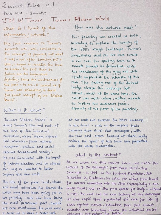
The first piece of work I came across was J.M.W Turner’s ‘Modern World’ (specifically referencing ‘Rain, Steam and Speed’ documented below) - I would usually overlook pieces that seemed ‘pre-2000′s’ in appearance but I am glad that this activity forced me to do otherwise. For me, it was the unexpected detail of the train in the painting that transformed my previous opinion - the more we zoomed in, the more history the piece revealed, and surprisingly mid 1800′s society was not that far off today’s in the technological manner. We are still in the mentality of producing the most powerful robots, whether it’s in the form of cars or architecture - the ‘obsession’ has not stopped (and I don’t think ever will).
0 notes
Photo


Walter Sickert 1860–1942 - Contextual
Ennui ,h60 x w44in. oil on canvas
The title Ennui means ‘boredom’ in french. Sickert specialised in painting portrayals of daily life. Use of somber colours and rough dark tones.
Sickert suggests the disconnected relationship between the figures by their lack of communication and their surroundings. despite being close in physicality the couple face opposite directions and stare into space.
Sickert creates a suffocating atmosphere of boredom. There is no connection between this pair.
ref : The Art Book 1994 & tate.com
4 notes
·
View notes
Text
Question of the Week 13
Q: What distinguishes visual art from design? What distinguishes visual art from craft?
A: Design has been called “a method of human expression that follows a system of highly developed procedures in order to imbue objects, performances, and experiences with significance,” or in other words, a structured method of putting meaning to things (Art versus Design, Toptal).
Tate.com calls craft “a form of making which generally produces an object that has a function,” or a trade wherein one makes objects to be used first and foremost.
What hasn’t been included in those quoted definitions are near-identical statements that the line between craft, design, and fine art are all blurry. All three integrate similar components, but follow different methodologies. Most sculptures will not make good chairs, and the geometric compositions of abstraction break most tenets of design. However, all three are united in one aspect: mutual reliance.
Design requires a portion of raw creativity present in fine art in order to apply the its tenets to the outside world. Fine art often uses tenets of design as a foundation of communicating its messages; even breaking rules are still acknowledging they exist. Craft integrates both the creativity of fine art and the rigidness of design into its functional needs. One needs creativity to find a new solution to an old problem, and one needs that structure of design to create a practical object. Both fine art and design serve a purpose of some kind, which makes them reliant on the concept of a ‘craft’ to function.
I would argue that craft, design, and fine art find their origin from the same stuff, and rather than remain distinct, create their individual identities in their divergent goals.
1 note
·
View note
Photo


Ingredient Brand and Red X
Intel’s successful brand story reminds me of the ingredient brand which means that a product can generate sufficient awareness and preferences for consumers, then affects consumers not to buy products that do not contain this element. It is a good way to improve their bargaining power. Normally, the original consumption path is Intel- Branded computer manufacturer- customers, however, Intel had used Intel’s inside brand strategy to bring consumers’ unfamiliar microprocessors to consumers and gradually build consumer dependence and enhance their brands. What a smart strategy!
There are several successful stories of ingredient brand, like Dodge’s Hemi engines, Citgo’s TriCLEAN fuel and Dupont’s Teflon. They all successfully build trust with consumers. https://stevens-tate.com/blog/articles/ingredient-branding/
Red X is another amazing branding activity that Intel had taken. I tried to find if there was another company tried to use this aggressive method to push there new products, but I failed. This was a breakthrough in the advertising industry, no one before and on one after.
Recently, the modesto Intel decided to move from behind the scenes to the stage.I remembered that they released an ad called “Experience Amazing” in 2016. https://www.youtube.com/watch?v=wlZpzqp6d90
Under the accompaniment of the adapted Beethoven’s Fifth Symphony (very familar and interesting symphony, in Chinese, we translate this symphony as 灯等灯等灯), a project with the help of Intel technology, such as RealSense cameras that can make humanoid effects, Edison micro-modules, DreamWorks, “How to Train Your Dragon” The 3D animation equipment used in the “,” and so on, was shown one by one.
You know, it is an ever-changing world, always make proper changes to adapt to the world.
#2019mitsloanbrandingA
1 note
·
View note
Text
Journal Week 8 - (13/11/19)
Advanced Research Methods - Seminar group presentation
After meeting my group and discussing several presentation topics, we decided to focus on the idea of abstraction. We chose to each choose different genres within abstraction, discuss our ideas in a presentation, link each of our ideas together and finally, present to the class as a whole. With each of us exploring an individual side to abstraction, we thought this would create a more diverse and extensive analysis of abstract photography.
“Abstract art is art that does not attempt to represent an accurate depiction of a visual reality but instead use shapes, colours, forms and gestural marks to achieve its effect.” - (tate.com)
The categories of abstraction we chose to explore were:
1. Architectural abstraction
2. Abstract expressionism
3. Art abstraction
4. Black and white abstract photography
What went well?
We worked productively to find a subject we all wanted to present. Sharing and discussing ideas about what we know about abstraction and what we could contribute to the presentation.
What needs to improve?
Exploring the idea of abstraction further, going into depths about how we can analyse abstract photography within a theoretical context and how we can clearly and confidently present our ideas to the class.
How will this improve my future work?
Throughout this process, I will learn areas of abstraction I never knew about, developing my theory knowledge and how I link it to my work effectively.
What was learnt from this process?
Once grasping the fundamentals of abstraction and exploring our individual’s topics; teaching these ideas to our group helped me better understand what I was learning about. My group asking me questions and vice-versa was me actively thinking about an informed answer which helped me to remember what I needed to know for my presentation. This is a good way to remember information.
I began my research by looking at photographers, I both knew and hadn’t heard of before, to generate ideas and look for the key elements I’d normally find in abstract photography.

(”Grass in Pond Water” photograph by Robert Berdan)
Elements I found: Line, pattern, shape contrast/highlight, mystery, value.

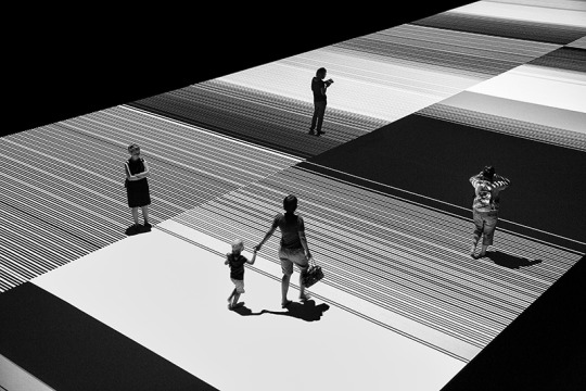
(”Test Pattern” photograph by Hans Wichmann)
Elements I found: Pattern, line, the sharp tonal difference

(”Tracks in Snow 2″ photograph by Joseph Romeo)
Elements I found: Line, shape, form, pattern, value, mystery, texture
This photograph is my favourite piece, out of the photographers I explored. The texture of the snow, on the interwinding tracks going off into the distance, provides effective depth and a strong sense of touch.
Presentation:
In my presentation, I want to present an examination of these key elements and demonstrate them in workings, perhaps my own??? Developing and explaining them as theoretically as possible.
0 notes
Link
Hey friends, I updated my website this weekend! I added some new pieces, took out some old ones, and gave the whole site a makeover. Phew.
(Let me know if anything looks weird or is broken, I built the darn thing on my own and it's been a while since I've coded.)
5 notes
·
View notes
Text
Henry Paker joins in for this episode which features an interview with bovine poet laureate Michael Banyan. We also hear some of your e-mails on the topic of cows’ eyes. By Benjamin Partridge and Henry Paker. Thanks to Beth Eyre. Lid Licker poem by Rob Auton (www.robauton.co.uk) with original music by Timothy Tate (www.timothy-tate.com) Music: “Introspection” by Eric Matyas www.soundimage.org Stock media provided by Setuniman/Pond5.com and Soundrangers/Pond5.com
4 notes
·
View notes
Text
MARJORIE MALLON AND THE GRASSHOPPER OF TIME | Leslie Tate.com
MARJORIE MALLON AND THE GRASSHOPPER OF TIME | Leslie Tate.com
via MARJORIE MALLON AND THE GRASSHOPPER OF TIME | Leslie Tate.com
View On WordPress
0 notes
Photo

Hito steyerl- "How not to be seen- a fucking didactic educational" " Steyerl works across video and installation, as well as delivering performative lectures, and she appears in this work as a performer. The video flips playfully between ‘real world’ footage and digital recreations. This visually disorientating mix contrasts with the blandly authoritative, automated voice delivering advice for ‘how to become invisible’. Settings include a virtual reality tour of a gated community and a desert site covered in huge patterns used to focus aeroplane surveillance cameras, echoed in the layout of the benches in front of the screen here. Steyerl’s work addresses recent developments in the way digital images are created, shared and archived. It also refers to the ‘disappearance’ of political radicals (as has taken place under dictatorships across the world) and the cultural invisibility of women. The work balances criticism and humour, showing how ‘not being seen’ has both oppressive and liberating possibilities." Tate.com - I enjoy the contrast of "real and unreal"- where the digital is placed against the actual. - I find it Interesting that this digital world feels natural to us- perhaps it is also less intimidating?
0 notes
Photo


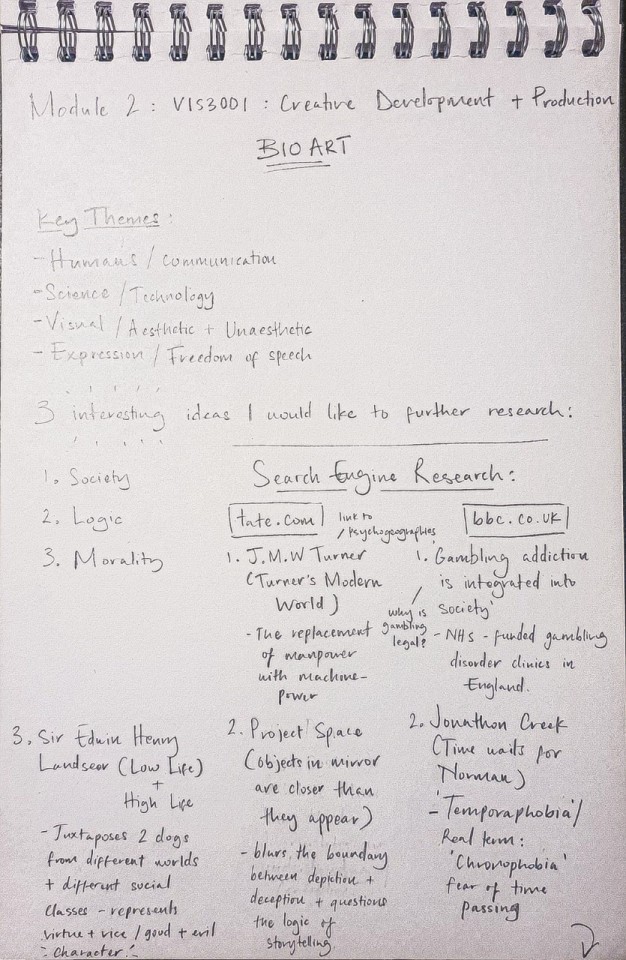
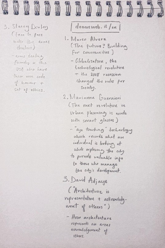
The final part of kickstarting my research was the search engine activity, which involved me taking 3 words or phrases that I found most interesting from my mind map and entering them into a variety of search engines listed by the University. As shown above, my key words / themes were: Society, Logic, and Morality. The first I picked after realising how much society as a whole impacts an individual and their work, the second is something I have always been fascinated in, probably due to my love of debating, and finally the third is something I believe we should all question, especially considering the subjectiveness of morality in a secular society.
The search engines I picked were the following: ‘tate.com’, ‘bbc.co.uk’, and ‘domusweb.it/en’ - the first I am quite familiar with due to A Level Art, the second is one I do not like to visit very often (because of fairly obvious reasons #biased), and for my final search engine, I had chosen an unknown site to try and broaden my findings. Above indicates my rough research, which I intend to explore in the next few posts.
0 notes
Photo


Edward Hopper - Contextual
Automat 1927 ,Oil on canvas ,71.4 x 91.4 cm
Stairway at 48 rue de Lille, Paris 1906 ,Oil on wood ,33 x 23.5 cm
Hopper is considered to be one of America's greatest modern painters. He responses to the human condition. His goal was to reveal the ‘truth about the everyday and the interior life of ordinary people.’
Using light (beams of sun or moonlight) he exposes an isolated figure. common portraits of aloneness, the figure lost in thought and detached from their surroundings. and society.
most of hoppers work deals with the theme of isolation and a certain detachment from society which is very prominent to our society today in current situations.
Ref: tate.com / ALAIN DE BOTTON
3 notes
·
View notes
Photo


Alberto Giacometti - Contextual
(10 October 1901 – 11 January 1966) was a Swiss sculptor, painter, draftsman and print maker.
Giacometti’s studied the the human condition and focused on heads that seem to ‘emerge from nothingness, appearing alone and isolated in space.’ - darkened and skull like - these figures where often painted at night in artificial light. he’s also known for his reduced colour palette.
Giacometti often used the familiar face of his brother Diego. this study, and continuous reworking of the image became an ‘object of investigation and discovery for the artist, who commented ‘When he poses for me I don’t recognise him’.’ ( it is strange and interesting how the familiar can transform into something completely unfamiliar.)
There seems to be a distinct lack of connection in his paintings, the subject looks far away and isolated.
“The poetic mood of the studio''s space is replaced by a forthright confrontation with a presence that dominates the space in front of the canvas.'' - David Sylvester
“I have often felt in front of living beings, above all in front of human heads, the sense of a space-atmosphere which immediately surrounds these beings, penetrates them, is already the being itself.” - Giacometti(Quoted in Sylvester 1994, p.34.)
ref : tate.com
3 notes
·
View notes