#teachingdesign
Explore tagged Tumblr posts
Visit Tumblr Blog
Explore Tumblr blogs with no restrictions, modern design and the best experience.
Last Seen Tumblr Blogs


Fun Fact
After the announcement of the deal with Yahoo!, there were 170K signatures of unhappy Tumblr users petitioning to prevent the sale in 2013.
Text
In hindsight, my abstraction related course with form integration exercises fits Pikotaro’s PPAP perfectly well.
Good to be at DJAD for the annual round of teaching yatra. Thank you, 2nd year, CD students for suffering valiantly for the last two weeks.
2 notes
·
View notes
Photo

Today @arcadiaartanddesign we had an awesome visit from @zachwoomer. He discussed beverage branding and designing for @levantebrewing with our senior Graphic Designers. Thanks Zach! #arcadiauniversity #graphicdesign #teachingdesign #levantebrewing (at Arcadia University) https://www.instagram.com/p/B4iVzykjsvv/?igshid=wx9gko07ftt3
1 note
·
View note
Photo

Pink Stamen is simple and minimal but cleverly positioned, no matter which side you view the piece the curves always point inwards and there is always a central stem framed by two outer stems. Sculpture I developed from collaborating with pupils for a sensory space in the school grounds. Back catalogue : #sculpture #steel #steelsculpture #contemporaryart #contemporarysculpture #collaboration #collaborate #school #learning #teachingdesign #teachingartist #teachingart #childrensdevelopment #publicsculpture #outdoorsculpture #madetomeasure #sensory #sensoryplay #sensorygarden #schoolproject #salixrobot #spencerjenkins #boroquebot #art #artinschools #artist
#boroquebot#teachingdesign#publicsculpture#learning#art#childrensdevelopment#salixrobot#artinschools#outdoorsculpture#teachingartist#collaborate#schoolproject#contemporaryart#collaboration#spencerjenkins#sensory#contemporarysculpture#sensoryplay#steel#sensorygarden#school#steelsculpture#artist#madetomeasure#teachingart#sculpture
1 note
·
View note
Photo

Teaching the Design Thinking #designthinking #teachingDesign #designers #dsgnerds (at LaSalleMx / Facultad Mexicana de Arquitectura, Diseño y Comunicación)
0 notes
Photo

Marc Baroud has been shaping Lebanon's design talent since 2004, initially as a professor at Académie Libanaise des Beaux-Arts (ALBA) and for the last four years as the Director of their Design Department. Read our interview with Marc, up now on #Letternoon Design+, to find out what influences and inspires him in his own design practice. [Link in bio]. #MarcBaroud #HouseofToday #Interview #Design #Lebanon Beirut #TeachingDesign #ALBA #AcadémieLibanaisedesBeauxArts #objectdesign #lebanesedesigner #MadeinLebanon #smartphone #phoneaccesories #luxecharger #newmiddleeastbydesign #shoponline #techhabit #limitededition #vault #resin #fiberglass #designprocess #productdesign #charger @mbaroud @HouseofToday
#teachingdesign#interview#académielibanaisedesbeauxarts#fiberglass#marcbaroud#techhabit#phoneaccesories#smartphone#alba#madeinlebanon#productdesign#letternoon#houseoftoday#shoponline#luxecharger#designprocess#lebanesedesigner#charger#objectdesign#lebanon#resin#design#vault#newmiddleeastbydesign#limitededition
2 notes
·
View notes
Photo

Overwhelmed with feelings of pride, sadness, happiness and uncertainty. So proud of all my graduates ♡ #teachingdesign (at College Of Design, Dammam University)
2 notes
·
View notes
Video
youtube
"....but , its not democratic
it has to do with the fact
that architecture us experienced
by laymen
without thinking
architecture is not about arguments
in the end "
"... in the end
i judge
with my heart..
if i dont like it
who gives a hell
to all the rules i had before "
1 note
·
View note
Link
Germany gets it right, again...It was a while I've been questioning myself:
1. How can we educate society that design spanning not only drawing or problems solving tasks but the creative investigation? Exploring a "field" with no clear intention of coming up with a final product is also a big part of a design.
2. What can design trainer provide for his student to make the best for it's future mastery? Right, the framework for creation rather than to tools and models of actions.
3. Why cannot design be more "life-friendly" and related to our natural living environment?
PS. To catch the stream of the same thinking, get to the medium link and read this... Title of the article is pretty controversial, though.
#interaction design#tutoring#teachingdesign#framework#real-life design#life-friendly#design investigation#research#problems vs solutions#future of design#ux
0 notes
Text
Illustration at NID
To start things off this year with teaching, I had a ten and half day course at NID with the Animation, Masters students. I taught them illustration as departmental elective. Somewhere my illustration course and basic graphics course tend to have a very similar objective; how to come up with visuals that are intelligent, have a conscious understanding of the creator’s gaze at the subject, and what are the alternative ways of representing a subject instead of a direct and bland approach. Illustration like design borrows a lot from the problem finding approach. There are contexts and constraints that guide your decision, and the limitations itself bring out the fun and challenging aspect.
The batch I taught was quite small; six students regularly seen in the classroom, and I was happy to have such a tight manageable bunch who were open to looking at illustration more than just drawing. Thank you for putting up with all the cutting and pasting. It was delightful to spend the time with this dedicated bunch.
1 note
·
View note
Photo

Today @arcadiaartanddesign we had an awesome visit from @zachwoomer. He discussed beverage branding and designing for @levantebrewing with our senior Graphic Designers. Thanks Zach! #arcadiauniversity #graphicdesign #teachingdesign #levantebrewing (at Arcadia University) https://www.instagram.com/p/B4iVjvwjP-W/?igshid=1g4kn0h79ocqj
1 note
·
View note
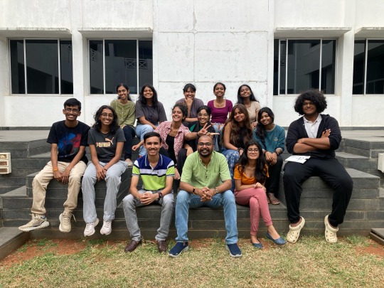
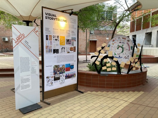
Text
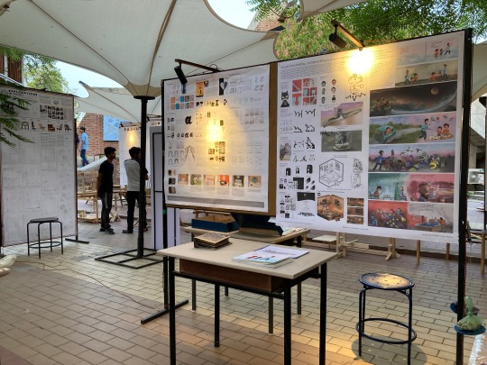
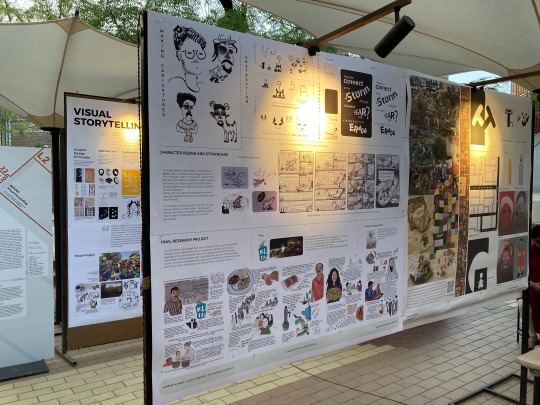
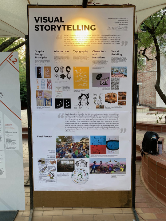
CEPT
It has been a month since Hazel and I wound up our Visual Storytelling course at CEPT. I have been meaning to write about our four-month-long course for quite some time, but the daily stuff kept pushing it to the side. When Hazel called me last year about taking a course together at CEPT, I was a little hesitant to take it up because work on my book had been pending and I had decided to dedicate more time to it. Even Hazel was unsure of it, but we have been talking to each other about taking a course together for so long that letting this opportunity go wasn’t an easy choice. Working as By Two Design, and Perch Project, has been a leap of faith, and for the CEPT course, we decided to do the same. It was daunting to take a four-month-long course, but it was always relieving to know that we were taking this course together.
Since these kids were not from a graphic design background, taking a strictly typography/illustration course felt like an unfair offering. Hazel and I have always been driven by stories in our work. My work on the graphic novel comes from the urge to tell my story, and Hazel’s Edible Heirloom is her way of preserving heartfelt stories with the goodness of cooking. We use our skills to facilitate the telling of these stories, and at the end of the day, our task is essentially of a storyteller. Stories and articulating them visually felt like something that could sustain the interest of students over a four-month-long period, and also make them see value in it to take it back to their discipline and apply it. We had grand plans, and to kick things off it all had to be put in a seven-minute-long video presentation. The amount of goofing up and fumbling we had to go through to overcome our embarrassment and put this video was a joke in itself. We rehearsed, scripted our words, and slashed the details to their core to get the video out. Thankfully, we managed to get 12 students for our studio. Some opted for it as their first preference, and a few as their seventh preference. Clearly, we had a job at our hand to catch the interest of these kids like you grab a scattered egg yellow out of its white.
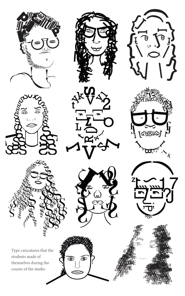
One of the warm-up exercises done by the students related to Typography
I won’t go into the week by week detail, but we soon realised that the standards we had set in terms of output were not being met at all. Maybe the pandemic had broken the will of these students to work and persevere, maybe the isolation had taken away any group dynamism you need to make it a healthy exchange of knowledge. Hazel, Shrenee (our very resourceful and helpful TA), and I would keep wondering after every few weeks as to why are we falling short. We did realise that we need to slow down the learning to allow them time to accomplish one task well at least to let the confidence seep in. Teaching if not going well can be a very slippery slope, and if there are no milestones that the teacher or student can see then it becomes a way of being removed. Hazel and I would feel exhausted on many days because of how much mentally you have to stay invested. My plans of working on the book on the side with the studio going on also slowed down heavily because even though you have only classes on alternate days, the day in-between just went into recuperating. This was new for us, and it was new for the kids too, but we didn’t want to give up. There were also many things in terms of the institutional process that came our way as a surprise, and we had to readjust our course structure heavily to buy time for the students to work on their final project.

Sketches of students while discussing their work over zoom call.
We had offered a mix of beginner’s typography, image-making, illustration, and abstraction techniques to enable the students to visually put together a story belonging to a community that they would reach out to. The idea of a community was very broad because we wanted them to look at people who are bound by a shared experience, and not necessarily look at a community in its traditional sense. At this point, the classes had become offline, so Hazel really helped the students to streamline their process. The last two years have also chained us within our spaces, so reaching out to anyone new was in itself a daunting task for the students. By the end of the last month, our job was mainly to push them to stick to a timeline, work backwards on their deliverable, and direct them to the right references and resources. The very heartening thing to see was the progress being shown in thinking independently of their ideas. When we started, we had to spoon-feed a little to the students, and we detested doing that, so as teachers/educators, our biggest achievement was to see the students taking charge of their work, and ideas, and developing a sense of ownership towards it. The most important value you want to see from a student is to problem-solve their way out of a situation, and when it comes from them then the confidence it provides is unparalleled.
We ended the course with an exhibition, and while we were relieved, Hazel, Shrenee and I had a degree of pride in how we managed to steer the course. We did have our ups and downs, and there are quite a few things we will do differently if we take the course again, but you live and learn, right?
youtube
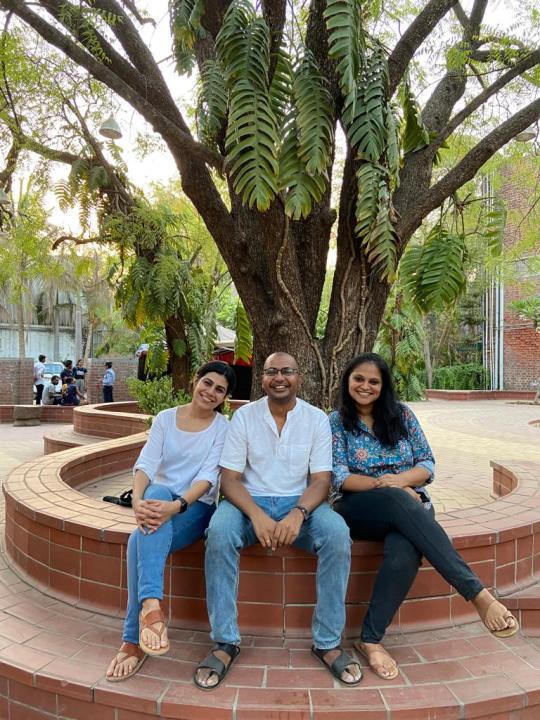
Tired yet happy faces after wrapping up the course.
Also, there is another small story behind the CEPT course. After passing my twelfth board exams, I was preparing for getting into Design and Architecture colleges. My interest was in animation those days, and architecture came along on the list from a coaching centre I was going to because they offered preparatory exercises that covered NID and CEPT. CEPT was the premier institute to get into. If you are not a Gujrati and fell into the General category, then you had to get a rank in the top five in their entrance test to have a chance of being a CEPT student. I had given NID exams earlier that year with no coaching or guidance, and I couldn’t clear the written tests. I had been attending the coaching in Delhi for a month before CEPT exams were due. I had gotten into Srishti by the time the CEPT exams came up. I was debating in my head whether to go ahead in Design or try Architecture. I was staying at my cousin’s place in Ahmedabad for the test days. My cousin had studied exhibition design at NID, so seeking his opinion was natural in my career choices. As an elder cousin, he was guarded about my choice to not pursue a more mainstream career choice. Maybe he was all too familiar with the struggle waiting ahead, but he suggested that I stick to Design if Animation is what fascinates me. I still went for the first day of the entrance test at CEPT. The campus was huge, and it did seem like an architecture college with its exposed walls and monolithic shapes. I had the Interior Design exam on day one, and in my head, I could see myself withdrawing already from the test. It was summer with heat waves outside, and my cousin was going to Mount Abu for a few days. I didn’t know what came over me, but I decided to not appear for the rest of the exams and went to Abu instead. I went to Bangalore and joined Srishti, didn’t end up studying Animation (my interests had moved towards Graphic Design and Illustration), but somewhere it always did prick me a little that I didn’t appear and get into one of the best colleges for architecture in India. I think it nagged me more back then because I had just come out of a very competitive environment, and the thing with such spaces is that it blinds you from seeing what you want to do. All you see is the merit list, no matter if the list is the one you should be actually on. So after all these years, when the opportunity to teach at CEPT came in, in some way it was redemptive for me to go to the same institute where I didn’t appear for the entrance test.
2 notes
·
View notes
Text


I am not a type designer and have no proper training in it, but as a graphic designer, it’s good to familiarise and sensitise yourself with what goes behind the making of letterforms, and I especially feel that it’s important to look at the counter forms in letters as alive spaces. I am trying to keep this course very hands-on, and it’s only when you start drawing or cutting letters that you start paying attention to the shapes involved in the making. Each of the student did a simple sans-serif of their initial, and then made another version of it, slightly stylised, with the negative shapes.
4 notes
·
View notes
Text


Who would say that they are Industrial Design kids! While I took them through the basics of publication design, I expected them to bring paper fold-out techniques that would complement their chosen product for which they were making the brochure for. All of this was done in a week long course. Very pleased with how the final results have turned out to be. Well done ID Year 3, DJAD! Unfortunately, Ruchita and Kenny’s GIF is missing from this set. Thank you, Pratheek, Aditya, Sudarshan, Aditi, Ganpathy, and Nithyn for posing with your brochures.
1 note
·
View note
Text


To take a break from drawing or sketching as a way to approach illustration, we looked at how one can use construction as a technique. We looked at the process of Chris Haughton illustration work where he uses paper cut-outs to create characters. Not everyone is good at drawing, but you can use different materials to compose an illustration. Each of the student took a photo of themselves and then dissected each facial element out and then put it back on paper with other textures, paper, magazine cut-outs to create five characters. Before doing this, the students also made marks on paper without knowing what it will be used for. Once done with the faces, they had to make the entire body using the marks in a way that it complements the characters and style used for the face.
It seemed like it was a more playful approach for some of the students who seemed overwhelmed with drawing again and again by putting pencil on paper. There were many other good examples that I haven’t shared here, but these are just to illustrate the idea behind the exercise.
Credits: Patrali Bhaskar, Ayushi Arora, Sushma Juttukonda, Neha Yadav, Twinkle Singh, Kratika Shekhawat.
2 notes
·
View notes
Photo


Second warm-up assignment from the publication design course. This was to make the students familiar with modular grid and how the grid is meant to be a structure, but the end product doesn’t need to carry the rigidity of it. The idea again was to use found material and the final composition had to be photo-copied, so you see text blocks not as boxes but with interspersed white spaces within it too. Super proud and happy with the results that the students came up with.
2 notes
·
View notes
Video
tumblr


Wrapped up publication design with these wonderful kids of DJ Academy of Design. This was taken when each of them had finished printing their magazine. Missing Arvind and Aparna in the photoshoot :(
1 note
·
View note