#teachingtypography
Explore tagged Tumblr posts
Text


I am not a type designer and have no proper training in it, but as a graphic designer, it’s good to familiarise and sensitise yourself with what goes behind the making of letterforms, and I especially feel that it’s important to look at the counter forms in letters as alive spaces. I am trying to keep this course very hands-on, and it’s only when you start drawing or cutting letters that you start paying attention to the shapes involved in the making. Each of the student did a simple sans-serif of their initial, and then made another version of it, slightly stylised, with the negative shapes.
4 notes
·
View notes
Photo

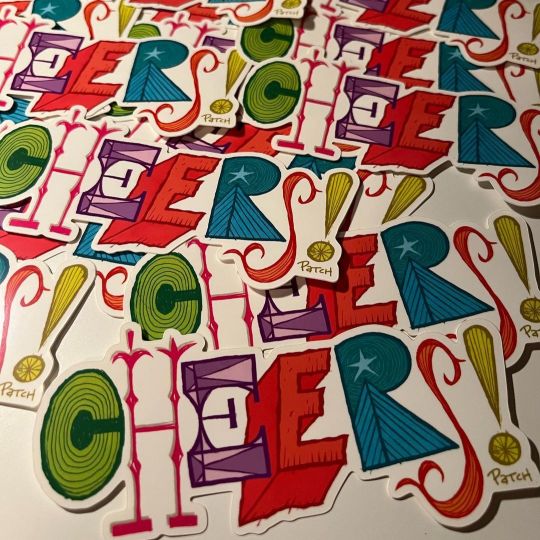
Swipe ▶️ and a toast to you! Happiest of Holiday Wishes. Be sure to spread some cheer to those that need it the most this time of year. Cheers!!! . . . . . . #cheers #happyholidays #holidaycheer #holidaycheers #handlettering #handletter #penandink #typography #teachingtypography #teachingtypographicdesign #stickers #sticker #stickerart (at Winter Wonder Land) https://www.instagram.com/p/CmnE0YRppUm/?igshid=NGJjMDIxMWI=
#cheers#happyholidays#holidaycheer#holidaycheers#handlettering#handletter#penandink#typography#teachingtypography#teachingtypographicdesign#stickers#sticker#stickerart
0 notes
Photo


After staring down at letterforms for a couple of days, I thought it will be good to introduce page layouts made by primarily using typography. I sat and brushed up my understanding, found references to show, but the assignment I had planned felt a little chore like. While collecting references, it occured to me that it will be good to throw the students in a problem solving situation where grids are made through accidents and then you work your way out of it. I took an A4 sheet and folded it six times, when I unfolded it, it had criss cross lines going through the page. I sat and worked out this assignment by myself. I did enjoy working on it, so I thought the students would too. I am glad that the students found it exciting. I have been throwing slightly advanced assignments at them even though they are in Foundation, but the response has been very encouraging. Hope I can follow my instincts and work it out as I go along.
#teachingdesign#Typography#designeducation#teaching#teachingtypography#bodoni#GraphicDesign#graphicdesigncentral
1 note
·
View note
Photo

Sending you all some holiday CHEER! And if you know someone that might be spending the next few days by themselves - reach out and share some CHEER of your own. Happiest of Holiday Wishes!!! & Cheers! . . . . . . #holidaywishes #happyholidays #warmwinterwishes #cheers #handlettering #handlettered #penandink #inkedletters #typography #teachingtypography #teachingtype #stickers #stickerart #stickerartist #selfauthorship (at Chestnut Hill) https://www.instagram.com/p/CmkEV5SpdlM/?igshid=NGJjMDIxMWI=
#holidaywishes#happyholidays#warmwinterwishes#cheers#handlettering#handlettered#penandink#inkedletters#typography#teachingtypography#teachingtype#stickers#stickerart#stickerartist#selfauthorship
1 note
·
View note
Video
tumblr


Wrapped up week 1 with DJAD, Masters students where I worked alongside them on the assignments I gave. We started first with drawing letterforms of our initial in such a way that the negative space will form our second initial. After this we created the letter form in our mother tongue which should look like a family of the English letter. This meant tweaking the initial in English too because Indian scripts usually have a lot of counter forms and it’s important to let the derivation process work both ways, not just English to our mother tongue. Post this stage, we worked on the different weights of the letter, and then created new versions of the letter for usage in these three spaces - Children’s Library, Fashion brand, and Heavy Metal band. The last step was to create compositions using the letters that can be used as wrapping paper, backdrop etc. for the respective brand.
This is my submission for the assignment. I will be sharing my student’s work today too. :)
0 notes