#textures can absolutely make ur colouring look interesting tho so try some out!
Note
Do you have any art tips or a step by step on how you color??
Please its ok if you wont
sure, i can give a tiny bit of insight on how i colour. Under the readmore:
At this point of my personal understanding, i would say colouring is just two things: 1) making sure your colours look good together, and 2) lighting (if u decide to even do lighting/shadows, that is)
The 1st one you can achieve by doing palette studies based on photographs or other ppls art, or by doing trial and error, or apparently by learning colour theory (im too dumb to understand it) and also applying digital tricks like overlay layers and also fiddling with hue/sat/brightness/contrast until it looks good to you. Below is my latest Audrey drawing without the overlay layer (left) and then with the overlay layer (right).
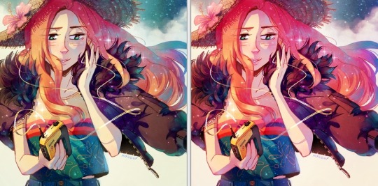
It’s magic, right!? I’m so used to having an overlay layer in every drawing now that these days i just slap one on before i even start colouring lmao. usually 20-50% opacity, usually a saturated orange or pink and then i’ll adjust as i go. mostly i just do trial and error like fitting wooden toy shapes into the right holes - my brain will go “ding!” when the arrow on the hue gauge hits a colour that looks good to my eyes.
The 2nd one, lighting, is more complex. I always say “lighting is everything” because to me it IS...it can control the entire mood of the picture. Where is the light? Is it hard or soft? is there a secondary light? What emotion are u trying to convey? and then how can you execute it? how would light look on THIS object compared to THAT object? A big part of lighting is being able to visualize your drawing in 3D. Once you can do that, you can lay down the light and shadows quite naturally depending on where your light source is. this ties into the way you DRAW things tho (like, u have to already be thinking about 3D while in the drawing stage) so i dont wanna get into it since this post is about colouring.
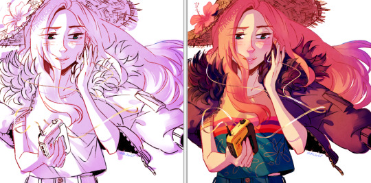
Lately I’ve been p lazy and doing all my major shadows on a single layer, set to “Shade” on sai (it might be something diff on other programs idk), 42% opacity (for this particular piece), and clipped to my folder of colour layers. So that means almost all my actual colour layers are just flat colours! Here’s my main shadow layer all by itself without any base colours (left), and then shadows + base colours (right):
sometimes i’m already thinking about lighting while im still sketching the picture. sometimes i’m already thinking about lighting before i even start to draw. For this particular pic I ended up with 5 different layers for lighting:
1) all shadows (42% opacity Shade layer);
2) some extra shadow under her hat (72% opacity Shade layer), which then allowed me to create the cool hat texture by simply erasing bits of this layer
3) a soft angelic backglow coming from behind her. this layer goes somewhere above the lineart layer to give the illusion of light spilling in front of her and fading out her edges;
4) secondary blue reflective light coming from the....sky im presuming, but mostly because i just felt like the drawing needed some blue lol;
5) a 55% opacity overlay layer containing a trace amount of vignette in 3 of the corners + an extra glob of light just to the right of her cuz i was experimenting with different instagram filters near the end and found one i rly liked and tried replicating it on sai 😂
Here’s the picture with only my main shadow layer (left) vs the picture with all 5 lighting layers (right):
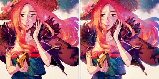
The pic on the right makes her look more like she is Somewhere. I think I could’ve pushed the depth even more but i wasn’t confident enough. And sai doesn’t have blur tool :(
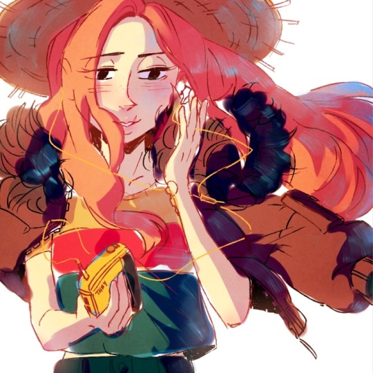
I also always have at least one layer that i name “extra”. The Extra layer goes on top of the colours/shadows/lineart layers, but under the overlay/glow layers. This is for extra details (including extra LIGHTING details) that I wanna add like extra sparkles, extra straw hat strands, hair strands, hair shine, zipper shine, etc all for that “extra” touch of realness. I don’t do all this stuff at the end, though. I have my Extra layer created pretty early on and i go back to it and add to it when I need to. Here’s what it would look like without the Extra layer (left), and with it (right). Try to find all the extra bits i listed:

One last note is i don’t colour one thing at a time. Before I start, I slap on all the base colours and all the shadows super roughly, just to check if my lighting and colour choices look good TOGETHER and make the entire composition look good. no point in spending hours rendering all the lighting and shadows on the character’s hair if in the end u decide there was actually a better lighting design u could’ve gone with. So here’s the rough colouring plan I made for myself before i started rendering for real:
im not sure if this was useful at all but i hope it was interesting at least! if you want to see my actual chronological process for colouring you can watch the gif of wips i compiled here: [link]. You’ll notice that i edit my lines as i colour. I think it’s good to be adaptable, and to be ready to go back and change ur lines to benefit your lighting, colouring, and overall look of the piece.
Also here’s the finished version of the pic: [link]
#Anonymous#miruask#miru art#tutorial#there's a lot more i didnt mention#i didnt mention my texture layers#cuz i felt too ashamed lol im just a sham artist using textures and overlays and texture overlays#textures can absolutely make ur colouring look interesting tho so try some out!#i didnt use a texture for the hat tho i did that all on my own and im proud#i also didnt mention locking ur lineart layer and colouring the lines themselves#but thats such an age old technique that im sure everyone already knows it
32 notes
·
View notes
Last Seen Blogs

wordsbykell-blog
blue jeans white shirt

liezlx0
Philippians 4:13

shelterugolyok
Shelter Ugolyok
johnlr3
Cars🏋🏽Fitness 🚘Life
feedesmarais
ravens and wonders