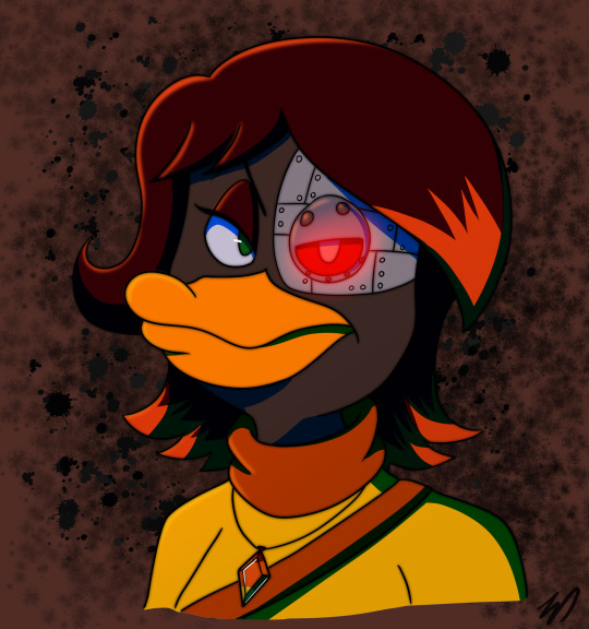
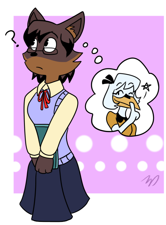
#thegoldensungoddess
Note
Hey Do you have any tips on making a logo because ive been looking to make logo for Ask blog and was wondering if you had any tips?
Hey, thanks for asking! :D I can be very wordy about stuff I’m passionate about so my apologies for the length of this answer ^^’ That said though, if you have any further questions feel free to reply or send another ask :) Here’s a few tips, I hope they help!
1. Choose a font (or draw one yourself) that fits what you want the logo to represent
Similar to how specific choices are made to convey the intent in character design, font choice in a logo design can affect the overall “feel” of it, so try to pick ones that fit whatever you’re making the logo for. In other words, logos can have their own “character” too! Many character design principles, such as shape language and colour theory, can apply to logo design as well.
If this is for a fandom/pre-existing media, try looking up those logos first if you want to match their look for your own. Also try studying logos you like in general to figure out how they're constructed, and use anything you like from them in your own design!
There are a ton of styles and combinations out there, but one of the biggest distinctions between fonts is serif versus sans serif.

Though not the case every time, serif fonts tend to look more old-fashioned/traditional, while sans serif usually appears more modern/digital.
While you can use any font for inspiration if you intend to draw your own, if you just want to type one out, then be sure to look up the usage permissions for it first. Not all are free for personal use and may be stolen even if they're listed as free online. If you’re unsure, search the font name and find the license or usage permissions directly from the creator/font foundry if you can!
2. How “fancy” you want your logo to be is up to you, but make sure it still works as a flat image as well
This is less applicable if you’re only using the logo for one thing, but generally speaking you want your logo to be versatile enough to still be readable without all of the fancy gradients and drop shadows added. Those should be extra details, not the main component that's holding up the whole design, so to speak.
I recommend starting with the flat or black & white version and refine the design enough in that stage first before moving on the final clean/fancy version. Here's a comparison between the flat and full version of the logo for my comic project, Starglass Zodiac (original post here):
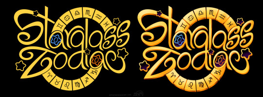
Even without all of the shiny stuff on top/underneath, the flat colour version still functions as intended.
3. Make sure the width/length/size of the logo works well for what it will be used for
For example, if you want to use the logo on the banner for your ask blog, make sure it'll can be read well in that format. You can do this by either making the logo in a file that's the same dimensions as your banner, or testing the rough design for the logo on the banner first before committing to the final design.
Also make sure that the logo doesn't blend into whatever background you intend to put it on, especially if the logo itself doesn't have a background. Adding a black or white (or both) stroke around the logo can help it appear on more background colours.
4. Make sure the most important words are largest or are the focal point otherwise
Similar to the last point, make sure that a viewer will get the gist of your logo even if they look at it quickly. This is most relevant for logos for things that have long titles or have a subtitle attached to a main name. If your logo will have multiple words, having a hierarchy of importance in size and/or colour can help the viewer see the most important part first.
--------
Now for some general additions/effects to consider for your logo!
Gradients - Your best friend, one of the easiest ways to make even the simplest logo look fancier than the flat version, if the overall style you're going for calls for it. These can allow you to have colour shifts over the whole design, or add highlights in parts of it to tie the whole thing together. You can also add edge highlights/shadows on top of these too.
Textures - Similar to gradients, textures can add a lot of flair to a design very quickly. Even gradients themselves can be textures already, like mimicking shiny metal or the like. They can also be used to represent something about what the logo is for, like adding a rocky texture for a logo involving mountain climbing or ancient ruins.
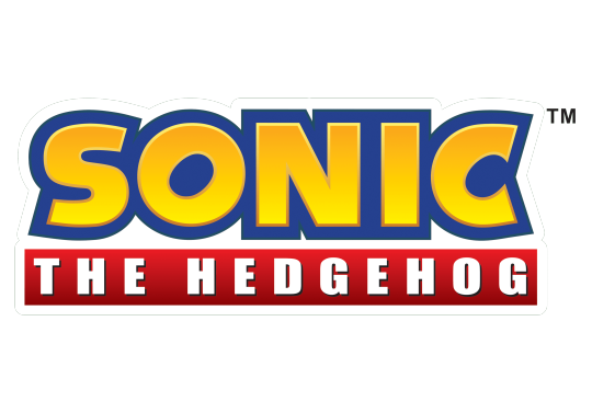
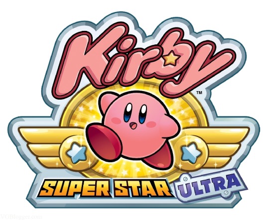
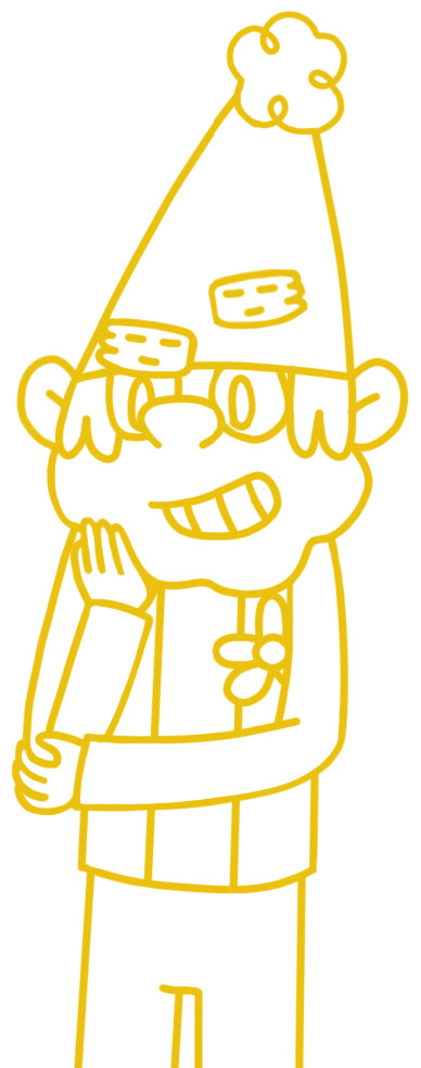
Strokes - These are outlines around your lettering that can help them be seen on multiple background colours, or to make specific letters pop out from the others. You can use multiple strokes on different areas of the same design as needed, but make sure they don't impede the legibility of the lettering itself! Many of the Kirby logos use several strokes at once, like this one below.
Backgrounds - Any colour/shape underneath the text to serve as a base for it. Similar to strokes, they can help the lettering read properly on multiple colours/shades. They can also provide additional information about what the logo is for or represents, like putting a sunset in the background of a logo that has "Sunset" in the name.
Drop Shadows and Outer/Inner Glows - These are often paired together, as they generally serve the same purpose; emphasizing the part of the design they're applied too. Drop shadows can help "lift" some parts of the design off the base, while glows can outline something instead, like a soft version of a stroke. It's very easy to overuse these though, so use them sparingly!
Bevels & Edging - Adding these to the lettering or other parts of the design can make them stand out more, especially if you add shading to it! One of my favourite examples of this is the main Spyro logo, both classic and modern :)
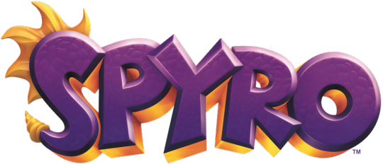
Blocking - Basically a way to make the letters or the whole logo look more 3D by adding "blocks" underneath it, which can also help add another colour to the logo's palette! Spyro's logo above uses shaded blocking.
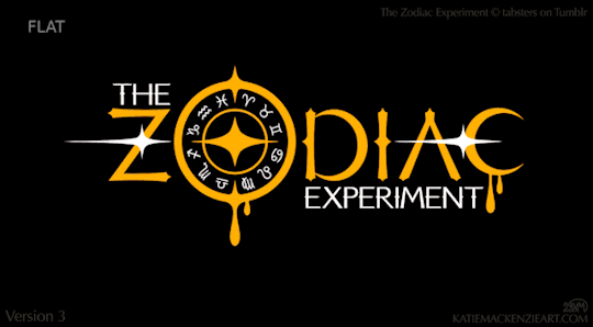
There are a ton of other effects and ways to combine them, so feel free to experiment with a bunch of them! As one final example, here's a breakdown of the logo design I made for The Zodiac Experiment (Original post here) so you can see how these effects can work together on one piece!
Have fun designing! ^_^
8 notes
·
View notes
Text
Empathy, Megan and Jen as the Andrews Sisters
2 notes
·
View notes
Text


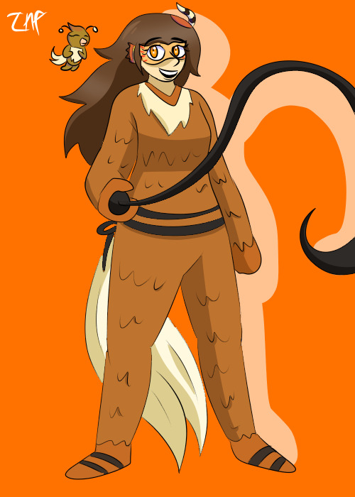
Various artfight attacks thus far!
Lane belongs to @wonderlaneyart
Tana and Catherine belong to @thegoldensungoddess
Gav belongs to Limbus at Artfight
Morana belongs to @annacpadilla
Faith belongs to MaddieRoo at Artfight
Hannah belongs to @cookieruby
Morrigan belongs to @monstrousturtles
Quinn and Queen belong to @strangejellybeans
Natalie belongs to @trishabeakens
40 notes
·
View notes
Text
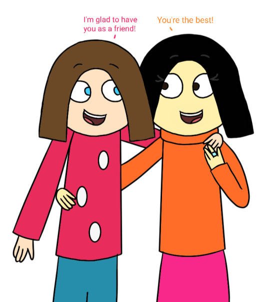
@thegoldensungoddess's birthday is tomorrow, but I just wanted to post this as an early birthday gift. She has been there for me for 6 years now, and I'm proud to call her one of my best friends, even if we still haven't met in person yet, but hopefully, someday, we will.
#The 7D#save the 7d#Empathy#MY OC FOR THE 7D AND THE 7D ONLY!!!!!!!#Megan#original character#my art#autodesk#sketchbook#I did draw this pretty quickly#Megan is wearing the ring that Happy proposed to her with in that one drawing I made last year#I do want to get to drawing Megan and Happy's wedding
16 notes
·
View notes
Text
(Once again sorry for the poor quality


YEESSSSS THIS IS WHAT IM TALKING ABOUT
#bees self ships#self shipping#hades#submission#thegoldensungoddess#disney hades#hercules zero to hero#f/o gush#look at him!!!#this scene has me just... 🥺🥺🥺#babey#I know he’s technically under a spell but... he’s such a dork I’m gonna cry#❤️
69 notes
·
View notes
Note
Is it weird that I want to make an oc and headcanon that
Years before his mutation bushroot once had a kid
Well, to be honest, I personally think it's unlikely that he did, given how lousy he is at relationships.
But, on the other hand, that could be an interesting concept to explore, where at some point in his past, Reggie had a relationship that resulted in a kid, only for something to happen that made him lose it in some way and end up alone. It has both dramatic and comedic potential.
(The reactions of the other Fearsomes to that bit of info would be priceless.)
Anyway, if you want to go that direction, go for it! I'm curious to see how you'd make it work.
8 notes
·
View notes
Note
I hope you don’t mind me asking
What art software do you use
And what layer modes do you use to shade and light
i dont mind at all !! i use ibis paint for all my art and overlay mode for all my lighting :]
#skye's ramblings#overlay mode my beloved <3 i use normal layers for everything else but when its time for light !!! overlay :)#n yeah i havent tried many other programs bc i dont have money or i simply do not want to but. ibis is a really high quality program <3#tbh its probably what im gonna use forever i love it too much to use anything else#thegoldensungoddess
4 notes
·
View notes
Note
Do you have any headcanons about how the other gods and goddess are going to feel about hades and jafar
Like how do they feel about them how are they going to react
The only gods I have in this au that *aren’t* Hades are Persephone from the Silly Symphonies short, and *maybe* the Spring Sprite from Fantasia 2000, but I’m not sure if she counts as a goddess since I don’t think she’s ever directly called one.
Persephone finds Hades sort of intriguing because he’s basically an alternate-universe version of the “Pluto” who came to her. So she’s the fairy that talks with him the most, but he really hates how cheery and song-y she is. She’s also pretty different from *his* universe’s Persephone.
Persephone also tries to lead Jafar to the path of good like she does with the rest of the villains, but she doesn’t interact with him much directly. She leaves that to Genie.
Spring Sprite is honestly afraid of Hades, she always hides whenever he wanders into the garden. She’s also a little spooked of Jafar too, though not as much. She thinks Iago’s funny, though.
8 notes
·
View notes
Photo

Art Fight lol XD Characters belong to @sixfallenlosers @annie-wilderson@thegoldensungoddess @envandrare
3 notes
·
View notes
Photo


More Art Fight pieces!
Penny, Detective Slinger and Jinxie belong to Mothball_Arts_ on insta
Plague Doctor belongs to @plaguedctrdraws
Orion belongs to @starlightmoth
Naomi belongs to @merani-draws
Marie belongs to divynez on twitter
Rosalia belongs to @thegoldensungoddess
Asellia belongs to @trishabeakens
Jessie Raine belongs to Pickled_Paint_Palette on insta
22 notes
·
View notes
Text
Here's a redraw of something I drew a few years ago. I'm pissed at myself for not drawing anything for the 6th anniversary of The 7D, which is a cartoon I'll most certainly NEVER stop loving, watching, or drawing and NEVER lose interest in at fuckin' all! @thegoldensungoddess, you can definitely color this in if you want to.
#The 7D#save the 7d#the 7d happy#❤ my 3rd favorite dwarf! ❤#The cheerful and musical dwarf!#my art#autodesk#sketchbook#amazed and confused#redraw#I don't have any other tags to put!#Seriously I don't!
10 notes
·
View notes
Text
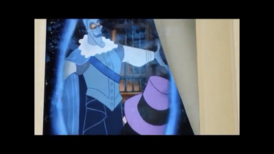
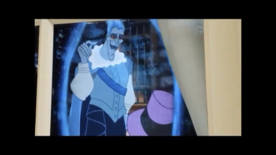
This hades from the sorcerers of the magic kingdom game
During the governor ratcliffe segment and hades calls himself Lord Indigo of the East Underworld Trading Company
(Sorry for the poor quality there are just screenshots
#YESSSS I’ve seen this thank you for submitting it#he looks so handsome but like at the same time not the colonizer fit 😩#hades#bees self ships#submission#thegoldensungoddess
30 notes
·
View notes
Note
Hey I wanted to say I love your story and I love your ships And I can’t wait to see more of hades x jafar X3
Thank you! I’d recommend checking out @evildisneydorks too if you want more Jafar x Hades besides the stuff I post! I think they post more of it than I do
3 notes
·
View notes
Text

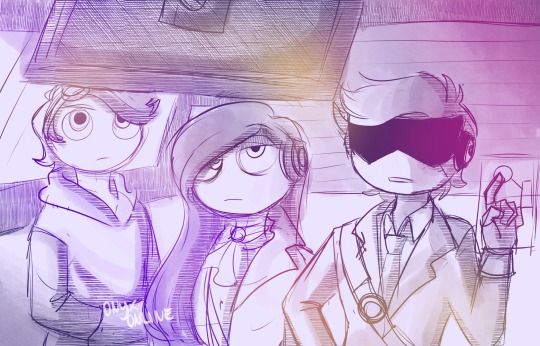

On board of Grey Crush’s blimp
Where will they head for their new adventure?
Ocs in the drawings:
@bashful-sword @bubblesthedreamer @anghel-o @cacaocheri @invisible-b0nes @pompcoco @twigthecoyote @thegoldensungoddess @sylunisart
Thank u for lending me ur ocs, *returns them cutely*
47 notes
·
View notes
Last Seen Blogs