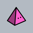
#theyre all just colorpicked
Text


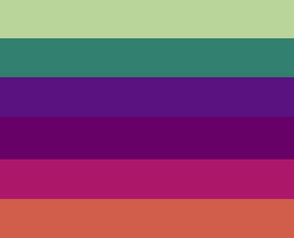
zimkisser, dibkisser, and irkenkisser purride flags
#theyre all just colorpicked#the irkenkisser one is all showcolors though#no florpusirkens#sorry didnt have enough room fur that had to fit in all the diffurent irken colors ¯\_(ツ)_/¯#well i like em all#ESPECIALLY the dibkisser flag#zim mew have the best one. damn#idk what to tag this as.......................#ummmm........#iz#invader zim#uh#any ships mew want i guess!#my art
29 notes
·
View notes
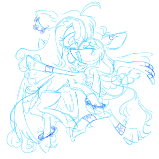
Text

i tried free draw today.
(by the way, where'd "free draw 2" go? i remember that was the bigger game when i was younger. why is it only "free draw" out of the sudden?)
im not the biggest fan of them but its something. i really do like the colors i picked, i just think they could've been used better. it's a little hard to pick good colors when the colorpick tool won't work properly,,,, but i think theyre bearable to look at!!
by the way !! im going on a trip really soon! i think it was tomorrow (2023.08.08) but i dont know if my family changed the date. either way, im gonna be doing a lot of stuff, so i might not be able to draw a lot when i'm there. i'll probably get a ton of ideas from all the pretty places I'll see though, so it's okay!
2023.08.07
119 notes
·
View notes
Text


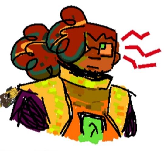
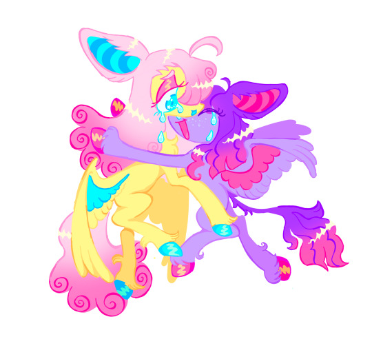
VOTE GOLDAMI
extras below the cut
inspired by Chocos animatic that wrecked me, I've rewatched it god knows how many times! i love it so much!
vote goldami i say as if im not going down with a sinking shi-💥
uh uhh i gave Cami some scarring (?) on her hands, due to her "evil magic hands", idk if they're Actually There or if its metaphorical for how she sees herself, Golden is kissing her hands and pulling one to their chest to show that her hands wont inherently harm people.
her hands are inspired by eclipsa from star vs the forces of evil, personally i would giver her the scarring physically, cause her wearing long gloves all the time would be really cool
uhhhh detaaails details uhhh
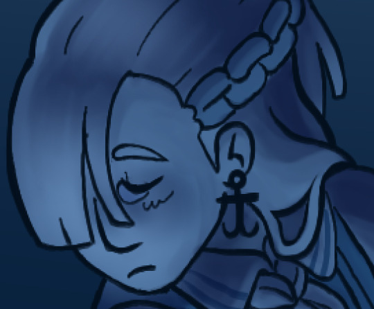

cami has anchor earrings, Golden has the steering wheel of a ship. haha get it? a ship could never love an anchor? cami also has her hair turn into chains but i feel like thats obviousss. their outfits are also sailor and captain outfits respectively, idk how accurate they are i just googled sailor and captains and combined things that looked cool to me. anyyway details abt their outfits:


camis stripes are "light stripes on dark base" with a white bow thinggg (if we ignore her collar thing)

Golden has stripes that are "dark on light" and a black bow thing, and black gloves! so their things are opposites but their hands are matching and "dark"
THATS IT thats all for details, uh onto concept stuff and drafts that you (choco) might like.
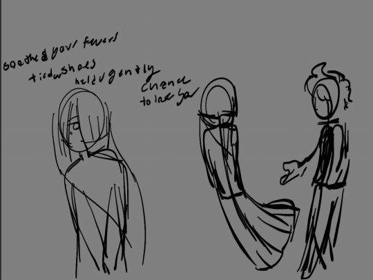


in my first sketch (left) wanted to have cami doing nothing with her hands, abscuring them complerely somehow, and then theres one where shes literallt going in circles with golden with her hands behind her back, and Golden offering out their hand.
second sketch (middle) i got the idea to have Cami not looking at golden, crying, and gaving Golden hold her hands to their face, cupping their own face with her hands, and kissing her hands to show theyre not evil.
but the third (right) sketch i realized that i didnt really like Golden being "above" Cami in any way, whether it was her own perception of them as better than her, or not, i liked the idea of golden "coming down to her level" on the floor and comforting her, being by her side. so! on the floor! they re both on the floor now.
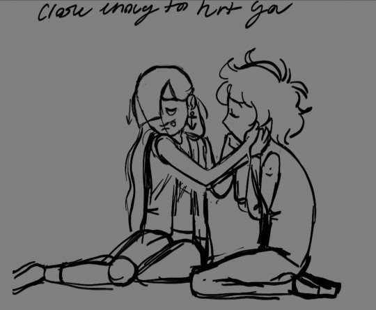
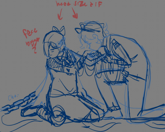

heres where i start focuing on the one pose, getting the anchor as an earring instead of a hairclip, and i lifted her head a bit but i ddnt like that, i really really liked the "dropped" hanging head she had in that third sketch.
uh blue sketch is the begining og the final thing! yay! then the first actual draft thing. this is when i decided that i wanted to colorpick the blues specifically from chocs videos. twas essential. uhhh yeah. yeah.
long story short this it totally revenge. this is me getting revenge. revenge from choco, who clearly wrong me, me in specific, by using the cranewives in his propaganda. this is revenge, i hope you explode. <3
#fnafhs#fhs#goldami#golden#cami#golden fnafhs#loops post#cami fnafhs#fhs cami#fnafhs cami#cami fhs#golden fhs#fnafhs goldem#fhs golden#this is what you get for crane wives-ing me asshole this is what you get#content for your ship#clearly#revenge#totally#i forgot to say there was originally gonna be rope between them bc#‘i severed the rope ti set you sailing from my harbors’#but i forgot it slone the way or smth#fhsz3r0#fhszero
20 notes
·
View notes
Note
i feel so outta the loop with whats going on with that art tracer, they're also a race bender too?
okay so the art tracer has gone by many names over time. i used to be mutuals with them (i feel very stupid about it now for not recognizing them!) but they used to go by (in reverse order, from most recent to oldest):
- marco / red, who traced art back then as well (you can check my "mutuals.marco" tag for more of their art. i tried to give benefit of the doubt back then, but it is very clear their understanding of anatomy and other things does not quite line up with their physical "skill." look at the semi decent grasp of anatomical elements and proportions but entire lack of detail and messy linework on things like fingers and hair. ive noticed these things as ive gotten better also at art. they were into genshin, the quarry, and "apocalyptic" media. their card visually is the same, with the same strange typing quirks, tagging system, and carrd details as 'aray' (ie: the three emojis at the bottom of a small text box, with the key leading to i believe platonic or familial f/os i cant remember which.) marcos main f/o was buck from 911, which carried over to the 'aray' blog. theyve since deleted this f/o from their list. dina and ellie were on marcos list towards the end of that blog. that has since carried over. they also strangely had dragon ball blacklisted, as they do on their current blog, which is very likely because of the issues they have had with keke/@galedinner the past who, at the time of their old blogs deactivaton and new blogs creation, was fixated on his dragon ball f/os, and had some fairly popular posts regarding them.
- kayle, the shipper who also racefaked (at first to being wholly poc, then mixed, then 'part' native i believe because their...stepdad? was native? hello?they also faked did, and e-begged for money after causing a three-car pileup via distracted driving. they were into DC with bruce wayne always being their 'main' f/o,' and genshin. (this is where keke very bravely called out their shit, which is where their issues with him started i believe.)
- ana/anastasia, a shipper who also used to trace art, specifically DC comic art. they shipped with bruce wayne and jason todd.
- a few other blogs whom i never checked, but if you remember that "deactivation speedrun" thing that happened round a year ago on my blog, that was them also, also going by ana again. i called them out on clearly trying to weasel their way back into the community, and they immediately deactivated.
just to name a few. they didnt racebend, they falsely claimed to be poc more than once. they claimed i believe to be at points: latinx, native, and black mixed? i have talked to more than one person who has known them throughout all these blog changes/at different points throughout, as well as adding my own experience, in case youre curious as to where im getting some of these details.
this is how they drew their selfinserts (character on the right) btw, at least when they were going by marco:
i have added an image of my own arm and colorpicked directly from it, which is the the darker two colors -- mind you, i am polish and irish. im about as white as it gets ethnically, though i admit im not as pale as i could be for it. i picked from my natural tone and even from the lightest part i could see just to really try to throw a bone, and they still drew their s/is very consistently paler than me. and then claimed to be poc. (also, look at the hair. the clothes folds. the hands. its very clearly traced. no way someone is so good at facial anatomy and proportions and then...draws a hand like that. im sorry.)
its a clear pattern, and quite easy to follow through time via their interests and other small details about their blog/typing/tagging system/etc.
theyre not a great person, and im quite upset i didnt pick up on the kayle -> marco switch when it happened, but i try to give people benefit of the doubt. i have known them for years, though rarely interacted directly with them until they went by marco, though i dont know if they know i have known them so long, as i myself have gone through a few name/url changes since then (but it is all present on my blog. i have never remade attempting to 'be' someone else. i just think theyre not that smart to realize.) others im sure have more dealings with them, and feel free to add on.
4 notes
·
View notes
Text
an oddity regarding bdsps character models is the strange discrepancy between cyrus’s models. his eyes are blue like normal in the chibi, but theyre actually this funky silver color for the battle model
for reference, heres the textures of both models

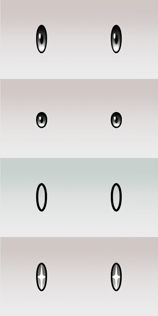
and you might say ‘well what about other characters?’ or ‘how does this look actually on the models’ to which im not entirely sure about All of the other characters, but the commanders and a portion of named npcs have proper matching eye colors. and in regards to a picture of both models side by side for easy comparison, its pretty easy to see how grey his eyes are if thats such a deep blue on his chibi model

funny enough his bdsp key art actually has blue eyes, as well as the vs model, which tell me that this is Definitely some kind of texturing oversight that happened during development

my current theory is they based the model off of the artwork, considering the more similar skin tone between the key art and the vs model. the vs model is basically just a png for the battle start so they probably rendered and saved an image of the model. then at some point a corruption happened to the model during development, which resulted in the altered textures, either from the corruption itself or rushing to refinish the parts of the model that werent saved. of course all of that is just my thoughts on the matter, but heres a handy colorpicked chart i made to support it just a little bit. used the pure textures where i could for best comparison.

(credit to Pikapika-2000 and MikuMikuKnight on deviantart for the bdsp rip)
#bdsp#pkmn bdsp#pkmn#pokemon#team galactic cyrus#cyrus akagi#pokemon cyrus#galactic leader cyrus#galactic boss cyrus#pokemon brilliant diamond#pokemon shining pearl#pokemon bdsp
13 notes
·
View notes
Note
do you have character refs?
Funny you ask because ive been drawing some at school but they arent done because i want them to be digital so i can more accurately get colors i want and colorpick from that for future drawings
But ill be honest im a little anxious because of an incident in the past where some of my special ocs were stolen with very little changes and im frequently worried itll happen again. I was able to provide proof but any bad situations like that send me into fight or flight and kinda leave me feeling like i cant trust anyone for a bit
I’ll eventually post refs, including the rainbow shapes (without the white shape cuz shes too special to spoil), after theyre ALL done and im feeling good enough to post them.
Esther in the pfp isnt a good ref because it doesn’t accurately depict how she ACTUALLY looks in the story, i just threw the drawing together way back when because i needed something as the pfp for this blog. Itll change eventually as well
0 notes
Note
Don't worry about it. That's fine, but I really love how you draw Sakura, like her skin tone makes me happy ngl. Idk why, but I just really love it.
Quick question, what made you change her skin tone? Is it a headcanon or did you think it looked cool? Same with Naruto too. (Anyway, I hope you have a great day or night!)
Ah, interesting question—I have a lot to say on this actually, so I'll put it under a cut!
I mean, to be honest I've probably darkened the skin tones of most of the characters in Naruto in my paintings of them.
Part of this is intentional! In shippuden, a lot of the characters are depicted with skin which is almost an eggshell off-white color, (which u can see in sakura and sasuke here)

and even tho i'm white + pretty pale myself, i just...don't really see skin of that hue or tone in my daily life, except in specific indoor lighting conditions which aren't usually present in naruto.
Like, Sakura's skin tone here is very nearly the same as the whites of her eyes! Because of this, I kind of assume that this is an aesthetic exaggeration of the anime, and so take it with a grain of salt in the same way I do their anime hair-spikes. I don't look at this and assume that Naruto has like, little pyramids of hair all over his head, I just assume it's the exaggerated implication that his hair stands up easily and is a little messy.
So, yeah, since Naruto in general, and especially my comics and illustrations, takes place out in the sunlight and not in environments lit like that (aside from like, orochimaru's lab, lol)—
—I generally lean towards more sun-warmed colors, lots of browns, oranges, pinks, yellows and reds go into my mixing. I sometimes paint them with sunburned cheeks too—if just to imply theyre out n about in these warm fire country days, enjoying the sunlight while they have it.
The only person I keep that kind of eggshell white color for is Sai, because they straight up gave him like. #FFFFFF skin.

which feels like a direct commentary on his lack of exposure to sunlight (to borrow Yamato's metaphor for leaving Root) as well as tying him thematically to his jutsu, with like ink black hair and paper white skin, or something. Since that aesthetic decision is directly tied to his character, I don't mess with it that much.

Similarly, there are some characters who are depicted as having slightly darker skin in general in naruto, like Iruka Sensei, or Naruto himself, and so when I paint them, I try to keep their skin colors slightly darker than I might paint the others, to stay in line with the information I've been given.


that said—that's all the intentional stuff! A lot of the reason that my drawings have the skin colors that they do is because of unintentional factors. For example, none of the skin tones I ever use have been "straight from the tube" so to say. I'm always mixing them, which includes a margin of error and change with something like watercolor, because I'm unable to colorpick the same way that I might if I were drawing digitally.
In fact, even if I wrote down an Exact Mixture of how to make the skin color I want (Usually for Yamato's, for example, I usually three drops of green, one drop of brown, two drops of ochre, and two drops of different kinds of red) i would STILL get a lot of variety in the actual paint.
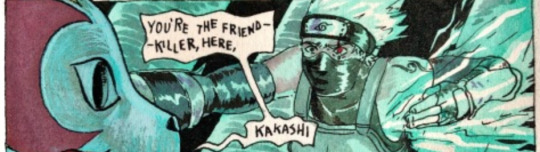
This is because, as I work, the water colors will dry out, and as they dry out, the colors will get more intense as the water-to-pigment ratio changes. I can add water back into the mix, but there's no guarantee that the amount of water I add will be the same amount of water I started with, for example, in this comic i painted both kakashi and tenzō's skin with the same pool of paint, but kakashi's ended up much darker because I painted his when the pool was more dry!

so...basically, there's no way to make sure I get the exact same color mixture every time, unless I only ever use freshly mixed paint, which is not something I have the patience or the money to constantly be doing hahaha,
(and tbh, even then, if i use some drops that are larger than they were last time, or smaller than they were last time, that will affect the color—as will getting paint from a bottle I haven't shaken up thoroughly enough, which might give me more pigment! It's a very fiddly process)
you can actually see a lot of variety in skin tones just in sakura

I'm trying my best, but the inconsistency of watercolor is something I do struggle with, honestly. like, you can see a lot of variety not just in the way her skin color came out (some of these just look...straight up pink 😖), but also the color of her hair, the color of her eyes...etc etc.
I'm trying my best, but the inconsistency of watercolor is something I do struggle with, honestly. the amount of times ive had to grab the paper towel, sponge it all up and start again...it's a wonderful medium but it's an exercise in frustration certainly
#yamswers#melancholic-lionness#and thank u for the well wishes! i had an ok night i actually got some sleep!!!#i hope that u had a good day or night too
92 notes
·
View notes
Note
The fandom is trash and so is the creator, i hope they put more love into clover not just made him a side character that exist. I use to draw clover very much too but see how people attack on me cus i color skin with my cannon got me tired and sick of it. Not everything have to be black yk👁️👄👁️☕
Understandable. I go by dough color whenever I colored the cookies just so I won‘t get attacked for “oh no youre whitewashing” or “oh no youre blackwashing.” Folks always say “hey the colorpicker is right there, use it” when theyre too light but always go for darker when they color. What happened to the colorpicker, fam.
(Warning: Long post, but I ain’t putting it under readmore nyahaha)
However, I strayed from the color picker for an experiment. I got attacked for making vampire cookie pale, but it was a set up for the joke where he’s dying because he hasnt had anything to drink. (But I posted pale vampire before the comic. On here, I posted the pale vampire picture and the comic in the same post.) It didn‘t bother me because I knew what I was doing. There was backlash and blocking and fighting in the replies (yes, this was on twitter). I was streaming myself coloring the picture and I asked my friends “Yall wanna see if people get mad at me for making Vampire pale here and just post it.” I was testing to see if people will check my twitter for context and get the joke, or view the picture on its own and accuse me of being a whitewashing racist. Guess what the result was.
People who don’t follow me quote retweeted that drawing of vampire cookie holding a sign that said “dipshit“ upside-down and spreading around I’m a racist. Yet they didn’t dare to check who they are accusing of being a racist. They didn’t check who I was or what I did or if there was more to that silly picture than it being the sole evidence that I am a whitewashing bozo racist. It was a set up to a joke that they didn’t even try to find the punchline for, because they don’t know me. They don‘t know I’m a funny haha shitposter who has to spread their drawings across several posts because twitter has an image limit. The punchline all along was them calling me a racist and proving my hypothesis for the experiment correct.
They paid all the attention to the skin color and I thought, “yes yes this is what I wanted. Now let‘s see if they go to my page and see that I did it on purpose to gain their attention to focus in on the skin color and see the followup. “ But they didn’t. Immediate block after seeing the terminal whiteness of his skin. And that really was the punchline. Folks don‘t want to dig deep, they only focus on the surface. They don’t want context. What they see is what they get: What they saw was whitewashing and what they get is the conclusion of me being a racist.
Comedy involves timing, sometimes you have to wait to give the punchline because the set up hasn’t set in. The first joke was seeing vampire holding the sign upside down, and you think, wow what an idiot. But the next picture is he himself hanging upside down, like a vampire, and now the picture is upright. And you think, oh i see. That‘s silly. But the second joke is for those that focused on how pale he is. The punchline had two parts: The accusation of racism and the other is the follow-up comic where he drinks some juice and he’s back to his original lively color and not pale because he’s dying. I got a laugh out of both because I’m a conniving asshole who knows how to manipulate the masses and is sorry for having to explain such a complicated joke/experiment.
Off the comedy and onto the racism, I know whitewashing and I know blackwashing. I have tried to change the color of my skin to fit in. I was scrubbing myself down with whitening soap and staying indoors in the shade so I can get pale for cosplay. I’ve went to the beach without sunscreen multiple times because “I’m not dark enough to be filipino.” I’m accepting my rough, dry ass, mocha frappucino skin color. You should accept your skin too.
And to the main point of all this: Coloring a gijinka of a cookie shades or tints variant of their dough is not whitewashing or blackwashing.
And lemme tell you, in my Almighty POC opinion, that coloring the humanization of a cookie in a color lighter or darker than the dough is not racist. Because, and let me hear the folks in the back say it: They are fictional cookies whose “souls” are put into dough. Dough, as in edible, unsentient, globs of ingredients of which can be modified in color based on the flour, the sugar, the food coloring, or whatever other food is shoved in there.
It’s a fictional world with made up logistics to create a universe where cookies come to life and run away from witches and cake monsters. And we are real world people taking these cookies and making humanizations of these cookies to fit our own headcanons because drawing semi-2D cookies are hard and we want to give them real penises. Don’t get mad at small internet artists for taking their favorite cookies and drawing them in their own likeness because the ”human cookie” they drew doesn’t have the same skintone as you.
I’m sooooooo sorry this Korean Artist with 20 followers on twitter didn’t provide you with the representation you crave. How about take it to the creators of media that use actual humans and ask them for representation. Or you make your own characters and force the representation by your own beautiful hands. That’s what I’m doing, making OCs and giving them backstories, and that’s more enjoyable than fighting with children on the internet because they didn’t color a ”human cookie” the matching shade of your imagination.
These are cookies. We can take a mallet, crumble them to dust and snort up their dusty carcass through a rolled up 20 dollar bill. Color them however you want, there are more things to worry about than the innocent human artist trying to show their drawing of a cookie that represents them as a human.
Understand, we humans, have more depth than a cookie, because we are 3-Dimensional physically but also personally. Not every person who has done/said something you deem as racist is racist, because as humans, we have the capability to change and are more than just the one instance you viewed on twitter. Go deeper than one post to put your judgement on a person.
I’m not a whitewashing racist.
I’m just a funny man who makes art and can also be an asshole.
I have been King and I apologize for this long post.
#People need to learn to talk to each other. How about talk to me instead of making an accusation and running away.#Thats like going into a crowd. See me pick my nose. Call me a rapist. And you run away and everyone else in the crowd believes you.#I dont get the chance to talk to most of them cause I’m already being dragged away by the cops. Handcuffing my booger finger hands#also whitewashing does exist when it comes to art. But i say that depends on their intent. The key is to tell them whats wrong#And not tell them to k ill themselves. They aint gonna learn if you point a finger namecall and block. Yall gotta be kinda to people.#And also i befriended that korean artist who has 20 followers. Hundreds of qrts and messages in english bashing them.#They colored clover paler than his dough. I dont give a shit. I love any piece of clover art i can get my tan hands on#I wanted to be the one kind person out of the hundreds who cursed them out and recolored their art#Whatever man. I’m outta there. If ya ever wanna draw my OCs I got one thing to say:#Use that colorpicker….fam. Its for the best. Just keeping my eye out on ya.
25 notes
·
View notes
Photo


hadnt touched this acc in a hot sec so heres some stuff i sketched for the past month (info on each image under the cut)
1- a super quick sketch on my personal interps of tenmikoangie ! i initially made it for someone as a quick colorpick ref and whatnot so i might end up coming back to refine each of them more.
if anybodys curious my personal gender hcs for them are:
tenko - transmasc nonbinary (he/mew/they)
angie - nonbinary (any prns including neos)
himiko - transfem nonbinary (she/bun/they/it)
nd theyre all lesbians bc i am a lesbian nd im funny like that
2- just !!!!!!!!! tenko being upset i guess. i never really seen tenko just. genuinely radiate raw anger energy before and the only mentions of that was when they had temper tantrums that were so bad that their parents felt like they couldnt care for them. and ykno tenko is a very feelsy person i want him to be angry !! tht would be interesting to see. and heartbreaking but mostly interesting
3 - alternate au kinda thing where both tenko and gonta are both siblings, and instead of tenko becoming the SHSL aikidoka, they turn to herpetology (study of amphibians and reptiles). its kinda silly but i am going to draw them bc i can <3
#tenko chabashira#angie yonaga#himiko yumeno#tenmikoangie#tenhimiangie#gonta gokuhara#kokichi ouma#honestly theyre all just silly sketches to put out here#i really like exploring random concepts just bc its fun !#also the gender hcs r my personal thing if u dont like it u can block lol#bc its going to appear a whole lot on my acc#norse casting
19 notes
·
View notes
Text
gonna post progress pics from my volo painting and write a bit about my process since some1 asked for them!
excluding adjustment layers this has 20 layers in all. i wont show all of them bc some of them just have minor differences but ill show my general progress
sketch. just super loose but has enough visual clarity to be able to work off of and not have to fix issues caused by poor anatomy etc later
background color + painting under sketch. to choose colors, i go on the color wheel and just kinda choose colors freely and almost randomly & paint w them by very lightly pressing with a hard round elliptical opacity brush set to a large size, blending other colors on top of them this way. i dont use this brush the whole way through but honestly i couldve and it still wouldve turned out good
a lot of trial and error but because were doing it so loosely its pretty easy to find something that works quickly (also sorry the painting is so dark at this point oops)
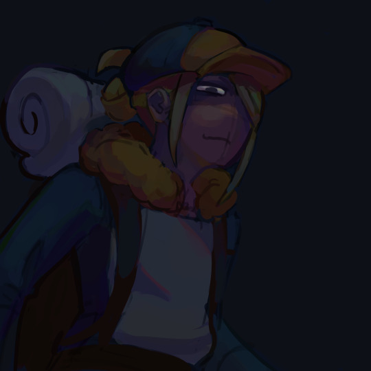
developed painting a bit more and upped saturation in some places using an adjustment layer.
to get a lot of the color variations im getting here, i colorpick from other areas of the piece, ie colorpicking from the face and using it as subtle lighting for the hair, seeing i like how those colors look, and using that as a jumping off point and using a more intense pink for the hair shading. you can also see i got some of the yellowish on the sleeping bag or whatever tf he has on his back from the hair/hat/etc, just brushed it on there really lightly and it looks cool. another place i like to colorpick from is where the sketch overlaps with the colors underneath, it creates some interesting desaturated colors.
you can also see im developing linework a tiny bit here, its pretty early on and a lot of it will be painted over later anyways but i start being like, okay the 3d forms i've been making are working, let's draw on top of the sketch a bit to encapsulate those areas
but yeah uhh definitely a lot of this is just testing stuff out when i'm this early in the painting, i am aaaalways in motion, never stopping and just working off of instinct and what looks cool. and if i mess something up, i can just erase it and i'll have the layer underneath to fall back on.
also im just straight up not thinking about anything at this point unless im trying to closely replicate a reference image, which i didnt do very much. i use reference for eeeeeeverything i make. i took a pic of myself at a similar angle to this and then loosely based the sketch off of it, looked at pics of volo, later on looked at some reference of how ppl paint fabric, grabbed some pics of how i drew one of my ocs who makes a similar expression w his eyes, grabbed images of other digital paintings i'd made! because i wanted to work in a certain style i'd done maybe only twice before. for reference images, i use pureref, which i would highly recommend to any artist, especially ones without dual monitors (like me). basically just allows you to make a reference board and pin it on the very top of your screen
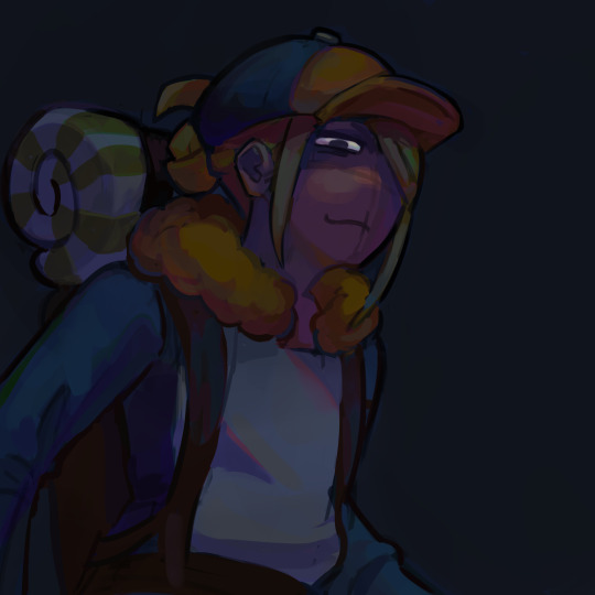
just developed more in the same fashion, then threw a couple adjustment layers over it. i toned back some of these adjustments later but yeah. you can see the lineart really starting to come together, a lot of the color variation on it colorpicked from accidental overlapping colors that ended up looking cool. btw i need to make it clear i do lineart and rendering on the same layers. also i did the stripes on the pack just by using a multiply layer, then giving it more love on the layer immediately above it so it doesnt look cheap
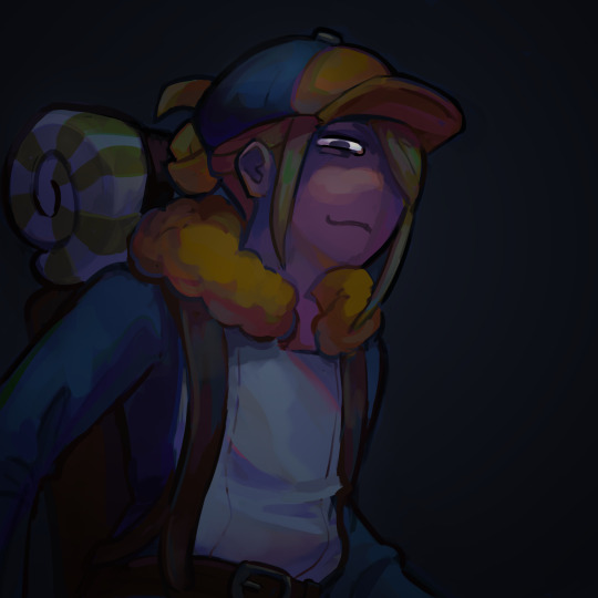
more rendering, got a vignette going w a multiply layer. actually started using reference for fabric folds. theyre really simply done honestly and dont look like. amazing. but they work
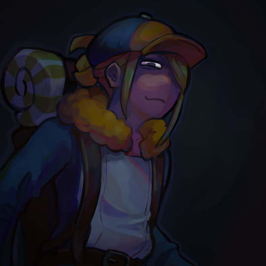
painted over the vignette in the background to make it a bit more interesting & not just a gradient, more rendering as usual, threw in some subtle highlights to make it a little more interesting! i probably couldve gone further with them honestly. also decided to do a really subtle outline around him cuz it looks cool. lineart is basically done at this point and this is where i started to think i was just about done

desaturated it a little bit, re-added some details i forgot about, generally fiddled with stuff and corrected some mistakes, added signature. and its DONE. i think this took me about four-four and a half hours? yeah something like that
other general notes:
-probably favorite part of this is the sleeping bag or whatever the hell that thing is on his backpack
-not entirely happy with how i did the fluffy part, it has some really cool color shifts but it doesnt feel like a proper 3d form all the way through to me. definitely pretty 2 dimensional in spots, but i was like eh i dont care enough to fix it
-although i think the pose works well enough, its definitely another example of me using pretty static poses and basic composition in my art. which isnt too terrible but i really need to start getting outside of my comfort zone on that stuff. this definitely couldve looked cooler if i developed the pose more and did better foreshortening but i didnt cuz that shiht is hard to me. im really awful at foreshortening
-on that same note, i worked off of the first sketch i made and didnt warm up beforehand which you do NOT want to do. thumbnail stuff out and make multiple sketches. 80% of the time the sketches following the first one will be better
-IM NOT AN EXPERT lots of stuff i still need to learn dont follow this 1:1
OVERALL im really satisfied with this though especially for how quickly it took me to make it. & i hope this was interesting, lmk if you have any more questions on my process !
12 notes
·
View notes
Note
would you ever consider making a post that’s like a step-by-step breakdown of your art process? i really admire the way you choose color palettes and add lots of cool details, but i never know where in my own art process i would fit that kind of stuff in! if you read this: thank you! if you end up doing this: double thank you all the way across the sky!!!!!!
SURE ok so first im super super flattered u wanna see my process... SECOND i am super inconsistent and stuff but ill try to be specific abt my general process!! for context im drawing twishy but their designs are based on how fluttershy and twilight look in my miitopia game LOL... here we goooo!
1. sketch! usually super messy, can be done with like ANY brush, sometimes i use a different color for accessories to make them easier to see
2. color time!! i use the sketch as a guideline, but sometimes i deviate from it if i want to change it. i make the colors a bit more neat than the sketch, but its fine that theyre kinda messy cause im gonna clean them up later. usually i do all the colors on one layer but in this case im using gradients so i had to use multiple pinned layers. i only use colors on the very top or right side of the palette, unless im doing grey or brown. that way i get nice bright colors! i dunno anything about color theory or whatever so i just choose colors that look good to me

3. start lining! i usually just do the lining on the same layer as the colors. i start by colorpicking from different parts of the piece and using those colors to line. for example, here im using twilights back hoof color to line her hair, and fluttershys lower hair color to line her upper hair!

4. finish lines and add shine! usually i just use more saturated versions of existing colors to finish off the lines. for shiny parts, i tend to use lighter, yellower colors of the base color. im adding lots of squiggles and swirls here! also the hair shinies are on a different layer
5. set the hair shine layer to overlay! i just keep it at 100% opacity

6. use a bright pinned layer to unify the colors! usually i do hot pink but sometimes i do bright yellow or turquoise. just depends on how u want it to look in the end

7. ok done! i set the bright pink layer to overlay (i think lol i kinda forgot) and turned down the opacity, and then added a blurred white layer for that fun glowy background or whatever!

so ya thats my general process! i dunno how helpful this is but i hope u enjoyed ^___^
#SORRY ITS SO LONG idk how to add a divider thingy on mobile#also sorry thr drawing is kinda messy my hands r shaky im SO HUNGRY. i want paaaaancakes (but i cant right now bc it is 12 am)#(and i cant break routine bc. idk autism)
59 notes
·
View notes
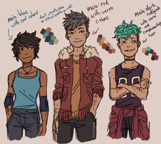
Photo

also bc my NECK hurts and i havent been able to successfully art for a bit other than silly doodles, i guess here is the height chart for that unnamed magical girl webcomic? all 6 protags, baybee! more unnecessary ramblings under the cut
again, yeah, this is a crossover comic, in order left to right they’re from Gravity Falls, Invader Zim and Psychonauts - just with my meddling in fashion choices and me going “what would they wear when they got to this stage of their life?“ i just really like thinking about how people pick their wardrobes and outfits and how that reflects on them. i mean, dippers got on ten layers because he keeps walls up and dib has barely changed from EtF because he’s very stagnant in his identity as a “hero” and doesn’t need to change himself to be loved by others. but also mabel wears overly complex hoodies because... well, she’s adorable, and raz just doesnt change out of his work clothes because it’s easy. (also because his work / occupation is a big part of who he is but shhhh i dont wanna get that deep into it) idk. im just a big nerd abt fashion sometimes.
im not really pleased with the visual style, but this is mostly for reference and colorpicking (hence no lines) so if you totally hate this dont worry its not my usual style, i just wanted it to be simple. god i always hate zim the most when i do a lineup i dont know Why? ?? ? ?
either way, here they are, the characters ive been freaking out abt in my brain since middle school and how theyre gonna b drawn in this silly lil comic.
#generic art tag ahoy!#chr; dipper pines#chr; mabel pines#chr; dib membrane#chr; zim#chr; razputin aquato#chr; lili zanotto#unnamed magical girl comic
22 notes
·
View notes
Text
i yearn for one(1) thing only, and that is to have a nice, simplistic, cartoonish artstyle. an artstyle that doesnt rely on anatomy, but the "movement" of the drawing, if you get what i mean.
i dont want realistic proportions and traditional colors and basic poses and gradient shading, i want funky lil dudes in funky poses with funky styles littering my sketchbook :( but alas i havent figured out how to develop that kind of style yet, my brain wants anatomy to look nice but also i dont want to draw eyes. i dont want to take time out of my day to learn how to draw lips i want to draw a line that extends past the characters face. i dont want all my characters to have pointy chins with curved cheeks i want their heads to be round and friend-like or full of sharp edges depending on their personalities and styles. i want to give them all not-quite human ears, blob feet, simple faces, but at the same time i want enough detail to convey the story or emotion im trying to tell.
ive spent so much time recently agonizing over how to use 3d model websites, using real-life references and tracing over them for practice, color-picking from real images to try and do realism and failing miserably, but you know whats easier than that? funky little dudes. little dudes who do not care if their legs are too long or their hair is too bouncy. i dont want my characters to look human.
ive spent enough time on the artfight website to realize that most people who classify their characters as "human" have the most basic ass designs (no offense to people who like basic human designs its just not my thing) or its like dnd-medieval style outfits which i cant draw for the life of me (ive tried). again no offense to people who actively enjoy and draw characters like that. i just need my dudes to have that certain,,, off-ness to them. tails are cool. wings are swag (especially if they arent even like,, fully attached,, ), elf ears are so wonderful to me no matter how much theyre overused, horns are so much fun to draw, and colors!! i have no knowledge in the color theory department so this works great for me!! the only thing i really know is dont shade with black, other than that i just colorpick from references usually but i dont want to do that!! i want the colors to hurt people's eyes but in a satisfying way. like the character's design is so nice to look at that you dont mind your eyes hurting a bit. like how im enjoying writing this post even though its 2 am and the brightness on my computer wont go any lower.
and then another thing ive noticed from being on the artfight website is that a lot of people classify their characters that are anthro/have anthro features under humanoids/monsters. like i made a google form to find some people to attack and someone sent me in a character with some sort of animal (wolf? idk) arms and legs. like dude!! peak character design i love her. but me personally? i cant draw that shit, its so hard for me. i tried a while back and its just Not my thing. nothing against furries i just. cant. and i dont want to either.
and i got another submission that i accidentally deleted that was like full anthro/wolf-like like my comrade,,, i cannot draw animals what makes you think i can draw an animal who acts like a human lmao. i can do like. very basic tails, and also animal ears but i cant do the arms and legs and such i just dont know the anatomy, and i know i was talking about how i dont want to care about anatomy but i feel like for anthros you really do need to know at least basic animal anatomy so you know how the limbs look and shit and i dont have that knowledge and dont feel like gaining it.
and then there were some submissions that i absolutely adored. there was one that like, was vaguely human shaped but definitely was not a human. they had a dark-ish lavender colored skin and horns and tusks and like goat ears and a sorta fluffy tail with spikes on it and they had wings and such and they were such a pleasure to draw i love them. and they had a fairly simple outfit too, nothing too complicated. and then i also enjoy object head characters, theyre so neato to me. i got one of those and i really wish i had the motivation to work on it cause it looks so fun.
i want to make funky characters but id have nothing to do with them because the only book i ever tried writing (key word tried - never got past planning it out) had strictly human characters in it, and most of the books i read are humans/humans with powers in situations specific to them so id have no idea what lore to make with the dudes. assuming i have the motivation to make lore and backstory because honestly i just really enjoy character designing its super duper fun.
(side note a song about trucks doing the deed came on just now and its interrupted my flow, apologies).
i only have three actual characters right now. one is an original roleplay oc whos design is literally athletic shorts, an oversized long sleeved grey sweatshirt, long purple hair, and demon horns. the second one is my persona whos design some sorta medival knight outfit kinda thing? but not ugly it looks really cool (idk one of my friends designed it bc i won some contest from him but the drawing was on a super small scale so idrk the details,,,) with a plague doctor mask and crown, and shoulder length wavy brown hair, dyed bright pink at the end. and then my last one im not too comfortable using other places because theyre a character my friend is using in the story hes writing, and thats really the only place theyve been used. but theyre easily my favorite and im already writing a ton so ill talk about them too.
they're a sorta elf species thing from another planet, with pale green skin and pointed ears. they also have a tail, its like,, super thin, but with a feathery bit at the end. probably not the texture of a feather but i dont know how else to describe it. they have short, curly, almost-draco-malfoy-blonde hair that when it gets too long they can put in a man bun. their eyesight is kinda shitty so when they got to earth, they were exploring some supply closets around the airship. drop off area. thing. like airport but for rocketships and also fancier. yeah. they were exploring that area and found a nice big pair of round glasses with grey frames. and they also found a cowboy-style hat and a sharpie so they wrote their name on the underside of the brim of the hat and stole the hat and glasses (but left the sharpie in the supply closet).
yeah theyre my favorite, my absolute beloved, my child, so cool. i want more characters like them but with maybe a bit more snazzier designs. theyre super cool and all but they could have more pizzazz if they werent in a story where its too late to give them more pizzazz. i just want to be able to give my characters thigh-high boots with a bunch of buckles and fluffy hair with tons of accessories crammed in and abnormally large and long ears that can harbor many piercings and horns that can hold rings on them and special little details on their outfits like who knows what but i dont have any characters to do that too, so i have to make them from scratch, which is always hard especially when you have artblock.
and i also have like 17 characters i need to fully draw, line, and maybe color for artfight before august 1st. so i dont know. i have many things to do and plenty of time to do it but instead i spend my time halfway watching repetitive youtube videos that get boring or sleeping all damn day because i stay up too late doing things like this or i just do nothing at all and its tiring and frustrating but i also feel nothing about it like theres no consequence if i dont do it besides you know. not doing it, not gaining that experience, not making something i enjoy.
so i should do it but i dont for whatever reason, i think its called executive dysfunction but im not sure. this post started out very differently than it ended and i said somewhere up there that i was writing this at 2 am but now its almost 3. this is so many words why couldnt i have put this energy into something productive
#long post#sorry its so messy but like i said its almost 3 am and i dont want to go back and format all this#i might come back and make it look nicer in the morning#maybe not who knows#i just checked and this is 1.5k words what the hell
3 notes
·
View notes
Note
SO true colorpicked flags r so much fucking fun until u try to do the bi flag with a cat who is entirely gray-brown (gerbilstar)
ok but ANYWAYS . im gonna work backwards instead and start with gerbilstar bc oh my god oh my god i love them i love him so much shes my favorite ever i love her
so gerbilstar !!!!! gerbilstar actually came to be partially bc i noticed canon warriors shitty at best ablest at worst way of handling disabled cats (but thats a story for another time) and i wanted to make a warriors oc out of my pet gerbil which is where gerbilstar got her name
gerbilstar is almost completely blind in both eyes and has been forever but instead of being forced to be a medicine cat she became a warrior and eventually a deputy/leader because of her charisma, strength, and perseverance
shes bisexual and polyamorous goes by she/he/they and she has 3 wives all of whom are featured in the last post (all excluding muddypaw) and she has adopted muddypaw and marigoldpaw !! muddypaw is the token boy of the family and marigoldpaw is the token cis . theyre on thin ice /j theyre very loved and cared for
other than that she honestly doesnt have all That much of a backstory?? shes just chilling with her family and her clan and everyones just vibing isk what else to say GDJAGDKS
heres them again not by me but instead by sneechain on toyhouse
I fuckig love him ohmy god?!??! We love she/he/they pronouns! and oh em gee a poly cat!!!!!! Poly rep is so ! like bro IM polhy!!!
1 note
·
View note
Text
A Little Explanation On How I Choose My Colors
Ok so a while ago i was asked to do a tutorial on how i choose colors! im no professional or expert or anything but i do think explaining how i do things could help someone else! i wasnt sure if they meant picking colors for designs or just for like art and shading in general so ill go over both(this may get a bit long sorry)
-so for designs what i actually focus on the most in my designs appearance wise is color bc i love using it so much! since a bitch needs structure i give each oc a main or base color and base the rest on what just looks good with it i usually go with base+grayscale or base+colors right by it(ie red and orange)
-heres a few to get an idea of what i mean also i included palettes and while i dont use them myself it might be helpful for someone else
-its also helpful to change your canvas color to a color you want to be a base/mood
-now i usually have my sai window something like this:

-i dont make official palettes for anything i either color pick or wing my art bc i do think it helps alot with confidence in colors or something like that (just make sure you dont whitewash characters color pick the skin if youre worried)
-my personal preference is to not use full black/white or fully saturated color(bc most of the time i will be putting an overlay on so that will saturate my pics more) also for my insp swatches theyre from various media that i liked the colors on! if you find something with colors that standout to you color pick them and look how they relate to each other! it really helps to look at the color wheel and then then colors to see how saturation and where on the color wheel stuff is
-now for an image its very important to think that you arent gonna get your base colors right the first time!! when you draw characters more and more you get a feel for what colors you like best just slap on some colors you think will work and use the fill tool to make changes when you see fit!

-small process gif of me trying to pick colors (you can see my unsaturated color bias) but if youre stuck making things coherent for a certain mood like nighttime etc overlays can help!

-a little trick i like to do is put an overlay over the pic and colorpick the colors while the overlay is up then fill them on the layer with the un overlayed colors it will make it darker and weird looking initially but when you take of the overlay those nicer colors will still be there and now you can edit them
-anyways on to the shading! i wont go over form and light sources since that would make this Very long so heres me slapping a bit of colors down its mostly color picking the base and moving it around to get various colors i like its all very spur of the moment and i colors almost haphazardly because im trying to have a bit more fun with it
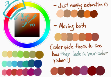
-a neat little trick i use is the zigzag color picking technique(?) its hard for me to explain so i tried to draw out how the movement of my picking goes and provided some palettes so ppl can color pick those to see for themselves now in shading i try to use more Non Realistic colors bc i think they provide a cool pop
-now hair is..even less easier to explain its mostly a gradient shown below and i hard blend it all and then add dashes of various other color using the same technique above

-my technique involves sort of subtle shading and if thats not your style you can definitely use what i talked about to make highly saturated art and if you do shade similarly and are not satisfied with how dark or noticeable it is

overlays are your best friend! just make note on using not very saturated ones because then you can make colors muddy and confusing
Thanks for reading I hope something in here was helpful! Always remember art is supposed to be fun and if you want to go wild with colors you should always do so!!
#myart#mytutorial#long post#art tutorial#i hope.........this isnt too long#also i hope there arent too many like spelling errors i didnt read overthis#i hope its helpful! art is about taking techniques u like and using them
277 notes
·
View notes
Last Seen Blogs
purenonsens
GWIAZDOLOT

wekawaiiladystudentme-blog
Untitled
southwarkhandyma
Untitled
i-need-friends-plz
Ian the Impaler

slyfoxann544
constantly hyperfixated