#this is also experimental/stylistic as well!! had fun!! nice to just draw something in one day and not worry. leaves me tired but...
Text
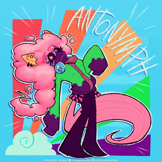
i'm the antonymph of the internet
#how many tributes to this song will i make in my life#MANY ! it literally changed my life and means a lot to me. i love antonymph and vylet pony's music is worth checking out - please do.#unsupervised internet access as a queer neurodivergent kid anthem !!#i chose to do misty since we all know i like drawing her in experimental pieces and putting her in outfits. she also has art in a gir hoodi#from the clash team in treasure trove!! :D#this is also experimental/stylistic as well!! had fun!! nice to just draw something in one day and not worry. leaves me tired but...#haven't done a nice piece like so in one day in a while!!! i'm very proud :] it's a fun one#anyways... both a little tribute to the song and misty as a character#ihave so many thoughts about misty even if i dont talk publicly on them. shes a very interesting character to me and i care about her so#much. i compared her to fluttershy in the past - and realized that if i liked ttcc as a kid she would've been my favorite.#fluttershy on her own meant a lot to me as a child. including mlp itself as it's one of the core things that got me into drawing art online#a lot of my analysis on misty and headcanons at least on the more emotional scale do come from a bit of projecting but...it makes it more#fun to me when i can put myself into the shoes of a character like her who i already relate to. rrghh too bad im scared to talk about her#too much in nuanced detail in public since some people are... not so nice about her. though i know the tumblr audience is nice and unders#standing!!#anyways from me just having fun being me#i let misty have a little bit of fun... something i think she would possibly enjoy? i do see her as someone who gets nostalgic#and is stuck in more childish things and matters. she wants to play ip dip with you...its very sweet to me. letting myself and her be#confident through a song that means so much to me is kind of powerful to me. i had a lot of fun making this drawing.#anyways. love this song. love ttcc. love mity /p. be swag and be self indulgent and have fun. you can do anything u want forevah#toontown#toontown corporate clash#antonymph#guz art#rainmaker
53 notes
·
View notes
Video
youtube
Great Albums is back! This week, we’ll take a look at one of the greatest electronic albums of all time, Kraftwerk’s The Man-Machine, and try to avoid getting sued by Ralf Huetter! Full transcript for the video can be found below the break. Enjoy!
Growing up, my main genre of choice was 80s synth-pop, and while the deep influence of Kraftwerk is as significant there as it is everywhere else in electronic music, I was one of those people who initially saw them as somewhat "intimidating." Today, moreso than ever, Kraftwerk are held up as one of those more high-brow or cerebral groups with a philosophy that transcends mere pop or dance music, which makes them seem respectable, a kind of “model minority” in the world of music outside rock. While I don’t buy into the judgmental quality of that sort of praise, which damns so many of Kraftwerk’s greatest fans and imitators, I did get the sense, as a child, that these hoity-toity Germans, working with primitive equipment way back in the 1970s, might not be what I was looking for in a new favourite band. That was before I heard The Man-Machine.
While it’s certainly true that Kraftwerk were a highly experimental band in their own time, they’re one of those acts whose ideas have deeply permeated contemporary music, to the point where their actual work is extremely approachable and listenable to today’s ears. Of all the fairly early electronic acts, who started making this kind of music before it began to become mainstream in the late 70s, Kraftwerk are almost certainly the ones people nowadays listen to for pleasure the most, and that’s no accident. While their earlier albums like Trans-Europe Express took more overt inspiration from classical music, The Man-Machine was their first great foray into the arena of pop, which I think is key to why it resonates with people. For evidence of that, look no further than the biggest mainstream hit of Kraftwerk’s career, “The Model.”
I think it’s easy to see why “The Model'' became a hit single. Sure, it may not have the most traditional pop song structure, let alone instrumentation, but unlike a lot of what Kraftwerk had done before, it’s got a lot of lyrics and a real sense of narrative. Plus, that narrative we get is about a person and not a machine--a good-looking person, in whom the narrator is sexually interested. It’s the perfect pop material. Of course, I would be remiss to mention that “The Model” didn’t achieve all of its success until the single was re-released in many markets in 1981, and in those few years, the idea of “synth-pop” advanced significantly in the charts and popular consciousness. By the time “The Model” was a hit, Kraftwerk admirers were already taking over: look no further than Gary Numan’s "Cars” or OMD’s "Enola Gay,” two synth-pop classics that, it must be said, are still about vehicles!
That aside, though, not everything on The Man-Machine sounds like “The Model”--in fact, it’s surrounded by tracks that have much more in common with Kraftwerk’s earlier LPs. Literally surrounded, in the track listing. I think that adds to this album’s appeal as an ideal entry point into their catalogue: it has some things that sound familiar, while also preparing you for what else you’ll encounter if you choose to probe deeper into the band. The Man-Machine has the least homogeneous profile of any Kraftwerk album. While most of their other classic albums are highly cohesive “song cycles” that almost blend into one long song when you listen to them in full, The Man-Machine doesn’t really have those repeated melodies and motifs that tie its tracks together. While many people, especially fans of psychedelic and progressive rock, really like those cohesive albums, I think this change is a welcome one. It gives the individual tracks a bit more room to breathe and express distinctive identities, and makes the album feel a bit more pop, even if the material itself isn’t always all that poppy. *The Man-Machine* actually only has six individual tracks; they range in length from the three-minute pop stylings of “The Model” to the urban sprawl of “Neon Lights,” which luxuriates in an almost nine-minute runtime.
Given that the average track length is around six minutes, I’m almost tempted to think of The Man-Machine as six tiny Kraftwerk albums, or at least, musical ideas that could have been expanded into full LPs in another universe. “Neon Lights” and “Spacelab” feel dreamy and easy-going, with floating melodies that draw from the “cosmic music” scene, one of the many emergent styles that began as something uniquely German and spread throughout the world--in this case, becoming an important forerunner to ambient electronic music through acts like Tangerine Dream. Meanwhile, the hard, tick-tocking rhythms of “Metropolis” and the title track point to the newfound focus on rhythm and the so-called motorik beat that made the music of Neu! so compelling.
The Man-Machine can serve not only as an introduction to Kraftwerk, but also as a sort of crash course in this entire period of electronic music, showcasing some of the most distinctive and influential features of the German scene, as well as the shape of synth-pop to come. It’s a complex and busy historical moment with huge ramifications for almost all of subsequent electronic music, and The Man-Machine really creates a microcosm of that whole environment. There’s also the fact that each side of the record has one track from each of my three broad groups, like an expertly-designed sushi platter or charcuterie board for us to sample from, and they both follow the same formula: a pop appetizer, a cosmic *entree,* and motorik for dessert.
*The Man-Machine* also has what is almost certainly the most iconic cover of any of Kraftwerk’s LPs. This is how lots of us still picture them in our minds, and it’s inspired tons of parodies and riffs over the years. I think all of that acclaim is deserved! Emil Schult’s graphic design for the album was heavily inspired by avant-garde Soviet artists of the 10s and 20s, chiefly El Lissitzky. These visual artists used their art to express their hope for a new world, defined by the promise of technology, and their literally revolutionary philosophy--so what could be a better match for Kraftwerk’s electronic revolution in music? Lissitzky used bright, primary colours, straight lines, and geometric shapes to convey the “built environment” of modern cities and man-made architecture, and you’ve got all the same sentiment on display here. The use of strong diagonals really draws the eye and lends this image a lot of continued visual interest. It’s also worth noting the extent to which Kraftwerk’s aesthetics inspired later electronic acts almost as powerfully as their sound. When you picture an electronic band, and get a mental image of stiff and stone-faced musicians behind synthesisers wearing shirts and ties, you can certainly thank Kraftwerk for that, as well.
I also love the title of The Man-Machine! The relationship between people and technology is one of, if not the, most central themes in Kraftwerk’s entire discography, which is full of references to anthropomorphic machines as well as mechanically-mediated humans. The particular choice of the phrase “man-machine,” as opposed to words like “android,” has a fun vintage flair to it, which matches the use of early 20th Century visual art quite nicely.
As might be expected from the album’s stylistic diversity, *The Man-Machine* would prove to be something of a transition point in Kraftwerk’s career. Their 1981 follow-up, Computer World, would return to the song cycle format, but with increasing emphasis on ideas from the pop sphere, championed by percussionist Karl Bartos. By the time of the last classic-lineup Kraftwerk LP, 1986’s Electric Cafe, they had not only amped up the pop, but also incorporated influence from the electronic dance music of the time. Ultimately, Bartos would leave the group, chiefly due to discontent with his treatment by founding members Ralf Huetter and Florian Schneider-Esleben, and their persistent lack of musical productivity.
On a somewhat lighter note, my personal favourite track on this album is its opener, “The Robots.” Per my typology from earlier, I classified this as a pop-oriented song, and it certainly is an approachable one that’s proven to be quite popular. But it’s got just enough more experimental touches to keep things quite interesting. From an ominous, dissonant intro, a slightly more pop form, hinting at a verse/chorus structure, soon emerges and contrasts. I love the groove of the rhythm and percussion here, as well as the very heavy vocoder, rich in texture and certainly a Kraftwerk staple.
While the lyrics can be read as sort of light and silly, I like to think that the robots in question might also be dangerous. The track “Metropolis” seems to reference the seminal 1927 silent film of the same name, which is famous for its portrayal of an evil, mechanical doppelganger. Likewise, the choice to translate the lyrics of the song’s interlude into Russian is likely inspired by another great work of art from this era: the stage play R.U.R.--Rossum’s Universal Robots. Written by Karel Čapek in 1922, it’s the progenitor of the “robot revolution” trope in science fiction, the source of the word “robot” for autonomous machines in almost every human language, and one of the first entries in the illustrious career of an author who helped make Czech a true literary language. While the titular robots take time to assure us that they’re programmed to do what we humans want, should we really trust them...?
14 notes
·
View notes
Photo
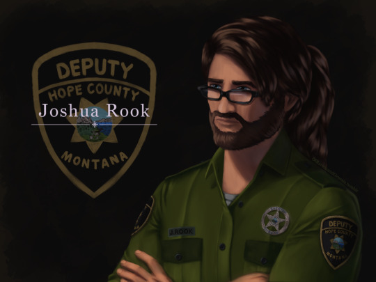
IT IS FINISHED no seriously, this took ages. First couple of days were fine and motoring along with progress, then I was laid out for a week-ish with health problems. Then once I was well enough again I was back to being fixated on finishing this piece of my lad Joshua here for another handful of days, so I’m super glad this is done now.
More talk about the painting, details and process under the cut:
Art Entry 01, Joshua Rook, Junior Deputy of Hope County. Regarding the painting’s execution, stylistic choices, practiced methods, and speculation on further experimentation for skill and stylization.
_____________________________
Honestly I thought that the uniform’s large swatches of green fabric would be more difficult than it actually was. Turns out that was the easier part compared to the shoulder patch and metal badge. x’D The metal badge design is based off of and inspired by a custom-ordered cosplay badge design I found while looking for references, in this post here (link,) from v-i-d-e-n-o-i-r’s blog and Far Cry 5 cosplay. There are some differences in the painting’s rendition above, namely I flattened the middle section and made it all concentric polished metal instead of painted and the great seal rendition in the middle doesn’t have silver lineart either. Those choices are as much for aesthetic reasons of eliminating the blue ring so it was all a fairly simple mono-material-looking surface as it was for simplifying having to forego painting the foreshortening that a spherical dome might entail. Also just because the rest of the metal turned out looking good enough that an additional bit of shiny metal seemed like it’d fit right in for this. That being said, the badge design that inspired this one is rad and awesome looking—and I totally didn’t realize it wasn’t quite like the badges from in-game assets until after I’d painted it. x’D So, I decided to stick with this one since it’s simpler and has cleaner lines, and less engraving to pick out highlights on. Metal is very hit or miss for me to get right, so I’m very pleased with how this one came out! :D I think I did well on that one.
The shoulder patch originally I was looking at real world references and ended up changing the shape once I actually looked at in-game references on Staci and Joey—who I discovered have slightly different details on their uniforms, like the font for their name tags—Staci’s has an old-timey-looking-font with serifs, Joey’s is a non-serif more modern-style font. Some pictures have them having different buttons on their uniforms either in color or shape (the former being exported assets, the latter being in-game gifs/screenies/etc.) This is also how I learned that the little landscape with the shovel, pickaxe and plough/plow are part of the great seal of Montana. I had no flipping idea that was what it was, looking at the patches in-game. The cosplay community does some great work for that, for which I’m grateful. I ended up looking up references of what the state seal’s design was so as to see the smaller details, and to find out what the motto meant ”Oro y Plata,” meant, leading to etymology googling adventures from there, as usual. All important details to paint though I think here, since Joshua’s deputy uniform is symbolically significant to him and will remain so throughout his story as part of his internal conflict for a couple of reasons.
One thing I knew I should’ve done from the start, and reminded myself to do, was the fact that I should paint all skin sections at the same time, so as to ensure they all came out the same shades. I did not do this. x’D I’ll have to actually try to do that next time honestly. Same with the hair sections, while I like how they came out, I do feel the differences between the three major segments in terms of brushwork is not as coherent as I’d like, even if beard hair is not necessarily similar in how it lays to scalp hair, particularly with length and such taken into consideration. Still, not bad. Could’ve used more refs for the backlighting and figuring out how the highlights would fit best on the ponytail, but I think the hair curves turned out nice there in particular. Overall, Joshua’s hair ended up messier than I’d thought with how the locks all end up looping this way and that across his head, but it does actually fit him well as a character for his hairstyle to be messy and loosely held together, but functional. It did end up longer than I’d intended, so we have him likely ending up with a nerdy Jesus hairstyle when it’s down. x’D (Thanks to @undead-gearhead for that mental imagery, I shall take great amusement in that should I get around to drawing Joshua with his hair down.)
Aside from that, I think I’m slowly improving on figuring out how to paint glasses, though I’m thinking in the future I should test more layered reflective light on them or something where the frames are in contact or close to skin, particularly around the glasses’ bridge across the nose and such.
Then there are the other deviation details added—like using dark green instead of the black for the uniform accents. The faded black looks great in-game, but I do think the buttons pop more against dark green instead for this painting. I’m a little bit surprised how well the button-placket section came out, Clip Studio Paint crashed when I painted the first rendition of it, sadly losing all that work. I thought it’d be okay but turns out it didn’t quite get to auto-save that recently enough, but the second go around turned out quite well I think, possibly better. I was originally planning to try to put more textured brushwork across the flat sections of the uniform material, but decided to skip it for speed—I’ll test that elsewhere perhaps, though I think it came out well with the watercolor brushes layered on top of one another like that as is. Among the other smaller details, there’s some tweaks and such for how Joshua’s eye shape, eyebrows, nose shape, hairline etc came out compared to references of Greg Bryk in his role as Joseph Seed. I think Joshua did come out looking like he’s obviously related to the Seeds as I was hoping for, but I’m kind of on the fence that people would look at him and automatically assume it’s Joseph specifically that he’s descended from. I hope so, but either way, that’s how he’s written in-fic. x’D
Overall, I would consider this painting a success, though as usual I do wish it’d been faster to finish. I do think this was good practice for detail work, and metal shading, also: buttons. Still haven’t figured out how to paint lips with more pink or red tones, I don’t like the way they look when painted sadly, unless it’s lipstick. That may end up being a stylistic element perhaps, along with how I paint the lines for fingernails and other such details. Fun fact: I have to leave the shading on the eyes for last, or else my brain goes “The eyes are done! We’re done! Call it a day.” I’m not sure why, but so far, leaving them as flats until the end seems to work a treat for keeping me focused on finishing the rest of the work with less mental dissonance.
Now if only I could figure out why despite knowing I should do all the exposed skin portions at the same time, I don’t follow through on that naturally as far as inclinations go. Maybe it’s a layer organization thing and perception of wanting, say, the cloth to be done first before working “down” to the hands and such in the sense of working from the head down? I’ll have to think on that some more and test things in the next painting. Perhaps color coding the order of layers to paint will help? CSP does have a nice layer-icon-color function that I’ve dabbled with here and there. There are so many brushes, I really do need to test out more of them, I use, what, four or five total, but primarily somewhere around two or three. Hm, but what to do with texture, and how to utilize it so?
Hmmm, as far as personal appeal for methodology goes, I might prefer to use textures in select pieces for more emotional emphasis? If I can figure out how to do that in a messier speed-paint style of things. Rougher textures for conflict, for example. That sounds like an interesting idea to explore, I’ll have to remember that for a later piece. Maybe more heavily textured brushes will also help with the mental itch to refine things to a cleaner-level of refining instead of leaving it in a more organically rough state. Hm, maybe it’s a “mental texture” aversion or something, as far as an interplay between the brush’s texture and the flow of the linework/brushstroke. Perhaps more uneven brushes echo that in a complimentary fashion to better allow less mental discomfort for me personally when trying to paint in a faster, looser fashion?
Honestly, very tempting to go try that out sooner rather than later on some art ideas I have, but I’ve been missing my writing very much of late with two time-demanding paintings back to back. So, ideas for a later time to experiment with.
#Far Cry 5#FC 5#Far Cry 5 AU#FC 5 AU#deputy joshua rook#my art#ofravensandgenesis's art#art talk#chatter#writing about art#writing about fanart#queue
23 notes
·
View notes
Photo

This is about 5 minutes early, but since I’m gay going waaay tf out of town in two days and won’t be getting back until after New Years, it’s basically the end of the year for me bye.
My own thoughts on this and some honorable mentions bc I actually have those this year below the cut rip mobile
As far as like. style and anatomy and all that good stuff goes that’s easier to notice, I don’t think I improved all that much this year. I don’t think that’s necessarily a bad thing, I think my art’s in a pretty good place that I kinda like rn.
What I noticed while going through all these though was 1) I drew A Lot more this year in general than I did last year, and a lot more of them were full-scale pieces with at least simple backgrounds and/or shading, 2) I tried a lot of funky things like limited palettes, playing with line weights, and experimental shading, 3) at least those pieces from May thru July, all three of those winners had at least four characters in them and interacting in some way, and that July piece had a grand total of SEVEN full-body characters in a full environment, and 4) looking at this spread, literally every single one of these drawings was one I had so much fun making and that’s not something I could’ve said about last year’s summary. So no I don’t think I really improved much stylistically, but I’m doing more and I’m going harder and I’m having a blast in the process and I am so proud of myself for managing that because it’s new for me to love both the process and the products of my art, and I don’t think it would’ve been at all possible without the support that I have now, so thank you guys for that, I hope you know who you are, and if you don’t, I’m probably already in your vents for your other crimes so you’ll know soon enough.
On a related note to me being proud of myself, this year was also new for me in the sense that I had an Extremely hard time deciding between multiple pieces on more than three of the months. So here’s some honorable mentions that didn’t quite make the cut but I’m still proud of regardless:

A little about these and why they didn’t quite make it onto the actual meme:
January: I really like this one because I was trying some new things with it and I think it looks really nice; I used a new brush on the highlights, it’s got a full brackground, I made it with one of the most limited palettes I’ve ever worked with, and it’s overall pretty close to my heart for reasons. Unfortunately, it didn’t quite make it as The jan. piece because even though it was ambitious, I think the Jackie drawing was even more ambitious and also higher quality; it’s more detailed (especially the shading), I went to town on the foreshadowing at least in the sketch even if I’m not sure how well that turned out in the final, and I intentionally forced myself to use as thin of lines as I possibly could just to get out of my comfort zone, and I am unbelievably proud of the results, I still feel like it was one of my best pieces this year as a whole.
March: This one was so hard because I felt like the pieces were pretty similar quality, both with partial backgrounds and experimental shading, but I went with the Bubbles pic over the Jackie one because I felt like it’s just more interesting overall; the pose is more energetic, the shading is wildly unconventional, and there’s a lot more contrast that makes it pop. That being said, the Jackie one is still a big fave of mine personally, the aesthetic really fits him as a character.
November: This one was more of an experiment with posing and linework, but even though I really like how it turned out and there’s some characterization reasons that make it even cooler, I just don’t feel like the shading is as good as it could be because I kinda rushed that part so even if it looks nice it’s not as detailed as it could’ve been. The Undertale piece on the other hand was me tackling subject matter that I’m not used to and the shading was partly me experimenting with the angle of the light as well as an aesthetic that I wanted to play with by having it look softer than usual despite it still being cel shading, so it ended up winning out.
December: Mother of god this was probably the hardest choice of these four, but in the end I just decided that the Mumble piece was more ambitious. The character wasn’t anything special but the bubbles were new territory for me and figuring out how to give them dimension tastefully was a challenge that I just had to throw at the wall and hope went well, and I think that the result is pretty nice considering. The BATIM piece still looks really great in my opinion and I’m proud of it too, but I didn’t really challenge myself with it at all, it was some characters and techniques that I’d already done before and I just drew it for fun rather than to branch out at all, so even though I’m still really happy with it and had fun drawing it, it didn’t quite make the cut.
That’s Everything I have to say pretty much, so if you read all that wow thank ya kindly HGDUILHGSDUIHGDUILSHGDUIS
Happy Holidays Ny’all uwu
#tw: body horror#only mild tho tagging just in case because of the august piece#anyways#mumble draws#art summary
2 notes
·
View notes
Text
Anime Styles- Why unique styles, new and old, can make for a better overall anime experience.
Hello, I’m back from the dead with a rant. Recently, there have been a lot of posts floating around Tumblr about anime styles and why “old anime/new anime is garbage because of these stylistic choices” which usually have something to do with the obsession with nostalgia, or the abhorrence to the old, or even… *sigh* the push of the anime industry appealing to pedophilic otaku. It’s complicated and watching these posts float around and continue to gain more interesting discourse and additions to it had definitely made me want to share my views. Oh, not on that argument-- just on style. I have eclectic tastes in anime, and I’ve been watching anime for a long time. In my free time, I even go back to watch shows as old as 30, or as young as five years old, because first and foremost I am interested in the story presented. Once you layer upon that character designs, a cool soundtrack, and yes, good animation, the show becomes deeper and more interesting.
I don’t limit myself to one single style or genre, because without that I’m unable to see the historical and cultural effects all anime has on the industry and what’s coming out that’s new. When I first watched anime, it was 90s anime: Sailor Moon, DBZ, Yu Yu Hakusho, Pokemon, and Card Captors were a few. Stylistically, those are COMPLETELY different anime, but aesthetically, they all fall into the same vein of what’s now just “90s anime” with their more matte tones, cell shading, and exaggerated shonen/shoujo styles. Instead of just going by genre nowadays, there are many overlapping styles in several different types of genre anime. For instance, you may have an anime that bleeds stylistically into several genres, while it may not resemble many other anime in that same genre.
What’s wrong with these posts coming out is that they’re cherry-picking terrible examples. They’re choosing THE BEST (not really) of 80s/90s nostalgia anime, and then the most generic of generic modern anime, or vice versa. The moral of the story is style is a fluid thing, that may have a major influence on any particular era of animation, but every era has their good and bad examples, and cherry-picking is *stupid*.
What I want to tell you is that if you start looking, you will find cool anime with styles that entirely subvert the genres you’re most used to seeing. Shows with styles that you might be surprised to see, or maybe even turned off by, but you should totally watch, are shows like Katanagatari, The Eccentric Family, Tatami Galaxy, Dennou Coil, Flip Flappers, Gatchaman Crowds, Kyousougiga, and Little Witch Academia. These shows are good, not only because they’re well written, epic at times, and even because they might be a little weird. It’s because their styles and breaks from convention are much needed, refreshing perspectives on visual story telling.
I love these shows because they look so damn good. Simplistic art styles and character designs allow for more crazy and nice looking animation. Even stuff like giving different faces and body types to the characters allow them to be expressive and emote more. The shows I picked out earlier all have cool stuff. They have cool character designs that vary, sometimes to the extremes, interesting experimental animation styles, and varied and beautiful settings where the characters aren’t just superimposed into a boring background they don’t quite fit into.
The is done more elegantly in shows like Shingeki no Bahamut, Fullmetal Alchemist, and My Hero Academia, where the variety in body type, exaggerated emotions, and a variety of palettes and settings allow for more variety. Even just a variety in character designs, like what we see in MHA, make for a wider audience appeal than Moe McBigTit Sameface who has existed in anime FOR DECADES MY GUYS. MHA’s variety in designs make for more body types, more color palettes, more expressions. I was so glad to watch the first ED for season two where the main girls of class A are all side by side and they all look so different in height the way their eyes and mouths are set, not to mention THEIR FACE SHAPES ARE ALL DIFFERENT. Stylistic choices like character design, even down to making a very stylized silhouette can make for a unique anime. Anime like the Eccentric Family and Tatami Galaxy (both by the same author, but by different animation studios) just showcase the character designs in their opening themes because they’re so damn good. They draw in the viewer, who in turn, is excited to see these static, but interesting, designs animated.Sometimes I feel like some animation companies take some of their designs too far, and too anime, if that makes any sense, by pushing the envelope on “here’s a special boy” haircuts, and obnoxiously colored and cut clothing, but some show use exaggeration to their benefit, like Shiki and especially JoJo’s.
Nothing pisses me off more than a cool, aesthetically pleasing anime, with an interesting premise getting thrown into a boring and plain looking school setting, the biggest offenders being Owari no Seraph and Makai Ouji. Also, nothing makes me want to rip my hair out like taking COOL looking character designs and neat world building and dumping ugly on it, like how Rokka no Yuusha tossed its Inca inspired setting into FUCKING FOG FOR 10 EPISODES. One of the cardinal sins that I try to avoid nowadays is the high school anime. Occasionally a show like Orange or Tanaka-kun is Always Listless will catch my interest, because they do something interesting with that boring setting. The anime needs to be set in a high school if it is relevant to the plot. You can have characters of high school age, like in Natsume’s Book of Friends, or Yu Yu Hakusho, but the story isn’t set in high school. Shows like Myriad Colors Phantom World, or your typical Run of the Mill™ high school anime, find themselves trapped in a land of boring settings and endless tropes, whereas anime like My Hero Academia and LWA not only use that school setting as a theme, but they make it into something interesting and new.
Smear frames are also becoming more common in anime, as they were originally in traditional western animation. Smear frames make for smoother, more fluid looking animation, and really fun expressions, like we see in Little Witch Academia and Mob Psycho 100. This is also thanks to simplistic character designs. You don’t have to worry about a character being a block of on-model pretty boys with lips flapping, or worry about making them ugly when they start doing action sequences. Simplistic character designs lend themselves to better animation, and more interesting characters.
I think I’d like to showcase Kyousougiga especially for its interesting style choices. Every character looks wildly different, even the background characters. Each scenery set both feels bizarre and otherworldly, yet lived in and nostalgic. On top of all of that, this anime does a disgustingly beautiful job of balancing its animation, story, style, and tone. You’d actually be doing yourself a disservice by not watching this anime at least once, just don’t watch episode 0. It has nothing to do with the anime and will only confuse you.
No matter what anime comes out, or if you’re more into new or old stuff, there’s always something that is stylistically challenging the norm. There’s always a show out there that’s overlooked because it’s style isn’t “pretty” enough or it looks too out there. Always take a chance on anime that isn’t quite your aesthetic if you want to find truly interesting shows.
#katanagatari#eccentric family#tatami galaxy#denou coil#flip flappers#gatchaman crowds#kyousougiga#little witch academia#anime#anime styles
7 notes
·
View notes
Text
‘Mugen’ Analogue Experiment
In this session, I’m creating a flashing character design walk cycle, inspired by the works of animator Oscar Barany.

In response to my research into freelance animator Oscar Barany, I wanted to create a flashing character walk cycle, inspired by his ‘Mugen’ example.
The sequence is essentially a one-man exquisite corpse of exciting and rich character designs, drawn digitally in photoshop. Oringially, I had assumed the artist used the program to create the actual animation, but after chatting online, I found out that this wasn’t the case. Barany created a normal walk cycle in After Effects, using a character rigging tool named DUIK. ‘Once I'd got a nice looping walk cycle I rendered it out and I put that into photoshop and redrew each frame using the walk cycle as a guide.’

It Never Ends. (2017). Oscar Barany. Mugen.
I asked why he chose to create a walk cycle of this experimental nature for the project, if it was a stylistic choice or out of budgetary reasons. The artist chose a walk cycle due to limited time he had in which he could create a visual that would have ‘a lot of impact’. The project had no budget, Mugen was a music experiment from the start and so Barany was working on the sequence alongside other work. He used different styles for each frames because he wanted to ‘use it as a quick illustration challenge, and as an excuse to test out a load of different drawing styles’.

Oscar Barany. (2018).
Looking at the animation, I can see this. There’s a range of experimental character designs but they alll evidence new approaches and drawing styles. They’re all digital illustrations, of course, but the approach to character is different every frame. The collective used the different frames for different single covers out of economy - ‘the creative director realised we could use the different frames separately, so they were used in various campaigns for the project’.
Finally, I mentioned how I’m asking animators in the industry for an opinion of my work. ‘Looks like you’re on the right track practising walks, deffo read through the animator’s survival kit there’s a wealth of knowledge in there. A lot of people start with the feet and legs, and then do the rest after’. Here, Barany suggests that a walk cycle is a great challenge to start with, and the work I’m creating is interesting, atleast. His last comment, though, is something that I’ve never considered before: animate the legs first, and then add the torso, arms and head. This allows us as animators to focus on the leg and foot placement first, and then isolate the other parts.
What I find the most exciting part of Barany’s walk cycle is the very concept of it. Having the animation feature variations of a character design isn’t something I’ve seen before, and it’s very visually stimulating and engaging to us an audience. The flashing character designs asks us to pause the video, and appreciate each one. It’s almost like a challenge for the viewer, and that’s inherently engaging and fun. The flash of colours and styles give the animation a lucid feeling, matching the overall tone of the track It Never Ends very nicely.
I’ve already explored this digital, clean approach to character designs in my FMP, looking at my experiments in Character Animator for example. In response to this research and analysis, I wanted to create a flashing ‘mugen’ style walk animation, but challenge myself to use a range of traditional, analogue mediums and materials.
The process began, however, by creating a simple walk cycle using Photoshop. Like Barany, I wanted to create a looping walk animation that I’m happy with and then use these as a guide for the final frames. It was important that this walk possessed a different character from my other experiments, however, so sketched a few designs in my sketchbook. These were simple thumbnail sketches just exploring potential shapes and proportions, settling on a large, circular body, small head and long legs.
I wanted a design that contrasted my Michael walk animation in shape and proportions, and this did just that. Happy with this basic design, I moved into Photoshop and created a quick walk cycle, using my understanding of the movements that I’ve been able to grasp through my FMP. For the walk, I’m using a traditional frame by frame animation technique, just on a digital workspace rather than punched paper and a Lightbox. I’m not worried about any character design or perfect line quality here, just about getting a smooth walking motion that I can then use as reference.

Oscar created the template walk in After Effects with a rigging tool, but here I wanted to develop on from my photoshop animations and continue with the hand-drawn, traditional technique.

Whereas my Character Animator pieces were reserved in movements, with Michael having his hands in his pockets, and my stop motion tests showing a rather slow and tired character - I wanted this walk to have an excitement to it, almost like a leap from each step. It’s quite a smooth motion, but I was able to create this dramatic effect through empathising the extreme poses so my character raises his foot very high off the ground.
With this completed, I exported the animation frame by frame and printed these off, to use as a guide. Before jumping to the animation stage, I wanted to explore some potential ideas, materials and styles for the frames. In my sketchbook, I created some quick sketches of my character in different drawing styles and materials, sticking to a primarily analogue approach.

I found the crayon and charcoal sketches to be the most interesting here, due to the textural quality of the medium. In this animation, I wanted to create a clearly hand-drawn aesthetic, and I think embracing the obvious mark making style of these naive materials will help me to achieve this.
After setting a Lightbox up and some paper, I began re-drawing each frame, in a variety of styles, mediums and drawing approaches from biro to oil pastel.
In this process, I was able to create frames using traditional drawing styles using pencil, biro and finaliser, but also more experimental technwieus such as continuous line and charcoal markings. The point of this was to work fast, treating it as an excuse to play around with drawing tehcniwus and mediums that I’ve neglected to explore so far in this project. The purpose was to explore a range of drawing processes and mediums, and embrace the textural quality in comparison to the flat, minimal character designs I’ve already created.


I was able to record myself creating these frames, as a way to visually document the process instead of discussing each one at length. Personally, though, I feel like the oil pastel and charcoal frames were the most visually exciting and interesting, due to the inherently textural quality of the material. There’s a physicality to the medium that I’m really engaged by, and it’s this grainy, visually rough aesthetic that communicates hand-drawn and ‘analogue’ the best, I think.
Having produced these, I then scanned each of these into Photoshop, cleaned them up using a simple Levels edit and compiled them into a frame by frame sequence. This was the result, a collective walk cycle exploring a range of analogue mediums and materials.

The textural quality of the animation is what stands out to me as the most important element of the sequence. If we compare this to my digital animations, or my zoetrope experiments, there’s a rich physicality to the marks I’m making here. It’s what has the most potential, I think, in terms of development.
The flashing character designs work well, with the audience still being able to understand the character’s walk cycle. It’s an exquisite corpse of character designs, analogue materials and styles ranging from a crayon-coloured superhero to a loose charcoal sketch. The flashing character designs work to make the animation visually engaging to the audience - it hooks your attention straight away, and asks you to take a closer look at each one. I’ve been able to successfully convey the ‘leap’ walk from my digital reference, and the animation loops smoothly.
Fellow student Jack mentioned the effective quality of the animation, and how it successfully represents my project as a whole. The experimentation of analogue drawing materials is something I’d neglected to do until now, and the use of oil pastel and charcoal is something he identified as exciting and visually quite engaging. This is something I wanted to explore - up until now my animations themselves have been singular pieces, which I want to curate into an exquisite corpse. Here, however, I wanted to take a more simplistic approach to the idea, putting a focus on the walk whilst also being a frankensteins-monster of character designs.

The sequence, though, isn’t without it’s problems. The most glaring issue for me was the brush frame, which juts out from the others due to the bold and large brush strokes. It’s a little jarring, I think, and the blend of a digital Illustrator-based frame doesn’t really fit with the sequence. On the whole, though, its quite entertaining and the walk animation itself is successful. I’ll be using this in the final animation, and the textural quality of the oil pastel frames inspired me to explore the medium further.
As a development of this animation, I sat by the beach and produced a series of quick observational sketches using the material. I’ve been told to draw people at cafes, but I’m not quite that confident yet, and drawing people down by the beach has brought me success already in my FMP, so I thought I’d continue.

The sketches aren’t realistic - there were no green or red people walking down the beach - I was focusing on their body shape, proportions and poses mid-walking. It was a way to continue to explore a walk, but also get inspiration for more character designs - drawing from life in the process. The sketches I created aren’t accurate to life, but they serve as an interesting document of the people I’ve seen, to refer to for character designs. From this, I was able to capture a range of shapes, sizes and proportions and was developing on the rich textural quality and bright, colourful nature of oil pastels as a medium.
Having created those, I then produced a walk cycle using just oil pastels, using the same walk cycle as reference. It was a quick process, but I feel that transitioning from this sequence to the flashing design animation would work well when compiling a final reel. The bright colours evoke a childlike sense of creative, fun and life with clear mark making and rough, granular texture that we as an audience can almost feel.

The combination of these two sequences creates a singular exquisite corpse in itself, flashing between varying character designs and drawing styles whilst also bringing focus to the walk itself. It’s an entertaining piece of animation, challenging my digital predisposition in place for a textural, experimental and naive appeal.

The purpose of this session was to explore experimental materials and drawing mediums, and create a more exaggerated walk cycle animation in the process - responding to Oscar Barany’s ‘mugen’ example. In the process, was able to talk with the artist about his approach and the Mugen Project, explore oil pastels as a drawing medium for quick observational sketches and produce a sequence that effectively represents my project as a whole.
This session was about me putting a heavy focus on analogue materials, and experimenting with different drawing processes whilst also producing an animation. It’s something that I’ve somewhat neglected to do so far in this FMP, sticking to pencil and pen for the most part. Having looked at oil pastel amongst other mediums, and created an animation with a rich textural quality I’ve been able to do just that.
After speaking to Barany about his process, I want to explore Adobe After Effects and character rigging within the software. It’s a digital animation program with a completely different approach and mechanics to Photoshop or Character Animator - and it’s a program that I’ve always felt a little intimated by, due to the extensive controls and user interface. After speaking with Oscar about using the software for a walk cycle, however, and discussing with my tutor about rigging characters using After Effects, I want to challenge myself to learn the program, in an attempt to ready myself for the industry.
After Effects and motion graphics are quickly becoming the standard in commercial animation, and even narrative-based animations from studio Animade. My next move is to play around with the software, and attempt to create a walk cycle exploring a new approach to animation.
Producing these analogue animations has resulted in some exciting pieces here, however, and I want to look further at traditional animation as a process before I continue with my digital exploration into new software Adobe After Effects.
Actions
Explore traditional animation further, create a sequence using punched paper and a Lightbox
0 notes
Text
Bad at Sports Sunday Comics with Tara Booth
By Krystal DiFronzo
Tara Booth’s work is an assertive clash of color that depicts the most humbling and sticky situations. Some relatable moments include trying to pee while wearing a romper, cutting bangs into near oblivion, and stoned Amazon shopping (with the resulting surprise package hangover). My first introduction to Booth’s comics were through her Tumblr back in the golden age of cartoonists using that platform. Since then she’s had her work published by kuš! and Colorama. She regularly posts comics and in progress work on her Instagram @tarabooth.
Krystal DiFronzo: The first thing I noticed about your comics is the density of information, there’s so much color and pattern all piled on top of each other! Also you use gouache like a painter, not like a cartoonist coloring between lines. The ghost layers of paint create this constant atmospheric movement. The reader is made aware of the hand and medium, unlike traditional pen and ink comics. Do you have a background in painting prior to your comics? If so, why the transition to comics or are they all part of a single practice?
Tara Booth: I studied painting and graduated with a BFA at Tyler School of Art. I used to work on big 4×5 foot canvases that I built, stretched, gessoed, and sanded over and over. This time-consuming preparation, combined with the preciousness of the material gradually grated on me. I appreciate the importance of these processes and I’m happy to have access to this skill set, but it wasn’t something that I ever wanted to include in my everyday art practice (due to my extreme and often debilitating impulsivity). Producing work in art school wasn’t a problem for me, but I wasn’t a great student. It became increasingly difficult to connect to ideas being taught in my painting and art theory classes, which were focused more on abstraction and conceptualism than direct representation or narrative, which is where my interest had always been. The language and concepts we studied felt really inaccessible and detached from my experiences as a highly-dramatic, drunk 21-year-old. I started to focus more on folk art, Lowbrow, and self-taught artists. I began reading more comics, and decided I wanted to make paintings that were direct, accessible, and inexpensive to produce—so I transitioned to working on paper with gouache, with the ambition of eventually making my own comics.
KD: Your comics also have a lot of unusual formatting choices that affect how you read it. They don’t have any formal paneling or gutters, they flow across the page almost like an animation or a Muybridge study. You can read the comic either left to right or as a single-paged composition. They are also predominantly dialogue-less other than their titles. What made you come to these decisions? What’s your planning process like?
TB: The unusual formatting in my comics isn’t something that I had planned. For the longest time I felt really stunted by my background in traditional painting. I bought a bunch of comics, and attempted to mirror the techniques I saw, but working in panels always felt totally awkward. I had little experience with Photoshop, storytelling, principles of design… teaching myself how to make a comic felt like an uphill battle. Five years after graduation, I still hadn’t produced anything solid. I had kind of given up, and finally decided that making a shitty comic was better than not making anything at all—that I should worry less about what I think a comic is supposed to look like, and more on painting within the realm of my own abilities. Once I threw all of my preconceived notions out the window and forced myself to get to work, I actually started to get recognition for what I was doing rather quickly. Embracing some of my naivety and focusing on the painterly qualities in my work has compensated for whatever technical obstacles stood in my way. I still struggle with using text in my work. Until I’m more comfortable with my writing, I’m relying symbols, visual cues, facial expressions, and body language to tell my stories.
I like that you mention Muybridge studies, I look at them all the time. They’re one of my main influences. I love them!
KD: It’s a common trope of comics or animation that characters wear the same outfit. Like opening up a closet to rows of one identical dress. Your stand-in wears such incredible outfits in every comic, they almost become characters themselves. Do you have an interest in design? (Please make Fantomah leggings a reality.)
TB: Ha! I would love to work in textile design. In a failed attempt to simplify my life, I’ve ended up with a pretty boring wardrobe. I like to use my little avatar as a paper doll, dressing her up in outfits that I wish I owned myself. (Does anyone want to offer me a job?) I also use the clothing as a way to explore difference ways of drawing. To find different ways to use line, play around with abstraction and incorporate more surreal subject matter. I spend so much time working on this one body of work, I haven’t been prioritizing stylistic experimentation. It’s nice to have tiny t-shirt shaped opportunities to paint in ways that might feel separate from my comics practice.
KD: I’m emailing you while you’re at Printed Matter’s LA Book Fair, what was the show like for you? Could you talk about your new book with Colorama?
TB: The Art Book Fair was great! Like plenty of other artists I have a lot of anxiety in social situations, so it was stressful for me, but wow—so much of that melted away as the fair went on. It felt amazing to be surrounded by so many talented people, beautiful books, and all of the supporters who make this stuff possible. I was able to spy on a lot of my instragam art crushes. I loved watching how excited people were to buy my work. I got to see them laugh as they flipped through my prints, and I had some fun conversations. A few people even brought me gifts! But the most important and exciting part of the Art Book Fair was finally meeting my publisher, Johanna! She runs Colorama, a publishing house in Berlin. We’ve been communicating through email for months now, and it felt like the best blind date ever. The book she published for me, “D.U.I.I”. is the riso printed story of one of the most awful experiences I’ve had. It was also one of the most beneficial things that has ever happened to me. I got a DUII in February 2016. I’m an alcoholic, and this was the culmination of years of increasingly toxic behavior. Court ordered sobriety seems to be the motivation that I needed to change. I’m incredibly thankful that I didn’t hurt anyone. It’s a humiliating story to tell, but I felt a compulsion to draw it all out. I feel so lucky that Colorama decided to work on this project with me. It’s very different from my more popular, colorful work. I’m still dealing with the stressful and expensive results of that experience. Making the book was a huge part of the process of working through it. I tried to lighten it up a bit and make it silly—but yeah, its all true.
KD: Your work is true to life but veers into the surreal. It feels like it’s in the same vein as work by Julie Doucet, Gabrielle Bell, or Dori Seda. Artists who told confessional stories of humiliation and embarrassment but added fantastical elements for comedic or therapeutic effect. What about writing semi-autobiographical work interests you? Do you see yourself leaning more towards fiction or towards memoir?
TB: I’ve always been drawn to autobiographies, in comics and in literature. I really admire a lot of the artists you mention, and confessional work like theirs is part of what inspired me to make comics to begin with. For years I’ve kept a diary filled with drawings, but its tricky. Really putting yourself out there is scary. The paintings that I post publicly, while totally based on my daily life, are drastically different in tone and content than what you might find in my journals. My comics are embarrassing, funny, absurd, relatable… they can be sad, but I think it’s easy to see how I use humor and fantasy as a way of dodging some of the more raw and dangerous territory that can make autobiography so potent. I’m glad that my drawings make people laugh, I don’t want to take myself too seriously and I’ll always make silly drawings… I guess I just hope that as I continue to make comics, I’ll find a way to add more depth to my practice, whether it’s by working on developing more complex fictional stories, or by being brave enough to express some of the heavier, and maybe less palatable aspects of my life.
KD: Outside of comics, what artists or media makers are inspiring you right now?
TB: Well, first I’d like to say how incredibly inspired I am by artists like Marie Jacotey and Aidan Koch, whose work transcends the world of comics. I want the space between the comics world and the art world to keep getting smaller and smaller. These two stand out in my mind as artists that are helping to bridge that gap. I’d love to be a part of that transition. I’m always discovering new painters. Some of my favorites are Misaki Kawai, Austin Lee, Mogu Takahashi, Katherine Bernhardt (I’m inspired both by her paintings, and by the gorgeous Morrocan rugs that she sells) and Danny Fox. These people remind me of how powerful one large stand alone image can be. I follow the work of so many illustrators, but my favorites are probably Aart-jan Venema and Monika Forsberg, I’m always trying to figure how they do what they do. Who else… there’s a lot of really interesting stuff happening with ceramics that makes me want to get my hands on some clay. Benjamin Phillips is making great pots, it looks like it could be really fun to work in that style. Clay reminds me of Janie Korn, who makes really fun claymation shorts. Having access to all of these creative minds through social media sheds light on the infinite avenues that I want to explore in the future.
To order D.U.I.I, head to the COLORAMA webstore.
Dark Noise : An Interview with Chris Hammes
Half the sky, all your attention.
What We’re Doing This Weekend: 3.20-3.22
Endless Opportunities (Or Something)
MAINTENANCE #3
from Bad at Sports http://ift.tt/2mHQxB6
via IFTTT
0 notes
Text
Shutter Brings Classic Image Characters Together… for Brunch
With its 25th issue, “Shutter” found a whole new way to be groundbreaking. How, exactly? Well, the book managed to crossover Image Comics’ flagship characters, including Spawn, Savage Dragon and Shadowhawk for a brunch — yes, brunch — of epic proportions.
In a conversation with the “Shutter” creative team of writer Joe Keatinge and artist Leila del Duca, we discussed the influence of the series, its merging of various art styles, what lies ahead, and of course, that crossover brunch that fans have been waiting for.
CBR: Why do you think Shutter is so popular among fellow creators?
Joe Keatinge: It’s not my place to speak on why anyone reads our work, whether they enjoy it or not, whether they make comic books or not, other than to say, “thank you.”
I will say the comic books I find myself enjoying most these days are by Emma Ríos. While she may be most well known for her visual art in titles such as “Pretty Deadly,” over the last few years she’s become one of my favorite writers, in comics and otherwise. The best work stays with you long after its over and this is certainly true of her graphic novel, “ID,” which was serialized in her anthology, “Island.” I think about it often, both in the high quality of its production, but what she examines in humanity, politics and the arts. I was happy to see this continue on with Mirror, the title she co-creates with artist Hwei Lin. Again, it’s not just the great quality of their collaboration, nor is it limited to how they both stretch the bounds of storytelling to do something wholly their own, but it keeps coming back to me – thematically, emotionally, symbolically. They do what so many strive to do, connecting in with a reader in a way which sticks forever and never fall into cliché. No question, “Mirror” is my favorite ongoing comic book currently on the stands.
Del Duca: I think my fellow comics creators really like the idea of “anything goes” in our series. My friend and studiomate, Terry Blas, said that he loved with every turn of the page he’s constantly being surprised by the crazy visuals, being blindsided and wowed on many an occasion. I’ve had other studiomates say they dig seeing the different styles implemented in the series. “Shutter” is a visual and storytelling playground for us, and I’m always thrilled that Joe is fearless in writing such an experimental story with vast room for exploring the medium.
What’s some inspiration for the meta nature of the series and how that’s reflected visually?
Keatinge: Comics is a relatively young medium when it comes to visual arts, but its history is rich with so many tools built by generations before – it makes sense to use them.
Ever since the early 2000s – I imagine correlating with comic book feature films suddenly being a hot commodity – there’s been a move to make comics more “cinematic,” a term I’m not entirely comfortable with, but does result in some of my favorite work. Look at an early example, with Brian Hitch and Warren Ellis on “Authority” or Brian Hitch and Mark Millar on “Ultimates.” Brian understands which storytelling toolsets can be adapted, while still making sure it works well as a comic book. Gabriel Hardman and Sean Philips are other examples of contemporary artists who do this phenomenally – and I recommend their work overall for great examples (“Invisible Republic” and “The Fade Out,” for more specific recommendations).
The danger gets into when you’re striving to make a movie on paper instead of a comic book, which are two different things. With Shutter, it was a conscious effort to make a comic book as a comic book to be a comic book, utilizing the history set before it as a tool set to tell our own story. Then there’s the challenge of what storytelling tools we can bring in, from other media besides the “cinematic” which we haven’t had the opportunity to implement. It’s been a fun experiment through and through.
Issue 25 didn’t take on different art styles, like you’ve done in the past with flashbacks.
Leila Del Duca: The only stylistic differences are with Owen’s coloring. As usual, present-day (more watercolor textures) is colored differently than the flashbacks (a more cell-shading style). This last arc, Joe and I wanted to stop doing the Other Styles. Joe is still being pretty damn creative with the writing side, but he kindly agreed that I could settle into my own style in this last arc. I had so much fun emulating other artists during this series, but after issue #22 I realized I wanted to concentrate on developing my own style more instead of furthering the exploration into styles that weren’t me. I do think that some day I want to revisit the Ligne Claire style we used once, but other than that I kind of want to delve deeper into my own stylistic evolution.
How did the Image founders’ characters come into play?
Del Duca: I love how randomly this came about! I was on a panel with Erik Larsen at Boston Comic Con, and on the panel someone asked if he minded when people drew his character, Savage Dragon, into comics, or something to that effect. Erik replied that he likes having his character in other books and doesn’t care if people use them or not. Joe is friends with Erik, and I think Savage Dragon is super cool, so I asked Erik if we could put him in “Shutter” and Erik was like “Sure, that’s fine.” I told Joe, Joe asked “Hey, why don’t we put each of the Image founder’s characters in there,” and I was like “What, no, that’s way more than I was imagining, I wanted to keep things simple” and then he was like, “Okay, what about six instead of seven, and there’s brunch involved? And by the way, this is perfectly timed because next year is Image’s 25th anniversary and it’s ‘Shutter’s’ 25th issue” I said, “Woah, that is a pretty cool coincidence, so sure, as long as you can get me script on time while you’re waiting for permission from all of these founders.” And then it magically worked out, thank you to all the Image folks, and I had a blast drawing them, especially Glory because I love her.
Keatinge: When Leila mentioned Erik’s Savage Dragon offer, it made me think about how grateful I am for the Image Founders for opening the door to make this book possible. They could have easily made a lot of money in 1992, called it quits and not offered what they built to others. Same goes for Robert Kirkman – again, he could have easily kept his successes to himself, but he formed his imprint, Skybound, and they’ve directly helped both my career and life ways direct, above and beyond. It felt right to make a tribute to them within “Shutter” and the confluence of events, timing, and most importantly, the story we were telling made it essential to have their characters appear.
Was there a particular character you’ve been eager to work on that you finally get your hands on with the special?
Keatinge: This might seem like a cop out, but I don’t think I can choose – again, it’s the group which makes this work, not just any one individual, not just for what they did but for how they allowed others to do the same. That said, “Spawn” #10 had a massive influence on me as a kid, which was Todd McFarlane and Dave Sim’s tribute to those who went before, so it was nice to have something which sort-of acted as an unofficial sequel, at least thematically.
Del Duca: Glory. I love Joe and Sophie’s version of Glory. But I’m also a huge “Invincible” fan, so drawing Mark Grayson was a dream!
Why are they having brunch?
Keatinge: Why not?
Will we see any more of those characters after issue 25? Would you like to work with those characters again, and in what way?
Del Duca: I think the brunch event will be referenced in a later issue’s flashback, but those characters won’t be featured more than that again in “Shutter.” I’m totally up for drawing those characters again. If anyone wants to commission me for pin-ups, that is something I’d be very interested in doing. I think it’d be a pipe dream to ever draw “Invincible,” but if Kirkman, Walker, and Ottley ever wanted me to do a fill-in issue, I’d very insecurely and vigorously draw the hell out of it and hope I don’t die of happiness during the process.
“Shutter” #25 by Keatinge and Del Duca is in stores now; “Shutter” #26 hits stands on January 25.
The post Shutter Brings Classic Image Characters Together… for Brunch appeared first on CBR.com.
http://ift.tt/2ikqryc
0 notes
Last Seen Blogs

shiminnl
s h i m i n n l


pknessstuff
Nessu
gifartistscollective
GIF Artists Collective

sp-lost-hope
Lost Hope Comic