#this is not quite the original palette- i had some cooler purples but i liked this better after fiddling with gradient maps a bit :)
Photo

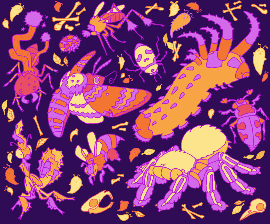
🕸️🎃👻SPOOKY BUGS👻🎃🕸️
#my art#insects#spiders#bugs#halloween#the roster inlcudes:#ghost mantis#death's head hawkmoth#big headed ant#cordyceps#dermestid beetle#mosquito#skull face shield bug#hickory horned devil#burying beetle#skeleton tarantula#Bones#against all odds i think the little dermestid turned out the best#this is not quite the original palette- i had some cooler purples but i liked this better after fiddling with gradient maps a bit :)
557 notes
·
View notes
Text
I did a Color Analysis on the Outfits of the Doctor for a class
Okay first I want to preface this with a: I haven’t finished Classic Who, nor watched a whole lot of it, but wanted to include it in this analysis, neither have I fully completed 13′s run, but also wanted to include her. I adore her final outfit, but it feels much more like a compilation of references to other Doctors at the last minute than a deliberate choice made with Color Theory in mind. She really got cheated out of a lot on her run, and it makes me upset, because she deserved better. I hope this is taken with heaps of salt, I just wanted to write about Who for class.

Okay here we go:
For live Action TV Shows, I struggled, as I don't really watch that much live-action TV, as I find them boring. The exception to this rule is of course: Doctor Who.

Doctor Who is an interesting case, as Classic Who (60's-late 80's, includes TV movie from mid-90's) and New Who (2005-present) use color, and more specifically, the Doctor's color scheme in very specific and different ways, that are still relatively controversial in discussion online. Doctor Who actually began in black and white, airing on the same day JFK was assassinated. Eventually, the actor who portrayed the Doctor, William Hartnell, had to retire due to health complications, so they brought in a new actor to portray the Doctor, starting a new pattern of "regenerating" the Doctor when an actor wanted to quit the role.
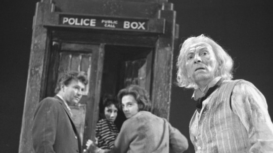
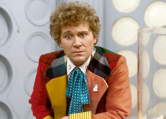
While the first two Doctors were entirely in Black and White, Jon Pertwee, the Third Doctor, saw the series shift into color. His outfits reflected this, shifting from a black and white normal suit into velvety maroon suits, or even a normal suit, with a bright red cape to accentuate him. As Doctor Who had originated in Black and White, the designs for enemy aliens had a tendency to be achromatic, grey and dull- Classic Doctors incorporated warm muddy hues to contrast this wildly. This is also explained in-universe, as the 3rd Doctor is the incarnation that is forced to live exclusively on Earth, and is influenced by Earth's vibrancy for his outfits. Every subsequent classic Doctor has some sort of warmth in their outfits, as pictured in the previous poster, which contrast wildly with the lifeless grays of Daleks and Cybermen. The Sixth Doctor and his companion are pictured below alongside a Dalek and a Dalek control console, showing how alien those from our world appear.

We can additionally see how alien the Doctor looks in the TARDIS after having been influenced by Earth.
There is a clear shift however, by the time of New Who.
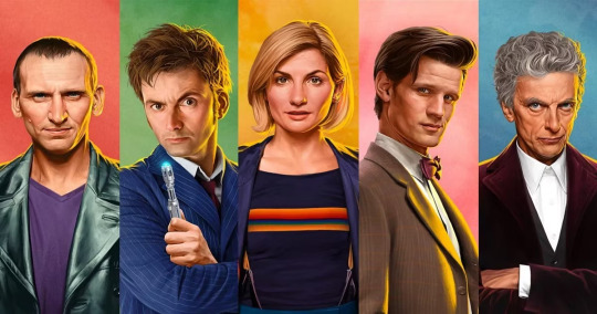
New Who's Doctors have a tendency to stick to cooler color palettes, making THEM seem alien. There are exceptions to this, namely the Tenth and Eleventh Doctors, but they will be talked about later. The colors I would associate most with New Who would be Brown and Green. Christopher Eccleston's 9th Doctor is very rude, and a bit eccentric, battered from a war in space, he has long lost the whimsical earthy tones that were so present in Classic Who, instead sporting a black leather jacket and a purple shirt, very often seen in green or cool lighting.

The 9th Doctor falls in love with his earth companion Rose Tyler, and in regenerating, is born of that love for humanity. The Tenth Doctor, played by the beloved David Tennant, is a stark contrast from the 9th Doctor, dressing in vibrant pinstripe brown suits. This continues to be the case until he is separated from Rose, after which he dons a blue suit, cool colors returning to signify that he is once again alienating himself from humanity. As he begins to heal, he dons his old brown overcoat over his blue suit, showing he is again allowing his humanity to resurface.

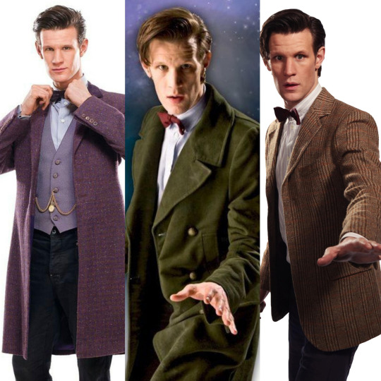
The Eleventh Doctor, played by Matt Smith, dresses in brown, earthy tones, as he's very connected and loving towards Earth and his companions, but after facing dramatic loss, shifts towards wearing cooler tones, namely a purple suit. His outfits are seen in the opposite order of appearance. (Right to Left)
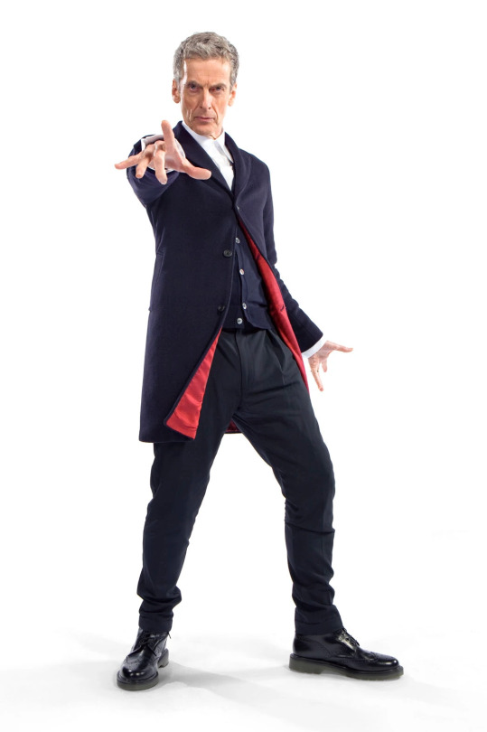
Now for my favorite: Peter Capaldi's 12th Doctor! Capaldi's Doctor is much more like the initial Doctors, feeling very, VERY alien, compared to the almost human 11th Doctor. This is demonstrated in his first outfit, a cool dark blue suit. This suit comes with a catch however, flaunting bright red interiors, signifying a truth about the 12th Doctor, he has soul and empathy within, he's still learning how to show it. The series makes special attempts to have the red inlet be visible in scenes where Capaldi gets to show his emotions.
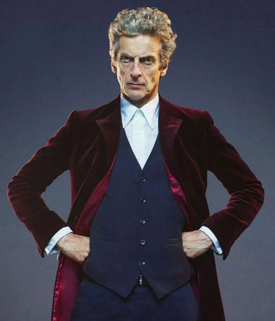
As 12 grows into learning better empathy through his companion Clara, and following a reunion with his wife River Song, Capaldi's Doctor starts to wear a vibrant Magenta/Red suit, signifying a massive change in his character- upfront, honest kindness.
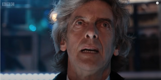
After facing more massive loss, and being on the brink of regeneration, Capaldi's Doctor's new black suit is revealed once again to have a bright red interior in his final scenes, and he is deliberately lit up in oranges and yellows, not from his regeneration energy, but from lighting inside the TARDIS.
Unfortunately, the following Doctor, Jodie Whittakher's 13, does not shift outfits throughout her seasons, instead opting for cooler tones despite being much like 11 or 10. This may be to emphasize her alien-ness despite her warm-hued TARDIS, but to me, it doesn't feel as intentional as before, instead feeling like another way Jodie was given the short end of the stick in regards to Who. Jodie's 13th Doctor deserved outfit theming!!

#doctor who#classic who#new who#dw#first doctor#third doctor#sixth doctor#ninth doctor#tenth doctor#eleventh doctor#twelfth doctor#thirteenth doctor#1#3#6#9#10#11#12#13#color theory#outfit discourse#doctor who discourse#dw discourse#capaldi#william hartnell#jon pertwee#colin baker#christopher eccleston#david tennant
62 notes
·
View notes
Text
Animation Practice - Weeks 5 and 6
Continuing with my graphic novel, I started to create the lineart for my pages. My aim for this week is to have the lineart finished and maybe some of the base colours, so that I can work on colouring and cleaning up the drawings in the final week. This took a lot longer than I anticipated, but I am at a good stage to move onto colouring. I also ended up adjusting my third page quite a bit, as I felt my initial plan didn’t work very well for fitting in the dialogue. I used the panel I had created before, but changed the scale and composition, then worked on adding some extra panels that worked alongside the dialogue in the scene.
In between the fifth and sixth week, I did a lot of work on colouring and shading my graphic novel. I had previously done a few colour experiments, but still wasn’t 100% settled on one palette yet. So, for the first page, I experimented with different colours and saturation to get a feel for how I wanted my graphic novel to look when finished. Instead of realistic colours, I decided to use a cooler palette of indigos, blues and purples. I chose this as I liked the cooler tones and felt they matched the environment my character is in. With the purple it also allowed for warmth to be added to the pages. I kept shading relatively minimal, only shading the face slightly, and this helped reduce my colour palette, whilst also maintaining a level of finish I was satisfied with. I also changed the colour of some of the lineart as I originally did in my character design.
The lesson in the sixth week was supposed to be the critique, however, it happened a few weeks later due to technical difficulties. I found the critique really helpful, especially as I printed my graphic novel out, which allowed me to see how the colours printed. They printed slightly darker and more saturated. On the third page especially, this allowed me to see that the colours were very similar in tone, and therefore they blended together and washed out the page, which I adjusted after. As well as editing things from my critique lesson, I also made a simple front cover for my graphic novel. Putting this all together, I reprinted my graphic novel in the correct order for printing, and I am more pleased with the result.
Overall I am very proud of my graphic novel, as I put a lot of effort into it, and I found my research challenging yet exciting, I think using the randomized prompts for our character designs (stocky, disrespectful, 2010’s South Korea) ended up working really well as I went down a route I don’t think I would have ever considered, and thoroughly enjoyed it. I feel that my graphic novel looks quite professional overall and I would personally want to continue working with my new characters and story in my own time.


0 notes
Note
Hallo! Ik you aren’t drawing right now so hopefully asking about art is still okay. I was wondering how you fit your characters into your background so seamlessly when you’re coloring? Ive never been successful with tying the subject to the background so I was hoping you had some tips :)
your coloring and composition are absolutely gorgeous by the way!
Hay-o! I certainly don't mind art questions ^_^ and thank you for the kind words dude!
To be honest, most of it just has to do with having a good idea of what the main color of the piece is going to be. If I know the piece is going to be predominantly blue [a lot of my pieces have a blue/purple color palette :'D], then when I lay the flat colors down for the character, even if I'm pulling from a reference, I will tone those colors cooler. That way when I go into shading and everything, they already look like they belong in that environment.
A good way to cheat this if you're still figuring it out, is to correct the colors in post, or add a color filter. So for example:

[Forgive the old, really sketchy doodle] When I made this originally, I didn't think the characters [namely the critter on the wall] meshed well with the bg, but I'd colored it all on a single layer and didn't want to go back and redo it all. So slapping a blue color filter over it like this:

homogenizes the color palette a little bit more, so everything looks like its supposed to be in a moody night time environment. I don't do this quite as much as a used to [after a while, you get better at figuring out how dark/dull your colors are supposed to look in certain settings, and start to color correct all on your own] but I still use this trick for super bright, golden hour sunny day drawings. Helps get that hyper gold color going.
A couple other things that help are:
Merging the canvas and working / starting a layer on top of everything else and painting on it. Even with cell-shaded work. I do this a lot with shading, but merging everything onto one layer and painting over it helps you bring the piece together as a whole, and breaks our mind out of the strong foreground layer/background layer/middleground layer headspace when drawing.
Also, it helps to treat your backgrounds like a character? I used to get really hung up on making sure characters looked cool with intricate outfits or over the top expressions, and then the background was just... trees. A grassy hill. Basically just something to fill the space in the back. Treating your backgrounds like they're a character [what personality does this environment have? what vibes does it give off? is it cheery opposed to the character or does it reflect their emotional state? how cluttered/busy is it? etc.] helps you add missing details that you otherwise have spent large amounts of time developing in your characters. Makes the environment less of an afterthought and more a part of the piece as a whole.
And! I think that's everything off the top of my head. Hope that helps you out some! Backgrounds, and putting people in them, are hard. Most of getting through them is just.... drawing them a lot and seeing what sticks lol.
#the barking artist#taztaztaz-blog#art advice#kinda#i'm a little rusty since for the past month i've been working on those comics#and their bgs are DEFINITELY an afterthought lol
25 notes
·
View notes
Photo
Koh-i-Noor Polycolor Pencil Review
Well here's a supply I actually had no plans on acquiring or testing.
I have acquired plenty of colored pencils in the past, and honestly, the Koh-i-Noor Polycolors weren't really on my radar for the simple fact that it just doesn't seem like a lot of people talk about them. They didn't seem to stand out as terribly special. Most of the pencils I'm interested in acquiring usually have something special about them or they otherwise stand out for one reason or another.
These, likewise, ended up catching my attention solely because I found the 24 set on clearance at my local Michaels for $20.
Although, I was also vaguely interested because in my colored pencil research I had previously come across a theory that, since Chartpak is a sort of parent company behind the scenes (and the new model of Spectra AD markers are virtually identical to the Blick Studio Brush markers) that these pencils are either the same or are manufactured almost identically to the Blick Studio colored pencils. I don't have the Blick pencils, but I have considered getting them before since they've been reported as pretty good and they're supposed to be an artist quality pencil but the prices are more reasonable than some truly high-end artist pencil options out there. So I figured if I tried these and the speculation is on the right track, perhaps these would be a good way to get an idea of what the Blick pencils are like beforehand, even if they're not actually the same pencils with different branding.
Now, a clearance price of $20 still sounds pretty steep for 24 pencils. And to a certain extent, it is. But we have to keep in mind that brick-and-mortar stores like Michaels love to markup the product prices right out of the gate. Upon further research, this same set averages around $30 online, whereas the original price listed on these from Michaels is $50. For further comparison, at the same time that I found these, the store also had a couple of Faber Castell Polychromos 24 sets for about $30 apiece as a clearance price, and online the same 24 set goes for around $40 or more. So the prices are still technically good deals, they're just not like "ohmygosh that's so cheap I can't believe it!" kind of deals.
I had one other previous experience with Koh-i-Noor pencils in the form of their set of 12 tri-tone pencils, but those are more of a specialty item and thus I don't use them as normal colored pencils and I don't feel comfortable putting them through my normal colored pencil testing, same as the tri-tone colored pencils made by Crayola that I acquired around the same time.
So I went into testing these without much pre-conception for what they'd be like.
Even after poking around for some extra information on my Colored Pencil Testing Workshop and seeing how other people would describe and compare them, I still felt like I was going in largely blind since the comparisons were usually a little vague and base-level. And also, just, in general, there aren't a ton of in-depth reviews to be found for the Polycolors.
Of the information I found, I learned a couple of interesting things:
1. There's some debate as to whether or not these pencils are oil-based or wax-based. Most online listings say they're either oil-based or say they've been "made with oils." But there's a rumor that there was a translation error (since these are made in the Czech Republic/Koh-i-Noor is presented as a foreign brand) and they're actually wax-based. The most compelling idea I ran across is that they're wax-based but given some kind of oil bath as part of the manufacturing process. But the reason this matters is that it does affect how the pencils behave to a certain extent, and it also matters because it's not fair to compare an oil-based pencil to a wax-based pencil and expect them to perform the same. For example, oil pencils traditionally have better layering capabilities, but they're not good for getting a lot of intense color down quickly, meanwhile, wax-based pencils don't usually layer as well but you can usually get more intense color more quickly.
2. These seem to share a very particular trait with the Blick Studio pencils I mentioned earlier. The biggest sets you can buy for each have 72 pencils total. However, both lines have a Portrait set and a Gray set, and these sets contain some additional colors that aren't available in the 72 set. The Blick pencils, including these other colors, are a total of 91 colors. I couldn't find an official word on how many total Koh-i-Noor colors there actually are, but given the above speculation, it wouldn't surprise me in slightest if the number is also 91, which likewise add to the credibility that there's a link between the two pencils.
I can't comment much more on point 2, since I don't have any Blick pencils to compare them too, but I'll talk about point 1 more in a moment.
Before that, though, let's talk about the pencils' appearance and packaging. Aka, most likely the first thing you'll notice about them out in the wild.
The pencils themselves have hexagonal (hexagon-shaped/six-sided barrels) instead of smooth round ones, which I thought was an interesting choice since the longer I look, the more it seems that most companies make their regular colored pencils with round barrels and save the hexagonal barrels for their watercolor pencils. They also have dullish gold-dipped ends with a white line separating it from the main color of the barrel. The gold dipping is nice, but I'm not crazy about the white line. It looks kind of tacky to me, but that doesn't really have much bearing on how good the pencils are.
They also have gold printing on one side with the brand name, a number identifying the Polycolor line specifically: 3800 (at least I assume that's what it is), and the number tied to that specific color. The opposite side of the pencil, curiously, has black printing with the color name, some other 3-digit number I can't figure out because some pencils have the same one, another much longer string of numbers, a barcode, and "Czech," as in they were made in the Czech Republic. I mention this because, as someone that likes to chart and organize my pencils pretty meticulously and make sure I have the right color at all times, I found it kind of annoying in practice that the color name and number were on opposite sides of the pencil.
The packaging is a little more interesting. Koh-i-Noor seems to like this system of having their pencil sets both in a pretty nice storage tin with a completely detachable lid (although for some reason I find the tins seem a lot nicer in person than they do in pictures online for some reason) and then they'll have the tin with the lid off encased in a cardboard-backed, plastic-front hang card. I like this because I case us the plastic front as a disposable paint palette before chucking it in the trash, but otherwise, there's not really a lot of obvious rhyme or reason as to why they package them this way.
Beyond that, this set also came with a little "quality guaranteed" square piece of paper, just like my tri-tone set did, a piece of tissue paper that I guess is for putting in the tin on top of the pencils? And much to my surprise, a little fold-out pamphlet showing off all the products that Koh-i-Noor makes. Expect, for reasons I can't figure out, the tri-tone pencils don't appear to be anywhere on said pamphlet.
And yet the pamphlet shows all of these other supplies I previously had no idea that Koh-i-Noor made, including watercolor and acrylic paints, paintbrushes, papers, and even fixatives.
Overall though, this gives otherwise unremarkable-looking pencils a pretty nice presentation. And I personally really appreciate that the tin lid comes all the way off and isn't hinged to one side, but that's really a personal preference thing.
As for how the pencils actually work, for the most part, they're pretty average. They blend more nicely than something super cheap like Crayola or dollar store pencil finds, though I wouldn't say they blend quite as nicely as Prismacolor. I had some very minor issues with getting good, even consistency, and they're not nearly as soft and nice to work with as Prismacolor, or I would argue even as some of the other brands like the Polychromos or Schpirerr Farben. But you can see on the drawing here that I was still about to get plenty of layers going back and forth, and the blending still came out pretty nice and smoothly so long as I was patient with it. It didn't come as easily as something like Prismacolor, but it came well enough, I think.
What I did find interesting about how they perform is that, for one thing, they have a very sandy feeling against the paper that's uncannily similar to the June Gold Mechanical pencils. And the June Gold pencils are confirmed as being oil-based. Similarly, while I don't think these had the "limitless" layer-ability that most oil-based pencils like the June Gold, or Schpirerr Farben, or Faber Castell Polychromos do, they did layer for longer and better than I was expecting. This is what makes me think that the whole "wax-based but given an oil bath" idea is true, or that they are in some other capacity an oil/wax hybrid, instead of just being solely wax-based.
And they do feel more rigid and less soft like most oil-based pencils do. Which makes them seem like they have a weaker pigmentation whether they actually do or not.
Speaking of which...
As far as color selection for the 24 set goes, the only thing that I really feel like I'm missing here is a pastel purple. You get a white, a warm and a cool yellow, an orange, a warm and more neutral/cool red, a burgundy type color, a pink, a magenta type color, a purple, a warm blue and a cool blue, a dark neutral blue, a yellow-green, a seafoam/blue-green, a warmer dark green and cooler dark green, an ochre and a red, neutral, and dark browns, a grey, and a black. Personally, I think I would've swapped the magenta color for said pastel purple. Other than that, I think this is probably the most well-rounded selection I've seen of the 24 color sets that I have. And the colors come across as pretty rich and vibrant too, which I also can't say I was expecting. (And is also why I went the route that I did with the visuals and colors on this one.)
My other two main complaints are with the white and black. The white actually did better than I was expecting, but on it's out it is still pretty lackluster compared to the Holy Grail Prismacolor white. It takes a lot to get it to layer on top of other colors, but it is technically possible. But it does do pretty okay as a blender like most lackluster white pencils do. And the black, unfortunately, isn't a true black and is instead a very dark gray that thinks it's a black. It's dark enough you wouldn't really notice without putting it next to a proper black, but it's still a little disappointing to me because it just doesn't have quite the right punch to it because of that.
I will say that these handle gel pens extremely well. In a ranking out of 5, they get a 3.5, which is really good since I haven't seen anything beyond a 4 and most pencils struggle to get as high as a 3. I was genuinely surprised about that during testing.
Ultimately, they perform pretty well for $20. However, I don't think they're worth the $50 price tag Michaels original put on them. If you're going to spend that kind of money, I suggest getting the 72 set of Prismacolors that usually fall just shy of that number over on Amazon. But if you're curious or a colored pencil connoisseur, then they might be work picking up if you can find them for the $20 price point as I did.
The Koh-i-Noor Polycolors work just fine, good even, but they just don't stand out very much. I can see why not a lot of people talk about them; the more talked about brands like Prismacolor and Faber Castell really stand out and shine on their own (especially Prismacolor as the price has come down to the low end for true artist quality pencils over the years) and you end up getting more bang for your buck.
And personally, again, they came out pretty good in testing, but I personally don't really care for them. I'm not sure why, but I think it has something to do with that sandy feeling and the few performance issues I do have with them. Still, I did my best to not let my personal dislike affect the overall verdict on whether or not they're any good or worth the price.
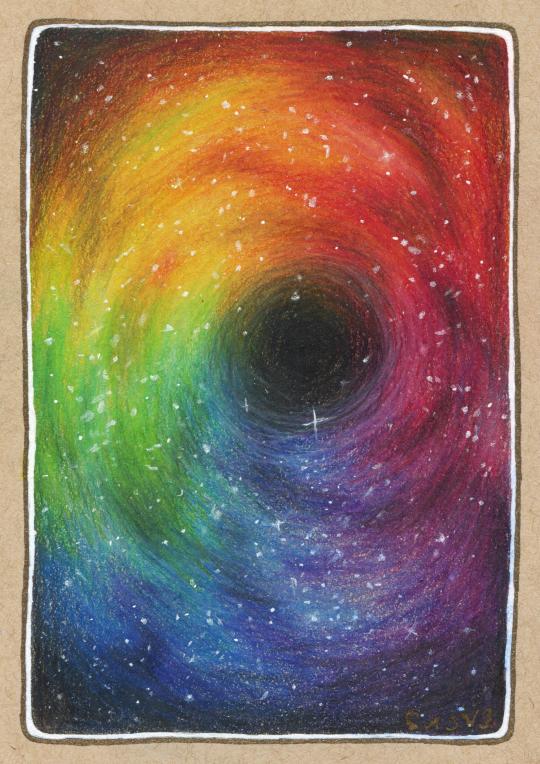
A little about the drawing itself before I bow out: I was going for a kind of black hole effect, in some kind of rainbow-galaxy, after not wanting to do just another typical galaxy but still wanting to do something that would really push the blending and layering abilities of the pencils. It's not perfect even in concept, but I still think it turned out pretty nicely. I also tried my best with my white gel pens to get a more natural and consistent star effect, since that can be kind of a challenge with colored pencil pieces using only gel pens to get said effect. And I think I managed pretty okay in that department.
And after all, was said and done, I went around the edge with my black Gold Shadow gelly roll pen, as it felt like the best/most neutral choice out of the different options I'd considered. You can't really tell on the scan, but it has a kind of neat almost not-there effect in person until you move it in the light, since the gold in the ink is really close to the tan paper color.
I may not be crazy about the pencils themselves, but I am pretty happy with how the drawing turned out, and it was actually really nice to take a break from Inktober stuff and work on a good ol' pencil test/review piece. It really hasn't been that long since I've done one, but I've done so much since then that it feels like it has, and I do really enjoy testing/trying out new supplies, whatever they may be, even if I don't like them that much or don't end up using them very often.
That said, I don't know when the next supply test like this will be, and it may not be for quite some time, but whenever it happens I'll be looking forward to it, that's for sure.
Now if you'll excuse me, Inktober has come and gone and that means it's back to making more complex art on the regular for me.
____
Artwork © me, MysticSparkleWings
____
Where to find me & my artwork:
My Website | Commission Info + Prices | Ko-Fi | dA Print Shop | RedBubble | Twitter | Tumblr | Instagram
4 notes
·
View notes
Text
OUAT: Out of the Past - Dead in the Water
Hi! So, while we’re on our break between Seasons 2 and 3 of the OUAT Rewatch, I wanted to do a brief little lookback at a couple of the show’s pieces supplementary material. I can’t promise how many I’ll get to during this break specifically, but this is something I’ve wanted to do for a while and honestly, it’s a fun way to fill the time, so I’ll get to as much as I can!
If you don’t know, Once Upon a Time had released three novels (With hopefully more on the way!) and two comics that fill in some non-necessary gaps in the series and timelines. To start off with I want to talk about the comic “Out of the Past.” While it’s not chronologically first...I honestly can’t reach the other one. That’s really why I’m going for it first. XD
Here, we follow four non-connected stories starring Rumple and Belle, Killian, Regina, and Jefferson. What’s so interesting about this comic as a whole is that each of the four stories is not only distinct in their locations and characters, but in their art styles, giving way to separate tones for the different stories. I’ll do my best to link to artwork as I write these up for that reason, and believe me when I say that every part of this comic thrusts you into...a whole new world! XD (The puns can NEVER be escaped!) Additionally, each of the stories has a new original character that closely connected to someone in the main cast! I’ll explain as we go, but I generally like all of these characters. They meld into the world of OUAT brilliantly while still being memorable in their own rights.
I won’t be giving these grades like I normally do for the episodes, but rather, I want to examine the stories, the use of characters, the art, and the writing. If you want to read them for yourselves, they’re available all over online (Hey! Maybe if we buy the comics, we’ll get more of them!!!) and here’s a link to the Killian comic!. While there are a risk of spoilers up ahead, I’ll try to keep things as conceivably vague enough as I can for someone who hasn’t read to follow along.
The stories of the four pieces were created by Kalinda Vazquez and scripted by Corrina Bechko. Kalinda is a regular writer for the show while this is Corrina’s first and only bit of work for the show. Overall, I think they both did a good job, but I’ll get into that as I talk about the individual pieces.
Today, we’re going to be looking at the first piece from the comic, “Dead in the Water.” It’s Killian-focused and a pretty interesting piece! Why? Well, let me tell you!
Anyway, let’s get grooving! Join me under the cut for my review!
Link to the comic! Thank you so much to @misspo0ky for uploading the piece in it’s entirety!

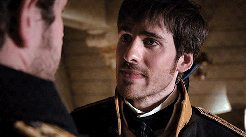
Our first comic follows Killian Jones. Not long after after becoming a pirate, Killian and his crew get lost in a nasty storm. Desperate, they take refuge in the Leviathan Shoals, a seemingly safe haven with a terrifying reputation for both a deadly sea beast and mists that -- as Killian’s first mate Lewis states -- “cloud the mind...induce visions, madness...even drive men to MURDER!” Killian looks prepared to handle everything, but when he gets to the shoals, he sees the one person he never expected to: Liam, seemingly back from the dead!
What’s very interesting to me is the placement in Killian’s life they chose to focus on. Killian’s lived an extensive life to be sure, but to zero in on the point between losing Liam and meeting Milah is so bizarre to me -- not bad at all -- but given that so much of his life was spent in Neverland, one would think we’d see more of that or even just his childhood. Still again, I’m not complaining and I really like what we get!
But anyway, let’s talk story! I’d say this story is simple, and it is -- Killian and his crew get stuck somewhere, they find someone, and then they get out -- but I’d be lying if I said that’s all. Liam’s existence in this comic is ambiguous. It’s explained, but against the exposition that Lewis -- Killian’s first mate who is framed here as something of a moral compass -- provides, it’s unclear just how much Liam can be trusted. It makes the conclusion (which I won’t spoil, but I think it’s pretty obvious) equally ambiguous and thus hit a very emotional note upon further reflection. And the implications of this on Killian’s mindset throughout the rest of the series is just utterly heartbreaking! They story itself is decently paced (I’ll talk more about that in a moment), the world of the shoals is quite interesting and spooky, and the practicality of the plot elements come together well. ALSO, I love the fact that we finally get to see Killian interact with his crew members aside from Smee for an extended period of time. Killian may not always make the right call, but he definitely has good taste in crew members. Lewis is very smart and honest and you can tell just how much he cares for Killian.
My only problem with the story is the pacing at the climax of it, namely when Killian has to make a certain decision. I won’t detail it for those who haven’t read, but given both the weight of the decision on a personal level to Killian and the convictions that Killian spent the past few pages on feeling so strongly about, to not have at least a panel of him processing or thinking about the decision before he goes against those convictions just feels poorly paced. Additionally, I feel like a bit more Liam in this comic -- like through a flashback with Killian -- would’ve brought home the weight of the decision more so that it could be as ambiguous as the ending. As it stands, Liam isn’t made to be nearly as likeable as he was in “Good Form” (The only Liam episode released at the time of this comic’s publication) and it makes the ambiguity of his appearance falter.
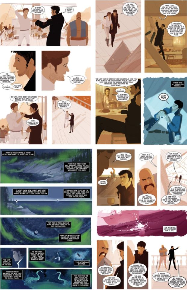
The art for this piece is so unique! Designed by Pascal Campion, “Dead in the Water�� has two focuses in its art style. During the opening, to accentuate the danger of the storm, the art is much grainier and more detailed. The brushstrokes are far more visible in the environment outside the characters and while not without detail, there is more of a focus on the basic shapes for the characters. When we get to the shoals however, the art style completely changes and it persists until the end of the comic. It’s very minimalist and well-filled in. If I didn’t know any better, I’d swear it was made on a computer because I can barely make out a single brushstroke! There’s also a rather transitional shading between the environments of the comic. When Killian, the crew, and Liam are on the water, a cooler color palette is used (Blues, greens, and purples) while the shoals use a warmer palette of yellow, reds, and oranges. That said, the exact colors used flip back and forth from shade to shade without much in terms of rhyme or reason and while I like it, it’s not the most consistent style of art. It’s pretty to look at, but I do wish there was a touch more cohesion to the style.
Overall, despite my complaints, this comic still draws me in like a fly to a light. I think it comes down both to seeing Killian actually being a captain and the ambiguity of the ending as a whole. Stories like “The Lady and the Tiger” have a way of sticking with me, and if you like something a little less than clear, but in a good way, you will probably like this!
Thank you for reading this review and to @watchingfairytales for inspiring me to take on this re-read! I hope it’s okay that I’m jumping the gun a bit with the comics! XD
Next time, we tackle a piece of the tale as old as time!
See you then!
Operation Rewatch Archives
2 notes
·
View notes
Photo
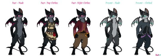
Onene-- Clothing and Phenotypic Trends, Past and Present
About 500 years before the "start" of the main story, the onene were forced underground and into a cave system due to a massive storm of soul ash. This storm effectively rendered the islands stuck in a cluster of grey zones on the surface, changing the landscape and destroying much of the above-ground remains of the race's culture. This strange storm persisted throughout the years and never seemed to relent, though sometimes parties would head aboveground to forage things like fish, eggs, and seeds while tied to rescue parties still past the mouth of the caves. Since there was simply not enough space for aggressive corruptions to spawn underground, they spawned in the overworld instead, making topside very dangerous. As a result, these foraging appointments only occur a few times per year.
The change from above to below ground changed the onene in other ways, too.
Onene, prior to the storm sweep, were more predominantly dark in color, usually not much lighter than dark grey. Skin was also darker, seen in the wing membranes, the ears, the feet, and the nose should one look closely enough. Markings seemed much simpler with basic countershading and only a few areas of the colorful marks. The face, upper arms, wing membrane, tail, sometimes the back, and rarely on the ears were the only places to find these markings once upon a time, and the colors were different compared to today. Other markings, such as socks and sleeves, were only somewhat common. Certain markings and colors were more common depending on which island one was visiting, as each island had their own flavors-- color marks and eyes depended on location, yes, but some features like main coat color, countershading color (if any), and other marks (if any) would be more prevalent depending on location just the same.
Clothing of the old times was also much different. During the topside days the clothing was split between day and nighttime wear, with the day wear much more "open" given the tropical climate temperatures and sun exposure while the nighttime wear was much more "closed" and reminiscent of the current era's clothing in general style. Day wear was typically made of barkcloth or grass fiber and decorated with plant-derived dyes and inks. The decorations varied in complexity but typically reflected the surroundings-- plants, animals, the wind, the ocean, and so on. The back of the top was usually a set of straps or similar to an apron to allow the wings to comfortably protrude and stretch. The bottomwear was usually some kind of skirt with similar decorative style as the top and designed as either a wrap or a "solid" (non-overlapping) garment, not usually falling past the knees in length. The tops of the skirts were held up and decorated with brightly-colored cloth belts, sometimes patterned or dyed in a way similar to tie dye using flowers and other plants.
Nighttime wear was usually a simple overcoat-and-undershirt setup. The overcoat was usually some dark color to better blend in with the surroundings at night, usually a dark red, brown, or green, with minimal decoration, and made from cotton. The front was often buttoned in some way with buttons made of coconut shell or seashell pieces. Bottomwear was a form of pants tied off around the ankles and usually made of leather. A belt was woven through the top similar to the daytime clothes, though the belt was usually a different color. The undershirt was usually very dark in color and made from cotton similar to the overcoat. The use of these nightwear clothes is quite recent, coinciding with the establishment of trade routes between the Nimbus islands and Ramios. The clothes were proven useful for wicking away the chill and moisture of nighttime and early morning, so the popularity of use grew with time.
Onene of the current era have diversified, with lighter coat and skin colors becoming more common, as well as different and more complex markings, both light and dark. The colorful markings have also grown more complex and can now be found on the legs, lower arms, and ears, which was very uncommon before the move below ground-- sometimes up to half of the tail is colored. The palette for eyes and marking colors changed and reduced based on locations underground, ending with four main groups: light purple (Iris Walls), pink (Wisteria Gardens), light blue (Sanctum of Azurite), and light teal (Turquoise Serpent).
Clothing was now based much more on the nighttime clothing of old and changing very little even over 500 years. The climate of the caves was cooler than the overworld and much less prone to change throughout the day, lending to the need for warmer clothing and multiple layers. Due to limited resources and dim lighting, clothes have become much more muted and dark, as only a handful of plant types and colors are available underground and not all of them are useful for dyeing. Unlike before, however, the onene have discovered metal deposits underground and work to extract it for tools or other things, such as the belt ring commonly worn around the waist or the ring clasps around the ankles. By farming and tending to silk moth larvae, the onene have developed a means of working with silk to produce simple scarf belts which tie onto the belt ring. The belt is dyed usually a purple, pink, blue, or teal using components found in their given locations, and are often used to denote one's place of origin or where they currently reside as a form of expression of pride, similar to owning yard flags for a home state. Since the eye and marking colors change by location, it's a more reliable means of communicating locations of importance to others. There is a playful competitiveness between each section of underground Nimbus like one finds with, say, sports teams in real life.
Due to severely-limited outside influence, very little has changed even over 500 years. Maybe this will change in the future, should the storm over Nimbus subside.
If you want each separate image you can get them from the attachments here: https://www.patreon.com/posts/17405701
Please consider becoming a Patron or donating through Ko-fi if you would like to support what I do.
6 notes
·
View notes
Photo

(THURSDAY 21ST - SUNDAY 24TH MAY 2020)
I am reaching the pointy end of this project and I’m really quite stressed about how it is coming together. I have completed the majority of the physical zine layout, but there is still much to do.
Similar to my last post, I have compiled a few more images of the process. I’m currently trying the figure out the layout for the final question, but...I feel like I’ve a brick right now. I have so much inspiration to draw from, but nothing seems to be working with my formatting and the amount of type that I will have to feature.
This selection depicts most of the development for the cover page of my zine. The final product is likely to feature my surname, however, it has been redacted from the pictures here. When I started developing the cover, I envisioned the colour palette to match the final (references) page, however, I later discovered that this approach would be ineffective because they wouldn’t be viewed next to each other. I trialled a lot placements. Some of the posters I was using as inspiration showed the type extending off the page, but I didn’t think it worked particularly well in my design. I also removed the hyphen between ‘akzidenz’ and ‘grotesk’. While, it is most-commonly seen with the hyphen, the typeface is also recognised without it. I thought it made the design less cohesive, so I removed it. I really liked the vertical, and face-to-face placement of the type from the start, so it has been maintained throughout the planning.

I did really like the orange on black, however, once I established that the pairing to the final page was more or less irrelevant, I tested the other colours that I were already in the colour palette. I did really like the green on black design, but I already had a double-page spread that was largely green. I also tested using a trio of colours. While, I didn’t think the outcomes from these experiments looked bad, I wanted to continue the minimal duo colour palette, so I reverted back to using black and a single other colour. Apart from orange on black, I found that blue on black was also really effective, so I am currently still debating which should be used in my final.
I also considered the idea that my zine would present excerpts of a larger interview that I had with Akzidenz-Grotesk, but I thought it was distracting, so that direction was discontinued.

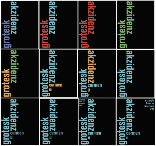
This is a mock-up design of what I think the front cover of my zine is likely to look like. I have kept the ‘U’ of my last name purely for presenting the format, and my name in its entirety will be shown during submission. I created a contents page because I am unsure of the format that I will be submitting my zine in/how my zine will be viewed. It is possible that this page may be removed at a later stage.
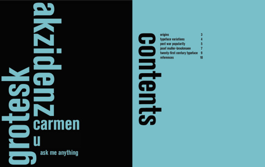
My final content page will be my references (I may have a black back page though), however, it will be presented on a double-page spread. The references will appear on right, and my fifth question will be on the left side. Below, is my slow development of the left page (where i am currently stuck):
I am trying a variety of methods, but some just don’t really work, particularly as I have to feature a larger written component.
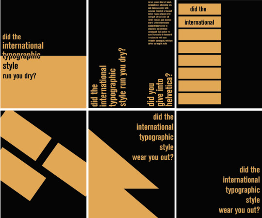
This screenshot also depicts a spread, that I have since changed. I originally used red, because of the direct reference to war, however, when everything (basically everything) is red, it’s very distracting and overwhelming to look at. I decided to keep the left-side red, purely because it is quite striking, but changed the right-side. I made it a purple colour, changing the ground colour to purple, and making the text and bars to black. I also chose to do this because red can be viewed as or have connotations as being quite brutal and bold, which could be related to the violence of wartime, however, the speaker is alive on the right-side, not battered and bloody, so it made sense to me to use a cooler tone like purple.

#rmit#communicationdesign#wip#akzidenz-grotesk#adobeillustrator#process#internationaltypographicstyle#swissstyle#WK11
0 notes
Note
yo i got a question, why/how are your original character designs so consistently excellent??
AAAAAAAaaaaa!! o(*≧□≦)o Thank you so much!!
I less design my OCs to look good and rather, try my best to design them around their personalities and backstories if you know what I mean? I apologize I’m probably going to go on a bit of a ramble here with little to no knowledge of design because I really love my OCs;
Edit now I’ve actually written all of this: ITS SUPER LONG IM SO SORRY
Like, for example, Neta’s design is based all around looking warm and making her look short. She’s the start of her plot, always kind and helpful. Somewhat impulsive (extremely impulsive at times really). She’s also a somewhat abstract detective too. So for her I gave her a warm palette for her personality, also a really long coat because characters wearing long drapey clothing like the trench coat that covers most their body seems to make characters look smaller to me? I went with the boots for the same reason.
On the other hand, her girlfriend Fuyu (excuse the old art I’ve not drawn her recently) is different because of this. Their colours are blue in hues because she’s like a “Cool untouchable” looking person, since her character has a job based in fame. Her outfit while it had to be something water-based for plot reasons, could of quite easily been a wetsuit. It’d of been less sexually appealing though and that’s not in her personality. She’s the type of person to exploit people she doesn’t know by using her charm, and showing off her legs (which are muscular! but i cant draw that properly yet), and having her long, flowing and glowing hair is meant to make her look enchanting too.
On the other hand! An extra point about Fuyu, I tried my best to show her casual personality in her look too, with a puffy blue jacket from her girlfriend and the way her hair hangs limp and in her face outside of water is supposed to show a sort of down-to-earth look to her too.
Hahahaha, not sure if I’ve pulled that off though.
I say the most important part of character designs is trying as much as possible to put a character’s personality and history into their design.
I give shy or cool standoffish characters mostly blues and cooler colours to show how not-fiery their personality is. The lighter the colours, like pastels, the more likely the person looks cheerful or happy or innocent (the except for this is when a character uses white and are used for bad guys, probably in an attempt to show off how ‘blank’ their feelings are). Greens are mostly kind, nurturing people, like nature. Pinks and yellows are for more happy carefree people (while writing this I realize Tokyo MewMew is a really good example of using colours to show personality)
Is your character non-confrontational? Draw their body language inwards, have them hunching their shoulders, holding their hands close to their chest and their legs closer together too. Have them avert their eyes a lot from the camera or be just-off from looking at the person.
On the opposite hand, a character with a loud boisterous personality that would confront people a lot, have them look directly at the person they’re looking at if they are, they’d almost be looming over other people. Definitely not hunching. They’d probably use their arms and body language a lot more to talk to people in order to express themselves better. Draw them with their arms more spread out too! Open, maybe even slightly claw-like unless they’re angry or intending to punch someone.
I don’t think I draw confrontational characters a lot actually.
The next thing you need to think of which is really important is their nationality.
Biologically wise and how they were raised too.
Now, I know that people say you need to add more variation in skin colour and nationalities to your OCs, but they’re your OCs. Circumstances may make them all from the same country. For example if you have something based in Japan, obviously more of your characters are going to be Japanese. You might worry this won’t give you variation, but don’t worry! If you do it right then despite them all being japanese- heck, they could all have black hair and black eyes- you could still make them completely different.
I find showing nurture is just as important as showing everything else.
My earlier OCs show a lot less of this. One of them, a character called Dannie (I can’t find her right now) I made in middle school, has a look that is different from their past, from their nurture. Her clothes show her as a tough person, a crop top with a popped collar, an exposed stomach, dirty jeans. Spiky hair done up in a ponytail. Sharp red eyes. All of this shows a somewhat rebellious child in her looks, but her personality isn’t really like that at all. I’ve hopefully improved by then!
One of my favourites of diversity and character design I did are the six main characters from my Haven story. Though they don’t have names yet (and honestly, I’m using colours for their names so often they might as well be), the most important part of them are their personality showing in their looks.
The first one, orange haired, eyes averted, wears a thick coat and a scarf in any weather is me trying to express they’re trying to hide and cover themselves up.
The second one, the white one, uses blues and whites in order to seem colder, with unnaturally yellow eyes to put the casual person off even further. They also have extremely formal wear with layers of clothing that are also rather traditional compared to everyone else. Most of her design is trying to show how anti-social everything about her is.
The third, the yellow guy is sort of portrayed to be a delinquent. In most Japanese culture that I know of, males with dyed blonde hair are seen as delinquents. His sleeveless jacket is also there to show how rebellious he is (honestly, who wears a sleeveless jacket? they’re so impractical). Actually, while I’m on about him being impractical, if you look closer everything he wears is impractical. His roots are showing, he has a turtleneck under under the shirt which is under a jacket. The heck? That’s because when you get to know him he’s actually a really awkward person who just doesn’t know how to express himself so resorts to blustering a lot.
The fourth one is honestly my favourite. Pink, despite being the prettiest, the most popular, and even a cheerleader, is actually the main fighter of the group. Her body language is supposed to show confidence and show off her muscles proudly despite being a female. I used pinks and pastely colours to attempt to show off how cheerful she normally is.
The fifth is supposed to be the opposite of her despite dressing similar. The hair is in a ponytail but it’s cut straighter and more conservative. They’re both wearing jackets but despite that one has their sleeves rolled up while the other has theirs zipped up (and if the hands were showing, they’d have long sleeves too). The darker and more purple colours are supposed to show some sort of maturity but also I was trying for some detachment.
The last one with the grey is honestly the easiest of them all, The hair is messy, their jacket is a mess, they’re wearing goggles, and feathers. Everything about them is designed to be ‘wild’ and practical but still somewhat civilized. They’re also the most confrontational of the bunch!
Ah I totally went on, and I could of gone on longer too if I thought you wanted to hear a whole essay on how much I love my characters. o(*≧□≦)o
Maybe I should draw you something sometime? (●´ω`●)ゞ Ehehehehe..
#djinndaijun#i remember seeing you a lot in my activity you're like a really loyal follower it makes me blush#not etihwsart
4 notes
·
View notes
Text
Master Artworks Captured In … Hairstyles?
Brunette, Blond or Redhead, Your Hair Can Be Art!
Hey remember that one time I did that thing? Well I’ve got other things I’m working on, and they might be even cooler, so just calm down, everyone. I gotchu. #rainbowhair #finearthair #fineart #igotufam #art
A post shared by Ursula Goff (@uggoff) on Nov 12, 2016 at 8:41am PST
When it comes to making art, it’s okay to think outside the “canvas.” Ursula Goff does just that by taking “getting into the creative mindset” to a whole new level: creating masterful artwork … in her clients’ hair!
Hair colorist by trade, Ursula creates beautiful styles from daring dyes to bright balayage highlights. But, that’s not all she does. She walks a thin line between a stylish hairdo and a striking work of art, incorporating the works of Old Masters from Vincent van Gogh’s The Starry Night to Edvard Munch’s The Scream.
With more than 50K fans on Facebook and over 91K followers and counting on Instagram, Ursula’s unique approach to hair leaves people wanting more — and more she gives! Her website not only features some of her hairstyles but also offers tutorials, videos and even a blog so her fans and clients alike can keep up with her dos and doings.
“I suppose I am known primarily for being a hair colorist, which is my main occupation, so you will see a lot of that [on my website],” writes Ursula. “But I also have a degree in psychology, and I have a lot of random interests — some of them creative, some of them academic. and some of them are just miscellaneous.”
Do you, boo. We love it, and we think you will, too. Below are some of Ursula’s artful hairstyles. Enjoy!
We are Screaming with Joy with This Edvard Munch-Inspired Do
I entered this in the BTC one shot contest last year, but I’m entering it again because I love it and I’m sort of proud of it and it was hard as hell to get right. Plus, it’s super weird and you know I love my weird shit. #behindthechair #btconeshot_vibrant17 #btconeshot_unconventionalcolor17 #expressionism #edvardmunch #thescream #arthair #paintingsonhair
A post shared by Ursula Goff (@uggoff) on Apr 7, 2017 at 11:20am PDT
Channeling her Inner Joan Miró
Channeling some Joan Miro. My favorite kind of work to do – totally weird and experimental. Sometimes you just have to ask yourself what would happen if you did some abstract expressionism on someone’s hair. #rainbowhair #experimental #abtractexpressionism #changecosmetics #arcticfoxhaircolor #Nrage #behindthechair #modernsalon #americansalon #beautylaunchpad #fckinghair #fiidnt
A post shared by Ursula Goff (@uggoff) on Feb 22, 2017 at 3:29pm PST
Get Your Marilyn On with Andy Warhol Flair
Soooooo….Debbie wanted to try a new piece of artwork and decided on a Warhol. Thankfully, I received a metric ton of color today, very generously provided by @changecosmetics, so I had some pretty new colors to play with. The yellow and red are Change Cosmetics brand, the blue is Ion, diluted with Change white and with two drops of Change yellow added, the skin is Change white with a drop of fuschia, and the black outline is @arcticfoxhaircolor in Transylvania. We are pretty happy with it, and it was super fun to do – I FUCKING LOVE MY JOB!!! PS I think as her cowlick grows out it will start to look like David Bowie so that’s technically a TWOFER. Check out @atlaspherehair for the original buzzed hair art. #warhol #popart #rainbowhair #neonhair #finearthair #sponsored #changecosmetics #marilyndiptych #behindthechair #modernsalon #americansalon #beautylaunchpad #fckinghair #fiidnt #nothingbutpixies
A post shared by Ursula Goff (@uggoff) on Feb 3, 2017 at 8:09pm PST
Starry Night, Starry Hair — Take 1
Touched up Debbie’s Starry Night color/cut – this gave me a chance to clean up my work a little bit and play around with the palette some more. I love getting to make a literal painting on her head, and she says she feels like a celebrity when she goes out in public because she gets stopped about her hair so often. She says it helps her feel more like herself, and if that ain’t the best dang compliment you can get, I don’t know what is. Also, if you wanna see the original painter of heads, go check out @atlaspherehair – some seriously great inspiration on that page, including a couple more Van Gogh’s! #starrynight #arthair #vangogh #finearthair #haircarving #manicpanic #ioncolorbrilliance
A post shared by Ursula Goff (@uggoff) on Dec 30, 2016 at 7:13pm PST
Simultaneous Style and Art with This Robert Delaunay Do!
Simultaneous Window On The City, by French abstract artist Robert Delaunay. I wasn’t necessarily trying to make it look so similar to this particular piece, but once I got done styling her, this is exactly what it reminded me of. And I even described it to her as looking like light coming through windows at night, and many of Delaunay’s works explore the appearance of light streaming through colored glass panes. I thought I was being slightly original for a minute, but this just proves again that pretty much all art is imitation on some level, even if it’s subconscious. #art #abstractart #arthair #cubism #cubisthair #rainbowhair #delaunay #behindthechair #modernsalon #americansalon
A post shared by Ursula Goff (@uggoff) on Nov 5, 2016 at 3:17pm PDT
Marilyn and Andy Warhol — AGAIN! (Because, This is Brilliant, Right!?)
Here’s one of colors I did that’s been nominated for the Behind the Chair One Shot Awards – an Andy Warhol Marilyn Monroe amongst custom colored (and sponsored) @vpfashion extensions. I really didn’t expect to get nominated this year, because I didn’t think my work was quite what they were looking for, and I even considered the possibility that my stuff was going completely unnoticed by them because, well, maybe it’s not that great. Maybe last year’s nomination was a fluke. Maybe I just get lucky sometimes. Maybe maybe maybe. It’s impossible for me to be objective about my own stuff. I mean, I know I usually like it, but that doesn’t mean anyone else will. And even if a ton of people like it, that still doesn’t necessarily mean it’s anything special. I always allow for that possibility. My main priority is enjoying what I do, but it’s admittedly pretty neat to get industry recognition. So thank you, @behindthechair_com, for appreciating my personal brand of ridiculous circus carnival hair. Makes my outcast, blue haired, former teenage self feel pretty validated about staying weird. AND, of course, if all y’all like this color scheme and/or you wanna do your own paintings on hair, then order some of these bad boys and use code UGGOFF so you can get a discount. I just used pink, yellow, and aqua to color them, and then mushed the colors together in varying combinations and dilutions to get the greens, oranges, and purples. I had to color them about three times, though, because there’s so much damn hair; be prepared for a workout. #extensions #Warhol #popart #marilynmonroe #rainbowhair #mermaidhair #unicornhair #stayweird
A post shared by Ursula Goff (@uggoff) on Aug 18, 2016 at 7:38am PDT
Starry Night, Starry Hair — Take 2
The usual Van Gogh #vangogh #vangoghhair#hairpaintings #artonhair #starrynight #behindthechair #btconeshot_unconventionalcolor17 #btconeshot_vibrant17
A post shared by Ursula Goff (@uggoff) on May 22, 2017 at 8:06am PDT
Color Me Pretty with This Style Inspired by a Wassily Kandinsky Color Study
I never shared the original piece with this one; it’s a color study by Wassily Kandinsky. I’ve been working on a couple more of these and I am going to TRY to get one done in the next few days. We’ll see if I get distracted by other stuff…. #paintingsonhair #hairpaintings #kandinsky #synesthesia @seminaraangelo #redhair #orangehair #manicpanic @manicpanicnyc #joico #adore #arcticfoxhaircolor @arcticfoxhaircolor
A post shared by Ursula Goff (@uggoff) on Jun 27, 2016 at 9:51am PDT
Can’t Forget THE Georgia O’Keeffe and Her Lovely Poppy Paintings
I love Georgia O’Keefe’s poppy paintings, so I decided to do one myself, first on paper with watercolor (left), then on hair (right). This is part of my project to help @matrix promote their new ColorSync Vinyls line of Demi’s, which should become available this fall! I used copper and red for the petals and cobalt, midnight violet and copper for its dark center, painted onto a blonde extension and then clipped into the hair. My client’s hair was also colored with the Vinyls; we do her regrowth (ashy level 6) with the red and then after processing added a layer of the red Color Graphics lacquer to the top third to bump the intensity. We let that bleed down into the mids a bit and then did some balayage on her ends with Matrix Lightmaster, which turned a fabulous bright coral! Loved how this came out! #matrixbrandpartner #matrix #colorsyncvinyls #redhair #paintingsonhair #hairpaintings #georgiaokeeffe #americanart #finearthair #beautylaunchpad #BehindTheChair #modernsalon #americansalon #fckinghair
A post shared by Ursula Goff (@uggoff) on Jul 24, 2017 at 10:06am PDT
My eyes are drawn to brilliant colors, and Ursula’s Instagram page is filled with them. Instagram is by far one of my favorite social media platforms. Perhaps, it’s because the app is so visually engaging; or, perhaps, it is because the app prides itself on being in the moment (hint: “Insta”).
Regardless of the reason, I check Instagram daily to inspire my inner creative — which is how I stumbled upon Ursula.
If you get inspired by seeing other artists’ work like I do, then you’re in luck. I promise to keep trolling the platform for more amazing art goodies. Stay tuned, artists!
What do you think about Ursula’s artful hairdos? Tell us in the comments below!
The post Master Artworks Captured In … Hairstyles? appeared first on Artist's Network.
from Artist's Network http://ift.tt/2vvBNZY
0 notes
Text
My birthday was already almost two weeks ago?! How did this happen?!
On my actual birthday, I felt conflicted, and I wrote a very serious post about the consequences of a friend’s death 8 years ago. The day after, with sales going on for Ulta and Sephora, I thought, “Its basically still my birthday; I should treat myself.” Turning 23 felt so strange to me- in many ways, I still feel I’m still 17 or even 15… Six years doesn’t sound like a long time, but the difference between 17 and 23 really does! So I figured this year would be a good year to officially celebrate myself, by myself.
Last weekend, I visited my older sister in Milwaukee. We went to several stores (Ulta, Sephora, MANY thrift/vintage stores, and yes, TJ Maxx), and while I didn’t feel the need to get much from Ulta and Sephora, we found many great products at TJ Maxx- some I purchased for myself, and some my sister bought for me as birthday presents.
I know I’m chatty- so let’s get into everything I hauled!

It looks like so much! Let’s get into some details here.
Palettes:
Too Faced “Cat Eyes.” This was. TJ Maxx find for something like $10? It was quite discounted. I love Too Faced in terms of collecting, and this was one my sister ended up picking up for me! The actual quality is a bit… chalky and without excellent pigmentation, but there is a lot of potential for soft looks that don’t take much effort (read: perfect for work) with this palette.
Marc Jacob’s Stye Eye-Con 7 in “The Tease 202.” This was another TJ Maxx find, although I purchased this myself. This was $20 at TJM, compared to $59 at Sephora. I’ve been looking at this palette for several months now, so when I saw it for such a steep discount, I had to pick it up. It’s not the best palette (the mattes are a bit powdery, IMO, and the darker shades a bit patchy), but the colors are wonderful, the compact itself feels so sleek, and just… yes.
Tarte “Make Believe In Yourself” Eye + Cheek Palette. I actually purchased this from Sephora online with my 20% off VIB coupon. Yes, it’s a total glitter bomb, but it’s SO PRETTY, and I love glitter shadows. The highlighter in the middle (Believe) is also a wonderful highlight on fair skin. This definitely screams “festival,” but let’s be real; I’ll use it just as a pick me up on my days off work!
Viseart Petit Pro. Another Sephora 20% VIB purchase. I already had the Bijoux Royal palette (which I adore), and the idea of a travel-friendly Viseart palette excited me. The colors are quite warm and dark- but I’m thinking it’d be a perfect fall palette. The mattes are a bit hard, but the glitter/shimmer shades are amazing!
Lorac Pirates of the Caribbean Eye Shadow Palette. I purchased this from Ulta with a 20% anything coupon (plus, you know, 2x birthday points… and 2x Ultamate Rewards MasterCard points). I’m not 100% into the Pirates franchise (as I mentioned in my last FotM unboxing post), but I do like to collect Disney merchandise- and I absolutely LOVE Lorac’s formula and these colors looked very fun and easy to use. Very different from the Alice palette from UD (which was chalky, difficult to use, and came in troublesome packaging… even if it was very beautiful). No regrets here!
Lorac Pirates of the Caribbean Cheek Palette. Another 20% off Ulta purchase- yes, at the same time as the eye palette! The colors in this palette looked so fair-skinned friendly and yes, fun, that I really wanted to try it! My only concern so far is not being sure if the last color (in the right bottom corner) is supposed to be a very shimmery blush or a darker highlight 😉
The other color products:

In order of swatch appearance, the other items I purchased were:
Spring Fling Argan Oil Lip Balm. This is a tinted lip balm that is shea-free and was on mega discount ($1.99 I believe) at Ulta. It’s a bit warm, but it’s lovely!
Nars Matte Lip Pencil in Sex Machine. This was one of those VIB sale purchases from Sephora. I had been considering which Nars lip pencil I wanted to purchase- Cruella, which was on my list for a while, actually came in a lip set I picked up not too long ago, and Sex Machine appeared to be the best spring-type shade for me.
MUFE Rouge Artist Intense in 43. Before I tell you how much this was- I want you to guess. It was at TJ Maxx…. for $6. SIX. Usually, MUFE lipsticks are around $20! I’ve heard that #43 is called “Moulin Rouge” and is an orange-based red; this one does NOT look like that at all, nor can I find it on sale anywhere online to check what it’s supposed to be… to me, it’s slightly cooler (not super cool, but slightly) and medium-deep. It is very beautiful, suits me very well, and whitens my teeth a tiny bit. GREAT find, IMO.
NYX Pin-up Pout in Bombshell. I purchased three other shades a while ago, and long story short, one of my colors (Almost Famous) was stolen by a kid at work, hidden in her pants, and used… so it went in the trash. I considered buying the shade again, but with summer approaching, I decided to go for a fun color- a hot pink that’s on the deeper side, so it looks almost red! This one was part of my Ulta order.
Ofra Long Lasting Liquid Lipstick in “Cape Town.” Ofra’s LLLL formula is one of my favorites, and I have it in a few colors that came in beauty boxes or part of sets- not colors I got to choose. When Ofra came to Ulta, I decided it was time to get another color, one that I carefully picked out myself. I settled on Cape Town because it was a nice plummy/berry color. They call it a cabernet with purple-pin tones. It’s one of my favorite, all-year-round colors!
Too Faced Melted Metal in Metallic Jelly and Metallic Violet. So these ones… they were also $6 each at TJ Maxx, and I was shocked to find both colors in packaging that wasn’t disgusting and not yet used/swatched. They appear to be on sale because the products themselves appear separated- they’re very light and very greasy feeling, which means I may need to pop the top off and mix them up in the tube.
Tarte Tarteist Pro Glow Liquid Highlighter in Stunner. I have the Amazonian Clay highlighter in this shade and love it- but I love liquid highlights (especially when paired with a powder on top) and wanted to try this one out. Ordered from Sephora during VIB sale.
Becca Pressed Shimmering Skin Perfector in Amethyst. I’ve been lusting after this since it was released (I LOVE lavender, violet, and any kind of purple hue on my face). I got it during the Sephora VIB sale, and I couldn’t be happier!
Origins GinZing Cream Eyeshadow in 16 Blue-tiful Burst. Yes, this is dark and feels quite navy, but I think it’ll be beautiful as a liner. I love using creme pots as liners! TJ Maxx find for about $10.
NYX Lid Lingerie Eye Tint in Whimsy. Liquid eyeshadows have become a thing recently, but not a thing I’ve tried yet. They are a little intimidating for my level of blending skills. I figured I’d start out with a NYX product, as the brand has a good success rate for me. This color is also super beautiful! This was an Ulta purchase as well.
Finally, the two non-color purchases:
Real Techniques Eye Brush Starter Set. This was another TJ Maxx find for about $8, which is half off the price from Real Technique’s website. I can never have enough eye brushes, as I hate washing my brushes…
NYX Honey Dew Me Up Serum & Primer. As somebody with dry skin, I’ve been curious about this serum/primer for a while- so the 20% Ulta sale was the perfect time for me to pick it up.
So there you have it- a massive haul, brought to you by my “Shoot, I’m 23” quarter-life crisis…. I mean… “treat yo’ self” mentality.
Haul // Birthday “Treat Yo’ Self:” Ulta, Sephora, and TJ Maxx Beauty Finds My birthday was already almost two weeks ago?! How did this happen?! On my actual birthday, I felt conflicted, and I wrote a very serious post about the consequences of a friend's death 8 years ago.
#becca#birthday#haul#hauls#lorac#make up for ever#mufe#nyx#origins#sephora#tarte#tj maxx#too faced#ulta
0 notes
Last Seen Blogs
pluteshojo
pluto looks like the moon

othmaneouatik
Sans titre

s-decoro
Untitled
elg3cko
⌨

a-beamish-bow
We're Gonna Need a Bigger Bow.