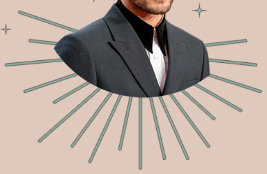
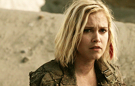
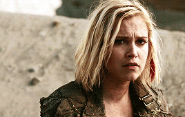
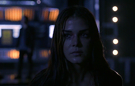
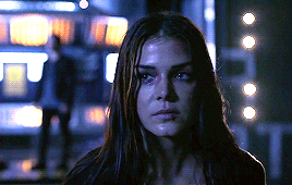
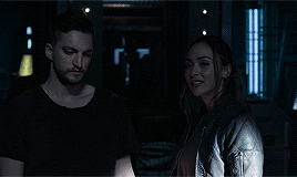
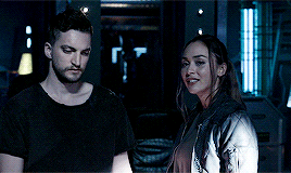
#this psd that i found made these colors POP SO HARD
Photo
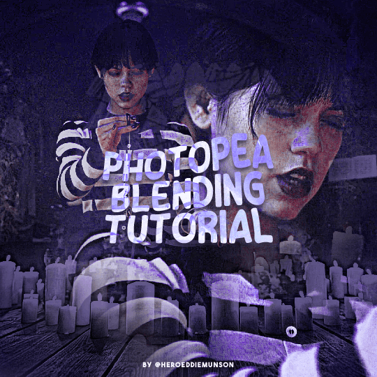
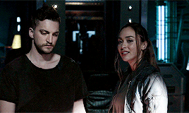
PHOTOPEA BLENDING TUTORIAL by kai @heroeddiemunson
howdy! i’m back with another tutorial for photopea :) nobody asked for this one, but i have noticed people who have reblogged my gifsets commenting on my blending, and i thought it’d be cool to have a tutorial on how i do it!
what you need:
photopea (basically photoshop in your browser, completely free!)
basic giffing knowledge, because i won’t cover it in this tutorial (other tutorials: tutorial by @benoitblanc, tutorial by @ashleysolsen)
decide what scenes you’re going to be blending; i don’t recommend blending more than three gifs together, just for the sake of being able to see what all your gifs are. for this tutorial, i will blending three gifs together. also make sure that all of your gifs are the same amount of frames as well, otherwise this blending tutorial won’t work!
step one: making your individual gifs
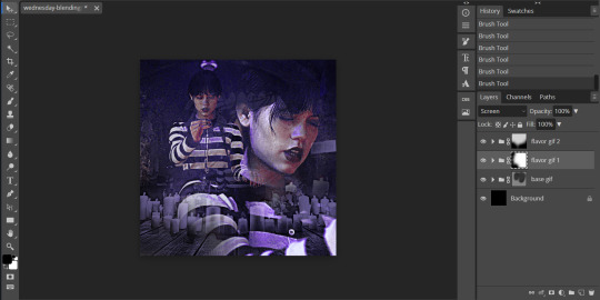
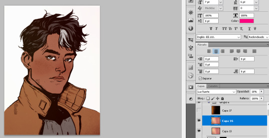
first thing’s first: you need to make the individual gifs you’re going to be blending. make sure when you’re cropping these gifs, you have a sort of understanding of what they will look like together; you can check this by right clicking on one gif, selecting duplicate to, and choosing the gif you’re going to be blending it with. on the other gif, you should have the duplicated version of the first gif on top. here’s what my work station looks like after i’ve duplicated two of my three gifs onto the third gif’s canvas:

now you can change the opacity of the gif(s) you have layered. here’s an example of what my three gifs may look like when they’re blended together (the middle gif is at 50% opacity, and the top gif is at 30% opacity):

since none of these gifs have been colored yet, it may be a little hard to see, so feel free to play around with the opacities of your gifs to make sure that you cropped them how you want them to be blended. i like my crops, so now i can color each of these gifs individually!
when i’m blending gifs, i like to think of them as my “base” and “flavor” gifs. “base” gifs i tend to keep simple, usually with some sort of color overlay on top of them to make the “flavor” gifs pop out more. below is what my “base” and “flavor” gifs look like individually before i’ve sharpened/blended them:

for my “base” gif, i colored it as normal, and then went to layer > new adjustment layer > gradient map; from here, i clicked the black to white gradient in the pop up, and then chose the white color and changed it to the color that i wanted (in this case, the hex code #b7a6ff). my “flavor” gifs are colored as i would color any other gif i’d make that isn’t blended.
save your psds of these gifs, sharpen, and go to file > export as > GIF. now you have the gifs you’re going to blend! great job! :)
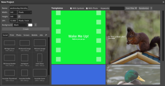
step two: making your blended gifs’ canvas
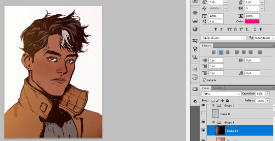
now that we have our gifs we’re going to blend, we have to have a “canvas” to put them on. to do this, go to file > new… and make a new canvas. make sure the canvas is the same size as your crops, and your background is set to black! below is what i did for the gifs i’m going to be blending:
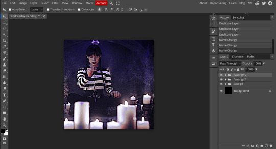
now to put our gifs that we made onto this canvas! unfortunately, photopea doesn’t allow you to use the open & place feature for gifs, so we’ll have to go to file > open and open our gifs individually. similarly to what we did in step one, right click your gifs and select duplicate to and duplicate the gifs you will be blending into your new canvas.
now your canvas will look something like this:
and we can move on to the fun part, which is actually blending the gifs together!
step three: blending!
so, when blending gifs, there’s a lot of ways to do it. i’ve found that blending gifs is a lot of experimentation, since you’ll probably never find yourself blending two gifs the same way every time.
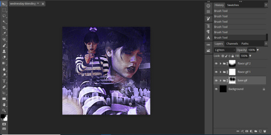
for now, let’s change the blending modes (drop down menu above the layers panel; it should say “pass through” right now) for each of the gifs, that we can actually see them as we blend them.
for my “base” gif, i always set the blending mode to “lighten” no matter what. but the fun thing about your flavor gifs is you actually have a fun choice of choosing either “lighten” or “screen”, depending on what you want the gif to look like. below i show the difference of what “lighten” or “screen” look like for each of my flavor gifs:

i personally really like what it looks like with my first “flavor” gif with the “screen” blending mode and the second “flavor” gif with the “lighten” blending mode, so that’s what i’ll be doing; but it always depends on your gifs that you’re blending and what you want it to look like, so do what works best for you!
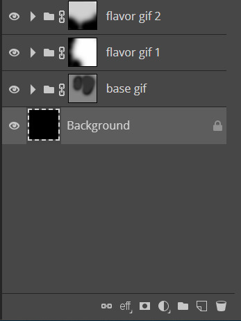
so as you could probably see from my screenshots or your own gifs, sometimes it gets a little hard to see your gifs. to fix this (and probably my favorite part of the blending process), select one of your gifs, and then look below your layer panel to click the “add raster mask” button (it looks like a little rectangle with a circle in the middle of it). do this same step for each of the gifs you will be blending, and your layers panel should look something like this (i’ve also highlighted the “add raster mask” button):

the raster masks are white, which means anything white is something you can see. using black with the brush tool gets rid of parts of the gif that may be visible. for example, this is what my gif looks like after playing around with getting rid of some of the stuff that was covering the parts of other gifs i wanted visible:
but to me, the black is a little too intense, as it gets rid of a lot of the gifs. but we’re in luck: the best thing about raster masks is that you can use various shades of grey to really blend your gifs together in unique ways by changing the colors in the bottom left corner. below i have a couple screenshots of what my blending for these gifs look like, as well as what my layers look like with the different shades of grey i used:
and now, our gif is almost finished! make sure to save your canvas as a psd, just so you don’t lose any of the work you’ve done.
step four: finishing touches
before we save this gif as a gif, i want to do some finishing touches. as we all know about me, i love myself some very colorful gifs, and i want the purple to stand out more in this gif. to do this, go to layer > add adjustment layer > gradient map and do like what we did for the “base” gif to make the same black to purple gradient we did before.
on the gradient map layer’s raster mask, use your brush tool like you used for erasing parts of your gif in order to erase part of this layer. i personally make my brush 1000px large and with 0% hardness into what i like to call my “big fluffy brush” (which makes no sense, because it isn’t fluffy, but it’s what i call it anyway). doing your best to center your brush in the middle of your gif and left clicking once should get rid of most of the gradient map’s color, but feel free to click again if you’d like. here’s what my gif looks like after two clicks of my big fluffy brush:

that doesn’t add much more color, but that’s okay, because it does add more contrast for us. go to layer > add fill layer > color fill and put in the color you have been using (in my case, that purple color). like the last layer, do your best to center your big fluffy brush and left click until you’re satisfied. here’s what my gif looks like after two clicks:

from here, i change the blending mode to “color”, and set the opacity at 50%. i then right click and choose duplicate layer, and with this new layer, change the blending mode again to “soft light” and set the opacity at 25%. now my gif looks like this:

now my gif is much more colorful! from here, i’ll add some typography and whatever else to my finishing touches before i once again save this psd so i don’t lose my progress. and now we can move to the final step!
step five: exporting
before we can export our gif, we have to combine our gifs together so they act as one singular blended gif rather than multiple separate gifs on one canvas. go to layer > animation > merge, and your individual gifs should be combined into one gif on your layers panel something like this:

and now, you can go to file > export as > GIF. make sure your gifs move together as you want them to, as well as that it’s until 10MB, and viola! congrats, you’ve just blended together a gif! :)
#photopea tutorial#photopea gif tutorial#completeresources#allresources#userars#userzesty#tusersai#dailyresources#gif tutorial#photopea#mystuff#mytutorials#hopefully i explained this good enough#feel free to send me asks if i said something confusing sjdhldsf
397 notes
·
View notes
Photo

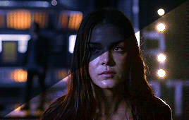
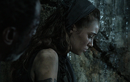
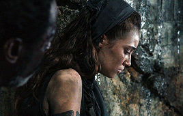
-- what is there to be afraid of, gin--?
reason is for those who cannot live without clinging to it.
/ @godkilller | personals do not reblog.
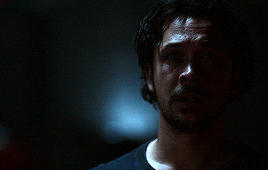
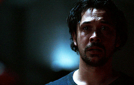
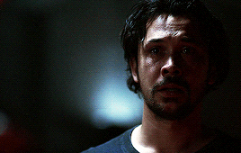
#aizen sousuke [ the beaming sun itself; something dangerous and yet captivating ]#ichimaru gin [ most honored poison of my heart ]#this psd that i found made these colors POP SO HARD#i may use this on the carrd i want to make sans text#but holy fuck look the psd made these colors SO NICE
18 notes
·
View notes
Text
#showyourprocess
From planning to posting, share your process for making creative content!
To continue supporting content makers, this tag game is meant to show the entire process of making creative content: this can be for any creation.
RULES - When your work is tagged, show the process of its creation from planning to posting, then tag up to 5 people with a specific link to one of their creative works you’d like to see the process of. Use the tag #showyourprocess so we can find yours.
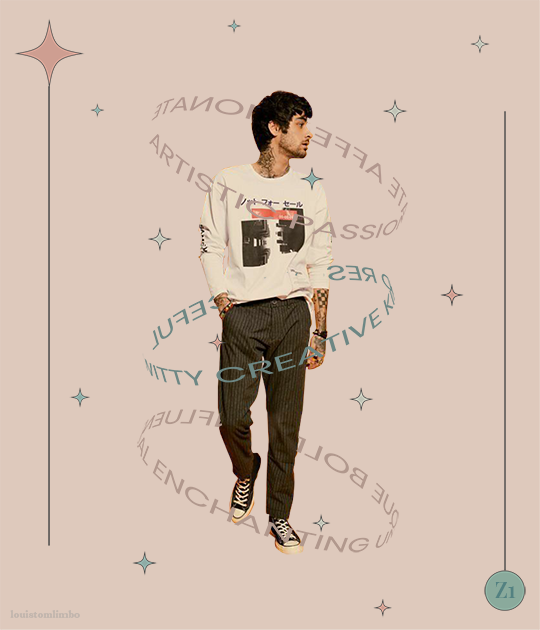
sabrina @lanwangiji tagged me to show how i made my zayn’s birthday edit! check out her explanation on this mesmerizing zayn’s edit
1. PLANNING
It’s Zayn’s birthday, I ought to make something because so far I have made birthday posts for Louis, Niall and Liam. I didn’t participate in his birthday challenge so I had more time to create something for his birthday. I saw this post by @spaceniall and instantly fell in love with it. It's so clean, so neat, an amazing edit. I had that post tagged for inspo and because my Louis’s birthday edit was a bit “grand”, I thought I should make something simple.
I went to look for some photos of Zayn everywhere. Literally e v e r y w h e r e. I saved every photo I found beautiful and there were a LOT. I asked my friends for adjectives that describe Louis best and added them on my Louis’s birthday post, and I followed that approach for this edit. I asked several friends what they think of Zayn and collected the adjectives.
This was a time where I haven’t used trello board, so I put all the adjectives in a google doc. Seriously I swear by trello board, they make my life easier.
After I had all the photos and the adjectives, I went to pinterest to look for the color palette. I forgot how and why I came up with this color scheme, but I believed I wanted something pastel and muted color.
I had this idea to make an evergreen birthday post. I didn’t want to state any “happy birthday zayn” or his age on the graphic. I didn’t want to make all the edits to have his face because I wanted to showcase my graphics and typography style lmao. So I came up with 2 pictures with Zayn’s face and one central picture with his name. And I’m obsessed with space stuffs so this birthday edit is space themed.
2. PROCESSING
This is one of my earliest edits that I made in Illustrator, though I used Photoshop as well.
2.1 REMOVING PICTURES BACKGROUND
Remember I saved a LOT of Zayn’s photos? Yeah? Well I had a hard time choosing the right one. I asked Sabrina to help lmao. After I agreed with myself which photos I would use, I opened Photoshop and prayed it won’t crash after 5 min.
I uploaded the 2 photos and then I used selection on Zayn and then clicked inverse and deleted the background. Recently I found this website who can delete your background in 1 min, tbh that’s a life saver. I recommend using them, if you hate removing backgrounds with Photoshop.
I saved the backgroundless Zayn’s photos as png. And we’re moving on to the next step
2.2 THE TYPOGRAPHY
I only used Photoshop to remove the backgrounds. Now onto Illustrator. Always pray it won’t close by itself every 5 min.
I don’t really remember which dimension I used, but I suspect it’s 600x700 px. I made 3 artboards and loaded the color palette I found from Pinterest. I made 3 rectangles as the backgrounds for each picture and filled them with my desired colors, 2 pink and 1 green. Green being the standalone was put in the middle.
A bit of excursion based on my experience
When you open an artboard in Illustrator, you’ll see a white background. When you save the file you’ve worked on, it’ll actually be transparent. That’s why I always draw a rectangle as a background so it has a solid color.
I focused on ZAYN (middle pic) first because I wanted that to be the main focus. I don’t remember the font I used and I already deleted all files. I followed this tutorial to make the text. Basically you write your text first and choose effect > 3d > extrude and bevel > isometric top. Changed the colors according to my color palette.
I moved on to the first picture, Zayn and the adjectives. I uploaded his photo to the artboard and put it in the middle. I wanted the adjectives to encircle him. I just followed this tutorial on how to make the effect. I made that text effect because that reminded me of the saturn ring lmao.
2.3 THE GRAPHIC DETAILS
Once I got the typography done, I made stars and moon to make the edits merrier and more space themed.
For the stars you can follow this tutorials. For the moon I made 2 circles, one of them was bigger. I put the smaller one in front and click minus front (I think). For the saturn planet, I made a circle with filling and an oval with stroke only, putting the oval infront of the circle and delete the back part of the ring (I hope this makes sense).
I have these lines around Zayn, my intention was to make Zayn pop and kind of crown him or give him a glowy effect sort-of.
All I did was follow this tutorial and delete the lines at the top, because I didn’t want it to be too crowded. Then I put some stars and planets at the top to balance it.
2.4 FINISHING TOUCHES & EXPORTING
I rearranged some things, zoomed out the artboard so I could see everything as one post and picked and deleted some unwanted things. After I was satisfied, I added my watermark and it was my old url, I just typed louistomlinboo. (Now I made a logo-ish and use that as my watermark and the logo is not dependent on my url)
Ok I lied I used Photoshop again… so I had these adjectives in 2.1 that encircled him right but some parts of the texts are above him. I exported my Illustrator file as a psd, uploaded it on Photoshop and used layer mask magic to delete the texts that were above him to create an illusion that the texts went around and under him you know. See the picture below, some texts are beneath him.
For this picture I exported the png file from Photoshop, the rest directly from Illustrator.
This was when I learned I needed to scale up, because on Illustrator they all look good in terms of quality. But when I posted it, the quality was reduced. That time I just exported as big as the dimensions and I was disappointed with the quality when it’s on tumblr.
3. POSTING
I uploaded the 3 pictures I have on tumblr and chose “happy birthday zayn” with star symbols/emojis to keep up with the space theme.
So I always write out what my caption will be with the “rich text” option.

Then I go to this color html website to add the gradient color in the caption and remove the “;” with “ “ in here. Once I have everything, I change rich text to html so I can put the text with color in html mode.
Put some tags related to Zayn. (self promotion time lol. i have compiled tags for 1d creators check them out here)
I finished I think a week earlier before Zayn's birthday so I saved it on draft. I posted around midnight (my timezone is CET), because oh boy it is a competition with birthday post lmao. That’s what I feel like at least. You know, everyone wants to make a birthday post, I feel I have a better chance If I post something first. Whenever I have something done earlier before a certain due date, I either save it on draft or schedule it so it’ll be posted automatically.
Yeah that’s it! It’s not as detailed as before I think because the files are deleted sorry!
i’m tagging:
@spaceniall for this wonderful niall’s birthday edit
@she-fearlesss for this magnificent louis’s birthday gifset
@finewalls for this mesmerizing animation
@louitomlinson (i know you’re not that active but if you want and can!) for this amazing edit
and @tomlinsun for this cool edit
21 notes
·
View notes
Text
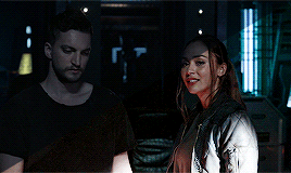
THE 100 GIF/COLORING TIPS
Okay, so I know nobody asked for this lmao but I’ve seen a lot of people complaining about the lighting on The 100 (which is completely understandable since it’s very bad.) And even though I’m not at all a pro, I’ve been giffing this show for awhile and I’ve found out some stuff that might be useful for other The 100 gifmakers out there.
Please reblog/like this if you save anything from this tutorial or if it helps you at all :)
WHAT YOU NEED
Photoshop (I use CS5).
General knowledge on giffing.
Patience because The 100 is a hard show to color.
COLORING PREVIEW

WARNING: This is very long. Everything starts under the cut!
GENERAL GIFFING TIPS
Get 1080p/720p downloads. Since The 100 is already a very dark and grainy show, anything lower will ruin the gifs’ quality.
Make sure you have cropped the gifs to the proper Tumblr size. Click here for reference. And get rid of the network logo when you’re cropping it! It always looks better without it.
Sharpen your gifs! I don’t see any reason why you shouldn’t. Sharpening your gifs will make it look more HD and show off your coloring better. My sharpening is a smart sharpen with these settings. You can go here if you want to experiment with other actions/settings, though.
Do not have any skipping frames. Please. Your gif will look sloppy and won’t be as smooth, therefore ruining the quality of it.
Make sure you have the gif timing right. I usually go for 0.05 seconds because personally I think it looks best, but I’ve seen some who went with 0.04s or 0.07s and that also works well. Go for 0.05s! I realized now other time settings doesnt work as well as 0.05s especially with The 100.
Save settings. My usual go-to settings are these. Though sometimes I went for selective instead of adaptive and it looks okay, too! :)
+ extras: subtitle!
The font you use for subtitles on your gif will also affect the way your gif looks. Fonts that are too big or too small will make it look less HQ, but having the right font with the right size (and the right position!) will make it look good. Here are some text settings you can use that I’ve found: [ one / two / three ]
COLORING TIPS
Now that you’ve kind of gotten the general giffing tips, I’ve listed out some coloring tips that I found out specifically for The 100. All PSDs will be linked at the end of this post.
Adjust your brightness before anything else.
The 100 is generally very dark, but even with scenes that are already not too-dark, you’re still gonna want to adjust the brightness so you can work on the colors better. I’ll go detailed with this one. We’ll be working on 3 scenes, bright, neutral, and dark scenes.
1. BRIGHT/YELLOW
For this one, I used a scene of Clarke from Season 5.
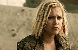
The scene is already very bright, so what we’re gonna do here is to adjust it so it’ll look prettier without being too bright that it hurts our eyes. First let’s do curves. I added two curves layer, the first one is to add just the tiniest bit more brightness to her face, and the second one is to darken the background. and then I’m gonna add brightness and levels for contrast:
Alright, now that I’m already happy with the brightness, I’m gonna go and adjust the color. This is too yellow for me, so I’m gonna add a color balance layer to and pull up the blues/cyans/magentas

That’s good, but it’s too desaturated. I’m gonna go and add selective layer to make the colors pop up. I adjusted the red, yellow, and neutral and I got this:

Now this looks great already! Unfortunately, I’m annoying so I have to add more adjustments lmao. This is the final result after being added with an extra brightness layer and a gradient map on luminousity.
2. NEUTRAL
For this one, I’m gonna use a scene of Lexa (reshop heda you’ll always be missed) from Season 2. It’s not very bright but it’s also not too dark.
Now the tips with scenes with enough clarity (doesn’t have to be super bright, but if you can still see things clearly) like this one, clicking the ‘auto’ button on curves saves a whole lot of time. I did so and this is what I have in result:

The auto curves will usually brighten the gif and balance the color on it. Often times you still have to adjust it again. But still this will save a lot of time. I added some more brightness and levels before adding color balance and selective colors layer, and here’s the final gif:
Keep in mind that this will only work with some scenes. This will work alright with the Clarke gif above, but it definitely won’t with this next gif we’ll be coloring.
3. DARK/BLUE
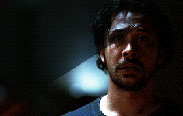
Okay now this one requires some work. I chose Octavia’s scene from the Season 6 trailer.
The original sharpened gif (notice that I got rid of the logo! It’s really annoying for me so I always find a way to get rid of it.)
It’s reaally dark. So let’s start with brightening it up a little. I added curves, brightness, levels and more brightness because it was still dark as hell:

Now, you may think it’s already bright enough, but for me personally I can still make it brighter, so I added exposure. With dark scenes exposure works really well. But you have to take it easy with this layer since it affects the gif drastically with very minimal effort. I also added a black and white Gradient Map layer that I always set to luminousity:
Now it’s time to go and adjust the hell out of the color balance to make it less blue! I also added an extra selective colors layer to make the reds pop out and get rid of the pixelated/grainy blacks on her hair. After that I added another brightness layer. Here’s my final result:

The quality on this gif is not as good as the others since it was from the youtube trailer (1080p youtube video are still low compared to web-dl’s) but that’s basically the gist on how I work on The 100′s darker scenes! :)
Color balance and selective colors.
The 100 lighting often makes your gifs not only too dark or too bright, but also too yellow or too blue. Balancing it out using a color balance almost always helps. Selective colors layer will also help when you want to pop up certain parts of your gifs. Here’s some tips on selective colors that I got from msmarvel’s coloring tutorial.
Selective colors and color balance layer usually go in the middle or on top of brightening adjustments for me. But I found out that color balance could also be done after you’ve done your coloring, but you have to put it under the other adjustment layers to have the most effect.
I’m gonna show you how I edit this gif here of Raven and Murphy with what I’ve said above.
Without any coloring:
Yeah, I know. I can’t see anything either.
I brighten up this gif using my method above for dark blue scenes. Curves, brightness, levels, and add more depending on what you need. Here’s what I have now:
We can see both of them properly now, but it’s waay to blue. Also I’m losing some color from Raven’s skin so I’m gonna add color balance under every adjustment and pull up the reds and yellows.
Now it’s better! You can totally leave it here and post your gif like this. but I added an extra selective colors layer to bring out the red, yellows and blacks, and here’s the final result:

I should mention that when it comes to scenes with POCs, you have to be very careful. With this scene with Raven color balance and selective colors helped bring back her color, but on other scene adjusting too much of the red/neutral/yellow might ruin her skin. You are allowed to adjust the colors on a gif extremely when necessary, but be careful about it :)
Some dark scenes are supposed to stay dark.
I realized that with the 100 (or any other shows tbh) brightening up a gif with a dark scene too much will make it lose so much quality and ruin it. So, what I’ve learned to do is to let it be dark. I’ve seen some people brighten their gifs too much and even though I understand your frustration, it’s gonna be better if you just let it be as it is. But, still, make sure it’s bright enough so you can still see the things happening on the gif.
Here’s a gif of Bellamy from Season 5. You can see how dark it is without any coloring:
First, let’s brighten this baby up so we can see Bellamy’s face. I added curves and brightness, levels and more brightness:
Now I know it’s still very dark, but instead of brightening it up too much I’m gonna go to color balance and add the tiniest bit of red and yellow, and then I’ll add a photo filter. These two adjustments are done so we can have more color on his face instead of the ugly dark red we had. With those adjustments, what we have now is this:
Next, we’ll move on to selective color. This is what I mean when I say you have to be careful with this adjustment. I want to brighten up Bellamy’s face by putting down the blacks on the red selective color. But by doing so I might erase all the reds from his face and whitewash him. To prevent that, while I put down the blacks, I bring up the reds (lowering the cyan) and yellows. I also pull up a bit of neutral and black selective color so I can get rid of the grain (adjusting the black on both selective colors.)
With a little more last-minute brightness, here’s the final result:

That’s pretty much it! You can add more brightness than what I did here (I was in a rush when I made this but I would definitely add a little more curves or brightness) as long as it doesn’t ruin the colors and won’t make the grain too visible.
Now as promised, here are the PSDs I made for this tutorial! Please don’t claim them as your own and feel free to tag me (#useraaya) if you make anything with them so I can check it out :)
[ clarke ] [ lexa ] [ octavia ]
[ murphy & raven ] [ bellamy ]
I hope this helps! Don’t hesitate to message me on my main blog if you have any questions. <3
#itsphotoshop#yeahps#chaoticresources#the100edit#the 100#**#gif tutorial#coloring tutorial#*tutorials#*resources#aaya
422 notes
·
View notes
Text
VENUS’ GUIDE ON HOW NOT TO WHITEWASH
STEP NO. 1 ━━ DON’T WHITEWASH ! yes it’s that simple , just don’t ! IT’S 2K19 FOR GOD’S SAKE . don’t whitewash poc with the way you’re writing them , don’t use an psd that will whitewash poc .
✿ CHOOSING TO WRITE A POC MUSE? do your research , find out as much as you can about their heritage , their culture , their values . this is not a suggestion , IT’S YOUR RESPONSIBILITY . JUST TRY GOOGLE , it’s free & easy af
✿ CHOOSING A FACE CLAIM AT RANDOM ? do your research , it takes like two seconds google ‘ faceclaim name ethnicity ‘ & you’ll know if your faceclaim of choice is a person of color or not . WHY IS THIS IMPORTANT ? well , FIRSTLY , it’ll give you pointers on how to write them . SECONDLY , it’ll tell you if u can use the neon pink & white psd you’re currently nuttin’ over on your face claim’s sweet face.
STEP NO. 2 ━━ FEEL LIKE ARGUING WITH THE PERSON TELLING YOU YOU’RE WHITEWASHING YOUR MUSE ? JUST PLEASE DON’T .
don’t be rude , don’t be passive aggressive , just politely own up to your mistake , & work hard to rectify it as soon as possible.
WHAT ELSE YOU SHOULDN’T DO? MAKE THE FOLLOWING EXCUSES ━
✿ “OH MY MUSE LOOKS WHITE, I DIDN’T REALISE.” NO . like i said , do your Research PLEASE. poc come in all shades , a lot of them can be white passing . but that still doesn’t give you the right to cast them as white nor can their light skin tone be used as an excuse to use a fancy psd that makes them look like casper the ghost.
✿ “OH I COULDN’T FIND A POC FRIENDLY PSD.” NO, JUST NO. YOUR INTENSE DESIRE TO HAVE A FANCY SCHMANCY PSD doesn’t trump your RESPONSIBILITY TO PROTECT & UPHOLD FACE CLAIM’S IDENTITY & ETHNICITY . like if worse comes to worse, you can just use plain icons . ALSO IT’S 2K19 , STOP SAYING “OH ALL THE POC PSDS ARE BEHIND A PAY WALL” it doesn’t just make you sound entitled , it’s incredibly hurtful to people who are generous enough to make & post resources for free? commissions blogs just started popping up like last year, & i don’t think there are more than 50 of us out there. there are literally so many free bomb af poc friendlly psds out there these days, even i have a free one out that works on all skintones ? not to mention thousands of rph’s / tutorial posts / photoshop blogs that will help you learn how to make a psd yourself .
HELPFUL LINKS : x x x x x x x x x x x x i found these after a quick search , but there’s a lot more out there.
✿ “ OH , YOUR SCREEN MUST BE TOO DESATURATED , IT LOOKS FINE ON MY END !” this , frankly can be a valid excuse 0.9 % of the time but isn’t usually. IT CAN BE AVOIDED THOUGH, all u need to do is ask a couple of your friends to look at a few images of your fc with the psd applied on different devices. YES IT’S JUST AS SIMPLE AS THAT. also, be polite , there’s no need to act like a smug bum when this is an issue , the person might be genuinely UPSET if they came to you in the first place & their feelings are valid ! ALSO, 99.1% OF THE TIME YOU’RE JUST LYING & USING THIS EXCUSE AS AN EASY WAY OUT , WE CAN TELL LMAO.
that’s it , that’s the guide. FEEL FREE TO REBLOG THIS, YOU CAN REBLOG THIS ON YOUR MAIN BLOG , REBLOG THIS ON YOUR SIDEBLOG . HECK, REBLOG THIS ON THE BLOG YOU HAVEN’T BEEN ACTIVE ON FOR A YEAR , I DON’T MIND . just please stop whitewashing , i’m begging you guys . as a woc , it pains me to see graphics whitewashed to the hell & back every time i log on , it pains me when muses are made poc just for the brownie points & their characterization is just mostly cultural stereotypes & misnomers . please guys.
186 notes
·
View notes
Note
hi! just wondering if you've done a coloring tutorial for how you colored the jason art by robles? it looks so amazing! 💞
i havent no, it’s pretty similar to my other tutorial here but a bit more extensive? idk doing another it’s fun

1. okay first of all i had to clean up the art bc it was like brownish and not clean enough to um color? so again, first u gotta make it black and white. I use ps5 in spanish so i’m using as many pics as i can as i’m not sure the english words lol

2. I’m not redoing this piece, just walking back my steps in the original one so sorry if anything is sssslighly different. Here, like many other steps, you gotta decide for yourself the settings and what looks better for you, as the art is different in each case and might need different settings. The point here is to make it as white / black as possible so it’s easier to color cleanly, but without making it super saturated (which could happen)

3. that looks fine, but it’s.. not as clean sharp white/black as it could be. So go down here (idk why it wont let me screenshot it >_>) and add a levels / niveles layer

4. looks like this
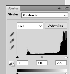
5. and again you gotta play with it yourself, testing what looks good for you. the goal in my case is to make it as clean as possible. My settings were 51 / 0,85 / 255

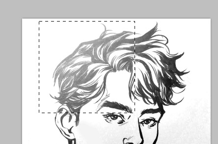
6. okay so next, there was a patch of like light that i didn’t like - the flash of the camera i think? the light of the room where the pic was taken? idk. So i wanted to get that to match the rest of the image. I selected it (here i saved the wrong screenshot LOL it ended up being a bigger selection)
7. and again down down there where we picked levels, we go to color selection i think?

8. and i used neutral +40 to even that patch out

9. as you can see it clearly looks like a square and there are parts that were just fine like they were

so with an eraser, idk what dureza is in english sorry but make it a low number, maybe even lower the opacity, erase around the borders of the darker patch to make it even?

i’m gonna be honest with you i didnt notice how uneven it still looked till now LMAO but its fine it doesnt have to be perfect, we arent artists we’re just making do
9. Okay i added another color selection or w/e layer, this time on black like this, and another one in white (that i didnt screenshot sorry) but was on -100.

10. OKAY NOW THE FUN PART!!! COLORS! i went over it on my original tutorial so i won’t be redoing it lol but its basically that + i added freckles which i genuinely can’t remember which brush it was sorry! but i found on deviantart.

11. I added this psd
12. now what i think made the piece pop up were the textures i used. First this one on Hard Light 9%

then i copied that one and put it hard light 10% (NO dont ask why i didnt just use one on 19%. the inner machinations of my mind are a mystery)
and then this one on overlay 50%
and that’s pretty much it?

i didn’t go over the actual colors because it’s literally what i do in all my pieces nothing different, but if u want to see each layer lmk and i’ll edit the post and add them.
hope this was hopeful.
#Anon#tutorial#loooong post is long#long post#instead of keep on studying i did this FUCK okay back to my geography hole
20 notes
·
View notes
Note
How exactly do you get started when roleolaying ? Like how to set it up
Hey there! I’ll let you know how I specifically set up a new blog. It’s different for everyone.
Sleep on it. This is a weird one. Whenever friends come to me asking if they should make a character, I like to tell them to sleep on the idea. A lot of times people pick up a character they may not understand or don’t know how to play, so when they actually make the blog, they feel sad and disappointed by their own writer’s block. I like to pine over the character first and create some headcanons so I already have a picture of the character in my head.
Aesthetic. Yeah, we all know I’m a slut for aesthetic, and this goes from the URL selection to the tagging format.
URL. Personally, I’m partial to shorter URLs, and nothing too on-the-dot. For example, if making a Loki blog, I’m not too partial to something like ‘iamloki’ or ‘lokilaufeyson’ or something. I like a bit of imagination. Using the native language of the character, if it’s not English, is always cool. ‘misunne’ means envy in Norwegian. My Belle is ‘greatsomewhere’ from my favorite line of hers in her song Belle (reprise). Some of my favorite URL selections are Ryder’s skychose for Anakin (how Anakin chose to roam among the stars, and it’s a twist off of his last name), Annie’s guiltweathered for Tony (guilt is a big subject to Tony’s character, and the boi is tired), go on and so forth.
Theme. Now, this is where some people have a lot of dispute. So many say you don’t need to be overflowing with aesthetic to be a good RPer. I agree to a point. I consider your theme and aesthetic to be your blog’s handshake, and it’s really easy to make it cool. You can go full out like mine (Ryder made it for me) and design a background to fit around a theme. If you don’t have photoshop skills or you just don’t want to, minimalism is always in. This is why I think it’s easy to make your aesthetic look nice. Check out my Belle’s minimalist theme at @greatsomewhere . Clean, crisp, and white, with a pic describing her. Books! Easy. I like to get my themes from theme-hunter or just poking around my followers/mutuals’ theme makers.
Blog preview. Again, people trip up here. This is before your handshake. This is your first smile when you meet someone. Make it look nice. I like to make my mobile banners on photoshop with psds and whatnot (Loki’s current one is made by Ryder), but when I first started as Loki, I just wanted to get going, so I used something I found on Pinterest. Yep, that was literally it. It’s minimalist, drawing, and not too confusing. Do NOT make your preview colors anything but a neutral tone. I’ve seen bright blues, greens, pinks. I immediately click away, they hurt my eyes. Make sure your blog preview clearly says who your character is, what fandom they’re from, and your alias. This is the bare minimum. These things are required. I can’t tell you how many people I see around who have nothing at all. Don’t make your followers dig to see who your character is.
The blog itself. Again, you can be pretty simple here. A lot of people have fancy pop-ups, as do I, but it’s not necessary. Just making pages with links is good enough. You need to have a rules page, which needs to have the bare minimum of your age (18+ or minor is good enough), your alias, your pronouns, your triggers, and your interaction policy. Are you mutuals only? Are you open to non-mutuals? These are requirements. Beyond that, I like to have my thoughts on shipping (if you have a ship you will NOT do, or one that you love), mains/exclusivity (I’m never exclusive, but let people know if you will only play with one version of a character), and anything else you want your followers to know before interacting with you. I’m always editing my rules. Beyond your rules, if you’re an OC (or canon divergent canon character), have a detailed about page. It’s nice to have a verses (where you have the tags for all your different verses and AUs) and navigation (links to your open starters, meme tag, headcanon tag, etc) page. Then whatever else you want.
I list all the aesthetic things first because it’s best that your blog is at least SLIGHTLY finished before starting. I know you may be eager to start right away after making a URL, but I won’t follow a blog with nothing on it. If a blog is just the basic Tumblr theme, I’ll assume it’s a spam blog. We get a lot of those. I block spam blogs on sight.
Content. If a blog is all done up and pretty but with nothing on it, I won’t follow back right away. I may come back to look again later, but I may forget. Try to get some content on there first. Reblog your faceclaim, some aesthetic things, and maybe write a headcanon or two, just so people can see your formatting and writing pattern. Do you write in purple prose? Is your writing straight forward? Is it heavy with narrative? Is it mostly dialogue? Do you use icons? What kinds? There are always people who will write with different kinds of writing patterns, and always those who won’t. I like to make sure we have similar writing patterns before following.
Advertisement. After your blog is pretty and functional and you have some stuff on there, it’s time to let people know about it! Create a promo! These can be as simple or fancy as you want. When I first made Belle, I just wanted to get started, so I made one of those text promos that were popular a few months ago. I let people know I was still under construction, too. Just so they knew. Later when I put more time into it, I used one of the cool new templates that are going around, and I love them so much. I have photoshop, but I’m not good at it, and this is as easy as copy paste.
Tags. How will people find you if you don’t have them? They’re so important! Personally, and I know a lot of people feel the same, I won’t follow people without some sort of tagging system. For promos, tag it with ways you would search in the Tumblr search engine for an RP blog. For Belle, I put things like ‘disney rp, disney roleplay, beauty and the beast rp, batb rp’, so on and so forth. For your average posting tags, I prefer to keep it simple. I have a tag for each verse, an in character and out of character tag, and I always tag the url of the person I’m reblogging in a reply. Making fancy url tags for your partners is cool, but ALWAYS leave their basic URL as well. If I go on my partner’s page and search my URL tag for my last reply but can’t find it bc it’s just a fancy one, I’m very annoyed.
Search! Same as above – go find people! Search the same tags you made, look for masterlists. Once you follow a few blogs you’re interested in, Tumblr recommends similar blogs, so I love eating those up.
Interact! People don’t really do intro starters anymore, like when someone follows you back and you make them a starter, but hey, you do you. It’s great to have a starter call out there (and reblog it a few times, like twice a day or so), as well as a sentence starter meme. Like people’s starter calls. Send them memes. Respect their rules. If they say they’re mutuals only, oblige. Don’t send them things if you’re not mutuals. (If you’re brand new, mutual means you follow them and they follow you.)
Have fun and don’t be discouraged! Making a new blog is hard. My Loki has something like 550 followers, Belle has something like 30. Depending on the character, the size of the fandom, a bunch of little things, it may take some time to get noticed. Don’t expect people to jump on you right away. It’s your job to reach out to them. Act like your blog already has a bunch of followers. I like to post jokes, headcanons, my feelings about my character, so when people follow or visit my blog, they see how passionate I am about my character and how much I’m thinking about them. People love to see you love your character. Don’t be negative. Do NOT post about how few followers you have, or how you’re not being noticed. I know it may be disappointing, but that sort of thing will only discourage them from following. Love your followers: thirty followers are just as beautiful as five hundred. They’ll keep coming. In the meantime, establishing great connections with the followers you do have will make it seem like you have a thousand. Make your blog a happy place to be! Make friends! There is always someone there who is interested.
Let me know if you have any more questions, and welcome to the RP community!
10 notes
·
View notes
Photo

a few ppl have been asking how i make my icons/transparents so ive finally decided to post a tutorial.
please like/reblog if you use my method, thank you

(apologies in advance if my explanations aren’t totally clear.)
here are all my icons for more ref.
first i should mention that i use firealpaca and photoshop. i try to keep my icons very simple and clean with solid backgrounds.
step 1: making your transparent
once i have my screenshot, we’ll use my my boy keith for this example,

i bring it into firealpaca and use the selectpen tool:

i use this to outline the character before filling them in:

i erase the whole background (selectpen > eraser), then i put a dark background behind the character layer to clean up the edges and fix outlines to make everything look clean. (eraser/pen tool)


after everything is clean, you can either:
outline the character yourself in firealpaca w the pen tool
or use the stroke option in photoshop
here are my settings:

that’s it transparent wise!

step 2: turning it into an icon
before anything, i resize my images and position it where i’d like it to be. i try to keep my icons at least 300x300, but personally i like mine 400 or 500 if it’s possible. after that, i add my effects - a stroke line and a gradient overlay. the gradient overlay keeps it from looking flat, which i like to avoid sometimes. (double click the layer you want them added to, the box will pop up) here are my settings.


then i get into coloring it. i prefer psds, but for the tutorial ill edit keith myself. i usually start out with the vibrance and or brightness/contrast. ill turn the vibrance way down to dull the color,

then mess with the selective color. for keith ill turn the black all the way down to make it darker, pull the white up about ¼th and mess with the purple and blue to make his suit pop.

finally ill mess with the curves option to make everything a little bit darker and add a soft grey background.

color editing is really just trial and error if you don’t want to/can’t use psds.
now that you know the gist of the icon process, here’s another quick example using allura instead.

remember not to whitewash characters. it’s not hard at all. here is a psd pack made just for dark skin that helped me with allura.
i hope i explained everything well, if you have any questions please check my faq before sending me an ask. please remember to like/reblog if you found this helpful!
67 notes
·
View notes
Last Seen Blogs

ec1dnac
candice
sevdigimsarkisozleri
Sevdiğim Şarkı Sözleri
hj-skb
The S̴͓̮͐͂ḙ̷̻͋c̷̗̩̉͑r̷̟̈é̵̦t̴̨̠̍͑ 8th

rockwood790
Untitled
