#tiny edit bc once again i used discord text styling outside of discord
Note
I love you art!! Do you have any advice for choosing colors that work well together?
thank you! colors mostly just come naturally to me (whether its actually natural or if i've just internalized color theory so strongly that it feels natural i'm not sure lol) so im not very good at actually explaining it. most of it is genuinely just what looks good to you, but looking up some basics of color theory can help a lot to narrow down options so it's easier to pin down what you want.
doing those limited palette challenges (especially when the subject matter doesn't necessarily fit the palette colors) can be good practice and i think at least a small portion of my skill in the area comes from playing those color-sorting phone games like blendoku or i love hue lol. also probably related is the year or so when i was younger where i just refused to use gradients whatsoever for some reason
that aside, here's very bare bones color theory (i wont get into it too deep, there's a billion explanations online that are leagues better than i could explain it) and some tips that might be useful?
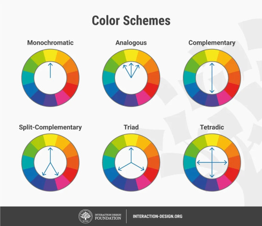
|img source|
i tend towards 2-tone palettes when i'm doing full color n they usually end up being complimentary (purple + yellow, green + pink) or close (blue + yellow, green + purple, pink + blue). i like a good strong contrast, which i think is generally what people mean when they say my style pops- having contrast makes the colors seem even brighter and stand-outish.
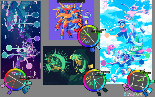
| left || top || bottom || right |
maybe that ^ helps? the ratios are rough estimates of how much of each pic is each color group. some common advice in general design (it's actually used in a lot of stuff- webpages, interiors, etc) is having 60% main color 30% secondary color and 10% accent color (but like i said, i mostly work in 2 colors so i don't have a great example on hand)
as for finding colors, i'll sometimes search for photography that has the kinda vibe i want- for the kindred spirits pic i literally searched "blue and green spooky toxic photography" and i think i ended up referencing a pic of green lights reflecting off of wet pavement on a dark street.
one big thing that i hardly ever see mentioned but i personally utilize an absolute fuck ton- dulling colors makes them lie. use this to your advantage. say you're using bright green; if you use a gray-blue it can look like purple and will blend with the green instead of contrasting like an actual purple would

| right example |
of course there's lots of situations where you do want the purple (or whatever color) to be a contrast, but this is useful when you don't.
a lot of the time lately i'll color everything in a base monotone (or very slightly varying analogous colors ie teal through indigo) and then make the lighting a contrast (complimentary) color on an 'add' or 'vivid light' or other lighting layer, then sometimes color pick the contrast colors shown in the lighting n use them sparingly to fill in a few of the base colors that didn't fit well being the base color. you can see that in the drowning picture (blue is the base color with pink lighting) and the kindred spirits drawing (gray-blue base colors with green lighting).
one last thing: never be afraid to use filters. almost all of the finished art i post has at least one overlay or gradient map or tonal correction layer ontop of it all. i'm quite partial to a low-opacity gradient map layer set to whatever colors i scrolled thru in my list and liked the vibe of, a black and white gradient map layer with the layer set to brightness (also on low opacity), or messing around with a tone curve or color balance layer.
if someone starts shit with you for using filters on your art fucking block them. in general if it looks good it isn't cheating (insert common sense caveat that you aren't stealing other people's art etc etc)
#tiny edit bc once again i used discord text styling outside of discord#this got kind of long woops lol#i hope this maybe helps? i'm never sure if i actually answered the original question when i get long-winded like this#talking#answers#tips
96 notes
·
View notes
Last Seen Blogs

joekennison
Untitled

sarah934
Untitled

swordwithribbons
Naraazia

gabrielasampaio
No Mundo Da Gabi

xdgzin-blog
Sem título