#to get a nice gradient up from pink to opaque white
Photo
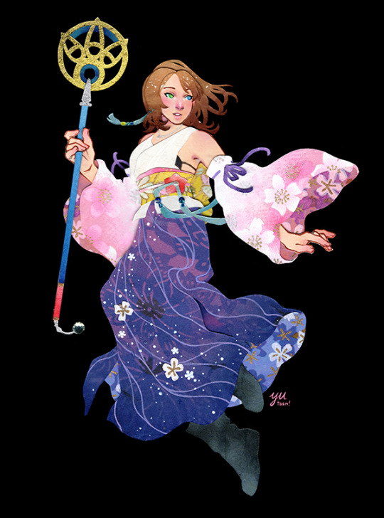
Papercraft Yuna from FFX! This game came out riiiight when Baby Yutaan was starting to figure out the bare bones of how design worked, and I was absolutely floored by the game’s aesthetic, particularly the character and clothing designs; Yuna was my favorite of the whole cast, and she still has one of my top favorite character designs of all time. I’ve wanted to make a papercraft of her for years, but was never satisfied with my sketches. But finally I feel like I’ve managed to do her justice! 🌸
#final fantasy x#ffx#yuna#final fantasy#papercraft#papercutting#paper art#my art#her SLEEVES were what really got me#I thought it was just the coolest costuming choice I'd ever seen#so I put some extra effort into the sleeves on this piece!#they're that pink flower pattern but I went in on top with white colored pencil#then white stamp ink#then white gel pen#to get a nice gradient up from pink to opaque white#the ink took more than a full day to dry but I really like how they came out :D
1K notes
·
View notes
Text
Hey, since a bunch of new people are following this blog now, do you guys want to see my Cool Rocks?
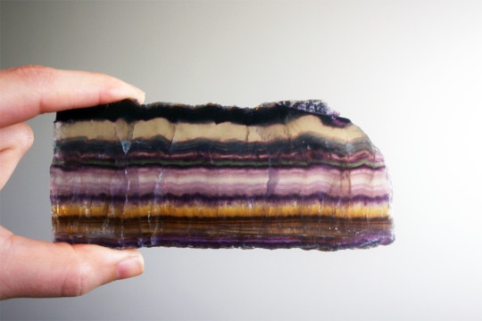
To start with, here’s a super amazing stripy colorful rock. This is banded fluorite, the most colorful rock in the world! The best way to view this rock is with a little light behind it.
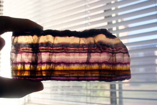
It’s so cool how all the little cracks in the rock cast shadows. And the way those colors glow! Look at all those different purples. That golden yellow gradient! Those thin stripes of teal and green and blue!! Amazing!!
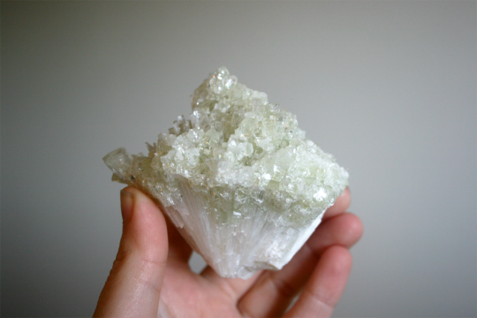
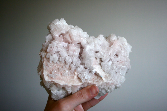
Here’s a rock which is business on the bottom and party on the top. Those pale green crystals up top are apophyllite. Here is a fun apophyllite fact: just like zeolite, apophyllite isn’t a mineral, but the name of a whole group of minerals! This piece might be natroapophyllite (probably not) or hydroxyapophyllite (maybe?) or fluorapophyllite (likely!) but it’s hard to tell without testing its chemical composition.
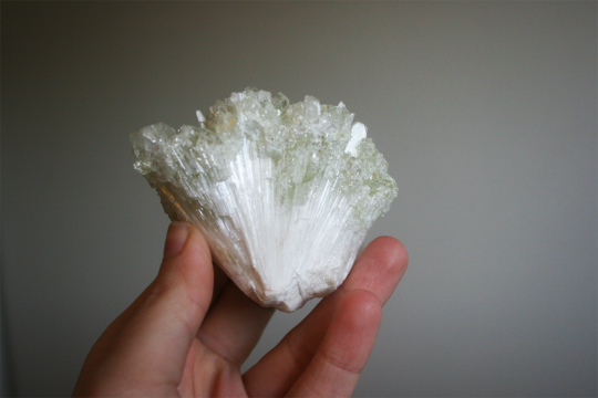
Speaking of zeolites, this cluster of crystals down below is a zeolite mineral called scolecite! It has the coolest crystal habit! Scolecite likes to form these silky white needles which radiate outwards as they grow. This apophyllite and scolecite growing together make such an awesome specimen.
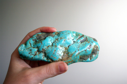
Turquoise is my birthstone, so it’s always been one of my favorites! That’s why I need an unreasonable amount of it. Look at this massive chunk of turquoise. This monster. This absolute unit.
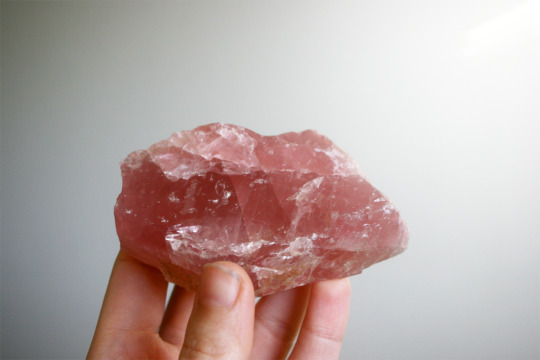
Here’s a lovely pink rock. Rose quartz may be a common stone, but mine has a secret backstory.
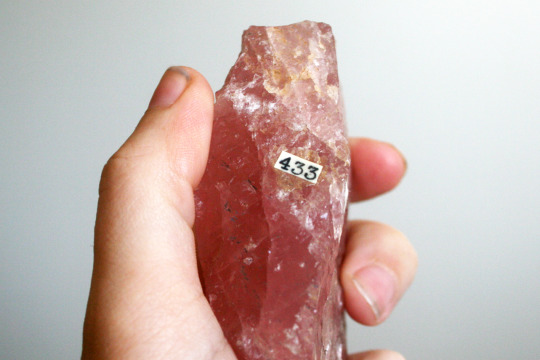
Back in the 40s, my rose quartz belonged to someone’s private mineral collection. The number identifying her as specimen 433 is still attached with resin! I would never in a million years scrape it off; it’s too cool thinking about all the shops and collectors it must have passed through before it came to me. What is your story, little rock? What have you seen?
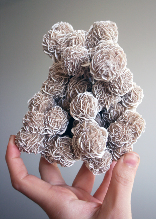
Desert roses! A whole huge cluster of them all stuck together! You might remember my big red barite rose. These little white roses are made of selenite, and I absolutely bought them because my barite rose needed a buddy. It’s incredible how they naturally form in this shape.
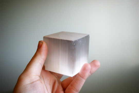
Here is some more selenite, which did not naturally form in this shape! But a cube like this is perfect for showing off some Cool Optical Properties.
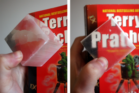
Selenite is just like ulexite; its crystal structure is like a fiber optics cable! (In fact, in nicely gemmy selenite this effect is even easier to see than in ulexite.) Even though the sides of its crystals are opaque and white, the top and bottom will project whatever’s behind it like a screen! Science!!!!!
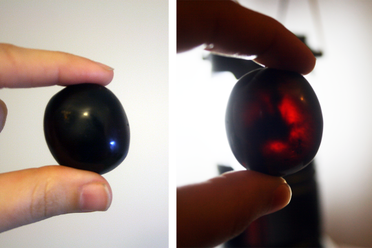
This little black rock turns a deep red-orange when I shine a light through it. It’s amber! Sadly no mosquitoes trapped in this one, but there are some cool swirls of lighter and darker amber inside. Since this rock is made from fossilized tree resin, it feels like resin! Super lightweight and almost like plastic. Maybe someday I’ll find this guy a friend with some bugs in it.
Halite is the sciency name for this rock, but you might know it better as rock salt. Halite’s the best because it can form in one of my favorite crystals habits: hopper crystals!! Just like bismuth, halite makes these weird hollow stairstep-like cubes. (But unlike bismuth, halite doesn’t need to grow them under lab conditions. It can just do this naturally!)
Does your monkey brain want to eat a rock? You could absolutely eat this one! If you licked this rock, it’d taste salty… but your saliva would dissolve my cool hopper crystals, so please don’t.
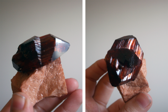
This weird shaped crystal is a lab-grown piece of arcanite. No, not the World of Warcraft item or the Yu-gi-oh card. It’s a potassium sulfate mineral, and here is a list of Cool Places To Find Arcanite! It was first discovered growing on railroad ties! It’s been found around hydrothermal vents! It can be found in bat guano! Oh, and big crystals like this can be found grown by humans in labs. Look, if you don’t collect manmade rocks that’s cool and all but I’ll be over here excitedly telling people about railroad ties and bat guano.
Hm, but now I’ve gotta pick something especially cool for the last rock…
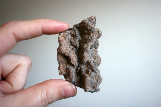
You guys wanna see some fossilized lightning?
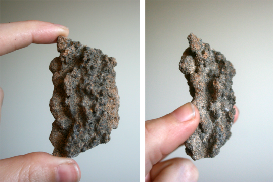
This is a fulgurite, also called lightning glass or petrified lightning! Oh man, this is one of my absolute favorite rocks!! It’s formed when lightning strikes sandy soil. The intense heat melts the sand and fuses it into a tube of natural glass, preserving the shape of the lightning bolt! I can’t get a good picture of it, but the inside of mine has a black, glassy texture. If you live near a beach, go check it out after a thunderstorm and you might find some fulgurites of your own!
Oh, and if you’re into witchy stuff and crystal healing, fulgurite is one of the few rocks I know crystal healing stuff about. They say fulgurites are good for contacting extraterrestrials and UFOs! Please bring me some moon rocks, UFOs. I’ll trade you some Earth rocks, which, have I mentioned? Are all amazingly cool.
(You can see more of my rocks over here!)
6K notes
·
View notes
Photo

Fire Flower
Note: I originally made this painting and typed most of the description towards the end of March. I meant to upload this sooner, but things happened it obviously got pushed way back.
Oh gee, would you look at that. It has somehow been 8-9 months since I last made a full acrylic painting... But! I have a video for this one to make up for it! Link: youtu.be/8IgVvgTiZjM
I promise I've been trying (and failing) to come up with ideas to do more with this medium. Acrylic paint just isn't my thing. I swear I said this somewhere before, but I have no idea where; It's just hard for me to commit to an acrylic painting when I know I can get the look I want usually much faster and much more easily with other supplies. Acrylic painting just takes so much more time, set up, and patience. This very painting I know I probably could've had done in half the time using primarily watercolor instead, for example.
So why is this an acrylic painting instead of something quicker and easier? Because my dear Sparklers, I made this painting and filmed it as a bit of a blending demo for a friend. They tried their hand at an acrylic painting with a sky going from red to yellow...except they lost most of the yellow in the process, and even they weren't really sure how it happened. So since I'm in sort of an art teaching/mentoring position to them, I decided I'd pull out my paints and take a shot at a similar look.
Now, to be fair, my end result is very different from their's intentionally. They painted a boat on the water during sunset, I wanted something different and more me, so after some browsing around on Pinterest, I settled on this flower silhouette. I made my own job harder because the reference image had a blue and orange background with lots of black, almost like a vignette, so once I got past the stage of putting the base background colors down, I had a lot more work cut out for myself in trying to replicate that.
Speaking of which, you can see most of my process in the video, but a recap just in case:
I started by picking out my paint colors, and to be fair I could've gotten away with less or slightly different colors, but I got extravagant and picked a total of nine colors from my Liquitex Basics set (also known as currently the only decent acrylic paints I have):
• Mars Black
• Ivory Black
• Titanium White
• Cadmium Red Deep Hue
• Cadmium Red Light Hue
• Portrait Pink
• Naples Yellow Hue
• Cadmium Yellow Medium Hue
• Primary Yellow
Why the two blacks? Mars Black is a "denser" black so to speak, it's more opaque (less transparent/see-through). The Ivory Black is less opaque, and it's a bit warmer in color than the Mars black. I used the Mars black in areas where I wanted a total and complete black and the Ivory black where I wanted some of the colors from the background to leak through a bit. It's subtle, more of a "feeling" to the eye than something you can clearly see.
Also, I used the Portrait Pink, which like the name implies is a very pink flesh tone, and the Naples Yellow Hue (think a shade similar to Yellow Ochre...or fancy Mustard if "yellow ochre" doesn't help you visualize) primarily for blending and not so much for the colors themselves. And the Cadmium Red Light Hue is much more of a reddish-orange in person than it is red, which is why I picked it. It's also pretty transparent (yellows and oranges often are in acrylic paints, especially more student grade ones like the Liquitex Basics) so it also got lost in the mix fairly easily and I had to build it up a lot.
In the video, you can definitely see as I start that I do indeed do a lot of back and forth with the paints, blending and layering to my heart's content to try and get the right color balance while also getting a smooth transition. And this goes on for quite a while; the background was definitely the part that took the longest.
Initially, I did sketch in a couple of lines as markers for roughly where I needed certain parts of the gradient to begin and end, and with the paints, I went in and got down the base of red and yellows so I could then start working on marrying the two together. And I have to admit, even I let my yellows get a bit lost/pushed down more so than I would've liked. It's a difficult balance to strike; red is already a strong color that easily overpowers yellow. It's even easier when the yellow and your transition colors are more transparent while the red is more opaque. And even more so when your painting has a vignette feel to it.
But once I finally had something I was comfortable with and blocked in most of the black (which was a pain in the butt to blend out, by the way, as I'm sure is obvious by how much I go back and forth with it in the video, misusing a fluffy watercolor brush as a mop brush to blend), I then took my outline for the silhouette that I'd already prepared on another piece of paper and used a Faber Castell Gelato (first a gray, then later I'd use a black) on the back to be able to transfer it on the canvas by tracing it with a mechanical pencil with the point pushed in. Personally, I really do think the Gelatos are the best method I've tried for making faux-transfer paper. They're soft so they transfer the color without much fuss without making a powder smudge-y mess (like charcoal, chalk, or pastels might), and they're also water-soluble so they play nicely with the wetness of the acrylic paints, especially if you've thinned them with a bit of water.
Then I got the lovely challenge of trying to paint and blend out a nice bright setting sun on top of the blackish mess I'd made. (It actually wasn't that bad; the Titanium White is pretty opaque so once it mixed with the yellow and I got a couple of layers on it really didn't have any problem covering the darkness that it had to.)
After that, I transferred again some of my lines I'd covered up and then got to work on the black silhouette parts. I did have to alter the look slightly because I wasn't quite as careful with lining up the placement of my "transfer paper" that second time and also because the brush had different ideas about how much black should be in some places than I did, but it wasn't too much of a hassle.
And then, of course, the real challenge of blending the black up to meet the silhouettes without completely covering up my sun or messing up my other blending. Although, this also wasn't as tricky as I had thought it would be. Ironically, I think by the time I got this far I was finally starting to get a handle on the acrylics after having been away from them for so long.
Believe it or not, this tiny 4"x6" painting took well over two hours to complete. I had at least two hours of footage that I trimmed down and sped up like four times, and that doesn't include the dry time in between two background layers, the background and the sun, and then the sun and the silhouette. I'd say it was probably closer to 3 and 1/2 hours total, although technically longer because I kept getting interrupted by things and I had to figure out how to set up the camera and everything before I actually started painting.
Once I was done with the painting, I also had to actually edit the thing together, which took many more hours than I bothered to document or care to admit. (P.S. Whoever decided all free video editors that don't come pre-installed on a computer either must have stupidly low export limits and/or super obnoxious watermarks, I hate you.)
Yeah, there's a reason it's been almost a year since I last posted an actual video of me making art... It just takes so long to edit everything together and I also have to make an extra effort to get stuff set up before and after for filming...Like, maybe it would be different if I had the space and resources to have an area where I could just leave everything and have a camera set up that doesn't move, but right now when my space is limited and my phone is my camera it's just so much easier to...well, to not.
At any rate, here's one. One acrylic painting, and one video. A two-for-one special! Sort of! And I think both turned out pretty okay in the end, at least for someone that 1. Doesn't acrylic paint and 2. Doesn't make videos regularly. I call that a win, wouldn't you?
Although, I have a few canvases stockpiled. I really should work on trying to squeeze more acrylic paintings into my art regimen somewhere to use those up, if nothing else...
____
Artwork © me, MysticSparkleWings
____
Where to find me & my artwork:
My Website | Commission Info + Prices | Ko-Fi | dA Print Shop | RedBubble | Twitter | Tumblr | Instagram
2 notes
·
View notes
Text
Create a painted giraffe composition
1. Start with the giraffe
Begin by placing a giraffe into the centre of the picture. Don’t worry too much about the blank space at the bottom of the image; create a Vibrance adjustment of +60 Vibrance and a Curves adjustment as you can see above.
2. Erase the giraffe’s pattern
Select a brush at 50% Opacity and Alt/Opt-click the sandy colour between the markings on the giraffe. Start brushing subtly to replace the darker colours with the lighter shades; repeat this until you’ve brushed over the lower half of the giraffe. Follow the side stepper on the next page for more tips.
3. Paint some drips
Load paint drip brushes in Photoshop. Select the darker shade from the giraffe using Alt/Opt-click again and on a new layer, add some paint drips to a couple of the markings just above the front-right leg.
4. Mask in the tree
Insert a tree image. Duplicate, go to Image>Adjustments>Threshold and turn to black and white. Go to Select>Color Range and select all the black; delete this layer then hit the Mask icon on your original tree layer. Touch up the mask further with a 3px brush.
5. Place some bushes
Using the technique in the previous step, add some bushes to the right of the image. Clip a Curves adjustment if needed, to just lighten up the brushes and add a little more colour to the image.
6. Plant some grass
Place some grass over the bottom of the composition. Hit Mask, then invert (Cmd/Ctrl+I). With a big, soft white brush of 50% Opacity, brush over the bottom of the image to blend some grass into the image.
7. Replace the sky
Add a sunset image into the project and hit Multiply. Create a new layer and clip it to the sunset layer; Alt/Opt-click to select yellowy colours. Brush over the bottom half of the sunset and over the giraffe to equalize the colouring of the piece.
8. Add the ladder
Place a ladder into the project. Cut it out using the Pen tool, and then clip a Color layer to it, before brushing white over the left side to get rid of the green shine from the original image.
9. Insert a subject
Using the Pen tool again, cut out a subject and bring her into the photo, placing her on top of the ladder. Position so that her feet are placed on a rung, and the spray can is just above one of the drips you brushed onto the giraffe.
10. Populate the scene
To bring more intrigue into the image, add a zebra and a tiger; two stripy animals that may well also have been painted by our subject. Use the Pen tool to cut each of them out; use a soft brush on the mask to get even closer to the fur.
11. Retouch the fur
Fur and hair is extremely difficult to cut out. On a new clipped layer with a small, soft brush, Alt/Opt and redraw the zebra’s mane if needed to create a more realistic edge to the animal.
12. Mask in painting equipment
Find images of some painting tools such as brushes, cans and tins of paint. Cut each out with the Pen tool and recolour if needed using the Hue/ Saturation adjustment. Hit Mask and using the grass brush that Photoshop has as default, mask the bottom of the objects.
13. Harmonise the colour
Create a new layer, and select all the pixels from the tiger, zebra, ladder, paint equipment and subject layers. You can do this by Cmd/ Ctrl-clicking a layer’s preview window; hit Shift to select more than one. Brush in #f2ce64 and set to Soft Light, 50% Opacity.
14. Dodge and burn
Create a new neutral grey layer (#808080). Using white and black soft brushes, paint in highlights and shadows over the entire image to add a little more dynamism and shape to the image. Set to Soft Light, 75% Opacity.
15. Highlight the animals
Create another new layer and select each of the animal layers using the Cmd/Ctrl-click technique from step 13. With a soft white, 20% opaque brush, subtly stroke down the side of each animal that’s facing the sun to add in a subtle but believable highlight.
16. Blur the highlights
Go to Filter>Blur>Field Blur. Select 20px, Light Bokeh: 40%, Bokeh Color: 20% and hit OK. Set this to Screen, then mask and invert. With a 25% opaque, soft brush, draw over the highlights in the image, as this creates a really nice effect.
17. Drag in a gradient
We’re using lots of effects to alter the overall colour of the image, but a gradient can affect the tone. Create a new Soft Light, 20% opaque layer, and drag in a black to white gradient to further enhance the illusion that the sunset is casting its light over the scene.
18. Adjust with Curves
A Curves layer is perfect for tweaking the red, blue and green aspects of your image with subtlety. Create the same effect as us by tweaking the channels as shown above.
19. Blend everything further
This is a great tip for creating a believable composition: merge everything into a new layer (Cmd/Ctrl+Alt/Opt+Shift+E), turn to Overlay, 50% Opacity, then reduce Saturation to -40 and Lightness to -8 using a clipped Hue/Saturation adjustment. Merge everything again and use the Blur tool to manually blend.
20. Reduce noise
Head to Filter>Noise>Reduce Noise. Choose Strength: 10 and leave everything else at 0. This will not only create a more cartoony feel to the image and remove noise, it will soften the earlier brushwork you made on the giraffe.
21. Colour some more
Create a new 30% opaque, Soft Light layer. Select a large, soft brush and Alt/Opt-click to select a colour. Refine it in the Swatches and paint over the image to adjust the colours a little; add more pink to some of the clouds, for example.
22. Screen in a lens flare
Insert a lens flare. Set it to Screen, 75% Opacity and position through the tree. Create a new layer, clip this to the flare and with a soft, black brush, draw over it to hide the edges of the flare.
23. Sharpen the piece
Create another merged layer of the project. Go to Filter>Stylize>Oil Paint and set all values to 10.0, Angle to 90 degrees, Shine to 0.0. This will soften and smooth the image completely; mask the layer over the clouds in the sky, and a little over the corners of the grass.
24. Sharpen the piece
Finally, merge all layers into one layer again and go to Filter>Other>High Pass. Choose a Radius of 6px and hit OK, then set to Soft Light to sharpen. Repeat this and mask over the animals for extra effect.
1 note
·
View note
Last Seen Blogs

mruelle
Mike Ruelle

smithbranden-blog
Smith Branden

thebeaniefreak
Saint Mars

pour-vos
Todo Es Pasajero

greedybookwyrm
OmnivoraciousBookwyrm