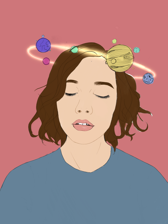
#used those stock images as refs u know the ones
Text

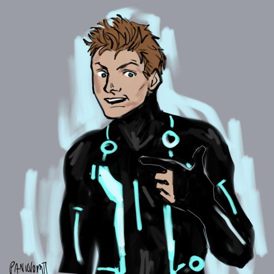
Who ??? Me???
#im sorry this is really dumb#used those stock images as refs u know the ones#tron#tron legacy#tron fanart#rinzler#sam flynn
224 notes
·
View notes
Note
i was wondering, where do you find good references for your art? especially for complicated poses like.. almost everything dearly does. i dont know if im just bad at image searching or what, but i can never seem to find what i need online (and i cant really take my own ref photos for poses that require a lot of flexibility ...or more than one person)
for really extreme poses i get specific -- like for those drawings of dearly i searched stuff like “gymnastics poses” and “yoga flexibility poses” (i tried “contortionist poses” too but i found that stuff was less clear/helpful). i don’t think you’re bad at image searching though, it IS really hard to find good reference and sometimes i really am sitting here for ages trying to find the right thing; and a lot of times even what you can find is kind of stiff and awkward bc stock photos and stuff are usually just kind of odd. (i saw on twitter that apparently, hilariously enough, adding “kpop” to the end of searches can get you more natural-looking/appealing refs; bc like, if you search “person eating lollipop” you get a bunch of awkward stock photos of someone making bug eyes at the camera while unhinging their jaw to lick a cartoonishly-sized rainbow candy but if you search “eating lollipop kpop” you get softly lit glamour shots of some music artist looking really cute while eating candy or whatever. i haven’t tried it myself but it genuinely sounds solid lmao.)
a lot of general figure drawing poses are pretty extreme too (i like using the class mode on this site) and i find that the more experience you have drawing really active/unusual poses, the more confidence you can have in kind of fudging it when a reference isn’t exactly perfect or when you can’t find what you need. (this also allows you to push/exaggerate poses or stylize realistic anatomy to better suit your art style, while still having things “look right.”) my personal goal for myself re: reference has always been to work towards a level of technical skill + confidence where the reference works as a flexible tool for me that makes my life easier, instead of me being chained to my computer for an hour looking for the Absolute Perfect Photo before i can even start; transitioning from the latter to the former comes from familiarizing yourself w anatomy and practicing a shitload and storing up enough Body Information in your brain that the way you draw becomes more, like.... modular, if that makes sense? and u can change things or edit things from reference -> drawing without too much stress.
for group/couple poses and also just general ref, especially re: characters holding things or sitting certain ways -- you probably already know about senshistock on deviantart, but i often go there when i’m in a pinch. i find the gallery a little hard to navigate just bc of the sheer size of it, so it might not make it Faster to find anything, but it’s a great resource with a lot of material that was made specifically with artists in mind.
you can also search up videos on youtube and stuff and pause them to try to find interesting frames of what you’re trying to draw! i don’t use this method much bc it’s definitely still not much easier or faster than any other kind of ref hunting, but it’s an option, especially for really niche stuff.
448 notes
·
View notes
Text
A BASIC GUIDE TO DIGITAL ART ON PROCREATE
okay so i joined the digital art scene about a year or so ago and it has been a total whirl! there’s so much stuff that’s so confusing and hard to understand at first. And that’s okay! A stupid amount of what constitutes as “good” or “complex” art is to do with layers, patience and experience.
and because literally every tutorial on here is for Paint Tool Sai i thought it might be useful for those of us using Procreate! because i don’t have sai and i have a relatively shit laptop by comparison to my Ipad.
so without further ado - here is how to make a KICKASS piece of art on procreate
1. REFERENCE + SKETCH
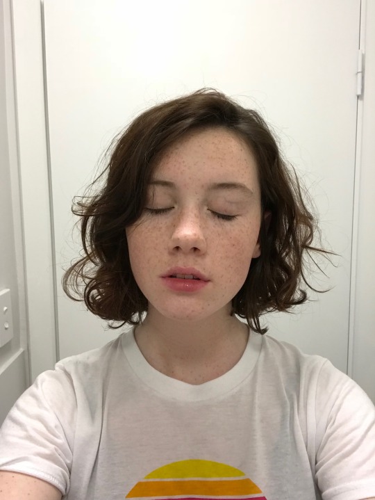
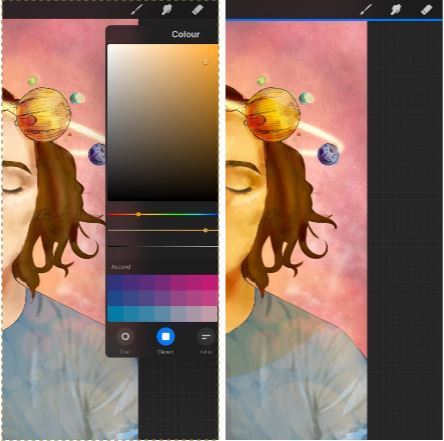
the first thing you're gonna wanna do is collect any references you need for thing youre tryna make. you can collect references by finding stock images, using other artists work (i use these mostly for colour refs cause i SUCK at finding good colours). however when i make art nowdays i usually just snap a selfie and use that. for this work i did the last option (see below)
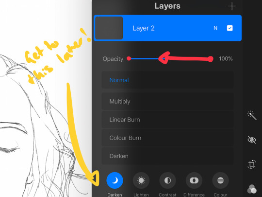
after grabbing my reference i decide on the style i wanna use. for beginer artists what i suggest doing is just pasting the image onto your canvas, opening layers and adjust the opacity to around 20% by clicking on the little N on your layer with the photo. then once thats done add a new layer by clicking the + and work over that
for more experienced artists experimenting with style just stick that bad bitch reference in the corner, then open a new layer and sketch in your own style.
when it comes to sketching i usually do little flicky lines. i do this with a mid grey (like 50% white 50% black) i recommend the “Narinder pencil” which you can find by clicking the little brush at the top, selecting sketching and then selecting that bad boy. you can adjust size and opacity using the sliders to the side of the screen.
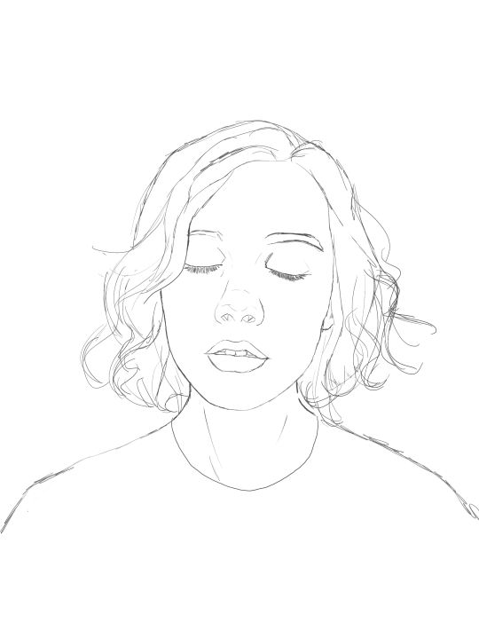
when sketching you just wanna get a rough idea of where you’re gonna do your eventual lines - don’t worry about it being smooth or anything just get down where everything goes
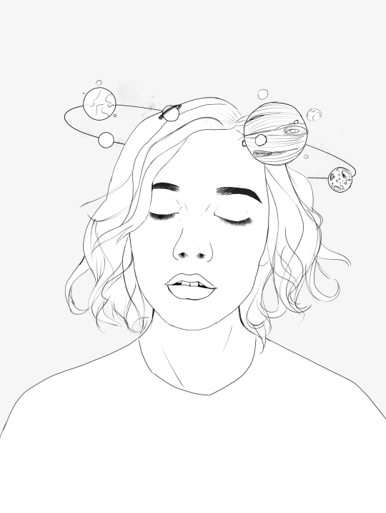
once you’re done you might have something like this:
this brings us too...
2. LINE ART
for beginners - lineart is just a sexy word that means a clean drawing with hard lines so you can colour it easier and it looks prettier. you want to do this on a new layer so you can delete the sketch one later.
your goal with lineart is to make it three things:
1) its gotta be seamless so you can select the insides, don’t leave little gaps between lines
2) its gotta be smooth! jagged lineart isn’t NEARLY as sexy as smooth curvy lines
3) this one is more of a tip - but lineart generally looks better if you do thinner lines inside your shape with a slightly thicker border line. again this isn’t essential but i find it looks cuter
the way i get my lineart all cute is by using the monoline brush (found in calligraphy). sometimes i use my own modified version of the Technical Pen (found in Inking) but mostly monoline is pretty neat. You can use whatever brush you want but mostly you just wanna ensure that its nice and smoooooth. you can do this by selecting the brush and then clicking it again. this will bring up a popup menu like this:
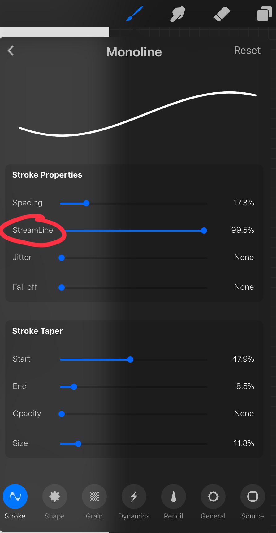
most of these brush settings are complicated and stupid and i’ll do a big post about it later. the only one that really matters here is streamline. if you wanna use a different brush for lineart just wack that slider up between 80-100% and you’re set.
once your lineart is finished on a seperate layer go to your layer menu and unselect the little tick on your sketch layer. you should be left with something like this.

3. ADDITIONAL DETAIL LINEART + MONOCHROME BASES.
once your focus lineart is done you can add detailed lineart by repeating the same process with sketching and lineart i described above. i like to do details separate because if i dont like it i can just delete the whole layer without destroying my focus.
what i find important in these now is using my favourite fuckin tool in this whole program. you can find it here:
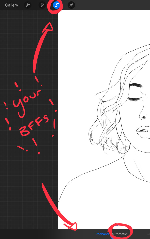
Only start using this once youre 100% done with your lineart. once thats done - make sure youre on the lineart layer and click that weird little s at the top of the screen. go to the bottom and click automatic. then select somewhere INSIDE your lineart. it should do something like this:
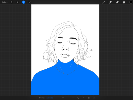
don’t freak out! what that blue stuff means is that you've just selected the inside bit of your lineart. continue selecting until your subject is 100% coloured in.
MAKE SURE THE BACKGROUND/STUFF OUTSIDE YOUR LINEART ISN’T SELECTED.
ALSO MAKE SURE YOU’VE SELECTED THE LINES THEMSELVES. THEY WILL TURN WHITE ONCE THEYRE SELECTED.
if u fuck up and select something by accident that’s all g, theres a little undo button on the bottom. if you click on the paint brush or another tool and you cant add stuff to your selection you can reload the mask by holding down on the weird s and the selection will reload. If there are certain bits of your work that you’re struggling to select with automatic selection that’s also not an issue. just click the “freehand” setting next to the automatic setting on the bottom and you can now use your stylus to draw around what you want to select.
once you’ve selected your foreground in its entirety - THEN click the layer button. insert a new layer underneath your lineart layer. Using literally any brush (works best if you get one from the painting section) colour EVERYTHING white. just get round brush and colour all of it. you wanna keep your line art layer separate over the top.
once all of it is coloured hold down on the weird s tool until it reloads the selection. then look along the bottom of the screen and click the little button that looks like 2 arrows pointing at each other.
THIS INVERTS YOUR SELECTION.
Open a new layer and make this entire thing a grey. THIS IS WHOLE STEP IS OPTIONAL BUT ITS SUPER USEFUL AND THE SELECTION TOOL IS SUPER HELPFUL FOR GOOD ART. DOING THIS WILL BE SUPER USEFUL WHEN YOU COLOUR STUFF LATER.
once you’re done it should look something like this:
4. BASE COLOURS
okay so this is where shit starts to get real. The goal of putting down base colours is to make is easier to add eventual shading to your piece and decide your colour scheme. This is where the white layer you just used is gonna become your BITCH.
you wanna start by duplicating your white layer you just made. You do that by opening your layer menu and swiping that thot to the left. this is what should happen:
click duplicate. Select the top duplicate you just made and select our favourite weird s tool. click inside your shape and the whole white shape should go blue (become selected). next, open a new layer on top of the white layer. colour in your base colours and now none of it can go outside the lines. you didn’t even have to do a billion selections. you just select inside the white blob on the layer we made the step before, opened a new layer and started colouring. fucking superb. so much time saved. DO YOU KNOW HOW MUCH I USED TO SUFFER BEFORE I THOUGHT OF THIS. HOW LONG I SPENT SELECTING AND RESELECTING I CANNOT
A TIP FOR PEEPS NEW TO THIS PROGRAM - if you use your finger and hold down on a colour you’ve just used it acts like an eyedropper tool so you can pick up any colour you want. like this:

once you got your base colours done you can either:
1) go to your grey layer you made in the last step and select the tick next to it. once you’ve done that scroll to the bottom of your layers and select background. it will open a colour wheel. pick your background colour.
2) you can use my second favourite tool from this program! go to your grey layer you made in the previous step. click on it, then click on it again. (not the little n just click the whole layer) this menu should pop up:

oh MAN okay so.
“alpha lock” pretty much means that it locks whatever is on the layer. when you get another brush and go over a layer with alpha lock turned on you can only paint over what you have previously put on the layer before turning on alpha lock. Its like automatically selecting everything on the layer. its fucking brilliant.
anyway.
scribble over your grey layer (once alpha lock is on) and boom you have a base for your background.
NOW YOU KNOW ABOUT ALPHA LOCK YOU GO BACK TO YOUR LINEART LAYER. SELECT ALPHA LOCK. COLOUR IN YOUR LINES ROUGHLY 2 OR SO ISH SHADES DEEPER THEN YOUR BASE COLOURS
(minus eyes i like to keep the lines around them black.) this will make your art like 100000000 times nicer (majority of the time)
once you’re done you should get something like this:
this brings up to...
5. SHADING!!!!!!!
this is my favourite step tbh.
what you wanna do is chuck on a new layer over the top of your base colours. and go into your brushes. pick up your basic bitch “round brush.” this is (in my opinion) the best painting brush in the program. Its the thing you can do the most with. so what you wanna do it get a slightly deeper colour from your colour wheel by yeeting your colour selection slightly more saturated and slightly more dark. dont just make it blacker move your colour selector on a diagonal to get a nicer colour. (i’ll eventually do a colour theory ref but today is NOT that day.)
i like to do colouring in short, light strokes. DON’T PRESS TOO HARD. you wanna get that cute little gradient.
A THING FOR BABY ARTISTS: on every art program i have ever used, the blending tool SUCKS. it makes paintings UGLY AF. (wow another tutorial i have to do at some point.
i HATE the blending tool.
SO HERE IS HOW I COLOUR MY ART TO MAKE IT LOOK, YKNOW, GOOD:
Unless you’re drawing something SUPER freaking smooth like a bubble or some shit. when you wanna blend colours what you gotta do is:
1) put in your darker colour.
2) use your finger to bring up the eyedropper tool to select a mid colour of the colours your blending together - a mix between your lighter and darker colour. (remember that tool? it looks like this)

3) Paint the colour you just made in the middle of your lighter and darker shades. REPEAT THIS PROCESS ON EITHER SIDE OF THE COLOUR YOU JUST PUT DOWN TILL IT LOOKS GOOD. The result is an WAY sexier piece of art.
once you’ve put in all your shadows repeat the same process with highlights.
FUN TIP:
if you decide you dislike a colour or want to change the colour you already did all the shading for you can change the colour without any major drama. You can do this by select ing the colour on your colour wheel you would like to change your already shaded work too. (make sure you’re on the right layer.) then hold down on the colour dot on the top bar (next to your layer settings) and drag it to whatever you want recoloured. let go of the dot and it should recolour your work (including all the shading you’ve done granted that its on the same layer) like this:
once you’ve got all your shading done it should look something like this:

6. background and pretty bits
so! youve got this kickass work but nothing surrounding it. lets fix that.
In procreate there is SO MUCH you can use to spice up a work. a SCARY amount even. this is when layer settings are gonna start to come in handy.
ill do a masterpost on procreate brushes for backgrounds later, but for this piece what im gonna do it head over to the Luminescence section and pick up a “nebula brush”. this makes a complex galaxy kinda design in a randomised stamping pattern that is frankly SEXY AS ALL HELL. Select a layer below your base colours but above your background colour.
IMPORTANT NOTE: this brush’s blend mode is autimatically set to “add” (ILL DO ANOTHER POST ON THAT LATER)which means if you go over the same spot heaps of times it will eventually go a bright white. This can be nice, but its not really what i want cause its kinda intense. to make this thing go glowy but not ~too~ glowy im gonna lower the brush opacity (the bottom slider) to around half way. i set my colour to a light yellow and a darkish pink and put in some nebulas!!!!
once that was done I wantd to add some more colour variation so i popped open a new layer - selected the lightleak tool and lowered the brush opacity using the slider to around 20% just to spice some shit up
you can kinda do whatever you want for your background. sometimes its nicer just to go into artistic, select a random brush and draw a square underneath what you were doing. backgrounds can be super detailed or super easy it doesn’t really matter to be 100% honest.
THE PART 2 OF THIS STEP WILL ADD HEAPS OF DIMENSION TO YOUR WORK AND MAKE IT SUPER PRETTY:
adding light effects over the TOP of your main subject often creates a more realistic sense of depth. In simple terms it just makes the thing look more 3D and nice. to do this, get a random brush with a nice (preferably light) colour. i picked up a “bokeh brush” from the Luminescence section. make this pretty big. sprinkle your brush across the page on a NEW LAYER above all of your work so far, including line art! Then open your layer menu and click that little n in the corner again. Remember this one:
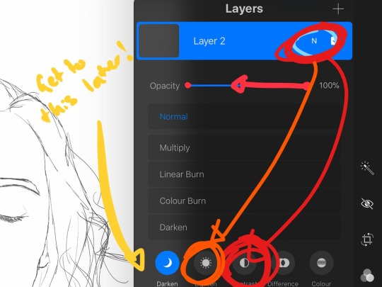
click the little n. then go down to the bottom and select a layer setting from either of the 2 groups circled (i normally like overlay for this type of thing) you can mess around with layer settings and opacity till you find something that looks super nice. My piece now looks like this:

pretty cool right. now we’re gonna make it EVEN COOLER.
7. LIGHT FILTERS
this is something i picked up from artists like softmushie and cryptidw00rm. (not gonna @ them here cause they probs dont wanna get tagged in my shitty tutorial thing but yeah i owe so much to those two especially)
for those unsure of what im talking about: light filters are layers you add over work to make the lighting on it seem more natural and pretty. you do this by colouring over your natural highlights and shadows with different colours and then messing with the layer settings to make it seem like its being hit by sunlight. these layers go BELOW your foreground stuff (the bokeh lights from step 6) but ABOVE your lineart.
start by opening a new layer. select a colour similar to where the green outlines are here:
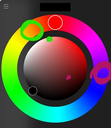
now on this layer paint over anywhere where the sun or other light source would be normally hitting (like cheekbones hair etc.) this can be kind of like shading. dont worry if it looks shit at first we’re gonna change it.
open a new layer beneath the one you just made. Using a colour similar to one circled in purple above colour over all the shadows in a piece. it should now look like this:
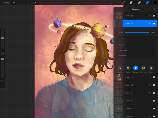
now open your layer settings on the purple/darker layer by selecting the N like we did with the foreground layer before. you can play around from here by setting the layer mode to anything from the “darken” or “contrast” menu. For this work i chose overlay. I then lowered the opacity until it looked nice.
Repeat the step above with the lighter highlight layer. when adjusting this one make sure you set the layer mode to anything from the “lighten” or “contrast” menu. For this work i did hard light.
your peice should now look kind of like this:

AND YOU’RE DONE!!!!!!!!
look at that sexy thing you just did. Congrats on creating an awesome peice of art!!!!!!
if you guys are interested in more tutorials like these or have any reqs for similar stuff send me a question or a dm to my blog @plasticbattleaxe
if you create anything by following tutorial that you want me to see don’t hesitate to tag me or submit it to my blog!!! i love seeing y’all make art
also - i know it’s annoying - but reblogs > likes. thanks for your support
i hope someone finds this useful!!!!!
#reference sheet#art reference#reference#art ref#procreate#procreate ref#zoeyeets#plasticbattleaxe#plasticbattleart#layer ref#art tutorial#art studyblr#art tips#ref artist#tutorial
1K notes
·
View notes
Text
Humor is een uitstekende manier om los van de menigte
Some of this gets lost in the fabricated Federer image, even though that image taps into some of the man genuine gravitations. When contemplating Federer, I often think of Gottfried von Cramm, that model sportsman, dashing aristocrat, and adonis (and he, too, had a "beautiful game"). Barbara Hutton, at that time the most glamorous woman on the planet (beat that, Anna W!) was madly in love with Cramm for most of her life.
nfl jerseys The good news is that, although they will sting anything that gets near them, cheap jerseys the jellyfish aren't always aggressive toward humans; it's just a case of the wrong place at the wrong time. The bad news is that they are devouring all of the fish supplies, and clogging up the fisherman's nets so badly that they've resorted to trying to sell them as food in an effort to recoup their losses. So if your Fillet O' Fish tastes a little more slippery and poisonous than usual, thank Japan.. nfl jerseys
Cheap Jerseys from china Brian Howard takes the free kick.90:00+1:39 Joey Barton fouled by Hal Robson Kanu, the ref awards a free kick. Direct free kick taken by Steve Harper.90:00+0:55 Effort from inside the six yard box by Kevin Nolan goes wide right of the target.90:00+0:25 Grzegorz Rasiak gives away a free kick for an unfair challenge on Mike Williamson wholesale jerseys from china. Mike Williamson takes the free kick.89:27 Grzegorz Rasiak gets a header at goal, save by Steve Harper.87:56 Hal Robson Kanu fouled by Joey Barton, the ref awards a free kick. Cheap Jerseys from china
cheap jerseys "I live in the neighbourhood, about a two minute walk away from the field so it's been pretty cool for me to get to know the kids from around the neighbourhood. A couple of them live on my street," he said. "I know football is good for kids. "The friends that I made on this team will be friends forever," he said cheap nfl jerseys. "Everything about my experience here was more than I ever could have imagined. It's definitely a lot of different emotions going on right now."By submitting a comment, you accept that CBC has the right to reproduce and publish that comment in whole or in part, in any manner CBC chooses. cheap jerseys
cheap jerseys I probably need a shoulder replacement right now My mind, I think I OK, but I find myself going from one room to the next sometimes and wondering why the hell I went. Other than that, I think I OK. Epaper, Digital Access, Subscriber Rewards), www.cheapjerseyschinatrade.com please input your Print Newspaper subscription phone number and postal code.. cheap jerseys
cheap nfl jerseys Once the lining is all pinned, sew the two together using a fine needle, matching thread and small stitches. Ithink this part is better sewn by hand. Iwould be afraid the knitted piece would catch in the feed dogs on the sewingmachine orknitted stiches would catch in the presser foot if you sewed it knitted side up. cheap nfl jerseys
cheap jerseys Consultative Selling is About Hunting Marlin Not Fishing TroutThe entire basis of consultative selling revolves around solving clients' problems so they come back to the seller. Hence www.cheapjerseyschina8.com, the seller becomes the client's expert and reliable source. "We need x again, oh call Bob or Sally, they take care of it." It's that simple. cheap jerseys
wholesale nfl jerseys from china Clearly, tough measures will be necessary if New Jersey is to overcome a gap of this magnitude. State officials would be well advised to follow in the footsteps of many corporations across the nation and close their defined benefit plan to new employees, offering them instead a defined contribution program. If New Jersey were to do the same, the $130 billion owed to current employees would still need to be bridged over time, but the state's long term financial prospects would be less dim.. wholesale nfl jerseys from china
The effect is twofold. Firstly, once zipped up, the shirt keeps you protected from the elements. Cycling can be a cruel mistress, forcing skinny people into brutal headwinds for hours on end www.cheapjerseysfromchinasale.com. It was the place to be seen and to be. The years, Buffalo basketball lost its way.The Braves left for San Diego. Bonaventure left for the Atlantic 10.
wholesale jerseys Het is een grote gedachte aan toe te voegen een beetje humor in uw betoog, maar als dat is niet u, wees niet bezorgd over het. Humor is een uitstekende manier om los van de menigte. Iedereen gaat huilen met tranen van vreugde en dit is een fantastische manier om te veranderen van de stemming.. wholesale jerseys
Cheap Jerseys from china In football requires the ball to break the plane of the end zone for a six point touchdown or two point conversion. The ball must go through the goalpost uprights for a kick to count as an extra point or three point field goal. In soccer, the ball must fully cross the goal line between the goal uprights and under the crossbar to count as a goal. Cheap Jerseys from china
wholesale nfl jerseys from china "I think we'll have a big crowd," Baldwin Jr. Said. "I'm not a morbid person at all. Fish farming, or aquaculture, is the growing response to wild fish stocks rapidly depleting. While it sounds like a good idea in theory, it unfortunately has many negative consequences due to poorly managed operations. Nutrient and chemical pollution can occur easily in open ocean operations when fish feed, excrement, and medication is released into the environment. wholesale nfl jerseys from china
This is the question that has motivated him for more than 25 years through the study of psychology, coaching, hypnotherapy, metaphysical research, quantum physics, spiritual teachings, and decades of deep meditation. Through this journey, Bruce found his answers, and his purpose: "My role and gift in life is not to teach, preach, or convince anyone of anything. I am here to empower others to get their own answers, access their true dreams, and overcome anything that gets in the way of making those dreams a reality.".
0 notes
Last Seen Blogs
karenfordonte
Caring For Donte
devilzcatto
Tomboy with long hair is real

letter
letter
arteefalo
Arte&Falo