#using a limited color palette is fun (((:
Explore tagged Tumblr posts
Visit Tumblr Blog
Explore Tumblr blogs with no restrictions, modern design and the best experience.
Last Seen Tumblr Blogs


Fun Fact
The Tumblr office adopted Tommy, an 11-year-old Pomeranian.
Note
I've seen some Jevin designs in which they give him a bird's tail, which got me thinking, what if Jevin had a peacock's tail?
(Also I wanna see your Jevin with a peacock's tail :] )
ooogh he'd be ethereal having those, ive seen him with one and they're a ✨yes✨ hehehe
and of course i shall deliver what mine would look like having them so here hyee!!

peabun hyee 🐇🦚
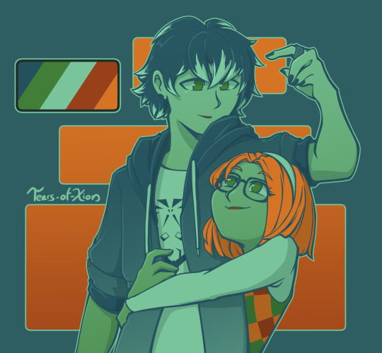
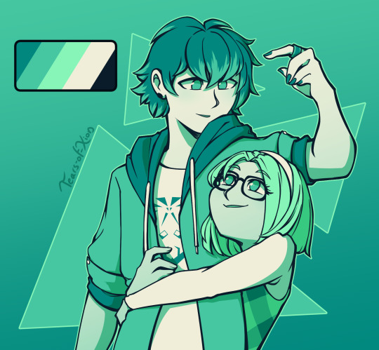
#leer got an ask#soundleer's art#sprunki#i heavily procrastinated onto this for some reason but despite that designing the peacock tail is so fun yippeee!!!#i would go for different colors but my ass wanna limit the palette so im using the colors from his charm hehe#but yea oooh my goodness oretty wolpertinger with peacock tail ooooghhh...‼️‼️‼️‼️#sprunki jevin#aisho4892
91 notes
·
View notes
Text
MERRY CHRISTMAS HAPPY HOLIDAYS
Have a little doodle \o/

#Hope everyone who celebrates has an amazing holiday!#and I also hope everyone who doesn't has a wonderful Wednesday <3<3#Bug art 🐛🖍#Using the limited color palette was kinda fun :D#Badboyhalo
50 notes
·
View notes
Note
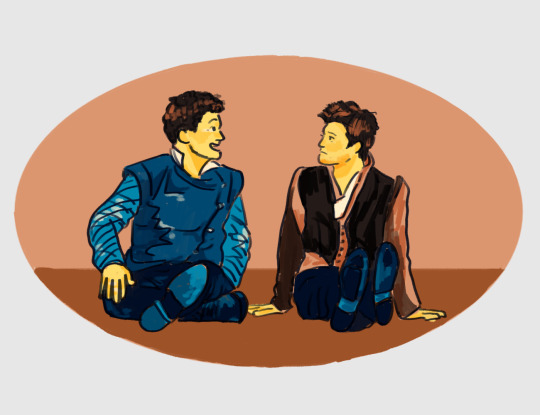
Pallette challenge? I don't know if I am doing this right but #86 with Miraculous Ladybug looks like good colors for either Viperhound or Noirhound or their civilian counterparts (luka/sabrina or adrien/sabrina)
Just a thought.
:D Luka x Sabrina is a rare pair I am particularly fond of, so I'm very happy to get the chance to draw it!
Ngl, I struggled with this palette. A lot. And I'm not 100% happy with how it turned out, but by this point I have fought with it for a couple of hours and I am throwing in the towel.
So.......I ended up picking a second palette to color it with (#80, Derezzed), 'cause I absolutely adored the sketch and wanted to have at least one version of it that I was pleased with the final result of.
In any case, I hope you enjoy the fruits of my labors! <3
Color palettes used are from this post !
-
Please do not use or re-post my artwork without my permission. Thank you! (reblogs, however, are welcome and appreciated)
I do not own Miraculous: Tales of Ladybug and Cat Noir, nor it’s characters. All rights to their owners.
#miraculous ladybug#fanart#luka couffaine#sabrina raincomprix#lukabrina#luka x sabrina#sabrina x luka#miraculous tales of ladybug and cat noir#intended as: romantic#limited color palette#color palette requests#it an ask!#clip studio paint#May2024#tearsofxion'sart#tearsofxiondrawsMiraculous#my art#is there an already established ship name for this two?#i've been using 'lukabrina' but idk if anyone else uses that#i have at least one other request with this same palette in my asks#so i will try again to make it work with me#i think i know why i struggled so hard with it this time#so hopefully with a fresh new drawing and preparation for trouble#it'll go better the next time#also sabrina is so much fun to draw#i should draw her more often
85 notes
·
View notes
Text
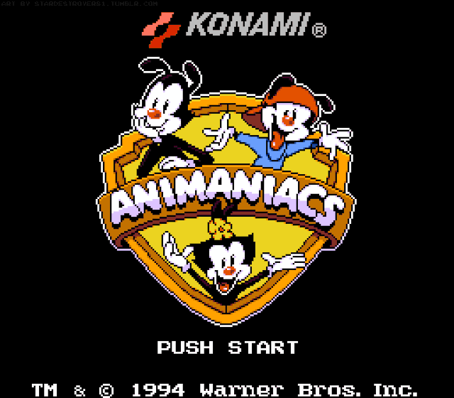
Sometimes I wonder what it would have been like if we got an 8-Bit Animaniacs game...
#⭐ Star's Art ⭐#Animaniacs#Animaniacs 1993#Yakko Warner#Wakko Warner#Dot Warner#The Warner Siblings#Aseprite#Sprite Art#Coolness#Rule Number Eighty-One: If I find myself with a new hyperfixation... I WILL draw sprite art for it.#And Animaniacs is certainly no exception!#You might have noticed I steered clear of referring to this piece as an 'NES-styled Animaniacs title screen'#And that's because I know I'll more than likely get a comment that this isn't accurate to the limitations of the system#Which is true. Initially I set out for this to BE NES styled before it ended up as something better...#My own spriting style! 💙✨#Granted I still used both the NES and NTSC NES color palettes to color this piece#When you're not going by strict limitations... a piece of this caliber becomes a lot more fun to draw!#I'm half tempted to do a SNES-styled logo of the 2023 iteration of the Animaniacs logo. I think that would look neat#I'm also very much open to spriting a V2 version of this logo as I understand there's a version with Pinky and the Brain too#I think there's just enough pixels for me to make it work!#P.S. - I still don't know when I'll start posting on the regular again. Just wanted to get this piece out since I had it on me
60 notes
·
View notes
Text
Self support 💙


Fia and her gijinka self.. <3333
I couldn't decide on which I liked better so have both (':
#doodlingstar's art catalog#myart#kirby oc#💙 fia 💙#illustration#digital art#using a limited color palette is fun (((:#i did primarily used two colors with a few additional colors from her palette for some extra ✨pretty✨#i love fia.. so much!!#she's become so fun to draw and experiment with#pretty much endeared to her.. wretched thang </3333#i really need to finish her ref so i can go off about her more but i hate making refs!! 💀
10 notes
·
View notes
Note
saw your pinned, take your pick if you like!
rei - autumn / cheren - night by the fireplace / hilbert - mmm carrots / silver - descent into madness

I chose the first one because I can't resist drawing my guy of all time
#Reestal answers#pokemon#reestallized drew this#reestal likes to draw#pokemon fanart#pokemon protagonist#pokemon legends arceus#limited palette#trainer rei#luxio#(they're in the Crimson Mirelands!!)#Also you may have noticed that I set a fun little rule for myself in that I can use a 50% opacity version of the colors I'm given for more-#-variety
24 notes
·
View notes
Text

sentimental bugs
this week i finally got to celebrate my graduation & i put them on my hat :-) lol
#ocs#nat#qamar#misc aus#character design#explaining context makes me sad so just enjoy them#i planned out their designs based on the limited number of paint pen colors i have so i ended up#using that limited palette here too#it was fun
27 notes
·
View notes
Text
//Oughhh... I'm getting the urge to draw Lambda in a color palette taken from Pok.em.on Crystal or Gold/Silver oughhh...


#backup log {ooc}#//been looking at the sprites for these to see if there's any i want to crop or use for personal reasons#//and the palettes for these are so good??? i really love these#//especially the color palettes for the trainers big fan of how some of those look. itches the brain in a good way#//and some of the pok.em.on palettes too ofc ffhngjgnj#//maybe i might blend the two idk yet but oooh working with a limited palette would be such a fun idea
5 notes
·
View notes
Text
Here, have some tiny pixel ninja turtles (+ April)

#rottmnt#rottmnt fanart#my art#rottmnt raph#rottmnt mikey#rottmnt donnie#rottmnt leo#rottmnt april#are they perfect? no#didn't use reference and the drawing program had a limited color palette#but they were fun to make#these are smaller than the character sprites used in rpg maker so I'm counting it as a win size-wise#pixel art
62 notes
·
View notes
Text


You know what I keep doing I keep making art for fun and then forgetting I never posted it anywhere, have an elf I did because I randomly felt like making a cyberpunk synthwave inspired color palette.

#my art#color palette#Sometimes I just make limited color palettes for fun and I suspect I'm barely gonna use this
25 notes
·
View notes
Note
omg grack art blog? poggers— [i am killed instantly]
um. slaps roof of rosencrantz and guildenstern are dead. this bad boy can fit so much the clock pallette in it. was this at all comprehensible i am deeply sorry
no no hes got a point..
#theyre so <3#also pleaes do not make fun of their simpson skin i had limited colors ok.#yes i could have used the orange for this. no i am not that smart#ragad#rosencrantz and guildenstern are dead#palette challenge
15 notes
·
View notes
Text

Edit: didn't mean to post this to this blog, but if you like it, check out my new Design Home sideblog resplendent-dwellings!
#Design Home#living room#another design unjustly scored poorly for the crime of being too colorful#admittedly the palette on this one isn't as tight#but it's a game night! it's supposed to be fun!#so yeah it's a little chaotic but like I don't think it's super unbalanced#it has an axel of purple between the couch and the art#another axel of orange crossing it the other way#and a rainbow multi complement going all around the rest#it's fun and it's lively and I'm proud of it#funny story I actually was going to use the orange paisley painting from the Mumbai series instead of that rose painting there on the left#but it would've been my final use of that and since it's a limited painting I didn't want to get rid of it yet#I do think it would've made the orange throughline stronger but I was okay with the pink/salmon softening it#other funny story this is the only time I've seen one of my own designs in a voting round!#and at the time I voted for it it was at 4.11 so I was disappointed to see how far it fell#I certainly wouldn't say this was a 5 star design but I'd give it at least... 4.3 or so#anyways. enough griping#but I like this look a lot
2 notes
·
View notes
Text
i love pixel art SO MUCH, it is SO MUCH FUN 💜💜💜💜
#key speaks#having a fun time animating a funky drinking horn#it's hard but VERY rewarding#bc most of the time it's very easy to see your progress#i love pixel art bc of the limitations#i can't go overly detailed on a canvas this small so i can't spend too long being a perfectionist#(i mean i totally CAN but it's WAY easier to tell when i'm being a perfectionist and make myself walk away)#also it's just faster and WAY more fun than traditional drawing#plus using other people's color palettes means i don't have to come up with my own colors#and is again another useful limitation!#(i mean i CAN make my own palettes but for now i'm trying to stick to figuring out shading before picking colors)
1 note
·
View note
Text

So Mumbo's fanart gallery submissions are open....
Makin' a Grumbot! If anyone wants to check out the event and submissions or maybe even upvote this👉👈, it's all on the Reddit!
It was lots of fun to mess with pixel art again. It's also exclusivly in minecraft map colors, so I even managed to learn a lot using a limited palette! I just really love it, man.....
#art tag#hermitcraft#mumbo jumbo#mumbo fanart#hermitcraft fanart gallery#that should have a proper tag..#should I have the copyright on this post? I think it's okay?#it was scary to upload :<#not to be that person but...#if you like pls pls pls pls upvote pls#<moment of weakness
463 notes
·
View notes
Text

Limited palette fun using this palette by @color-palettes.
535 notes
·
View notes
Text
Six of Crows Character Design Notes
Character design notes for my most recent character lineup for The Crows! I did this last time for the super old ones I did right after I read the series, so these new ones are much closer to how I imagine them. There probably will be a good amount of rehashing from the old notes, but I hope you enjoy these nonetheless!
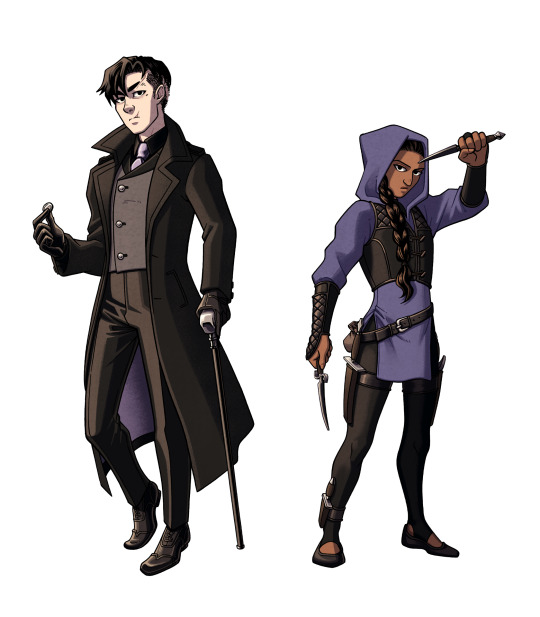
Kaz and Inej
Closest in color scheme due to how close they are at the start of the series, though there is a difference between the purples. Kaz's purple accents are light and muted (similar to the color of Kruge). Inej's tunic is more indigo, shifting away from the warmer purple she wore at the Menagerie. After she realizes her dream in the incinerator shaft, I imagine her theme color changing to dark blue, then dark teal by the end of the series.
I often see Kaz in a red tie, but he had to wear something different for my design since him and Van Eck would basically be in the same outfit. His black shirt is also meant to distinguish him from the real merchant class.
Coin added to Kaz's pose to refer to his magician and thief personas (and a callback to his backstory)
Their vests symbolize their morality. Kaz's is asymmetrical ("crooked and wrong...") while Inej's evenly goes down the center (more balanced and true to herself).
Jesper and Wylan
They're meant to contrast each other, since they don't exactly see eye-to-eye at the start, but their similarities are important. Both have patterned elements, brown leather boots, and freckles. My favorite differences: vibrant vs muted, gold vs silver, open vs closed poses
Jesper has freckles just because I feel like they suit him but also as a visual connection to Jordie. :)
Wylan is holding a Victorian fire grenade! They were actually used for extinguishing fires back then, but I can imagine Wylan replacing the ingredients to do the exact opposite.
I used to draw Jesper in a longcoat just because that look from the show is so iconic, but I changed it to something more cropped. The shorter coat makes him look taller and differentiates his silhouette from Kaz's.
Wylan's black vest is meant to hint at his merch family ties.
Nina and Matthias
Another couple who clashes through color palette! Nina's Heartrender red vs Matthias's northern blue. They also differ in leather color (black vs brown).
Matthias was a bit harder to design since he's not wearing clothes that he'd pick out himself. These are whatever Kerch dockworker clothes the gang could find for him, but I feel like they suit him enough to convey his personality.
Nina's necklace pendant is teardrop shaped (The Queen of Mourning).
Nina is wearing makeup and nail polish. From my limited research on Victorian culture, this was seen as improper, but I think that fits Nina's boldness all the better. I don't try to make any of my designs authentically Dutch Victorian (It's a fantasy series after all! Why not make semi-anachronistic designs that value personality over accuracy?), but it is fun to think about how these characters would be interpreted with that lens.
#next week's post isn't a comic but it's still gonna be real cool#six of crows#six of crows fanart#soc#soc fanart#grishaverse#grishaverse fanart#kaz brekker#inej ghafa#jesper fahey#nina zenik#matthias helvar#wylan van eck#wylan hendriks#kanej#wesper#helnik#character design#design talk
468 notes
·
View notes