#using the same black for shadows as my lineart doesn't work when i have to draw thin things over it
Text
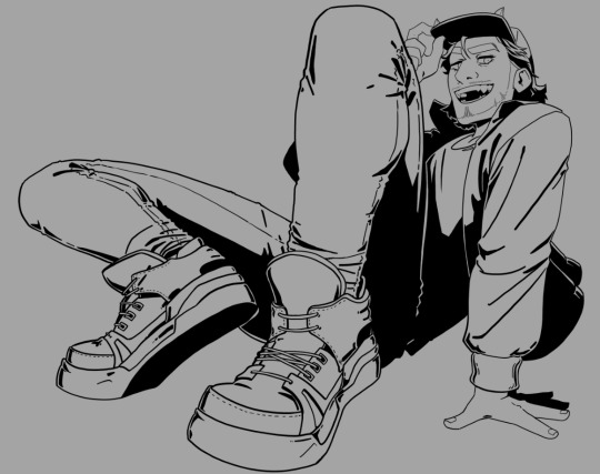
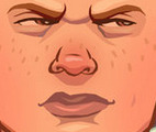
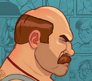
hi heres art so you pay attention to me now go read the tags
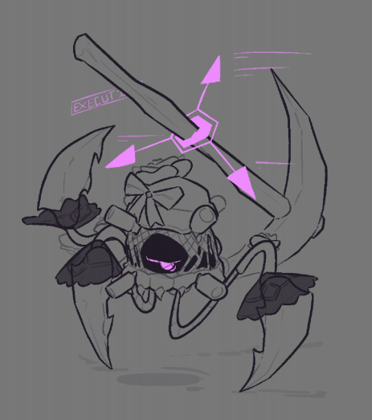
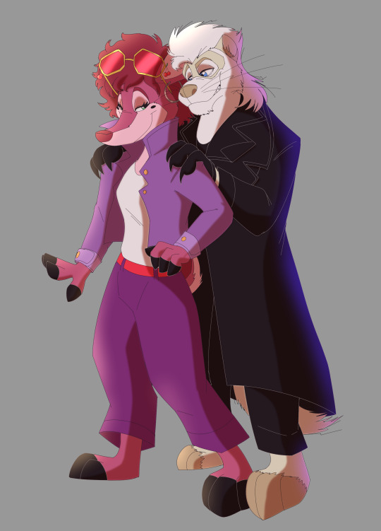
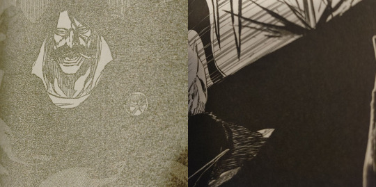
#ive been rewatching episode 7 like its the only thing on youtube and made note of many things#first off. the solver can only have one host. nori mentions skyn wants to kill off all the other solver hosts (with the dds) and disregards#the idea of both uzi and doll being its current host when they get chased#plus the main solver possessions only occur when skyn is out of the picture (the fightt in ep 7 is only after n decapitates “tessa”)#solver uzi is possible too but i dont count her cause she doesn't have the yellow#personal theory is that its more an instinctual response to overheating or something and not full on possession#second off nori calls the solver cyn. how does she know that name#cyn was on earth and only showed up to copper 9 recently and i presume nori's been here her whole life#it probably wasn't the other dds cause none of them made it down and they're all more savage beasts#since cyn specifies n's team retained their personalities and that makes me think the other teams didnt#also also we should've immediately questioned tessa arriving in the same type of pod as the mds when they were revealed to not be sent by j#im running out of characters also the people who dont like when i use tags like this can bite me#murder drones#murder drones nori#artori? that sounds cool#ill probably just stick with nori though#i have so many solver heart refs now#art#episode 7#murder drones episode 7#murder drones episode 7 spoilers#using the same black for shadows as my lineart doesn't work when i have to draw thin things over it#murder drones spoilers
1K notes
·
View notes
Note
You have such an amazing use of linework, how you combine it with color and how you use it ro make wavy and rounded shapes for black to fade in qnd out of is truly inspiring. Ive tried copying the general gist of it but its a hard stylisitc choise to wrap my head around. What do you recomend people who want to ink like you study/do?
my main influence for how i approach that sort of work is Mike Mignola's art (Hellboy etc) so there's a recommendation for you. quick demonstration below the cut
generally what you want to look for is separation of shapes and reducing detail in lineart where it isn't needed, and implying detail using edges of shapes rather than edges of lines. the wavy shapes are basically a fast way to fill area in a way that doesn't rely on me drawing perfect straight or parallel lines or edges, it's a time saving device for me that is kind to the fact that i have a very shaky hand
see:

borrowing lineart from a WIP here. so there's a lot surface detail on the armour and we want to preserve most of it when this is zoomed back out - this is only a small part of the image. if we just colour it in under the lineart, a lot of this detail will be lost or appear confusing, like just a bunch of fine lines
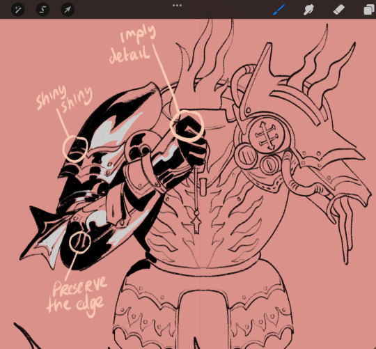
so what we wanna do is reduce the AMOUNT of visible lines without reducing the detail. the shadow and highlight go OVER the lineart. whatever base colour there is goes under. i keep track of the textures too; only the metal surfaces (not leather) get this treatment. but you can see that i reduced the amount of lines by drawing out the important details and hiding everything that is cast in shadow (and you can hide a multitude of sins in that shadow block)
if the whole drawing gets this sort of look, it'll also end up overwhelming and confusing, which is where the biiig black blocks come in
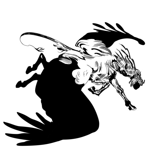
like here i originally detailed in all the feathers and hind legs and shit but the drawing wasn't strong enough and ended up all sort of blurring together so i just blocked those parts in. you don't need a lot of lines to know what's going on, the silhouette carries the rest

for scenes like this, i don't actually separate shapes that have the same value. if i drew in visual distinction between pantera, the ground, and the church, it would just add unnecessary noise and i think take away from the overall impact (as i believe the paler metal tone on his helmet and breastplate do). that's why i never finished this one, i thought that this was as strong as it was going to get and adding more to it would not help. so this is also something to keep in mind - a 'less is more' approach.
321 notes
·
View notes
Note
If you're comfortable with sharing... What pen and color do you use for the lineart on your 80s cartoon style? 👀
Well I say if you're trying to replicate an 80s cartoon style then I would say firstly find what kind of style you're looking to replicate. For example I take inspiration from Don Bluth's style
His art doesn't really use a lot of line weight, in fact the lines are pretty light. Shape is also very prominent with his artwork as every character can stand out from each other and doesn't end up getting repetitive. I would say try to study different artists styles to help develop you're own style, see what they do to make their art stand out.
I use firealpaca as my drawing program, and in the brush shop there is a pen called pencil(leather) I use this pen but I alter it to the settings seen below
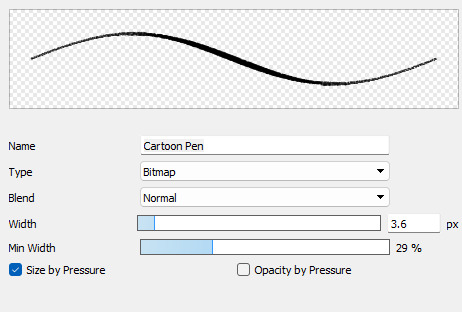
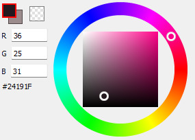
This allows for thin linework and for it to have a somewhat grainy feel giving it that more older feeling. As for color I don't use full on black, I use a sorta black but with a greyish pink tint. (As seen below)
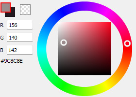
And I also use a grey color for when I color using the same black as the main linework, I just recolor the original lines into the grey to keep it from becoming indistinguishable. I'll put an example so you have an idea.
Of course if you wanna alter these choices that's up to you! Experiment with whatever works for you.
I'll do a little demo to you can get an idea of how you can approach doing this process.
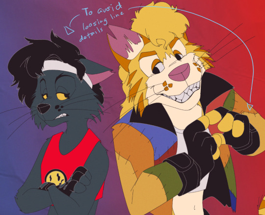
First I start with completing my linework, I may even leave a few blemishes just to make it look a little more "natural" cuz nothing is perfect

Then I color the lines outlines of any part of the characters that are black into grey so it'll look something like this (I colored the background white so you can better see the change)

Then next I colored the drawing accordingly and shaded it, shading just involves me using certain colors like a dark low saturated red and using the darken layer. But that can of course vary, I also as a slight gaussian blur to the shading as a stylistic choice.
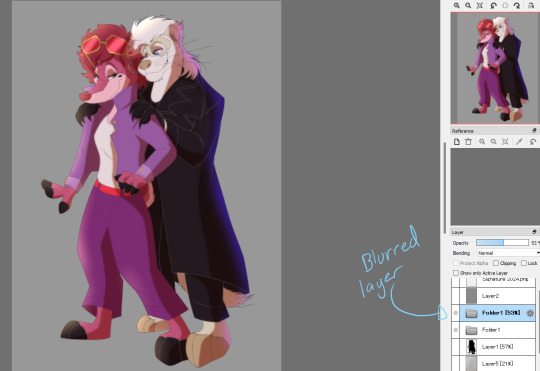
Then through putting everything into a folder or merging the layers together, I duplicate the entire thing and on the top layer use the gaussian blur once again, and put it at a value of 5
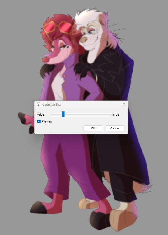
On that same layer I lower the opacity down to around 50% so it makes the drawing look more like an old animation feel.
Then I add the finshing touches like the background, which is a color gradient and a texture overlay. A noise filter just to make it that much more retro. and a drop shadow beneath the characters because I think it looks neat. And after adding my signature, it's finished.

I hope this my advice and this lil demo helps with developing an old cartoon style. Sorry with how long this shit is, I just didn't know how to keep this simple and concise without confusion. If you have any questions then feel free to ask.
15 notes
·
View notes
Note
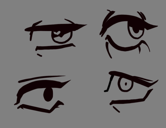
Two things
Any tips for line work?
Any tips for drawing eyes?
You’ve got a killer style for that and I struggle for things like that, so was wondering what you do for that and have any advice for a young artist? Also Steve is gender goals and me and him have the same haircut which makes me happy. Comics with an older queer character are nice, makes me happy to see someone like me get to get older like that :]
This ended up really long, sorry...
"Style" is really just an amalgamation of every decision an artist makes. When you're starting to learn, your brain is processing a LOT on the technical and fundamental side. In time, these will become tools for you to use as you please.
Your style is in you already, I assure you. It's the clothes you love, your favorite color, the season that makes you comfy... Art is a form of communication, and the first person you have to learn to communicate with is yourself. It's a lifelong process of growth, self love, and personal expression. It's nothing to rush!
these are from 2011, 2016, and 2023!
(13, 18, and 25 years old)
You can see how my skills have evolved, but my tastes are rather much the same. I've still got an absolute ton to learn.
When it comes to lineart, if you find yourself regularly struggling with "losing energy from the sketch", then making your lineart thicker might be a solution; thicker lines are a lot more forgiving!
This is a common issue many artists struggle with. It happens because the sketch has multiple lines, so the brain gets to choose which one it likes most. When you do lineart that choice isn't up to the brain, so it's not tricking itself to seeing all its favorite lines anymore.
Lineart can also help you define depth. Generally speaking, thicker lines tend to be on closer objects, and further away objects have thinner lines. You'll also lose more and more detail (and sometimes edges) the further away an object gets.
It can also define light in your lines. solid blacks can block out entire sections of shadow. Another option is hatching, and another is stippling. It doesn't have to define light, though, many styles define their light through various other shading methods.
My biggest tip for lineart is to practice "line confidence." fill a sketchbook page with lines that span the entire length of the page, evenly distanced, as straight as you can, without lifting the pen. Do this every day. Fill a page with ellipses, fill a page with circles. Do this every day. Eventually, you'll learn to 1: draw with your entire arm, which will save you a lot of quite literal pain in the future, and 2: you'll be able to draw the right line the first time more often, which will save you time and frustration!
I didn't have an example offhand so I did this to show what I mean, but I highly suggest doing this on paper in ink and not on the computer, if you can.

When it comes to eyes, definitely look lots to real people, and also pay attention to how artists stylize them! There's generally 4 main things to keep in mind:
1: the top lid. This one is major for defining the expression, so it changes a lot depending on context.
2: the bottom lid! this one doesn't move nearly as much.
Each lid has a vertex, and changing where the relative high and low points are on them between characters can change a lot about what the eyes are saying.
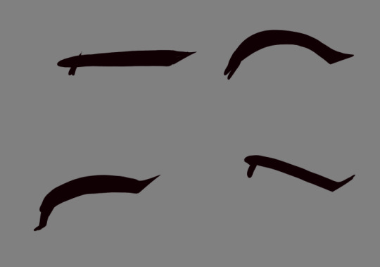
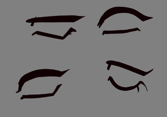
3: the sclera (whites of the eyes), iris (color of the eyes), and pupil (the hole we see out of)! These change an absolute TON based on style.
4: the eyelid!
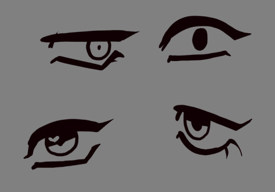

and here's me just moving each of the elements around! it changes a lot about what the eye is saying as you change each element, play around with them! try not to always go with your first choices.
There's a lot more to eyes than this, and a lot more to lineart as well... but I hope this is something of a starting point! Getting better about art is about learning to think and study everything you see. I genuinely see the world differently than I did 10 years ago, and I'm much happier for it (and a much better artist!)
And when it comes to writing stories about queer characters who get to be older and still happy, I hope to someday see you making stories that bring someone the same sense of comfort you had reading my work. I hope it someday becomes normalized, mundane even. And I know it starts with people like you deciding it's important! We're here, we've always been here, and we're not going anywhere.
Best of luck on your artistic journey, I wish you a long lifetime of growing closer to yourself through your art.
52 notes
·
View notes
Note
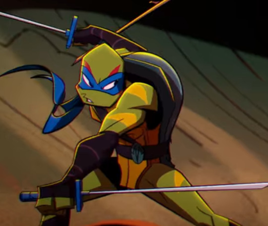
Quick question.. when you draw the ROTTMNT characters, why do you not draw their shorts? I'm not trying to be weird or anything since it's not like you draw them completely naked, but it's a little odd to leave that bit out.
i mean i think the shorts aren’t canon, just a widely accepted headcanon. i don’t think i really need a reason to not follow a certain headcanon, but i will give you mine anyway since you asked (and so that hopefully people will stop asking):
i’ve talked about this before but the black areas change shape quite a bit and are sometimes drawn with an extra line along the bottom, plus that shade of black is only used in shadows or lineart. that all makes me think they’re just part of the show’s art style, which makes sense since that shadow being there means less work for the animators + convenient censorship so there’s no turtle ass, considering how much this show likes low angles. i don’t draw it for the same reason i don't draw the shadows below their chin or arms; it’s part of the show’s style, not mine.
and even if i did think they're shorts, their og outfits don’t have a lot of black in them to begin with, so i feel like random black shorts in the middle of it wouldn’t really add anything worthwhile to the designs, at least in my art style. it doesn't look bad when ppl do draw them, i just personally have no interest in doing so myself and i think it'd be kinda boring if everyone drew them exactly the same way lol.
sorry for such a long-winded answer. i do find it a bit uncomfortable that people keep bringing it up when i’m not really drawing attention to that part of the image in general. i kinda don’t wanna be making that big a deal about.. essentially their crotch area? especially when i already add the tail + plastron there in place of the shadow to make it look less like a human ass.
(also this isn't necessarily directed at anon, but if yall wanna discuss this headcanon or anything, please don't do so on this post or in my inbox. i'm kind of tired of seeing talk about this for the above reasons.)
edit cuz i just saw a gif of this, but like it literally is a shadow:

129 notes
·
View notes
Text
The Bully Artstyle
Am I the only one who really appreciates the official Bully artstyle?
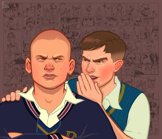
Though, calling it one style is technically wrong, since the images are made out of one front image and the comic background, both of which are made by different artists.
If you are wondering, the guy who did the main illustrations is Anthony Macbain.
If you look around his website, you will not only see his Bully art, but also that he also did some work for the GTA series.
The person who did the background illustrations is Stephen Bliss, who... also did art for GTA, believe it or not. I guess Rockstar only has that many artists that focus on semi-realism.
Obviously, since GTA is like, the most famous thing ever, his website does not focus on Bully that much. But if you scroll all the way in the Rockstar Games portion of his website, you will find the art that was used for the backgrounds! And it seems like he designed the logo too!
Now that we know who did it, I'll try to to a bit of art analysis.
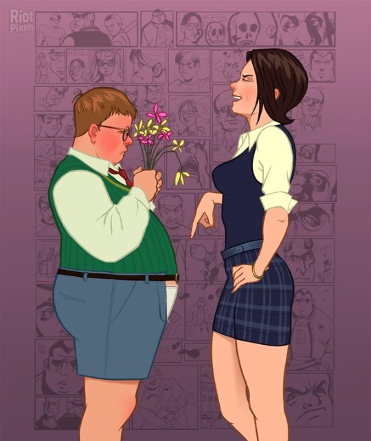
Similar to the GTA style, the style of Bully is somewhat realistic. Kind of stiff looking, to be honest. But the background illustrations kind of make up for that.
The lines are mostly the same unchanging width (except for some smaller lines for details). They do not taper much. The lines are also colored - their color is more dulled out than the colors they are containing.
The colors are also kind of dull in general (though this may only be because of my monitor.) Probably because the art is going for that realistic look. Of course, we could also look at it a bit more artistically and say that the colors are dull to fit the miserable atmosphere of Bullworth. You might also notice that there are no real whites - the shirts are either tinted yellow, or whatever color is around it. I think this is pretty neat. White fabric often tends to reflect the colors around it in real life.

The lineart is just a bit too chunky to convey true realism, so it is stylized in a cool kinda blocky way. The shadows are also quite blocky in general. They often tend to be interesting shapes by themselves. Look at those eyebags and the shadow under the mouth!
Besides the hard shadows, the art also uses some airbrush-like effects. Look at how it conveys the shininess of Pinky's belt and the softer shadow on her thigh. It is also used in Gary's hair to show the soft color transition.

The opposite of shadows, the hair highlights, are these cool zigzag shapes. I like it when artists make the hair highlight a bold shape like that. Speaking of the hair highlights, notice how they often have a similar color to the background. Like, look at this - these ones are actually a pretty bold purple, probably to mimic the way real hair can, just like fabric, reflect the color of its environment.
Now, let's look at the blush. A lot of the characters in these illustrations have this strong blush on their cheeks and nose. This is probably used to make them look a bit more alive. I wanted to say every character, but then I looked at the art again and found out that was just not true.
Look at these two, for example. Edna sort of has the blush, but it is single colored and blocky, making her look kinda sick, rather than more alive. The boy next to her also doesn't have the blush, probably because the brighter pink wouldn't work as well on darker skin.
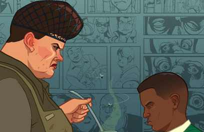
Mr Burton here also does not have the blush, because... I don't know, to be honest. Random stylistic choice, I guess.
Overall, I cannot quite name why I like the style of the main illustrations so much. It's just not the kind of thing that would usually appeal to me. I guess it's something about the realism combined with the cartoon stylisation and the slight blockiness of it all.
I have much less to say about the background illustrations. Don't get me wrong, I love them. It's just that they are only black and white, so we really cannot dissect the stylistic choices here. But also...
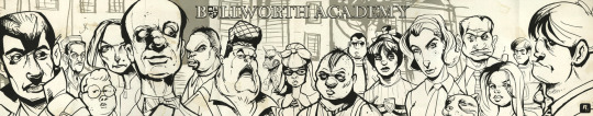
God, I just love the style of these. Just look at them. The caricature-ish style done with some bold inks is so cool. These have so much character, shame we never got a real comic in this style. And since they are black and white, they are as contrasting as a picture can be. Which means they are perfect for the backgrounds. And since the style is so exaggerated, it looks good even when the pictures are pretty small.
I wonder, were these done digitally, or with real ink? Both are possible, I think.
And that's about it for this post. If you have any other observations about these styles, I would love to read it. I just really like these illustrations!
#bully cce#canis canem edit#thoughts#Sorry if this is clumsily written I only wrote this in about an hour and a half
27 notes
·
View notes
Text
Was chatting with a coworker the other day and two things crossed my mind...
that I've been at this weeb shit so long that I forget what I just sort of take for granted and what might not be commonly known little factoids, and
that VIZ's attempt at a monthly Shonen Jump magazine has been gone so long most people probably never saw them. (nevermind the old RAIJIN Graphic Novels that tried the same thing)
So, here's some fun little things you might not have known about manga if you've only ever read English publications and/or digital scans...
For one, there's the matter of print formatting... In general, Japan actually uses their own standards for print that tend to differ from those in the US; The JIS(Japanese Industrial Standards) series A and B. Magazines like the typical anthology format manga are printed in JIS B5, which is comparable to the US Letter standard, or the ISO A4.

This was the same format that RAIJIN Comics printed in as well, and although I don't have a copy of the old English Shonen Jump for reference, if memory serves they printed in the same format as well in an attempt to really sell that "authentic" manga feel. Sadly, I don't know that the effort or attention to detail was much appreciated. Neither published a volume comparable to a Japanese weekly or even monthly serial magazine, though --not by a long shot. But this might not be the most practical for comparrison, since there actually just isn't much of an English language equivalent format. (unless you count actual magazines that happen to include comic illustrations or
miniscule comic strip segments)
Despite the mammoth size of a serial magazine, Japanese tankoban are actually smaller than the North American equivalent. But notably the Japanese small book format isn't just a matter of contending with nearest print standards... What I believe is the JIS B40(although I could be wrong) tends to be the standard print size of small books in general, not just manga, and it's a print size that is only marginally smaller than VIZ's standard size manga, but with the very particular benefit of being deliberately portable. The small difference in size is the difference between a Japanese manga fitting in my coat pocket where as the English equivalent can't.
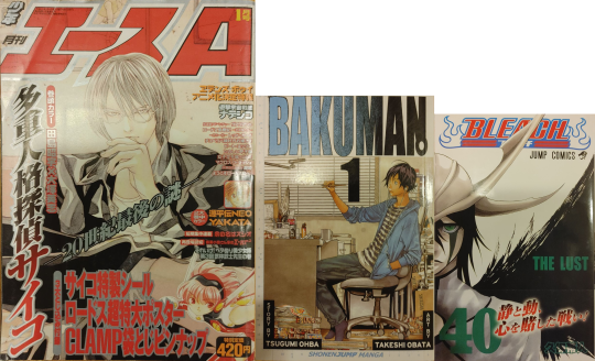
(I realize I photographed a copy of Shonen ACE, and not Weekly JUMP, but I measured a copy of Weekly JUMP for the thickness and not the copy of ACE; the copy of JUMP was around 506pg, while the copy of ACE was 570pg. Those are both older though, and the most recent digital copy i have of Weekly JUMP actually had around 520pg)
And I don't think it's always addressed just what a difference there is, culturally, in how Japan approaches the print medium. It's kind of an old cliche by this point, and I don't know how accurate it's remained in the past decade or so, but the quintessential image passed around between comic nerds has always been the Japanese bullet train; A place packed with commuters all passing their transit time with isolated preoccupation with music and/or reading, with manga being the king of this time killing arena. And its not just about sheer popularity driven by interest, American comic vendors have long envied the sheer accessibility of manga in Japan.
Here in the U.S. we used to have a thriving newsstand retail scene for comic books, and a kind of similar ease of grab and go comic purchase, rather than the explicitly niche interest driven "direct market" model that has been slowly but surly strangling the comic market ever since. But in Japan serialized manga has remained in relatively quick, impulse friendly, arm's reach of readers on the go. And what lubricates that business model more than anything is price.
I still remember a time when VIZ dominated the English manga market by offering at $7.95(and am I crazy or am I remembering a time when it got down to $6.99?) but now'days it's settled on a low end of $9.99. You know how much the recent vol.29 of My Hero Academia goes for? ¥484. That's less than $4.50.
You know how much that big ass magazine with 500+ pages and 21 different series goes for? Do you think it's more or less than the little pocket-size tankoban? Did you guess something close to ¥290? That's less than $2.75. But how does something bigger in both page size and page count managed to sell for less???
There are a few secrets to that, but one is that the things are packed to the gills with ads. But that's the boring answer. The other feature contributing to keeping an accessible cost on weekly/monthly manga is something we don't think about much in the U.S.; it's the paper and print quality.
The nice little books are printed in what you might expect as far as starch white paper and clean black inks, but those big honkin' phone book(do people still know what phonebooks look like??) size magazines are printed on cheap recycled pulpy newpaper with typically rough print jobs. This is most noticeable in the quality of solid blacks, and when scanning the texture of "white" space.
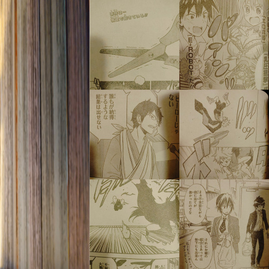
(I tried to take individual photos of different series chapters to show off the fact that the paper is differently colored... but my phone's camera seems to be smart enough to auto balance that kind of thing when there's no other context to anchor it to. (It doesn't help that it's night and my lights have a harsh yellowing glow to them.) but on th left you can still kind of see the different paper colors; this particular issue alternated every 3 chapters between pink-ish, green/gray, a kind of off-white/gray, and sepia, but I've also seen blue-ish, oranges, and a different shade of yellow different from the sepia-ish one.)
Back in ye olden days when it came to fan scanlations, more slapdash teams and projects would often stumble over levels in photoshop (too much black and the pulpy paper texture shows up as grainy shadows, but too far white and the edges of lineart get crunchy and ugly) but those who had more robust readership and a regular streamlined flow of work, we'd actually go in and touch up the solid blacks and whites by hand. We'd also redraw art to erase overlaid text so the type setters could lay the new English in over top.
(Weekly Jump: Left, Bleach tankoban: Right)
They do however keep a few coveted color pages in better quality paper and ink. In contrast, the standard quality tankoban actually don't include color pages at all, and just print what had been color pages in grayscale. There are also all kind of irregularities between publishers and special editions and such, but on the most basic level this difference in quality both keeps serial prices down, while also incentivizing tankoban purchase.
In the U.S. we might still have the draw of an ad-free reading experience in our TPB, but the print quality between a biweekly issue and a TPB are basically the same. Incidentally, even though manga are generally drafted at a much larger scale than even the serial magazine proportions anyway, the scaled down size of the tankoban also serves to sharpen the image. When put side by side the nice clean tankoban print looks noticeably better than the serial.
Now'days the English scanlation scene seems to be conducted almost entirely through ripped digital releases (at least as far as I can tell with popular, regular weekly titles) which is great for quality, frankly, but it does kind of lack the charm and personal touch of a band of amateurs finding round about solutions to a convoluted bootlegging pipeline. But obviously I'm a little biased.
[edit]: Oops i posted this without really ending it in any sensible ro conclusive way... I feel like ive lost sight of the point since i first drafted this but I guess its mostly just me pining after if we could just get super cheap, disposable quality, bulk manga in that classic Japanese magazine model to work here in the states. I already tend to sell manga in big runs, even at $9.99+, and frequently I'll have customers put volumes back, or clearly want the next volume but just can't afford it and wait to come back. If I could sell these customers more volumes, and more importantly more titles, at the same price, I would love to. I would love to see these things fly off the shelves. I would love to see people keeping up with multiple series. I would love to see someone look at a 44vol long series and actually feel like that's a number of volumes they can afford.
5 notes
·
View notes
Last Seen Blogs
ladnva
To Live & Die in V.A.

100rumooooo
Um Dia Pode Ser Você 🧐
brandnewbeauty
You Only Get One Chance To Be You.

tomatogoblin
Untitled

sweirios-blog
midnight blue