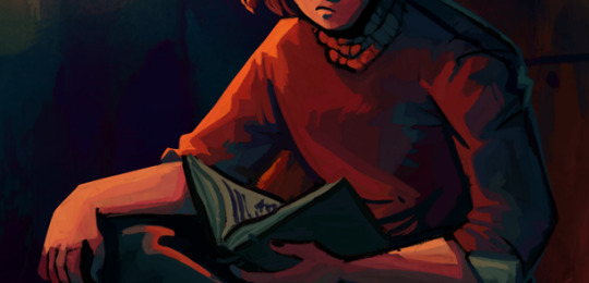
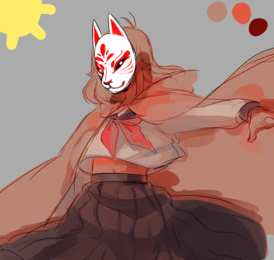
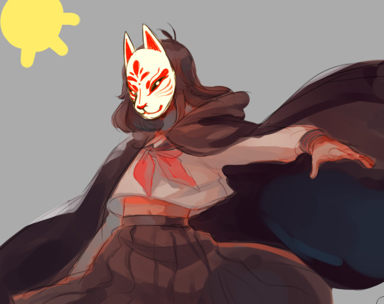
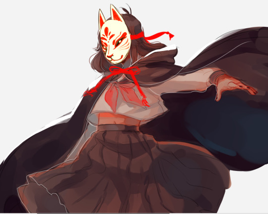
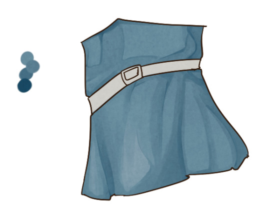
#usually my art is too soft :( all the lines blend in and i dont like it so i always use a little bit of sharpening over all my art
Text
Huge fan of the unsharp mask/sharpen tool it does wonders for my art
#it makes it ✨️crisp✨️#usually my art is too soft :( all the lines blend in and i dont like it so i always use a little bit of sharpening over all my art#also gradient maps my beloved#also noise my beloved!! i love textures
4 notes
·
View notes
Text
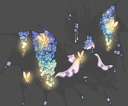
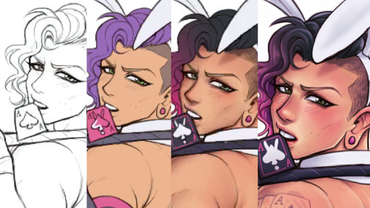
Tutorial: How I Render Accents
PART 2: COLORS
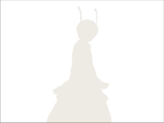
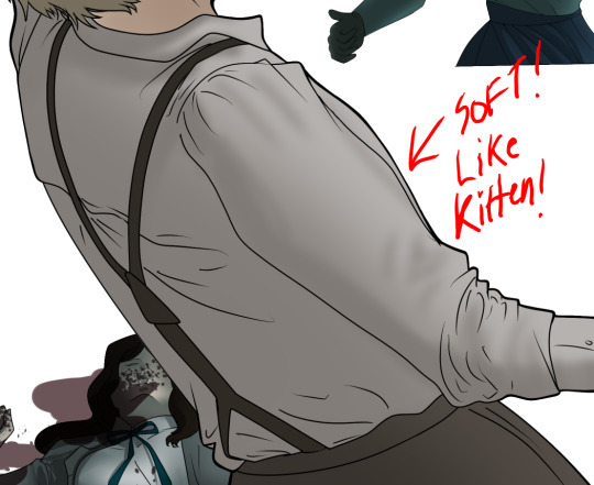
I usually do not recommend 'pixel hunting' aka going over your work with a fine tooth comb and picking out stray pixels to erase. However, for setting up a proper base layer for accents it is imperative to do so.
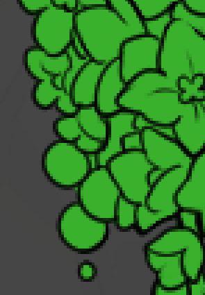
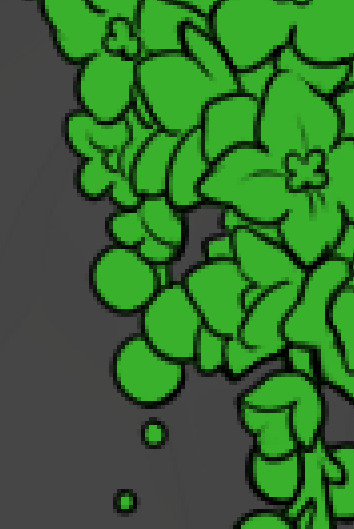
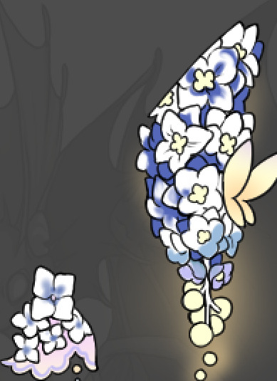
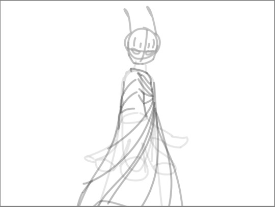
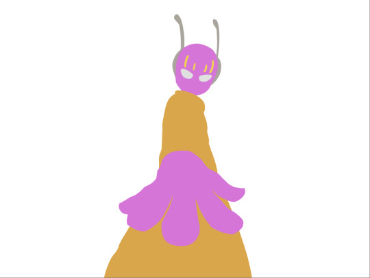
To explain my method of color blocking: I select everything outside of the lines, invert that selection, then fill in. This does a more accurate job than going into each and every section and filling them all in individually, and is also significantly faster. Only downside is small sections like above where you can see bits of the green (which I use bright green against a dark grey background to contrast the base color, lines, and background) poking out, as well as the inner section where it filled in a spot I did not want filled in. Getting all of this right in this stage will make your life easier as you go. (It's also the method I use to color block all my work, even beyond accents)
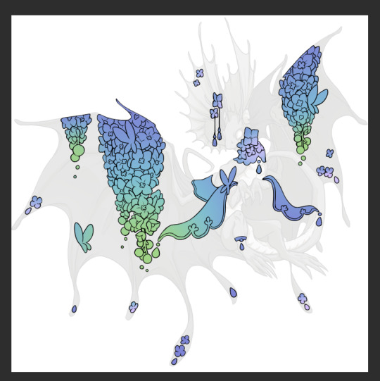
Now this where my style of rendering color may come off intimidating and, tbh it might be. I do gradients first and then I color over them with "normal" blend layers. I typically don't use multiply layers unless I'm shading something that has a lot of textures. If this scares you, it's okay I'll keep walking you through it. Here, my gradient goes from a pastel but deep periwinkle, to a soft more cyan blue, then to a lighter pastel green. Skipping steps and going from the periwinkle to green will give it a different look. There's also hints of a pinkish tone as an accent color.
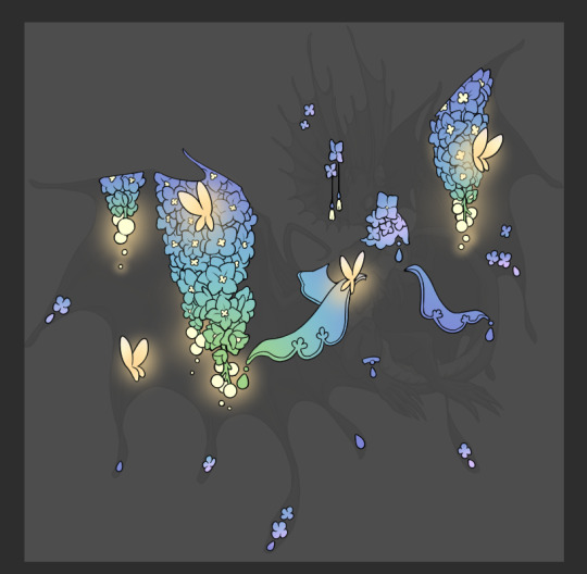
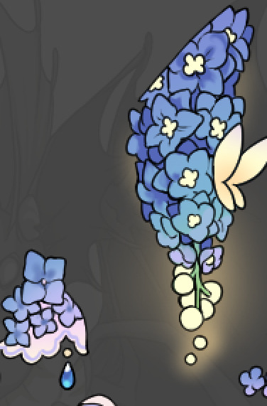
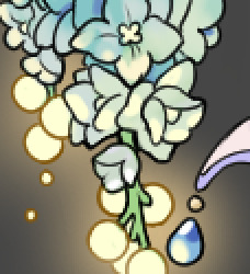
So as I said, these additional layers are done with regular "normal" blend mode layers. I've placed one in between the butterfly line art and the line art for the rest of the flowers, and then an additional layer under everything else. This allows me to create a glow effect specifically around the butterflies, and then specifically under the flowers. Going back and forth with the proper amount of opacity (by using the airbrush transparently) helps to make it glow but not be Too Loud. Also checking it against a dark background can help to check for spots where it spills past the borders, as well as really gauge how Bright it is. I've also color matched the butterflies with the flower pits and the bulbs. This adds extra cohesion and makes them all look uniform but different enough with the gradients.

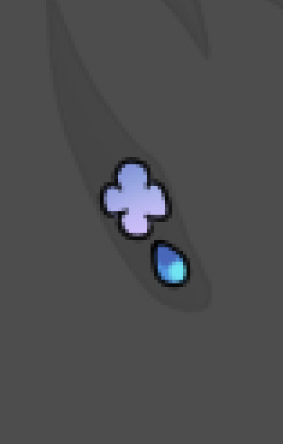

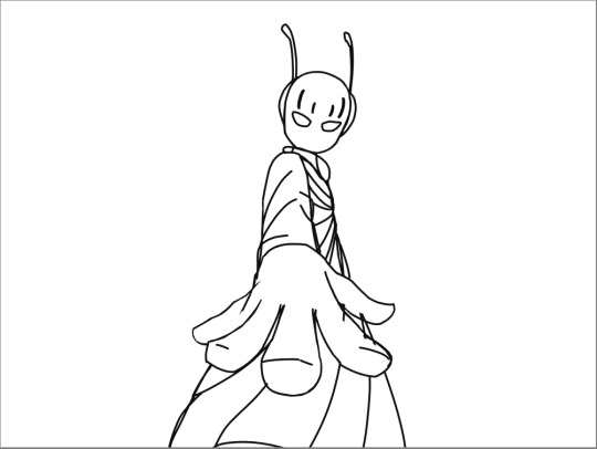
The stages of how I render gems/dew drops. Take the base color, make it a bit darker and less saturated (as well as changing the hue a bit depending on what the default color is. For yellows I go more orange/red, for blues I go more purple or even pink. It depends), add a small drop light at the bottom thats a fairly saturated version of the base color, and then a stark white/ near white highlight. That's it. Don't over complicate it, it will not matter when it gets shrunk down. Note that I do not use multiply/overlay/screen layers for these types of things as it adds too much bulk to the files and doing it manually helps to strengthen your color theory skills.
For shading and rendering, again, I create a "normal" layer and simply. Draw over what exists. Color picking and hand blending allow me to create the exact shades and effects that I want that multiply/screen/overlay layers may not be able to achieve. (which isn't to say I dont use them! i just don't use them for the main meat and potato part of my coloring) All of what is shown here is also achieved with the CSP asset SOIPEN (which can be found for free in the asset store)
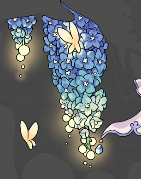

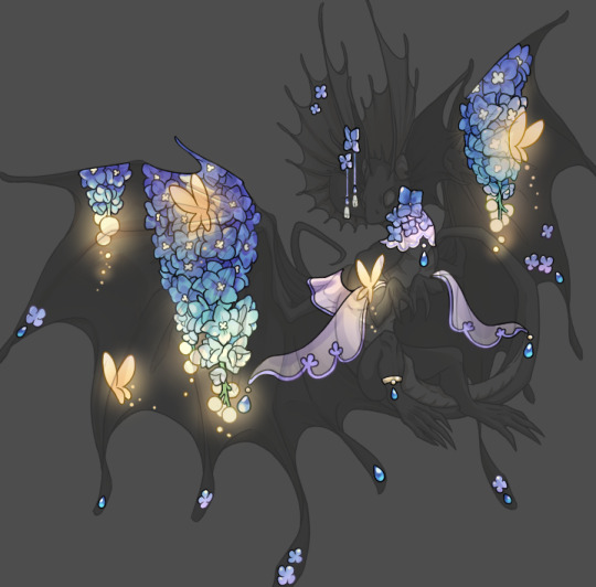
another example. The one on the right is showing how the layer looks without the gradient base layer under it. All of this is rendered by hand. I also specifically put a highlight color around where the butterfly is sitting to give a better illusion that it is properly sitting on the flowers rather than just in front of them.
Next is changing the color of the lines, if needed. A method i'll use is I color just the sections I want (on a separate clipping layer) then lock that layer's alpha setting to them add in a gradient. It's a small and subtle effect that adds more depth without doing a lot of effort. (work smarter not harder)
Now we get to the Polish Layers!
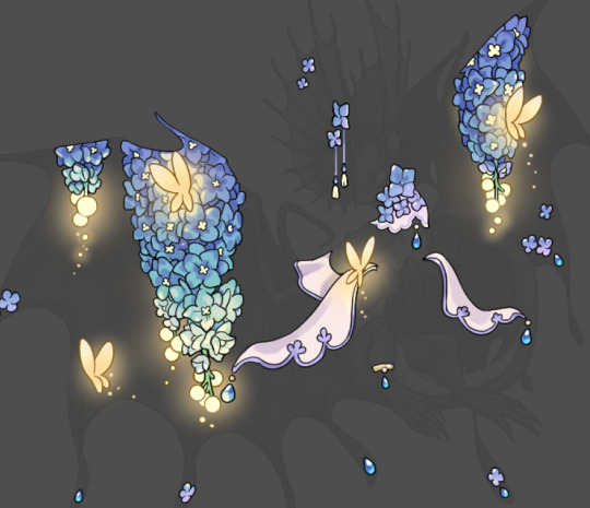
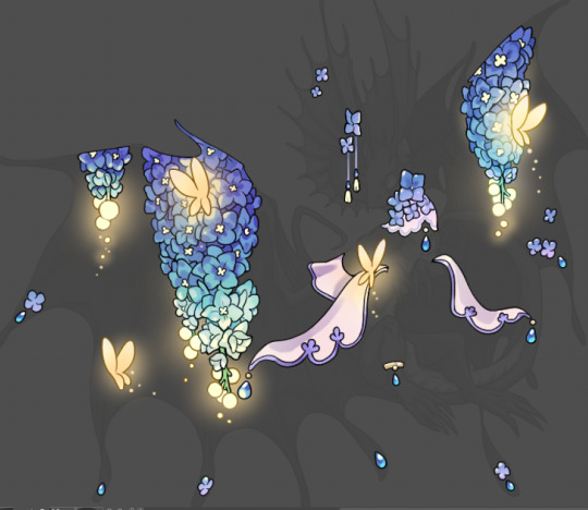
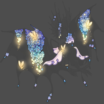
first image is how it looks as a base. second image is with an overlay layer applied. I've used some dark purples and mid tone desaturated greens to push the values a bit further (especially evident on the top left wing) Third image is with a screen layer applied, highlighting the inner most part of the flowers and adding some additional bounce light.
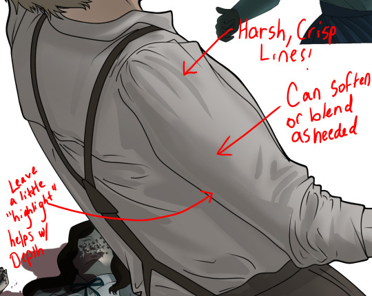
An important thing to note about making accents vs making full coverage skins: OPACITY AND LAYER TYPES MATTER OVER TRANSPARENT SPOTS. What I mean by this is that if you use a soft, light grey to shade with a multiply layer, don't clip it to anything, and have it go outside the lines - that will no longer appear as a 'shadow' when it comes to the final result. Instead you will have a section of soft light grey that is simply laid on top of whatever the image under it is. The same applies for overlay/screen/add layers and so on. If i use a very dark color on a screen layer (to give a soft highlight) and airbrush it over a bunch of stuff and don't clip it, it will end up with this horrible dark splotch over everything that isn't opaque. To this end, mastering normal layers is imperative to having well rendered and convincing accents.
Another thing of note: when it comes to sparkles/small details, note how 'large' the sparkles behind the butterflies are. They seem a bit chunky, yeah?
this is what they look like at proper size. If anything, I could have gone larger on the small metal beads connecting the dew drop jewels to the lace.
Another trick I also like to do is this:

a slight hint of transparency! It's just enough to let the dragon's lines underneath show through but not enough to be super noticable. I like to do this a lot when it comes to sparkly and magical effects.
Next is the worst part of all: destroying all that beautiful hard work with the shadow and line art layers! (sobbing)
This stage always agonizes me. This is my first pass of the shadow/line layers and let's hope it's dark enough.
But yeah that's a start to finish look at how I create my accents. Unfortunately a lot it devolves into needing to know, yknow, line weight and silhouette importance, color theory and the ways that drawing applications actually apply color to a png vs how its rendered in app. All of these things impact the finesse of the accent, and are things you do have to learn gradually over time, but hopefully this has given yall some additional insight and perhaps some helpful tips.
And this should also explain why I get so mad when people go 'hey can I get this accent in another color' no! no you literally can't!
132 notes
·
View notes
Note
I just found this blog and I noticed that a lot of your stuff seems, well, oddly 3D. I don't mean like in a bad way but it feels like rendered but untextured 3D models? I kinda want to ask what your art process is (sorry for mini-rant)
thanks for checking out my blog! and no need to apologize for anything.
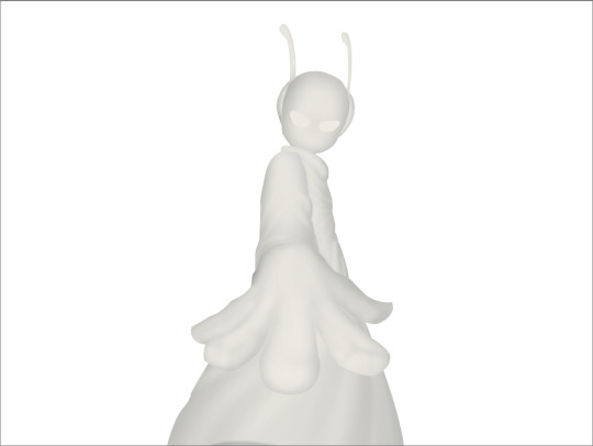
hmm, my art process. honestly i have no idea what to say, i dont know how people normally answer this question so i cant base it off anything either. i'm still kinda new to this whole art thing but i'll try and answer, super sorry if i get this completely wrong and this was all a waste of time.
i guess i'll just talk about how i draw things step by step? for the high effort pieces at least.
ok, so for starters like step 0. when it's a high effort piece, i can already see the image in my mind. i see the pose, i see the general lighting, the layout of stuff, but it's a bit blurry. if i cant see this mental image, the drawing usually comes out extremely poorly.
this is kind of an example of what i see in my head? this might be all useless info idk, but this is i guess where i start.
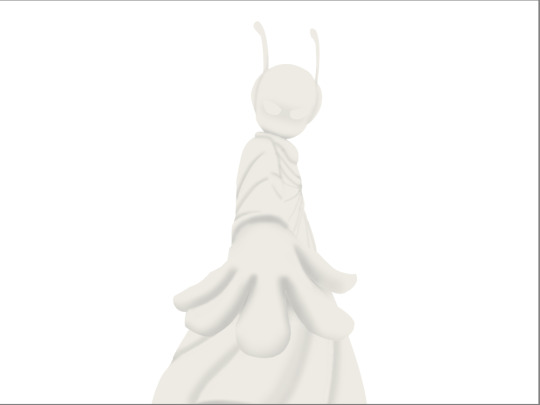
well step 1 is just the sketch and line. i start with just sketching the general shapes, then slowly refining it until it fits close enough to the image in my head. then in the line layer i'll fix any mistakes the sketch had and add more details to it. oh and for brush, it's just a round brush, like default. i dont know how much of a difference using a drawing tablet does, but i dont use one so... yeah.
i should've put more effort into the sketch for this drawing, but i did not.
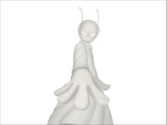
next i do flat colors. pretty simple, i just select the smart select the outside of the line layer, invert the selection and now i can't paint outside the lines. i dont really think about what colors i use, i just use whatever the characters normal colors are.
next i do the shading, but first. i duplicate flat layer and recolor it to like a cream color
like so. for high effort pieces, i was told online to shade in pretty much black and white. now actually onto shading. there's 2 kinda shading i do, 1 from the proper light source, and 1 that's kinda just a shadow because things are close together (like corners and stuff). and i'll shade them on separate layers so i can adjust them individually however i want. oh right, i'll either use a very dark color, pretty much black and the the layer blending mode set to multiply. or i'll use a light kind of gray, tinted slightly yellow or something and set the layer blend mode to difference. then i just use a soft air brush and shade in the ways i described above. shading from regular light source, and the corner stuff thing.
normal lightsource - - - - - corner thing
then toggle both layers on and mess with the opacity of each layer until you get what you want.
then you can toggle the normal flats layer, the one that has color and it should apply the shading decently. you can mess with the opacity again on the shadows.
next i do lighting. i just grab a very light color, usually pretty close to white and set the layer blend mode to overlay. then i use a soft airbrush and "light" it? idk i just do like the opposite of the normal shadows, lighter the closer it is to the light source
mess around with the opacity as usual. then i do pretty much the same thing if there's another light source. in this case there was a blue light kinda coming from underneath, so i did that.
now from here i would go back to the flats layer, make a copy, and mess around with different layer styles and properties and settings. sometimes just messing around is useful. in this case, i felt it was too bright and colorful, so i decreased the brightness and saturation of it.

i think it helped a little bit but who knows.
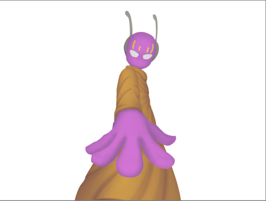
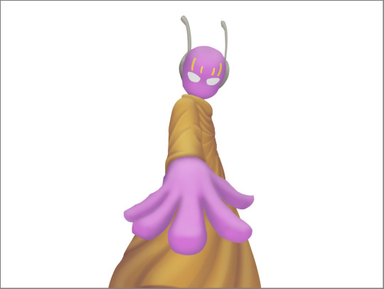
now i do some kinda highlights and details. i grabbed the colors that were in the background and used those. it was a weird pale blue. i had 2 layers for this, 1 of them was specifically for his antenna things at the top, and one was just for his "skin". anyway, the antenna layer was normal, just kinda gave it an outline with the random reflective circles you see normally in pictures, no thoughts behind them. the skin tho had the layer blend mode set to soft light, i thought it looked best this way. it was just more random things to imply it was slightly reflective.
together the layers looked like this. i think it makes him look glossier which is what i was aiming for.
next, and it pretty much the end for pebbles, i got someone to look at it and let me know if they think anything was missing. they said it looked a little unsaturated. which it does. so i made a new layer, set the blend mode to saturation, grabbed the airbrush and made it pretty inline with the lighting layer.
that's kinda it. the background i didnt really care about, just drew and colored it. blurred it a bunch and added a bunch of shadows. i did add some like, "overshadows" is what i call it, i just draw some big shadows down the screen as the top layer.

but yeah thats literally everything i did to draw this. i would like to apologize if this was not at all what you wanted to know, i'm certain i've screwed this up bigtime. super sorry for wasting your time. if there's anything i can do to help, please ask. i owe you a proper answer to your question, i'm just really dumb. sorry for rambling. sorry. and sorry if the drawing i used for example didnt showcase what you wanted to know.
also, i really like your art! please keep up the great work!
#i think i did this all wrong#i'm so sorry#i feel incredibly stupid#:I#rambling :I#now everyone get's to see how little i know about drawing
25 notes
·
View notes
Text
my drawing process (thank you @pepper-ika!)
i draw and colour for a long long time. i don't do the traditional sketch + lineart + colour -- sketches are hard to line, they're kind of time-consuming and usually they end up better than the lineart, so i just draw like normal and clean it up before colouring. i start at the head and end at around the feet, kinda like a person showering (lol). here i'm using your typical pencil brush you can find in any standard art program.

a tip i got from another artist was to colour using a thick, opaque pen brush that varies a lot in width. it saves a Lot of time. before they showed me that, i made the mistake of using a soft, painterly brush to colour my art. it hurt my wrist because i had to press really hard to get flat colour -- when all that time i could have just been using a pen brush! also, i start with soft colours because they're nicer to look at.

2. i do colourful midtones like redness in the skin or maybe a blue five o clock shadow if they have one. from this point onward, i use a flat square-ish brush combined with a painterly smudger and a soft airbrush.
i read somewhere that you should apply perfume on the moistest parts of your body so i kind of use that same idea when drawing redness. usually i do it where skin meets skin: folded arms, a crunched back, closed hands, and that place where the thighs touch the buttcheeks, lolol. and of course: the nose, lips, and ears. it makes the skin look real and warm and lively!

3. i lay down my shadows and lights, usually in that order. and at this point, i'm throwing extra shadow on wrinkles, fat, bumps, lumps, etc. a body without rolls is like an angel without wings!
also i smudge like CRAZY here. just like how it's impossible to have "too much gravy" on your chicken, it's impossible to have "too much blending" when you're drawing skin. blend that ish.
when it comes to the colour of the shadows, i always make shadows the base colour but darker and more saturated, and i move the hue a little to the left (for example: orange goes to red, green goes to yellow, purple goes to blue). i do that with, like, every colour. i can't tell if it's lazy or not but at this point i'm too scared to ask.

4. finally i make some minor adjustments like liquifying to fix lopsided eyes or oversized heads/hands. when i was in high school, my art teacher would say "great, but watch the size of the feet, hands, and neck," lolol. he was right ofc. when i go "hm... that looks a little weird," i have to trust that gut feeling because when i do fix it, it ends up looking way better. here is a horrifying gif illustrating that.

AHH!!!
alternatively you could do a messy line and color, then do a whole paintover like i did here. this is awesome for details because you dont have to go back and change the lineart - you just paint over and add whatever you want and redraw the line to fit it.
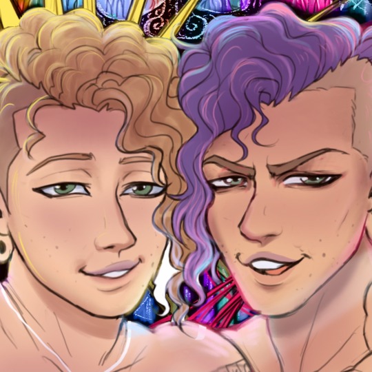
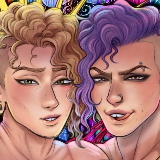
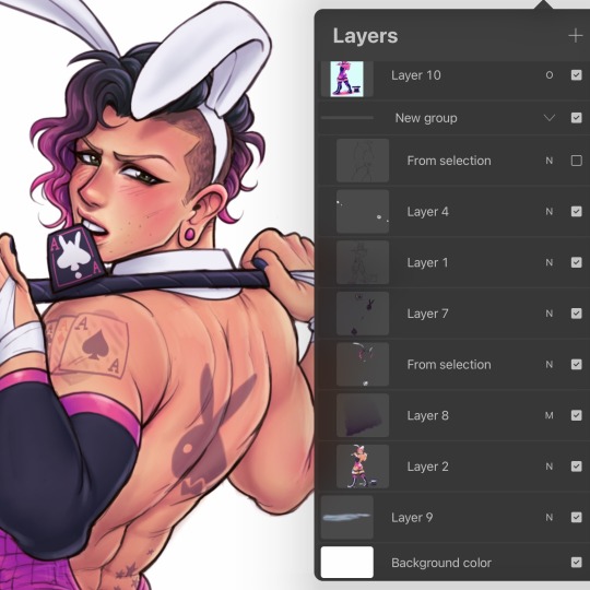
i dont really use the different layer modes that much. in this one i used a gradient map of the drawing as an overlay. idk if that really does anything major but it does create a new range of colors to play with. i also used a multiply layer to cast a big shadow over the card (layer 8) because it has this tiiiny little pattern that would be a pain in the butt to draw shadows over. everything else is pretty standard.
(and no i dont name my layers... yes i will be changing my name and moving countries)
another thing worth noting: i use airbrushing A LOT. i remember reading somewhere that using airbrushes is like. a cardinal sin. it’s not, man. it’s great. airbrushes and smudging are dope and i use them all the time.

i hope you found this helpful! have a great weekend <3
33 notes
·
View notes
Note
Hello! I just found your blog and I've just fallen in love w/ur art! I've always wanted to have a more paint/textured digital style but I feel like I'm too nervous to experiment with brushes/color. Do you have any tips? Also unsure if this has been asked before but how long does a piece usually take? And do you have and tutorials/artists you recommend!
💜have a good day!
Thank you so much <3 Sorry for a late answer but I didnt want to rush answering these questions. It got a little bit long and do keep in mind all of these are my opinions and things I figured out on my own so here you go
I'd say my number one tip for painting is to stop blending so much. When I started painting I wanted everything to be blended as much as possible but I find those sharp edges of colors to be way more interesting to look at and help the eye distinguish elements quicker.
If I want a softer transition of colors I will put them next to each other and blend them so I can get the color between them, then paint over the blended portion with that color, try to not make it just a line after line of colors tho
Here you can see the light parts are just a line of darker and darker colors (still I tried to vary the shape a little bit) but the shading on the chest is more varied and I use not only the transitional colors but change the hue a little bit as well so its more interesting to look at. My rule of thumb for the amount of colors I use for transitions is that I think if it's a hard or a soft shadow, if the light is a very contrasting color, you can make bigger jumps between colors and then as you aproach the darkest parts let the hue and lightness change happen slower.
.Also I use a lot and I mean A LOT of blending modes, if it's hard for you to change the hue very suddenly when painting, just paint the thing like it would be in a very soft netural lighting and then throw a bunch of colors and blending modes at it until you like it. I like to go over parts of my paintings with just a random assortments of shapes and colors that look somewhat plesant together and see how it looks with different blending modes, if I like something I will copy the original layer, merge it with the blending layer and do that a couple of times until I like the results. It's hard to explain how to do that properly tho, it's just something I learned how to use effectively by using it contantly.
Also this back and forth of changing things make my painting process a little bit slow, I'd say on avarage it takes me something like 6h to finish one art piece. It very much depends on the flow I have so I try not to get too attached to any piece of painting or colors etc so I dont feel bad when I go back and change things later.
I dont really use tutorials, my brain is very bad at learning by listening or reading, one exception being tb skyen's legends of runterra card reviews videos I know it's weird I dont even like lol and theyre very long but theres a lot of really good art there and him showing how composition works in them really helped me. I also try to collect art I like in my twitter likes and when I start a new piece I will go through them and see what elements inspire me, what painting techniques or color combos are interesting etc. Theres also a bunch of artstation accounts I look at when looking for inpiration, some of them being
Aleksander Rostov, Ismail Inceoglu, Julia Zhuravleva and Dominik Mayer
Hope this was useful, I went on a little bit of a rable there and I'm not sure if it makes sense, sorry :p
34 notes
·
View notes
Text
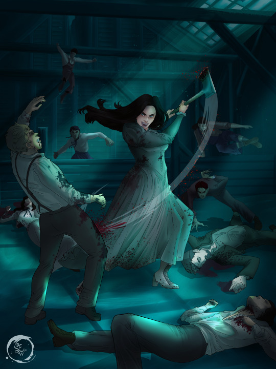
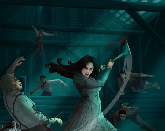
How I Digitally Paint like a Scenic Artist/Designer
Aka: how I did this and put my degree to good use.
LONG POST WARNING
Step 1: Research.
First off, get to your image search. If you are going to be using Google, you may want to type “-pinterest” in the search to eliminate the countless boards.
I had to figure out clothing that is vaguely late 1800s. I found a multitude of reference images that were fancier clothes- but I wanted to find images of clothing for kindred across all social classes. Photographs from the era and paintings are your friend. They will more accurately showcase what was worn.
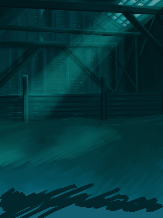
After Fashion research comes location research. The 1890s in America is known for the rapid industrialization. Factories were getting bigger and work days were getting longer. But, I wanted the moonlight to be cascading into the place, illuminating the scene. This means I needed to find a structure that had skylights or let sunlight in. And the best images I found? Slaughterhouses. Fitting, huh?
The same rule for fashion still stands- if you can find photographs or paintings from the era- they’re better. There are tons of places still standing today from the 1800s. But today, they look WAY different. Ya know, Abandoned! So just be sure to take this into consideration if you search “abandoned slaughterhouses” or go trespassing like I did.
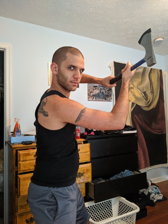
Lastly, pose research. Finding the poses for a fight scene can be tedious. So, I enlisted some help from a few fight choreographers and stunt men. You can record their fights and play them back at quarter or half speed. You can also get a mirror and flop on the floor a bunch. I did both. This lets you see the action/motion lines you are going to replicate in the drawing. Heres how we initially did fina’s pose:

And sometimes you have to go back and get a clean shot. I ended up using this pose for the axe.
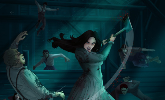
Step 2: Set up and Background!
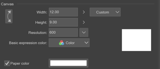
When you open a new file, set it to the dimensions and resolution you want. I was working at 600. Usually, I’m working at 300-350. You can always reduce resolution. Its hard to prevent fuzzy lines if you increase it later.
I cannot stress the following enough:
You work background to foreground. Big Shapes and areas to little shapes. Work your way forward. What this means is you need to fill in as much space as possible first. Then build your details. I prefer working as follows: Big Solid tones, Soft shadows, Dark Shadows, Highlights, then final blend. Once you finish this, put an overlay on top. This knocks everything back and helps create the illusion of depth. See this at work with the video below or here
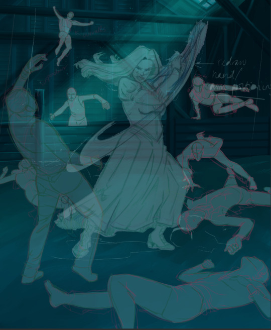
Step 3: Figure Drawings + Composition
Utilize that research and images you collected to pose your characters. I create subfolders for each set of figures. Organization is important here. This will help keep you on the right layer and prevent the eternal digital artist struggle of “Fuck that was on the wrong layer!”
Even after you move on to lineart and shading, Keep the sketch layer as a reference. You may need to see what youre original notes/ figures looked like as you do the lineart and shade. Don’t be afraid to move them around and alter the composition rn. You want to be able to make changes. Make notes! Detail light sources!
I’m about to through out some art jargon:
You want to think about asymmetric balance. The easiest way to achieve this in an eye-pleasing manner is to use the Fibonacci spiral. Yeah. This boi:

Place your figures and actions in a similar sequence to the spiral and the viewer’s eye tends to naturally follow it. This is sometimes called the Golden Ratio in the art world.
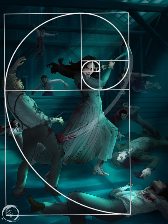
Doesn’t need to be perfectly on the spiral. You can break it- but its an excellent tool to plan how things move in the piece.
Step 4: Lineart
Once you got things sketched- its time to do the lineart. I’m using clip studio paint’s standard brushes. Nothing fancy. I often switch between the G-pen and the For Effect Liner. Mapping and Turnip are for thicker lines.

Usually I set these pens to a specific thickness depending on where I’m drawing.
My background figures are lined at 0.05 thickness, the midground is .1 to .2, Fina is .3 and the foreground is .4. I set my stabilization high to help keep my lines smooth. Stabilization 100 means there’s a significant delay between where the pen is and the cursor. I like the stabilization to be at 20 for freehanding and at 50 ish for outlining. Dont become completely reliant on the stabilization though. Good and smooth lineart is drawn from the arm not the wrist. Your range of motion is severely limited if you only move your wrist. Practice moving from your elbow and you’ll be surprised how much smoother your lines get.

Once I finish lining the figures, I usually go around it with an outline. This does three things:
1. Solidifies the figure and cleans lineart for paint bucket tool. More on that in the next step.
2. Its a stylistic choice. Helps give it that comic book feel with a heavy outline.
3. Pushes figures forward or back in the composition. Thicker outline helps denote that a figure is farther forward than another. My background figures have no outline to push them away
Step 5: Digitally coloring
For each figure you are going to select outside the lineart.
Create a new layer under the lineart
Invert the selection. Paint bucket. You should now have a solid shape of the figure under the lineart. Do not deselect.
Create a new layer above the one color. Title it solid colors. Paint in thick, solid tones. I like to use the mapping pen and turnip pen to color in my solid tones: skin, clothing, hair, etc.
After that, deselect. Create a multiply layer if you can. If your program does not have a multiplier function, Pick a tone you want to use for shadows and lower the opacity (usually 30-40% I like to use lavenders or blue tones). It will not be as vibrant, but you can edit it in post. Select off of the solid colors layer. I like to start with skin tones. Use the airbrush tool to create soft shadows. You don’t want to create harsh lines on this layer.
Then repeat this process with harsh lines.
Then knock it all back with an overlay. If you dont have the ability to create an overlay, you can again drop a solid color and lower the opacity, but you’ll have to mess with the color balance/ brightness/contrast to let all the hard work come through.
You’re going to repeat this for every single figure. Here’s a few color theory tips though.
Your overlay colors should be darker (not more vibrant) in the foreground and lighter (avoid using pure white) in the background. This helps with the depth of the piece. Things closer tend to be darker (not always true, depends on lighting)
You can choose to use color theory to aid your shadows. Instead of choosing black or grey for shadows, choose a complimentary color. I used a lot of green for this piece, I used red for really dark shadows. Its not that black drains color- its just loses some depth if not used carefully.
Keep your colors consistent. Helps unify the piece. You can strategically break the consistency to draw focus. For example, Fina is the only figure with a true blue overlay. This helps her stand out from the other figures who have reds and greens.
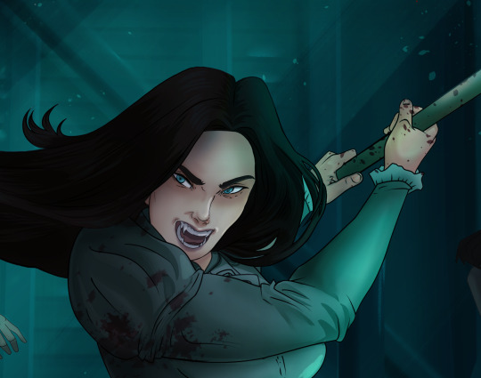
Step 6: Touch Ups and Final Renderings
Now comes the most tedious part. If you’re like me, your computer fans have been whirring for the last few hours trying to render this monster of a file. If you havent already, SAVE FOR THE LOVE OF ALL THINGS GOOD

These are the last four layers I have for the entire piece. Here, I am trying to create effective and believable lighting. This kind of work I have only been able to achieve in clip studio or photoshop. You can do it with normal layers, but choose your colors CAREFULLY. Stay away from pure white. Carefully utilize your knowledge of light and shadow to create soft highlights. Harsh lines tend to be a stylistic choice for me. The final layer, subtract, dulls out harsh red tones. I used this as a final overlay to help put everyone and everything in the scene. Without it, things are a little too green and skin tones are a little too blushed for vampires.
The challenge here is I want to tone down the red, but not lose the vibrancy of the blood. So, shift it to a blue. This also helped reinforce the “nighttime” effect. Its only a slight change.
Final thoughts:
Whenever you finish something, its important to reflect.
1. I am so FUCKING PROUD OF MYSELF. This is easily one of the most complicated pieces I’ve done in a while- and I’ve made 16′ tall faux stained glass. Brag. Let yourself feel awesome cuz you just made something awesome.
2. I timed myself on the piece. I could have easily spent another 7 hours on it. But its important to know when to stop messing with it. Partially for budget reasons but also when you get down to the details you can make yourself go insane. Theres also a ton of detail work I lost cuz of overlays or its just too small to notice. Fina’s face? hard to see cuz its not close enough.
3. I needed to take frequent breaks for this piece. That was good. Resting and stretching was very important. That is one of the reasons why I was able to work so fast.
4. I started doing more digital art in April 2020. I have to say, practice makes perfect. I practice drawing and digital painting for at least 3 hours a day.
That discipline has allowed me to improve so rapidly. So- I don’t wanna hear shit about I can’t possibly get this good! Or I couldn’t even draw a stick figure! BULLSHIT. You can. Get yourself some free software like Krita or Autodesk sketchbook and start playing!
And thats what I got! Thanks for coming with me on this long post!
27 notes
·
View notes
Note
Hey! Feel free to not answer this, but I was wondering how you do your Night Sky backgrounds with all the cool stars and galaxy stuffs? It’s gorgeous and I can’t seem to get it nice and flowy like I want- if that makes any sense- Anyways!! You’re very sweet and your art is gorgeous! Feel free to ignore this if it’s too bothersome aaaa thanks bye-
Oohboy. I did do a bunch of screen-capture vids for these, so if you’d like I can edit those and make a few speed-drawing videos if you think it might help more than me trying to talk it out (because tumblr isn’t liking me putting pictures into here) >w
For the most part, a lot of it has to do with using a Really soft brush, a color palette that blends together really well (but also Pops and feels Bright, especially if you want that nebula/galaxy look)
For night skies, Your darkest color is generally gonna be your base, usually that is gonna be a dark-almost-black blue/purple (of course, depending on your lighting, you can get away with a lot of other colors). (you can use black-black, but, that’s gonna be harder to blend other colors with unless they’re closer to grey-scale)
Your nebula/galaxy effect colors are mostly gonna be fairly bright-feeling mid-tones, they should pop against your background if you used a pen-tool or something on it. Which brings me to the Trick! For the most part, you’re gonna be using something like an air-brush tool throughout the whole process until you get to the stars. Use a low-opacity pencil/pen tool for those finer details, but for the most part, you’re gonna be acting like you’re painting clouds.
(Use a full-opacity pen tool if you’re gonna have something like a spotlight effect or a bright horizon/sun/ect. Give yourself transition colors between your darkest color and your brightest color- And then BLUR the HELL out of it or airbrush over it until the transition is nearly seamless)
MKay back to the Not-clouds- aka nebula. I’m gonna be totally honest and tell ya after I air-brushed my baseline colors (again, treating it like I would clouds, making a bunch of rather fluffy soft strokes, I used a cloud-preset pen-tool (if you’re using Sketchbook like I am, find the ‘clouds’ tool set and use the ‘cotton ball’- a life saver). I’d say it acts fairly similar to a sponge tool though.... IDK. Key point is, it blends, but with a soft cloudish texture.. The Texture is probably the most important point to getting it to Feel like a Nebula or even just the Milky Way.
You mostly gotta work in kinda like, half circles. Bubble up. Straight lines are your Enemy. (mostly. we’ll get there.)
So, start with the midtone closest to your bg color (so if you have dark blue, use a brighter blue, or if you have a dark purple, use a bright purple- ect), and then after you get the desired amount of that, switch to your other midtones if you have them (you’re gonna want at least 2, most of the time.) Depending on the effect you want, you might just add a little bit of other colors, or you’ll want a lot! but starting w/ a base color range will help everything blend into the bg
After that, you work in details w/ your brighter colors, dont be afraid of shadow! Go back over w/ your darkest color and get some bubbles back, that’ll give you depth! Depending on how much you want it to take center stage, you’ll decide how much detail you wanna put into highlighting it.
All in all, you’ll want to work with about 3-5 colors for everything. Try not to plop in one random color or tone if you don’t intend to use it across the whole scene, unless you want something to draw Attention.
Your stars aren’t usually gonna be White, they’re probably the Lightest highlight color you have. I usually use a bright blue or purple. Use white when you want something to just pop right out of the screen.
I use another layer and just have a tool for dots of varying sizes and I just fill where I need stars w/ that, and then erase excess. Easier than drawing a million little tiny dots for hours. (I’ve done it. having a tool is 100 times easier, and it make Much more dots than I ever could) After I erase my excess, I blur out or lower the opacity of a few of them to give a feeling of distance/brightness for others. (but if you’re hand drawing all of your tiny little stars you can control that as you make them) And then I go back in and make my Bright Stars w/ their pretty Star Shape (I usually only have about 2-6 of these)
Then that’s about it! All in all, I say your key factors are gonna be Color, Texture, and blending. Just play with it! See what you like! See what comes naturally to you, find tools that make things easier. Do you & have fun! ^u^
30 notes
·
View notes
Note
um, can i ask how you color in your drawings? they all look really good and your art inspires me :)
OH!! UHM!! My coloring style is such a mess but djfhdeghI try emulating my watercolor style when i do traditional illustration- which is me adding bursts of color everywhere jsdhfdgGonna use this doodle of witch fury I made!!So first I guess i start with layer layout; I have my sketch (in black lines works best for this style);Note: Yes the colors folder is above the lines! It’s supposed to be there!
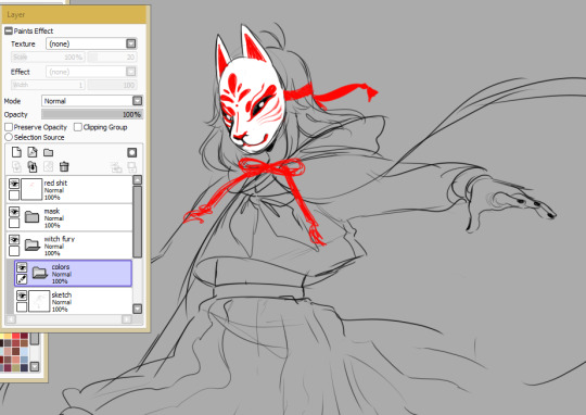
I then set my colors folder to Lumi&Shade
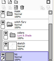
Note: You have to keep your sketch and colors folder inside another folder when doing this, or else the Lumi+Shade folder will also be affected by the background. Which you don’t want! As long as it’s all contained in a folder, it’ll prevent other layers below it from affecting it!From there, I add a base color to the entire sketch/linework (usually the skintone)
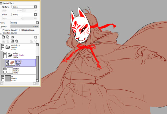
The skin tone is what usually sets the overall tone for the colors, since I usually do all the coloring on one layer and it all blends together.I lock the coloring layer’s opacity (preserve opacity in sai) so the colors dont go outside of the base, and using a custom watercolor brush, I slap on color! I always start with the skin shading. For a sketch like this, it’s not usually too detailed shading. I only ever detail when I plan to refine something. I try to keep in mind the light source.
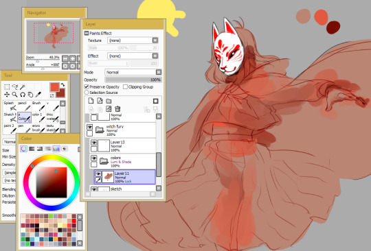
the process is a bit hard to explain I’d have to record a video tbh if you wanted to really see it. But I rely heavily on vibrancy and local colors when I color the skin here. By local colors I mean I use the eyedropper tool a lot to color pick midtones from the lineart itself and the three main colors I’m using (base, a vibrant color, and a darker shading color). I’m still following my light source here!For the rest of the drawing I’m doing relatively that same thing, but I’m also using the mess from my skin coloring process to blend with the clothing colors (and the clothing colors to blend with each other)I start with the shading color first for clothes and then go over it with the lighter color after
and since I almost always work with a really warm palette (due to working off the base skintones), I’ll often take a really bright or saturated cool color (like a blue or green)and lightly splash it in some of the darkest areas to contrast all these warm tones
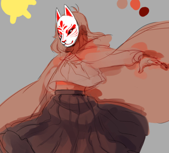
to finish ti all off, I usually add some sharper white highlights and lines on a topmost layer to counteract how soft and blended the coloring is. I also usually lower the opacity of the sketch a bit, so in some places (for example the hands here), I’ll do some quick-but-not-so-crazy refining or outlining to make them more defined
And then I’m done! That’s my coloring process!!
Disclaimer: This coloring style is highly stylized. I developed this style after developing a basic understanding of shading and painting. This style is absolutely great if you wanna make something look pretty or use it to help develop your own style.However!! it’s not good at all if you’re trying to learn how to shade or color, or other basics, since it doesn’t use a lot of technical application. The technical stuff is stuff I already have in my head and learned and I take some shortcuts, so trying to learn how to shade or color from this is not so good if you're just starting out and want to improve ;v; best used for fun!
That aside!!! I’m so happy that I inspire you; getting this ask made me really happy and I hope that this short guide on how I slap colors onto doodles or right before I refine a painting helps!! It’s messy, so it’s not for everyone, but it’s just how I like it! Have a wonderful day and art adventures anon
62 notes
·
View notes
Note
my friend how did you achieve that wonderful colouring style of hidari's, how do you KNOW how to do it, teach me your ways, thank you!
GEE THANKS!! tbh i dont know, i tried it yesterday for the first time after months of staring in awe at official art, but let me give you a few pointers under the cut
my first observation was that although hidaris works are super well rendered, they actually have very simple lineart! as someone who cant paint for shit without lineart it made me very happy o/ for that innes i used a sharp brush for maximum crispness but now that i look at it, something that resembles a pencil more would work a lil better, just not TOO textured. lineart usually dark brown, maybe colored darker where the coloring inside it is dark so its actually visible
another thing about lineart, all clothing folds and hair strands are actually NOT lined, so lining just the outlines of shapes is the way to go! see:
just the outline (and those bomb ass details, but thats another story), all folds and creases are done in the coloring stage
now how to actually do that cool coloring? well i did it kinda like this: after laying down the base color i pick several darker shades, usually 2 or 3
and i try to do something like regular cel shading with one or two, with a soft brush so it can blend in some spaces
(looking at references where the folds and creases should go is Greatly recommended)
now youll notice that hidari makes outlines of shading darker, which gives off that kinda watercolor effect, so use a darker shade to implement it where necessary (NOW you can make lines where the folds should be)
and dont be afraid to blendsome things, those dark lines dont have to connect from a to b, theyre just there for Effect
lastly, slap some old paper texture on that binch, works wonders (also if colors look a little bleak, like in my case, a yellowish brownish overlay on ~30% opacity should to the trick, hidari uses mostly warm colors)
TADAH now youre hidari
thats it for clothing, i havent actually tried armor that much, but the principle is the same, except you color with dots and blots, see here
BASICALLY, if youre not sure how to color some detail, find a similar one in hidaris works, squint really hard, and try to copy it, cant stress enough how just looking and analyzing can help because then you can find some things you do in your own style and go !!!! I CAN DO THAT
dunno if thats very helpful, but i hope it could give you a sense of how to approach this style at least! happy fake official arting B^)
#hidari is one tricky bastard to copy mind you#kozaki was easier since his coloring is more animeish#but NOTHING IS IMPOSSIBLE#the askos
58 notes
·
View notes
Text
A PSA: protip from an artist to fanfic writers
you can always tell when a fanfic writer has never met or even seen an artist irl ever bc they ALWAYS. WITHOUT A FAIL. will have their artist character drawing with charcoal like casually and it feels kinda like a copout like yes i know there are charcoal artists out there but listen,,,, 95% of artists who like just draw on sketchbooks bc they love drawing actually hate charcoal charcoal is one of the most impractical mediums for sketching and it gets everywhere and it smudges all over ur sketchbook pages and everything else in your life forever so like really take into account what the profile of the character as an artist is and more often than not you'll find yourself realizing that no, no matter how lyrically you think the image of charcoal sketching would work, your character would not find it practical/worth the mess to carry around one or more charcoal sticks then have it MARK UP ALL THEIR EARTHY POSSESSIONS (sorry im really passionate abt this) just for sketching also PLEASE FOR THE LOVE OF BUMBLEBEES dont use it as a synonym for graphite ok just dont just say graphite, say they were using a pencil i promise you itll feel better. ⚫️here's some nice alternatives to charcoal if u like a Messy Artist™feel to things + how to match them to your character based on my experiences w artists that use these mediums/myself: → ink has a similar edge of "fingertips smudged in black probably forever" but it's simpler to carry even though it also has that risk of staining everything you love, depending on how its used (as in, will they carry around a glass bottle of jett black ink and a brush in their bag/pocket or just have it in different kinds of pens?) + artist who use ink usually like a very finished crisp look to their work and are therefor usually quite methodical and have (or strive to have) steady hands even with fluid lines there's intent to whats going on. these artists usually sketch first (and rarely in graphite, usually blue or red colored pencil) so keep that in mind too. rarely will you see someone just straight up taking a brush pen to paper with no layout and if they do they have a very clear image in mind and outstanding control and understanding of where everything should go and how and where. →watercolor is less messy but it takes a bit more of a setup bc you need water and usually a palette. i use it quite a bit myself on my sketchbook and what i do is i just ask for/get glasses of water anywhere i go, get my paints and whatever scrap of paper to mix them on and im ready bc all i care about is my finished product and i usually draw in places where water is easily accessible (like parks w water fountains/stores w water fountains nearby, coffee shops, school, etc) but a lot of artists who have it as their *main* medium and have developed more practical setups over the years tend to have lil travel palettes that are tiny and easy to pack as well as waterbrushes and water bottles to fill them with all in all not too hard to carry around with minimal incident. people with watercolor as a main medium are usually more laid back and like things to look soft and dreamy (can be REALLY picky about paper tho) and generally just strive for happiness and like pretty things (if yr person is painting a landscape, its probably in watercolor since it dries fairly quickly and like i said isnt too hard to carry) →acrylic artists uhh... idk any other artists who paint w acrylic on their sketchbook so ill just speak for them ok WE JUST WANT THINGS TO LOOK GOOD OK WE WILL SUFFER FOR IT WE DONT CARE its a bit of a lot to carry depending on how many colors ur tryna have to mix but u gotta have at least ur 3 primaries and a black and a white (some artists work w yellow cyan and magenta but ppl swear by yellow ultramarine and red so idk ycm shows better online or if ur printing it out so it works for me bc i like my colors really really bright) and ur brushes so ye. + like i said folks who work with acrylic have a very specific look and feel they're going for and they dive headfirst into it, if something goes wrong, acrylic is usually quite opaque so it can be easily layered over once its dry, blending usually comes from mixing dif midtones so if thats part of their style they're probably quite patient/willing to sacrifice their patience for a good end product. some artists will mix their colors themselves bc they like the process or because they want very specific shades and those are the methodical fuckers who'll die for things to look the way they gotta look and also just really like the process (be it because it relaxes them or makes them think or whatever BUILD ON THAT W UR CHARACTER) and some just get premixed bottles of the colors they want and those are really focused on efficiency and laying paint down wherever they're painting and getting it done (so not so much the process but the act of painting or even just having art made) but i cant really speak for those too much then again thats between you and ur character →IF YOUR CHARACTER WORKS WITH COLORED PENCILS AS THEIR MAIN MEDIUM THEY'RE A WELL OF PATIENCE AND DESERVE TO BE CANONIZED. fairly easy to carry i mean i own like 100 of them and i just carry one big pencil case w them in so ye whats really tiresome is the process since u gotta go color for color and cant really cover too wide a surface w the pencil tip ever + usually daydreamers and, honestly, dayDREAMS, lovely patient folk who just really like color and enjoy the introspectiveness and calm of coloring. explore those dudes, they deserve it SUMMARY: TAKE INTO ACCOUNT THE MEDIUM YOUR ARTIST USES. THINK ABOUT STYLE. DONT JUST HAVE YOUR PAINTED MAKE ABSTRACT ART BC YOU CANT BE BOTHERED TO THINK OF ANYTHING BETTER TO DO WITH PAINT. IF UR NOT GONNA MAKE IT PART OF UR CHARACTER STUDY WHAT THEY MAKE ART WITH AND HOW AND WHAT ABOUT UR MISSING OUT MAN!!!!!! I KNOW YOU CAN DO IT!!!!!!! please give your artist characters the depth they deserve and remember us artists build half of ourselves because, through and around our art so to make that just a title of ours is kind of a disservice, your artist character wouldnt want that. visual artists feel free to add on to this!!
23 notes
·
View notes
Text
Antithesis: “a babe, a snack, a f-cking heart attack”
[Specific-Summary]: They should expect growing pains. For not everything to feel right or make sense. That doesn't mean it'll always hurt, nor does it mean they can't have fun along the way. It's senior year. Everything may be different. It won't be senior year for long. Everything will be okay.
[General Warnings]: Implied Emotional Abuse, Implied Physical Abuse, Bad Parents are Bad Parents, Mild Sexual Content/jokes,Mentioned Homophobia, Mentions of underage drinking (backround), Some Catcalling,Cursing , Self Hate,implied pregnancy talk/inability to become pregnant, adults arguing where the “kid” can hear it, adults drinking,
[Tags/mood:] highschool au, fluff and angst but its all good, chat fic, teen stress, its flordia no snow we die like men [Pairing:] Roceit (Roman Sanders/ Deceit Sanders), hinted future/possible logince/roloceit/loceit [Characters]Roman Sanders/Deceit (Dmitri) Sanders, Virgil Sanders, Logan Sanders, Patton Sanders, Remy (Sleep) Sanders, Nate Sanders, Dragon Witch (Diana) Remus “The Duke” Sanders (minor/brief)
(Ao3) (Previously) (8) (9) (10) (11) (12) (13) (14) (15)(16) (17) (18) (19)
(20) (21)
D: [Picture of Roman and Logan cuddling asleep. Jpeg] Aw what a lovely couple
R: s h ut u p sh ut u p
D: Hey you were the one who said it was ok to make fun of your crush
R: I SAID THERE WAS NOTHING TO MAKE FUN OF BECAUSE I DIDNT AND DONT HAVE A CRUSH
R: ok i might have said to not bring it up to his face again but that was not an admission of anything deeper then standard thirst ok
R: deeeee yyou’re not responding and your silence wont make me talk
D: Oh I was getting the evidence
[Screenshot. Jpeg]
D: Huh… That seems pretty soft and gay for “standard thirst” don’t you think?
R:....
R: YOU MENTION SOMEONES CHUBBY CHEEKS ONCE. ONCE.
D: It was more then once {Screenshot Montage. jpeg]
R: he has a lovely smile ok!!! And all those dimples and his moles byg od!!!i can appreciate friends!!!
D: and I have beautiful piano hands you think were sculpted from the finest porcelain and should be protected but alright just a friendly friend thing to constantly be thinking about
R: why must youl punish me for speaking the truth????
D: it's apart of the job <3
D: but yeah we all know you dont have a hand fetish or a smile fetish you were just raised on a diet of shakesphere and disney
R: you know,,, boyfs usually don’t yah know e nc oura ge this HYPOTHETICAL behavior
D: I mean if it was someone like Remy then yeah I’d have some issues
D: But it’s L so it’s all good
R: remy isnt that bad!!! yall be petty!!!
D: That’s Why We’d Have Issues
D: If I have to share I’d at least liked to enjoy the other person’s company
R: thats almost sweet
D: I try
R: speaking of trying… this weekend?? you free???
D: If this has anything to do with a birthday present I Dont Want then I’m suddenly busy with homework
R: lies lies lies lies lieeeeeessssss you barely do homework
D: ;)
R: but really i told you im not getting you a physical gift but we can still go on a date!!!
D: mm sounds like you treating me and thats Illegal and suspicious
R: nope! I want a date! It's entirely for selfish reasons!!!no selflessness here!!! And if we just so happen to end up at one of those stuffy art museums you like or a book signing or two then well dang i guess???
D: what are you planning
R: it's a date!!a cute little date k!!! So you down?
D: Perhaps
R: yee boy
D: If you drive me there <3
R: SLIMY
D: Snakes do not have slime ™
R: yet here we are
D: So?
R:alrigh fuckin bet lets do it
D: Wai
D: t wha
---
“Happy birthday!” Roman cheered, crashing into Dmitri.
Without looking up, Dmitri easily caught Roman in his arms, “My birthday isn’t for two weeks,” he sighed, his exasperation being melted as Roman nuzzled him further.
“Mmm shut up,” Roman dragged Dmitri behind him in the parking lot, the school bell ringing, “We had a deal so stop pouting,” he said, sing-song.
“It’s not a pou...Then why are we going to my car,” Dmitri said, expression souring and no it wasn’t a pout, he does not pout--
“Because, ” Roman said, expression sly in the way that always made Dmitri’s stomach flip, “You’re a babe, and I love you dearly, but Virgil’s car is his baby and some lines aren’t meant to be crossed.”
“Uh,” Dmitri ignored his blush, “Noted.”
-
“I’m surprisingly in one piece,” Dmitri said as they got out, “With all those cute faces you make when concentrating it was a wonder I got out alive.”
“Shut up!” Roman shoved him lightly.
Dmitri caught his hand swinging it between them, “Where are we anyway?” he vaguely recognized the park.
It was one of the smaller ones around, with it’s old, weathered playground blending almost seamlessly with the unruly trees. The discarded toys and cracked pavements so achingly familiar that he had to second guess whether or not he actually could hear children laughing.
Roman looked up at him, lips quirked, “Don’t you remember? It’s where we first met,”
“But we met in 8th--” he stopped as something clicked, his hand drifting to his scar automatically, “Huh, church camp?” he looked at Roman curiously, “There were a dangerously high amount of kids who went there, how did you even know me?”
“We were...always the last kids picked up,” Roman said, "Virgil and I always had each other or Remy to keep each other company, but you…” he got a faraway look and he rubbed his arms self consciously, “You always looked so... lonely...I guess I never really forgot.”
Dmitri sighed pushing a stray curl from Roman’s face, “You’re so sappy,” Dmitri murmured with a fond look, effectively pulling Roman back down to earth.
He didn't bother to linger on the memories for too long, instead pulling Roman along gently, “Let’s see if those rusty swings still work, eh?”
----
“Stop fidgeting,” Roman whined, the flower crown falling limp in Dmitri’s hair. Dmitri continued to ignore his request, choosing to press his face into Roman’s stomach, much to their distress.
“How do you expect me to just ignore such a fuckin’ snack?” Dmitri said, muffled in Roman’s skin.
Sure the ground pressed into him at an uncomfortable angle, but Dmitri had the important job of figuring out if that was a new freckle he spotted. He planned on being thorough. Roman eventually relented to the very important investigation, dandelions falling to the wayside as Dmitri shifted him onto his back.
Even when Roman managed to reluctantly bat him away, Dmitri still looked mighty pleased with his new spot between Roman’s thighs.
“Having fun?” Roma drawled, resigned.
“Always,” Dmitri’s immediately said. He cupped Roman’s face, hair falling in waves around them as he leaned down.
“Mmm,” Roman hummed, the air warm, “Do you want your real birthday gift now?”
Dmitri’s eyes narrowed, “Roman…” he said, warningly.
“Hush,” Roman said, no whine in his tone. Instead, it was of calm reassurance, “I didn’t buy you anything. I just got a bit nosy…”
“What do you…”
“I talked to a few old friends who knew Emile--”
Dmitri stiffed, pulling back, “-- he left without a word, he fucking hates--this town.”
“Dmitri, let me finish,” Roman said softly, slipping a hand on their shoulder and sitting up, “I asked a few of his old friends, got in touch with him,” he explained, “He’s living with a few cousins in California, he’s doing well...and...and I asked him about you…”
“He fucking hates me.”
“No, he misses you.”
----
Dmitri slid into the driver’s seat before Roman could protest and soon enough they were driving back in silence.
It had been a long time since it’s been this...awkward between the two. Sure they have their quiet moments, but it was never like this…. Roman had never done well with silence, even if Dmitri seemed to thrive in it.
Roman twisted his hands, forcing himself to speak, “Dee...I’m sorry if I overstepped your boundaries. I know it’s a sensitive subject,” he said.
Dmitri’s remained intently focused on the road, “You were being thoughtful, a prince as always,” he said with a smile.
That smile.
You know the one.
“That’s some god-awful bullshit,” Roman said, “You're angry.”
“Not at you,” Dmitri said, far too quickly.
“It’d be okay if you were,” Roman said and Dmitri’s face faltered, “As much as you claim me to be faultless, that little conversation about boundaries applies to me as well. It’s your birthday gift, so it’s your choice what to do from here.”
“Does this...gift have a receipt…”
“It can if you want it to.”
“And if I…” Dmitri's voice cracked, but he continued, “If I don’t want it to…”
“I have his new number and you have all the time in the world. Don’t stress about it he’ll understand.”
Dmitri wanted to think Roman was lying. God, he wanted it to be a lie because the truth curled in his mouth like a foul aftertaste. It rose in him and consumed him completely.
He was afraid, so fucking-goddamn afraid.
He saved the number regardless.
---
@daflangstlairde
@ace-anx
@cataclysm-al
#Roman Sanders#Deceit Sanders#roceit#ts sides#sanders sides#sanders sides fanfiction#fanfiction#antithesis
0 notes
Last Seen Blogs
nftshop
nft shop global-artwork.com

haygryncrypto
Untitled
dontaskalbay
whispers in the dark
writerofmanyfandoms
A Fanfiction Writer