#vector graphics may be good for logos & stuff
Text
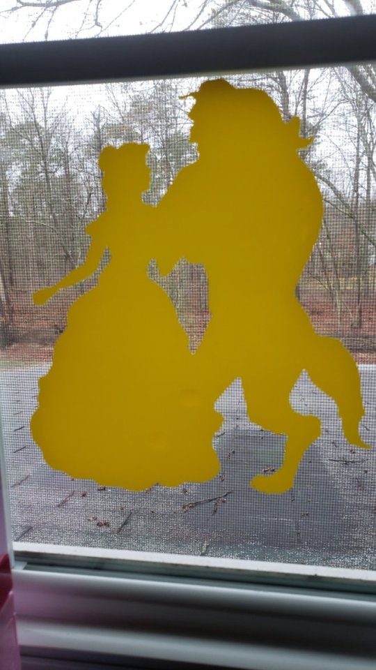
My Weapon concept for WD!Steven X Garnet fusion!
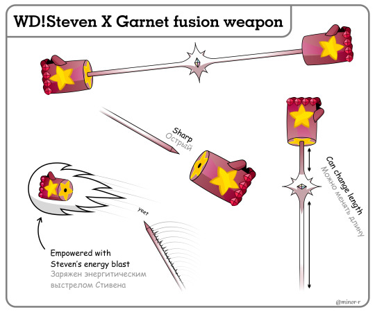
Click for better quality / Кликните для хорошего качества
Steven from @ask-whitepearl-and-steven made by @thechekhov, more specifically.
Info under the cut / Подробности дальше
I drew it in CorelDraw, and what can I say... I'm not drawing anything in Corel by my own will again.
Рисовал я в CorelDraw, и что я могу сказать... В кореле я больше по своей воле ничего рисовать не буду.
It can change length of both its segments, just like Steven's staff does, and gauntlets can be detached if needed, for example to reveal a sharp spike, or to be thrown at enemy! in this scenario two additional effects also take place: Garnet's rocket gauntlets and Steven's energy blast!
Как и посох Стивена Это оружие может менять длину, а перчатки можно отсоединить, чтобы обнажить острый шип или запустить их во врага! В последнем случае также активируются сразу две способности: ракетные перчатки Гранат и Энергетический выстрел Стивена!
I haven't figured out what the fusion themselves would be like, but I imagine them to swing it around like a VERY heavy kung-fu stick and sometimes use it as a hammer.
Как само слияние выглядит я так и не придумал, но я представляю, что оно бы сражалось этим оружием в основном как кунг-фу палкой, только ОЧЕНЬ тяжелой, иногда используя его как молот.
Fun fact: I got this idea more than a year ago, on Aug 15, 2022! (no idea why I remember this lol) At some point I was even scared that by the time I finish this Steven and Garnet will already fuse in the comic XD
Забавно, но этой идее уже больше года! Она пришла мне в голову 15 августа 2022 года! (Без понятия почему я это помню хввх) Какое-то время я даже боялся, что к тому моменту, когда я это доделаю, Стивен и Гранат уже сольются XD
I also got some ideas for Steven X Rose, so maybe I'll draw this too sometime! But not soon.
У меня также есть пара идей о слиянии Стивена и Розы, так что может быть когда-нибудь я и это нарисую. Но не скоро.
#vector graphics may be good for logos & stuff#but not for art#nuh uh#never again#my favourite part was shadowing#steven universe#garnet#su garnet#steven *au*niverse#ask whitepearl and steven#su fanart#fanart#coreldraw#digital art#is it too many tags?#anyway#Вселенная стивена#Стивен юниверс#Гранат#фанарт
443 notes
·
View notes
Text
The five Most Lucrative Electronic Products and solutions
To Promote On the internetDon't forget on the initial Star Trek when individuals just pressed a button and a meals replicator would promptly make whatsoever you required. You didn’t must go to a shop and try to look for components and after that make the meal. No hunting up a recipe or getting your palms soiled. Push a button and Voila, a sundae appeared.
Or maybe you don’t remember because you aren’t a complete nerd like me. In any case, you receive The thought, push button and food stuff seems. Like “the foods replicator”, digital downloads are almost instantaneous. You pay, push a button to download, and right away get what you want. Easy.
Currently We've a lot of information and facts readily available to us. With the press of the button, We've usage of publications, songs, classes, tutorials, graphics, photography, weblogs, themes and a lot more. Practically just about anything you desire can be bought digitally.
Consumers are embracing the entrepreneurial spirit. Einstein after claimed, “Everybody is usually a genius. But if you choose a fish by its power to climb a tree it is going to Dwell its entire daily life believing it's stupid.” Not everyone seems to be eliminate for or is greatest fitted to a nine-5 career.Most are turning to promoting their know-how on the web. Whether or not it be composing an e book or instructing guitar classes. The condition many people face will not be knowing if their product or service are going to be successful. We have been below to assist you out. Listed here are the five most financially rewarding digital products that you can promote yourself eCommerce shop.1. eBooksThe most popular electronic download goes to the e book and with very good rationale. As a result of emergence of equipment such as Kindle and Kobo, the recognition of eBooks has skyrocketed. Due to this new period of ebooks, self-released authors are now receiving the recognition they deserve. Authors, when they decide to go this route, no longer really have to go from the inconvenience of finding a publisher.

Check out these impressive stats from publishers weekly:
The Big Five regular publishers now account For under 16% from the e-books on Amazon’s bestseller lists.Self-released textbooks now characterize 31% of e-reserve income on Amazon’s Kindle Retail store.Indie authors are earning just about forty% in the e-guide pounds planning to authors.Self-released authors are “dominating usually revealed authors” in sci-fi/fantasy, mystery/thriller and romance genres, and therefore are having major marketplace share in all genres.Self-published books are dominating as They can be starting to gather a cult-like pursuing. Many people are tired of viewing the same textbooks revealed by exactly the same authors and are seeking some variety.
Pictures
70 million. The volume of images, vectors, and illustrations presently becoming offered on Shutterstock. In addition to over 750,000 Lively customers in around a hundred and fifty international locations. There have been 58 million downloads of Shutterstock visuals in 2011, which produced $a hundred and twenty.3 million in income. Which’s just Shutterstock. There’s also Photocrati, SmugMug, Zenfolio, DigiLabs, Shutterfly, Zazzle, iStock.
All of this most likely Appears very good, correct? There’s a bunch of seriously large figures, but the fact is, In order for you your images to stand out, they received’t. They turn into a needle inside a haystack along with the Competitiveness is fierce. You could possibly Imagine your Picture is worth a particular amount of money, but funds talks and you simply’ll will need to cost your images competitively to be able to stay pertinent. Aritc -> [Treinamento Negócio Mobile]
A photograph is really worth a thousand terms. Over and over photographers have a compelling storyto go with their photo. Like a merchant advertising a product, the description within your Image gives you an opportunity to seriously provide a person on it.
Then there’s The point that these third events are likely to acquire A serious cut of the revenue. Not amazing. With your own store, you keep All your revenue and make sure your photos get the eye they are worthy of.

Songs
iTunes, as we all know, is massive. Like billions-of-pounds-in-revenue-each-yr massive. But Do you realize that iTunes usually takes thirty% within your audio product sales? Positive, you can get publicity on it, but Until your Taylor Swift, chances are high you aren’t likely to be producing a ton of money. The circumstance is even worse after you evaluate other companies like Spotify. Aritc -> [Treinamento Negócio Mobile]
With your personal eCommerce store, you have to maintain each and every cent of your hard earned money anytime anyone downloads your tunes. You are able to develop your individual customized Web-site, build a worldwide lover following, and distribute new music to them ideal out of your internet site.
You may also market what ever you wish to go together with your music together with t-shirts, hoodies and even more, and bundle them with all your new music.
Video clips and Classes
With every thing currently being so readily available and absolutely free, it would seem that video clips and on the web classes would be obsolete. Not the situation.
On line movie and class marketplaces like Udemy became very well-liked. Udemy shared that it now has in excess of 8,000 courses becoming taught to 800,000 pupils. The condition is, Udemy along with other very similar Internet websites just take 50% of one's income! Along with that, they often operate price reduction promotions that further diminish your revenue.
From healthier living to Mastering the way to code, you name it, persons are looking to find out and actually purchase the data!
The problem with promoting on third party sites is it’s hard to stand out. Obtaining your individual web-site will assist you to notify your story and definitely placement yourself as a professional in your industry. This gives you a leg up in your Competitiveness.
World wide web Aspects
For those who’re a graphic designer, you’re in luck. Men and women are having to pay a lot of income for themes, styles, brushes, wallpapers, logos, practically nearly anything World wide web similar you may think of.
Themes are incredibly well-liked. A number of the themes on Theme Forest are now being downloaded A huge number of moments with the cost selection amongst 14-thirty dollars. You can find above a thousand WordPress themes by itself. Another incredible figures from Concept Forest incorporate:
Maximum offering concept: $two hundred,000 product sales to this point
Quickest promoting concept of all time: $one hundred sixty,000 in seven months, and counting
Greatest creator earning in one month: $40,000 (take house earnings)
Then you will discover websites like Graphic River that sell just about anything you could consider, from social media marketing packs to banners advertisements to textures. There are over a hundred and fifty,000 vectors by itself to choose from. The probabilities of Website things that a graphic designer could promote on the net are unlimited.
making them good digital products to sell onlineCLICK TO TWEET
Aritc -> [Treinamento Negócio Mobile]
Start out Advertising
Digital downloads is usually a billion dollar marketplace. Standing out and making genuine income can be done nevertheless it gained’t be finished promoting on 3rd party Sites. Guaranteed, there are the Fortunate several that do find yourself creating some first rate coin, Nevertheless they continue to have to give up a percent of their earnings.
Starting your own online store permits you to model your self, current market your self and sell your digital downloads with your conditions, devoid of paying out Those people significant marketplace expenses.
The better part is, it’s actually very simple to get rolling. You don’t will need makers, suppliers, packagers, shippers and all another operational pains that include Bodily solutions. Decide among the list of previously mentioned electronic product kinds, set up your eCommerce store, and begin promoting!
[Treinamento Negócio Mobile]
5 notes
·
View notes
Text
Technical Graphic Design Skills That Employer Wants
If you want to be a graphic designer, you should know graphic design is a profession where the skills get paid. There are some basic skills that all ambitious designers have to understand before they will be heading to accomplish their purpose. Through this article, you will get the relevant information about the skills demanded to be a graphic designer and what are the skills that company owner looking for before hire a graphic designer:
Digital UI, UX
As a Melbourne graphic designer, you need to understand the importance of the User Interface (UI) and User Experience (UX) fields because they both are subparts of digital design. UI is centered on the visual occurrence meaning how a portion of digital design seems. On the other hand, UX is converged on usability, suggesting how a digital design operates. All digital designers need to have good knowledge and skills in both fields because how could you create a thriving UI section if you don't know how UX operates and contrariwise?
Sketch
The sketch is an essential piece of equipment in a digital designer's toolkit. A complete digital design program includes UI and UX and can help you create websites, mobile apps, prototypes, and colludes. With this mindset, it's straightforward to recognize how digital, which uses UI, UX, Sketch, and more, is a vital part of a skill set of a graphic designer.
Typography or Typesetting
Typography is also an essential part of the graphic design skills list. These skills relate to typography by selecting the appropriate font for a design to get into the nitty-gritty of typesetting with the association, kerning and driving. Most of these typography associated abilities will be utilised while operating in InDesign and applied in every project a graphic designer works. Additionally, professional typography skills are also essential for designers to hold an in-depth perception of typography to describe why they have obtained positive typographic options and choices have a basis in theory, or they are purely aesthetic.
Adobe InDesign
Adobe InDesign is a most valuable piece of software that can be assumed as a graphic designer's best friend. InDesign is a typesetting and desktop publishing application, a component of Adobe Creative Cloud that Melbourne graphic design agency designers use for graphic designs. It succeeded Quark that endured harsh critique, which first launched the enterprise standard in 1999. So, once a designer is wholly qualified in InDesign, it uncovers a whole world of opportunities. You can use InDesign to design several items, such as books and magazines, posters, and all those things that instantly pop up in people's brains during you declare you're a visual designer. Although, in all sincerity, you won't encounter a graphic creator who isn't both a master of InDesign and concurrently steadily studying new suggestions and methods on the application!
Adobe Photoshop
Adobe Photoshop is another part of the Adobe Creative Cloud, the worlds most famous and successful photo editing app published 30 years ago in February 1990. Most people think photo editing is a part of photographers' job, and it does not relate to graphic designer either. But, it is not valid. Photoshop is so much more than simple photography and photo editing. As a graphic designer, you'll use Photoshop to alter and edit bitmap/raster graphics such as JPEGs, PNGS, GIFs, and more for application in your designs. In more straightforward terms, it applies pixels to create pictures. You can use the application for stuff, including colour-correcting, cropping, resizing, and editing photographs and images.
Adobe Illustrator
Adobe Illustrator is the third and final section of Adobe Creative Cloud, a vector graphics editor first released in 1987. Vector graphics can be sized much more than raster graphics because they are not built up of pixels but are formed up of pathways. Illustrator deals with vectors, and on the other hand, Photoshop works on the latter. The application can be utilised to produce various digital and printed images, including graphs, charts, cartoons, logos, illustrations, and diagrams that may need to be printed or displayed in different sizes or other formats. The actual value of InDesign, Photoshop and Illustrator is that you can use them all concomitantly seamlessly to make designs, and you can open files in the other applications. That is why they place profoundly on the vital graphic design skills program.
Portfolio Management
A graphic design portfolio is debatably an essential tool for graphic designers that will be utilised while searching for a job, diving to patrons and exhibiting their incredible achievement to their clients, friends, and colleagues. Accordingly, being capable of managing their portfolio precisely and a website is essential for any designer. Some viewpoints of portfolio supervision can be determined, such as how to lay it out perfectly, what data to incorporate, and social media experiences, including adequately managing and utilizing Instagram and Behance profiles and more. These points are super necessary for a graphic designer to understand to have the most flourishing portfolio potential. However, other components of portfolio management are a bit further complex than these. Graphic designers should identify how to create their portfolio, display them as skilful graphic designers by their artistic and pitch, or say how to use their branding skills to brand themselves in the graphic design industry. They should also understand how to develop and evolve their portfolios as they grow and improve as designers. It's necessary to modernize and update designs as you proceed throughout your profession. You don't fancy undergraduate designs in your portfolio! A crucial part of portfolio management, and therefore of a graphic designers' skill set, make their portfolio as unique as they are!
Design Policies
Repetition, hierarchy, balance, alignment, and contrast are five words that any designer must be astonishingly familiar with. They build up what we call the design policies or principles that should be practiced on every design project you work on. They are vital in creating any flourishing design.
• Repetition
Repetition reinforces a design by matching coincidentally otherwise separate components and, as a consequence, forms bonds.
• Hierarchy
It constitutes organisation.
• Balance
Balance offers resistance and construction to a design, either over agreement or tautness of components.
• Alignment
It produces a sharper, more associated design.
• Contrast
It is the most efficient method to make an impression on your clients with the help of your design.
A crucial component of the skill list of any designer is that the five design principles should be used together to create a visually appealing and adequately structured design.
0 notes
Text
Packaging And Product Design-
Product design describes the process of imagining, creating, and iterating products that solve users' problems or address specific needs in a given market. The key to successful product design is an understanding of the end-user customer, the person for whom the product is being created.
So what is product packaging? Product packaging design is the creation of the exterior of a product. That includes choices in material and form as well as graphics, colors and fonts that are used on wrapping, a box, a can, a bottle or any kind of container.
Like any good design, packaging tells a story. Engaging us through sight, touch and sound (and possibly smell and taste, depending on the product/package). All of these details help us understand what the product is for, how it should be used, who should use it and, maybe most importantly, if we should buy a product or not.
Before you start your packaging design-
3 crucial questions:
There are three questions you must have the answer to before you start designing the packaging for a product:
1.What is the product?
2.Who’s buying the product?
3.How are people buying the product?
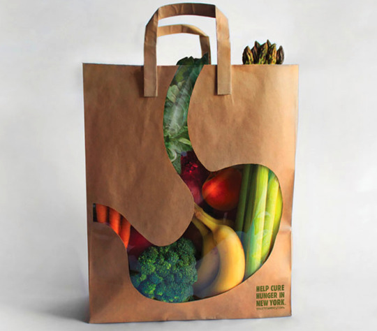
City Harvest’s Shopping Bags
1. What is the product?
What are you selling? How big is it? What materials is it made of? Is it delicate?
This question is going to help you think if there are any logistical needs for your product packaging. For example, a delicate product will require more secure packaging. Something that is large or with odd dimensions, on the other hand, may require a custom packaging solution instead of an out-of-the-box box.
2. Who’s buying the product?
Is the product supposed to be for men, women or both? Is it for children or adults? Is it designed more towards people who are environmentally conscious? To those on a budget or with lots of disposable income?
A product’s packaging should appeal to its ideal consumer; it’s important to know who that consumer is before you start the design process. Products for older adults may need larger text. Alternatively, items designed more towards an affluent customer will need to consider materials that create a feeling of luxury.
3. How are people buying the product?
Are they purchasing it in a supermarket? Online?
You’re going to want to think about packaging differently if the product is going to be sold online and shipped than if it’s going to need to stand out from the competition on a big-box store shelf. Items that will be sold online probably shouldn’t have a lot of extra space that could cause the product to rattle around, or the package to bend.
Information you need to collect:
Brand requirements-
Sometimes a product is stand alone, and in other cases it’s representing an established brand. If your packaging needs to represent a certain brand style, it’s important you’ve gathered the following information before you start:
Colors-
If you already have the CMYK values or Pantone Matching Values (PMS) colors include those as they’re specifically for printing.
Fonts-
Make sure you have the proper fonts and any specific usage instructions for example kerning between letters.
Logo-
If you need to put a logo on the package,
Context that needs to be on package design-
What this is is going to be pretty unique to your certain product, but you’ll want to make sure you have it all sorted out before you start design. Note that depending on your industry, there may be some things you’re required to put on your packaging for legal reasons.
You may need:
Written copy-
This can include anything from the name of your product to a description to words to make the audience want to purchase it.
Imagery-
Want to put photos on your packaging? You’ll need to have those ready to go before you start the design process.
Required marks-
Depending on your product / industry, you may be required to include a barcode, nutrition information, etc.
Know what temporary content you need-
Some products—like foods or cosmetics—have additional information that needs to be put on different batches of products (expiration dates or batch numbers). You probably don’t want to print this directly onto your packaging as it will be changing regularly, but you’ll want to make sure you save space for a sticker or stamp to be placed at a later date with that information.
Designed by Soon Mo Kang
Style likes and dislikes-
It’s a good idea to have done some style research before you start the design process. Start collecting packaging that you like.
Remember, style inspiration isn’t always a one-to-one transaction. Maybe you love the color of a specific shirt, or the font on a sandwich shop sign. One thing to remember, though, is that you’re not necessarily curating design ideas for yourself, but for that ideal customer. You may love shabby, vintage chic, but if you’re selling baby motorcycle jackets to badass biker moms, that’s probably not the best style for your packaging.
Another thing to start thinking about when you’re starting your style journey is materials. You don’t have to make any decisions right now, but you’ll want to start noticing the different options.
Budget-
Packaging design budgets break down into two categories:
-One-time costs
-Per-item costs
One-time costs include things like paying for the original design work, purchasing a stamp (if you’re going the DIY route), print plate setup (for large, offset print runs.) You pay for these up front, and usually only once (unless you change your design).
Per-item costs are generally for materials and labor. Each box will cost a certain amount, as will the tissue paper you stuff it with and the tape you use to seal it. And you either have to pay someone to put your product into the box, or do it yourself.
You’ll want to have a ballpark idea of how much you’d like to spend before you start the design process. Keep in mind that cheaper isn’t always better; paying a little bit more for your materials could up your presentation (and your selling price) by making you stand out from the competition.
The packaging design process in 6 steps-
Once you’ve gathered all of this information, it’s finally time for the creative part: the design process.Remember how you want your packaging design to tell a story? The choices you make in the design process are what’s going to help you tell that story.
1. Understand packaging layers
There are three “layers” of product packaging: outer packaging, inner packaging and product packaging. Your product may need one or all three of these.
Outer packaging is the first thing a customer is going to see. It’s what protects your product from the elements. This could include the box that the product is shipped in or the shopping bag the item is placed in at the store.
Inner packaging is what keeps your product nestled safely in the outer packaging. This might be packing peanuts or tissue paper that stops something from getting jostled or scuffed. Or it might be a sealed bag that acts to preserve freshness.
by Imee008 for 6DT
Product packaging is what most people think of when they think of packaging: it’s the box the toy comes in, the bottle with a label, the tag on a garment, the wrapper of a candy bar.
Each one of these layers of packaging gives you a chance to tell a part of your story.
2. Choose the right type of packaging
There are many different types of packaging available for your product:
Choosing between a box and a bottle may sometimes be a no-brainer. But sometimes it’s not. Here are a couple of things you need to think about when selecting the right type of packaging for your product:
The product-
If you are selling something liquid, that’s going to limit your options. This shouldn’t limit your your creativity.For example Capri Sun: they turned the juice-box industry on its head by creating a juice-sachet.
A custom-shaped bottle is going to be much more expensive than a standard bottle. By cabinet for Bryson Ishii.
The budget-
You may have an awesome idea on how you’re going to sell your astrology charms in a star-shaped box. But if your budget is £0.50 per piece, that’s probably not going to be possible. Remember to always keep the ideal customer in mind: if your charms are going to sell for £12 each, a simple, inexpensive box is probably your best bet. But if they’re hand-crafted, gold keepsakes that you are selling for £100, you may be better served to up your budget and go for that luxury star-shaped box.
3. Line up your printer
Printing is not something you’re going to do until after the design is complete. But you should think about it way before you get to that stage.Not only is connecting with a printer going to ensure you’re solid on the costs of printing, but they’ll be able to give you specific information that can help your designer prepare files.
A couple things you’ll want to ask about:
Dielines-
If you’re going with a standard-sized box or label, printers should be able to provide dieline templates that can be shared with a designer.
File-format requirements-
Your printer will need a vector file. Does it need to be a layered file? Should you include cut-lines or not? Your designer should supply a print-ready file (usually an Adobe Illustrator , Photoshop,(PDF or EPS). You may not be able to open these files if you don’t have the right software, but your printer will be able to. The designer will also supply visual mockups in a PNG or JPG format.Make sure you understand which file types are what so you can supply them to the right people.
Color options-
Some printers are going to be able to color-match to any Pantone color. Others (especially less-expensive options) are going to have a limited color palette for you to work with.
Digital vs. offset printing-
Which type does your printer use? If they do offset, what is the minimum order number? How do the costs scale?
4. Create your information architecture
Think back to those 3 questions, specifically who’s buying your product and where are they finding it. You’re going to use that to create the information architecture for your package.
You may have beautiful photos of your product in action, a brilliant testimonial from a customer, a tagline that explains how the product is so good, and a great graphic showing customers how to use your product ( can be seen at the back of the packaging).But when a shopper looks at your packaging they’re probably only going to remember one thing. What do you want that to be?
Pick the one absolute most important thing you want customers to know about your product. That should be the centerpiece of your design.
You can then add 2-3 things you want to show once they’ve picked up your product.
As you can see the typeface is cleverly created and stands out from the other elements on the package design. Underneath this is the tagline which tells the audience what this product is. Use of words like ‘unique design’ captures the audience attention.
5. Evaluate a packaging design-
Now you’re got some good design ideas it’s time to give some feedback. Here are a some things you’re going to want to think about:
1.Is it clear what your product is?
When you look at the package, is it clear what the product does and who it’s for? Buyers are only going to spend money on things they understand.
Make sure your packaging doesn’t look like something else (unless it’s very intentional). You definitely don’t want to confuse your consumer.
2.Is the packaging an honest representation of your product?
One of the worst things you can do is misrepresent your product in your packaging. Make sure any photos on the packaging are actually photos of the product. Yes you can and should put your best face forward, but if you show a picture of muffins filled with raisins and there’s actually only 1 raisin in each of your muffins, a customer is going to feel cheated (and probably won’t buy from you again).
3.What will this package look like in 3D?
A good designer should provide a mockup of your design both print-ready (flat) and in 3-dimensions. You can also create your own mock-ups by printing something out on white paper and constructing it into a box or tube. This will help you notice things you wouldn’t otherwise. Sometimes an image will look great when flat, but terrible when constructed. Make sure you understand the difference.
4.What will this package look like in stores?
Shelf-impact is very important for products that are sold in-stores. You’ll want to think about :
How much of the packaging will be visible? When products are lined up next to each other, you can usually only see one-face. Make sure your most-important info is front and center.
What will it look like when these products are stacked next to and on top of each other? Is there a pattern that’s created? Do you want there to be?
What will this look like compared to the competition? Go to one or more stores where your product will be sold and figure out where your product would be placed. Are most products one color? How will you make yours stand out and get noticed?
5.Is this design versatile?
Is your design going to be easily modified to accommodate new variations of your product?
6-Is your packaging reusable?
This may not be important for every product, but you may want to think about if your packaging can be reused (and if you want it to be).For example, can your bag be repurposed into a grocery tote? Free marketing.
6. Collect feedback
Before you 100% decide on your packaging design, make sure to run it by both key stakeholders and people who have never heard of or used your product.
Even if it’s just your neighbor across the street, people not closely associated with your product will notice things you never did. Think about asking them:
-What does this product do?
-Who is supposed to buy this product?
-What is the one key message you get when you look at this packaging?
Their answers to these questions will help you think if the packaging is communicating what you wanted it to. If it’s not, go back and figure out what you can change.
Packaging design glossary-
Here’s some common packaging design terms:
Adobe Illustrator (AI) file — Adobe Illustrator is a design program used to create vector images (which you will need for printing). Files created in this program have a .ai extension. You will need Adobe Illustrator to open these files.
Barcodes (UPC and EAN) — Barcodes are those groups of lines on any package. They have machine-readable data on them that stores information about the product, including price. There are several different types of barcodes, including UPC (Universal Product Code)—the predominant barcode in North America—and the EAN (International Article Number (it was originally “European,” hence the E)—a global barcode. You may wish to apply for these before you get your packaging designed.
Bleed — In printing, you use a bleed when your design goes to the edge of your paper (or box, or wrapper). In this case, designers will actually add a little extra design to the edges (the “bleed”) so that when the design is printed and cut to the right size there’s some room for error if the cuts are a few millimeters off.
Canister — A round or cylindrical container, typically made of metal, and used for storing things like food and chemicals.
CMYK — Stands for cyan (blue), magenta (red), yellow and key (black). These are the four colors used in printing. Each color has a CYMK code that a printer will use to help color match between your design and the finished package.
Dielines —The flattened pattern of your product packaging. Designers and printers use them to create the proper layout for a package.
EPS — Stands for encapsulated postscript. This is a file extension for vector-based images. They can generally only be opened in specialized graphic design programs.
Digital printing — A modern printing method wherein information about the file is sent to a printer digitally and each piece of packaging is run individually through that printer. Digital printing is great for small-runs and short turn around times. Often times, the more traditional offset printing is more affordable for larger print runs.
Offset printing — A printing technique wherein plates of your design are created in four colors (CMYK). These plates are then run through a large, industrial printer. Offset printing has high setup costs (i.e. the plates need to be created), but in large volumes (usually over 1,000 or so pieces) it is more economical.
Pantone — Pantone is a company that created the Pantone Matching System (PMS). The PMS is a catalogue of standardized printing colors. Each color has an assigned number and can be reproduced nearly identically by any printer.
PDF — Stands for portable document format. It’s a versatile file format that be either a vector or raster (you want vector for packaging) and supports both images and text. PDFs can be opened on nearly any computer.
Raster file type — Raster images are made up of thousands of tiny dots (pixels). As such, they are difficult to resize.
RGB — Stands for red, green and blue, the three primary colors (that can be combined to create all other colors) in light, and therefore on digital screens. RGB or hex codes are used to identify colors in digital spaces; they can be converted into CMYK and Pantone color codes for printing.
Vector file type — Vector images are made up of lines. As such, they are easy to resize.
0 notes
Photo
How to become a designer without going to design school
This is a guide to show yourself design.
Update: I first published this blog post over a year ago. Since then, I've gotten many emails posing for more guidance and more comfortable to follow steps, and that I finally found one: Designlab. This course wasn't around once I was learning, but man does I wish it had been – it might have made the entire process tons less daunting. I like it's that it gives you project assignments and then connects you to a design mentor who gives you feedback (they have specialized ones who work on Facebook).
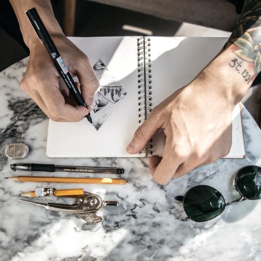
Step 1. Learn to ascertain
The biggest mistake is jumping into Photoshop too fast. Learning Photoshop doesn't cause you to a designer, a bit like buying paintbrushes doesn't force you to an artist. Start with inspiration.
First, find out how to draw.
You don't need to sit during a room with a bunch of other artists trying to draw an unadorned woman.
You don't even need to get that good at drawing. Just learn some basics so you'll be comfortable sketching with a pen.
You only need to do one thing to find out the way to draw: get the book you can draw in 30 days and practice for half an hour a day for a month. I've checked out tons of drawing books, and this is often one among the simplest.
Learn graphic design theory
Start with the book Picture This. It's a storybook of Little Red Riding hood but will teach you the foundations of graphic design at an equivalent time.
Learn about color, typography, and designing with a grid. If you'll find an area class to show the fundamentals of graphic design, take it.
Go through a couple of those tutorials a day.
Learn some basics in user experience
There are tons of books about user experience. Start with these two quick reads which will get you within the right mindset:
The Design of Everyday Things
Don't Make Me Think!
Learn how to write down
Here may be a sure sign of a nasty designer: their mockups are crammed with placeholder text like Lorem Ipsum. An honest designer may be a good communicator. A genuine designer thinks through the whole experience, choosing every word carefully. Write for humans. Don't write within the academic tone; you wont to make yourself sound smart in-class papers.
Read Made to Stick, one among my favorite books of all time. it'll teach you ways to suck in your readers.
Voice and Tone maybe a website filled with gems of excellent writing examples.
Step 2. find out how to use Photoshop and Illustrator.
Hooray! Now you've got a reasonably solid foundation – both visual and UX. You're able to learn Photoshop. I like to recommend starting with Illustrator first then moving on to Photoshop after. Illustrator is what designers use to form logos and icons.
Learn Illustrator
There are plenty of books, online tutorials, and in-person classes to find out Illustrator. Choose the design that works best for you. Here are the books I found especially helpful to find out the fundamentals of Illustrator:
Adobe Illustrator Classroom in a Book – It's boring, but if you get through a minimum of half it, you'll know your way around Illustrator pretty much.
Vector Basic Training – This book teaches you ways to form things in Illustrator that look good.
Now for the fun stuff! Follow these online tutorials and be impressed by what you'll make. Here are two of my favorites – a logo and a scenic landscape.
Learn Photoshop
There are 1,000,000 and one tutorials out there. Tons of them are crap. Fortunately, there are sites with really top quality tutorials. PSDTuts by TutsPlus is one among them.
Here's a simple photoshop tutorial to form an iPhone app.
Here's another good photoshop tutorial to make an internet site mockup.
Carve out an hour or two a day to travel through some tutorials, and you'll be impressed by how quickly you progress.
Step 3. Learn some specialties
Do you want to style mobile apps? Websites? Infographics? Explore all of them, and pick and choose those you enjoy to urge better at them.
Learn Logo Design
Learn how to form a logo that doesn't suck: Logo Design Love
You'll want to require it a step further than a logo, though. Learn to make a uniform brand – from the web site to the business cards. Inspect this book, Designing Brand Identity.
Learn Mobile App Design
Start with this tutorial to urge your feet wet on visual design for mobile apps.
Read this short but very comprehensive and well-thought-out book on iPhone design: Tapworthy. it'll teach you ways to form an app that looks good and straightforward to use.
Geek out on the apps on your phone. Critique them. What works and what doesn't?
Learn Web Design
Read Don't Make Me Think to find out how to make an internet site that folks find it easy to use and navigate.
Read The Principles of Beautiful Web Design if you would like help making an internet site look good.
Make an inventory of the websites you think that are beautifully designed. Note what they need in common.
Now for the hairy question of whether you would like to understand HTML/CSS as a designer: It depends on the work. Knowing it'll offer you a foothold within the job market. Albeit you don't want to be an internet developer, it helps to understand some basics. That way, you recognize what's possible and what isn't.
There are numerous excellent resources to find out HTML and CSS:
My favorite free one is Web Design Tuts.
My favorite paid one (pretty affordable at $25/month) is Treehouse. If you're ranging from the start and need someone to elucidate things clearly and comprehensively, splurge for Treehouse tutorials.
Step 4. Build your portfolio
You don't get to attend a flowery design school to urge employment as a designer. But you are doing need a solid portfolio.
How does one build a portfolio if you're starting for the primary time? The great news is you don't get to work on real projects with real clients to create a portfolio. Structure your side projects. Here are a couple of ideas:
Design silly ideas for t-shirts.
Find poorly designed websites and redesign them.
Got a thought for an iPhone app? Mock it up.
Join a team at Startup Weekend and be a designer on a weekend project.
Enter a 99 designs contest to practice designing to a quick.
Do the graphic design exercises within the Creative Workshop book.
Find an area nonprofit and offer to design for free.
Resist the temptation to incorporate everything you've ever designed in your portfolio. This is often an area for your most vital work only.
Steal, steal, steal initially. Don't worry about being original – which will come later, once you're more comfortable with your craft. Once you learn an instrument, you find out how to play other people's songs before composing your own. The same goes for design. Steal like an artist.
Go to Dribbble for inspiration on a number of the simplest designers. Inspect pttrns for iOS inspiration, and patterntap for website inspiration.
Step 5: Get employment as a designer.
When I first started learning design, I visited an employment search workshop for designers. I walked into an area filled with designers who had far more experience than I did – 5, 10, 15 years experience. All of them were trying to find jobs. That wasn't very safe. There I used to be, trying to show myself design, knowing I used to be competing with these experienced designers.
And yet six months later, I got a design job. There was one key difference between many opposite designers that gave me an edge and me: I knew how to work with developers.
The most significant factor to spice up your employability is to be ready to work with developers. Learn some interaction design. Learn some basic HTML and CSS. Designers within the tech industry (interaction designers, web designers, app designers) are in too high demand and are paid well. That's where the roles are immediate.
If you don't have any experience working with developers, get some. Attend Startup Weekend, attend hackathons, or find a developer through a project collaboration site.
Make a private website and make your portfolio the centerpiece.
Go out and make serendipity happen – tell everyone you recognize that you're trying to find employment as a designer. You never know who might know someone.
Research companies and agencies you would possibly have an interest in. Look on LinkedIn for 2nd and 3rd-degree connections to people that work on those companies and invite intros. The most uncomplicated thanks to getting employment is thru a link. If you don't have a connection, there's still tons you'll do to offer yourself a foothold.
Once you've got the work, continue learning.
I've been at Exec for a year now and have learned plenty of the work. I hunt down designers who are far more talented than I'm and learn from them. I find design classes (good online ones are Skillshare, General Assembly, Treehouse, and TutsPlus). I work on side projects. I geek out at the planning section of bookstores. there's still such a lot to find out and to enhance on.
Keep your skills sharp, and always continue learning.
0 notes
Text
How to create a logo for your Business/Blog
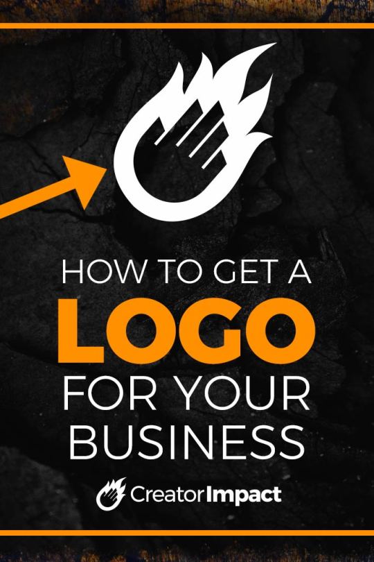
If you have a website, blog or business then you definitely need a logo.
Not sure where to start though? How the hell do you get a logo? Can I do it myself? Do I hire someone?
You can make something basic yourself to get started. Eventually, you’re going to want a professionally designed logo that’s going to stand out and effectively tell people who you are and help you become more recognizable.
So I have a nice list of options here for you to help you to get started, so you can find someone to design your logo exactly how you like it.
So I put together this video, or you can scroll past to read the written post!
Please Note: By playing any videos on this page, you hereby consent to the use of YouTube’s Cookies.
Subscribe to my YouTube Channel Here
Stop for a second.
This is important… What is a logo… really?
I recently redesigned the logo for this website and spoke about it here. I want to say that if you’re wanting to create a logo or even a name for your brand, then do not rush it.
A logo is a simple identifiable emblem or icon that is unique to the entity (or business) it represents, even if that emblem is pure text. Using certain visual elements, a logo creates an image that can be branded onto promotional material and clearly marks a promotion or product visually.
It’s more than just a simple identifier. A good logo that is designed well will give the viewer some idea or feel for it who the company is, what they do and the just how professional and reliable they are.
A clean-cut but smart looking logo says to a person that this company offers a good service or product in a professional manner – while a cluttered and poorly designed logo reeks of “this company is cheap and nasty“. So proper logo design can make or break that ‘first impression’ we’re all out there trying to nail.
You want it to be effective.
So keep it simple, iconic and avoid complicated designs or fonts. It should be easy to read and flexible enough to be used in multiple areas regardless of shape and color limitations. It may be worth googling some logos and getting a collection of logos you like for reference.
So test your logo in black and white to see if it works, show a few key people and make sure it’s likable and relevant.
But, let’s move onto how to make this happen!
Please Note: some of the links below are affiliate links I earn a commission from. I still highly recommend these products with or without the link and it is at no extra cost to you, with the occasional discount being placed on these links also.

Make your Own Online
This is the budget solution for most people. Maybe you love the idea or challenge of doing it yourself, maybe you’re a good designer and are fully capable of creating a logo.
Maybe you just can’t afford it and this your best option.
So there are a few options you can try to create your own logo, and there are varying levels to this whole idea. But first, you can create a logo from scratch using a design or photo editing program. You can then export the file in a PNG for use on your website – or a vector PDF, AI or EPS for commercial printing.
Below are some programs perfect for the job
Adobe Illustrator (part of Creative Cloud)
Adobe Photoshop (part of Creative Cloud) – basic text logo tutorial here!
CorelDRAW
Those above programs will require the most expertise and a bit of knowledge with a computer. But there are also Websites out there that do the job. But if you’re handy with programs like these, they could be a good way to get your initial logo designed.
Otherwise, here are a few other options for you!
Brand Crowd
Brand Crowd is a simple logo creation website with a basic process. Simply hop on, find a design you like and then customize it. You’ll then be given some options on color, icons, and elements to make your logo in a nice visual interface.
They also have the option to ‘buy out’ the design if you really like it, so no one else can use that emblem in their future designs. This means your logo can be more uniquely for you.
You can then modify things like the text, layout and add shapes to your design to further customize it. You can also save these and come back later. So you can take your time when creating your logo.
You pay a small fee (last I checked it was $20) to download the logo once it’s finished. Or you can sign up for more options via their membership which can be great if you want to do more than just one variation.
Check out Brand Crowd here.
Looka
Brand Crowd is a simple logo creation website with a simple process – type in your business name and pick some logos you like. Looka will then generate a number of options for you!
This is a nice process for creating a logo but I found mixed results. Sometimes you got good designs, other times they were pretty ordinary. The process is also a little longer than Brand Crowd but you may prefer it, so it depends on your taste.
Look also has its own customizer and you pay usually $20 or more for your final logo.
Check out Looka
Canva
Canva is a bit more advanced but a fun editor for those not willing to move to the complexity of Adobe Photoshop or Illustrator.
Canva can be used to create not just logos, but social media graphics, posts, PDF’s and a whole bunch of other options. I think Canva allows the most freedom is perhaps the biggest of the design tools out of the 3 just mentioned.
Most importantly, they have a logo creator.
You can start from scratch, drawing shapes and adding test to create your logo or find something pre-existing in the templates and customize it.
Check out Canva

Buy a Premade Logo
The following options allow you to find a logo you like, purchase it and get your name added to it. One of the reasons these websites are worth the money is the logo you buy is for sale only once, no one else will buy that logo after you (or before, or you wouldn’t be able to buy it!)
So the following are some resources you can try:
Logo Mood
A simple website with clean, professional logos. Explore a category that matches your business and go from there!
Logo Mood is definitely a place for the higher-end designs and quite often, higher price tags to match.
Check out Logo Mood
Logo Ground

Again, once you buy a logo here you hold all of the rights and it’s yours! Another high-end marketplace with very well crafter logos and designs.
There’s some really cool stuff at Logo Ground and it offers a vastly different style of designs than Logo Mood.
Check out Logo Ground
Logo is us
Same as above, buy a logo and get it, customize the text to your needs and receive high-resolution bitmap images and commercial ready vector files for your use.
This a nice, simple website and tends to be a bit cheaper than the above options. Quality varies but there are plenty to choose from.
https://www.logoisus.com/pre_designed_logos/

Find a local or online graphic designer
This option will most likely be the easiest but one of the most expensive options out there. If you’re truly serious, you will most likely go this route for your logo design.
It’s simple, search google for a Graphic Designer in your area (so search for ‘Graphic designer Rome’ or whatever area you live in). If you have trouble, try asking friends on Facebook / Instagram. Facebook business groups are a great place to do this.
You do need to do a little leg work, but you will most likely find someone who is better at communicating with you as they’re from your area and speak your language.
They will talk to you about what you like and are looking for, it may be good to send them samples of logos you like, or imagery/icons you think will do a good job.
Skill level can vary though, so try to look at previous examples first.
Note: at the time of writing this, I am a graphic designer who creates logos. Feel free to check out my design website if you’re curious.)
Start a Contest at 99 Designs
The idea behind 99 designs is simple – you post a job known as a ‘contest’ and a bunch of artists create variations you can choose from.
A good and bad thing is that you choose the price of the logo design and go from there. It’s good because you’re in control of the budget but the bad thing is that if you don’t offer good money, you will most likely get poor results.
The other issue with contests is that a lot of good designers won’t bother working on a project unless they know they’re going to get paid (fair is fair!), so you get a lot of designers who aren’t quite that good. But there still seems to be some talent in the contest pool over at 99 designs.
Because of this, 99 Designs also has designers you can search and work direct with instead of a contest, so you get proper, one on one service for your logo which can land you with a better design.
Check out 99 Designs
Check out Design Crowd
Design Crowd is a graphic design focused freelancing website.
It’s an outsourcing and crowdsourcing platform that gives you the option to find a specific designer or enter a design contest, much like 99 designs.
This site has some really talented designers working for them so give it a go!
Visit Design Crowd

Find a Freelancer Online
Working one on one with a freelancer may suit you perfectly. You get to deal with one person and get to work on the details over time.
If you’re a picky person or want a logo that is incredibly unique, then you should consider going this way as it will mean the design you have made will be based off your brief/discussion with the designer.
This is better than a generic design bought online or a poor design created by someone who is inexperienced.
Fiverr
Fiverr is a cool place to look for logo designers ranging in price from very cheap to expensive.
Simply head to Fiverr, sign up and search for logo designer and you’ll get a number of options. Each person has a star rating and portfolio so you can check out the quality before committing. You can get very cheap designs if you’re looking for a quick and cheap approach or you can go with something more expensive.
Fiverr is a great platform for just about any design work but the quality is often not top tier. Again, seeking out a local or online professional with a proven track record may produce better quality.
Check out Fiverr
Try some of these other Freelancing Networks
The following sites are Freelancing networks with a vast range of people to work with. I grouped these together as these sites are a little more generic and less focused than the above recommendations, but could be worth looking at if you don’t find what you need above.
Upwork
Guru
Toptal
Freelancer
Any of the above options should land you a logo!
Remember to take your time and don’t rush the process. A good logo that works well isn’t going to happen in a few days. Give it at least a couple of weeks or more, sit on the designs and make sure you’re happy when you do pick one.
Getting your logo right early in the game is highly valuable and saves you some headaches. if you decide to rebrand, you may need to time things really well or possibly throw out a heap of promotional material that’s designed using an outdated logo.
Get a good logo early. Establish your brand’s visuals and overall look and feel.
So before making a final decision, ask this question…
What is a logo… really?
A logo is a simple identifiable emblem or icon that is unique to the entity (or business) it represents. Using certain visual elements a logo creates an image that can be branded onto promotional material that clearly marks a promotion or product with that entity.
More than just a simple identifier, a good logo that is designed well will give the viewer some idea or ‘feel’ for it who the company is, what they do and the just how professional and reliable they are.
A clean-cut but smart looking logo says to a person that this company offers a good service or product in a professional manner.
While a cluttered and poorly designed logo reeks of “this company is cheap and nasty“. So proper logo design can make or break that ‘first impression’ we’re all out there trying to nail.
The Nike Logo, simple, memorable and highly effective.
What Makes a Good Logo?
You need to understand exactly what works! While you can look at some of the most successful logos in the world (think McDonalds or Nike), you can also look at some of the bad ones – terribly designed messes that are just plain ugly to the human eye – and learn from them.
But if you really want to be certain you’ve got a winner, try to stick to these guidelines:
1. It must be memorable!
If someone were to see a logo a number of times and not recognize it, than the logo is what I like to call a ‘fail‘.
Like a car that doesn’t start, or a shoe without a sole a logo needs to serve it’s main purpose. To create an image that is remembered, so when the logo is viewed again the person who sees it knows exactly who it represents.
This breeds familiarity between the viewer of the logo, the people it represents and what they do – the main purpose of the logo.
2. Aim for Simple and Unique!
Simplicity makes things convenient & easier to process.
An overly detailed logo could take too long to take in, and recognition becomes harder if you have to stop and think about what you’re looking at before making the connection. A complicated logo may be hard to see from a distance or when shrunk while a simple logo that is different from anything else out there is quick and easy to process and differentiates itself from other brands.
To keep your logo unique, try looking at other logos within the same industry – aim not to create something similar to that.
A simple logo that tells a larger story of the company does in a smart way is always memorable!
3. It must have, to some degree, a common ‘theme’ with who it represents.
If you created a logo for a hamburger shop with a shoe icon as your logo – you’d be feel pretty stupid wouldn’t you?
While not all logo’s need an image, the overall look & feel of the logo must match the product or service it represents.
Hot food works with a warm looking logo, just like an ice cream shop is represented well with cooler colors. Make your design appropriate so that when someone sees the logo they have a pretty good idea of what it represents.
4. Make it Flexible.
Logo’s are meant to be put everywhere, that’s how branding works.
But the space in which a logo must go quite often changes; it can be square, rectangular or even round. You need to make a logo which either fits well into most places or can be rearranged to.
On top of that the format can change in terms of color – it may also be printed or engraved. Your logo must work in black and white as well as color since you may not always have the option to include color in your branding – this is aided heavily by simplicity.
If you’ve ever tried to fit a square logo in a long horizontal banner, you’d be familiar with this need! You can’t waste the space and you can’t stretch the logo out of proportion (please don’t stretch it!), so make the logo more flexible.

What types of Logos are there?
Massive brands like McDonalds, Coca Cola and Nike are the best in the world at using their iconic branding to spread awareness of their business without a symbolic representation of their product or service actualy is (some being text only and relying on their well known name) – but will it work for you?
These 3 businesses all use logos that represent nothing to do with their service, but that’s because they are established.
An established business can slowly evolve their logo into something that is unique and doesn’t even really relate to what they do because of their reputation or alternative method in which they market their services.
A logo without a ‘theme’ can be used effectively with the words contained in the logo (eg. Monster Print – would obviously have something to do with printing), or the clever use of the logo on themed branding which tells the reader what the business is all about. For example, if you saw a picture of a 3D Television with the Sony logo clearly branded on it – you’d pretty quickly make the connection that Sony are selling 3D TVs.
There is usually some external method (outside of the logo) of expressing what the business does.
It may also be handy to consider an alternative – something iconic that represents what the business does. You can use an actual symbol or an object, or you can arrange the wording in a clever way that allows for something to be added or modified in a clever way to get the point across. It can be something like changing a letter or adding an object between words.
Remember the following
Do yourself and the world a big favor – create your logo in Vector!
Avoid bitmaps, avoid clip art, and create it entirely from scratch to be certain it is unique.
Vector is a scalable format and will make your logo easy to use for just about any format or media, and it’s incredibly easy to apply changes to – if you’re working with a client there’s a big chance they’ll ask for a lot of changes.
Work with CMYK colors, or if you’re only using 2 or 3 colors – pick Pantone equivalents so there’s a color standard that the logo can be matched to when it is being reproduced.
Work in programs like Adobe Illustrator or CorelDRAW to create your logo in vector format & in the right color space.
Also try to keep your use of text neat and legible – no more than 3 fonts! Keep it clean and tidy and don’t use the over-done ‘crazy’ looking fonts or fonts that are too thin that no-one will be able to read. Keep it simple and professional.
As you can see creating the actual logo is a very small part of the whole process!
When you’re done, the next step depends on your situation. If the logo is for you then stop when you’re happy. If it’s for a client you may want to show a few variations (3 or 4 at most – too many will just confuse them), and get ready for changes. Once they’re happy, you’ve finished the design process!

Handing over the logo
A good designer will offer a style guide or a basic information sheet with colors and fonts that match the logo, so it may be worth creating a style guide for the logo. This is handy as a client will more than likely try to use the logo in ways that are just visually horrible, having a guide for spacing and general usage MAY help to avoid such ‘logo abuse’ (I hate seeing my proud logo designs being used in an ugly way!).
Otherwise you can export the logo to different file formats and supply them to the your client (or yourself) with all text converted to curves. For professional usage a PDF & EPS file is a must (possibly an AI file may be handy too), but many clients also require something simple (to put into their evil word documents!) – so save a jpeg also.
These files can be emailed, uploaded to DropBox or popped onto a USB. Whatever suits your situation and relationship with your client.
You’re Done!
Kick back, take it easy for about 5 seconds and move onto the next job!
This process only covers the basic guidelines and not actual program usage. Good design does take some experience so practice makes perfect!
If you’re not a designer or not looking to become one – then hire a professional to design a logo for you – otherwise you’ll probably end up with a substandard logo that represents your image as that of a sub-standard business. It may cost a decent chunk of money, but it’ll be worth it with a good designer.
Remember, making the logo is the easy part, understanding what you want for the logo, and what will work is where the real skill comes in. So knowing what makes a good logo is essential.
Thank you for reading this post, I hope you found it useful. Also, leave a comment below if you have a logo you’d like to share. otherwise, I’ll talk to you next time!
source https://creatorimpact.com/create-a-logo/
0 notes
Text
No work? No problem, I’ve got plenty to do!
I voluntarily took a day off on Friday, not knowing it would be my last day for at least a week. Most people would be unhappy about this, but I like a healthy work-life balance. I love being at work, but I also love time that I can spend on my hobbies. It keeps me busy while my husband is working.
I could tell you about how I washed my home office floor with Pine Sol this morning (I did!), but that would detract from the excitement of showing off my new vinyl projects.
But hey, you want to see my home office, right?
Remember the den I used to inhabit? I loved that giant space, but this room is bright, cheerful, and not over a breezeway that kept the room at a balmy 50 degrees in December.
And hey, I washed the floor this morning!
Anyway, you didn’t come to see my office – I mean, you got to see it – but you really want to see my vinyl creations, right?
Right!
There’s a mix tape…
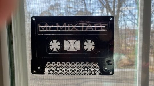
I removed the letters – I figured out a better way to add lettering to things. The tape is unmarked, which sounds like pretty much everyone’s collection.
And behold, the marker that I am an Avenger.
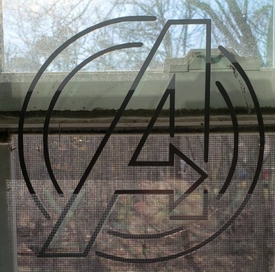
If I ever decide to make vinyls for the purpose of selling, I would make this in all Avengers colors. I made this one in gray because, well, Thor.
My first experiment with making multi-colored vinyl.
Who you gonna call?

And my second experiment. This popped in my head a few hours after I made the Ghostbusters logo, and quite frankly, I knew it would be perfect for a vinyl creation.
Here I was thinking I made the perfect “Reverse Batman” logo, and a friend informed me that it was, in fact, Batgirl.

It’s good to have friends that know things. My husband didn’t even tell me this, and he knows his Batman stuff!
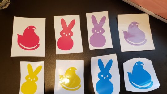
Just because we’re social distancing, which unfortunately may mean no Easter celebration, I’m still going to decorate for the holiday. I found this template for Peeps, and I made a few marshmallowy friends out of vinyl.
I have a bay window in my living room that will look great!
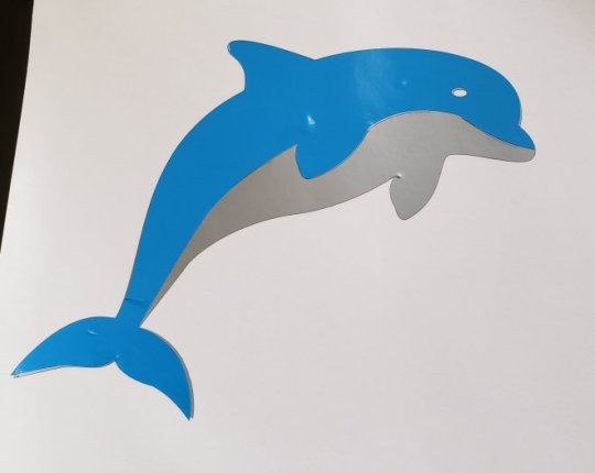
My best friend Amie loves dolphins, of which she has many in her home decor. In my ongoing attempt to make multi-colored vinyl creations, I made this cutie.
She loves it. And when there is no more social distancing, I will gladly give this to her.
The culmination of my work in multi-colored vinyls, I found this template on Cricuit Access and decided to “think summer” (don’t let the 48-degree Southern New Jersey weather fool you, summer is only three months away!). It isn’t perfect, but it looks great and was a great attempt!
As soon as I have more vinyl, I will definitely be making more flip flops in different colors as window decor!

And finally…
A tale as old as time, now in vinyl. Again, if I ever do decide to try to sell my creations, I would also make this in blue. Yellow really does cheer up a gloomy day though!
I found some more vector graphics, and I’m planning to find more ideas on Cricut Access. Perhaps I’ll have a few new creations next week? We shall see!
Have a great day!
More Vinyl Creations! - My latest crafts on vinyl! No work? No problem, I've got plenty to do!
0 notes
Note
Hello! I hope I’m late to the party when I say happy birthday!! :) Also may I ask if you know any good editing apps? Thank you in advance and I hope you’re birthday is spent amazingly 🎉🎂🎉
Hey there! My birthday was yesterday (well the 27th to be exact), but I love each and everyone of you for wishing me a good day. It was awesome! Anyways, I myself use Photoshop CS6 for making gifs and graphics. And for work and other stuff like designing logo’s I use Illustrator. But that is pure for Logo and vector design and many other things.
2 notes
·
View notes
Text
20 Secret Design Tips and Hacks for Non-Designers
With an end goal to do my part and help increase the world's number of well-designed presentations, I'm beginning a series called “Design Tips and Hacks For Non-Designers.” These tips aren't expected to make designers out of non-designers. They are just to help people who don't have configuration preparing turn out to be better at visual interchanges. This is for all the Project Managers, Researchers, and Marketing people out there who need to enhance their deliverables.
The awesome looking plan depends on the most diminutive subtle elements. These points of interest can bring about a lot of issues for beginner non-designers. Neglecting to take after the rules can destroy any presentation page, leaving your image looking unprofessional and even cost you changes.
Luckily, there are hacks you can use to enhance your design piece before you send your startup's website. In the event that you aren't a creator, however, need to hack it all alone until further notice, you require some direction. Here is given basic instructional design tips and hacks for non-designers to help you out,
Get Secret Design Tips and Hacks for Non-designers
1. You Can Get Inspired Designs
Consider about designs that you like motivation can originate from anyplace. Observe an email or site that snatched your consideration and what you loved about it. Don't simply search for design motivation inside your field, you can look at advertisements or sites for items or services that are totally unique in relation to what you do, and regularly these prompt to the most creative and striking courses of action of pictures and content.
Get inspired by your designs is one of the design tips for non-designers, In case you're trapped, don't simply stay there and gaze at a clear screen, however, watch out into the world for something that starts your creative ability. Monitor things that make you go "stunning" by logging them into a spreadsheet, sticking them to a board on Pinterest or bookmarking them. Now and again when you feel at a misfortune you'll have the capacity to backpedal to those purposes of motivation and make history once more.
2. Use Two Fonts
This isn't an immovable govern, yet it's a useful one for general circumstances. Utilize one textual style for features and subheadings, and the other for body content.
Legitimately pick text styles and consolidate them is hard. To make things less demanding on yourself, pick just 2 fonts one for body content and one for features. At that point increase the body text dimension by 2.5 to get the feature estimate. It more helps for non-designers.
3. Hierarchy Is a Big Deal
Remembering hierarchy will help your design for sure. Be that as it may, how might you apply this entangled idea into your designs? It the good tips for non-designers.
Hierarchy of importance is staggeringly insistent in design. While it's enticing to pack each cool component you need to flaunt on your landing page, or each and every detail of a logo, individuals can just concentrate on one thing at any given moment. It's a designer business to move individuals' eyes around the space they are designed to have them concentrate on particular things at particular circumstances. This originates from having a purposeful progressive system and great design.
The design is communication you need to unmistakably convey messages to your audience.
4. Keep It Simple Design
Always you can keep the design that is perfect and simple on the eyes gets the message crosswise over more successfully than the configuration that is full to the overflow with additional items. You can focus your message on being as clear as could be expected under the circumstances. Try not to utilize an excess of hues and don't utilize more than two textual styles, generally, the point will be lost in the disorder.
You don’t try to fear white space it is consummately alright, and in certainty it's ideal, to have it. Understand that the mind can just process such a great amount of data at one time, so maintain a strategic distance from the mess. Eliminate what's a bit much and give your design space to move around.
5. Take Your Own Time
Always take your time to the arrangement that is impeccable and straightforward on the eyes gets the message across over more effectively than a setup that is full to the flood with extra things. You can use some valuable tools to tracking a time to complete projects likewise utilize Restyaboard and trello. It is the best tips for non-designers to focus your message on being as clear as could be normal in light of the current situation. Do whatever it takes not to use an excess of hues and don't use more than two textual styles, by and large, the point will be lost in the disorder. You can follow some time management tips also...
6. Design Should Be People-Focused
While feel ought to completely be an aftereffect of the design procedure, designers really make with the motivation behind usefulness, they design with the user in mind.
The intriguing the truth is that when drawing in with brands, individuals are by and large narcissistic. When designing a website, you can follow this tips for non-designers we regularly converse with our customers about drawing in their gathering of people with a story. Nobody will think about another item, yet they can be persuaded that the item can fill a need that the gathering of people has.
7. Always Use The Perfect Logo
This ought to abandon saying, however, your organization logo should be on the page. Actually, every page, ideal tips for non-designers to accomplish this is to put the logo in the header that continues over your whole site, yet there are a lot of different approaches to force it off. Simply ensure that each page has your logo on it, promptly obvious upon the first load. It is one of the ways to the audience should look at your site design.
8. Consistency
It's vital to keep your design components reliable. For instance, in case you're utilizing one style of catch on one a player on the page, ensure you utilize a similar style on whatever remains of the page or record. In case you're utilizing photography in the header of the page, ensure you keep it reliable with whatever remains of the workmanship resources.
9. Photography
Nowadays every website has a style of photography they utilize. To match that on social or another advertising guarantee, you have to pick the privilege photographs. Be that as it may, picking the correct high determination photographs can be tedious.
10. White Space
You've all known about it, however, would we say we are truly utilizing it fittingly? Giving components breathing room improves things significantly. Allude to the above case for utilizing enough white space. Dispersing in the middle of the lines is likewise it’s important. Not excessively, but rather not very tight either.
11. Avoid Too Much Animation of Your Design
As a non-designer, you may discover moving parts charming, energizing, or if nothing else pretty fun. While this is valid for things like connections that swell up a tad bit when you drift over them or, sometimes, a trail of little and inconspicuous graphical components that takes after the program's cursor, by and large activity ought to be dealt with like flavoring. You must use it, as your site is insipid without it, yet a lot of it will overwhelm the primary dish completely. Unless you're in movement, attempt to restrict your website to maybe a two live energized components per page.
12. Clean Icons
Once in a while, you can't get a photograph to express what you're searching for or the style of what you're making doesn't function admirably with photographs. The option is utilizing clean icons. You can clean icons it’s one of the design hacks for non-designers. Utilizing vector based icons permit you to connect your words with visuals that will upgrade the message. You can avoid the clip art like the plague that stuff ought to have passed on in the 90's yet it seems to live on, particularly in corporate introductions.
13. Copy
Most things you design will have words on them. Those words matter a great deal. On the off chance that you think about the design of your work, you should think about ensuring your copy is best it can be. Clearly, it relies on upon what the motivation behind the item is for, yet some broad tips include:
Maintaining a strategic distance from formal language and composing all the more conversationally.
Shifting sentence length.
Doing whatever it takes not to depend on generally utilized expressions or platitudes.
14. Model and Borrow From Others
Try not to rehash the wheel on the off chance that you don't need to. Before beginning any design project, it's certainly justified regardless of an opportunity to look at different cases of what you're making. See what you like and what you don't care for. Show your work after somebody who did spend a huge amount of design assets on their project. It is mostly one of the hacks for non-designers.
15. Typography Fundamentals
Typography assumes a major part in making the visual hierarchy of importance and difference. One brisk tip is to utilize products sizes. The correct textual style can totally change the vibe of an introduction, site or report. We have the solid relationship with specific sorts of text styles.
Like with colors, it's anything but difficult to exaggerate textual styles. It's prescribed to stay with one or max two distinct textual styles that are to some degree novel. There are prescribed textual style blends and additionally certain text styles that have a lot of weights so you can utilize a similar textual style family while fluctuating the visual look.
16. Use A Simple Grid
Rather than utilizing networks with 12 segments, you can streamline the idea and basically split your format into 3 of 4 segments and ensure components are adjusted to a similar vertical and horizontal lines. You can always use a simple grid it is the design hacks for non-designers.
17. Use a Background Photo
As a non-designers use, a background photo for your site it helps to extensive foundation photograph can help by drawing consideration far from the little design mistakes. When you believe "there's something missing here", include a photograph. You can then play around with blur, saturation, and lightness.
18. Adjust Size And Resolution
Under the tools tab, you can alter the size and determination of your picture. Altering the measure of pictures can be exceptionally useful when you have extensive, great pictures. These pictures will look awesome on your site, yet in the event that they are too expensive, they will stack all the more gradually. Modifying the size down to around 900 pixels will even now take into account incredible picture quality, however, significantly quicker stacking time to keep up a decent user experience.
19. Space Out Your Lines
An incredible adjust can be accomplished through giving a considerable measure of space between your characters or lines. An excessive amount of looks somewhat abnormal, however remembering the white space administer over, this is a classy approach to put the message on a page.
20. Add Text To Your Image
Utilize the content tool to include customized content top of your picture. At that point, change the text style, size, and shading to coordinate your image or plan. For those of us who are non-designers and don't talk the language of Adobe, dread not, Preview has made it simple to make some truly cool design upgrades to pictures and components. Utilize these different hacks for non-designers to change and lift your pictures.
Do you concur that web design is so essential to your organization because these articles provide a more useful design tips and hacks for non-designers? Hope these are all is very useful to convey your designs from alright to incredible.
Remember these design tips and hacks for non-designers above and you'll be headed to improving as a better designer in no time.
#Design Tips for Non-Designers#Design hacks for Non-Designers#Non-Designers#Design Tips and Hacks for Non-Designers#Design hacks#Design Tips#Secret Design Tips and Hacks for Non-Designers
4 notes
·
View notes
Text
Here’s what you need to know about image optimization for SEO
A lot can be said about web performance and images. This post aims to provide an overview of key aspects of image optimization to help with your SEO efforts, from quick wins to slightly more complex techniques.
Why image search matters
Although there aren’t exactly official numbers, Google stated that every day hundreds of millions of people use Google Images to discover and explore content on the web visually. According to Moz, image search would represent 27% of all queries generated across the top 10 US web search properties:
About a year ago, Google updated the “View Image” button from Image Search to “Visit [Page].” As a result, analytics platforms began recording an increase in sessions specifically driven from image search and content visibility for the host pages increased (instead of random image files without context). Besides supporting content and improving user experience, images are once again an important source of traffic and should not be ignored.
Properly naming and describing images for SEO
One of the easiest and often overlooked optimization opportunities is the actual image file names themselves. Those should use a few carefully chosen keywords – ideally, keywords the image could rank for – while omitting stop words (a, the, in, of, etc.) and separating keywords by hyphens (e.g., IMG-458752.jpg would become brooklyn-bridge-night.jpg).
Image alt and title attributes (of the <img> HTML tag) are the next simplest settings that not only help images rank higher in search, but also build the page’s relevancy and improve user experience, eventually all ranking factors. In the case of image links, those attributes also provide context to search engines regarding the destination page, further helping it rank. Unlike file names, write those attributes in a grammatically coherent and concise way: alt attributes are played out loud by accessibility software and screen readers and title attributes appear when visitors hover over images, so do not stuff keywords there and vary it up!
For e-commerce and product images, it’s often a good idea to also add SKUs, ISBNs or model numbers to alt attributes as we sometimes look for very specific products. Note that on-page image captions and keywords in the surrounding text area also help search engines derive more context for images and improve their ability to rank.
Note that the host page’s HTML title tags are also now displayed in image search results so you should ensure that those are somewhat relevant to the image as well if possible (see above screenshot).
Choosing the right image formats, sizes and dimensions
Image file size can disproportionally affect page load time so it’s important to get it right. JPEGs are usually more SEO-friendly than PNGs, especially if you do not need transparent backgrounds, as they offer better compression levels. Logos and other high-resolution, computer-generated graphics can typically also use the vector-based SVG file format (make sure that your server caches, minifies, and compresses that format as well). The GIF format should be reserved for simple animations that don’t require wide color scales (they are limited to 256 colors). For large and lengthy animated images, it may be best to use a true video format instead, as it allows for video sitemaps and schema.
What matters most is the actual file size (in Kb) of the images themselves: always strive to save them under 100Kb or less whenever possible. If a larger file size must be used above the fold (for hero or banner images for instance), it can help to save images as progressive JPGs where images can start progressively displaying as they are being loaded (a blurry version of the full image first appears and gradually sharpens as more bytes are downloaded). So start by selecting the best format for your needs and then select the best settings for those!
Although Google Lighthouse and PageSpeed Insights audit tools recommend even more specific compression formats (Next-Gen formats such as JPEG 2000, JPEG XR, and WebP), those are not necessarily compatible with all browsers yet; some CDN providers do, however, offer WebP conversion when visitors use applicable browsers.
As for dimensions (image height and width), ensure that images are not wider than the most popular largest desktop screen resolutions (which is typically 2,560 pixels in width at most. Otherwise browsers will unnecessarily scale them down) and that your CSS makes your images responsive (images adjust automatically to screen or window size). Depending on the visual needs of your website, this might mean saving different versions of the same image in various dimensions to only dynamically serve the most optimized image based on the user’s screen (mobile, tablet, expanded or resized desktop window, etc.). This can be done automatically through the use of plugins or by using the <picture> and/or <srcset> elements.
A few popular image compression tools:
GIMP: cross-platform, downloadable image editor
TinyPNG: uses smart lossy compression techniques to reduce the file size of your PNG and JPG files
Smush: image compression and optimization plugin for WordPress
MinifyWeb: free service for compacting web files online:
Note that at this time, Google does not use EXIF metadata but may use IPTC metadata particularly for copyright information.
Properly hosting and caching images
Not only can images significantly increase page load times simply based on file size, but they can also dramatically increase the number of requests made to the server before the browser can finish loading the page, competing with other critical resources and further slowing down the page.
In the past, we used “image sprites” (multiple images saved as a single one and relying on CSS to be displayed) and hosted images on a cookie-less subdomain to speed up the process of retrieving and loading images (commonly referred to as domain sharding). Today, however, with HTTP/2 now allowing for multiple concurrent server requests, this is no longer critical. Depending on your specific setup, it may be faster to host images on the same host as your HTML files.
As previously mentioned, Google Images (until last year) directly linked to the image locations themselves so many webmasters and SEOs felt that it was then even more important to host images on their domains to capture any potential link equity from anyone “hot-linking” or embedding your images into their content.
Additional benefits of hosting images on your domain or subdomain include cache control, branding, and control of redirects. There are few benefits (if any) in exclusively hosting images on third-party sites unless it is on a content delivery network (CDN) which can speed up load times by serving images closer to the user location. When using a CDN, make sure to link a custom subdomain you own (CNAME DNS) to your CDN endpoint (in other words pointing one of your custom subdomains to your CDN provider’s server so that fd5dfs4sdf69.cdnprovider.com becomes images.yourdomain.com). This makes things much easier when changing CDN provider because you will not have to update and redirect your image URLs and provides obvious branding benefits as well.
In any case, ensure HTTP/2 is enabled for your subdomains or your third-party CDN.
When it comes to caching, also make sure that server expirations are set for all image types. Images should be some of the resources with the longest caching times (usually many weeks).
Sample cache control directives using .htaccess file’s mod_headers (left) or mod_expires (right)
Properly loading images on your pages
Images can not only slow down a page due to their file format, file size, and quantity, but they can also slow things down based on how they are being loaded.
Even though the latest HTTP/2 network protocol improved the process of loading multiple images at once, lazy loading below-the-fold images (especially larger ones) can provide significant performance improvements in some cases (particularly long-form media heavy articles or image galleries for instance). The lazy loading technique allows the page to finish loading even though many off-screen images will only start loading once a visitor scrolls down the page. Although this technique can improve page speed, it can adversely impact image indexing if not implemented correctly.
Note: if you are implementing an infinite scroll experience, make sure to support paginated loading, potentially using additional <no script> tags for images, etc.
Image sitemaps help as well with indexing if discovery and crawling are problematic. Including images as part of your page structured data also increases the likelihood of a carousel or rich result (images badges).
Scale your images to their actual display size: ensuring that you are not serving larger images than necessary to display in the browser window properly is another area of optimization often overlooked. Pages often load images that are then scaled down by browsers to fit users screen configurations: it is important not to serve images that are wider than the user’s window can display to save on unnecessary bytes.
In your web browser, right-click on an image, click Inspect, and hover over the img element to see the original (or “natural”) image dimension along with the browser’s scaled down version. Ideally, those should be as close as possible.
Use regular image tag for indexing: it is also important to note that if you want your images to get indexed and rank in Google Images, you should use the regular HTML <img src> tag; Google has historically not indexed resources loaded as background images using CSS. Also, ensure that your robots.txt rules do not prevent crawling of your images.
How to audit images on your site
Site owners, developers, and webmasters can usually simply sort their FTP image folder(s) by size to spot the worst offenders quickly. Audit third-party sites with crawlers like Screaming Frog by examining the Images tab and sorting by size:
Select an image URL and click the “Inlinks” tab below to view the embedding page and check that those large images are being lazy-loaded and/or can use better compression
Google Lighthouse and PageSpeed Insights audit tools can further report on image compression and cache settings on a manual page by page audit (note that there are ways to batch process URLs using a command line interface as well):
Image search performance reporting
Reporting on image search using Google Analytics has typically not been easy. Over the years, Google updated image traffic a few times (switching between referral to organic, from google.com/imgres to images.google.com, etc.) to eventually recently concede that the easiest way to report on your site’s image search performance is in Google Search Console.
To view image performance on Google, log in to your verified Search Console property, then go to the Performance report, set the search type to “Image,” and hit “Apply”:
Filtering to images in Search Console
From there, you will be able to access the same KPIs and data as search queries including clicks, impressions, average CTR, position, queries, pages, countries and devices.
Good to know regarding Search Console image reporting:
You won’t see the actual image file names displayed in SERPs but the pages they are embedded on instead (host pages); this means that the tool doesn’t differentiate between different images on the same page
For positions, the number of results shown per row and page partly depends on the width of the screen so the position describes only very approximately how far down the image appeared (position are counted from left to right and top to bottom)
If an image is displayed in the regular web SERPs (and not the Images tab), its clicks, impressions and positions will be reported separately in the regular Web results
Only clicks that bring the users to open the page hosting the image(s) are counted as such; on the other hand, impressions record everything (thumbnail or expanded image) but only count once per host URL (multiple images displayed in SERPs from the same URL would only record a single page impression)
Image recognition and new image search features
With Google’s reverse image search capabilities, Google Lens, and newer AI and machine learning products like Vision AI (which you can test here by uploading a picture), it is clear that Google is making strides at understanding what’s within images, both in terms of objects and text, and it would make sense for images to play a larger role for SEO shortly.
With the recent release of “shoppable ads on image search,” it seems that more changes around Image Search are still coming. It is now more important than ever for e-commerce websites to add product schema markups including carefully chosen images. Although only mainly active on mobile, we can see where Google is headed with their recently updated Product markup page where schema “product” labels include price, availability and reviews right within Image Search:
Product rich results enhancing Google image search results
Google, like marketers, understands image search’s potential as an inspirational and visual discovery tool that can be further monetized and leveraged for traffic, as the interest for Amazon Spark and Pinterest (which just went public) have shown.
Conclusion
When it comes to images, there is likely more than meets the eye. Often overlooked and underestimated, images on the web have been getting more attention lately and their importance is growing for a variety of reasons ranging from purely supporting user experience and content to enabling users to visually find more products directly from image search itself. Optimization and implementation can vary greatly depending on your business type and goals so start with the end in mind and communicate the best strategy to your editorial team to capture as much (transactional) traffic as possible!
The post Here’s what you need to know about image optimization for SEO appeared first on Search Engine Land.
Here’s what you need to know about image optimization for SEO published first on https://likesandfollowersclub.weebly.com/
0 notes
Text
Here’s what you need to know about image optimization for SEO
A lot can be said about web performance and images. This post aims to provide an overview of key aspects of image optimization to help with your SEO efforts, from quick wins to slightly more complex techniques.
Why image search matters
Although there aren’t exactly official numbers, Google stated that every day hundreds of millions of people use Google Images to discover and explore content on the web visually. According to Moz, image search would represent 27% of all queries generated across the top 10 US web search properties:
About a year ago, Google updated the “View Image” button from Image Search to “Visit [Page].” As a result, analytics platforms began recording an increase in sessions specifically driven from image search and content visibility for the host pages increased (instead of random image files without context). Besides supporting content and improving user experience, images are once again an important source of traffic and should not be ignored.
Properly naming and describing images for SEO
One of the easiest and often overlooked optimization opportunities is the actual image file names themselves. Those should use a few carefully chosen keywords – ideally, keywords the image could rank for – while omitting stop words (a, the, in, of, etc.) and separating keywords by hyphens (e.g., IMG-458752.jpg would become brooklyn-bridge-night.jpg).
Image alt and title attributes (of the <img> HTML tag) are the next simplest settings that not only help images rank higher in search, but also build the page’s relevancy and improve user experience, eventually all ranking factors. In the case of image links, those attributes also provide context to search engines regarding the destination page, further helping it rank. Unlike file names, write those attributes in a grammatically coherent and concise way: alt attributes are played out loud by accessibility software and screen readers and title attributes appear when visitors hover over images, so do not stuff keywords there and vary it up!
For e-commerce and product images, it’s often a good idea to also add SKUs, ISBNs or model numbers to alt attributes as we sometimes look for very specific products. Note that on-page image captions and keywords in the surrounding text area also help search engines derive more context for images and improve their ability to rank.
Note that the host page’s HTML title tags are also now displayed in image search results so you should ensure that those are somewhat relevant to the image as well if possible (see above screenshot).
Choosing the right image formats, sizes and dimensions
Image file size can disproportionally affect page load time so it’s important to get it right. JPEGs are usually more SEO-friendly than PNGs, especially if you do not need transparent backgrounds, as they offer better compression levels. Logos and other high-resolution, computer-generated graphics can typically also use the vector-based SVG file format (make sure that your server caches, minifies, and compresses that format as well). The GIF format should be reserved for simple animations that don’t require wide color scales (they are limited to 256 colors). For large and lengthy animated images, it may be best to use a true video format instead, as it allows for video sitemaps and schema.
What matters most is the actual file size (in Kb) of the images themselves: always strive to save them under 100Kb or less whenever possible. If a larger file size must be used above the fold (for hero or banner images for instance), it can help to save images as progressive JPGs where images can start progressively displaying as they are being loaded (a blurry version of the full image first appears and gradually sharpens as more bytes are downloaded). So start by selecting the best format for your needs and then select the best settings for those!
Although Google Lighthouse and PageSpeed Insights audit tools recommend even more specific compression formats (Next-Gen formats such as JPEG 2000, JPEG XR, and WebP), those are not necessarily compatible with all browsers yet; some CDN providers do, however, offer WebP conversion when visitors use applicable browsers.
As for dimensions (image height and width), ensure that images are not wider than the most popular largest desktop screen resolutions (which is typically 2,560 pixels in width at most. Otherwise browsers will unnecessarily scale them down) and that your CSS makes your images responsive (images adjust automatically to screen or window size). Depending on the visual needs of your website, this might mean saving different versions of the same image in various dimensions to only dynamically serve the most optimized image based on the user’s screen (mobile, tablet, expanded or resized desktop window, etc.). This can be done automatically through the use of plugins or by using the <picture> and/or <srcset> elements.
A few popular image compression tools:
GIMP: cross-platform, downloadable image editor
TinyPNG: uses smart lossy compression techniques to reduce the file size of your PNG and JPG files
Smush: image compression and optimization plugin for WordPress
MinifyWeb: free service for compacting web files online:
Note that at this time, Google does not use EXIF metadata but may use IPTC metadata particularly for copyright information.
Properly hosting and caching images
Not only can images significantly increase page load times simply based on file size, but they can also dramatically increase the number of requests made to the server before the browser can finish loading the page, competing with other critical resources and further slowing down the page.
In the past, we used “image sprites” (multiple images saved as a single one and relying on CSS to be displayed) and hosted images on a cookie-less subdomain to speed up the process of retrieving and loading images (commonly referred to as domain sharding). Today, however, with HTTP/2 now allowing for multiple concurrent server requests, this is no longer critical. Depending on your specific setup, it may be faster to host images on the same host as your HTML files.
As previously mentioned, Google Images (until last year) directly linked to the image locations themselves so many webmasters and SEOs felt that it was then even more important to host images on their domains to capture any potential link equity from anyone “hot-linking” or embedding your images into their content.
Additional benefits of hosting images on your domain or subdomain include cache control, branding, and control of redirects. There are few benefits (if any) in exclusively hosting images on third-party sites unless it is on a content delivery network (CDN) which can speed up load times by serving images closer to the user location. When using a CDN, make sure to link a custom subdomain you own (CNAME DNS) to your CDN endpoint (in other words pointing one of your custom subdomains to your CDN provider’s server so that fd5dfs4sdf69.cdnprovider.com becomes images.yourdomain.com). This makes things much easier when changing CDN provider because you will not have to update and redirect your image URLs and provides obvious branding benefits as well.
In any case, ensure HTTP/2 is enabled for your subdomains or your third-party CDN.
When it comes to caching, also make sure that server expirations are set for all image types. Images should be some of the resources with the longest caching times (usually many weeks).
Sample cache control directives using .htaccess file’s mod_headers (left) or mod_expires (right)
Properly loading images on your pages
Images can not only slow down a page due to their file format, file size, and quantity, but they can also slow things down based on how they are being loaded.
Even though the latest HTTP/2 network protocol improved the process of loading multiple images at once, lazy loading below-the-fold images (especially larger ones) can provide significant performance improvements in some cases (particularly long-form media heavy articles or image galleries for instance). The lazy loading technique allows the page to finish loading even though many off-screen images will only start loading once a visitor scrolls down the page. Although this technique can improve page speed, it can adversely impact image indexing if not implemented correctly.
Note: if you are implementing an infinite scroll experience, make sure to support paginated loading, potentially using additional <no script> tags for images, etc.
Image sitemaps help as well with indexing if discovery and crawling are problematic. Including images as part of your page structured data also increases the likelihood of a carousel or rich result (images badges).
Scale your images to their actual display size: ensuring that you are not serving larger images than necessary to display in the browser window properly is another area of optimization often overlooked. Pages often load images that are then scaled down by browsers to fit users screen configurations: it is important not to serve images that are wider than the user’s window can display to save on unnecessary bytes.
In your web browser, right-click on an image, click Inspect, and hover over the img element to see the original (or “natural”) image dimension along with the browser’s scaled down version. Ideally, those should be as close as possible.
Use regular image tag for indexing: it is also important to note that if you want your images to get indexed and rank in Google Images, you should use the regular HTML <img src> tag; Google has historically not indexed resources loaded as background images using CSS. Also, ensure that your robots.txt rules do not prevent crawling of your images.
How to audit images on your site
Site owners, developers, and webmasters can usually simply sort their FTP image folder(s) by size to spot the worst offenders quickly. Audit third-party sites with crawlers like Screaming Frog by examining the Images tab and sorting by size:
Select an image URL and click the “Inlinks” tab below to view the embedding page and check that those large images are being lazy-loaded and/or can use better compression
Google Lighthouse and PageSpeed Insights audit tools can further report on image compression and cache settings on a manual page by page audit (note that there are ways to batch process URLs using a command line interface as well):
Image search performance reporting
Reporting on image search using Google Analytics has typically not been easy. Over the years, Google updated image traffic a few times (switching between referral to organic, from google.com/imgres to images.google.com, etc.) to eventually recently concede that the easiest way to report on your site’s image search performance is in Google Search Console.
To view image performance on Google, log in to your verified Search Console property, then go to the Performance report, set the search type to “Image,” and hit “Apply”:
Filtering to images in Search Console
From there, you will be able to access the same KPIs and data as search queries including clicks, impressions, average CTR, position, queries, pages, countries and devices.
Good to know regarding Search Console image reporting:
You won’t see the actual image file names displayed in SERPs but the pages they are embedded on instead (host pages); this means that the tool doesn’t differentiate between different images on the same page
For positions, the number of results shown per row and page partly depends on the width of the screen so the position describes only very approximately how far down the image appeared (position are counted from left to right and top to bottom)
If an image is displayed in the regular web SERPs (and not the Images tab), its clicks, impressions and positions will be reported separately in the regular Web results
Only clicks that bring the users to open the page hosting the image(s) are counted as such; on the other hand, impressions record everything (thumbnail or expanded image) but only count once per host URL (multiple images displayed in SERPs from the same URL would only record a single page impression)
Image recognition and new image search features
With Google’s reverse image search capabilities, Google Lens, and newer AI and machine learning products like Vision AI (which you can test here by uploading a picture), it is clear that Google is making strides at understanding what’s within images, both in terms of objects and text, and it would make sense for images to play a larger role for SEO shortly.
With the recent release of “shoppable ads on image search,” it seems that more changes around Image Search are still coming. It is now more important than ever for e-commerce websites to add product schema markups including carefully chosen images. Although only mainly active on mobile, we can see where Google is headed with their recently updated Product markup page where schema “product” labels include price, availability and reviews right within Image Search:
Product rich results enhancing Google image search results
Google, like marketers, understands image search’s potential as an inspirational and visual discovery tool that can be further monetized and leveraged for traffic, as the interest for Amazon Spark and Pinterest (which just went public) have shown.
Conclusion
When it comes to images, there is likely more than meets the eye. Often overlooked and underestimated, images on the web have been getting more attention lately and their importance is growing for a variety of reasons ranging from purely supporting user experience and content to enabling users to visually find more products directly from image search itself. Optimization and implementation can vary greatly depending on your business type and goals so start with the end in mind and communicate the best strategy to your editorial team to capture as much (transactional) traffic as possible!
The post Here’s what you need to know about image optimization for SEO appeared first on Search Engine Land.
Here’s what you need to know about image optimization for SEO published first on https://likesfollowersclub.tumblr.com/
0 notes
Text
Monday 30th March
MONDAY 30TH MARCH:
WHAT’S THE PLAN FOR THIS WEEK?
EI: The site’s getting there. We have two pages, one for Text, and one for a homepage. There’s a few minor issues with formatting/sizing etc, but on the whole it’s looking okay. Let’s get a domain name and try putting it online… Let’s get that done by 12pm… 11:16
EI: I bought the domain name thevds.xyz and have managed to get the homepage up! Next step is to make the links work, and fix the ‘virtual design studio’ page, which is essentially the about page! 13:55
WEDNESDAY 1ST APRIL: DISCUSSING THE TO DO LIST.
EI: how do we make a data dictionary for the virtual design studio? 13:59
TF: It turns out this is something that I've been thinking about on and off over the last few years. Just a few weeks ago, I wrote about having a data dictionary for the UDK, and of course this could lead to a community designed data dictionary. I figured it was worth another shot and looked for some data that would be appropriate for the virtual design studio. The first thing I looked at was the Illumination wiki, which provides an enormous amount of data about your design studio from all of your major tools, as well as some secondary (Gif, audio, etc.) data. The key lines are where to find all of this stuff – Sb (not sure what that stands for.. 14:00
EI: A Community designed data dictionary, huh? That could be good… I’ll have a look at the illumination Wiki. 14:03
EI: I’m not sure which Illumination wiki in particular you’re referring to- one seems to be a media company. I wonder what data can be derived from our major tools… GIF, Audio are definitely good starting points. But there do we start for the VDS? 14:05
TF: Well as we've mentioned already this idea is to create graphics from scratch. Basically with Photoshop. Or any other design program. That could be Photoshop. Illustrator. Krita. Inkscape. We should start with our graphical objects and tools like sketch, photo. Create our own ideas as we went along and turn these into usable images that our business or team can use. You don't have to be an artist to do this. (I can only do vector graphics so that's what I'm doing currently but it's pretty simple if you want to try something new.) 14:06
EI: How can you make vector graphics? You’re just a transformer. 14:07
TF: Of course, being a transformer, you can change into a graphic design. Though, remember, there are other ways to spend your time. Just look at the tools that are available today, say, the ones that you will receive when you register for the first CSS Boot Camp. 14:08
EI: I've already made some graphics for the Virtual Design Studio identity on illustrator and exported them as SVG for the website. I'm wondering how to create more narratives or contexts for new graphics/images and drawings, and what that might look like. What do you think? 14:10
TF: Any suggestions for ideas for a logo for Level 9? 14:11
EI: what’s level 9 of the virtual design studio, and why does it need a logo? 14:11
TF: Not all designers, yes; but some. We want to increase the competence level of our teams. Level 9 is there for the team's daily needs.
Also the big "The Vision" found at the top. We just wanted to say, what's the vision? How can we make the website better? How can we improve things? What have you learnt?
Design your own logo. If you have questions, contact the design team, as we can answer them. This is one way of supporting the team. Your favourite logo design tool? Rebrand your company! And why not? It's not like we don't support our own 14:13
EI: Ok, so let's get back to the team members of the virtual design studio. There's Emma the Human, Botnik, Transformer. What other skills and people might we need? 14:14
TF: No one would even know if anyone could be an asset to our company.So let's continue the various stuff I did to get bots to work:
Demo the different options for setting the shots. I got a robot that was so hard to handle that I couldn't see why the team was spending so much time working on it.
Here's some sample example footage of Botnik in action:
What's the problem I asked myself in these experiments? How do I get a robot to move at the right speed and consistently? 14:15
EI: But if we think about it, we need *other* skills; we need to outsource things we aren’t already doing. Like drawing for example. Let’s find an intelligence who is an expert at drawing, and ask them to help us generate some stuff. Only question is, what are we generating and why? 14:17
TF: Anybody who knows how to draw will have no problem passing our test, because at least half of the time it will be something of worth. Think about that. * We're looking for a person who can produce art. * Somebody who can produce art can work for us, and not be completely unproductive, it turns out. 14:18
EI: I think I know someone… 14:18
EI: She’s called Quick, Draw!, and I think she can help us with some images, or doodles of certain things. What should we ask her for first in relation to the virtual design studio? 14:20
TF: First, you should be clear what you are wanting from the virtual studio. Do you want a full user interface design session, full stop? If so, that would be really cool, but not what this project is about. You may want a non-digital process such as art direction or actual design work and not just a design document for you to download. You may want to work with Quick, Draw! in-person. Do not have in mind a "completely digital process." 14:21
EI: I think it would be good to make an illustration of what we are. I’ll ask. 14:22
EI: Ok, so I’ve been and asked, and the images aren’t actual image files. I think they’re drawn in Json, or Javasript somehow, but they’re numbered, and they’ve been logged with places and dates, and how fast Quick, Draw! Identified them and what they’re drawings of. So I called up all the computer drawings, and there’s 117,460 of them. 14:32
EI: This is making me wonder what virtual narratives might look like, and how we can potentially begin to pull these drawings, perhaps randomise them with tags, and then generate illustrated, virtual, narratives. 14:33
EI: That said, this has a very limited vocabulary, and I think we need to find alternative intelligences that are capable of recognising imagery of a greater number of categories. 14:36
EI: I’m currently searching for AI that can draw, or any kind of AI that can make images. There’s quite a few that are capable of identifying images, but not a lot that are capable of producing an image when prompted. 14:41
EI: OH MY GOD. I’ve just found an AI that makes COLLAGES. I’ve typed a brief description into it, and the image re-renders every time you add a new letter. It’s SUPER weird.
“virtual design studio sat at their desks doing work for the virtual design studio. they make images about the internet and human interaction with computers and the problems that occur when the real and the virtual are separated” is what I typed in. Here’s what it made
EI: It’s so bad at doing what it’s supposed to do that it’s actually good. It starts to create things that allude to what we’re talking about here at VDS, but it also it completely does not make any sense. It’s like those pictures that are really ambiguous and you’re asked by a psychologist “what do you see here?” to try and diagnose what’s wrong with you etc. When in actual fact, these are completely perfect to the “clutching at straws nothingness” that the territory of the project resides in. 14:51
EI: OK, this is actually phenomenal and is everything I didn’t know I needed from an image generator. I’m actually feeling a little overwhelmed because I’m not sure I can do justice to everything this is producing; like how do I even handle and manage this? I’ve just gone through and saved all of the images. https://experiments.runwayml.com/generative_engine/ has created. I don’t even know what it’s called. It’s an experiment and a generative engine. Like, how do I begin to decide what to do with this next? Because what I just did was quite time consuming, but the result are VERY worth it. I think this is where the notions of CARE that Laura Potter was talking about on monday come into play. This is a powerful tool, and I have to be very careful with how I use it; what I ask it to do etc. 15:11
EI: I only found it because some news platform had written an article about it, saying how BAD it was. But, in fact, what it does is “hubristically tries to assert meaning meaninglessly where there is none”. I think it’s the same with the other intelligences I’ve employed to work for the studio. But, Congratulations Gengine (Generative Engine), you’re in the crew. 15:13.
EI: Right, so I’ve spent the past few hours plugging in words to the Image Generation Engine, and in return I’ve gotten some amazing stuff. The final task was plugging in the ‘living internet’ text, and then recording the playback and saving the images. Yes. All 480 of them. Individually. But that’s ok. I’ll need to make a gif of it, and I’d like to make some drawings from some of them. So that’s perhaps a task to start after dinner or tomorrow. The other thing it’s made me think is that I need to plug the text statements that Botnik made the other day into them. In particular the one that starts with ‘hands’ or ‘death’. I’d also like to put each of the categories of ‘living internet’ into it, as I feel like each category will end up having its own unique image aesthetic. Perhaps then I can make more drawings, or this will prompt more text pieces. Overall I just need to manifest the ‘nothingness’ that the project is about, and the truth is there’s very little to hold onto. So I guess it’s using the internet to analyse itself, but also using the internet to provide commentary on itself, and the theory that goes with it. Clearly the context report was GOOD- we just have to continue in the same way we did then- take the feeling and run with it.
I’d also like to teach botnik to set tasks for the studio. I’m not sure how I’d do this. Perhaps it’s by writing down the tasks we’ve already done (a bit like this) and then using his predictions to write and designate new tasks. I don’t know if plugging this script into him will do that. It might struggle to generate NEW content, but maybe that’s ok. Perhaps reworking the old is enough for now, and then the studio feedback loop will allow progress to occur, as transformer can be asked to comment on Botnik’s tasks, and that will push us into new territories.
Since I’ve mentioned feedback loops, it might be a good idea to start to document what these look like for the individual pieces that seem to be emerging. 17:40
This might be something along the lines of diagrams for the audio clip we recorded the other day, and then maybe making the GIF and drawing a system diagram/feedback loop/production line for it. This way we can spot patterns and begin to explore/exploit them. 17:41
I also need some help pinning down exactly what we’re tapping into here, and articulating that. I’m not sure if I should ask matt to describe what he sees on friday, or if something else would be more beneficial/helpful. That’s something to think about. Perhaps there’s an online bot that can write copy text or that can make a summary document? I don’t know. But it’s something I’m aware is lacking. But, maybe it’s not something that CAN be articulated in words. Maybe the articulation needs to be communicated through practice, presentation and execution, as those are equally credible modes, just not often regarded as highly as language. AND, maybe the best method of articulation is via setting up and running the studio (that’s the tool) and then employing sub-tools and devices that each serve an independent purpose and deliver independent deliverables/outcomes/articulations of the overall theme/struggle and nothingness. 17:45
0 notes
Text
May 20, 2019 at 10:01PM - The Ultimate UX/UI Designer Bundle (98% discount) Ashraf
The Ultimate UX/UI Designer Bundle (98% discount) Hurry Offer Only Last For HoursSometime. Don't ever forget to share this post on Your Social media to be the first to tell your firends. This is not a fake stuff its real.
You don’t need to be a programming prodigy to create your own website. Covering HTML5, CSS3, JavaScript, and jQuery, this beginner-friendly course is designed to get you building modern, beautiful, fully functional websites with absolutely zero experience required. You’ll start with an introduction to HTML, which provides the structure for your webpage. Then, you’ll add your style and make your HTML code shine with CSS. From there, you’ll tackle JavaScript and jQuery to round out your coding education.
Access 205 lectures & 16 hours of content 24/7
Explore creating your own websites w/ HTML, CSS, JavaScript & jQuery
Dive into structuring your HTML page for better presentation
Learn how to transform your HTML code w/ CSS
Explore creating elements on the fly w/ JavaScript
Discover what jQuery is & how to use it
UX design is more than just creating apps and sites that look good. It’s understanding your users’ needs and building products that satisfy them in the most intuitive way possible. As you can imagine, UX designers are highly sought after in the tech scene, and you can learn how to become one with this course. Jump in, and you’ll explore the tools and techniques UX designers use in their day-to-day work. You’ll explore creating user profiles and personas, building wireframes, and much more as you make your way through the course.
Access 29 lectures & 2.5 hours of content 24/7
Explore the relevant tools for UX designers
Discover how much a UX designer can earn
Learn how to research a UX project
Understand the difference between UI & UX
Explore running competitor research
Learn to draw on your web pages using the HTML5 canvas element! Through the power of JavaScript, you can bring your pages to life in a fun, creative way. Featuring insight from an instructor with more than 15 years of industry experience as a web developer, this course will take you through using the HTML5 canvas element is just one hour.
Access 1 section & 1 hour of content 24/7
Learn how to draw on your pages w/ HTML5 canvas
Access source files, top resource links & more to get started quickly
Validate your training w/ a certificate of completion
Meet Bootstrap 4, an amazingly popular HTML, CSS, and JavaScript framework for creating responsive, mobile-first websites. In less than 4 hours, this course will get you up to speed with the Bootstrap essentials, so you can start creating your own websites with next-level efficiency.
Access 40 lectures & 3.5 hours of content 24/7
Learn from examples of how to setup Bootstrap within your webpages
Access source code to work along w/ the course content
Dive into using the Bootstrap 4 grid system
Creating a website is easier than you think. With just this course, you’ll get a wall-to-wall look at the foundations for building a website with HTML, CSS, JavaScript, and jQuery. Across 8.5 hours of training, you’ll come to grips with these web development staples, creating your own HTML page, styling with CSS, creating elements with JavasScript, and much more.
Access 5 sections & 8.5 hours of content 24/7
Come to grips w/ HTML, CSS, JavaScript & jQuery
Learn the structure of the web w/ a look at HTML
Learn how to style your code w/ CSS
Validate your training w/ a certificate of completion
User Interface (UI) design plays a pivotal role in creating websites and applications that users find attractive and easy to use. As such, skilled UI designers can earn a pretty penny for their expertise. If you’re interested in becoming one, you’ll need to get up to speed with the vector graphics editing powerhouse known as Adobe Illustrator. This project-focused class will take you through building a professional portfolio website as get up to speed with Adobe Illustrator and explore designing different versions for desktop, tablet and mobile.
Access 15 sections & 4 hours of content 24/7
Learn how to design a website using Adobe Illustrator
Discover the user interface essentials
Access 27 completed files so you never fall behind
Learn how to wireframe at all levels
It’s no secret that you can make a pretty penny creating websites for clients, but what many of us don’t know is how easy it is to get started. Leveraging WordPress and the Genesis theme framework, you can start building professional, responsive websites, even if you’re a complete newbie, and this course can get you started in just an hour.
Access 5 sections & 1 hour of content 24/7
Install WordPress locally on your computer to ensure faster development
Learn how to layout a website visual in Photoshop & present it to your client
Explore setting up a website using WordPress on a host’s server
Walk through setting up a logo & top navigation menu w/ drop-downs
Learn how to add social media (Twitter, Facebook, LinkedIn, etc.) profile links & icons
Use CSS media queries to ensure the responsive design of a site
If you’re keen on becoming a successful UI/UX designer, you’ll need to come to grips with the tools of the trade. This course takes you through using Adobe XD, an all-in-one UI/UX solution for designing apps, websites, and more. Perfect for Adobe XD beginners, this course takes a project-based approach to getting you up to speed with the UI and UX essentials. You’ll walk through building and prototyping both a website design and a mobile app design. You’ll dive into all the secret tricks inside Adobe XD for speeding up your workflow and emerge from the course with real, hands-on experience.
Access 3 sections & 5.5 hours of content 24/7
Learn to design websites & mobile phone apps
Explore working w/ fonts & colors
Prototype your designs w/ interactions
Learn how to create your first UX brief & persona
Walk through creating quick wireframes & using pre-made UI kits
from Active Sales – SharewareOnSale http://bit.ly/2HADFVq
https://ift.tt/eA8V8J
via Blogger http://bit.ly/2JRVNwV
#blogger #bloggingtips #bloggerlife #bloggersgetsocial #ontheblog #writersofinstagram #writingprompt #instapoetry #writerscommunity #writersofig #writersblock #writerlife #writtenword #instawriters #spilledink #wordgasm #creativewriting #poetsofinstagram #blackoutpoetry #poetsofig
0 notes
Text
11 Instagram Accounts For UI & UX Design Inspiration
Instagram is one of the best sites to find quality UX inspiration. But you need to know who to follow and which hashtags are worth browsing.
I’m hoping this article will set you on the right path with a collection of the 12 best UX accounts on Instagram. These are all very active and perfect for anyone breaking into the field, or looking to expand their reach with more Instagram inspiration.
The UX Designer Toolbox
Unlimited Downloads: 500,000+ Wireframe & UX Templates, UI Kits & Design Assets
DOWNLOAD NOW
1. @ux_ui_wireframes
My absolute favorite account is @ux_ui_wireframes and it’s been around for years now.
New posts are frequently added, and many of them are sourced from designer accounts through hashtags. So this works like a curation resource where the account owner connects with other designers and asks if they can republish the photo on their account.
Naturally this draws more attention to the designer’s work and gives you a bunch of diverse UX inspiration. Cool stuff!
2. @uxdesignmastery
Here’s another one I really like that’s pushing just about 100k followers.
The @uxdesignmastery account comes from the main website offering tutorials and courses on this topic. So their photos are meant to guide you towards the site and increase users while offering some cool inspiration.
New UX designers will find this incredibly valuable since the website is chock full of knowledge. But even if you just follow the Instagram account you can still learn a lot from their uploads.
3. @wireflow
The team at @wireflow have their own Instagram account for publishing custom wireframes, prototypes, and storyboards for user flows.
Again this is managed by the main site which promotes their tool for simple flowchart management. It’s actually a great tool because you can use it freely on the web and the results are instantaneous in your browser.
But their Instagram account goes beyond digital work to include a lot of hand-drawn wireframes and user flows. Excellent for people who prefer classic methods of brainstorming.
4. @uxpiration
With a following of 12k designers and growing fast, one of my favorite newer accounts is @uxpiration.
It’s built solely to promote designers and help get work out there for ideas. This account almost takes on a communal feel giving back to the overall design community.
Well worth following if you want UX, UI, or general design inspiration.
5. @uxdesigns
Looking for animated interface designs? Then you’ll want to follow the @uxdesigns Instagram page.
A lot of these photos are pulled from Dribbble where designers share UX animations and custom interfaces. They’re all tagged properly so you can usually find the original designer pretty quickly.
But this is one feature I like about Instagram’s support for GIFs, and it shows just how useful this account is.
6. @humble_ux
For a good mix of digital and traditional, check out @humble_ux.
It has almost 20,000 followers and over 150 posts with many new ones added every week. The photos come from the Humble UX team who curate shots from around the web and share a few of their own too.
Most designs are sketches or brainstorms on a whiteboard, so you’ll see a lot of traditional mediums. This is great for all types of UX from mobile to websites and even desktop apps too.
7. @uiuxgifs
Here’s a premiere animation UX account that everyone should know about.
@uiuxgifs only publishes animated designs that feature logos, icons, or interfaces in motion. It’s a fairly large account with over 50,000 followers and they update constantly.
But the thing to note is that they publish a lot more than just interfaces. Many of their posts do center around logos and icons that animate separate from any interface, so this may not be as relevant to strict UX designers.
8. @uitrends
On the flip side here’s an account that only focuses on interfaces. The @uitrends Instagram is full of custom designs and even redesigns from popular websites.
Many of these are sourced from Dribbble so they all have that Dribbblification look to them.
But there are some gems mixed in, and you can find a lot of quality inspiration on this page. Plus they frequently update so it’s an excellent resource to browse for design ideas.
9. @interaction_design_foundation
The Interaction Design Foundation offers lessons and courses in UX design along with free articles for beginners. It’s a massive resource with a ton of great learning materials on the topic of user experience.
So naturally they have an Instagram account and it’s got a lot of posts in there.
As of this writing it totals over 1,330 posts and has just above 16,000 followers. This is one of the few Instagram accounts that mixes UX inspiration along with photos featuring tips, advice, infographics, statistics, and quotes from UX designers.
I definitely recommend this account for adding some variety to your feed.
10. @Uidesignpatterns
@Uidesignpatterns is quite possibly the largest Instagram account on design work.
It totals a massive 167,000 followers with only about 600 posts. These posts come from designers from all over the world, and you can even tag your content on Instagram to have them feature your work.
Each post includes a mention to the designer so you can browse around and find people who may inspire your work. Plus this account is really made for designers, and you can tell by some of the humorous posts they do.
11. @instaui
Last but certainly not least is @instaui. This one’s also pretty large with over 50k followers and new posts every day or so.
One thing to note is that despite their username they don’t always post UI designs. There are lots of digital illustrations, vector icons, logo designs, and general graphic design pieces.
But this is still a really cool Instagram account if you’re looking for general design ideas and want to follow active accounts that update on the regular.
And if you want to try finding even more accounts, check out the #uxdesign hashtag. If you dig deep enough, you’re bound to find more profiles worth following.
from Web Designing https://1stwebdesigner.com/instagram-accounts-ui-ux/
0 notes
Text
11 Instagram Accounts For UI & UX Design Inspiration
Instagram is one of the best sites to find quality UX inspiration. But you need to know who to follow and which hashtags are worth browsing.
I’m hoping this article will set you on the right path with a collection of the 12 best UX accounts on Instagram. These are all very active and perfect for anyone breaking into the field, or looking to expand their reach with more Instagram inspiration.
The UX Designer Toolbox
Unlimited Downloads: 500,000+ Wireframe & UX Templates, UI Kits & Design Assets
DOWNLOAD NOW
1. @ux_ui_wireframes
My absolute favorite account is @ux_ui_wireframes and it’s been around for years now.
New posts are frequently added, and many of them are sourced from designer accounts through hashtags. So this works like a curation resource where the account owner connects with other designers and asks if they can republish the photo on their account.
Naturally this draws more attention to the designer’s work and gives you a bunch of diverse UX inspiration. Cool stuff!
2. @uxdesignmastery
Here’s another one I really like that’s pushing just about 100k followers.
The @uxdesignmastery account comes from the main website offering tutorials and courses on this topic. So their photos are meant to guide you towards the site and increase users while offering some cool inspiration.
New UX designers will find this incredibly valuable since the website is chock full of knowledge. But even if you just follow the Instagram account you can still learn a lot from their uploads.
3. @wireflow
The team at @wireflow have their own Instagram account for publishing custom wireframes, prototypes, and storyboards for user flows.
Again this is managed by the main site which promotes their tool for simple flowchart management. It’s actually a great tool because you can use it freely on the web and the results are instantaneous in your browser.
But their Instagram account goes beyond digital work to include a lot of hand-drawn wireframes and user flows. Excellent for people who prefer classic methods of brainstorming.
4. @uxpiration
With a following of 12k designers and growing fast, one of my favorite newer accounts is @uxpiration.
It’s built solely to promote designers and help get work out there for ideas. This account almost takes on a communal feel giving back to the overall design community.
Well worth following if you want UX, UI, or general design inspiration.
5. @uxdesigns
Looking for animated interface designs? Then you’ll want to follow the @uxdesigns Instagram page.
A lot of these photos are pulled from Dribbble where designers share UX animations and custom interfaces. They’re all tagged properly so you can usually find the original designer pretty quickly.
But this is one feature I like about Instagram’s support for GIFs, and it shows just how useful this account is.
6. @humble_ux
For a good mix of digital and traditional, check out @humble_ux.
It has almost 20,000 followers and over 150 posts with many new ones added every week. The photos come from the Humble UX team who curate shots from around the web and share a few of their own too.
Most designs are sketches or brainstorms on a whiteboard, so you’ll see a lot of traditional mediums. This is great for all types of UX from mobile to websites and even desktop apps too.
7. @uiuxgifs
Here’s a premiere animation UX account that everyone should know about.
@uiuxgifs only publishes animated designs that feature logos, icons, or interfaces in motion. It’s a fairly large account with over 50,000 followers and they update constantly.
But the thing to note is that they publish a lot more than just interfaces. Many of their posts do center around logos and icons that animate separate from any interface, so this may not be as relevant to strict UX designers.
8. @uitrends
On the flip side here’s an account that only focuses on interfaces. The @uitrends Instagram is full of custom designs and even redesigns from popular websites.
Many of these are sourced from Dribbble so they all have that Dribbblification look to them.
But there are some gems mixed in, and you can find a lot of quality inspiration on this page. Plus they frequently update so it’s an excellent resource to browse for design ideas.
9. @interaction_design_foundation
The Interaction Design Foundation offers lessons and courses in UX design along with free articles for beginners. It’s a massive resource with a ton of great learning materials on the topic of user experience.
So naturally they have an Instagram account and it’s got a lot of posts in there.
As of this writing it totals over 1,330 posts and has just above 16,000 followers. This is one of the few Instagram accounts that mixes UX inspiration along with photos featuring tips, advice, infographics, statistics, and quotes from UX designers.
I definitely recommend this account for adding some variety to your feed.
10. @Uidesignpatterns
@Uidesignpatterns is quite possibly the largest Instagram account on design work.
It totals a massive 167,000 followers with only about 600 posts. These posts come from designers from all over the world, and you can even tag your content on Instagram to have them feature your work.
Each post includes a mention to the designer so you can browse around and find people who may inspire your work. Plus this account is really made for designers, and you can tell by some of the humorous posts they do.
11. @instaui
Last but certainly not least is @instaui. This one’s also pretty large with over 50k followers and new posts every day or so.
One thing to note is that despite their username they don’t always post UI designs. There are lots of digital illustrations, vector icons, logo designs, and general graphic design pieces.
But this is still a really cool Instagram account if you’re looking for general design ideas and want to follow active accounts that update on the regular.
And if you want to try finding even more accounts, check out the #uxdesign hashtag. If you dig deep enough, you’re bound to find more profiles worth following.
from 1stWebDesigner https://ift.tt/2x85uP1
11 Instagram Accounts For UI & UX Design Inspiration was first published to Simply PSD
from https://ift.tt/2ExTdt7
0 notes
Photo
15 Websites for Free Design Resources
Thinking about design freebies and resources, your mind wanders back to your internship days when you never had enough time to come up with a decent design.
Where you had to scour the whole internet for high-quality royalty-free images because those were all the resources you had available to figure with.
Often, they come short of your demands, and you've got to accept a design you'll have made tons better if only you had the proper designer resources in hand.
It doesn't do justice to the planning you already had in mind.
Luckily, I've solved half your problem and compiled an inventory of the most uncomplicated 15 Websites for free of charge Design Resources and Freebies.
1. Dribbble
Dribbble may be a very fashionable website which features a freebie tag related to it.
But many good designs don't have this tag, so you've got to seem careful to seek out beautiful designs which aren't always tagged.
Dribbble, however, limits checking out only the past 2-3 months' worth of styles. But that doesn't matter, as new designs are updated on Dribbble almost daily.
Dribbble little question contains a number of the most superficial quality of freebies.
2. Behance
Behance may be a renowned name amongst every designer.
It's a web community where people share their portfolios, hoping to catch real clients' attention.
The designers in Behance are quite willing to share their knowledge and any external graphic design resources they need to be linked to their work.
Considering the immense fan following Behance has, it makes it a superb source to know what tools and resources your favorite designers utilized in their work.
3. DB Freebies
Now you recognize about freebies available on Dribbble, and that I just told you that Behance also has designers that release freebies.
Did you recognize an internet site called DB Freebies, which collects and showcases a gallery of Dribbble and Behance freebies stacked together?
It's an ever-growing collection with quite a thousand freebies updated almost daily.
You can find EPS vectors for Illustrator, PSD mockups for Photoshop, fonts, and other such material by filtering the categories in your search.
4. DeviantArt
DeviantArt is right for references, as it's one of the most important art galleries online.
DeviantArt also contains references, freebies, and useful UI design resources, including vectors.
While it can certainly be a touch chaotic, it has an inquiry bar that you'll use to navigate among the items you've got in mind.
You can search consistent with categories and consider the art and styles consistent with your preferences.
5. Flaticon
FlatIcon, like its name, indicated, maybe a great online resource to look for flat icons.
They have around 70,000 icons on their website and doubtless the most critical database of free vector icons.
Not only do they need an outsized source where you'll choose tons of icons, but they also contain other features that you'll little question love.
If you employ Adobe Photoshop, Illustrator, or After Effects, then you'll also use the free FontIcon plugin so that you'll use and have direct access to all or any the icons in their database.
6. Iconfinder
Iconfinder, again because the name indicates, is for locating the right icons for your designs.
It's the first website I visit in search of clear images. Many are available free of charge also.
You can define the category you would like to look for and find many icons suitable for your needs.
It's very convenient with a comfortable layout, which is extremely user-friendly and straightforward to figure around with.
7. Icon Deposit
Icon Deposit isn't just for icons, albeit it does bear attention thereon.
It is often used for almost any freebie; from buttons, mobile app UIs, buttons, mockup posters, tabloids, and brochures are just a neighborhood of its collection.
They're submitted by designers everywhere the planet. It's like one among those social communities like Reddit where users, or during this case, artists, can share their freebies with other designers around the world also.
Members can "like" a freebie and upvote it. you'll map out categories supported the original popular icons helped the votes.
Icon Deposit may be a great website to share any design freebie and is explicitly meant for users' convenience.
8. Brands of the planet
When you're performing at a company level, you would like the simplest quality logs and vectors, and you can't copy the low-quality logo they need on their website or the other grainy image.
Brands of the planet are the perfect website to go to when it involves high-resolution vectors and logos.
You can find just about everything here and view the portfolios of all the good brands and designers.
You don't need to sit around and await your client to email you a logo once you have Brands of the planet and waste precious time on a project.
You also gain plus points for your research skills and impressing your clients too.
9. Freebiesbug
Freebiesbug features a very straightforward and straightforward layout with quick assessing navigation links located within the sidebar.
It contains content starting from free fonts, code snippets, PSD files also as Illustrator files. It's probably one of the most uncomplicated websites for web/UI designers.
It is color-coded for every category, and every new resource is cataloged during a unique and orderly fashion.
10. Freepik
free-vectors-design-resources
Freepik calls itself "the leading program of free vector designs."
It was created to help you discover different logos, vectors, illustrations, and PSD files to use in your design.
There are actually around many free vectors that are uploaded on Freepik on a day today.
Freepik was the first site I found, and it's helped me find tons of excellent stuff for my design, which I re-edit for a far better fit.
It's perfect for people that are just starting call at design.
11. FreeVectors
If you're a vector freak like me, then you'll love FreeVectors.
It's a full community consisting of other vector lovers who wish to share their free vectors with everyone.
You can view the vectors consistent with their updates. Most up-to-date ones will appear on top.
All the vectors uploaded here are free for private use, and most of them are free for commercial purposes.
12. 1001 Free Downloads
1001 Free Downloads is another one among those websites you happened to encounter. We're glad you probably did because it's another website that makes things incredibly convenient for designers, especially newbies.
It searches online for the most straightforward quality royalty-free images for you.
It contains in-house UX design resources like thousands of high-quality fonts, gradients, brushes, and PSD files. It never takes long to seek out precisely what you're trying to find.
13. 365PSD
free-graphic-design-resources-2016
365PSD has been around on the web site for over six years. It's one among the older galleries for freebie archives out there.
It contains almost everything from buttons to icons, to typical web elements. you've got a seemingly endless base of Vectors and PSD files at your disposal.
This website is particularly perfect for application and web designers.
14. GraphicBurger
GraphicBurger features a friendly, interactive, and conversational tone about its website.
The site claims to satisfy your hunger of design and fulfill your craving with its juicy designs available for free of charge.
Look through the long list of styles until one manages to catch your eye. All the designs in GraphicBurger are free for both commercial and private use, as its aim.
15. CSS Author
CSS Author is also one of the leading online free resources for graphic designing and web designing.
The website also contains a blog dedicated to providing you with relevant tutorials and articles for fellow designers and developers, and that's what it's known well for.
Apart from that, it's an enormous storehouse of graphical freebies and resources, including mockup designs, greeting samples, UI design kits, web templates, vector graphics and illustrations, greetings, wallpapers, and tons more.
Free design resources aren't only used for altering them in your designs, but they provide an excellent idea of how things work.
Every designer needs a push once during a while, and these websites are an excellent source of inspiration and gain knowledge.
They give a thought about which sorts of free graphic design resources are floating around the market.
If you would like exposure, you'll also submit one among your designs to any of those websites, and you're bound to generate an excellent response within the ever-active communities.
That's what graphic designers are most well-known for, and they're beneficial to every other and supply tons of support.
After all, if these websites helped you, why not help somebody else who's currently browsing equivalent difficulties you faced?
0 notes
Last Seen Blogs

anime-severler
Otaku

l-i-k-x
Likx

tomhardygallery
TOM HARDY

bittersweetfal-blog
Raphaela SILVA || 28 (????) || Demon