#vellucent bindings
Text
I'm so close to catching up with my books! Here we have the triumph of time, again, as a vellucent binding, again. And this may not look super different to you from my last iteration of this project! The differences were VERY process-driven and hard to photograph, but I pinky swear that there are incremental but noticeable improvements, and i would never mix up editions irl.

First up, refresher, vellucent binding is when there's a protective layer of vellum floating over your cover illustration, protecting it. Or. If you're cheap. Paper vellum. My first time around, I realized as soon as I got the vellum paper wet that oh shit, this REALLY has a grain, and it is the opposite of what my books want. It's the first time I've ever been punished for ignoring grain, though, so I can't complain. I pressed on anyways, because what is even the point of fucking around if you aren't bold enough to find out? As a result, my vellum on the first set has noticeable wrinkles, despite only the turn-ins being glued down, and it all floats more than i wish. You have to smooth it with your fingers to really SEE the detail in the images.
So, naturally, my second time, I got bigger vellum paper, covered the whole thing in paste, plopped my covers onto there, and planned to smooth the wrinkles out. Yeahhhh, that... it was fairly forgiving in the one volume with a primarily white background, and was a goddamn nightmare on the three illustrations.

Lesson one: paper vellum is like a sandworm that wants to curl up and die at the first touch of moisture. Lesson two: it wants to hurt you. PUNISH you. Lesson three: no seriously it is so much more difficult and unforgiving than any other material I've sampled yet. The wallet cost of actual vellum may be outweighed by the emotional cost of this shit.
Naturally, I am bewitched and determined to science it into submission.
For the record: v1 (turn-ins glued, wrong grain) in the bottom left, v2 (paste everywhere, abandoned on the curb without text blocks to warp and writhe as they please) in the top center, and v3 (turn-ins glued, correct grain, more effort to pull tension on the vellum) in the bottom right. I'm not done experimenting by any means, but i need to stop for a minute until i nail the process, to save my poor toner cartridges


But the books themselves! Even though i still see ways to polish my own process, i am DELIGHTED with them. The pull of the paper vellum still wants to introduce slack and wrinkles to the cover as it dries, but there's much less! The moment you get adhesive on paper vellum you commit to a fight to the death, but I'm getting better at handling and anticipating it!

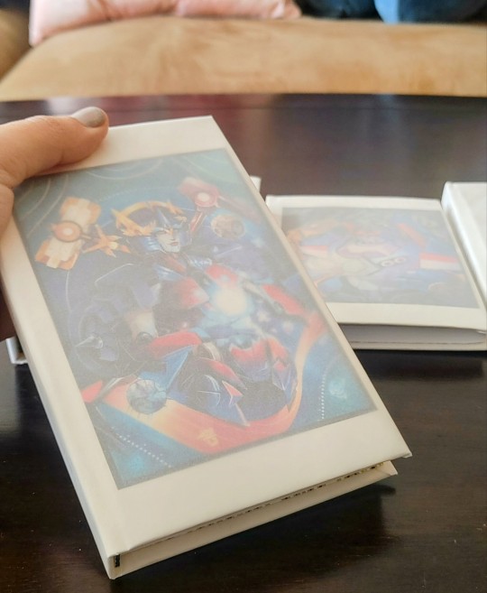

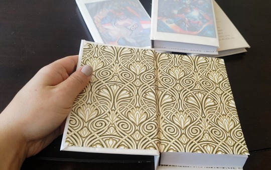
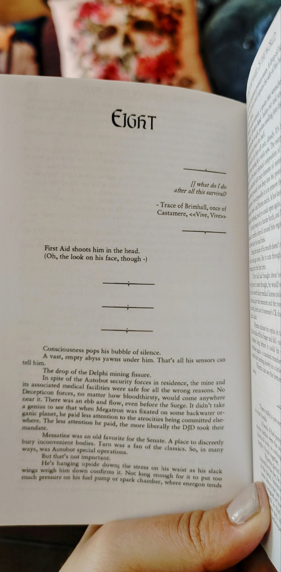
There's a level of polish in the assembly of this set that was lacking in my first and second attempts at the covers. Even if it isn't perfect yet, I'm learning so much, and have new ideas for how to troubleshoot. The idea of making this bookbinding style more accessible and affordable fills me with so much delight, I can't even articulate it. I'm still very much an amateur myself, there are lots of professional best practices I can only speak to in the abstract. Pinning down something this niche and luxurious would make me so happy. Future science will be done on single-volume sets, probably after I'm done moving, but it's at the top of my to do list!! And when it's perfected, I'm for SURE coming back to this series, it's one of my all-time faves, I want to give it the fanciest treatment my hands can devise.

88 notes
·
View notes
Text
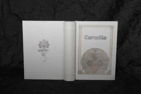
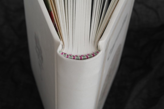
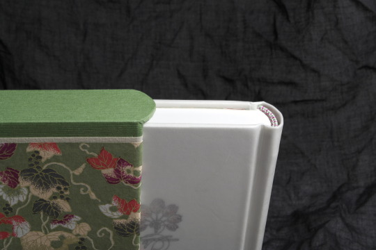


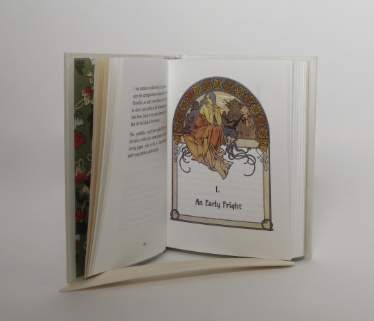


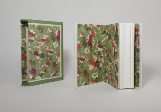
Carmilla - Robert Sheridan Le Fanu
Full vellum Bradel binding with slipcase
Book art - Alphonse Mucha
Many thanks @notwhelmedyet for inspiring me towards Mucha for bookart
Materials used:
case
board - museumsboard, white
spine stiffener - cardboard
gathering the case and laser printed cover decoration - white paper
cover material - calf parchment
inner book
text block paper - Schleipen fly 05, 115gsm
endpapers - Chiyogami paper and Hahnemühle Ingres Bütten paper
sewing material - linnen thread (flax)
endbands - buttonhole silk (Gütermann)
edge finish - head and foot edge polished
Font's used
Titel font - Boecklin's universe
Chapter title, page count and drop caps - Amarante
text body - Georgia
Slipcase
case construction - grey board (1,5 and 1mm)
covering materials - Tsumugi paper, Hahnemühle Ingres Bütten paper, Chiyogami paper
#bookbinding#Carmilla#le fanu#vellum binding#vellum#parchment#slipcase#Mucha#alphonse mucha#bookart#polished edges#this was a bit of a go for a vellucent binding#next time I'll try a treatment and see if it can be more clear#parchment bindings are always a bit nerve wrecking#also I improvised a new background because white parchment on white background is not really much of a contrast
298 notes
·
View notes
Text
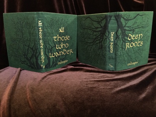


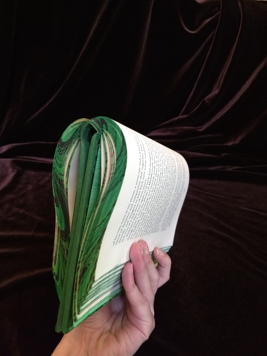
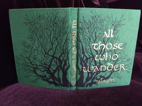
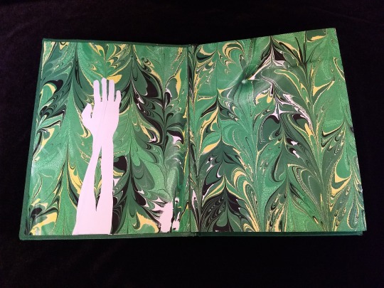
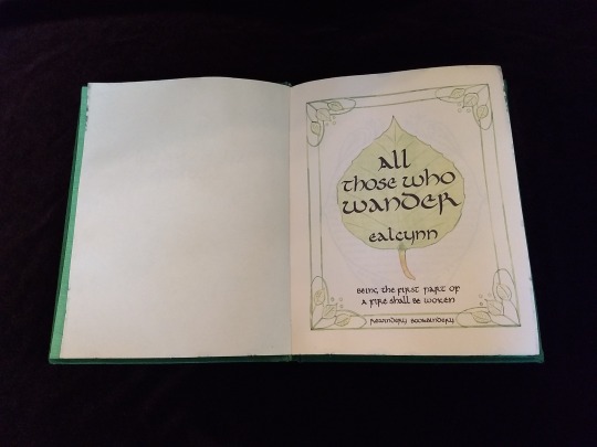
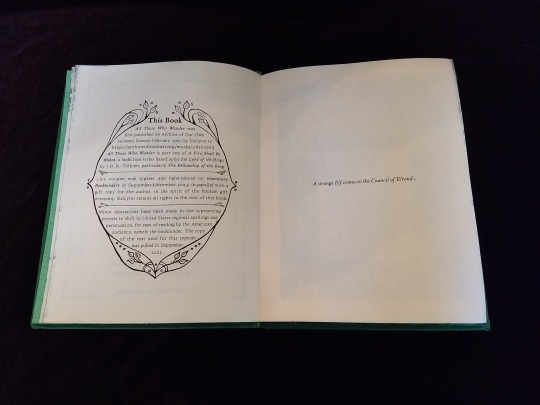

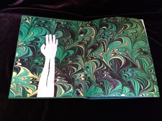
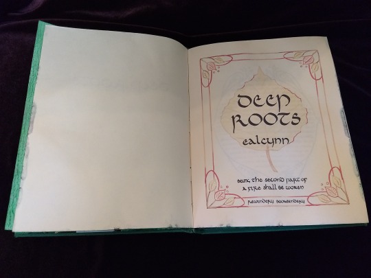
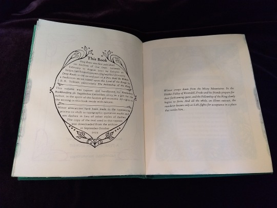
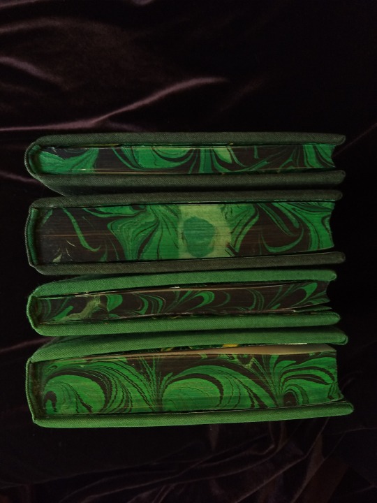


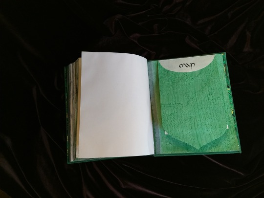

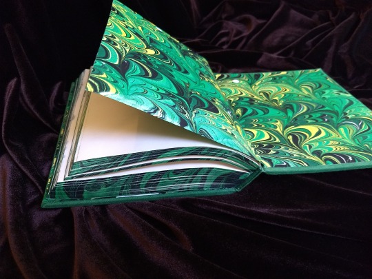

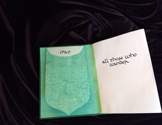

A Fire Shall Be Woken, by Ealcynn. A pair of bindings using the K118 structure, one as a gift for the author and one to keep.
Chapter page illustrations are by Alphonse Mucha, all other illustrations are hand-drawn.
I hope to make a long post later explaining the process in more depth & another to document all my mistakes, but here's the basics.
New techniques learned: Paper marbling, edge marbling, uncial calligraphy, making paste papers, drawing on bookcloth, making paste-filled cloth, fold-out maps
I began work on this project in early September and am completing the finishing touches this week.
Structures:
Binding: K118 tightback
Endpapers: Simple cloth-joined endpapers
Map fold: Turkish map fold
Materials:
Sewing supports: linen tapes
Thread: 30/3 linen thread
Spine lining: Medium weight kozo tissue bonded to linen fabric
Interior paper: Hammermill Ivory, 11x17, hand-cut to 8.5x11
Endpapers: Blick sulphite paper hand-marbled, with masked stenciled silhouettes created with freezer paper
Adhesives: Jade PVA, wheat starch paste, wheat flour paste
Covers: Davey board, laminated full thickness to half thickness
Cover fabric: Studio E shot cottons in Jungle and Emerald; filled with wheat starch paste
Cover decorations: Speedball india ink and Dr. Ph. Martin's calligraphy ink in Copperplate Gold
Inks for maps and illustrations: Speedball black india ink and a selection of watercolors thickened with gum arabic
Dip pens used for calligraphy: Combination of Brause calligraphy nibs and Leonardt tape nibs
Dip pens used for illustration: Nikko G pointed pen nib
Typesetting:
Typesetting program: Scribus 1.5.5
Body font: Coelacanth in 10 pt caption weight
Headings, titles, chapter titles, drop caps: Hand lettered uncial calligraphy, scanned
Illustrations and References:
Frames on colophon, copyright, author's notes and title page: Hand drawn, with inspiration taken from the vellucent bindings of Cedric Chivers
Frames that illustrate each chapter start: Alphonse Mucha from Cloches de Noël et de Pâques
Cover illustrations: Referenced from a photograph of an European beech tree found on iNaturalist.org
Maps of Imladris: Hand drafted with inspiration from the maps of Barbara Strachey, and Daniel Reeve
Map of Eriador: Traced from a map by Karen Wynn Fonstad, with edits made to coordinate with the geography of the fic
Frames on maps: Referenced from a drawing by Alphonse Mucha that @zhalfirin found for me
Special Thank Yous:
To the tightback council of problem-solvers in the Renegade server: Zhalfirin, Eka, @spockandawe who helped figure out many issues with the structure and technique
To the marbling experts in the Renegade server: Marissa, Aether, AGlance, Jenny, Catz, Badgertide, Rhi, and everyone else who helped me figure out beginnner marbling
To Spock for finding the K118 structure and introducing it to the server!
And to Bruce Levy, who discovered the method and shared his discoveries freely with the bookbinding and conservation world.
#bookbinding#Fanbinding#mine#bookbinding adventures#thank you to everyone i consider this a group effort#it has been 10000 years and I have loved every step#except for sanding. nasty nasty sanding. ew.#fic recs
241 notes
·
View notes
Text
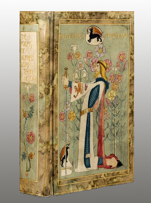
THE POEMS OF ALFRED LORD TENNYSON. (London: Macmillan, 1899). ‘Vellucent’ binding by Cedric Chivers, Hand-painted by Dorothy Carleton Smyth.
#beautiful books#book blog#books books books#book cover#books#vintage books#victorian era#alfred tennyson#poety#art binding#book binding#book design
74 notes
·
View notes
Photo
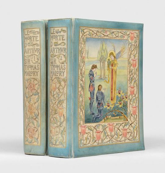


BEARDSLEY, Aubrey (illus.); MALORY, Sir Thomas
The Birth, Life, and Acts of King Arthur, of his noble knights of the round table, their marvellous enquests and adventures, the achieving of the San Greal and in the end Le Morte Darthur, with the dolorous death and departing out of this world of them all. The text as written by Sir Thomas Malory and imprinted by William Caxton... now spelled in modern style. With an introduction by Professor Rhys and embellished with many original designs by Aubrey Beardsley.
London: J. M. Dent, 1893
2 volumes, large square octavo (240 × 192 mm)
First Beardsley edition of Malory's Arthurian epic in a stunning example of Cedric Chivers's "vellucent" bindings, hand-painted after Beardsley's own artwork within. This copy presents Beardsley's decadent version of Malory's Chivalric romance, noted for illustrations "shockingly overt in their sexuality and eroticism", as a thoroughly luxurious whole. Only a handful of sets were bound in this manner. This is one of the 1,500 copies of Beardsley's edition printed on ordinary paper, aside from 300 produced on handmade paper.
Chivers's binding style is produced by hand-painting the backing sheet of the binding, which is subsequently covered in vellum that has been shaved to transparency, and then tooled in gilt. Chivers patented his vellucent method in 1898 and used it to create some of the most beautiful books of the turn of the century. This style influenced, and became closely associated with, the arts and crafts movement.
286 notes
·
View notes
Text

Here's a little library history: the end papers in the Chemists' Club copy of the 1924 American Dyestuff Reporter has a print design that says Chivers Patent Binding and Duro Flexile. Cedric Chivers (1854-1929) was a book binder in Bath, England. He is most famous for his "vellucent"
#chemists club#chemistry#journals#dyestuffs#dyestuff industry#dyes and dyeing#bookbinding#library history#library#othmeralia
50 notes
·
View notes
Text

Back cover of a pocket Book of Common Prayer, vellucent binding by Cedric Chivers, published by Oxford University Press, 1901
6 notes
·
View notes
Photo

Vellucent binding by the Women of Chivers Countess Longford’s copy From Mosher Books - booth 70 #floridabookfair #floridabookfair2019 #independentbookstoreday #rarebooks http://bit.ly/2VuzR11
2 notes
·
View notes
Text
Vellucent bindings
Vellucent binding: “A method of decorating (and protecting) a bookbinding utilizing transparent vellum. The technique was developed by Cedric Chivers sometime around 1903, and is designed not only for the protection of leather bindings, but also to protect covers bearing colored designs (usually pictorial in nature) painted on paper, attached to the boards, and then covered with the vellum. The…
View On WordPress
0 notes
Photo


This beautiful 1901 Book of Common Prayer is an example of what’s called a vellucent binding. The method involves painting a design on vellum (and, in this case, adding mother of pearl inlays to the painting), then stretching a very thin, transparent layer of vellum over the painting to protect it. Gold tooling was then added to this outer layer.
The method was developed by a man named Cedric Chivers sometime around 1898, when he first began exhibiting his bindings. Chivers is known to have employed women to create the paintings themselves.
Although vellucent bindings are beautiful, it seems they were not especially profitable for Chivers; eventually, he gave up the endeavor, and instead pursued a career in commercial library binding.
91 notes
·
View notes
Text
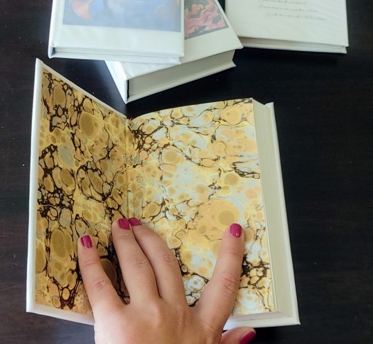
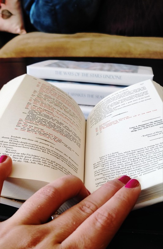
Here's a new experiment! Have you ever heard of vellucent bindings? You should look them up! The basic concept is that a delicate hand-painted cover is drawn on a piece of parchment and used to cover a book. Then a paper-thin translucent layer of vellum is sealed on top, protecting and preserving the art, and adding a gorgeous hazy overlay effect. If I understand properly, the art can also be drawn on the back side of the vellum. And this can also be done to cover inset art panels, but I really wanted to go for that whole-book effect. However, even before I became double extra broke, parchment and animal vellum are exponsive materials. Baby, we're doing this with printer paper and paper vellum.

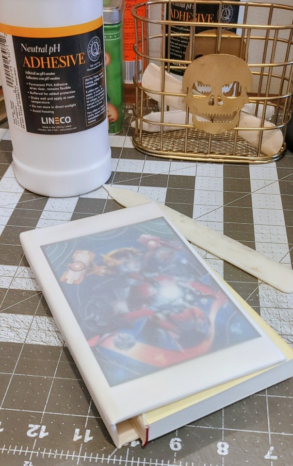
So here are the goods! The Triumph of Time by @sunderedstar is one of my all-time favorite fics by one of my all-time favorite authors, and is still the idw1 ending that lives in my heart. Plus, the author commissioned a piece of art for each finished longfic, all of which are GORGEOUS and vibrant and just begging for that hazy overlay effect.


This was a major experiment! I cannot overstate how much I was flying blind here, and the only instructions I had were for finicky materials that I wasn't using myself. And then paper vellum turned out to be impressively finicky too! I had to redo my first case from scratch, and I was making notes on tweaks to the process all the way up through this morning. It's a mixed success, but I adore it, and I'm delighted with how well it turned out given what a gamble it was. And it wasn't an expensive experiment at all. I badly need to give my hands a break asap, but I definitely plan to repeat this experiment soon, and that will include at least one more round with this beloved series, now that the typeset is up to my current standards :D

#crafts#bookbinding#vellucent binding#transformers#sunderedstar#the triumph of time#am i freshly emotionally wrecked by how much i love this series? YES???? 😭
233 notes
·
View notes