#vgttb
Text
HARLEY BERG from VIOLET GOES TO THE BEACH
JUSTIFICATION:
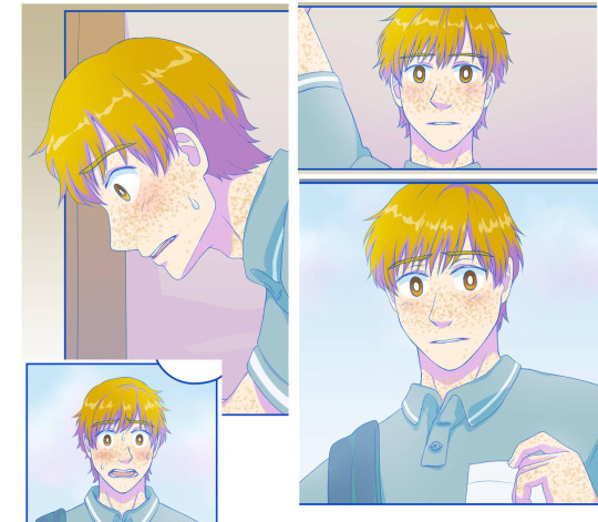
"Okayokayokay. Harley. HARLEY. So. He got ISSUES, man. He's got a tiny woman friendo named Violet who lives with him in his apartment and basically, he's in love with her but he struggles with that because he had a fiancee who DIED and also he has struggled with self-esteem issues all his life. The amount of fucking self-loathing in this man, damn. He could power fifteen goddamn windmills with his sadboy energy. So far in the comic he has NOT admitted his problems to any of his friends and prefers to bottle up every single one of his problems until he starts fuckin' crying. LIKE BRO HE JUST KEEPS ON CRYING. You would not BELIEVE the amount of TEARS that come out from this FUCKER'S eyes. The amount of lacrimation from the eyes of Mr. Harley Berg could turn the entire Sahara Desert into a goddamned ocean! AND HE'D HATE HIMSELF OVER THAT TOO. Anyway he's a grown man who is shy, sad, immature, and and really needs therapy I think. The most he's got was in a dream where he realizes he needs to work on his self-loathing problems and I mean I'm happy for him for making SOME progress but bro. You also gotta fucking talk to someone. It's not like he's alone anyway, he has friends and people who support him, he just DOESN'T WANNA OPEN UP TO FRIGGIN' ANYONE. I think most of his problems have been revealed in internal monologue or smth. At the very least get THERAPY, bro. He's not even the angstiest most traumatized character in all of fiction, there's others who have suffered through a lot more worse than him and VGTTB isn't necessarily THAT fucked up and dark, it def doesn't hold a candle to some other works of fiction in terms of that, and heck even some of Pacthesis' earlier characters might have more fucked up/darker backstories (like probs Xolga and Mr. Toko and the Star Days Sim Date cast), but still, the vibe of this comic feels much...heavier than Pacthesis' other works? Even if the others are technically angstier VGTTB feels angstier and heavier (to me at least) because I think it goes deeper into the characters' problems/emotional turmoil bc like Harley's issues are like. Damn. He really needs a hug (and therapy). Anyway the only reason I'm submitting Harley here was bc Pacthesis (the creator) drew him as a goth gf and I thought she was kinda cute. She'd still probs cry a lot even if she were a woman but ahwell. Anyway read Violet Goes to The Beach everyone it's kinda cute but also surprisingly angsty, personally the creator's other works are more of my favs I feel more connected to bc of childhood stuff and they just make my heart feel more happy (and personally I like the characters more) ig, but VGTTB I think it still has a lot of nuance to it and interesting dynamic. IMO transition might not NECESSARILY fix unless we drag Harley by the ear to therapy, but I still think goth gf Harley deserves a shot." - Anonymous
Reminder: Submissions are always open! Submit here!
#could transition have saved her#harley berg#violet goes to the beach#vgttb#transgender#trans hc#anonymous submission
7 notes
·
View notes
Text
Blog No.001 23年4月11日
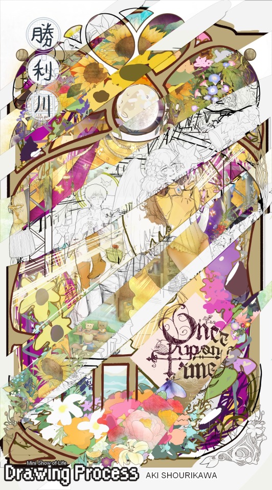
Drawing Process: Making of “Mini Show of Life” (commissioned illust.)
Hello! This will be my first in-depth journal/blog entry in a very long while after being quiet for 5? years since dA’s fall from grace. But, I hope you can find something of use, or at least get some entertainment out of it. Do take care though; once the talking starts...it’s not going to stop. Please feel free to skip through parts you deem only worthy of your time (or just the pictures really), I won’t take any offense! I will be mostly using these to gush out roughly 5 years-worth of recepientless chattiness directed to anyone willing to sit through walls of text anyhoo.
However long the stay; thanks for stopping by! (´• ω •`) /
CONTENTS:
0 - Making (overview)
1 - The Concept
2 - Inspiration
3 - Breakdown
4 - Never Finished
⓪ ― メイキング ―
Start of project (concept pitch): 2022年 February 7
Start of Labor (revisions and onward): 2022年 November 10
Date of completion: 2023年 March 27

Total time passed from start (labor) to finish:
4 months +17 days? ( ~3,280 hours / ~137 days )
Very Rough Estimated Labor Duration (*excluding breaks/sleep AND reference hunting + test runs) :
= ~1,128 hours / ~47 days / ~7 weeks / ~1.67 months in total.
※Very rough estimate indeed, my math may have failed me in a few places-
Although it seems like a lot of time has passed (*also in comparison to the previous one that was arguably much more laborious), it’s worth taking note that the duration of the entire process got hit by two major holidays in a row (Christmas + New Year), then immediately followed by my birthday haha so it had more days of rest than it did labor through all that time.
① ― THE CONCEPT ―
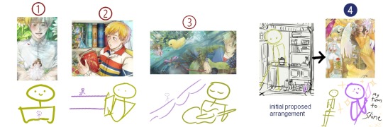
Around 2023年 early February, I was contacted by MissPacthesis (otherwise just known as Pacthesis) on twitter to draw a movie poster/book cover-type of illustration featuring the two main characters of their original webcomic, “Violet Goes To The Beach”. Since there was no specific request for the composition, I made four concept sketches with different themes and moods for their consideration. This was the first one:
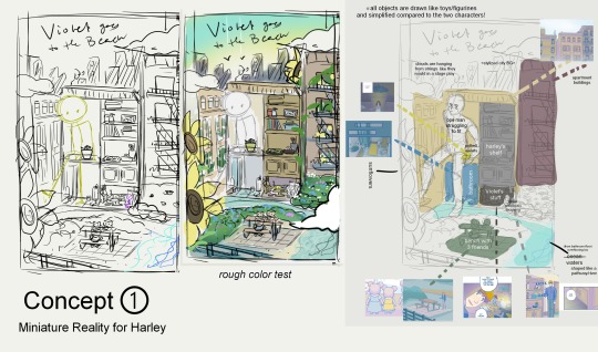
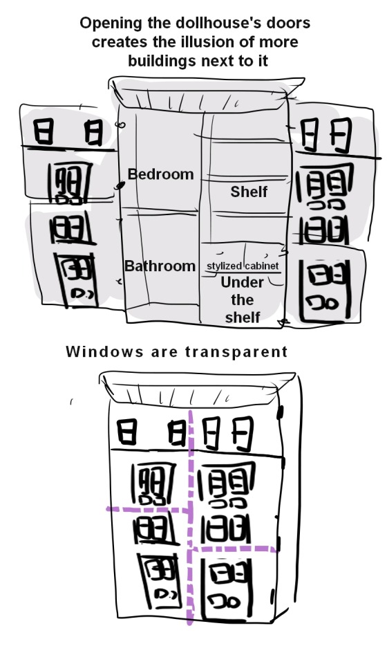
The basic idea was to create an artificial dollhouse-like environment that showcased the characters’ daily lives, as depicted in the comic.
I’ve always been fond of miniatures but, for some reason, never really thought about making them as the subject for my drawings? So I thought the whole physical dynamic between Harley and Violet was the perfect opportunity to explore that.
The three other concepts have already been finished by the time it was this one’s turn (despite being the first one to be conceived).
MissPacthesis was super generous and patient with me when it came down to the deadlines. And so, I wanted to take my time with it and really make sure to end it with a bang for the now-final boss of the bunch!
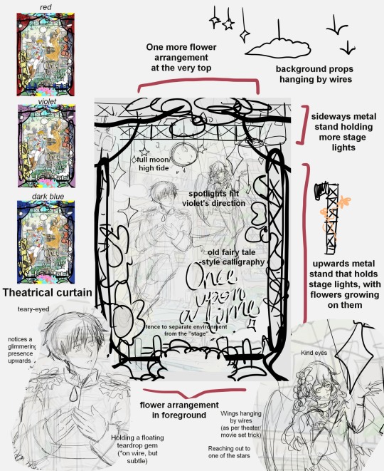
Following through the requested changes/details after the rough concept sketch was delivered + as well as my own additions, this was how the first set of revisions turned out.
Some of said requests are:
the moooooon
stars hanging on the strings as props
set curtains+lights (to establish a ‘show’ setting)
putting Violet against a less cluttered environment someway
One of the bigger issues was the size difference between the two characters; Violet inevitably can’t be clearly seen with how small she is in comparison to Harley, much less stand out in the composition in the original version. In the other three previously completed commissions, she always remained small and near the environment, while Harley’s ginormous size in comparison unintentionally hogs the spotlight (unless he’s bringing Violet near him).
I was really, really fond of Violet’s outfit design on this one, so I asked if I could make Violet be bigger than Harley for once; even through just an illusion of perspective. I got MissPacthesis’ OK and was feeling pretty OK myself, but immediately screaming and not as OK after realizing I had to draw the female anatomy in close-up view Aiyaaaah
② ― INSPIRATION ―
Each and every external inspiration used as reference is difficult to pin down in retrospect, but I can tell you that throughout the duration of this drawing, it wouldn't stop coming after me anywhere I happened to look.
The introduction of the fairy tale themes was inspired by its references in the comic, which leads to me connecting it with old fairy tale book covers that are known for being super intricate, magical, and no longer made how they used to be now. Then again, those things were probably super expensive too...
If we’re talking about the overall shape, then it's definitely the magical doorway in the movie “Barbie as Rapunzel”. I didn't remember it at all until I came across a pirat- I mean, a s l i m e t u t o r i a l on Youtube, that made me realize that it must've made an impact on kid-me; it was just this concept embedded in my subconsciousーraring to get blurted out at a moment’s notice. Just look at the way the flowers circle around the scenery as a border. Heck, even the same type of flowers in thereーpink ‘n blue morning glories. I was near finishing cleaning up my lineart when YT hooked me up and it hit, “oh sht, I copied the homework and I didn’t even know??”
Technique-wise, I’ve been keeping an eye on Art Nouveau styles that I discovered through the anime called “GOSICK”, which then introduced me to the works of Mucha, who is arguably THE poster man of Art Nouveau. I got acquainted with them in my very early teens, which is nice for familiarity. But due to even poorer understanding of fundamentals at the time, all I ever took from it was really:
'...very thin line on the inside, THICK BOI LINE OUTSIDE'.
A bit of a silly and insulting understatement to the nuances of the technique, but this simplified understanding did help fixing my shaky, shaky lineart through the years to now, hereーhelping me not go completely nuts over advanced class Art Nouveau complexities I won’t even pretend to understand.
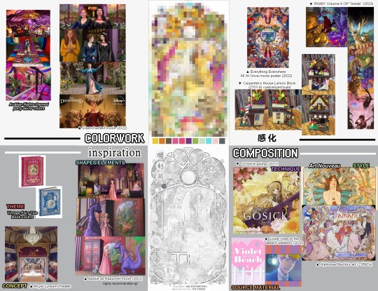
And from there, inspiration for colors burst out from newly-released movie posters smack dab in the duration of the commission; like
“Disenchanted”’s,
and even “Everything Everywhere All At Once”'s.
And then mid-lineart fixing, I got hit with “RWBY” Volume 9's start with the V9 Opening (”Inside” by Cassie Williams and Martin Gonzales), setting the tone with all the colors and all the madness.
It was my weekend hype man.
Although what I was working on was quite far from these in overall concepts/tone/themes (which, lowkey recommendations, btw-), they still served as a nice color setter inspiration + something that just made me keep remembering to continue working on my own colorful composition through the distracting days.
Aaand finally:
it’s most likely my unrequited love for miniatures that started and shaped this composition from the beginning + stayed after the ungodly amounts of revisions at the top!
The fact that the entire premise of Violet Goes to the Beach is pretty much enabling this obsession of mine? makes me feel like it was destined to beeeee (if you believe in that kinda thing anyway). I’ve pined for the concept even before knowing what they were actually called or how to spell and pronounce the damn word.
And I’m starting to think it’s the reason why I’m super drawn to the tiniest of details, be it in my illustrations or other fields with unnecessary hyper-everything.

As a lonesome nut in a cramped household, my hobby has always been staring at everyday objects and filling the rest with my imaginationーmaybe tiny plants growing on it? Or turning them into furniture for any and all small-enough creatures; anythingーI'll imagine a whole dang ecosystem growing or interacting with anything I can find, and then put myself in there to imagine what would it be like to just...vibe on top of gigantic everyday objects with all the space I could ever need and more.
This was essentially my standard as well for finalizing the composition of miscellaneous flowers in the piece:
"Do whatever you feel like, as long as a mini-you would wanna move in it; swim in it; jump on it? or be a e s t h e t i c c enough to be considered ‘instagramable’ or... or something. ヘルプミ- ”
The moment something felt off through a closer look, or disagreed somehow with its neighboring details, it got erased and rethought of until the vibes are decidedly pleasant enough for an imaginary miniature village of mini-me’s to live in there.
I think they’d all be screaming regardless.
③ ― BREAKDOWN ―
no, not of the mental variety-
I’m not exactly sure which place this piece goes on the ranking of detailing levels I’ve ever worked on, but it’s definitely one of the most detailed, by far. Took 4 months for goodness’ sake lol
Similarly to what I did to the previous big piece also featuring Harley and Violet (*I’ll write about that next + link it here later!), I deconstructed the parts into multiple parts to make it easier to digest as I went.


I kept previous versions of the color tests/sketches as a reference map of sorts while finalizing certain details, so I don’t keep going “wait, how did I want this to look like again” all over again.
I also made frequent “test runs” for certain techniques I want to/plan to apply in certain areas before finalizing them. Not that I’d really be in big trouble if I didn’t, since I can ctrl+z just fine... but it might just be a traditional illustrator-doing-digital’s habit at this point haha

In a nutshell quickly drawn with a mouse, this is how the layering went down in my poor, overworked, one-too-many overlayered drawing software:
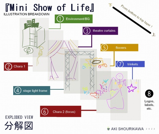
While I absolutely do not recommend layering as extremely as I tend to do, I will say this:
Layers (can) help!
When it comes to hiding each different sections to focus on something behind or above it, having separated everything into non-intersecting layers make it easier to navigate through a big piece.
If you have a similar approach to linearting similarly to how I do mine as well, layering will help when it gets down to cleaning/refining the details, since no lines belonging to different parts/objects intersect with one another in a single layer.
Tedious and fatigue-inducing as heck, but I personally find parts of the process oddly therapeutic.
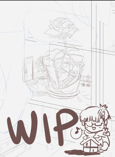
❹ ― NEVER FINISHED ―
You might’ve noticed that throughout my nonsensical ramblings with occasional pictures, said pictures contained preview of the unfinished drawing enclosed within a square frame when the actual finished product is in some curly...burly...shaped...thing.
That’s because the outer shape has changed multiple times:
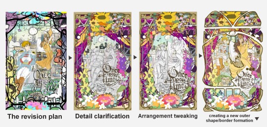
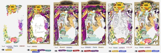
When I looked at the first revised shape with the rough color test (square frame), I thought the entire scene looked kind of cluttered? I also wanted to especially put more focus on Violet, so I repositioned things and decided to go the lineart-heavy Art Nouveau route to make the details really stand out from one another and not blend together in a single blur of colors.
And so, on top of everything else, I decided to cut the entire illustration into sections visibly seen and presented to the audience, outside of the actual layered sections of the illustration we broke down from earlier.
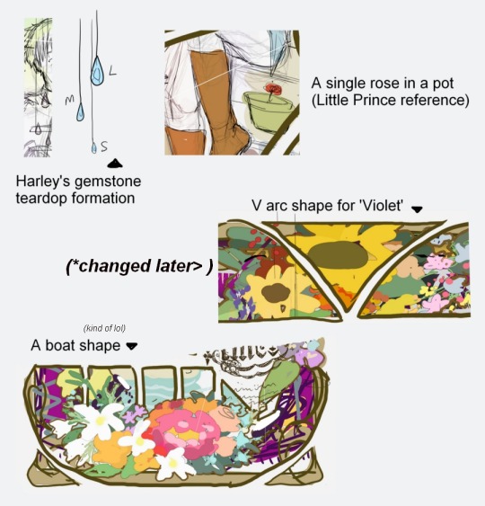
I was satisfied with the shapes overall, except for the very top part. It looked very flat and almost... incomplete? So, I experimented around giving the shape a fashionable tippy top hat.
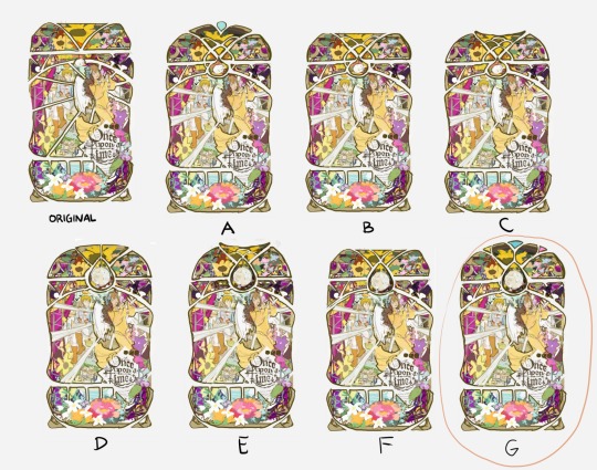
I liked A, but I disliked how the teardrop-shaped gem at the middle was jutting out compared to the rest of the surface.
B retained the flat top, but this time with an added section cut at the upper-middle part, as an attempt to also draw more focus on the moon.
C is the start of the brainrot for a “fish tail” shape.
D tried to just go with a smoothened semi-circle shape for the top, but was the start of the “now THAT’s a moon!” formation that I definitely preferred than what was originally planned.
E wanted to mix the new moon shape + fish tail shape together. I really liked it, but there was something that felt unnerving when looking at it from a distance together with everything else.
F tried bringing back the flat surface together w/ the new moon shape.
and finally, G saved the day (and my sanity). I went back to A and said “dang it, I still want that gem somehow though”, and figured all it really needed was a bit of trim to slot right in the corners and no longer be jutting out. The addition of the yellow and pink on each of its sides were in honor of the fish tail shape. It looks a lot less like one now, but I hoped the teardrop shape at the middle sliding in between two side-twisted oblongs might resemble a fish? haha
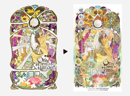
the plan vs the done
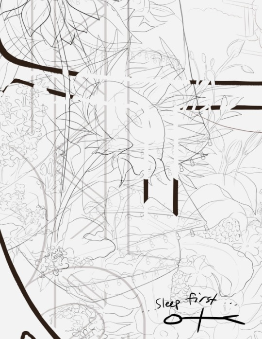
And, there you have it. By this point in time I’ve yet to upload the finished illustration here on Tumblr (*I’m still not done migrating my older stuff from dA to my main tumblr blogs orz) but I’ll update with a higher quality of the final version here as soon as everything’s caught up!
Thank you very much for stopping by, and I hope you have a wonderful day ahead! ヽ(*・ω・)ノ I’ll see you in the next one?
― AKI SHOURIKAWA・APR 2023 ―

let’s end it on the note of how I discovered two fibonacci spirals kissing is actually a heart
I actually do not understand how to use the fibonacci, was just taking the piss out by making cool shapes
#drawing process#drawing journal#process#step by step#overview#art breakdown#analysis#violet goes to the beach#vgttb#behind the scenes
0 notes
Last Seen Blogs

yannabee2016
Untitled

ships-sailing-in-the-night
Souls that Seek Beauty May Sometimes Walk Alone


jayne-hecate-writer
Jayne Hecate Writer