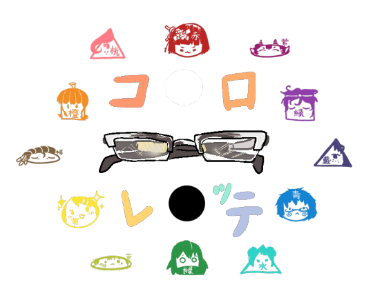
- コ ロ レ ッ テ - A mini blog for the behind the scenes...seams? of my chaotic art! And a lot of long-winded sidetracking. Lite version:@KororetteLiteArt blog:@AkiShourikawa Main blog: @theawesomeaki-kun
Don't wanna be here? Send us removal request.
Statistics
We looked inside some of the posts by korolife and here's what we found interesting.
Average Info
Notes Per Post
77
Likes Per Post
56
Reblog Per Post
19
Reply Per Post
2
Time Between Posts
4 months
Number of Posts By Type
Text
7
Last Seen Tumblr Blogs


Fun Fact
Tumblr Inc. is using 66 technologies for its website.
Text

Blog No. 005🥕 17年4月3日
Manga Research: Hair Detailing, Inking, and Toning (2017) + Free Screentones!
TABLE OF CONTENTS:
I. Introduction ・・・・・・・・・・・
II. Detailing The Hair ・・・・・・・・
III. Inking The Hair ・・・・・・・・・
IV. Toning The Hair ・・・・・・・・・
V. Free Manga Screentones Compilation
VI. Hybrid Techniques・・・・・・・・
※NOTE: The following tutorial is a reupload from a now inactive blog all the way from the year of 2017! Will hopefully be able to make an updated version of it soon ^^
For now, please enjoy, and I hope it helps!
ー ー ー ー ー
A little disclaimer: I will be showing a few images of other illustrators and mangakas to further explain something and/or provide concrete examples. I do not own them, and I’ll make sure to properly credit them!
Most of the mangas that I will mention in reference, if not all, are BL or Boy’s Love as that is also the genre of the original series I’m currently working on, so read them at your own risk! (some R-18)
Nonetheless, the focus will primarly be the techniques of drawing the hair.
Let's go!
I. INTRODUCTION
Manga hair ways of detail, inking, and (screen)toning has always been a problem for me. It’s different from normal drawing and coloring in general (or at least how I do mine), and most mangakas use very, very detailed hairstyles. Comparing those to my own art style is just depressing to look at.
Let’s have a quick example just so you can see what I’m talking about:

I repeat; depressing.
And so, I went for a very thorough research (okay, maybe not THAT thorough) to see the different ways and styles of different mangakas and artists with detailing, inking, and toning manga hair.
I’ll be using some samples I made by myself, explain each one by one, and possibly provide some samples and/or tips.
ー ー ー ー ー
II. DETAILING THE HAIR
The one I used for an example earlier was a work of Tennouji Mio, one of the mangakas I know with very, very complex hair detailing in her works.
Along with other mangakas I stalke–…er, researched, I’ve classified their way of detailing according to the hair strand complexity; from Level 1 to Level 3+, Level 1 being the easiest and the simplest style and Level 3+ being the most complex and hardest. I say 3 with a plus(+) because it can go even further, even to levels I can’t even reach yet (or never will).

Hair Detail Levels according to their (hair) strand complexity
– – – LEVEL 1 – – –
This is a level recommended for beginners for its simplicity. Yes, it’s a bit plain and often just the solid outline of the hair with barely any hair strands as details, but there are ways to spice it up with inking and toning (you’ll see it later). This is also most commonly used in chibi styles.

・REFERENCES USED:
① from AnimeOutLine
② from Xiataptara
③ from DragoArt
– – – LEVEL 2 – – –
This level is what I commonly see with the mangas I read. It’s also a middle ground for beginners and intermediate-level artists. It’s not too complex, but it’s not that simple or plain either. Depending on the artist’s style, the way the hair is drawn can look very complex despite having only a few drawn hair strands, sometimes are even in bundles.

The way the hair are drawn in these examples are a bit detailed compared to Level 1, but not too complex like the next levels.
・REFERENCES USED:
①Oh My Maid! by Itsuki Kaname
②Oresama Wa Koi No Dorei by Chitose Piyoko
③Recipe No Oujisama by Junko
– – – LEVEL 3+ – – –
I call this god-level style. While that may be an exaggeration, it’s just very far from my grasp to do or replicate. It has hair strands going on different directions, and sometimes even shaded one by one. Putting Tennouji Mio’s works as an exemption for the samples for this one (since I already used her work at the very first one), most of the mangakas I look up to have this style.

The complexity I aim for. But for now, I cry everytime.
・REFERENCES USED:
① Warui Koibito Ja Dame? by Mei Sakuraga
② Otona Keikenchi by Nekota Yonezu
③Love Neko by Mishima Kazuhiko
ー ー ー ー ー
III. INKING THE HAIR
Now that we’ve discussed the levels of detailing the hair, let’s move on with inking.
Inking the hair also depends on the character’s hair color. If it is light like blonde, most mangakas don’t even add shadows and ink them as it is. As for dark-haired characters, there are some mangakas who just fills up the hair with pure black inking, some with highlights. That said, here are some styles I gathered and some that I came up with myself with inking the hair:

Yes, I came up with the names. I really can’t tell if I’m genius or stupid at this point
Just a further explanation with the given samples I got:
USING LEVEL 1 DETAIL:
MINIMAL SHADOWS: The slightest of shading are placed where shadows are supposed to be, just to add some volume to the hair. Also called as the outline because the shadows can look like a thicker outlining on the already existing outline of the hair.
THE MINIMALIST HIGHLIGHTS: One of the easiest techniques, if you’re looking for something simple. Just groups of really small vertical lines around the hair that will serve as your highlights, viola!
SKETCHY HIGHLIGHTS: Similar to the previous one, minimalist highlights, but this one has longer lines.

SOLID BLACK FILL: When you don’t feel like detailing. Like, at all. Fill it up!
FILL WITH SIDE-TO-SIDE HIGHLIGHTS: Black fill with some highlights you can make with a fwoosh on both sides.
FILL WITH BUBBLE HIGHLIGHTS: A black fill with circles as highlights. I see this one a lot with artists who use chibi style or really, really cutesy art styles.
USING LEVEL 1 & 1/2 DETAIL:
FILL WITH WIGGLY HIGHLIGHTS: Another method of highlighting with a black fill. Am I the only one who thinks it looks like mustard on a hotdog sandwich? Or is that the growling stomach talking…

FILL WITH ZIGZAG GLOSS HIGHLIGHTS: This is mostly seen in older mangas made around the 80s-90’s. Compared to the other methods of highlighting with a black fill, this seems more…glossy, in my opinion.
HALF-BLACK FILL: It’s somewhat the lovechild of the minimal shadows (LVL1) and black fill (LVL1) technique; There are parts of it filled with black ink, but only the shadowy parts of the lower half. This can go to level 2 or level 3 territory, depending on how illustrator inks the shadows.
USING LEVEL 2 DETAIL:
FILL WITH WHITE OUTLINES: A black fill with hair strand details that are colored in white. I see this often with modern manga that are drawn digitally.

FILL WITH VERTICAL GLOSS HIGHLIGHTS: Somewhat related to the zigzag gloss highlights, this one isn’t a connected/clumped sequence of gloss placed on the middle going around the hair, but separated sections that are glossy-looking highlights placed all over it, as if highlights of different strands of hair.
FILL WITH WHITE STRANDS: It’s a black fill with some strands of hair that is colored in white, similar to the white outlines method. But instead of just one downward direction, the strands of this one goes in several directions for a bit more realism feel. Can also venture to level 3 if the direction of the strands are wild enough.
USING LEVEL 3+ DETAIL:
I like to personally refer to these three as the “Deadly Trio“.
STRAND-PER-STRAND HALF-BLACK FILL: Similar to the half-black fill method, this one’s the level 3 detailing version of it. It leaves the upper part of the hair blank from shadows, but it’s inked strand-per-strand on the bottom parts. It just makes me go “oh no”.

STRAND-PER-STRAND LINE FILL: This is similar to the S-p-S Half-black fill, however, this one has even more smaller lines among the shading all compressed to one another to create the overall shade of the hair, and the parts where they end or aren’t present in are the highlights. It is very time consuming, and it just makes you go “why” at every minute of it...
STRAND-PER-STRAND COMPLEX GLOSS HIGHLIGHT FILL: The name’s title is enough to make you go “oh my god”. It’s pretty much a fill with the gloss highlights, but now, it’s highlighting per hair strand. Thinking of drawing a character over and over with this inking style is enough to make me cry.
…
Overall, I think they’re all good techniques if used right. It doesn’t matter if it’s simple or complex, it’s still up to the artist how they can emulate the style and own it. And remember: Complexity doesn’t automatically mean good or godly, there are those who look really messy to look at. Vice versa, simplicity doesn’t mean boring, there is beauty in simplicity if done correctly.
ー ー ー ー ー
IV. TONING THE HAIR
The final topic of this lesson.
Using screentones in making manga is not necessary at all. In fact, there are some who just use plain inking in their work. But as per tradition, it does feel lonely without these monochrome textures for making the manga lively. For me, they’re the colors of the black and white of manga.

Some basic texture manga screentones, photo got from Akadot retail.
Back in the days, these screentones are physical materials that you had to manually cut and paste onto the desired parts in your manga. But now, thank heavens for digital technology, you can input them just fine on top of your inked page’s layer on your software. There are still mangakas to this very day who stick to the traditional methods, however.
Personally, I use digital screentones, mainly because there are no traditional screentones sold in where I live. Moreover, I don’t have the proper equipment to use them. And as a bonus, there’s a ton resources and people on the internet that are nice enough to provide free screentones for personal use. Just look around!
V. Free Screentones!
▼ I've made a compilation of free manga screentones provided by very nice internet neighbors from old dA if you're interested! A lot if it is also what I use with my own works. ^^
Anyhoo, back to the toning techniques!

Similar to inking, really.
SOLID TONE FILL: As the name suggests, simply fill it in with one texture screentone. Voila!
SOLID TONE FILL WITH SHADING: A solid tone fill with shadows. See levels for differences in strand shadings.
SOLID GRADIENT TONE FILL: Similar to solid tone fill, but this one’s a gradient screentone that goes from the lightest shade at the top to darkest as it goes down. Perfect when you’re a ‘lil lazy for highlights or shadows.
PARTIAL TONE FILL: Like the previous partial/half-fill methods in inking, this one only fills the tone of half of the hair.
…
I didn’t give much examples with toning because there is a lot, and I mean A LOT of different types of tones. There’s pattern tones, texture tones, decorative tones, etc.
It all depends on you what for, and how you’re going to use them.

ー ー ー ー ー
VI. HYBRID METHODS
You can combine inking methods and toning methods to create hybrids! They actually look pretty cool.

Pretty neat.
. . . . . . . . . . .
Aside from picking what you think best suits your style, you also have to remember that different ways of detailing, inking, and toning are adapted depending on the atmosphere or mood of a scenario. I’ll probably make another separate post for that one to explain further. But for now, I hope this helps to anyone who’ll come across to this for some manga-making projects.
END.
Thank you for anyone who stopped by to read, and I hope this somehow helps. Feel free to ask me any questions or concerns. See you in the next lesson!
Mangaka-wannabe Aki signing out.
・・・ホームページALL LINKS・・・
・Art Gallery・Commission Info・Free resources・
#art tutorial#manga art#manga tutorial#manga tone#manga hair#anime hair#hair tutorial#drawing tutorial#drawing guide#hair#screentone#inking#inking tutorial#techniques#art technique#shading#manga inspired#🥕
6 notes
·
View notes
Text
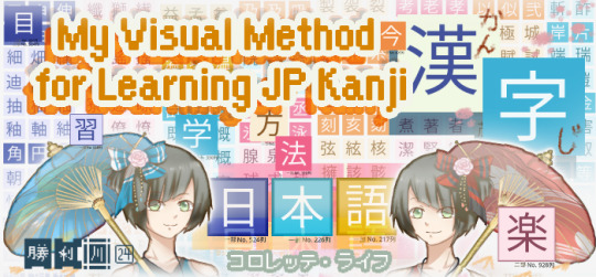
Blog No.004📚 24年6月13日
My Visual Method of Learning Japanese Kanji (漢字) part①
~ Let's Pair-up Similar-lookin' Characters Next to Each Other♥!~
There are many ways to learn Japanese. 📔
This way might not be effective or efficient (or even reasonable) for anyone else, but this is the visual approach that I'm currently developing + sharing for possibly any like-minded students it might resonate with!
Edit: It's all cleaned up for HD download on my ko-fi shop for free!
【Background】
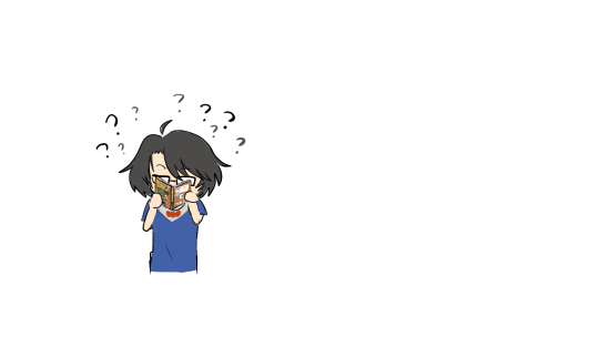
At first, I did the standard 'write it down with repetition until you get it right' on flashcards, notebooks, etc. and I don't think I ever got it 'right'ーevery optimistic attempt of "I'm gonna get in some daily lessons in today and successfully absorb this knowledge once and for all!!" was always accompanied with this state of... confusion? and being so, so overwhelmed that neither the meaning, the reading, the stroke order, nor even the appearance of the kanji stuck to me at all. I don't think I've ever made it past the list of N4 kanji, even though most words I come across tend to be scattered around the N3-N1 level whenever I check the dictionary.
I've tried studying them strictly in order of the listing / then tried loosely with some doodling / or even a cherry-nitpicky minimalistic approach; just-take-what-is-frequently-used-style... but there just seemed to be no end in sight. It's been a decade, and I still do not know a lot kanji。
『Issue①:』 I wanted to see ALL of the kanji displayed at once, instead of dreading the 'higher levels' hidden from the limited amount displayed at a time; be it from reference books, screen displays on websites or mobile applications, etc. It's definitely just a personal issue, I think haha I just didn't like the surprise sneak attack from so much identical kanji from differing levels that scrambles my brain everytime I encounter a doppelganger. And boy, there's a LOT of those (as you will see).
I thought about making a series of biiiig posters or scrolls I could stick up on a wall, like those kiddie info posters but completely filled with kanji as decoration + motivation + and a bit of a cheat sheet I could easily access at a glance. But just imagining over 2,000 jumbled characters looming over me while I work on my desk or seeing something like that first thing after waking up………feels a lot unsettling, I think-
『Issue②:』 They're often arranged according to their frequency of usage, stroke order, or general difficulty of the word. Although it's for practicality, it leaves the visual impact completely all over the place. I don't know if I have any underlying conditions that contribute to something trivial like this greatly bothering me past the point of productivity, but it's not even about aesthetics I have an issue with, I don't think? It's just...the arrangement feels so chaotic, or sometimes oddly restrictive that I keep getting distracted. It's like some kind of puzzle I've been trying to solve for 10 hours straight, but it's just me going in circles back to zero. Speaking of puzzles....
Maybe, to save physical space for literally thousands of characters, I thought about placing one kanji on each of a rubik's cube's faces. But that would take a ridiculous amount of cubes and printer ink/alternatively, manually cutting, pasting, and poorly writing very very tiny 0.5inch labels for...two thousand times, at least. By hand.

I'm still tempted to incorporate this idea in some way, but felt unmotivated and lazy with how flimsy and shoddy my handwritten labels were…also printer ink prices continue to be a goddang scam--
I've unfortunately never been a studious student, especially not when it comes to conventional learning methods. It tends to make me want to try ridiculous ideas to get around my own dysfunctionality, because the other option would be... to continue a system that doesn't work and be frustrated, and accomplish nothing; not even a smile.
I am learning Japanese out of my own free will, so I wanted to have fun with itーbecause the whole concept of kanji seems really fun in theory!… but not so much in attempted practice as a clueless outsider with no knowledge or means apart from the standard English reading and writing system. I'm a little envious of my chinese friends also learning Japanese having a bit of a headstart with the writing system's origins...
Even if perceived as a complete waste of time by a lot of people, I still want to understand each individual character to be able to appreciate and greet them accordingly when I encounter them in the wild.
For fun☆!
【Conventional Systems】
For this project, I mostly took inspiration from other existing popular learning systems that many people use:
➊The standard N5-N1 System was alright, but I found myself tempted to skip straight to ~N3 where frequently used characters appeared more, despite being barely at the lowest N5 proficiency level myself. I wanted all the characters to be visibly accessible…but it got intensely overwhelming so fast. The hierarchal labeling also made finding a N1 character have this weird sense of pressure? Like, "oh sht , this word has N1 kanji. mY ELEMENTARY GRADE DUMBASS AIN'T SUPPOSED TO BE IN HERE--"

➋Then there's the pictograph potential. It's interesting, but I thought a lot of them were a little bit of a reach? haha it's basically a visual mnemonic, right? But other people's mnemonics usually have their 'creative logic' that my own may not agree with, so I just end up getting distracted with the internal logic of the image and how it correlates to the kanji instead of absorbing any actual information. I think it has potential, but I'd need to personalize the visual imagery for it to be effective…or at least, have the mnemonic make enough sense to me and not be abstractly distracting. Even by then, the more strokes there are, the more convoluted it looks to even liken it to anything in the real world...Kanji by itself is already a pictogram, I guess...?

➌Then there's the beloved Heisig method. I liked the concept; the goal is for (mostly) foreigners to easily familiarize the 'look' of the kanji character and attach it to a singular meaning. But personally, it wasn't working with how much my brain was confusing every variation of similar-looking patterns that kept reappearing over a span of different pages of kanji, with the same radical appearing in different positions or orientations. Heisig's compilation was good in a sense that I could see a reoccurring pattern and it was most definitely less chaotic to look at now, but they continue to persist so far away from each other? Then adding that element of "the unknown" with kanji I've yet to encounter or seek out for being 'too advanced' with this doppelganger dilemma was driving me absolutely coconuts.
Plus, since it's a method created with absolute beginners in mind, it falls short with the lack of kun- and on- yomi readings…which were what I needed to learn the most.
I decided to combine these three ideas to make my own way.
【??? Personal System】
This system will continuously be developed from here on out until it can actually be functional, but so far, here's what's been done and being planned:

Apparently these were taken from 8+ months ago good lord-
I pretty much just lined up screenshots of a full kanji listing (I believe it was a Jouyou listing with some obsolete characters removed) and just...painstakingly played a Match-3 game, but irl, pretty much... and with more back pain
※Reference used to curate these kanji and their information are primarily from ①an app called 'Satori', and ②another app called 'Yomiwa'. Both apps source information from KANJIDIC and JMDict + mixed with a variety of online dictionaries to cross-reference and check for additional info.
I was working on and off on it because staring at nothing but kanji all day will probably make a few screws loose, but I generally continued anytime I was feeling a little down, stressed out, or just had free time. It was oddly therapeutic when I saw the finished arrangements, though. This feeling of "I can't tell if I like it or hate it" reminded me of my thesis days lmao

I had originally planned to put them on 3x3 rubik's cubes, so I initially had to group them by a full set of 9 characters. But the distribution was so unbalanced that each look-alike group was either lacking or exceeding in numbers, and trying to evenly incorporate 'leftovers' into the other groups just looked forced as hell, visually. So, I gave up on the rubik's cube concept and just tried to match at least a row of just 3 look-alikes to then ascend or descend in complexity with their other cousin-distant-lookalikes.
EXAMPLE:
人 大 木
person・big・tree
▲These three I would consider 'cousins'. I wouldn't classify them together in a row of 3 because there are far more identical characters, but after I gather all of each of their sibling groups, I'd most definitely arrange them next to each other in succession as if the 人 was growing more limbs.
太 大 犬
fat・big・dog
▲These three I would consider 'siblings'.
It reminds me of twins that only have differing beauty marks for distinction.

▲And these...are kinda cursed ngl, my double takes had to do their own double takes everytime I would finish grouping something to the 'tree radical' family, and suddenly spotting another one I could've sworn was the exact same character. It made me feel like I was going insane lol I know that the context showing the connecting hiragana is usually a dead giveaway on which kanji it is, regardless of how similar in appearance + how it's going to be read... but man. It's so surreal seeing them all lined up next to each other?? All I see is a forest-
Somewhere along the way, my brain remembered about the elemental periodic table and drew some layouting inspiration from there, too. Ideally, I would love to have all the information already present at a single glance with each character. But with the limited display space... assigning a chronological identification numbers on them for now is all I can do to help in navigating this wide, colorful kanji blanket.
I might've discarded a couple of archaic / overly complex kanji that no one really uses for this list at this moment, but in total, there appears to be 952 rows of trios. I may add or even remove more in the future.
= A total of 2,856 kanji have been included. Unless I miscounted somewhere-
my back hurts-
【Personal Limits + Goals】
I've been learning Japanese the same way I have Englishーvery, very informally; simply picking up what I hear and read in random places and applying them to how my brain interpreted their usage. It's literally like 'playing by ear', musically? except I'm tone deaf as hell-
There are some words (both Eng and Jp) that even I surprise myself when I know how to say it, or suddenly somehow using it during very specific situations, when I don't know how to define their exact meaning…or even to pronounce them correctly. Then there's very basic words that are so foreign to me because I have never personally heard or seen before, despite possibly being one of the first things teachers introduce in proper lessons I don't have the means or access to.
I can understand verbal Japanese just OK (some common dialects are recognizable too, just as long as it ain't extreme keigo-), my attempt at constructed sentences is weab-level at best... and my butchering of the intonations is an atrocity, but my biggest grievance is that I can't read most kanji I come across for the life of me without furigana. Even with it, it's usually too dang small in print to even read…
Basically the nutshell of my 'Japanese Reading Practice with Manga' series orz I was so worried about potential copyright infringements, but I misread everything, it just became transformative on its own--
※ADDITIONAL NOTE: There is the onyomi (Orig. Chinese reading used when compounding the character with another to create a word) and the kunyomi (general Japanese reading of the kanji) that I ranked as the 'most important' thing to learn for me...then there's their long-lost wayward sibling: Nanori for Japanese name readings.
It is a whole new world out there......and I'm good staying indoors, thanks- don't even get me started on kirakira name readings I will cry for those poor unfortunate souls deadass named things like 'PEGASUS' or 'ANGEL LOVE' as their government name good lord
Speaking of names, when I saw Kaedehara Kazuha's name (Genshin Impact) in kanji for the first time :
「楓原万葉」
I read it as "Kazewara Manba"💀he is Manba-kun to me now
ーEven though my overall Japanese proficiency is at kindergarten level next to my English, for now,
I want to improve at at least recognizing the correct kanji at a regular reading speedーwith no mistaken identities, frantic dictionary pulling-out, or furigana dependency necessary!★
And that's what I want to achieve first and foremost with...whatever this is I'm creating。
+ so I can read manga and novels in peace without constantly squinting at a magnifying glass orz also, online shtposting in the Jp meme side rly do hit different Speech fluency is kinda moot in my case because... I don't talk to anyone lol-
〘ーand I'd like colors to accompany me!〙
『Issue③:』 Every Kanji list overview, regardless of arrangement or method, always gives me anxiety with how sharply white and black it is. That minimalistic uniformity forces you to depend on shapes alone to make inferences... but then you see sh*t like:
土 VS 士
(dirt)・(samurai)
末 VS 未
(tip)・(sign of the sheep)
...where it's literally the subtlest of LINE LENGTH, a tiny splotch, or the more complex characters that don't even share the same radicals but because they both vaguely have a similar silhouette, they start looking confusing to the brain, I just...............colors are absolutely necessary!! At least, it is definitely the case for my very easily bamboozled noodle that demands distinctive visual variations! I am in the belief that shapes alone will not suffice to memorize the correct information when you have over 2,000 subjects to sift through that...literally-copied-each-other's-homework vibe. They kept gaslighting me throughout the process- Ask a Chinese or Japanese friend today if they're doing ok bc holy sht how do ya'll live like this, especially when web browsers tend to squash anything exceeding 14 strokes at regular display font sizes I-
I made something called 『コロレッテKoroLife System』 (Kororette Life; a wish for a 'colorful life') that pushes more focus on the creative and productive use of colors and patterns for myself, initially for drawing composition purposes... but I found that it was something just as applicable with making everyday tasks way easier and fun to look at.
It eventually took over this project too, and finally gave me what I was looking forーinner peace with a lifetime of beef and animosity with kanji…but in style★

When I said I was a heavy visual learner... this is exactly what I meant-
So…this is my way of arranging nearly 3,000 kanji by rows of 3 visually identical characters that confuses my dyslexic 外人 dumdum the most + making use of colors for subcategorizing them according to their shapes. And, hey, they make for pretty neat stickers!
⇒[FREE TO DOWNLOAD!]
△contains x4 parts of higher quality of each quadrant (transparent bg) + this huge overview display map...or kanji blanket, however you see it as + the color grouping guide.
Unfortunately there's very little to make of it apart from a display, but as soon as I add some practicality to this system, I will compile them as well into the 0+ Resource Shop. For now, please feel free to personally use them however you like~! I'm already sticking 'em everywhere-
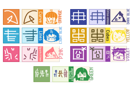
I divided them into 6 colored categories according to the character's overall perceived 'shape'*: ・Curves (orange)

・Sparks'n'mix (pink)

・Criss-crossing (dark blue)

・Lines (light blue)

・Cubes (yellow) ・囧メ (violet)

・imperfect matches (green)

・Highlighted ones are stand-outs, or visually the easiest to digest (to me anyway).
*these are very arbitrary classifications with flawed, subjective internal logic that has been revised multiple times over. (eg. Even if something has a curve, if I feel like the overall shape has lines that stand out more, then it's in the light blue category instead.)
And with that, I think I'll call it...
The「色々色 / IROIROIRO」 Method!! otherwise known as the 色³ for short!!!
■ 「色」・いろ・(Iro)
➊lit. Color, tint, hue, shade ➋kind, type, variant
■ 「々」・のま・同の字点 / どうのじてん・(noma / dou no jiten)
Kanji repetition mark; placed beside a repeating kanji.
■ 「色色 / 色々」 ・いろ・(Iroiro)
various, all sorts of
■「³」・3乗足す / さんじょうたす・3の立方 / さんのりっほう・(san jyou tasu / san no rihhou)
mathematical term.; Cubed, to the power of 3 pls don't ask me for the actual application specifics, I get a 3/10 average on my math tests-
It's a fun pun! Kinda.
【Preliminary Conclusion】
Is it an effective strategy to master Japanese kanji at all, though? Maybe not. At least, probably not just by this visual display alone. I honestly don't expect anyone else benefitting much from this project, but it personally really reinvigorated me to continue studying Japanese again after all these years. It's strange how something that caused me so much feelings of dread and anxiety for the majority of my early teen years suddenly feels so much fun to work with. All it needed was sleep deprivation, some touch of personalization, and a little bit of color!… ok, well, a lot of color-
It's a complete homebrew, unverified by anyone, and I guess a little insane, but I thought it turned out kinda cool anyway, so I thought I'd share it! What do you think? I'll write up an update about any further developments in this silly lil system the next time. I'm thinking of somehow fitting in all the definitions, readings, stroke orders, and maybe samples of their usage... but also in style★ somehow-
We'll workshop it, even if it takes another additional 8 months!!!
Until then! バイバイ( ̄▽ ̄)/
つづく
➡To be continued...
・・・ホームページALL LINKS・・・
・Art Gallery・Commission Info・Free resources・
#long post#kanji#japanese#language#study#study notes#japanese language#japanese kanji#visual learning#self study#colorful#learning japanese#f2u#f2u resources#study resources#japanese studies#📚
26 notes
·
View notes
Text
Blog No.003🍊 24年5月10日
「Let's Talk About Coloring+Rendering!!」
~ The Chaos of Akehhh-style Layering w/ Colors & Values ~
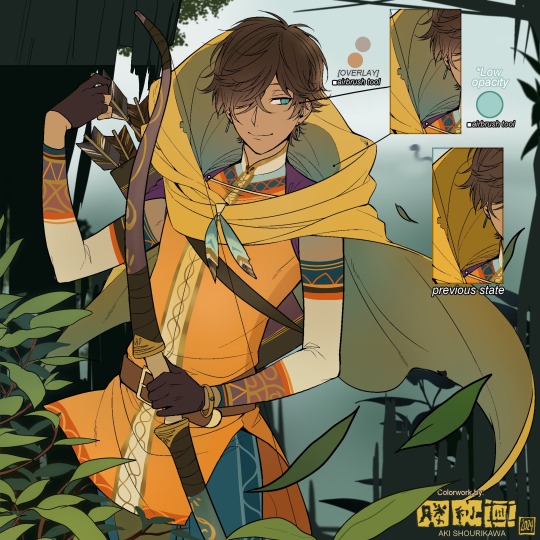
ArtStreet recently released some weekly coloring contests and as someone who likes joining 'em + colorwork being the absolute joyous part in drawing for me, I got really into it!! One of them somehow won and I still have the raw .mdp file of it with most of the layers unmerged... so, I thought there might be some value in sharing my chaotic coloring progress with it. There may never be an opportunity like this again...
CONTENTS:
Preface・・・・・・・・・
The Linework・・・・・・
Composition + Planning・
The Render・・・・・・・
Additional FX Tips・・・・
The Layers of Dread・・・
1. Preface
I use the free software MediBang Paint, which is made by the same folks who made the aforementioned art-sharing website, Artstreet. Although its file type extension is .mdp, it can also save as and open .psd files all the same.
If interested, you can download it on their website here! I believe it's available in both PC, Apple, iOs, and Android (also on the PlayStore). ☞And here is my google drive link of my fully rendered entry's raw .mdp file. I also included a .psd version that should be accessible with most other softwares like Photoshop, Clipstudio, etc.
NOTE: Not sure how some layer effects will be displayed apart from MediBang though (either in name or function) . But I think "multiply" and "overlay" is fair game on most drawing/photo-editing softwares with layer systems.
Either way, ↑this is just a bonus thing if you wish to see for yourself how much my MediBang cries everytime I work on something, since visuals of the rough step-by-step will be provided here as well!
At the end of this post, all of the layers' purposes will be explained...y-you'll see...
■And just as a disclaimer: I'm an instinctively self-taught illustrator who is a heavy visual learner, so there are certain methods I do that I cannot readily explain with back-up studies on color theories or formally taught techniques in art schools and the like/certain made-up terminologies that may or may not exist as something else. I mostly operate on instinct, observation, subjective preferences, and vibes, so this would just be me trying to verbalize my process (with visual aid) as a means of share-rambling, rather than actually directly "teaching" anything, I think haha You can take it as a cautionary tale too, honestly-
※I will also be going through this with the assumption that the reader has some background knowledge on digital illustration and general drawing basics + lingo. If you have any questions or needed clarifications, please feel free to let me know!
Although art can be fundamentally "wrong" when it comes to achieving certain specific styles, structures (especially when involving realism as the standard), or general executions of intentions/themes, I am of belief that there is generally no wrong or right 'way' for drawing anything; or for doing ANY type of artistic endeavor for that matter. This might be perceived as a "bad anatomy defender" / "no need to improve, then" stance on my part, but it is absolutely not the case! An artwork is never finished, there's always room for improvementsーa galaxy's size of a room especially for myselfーbut I just think anything at all that brings you an expressive or creative outlet, joy, or peace of mind is worth pursuing, regardless of your own skill or tact and there's no shame in that. I do not wish anyone, especially people starting out with drawing to be discouraged for having their own different approaches in comparison to other people's works by misconception of, "oh, am I doing it wrong?". Sometimes having different or an uncommon worldview is not always a 'bad' thing, I think. Heaven forbid artists actually start getting creative and unique―
What I will be presenting here is simply my one way out of thousands of thousands of different possibilities. So, let's start★
2. The Linework
Equally lengthy talk of lineart is probably for a later discussion, but here is the template provided by ArtStreet for the contest + what will be colored in for today.
☞The contest has since ended, but you can still download the lineart template here if you'd like!
3. Composition + Planning
The contest rules said it's "OK to draw backgrounds", so let's go!!
I had already decided on how I want to color it early on: It will be more scenic in nature, rather than stylistic. So, there will be more focus on looking 'real' than 'aesthetically stylish'! Just so it doesn't look disconnected or too out of place, I tried to draw my additions similarly to how Mr. archerman's linework looked as much as possible.
This how I visually define "scenic" VS "stylistic" illustrations (in my head)
I like experimenting and mixing different rendering techniques with varying linework styles and tend to think about my approach with the rendering long before the coloring process, even waaay before I line my final sketch, usually. But for this, I'm simply working with what was given to me.
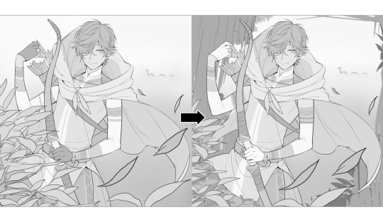
At first, I just wanted a "cool breeze w/ leaves flying away ahhhh refreshing~~" mood, but the space at the side of his head looked rather empty as is, even with Nessie. So I thought about putting him inside a vague...darkly-lit abandoned ruins-setting to eat up some of that space.
And with that, it's time for colors.
4. The Render
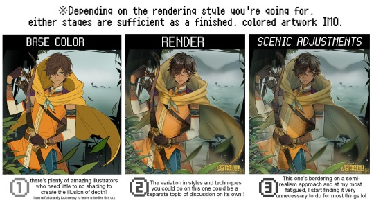
My coloring process is the lengthiest and often makes people who see me color in real-time scream in horror, but I think it's actually fairly simple and can be summarized into three nutshelled stages:
①Fill in the colors with a finalized palette of your choice,
②cry Continuously render until your arms fall off you're satisfied.
③ cry even HARDER (optional) Adjust accordingly to fit in better with other elements of the illustration, such as with the focus/subject to background. *will be explained later.
oh and btw, the usage of the words 'render(ing)' tends to be confusing with its association with other mediums like 3D models, but when it comes to drawing I like to think of it this way:
🎨Coloring is the planned/intentional selection of your color range, tints, tones, and palette to use in a drawing, ☀Rendering is the act (or product) of the set of techniques (including effects, filters, etc.) you use with the colors/values to create the illusions of depth, shadows and light, movement, warmth/cold atmospheres, etc in a 2D illustration.
But that's just how I define it with my own step-by-steps. Otherwise, I think either term is pretty much interchangeable.
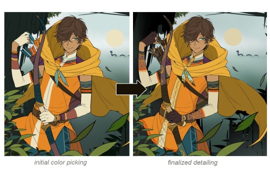
Anyhoo, what do you think should this man's hair, skin, eye, and clothing's colors be?
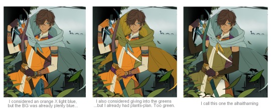
here are some of the variations on the color picks of his outfit that rotted my brain for about 3 hours straight, like it's a 2000s dress-and-match flash game
The many submissions for the contest had many fun color combinations and interesting interpretations I personally think should've won. I saw a lot of blonde archer-princes wearing greens, browns, and blues, as a lot also went for the "forest hunter boi" vibe. But I was saddened by the lack of my favorite colors being used as the primary colorーorange and yellow. So, let's use those!!
The start of my coloring/rendering journey is never at Layer '1'.........
―Starting with what I've always referred to as "environment prep":
The purpose here is to 'set' the base colors so they match with the environment or general atmosphere. Get ready to see this over and over
This could mean adjusting the saturation, or spraying gradients of the BG's most prominent color on parts that...gives me anxiety the most-
As someone who tends to work with very, very bright color schemes with character designs, trying to blend in when the illustration is meant to be scenic or 'serious' in tone without it being a distracting eyesore can be a challenge. So, this is what I do to counter it.
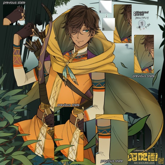
Shading is usually an early step for me as well, even though I think it's a lot of other artists' near-to-final step. I tend to lean towards an abomination mix of soft shade and cel shadeーthe strokes are sharp enough to trace where the shadows start and end, but softened around the edges for effect.
I also tend to apply an additional spray of subtly darker shade on top of the first one? It's usually on spots where I think the light source won't be hitting as much. I wouldn't do this for simple styles (stylized illustrations like with a chibi style), but for scenic illustrations I find it's necessary to achieve that depth against a fully-rendered environment.
※Just a side note: You may see multiple things changing around, but in real time I'm most definitely working on one part at a time lol. These visual aids were ripped off the raw .mdp by hiding some of the layers, so that's why different areas seem to progress together all at once, even if that's a bit idealistic in actuality.
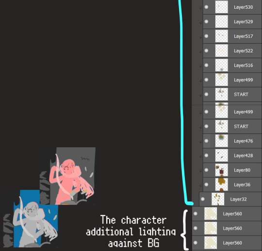
Apart from the previous adding of shades with a multiply-mode layer for the preliminary shadows, I add one more layer of shadow on there for objects or other characters that can cast distinct shadows on the subject. In here, it's the bow and the hovering strap across his chest.
Lighting is also starting to be added as well.
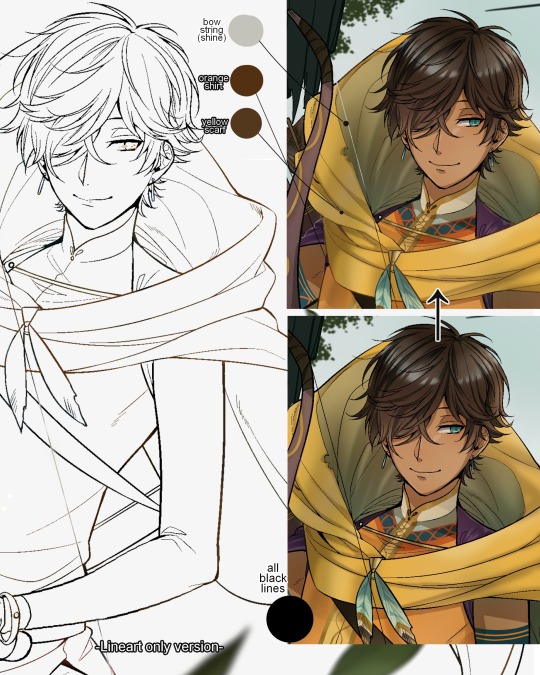
One direct alteration I did with the lineart template was change the line's colors. I find it really softens them to mix better with their filled-in colors + as well as not stand out too harshly against a light-colored scenic background.
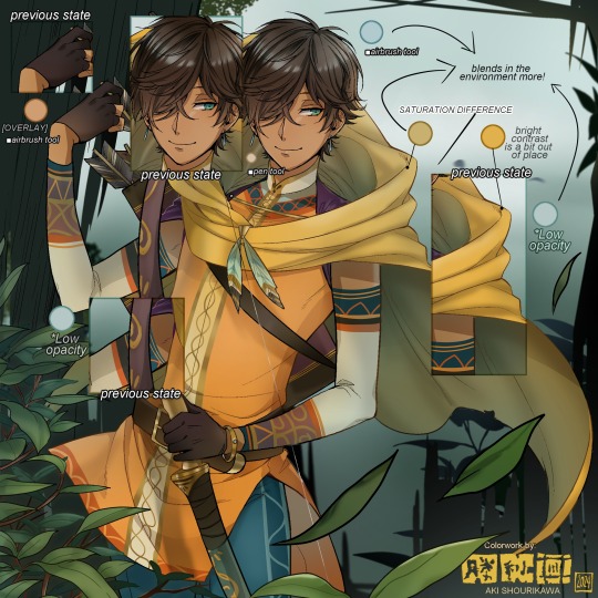
I think you now have a good idea over my hyperfixation on making sure colors are 'vibing' well against the BG lol A lot of these steps are basically just doing the same thing over and over with new layers for the sake of this purpose, really.
And after that, just repeating all the stuff we did with the character onto everything else (background, foreground, objects, etc.) until you're satisfied with it!
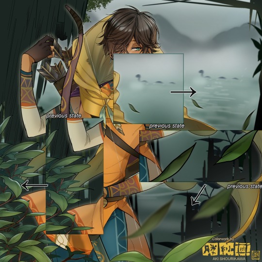
A lot of these changes are very subtle on their own, but makes all the difference in the bigger picture, I think!
Just maybe some additional finishing touches for some boom shakalaka and...that's pretty much it! You will notice that throughout the entire process, there's a lot of random little things that suddenly appear or change with seemingly not much purpose or meaning on its own. I unfortunately have always drawn in this sort of vague, quickly impulsive, directionless way since I was a child and I don't think even I will ever understand it, logically. It's mostly a... continuous string of instinctive feelings of "HEY let's do it this way, if not there's like 10 other things we can try next", is the closest I can get to an explanation of how it feels.
I don't know if it's common for other artists to think or function this way, but I do know for a fact that many people seem to be surprised and confused when they see me drawing in real time this way. Everytime I get asked 'how' I draw certain things, I say things like 'I turn my brain off and vibe with many, many layers with a broken back.' and people think it's just a dismissive joke. I-it's really not, it's literally what happens, I don't have any secret shortcuts for you-
Hopefully this very lengthy post + visual aids can help demystify some misconceptions on what "really" goes on when I'm drawing! It's also a bit of an update of my tutorials made for friendos starting out with digital drawing back in 2015!
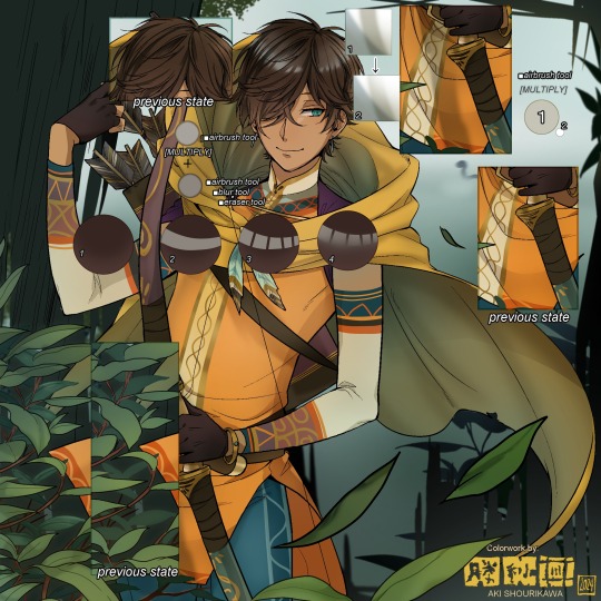
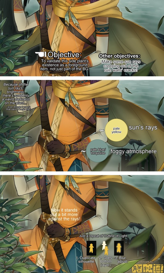
Anyway, the rendering stage is where the simplified steps ② and optional step ③ branch out like a fork in the road for me; I don't think one is any "better" than the other, I think doing either is simply a matter of personal preference and artistic choice;
➋being leaving all that 100++ layers rendering that we just did alone and calling it a day,
➌being a little bit more extra w/ additional shadows/lighting that corresponds with the environment the character is in.
I removed the walls to see the whole figure better in a side-by-side comparison. I like the unadjusted (L) without the wall, but with the walls in the final illustration, I think adjusted (R) felt 'right'. What do you think?
There are some things, although realistic, don't look that good as a visual aesthetic and are just downright excessive/unnecessary to add to certain types of illustrations.
Then there's things that aren't possible in real life, but artistically? Looks really dang cool. Being biased for either ends of the hyperrealism and hyperstylized spectrums of styles is fine; only as long as no discrimination is involved towards people who don't share your opinions, in my opinion-
and to conclude this section, I say,
『 You go render however you wantーhellーno colors even necessary if you wish!
Simple ≠ laziness, just as much as complexity ≠ skill。』
I will never stop yapping about how a lot of minimalist styles require so much more amounts of planning and effort to make sure everything is nice and clean, especially compared to mindless rendering loops like these. Mine's a maximalist hell and I wouldn't have it any other way, but I greatly envy minimalist artists that can render with just something like my step ① with so much grace and tact; not a single stray or wasted stroke!! Anyone who dismisses these types as "lazy" I will violently stuff inside a couchーwithout any potato snacks to snack on!!!
5. Additional FX Tips
Just a shorter section for some optional finishing touches tips'n'tricks used in this I frequently (ab)use☆
◆ From the very beginning, even before I understood how to draw, it's always been a tradition to doodle around sparkles all around the place. I usually do it with MediBang's sparkle brush if I want it to look polished, or simply draw it manually using either the pen or airbrush tool for a cruder charm.
◆ Motion blur is great, and MediBang in particular also has different types of blur effects like Gaussian and regular blurs. If your software doesn't have these effects / if you're working traditionally but still want to achieve the illusion of motion in a still drawing, you can still achieve the same effect through your linework! Try looking into incorporating action lines (commonly seen in manga and comics) into it. Otherwise, purposefully drawing something blurily to begin with oughta work as well.
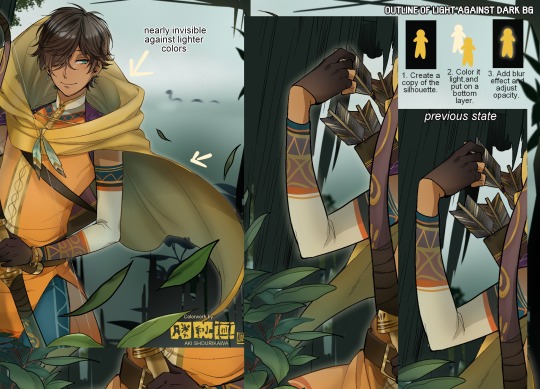
◆ Apart from changing the lineart's colors, there's also this little effect that is achieved by duplicating the lineart and blurring it. It gives something like a...'dreamy' quality to it? The higher the blurred copy's opacity is, the more emphasized it makes everything look.
6. The Layers of Dread
At long last we've arrived... at my MediBang's repeating demise for all of eternity...
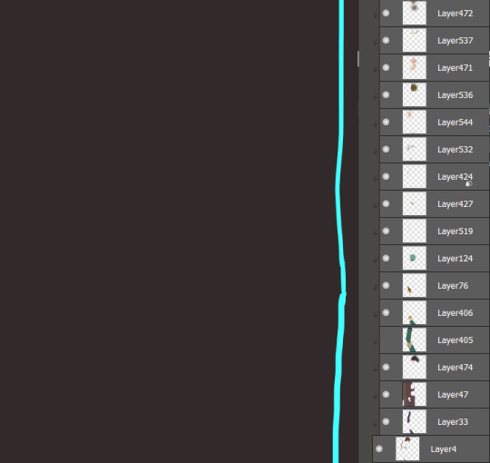
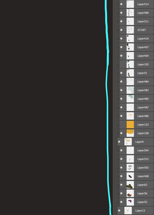
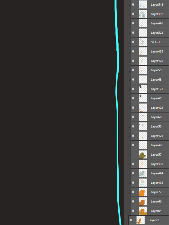
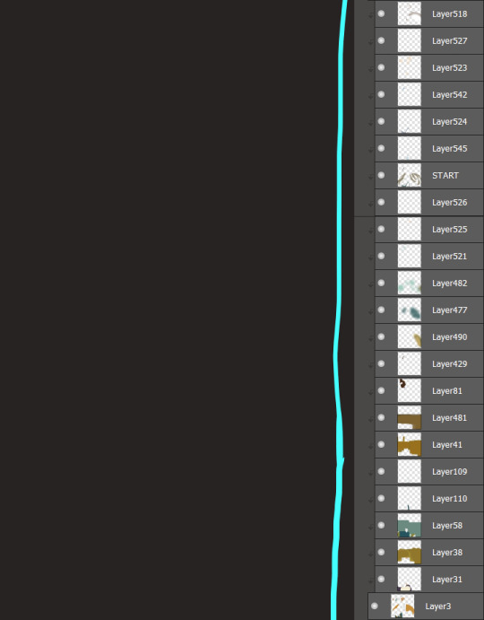
Here's a preview of what the .mdp/.psd file of this colored entry's unhingedmerged layers looks like + how I try to validate their existence. When I work on full-sized illustrations, I tend to merge layers as I go, so this is probably one of the rare times I can show something like this without either mine or your PC dying. If you'd like to see, play around with, and toggle them for yourself in all of its............glory, feel free to download it here.
Yes
we're starting at Layer 611. Enjoy.
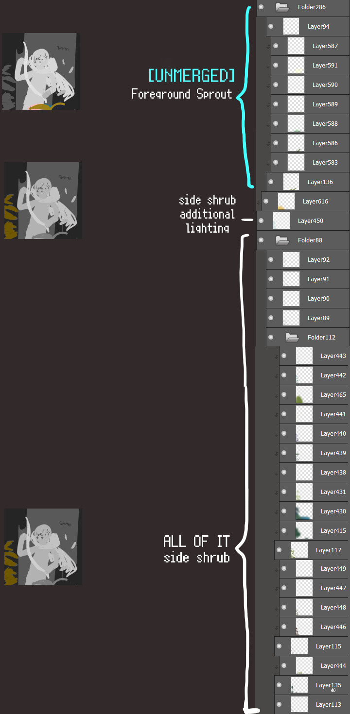
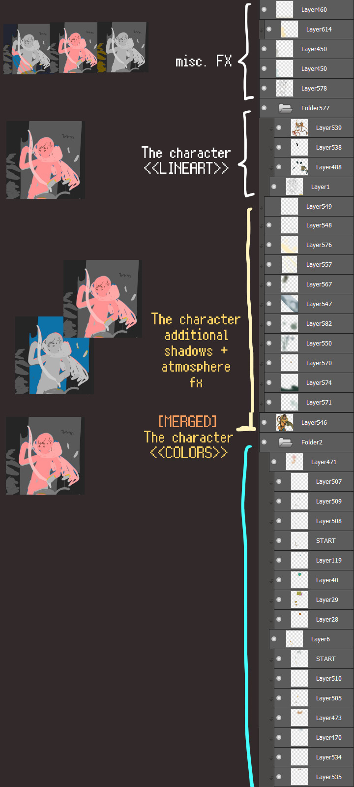
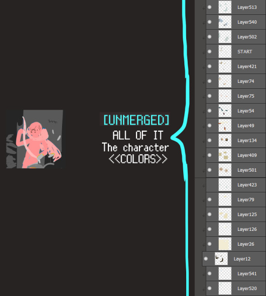
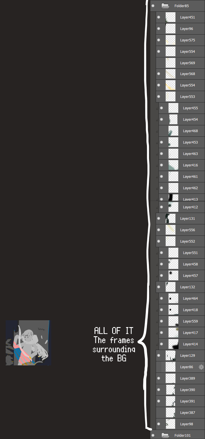
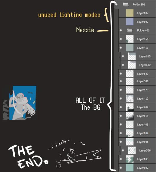
I will now delete my PC's copy because jfc that's one too many MBs ...and it's still eons lighter than what I usually work with on my own full illustrations from sketch to finish......。 (;´༎ຶٹ༎ຶ`) thank you for reading this far and making it out alive, goodbye for now...
・・・ホームページALL LINKS・・・
・Art Gallery・Commission Info・Free resources・
#art blog#long post#coloring#coloring tutorial#art tips#art tutorial#digital art#digital illustration#digital drawing#digital art tips#digital art tutorials#medibang#drawing journal#drawing process#illustration#coloring practice#nessie#the loch ness monster#🍊
35 notes
·
View notes
Text
Blog No.002🍋 24年5月4日
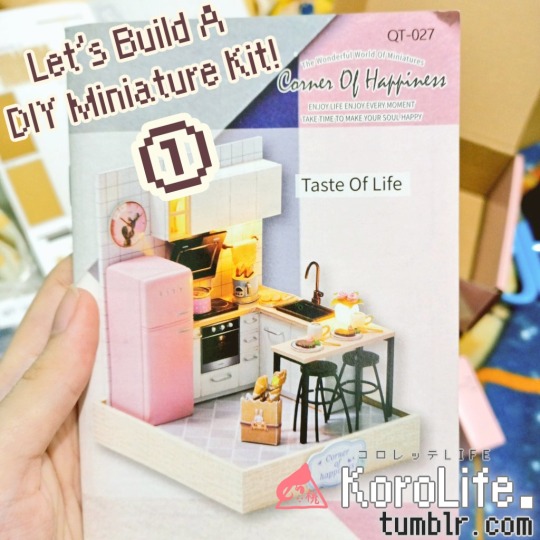
「Working on My Very First Miniature Kit!」
Hi, this is a behind-the-scenes on my experience in making the Corner of Happiness: Taste of Life DIY miniature kit!
It was from a couple of years ago, we found a stall selling miniature craft kits while strolling around the mall. My sister bought me the very same model I've been eyeing on my online shopping cart as a birthday present.
Me and my sister both love miniatures since we were very young, but making them from scratch require a lot of time, materials, and tools we don't really have (especially if you don't want them to look crudely made). Luckily, now with a Do-it-yourself kit, that wasn't going to be much of an issue! ...or so I'd hoped as a miniature newbie.
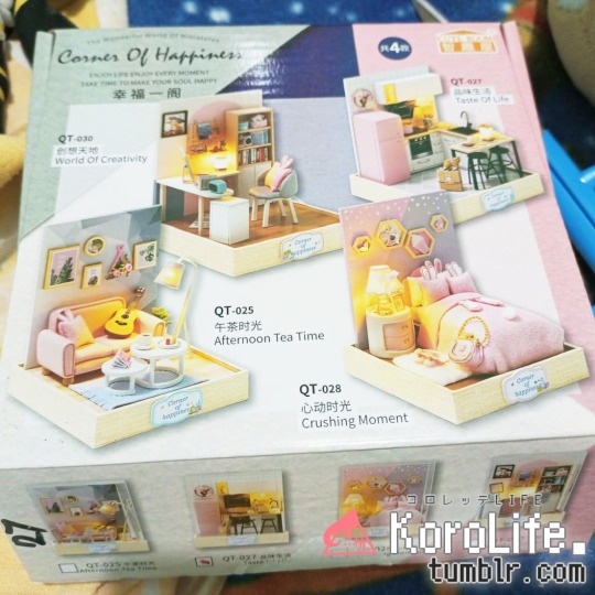
These are all the other variants of this series. I really dig the pink bunny aesthetics they're going for, though it's not as apparent on this one.
The kit also included custom wooden parts, wires, beads, and a tool kit necessary for the build. It also comes with an acrylic glass for dust-free casing!
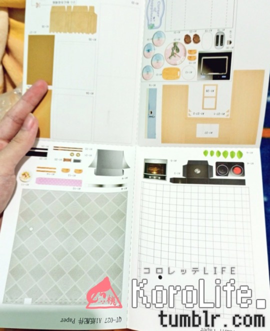
Most of the parts were made from a print-out glossy paper with all the items' photo-real textures; some of which are just to be pasted onto a harder material like wood shaped similarly to the object, but most of them are just the paper itself.
I guess doing it this way cuts costs for manufacturing, but it was very challenging to work with, in my opinion. You'll see what I mean in a bit.
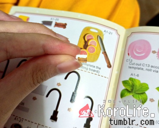
And here's a preview of the instruction booklet's contents.
I thought it was worded weirdly at parts, but still understandable enough with plenty of visuals to go with it.
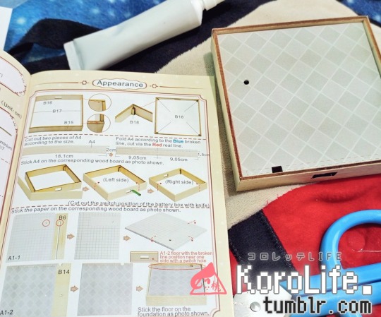
Starting with the base/foundation of the model before anything else seemed to be the best option... though I was very, very tempted to skip to work on the food items. I don't know why, but miniature food just gets me really giddy.
But, gotta hold backーcan't make food without the oven and all.
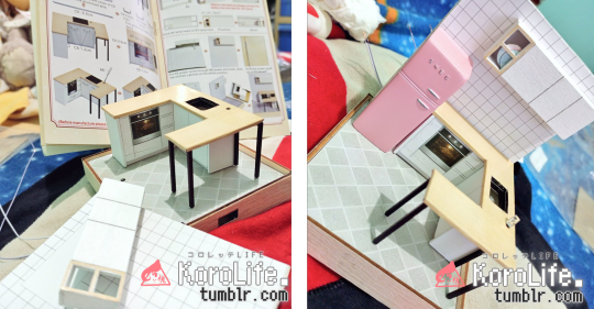
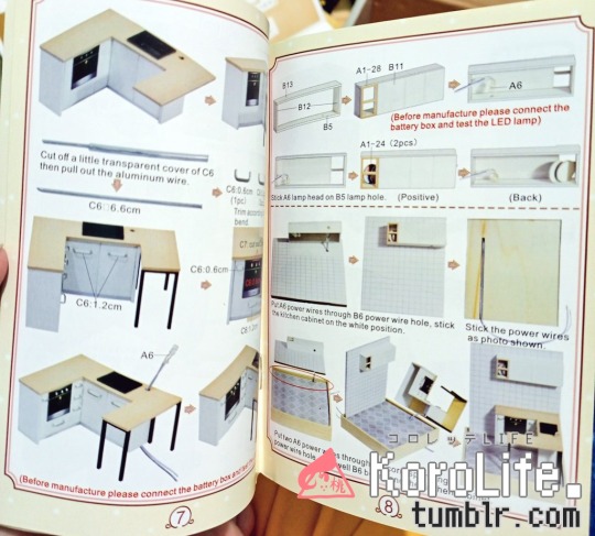
I then worked my way through the biggest parts and set them down permanently with the paste provided in the kit.
...but I probably shouldn't have glued the kitchen island in place before placing the handles...aiyah one of them is really crooked-
I'm not familiar with wirings, so setting up the LED lights made me panic a little. But somehow, it all worked out! I'm confident that if an idiot like me can get through this, so can anyone!!
And now I present to you: The Paper Struggles™
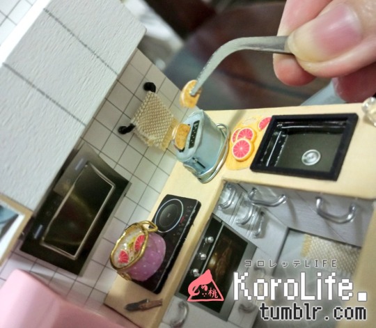
+ and a "It's so fakken small" compilation.
The booklet is a lie lol that knife .jpg is 5x bigger than what you've got to work with-
I remember both bread toasts being squished from the tweezers... thankfully tiny enough for anyone to really see, but there's definitely a shtload of dents on there...
The wire handles for the mug was such a struggle lol it kept falling off no matter what, so I just kept adding glue and just... held on to it with pressure against the bead for what felt like eternity until it dried completely.
I also remember struggling with the semi-origami flowers quite a bit, but I think the trauma of it all made my brain forget to take photos-
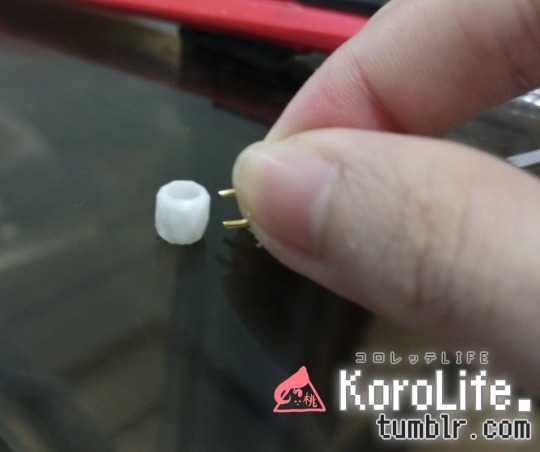
Next up are the wires. I never really considered it before this kit, but they can actually have a lot of use when it comes to making miniature furnitures and accessories.
This was unfortunately before I got into making earrings, so I didn't have the right tools (pliers) to straighten them out. The very thin tweezers that came with the kit didn't help that much, so I just had to use my fingers.
The results... are as wobbly as the hands that created them lol I've learned my lesson...
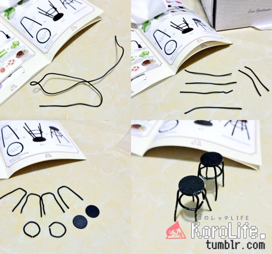
that incomplete circle pains me so
And here we have my favorite partーthe food! All the tiniest of detailing, the garnishing, the arrangements... it just makes me so happy, I really don't understand why.
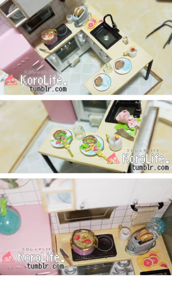
The original instructions only intended the oranges to be on the chopping board, but not in this household!!!
Oh, and the oranges were sliced up polymer clay rolls that I know are popularly used as nail art? Me and my sister used to sell polymer clay accessories back in the day and it felt very nostalgic seeing those tubes again.
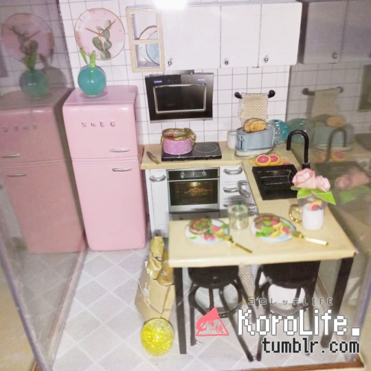
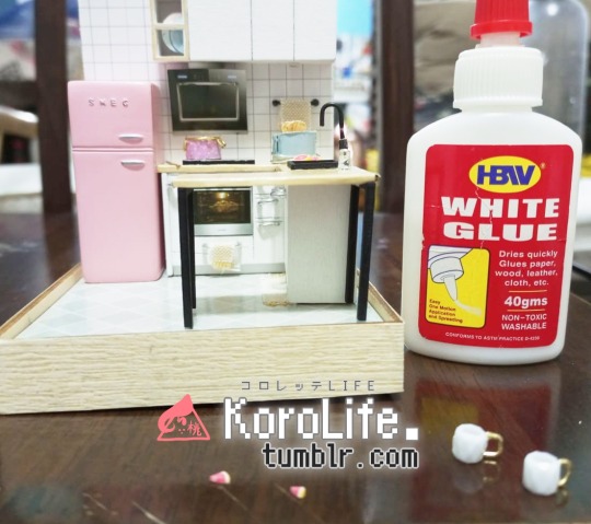
And here we have the finished model! ☆
I made a few changes from the original intended 'look' + added a couple of my own beads from my hoard material collection from childhood I planned on using for when we started making miniatures... and the time for use was most certainly now!
Aaand here's a bird's eye view before completing with the dust-free acrylic glass encasing top lid.
~ CONCLUSION ~
Overall, I thought it was really fun, despite the unforeseeable challenges along the way. Even as a newbie with little to no experience working on actual builds + with only the enthusiasm and love for miniatures to desperately cling to when the damn wires wouldn't stick on their corresponding surfaces properly... it seemed to turn out pretty OK!! I expected a whole lot more screaming and dying inside lol If you're interested in getting it, I think simply searching up "Corner of Happiness" or "Taste of Life DIY miniature kit" should get you some results on your preferred online shopping platform! ※NOTE: I do have to stress to make sure to check (either through other user reviews or the listing's description) if the seller is including a tool kit in your purchase. A lot of the items included in this kit you can probably find at home, but not a lot of people are so crafty to just have them lying aroundーespecially if you're a complete newbie with crafts/miniatures! You'll have a hard time trying to wing it without tools. ※also, they might just skimp on you by not including them, but still have you pay for the full price lol it's definitely worth considering when purchasing.
I know a lot of parents may see these kits to buy for their kids, but unless ➀ they're also helping out the kid in the process or ➁ if the kid in question has no interest or patience for these kind of things, I think it's best not to buy them DIY kits like these if you don't want to risk wasting money. But that's just my opinion, as a broke adult who's always wanted one of these haha
The amount of care, effort, and attention to make sure everything is sturdy enough and visually clean can be very drainingー but if you're willingーanyone can do it!
And of course, a final very cool look on LED lights turned on at night.
This project was done around 2022年. I've done one more miniature kit since then that was way more complex, but that's a whole 'nother journal entry for another day...
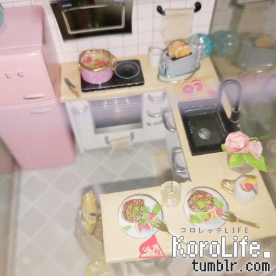
For now, here's a mini update of how this Taste of Life is hangin' after two years have passed:
please don't mind Mr. Gamma side-eyeing you in the BG-
The batteries for the LED unfortunately need replacing and one of the wire chairs kind of died a bit, but it's still alive + currently displayed and part of my makeshift not-all-Shounen Jump Manga corner! I might make a separate blog about that too...
But until thenーthanks for reading ( ´ ꒳ ` )⸝ see you in the next one!★
#crafts#miniature#miniature model#kitchen#taste of life#corner of happiness#diy#diy kit#review#miniature dollhouse#miniature craft#craft kits#diy dollhouse#diy miniature#🍋
5 notes
·
View notes
Text
Blog No.000🧺 24年4月5日
『KoroLife』 : (I wish for) A Colorful Life
in hindsight I probably should've started with this introduction but ah well
Hello! I go by Aki Shourikawa, also known as TheAwesomeAki-kun from DeviantArt. Ever since dA "died" in 2019, I felt like I lost a place where creativity and the fun aspects of making art was celebrated and utilized. With the character-limiting, trend-chasing, confusing censorshipping, popularity-prioritizing algorithms and systems most social media sites use, I lost an outlet for expressing my scattered thoughts and experiences throughout my art journey.
Even though talking to the void for not having a following was normal to me even from my dA days, it felt especially lonely the past few years trying to move everything and start anew to cold, uncaring websites who valued clicks more than integrity or ingenuity. So much so that I just felt like I shouldn't even try doing anything apart from quietly feeling inadequate and too incompetent for anyone else outside my own head.
Outside of being a creator, I can hardly find artists I'd like to follow as a viewer in these sites now compared to before; when all the recommended recommendations tend to be the hundred-thousand-eyeball-popular artists that usually ➀cater to a younger demographic for profit, or just ➁follow along with whatever is currently trending and mirror what other artists already made. Not that there's anything bad about understanding your market and making profit off of it! It's just... art, to me, has always been an escape from ridiculous societal standings, hierarchies, or denomination prejudices present in day-to-day lifeーEveryone is capable of drawing or making art, and that's something I've always liked about it. But even if bad apples with bad takes are probably just a minority to an otherwise wholesome majority of artists out there... the idea of transforming the creation of art into a pure competitive market, or even some kind of 'content' generator somehow leaves a bad taste in my mouth, personally.
I want to see more of artists who create their own art as a showcase of how they perceive the world in their unique sense and style, just because! But those types (especially ones without a following) seem to keep getting shadowbanned, stunted, and pushed away by unquenchable zombie algorithms that push and normalize this trend.
There's a lot of laughably bad things to say about DeviantArt's online reputation, but I found that a lot of like-minded lurkers were easier to find back then + genuinely interact with beyond one-word compliments and befriend over a common interest (art!) regardless of following size, skill level, or what have you...compared to how it is these days where it's a ridiculous..."looking for art moots, but I will be picky❤"-kinda world. It was probably because it was focused as an art website and not just a really broad scope of 'social media' site where everything non-art also goes down the hatch...that was the case for old dA, at least.
Now, enter Tumblr!ーa site that I've been extremely familiar with even before I started uploading my stuff online, even though I haven't used it myself mostly because of DRAMAtical Murder memes ngl- and while I understand it still contains most of the flaws I've listed of other social media websites... it's meant to be a blogging site! With multiple blogs for multiple different things! That'll work great for me!... with my category-varied 2.4k submissions on old dA...I think!!
So instead of moping around for halcyon days as I did the past 4 years or so now, through Tumblr's platform... I wanted to get back to being productive again and document an aspect of my life that I wish to be filled with different colors and flavors. Through this nonsensical ramblingy, longass tangent about not liking other social media sites in comparison to old dAーalreadyーI'm doing it now!!
I want to learn all sorts of things when it comes to drawing, so I want to share all the failed experiments, confusing experiences, and silly things that generally makes me a little happy when I'm drawing. Even though I'll probably still be talking to the void...I think even the void will appreciate having more than 280 characters to use without sounding like an incoherent, shattered fortune cookie prophecy.
And if somehow, somewhere, someone finds and reads through them.... I hope they can give some form of motivation, inspiration, entertainment, or a cautionary tale for your own artistic endeavors, maybe? like, underestimating your deadlines and procrastinating at the last day, then panic upon the realization that you should've started like a wholeass year ago to finish the task at hand, then proceed with praying to a god (of your choice) and cramming until the very last minute til you nearly break your hands! Me and my 7-, 11-, 14-, 19- and 23-year-old selves do not recommend this at all! Tune in next week for more wild experiences that will summon forth bombasticeth side-eyes!!-
See you around, and for now, I hope you have a nice day ahead! 'v')/
・・・ALL LINKS・・・
・Art Gallery・Commission Info・$0 Ko-fi shop・
Main blog・Art blog・Non-chatterbox drawing process (KoroLite)
3 notes
·
View notes
Text
A Palpitating Salutations to U
Hi! this will be a nervous wreck word salad dump of my drawing processes! (with visual aid). More specifically, I’ll be journaling the 'making-of’s of:
illustrations that have a ton of detailing that needs a lot of pre-planning,
ones especially that are humongous in size,
ones that experiment around techniques and styles,
and ones that contain certain elements or... just something I feel like rambling about.
Crafting endeavors / general creative experiences!
Thanks for stopping by. (´꒳`)
・ MAIN BLOG (central hub for everything I do)
・ ART BLOG (where all the finished illustrations are at!)
・ SUPPLEMENTARY LITE VERSION (moving .gifs only)
- - - - 🍊🍋 🧺 BLOG ENTRIES INDEX:
- - - - - - - - - - - - - - - - - -
Symbol Legend:
🍊 is for Detailed Drawing Process 🍋 is for Crafting Experiences 🧺 is for Blog Updates 🥕 is for drawing technique discussions 🍘 is for general drawing journaling / notes 🥮 is for spec. Art Challenges 🥪 is for spec. Art Collaborations 🍱 is for spec. Original project releases 📚 is for (non-drawing) Studies / Notes 🍧 is for Concept Diving 🍨 is for Room Update 🍈 is for DIY and makeshifts 🥛 is for ??? 🌌 is for Recommendations 🌠 is for Artist Features 🥏 is for Product Reviews
- - - - - - - - - - - - - - - - - -
Listing:
🧺 No. 000 - What’s KoroLife?
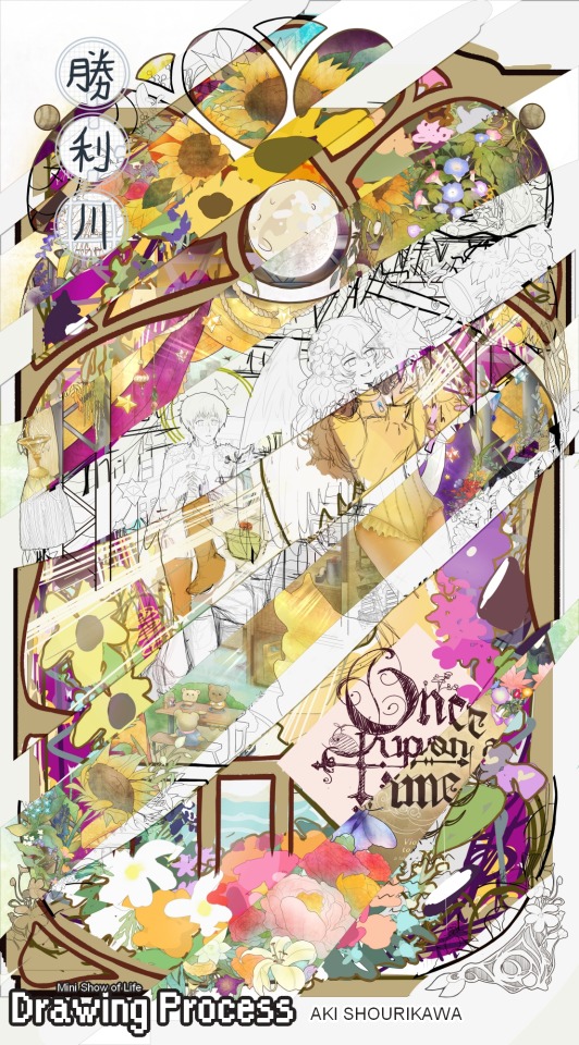
🍊 No. 001 - Making of “Mini Show of Life” (big illustration)
🍋 No. 002 - Let’s Build A DIY Miniature Kit!①: ”Taste of Life”
🍊 No.003 - Let's Talk About Coloring+Rendering!! (+downloadable raw .mdp and .psd file)
📚 No.004 - My Visual Method for Learning Japanese Kanji (漢字) part① (+ free downloadable map + guide)
🥕 No. 005 - Manga Research: Hair Detailing, Inking, and Toning (2017) + free downloadable manga screentones compilation list!
1 note
·
View note
Text
Blog No.001🍊 23年4月11日
Drawing Process: Making of “Mini Show of Life” (commissioned illust.)
Hello! This will be my first in-depth journal/blog entry in a very long while after being quiet for 5? years since dA’s fall from grace. But, I hope you can find something of use, or at least get some entertainment out of it. Do take care though; once the talking starts...it’s not going to stop. Please feel free to skip through parts you deem only worthy of your time (or just the pictures really), I won’t take any offense! I will be mostly using these to gush out roughly 5 years-worth of recepientless chattiness directed to anyone willing to sit through walls of text anyhoo.
However long the stay; thanks for stopping by! (´• ω •`) /
CONTENTS:
0 - Making (overview)
1 - The Concept
2 - Inspiration
3 - Breakdown
4 - Never Finished
⓪ ― メイキング ―
Start of project (concept pitch): 2022年 February 7
Start of Labor (revisions and onward): 2022年 November 10
Date of completion: 2023年 March 27

Total time passed from start (labor) to finish:
4 months +17 days? ( ~3,280 hours / ~137 days )
Very Rough Estimated Labor Duration (*excluding breaks/sleep AND reference hunting + test runs) :
= ~1,128 hours / ~47 days / ~7 weeks / ~1.67 months in total.
※Very rough estimate indeed, my math may have failed me in a few places-
Although it seems like a lot of time has passed (*also in comparison to the previous one that was arguably much more laborious), it’s worth taking note that the duration of the entire process got hit by two major holidays in a row (Christmas + New Year), then immediately followed by my birthday haha so it had more days of rest than it did labor through all that time.
① ― THE CONCEPT ―
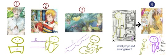
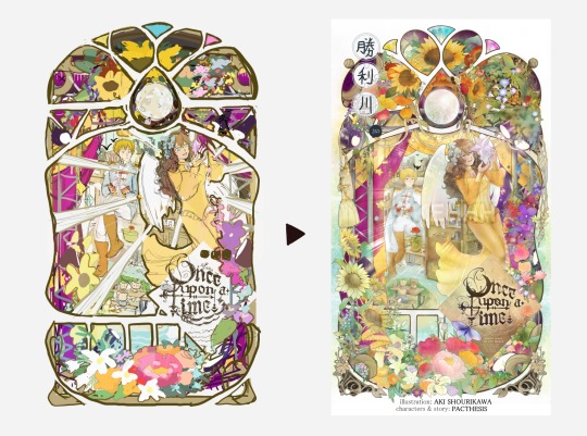
Around 2023年 early February, I was contacted by MissPacthesis (otherwise just known as Pacthesis) on twitter to draw a movie poster/book cover-type of illustration featuring the two main characters of their original webcomic, “Violet Goes To The Beach”. Since there was no specific request for the composition, I made four concept sketches with different themes and moods for their consideration. This was the first one:
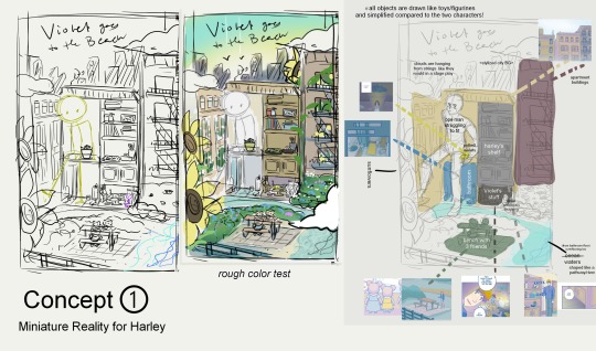
The basic idea was to create an artificial dollhouse-like environment that showcased the characters’ daily lives, as depicted in the comic.
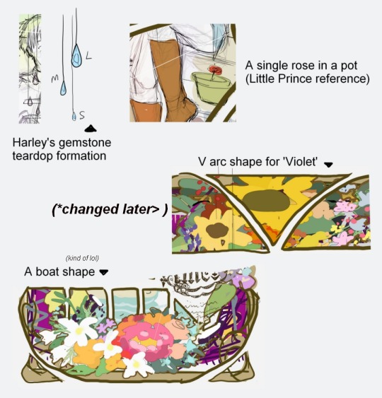
I’ve always been fond of miniatures but, for some reason, never really thought about making them as the subject for my drawings? So I thought the whole physical dynamic between Harley and Violet was the perfect opportunity to explore that.
The three other concepts have already been finished by the time it was this one’s turn (despite being the first one to be conceived).
MissPacthesis was super generous and patient with me when it came down to the deadlines. And so, I wanted to take my time with it and really make sure to end it with a bang for the now-final boss of the bunch!
Following through the requested changes/details after the rough concept sketch was delivered + as well as my own additions, this was how the first set of revisions turned out.
Some of said requests are:
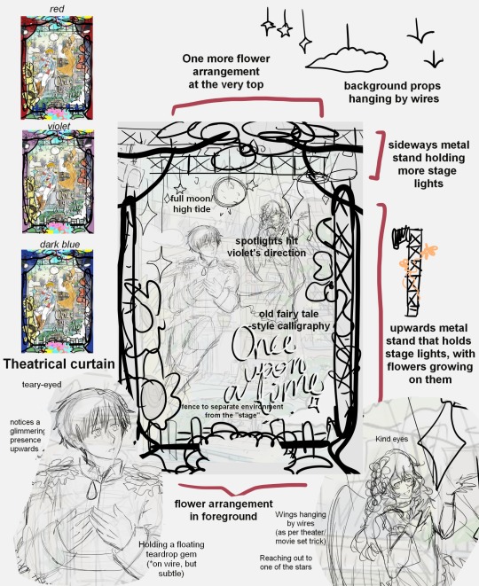
the moooooon
stars hanging on the strings as props
set curtains+lights (to establish a ‘show’ setting)
putting Violet against a less cluttered environment someway
One of the bigger issues was the size difference between the two characters; Violet inevitably can’t be clearly seen with how small she is in comparison to Harley, much less stand out in the composition in the original version. In the other three previously completed commissions, she always remained small and near the environment, while Harley’s ginormous size in comparison unintentionally hogs the spotlight (unless he’s bringing Violet near him).
I was really, really fond of Violet’s outfit design on this one, so I asked if I could make Violet be bigger than Harley for once; even through just an illusion of perspective. I got MissPacthesis’ OK and was feeling pretty OK myself, but immediately screaming and not as OK after realizing I had to draw the female anatomy in close-up view Aiyaaaah
② ― INSPIRATION ―
Each and every external inspiration used as reference is difficult to pin down in retrospect, but I can tell you that throughout the duration of this drawing, it wouldn't stop coming after me anywhere I happened to look.
The introduction of the fairy tale themes was inspired by its references in the comic, which leads to me connecting it with old fairy tale book covers that are known for being super intricate, magical, and no longer made how they used to be now. Then again, those things were probably super expensive too...
If we’re talking about the overall shape, then it's definitely the magical doorway in the movie “Barbie as Rapunzel”. I didn't remember it at all until I came across a pirat- I mean, a s l i m e t u t o r i a l on Youtube, that made me realize that it must've made an impact on kid-me; it was just this concept embedded in my subconsciousーraring to get blurted out at a moment’s notice. Just look at the way the flowers circle around the scenery as a border. Heck, even the same type of flowers in thereーpink ‘n blue morning glories. I was near finishing cleaning up my lineart when YT hooked me up and it hit, “oh sht, I copied the homework and I didn’t even know??”
Technique-wise, I’ve been keeping an eye on Art Nouveau styles that I discovered through the anime called “GOSICK”, which then introduced me to the works of Mucha, who is arguably THE poster man of Art Nouveau. I got acquainted with them in my very early teens, which is nice for familiarity. But due to even poorer understanding of fundamentals at the time, all I ever took from it was really:
'...very thin line on the inside, THICK BOI LINE OUTSIDE'.
A bit of a silly and insulting understatement to the nuances of the technique, but this simplified understanding did help fixing my shaky, shaky lineart through the years to now, hereーhelping me not go completely nuts over advanced class Art Nouveau complexities I won’t even pretend to understand.
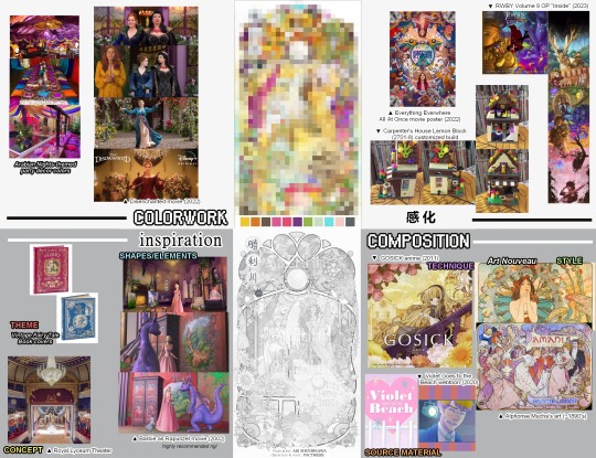
And from there, inspiration for colors burst out from newly-released movie posters smack dab in the duration of the commission; like
“Disenchanted”’s,
and even “Everything Everywhere All At Once”'s.
And then mid-lineart fixing, I got hit with “RWBY” Volume 9's start with the V9 Opening (”Inside” by Cassie Williams and Martin Gonzales), setting the tone with all the colors and all the madness.
It was my weekend hype man.
Although what I was working on was quite far from these in overall concepts/tone/themes (which, lowkey recommendations, btw-), they still served as a nice color setter inspiration + something that just made me keep remembering to continue working on my own colorful composition through the distracting days.
Aaand finally:
it’s most likely my unrequited love for miniatures that started and shaped this composition from the beginning + stayed after the ungodly amounts of revisions at the top!
The fact that the entire premise of Violet Goes to the Beach is pretty much enabling this obsession of mine? makes me feel like it was destined to beeeee (if you believe in that kinda thing anyway). I’ve pined for the concept even before knowing what they were actually called or how to spell and pronounce the damn word.
And I’m starting to think it’s the reason why I’m super drawn to the tiniest of details, be it in my illustrations or other fields with unnecessary hyper-everything.

As a lonesome nut in a cramped household, my hobby has always been staring at everyday objects and filling the rest with my imaginationーmaybe tiny plants growing on it? Or turning them into furniture for any and all small-enough creatures; anythingーI'll imagine a whole dang ecosystem growing or interacting with anything I can find, and then put myself in there to imagine what would it be like to just...vibe on top of gigantic everyday objects with all the space I could ever need and more.
This was essentially my standard as well for finalizing the composition of miscellaneous flowers in the piece:
"Do whatever you feel like, as long as a mini-you would wanna move in it; swim in it; jump on it? or be a e s t h e t i c c enough to be considered ‘instagramable’ or... or something. ヘルプミ- ”
The moment something felt off through a closer look, or disagreed somehow with its neighboring details, it got erased and rethought of until the vibes are decidedly pleasant enough for an imaginary miniature village of mini-me’s to live in there.
I think they’d all be screaming regardless.
③ ― BREAKDOWN ―
no, not of the mental variety-
I’m not exactly sure which place this piece goes on the ranking of detailing levels I’ve ever worked on, but it’s definitely one of the most detailed, by far. Took 4 months for goodness’ sake lol
Similarly to what I did to the previous big piece also featuring Harley and Violet (*I’ll write about that next + link it here later!), I deconstructed the parts into multiple parts to make it easier to digest as I went.


I kept previous versions of the color tests/sketches as a reference map of sorts while finalizing certain details, so I don’t keep going “wait, how did I want this to look like again” all over again.
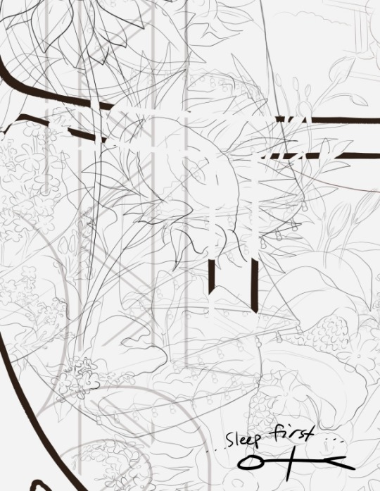
I also made frequent “test runs” for certain techniques I want to/plan to apply in certain areas before finalizing them. Not that I’d really be in big trouble if I didn’t, since I can ctrl+z just fine... but it might just be a traditional illustrator-doing-digital’s habit at this point haha

In a nutshell quickly drawn with a mouse, this is how the layering went down in my poor, overworked, one-too-many overlayered drawing software:
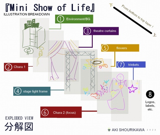
While I absolutely do not recommend layering as extremely as I tend to do, I will say this:
Layers (can) help!
When it comes to hiding each different sections to focus on something behind or above it, having separated everything into non-intersecting layers make it easier to navigate through a big piece.
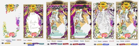
If you have a similar approach to linearting similarly to how I do mine as well, layering will help when it gets down to cleaning/refining the details, since no lines belonging to different parts/objects intersect with one another in a single layer.
Tedious and fatigue-inducing as heck, but I personally find parts of the process oddly therapeutic.
❹ ― NEVER FINISHED ―
You might’ve noticed that throughout my nonsensical ramblings with occasional pictures, said pictures contained preview of the unfinished drawing enclosed within a square frame when the actual finished product is in some curly...burly...shaped...thing.
That’s because the outer shape has changed multiple times:
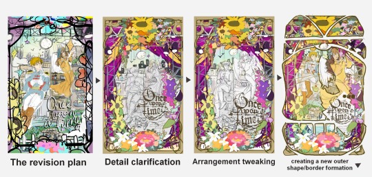
When I looked at the first revised shape with the rough color test (square frame), I thought the entire scene looked kind of cluttered? I also wanted to especially put more focus on Violet, so I repositioned things and decided to go the lineart-heavy Art Nouveau route to make the details really stand out from one another and not blend together in a single blur of colors.
And so, on top of everything else, I decided to cut the entire illustration into sections visibly seen and presented to the audience, outside of the actual layered sections of the illustration we broke down from earlier.
I was satisfied with the shapes overall, except for the very top part. It looked very flat and almost... incomplete? So, I experimented around giving the shape a fashionable tippy top hat.
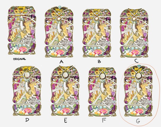
I liked A, but I disliked how the teardrop-shaped gem at the middle was jutting out compared to the rest of the surface.
B retained the flat top, but this time with an added section cut at the upper-middle part, as an attempt to also draw more focus on the moon.
C is the start of the brainrot for a “fish tail” shape.
D tried to just go with a smoothened semi-circle shape for the top, but was the start of the “now THAT’s a moon!” formation that I definitely preferred than what was originally planned.
E wanted to mix the new moon shape + fish tail shape together. I really liked it, but there was something that felt unnerving when looking at it from a distance together with everything else.
F tried bringing back the flat surface together w/ the new moon shape.
and finally, G saved the day (and my sanity). I went back to A and said “dang it, I still want that gem somehow though”, and figured all it really needed was a bit of trim to slot right in the corners and no longer be jutting out. The addition of the yellow and pink on each of its sides were in honor of the fish tail shape. It looks a lot less like one now, but I hoped the teardrop shape at the middle sliding in between two side-twisted oblongs might resemble a fish? haha
the plan vs the done
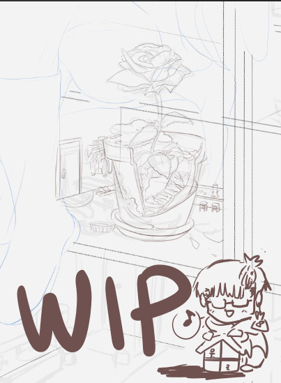
And, there you have it. By this point in time I’ve yet to upload the finished illustration here on Tumblr (*I’m still not done migrating my older stuff from dA to my main tumblr blogs orz) but I’ll update with a higher quality of the final version here as soon as everything’s caught up!
Thank you very much for stopping by, and I hope you have a wonderful day ahead! ヽ(*・ω・)ノ I’ll see you in the next one?
― AKI SHOURIKAWA・APR 2023 ―

let’s end it on the note of how I discovered two fibonacci spirals kissing is actually a heart
I actually do not understand how to use the fibonacci, was just taking the piss out by making cool shapes
・・・ホームページ ALL LINKS ・・・
・Art Gallery・Commission Info・Ko-fi resources・
#drawing process#drawing journal#process#step by step#overview#art breakdown#analysis#violet goes to the beach#vgttb#behind the scenes#🍊#art process
1 note
·
View note