#vox: geometric sans serif
Photo
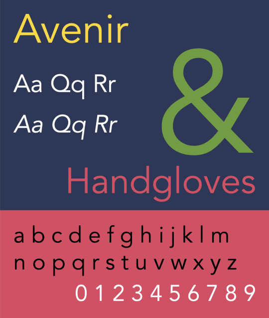


Released in 1988, Avenir is a geometric sans-serif typeface designed by legendary type designer Adrian Frutiger, best known for his Univers and Frutiger designs. Although modeled after Futura (Avenir is the French word for future) and classified as a geometric sans, Avenir has some slightly humanist features that add warmth to the face, such as the tail on the t and the o that isn’t a perfect circle. Frutiger considered Avenir his finest work and it was voted the top favorite font of designers in a recent poll on Typewolf. Avenir is available in six weights—light, book, roman, medium, heavy and black—each with corresponding oblique styles.
It ranks at position 65 among The 100 All Time Best Fonts.
#pangramma#avenir#fonderia: linotype#designer: adrian frutiger#1988#vox: geometric sans serif#top 100
0 notes
Text
The Stroke: Theory of Writing (1985) - G. Noordzij
- dense
- double and triple negatives in a sentence
- new categories, unclear differentiations
- illustrations do not
- stroke
1. translation / expansion (type of contrast vertical / diagonal)

2. running (continuous, cursive) / interrupted construction / neprekidno kurzivno - vrsta konstrukcije
running - neprekidna / potpuna, cjelovita linija
interrupted - isprekidana linija
3. monoline / extreme contrast
- imprint,otisak
- contours, konture
- counterpoints, kontrapunkti
- frontline, frontalna linija
- heartline
- the front (ravan?)
- 3d model of theory **The model helps readers and designers understand the workings of letters without having to fathom complex classification systems.
**
- 3 axis
- no essential difference between the written and the printed word
the serif
- It is the serif that illustrates the fundamental difference between Noordzij’s theory and traditional type classification. An essential feature in previous classification systems, it becomes a mere byproduct in Noordzij’s model, an artifact. He argues that low contrast is inherent to the sans serif. As the contrast diminishes, the serifs disappear into the stroke. Some of Noordzij’s former students were reluctant to use the term “sans serif:” They preferred “low contrast.” Maybe some still do.
- Noordzij’s model is a great tool for teaching people how to look analytically at letterforms. But like the Maximilien Vox classification system of the 1950s, it cannot be applied universally. It is incompatible with many of today’s genres and subgenres, such as almost any alphabet that involves geometric construction. Noordzij seems to get normative here, dismissing such non-traditional typefaces as “irrelevant.”

****Type, Technology, and Beyond | Lynne Yun | ATypI 2020 All Over:

---
**
"It all starts with writing", Jan Middendorp, https://www.typemag.org/post/it-all-starts-with-writing-gerrit-noordzij
*** https://www.dutchgraphicroots.nl/?p=1495
**** https://www.youtube.com/watch?v=ODWYhDC_GFQ
0 notes
Conversation
VOX-ATYPI CLASSIFICATION
Classical: Humanist, Garalde, Transitional.
Modern: Didone, Mechanistic or Slab, Lineal or Sans-serif.
Grotesque, Neo-grotesque, Geometric, Humanist.
Calligraphic: Glyphic, Script, Graphic, Gaelic, Blackbetter.
0 notes
Text
MOVIE QUOTES
MOVIE QUOTE

Rachel Weisz is a pathological liar, a woman of many guises in Joshua Marston's academic but intriguing study of mutable identity.
The lyrical reference slyly buried in the title of Joshua Marston’s “Complete Unknown” suggests the film might be a response to the question posed by Bob Dylan: How does it feel to be like a rolling stone? If so, this chic, cryptic identity drama has few clear answers, merely scratching the surface of its heroine’s cool-blooded existential restlessness.
It's a film that challenges the idea of identity in a chic, cryptic and moody way.
USING TEXT AS A VISUAL ELEMENT
My main research was made in the library, looking at different books of type and design.


I thought about a lot of different styles and designs that I can use for this task, but the final idea was to go with something more subtle. I am trying to stay away from reproducing something appealing, that you can see everywhere online, in Photoshop tutorials or through obvious images you get when you search on Google. Example below:

My intention was to make a puzzle and I consider that to some extent I managed to develop a good one for this brief. In my quest to represent visually this concept, I created a “.gif” file and a video (submitted). I have embraced the idea of producing the video for this brief, mainly because is an extension to the movie we’ve used as the starting point and inspiration.
I decided the best place to start the editing, would be watching as many tutorials I can find, in order to animate a simple image:
https://www.youtube.com/watch?v=ot5GwpQPjF0
https://www.youtube.com/watch?v=EL_qCVKuTxg
https://www.digitaltrends.com/social-media/how-to-make-an-animated-gif/
Using Photoshop I created a series of layers, dividing the image in equal squares. The timeline contained the sequence of these layers and with some time and order adjustments I created the animated image, which - just like any puzzle, is being revealed with every new piece.
The .gif file was created in Photoshop, using more than 29 layers.
With the image itself, the type used and the process (video) I feel I managed to encapsulate the main attributes of the movie – “Complete Unknown”.
When I started to use the text, I spent a few hours trying to find the right font and I experimented and read about different designs, type and colours too. (ex. Aparahita, Baskerville Old Face, Broadway, Perpetua, Modern No.20).
With the selected font and design I tried to find again a reference in the movie and I choose a subtle colour and different sizes in other to evoke movement, change and mood.
Type Classifications
Most typefaces can be classified into one of four basic groups: those with serifs, those without serifs, scripts and decorative styles. Over the years, typographers and scholars of typography have devised various systems to more definitively categorize typefaces – some of these systems have scores of sub-categories.
A classification system can be helpful in identifying, choosing and combining the typefaces. While four categories are clearly inadequate for design professionals, dozens become self-defeating. We have put together a somewhat hybrid system of 15 styles, based on the historical and descriptive nomenclature first published in 1954 as the Vox system – and still widely accepted as a standard today.
Classifications
Serif Type Styles
Old Style
Transitional
Neoclassical & Didone
Slab
Clarendon
Glyphic
Sans Serif Type Styles
Grotesque
Square
Humanistic
Geometric
Script Type Styles
Formal
Casual
Calligraphic
Blackletter & Lombardic
Decorative
Grunge
Psychedelic
Graffiti
A great source for general information about font types can be found here:
https://www.fonts.com/content/learning/fontology/level-1/type-anatomy/type-classifications
For the preparation and researching of this brief, I watched again "Helvetica", an inspiring movie about types and fonts. Many other videos and workshops were carefully followed in order to gain a better understanding about graphic design, type, and colour.
Some of the sources:
https://www.youtube.com/watch?v=sByzHoiYFX0
https://www.youtube.com/watch?v=Ty0fGn8fiUU
https://www.youtube.com/watch?v=mBoVoj5jLfc
https://www.youtube.com/watch?v=SG0Ou07IDhQ
https://www.youtube.com/watch?v=UPCIdtrDagc
Some of the work produced for this brief:


Moving image (the final piece):

2 notes
·
View notes
Link
Welcome to Noticed, The Goods’ design trend column. You know that thing you’ve been seeing all over the place? Allow us to explain it.
What it is: Loose, very feminine script that looks like it was done with a brush. This kind of font or calligraphy has a ton of bounce, meaning the letters don’t all sit on the same baseline; they rise and fall, often rotated at different angles, giving the full word or phrase a fun, whimsical look. There are a number of different typefaces that fit into this stylistic bucket, but let’s call them, collectively, “bridesmaid fonts.”
Where it is: All over Pinterest, Etsy, craft stores, and in chains like Charming Charlie. It’s printed on greeting cards, home goods, and wine glasses (“I need wine right meow”). It’s particularly big in the bridal market, on invitations as well as gifts for bridal parties like custom robes, bags, decals, and makeup cases. If you go to Etsy’s landing page for bridesmaid gifts, it’s an absolute sea of bridesmaid fonts. (This style is also popular with the hip Christian clothing company Altar’d State, which puts it on the front covers of journals and the bible.)
Why you’re seeing it everywhere: This style of script has found mass distribution thanks in no small part to corporate America (Charming Charlie, for instance, has more than 260 stores around the country). But while bridesmaid fonts adorn many consumer products — and dovetail with the boho-chic look marketed by mega-brands like Free People and Anthropologie — they’re appealing because they look intimate and human.
“When you see it, it immediately feels a lot more organic and warm than some austere, über-professional geometric sans,” says James Edmonson, a San Francisco-based type designer. “I think that’s why people want it for their weddings and for things that are very personal.”
Thus, invitations and custom bridal party gifts. And in the world of weddings, where design and decoration choices are often framed in terms of their adherence to or deviation from tradition, script signals the formality of a big life event while added bounce telegraphs individuality. Calligraphy that stays planted on its rails, uniformly slanted, would look much more conventional.
I showed a bag that says “Bride Squad” in looping script to Elaine Charal, a handwriting analyst in Toronto, to see what she made of its trampolining letters.
“It does suggest a bit of spice to the personality,” Charal says. “If it’s too rhythmic, too school form, you’re looking at a more traditional type of personality. One reason this font is so attractive is that it combines so well all the traditional qualities with spice and sass.”
There isn’t one bridesmaid font — it’s more about a set of unifying characteristics that present a modern riff on a very old practice.
From the mid-19th century through the 1930s, Spencerian script was the dominant form of cursive taught in American classrooms; it was elegant and filled with flourishes, as in Coca Cola’s logo. Spencerian script was overtaken by the simplified Palmer method of the 1920s, which was in turn gave way to the Zaner-Bloser method and the D’Nealian method. Today, many students don’t learn cursive at all.
In the mid-century, type designers really started messing with the conventions of script, Edmonson says, pushing them upright, rather than keeping them at a slant. During the 1960s, designers added a lot of bounce to their scripts, and the ’80s and ’90s brought on a wave of expressive, experimental calligraphy, as in the spiky lettering on the cover of Prince’s 1984 album Purple Rain.
The home goods company Rosanna Inc sells plates and trays with phrases like “It was always you” and “You da mom!” written on them in looping script. Rosanna Bowles, the company’s president and art director, says that women often buy these as gifts for one another. The handwritten messages on them are meant to read as notes of love, support, and congratulations — an emotional, woman-to-woman experience for which a “noodly, feminine script” is the best match.
A dish by the brand Rosanna Inc. Courtesy of Rosanna Inc.
Bowles has been using handwriting in her designs since she founded her eponymous brand in 1982, but she says that she’s seen more of this style since the recession in 2008. During that period of uncertainty and fear, she noticed people getting back to cooking at home and making things by hand.
On top of that, the 24/7 digital-everything nature of our world — where we communicate in the same sans serif type as everyone else on text, email, and social media — may have us hankering for typefaces that feel human, almost messily so. Goop, home of all things wellness, used scrawling, partially connected lettering for the cover line of its third magazine issue — a rougher, less expected cousin of the bridesmaid font.
At some point, perhaps, bouncy, ultra-feminine scripts will become so ubiquitous that they’ll cease to represent the personal affection and individualism that they do now. But that time has not come.
“Honestly, it has so much more longevity than I would have expected when we started seeing it a couple of years ago,” says Edmonson. “I keep thinking we’re seeing it phase out, but if you do searches on font distributors like MyFonts and Creative Market, you see new typefaces are being added in this genre all the time.”
Want more stories from The Goods by Vox? Sign up for our newsletter here.
Original Source -> Why bouncy, hyper-feminine script is the font of choice for bridesmaid gifts and novelty wine glasses
via The Conservative Brief
0 notes
Text
WK 2: Typographic Taxonomy with Brian Lucid
Identifying hierarchies - physical and formal relationships - grouping information and figuring out how to visualise it
VOX system - way of classifying type
The history of typography is the history of technology - there have always been cycles in technology of restrictions and breakthroughs
For a low time printing was one of the most expensive human activities - when you follow typographic history you follow the money
Type categorisation requires tracing the transition from calligraphy to constructed letterforms - to legible and defined forms - type and hand lettering are very different forms and techniques - type is reproducible
Stroke Axis
Angle of the writing instrument - marker of the pen that used to write the forms (broad nibbed pens)
Difference in thickness at different points of the letterform
Contrast
Relationship between thick and thin
Monoline - same thickness over letterform
Serif Type
Style, thickness and transition
Serifs come from when brushes were used and you has to flick the brush off the page
Tells us how the letter was made - when it was made and what it could be appropriately used for
VOX +1 - Humanistic, Geraldes, Transitional, Didones and Slab Serifs
All serif typefaces
1467 - Gutenberg Bible - invented movable type in the west (Germany) - wanted it to look like calligraphy (because that had value at the time) - special characters were hand painted in so it looked like an illuminated manuscript
Venice 1420-1480 - italic style - Nicholas Jensen - humanistic typefaces - you can see the influence of the pen - hand written - old historic look - strong sense of the hand - strong sense of axis - unique serifs
France 1510-1561 - Claude Garamont - Garaldes - similar to humanist but more consistent in form - not much contrast (because of the technology available) but a cleaner overall look - serifs are identical - less axis stress - e.g. Sabon
England 1707-1775 - John Baskerville - Transitionals - metal printing press - transition away from mimicking pen forms - serifs flattened out - higher contrast - more thick and thin (which wasn’t technologically possible before this point) - no axis - straight up and down - removed the sense of the pen angle
Giambattista Bodoni (Italy) - Didones - flat, thin serif (no flicks) - rounded terminals - marker of technology instead of the pen - using more precise methods (compass and ruler) - no stroke axis - high contrast
The Industrial Revolution changed the purpose of font design - not about fine printing/quality but how much you can print quickly - this shift lead to slab serifs
Slab Serifs - old letter forms couldn’t handle fast speed printing - fast, quick and inexpensive - big chunk serifs, low contrast, reverted a bit to older forms
VOX +2 - San Serifs
Serifs were removed because they could no longer be printed
Humanist Sans - references calligraphy - Edward Johnson - made the typeface for the London Underground - hand drawn letterforms - follows proportions of calligraphic forms - thin R’s - e.g. Gill Sans, Myriad
Neo-classical sans & Benton sans - away from calligraphy - more constructed - double story G - like slab serifs with the serifs cut off - e.g. Helvetica, Univers - result of Modernism wanting a more universal typeface to unite a divided Europe
Geometric sans - constructed with a ruler and compass - no calligraphy - faux geometry - sense of modernity - machine perfection - close of monoline - low contrast - e.g. Futura, Avenir
VOX +3
Glyphics - letterforms once constructed in stone - glyph based forms - e.g. Albertas
Scripts - connected letter forms - came from engraving styles - calligraphy
Graphics - shows a modern hand, hand-lettering, informal
Gothic - blackletters/froctor, letterforms that point to a medieval history - pen/calligraphy forms
0 notes
Photo


Designed by Tobias Frere-Jones and released in 2000 through H&FJ (now known as Hoefler & Co.), Gotham is a geometric sans-serif typeface that is among the most widely used fonts of the last decade. From Obama’s 2008 presidential campaign to countless corporate identities, Gotham is seemingly everywhere. The design was inspired by architectural lettering from mid-century New York City. Unlike other sans-serif typefaces which might feel German or Swiss, Gotham feels very American. The Gotham family is available in eight weights—thin, extra light, light, book, medium, bold, black and ultra—each with matching italics as well as narrow, x-narrow and condensed widths.
It ranks at position 41 among The 100 All Time Best Fonts.
#pangramma#gotham#fonderia: hoefler#designer: tobias frere jones#2000#vox: geometric sans serif#top 100
0 notes
Photo


Released in 1927, Futura is a geometric sans-serif typeface designed by German type designer Paul Renner. It was a revolutionary design for its time, as most books in Germany were still being printed in heavy blackletter scripts. Futura has remained consistently popular since its release over 85 years ago. It’s the favorite typeface of directors Wes Anderson and Stanley Kubrick and has been the main advertising typeface of Volkswagen since the 1960s. Futura continues to be one of the most popular fonts used on the web.
It ranks at position 5 among The 100 All Time Best Fonts.
1 note
·
View note
Photo


wikipedia - typewolf - fonts in use - identifont
#nopangramma#campione#eurostile#fonderia: nebiolo#designer: aldo novarese#1962#vox: geometric sans serif#top 100
0 notes
Text
Classificazione Vox dei Fonts
Nel 1954 Massimiliano Vox, studioso di caratteri francese, propose una classificazione dei caratteri molto dettagliata ed estesa, che nel 1962 l’Associazione Tipografica Internazionale adotta come classificazione ideale. Questa classificazione oggi viene riconosciuta nella sigla DIN 16518 (A. Typ. I.) e suddivide i caratteri tipografici in 11 grandi famiglie.

01. Veneziani o Umanistici (serif - old style)
02. Garaldi o Aldini o Romani Antichi (serif - old style)
03. Transizionali o Reali o Barocchi (serif)
04. Didoni o Bodoniani o Romani Moderni (serif)
05. Egiziani o Slab Serif o Meccanici (serif)
06. Lineari (sans serif)
a. Grotteschi o Grotesque
b. Neogrotteschi o Neogrotesque
c. Geometrici
d. Umanistici
07. Lapidari o Incisi o Glifici
08. Scritture o Script
09. Manuali o Handwritten o Grafici
10. Medioevali o Fractur o Blackletter
11. Non Latini o Stranieri
#vox#vox: venetian serif#vox: garalde serif#vox: transitional serif#vox: didone serif#vox: slab serif#vox: grotesque sans serif#vox: neogrotesque sans serif#vox: geometric sans serif#vox: humanist sans serif#vox: glyphic#vox: script#vox: handwritten#vox: blackletter#vox: foreign
0 notes
Text
Geometric Sans Serif Fonts
I caratteri Geometrici sono caratteri sans serif progettati con semplici forme geometriche, cerchi o rettangoli, obbedendo allo slogan razionalista “la funzione crea la forma”. Lo spessore delle aste è pressoché costante. Le stesse curve e linee si ripetono spesso nei diversi caratteri, producendo la minima differenziazione tra le lettere.
Sono Geometrici: Kabel, Avant Garde


0 notes
Last Seen Blogs

fucking-solar
Solar as said

fuck-that-feeling-bro
Freefall

incorrect-km-shea-quotes
Incorrect KM Shea Quotes