#what ia anaconda in python?
Explore tagged Tumblr posts
Visit Tumblr Blog
Explore Tumblr blogs with no restrictions, modern design and the best experience.
Last Seen Tumblr Blogs


Fun Fact
Tumblr has 411 employees.
Text
Working with Anaconda Python
Python programming language- different Environment - Jupyter, Anaconda, Spyder
Hello Techies, This is a new post for you to knowing about downloading and installing and working with Anaconda distribution. I hope you all are very excited to read this blog post and please give me your golden feedback to encourage my blogging skills. Downloading and Installing Anaconda Distribution. Firstly you must know that Why you download and install Anaconda Python…

View On WordPress
#download python package#how to download anaconda in python?#python programming#what ia anaconda in python?#what is anaconda?
0 notes
Photo
Also, I'm not convinced that Titanoboa is dead. We know giant snakes still exist. We all know about anacondas, but the Reticulated Python can get even longer (anacondas tend to be heavier though), both topping out around 30 feet long. But people have reported for centuries, including well into the 20th century, of snakes that are 40, 50, 70, even 100 feet long! As for what could exist in the deepest depths? Remember that giant and colossal squid were both thought to be merely legend until about 150 years ago, when they started washing ashore. Now we know krakens are very real (don't forgot how big of a deal it was when we finally filmed one in the wild some time ago...now it doesn't seem that big because I think we've learned how to bait enough to get them to come to the surface and just hang out beside research boats, but about 10 or 15 years ago, that was front page news!), understand that they and sperm whales tend to hunt each other, and we still aren't completely sure how big they gets. The average seems to be between 30 and 35 feet. Big specimens get over 40 feet. Some of the washed up specimens measure up to 70 feet, though those measurements are disputed because squid is elastic enough that you can screw up the measurements by just tugging a tentacle to move it or straighten it. So we think the max out somewhere between 45 and 60 feet. That's to say nothing about theorized colossal octopi! We don't know if their cousins exist or not, but if they do, we can only guess how gargantuan they get! And can you imagine what else is out there if these leviathan exist? Ia. Ia. Cthulhu ftaghan.
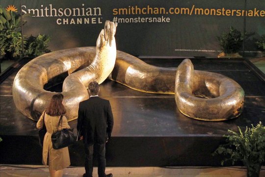
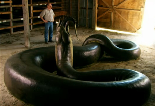
The Titanoboa, is a 48ft long snake dating from around 60-58million years ago. It had a rib cage 2ft wide, allowing it to eat whole crocodiles, and surrounding the ribcage were muscles so powerful that it could crush a rhino. Titanoboa was so big it couldn’t even spend long amounts of time on land, because the force of gravity acting on it would cause it to suffocate under its own weight.
828K notes
·
View notes
Text
Week 5: Literature Review Draft and Updating
My decision to work with the #STEM data set imported from twitter from this past March to June [due to data science at George Mason, Dr. Johri & Sheridan, and colleague Karbasian H.] began when I read Chen et al. 2014’s paper, “Mining Social Media Data for Understanding Students Learning Experiences.” [link]. Chen wrote a paper that talked about data mining student for student experiences. Her paper involved analysis of over 19000 tweets under the hashtag #EngineeringProblems made by students at Purdue University In her paper, she urged for a combined qualitative and quantitative approach to understanding large scale data. Chen et al. (2014) states (p.245, explaining inductive/qualitative analysis)
Because social media content like tweets contain a large amount of informal language, sarcasm, acronyms, and misspellings, meaning is often ambiguous and subject to human interpretation. Rost et al. [2] argue that in large-scale social media data analysis, faulty assumptions are likely to arise if automatic algorithms are used without taking a qualitative look at the data. We concur with this argument, as we found no appropriate unsupervised algorithms could reveal indepth meanings in our data. For example, Latent Dirichlet Allocation (LDA) is a popular topic modeling algorithm that can detect general topics from very large scale data [40], [41]. LDA has only produced meaningless word groups from our data with a lot of overlapping words across different topics. There were no pre-defined categories of the data, so we needed to explore what students were saying in the tweets. Thus, we first conducted an inductive content analysis on the #engineeringProblems data set. Inductive content analysis is one popular qualitative research method for manually analyzing text content. Three researchers collaborated on the content analysis process.
Chen et al. 2014 voices a critique of the use of topic modeling techniques like LDA and Bag-Of-Words in text mining for social media data. In light of this critique, Chen et al. 2014 approached their data set of more than 19000 tweets under the hashtag #EngineeringProblems first using a personal qualitative “inductive analysis.” Prior to implementing any unsupervised programming, they instead had researchers work together to create categories or topics that they saw in tweets. The researchers read 2000 tweets initially to form these categories, but several rereadings and recodings took place. In sum, their paper resulted in feedback on student experiences within engineering. Chen et al (2014)’s efforts resulted in a Naive Multi-Label Classifier that could, given a tweet text, classify it accordingly to the human-planned inductive analysis categories. This way, their report focused on relationships among categories and frequencies of terms, as well as how students voiced their academic experience. My decision to work with the #STEM dataset came from extending Chen et al (2014)’s work to a question of “what can be learned about academic, professional, and learning experiences from the #STEM hashtag, a topic about the engineering discipline?” While I would be interested to find discussion of student wellness in this dataset, I need to learn what terms people actually use in this hashtag and what they talk about. #STEM is an extremely public hashtag that holds a great amount of representation engineering both educationally and as a career profession.
My paper will report upon the accuracy of a combined qualitative and topic model clustering techniques as applied to larger set of social media that captures STEM as a discipline, in scope as a profession, interest, and academically. One of the main objectives of my project is to create a model that can elaborately work with a large scale dataset of tweets made under a discipline, like the #STEM hashtag. I will be providing mostly descriptive information about what is discussed and participation (retweeting, favoriting, replying, response to real world events).
A similar inductive analysis will take place, however… At the moment, I’m still in preliminary stages of “what do people talk about in the #STEM hashtag?” It’s a rigorous undertaking to plan an elaborate approach for coding and categorizing such large scale data. My dataset is of 198000 tweets. While I am considering Chen et al (2014)’s caution towards unsupervised techniques that lack human interpretation, my dataset is muh larger. For my large data set containing data on experiences relating holistically to educating, and for other large data sets based on high level questions collected over long spans of time or with large sums of money for reliable feedback, there are many places to start with qualitative analysis. Ultimately, I haven’t found evidence so far the student wellness is regularly discussed within the #STEM hashtag. The basic scripts and visualizations I’ve created so far have gathered basic spatial and temporal figures for evidence. I have two geographical plots and one time series plot, each containing 12000 data points/tweets. The geographic plot is not fully accurate and show some of the challenges of geographic disambiguation. It is made using code to read twitter json files, find the part where a user manually types their profile, then searching for the corresponding geographical coordinates on google maps api.

Figure 1: Geocoding plot of each of the 12000+ randomly selected tweets among the #STEM hashtag.
This figure was created with python and matplotlib
Code (Windows 10 Python 2,7 Anaconda distribution): (see end of the post, Appendix A)

Figure 2: Slightly more visuallly appealing portrayal of geographical analysis

Time series plot, spans from March 13th to June 5th
I made one of my research questions almost immediately after seeing the time series plot, “why did activity increase in late may/June?” I predict that it’s due to graduations for prep schools, higher education institutions, and so forth. Perhaps the whole month of June has vastly increased activity, but data collection ended on June 5th.
All steps of the research process should be devoted towards exploratory but strategic actions towards social welfare. So I’m using these preliminary visualizations as well as my topic model to really learn what people talk about within this hashtag, before narrowing my focus towards issues of wellness (if that is even a viable focus within this hashtag at all) IA more strategically planned analysis could be carried out within the #STEM hashtag and the many co-occurring hashtags it’s connected to if I use a combined qualitative and unsupervised topic model approach to see commonly used keywords in the dataset. The demand from big data is to try to use data and learning analytics to generate meaningful bodies of information from social media, a space where self expression and corporate/managerial processes intertwine. Social media contexts collapse micro and macro level processes in terms of context (Hogan 2016, The Presentation of Self in the Age of Social Media... [ [link]). . It is inevitable that researchers will seek large scale analysis of data sets for educational data from social media and MOOCs because this is what is currently accessible. I actually hope to perform a combination of qualitative stes and topic modeling. I’ve moved towards topic modeling because I feel that best speaks to the following question:
To perform topic modeling, I actually am stepping back and trying to implement an improved LDA algorithm for understanding context and I’m looking into other methods. However, LDA because the output of a model implementing this algorithm is a set of text documents and a topic assignment for each document, as well as the list words used to comprise each topic. I just need to make sure that the list of words generated by LDA among each topic make human-sense, not just unsupervised machine clustering sense. There are at least efforts I an undertake, including
Omitting low frequency words from the LDA corpus/text data
Batch wise LDA (Bansal, S. 2016, Beginner’s guide to topic modeling in python, link
Appendix A:
Code Python 2.7, Windows 10, Miniconda/Anaconda dist
Using the Basemap package installed for matplotlib and geocoding (NO INDENTATION):
def plot_small_percent_of_data(small=False, save=False):
print "Plotting 12000+ geographical coordinates attained via the google maps api for tweets with the #STEM"
if small == False:
all_records = pd.read_pickle(PATH_TO_DATAFRAME_DIR + "clean_geographic_dataframe")
print "HEADER LIST :", list(all_records.columns.values)
if small == True:
all_records = pd.read_csv("csv_dir/small_api_loc_with_coordinates.csv")
x_cords = list(all_records['longtitude'].values)
y_cords = list(all_records['latitude'].values)
# bug with basemap where the latlon keyword for .scatter(latlon=True) where it will only plot coordinates
# when they are sorted in order of smallest longitutde to largest
x, y = list(zip(*sorted(zip(x_cords, y_cords), key=lambda it: it[0]))) # sort coordinates
pairs = zip(x, y) # UNUSED VARIABLE
If verbose == True:
print x_cords
print y_cords
plt.figure(figsize=(12, 6))
map = Basemap(projection='robin', lon_0=180)
mscattered_plot = = map.scatter(x, y, latlon=True, marker='.', color='g', s=24, zorder=10)
map.drawparallels(np.arange(-90,90,30),labels=[1,0,0,0])
map.drawmeridians(np.arange(map.lonmin,map.lonmax+30,60),labels=[0,0,0,1])
map.fillcontinents(color='coral',lake_color='aqua')
map.drawcountries()
plt.title('Small Amount of Data Plot')
plt.show()
if verbose == True:
print(all_records['manual_location'])
print "PAIRS"
print pairs
#social media#data analytics#data#data analysis#big data#twitter#STEM#engineering#education#computer sience#computer programming#reu#research
0 notes