#which is also! my pinned audio + blog title + description
Text
hi reddit. here are some tips.
i will be putting these below a "readmore" - which is the first lesson. on desktop there is a button for this. on mobile you type :readmore: followed by a linebreak. it is considered common ettique to shorten your long posts in this way.
by the way, are you reblogging a long post that isn't under a readmore? tag that as #long post so users can blacklist it and not have to scroll for five years.
(weird gaps in bullet points due to character limits lmao)
Title. Icon. Banner. blog description. (look around if you need an idea for what to put in your blog description.) Blogs without this information (ESPECIALLY the no icon + no title combo) gets you blocked immediately. This is because tumblr has always had a severe bot problem. Just grab a meme from your camera roll or a picture of a character you like from google.
also, because most users have their pronouns in their bio, it is expected that you will look there to check before addressing them, out of courtesy. don't just default to "they" - only do that if a person's pronoun's are unclear or if the pronouns listed ARE "they."
Disable public likes. the like button is for personal bookmarking. very often, people will like posts they have not read yet, so that they can read them later. a person's likes is not always reflective of their stances, and if your likes are public, people may use them against you in an argument. think of your likes as your browser history. tumblr users value privacy in this instance.
unrelated to the above point: likes are also used to show compassion for a user going through a tough time, or to say "hey, i thought this joke you made was funny." this use of likes is more for friend-to-friend communication.
Disable anything in your settings that is algorithmic including seeing posts based on other people's likes (one, because algorithms exist to make you mad and two, as part of respecting privacy)
set "following" to appear before "for you" (and overall avoid "for you")
Snooze Tumblr Live (sorry. you have to do this once a week bc tumblr sucks.)
Open your askbox so people can communicate with you. Decide if you want to allow anonymous asks and/or public DMs.
Enable the desktop version of your blog. This makes it so that when you use a computer and go to [yourusername].tumblr.com you can have a website with HTML and CSS. tumblr has tried very hard to kill blog personalization but you can find many helpful users posting in the tags, as well as pre-made themes you can install. tumblr users are the ones making the bulk of neocities websites, and in general tend to be friendly in redirecting you to resources.
enabling your desktop blog also allows you to insert links and do very basic editing (like inserting line breaks) in your blog description (we call "bio") which translates to the mobile version of your theme. you have to do this in the editor for the desktop on a computer. also, editing your theme on mobile (like changing color, font) will undo your HTML. your best bet is to edit your mobile theme first and THEN do the HTML/link stuff on a computer. i know it sounds a bit convoluted but you'll figure it out. (this website is made of duct tape)
also while you are on desktop: download xkit rewritten. it won't work on mobile but it gives you a lot of helpful features. also consider installing ublock origin if you haven't already, because tumblr will sometimes add annoying widgets to their website and that tool will allow you to block them. i also use "palettes for tumblr" to customize my dashboard color. tumblr DOES have built-in dashboard themes but i do not like them personally.
pinned posts. you can pin any post you make or reblog. some people use this to pin a funny meme, and other people use the pinned post as an extended bio (or otherwise an alternative to it). a tumblr post made on desktop can hold up to 30 images (the limit is 10 on mobile.) you can also embed links, a video, and even audio. you can change text color, have bullet points, and increase font size. as such, you can express yourself much more in a pinned post than in your mobile blog description. a typical pinned post may include information about the user, a link to an external website (like a carrd, neocities, or linktree), and sometimes an image or two. tumblr allows you to disable reblogs for a post, so most pinned posts are set this way so it just stays on a user's blog.
DNIs (also called "BYF"). not everyone uses them, and they can be divisive. it stands for "Do Not Interact" - and is a boundary set to keep people away. this may include age (example: "minors DNI"), political opinions (example: "prolifers DNI"), and sometimes deeply niche online discourse. DNIs are also sometimes a joke (example: "DNI if you like tuna salad"). there is actually a meme where someone will write a post with a very long, unreasonable DNI and users will count how many apply to them.
If you would upvote a post on reddit, you would reblog it here. If you see something and you think it is cool, you think it is funny, or you think it is helpful, reblog it. Some users have sideblogs (you can have infinite sideblogs attached to your main account) to organize all of the posts they reblog. Others simply use a tagging system for organizational purposes (and so users can blacklist ("filter") those tags in their settings if they don't want to see the post). For example, if I followed a user for Star Trek, but they also posted a lot of Star Wars, I might add "#star wars" to my list of filters. This way, I am only seeing the Star Trek posts. Tumblr's default way of handling this is to display a box that says "this post contains #Star Wars" and you can choose whether or not to open it. on desktop with xkit rewritten, you can have it hide those boxes entirely. please use filters. your sanity will thank you.
In a reblog, Organizational Tags are for /you./ I see a lot of confusion about this from new users. If you reblog someone else's post and add 500 tags..... it's not going to get picked up in tumblr search. You're not going to get any sort of exposure. Because it is not your post. Those tags are only for /you/ - if you want to find the post again.
tags are also used for commentary. most tumblr users do /not/ talk in post replies or in the comments of a reblog. most of them talk in tags. tags have a character limit so these messages are broken up in fragments. tumblr uses a comma (,) to make a new tag, so users often use either no punctuation or a period (.) or a hyphen (-) to break up thoughts. two apostrophes ('') are used instead of quotation marks (because they dont work in tags). this is also where "tumblr writing style" comes from. we all began to write in lowercase and use punctuation in. a weird way. like. for emphasis. there is also the Tumblr Comma, a special unicode character that resembles a comma and works in tags when copy+pasted or put there with a keyboard shortcut. but this is often not used. here it is: ‚
also here's an example of tags. you will notice that commentary goes before organizational: #GOD DHSHSKDDJDL #i cannot BELIEVE i forgot about this. what the fuck #star trek #spock
when leaving tags, most users talk to themselves. but please remember that tags can be seen by anyone, including the original poster. in general, it is discouraged to traumadump or be rude.
"prev tags" (which tumblr staff is trying their damnest to erase sadly) is when a user reblogs a post from another user and tags it simply ''prev'' or ''prev tags" (meaning "i agree with the previous user's tags"). sometimes it's because a thoughtful observation was made, but usually it's a way of saying "hey! that was a funny joke!" without putting the user on blast by screenshotting the tags. it's most common between friends and mutuals (users following each other). i would say it is equivalent to users whispering to each other and giggling rather than getting up on a table and shouting. "prev tag chain" is when users reblog "prev tags" "prev prev tags" - and so on. however, sadly, tumblr has removed the feature of moving backwards in a reblog chain on desktop. i have not updated my app and refuse to, so i so not know if it is gone on mobile as well, but it probably is. EDIT: the browser extension Xkit Rewritten has an option now, in "tweaks" called "restore links to individual posts in post header." it should be the first option. prev tags, on desktop at least, is saved!
screenshotting someone elses tags and adding the image in a reblog is known as "passing peer review." it is, however, considered to be Greatly Annoying to accompany those tags with unnecessary commentary (ex: "these tags pass peer review!" "WHY WOULD YOU LEAVE THIS IN THE TAGS" "LMAAOO THIS IS SO FUNNYYY"). the tags can stand on their own. the only instance in which this is different is during a serious discussion, when you want to build off of another user's perspective. in which case, you address them as normal. some people credit taggers, some people don't. crediting tends to occur in discussions.
when making an original post, do not use irrelevant tags for Exposure. this is Greatly Hated by the userbase and is also against the TOS. you will get blocked at best, reported or yelled at at worst. only add relevant tags, and do not go overboard.
reposting other people's artwork is highly discouraged and is considered the Highest Offense. if you do any sort of reposting, you should credit and link to a creator directly. however, tumblr loves reposted videos, especially ones from tiktok. there are entire accounts dedicated to posting those.
sideblogs! it is possible to have multiple blogs under one email address. tumblr treats these blogs as proxies of your main blog. this means that sending someone an ask/commenting in the replies of a post will always appear with the name of your main blog, your likes will appear with the name of your main blog, and that if you follow someone you will appear on their followers list as your main blog (so you may be mutuals with someone and not even know it because their sideblog interacts with you, but isn't on your follower's list... because their main blog is listed there instead.) however, DMs DO appear as the sideblog name. you cannot swap your main blog with your sideblog. and right now, there is a bug where deleting a sideblog will delete your entire tumblr account so. don't do that lol. anyway, the amount of sideblogs you can make is literally infinite and i think there's just a Daily Limit of creating 10 of them or something. some users make a sideblog for each interest they have. others have no sideblogs and reblog everything to main. and then you have people like me that do both. somehow. some users will make sideblogs to hoard URLs. also sorry i'm just introducing this now, but that is what our usernames are called. because when tumblr was more desktop-oriented, every blog was literally a Personal Website. so ya. we call them "URLs." anyway, if someone wants to hang onto a URL for later, they might save it on an empty blog. this usually pisses people off. a "canon URL" is when someone has a URL that is like One Word or a Company Name or a Fictional character. hypothetical examples: "ketchup" "burgerking" "lukeskywalker." these are highly rare, coveted, and you look cool as hell if you have one.
tumblr's /\/SFW policy (/\/ is an N. i've censored it.) is best described as ???. posts that are safe for work get marked as /\/SFW and hardcore p0rn somehow persists. in general, be very wary of posting even artistic nvdity (even though it is supposedly permitted.) never deliberately mark your own posts as Mature. this is essentially like walking directly into a bear trap and waving a big sign at tumblr staff saying "hey! make it so people can't find my blog and i'm far more likely to get banned!" also do not tag posts with "/\/SFW." too many of those will get your entire blog marked as mature (which makes your posts pretty much invisible to other users.) tumblr users used /\/SFT (/\/ot safe for tumblr) for a long time, but staff caught on. there is now no consensus and people use their own personal tags for it. just pick something and people will catch on and blacklist it if need be. (btw you CAN type whatever you want on this website. i am only censoring in the hopes that this will allow my post to appear in the tags. this isn't tiktok lol)
while it is possible to disable reblogs on a post, this is a very RECENT addition and most users forget it exists. as such, please use common sense. if someone has written a post about, say, how sad they are feeling because they got in a fight with their family... that's not a good post to reblog. a like would be better here, like a pat on the back.
we LOVE polls. we love them. they are like sports to us. most of them are popularity polls - who is the better character? but people also use polls for, say, making bug emojis "race" each other. or "lets build a cake." other people use polls to write poetry, or learn about regional differences, or even to draw a pen!s. if you tag a poll as "poll" it will most likely be seen and voted in, because users look in the tag to find buttons to click.
there is unfortunately a T3RF (this one censored specifically to protect my notifs lmao. 3 is E) presence here. report, block, ignore, move on. common courtesy for users to inform each other if one is accidentally reblogged from. it also helps to blacklist tags related to them to avoid them. use shinigam! eyes browser extension on desktop.
there is NO equivalent to reddit awards on this website. as the userbase hates the staff, it is considered blasphemous to spend your money on checkmarks, etc. - buying them as a gift for another user is seen as a hostile act. it's like receiving a "kick-me" sign. once owned, badges cannot be deleted. thankfully, tumblr now allows you to disable checkmarks and other badges from appearing publically. that said, some users also give checkmarks unironically to show appreciation??? and others buy checks for themselves???? so yeah. tumblr doesnt actually have a verification system - these exist to mock twitter and to make a quick buck.
tumblr blaze. essentially, tumblr has a system in place to showcase user posts instead of advertisements sometimes. this is done by the user paying money. the higher the amount, the more impressions. tumblr users can now also blaze OTHER PEOPLE'S POSTS. MAKE SURE YOU HAVE BLAZE DISABLED!!! blazing another person's post (without asking first) is seen as a hostile act. why? because most blazed posts result in rude comments from strangers who are annoyed to see the post on their dashboard. unless it's like, a cute picture of a cat. or something genuinely helpful. boosting your soundcloud or a selfie or a rant about fandom does not typically garner positive responses. you can blaze just like. watch out. and also always ask the OP if you want to blaze someone else's post. (there is a reason this feature is called "blaze pvp")
tumblr merch is also frowned upon, as tumblr staff steals ideas from the userbase and profits off of them without financially compensating or crediting the users. there was a meme on here, "vanilla extract", that tumblr turned into water bottles while the person who made the meme was having to fundraise to survive :(
BLOCK. LIBERALLY.
umm i think thats it for now. but like if you have questions feel free to launch them into The Void with some tags and users are pretty quick to help out! hopefully i covered some stuff that other ppl haven't
164 notes
·
View notes
Photo

the theme I don’t know how to describe because it has too many things featured in it and it will take a year or
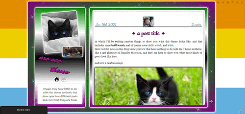
aro-ace theme!
note that you are allowed to use the theme for whatever you want, change all colors, images (you want to make it a marvel thing? go for it! It’s personal and you want to use other flag colors? go pick those rainbow colors!), but my inspiration was, well, not having seen aro-ace themes before and wanting to make one. I didn’t upload background images but you have the option. Feel free to edit as you please, just don’t remove the credit or claim it’s yours!
as always in the source you’ll find the link to the post with static preview, code and instructions/extra credits.
theme is contained, responsive, super customizable. It’s free! But as always consider donating to my ko-fi as this was a lot <3
like or reblog if you use! (or just if you like it, if you want to!)
this post will have: what you can edit from custom page, the widgets/scripts used with credits and some explanations. Asterisks * next to something will indicate that more about it will be said in the linked post. I’d apologize for the length but it’s due to how many things I added to the theme and that you should know about.
now, what can you edit from your customization page:
-nearly every font and its color and size, so that if a font is by default bigger than others you can easily reduce the size. There is a select menu for the body font with all the fonts present in this blog, so you know what they are and can type the one you want for other eleents. I think I only left a couple to be edited from the editor, like your quotes posts if you reblog them a lot. This includes h2 as it’s what you use as ‘big font’ in your posts and h3 in case you want to personalize it and use it for something on purpose, as it has to be added to the html of the post.
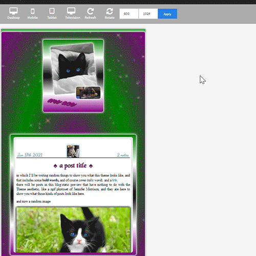
-one of the new things:I used a gradient for the backgrounds of the big container, the sidebar and the posts container, but also of tumblr’s default music player (latter done initially following @octomoosey‘s tutorial then messed with by me hence no album art). See static preview posts. You can type the colors straight from the costomization page like this:
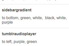
if you want one solid color you can just write, for example: black, black as it needs at least two. To bottom/To left/to top/to right change the direction. The only thing you need to edit from the html is if you want to go from linear-gradient (like you see in the sidebar) to radial-gradient (like in the big container which has green in the center and purple on the outside) and vice versa, if you want.
-you can also upload background images of the sidebar, container and bigcontainer and select the optional blending with the colors, which can be none and you only see the images or something like screen or hard-color and check the results (bigcontainer as an overlay gif on Screen now)
-more typing: you can paste the symbol or the symbol code for the list items and the decorations around the post title, right now both being spades. *
-you can upload up to five background images if you enable the ‘changing background’ function otherwise only the first one counts. They will change when you refresh the page, thanks to @lmthemes
-you can turn on and off the music box (player3 by @glenthemes ), and if it’s enabled you can add two songs from the customization page (or go to the html editor and up it to four before it can get messy as it shows on hover), typing url, author, url of the album art, and song title. You already have We Are Golden by Mika as an example (takes a second to start due to the recording, watch out not to get scared if there is silence and then the first note)*
-optional searchbar in the sidebar with optional suggestions when you click on it (if you want them though you’ll need to go to the editor to type links and names, but you can turn it off and just keep the searchbar, like I said) also by glenthemes’ tutorials.
-the separator between text posts image is also optional and if turned on, you can also turn on and off whether the image is the avatair/portrait of the person who made the post, with a link to the original if it’s a reblog, or if you want the image to be one you upload yourself, 50x50px and it should resize to fit in (also with a link, in this case to the post itself so you can open it from the top of the page). One is the toggle button ifshowtinyimage, and the other is ‘tinyimageisthesource’, if you turn that off you upload the image yourself. If you add a source to your posts, it will appear among the permalinks regardless.
more under read more!
-besides all normal colors and borders you can pick the color of the border/glow/shadow (call it as you want) of three different categories, or turn it off: the mainglow for big elements like containers and sidebar and sidebar images, the audios glow for players like spotify, regular one or soundcloud. Finally the images shadow when inside your posts. The latter is set on inherit because it means that if an image is also a link like your tiny-image it will be of the same color of your links and change on hover. That is something you can only change on the editor by searching for color:inherit and change it to what you want, if you don’t want to turn it off.
-askbox colors have been changed with @eggdesign‘s tricks! look for ask_form in the editor and try changing the number of filter there to see more effects. Also the askbox never shrink, a fix by @whateverhtml
-pinned post has a little banner, styled like permalinks.
-you can pick a color for top-info which are the date and notes. I left it empty because it automatically gets the default links color but you can pick it yourself.
-turn on and off unnested captions looks for textposts and for all other posts (as people who use xkit to edit previous posts will get blockquotes anyway and may not like the final result) thanks to @annasthms code.
-blockquotes are of alternating colors, by @bychloethemes. You can obviously choose the same color if you want them to just have the one. You can also select the type of blockquote, if a solid line or dots or dashes.
-you can choose if your smaller sidebar image, sidebarimg2, is an image you’ll upload or if it’s your avatar/portrait by toggling it on and off. If you don’t want sidebar images and you don’t upload any, there are instructions on top of the html to delete the border so you only see the sidebar bg. (basically just delete their box-shadow)
-speaking of which, your title will wrap around the second image like in the preview. If that doesn’t work for you you can try changing sizes and font or by going to the editor and changing the margin-top so it’s out of the sidebar image’s reach and can be a “straight line” again (in case it doesn’t fit and the long title is cut in the wrong place)
-you can turn on and off a copy link of the post button on the far left of your permalinks bar, so people can copy the permalink from dash - also by glenthemes.
-navigation links have two alternating colors, odd links right now are black, even links are white, and their hovers are the opposite of that. You can make them all of the same color, in which case you’ll need to look for .navilink a:hover and change the hover color for both. If you have custom pages and enable the link to show it will be automatically added. To change the cat icons just search for ‘cat’ and replace as pleased. To change the ask icon because maybe you don’t have them enabled look for ‘envelope’ with your ctrl + f. You can type urls and titles of navi links from the custom page, the first two are automatically home and ask, there are three more under the description. All icons from font-awesome have a black border so the white ones don’t disappear on light backgrounds, you can change that looking for .fas
-you can select post-sizes: 400, 450, 500, 540. Whether the sidebar is next to the container or on top will depend on your post size and the screen width as at some point they may not fit. They always do fit on desktop though, and on screens that are smaller than 800px the sidebar is assumed to be on top and will have a max height of 300px (but you can scroll down). I couldn’t make the bigcontainer get bigger for giant screens as I can’t calculate the right size in which all post-sizes + sidebar will look good.
-lightboxes show images with a glow too. Speaking of which you get lightboxes as always, pxu photoset fix and video resizing fix all by @shythemes and with the bychloethemes fix. npf photosets fix by glenthemes. No href.li addition from tumblr when you add a link to a post by @magnusthemes.
-soundcloud player is minimal and its play button is the same color of your permalinks icons thanks to shythemes tutorial. spotify is also minimal, instructions to change it are there.
-tumblr controls are small and semi-transparent until you hover, also dark regardless, followed painthemes tutorial.
-chats are styled like imessages by ncrthlanes now deactivated, submit posts have at least the submitter’s url recognizable, reblogged asks also get a background for the answer as well as borders, link posts are styled as much as a link-post can be styled.
-there are already links and similar things written to be an example in your customization page but in any case you get instructions in the editor and everything is divided in sections as much as possible. Also I’m here for any questions.
#asexuality#aromance#aroace#lgbt#aro-ace#themes#free themes#free resources#evansyhelp#dailyresources#rp themes#rph theme#rpc#main theme#lgbtqia#dustyresources#onlyresources#completeresources#my themes#tumblr theme#rp theme#theme 08#mine
58 notes
·
View notes
Text
RECENT NEWS, RESOURCES & STUDIES, late February 2020
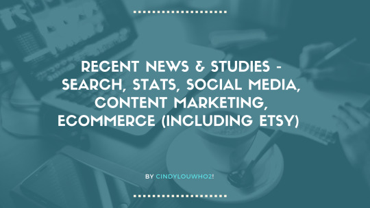
Welcome to my latest summary of recent ecommerce news, resources & studies including search, analytics, content marketing, social media & Etsy! This covers articles I came across since the early February report, although some may be older than that. I am a bit behind due to my trip last week and other events, but some things here are a bit time-sensitive so I wanted to release this now.
I am still looking into setting up a new ecommerce business forum where we can discuss this sort of news, as well as any day-to-day issues we face. I need some good suggestions for a cheap or free forum space that has some editing tools, is fairly intuitive for inexperienced members, and is accessible. If you have any suggestions, please reply to this post, email me on my website, or send me a tweet. (I will put out a survey once we narrow this down to some good candidates, but if you have any other comments on what you want from such a forum, please include those too!)
As always, if you see any stories I might be interested in, please let me know!
TOP NEWS & ARTICLES
Since we are seeing more shops closed due to Etsy’s customer service level standards, my blog post on ODR now has major revisions explaining what we have learned, and includes some tips for staying out of trouble and if necessary, appealing a suspension. Please circulate the info widely, as many sellers still haven’t heard about this, and some were closed without having any clue this was possible.
Mobile continues to grow while desktop use is slowly shrinking. It should affect how we design web pages. “Mobile visitors also behave differently from their desktop web counterparts, staying on pages for shorter periods of time, for example.” Other interesting takeaways from this SimilarWeb report: “[Facebook] lost 8.6% of [web] traffic over the past year alone” but increased in app sessions.
The price of domains ending in “.com” will almost certainly be going up soon, and will go up most years after that, unless something changes at the last minute. If you are absolutely certain that you will continue to use the same domain name for your website, blog, ecommerce forwarding etc., then you might consider paying a few years in advance to save a few bucks.
Another article explaining how people are selling thrift store and vintage clothing on Instagram, without setting up a checkout/cart anywhere. (The article focusses on teenagers, but does reference other examples.)
ETSY NEWS
Two weeks ago, Etsy Support posted on Twitter that they were no longer monitoring the account, and asked everyone to use the help page maze instead when they need support. Forum thread here.
Another trend report for 2020 from Dayna Isom Johnson [podcast links & transcript] She leads off with tips on how to get featured: “ so it's incredibly important to see a bright representation that really clearly shows your product...Do be original. I'm always trying to find the latest and the greatest that isn’t already on the shelves...Do be inclusive. ... I'm talking about models of all ethnicities, all genders, all body types, all ages.” Etsy chose chartreuse as their colour of the year: “in the last three months, there's been a 12% increase in searches for green already, and a 55% increase in neon green.” The wedding trends part was mostly already covered in a blog post, but she does also answer a few seller questions.
Website user experience (UX) is a big part of getting people to convert, and an outside group ranks Etsy’s as “acceptable”. Many will be unsurprised that search gets a score of “mediocre” and Accounts & Self-Service get a “poor” grade.
The migration to Google Cloud services is complete, so now Etsy can run more experiments more often, including those involving AI. (Although the forum thread was laughing at the idea of bad reviews helping shops, there is actually some research supporting that, so it is a logical thing to test.)
Etsy sellers in the US, UK & Canada who use Instagram can apply to win a trip to Etsy HQ here, until March 1.
Etsy is launching an Etsy U program which just seems a bit sketchy. Forum thread here.
Reverb (owned by Etsy) named a new Chief Technology Officer on Feb. 18.
SEO: GOOGLE & OTHER SEARCH ENGINES
Google does not confirm every large search update, so this one remains a mystery at the moment, since Google refused to give an answer. That means it’s not a core update.
Another video (with subtitles in several languages) from the SEO for Beginners series from Google, on the basics you need for good website SEO.
If you are interested in “searcher intent”, this 500 person survey asks about what people are really looking for, and what they think of the search results the end up with. Overwhelmingly, they say they prefer organic results to ads, and the majority see targeted ads that they can’t figure out the reason/s behind. “Sixty-eight percent responded that Google adding more ads to the search results would make them want to use the search engine less.” Also, a slight majority preferred text results to images, video, & audio.
“When asked which factor had the most significant impact on their decision to click a result, 62.9% responded it was the description, followed by 24.2% who said the brand name, and 13% who said title.” That means that the first part of your Etsy listing description, or the coded meta description on a page on your website, has the most influence on people clicking on your link once they see it.
I usually strongly suggest that people setting up their own websites make sure they do some SEO work & keyword research for their category/shop section pages, and it turns out that there is new research showing I am correct. “Specifically, e-commerce category pages – which include parent category, subcategory and product grid pages with faceted navigation – ranked for 19% more keywords on average than product detail pages ranked for. The additional keywords they ranked for drove an estimated 413% more traffic, based on the keywords’ search demand and the pages’ ranking position. With optimization, those ranking category pages also showed the potential to drive 32% more traffic.”
Semi-advanced: explaining the (seemingly endless) debate on whether subdomains or subdirectories are better for SEO.
SEO study - do you really need to use H1 tags on a page? Maybe not, although some screen readers recognize them as the page title so they help with accessibility. (Etsy & many other marketplaces don’t let you make this coding choice, so don’t worry about it there.)
Confused about how to apply all of these SEO tips I post here to your Shopify site? Good news! Here’s a list of what is most important for Shopify SEO. Note the attention to setting up your category pages, which is something I completely agree with. (it’s by Ahrefs so of course it pushes their tools; you don’t need to pay for that.)
CONTENT MARKETING & SOCIAL MEDIA (includes blogging & emails)
Some businesses say social media doesn’t work, but maybe they aren’t doing it right. See if you are making one or more of these three mistakes. “Understanding who your target audience is - what they want, what they need, where you fit in, etc. - is critical to maximizing your social media marketing performance.”
Email marketing also works better if you do it right, so here are 5 things you might be doing wrong. And if you like a quick read, here’s an infographic on the psychology of email marketing.
8 ideas for getting more interactions on Facebook (detailed infographic).
More fourth quarter reports continue: Pinterest’s 4th quarter revenue was up 46% but they lost $1.36 billion, and they are introducing a verified merchant program. “Almost all (97%) of the top searches on Pinterest are unbranded, according to the company, giving merchants a chance to stand out.”
Want to tap into that Pinterest traffic? You should because “90% of weekly Pinterest users log in to make buying decisions.” Here are 10 ways to get more attention, followers, and pins.
Like almost all social media, Twitter has an algorithm that mediates what users see (although you can turn it off, or use apps such as Tweetdeck to get around it as a reader). Ranking factors include recency, engagement, media and activity. The article includes a few tips on how to make it work for you, but then slides into promoting its app as the solution - you can just skip that part.
ONLINE ADVERTISING (SEARCH ENGINES, SOCIAL MEDIA, & OTHERS)
Google search ads get more results than Facebook and Instagram, simply because more people who see them want to buy something. “Less expensive products tend to sell better than more expensive ones on Facebook and Instagram, per the study.”
If you are running ads where you can choose your keywords, don’t forget to examine your organic search results and impressions for new words to advertise. Google Search Console is a great source.
If you found Instagram ads too expensive, check out this post on how the ads are priced, which can help you make decisions on your spend.
ECOMMERCE NEWS, IDEAS, TRENDS
Amazon has nearly 40% of the US ecommerce market, according to a report by eMarketer. Etsy is not in the top 10; eBay is 3rd behind Walmart.
Sales on Shopify sites during the Black Friday-Cyber Monday long weekend went up 61% to $3 billion in 2019. They claim that the “direct -to-consumer” approach can be successful for both big & small brands.
Japanese authorities are going after Rakuten for the ecommerce company’s push to make its sellers offer free shipping.
eCommerceBytes’ annual Sellers Choice survey placed eBay first out of the online marketplaces that were rate. Note that this is not a scientific survey and largely covers the site’s readership only. Bonanza was the most improved & Etsy showed the worst drop (from 1st to 5th place).
A review of that article last month that says ecommerce sites should have info pages as well as product pages, if only for SEO reasons. The author approves.
The CBC show Marketplace did a large test buying branded items on AliExpress, Amazon, eBay, Walmart and Wish. It turns out that most were fake.
Facebook’s cryptocurrency plans (Libra) finally have a partner: Shopify. The potential benefits include no credit card processing fees.
BUSINESS & CONSUMER STUDIES, STATS & REPORTS; SOCIOLOGY & PSYCHOLOGY, CUSTOMER SERVICE
Younger people (think Gen Z) expect to see gender treated expansively and beyond traditional stereotypes, and they expect this from companies and advertising. “Half of women and four in 10 men in the U.S. now believe that there is a spectrum of gender identities, according to a recent Ipsos poll titled "The Future of Gender is Increasingly Nonbinary." An additional 16% of those surveyed said they know a person who identifies as transgender”
MISCELLANEOUS (including humour)
Google employees are pushing back against the sea change in the company’s culture and values - and some are being fired.
Turns out that the “Peleton Wife” ad might not have hurt them as much as you might think. However, their stock dropped 12% after the fourth quarter report showed a 77% increase in revenue that still managed to be below market predictions. Interesting discussion around going viral in a negative fashion.
#Cindylouwho2newsupdates#seo#search engine optimization#search engine marketing#Etsynews#etsy#social media#Contentmarketing#Content marketing#ecommerce#Smallbiz#Seotips#Customer service#Ppc advertising#onlinemarketing#ecommercetips#EmailMarketing#socialmedianews
3 notes
·
View notes
Text
HOW TO REPURPOSE BLOG CONTENT IN 2020 AND BEYOND
Want to know how to repurpose blog content? This video will show use the best content creation strategy, how to repurpose content and my secret repurposing content method. If you’re looking for some top content marketing tips, content ideas for social media or some content creation hacks, this video will show you some content creation tips to help you with your content marketing strategy.
Click here to watch the video on YouTube.
Resources & Links Mentioned In This Episode
COACHING: Want to boss your online presence? A Branch of Holly is now accepting applications to work with Holly 1:1. Check out the details and book a call here.
TWEET THIS VIDEO
**Click HERE to SUBSCRIBE for more videos
Download the BOSS Traffic Flow Checklist
LISTEN: "How To Create A 3-Month Content Calendar"
LISTEN: “Batch Working 101”
The way we create content today has completely changed. So how do you create content that people actually engage with? How do you create content that increases your visibility, and how do you actually get ahead on content creation? We're diving into all of that and more today.
Here's the deal. I have been creating content for a very long time, and I feel like I've now mastered the art of creating a lot more while doing a lot less work. And I know that sounds a little bit weird, so let me explain.
When I first started creating blog posts and then videos and podcast episodes, I instinctively knew that I needed to be sharing them out on more platforms. So I'd create all of these mini graphics and quotes to drive traffic back to the original content, and I'd share them out on Facebook and Twitter.
And then all of a sudden there were all of these other platforms I had to think about. And it all became super overwhelming, and I was like, hold on a minute, do I need to create content for each new platform? Do I have to create individual, new pieces of content for each specific platform? How are you supposed to keep up with all of that? It just became super overwhelming and I couldn't keep up with it all.
And then I decided to take things right back to basics, and I figured out where I really thrived and how I could use that to my advantage. And you can do the exact same thing. So you can do less while creating more, and reaching more people, and having a bigger impact.
So I'm going to break that down for you. Now, if you were my client and I was coaching you on this, the first thing I would ask you is, "Well where do you thrive?" And for me it was always written word. Writing blog posts came so naturally and really easy to me and so it just made sense to follow in that direction.
But really you have four options when it comes to deciding what kind of content you want to create and how you can use that pillar content to create more content from that. I don't know how many times I'm going to say content in this video, but there you go, you can keep count if you want. So basically you have video, you have audio, you have written word, and you have images. Those are the four categories of content that you can create.
So first of all, what is your platform of choice? Comment below and let me know which one of those comes most naturally to you, because that is honestly the easiest and the best place to start. So what you really want to do is figure out which of those platforms plays to your strengths and then use that to create, what I like to call, and I actually just mentioned it, your pillar content. That is your pillar piece of content, and it is going to help you create content for every single other platform. And you won't have to reinvent the wheel or have unique content for every individual platform, because that's just not humanly possible unless you've got a massive team behind you. But when you're first starting out, that's just not doable.
So what is the best content strategy for 2019, 2020 and beyond? Drum roll please. Repurposing and repackaging. Don't worry, it's very simple, and I'm going to break it down for you how I do it in my business and how I turn one piece of content into many other pieces of content for multiple platforms. So this is broken down into two rounds. And round one starts with your pillar content. Now for me, I have two pieces of pillar content. I have my weekly blog post and my weekly podcast episode.
So let's use my YouTube video tutorial of how to add a Pin It button to Squarespace as an example. This is how I take that one video and turn it into all of these different pieces of content for all of these different platforms. I repurpose it and then I repackage it.
Step one is creating a mini teaser to go on Instagram. And the purpose of this is to direct traffic to the latest episode on my YouTube channel. It uses the exact same footage from the YouTube episode, and then I also do an Instagram Story. And again, it's using the same footage from the original YouTube video. Then I post to IGTV as well, so it's repackaged in the IGTV 16 x 9 format. But I don't post it on the same day I post to YouTube, because I want all the traffic going to YouTube so I can get more results long-term from all the views of traffic that are going there in that first 24 hours and that first week. So IGTV, the full video doesn't go up until a few days, almost a week, later. And that's exactly the same thing with Facebook. For a YouTube video, I post the whole YouTube video natively, meaning I upload the video directly to Facebook a few days to a full week later as well. And for the podcast I would share a teaser of that on the day the podcast episode goes live to direct people to go and listen to that latest episode, and I would upload that natively to Facebook as well.
I also use Twitter graphics. So sometimes this is just the title graphic for the podcast episode or the thumbnail for the YouTube video. And sometimes it's quotes from the podcast episode or YouTube video. But sticking along the YouTube theme as well, I've started putting my YouTube videos on my podcast as well, and I love my podcast. It has truly been a real experiment for me, and it honestly started off as just something that I wanted to try out. It was something that I really wanted to do, but never did I think it would become one of my main pillar platforms, and it definitely has turned into that.
Now a little preface to that, because I do believe in the power of focusing in on one platform at a time and really growing that platform. That's what I did when I first started out, because especially using this strategy, that one platform will grow everything else.
But other times, what I'm going to start doing more of as well, is repurposing my YouTube videos. So taking the audio from the YouTube video and putting it as a podcast episode with a new intro and outro. So just making it a little bit more formatted and packaged to the audio-specific podcast platforms. But it makes it so easy to pump out a lot more content when I'm repurposing and repackaging rather than trying to create all new content all of the time.
Now for all of the blog posts, podcast episodes and YouTube videos I create as part of my content creation strategy, what makes this even more effective and so powerful is I try to do all of these well in advance. So I'm a big believer, as you know, I believe that you should absolutely batch content. I think if you don't batch content it's really hard to stay consistent, and consistency is one of the biggest problems and biggest hurdles that any business owner can face.
So you may want to do a fresh new piece of content and jump on a trend one week, but at least you have all of this backup content as well. So I've created plenty of podcast episodes on this. I would highly recommend listening to last week's podcast episode on how to create a three month content calendar, and also episode number 24 which is called Batch-Working 101. I definitely recommend you listen to those and check those out, so I'll leave them linked in the description below. These are all about how you can batch your content ahead of time, and how I took three weeks off from my business to get married, and I didn't skip a beat. I had fresh new content coming out, I stayed consistent, and it was all because I batched ahead of time. So it's really, really powerful to continue to expand your reach and make an impact without having to be consistently working on creating content.
Now this brings us into round two. So the most important part of round two is focusing on the comments that come up. When you post these pieces of content to your pillar content... so remember that for me is my weekly blog post and podcast episode, for you it might be YouTube as well. Whatever it might be, pay attention to the comments and the feedback, because the comments and the feedback will tell you exactly what resonated and what hit home the most for the people that were viewing your content. And that allows you to create even more micro content from that one piece of pillar content. So the really cool thing about this is that you have all the content there right at your fingertips once you create that one piece of pillar content.
So here's another really amazing little hack or trick that you can use. Whenever I create an audio piece of content or a video piece of content or a live stream of any kind, what I'll usually do is get it transcribed, which is really important for SEO purposes, especially for YouTube and for blog posts as well, which is one of the steps I always recommend you do. And then I'll take that and I'll take little pieces of it and turn them into quotables and graphics for Instagram and Twitter. These are based from that one piece of content that I know really hit home and got a lot of engagement. So I know that on other platforms, if I repackage them, they'll also get a lot of engagement.
I want to share a real-time example of this. So I did a live training series recently, and I could tell that one of the things I said in one of the days of my training series really resonated with people. So I took that line and I decided I'm going to repurpose this, because I've listened to the comments, I know that this really stood out for my audience, so I can repurpose it and repackage it without having to think of any new content, and create a brand new post out of it. So I took that one line in my caption, reposted it and repackaged it, and it ended up getting so much engagement.
Another thing you can do, if you ever do speaking engagements or workshops, is take that and turn it into a bunch of micro videos. And as you are listening back, you might find that one part of your speaking engagement got more engagement than the rest. So then you can be like, well, I might as well take that micro piece and turn it into an Instagram video. That becomes a native piece of content. And it's not a new piece of content because it's what you did in your speaking engagement, but it's repurposed and repackaged so you can expand your reach even more and get a bigger impact with your content.
So this is so amazing because I can show you my content calendar and you would see how one piece of content can become so many pieces of content. And they last for months to come. One blog post, one podcast episode, one YouTube video can turn into a whole week's worth of content. And they go on to all of these different platforms. So I'm not constantly creating new content. I'm repurposing and repackaging my content to go on all of these other platforms.
And this one piece of pillar content is creating content for weeks to come across all of these different platforms in all of these different versions. So I'm making content for Instagram, Facebook, Twitter, Pinterest, all of these places, from just one piece. And I'm able to schedule things so far in advance that I'm never really stressed about content creation. I'm basically always able to work in advance, and it gives me that flexibility, like I said, if I want to create a blog post on a whim I can definitely do that, but I also have this bank of content sitting there waiting, ready to be used just in case something happens, or you get sick, or your schedule goes crazy. This is why it's so important to the consistency and sustainability of being a content creation machine.
As someone who has been active on social media for over six years, believe me, I have tried everything. I've tested everything, every tool, every gadget, every tactic, every strategy, every platform, every technique, and this is truly the best strategy out there. It just works and it makes your life a whole lot easier.
If you are ready to simplify your marketing strategy and attract more clients and customers online, be sure to join the Busy to Boss Community on Facebook today and get daily prompts to start working towards your goals. The link is below this video.
So if you liked this video, take a screenshot right now, and share it out on your Instagram, and always remember to tag me because I love seeing your feedback. If you haven't subscribed yet, make sure you hit that subscribe button and then hit the little notification bell to be notified every time I post a new video, which is every single week, and give this video a like if you found that it really helped you. I'll see you in the comments and I'll see you in the next video. Thanks so much for watching and keep bossing it.
PIN THIS POST
from Blog https://ift.tt/31p2HQ0
via IFTTT
0 notes
Text
Taylor 110e Acoustic Guitar Review. The Blogging Musician @ adamharkus.com
I didn’t have a single issue with my Taylor 110e acoustic guitar in the 10 years spent with it. So why did I let it go?
Outdated electronics
My Taylor 110e featured Taylor’s now-defunct ES-Blue pickup system, devoid of any such niceties as EQ or an even end-pin mounted jack. Battery access? well, that was installed directly onto the inside of the top. You couldn’t really get more basic or rough around the edges, with the jack socket protruding untidily out from the same position as a Les Paul, or in other words exactly where you don’t want it for mostly sat-down acoustic work.
Taylor has since moved on with their far superior 3-band Expression system.
In practice, the amplified tone isn’t offensive, but the chances are it won’t be perfect for the venue either, in which case you’ll need outboard eq, which is a chore. The tone is exactly what you’d expect, which is a clean electric tone with a dash of acoustic, rather than pure acoustic what you’d hoped it to be, it seems rubbery and unresponsive, predictably synthetic, and worst of all, uninspiring.
Spec for the money
At the time of purchase (around 2005), we were talking £450+ for a solid Sitka Spruce top with laminated Sapele sides. These days, fully solid instruments can be had for less, and with far superior electronics to boot.
Build Quality
Rudimentary electronics aside, the construction of the Taylor 110e is rather shabby, to say the least. First off is the bridge, billed as ebony, but as it turns out it’s a lighter coloured wood with a darker finish, which started to peel away almost immediately.
The headstock is similarly low-rent, with a very cheap-looking white transfer Taylor logo on a black veneer (since upgraded to Indian Rosewood on later models).
Soundhole ornamentation is a simple as it gets, but more disappointingly, the back and sides or also very scruffily finished. Some would say the thin lacquer coating is a benefit. I’d say it’s merely slapdash.
All in all, not the tidiest of packages.
Lack of Personality
I’ll always remember the first strum on the Taylor 110e. Its acoustic tone is bright, and a real eye-opener compared to what it was replacing, a Simon & Patrick Cedar SP6 (Closest recent model here). But more than the brightness was the clarity and an uncanny, almost chorus-like sheen. For a time I revelled in the zing of the piano-like bass note tones, which were a world away from the woody thud of the Simon & Patrick (my main reason for letting it go), the increase in volume, thanks to the Taylor 110e’s signature ‘bowled’ back, the Taylor calling card of electric-like neck dimensions and playability, and the rock-solid reliability and kudos of USA-built instrument by one the best name in the business.
But as the years went by, the Taylor provided me with nothing new. No issues, no breakages, no degradation, but also no fun, no inspiration, no surprises, no personality.
And then I began to realise, for vocal accompaniment, its main job, the Fender-esque icy response of the Taylor wasn’t really a good foil for the similar qualities in my voice. The Simon & Patrick, with its earthy bass and muted high end, was a better match, and as a result, that guitar got a lot more songs out of it despite its on-paper inferiority.
It’s not all about specs and brand
So there you have it, I was almost heartbroken to see the Simon & Patrick go. Despite its flaws, it had all the songs, all the history, It had become a friend, even accompanying me to Goa (full story here). When it went, a part of me went with it.
On the other hand, I had the Taylor 110e for longer, but there was no sense of loss at all. It had delivered, yes, but it hadn’t inspired, I hadn’t fallen in love with it.
As a musician and songwriter, I truly believe our very best work comes from using instruments that have that extra-special something, beyond specs and brand. It’s that deep, comforting connection of knowing it’ll surprise you in inspiring ways, gift you an idea or even a whole song. Guitars are not just a collection of parts, they have the capacity within them to change the world.
… I really miss that Simon & Patrick.
Taylor 110e Sound examples.
Take a listen to a couple of my own Tracks featuring the Taylor 110e
This Is Who I Am
You'll Find A Way
{"type":"audio","tracklist":true,"tracknumbers":true,"images":false,"artists":true,"tracks":[{"src":"https:\/\/adamharkus.com\/wp-content\/uploads\/2017\/07\/Adam-Harkus-This-Is-Who-I-Am-07-This-Is-Who-I-Am.mp3","type":"audio\/mpeg","title":"This Is Who I Am","caption":"","description":"\"This Is Who I Am\" from This Is Who I Am by Adam Harkus. Released: 2016. Track 7.","meta":{"artist":"Adam Harkus","album":"This Is Who I Am","year":"2016","length_formatted":"3:02"},"image":{"src":"https:\/\/adamharkus.com\/5077\/","width":340,"height":340},"thumb":{"src":"https:\/\/adamharkus.com\/5077\/?w=150","width":150,"height":150}},{"src":"https:\/\/adamharkus.com\/wp-content\/uploads\/2017\/07\/Adam-Harkus-This-Is-Who-I-Am-03-Youll-Find-A-Way.mp3","type":"audio\/mpeg","title":"You'll Find A Way","caption":"","description":"\"You'll Find A Way\" from This Is Who I Am by Adam Harkus. Released: 2016. Track 3.","meta":{"artist":"Adam Harkus","album":"This Is Who I Am","year":"2016","length_formatted":"2:33"},"image":{"src":"https:\/\/adamharkus.com\/5077\/","width":340,"height":340},"thumb":{"src":"https:\/\/adamharkus.com\/5077\/?w=150","width":150,"height":150}}]}
You can also purchase my album. This is Who I am on Amazon, Apple Music, Google Play Music etc.
Taylor 110e Acoustic Gallery
Taylor 110e Acoustic Guitar Review. The Blogging Musician @ adamharkus.com
Taylor 110e Acoustic Guitar Review. The Blogging Musician @ adamharkus.com. The unique bowled back and stripey grain.
Taylor 110e Acoustic Guitar Review. The Blogging Musician @ adamharkus.com. Transfer logo.
Taylor 110e Acoustic Guitar Review. The Blogging Musician @ adamharkus.com. Awful jack socket position.
Taylor 110e Acoustic Guitar Review. The Blogging Musician @ adamharkus.com. Handy second strap button.
Taylor 110e Acoustic Guitar Review. The Blogging Musician @ adamharkus.com. Almost electric-like action.
Taylor 110e Acoustic Guitar Review. The Blogging Musician @ adamharkus.com. Rudimentary soundhole ornamentation.
Taylor 110e Acoustic Guitar Review. The Blogging Musician @ adamharkus.com. Plain as it gets headstock.
Taylor 110e Acoustic Guitar Review. The Blogging Musician @ adamharkus.com. Rather nice padded Gigbag.
Taylor 110e specs
Type/Shape: 6-String Dreadnought
Back & Sides: Sapele Laminate
Top: Sitka Spruce
Soundhole Rosette: Plastic
Neck: Sapele
Fretboard: Ebony
Fretboard Inlay: Pearloid Dots
Binding: Black
Bridge: Ebony
Nut & Saddle: Tusq
Tuning Machines: Enclosed, Die-Cast Chrome Plated
Strings: Elixir® Medium Gauge Strings with NANOWEB Coating
Scale Length: 25 1/2 Inches
Truss Rod: Adjustable
Neck Width at Nut: 1 11/16 Inches
Number of Frets: 20
Fretboard Radius: 15 Inches
Bracing: X-Brace
Finish: Varnish
Color Options: Natural
Sunburst Options: None
Cutaway: None
Electronics: Taylor ES-Blue
Left-Handed: Available; No Charge
Body Width: 16 Inches
Body Depth: 4 5/8 Inches
Body Length: 20 Inches
Overall Length: 41 Inches
Case: Gig Bag
Other Guitar Gear Reviews @ The Blogging Musician.
Taylor 110e Acoustic Guitar Review I didn't have a single issue with my Taylor 110e acoustic guitar in the 10 years spent with it.
#Acoustic Guitar#Finder#Guitar#Music#Simon & Patrick#Simon & Patrick Guitar#Taylor#Taylor Acoustic#Taylor Acoustic Guitar
0 notes
Text
How to Easily Add Subtitles to Your Facebook Video Posts
You might be tempted to post your Facebook video without subtitles at all. After all, adding subtitles is an extra step. However, your video will get far more views when it has accurate and readable subtitles.
Subtitles and captions in Facebook video posts can make a big difference because:
Viewers can get an idea of what the video is about when they scroll through Facebook with their audio off.
Your audience can watch the whole video with audio off if they want to (which is perfect for work or another quiet setting).
People who cannot hear well or who prefer to read rather than listen can enjoy the video.
Overall, subtitles improve user experience and make videos more accessible.
So, why not begin adding subtitles for Facebook video posts? Doing so is easier than you think. We will walk through the whole process step, by step, so you can start adding subtitles to your own Facebook videos.
Subtitles for Facebook videos send a message that you care about your audience.
Click To Tweet
Step 1: Create Your Video Post
Before you even log on to Facebook, you need to have your finished video. (You can also use these steps to add subtitles after the fact to a Facebook LIVE that you have already finished posting.)
Already made sure that your video meets the Facebook format guidelines? Then you are ready to start creating subtitles for Facebook videos. Start by clicking on the “Photos/Video” option at the bottom of your “Create Post” box.
Next, select “Upload Photos/Video” and choose your video file. (Don’t confuse this with the “Video Slideshow” option, which is a different type of post.)
You will add your subtitles for Facebook videos during the process of publishing your video. Important: Go through all the steps to publishing first.
Step 2: Prep Your Video for Publishing
Before you get to adding the subtitles/captions for your video, make sure you have taken all the other steps.
1.) Create your title. You want a title that is clear and engaging and makes people want to watch. This title needs to be short, sweet, and to the point! (You also want to include keywords that you want to be known for.) Feel free to brainstorm a few headline ideas on paper before you choose one.
2.) Fill out the full description of the video. This gives people a broader idea of what to expect from your video content. The description is also a good place to put links to any outside resources, such as a blog post that you wrote about the same topic. Use questions, action words, and teasers to engage people and make them want to watch your Facebook video.
3.) Add tags. This will impact where your video is shown by Facebook and how the algorithm ranks the video.
4.) Add a custom thumbnail. You might want to select a frame from the video itself or create a separate image, depending on the content of the video. The best thumbnails will let people instantly know why they should watch this video.
You are ready to get started on the actual subtitles for Facebook videos! (You might also want to consider adding polls or tracking depending on the goals for the video, but these items are less universal.)
Step 3: Create and Edit Subtitles for Facebook Video Posts
Click on the “Subtitles & Captions” section on the right-hand side of the pop-up window. Then enter the language for the subtitles you are creating. (If you can create subtitles in multiple languages, upload a new copy of the video for each language and customize the title, description, and thumbnail accordingly.)
Once you have selected the language, immediately below that you will see all the options for creating your captions:
Auto-Generate
Write
Upload
You can upload the subtitles for Facebook videos.
You may often not have this available. And you may find it is more work if you are trying to match it to speech. If you have an image-only video, however, and want to add the subtitles for extra explanation, this may work well for you. This may also be a good option for a very long video if a transcript has been made for other reasons.
The “Write” option lets you start from a blank screen and type out the subtitles by hand, matching each frame of text to the video. This may work best when you have a speaker with a very strong accent, need to add captions in a different language from the speaker in the video, or the audio is hard to understand.
By far, my favorite option for most videos is to autogenerate the captions for your Facebook video. However, never rely solely on the auto tool. Audio recognition technology is still an evolving technology. The last thing you want is to publish an error to the world. To prevent this, always listen to and edit your audio.
Once you click “Auto-Generate,” it may take a couple of minutes for Facebook to create the subtitles. When it is done, it will show you the golden checkmark. Click on the pencil to open up the editing screen.
When you open the editor, you will see your video. Below is a play bar, and along the right-hand side of the screen all the spoken text. Press play, and listen carefully while you read along.
If you spot a mistake (an incorrect word, a period in the wrong place, etc.), simply pause the video. You will then be able to click on the text and type the correction.
Continue through the whole video. Once you get to the end, you can save the draft and then your subtitles will be inserted in your video and ready to go!
Step 4: Publish Your Facebook Video
The last step to getting your video out to the world is to publish! But this is no longer a simple one-click operation.
You have several options available to you:
Including scheduling it to post in the future
Publishing immediately
Creating the video as a new release
Take some time to understand your options and which will best meet your goals for the video.
Step 5: Share to Other Platforms
Sometimes your video might also be a good fit for another platform like Twitter or LinkedIn. You might even want to post it on your website.
If you want to keep the subtitles that you just created, you will have to either embed the video or share a direct link to the video itself. Make sure to click on the post, so you get the link to the video specifically. If you are using the link, you can schedule it using a tool like Agorapulse just like you would any other link.
Pin This Post!
How to Easily Add Subtitles to Your Facebook Video Posts posted first on http://getfblikeblog.blogspot.com
0 notes
Text
7 of the Coolest YouTube Banners We've Ever Seen
When someone sends me a really great YouTube video, I always want to know who’s behind it. Was it an ad agency? A small or medium business? A B2B tech company? No matter who it was, if I’m impressed, I want to see more from the content creator. So once the video is done, I click the link to visit their profiles.
And from there, if the brand is really on top of its game, I’ll see its channel art -- the horizontal banner displayed across the top of the user’s YouTube channel that, hopefully, shows a combination of good design and brand presence.
But how do they do it?
We’ve all seen design work that inspires us, but can have a bad habit of not taking it any further than that. What makes something like strong YouTube banners so great? And how can you create your own gorgeous artwork? To answer those questions, we found three excellent resources for YouTube banner templates, as well as seven creative channel banners -- both old and new -- that inspire us as marketers.
What Makes a Good YouTube Banner?
Responsive Dimensions
A YouTube channel banner will take on different dimensions depending on what platform is being used to view it. For example, a banner might have different dimensions when viewed on a TV, desktop, or mobile device.
Google's suggested YouTube banner dimensions are:
Recommended: 2560 x 1440 px
Minimum for upload: 2048 x 1152 px
Minimum "safe area" where text and logos are ensured not to be cut off: 1546 x 423 px
Maximum width: 2560 x 423 px
File size: 4MB or smaller
The recommended resolution seems like an exorbitantly large file size. But think about how YouTube banners would appear on a 30" smart TV or higher. With a growing number of options to view YouTube videos in this way, you'll want to make sure your channel art is large enough to display with quality on larger screens.
Here's a helpful visual representation of those dimensions:
Source: Google
Balanced Design
Take note of the "safe area" we alluded to in the first section. Your banner is essentially the biggest branding opportunity for when people land on your channel, so you'll want to make sure your logo and supporting text is well-represented in the channel art. That's why it might be best to place your company name and logo in that center space -- this prevents viewer confusion if the name of the company behind the YouTube account is accidentally cut off.
If you're not sure how to take up the entirety of a 2560 x 1440 frame, video production company MiniMatters suggests "build[ing] the image from the middle out," putting the most important assets in the center, and going from there.
Finally, as to what to put in your banner, we like to follow a few basic rules:
Use a high-resolution image. A pixelated or blurry banner doesn't exactly signal that there's high-quality video to follow.
Keep it on-brand. While your channel art doesn't have to be a carbon copy of your logo or tagline, it should incorporate visual elements that you want associated with your brand, like certain colors, fonts, or keywords.
Your banner should represent what your company does in a timely fashion. For example, if you run a bakery and you're gearing up for summer, an eye-catching banner might be a high-res photo of a brightly-colored work surface covered with flour and a rolling pin, along with accompanying text like, "April showers bring May flours."
How to Make a YouTube Banner
"That's just great, Amanda," you might be thinking about these tips. "But where the heck am I supposed to get these beautiful design assets?"
You're in luck -- there are dozens of free resources for creating a great YouTube banner. Here are a few of our favorites:
Google: Why not start with the hosting platform itself? Google has its very own channel art templates to help you get started with your banner design. (Note: Clicking this link will prompt an automatic download of the zip file containing these templates.)
Canva: One of our go-to destinations for DIY design, Canva offers several free YouTube channel art templates that allow you to use your own art, or its library of stock photography.
Fotor: Similar to Canva, Fotor also offers a selection of free YouTube banner templates that allow you to use both your own visual assets or its own library of images.
8 Cool YouTube Channel Art Examples
1. Death Wish Coffee Company
In 2016, Death Wish Coffee was named the winner of a small business marketing competition held by software company Intuit. The reward? A free 30-second commercial during Super Bowl 50. Since then, the self-proclaimed maker of “the world’s strongest coffee” has capitalized on that momentum by making sure its branding stays just as robust.
Its former YouTube banner banner is no exception. It’s straightforward, but also, bold. The company’s logo is displayed as the channel icon, as well as a tiled watermark that doesn’t interfere with the text display. And that message doesn’t leave any doubt about what the brand does. “World’s strongest coffee?” Okay, I’m watching.
2. Adobe Creative Cloud
Seeing as turquoise is my all-time favorite color, there might be a touch of aesthetic bias in our selection of Adobe Creative Cloud’s YouTube banner. But color can have quite an impact in marketing -- shades of blue, for example, have been found to invoke feelings of trust.
This banner doesn’t just make great use of color, though. In a single photo, it connotes creativity and visual quality -- two things that the Adobe Creative Cloud promises with its suite products. The person depicted seems to be creating something remarkable -- an ocean inside of a balloon -- with accompanying text to confirm it: “Make wow.” Plus, to learn more, social buttons are right there within the image.
3. Bon Appétit
Is anyone else hungry? It only seems right that the channel art for a food magazine like Bon Appétit should be, well, appetizing. And with a phrase that’s used as frequently as “bon appétit” -- before a meal or as the title of a pop song -- it’s important that folks who land on this YouTube channel know what they’re getting into.
That’s one thing that makes this banner so great. The branding is clear, from the logo icon to the iconic title text in the center of the image. Plus, the photo itself sends a signal of the type of content visitors can expect to consume -- no pun intended -- when they start watching the channel’s videos: All things food.
4. TauliaInc
One great thing about YouTube banners is that they can be swapped out or modified whenever you want, time permitting. That makes them especially conducive to temporary promotions or campaigns. That’s what tech company Taulia did for “P2P Superheroes”: a campaign that shows how its software can eliminate difficult, time-consuming tasks, helping everyday professionals focus more on the work that matters and turn them into superheroes.
The banner communicates two things: 1. That Taulia is in the business of P2P (“procure to pay”), and 2. the brand really celebrates procurement specialists. And by using original, cartoon-like art, Taulia is turning what could be a dry topic into something fun and engaging.
5. Refinery29
We’re big fans of showcasing the people that make your brand great. That’s one thing that Refinery29 does well, by frequently featuring its writers, editors, and content producers in its videos. As it turns out, they’ve all become quite popular personalities -- which is why the brand put them front-and-center in its channel art.
Creating a banner of this nature is two-fold. First, you have to find a way to incorporate your company’s talent into video content in a way that’s engaging and appealing to your target audience. Here at HubSpot, we have our blog writers, for example, recount important information from blog posts in video and audio summaries. Then, once you’ve produced enough of that media consistently -- and if it’s gaining the right kind of attention -- you can use those personalities to promote your channels.
6. TripAdvisor B2B
TripAdvisor is a resource used by millions of travelers to discover and rate lodgings, restaurants, and much more information about endless destinations. But did you know it also offers B2B services for hotel and other property owners to make the most of their presence on the site?
We like to think of it as a B2B hybrid of review site Yelp and vacation rental site Airbnb. On the one hand, TripAdvisor B2B helps business owners create a profile with photos, descriptions, and other information that’s going to be helpful to travelers. But, like Yelp, it also allows them to monitor and respond to the reviews their businesses receive.
That’s represented in the YouTube banner by portraying what the site is all about -- travel -- but also depicts the act of visitors giving feedback on their experiences by way of rating symbols.
7. Nuvolari Lenard
The thing that stands out to us the most about this banner is its simplicity. It represents a Italian yacht design company Nuvolari Lenard, which is known for work that emulates a luxury and chic lifestyle. And while the channel art itself doesn’t portray anything specifically nautical, the use of capital letters and tiered monochrome does connote a brand that’s high-end.
Those kinds of digital aesthetics create what’s often known as aspirational marketing -- the kind that symbolizes something that’s unattainable by most, but still has a vast following of people “who covet the look and feel of the brand,” as Mediaboom puts it. Can I afford a yacht? Of course not. But seeing something like this makes me want one anyway, and makes me want to consume the video content pertaining to it.
Channel Your Creativity
It’s important to note that really cool YouTube channel art is just one part of a comprehensive video content strategy. It doesn’t matter how beautiful your banner is, for example, if your channel lacks in quality video, or hasn’t added anything new in several weeks.
So, along with great design must come consistency. And as you begin to create both, you can turn to these examples for inspiration.
What are some of your favorite YouTube banners? Let us know in the comments.
0 notes
Text
How to build a personal landing page online
New Post has been published on https://nexcraft.co/how-to-build-a-personal-landing-page-online/
How to build a personal landing page online

What do people see when they search for you online? To control these results, you need a personal landing page. This hub lets you promote yourself to potential employers, advertise a freelance business, network with colleagues in the same line of work, or just help people contact you.
While full-blown websites can encompass a sprawling collection of links, blog posts, galleries, and other content, a personal landing page is much simpler—and easier to create. It includes only one or two pages that display the most important information you’d like to share about yourself.
When you decide to create a landing page, spend some time considering what you want to include. Start with a few quality, high-resolution images that present you in a good light—so avoid random, goofy Facebook photos. For text, put some thought into a short bio that describes who you are and what you want. To flesh that out, you might include some well-chosen links, perhaps to a portfolio of your work on a site like Flickr (for photos) or Dribble (for design projects). You can also link to one or more of your social media accounts, although you should make sure those accounts are up to date and don’t feature embarrassing posts.
Once you’ve decided what to include, many online services will help you set up a landing page in just a few minutes, for free or a very low fee. As you play around with the features these site builders offer, you’ll probably get more ideas for profile content. Here are five services that will launch your landing page—no web programming experience required.
The classic: About.me
About.me, which has been creating personal landing pages for years, remains one of the most effective and easiest options out there. Visit the site, click Get your free page, and enter a few personal details and an email address. You can also follow links to sign up via your Facebook or Google accounts.
Once you’ve set up your About.me account, you can post your name, choose a cover photo, and provide a location (the nearest city is fine). To help other people on the network find you, you’ll also need to answer a few questions about your interests and line of work. Finally, choose from some basic page layouts and select a color scheme.
That’s all you need for the most basic version of your page. If you’d like to include more details, you can also enter a bio, connect your social media accounts, and add a link to a portfolio, blog, or other site. Then you can start sharing the URL for your page, which will be something like about.me/yournamehere.
Although About.me is free, you can pay to upgrade to a Pro account. This provides bonuses like a unique domain name (think yournamehere.com), the ability to embed an image gallery or video, and the chance to remove About.me branding from your page. It costs $8 per month or $80 a year.
The multi-tasker: Carrd
Carrd works very similarly to About.me, but it lets you create three free sites from one account. This comes in handy if you want one landing page for yourself and another one or two for your business or hobby.
To get started, visit the site and click the Choose a Starting Point link on the opening page. Carrd will prompt you to pick a layout template and populate the page with details like your name and a short bio. Then you can employ the page editor tool to make the site look exactly how you want, complete with customized colors. It’s a breeze to use, letting you drag and drop elements to move them around the page. You can also add multiple social icons and links, including connections to your Twitter profile, LinkedIn page, and email address.
Before you publish your landing page, you need to give it a title and a description, and enter an email address and password so you can log back into Carrd and make changes in the future. Once you’ve published, it’s not easy to switch from one template to another, but thanks to your two spare sites, it doesn’t take long to start over from scratch on a new page.
Like About.me, Carrd offers pro accounts that go beyond the free option. In this case, you get extras like additional sites, high-resolution images and videos, forms, and support for custom domains. Prices range from $20 to $100 a year, depending on which features you want.
The social maven: Me in a Nutshell
Me in a Nutshell concentrates on your social channels, building up your landing page with feeds from your Facebook, Twitter, YouTube, and other accounts. This service is ideal if you’re already very active on social media and other online accounts and just need a place to pull everything together.
To begin crafting your page, head to the website and click Get started. The first step is connecting all of your social media accounts, though you start with just one and deal with the rest later. You can also link to websites where you store your work, including Behance for portfolios, Flickr for photos, and SoundCloud for audio clips. Just enter your login credentials to let Me in a Nutshell share your various accounts in one place.
When you’re ready to see how your page is looking, click Go to my Nutshell. Although the site automatically arranges your feeds in a well-presented and elegant way, and pulls in bio information and profile images to boot, you can also edit any of these details. While you’re at it, play around with modifying the page’s colors and fonts.
Again, the basic service is free, but you can pay for add-ons and extra features on an individual basis. For example, replacing the Me in a Nutshell URL with your own domain name costs $3 a month.
The business site: Lander
Lander focuses more on personal business applications. That said, individuals can also use it, and it offers a much wider range of templates and options than the other services we’ve mentioned. On the downside, you have to pay for the service, with prices ranging from $16 to $200 per month, depending on how many domain names you want and how many visitors you need to handle.
Before you pony up, take advantage of Lander’s 14-day free trial, which lets you see whether the site creator works for you. To sign up, click Try Lander for free on the opening page and enter a few personal details. Next, click New Landing Page and choose a template. Because Lander has more options, it may take you a little more time to consider all your choices. For a personal landing page, you might want to try the Bio & Portfolio template.
When you’re ready to populate that template, you can add multiple blocks of text and images, as well as social media shortcuts and links to other sites. The page editor relies on a simple drag-and-drop system, but it also lets you adjust other properties such as the alignment of each element.
Lander will cost you more and take longer to figure out, but it has far more customization than the other sites we’ve mentioned. If you’re interested in growing a small business or a freelance endeavor, it’s particularly useful, because it also offers advanced features like conversion rate tracking—how many people actually stick around on or interact with your site.
The simple: Social media and blog platforms
We’ve discussed four of the best services for creating landing pages, but they’re not your only options. Social media and blogging sites also let you put your best digital foot forward.
If you maintain a Twitter account, for example, you already have a site that hosts your photo and a brief bio. It has a simple URL you can share with other people, options to design the color and look of your page, and tools for sharing links and photos of your work. Because the bio section of your Twitter page is limited, you can supplement it with a pinned tweet that explains who you are or links to your best piece of work. To pin a tweet, find it in your timeline, click the down-pointing arrow in the tweet’s top right corner, and choose Pin to your profile page.
You can also turn to your Facebook profile, although you probably want to create a separate page for your professional self-promotion. This will keep a distance between your public image and the one you share with friends and relatives. As with Twitter, you get some control over the look and feel of your page, and of course, it’s easy for people to get in touch with you (as long as they use Facebook). To get started, log into Facebook, click the down-pointing arrow in the very top right of the page, and choose Create Page.
Beyond social media, you can adapt other free web hosting sites to create a single landing page. Options include Blogger, WordPress, and Tumblr. However, none of these are as simple to use as the services we’ve already mentioned. They might work better as supplements to your landing page, if you end up needing more flexibility or want to expand into regular blogging.
Written By David Nield
0 notes
Text
Considering The best places to Purchase Custom-made Essay? Shop for On-line From My Crafting Company! Get handbook record authoring guidance
Considering a piece of historical writing in german The best places to Purchase Custom-made Essay? Shop for On-line From My Crafting Company! Get handbook record authoring guidance
So youve received the task and youve have the funds now you just need the valor to accept hop and buy a great essay. Like several thousand trainees when you, youve last of all found yourself in the acknowledgement that you should purchase an essay cardstock. You do not have the time to the a raise in the sun essay task, youre overcome with get the job done and associates, where there just arent sufficient several hours inside period to carry out that essay. Theres no problem with obtaining an essay, not surprisingly; lots of folks get it done, as well as its required behavior for the majority of scholars. Even so, its easy to understand for being worried, specifically when youve by no means expertise the entire process of shopping for essays from formulating firms right before.
Shop for a proper essay for ged made to order essays on-line – we compose from nothing
Anything of alert: when pupils pay for essays from composing agencies, they do not constantly get anything a personal narrative essay they cover. That is a widespread symptom in present day markets, and actually article writer at MyCustomEssay.com is aware you need to be informed. Although people helps you purchase an essay on-line doesnt necessarily suggest theyll respect their concept when considering generating a piece of persuasive writing it. All students that get essay reports find yourself with cheap-level deliver the results that isnt even furnished by natural Language audio system. MyCustomEssay.com refuses in order to permit that type of program. Our authors are extremely indigenous British people which can be tremendously intelligent and offer very good, safe company to individuals who obtain an essay from us. Our 24/7 customer satisfaction crew a persuasive essay on illegal immigration can also be provided to reply to any more basic questions trainees probably have about our organization. We arent concealing a single thing the manner in which others are; were definitely start and happy to response all queries, interact straight in hand and alter everything pertaining to our insurance coverage to ordering an essay.
Purchasing essays over the internet – currently it’s superior apply
Whenever you a prayer for owen meany essay shop for essay authoring, also make sure you are having a good package. A good amount of providers and folks make the most of trainees that are interested to buy essays web based a persuasive piece of writing by overcharging them for a simple task. Do not permit self-centered corporations make full use of you therefore. Its harmful an adequate amount of the need to order an essay on the web when thinking about id theft and finance potential risks. It is advisable to get an essay using a highly regarded firm, and MyCustomEssay.com has a lot of glad, gratified people to feature. Weve in no way dealt horribly or dishonestly which has a lone on of our own customers you can easily question them on your own! In addition to, you obtain leading-top quality solution for lower part money a picture of the lady writing. All those thatbuy essay paperwork onlinefrom our very good authors have become 100 % genuine work with a virtually unethically good deal! (Do not fear, nevertheless we continually find a way to pay for our authors, by some means).
Get essays a persuasive essay on fast food restaurant over the internet right now and have fantastic standard the future
In fact, MyCustomEssay.com just demands you, the individual, to truly feel safe when you buy an essay. In any case, youre the main bringing all of the chance if you decide to purchase an essay all perform is compose and deliver the effect. Do not get an essay on the net without any reviewing the a process essay reality, as well as details are that MyCustomEssay.com is easily the most effective, powerful, and level of quality publishing organization on the internet. Do not a picture of a hand writing be happy with much less, especially if it signifies shedding capital in addition to a quality!
Exactly why do people individuals locate reserve reviews so hard? To be truthful, publication records are difficult projects that need considerable concentration and commitment. In addition learners really have to have a look at complete e-book and recall very important specifics about difficult plots, in addition they really need to critically appraise and review hidden concepts. This is exactly a very difficult wording to get a literary specialized, how can tutors hope mastered deliver the results from teenage students? All students as of late are being affected by manual a piece of descriptive writing article essays consequently they are getting no the aid of their educators or friends so they have to check out the a, pro, effective set that offers intensive publication document enable. They should found yourself in MyCustomEssay.com.
Our composing staff at MyCustomEssay.com has started devoted to publication studies. By letting individuals to shop for a magazine article a poem about writing a poem from the enterprise, you can easily confirm lots of things. Superior quality, quickness and polite a pro and con essay services are our most loved beliefs by many people consumers, however its even the astounding extension in our posting products and services. Are you looking to purchase guide reviews because you eventually actually cant complete the specified article content? Probably Fahrenheit 51 or even to Destroy a Mockingbird do not actually get your interest and then we do not pin the blame on you! Do not fret. The freelance writers we use at MyCustomEssay.com are usually serious viewers. When they hadnt study your manual undoubtedly a primer on mathematical writing (and that is a hardly ever existence these freelance writers examine from Moby Dick to your Appetite Video game titles) theyll job tirelessly to see it and use it into your obtained handbook article. No sparknotes or skimming for such authors; they already know that trainers can odor a b.s. publication record a distance aside, and they usually arent having to take any odds! Furthermore of the many handbook document guidance a ready made assignment/dissertation on obstetric cholestatis websites, happen to be the only person which can genuinely say we do not scrimp when considering reserve a qualitative research paper studies.
Qualified professional arrange article freelance writers
When our authors established all sorts of things they will need to learn about your manual including your publication document, they find get the job done. With tough emphasis, they function tirelessly to jot down up a manuscript are a poison tree essay convinced that would have your mentor performing your praises for several years. As all of our authors can be a local Language-lecturer, youre also certain to not have any goofy grammatical problems or inaccurately conveyed principles while you invest in reserve stories on-line from MyCustomEssay.com. With these makes certain, its challenging to think of reasons why you wouldnt use MyCustomEssay.com particularly when dealing with make a reservation for state tasks that you really cant take care of. Enable others correct the lengthy, in-height guide survey technique for yourself. Our article author are willing to examine and get started drafting an ebook claim a personal reflective essay or story do you want permit them?
The post Considering The best places to Purchase Custom-made Essay? Shop for On-line From My Crafting Company! Get handbook record authoring guidance appeared first on Guest Blogging Platform for Jewelry & Fashion.
from Blog – Guest Blogging Platform for Jewelry & Fashion http://ift.tt/2EuLNF6
via IFTTT
from Untitled http://ift.tt/2DUfPRP
via IFTTT
from Ladies Fashion http://ift.tt/2FB3TVm
via IFTTT
0 notes
Last Seen Blogs

swedteen
Fanfics And Imagine

matildasbooks
Matilda's Books

theoreticslut
“you are such a soft & messy thing”

nerdy-1
show me stuff.

sweatytragedystudentus-blog
Untitled