#why do they have eyeballs
Text
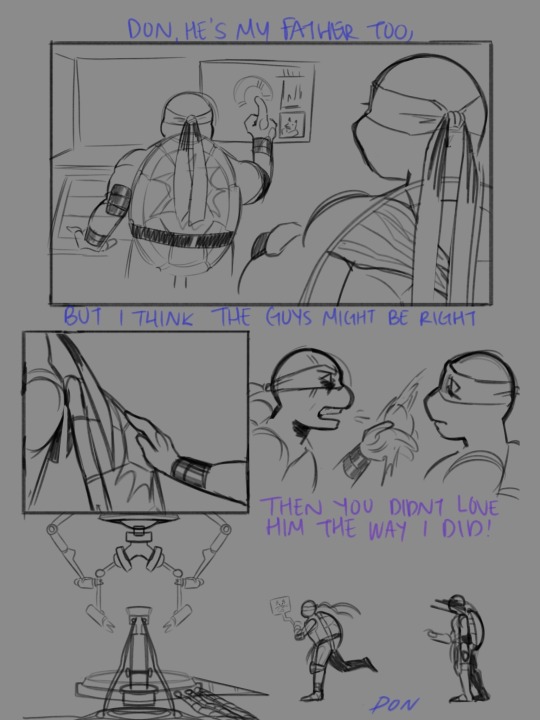
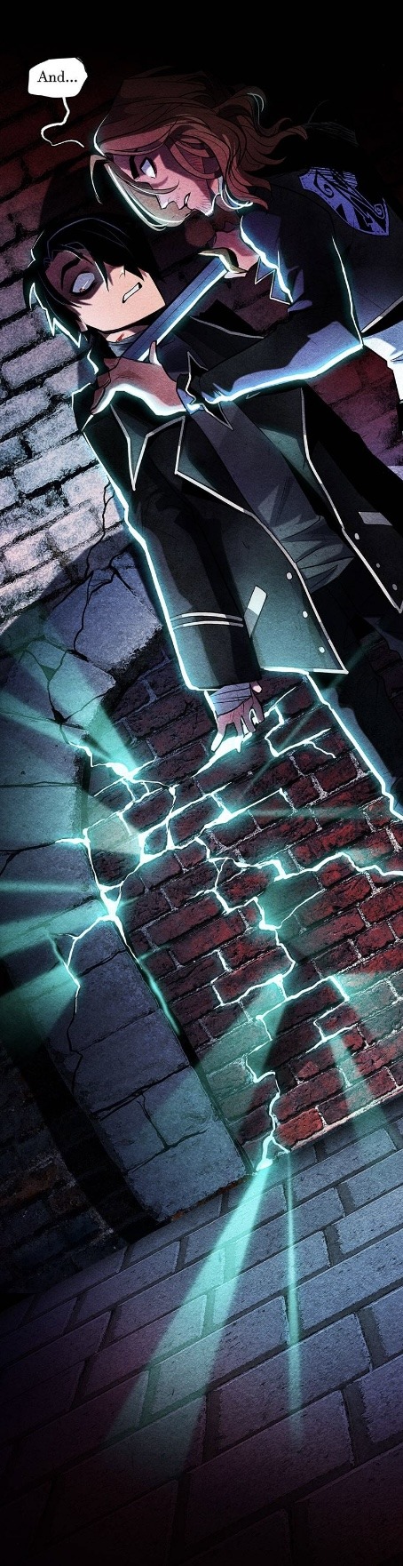
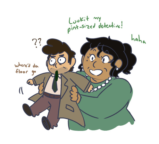
TMNT 2003 Seaon 7 Donatello’s Arc is something I will never recover from
#TMNT#teenage mutant ninja turtle#TMNT 2003#2003 Donnie#2003 Leo#season 7 was so rough#I would enjoy it so much more if they didn’t have eyeballs#why do they have eyeballs#why why why#season 7 isn’t talked about but Don’s self degrading behaviors was showing#he was no sleeping eating or anything#THEY WERE ALL SO CONCERNED#using audio from ATLA
369 notes
·
View notes
Text
I think because of the whole hiatus and whatnot we were very much blind sided whenever ichikawa really went forward with eliminating most of the main characters we loved and cared about, but also there were many who were upset phos went through with the prayer.

I'm not gonna pretend what phos went through to become divine was horrific. They didn't deserve to suffer. But that doesn't seem to be the overall point of the story. Consider why phos decided to pray away. It was the overall best decision considering phos knew humanity had run it's course, but also there wasn't a point in letting the remnants of humanity suffer for eternity. It was unfair, but what's the point in enacting more suffering?

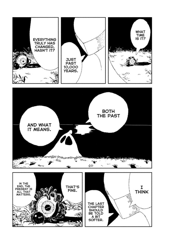
And after so many millions of years of sleeping, and finally finding some peace with himself. To Phos, the events of the series are now a a small moment of their current lifetime, and a blink in the universe. There is no going back. But even then, it's not like it's all over.

Everything has an end eventually and they've accepted it. They will one way be back in some form, maybe it'll be better or maybe it'll be worse. But they will have the option to act again and maybe they'll act different. I'm not sure at this point because I'm constantly blindsided.
And although I think it would miss the point if we did have the other main characters come back I do wish we had some sort of closure between them. At the same time, that's how life is. Phos needs to move beyond that now because that isn't what is happening to them now.
Maybe in a different universe.
#hnk spoilers#houseki no kuni#phosphophyllite#hnk discussion#I do understand why phos doesnt want to keep themselves on the move for the rest of the universe's existence#houseki spoilers#hnk 105#rock#The sun going BOOM#i do understand why phos doesnt want to constantly run away from their end#phos to me is happy now#there is a tragedy in being millions maybe billions of years old.#eyeball seems to be vibin tho#i wish phos could have told their story to the pebbles
77 notes
·
View notes
Text
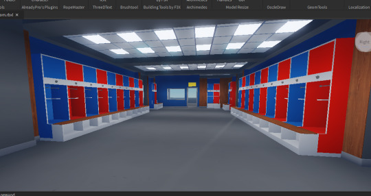
actually yknow what heres what ive been working on in roblox for the past 2 days
#YEAH ITS. YEAH IDK.#ted lasso#yeah sure fuck it im tagging it :/ LMAO#its unfinished rn because im trying to do the layout mostly first and i just cannot for the life of me find a decent image of the ceiling i#the coaches' office to get an estimate as to how big the room is (im using the tiles to measure) so if anyone has a good photo PLEASEE GIVE#dont ask me why im doing this idk either but its been SO fun to do so far :3 <- full of agonies#im doing the text and stuff last... but it is so weird seeing the believe sign without the blue text on it huh#i can actually explain stuff as to how i 'measured' the place and how im having troubles with Measuring the office because theres like zero#full references for the rooms but honestly would anyone actually want to listen to me get more and more insane with each sentence LMAO#i keep on saying but alot huh. i love butts#edit: GRAAAH ILL JUST EYEBALL THE OFFICE LATER </3
93 notes
·
View notes
Text
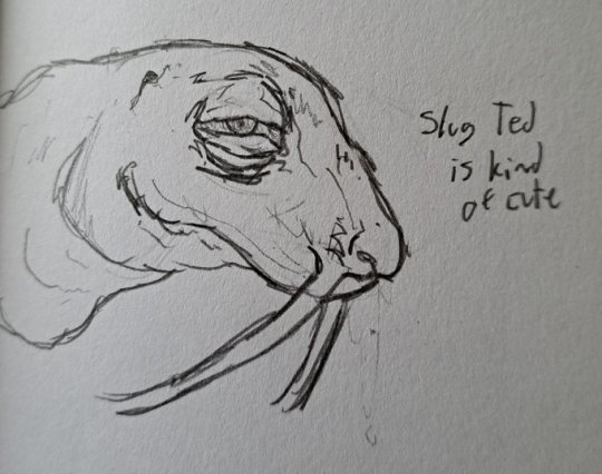
slug ted call that bitch sled

#i doodled these in class and i forgot what he looked like </3#im not looking up a reference though i like my fucked up jelly bean jelly ted#this post is so stupid why do i always have to like classics and be weird about them.#im having unpleasant flashbacks to my lotf fixation#wait is ihnmaims a classic?? my mom (whos a literature enthusiast) says it is but I've never heard it called that elsewhere#God whatever ok it doesn't matter. jelly ted my beloved#i have no mouth and i must scream#ihnmaims#ihnmaims ted#FARTTTT I JUST REMEMBERED HES GOT NO EYEBALLS... FAAAARRTTT!!!!
21 notes
·
View notes
Text
Ik Heart literal wise is the actual heart but like what would Mind be? Cos im thinkin it about it an since Heart & Mind are stated to be the halves of the brain, he cant be the brain then?
#or maybe im overthinking that#like im trying to go for literal stuff in some drawings#an like Heart is obvious cos he's the heart like yea#but in the songs Soul mentions many times that they're both the brain [the left brain & right brain]#SO LIKE WHAT IS MIND THEN THE SKULL?? WHAT DO I USE FOR YOU BUDDY???#shaking Mind like im that little girl from finding nemo with the fish bag#WHAT ARE YOU#heart = the heart. soul = the body. mind = ???#maybe like hands??? i would say the voice/throat or smth but be born makes it seem like the two of them are voice/voices?#idk man im too dumb for this#maybe eyes??#i have no idea#“what are you guys?” (oh im the heart) {im the body/self} [idfk man the nose?? an eyeball??? im asking the same question myself]#ig he's just the logic half of the brain#am i stupid? am i missing a lyric or misinterpreting a line?#okay its IS 4am so ya know maybe that's why im like this#idk im dumb#I might delete later cos I feel stupid but I am curious to other ideas/interpretations#chonny jash#chonnys charming chaos compendium#moss post
21 notes
·
View notes
Text


GO FRENCHIE GO!!!!
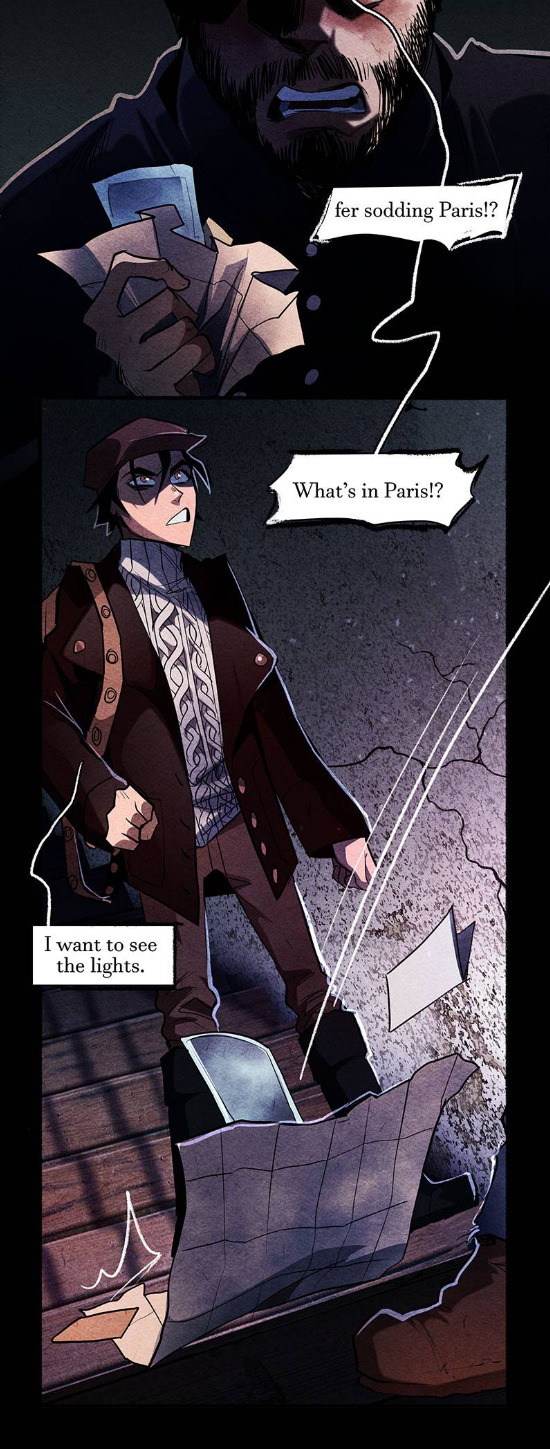
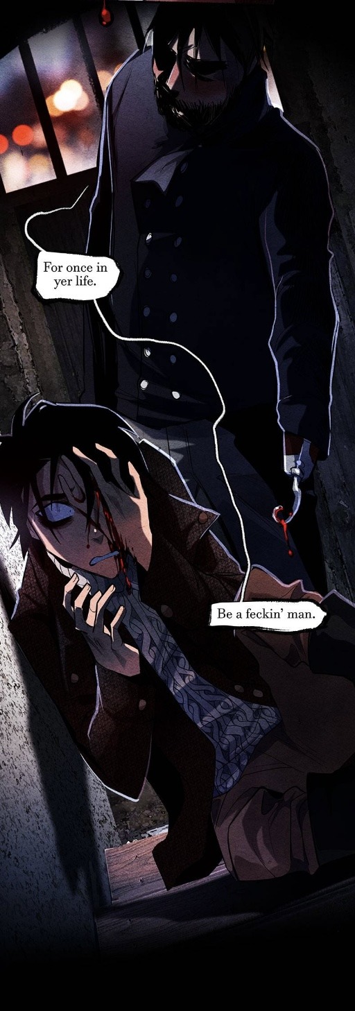
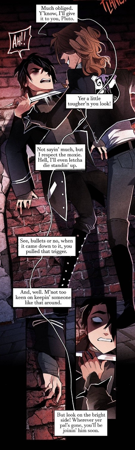
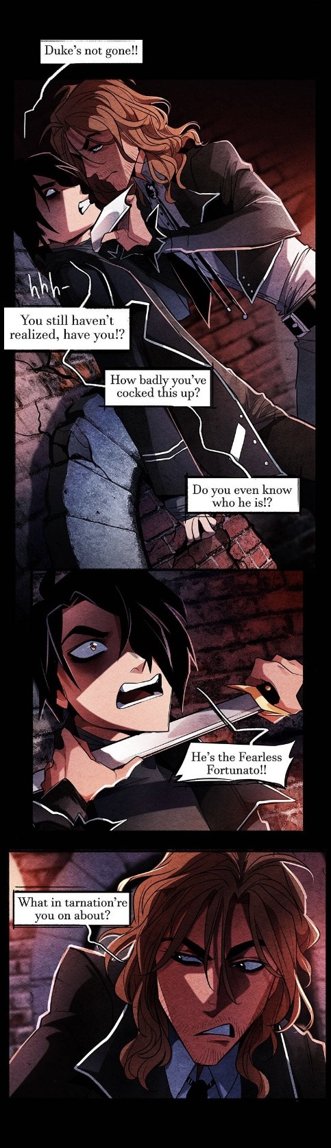
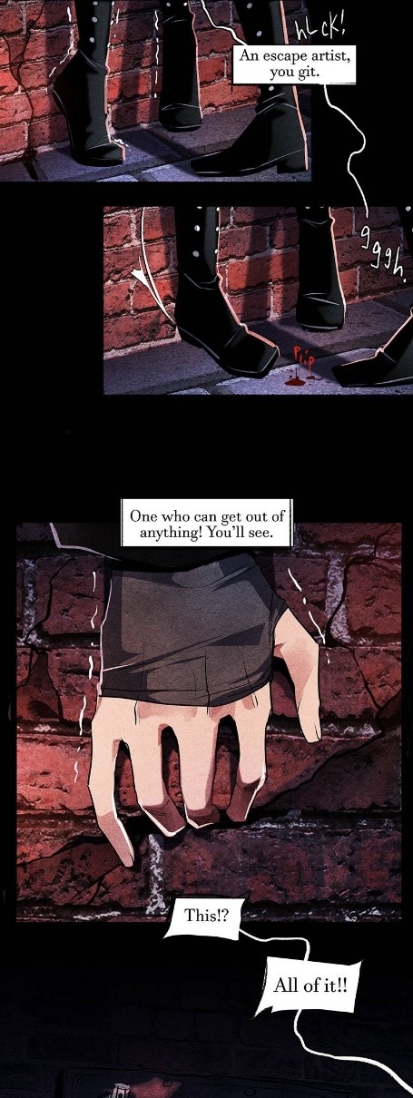
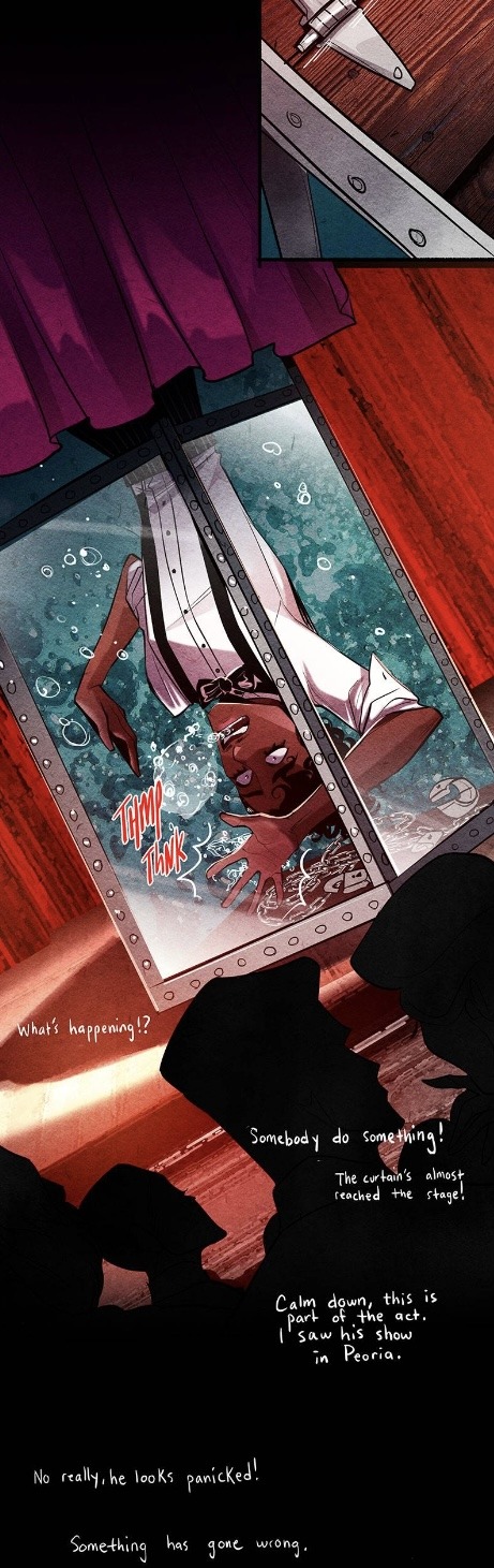
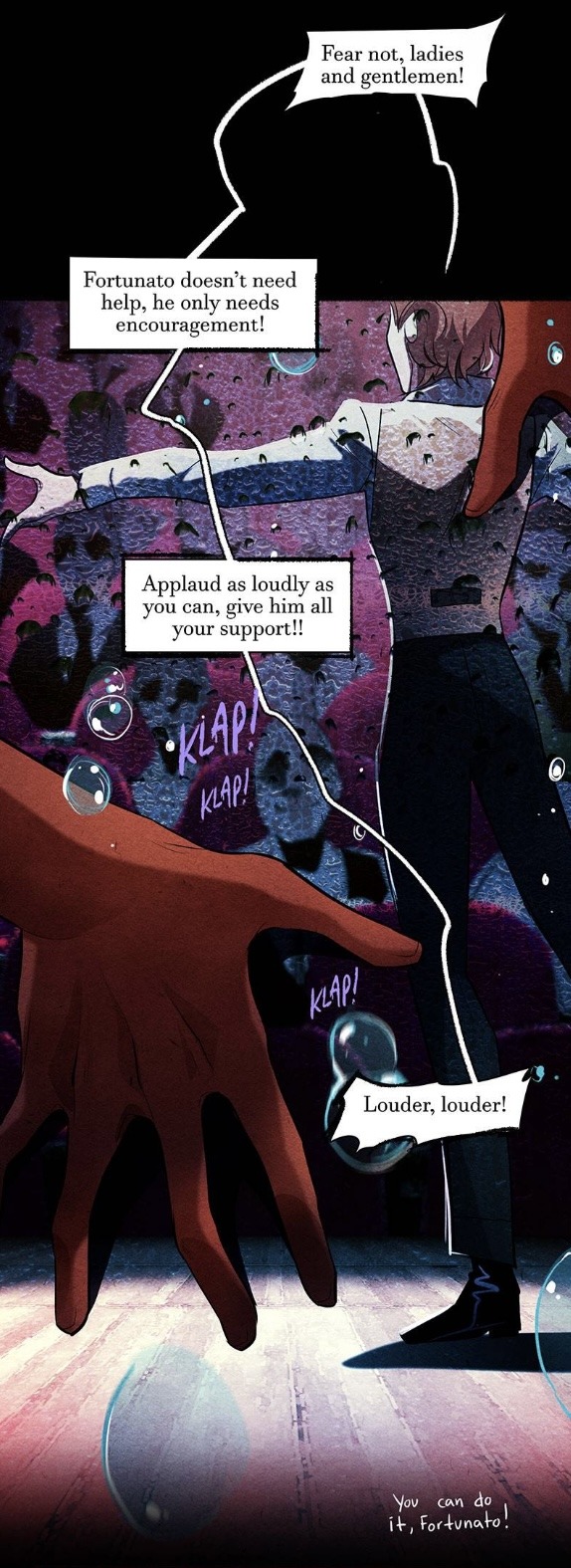
#Nevermore#Nevermore Webtoon#Webtoon#HOOOOOO BOY A BIG ONE TODAY! PLUTO BACKSTORY LOOK AT HIM AND HIS TWO WHOLE EYES#Ngl I thought he already was in Paris with the buildings outside#Oop there’s dad uhhh hey Buddy don’t hurt Pluto#Yeah he earned his own money (working where I wonder) he can spend it how he wants to and see the lights!#Him yelling at his dad mmmm so good Pluto voice very fun to do#OW WHY’D YOU CUT HIS EYEBALL THAT’S SO RUDE#NO IT’S NOT TEARS (IT IS) IT’S BLOOD YOU IDIOT LOOK WHAT YOU DID WHAT DID I JUST ASK YOU NOT TO DO#YOU’RE THE ONE WHO’S NOT A MAN#ACK MONTRESOR an aside the way they went in between flashbacks and current day this ep was very well done#NO WHY DO YOU HAVE A MACHETE SIR PLZ DON’T USE IT ALL HE HAS IS A CROWBAR#Gosh it’s just like Shiloh there were no bullets butcha pulled the trigger and what does that say about you#NO DON’T CUT HIM BUT YES DUKE CAN GET OUT OF ANYTHING (DID PLUTO KNOW WHO HE WAS WHEN HE WAS ALIVE) IT’S ALL PART OF THE DAMN TRICK!#OH NO NOT THE WATER TORTURE CELL#DARN GUY ON THE SIDE WHOEVER THE HECK YOU ARE I NEED TO LOOK THROUGH POE AGAIN#LOOK HOW PANICKED HE IS GET HIM OUT OF THERE#DON’T CHANGE THE SUBJECT YOU IDIOT IT’S NOT ABOUT PRAISE PRAISE CAN’T DO ANYTHING HERE DON’T SMILE AT HIM WHILE HE’S DROWNING#MANIFESTATIONNNNNNNN OMG I’M SO EXCITED TO SEE HIS SPECTRE CARD AND DESIGN AND VIBES AND AFTER THIS LENORE WILL BE THE ONLY ONE#AND I HAVE AN ART PIECE LINED UP I LITERALLY JUST NEED HIS SPECTRE DESIGN AND THEN IT’S LIKE DONE SO SO SO SUPER EXCITED!!
35 notes
·
View notes
Note
how do you get your colors to look so nice and your lineart so red and vibrant? i love it
omg anon thank you!! 😭 im going 2 be honest I am Not Great with color theory... but i like having my sketch pages look cohesive to me...
BUCKLE UP this is going to need a readmore bc i like talking.
I always sketch in neon colors it's a habit i picked up from an old teacher but I'll think of a color usually on a whim and draw with that. and then if i want to draw something else ill pick another color that i think goes well with the page. usually most of my color schemes r analogous (colors right next to each other on the wheel)

yanked this from recent dunmesh post; i kept most of my colors within the pink/red/orange range.
i wouldn't recommend doing everything in monochrome or analogous palettes though because it's sort of a guilty crutch of mine XD.
sometimes when im coloring ill change the layer mode of the sketch. color burn gets you either very very bright or very very deep colors depending on the color of the flats underneath. multiply and linear burn do the same thing but they're a lot tamer and generally always return darker colors. im sure there's some technical bits behind this though. ill either color my lineart afterward to compliment the color of the flats, leave it as is, or mess with layer modes if i feel like it. my favorite trick is color burn + linear burn + some combination of two lineart layers and just fiddling until i get a nice burn effect.
mithrun was done with crimson red on color burn.
coloring... like 999% of this is relative color which is like. kind of the idea that colors look different when placed next to each other. if you eyeball it a bit it's pretty noticeable.

what i used to do a bit ago was i would fill in the area i wanted to color with one big mask of color, make a new layer that has a clipping mask down to the flat layer of color, and then draw my actual flat colors. the color of the mask helped me pick my flat colors bc if I picked a color i think stood out too much next to the mask i could kind of just adjust it until it looked a little more cohesive.

old ish drawing next 2 a canon reference. i ignore local color a lot...mea culpa....but my overall color palette here was a light pink, so the shirt here is actually a desaturated pink? or violet i believe. if you shift sort of that purple color far enough into the gray area of your color wheel it can take on a blueish or even greenish hue. it being next to a lot of warm pinks/fuschias helps.
a neat thing that kind of helps is that if you desaturate or saturate certain colors they can kind of take on a certain hue? not sure if this makes sense. sort of how orange here turns tealish blue the grayer it gets. so if im drawing something that's predominantly orange and i have a blue color i can just take an orange color and desaturate it until i get a color that sort of looks like blue. and that way it kind of looks more harmonious? at least to me XD
shading. i don't apply serious lighting to a lot of my drawings, but a helpful bit is that the shadows tend to be the opposite of whatever color the lighting is? i try to think first about the "mood" or the main color i want to go for in the drawing and then i pick a shadow color opposite of that. so for here, i wanted the lighting to be a coolish magenta so the shadows r lime green. if there's anything off i fiddle around until i get something i like. the shadows on the skin here were too green initially so i shifted them a little more orange.
there's a "band" of color going on between the transition of the shadows to the light. generally this could be for a lot of reasons and i tend to use it differently (core shadow? overexposure? etc etc). but this is a color post so ill try not to go too off track.
but generally digital doesn't "mix" colors the same way traditional colors do if you use RGB (cmyk is a bit better with this but is kind of a pain to get used to), so to make blending a little less muddy, i sometimes add an intermediate color to smooth things out a little. for example, mixing digitally blue n yellow tends to get you gray, but generally, blue + yellow makes green, so if im making a blue->yellow transition ill slap some green color in the middle so it flows a little better.
I do a lot more cel shading nowadays. if you've been on here for a while earlier this year i have another style of coloring but it's not really accurate to how shadows really work so i wouldn't recommend looking at it. it's mostly to add zest and texture to the underlying flat colors.
coloring your lineart does a TON to helping your colors look vibrant, though its like the garnish on a dish to me (same with shadows). i think it's good to try and play with your flat colors and try to make sure those look in order first before adding flourishes. usually ill leave it a dark, saturated color that again matches my overall palette but sometimes i go in and color them by alpha locking my lineart layer and picking a color that matches the flat colors underneath? not sure how to explain it properly.

i used a darkish purple for shuro's ponytail to match the dull red of the flat colors (more relative color! trying to simulate a black/brown while keeping the pink palette there) but a lighter crimson for laios's blond. the light was this super intense like blush pink so i thought it might be cool to add this neon salmon red in the areas of that light to really give off that vibe of a very bright intense rim light.
sometimes you could also tweak with gradient maps or color balance, which adjusts hue based on how light or dark a color is. these r fun to mess with as a final touch but i need to watch using them because they can become crutches real fast XD but those are also just tools to help you. in the end just developing a good sense of how color works and how you want to use it is the best place to start.
LONGASS ramble but yeah. tldr just kind of train ur eye for color and look at what you like best. which is unhelpful and a little sucky but it really is just observation and practice and maybe some personal zest.
happy drawing!
#SORRY THIS IS THE SIZE OF CANADA I YAP A LOT#i like being thorough when explaining myself a lot XD but i think the easiest way to get good with this is just repeat practice n observing#and figuring out how stuff behaves in certain situations and what you like to do and blahblahblah#if you have artists u like that do this well looking at how they use color might be cool#...i feel this entire post is just putting my entire thought process on blast LOLLL.#“eyeball it out” -> study some actual fundamental stuff and or intake new info or art -> apply it back to just eyeballing it out#i dont think i have a natural sense for some basics#but i dont think im naturally one of those people who grind out studies all the time and breakdowns either#i guess i just kind of like knowing the mechanations behind why to do a certain thing or how stuff works and then figuring out#how that translates into what i know nerd emoji#james gurney has a good book on color and light#if you like reading. but its very informative!#quirinahscreams#ask#anon#this is mostly just me talking about how i draw i dont think this is meant to be educational or informative XD um
10 notes
·
View notes
Photo

he is so small and so little and so SLEEPY!!!
#columbo#lieutenant columbo#mrs columbo#my art#can i stop thinking abt them for 5 seconds..... mayhaps not.....#trying to make his outfit actually accurate instead of just. eyeballing it.#this includes his second smaller purplish coat which by the way why they fukc do u have two coats on.#are you like one of those small dogs that need a sweater on bc they cant generate their own body heat. is that it lieutenant
156 notes
·
View notes
Text
Nobody asked for these, but here are some random Familiar AU thoughts!
Lately, Ford has been begrudgingly admitting that he knows of one time someone summoned a demon and it worked out.... okay. For certain definitions of the word. He grumbles about it a lot, but all of his associates are very surprised by this small admission. The news really comes in handy the first time Dipper and Bill meet some demon hunters. Nepotism at its finest.
Dipper is dreading the day he has to admit his marriage to his parents. Bill hasn't brought up the subject; Dipper's pretty sure it's because Bill doesn't care about them. Mabel, thankfully, hasn't spilled the beans yet. Maybe Dipper can avoid it forever. (He Can't.)
Wendy, whenever she finally meets Bill, is entirely unaware of his seething jealousy at her being Dipper's first crush. Soos, however, gets along with Bill fairly well! Considering he's Bill and all.
Bill has a whole set of extremely gaudy gold jewelry he can't wait to see Dipper wearing. (ONLY wearing that) He daydreams of his 'servant' feeding him eyeballs while he lies on a chaise lounge holding court. (Not gonna happen.)
One of Bill's first goals with the first reincarnation of Dipper is to sleep with him. Not sex, just literally sleep. Nap. Rest and snore in his ear and cuddle, because it's something he hasn't done before.
Dipper absolutely takes a ton of inspiration for his illusions from all the nightmares he's seen in the Mindscape. He's still a shitty actor, though, so the best bet of telling if that horrific writing monstrosity is real or an illusion is watching his face.
If Dipper's clearly pretending to be afraid? Illusion. If he's scared? Real. If he's calm? That's a coinflip; he's either making it, or he knows the guy from somewhere and isn't worried. Best to be cautious, 'cause it might eat you if you get close.
Finally, I bet Bill is the type of Gross to like popping his partner's pimples. Behold the only thing that could get Dipper Pines into skincare: Self Defense
#Familiar!AU#This is just some random bullshit so feel free to ignore it#None of this is technically canon until I write it and even then it's nebulous#Dipper's only gonna wear the cultist gold for bedroom times#He *might* do the feeding Bill things while lounging in front of his court if he got pants and the eyeballs were exchanged for grapes#A fair compromise; Bill didn't really want everyone seeing Dipper's bits anyway#They end up having an argument about why the grapes aren't peeled#Dipper makes an excellent point about how he'd mangle them and it'd ruin the aesthetic#Too late you've already spent fifteen minutes flirting/bickering in front of everyone#Dipper probably has to go to Pacifica for skincare tips#His face has cleared up a ton since puberty but he's in defense mode for the next eruption#And Mabel has plenty of stuff but it's either glittery or causes a breakout on Dipper#Or Both#One day I might write the parent thing cause it has a ton of potential chaos#But honestly the Wendy and Bill meeting is much closer to being conceptually done#Also smut is at 5k and I got to use the word 'antediluvian' which is always fun#That has been my rambles and thank for your reading
113 notes
·
View notes
Text
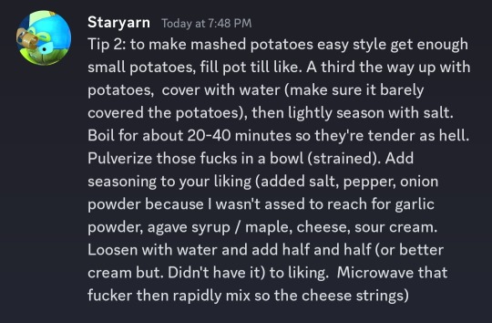
Season with your heart
[
Tip 2: to make mashed potatoes easy style get enough small potatoes, fill pot till like. A third the way up with potatoes, cover with water (make sure it barely covered the potatoes), then lightly season with salt. Boil for about 20-40 minutes so they're tender as hell. Pulverize those fucks in a bowl (strained). Add seasoning to your liking (added salt, pepper, onion powder because I wasn't assed to reach for garlic powder, agave syrup / maple, cheese, sour cream. Loosen with water and add half and half (or better cream but. Didn't have it) to liking. Microwave that fucker then rapidly mix so the cheese strings)
]
#the only reason i add a swetener is to balance it and because its to my taste. however do what you want#i do NOT have measurements you eyeball that shit and learn from experience#my tip is dor the love of god get a potatoe masher. however fork will work well#i had like. maybe 10 min or so boiled till soft potats and god was it an arm exercise#thats why i suggest the long ass cook time#but really its boil till tender enough to split without effort#this probably can be applies to sweet potats but. have not tried it#some fresh minced garlic would be a good replacement for some dried seasonings. id also add paprika (could not find it and couldnt be assed#if you have meat that youre making on the side make sure to get some of the meat juices (after cooking) and spoon in like 3-7 (to taste)#it adds another depth of flavor that cant be mimicked with seasonings. balance with sweetness to liking#resippy#shiko speaks#for meat fucking reverse sear that bitch. however broiling works well too#i could give recipe on custard however i do not wish egg tempering on anyone#do not bully my ass for typos i dont look at my phone my ass is typong too fast
5 notes
·
View notes
Text
obsessed with the bullets from my 'physical impacts from 'gaming'' notes for class cause they all talk about violence and aggression an yeah that sure is a thing in videogames but have you considered ichiban deserves to enact a lil violence. just a bit. also he's the light of my life and the ray of sunshine in the dark and
#snap chats#the videogame segment funny as hell in general cause theres bullets where its like#'yeah youre putting yourself in the position of these hyperviolent and dangerous people'#and then im thinkin of ichiban calling a fuckin crawfish on his phone like yeah. deadly stuff right there youre right professor#tho now that i mention ichiban Aw Fuck he might be the worst/best example of videogames and the correlation of violence#if not solely because his fighting method is literally influenced by dragon quest but i repeat hes valid and its ok <3#anyway sorry i have to be sick in the head stop reading now if youre a fish. or daigo bear GET OUT#theres a note here like 'increase in arousal' and Honey. if my eyeballs observing this community have a comment on that--#im not guiltless tho 😔 saw that forbidden masato katsu screenshot and i got sick <- still obsessed with how gorg he is#AND WHY DID THEY REMOVE THAT SCENELVKLVKJ ITLL FOREVER BE FUNNY AS HELL#THERES JUST THIS GORJUS AS CHRIST SHOT OF KATSU AND ITS LOST TO THE RGG VAULT#rgg please one high-rendered cutscene of ishin masato is not enough for me. his smile was so cute in the scene pleeaaaaasssee bro#im so ill. anyway im gonna lay in bed for the next five hours until my last class#i thought i was gonna stream but if i even try talking i just might throw up. also i should prob do my comm work instead OOP#luckily its just sketches this week so.... maybe i can stream tomorrow or thursday...#dont quote me on that i suck. anyway bye
12 notes
·
View notes
Text
trying to write, i want to write but the only place i have with dark mode is my computer's notepad and i can't access those files from anywhere else. augh
#just me hi#girl help my Eyeyessseses hbfvhs#i keep getting told 'use google docs' it Hurts My Eyeballs !!! let me change the funkin website theme !!!#plus when i'm writing at night i don't want the whole world knowing what's up bc i have the equivalent of a lighthouse beacon telling every#one 'HEY. THIS THING'S AWAKE !!' lol :^#i'd use google keep bc it feels. friendlier ? but also the clutter behind the note i'm writing in is making me anxious + distracting me. so#hvfbhs#this is such a silly problem but i'm running in circles just trying to rewrite p.space for the... i think eighth or ninth time now Lolll#i wanted to try wattpad again but i like not having my eyes hurt. and i'm trying to plan ahead bc i want to have a place i can write in#Consistently. ya know ?#sigh. sogh. saigh. sygh#oh and also wattpad feels too cluttered. there's something about having the writing space take up the Whole Entire Screen that doesn't#groove with my brain right. so !#this is just me being very picky for no good reason lolll :)#'just minimize the tab then' but that is still wrong bc the writing space is taking up the Entire Tab now !!#/anyway i just remembered rn why i don't explain why i'm actually having issues with things HFBVSH#it's really specific. and really vibe-based. and it's like being in the middle of a field and not being able to explain what is so wrong ab#being in the empty‚ cold‚ deadly-quiet but also piercing-loud field forever and ever and ever#do you know what i mean ??#//ANYWAY. back to whatever this problem is Lolll :3
9 notes
·
View notes
Note
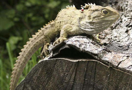

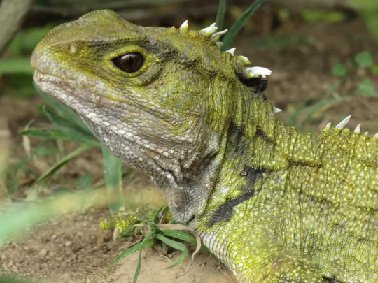
tuatara gang
little mossy dinosaurs with a mysterious third eye, what could be better
that's a capital-L Lizard, baby!
#just read a bunch about these guys and they're very cool#also I really want to know why they have a secret third eye on top of their heads that you can only see when they're young#like what does that thing do. are there other lizards with a secret mysterious extra eyeball
11 notes
·
View notes
Text
As much as I roast Beyond Birthday for his lack of subtlety I also kin him for it. Because in art school we were sometimes required to incorporate deep symbolism into our art pieces, and I was always doing things like drawing a dude holding a compass and wearing goggles to represent that he's feeling directionless about his worldview
#seriously art school was such both a good learning experience and also an embarrassing bummer all at once hahaha#i think the worst part about it is i started feeling like i couldnt have a sense of playfulness or humour in what i made?#not necessarily because anyone told me that but i just somehow internalized it and it sucked all the joy out of making stuff#i had to relearn a lot about why i used to love doing it in the first place and all that jazz people always say about art school#but anyway i just cant not be literal and hamfisted so i really shouldn't make fun of B#for being like#hmmm clocks!! eyeballs!! the number 13#it's really not as easy as it looks to be subtle and artful about such things#i think part of the problem was i went to school basically for making fine art to hang in galleries#when all i really ever loved art for was all the comics and movies and games and cartoons i took in#i didnt live somewhere where i could often go to museums or galleries so i lived through books and screens alone for art basically#and i really started believing all the stuff i loved wasnt the 'correct' kind of art that i should be focusing on anymore because of school#i definitely recommend considering your influences when it comes to the kind of schooling you do#like pick something where you'll be studying the artists and art you genuinely were inspired by because#so much of art school was studying fine art and artists that legitimately did nothing for me#not because they werent worth studying but just because they werent my personal taste#beyond birthday#p
38 notes
·
View notes
Text
I'd like to start a protest because the word Ouija as in Ouija Board has too many vowels and I have had to type it out because my current hyperfixation is Phasmophobia and then twice more to complain about it.
NO TWO SYLLABLE FIVE LETTER WORD IS WORTHY OF FOUR DAMN VOWELS
thank you for coming to my ted talk
#i am mad#it should be spelled ouijae because that would a) make more sense and b) honestly trigger me less#yall e is feeling left out#do ghosts not like to talk to E?#what did E ever do to you#huh?#hyperfixation#english#english is bad#english spelling is one of the worst things these eyeballs have ever graced the earth with#that didnt make sense BUT NEITHER DOES THIS LANGUAGE#why am i so mad this is actually kinda funny how mad i am about this#is this what social media is for?
2 notes
·
View notes
Text

❝ Please do not wear glasses with wrong prescriptions nor purchase regular fantasy contact lenses if you have astigmatism ❞
#;a.sclepius#;ic#(def a reference to our glasses event in f.go yes)#look at his chair he's zoominggggg#/also i dunno if this is common knowledge or not ? but it was lit in -this- year that i learned-#/that u cant/shouldnt/ wear just any contact lenses if u have astigmatism#/like u know those pretty lenses that make ur eyes bigger or cosplay lenses that people just buy wherever?#with people with astigmatism; u actually need prescribed lenses; u cant just buy regular fantasy lenses bc basically ur eyeball's shape is-#that of a football; so regular fantasy lenses are made for the regular more rounded eyes#so u can imagine this would fck up ur eyes if u have astigmatism#i mean ideally everyone should get prescribed lenses but regular people have it safer-ish#i read that it can scratch ur eyes and u can get blind if ur not careful so its a big thing if u have astigmatism#i dunno why i just never see this getting mentioned anywhere; bc even for a con; 6 hours with wrong lenses can do big dmg#basically all this talk comes from me thinking about cosplaying a character with red eyes and then sobbing bc of my own astigmatism#anyways; my headcanon is that both h.olmes and da vinci craft glasses#a.sclepius can take ur measurements but thats it
6 notes
·
View notes
Last Seen Blogs

sissyballs69
Sissy Whore.

movizark
MovizArk

juicy-jade
Jade S. Sasahara
everythingdestroyingme
EverythingDestroyingMe