#ylva nykvist
Photo
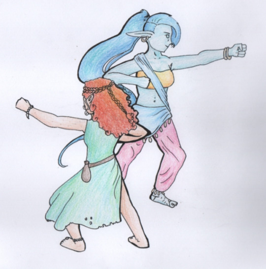
I do mean to finish up inktober at some point but I’m not mentally in a good enough place for most of the remaining prompts and i didn’t want to jump straight to slice right now. So here’s a different thing I’ve wanted to draw for a little while? I could probably have composed this better, but hey-ho. Potentially I could have thought of a more unique pose than ATLA’s Dragon dance, but I thought it was cool, and a nice inversion to put two female martial artists in there, have the firey one be the small one, and the airy one be the tall one, and such... It makes sense in my head.
Also, pro tip; don’t just continue inking when you start having a sneezing fit from your cold. You’ll do something stupid like jump and make one of the lines stupidly out from where it should be and forced to make a whole load of the lines super thick to hide the error. Not that that happened here at all. Nope.
#high hopes#high hopes low rolls#mina floccus#d&d 5e#werewolf#ylva nykvist#genasi#genasi monk#monk#lythari#lythari monk#oc#art#traditional art#rio-los's art#rio-los's traditional art
87 notes
·
View notes
Photo
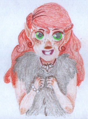
In the Tangled: the Series art style, Ylva goes from being 99% puppy, to being 12 puppies in a trench coat. Literally.
Even her little crooked smile looks even cuter. Werewolf fangs look cuter. I didn’t even know that was possible. Anyone who knows me irl and has noticed a pattern in characters I tend to like should know that making me like werewolves more is hard.
Honestly probably going to yoink the tone variation on the cheeks and so on for my own art styles, I really like how it looks and it’s pretty easy and gives a little more focus onto the eyes (for me at least). This is sadly the last of them I have drawn in this style for now, but if they prove popular for here, even without being actually from TTS, I’ll probably do more - including fan art, obviously.
#werewolf#not sparkly#elf#Monk#d&d 5e#d&d#art#traditional art#tangled style#ylva nykvist#rio-los's art#rio-los's traditional art#elven monk#lythari#lythari monk#waist up#lineless#my internet wasn't working so i did this
5 notes
·
View notes
Photo


A drawing done a little while ago of my lythari (elf werewolf subrace) monk. When I take pictures of drawings, the colour always goes down in brightness, so I thought I’d also do some experimenting with how to make the colours stand out more. The first edit is by massively upping the saturation of colours, and doing a massive upward curve on one of the colour managing things, which has the downside of not being very faithful to the original colours, and making everything look super pale, but the colours are really bold and visible, and everything looks a little bit clearer. The second edit is by playing around with contrast and brightness. It doesn’t look so bright and bold but it’s more faithful to the colours I used and doesn’t make everything so pale (I also fiddled around with a second layer to get a bit of a framing thing going on that I quite like. It somehow both manages to make her look less realistic but more alive, which works quite well for me as I like my semi-realistic style on traditional stuff).
If you think one’s better than the other, I’d appreciate a comment saying so so I know which people think looks better and can go more in that route later.
#d&d 5e#oc#art#traditional art#colour experiment#ylva nykvist#my own art#my own traditional art#elven monk
7 notes
·
View notes
Photo

@laketahoefanfiction
#wolf#d&d 5e#art#werewolf#rio-los's art#rio-los's traditional art#traditional art#lythari#elf#elven monk#lythari monk#ylva nykvist#oc
4 notes
·
View notes
Photo

In case anyone hadn’t noticed, I got the scanner functional again!
I posted this a little while ago, but here’s a better version. Scanning makes things a little pale but personally I think paler > completely desaturated.
#wolf#d&d#d&d 5e#art#werewolf#elf#lythari#traditional art#rio-los's art#rio-los's traditional art#ylva nykvist#money#elven monk#lythari monk
2 notes
·
View notes
Photo

I got drunk. I started drawing. I kept drawing because once I make a decision when I’m drunk, that decision does not easily change. There are 5 drawings in this series of “I got drunk so I drew these”. They’re all sketches in the same pen on the same information leaflet so they should all be recognisable.
#art#traditional art#d&d 5e#sketch#drunk drawing#oc#ylva nykvist#elven monk#lythari monk#homebrew d&d#and my obsession with curly haired female characters continues#rio-los's art#rio-los's traditional art
0 notes
Last Seen Blogs

thesecretdiaryofastrangegirl
𝓜𝓸𝓷𝓷𝔂💜

sistertoxxxic
asystolè

ff7remake5e
FFVII Remake DnD 5e Conversion

saggertieduk
SaggerTiedUK

prettytoessexyfeet
Pretty Toes In Heels